Table of Contents for
Bootstrap 4 – Responsive Web Design
 Bootstrap 4 – Responsive Web Design
Published by
Packt Publishing, 2017
Bootstrap 4 – Responsive Web Design
Published by
Packt Publishing, 2017
- Cover
- Table of Contents
- Bootstrap 4 – Responsive Web Design
- Bootstrap 4 – Responsive Web Design
- Credits
- Preface
- What you need for this learning path
- Who this learning path is for
- Reader feedback
- Customer support
- 1. Module 1
- 1. Getting Started
- Setting up the framework
- Building our first Bootstrap example
- Optionally using the CDN setup
- Community activity
- Bootstrap and web applications
- Browser compatibility
- Summary
- 2. Creating a Solid Scaffolding
- Building our scaffolding
- Fluid container
- We need some style!
- Manipulating tables
- Like a boss!
- Final thoughts
- Summary
- 3. Yes, You Should Go Mobile First
- Bootstrap and the mobile-first design
- How to debug different viewports at the browser
- Cleaning up the mess
- Creating the landing page for different devices
- Summary
- 4. Applying the Bootstrap Style
- Summary
- 5. Making It Fancy
- Paying attention to your navigation
- Dropping it down
- Making an input grouping
- Getting ready for flexbox!
- Summary
- 6. Can You Build a Web App?
- Adding the navigation
- Do a grid again
- Playing the cards
- Implementing the main content
- Creating breadcrumbs
- Finishing with the right-hand-side content
- Summary
- 7. Of Course, You Can Build a Web App!
- Waiting for the progress bar
- Creating a settings page
- Summary
- 8. Working with JavaScript
- Awesome Bootstrap modals
- Creating our custom modal
- A tool for your tip
- Pop it all over
- Making the menu affix
- Finishing the web app
- Summary
- 9. Entering in the Advanced Mode
- The last navigation bar with flexbox
- Filling the main fluid content
- Filling the main content
- Overhead loading
- Fixing the toggle button for mobile
- Summary
- 10. Bringing Components to Life
- Fixing the mobile viewport
- Learning more advanced plugins
- Summary
- 11. Making It Your Taste
- Working with plugin customization
- The additional Bootstrap plugins
- Creating our Bootstrap plugin
- Defining the plugin methods
- Creating additional plugin methods
- Summary
- 2. Module 2
- 1. Introducing Bootstrap 4
- Summary
- 2. Using Bootstrap Build Tools
- Download the Bootstrap source files
- Setting up the blog project
- Setting up the JSON files
- Creating our first page template
- Summary
- 3. Jumping into Flexbox
- Ordering your Flexbox
- Wrapping your Flexbox
- Setting up the Bootstrap Flexbox layout grid
- Setting up a Flexbox project
- Designing a single blog post
- Summary
- 4. Working with Layouts
- Inserting rows into your layout
- Adding columns to your layout
- Choosing a column class
- Creating a simple three-column layout
- Mixing column classes for different devices
- Coding the blog home page
- Using responsive utility classes
- Summary
- 5. Working with Content
- Learning to use typography
- Customizing headings
- How to style images
- Coding tables
- Summary
- 6. Playing with Components
- Basic button examples
- Creating outlined buttons
- Checkbox and radio buttons
- Coding forms in Bootstrap 4
- Creating an inline form
- Adding validation to inputs
- Using the Jumbotron component
- Adding the Label component
- Using the Alerts component
- Using Cards for layout
- Updating the Blog index page
- How to use the Navs component
- Adding Breadcrumbs to a page
- Using the Pagination component
- How to use the List Group component
- Summary
- 7. Extending Bootstrap with JavaScript Plugins
- Coding Tooltips
- Avoiding collisions with our components
- Using Popover components
- Using the Collapse component
- Coding an Accordion with the Collapse component
- Coding a Bootstrap Carousel
- Summary
- 8. Throwing in Some Sass
- Using Sass in the blog project
- Importing partials in Sass
- Creating a collection of variables
- Customizing components
- Writing a theme
- Summary
- 9. Migrating from Version 3
- Big changes in version 4
- Updating your variables
- Additional global changes
- Other font updates
- Migrating components
- Migrating JavaScript
- Miscellaneous migration changes
- Summary
- 3. Module 3
- 1. Revving Up Bootstrap
- What Bootstrap 4 Alpha 4 has to offer
- Setting up our project
- Summary
- 2. Making a Style Statement
- Image elements
- Responsive utilities
- Helper classes
- Text alignment and transformation
- Summary
- 3. Building the Layout
- Adding Bootstrap components
- Summary
- 4. On Navigation, Footers, Alerts, and Content
- Improving navigation using Scrollspy
- Customizing scroll speed
- Icons
- Using and customizing alerts
- Creating a footer
- Creating and customizing forms
- Form validation
- Progress indicators
- Adding content using media objects
- Figures
- Quotes
- Abbreviations
- Summary
- 5. Speeding Up Development Using jQuery Plugins
- Enhanced pagination using bootpag
- Displaying images using Bootstrap Lightbox
- Improving our price list with DataTables
- Summary
- 6. Customizing Your Plugins
- Customizing plugins
- Writing a custom Bootstrap jQuery plugin
- Summary
- 7. Integrating Bootstrap with Third-Party Plugins
- Hover
- Summary
- 8. Optimizing Your Website
- Minifying CSS and JavaScript
- Introducing Grunt
- Running tasks automatically
- Stripping our website of unused CSS
- JavaScript file concatenation
- Summary
- 9. Integrating with AngularJS and React
- Introducing React
- Summary
- Bibliography
- Index
Now that you have a good grasp of how to use the Bootstrap 4 grid, we're going to code up our blog home page. This page will include a feed of posts, a sidebar, and a newsletter sign-up form section at the bottom of the page. Let's start by taking the code we wrote in
Chapter 2
, Using Bootstrap Build Tools for our hello world! template and duplicating the entire directory. Rename the folder Chapter 4: Working with Layouts or Bootstrap Layout.
Good news! Since we set up our Harp project in
Chapter 2
, Using Bootstrap Build Tools, we can reuse a bunch of that code now for our blog home page. There's no need to make any updates to the JSON files and header or footer partials. The only file we need to make changes to is index.ejs. Open the file up in a text editor and paste the following code to get started:
<div class="container">
  <!-- page title //-->
  <div class="row m-t-3">
    <div class="col-md-12">
      <h1>Blog</h1>
    </div>
  </div>
  <!-- page body //-->
  <div class="row m-t-3">
    <div class="col-md-8">
      <!-- blog posts //-->
    </div>
    <div class="col-md-4">
      <!-- sidebar //-->
    </div>
  </div>
  <!-- mailing list //-->
  <div class="row m-t-3">
    <div class="col-md-12">
      <!-- form //-->
    </div>
  </div>
</div>
There are a few different things going on here so let me break them all down for you:
- I don't want a full width layout, so I've decided to use the
.containerclass to wrap my templates layout. - I've created three different rows, one for our page title, one for the page content (blog feed and sidebar), and one for the mailing list section.
- There are some classes on the row
<div>s that we haven't seen before, likem-t-3. I'll cover what those do in the next section. - Since I want my blog to be readable on devices of all sizes, I decided to use the medium-sized column classes.
- The page title column is set to .
col-md-12, so it will stretch to 100% of the layout width. - I've divided the second row, which holds most of our page content, into a two-column grid. The first column will take up 2/3 of the layout width with the
col-md-8class. The second column, our sidebar, will take up 1/3 of the layout width with thecol-md-4class. - Finally, the third row will hold the mailing list and it is also using the
col-md-12class and will stretch to fill the entire width of the layout.
The basic layout of the grid for our blog home page is now complete. However, let's revisit those new CSS classes from our layout that I added to the row <div>s.
One of the new utilities that has been added in Bootstrap 4 is spacing classes. These are great as they add an easy, modular way to add extra vertical spacing to your layouts without having to write custom CSS classes for each region. Spacing classes can be applied to both the CSS margin and padding properties. The basic pattern for defining the class is as follows:
{property}-{sides}-{size}
Let's break down how this works in more detail:
propertyis equal to eithermarginorpadding.sidesis equal to the side of a box you want to add eithermarginorpaddingto. This is written using a single letter:tfor top,bfor bottom,lfor left, andrfor right.sizeis equal to the amount of margin or padding you want to add. The scale is 0 to 3. Setting the size value to 0 will actually remove any existing margin or padding on an element.
To better understand this concept, let's construct a few spacer classes. Let's say that we want to add some top margin to a row with a size value of 1. Our class would look like this:
.m-t-1
Applied to the actual row, <div>, the class would look like this:
<div class="row m-t-1">
For a second example, let's say we want to add some left padding to a div with a value of 2. That combination would look like this when combined with a row <div>:
<div class="row p-l-2">
Are you starting to see how easy it is to add some spacing around your layout and components?
Now that you understand how these classes work, let's take a look at our blog home page template again. In that case, our <div>s looks like this:
<div class="row m-t-3">
On three sections of the template, I've decided to use these classes and they are all top margin with a size value of three. It's a good idea to try and keep these consistent as it will result in a visually appealing layout when you are done. It also makes it a little easier to do the math when you are setting up your page. Now that we've gone over the entire home page layout, we need to test it.
Let's test it out in the browser to make sure it's looking the way we want. Before we can do that we'll need to compile our code with Harp. Open the Terminal back up and navigate to the project directory for this chapter's code that we created. Run the harp compile command, here it is again in case you forgot:
$ harp compile
That should run without any errors; then, we can start-up the web server to view our page. Here's the command again to run the web server:
$ harp server
Now that the server has launched, head to a web browser and enter http://localhost:9000 in the URL bar to bring up the blog home page. Here's what your page should look like:
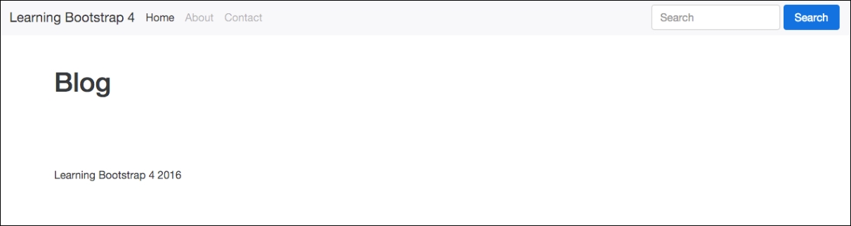
Uh oh, that doesn't look quite right. You can see the page title but we can't see any of our columns. Oh yeah! We need to fill in some content so the columns are revealed. Let's add in some dummy text for demo purposes. In later chapters, I'll get into coding the actual components we want to see on this page. This chapter is just about setting up our layout.
Head back to index.ejs in your text editor and let's add some dummy text. Go to the first column of the main content area first and enter something like this:
<div class="col-md-8">
      <p>Pellentesque habitant morbi tristique senectus et netus et malesuada fames ac turpis egestas. Vestibulum tortor quam, feugiat vitae, ultricies eget, tempor sit amet, ante. Donec eu libero sit amet quam egestas semper. Aenean ultricies mi vitae est. Mauris placerat eleifend leo. Quisque sit amet est et sapien ullamcorper pharetra. Vestibulum erat wisi, condimentum sed, commodo vitae, ornare sit amet, wisi. Aenean fermentum, elit eget tincidunt condimentum, eros ipsum rutrum orci, sagittis tempus lacus enim ac dui. Donec non enim in turpis pulvinar facilisis. Ut felis. Praesent dapibus, neque id cursus faucibus, tortor neque egestas augue, eu vulputate magna eros eu erat. Aliquam erat volutpat. Nam dui mi, tincidunt quis, accumsan porttitor, facilisis luctus, metus</p>
</div>
If you're looking for a quick way to get filler text in HTML format, visit http://html-ipsum.com/ .
Next, go to the sidebar column <div> and add the same paragraph of text, like so:
<div class="col-md-4">
      <p>Pellentesque habitant morbi tristique senectus et netus et malesuada fames ac turpis egestas. Vestibulum tortor quam, feugiat vitae, ultricies eget, tempor sit amet, ante. Donec eu libero sit amet quam egestas semper. Aenean ultricies mi vitae est. Mauris placerat eleifend leo. Quisque sit amet est et sapien ullamcorper pharetra. Vestibulum erat wisi, condimentum sed, commodo vitae, ornare sit amet, wisi. Aenean fermentum, elit eget tincidunt condimentum, eros ipsum rutrum orci, sagittis tempus lacus enim ac dui. Donec non enim in turpis pulvinar facilisis. Ut felis. Praesent dapibus, neque id cursus faucibus, tortor neque egestas augue, eu vulputate magna eros eu erat. Aliquam erat volutpat. Nam dui mi, tincidunt quis, accumsan porttitor, facilisis luctus, metus</p>
</div>
Finally, drop down to the mailing list <div> and add the same paragraph of content again. It should look like this:
<div class="col-md-12">
      <p>Pellentesque habitant morbi tristique senectus et netus et malesuada fames ac turpis egestas. Vestibulum tortor quam, feugiat vitae, ultricies eget, tempor sit amet, ante. Donec eu libero sit amet quam egestas semper. Aenean ultricies mi vitae est. Mauris placerat eleifend leo. Quisque sit amet est et sapien ullamcorper pharetra. Vestibulum erat wisi, condimentum sed, commodo vitae, ornare sit amet, wisi. Aenean fermentum, elit eget tincidunt condimentum, eros ipsum rutrum orci, sagittis tempus lacus enim ac dui. Donec non enim in turpis pulvinar facilisis. Ut felis. Praesent dapibus, neque id cursus faucibus, tortor neque egestas augue, eu vulputate magna eros eu erat. Aliquam erat volutpat. Nam dui mi, tincidunt quis, accumsan porttitor, facilisis luctus, metus</p>
</div>
Now that we've added some actual content to our page body, let's recompile the project and launch the web server again:
Note
With Harp, you don't actually have to recompile after every little change you make. You can also make changes to your files while the server is running and they will be picked up by the browser. It's a good habit to compile regularly in case you run into an error on compile. This will make it easier to troubleshoot potential problems.
Once the server is up and running, return to your browser and refresh the page. Now your layout should look like this:
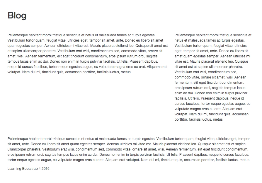
Yay! We can now see our columns and the dummy text that we just added. The page may not be much to look at right now, but what's important is to verify that your columns are laid out correctly.
We need to consider what will happen to our layout on mobile devices and smaller screen resolutions. I used the medium grid layout class, so any device that is smaller than 720 pixels will have an adjusted layout. Resize your browser window, making it smaller to trigger the media query, and you'll see that all of the columns will be resized to 100% width of the container. Here's what it looks like:
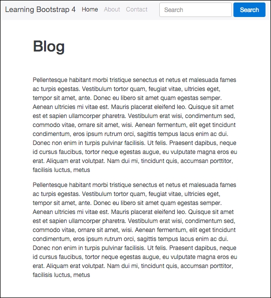
I'm going to keep our blog layout pretty minimal so I'm okay with this layout. In this format, the sidebar will slide in under the main blog feed of posts. I'm actually not that crazy about this design, so I'm just going to hide the sidebar altogether when you view the blog on a smaller device.