Table of Contents for
Bootstrap 4 – Responsive Web Design
 Bootstrap 4 – Responsive Web Design
Published by
Packt Publishing, 2017
Bootstrap 4 – Responsive Web Design
Published by
Packt Publishing, 2017
- Cover
- Table of Contents
- Bootstrap 4 – Responsive Web Design
- Bootstrap 4 – Responsive Web Design
- Credits
- Preface
- What you need for this learning path
- Who this learning path is for
- Reader feedback
- Customer support
- 1. Module 1
- 1. Getting Started
- Setting up the framework
- Building our first Bootstrap example
- Optionally using the CDN setup
- Community activity
- Bootstrap and web applications
- Browser compatibility
- Summary
- 2. Creating a Solid Scaffolding
- Building our scaffolding
- Fluid container
- We need some style!
- Manipulating tables
- Like a boss!
- Final thoughts
- Summary
- 3. Yes, You Should Go Mobile First
- Bootstrap and the mobile-first design
- How to debug different viewports at the browser
- Cleaning up the mess
- Creating the landing page for different devices
- Summary
- 4. Applying the Bootstrap Style
- Summary
- 5. Making It Fancy
- Paying attention to your navigation
- Dropping it down
- Making an input grouping
- Getting ready for flexbox!
- Summary
- 6. Can You Build a Web App?
- Adding the navigation
- Do a grid again
- Playing the cards
- Implementing the main content
- Creating breadcrumbs
- Finishing with the right-hand-side content
- Summary
- 7. Of Course, You Can Build a Web App!
- Waiting for the progress bar
- Creating a settings page
- Summary
- 8. Working with JavaScript
- Awesome Bootstrap modals
- Creating our custom modal
- A tool for your tip
- Pop it all over
- Making the menu affix
- Finishing the web app
- Summary
- 9. Entering in the Advanced Mode
- The last navigation bar with flexbox
- Filling the main fluid content
- Filling the main content
- Overhead loading
- Fixing the toggle button for mobile
- Summary
- 10. Bringing Components to Life
- Fixing the mobile viewport
- Learning more advanced plugins
- Summary
- 11. Making It Your Taste
- Working with plugin customization
- The additional Bootstrap plugins
- Creating our Bootstrap plugin
- Defining the plugin methods
- Creating additional plugin methods
- Summary
- 2. Module 2
- 1. Introducing Bootstrap 4
- Summary
- 2. Using Bootstrap Build Tools
- Download the Bootstrap source files
- Setting up the blog project
- Setting up the JSON files
- Creating our first page template
- Summary
- 3. Jumping into Flexbox
- Ordering your Flexbox
- Wrapping your Flexbox
- Setting up the Bootstrap Flexbox layout grid
- Setting up a Flexbox project
- Designing a single blog post
- Summary
- 4. Working with Layouts
- Inserting rows into your layout
- Adding columns to your layout
- Choosing a column class
- Creating a simple three-column layout
- Mixing column classes for different devices
- Coding the blog home page
- Using responsive utility classes
- Summary
- 5. Working with Content
- Learning to use typography
- Customizing headings
- How to style images
- Coding tables
- Summary
- 6. Playing with Components
- Basic button examples
- Creating outlined buttons
- Checkbox and radio buttons
- Coding forms in Bootstrap 4
- Creating an inline form
- Adding validation to inputs
- Using the Jumbotron component
- Adding the Label component
- Using the Alerts component
- Using Cards for layout
- Updating the Blog index page
- How to use the Navs component
- Adding Breadcrumbs to a page
- Using the Pagination component
- How to use the List Group component
- Summary
- 7. Extending Bootstrap with JavaScript Plugins
- Coding Tooltips
- Avoiding collisions with our components
- Using Popover components
- Using the Collapse component
- Coding an Accordion with the Collapse component
- Coding a Bootstrap Carousel
- Summary
- 8. Throwing in Some Sass
- Using Sass in the blog project
- Importing partials in Sass
- Creating a collection of variables
- Customizing components
- Writing a theme
- Summary
- 9. Migrating from Version 3
- Big changes in version 4
- Updating your variables
- Additional global changes
- Other font updates
- Migrating components
- Migrating JavaScript
- Miscellaneous migration changes
- Summary
- 3. Module 3
- 1. Revving Up Bootstrap
- What Bootstrap 4 Alpha 4 has to offer
- Setting up our project
- Summary
- 2. Making a Style Statement
- Image elements
- Responsive utilities
- Helper classes
- Text alignment and transformation
- Summary
- 3. Building the Layout
- Adding Bootstrap components
- Summary
- 4. On Navigation, Footers, Alerts, and Content
- Improving navigation using Scrollspy
- Customizing scroll speed
- Icons
- Using and customizing alerts
- Creating a footer
- Creating and customizing forms
- Form validation
- Progress indicators
- Adding content using media objects
- Figures
- Quotes
- Abbreviations
- Summary
- 5. Speeding Up Development Using jQuery Plugins
- Enhanced pagination using bootpag
- Displaying images using Bootstrap Lightbox
- Improving our price list with DataTables
- Summary
- 6. Customizing Your Plugins
- Customizing plugins
- Writing a custom Bootstrap jQuery plugin
- Summary
- 7. Integrating Bootstrap with Third-Party Plugins
- Hover
- Summary
- 8. Optimizing Your Website
- Minifying CSS and JavaScript
- Introducing Grunt
- Running tasks automatically
- Stripping our website of unused CSS
- JavaScript file concatenation
- Summary
- 9. Integrating with AngularJS and React
- Introducing React
- Summary
- Bibliography
- Index
Let's start by learning how to create an inline form. This is a layout you might want to use in the header of a project or perhaps for a login page. In this case, we're going to align the fields and buttons of the form vertically across the page. For this example, let's create a simple login form with the following code:
<form class="form-inline">
  <div class="form-group">
    <label>Name</label>
    <input type="text" class="form-control" placeholder="Mike Smith">
  </div>
  <div class="form-group">
    <label>Email</label>
    <input type="email" class="form-control" placeholder="mike@gmail.com">
  </div>
  <button type="submit" class="btn btn-primary">Login</button>
</form>
There are a few things going on in this form, so let me explain them for you:
- For inline forms, we need to add a CSS class named
.form-inlineto the<form>tag. - You'll also notice the
<fieldset>tags have been replaced with<div>tags. This is so they can be set todisplayasinline-block, which won't work with a fieldset.
Aside from those two differences, the form is coded up the same way as a regular one. Once you're done, your form should look like this in the browser:

If you're like me, you might find the labels next to the text inputs kind of ugly. The good news is there is an easy way to hide them.
The reason those labels are there is for accessibility and screen readers. We don't want to remove them altogether from the code, but we can hide them by adding a CSS class named .sr-only. This class stands for screen reader only and will therefore only show the labels if they are viewed on an accessible screen reader. Here is an example of how to add the CSS class:
<label class="sr-only">Name</label>
After you apply that CSS class to all the labels in the form, it should now appear like this in the browser:

That concludes how to make a basic inline form. However, what if you want to include other fields in an inline manner? Let's see how we can add checkboxes and radios.
If you'd like to include checkboxes and radio buttons to an inline form you need to make some changes to your code. Let's start by going over the checkbox code. Insert the following code after the last text input in the inline form:
<label class="checkbox-inline">
  <input type="checkbox" value="option1"> Remember me?
</label>
There are a couple of things here that you need to be aware of:
- First, there is no longer a
<div>wrapped around the checkbox - You need to add a class named
.checkbox-inlineto the checkbox's<label>tag
Once you do this, save your form and it should look like this in the browser:

Now that we've added the checkbox, let's check out an example using radio buttons. Add the following code to your form after the checkbox code:
<label class="radio-inline">
  <input type="radio" name="inlineRadioOptions" id="inlineRadio1" value="option1"> Yes
</label>
<label class="radio-inline">
  <input type="radio" name="inlineRadioOptions" id="inlineRadio2" value="option2"> No
</label>
As you can see, the pattern here is exactly the same. The <div> around each radio button has been removed. Instead, there is a CSS class named .radio-inline that needs to be added to each radio <label> tag. Once you've completed this step, your form should look like this:

That completes everything you need to know about inline forms. Let's now move on to some more utility-type actions that you can apply to your form fields.
Bootstrap comes with a few handy utility CSS classes that you can use with form fields to have them appear at different sizes. Along with the default size, you can choose to display your fields in a larger or smaller size. Let's take a look at the code to render all three size variations:
<input class="form-control form-control-lg" type="text" placeholder="form-control-lg">
<input class="form-control" type="text" placeholder="Default input, No class required">
<input class="form-control form-control-sm" type="text" placeholder="form-control-sm">
To use the different size inputs, you simply have to add an additional class to the tag:
- For a larger input, use the class
.form-control-lg - For a smaller input, use the class
.form-control-sm - The default input size requires no extra CSS class
Here's how each version looks in the browser:
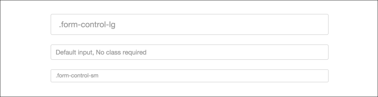
As you can see, the larger input is taller and has some additional padding. The smaller input is shorter with reduced padding. These classes only cover the vertical size of an input. Now let's learn how to control the width of inputs.
Since Bootstrap is a mobile-first framework, form fields are designed to stretch to fit the width of their column. Therefore, if you are using .col-md-12 for your column class, the field is going to stretch to the width of the layout. This may not always be what you want, you may only want the input to stretch to half of the width of the layout.
If this is the case, you need to wrap your field in a <div> with a column class on it to control the width. Let's check out some example code to get the point across:
<div class="col-md-12">
    <input type="text" class="form-control" placeholder="full width">
</div>
<div class="col-md-6">
    <input type="text" class="form-control" placeholder="half width">
</div>
In the preceding code, I've removed some of the labels and other form code to make it easier to see what is going on. Here's a breakdown of what you need to know:
- You need to wrap your input in a
<div>with a column class on it - The first input will stretch to the width of the layout because of the
.col-md-12class - The second input will only stretch to fill 50% of the layout because of the
.col-md-6 class
Let's take a look at how this will look in the actual browser:
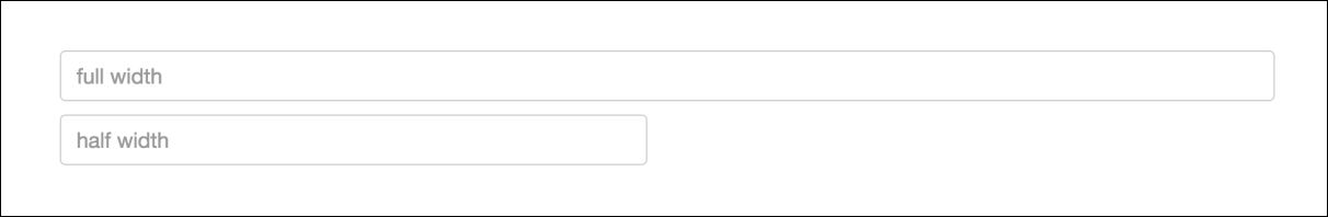
As you can see, the second input only stretches to half of the width. This is how you can control the width of inputs if you don't want them to fill the entire layout of your page. The last thing I'd like to cover when it comes to forms is validation of input fields.