Table of Contents for
Bootstrap 4 – Responsive Web Design
 Bootstrap 4 – Responsive Web Design
Published by
Packt Publishing, 2017
Bootstrap 4 – Responsive Web Design
Published by
Packt Publishing, 2017
- Cover
- Table of Contents
- Bootstrap 4 – Responsive Web Design
- Bootstrap 4 – Responsive Web Design
- Credits
- Preface
- What you need for this learning path
- Who this learning path is for
- Reader feedback
- Customer support
- 1. Module 1
- 1. Getting Started
- Setting up the framework
- Building our first Bootstrap example
- Optionally using the CDN setup
- Community activity
- Bootstrap and web applications
- Browser compatibility
- Summary
- 2. Creating a Solid Scaffolding
- Building our scaffolding
- Fluid container
- We need some style!
- Manipulating tables
- Like a boss!
- Final thoughts
- Summary
- 3. Yes, You Should Go Mobile First
- Bootstrap and the mobile-first design
- How to debug different viewports at the browser
- Cleaning up the mess
- Creating the landing page for different devices
- Summary
- 4. Applying the Bootstrap Style
- Summary
- 5. Making It Fancy
- Paying attention to your navigation
- Dropping it down
- Making an input grouping
- Getting ready for flexbox!
- Summary
- 6. Can You Build a Web App?
- Adding the navigation
- Do a grid again
- Playing the cards
- Implementing the main content
- Creating breadcrumbs
- Finishing with the right-hand-side content
- Summary
- 7. Of Course, You Can Build a Web App!
- Waiting for the progress bar
- Creating a settings page
- Summary
- 8. Working with JavaScript
- Awesome Bootstrap modals
- Creating our custom modal
- A tool for your tip
- Pop it all over
- Making the menu affix
- Finishing the web app
- Summary
- 9. Entering in the Advanced Mode
- The last navigation bar with flexbox
- Filling the main fluid content
- Filling the main content
- Overhead loading
- Fixing the toggle button for mobile
- Summary
- 10. Bringing Components to Life
- Fixing the mobile viewport
- Learning more advanced plugins
- Summary
- 11. Making It Your Taste
- Working with plugin customization
- The additional Bootstrap plugins
- Creating our Bootstrap plugin
- Defining the plugin methods
- Creating additional plugin methods
- Summary
- 2. Module 2
- 1. Introducing Bootstrap 4
- Summary
- 2. Using Bootstrap Build Tools
- Download the Bootstrap source files
- Setting up the blog project
- Setting up the JSON files
- Creating our first page template
- Summary
- 3. Jumping into Flexbox
- Ordering your Flexbox
- Wrapping your Flexbox
- Setting up the Bootstrap Flexbox layout grid
- Setting up a Flexbox project
- Designing a single blog post
- Summary
- 4. Working with Layouts
- Inserting rows into your layout
- Adding columns to your layout
- Choosing a column class
- Creating a simple three-column layout
- Mixing column classes for different devices
- Coding the blog home page
- Using responsive utility classes
- Summary
- 5. Working with Content
- Learning to use typography
- Customizing headings
- How to style images
- Coding tables
- Summary
- 6. Playing with Components
- Basic button examples
- Creating outlined buttons
- Checkbox and radio buttons
- Coding forms in Bootstrap 4
- Creating an inline form
- Adding validation to inputs
- Using the Jumbotron component
- Adding the Label component
- Using the Alerts component
- Using Cards for layout
- Updating the Blog index page
- How to use the Navs component
- Adding Breadcrumbs to a page
- Using the Pagination component
- How to use the List Group component
- Summary
- 7. Extending Bootstrap with JavaScript Plugins
- Coding Tooltips
- Avoiding collisions with our components
- Using Popover components
- Using the Collapse component
- Coding an Accordion with the Collapse component
- Coding a Bootstrap Carousel
- Summary
- 8. Throwing in Some Sass
- Using Sass in the blog project
- Importing partials in Sass
- Creating a collection of variables
- Customizing components
- Writing a theme
- Summary
- 9. Migrating from Version 3
- Big changes in version 4
- Updating your variables
- Additional global changes
- Other font updates
- Migrating components
- Migrating JavaScript
- Miscellaneous migration changes
- Summary
- 3. Module 3
- 1. Revving Up Bootstrap
- What Bootstrap 4 Alpha 4 has to offer
- Setting up our project
- Summary
- 2. Making a Style Statement
- Image elements
- Responsive utilities
- Helper classes
- Text alignment and transformation
- Summary
- 3. Building the Layout
- Adding Bootstrap components
- Summary
- 4. On Navigation, Footers, Alerts, and Content
- Improving navigation using Scrollspy
- Customizing scroll speed
- Icons
- Using and customizing alerts
- Creating a footer
- Creating and customizing forms
- Form validation
- Progress indicators
- Adding content using media objects
- Figures
- Quotes
- Abbreviations
- Summary
- 5. Speeding Up Development Using jQuery Plugins
- Enhanced pagination using bootpag
- Displaying images using Bootstrap Lightbox
- Improving our price list with DataTables
- Summary
- 6. Customizing Your Plugins
- Customizing plugins
- Writing a custom Bootstrap jQuery plugin
- Summary
- 7. Integrating Bootstrap with Third-Party Plugins
- Hover
- Summary
- 8. Optimizing Your Website
- Minifying CSS and JavaScript
- Introducing Grunt
- Running tasks automatically
- Stripping our website of unused CSS
- JavaScript file concatenation
- Summary
- 9. Integrating with AngularJS and React
- Introducing React
- Summary
- Bibliography
- Index
Creating your own Bootstrap theme is a bit of an undertaking. The good news is that once you've done it you can reuse a ton of the code for future themes. That's where the real power in making your code modular comes into play. Instead of starting over from scratch each time, you can reuse old code and just extend it. In the last section, we learned how to customize the button component that was the start of our own theme. Let's first start by looking at some common Bootstrap components that you'll want to customize for your own themes.
There are many ways that you can theme Bootstrap. In some cases, you may only need to customize a few components to get a unique look and feel going. However, you may want to do a more thorough theming process so that your theme doesn't resemble the default Bootstrap look at all. In this section, let's start by listing some of the common components you will most likely want to customize.
Next we'll go through the process of writing the code to customize a few so you get an idea as to how it works. Here's a list of components that I would recommend customizing:
- Buttons
- Drop-downs
- Alerts
- Navbar
- Typography
- Tables
This list is just a starting place. If you want to create a unique theme, you should really try to customize all Bootstrap components. At the very least, you should change them to use your custom color palette, typography, and layout styles. We've already covered buttons so let's jump into customizing the drop-down component, which is an extension of the button.
The drop-down component requires a medium-sized amount of customization so it's a good starting place to get an idea of what is involved in this process. It also builds on the code we wrote for the button so it's a natural second step. It's important to note that some components will require a good amount of CSS to customize them, while others will only need a little bit. Let's start by creating a new Sass file for drop-downs. From your project folder, create a new file called _dropdown.scss in the css/components directory. You can leave the file blank for now, just save it.
Once you've created the new Sass file for the drop-down component, we need to import it into our main theme is called custom.scss. Open up the custom style sheet in your text editor and insert the following line of code after the @import for the button component:
@import "components/_dropdown.scss";
Now we are ready to start coding our custom drop-down styles. Open up _dropdown.scss in your text editor and let's insert this first section of CSS:
.dropdown-menu {
   color: $primary-text;
}
As with the buttons in the previous section, I'm only going to change the most basic properties to demonstrate how you can customize the component. Feel free to customize additional properties to get a more unique look and feel.
Let's break down what is happening here. The drop-down component is made up of the base .dropdown-menu CSS class. This controls how the menu will look. Here I've simply changed the text color to use for the $primary-text variable.
We also need to do some work on the list of links that appear in our drop-down menu. Insert the following CSS after the first section you just entered:
.dropdown-item:focus,
.dropdown-item:hover {
   color: $primary-text;
   background-color: $secondary-background;
}
Let me break down what is happening here:
- These CSS classes control the hover and focus states for each list item in our drop-down menu. Again, I've set it to use our
$primary-textfont color. - When you hover on a list item, the background color changes. I've changed that background color to use our
$secondary-backgroundcolor variable. In this case you should use the background color variable, not a customized color variable. The reason for this is it's easier to keep track of what background colors you are using as you progress through the writing of your code.
The last thing we need to do is update the actual drop-down button trigger with some additional code. Enter the last part of CSS into the file:
.open > .btn-primary.dropdown-toggle:focus {
   background-color: $purple2;
   border-color: $purple2;
}
When the drop-down button trigger is clicked the .open CSS class will dynamically be inserted into the HTML code. This initiates a unique variation on the button class, a drop-down toggle focus. That may sound complicated but what you need to know is that you need to set this selector to our $purple2 color so it matches the rest of the button.
I've overwritten the background-color and border-color properties to use $purple2 from our color palette.
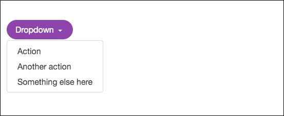
That's it, the drop-down component has now been themed to match our look and feel. If you preview it in the browser it should look like this when the menu is open:
Now that we've finished with the drop-down component let's move on to learning how to theme the alerts component.
The alerts component in Bootstrap is fairly easy to theme. As with the button component, it comes in a few variations. Let's start by coding up the CSS for the default color method. Create a new file called _alerts.scss and save it to the css/components directory. Don't forget to import it into custom.scss with the following line of code:
@import "components/_alerts.scss";
Once you've set up the file, let's get started with the code for the success alert component:
.alert-success {
   color: $green;
   background-color: lighten( $green, 30% );
   border-color: lighten( $green, 30% );
}
What you're now seeing should start to look familiar. However, I have introduced something new that I need to explain:
- This is the success alert so it should be green in color. The first thing I've done is change the text color to use the green from our palette with the
$greenvariable. - For the
background-colorandborder-colorproperties, I'm using something new, a Sass function. In this case, I want a green color that is slightly lighter than my text. Instead of introducing another green color variable, I can use a Sass function to lighten the base$greenvariable color. - To create the function, you use the
lightenkeyword. Inside the brackets you need to include the variable name you want to target, in this case$green, and finally include a percentage value for how much to lighten it by. This is a nice little trick to save you having to create more variables.
Once you code this up it should look like this in the browser:

As you can see, we are using the green color values from our color palette. Let's continue and customize the colors for the rest of the alert bar variations. Enter the following code into the _alerts.scss file:
.alert-info {
   color: $blue;
   background-color: lighten( $blue, 30% );
   border-color: lighten( $blue, 30% );
}

.alert-warning {
   color: $yellow;
   background-color: lighten( $yellow, 30% );
   border-color: lighten( $yellow, 30% );
}

.alert-danger {
   color: $red;
   background-color: lighten( $red, 30% );
   border-color: lighten( $red, 30% );
}
The other alerts follow the same pattern as the success version. They should look like this in the browser when you are done:
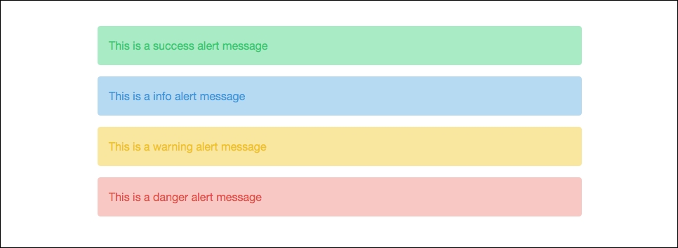
As you can see, the alerts are now using our color palette. Let's move on to the last component that I will show you how to customize, which is typography.
The typography component isn't difficult to customize. We'll build off the base variables we set up to apply them to the appropriate HTML tags. As we did with our other components, start with creating a new file called _typography.scss and save it to the css/components directory. Once you do this, import the file into custom.scss with the following line of code:
@import "components/_typography.scss";
Let's start customizing the type by applying some styles to the base header tags:
h1, h2, h3, h4, h5, h6 {
   font-family: $heading-copy;
   color: $primary-text;
}
Here I've simply used the $heading-copy variable and applied it to all the HTML heading tags. This will allow our custom heading typeface to be used for all headers. I've also added the $primary-text variable so that our headers are using the correct text color. Next let's take a look at a few miscellaneous text styles that you will likely want to overwrite:
small {
   color: $light-text;
}

pre {
   color: $pre-text;
}

code {
   color: $code-text;
}
As we did with our base variables, I'm now applying some of them on actual selectors. Let's break it down:
- For the
<small>HTML tag, I want it to look more subtle so I've set the text color to use the$light-textvariable. - I purposely set up color text variables for the HTML
<pre>and<code>tags. I've now applied the$pre-textand$code-textvariables to these tags.
That covers some of the basic typography styles you're going to want to customize. There are more you could add but I will let you explore these on your own. That also goes for all the Bootstrap components. We have only scratched the surface of the level of customizing you can do for your Bootstrap theme. However, I think I've given you a good introduction to what you need to do for coding your own Bootstrap themes.