Table of Contents for
Bootstrap 4 – Responsive Web Design
 Bootstrap 4 – Responsive Web Design
Published by
Packt Publishing, 2017
Bootstrap 4 – Responsive Web Design
Published by
Packt Publishing, 2017
- Cover
- Table of Contents
- Bootstrap 4 – Responsive Web Design
- Bootstrap 4 – Responsive Web Design
- Credits
- Preface
- What you need for this learning path
- Who this learning path is for
- Reader feedback
- Customer support
- 1. Module 1
- 1. Getting Started
- Setting up the framework
- Building our first Bootstrap example
- Optionally using the CDN setup
- Community activity
- Bootstrap and web applications
- Browser compatibility
- Summary
- 2. Creating a Solid Scaffolding
- Building our scaffolding
- Fluid container
- We need some style!
- Manipulating tables
- Like a boss!
- Final thoughts
- Summary
- 3. Yes, You Should Go Mobile First
- Bootstrap and the mobile-first design
- How to debug different viewports at the browser
- Cleaning up the mess
- Creating the landing page for different devices
- Summary
- 4. Applying the Bootstrap Style
- Summary
- 5. Making It Fancy
- Paying attention to your navigation
- Dropping it down
- Making an input grouping
- Getting ready for flexbox!
- Summary
- 6. Can You Build a Web App?
- Adding the navigation
- Do a grid again
- Playing the cards
- Implementing the main content
- Creating breadcrumbs
- Finishing with the right-hand-side content
- Summary
- 7. Of Course, You Can Build a Web App!
- Waiting for the progress bar
- Creating a settings page
- Summary
- 8. Working with JavaScript
- Awesome Bootstrap modals
- Creating our custom modal
- A tool for your tip
- Pop it all over
- Making the menu affix
- Finishing the web app
- Summary
- 9. Entering in the Advanced Mode
- The last navigation bar with flexbox
- Filling the main fluid content
- Filling the main content
- Overhead loading
- Fixing the toggle button for mobile
- Summary
- 10. Bringing Components to Life
- Fixing the mobile viewport
- Learning more advanced plugins
- Summary
- 11. Making It Your Taste
- Working with plugin customization
- The additional Bootstrap plugins
- Creating our Bootstrap plugin
- Defining the plugin methods
- Creating additional plugin methods
- Summary
- 2. Module 2
- 1. Introducing Bootstrap 4
- Summary
- 2. Using Bootstrap Build Tools
- Download the Bootstrap source files
- Setting up the blog project
- Setting up the JSON files
- Creating our first page template
- Summary
- 3. Jumping into Flexbox
- Ordering your Flexbox
- Wrapping your Flexbox
- Setting up the Bootstrap Flexbox layout grid
- Setting up a Flexbox project
- Designing a single blog post
- Summary
- 4. Working with Layouts
- Inserting rows into your layout
- Adding columns to your layout
- Choosing a column class
- Creating a simple three-column layout
- Mixing column classes for different devices
- Coding the blog home page
- Using responsive utility classes
- Summary
- 5. Working with Content
- Learning to use typography
- Customizing headings
- How to style images
- Coding tables
- Summary
- 6. Playing with Components
- Basic button examples
- Creating outlined buttons
- Checkbox and radio buttons
- Coding forms in Bootstrap 4
- Creating an inline form
- Adding validation to inputs
- Using the Jumbotron component
- Adding the Label component
- Using the Alerts component
- Using Cards for layout
- Updating the Blog index page
- How to use the Navs component
- Adding Breadcrumbs to a page
- Using the Pagination component
- How to use the List Group component
- Summary
- 7. Extending Bootstrap with JavaScript Plugins
- Coding Tooltips
- Avoiding collisions with our components
- Using Popover components
- Using the Collapse component
- Coding an Accordion with the Collapse component
- Coding a Bootstrap Carousel
- Summary
- 8. Throwing in Some Sass
- Using Sass in the blog project
- Importing partials in Sass
- Creating a collection of variables
- Customizing components
- Writing a theme
- Summary
- 9. Migrating from Version 3
- Big changes in version 4
- Updating your variables
- Additional global changes
- Other font updates
- Migrating components
- Migrating JavaScript
- Miscellaneous migration changes
- Summary
- 3. Module 3
- 1. Revving Up Bootstrap
- What Bootstrap 4 Alpha 4 has to offer
- Setting up our project
- Summary
- 2. Making a Style Statement
- Image elements
- Responsive utilities
- Helper classes
- Text alignment and transformation
- Summary
- 3. Building the Layout
- Adding Bootstrap components
- Summary
- 4. On Navigation, Footers, Alerts, and Content
- Improving navigation using Scrollspy
- Customizing scroll speed
- Icons
- Using and customizing alerts
- Creating a footer
- Creating and customizing forms
- Form validation
- Progress indicators
- Adding content using media objects
- Figures
- Quotes
- Abbreviations
- Summary
- 5. Speeding Up Development Using jQuery Plugins
- Enhanced pagination using bootpag
- Displaying images using Bootstrap Lightbox
- Improving our price list with DataTables
- Summary
- 6. Customizing Your Plugins
- Customizing plugins
- Writing a custom Bootstrap jQuery plugin
- Summary
- 7. Integrating Bootstrap with Third-Party Plugins
- Hover
- Summary
- 8. Optimizing Your Website
- Minifying CSS and JavaScript
- Introducing Grunt
- Running tasks automatically
- Stripping our website of unused CSS
- JavaScript file concatenation
- Summary
- 9. Integrating with AngularJS and React
- Introducing React
- Summary
- Bibliography
- Index
Now that we have fixed everything and learned some things about media queries and CSS3 properties, let's play with our layout and change it a bit for different devices. We will be starting with mobile and go further until we reach large desktops.
To do so, we must apply the column class for the specific viewport, as we did for medium displays using the .col-md-* class. The following table was presented in the previous chapter to show the different classes and the resolutions applicable for specific classes:
|
Extra small devices (phones < 544px / 34em) |
Small devices (tablets ≥ 544px / 34em and < 768px / 48em) |
Medium devices (desktops ≥ 768px /48em < 900px / 62em) |
Large devices (desktops ≥ 900px / 62em < 1200px 75em) |
Extra-large devices (Desktops ≥ 1200px / 75em) | |
|---|---|---|---|---|---|
|
Grid behavior |
Horizontal lines at all times |
Collapse at start and fit column grid | |||
|
Container fixed width |
Auto |
|
|
|
|
|
Class prefix |
|
|
|
|
|
|
Number of columns |
12 columns | ||||
|
Column fixed width |
Auto |
|
|
|
|
To adapt our landing page to mobile devices, we will be using the Chrome mobile debug tool with the device iPhone 5 set and no network throttling.
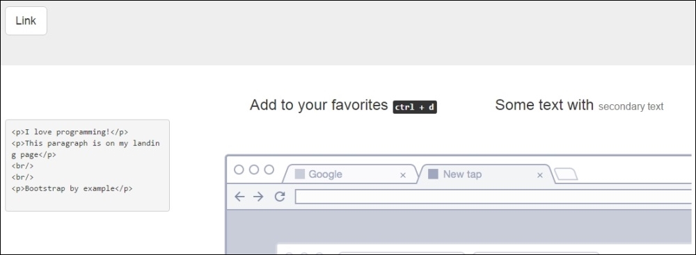
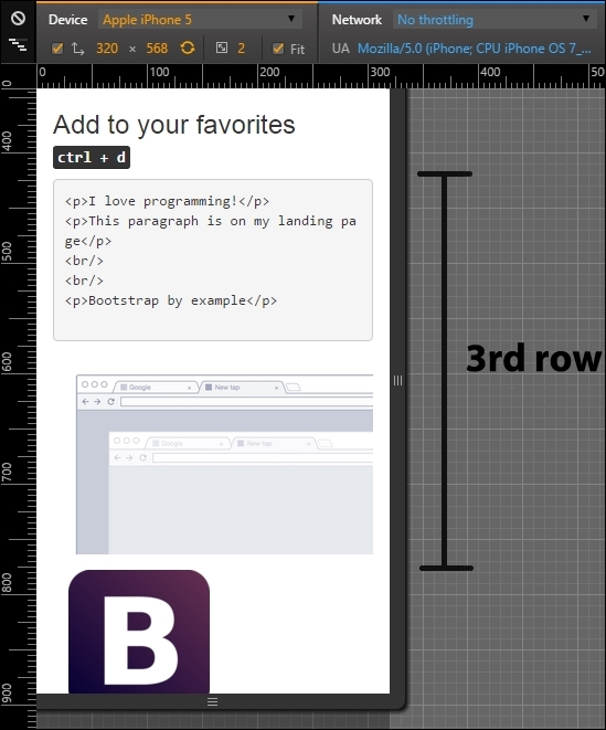
You might have noticed that for small devices, Bootstrap just stacks each column without the referring for different rows. Some of our rows seem fine in this new grid, like the header and the second one. In the third row, it is a bit strange that the portion of code and the image are not in the same line, as shown in the following screenshot:
For doing that, we need to add the class columns prefix for extra small devices, which is .col-xs-*, where * is the size of the row from 1 to 12. Add the class .col-xs-5 and .col-xs-7 for the columns of the respective row (near line 49). Refresh the page and you will see now how the columns are side-by-side. The code is as follows:
<div class="row">
<!-- row 3 -->
<div class="col-md-3 col-xs-5">
<pre><p>I love programming!</p>
<p>This paragraph is on my landing page</p>
<br/>
<br/>
<p>Bootstrap by example</p>
</pre>
</div>
<div class="col-md-9 col-xs-7">
<img src="imgs/center.png" class="img-responsive">
</div>
</div>Although the image of the web browser is too small on the right, it would be better if it was a more vertical stretched image, such a mobile phone (what a coincidence!). To make it, we need to hide the browser image in extra small devices and display an image of a mobile device. Add the new mobile image below the old one, as shown in the code:
<img src="imgs/mobile.png" class="img-responsive">
You will see both images stacked up vertically in the right column. Then, we need to use a new concept of availability classes. We need to hide the browser image and display the mobile image just for this kind of viewport, which is extra small. For that, add the class .hidden-xs in the browser image and add the class .visible-xs in the mobile image:
<div class="row">
<!-- row 3 -->
<div class="col-md-3 col-xs-5">
<pre><p>I love programming!</p>
<p>This paragraph is on my landing page</p>
<br/>
<br/>
<p>Bootstrap by example</p>
</pre>
</div>
<div class="col-md-9 col-xs-7">
<img src="imgs/center.png" class="img-responsive hidden-xs">
<img src="imgs/mobile.png" class="img-responsive visible-xs">
</div>
</div>Now this row seems nice! The browser image was hidden in extra small devices and the mobile image is shown only for this viewport in question. The following screenshot shows the final display of this row:
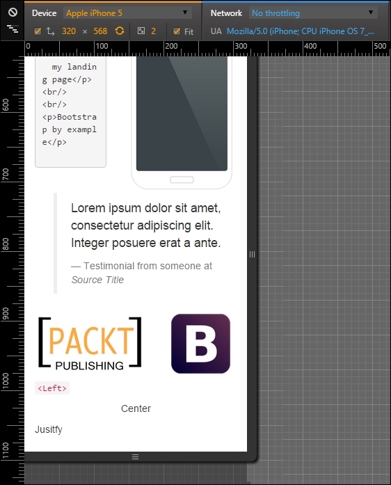
Moving on to the next row, the fourth one, it is the testimonial row surrounded by two images. It would be nicer if the testimonial appeared first and both of the images were displayed after it, splitting the same row. For this, we will repeat almost the same techniques presented in the previous row. Let's do it again for practice.
The first change is to hide the Bootstrap image with the class .hidden-xs. After that, create another image tag with the Bootstrap image in the same column of the PACKT image. The final code of the row should be like this:
<div class="row">
  <!-- row 4 -->
  <div class="col-md-3 hidden-xs">
    <img src="imgs/bs.png" class="img-responsive">
  </div>
  <div class="col-md-6 col-xs-offset-1 col-xs-11">
    <blockquote>
      <p>Lorem ipsum dolor sit amet, consectetur adipiscing elit. Integer posuere erat a ante.</p>
      <footer>Testimonial from someone at <cite title="Source Title">Source Title</cite></footer>
    </blockquote>
  </div>
  <div class="col-md-3 col-xs-7">
    <img src="imgs/packt.png" class="img-responsive">
  </div>
  <div class="col-xs-5 visible-xs">
    <img src="imgs/bs.png" class="img-responsive">
  </div>
</div>
We made plenty of things now and they are highlighted in bold. First is the .hidden-xs in the first column of Bootstrap image, which hid the column for this viewport.
Afterwards, in the testimonial, we changed the grid for mobile, adding a column offset with size 1 and making the testimonial fill the rest of the row with the class .col-xs-11.
Finally, as we said, we want to split in the same row both images from PACKT and Bootstrap. For that, make the first image column fill seven columns with the class .col-xs-7.
The other image column is a little more complicated. Since it is just visible for mobile devices, we add the class .col-xs-5. This will make the element span five columns in extra small devices. Moreover, we hide the column for other viewports with the class .visible-xs.
As we can see, this row has more than 12 columns (1 offset, 11 testimonial, 7 PACKT image, 5 Bootstrap image). This process is called column wrapping, and it happens when you put more than 12 columns in the same row so the groups of extra columns will wrap to the next lines.
Tip
Availability classes
Just like the .hidden-*, there are the .visible-*-* classes for each variation of display and column from 1 to 12. There is also a way to change the display CSS property using the class .visible-*-*, where the last * means block, inline, or inline-block. Use this to set the properly visualization for different visualizations.
The following screenshot shows the result of the changes. As you can see, we made the testimonial appears first, with one column of offset and both images appearing below it:
After completing the mobile visualizations, let's go further to tablets and small devices, which are devices from 48em to 62em. Most of this these devices are tablets or old desktop monitors. For this example, we are using the iPad Mini in the portrait position with a resolution of 768 x 1024 pixels.
For this resolution, Bootstrap handles the rows just like extra small devices by just stacking up each one of the columns, making them fill the total width of the page. So if we do not want that to happen, we have to manually set the column fill for each element with the class .col-sm-*.
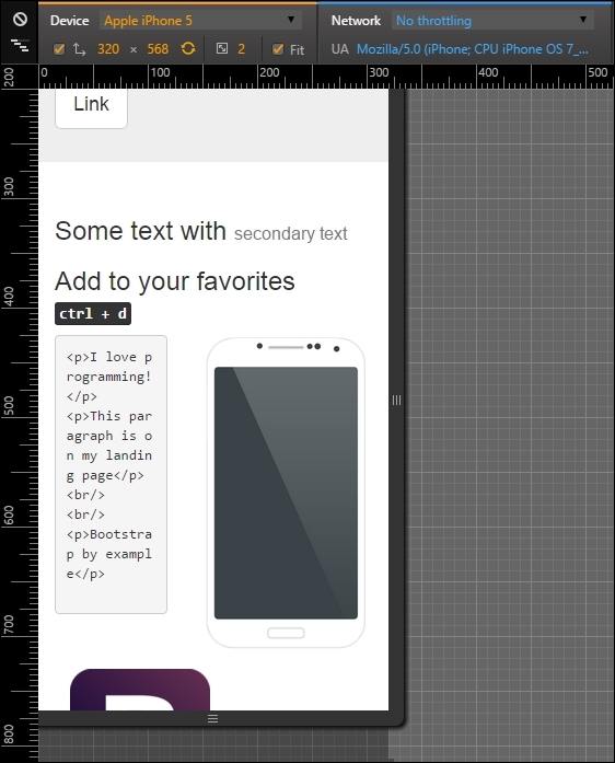
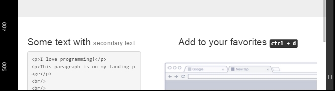
If you see how our example is presented now, there are two main problems. The first one is the second row, where the headings are in separated lines when they could be in the same. So, we just need to apply the grid classes for small devices with the class .col-sm-6 for each column, splitting them into equal sizes:
<div class="row">
  <div class="col-md-offset-4 col-md-4 col-sm-6">
    <h3>
      Some text with <small>secondary text</small>
    </h3>
  </div>
  <div class="col-md-4 col-sm-6">
    <h3>
      Add to your favorites
      <small>
        <kbd class="nowrap"><kbd>ctrl</kbd> + <kbd>d</kbd></kbd>
      </small>
    </h3>
  </div>
</div>
The result should be as shown in the following screenshot:
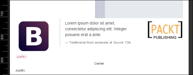
The second problem in this viewport is again the testimonial row! Because of the classes that we have added for mobile viewport, now the testimonial has an offset column and different column span. We must add the classes for small devices and make this row with the Bootstrap image on the left, the testimonial in the middle, and the PACKT image at the right position:
<div class="row">
  <div class="col-md-3 hidden-xs col-sm-3">
    <img src="imgs/bs.png" class="img-responsive">
  </div>
  <div class="col-md-6 col-xs-offset-1 col-xs-11 col-sm-6 col-sm-offset-0">
    <blockquote>
      <p>Lorem ipsum dolor sit amet, consectetur adipiscing elit. Integer posuere erat a ante.</p>
      <footer>Testimonial from someone at <cite title="Source Title">Source Title</cite></footer>
    </blockquote>
  </div>
  <div class="col-md-3 col-xs-7 col-sm-3">
    <img src="imgs/packt.png" class="img-responsive">
  </div>
  <div class="col-xs-5 hidden-sm hidden-md hidden-lg">
    <img src="imgs/bs.png" class="img-responsive">
  </div>
</div>
As you can see, we had to reset the column offset in the testimonial column. It happened because it kept the offset that we added for extra small devices. Moreover, we are just ensuring that the images columns had to fill just three columns. Here's the result:
Everything else seems fine! These viewport was easier to setup. See how Bootstrap helps us a lot? Let's move to the final viewport: desktop or large devices.
Last but not least, we enter the grid layout for desktop and large devices. We skipped medium devices, because we first coded for that viewport.
Deactivate the device mode in Chrome and put your page in a viewport with a width larger or equal to 1200 pixels or 75em.
The grid prefix that we will be using is .col-lg-*. If you take a look at the landing page, you will see that everything is well placed and we don't need to make changes! However, we would like to make some tweaks to make our layout fancier and learn some stuffs of Bootstrap grid.
We want to touch upon column ordering. It is possible to change the order of column in the same row by applying the classes .col-lg-push-* and .col-lg-pull-* (note that we are using the large devices prefix, but any other grid class prefix can be used).
The .col-lg-push-* means that the column will be pushed to the right by the * columns, where * is the number of columns pushed. On the other hand, .col-lg-pull-* will pull the column in the left direction by *, where * is the number of columns as well. Let's test this trick in the second row by changing the order of both columns:
<div class="row">
  <div class="col-md-offset-4 col-md-4 col-sm-6 col-lg-push-4">
    <h3>
      Some text with <small>secondary text</small>
    </h3>
  </div>
  <div class="col-md-4 col-sm-6 col-lg-pull-4">
    <h3>
      Add to your favorites
      <small>
        <kbd class="nowrap"><kbd>ctrl</kbd> + <kbd>d</kbd></kbd>
      </small>
    </h3>
  </div>
</div>
We just added the class .col-lg-push-4 to the first column and .col-lg-pull-4 to the other one to get this result. By doing this, we changed the order of both columns in second row, as shown in the following screenshot: