Table of Contents for
Bootstrap 4 – Responsive Web Design
 Bootstrap 4 – Responsive Web Design
Published by
Packt Publishing, 2017
Bootstrap 4 – Responsive Web Design
Published by
Packt Publishing, 2017
- Cover
- Table of Contents
- Bootstrap 4 – Responsive Web Design
- Bootstrap 4 – Responsive Web Design
- Credits
- Preface
- What you need for this learning path
- Who this learning path is for
- Reader feedback
- Customer support
- 1. Module 1
- 1. Getting Started
- Setting up the framework
- Building our first Bootstrap example
- Optionally using the CDN setup
- Community activity
- Bootstrap and web applications
- Browser compatibility
- Summary
- 2. Creating a Solid Scaffolding
- Building our scaffolding
- Fluid container
- We need some style!
- Manipulating tables
- Like a boss!
- Final thoughts
- Summary
- 3. Yes, You Should Go Mobile First
- Bootstrap and the mobile-first design
- How to debug different viewports at the browser
- Cleaning up the mess
- Creating the landing page for different devices
- Summary
- 4. Applying the Bootstrap Style
- Summary
- 5. Making It Fancy
- Paying attention to your navigation
- Dropping it down
- Making an input grouping
- Getting ready for flexbox!
- Summary
- 6. Can You Build a Web App?
- Adding the navigation
- Do a grid again
- Playing the cards
- Implementing the main content
- Creating breadcrumbs
- Finishing with the right-hand-side content
- Summary
- 7. Of Course, You Can Build a Web App!
- Waiting for the progress bar
- Creating a settings page
- Summary
- 8. Working with JavaScript
- Awesome Bootstrap modals
- Creating our custom modal
- A tool for your tip
- Pop it all over
- Making the menu affix
- Finishing the web app
- Summary
- 9. Entering in the Advanced Mode
- The last navigation bar with flexbox
- Filling the main fluid content
- Filling the main content
- Overhead loading
- Fixing the toggle button for mobile
- Summary
- 10. Bringing Components to Life
- Fixing the mobile viewport
- Learning more advanced plugins
- Summary
- 11. Making It Your Taste
- Working with plugin customization
- The additional Bootstrap plugins
- Creating our Bootstrap plugin
- Defining the plugin methods
- Creating additional plugin methods
- Summary
- 2. Module 2
- 1. Introducing Bootstrap 4
- Summary
- 2. Using Bootstrap Build Tools
- Download the Bootstrap source files
- Setting up the blog project
- Setting up the JSON files
- Creating our first page template
- Summary
- 3. Jumping into Flexbox
- Ordering your Flexbox
- Wrapping your Flexbox
- Setting up the Bootstrap Flexbox layout grid
- Setting up a Flexbox project
- Designing a single blog post
- Summary
- 4. Working with Layouts
- Inserting rows into your layout
- Adding columns to your layout
- Choosing a column class
- Creating a simple three-column layout
- Mixing column classes for different devices
- Coding the blog home page
- Using responsive utility classes
- Summary
- 5. Working with Content
- Learning to use typography
- Customizing headings
- How to style images
- Coding tables
- Summary
- 6. Playing with Components
- Basic button examples
- Creating outlined buttons
- Checkbox and radio buttons
- Coding forms in Bootstrap 4
- Creating an inline form
- Adding validation to inputs
- Using the Jumbotron component
- Adding the Label component
- Using the Alerts component
- Using Cards for layout
- Updating the Blog index page
- How to use the Navs component
- Adding Breadcrumbs to a page
- Using the Pagination component
- How to use the List Group component
- Summary
- 7. Extending Bootstrap with JavaScript Plugins
- Coding Tooltips
- Avoiding collisions with our components
- Using Popover components
- Using the Collapse component
- Coding an Accordion with the Collapse component
- Coding a Bootstrap Carousel
- Summary
- 8. Throwing in Some Sass
- Using Sass in the blog project
- Importing partials in Sass
- Creating a collection of variables
- Customizing components
- Writing a theme
- Summary
- 9. Migrating from Version 3
- Big changes in version 4
- Updating your variables
- Additional global changes
- Other font updates
- Migrating components
- Migrating JavaScript
- Miscellaneous migration changes
- Summary
- 3. Module 3
- 1. Revving Up Bootstrap
- What Bootstrap 4 Alpha 4 has to offer
- Setting up our project
- Summary
- 2. Making a Style Statement
- Image elements
- Responsive utilities
- Helper classes
- Text alignment and transformation
- Summary
- 3. Building the Layout
- Adding Bootstrap components
- Summary
- 4. On Navigation, Footers, Alerts, and Content
- Improving navigation using Scrollspy
- Customizing scroll speed
- Icons
- Using and customizing alerts
- Creating a footer
- Creating and customizing forms
- Form validation
- Progress indicators
- Adding content using media objects
- Figures
- Quotes
- Abbreviations
- Summary
- 5. Speeding Up Development Using jQuery Plugins
- Enhanced pagination using bootpag
- Displaying images using Bootstrap Lightbox
- Improving our price list with DataTables
- Summary
- 6. Customizing Your Plugins
- Customizing plugins
- Writing a custom Bootstrap jQuery plugin
- Summary
- 7. Integrating Bootstrap with Third-Party Plugins
- Hover
- Summary
- 8. Optimizing Your Website
- Minifying CSS and JavaScript
- Introducing Grunt
- Running tasks automatically
- Stripping our website of unused CSS
- JavaScript file concatenation
- Summary
- 9. Integrating with AngularJS and React
- Introducing React
- Summary
- Bibliography
- Index
As I mentioned in the previous section, Sass is part of the development process and the browser cannot read it in its native format. Before you can deploy the project, you need to convert or compile the Sass files into regular CSS files. Normally this would require you to install a Ruby gem and you would have to manually compile your code before you can test it. Luckily for us, Harp.js actually has an Sass compiler built into it. So when you run the harp compile command to build your templates, it will also build your Sass files into regular CSS. I bet you're starting to like Harp even more after learning that.
Before we go any further, we need to make a few updates to our blog project to set it up for Sass. Head to your project directory and navigate to the CSS directory. In this directory, create a new file called custom.scss.
What we're doing here is creating a custom style sheet that we are going to use to overwrite some of the default Bootstrap look-and-feel CSS. To do this, we need to load this custom file after the Bootstrap framework CSS file in our layout file. Open up _layout.ejs in the root of the project directory and insert the following line of code after bootstrap.min.css. Both lines together should look like this:
<link rel="stylesheet" href="css/bootstrap.min.css">
<link rel="stylesheet" type="text/css" href="css/custom.css">
Note here that I'm using the .css file extension for custom.css. This is because, after the files are compiled, the template will be looking for the actual CSS file, not the Sass file. The critical part is just that the actual filenames match and that you use .css in the layout file. Before we go any further, let's test out our Sass file to make sure it is set up properly. Open up custom.scss in your text editor and add the following code:
body {
   background: red;
}
This is just a simple way to make sure that Sass is compiling to CSS and is being inserted into our layout. Compile your project and launch the server. If you've done everything correctly the background for your homepage should be red and look like this:
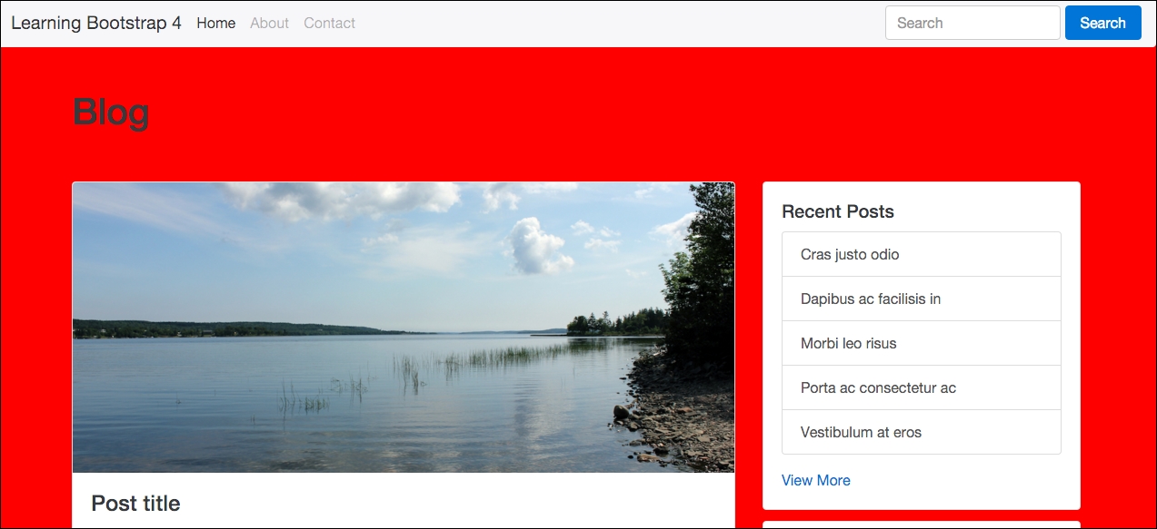
Hopefully this is what you're seeing and you can confirm you've set up your file correctly. Once you've successfully done this, delete the CSS we entered in the Sass file.
Now that you've finished setting up your files, let's start to learn a little bit more about using Sass in your project.
In Sass, variables are called by using the $ sign character. If you're familiar with Less, the @ symbol is used for variables. So in that case, all you would need to do is use $ instead of @. To write a variable, start with the $ sign and then insert a descriptive keyword that can be anything you like. Here are a few examples of generic variable names:
$background-color
$text-size
$font-face
$margin
I've named these pretty generically and they actually match some CSS property names. This is a good idea and they are easy to reuse and make sense of if multiple developers are working on the same project. However, like I said, you can name your variables whatever you want. If you'd like to get more creative, you could name variables like this:
$matts-best-color
$awesome-background-color
$fantastic-font-face
These are extreme examples and it is advisable not to name your variables in this way. To you $awesome-background-color might mean red but to another person it could mean anything. It's always a good idea to name your variables in a descriptive manner that makes sense.
I've shown you how to write the variable name but the other side of the equation is the actual value for the variable. Let's add in some sample values for our first set of variable names:
$background-color: #fff;
$text-size: 16px;
$font-face: helvetica, sans-serif;
$margin: 1em;
You write Sass variables the same way that you would write CSS properties. It's also worth noting that you should enter your variables at the very top of your style sheet so that they can be used in all of the CSS you write after them.
Now that we've written some variables, let's actually insert them into some CSS. After the variables in custom.scss, enter the following code:
body {
   background: $background-color;
   font-size: $text-size;
   font-family: $font-face;
   margin: $margin;
}
So instead of using actual values for our CSS properties, we're using the variable names that we set up. This starts to get more powerful as we add more CSS. Let's reuse some of these variables:
body {
   background: $background-color;
   font-size: $text-size;
   font-family: $font-face;
   margin: $margin;
}

h1 {
   font-size: 36px;
   font-family: georgia, serif;
}

h2 {
   font-size: $text-size;
   font-family: $font-face;
}
In this example, you can see a few things going on that I should explain:
- For the
<h1>tag, I'm not using any variables. I'm using regular CSS property values. - For the
<h2>tag, I'm reusing the same variables to insert thefont-sizeandfont-familyvalues.
As your style sheet grows longer, I'm sure you'll see the value in this strategy. For example, if I decide I want to change my font-size to 24px, all I need to do is change the value for the $text-size variable to 24px. I don't have to go through my entire style sheet and change all the values individually. These are just the basics of what you can do with variables. Let's look at a more advanced use case.
That might sound like a bit of a mouthful, but you can actually use a variable as the default value for another variable. A good example of where you might want to do this is when you are defining a color palette. You can switch the hex values to readable names and then use them for your other variables. This is much easier to scan and understand when you are debugging your code. Here's an example of what I mean:
$black: #000;
$white: #fff;
$red: #c00;

$background-color: $white;
$text-color: $black;
$link-color: $red;
Let me break down what is happening here for you:
- First I've created three color variables for
black,white,andred - Next I've created three CSS property variables for
background-color,text-color, andlink-color; the values for these CSS property variables are the color variables
Instead of using hex number values for the CSS property variables, I used a color keyword variable which is much easier to read and understand. That concludes the introduction to variables in Sass. Next we'll learn about importing different files into custom.css and using partials.