Table of Contents for
Bootstrap 4 – Responsive Web Design
 Bootstrap 4 – Responsive Web Design
Published by
Packt Publishing, 2017
Bootstrap 4 – Responsive Web Design
Published by
Packt Publishing, 2017
- Cover
- Table of Contents
- Bootstrap 4 – Responsive Web Design
- Bootstrap 4 – Responsive Web Design
- Credits
- Preface
- What you need for this learning path
- Who this learning path is for
- Reader feedback
- Customer support
- 1. Module 1
- 1. Getting Started
- Setting up the framework
- Building our first Bootstrap example
- Optionally using the CDN setup
- Community activity
- Bootstrap and web applications
- Browser compatibility
- Summary
- 2. Creating a Solid Scaffolding
- Building our scaffolding
- Fluid container
- We need some style!
- Manipulating tables
- Like a boss!
- Final thoughts
- Summary
- 3. Yes, You Should Go Mobile First
- Bootstrap and the mobile-first design
- How to debug different viewports at the browser
- Cleaning up the mess
- Creating the landing page for different devices
- Summary
- 4. Applying the Bootstrap Style
- Summary
- 5. Making It Fancy
- Paying attention to your navigation
- Dropping it down
- Making an input grouping
- Getting ready for flexbox!
- Summary
- 6. Can You Build a Web App?
- Adding the navigation
- Do a grid again
- Playing the cards
- Implementing the main content
- Creating breadcrumbs
- Finishing with the right-hand-side content
- Summary
- 7. Of Course, You Can Build a Web App!
- Waiting for the progress bar
- Creating a settings page
- Summary
- 8. Working with JavaScript
- Awesome Bootstrap modals
- Creating our custom modal
- A tool for your tip
- Pop it all over
- Making the menu affix
- Finishing the web app
- Summary
- 9. Entering in the Advanced Mode
- The last navigation bar with flexbox
- Filling the main fluid content
- Filling the main content
- Overhead loading
- Fixing the toggle button for mobile
- Summary
- 10. Bringing Components to Life
- Fixing the mobile viewport
- Learning more advanced plugins
- Summary
- 11. Making It Your Taste
- Working with plugin customization
- The additional Bootstrap plugins
- Creating our Bootstrap plugin
- Defining the plugin methods
- Creating additional plugin methods
- Summary
- 2. Module 2
- 1. Introducing Bootstrap 4
- Summary
- 2. Using Bootstrap Build Tools
- Download the Bootstrap source files
- Setting up the blog project
- Setting up the JSON files
- Creating our first page template
- Summary
- 3. Jumping into Flexbox
- Ordering your Flexbox
- Wrapping your Flexbox
- Setting up the Bootstrap Flexbox layout grid
- Setting up a Flexbox project
- Designing a single blog post
- Summary
- 4. Working with Layouts
- Inserting rows into your layout
- Adding columns to your layout
- Choosing a column class
- Creating a simple three-column layout
- Mixing column classes for different devices
- Coding the blog home page
- Using responsive utility classes
- Summary
- 5. Working with Content
- Learning to use typography
- Customizing headings
- How to style images
- Coding tables
- Summary
- 6. Playing with Components
- Basic button examples
- Creating outlined buttons
- Checkbox and radio buttons
- Coding forms in Bootstrap 4
- Creating an inline form
- Adding validation to inputs
- Using the Jumbotron component
- Adding the Label component
- Using the Alerts component
- Using Cards for layout
- Updating the Blog index page
- How to use the Navs component
- Adding Breadcrumbs to a page
- Using the Pagination component
- How to use the List Group component
- Summary
- 7. Extending Bootstrap with JavaScript Plugins
- Coding Tooltips
- Avoiding collisions with our components
- Using Popover components
- Using the Collapse component
- Coding an Accordion with the Collapse component
- Coding a Bootstrap Carousel
- Summary
- 8. Throwing in Some Sass
- Using Sass in the blog project
- Importing partials in Sass
- Creating a collection of variables
- Customizing components
- Writing a theme
- Summary
- 9. Migrating from Version 3
- Big changes in version 4
- Updating your variables
- Additional global changes
- Other font updates
- Migrating components
- Migrating JavaScript
- Miscellaneous migration changes
- Summary
- 3. Module 3
- 1. Revving Up Bootstrap
- What Bootstrap 4 Alpha 4 has to offer
- Setting up our project
- Summary
- 2. Making a Style Statement
- Image elements
- Responsive utilities
- Helper classes
- Text alignment and transformation
- Summary
- 3. Building the Layout
- Adding Bootstrap components
- Summary
- 4. On Navigation, Footers, Alerts, and Content
- Improving navigation using Scrollspy
- Customizing scroll speed
- Icons
- Using and customizing alerts
- Creating a footer
- Creating and customizing forms
- Form validation
- Progress indicators
- Adding content using media objects
- Figures
- Quotes
- Abbreviations
- Summary
- 5. Speeding Up Development Using jQuery Plugins
- Enhanced pagination using bootpag
- Displaying images using Bootstrap Lightbox
- Improving our price list with DataTables
- Summary
- 6. Customizing Your Plugins
- Customizing plugins
- Writing a custom Bootstrap jQuery plugin
- Summary
- 7. Integrating Bootstrap with Third-Party Plugins
- Hover
- Summary
- 8. Optimizing Your Website
- Minifying CSS and JavaScript
- Introducing Grunt
- Running tasks automatically
- Stripping our website of unused CSS
- JavaScript file concatenation
- Summary
- 9. Integrating with AngularJS and React
- Introducing React
- Summary
- Bibliography
- Index
First of all, we will add the navigation bar to our web application. Before the start of the <body> tag, add the navigation bar, just as we did in the last chapter:
<nav class="navbar navbar-default navbar-fixed-top">
  <div class="container">
    <div class="navbar-header">
      <a class="navbar-brand" href="webapp.html">
        <img src="imgs/logo.png" class="img-responsive">
      </a>
      <button type="button" class="navbar-toggle collapsed" data-toggle="collapse" data-target="#nav-menu" aria-expanded="false">
        <span class="sr-only">Toggle navigation</span>
        <span class="icon-bar"></span>
        <span class="icon-bar"></span>
        <span class="icon-bar"></span>
      </button>
      <!-- <a class="btn btn-primary navbar-btn pull-left" href="#" role="button">Sign up</a> -->
    </div>

    <div id="nav-menu" class="collapse navbar-collapse">
        <ul class="nav navbar-nav">
        </ul>
    </div>
  </div>
</nav>
First, we created a simple navigation bar with the collapse option, just as we did in the last chapter. The major difference this time is the addition of the image <img src="imgs/logo.png" class="img-responsive"> logo. The CSS for adjusting the logo is as follows:
.navbar-brand img {
  height: 100%
}
So, we need to create the items inside the list ul.nav.navbar-nav tag. Append the following code inside the list:
<ul class="nav navbar-nav">
<li>
<a href="#">
Home
</a>
</li>
<li>
<a href="#">
Notifications
</a>
</li>
<li>
<a href="#">
Messages
</a>
</li>
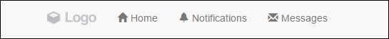
</ul>Therefore, we should add some icons to each menu. Do you remember how to do this? We need to use the Bootstrap Glyphicons. Add the icons, as highlighted in this HTML code:
<ul class="nav navbar-nav">
  <li>
    <a href="#">
      <span class="glyphicon glyphicon-home" aria-hidden="true"></span>
      Home
    </a>
  </li>
  <li>
    <a href="#">
      <span class="glyphicon glyphicon-bell" aria-hidden="true"></span>
      Notifications
    </a>
  </li>
  <li>
    <a href="#">
      <span class="glyphicon glyphicon-envelope" aria-hidden="true"></span>
      Messages
    </a>
  </li>
</ul>
The result right now should look like what is shown in the following screenshot:
In our navigation bar, we will add a search input. There are two tricks for this. The first is the input must be like an input group to have a magnifier icon on the right-hand-side part. The second is that the input must be aligned to the right and not to the left in the <nav>. In the HTML, let's create a form after ul.nav.navbar-nav:
<div id="nav-menu" class="collapse navbar-collapse">
    <ul class="nav navbar-nav">
      …
    </ul>

    <form id="search" role="search">
      <div class="input-group">
        <input type="text" class="form-control" placeholder="Search...">
        <span class="glyphicon glyphicon-search" aria-hidden="true"></span>
      </div>
    </form>
</div>
In the CSS, move the form to the right and add some padding:
nav form#search {
  float: right;
  padding: 0.5em;
}

nav form#search .glyphicon-search {
    z-index: 99;
    position: absolute;
    right: 0.7em;
    top: 50%;
    margin-top: -0.44em;
}

nav form#search .input-group .form-control {
    border-radius: 0.25em;
}
Refresh the web page and check out the input. It should appear as shown in this screenshot:

Our navigation bar is starting to appear like the navigation bar of a web application, but not close enough! Now, it's the turn of the menu options.
We will now do some crazy stuff: add a thumbnail together with a Bootstrap button dropdown. Just before form#search, add the button HTML:
<div id="nav-options" class="btn-group pull-right">
  <button type="button" class="btn btn-default dropdown-toggle thumbnail" data-toggle="dropdown" aria-haspopup="true" aria-expanded="false">
    <img src="imgs/jon.png">
  </button>
  <ul class="dropdown-menu">
    <li><a href="#">Profile</a></li>
    <li><a href="#">Setting</a></li>
    <li role="separator" class="divider"></li>
    <li><a href="#">Logout</a></li>
  </ul>
</div>
Basically, we used the template for a button dropdown (which you learned about in the previous chapter) and just removed the .caret component present on it. Instead of adding some text, we added an image, that is, the profile image. In .btn-group, we applied the helper class from Bootstrap, .pull-right. Since it was placed before the form, the button will appear after the form.
Then, it's time for the CSS. We need to resize the image and properly set the margins and paddings:
#nav-options {
  margin: 0.5em;
}

#nav-options button.thumbnail {
  margin: 0;
  padding: 0;
}

#nav-options img {
  max-height: 2.3em;
  border-radius: 0.3em;
}
The result of the addition of the button should be like what is shown in the following screenshot:
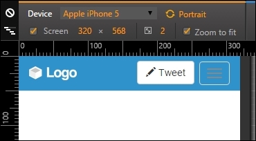
The last element present in the navigation bar is the Tweet button. To add it, we set following the HTML right before the button group option that we just added:
<button id="tweet" class="btn btn-default pull-right">
  <span class="glyphicon glyphicon-pencil" aria-hidden="true"></span>
  Tweet
</button>
For the CSS, we just need to add some margin:
#tweet {
  margin: 0.5em;
}
Finally, we have all the elements and components in our navigation bar, and it should look like this:

Now that we have our navigation bar done, it's time to customize the Bootstrap theme, add some tweaks, and fix viewport issues.
To be a little different, we will use a blue background color for our navigation bar. First, we need to add some simple CSS rules:
.navbar-default {
  background-color: #2F92CA;
}

.navbar-default .navbar-nav > li > a {
  color: #FFF;
}
Afterwards, let's add the active option to the list on the navigation. Add the .active class to the first element of the nav list (the Home one), presented in bold in the following code:
   <ul class="nav navbar-nav">
     <li class="active">
       <a href="#">
       <span class="glyphicon glyphicon-home" aria-hidden="true"></span>
        Home
       </a>
     </li>
     … <!--others li and the rest of the code -->
   </ul>
Then, go to the CSS and set the following:
.navbar-default {
  background-color: #2F92CA;
}

.navbar-default .navbar-nav > li > a {
  color: #FFF;
}

.navbar-default .navbar-nav > .active > a {
  background-color: transparent;
  color: #FFF;
  padding-bottom: 10px;
  border-bottom: 5px solid #FFF;
}
The result of this should be like the one presented in the following screenshot. You can see that Home is in the active state. To mark that, we've added a border below it for denotation:

If you hover over any element in the navigation list, you will see that it has the wrong color. We will use some style to fix that—by using CSS3 transitions! The complete CSS for the customization should be like the following:
.navbar-default {
  background-color: #2F92CA;
}

.navbar-default .navbar-nav > li > a,
.navbar-default .navbar-nav > li > a:hover {
  color: #FFF;
  -webkit-transition: all 150ms ease-in-out;
  -moz-transition: all 150ms ease-in-out;
  -ms-transition: all 150ms ease-in-out;
  -o-transition: all 150ms ease-in-out;
  transition: all 150ms ease-in-out;
}

.navbar-default .navbar-nav > .active > a {
  background-color: transparent;
  color: #FFF;
  padding-bottom: 0.62em;
  border-bottom: 0.45em solid #FFF;}

.navbar-default .navbar-nav > .active > a:hover,
.navbar-default .navbar-nav > li > a:hover {
  background-color: transparent;
  color: #F3F3F3;
  padding-bottom: 0.62em;
  border-bottom: 0.45em solid #F3F3F3;
}Here, we had to change the default colors from the default Bootstrap navigation list. Also, by adding the transitions, we got a nice effect; when the user hovers over the menu, a border appears at the bottom of the item list.
To finish the navigation bar, it would be nice to add some badges to the notifications item in the up list to show the number of new notifications, just as Twitter has on its website. For that, you will learn to use Bootstrap badges.
So, in the notifications item in the list, add the following highlighted HTML line:
<ul class="nav navbar-nav">
  <li class="active">
    <a href="#">
      <span class="glyphicon glyphicon-home" aria-hidden="true"></span>
      Home
    </a>
  </li>
  <li>
    <a href="#">
      <span class="badge">5</span>
      <span class="glyphicon glyphicon-bell" aria-hidden="true"></span>
      Notifications
    </a>
  </li>
  <li>
    <a href="#">
      <span class="glyphicon glyphicon-envelope" aria-hidden="true"></span>
      Messages
    </a>
  </li>
</ul>
For the CSS, set some positions, paddings, and borders:
.navbar-nav .badge {
  color: #2F92CA;
  background-color: #FFF;
  font-size: 0.7em;
  padding: 0.27rem 0.55rem 0.2rem 0.4rem;
  position: absolute;
  left: 0.37rem;
  top: 0.7rem;
  z-index: 99;
  border: 0.2rem solid #2F92CA;
}
Nicely done! Refresh the browser and you will see this pretty, beautiful badge:

We now have three issues with the navigation bar. Can you guess them?
They are the Tweet button at the small viewport, the collapsed navigation menu collapse, and the color of the collapse hamburger button.
Well, first we will handle the easiest one—fix the Tweet button! For that, we will create another element to be placed at the left-hand side of the collapse button and just display it when they are in extra small resolution. First, add the .hidden-xs class to the current Tweet button:
<button id="tweet" class="btn btn-default pull-right hidden-xs">
  <span class="glyphicon glyphicon-pencil" aria-hidden="true"></span>
  Tweet
</button>
Secondly, at .navbar-header, after button.navbar-toggle, add the following highlighted button:
<div class="navbar-header">
<a class="navbar-brand" href="webapp.html">
<img src="imgs/logo.png" class="img-responsive">
</a>
<button type="button" class="navbar-toggle collapsed" data-toggle="collapse" data-target="#nav-menu" aria-expanded="false">
<span class="sr-only">Toggle navigation</span>
<span class="icon-bar"></span>
<span class="icon-bar"></span>
<span class="icon-bar"></span>
</button>
<button id="tweet" class="btn btn-default pull-right visible-xs-block">
<span class="glyphicon glyphicon-pencil" aria-hidden="true"></span>
Tweet
</button>
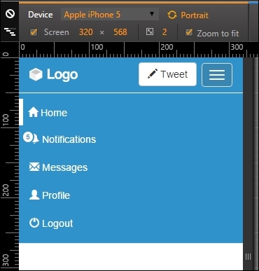
</div>So, what we did is hide the Tweet button for extra small devices and show a new one in a different element. Set a mobile viewport and you can see the button's position fixed, as follows:
Next, let's fix the color of the collapse hamburger button. Just apply the next CSS to change its color:
.navbar-header .navbar-toggle,
.navbar-default .navbar-toggle:focus {
  background-color: #57A5D2;
}

.navbar-default .navbar-toggle:hover {
  background-color: #3986B3;
}

.navbar-default .navbar-toggle .icon-bar {
  background-color: #FFF;
}
Finally, let's customize the collapsed navigation bar using Bootstrap helpers. We add the .hidden-xs class to .nav-options and the .hidden-sm class to the form#search element, making them invisible for extra small and small devices respectively, just as we did to the Tweet button:
<div id="nav-options" class="btn-group pull-right hidden-xs">
  …
</div>

<form id="search" role="search" class="hidden-sm">
  …
</form>
Then, in the ul.nav.navbar-nav navigation list, create two items that will replace the ones hidden at the current viewport:
<ul class="nav navbar-nav">
  ...
  <!-- others elements list were hidden -->
  <li class="visible-xs-inline">
    <a href="#">
      <span class="glyphicon glyphicon-user" aria-hidden="true"></span>
      Profile
    </a>
  </li>
  <li class="visible-xs-inline">
    <a href="#">
      <span class="glyphicon glyphicon-off" aria-hidden="true"></span>
      Logout
    </a>
  </li>
</ul>
Thus we are making them visible for extra small resolution with the .visible.xs-inline class, as long they are from an inline list.
To wrap it up, let's remove the border in the active list item, since it does not seem nice at the bottom in the layout. Let's change it to a right border instead of bottom with the following CSS using a media query:
@media(max-width:34em){
  .navbar-default .navbar-nav > .active > a {
    border-bottom: none;
    border-left: 0.45em solid #FFF;
    padding-left: 0.5em;
  }
}
And we are done! Refresh the web page and see the final result of the navigation bar. It is awesome!