Table of Contents for
Bootstrap 4 – Responsive Web Design

Version ebook / Retour

Cover image for bash Cookbook, 2nd Edition Bootstrap 4 – Responsive Web Design by Jason Marah Published by Packt Publishing, 2017
  1. Cover
  2. Table of Contents
  3. Bootstrap 4 – Responsive Web Design
  4. Bootstrap 4 – Responsive Web Design
  5. Credits
  6. Preface
  7. What you need for this learning path
  8. Who this learning path is for
  9. Reader feedback
  10. Customer support
  11. 1. Module 1
  12. 1. Getting Started
  13. Setting up the framework
  14. Building our first Bootstrap example
  15. Optionally using the CDN setup
  16. Community activity
  17. Bootstrap and web applications
  18. Browser compatibility
  19. Summary
  20. 2. Creating a Solid Scaffolding
  21. Building our scaffolding
  22. Fluid container
  23. We need some style!
  24. Manipulating tables
  25. Like a boss!
  26. Final thoughts
  27. Summary
  28. 3. Yes, You Should Go Mobile First
  29. Bootstrap and the mobile-first design
  30. How to debug different viewports at the browser
  31. Cleaning up the mess
  32. Creating the landing page for different devices
  33. Summary
  34. 4. Applying the Bootstrap Style
  35. Summary
  36. 5. Making It Fancy
  37. Paying attention to your navigation
  38. Dropping it down
  39. Making an input grouping
  40. Getting ready for flexbox!
  41. Summary
  42. 6. Can You Build a Web App?
  43. Adding the navigation
  44. Do a grid again
  45. Playing the cards
  46. Implementing the main content
  47. Creating breadcrumbs
  48. Finishing with the right-hand-side content
  49. Summary
  50. 7. Of Course, You Can Build a Web App!
  51. Waiting for the progress bar
  52. Creating a settings page
  53. Summary
  54. 8. Working with JavaScript
  55. Awesome Bootstrap modals
  56. Creating our custom modal
  57. A tool for your tip
  58. Pop it all over
  59. Making the menu affix
  60. Finishing the web app
  61. Summary
  62. 9. Entering in the Advanced Mode
  63. The last navigation bar with flexbox
  64. Filling the main fluid content
  65. Filling the main content
  66. Overhead loading
  67. Fixing the toggle button for mobile
  68. Summary
  69. 10. Bringing Components to Life
  70. Fixing the mobile viewport
  71. Learning more advanced plugins
  72. Summary
  73. 11. Making It Your Taste
  74. Working with plugin customization
  75. The additional Bootstrap plugins
  76. Creating our Bootstrap plugin
  77. Defining the plugin methods
  78. Creating additional plugin methods
  79. Summary
  80. 2. Module 2
  81. 1. Introducing Bootstrap 4
  82. Summary
  83. 2. Using Bootstrap Build Tools
  84. Download the Bootstrap source files
  85. Setting up the blog project
  86. Setting up the JSON files
  87. Creating our first page template
  88. Summary
  89. 3. Jumping into Flexbox
  90. Ordering your Flexbox
  91. Wrapping your Flexbox
  92. Setting up the Bootstrap Flexbox layout grid
  93. Setting up a Flexbox project
  94. Designing a single blog post
  95. Summary
  96. 4. Working with Layouts
  97. Inserting rows into your layout
  98. Adding columns to your layout
  99. Choosing a column class
  100. Creating a simple three-column layout
  101. Mixing column classes for different devices
  102. Coding the blog home page
  103. Using responsive utility classes
  104. Summary
  105. 5. Working with Content
  106. Learning to use typography
  107. Customizing headings
  108. How to style images
  109. Coding tables
  110. Summary
  111. 6. Playing with Components
  112. Basic button examples
  113. Creating outlined buttons
  114. Checkbox and radio buttons
  115. Coding forms in Bootstrap 4
  116. Creating an inline form
  117. Adding validation to inputs
  118. Using the Jumbotron component
  119. Adding the Label component
  120. Using the Alerts component
  121. Using Cards for layout
  122. Updating the Blog index page
  123. How to use the Navs component
  124. Adding Breadcrumbs to a page
  125. Using the Pagination component
  126. How to use the List Group component
  127. Summary
  128. 7. Extending Bootstrap with JavaScript Plugins
  129. Coding Tooltips
  130. Avoiding collisions with our components
  131. Using Popover components
  132. Using the Collapse component
  133. Coding an Accordion with the Collapse component
  134. Coding a Bootstrap Carousel
  135. Summary
  136. 8. Throwing in Some Sass
  137. Using Sass in the blog project
  138. Importing partials in Sass
  139. Creating a collection of variables
  140. Customizing components
  141. Writing a theme
  142. Summary
  143. 9. Migrating from Version 3
  144. Big changes in version 4
  145. Updating your variables
  146. Additional global changes
  147. Other font updates
  148. Migrating components
  149. Migrating JavaScript
  150. Miscellaneous migration changes
  151. Summary
  152. 3. Module 3
  153. 1. Revving Up Bootstrap
  154. What Bootstrap 4 Alpha 4 has to offer
  155. Setting up our project
  156. Summary
  157. 2. Making a Style Statement
  158. Image elements
  159. Responsive utilities
  160. Helper classes
  161. Text alignment and transformation
  162. Summary
  163. 3. Building the Layout
  164. Adding Bootstrap components
  165. Summary
  166. 4. On Navigation, Footers, Alerts, and Content
  167. Improving navigation using Scrollspy
  168. Customizing scroll speed
  169. Icons
  170. Using and customizing alerts
  171. Creating a footer
  172. Creating and customizing forms
  173. Form validation
  174. Progress indicators
  175. Adding content using media objects
  176. Figures
  177. Quotes
  178. Abbreviations
  179. Summary
  180. 5. Speeding Up Development Using jQuery Plugins
  181. Enhanced pagination using bootpag
  182. Displaying images using Bootstrap Lightbox
  183. Improving our price list with DataTables
  184. Summary
  185. 6. Customizing Your Plugins
  186. Customizing plugins
  187. Writing a custom Bootstrap jQuery plugin
  188. Summary
  189. 7. Integrating Bootstrap with Third-Party Plugins
  190. Hover
  191. Summary
  192. 8. Optimizing Your Website
  193. Minifying CSS and JavaScript
  194. Introducing Grunt
  195. Running tasks automatically
  196. Stripping our website of unused CSS
  197. JavaScript file concatenation
  198. Summary
  199. 9. Integrating with AngularJS and React
  200. Introducing React
  201. Summary
  202. Bibliography
  203. Index

Dropping it down

It is time to go back to the buttons once more. Now we will use the buttons dropdown. Button dropdowns are great for grouping a set of options in a single button. It can be used in several situations.

Note

Remember that it is necessary to use Bootstrap JavaScript for buttons drop-downs as well.

To make use of these, you just need to make some small markups and class usages. We will also go a little further and add a button dropdown to our new navigation bar. The complete HTML code of the <nav> tag is this one:

<nav class="navbar navbar-default navbar-fixed-top">
  <div class="navbar-header">
    <a class="navbar-brand" href="landing_page.html">Company name</a>
    <button type="button" class="navbar-toggle collapsed" data-toggle="collapse" data-target="#nav-menu" aria-expanded="false">
      <span class="sr-only">Toggle navigation</span>
      <span class="icon-bar"></span>
      <span class="icon-bar"></span>
      <span class="icon-bar"></span>
    </button>
    <!-- <a class="btn btn-primary navbar-btn pull-right" href="#" role="button">Sign up</a> -->
  </div>

  <div class="btn-group pull-right">
    <button type="button" class="btn btn-primary dropdown-toggle" data-toggle="dropdown" aria-haspopup="true" aria-expanded="false">
      Customer area <span class="caret"></span>
    </button>
    <ul class="dropdown-menu">
      <li><a href="#">Action</a></li>
      <li><a href="#">Another action</a></li>
      <li><a href="#">Something else here</a></li>
      <li role="separator" class="divider"></li>
      <li><a href="#">Separated link</a></li>
    </ul>
  </div>

  <div id="nav-menu" class="collapse navbar-collapse navbar-right">
      <ul class="nav navbar-nav">
        <li><a href="#about">About</a></li>
        <li><a href="#features">Features</a></li>
        <li><a href="#pricing">Pricing</a></li>
        <li><a href="contact.html">Contact</a></li>
      </ul>
  </div>
</nav>

The highlighted code is the new one for the drop-down button. We have to create a <button>, followed by a list <ul>, all of that wrapped by a div.btn-group. It is a pretty strict piece of code that should be used for these components.

Regarding the CSS, we must add some spacing between the button and the list. So, the CSS for the button drop-down is as follows:

 nav .btn-group {
  margin: 0.8rem 2rem 0 0;
}

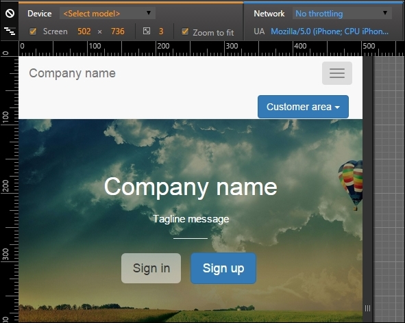
The result for the button is presented in the following screenshot:
Dropping it down

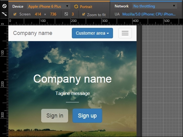
Oops! If you see the example for large devices, the new button looks pretty good, although it looks badly placed for small devices. Let's fix this with a media query!

@media(max-width: 48em){
  nav .btn-group {
    position: absolute;
    top: 0;
    right: 4em;
  }
}

After the fix, the output that you get should be as shown in this screenshot:
Dropping it down

Customizing buttons dropdown

The Bootstrap buttons dropdown offers some custom options. The first one that we will discuss is the split option. To do this, you need to change your HTML a bit:

<div class="btn-group pull-right">
  <button type="button" class="btn btn-primary">Customer area</button>
  <button type="button" class="btn btn-primary dropdown-toggle" data-toggle="dropdown" aria-haspopup="true" aria-expanded="false">
    <span class="caret"></span>
    <span class="sr-only">Toggle Dropdown</span>
  </button>
  <ul class="dropdown-menu">
    <li><a href="#">Action</a></li>
    <li><a href="#">Another action</a></li>
    <li><a href="#">Something else here</a></li>
    <li role="separator" class="divider"></li>
    <li><a href="#">Separated link</a></li>
  </ul>
</div>

The main difference is the bold text, where we create another button, which will be responsible for the split effect, as shown in the following screenshot:

Customizing buttons dropdown

Moving on, you can make the drop-down a "drop-up". To do that, simply add the class to div.btn-group:

<div class="btn-group dropup">
  ...
</div>