Table of Contents for
Bootstrap 4 – Responsive Web Design
 Bootstrap 4 – Responsive Web Design
Published by
Packt Publishing, 2017
Bootstrap 4 – Responsive Web Design
Published by
Packt Publishing, 2017
- Cover
- Table of Contents
- Bootstrap 4 – Responsive Web Design
- Bootstrap 4 – Responsive Web Design
- Credits
- Preface
- What you need for this learning path
- Who this learning path is for
- Reader feedback
- Customer support
- 1. Module 1
- 1. Getting Started
- Setting up the framework
- Building our first Bootstrap example
- Optionally using the CDN setup
- Community activity
- Bootstrap and web applications
- Browser compatibility
- Summary
- 2. Creating a Solid Scaffolding
- Building our scaffolding
- Fluid container
- We need some style!
- Manipulating tables
- Like a boss!
- Final thoughts
- Summary
- 3. Yes, You Should Go Mobile First
- Bootstrap and the mobile-first design
- How to debug different viewports at the browser
- Cleaning up the mess
- Creating the landing page for different devices
- Summary
- 4. Applying the Bootstrap Style
- Summary
- 5. Making It Fancy
- Paying attention to your navigation
- Dropping it down
- Making an input grouping
- Getting ready for flexbox!
- Summary
- 6. Can You Build a Web App?
- Adding the navigation
- Do a grid again
- Playing the cards
- Implementing the main content
- Creating breadcrumbs
- Finishing with the right-hand-side content
- Summary
- 7. Of Course, You Can Build a Web App!
- Waiting for the progress bar
- Creating a settings page
- Summary
- 8. Working with JavaScript
- Awesome Bootstrap modals
- Creating our custom modal
- A tool for your tip
- Pop it all over
- Making the menu affix
- Finishing the web app
- Summary
- 9. Entering in the Advanced Mode
- The last navigation bar with flexbox
- Filling the main fluid content
- Filling the main content
- Overhead loading
- Fixing the toggle button for mobile
- Summary
- 10. Bringing Components to Life
- Fixing the mobile viewport
- Learning more advanced plugins
- Summary
- 11. Making It Your Taste
- Working with plugin customization
- The additional Bootstrap plugins
- Creating our Bootstrap plugin
- Defining the plugin methods
- Creating additional plugin methods
- Summary
- 2. Module 2
- 1. Introducing Bootstrap 4
- Summary
- 2. Using Bootstrap Build Tools
- Download the Bootstrap source files
- Setting up the blog project
- Setting up the JSON files
- Creating our first page template
- Summary
- 3. Jumping into Flexbox
- Ordering your Flexbox
- Wrapping your Flexbox
- Setting up the Bootstrap Flexbox layout grid
- Setting up a Flexbox project
- Designing a single blog post
- Summary
- 4. Working with Layouts
- Inserting rows into your layout
- Adding columns to your layout
- Choosing a column class
- Creating a simple three-column layout
- Mixing column classes for different devices
- Coding the blog home page
- Using responsive utility classes
- Summary
- 5. Working with Content
- Learning to use typography
- Customizing headings
- How to style images
- Coding tables
- Summary
- 6. Playing with Components
- Basic button examples
- Creating outlined buttons
- Checkbox and radio buttons
- Coding forms in Bootstrap 4
- Creating an inline form
- Adding validation to inputs
- Using the Jumbotron component
- Adding the Label component
- Using the Alerts component
- Using Cards for layout
- Updating the Blog index page
- How to use the Navs component
- Adding Breadcrumbs to a page
- Using the Pagination component
- How to use the List Group component
- Summary
- 7. Extending Bootstrap with JavaScript Plugins
- Coding Tooltips
- Avoiding collisions with our components
- Using Popover components
- Using the Collapse component
- Coding an Accordion with the Collapse component
- Coding a Bootstrap Carousel
- Summary
- 8. Throwing in Some Sass
- Using Sass in the blog project
- Importing partials in Sass
- Creating a collection of variables
- Customizing components
- Writing a theme
- Summary
- 9. Migrating from Version 3
- Big changes in version 4
- Updating your variables
- Additional global changes
- Other font updates
- Migrating components
- Migrating JavaScript
- Miscellaneous migration changes
- Summary
- 3. Module 3
- 1. Revving Up Bootstrap
- What Bootstrap 4 Alpha 4 has to offer
- Setting up our project
- Summary
- 2. Making a Style Statement
- Image elements
- Responsive utilities
- Helper classes
- Text alignment and transformation
- Summary
- 3. Building the Layout
- Adding Bootstrap components
- Summary
- 4. On Navigation, Footers, Alerts, and Content
- Improving navigation using Scrollspy
- Customizing scroll speed
- Icons
- Using and customizing alerts
- Creating a footer
- Creating and customizing forms
- Form validation
- Progress indicators
- Adding content using media objects
- Figures
- Quotes
- Abbreviations
- Summary
- 5. Speeding Up Development Using jQuery Plugins
- Enhanced pagination using bootpag
- Displaying images using Bootstrap Lightbox
- Improving our price list with DataTables
- Summary
- 6. Customizing Your Plugins
- Customizing plugins
- Writing a custom Bootstrap jQuery plugin
- Summary
- 7. Integrating Bootstrap with Third-Party Plugins
- Hover
- Summary
- 8. Optimizing Your Website
- Minifying CSS and JavaScript
- Introducing Grunt
- Running tasks automatically
- Stripping our website of unused CSS
- JavaScript file concatenation
- Summary
- 9. Integrating with AngularJS and React
- Introducing React
- Summary
- Bibliography
- Index
Now that we have downloaded the framework and covered its basic file architecture, we will advance to setting up Bootstrap on a web page.
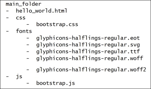
First, let's explicit the folder structure that we will be using in this book. In a folder that we will call main_folder, we extract the Bootstrap contents and create a file called hello_world.html at the same level. Inside the Bootstrap contents will be some folders for fonts, CSS, and JavaScript. The final layout should be like this:
Now, we will add the recommended setup of the Bootstrap framework to the hello_world.html file. Open it in your preferred code editor and add the outline HTML code, like this:
<!DOCTYPE html>
<html>
<head>
    <title>Hello World!</title>
</head>
<body>
    Hello World
</body>
</html>
Next, add the code for loading css inside the head tag:
<!DOCTYPE html>
<html>
<head>
    <title>Hello World!</title>
    <link rel="stylesheet" href="css/bootstrap.css">
</head>
<body>
    Hello World
</body>
</html>
And at the end of the body tag, load the JavaScript file:
<!DOCTYPE html>
<html>
<head>
<title>Hello World!</title>
<link rel="stylesheet" href="css/bootstrap.css">
</head>
<body>
Hello World
<script src="js/bootstrap.js"></script>
</body>
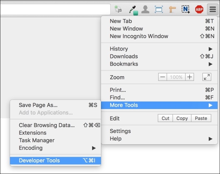
</html>Open the hello_world.html file in a browser (we will use Google Chrome in this book) and open the JavaScript console. In Chrome, it can be found at Options button (the hamburger button on right upper corner. Go to More Tools | Developer Tools, just as shown in the following screenshot, and click on Console in the opened window. You will see a message saying Bootstrap's JavaScript requires jQuery:
jQuery is a cross-platform JavaScript library, and it is the only third-party requirement for Bootstrap. To get it, we recommend the download from the official website and the latest version (https://jquery.com/download/). Bootstrap requires version 1.9 or higher.
Copy the jQuery file inside the js folder, and load it in the HTML code at the end of the body tag but before the bootstrap.js loads, like this:
<script src="js/jquery-1.11.3.js"></script>
<script src="js/bootstrap.js"></script>
Bootstrap has three tags that must be at the beginning of the <head> tag. These tags are used for text encoding and improved visualization on mobile devices:
<meta charset="utf-8">
<meta http-equiv="X-UA-Compatible" content="IE=edge">
<meta name="viewport" content="width=device-width, initial-scale=1">
The viewport tag is related to the mobile-first philosophy. By adding it, you ensure proper rendering in mobile devices and touch zooming.
You can also disable the zoom functionality by appending user-scalable=no in the content key. With this option, users will only be able to scroll on the web page, resulting in a feel of using a native mobile application.
Also, if you want to add support for older versions of the Internet Explorer (IE) browser (older than version 9), you must add some libraries to have fallback compatibility for the HTML5 and CSS3 elements. We will add them via CDN, which is the Bootstrap recommendation. So, add these lines at the end of the <head> tag:
<!--[if lt IE 9]>
    <script src="https://oss.maxcdn.com/html5shiv/3.7.2/html5shiv.min.js"></script>
    <script src="https://oss.maxcdn.com/respond/1.4.2/respond.min.js">
</script> <![endif]-->At this point, the file should be like this:
<!DOCTYPE html>
<html>
  <head>
    <meta charset="utf-8">
    <meta http-equiv="X-UA-Compatible" content="IE=edge">
    <meta name="viewport" content="width=device-width,
initial-scale=1">
    <title>Hello World!</title>

    <link rel="stylesheet" href="css/bootstrap.css">

    <!--[if lt IE 9]>
      <script src="https://oss.maxcdn.com/html5shiv/3.7.2/html5shiv.min.js">
      </script>
      <script src="https://oss.maxcdn.com/respond/1.4.2/respond.min.js">
      </script>
    <![endif]-->
  </head>
  <body>
    Hello World!

    <script src="js/jquery-1.11.3.js"></script>
    <script src="js/bootstrap.js"></script>
  </body>
</html>
This is our base page example! Keep it for the purpose of coding every example of this book and for any other web page that you will develop.
We would like to point out that Bootstrap requires the doctype HTML5 style before the <html> tag:
<!DOCTYPE html>
<html>
    ... <!--rest of the HTML code -->
</html>