The core of any Bootstrap website is the layout or grid component. Without a grid, a website is pretty much useless. One of the biggest layout challenges we face as web developers nowadays is dealing with a large array of screen resolutions, from desktop to tablets, mobile phones, and even Apple watches. It is not easy to lay out a website and we rely on responsive web design and media queries to take a mobile-first approach. Perhaps the best feature of the Bootstrap layout grid is that it's mobile-first and built using media queries. This takes the hardest part out of constructing a grid and lets us concentrate on the actual design of our projects. Before we start to layout the next part of our blog project, let's review the lay out grid basics in Bootstrap 4.
In this chapter, we are going to discuss the following listed topics briefly:
- Working with containers
- Adding columns to your layout
- Creating a simple three-column layout
- Coding the blog home page
- Using responsive utility classes
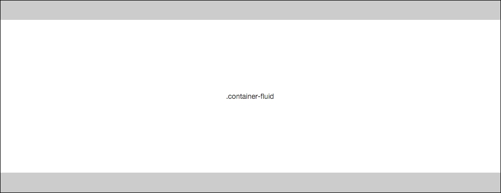
The base of any Bootstrap layout is a container class. There are two types of containers you can choose to use. The first is .container-fluid, which is a full-width box and will stretch the layout to fit the entire width of the browser window.
There is some left and right padding added so the content doesn't bump right up against the browser edge:

The second option is the basic .container class, which will have a fixed width based on the size of your device's viewport. There are five different sizes in Bootstrap, with the following width values:
- Extra small <544px
- Small >544px
- Medium >768px
- Large >992px
- Extra large >1140px

Let's take a look at the markup for both container types. I'll start with the basic .container class:
<div class="container">
  ...
</div>
That's pretty easy. Now let's look at the code for the fluid container:
<div class="container-fluid">
  ...
</div>
Again, that is straightforward and is all that you need to know about using the container classes in Bootstrap 4.
Now, in some cases, you may not want to use a container and that is totally fine. An example of this would be if you want a full width layout but you don't want the default left and right padding. You may have an image banner that you want to stretch to the full width of the browser with no padding. In this case, just remove the <div> with the container class on it.
It is perfectly fine to use multiple containers on a single page template. The containers are CSS classes, so they are reusable. You may want to do this on longer page layouts, perhaps a landing page design, where you have multiple large regions. Another example is using a container to wrap your footer. If you are using a template system like Harp, you'll want to create a footer partial. You can make the footer component more self contained by giving it its own container. Then you don't have to worry about closing a container <div> in the footer that was opened in a page template or even the header. I would recommend using multiple containers to make your designs more modular and easier to manage by multiple users. Let's take a quick look at how you would structure a basic page with multiple containers:
<div class="container">
   <!-- header code goes here, harp partial name would be _header.ejs //-->
</div>

<div class="container">
   <!-- template code goes here, harp file name would be index.ejs //-->
</div>

<div class="container">
   <!-- footer code goes here, harp partial name would be _footer.ejs //-->
</div>
We have three separate files there and using a container class for each makes each section more modular. You also don't have to worry about opening a <div> in one file then closing it in another. This is a good way to avoid orphan closing </div> tags.
