Table of Contents for
Bootstrap 4 – Responsive Web Design
 Bootstrap 4 – Responsive Web Design
Published by
Packt Publishing, 2017
Bootstrap 4 – Responsive Web Design
Published by
Packt Publishing, 2017
- Cover
- Table of Contents
- Bootstrap 4 – Responsive Web Design
- Bootstrap 4 – Responsive Web Design
- Credits
- Preface
- What you need for this learning path
- Who this learning path is for
- Reader feedback
- Customer support
- 1. Module 1
- 1. Getting Started
- Setting up the framework
- Building our first Bootstrap example
- Optionally using the CDN setup
- Community activity
- Bootstrap and web applications
- Browser compatibility
- Summary
- 2. Creating a Solid Scaffolding
- Building our scaffolding
- Fluid container
- We need some style!
- Manipulating tables
- Like a boss!
- Final thoughts
- Summary
- 3. Yes, You Should Go Mobile First
- Bootstrap and the mobile-first design
- How to debug different viewports at the browser
- Cleaning up the mess
- Creating the landing page for different devices
- Summary
- 4. Applying the Bootstrap Style
- Summary
- 5. Making It Fancy
- Paying attention to your navigation
- Dropping it down
- Making an input grouping
- Getting ready for flexbox!
- Summary
- 6. Can You Build a Web App?
- Adding the navigation
- Do a grid again
- Playing the cards
- Implementing the main content
- Creating breadcrumbs
- Finishing with the right-hand-side content
- Summary
- 7. Of Course, You Can Build a Web App!
- Waiting for the progress bar
- Creating a settings page
- Summary
- 8. Working with JavaScript
- Awesome Bootstrap modals
- Creating our custom modal
- A tool for your tip
- Pop it all over
- Making the menu affix
- Finishing the web app
- Summary
- 9. Entering in the Advanced Mode
- The last navigation bar with flexbox
- Filling the main fluid content
- Filling the main content
- Overhead loading
- Fixing the toggle button for mobile
- Summary
- 10. Bringing Components to Life
- Fixing the mobile viewport
- Learning more advanced plugins
- Summary
- 11. Making It Your Taste
- Working with plugin customization
- The additional Bootstrap plugins
- Creating our Bootstrap plugin
- Defining the plugin methods
- Creating additional plugin methods
- Summary
- 2. Module 2
- 1. Introducing Bootstrap 4
- Summary
- 2. Using Bootstrap Build Tools
- Download the Bootstrap source files
- Setting up the blog project
- Setting up the JSON files
- Creating our first page template
- Summary
- 3. Jumping into Flexbox
- Ordering your Flexbox
- Wrapping your Flexbox
- Setting up the Bootstrap Flexbox layout grid
- Setting up a Flexbox project
- Designing a single blog post
- Summary
- 4. Working with Layouts
- Inserting rows into your layout
- Adding columns to your layout
- Choosing a column class
- Creating a simple three-column layout
- Mixing column classes for different devices
- Coding the blog home page
- Using responsive utility classes
- Summary
- 5. Working with Content
- Learning to use typography
- Customizing headings
- How to style images
- Coding tables
- Summary
- 6. Playing with Components
- Basic button examples
- Creating outlined buttons
- Checkbox and radio buttons
- Coding forms in Bootstrap 4
- Creating an inline form
- Adding validation to inputs
- Using the Jumbotron component
- Adding the Label component
- Using the Alerts component
- Using Cards for layout
- Updating the Blog index page
- How to use the Navs component
- Adding Breadcrumbs to a page
- Using the Pagination component
- How to use the List Group component
- Summary
- 7. Extending Bootstrap with JavaScript Plugins
- Coding Tooltips
- Avoiding collisions with our components
- Using Popover components
- Using the Collapse component
- Coding an Accordion with the Collapse component
- Coding a Bootstrap Carousel
- Summary
- 8. Throwing in Some Sass
- Using Sass in the blog project
- Importing partials in Sass
- Creating a collection of variables
- Customizing components
- Writing a theme
- Summary
- 9. Migrating from Version 3
- Big changes in version 4
- Updating your variables
- Additional global changes
- Other font updates
- Migrating components
- Migrating JavaScript
- Miscellaneous migration changes
- Summary
- 3. Module 3
- 1. Revving Up Bootstrap
- What Bootstrap 4 Alpha 4 has to offer
- Setting up our project
- Summary
- 2. Making a Style Statement
- Image elements
- Responsive utilities
- Helper classes
- Text alignment and transformation
- Summary
- 3. Building the Layout
- Adding Bootstrap components
- Summary
- 4. On Navigation, Footers, Alerts, and Content
- Improving navigation using Scrollspy
- Customizing scroll speed
- Icons
- Using and customizing alerts
- Creating a footer
- Creating and customizing forms
- Form validation
- Progress indicators
- Adding content using media objects
- Figures
- Quotes
- Abbreviations
- Summary
- 5. Speeding Up Development Using jQuery Plugins
- Enhanced pagination using bootpag
- Displaying images using Bootstrap Lightbox
- Improving our price list with DataTables
- Summary
- 6. Customizing Your Plugins
- Customizing plugins
- Writing a custom Bootstrap jQuery plugin
- Summary
- 7. Integrating Bootstrap with Third-Party Plugins
- Hover
- Summary
- 8. Optimizing Your Website
- Minifying CSS and JavaScript
- Introducing Grunt
- Running tasks automatically
- Stripping our website of unused CSS
- JavaScript file concatenation
- Summary
- 9. Integrating with AngularJS and React
- Introducing React
- Summary
- Bibliography
- Index
Now that we've covered the card component, it's time to set up the main layout for our Blog index page. The design is going to rely heavily on the Card component, so let's get to it. First of all, open up index.ejs in your text editor and find the body of the page section. The left column will look like this:
<div class="col-md-8">
Within this <div> currently is some filler text. Delete the filler text and insert the following Card component, which will be our first Blog post:
<div class="card">
  <img class="card-img-top img-fluid" src="img/image.jpg" alt="Card image cap">
  <div class="card-block">
    <h4 class="card-title">Post title</h4>
    <p><small>Posted by <a href="#">Admin</a> on January 1, 2016 in <a href="#">Category</a></small></p>
    <p class="card-text">Some quick example text to build on the card title and make up the bulk of the card's content.</p>
    <a href="#" class="btn btn-primary">Read More</a>
  </div>
</div>
Now that we've added our first card to the Blog roll, let's break down what's happening:
- I've started by including a photo I took in Nova Scotia a few summers ago. I've given it a class of
.img-fluidso it stretches the width of the card. - From there, I've set up my card exactly like I taught you previously, but in this case, I've added some real content for a blog.
Let's go ahead and add the rest of the Card component code for the blog roll. Insert the following code after the first Card in the left column:
<div class="card">
  <div class="card-block">
    <h4 class="card-title">Post title</h4>
    <p><small>Posted by <a href="#">Admin</a> on January 1, 2016 in <a href="#">Category</a></small></p>
    <p>Pellentesque habitant morbi tristique...</p>
    <a href="#" class="btn btn-primary">Read More</a>
  </div>
</div>
<div class="card">
  <img class="card-img-top img-fluid" src="img/image.jpg" alt="Card image cap">
  <div class="card-block">
    <h4 class="card-title">Post title <span class="label label-success">Updated</span></h4>
    <p><small>Posted by <a href="#">Admin</a> on January 1, 2016 in <a href="#">Category</a></small></p>
    <p class="card-text">Some quick example text to build on the card title and make up the bulk of the card's content.</p>
    <a href="#" class="btn btn-primary">Read More</a>
  </div>
</div>
<div class="card">
  <div class="card-block">
    <h4 class="card-title">Post title</h4>
    <p><small>Posted by <a href="#">Admin</a> on January 1, 2016 in <a href="#">Category</a></small></p>
    <p>Pellentesque habitant morbi tristique senectus...</p>
    <a href="#" class="btn btn-primary">Read More</a>
  </div>
</div>
That's a long chunk of code. The filler text is just in there to give you an idea. Feel free to remove that or replace it with actual text. Now that we've filled out the left column with a good amount of content, your page should look like this:
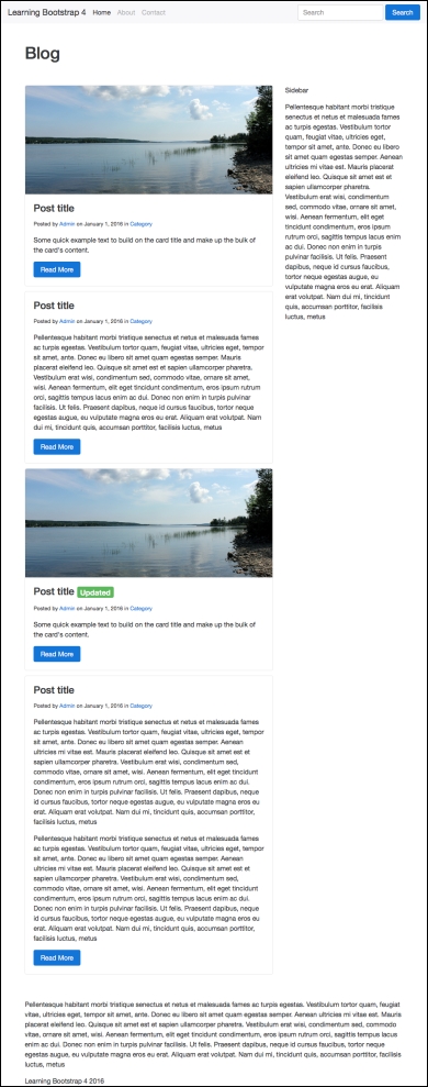
Now that the main blog roll content is complete, let's also add the right column content.
Let's add some more content to the index page by adding the sidebar. We'll also use the Card component here, but in this case, some different variations of it. Go back to index.ejs and remove the filler text from the second column. Instead, insert the following Card code:
<div class="card card-block">
  <h5 class="card-title">Recent Posts</h5>
  <div class="list-group">
    <button type="button" class="list-group-item">Cras justo odio</button>
    <button type="button" class="list-group-item">Dapibus ac facilisis in</button>
    <button type="button" class="list-group-item">Morbi leo risus</button>
    <button type="button" class="list-group-item">Porta ac consectetur ac</button>
    <button type="button" class="list-group-item">Vestibulum at eros</button>
  </div>
  <div class="m-t-1"><a href="#">View More</a></div>
</div>
You'll notice in this Card I'm using a different variation, which is the List Group option. To do this, follow these steps:
- Create a new
<div>with a class of.list-groupinside your card. - Inside, insert a
<button>with a class of.list-group-itemon it for every item of your list. I've added five different options.
Once you're done, save your file and it should look like this in the browser:
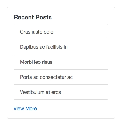
As you can see, that will draw a nice-looking sidebar list component. Let's fill out the rest of the sidebar by inserting the following code after the first Card component:
<div class="card card-block">
  <h5 class="card-title">Archives</h5>
  <div class="list-group">
    <button type="button" class="list-group-item">Cras justo odio</button>
    <button type="button" class="list-group-item">Dapibus ac facilisis in</button>
    <button type="button" class="list-group-item">Morbi leo risus</button>
    <button type="button" class="list-group-item">Porta ac consectetur ac</button>
    <button type="button" class="list-group-item">Vestibulum at eros</button>
  </div>
  <div class="m-t-1"><a href="#">View More</a></div>
</div>
<div class="card card-block">
  <h5 class="card-title">Categories</h5>
  <div class="list-group">
    <button type="button" class="list-group-item">Cras justo odio</button>
    <button type="button" class="list-group-item">Dapibus ac facilisis in</button>
    <button type="button" class="list-group-item">Morbi leo risus</button>
    <button type="button" class="list-group-item">Porta ac consectetur ac</button>
    <button type="button" class="list-group-item">Vestibulum at eros</button>
  </div>
  <div class="m-t-1"><a href="#">View More</a></div>
</div>
This will produce two more List Group Card components for the sidebar of your blog project. Once it's all done, the entire page should now look like this:
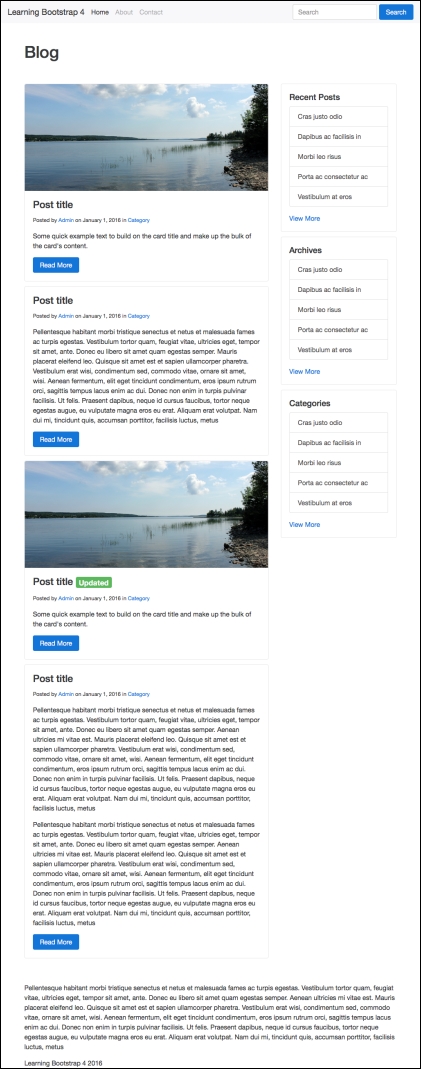
That concludes the user of the Card component on the index page. The last page we need to set up with the Card component is our Blog post page.
The index page is a list of all the Blog posts in our project. The last page we need to setup is the Blog post page, which is just a single post in our project. Open up the blog-post.ejs template you created earlier in the book and let's start updating some code. Head down to the page body section and find this line of code:
<div class="col-md-8">
Currently, you'll see some filler text in that <div>; let's replace it with the following code:
<div class="card">
<div class="card-block">
<p><small>Posted by <a href="#">Admin</a> on January 1, 2016 in <a href="#">Category</a></small></p>
<p>Pellentesque habitant morbi tristique senectus et...</p>
<p><code><p>this is what a code sample looks like</p></code></p>
<p>Pellentesque habitant morbi tristique senectus et netus...</p>
<!-- pre sample start //-->
<h4>pre sample code</h4>
<pre>This is what code will look like</pre>
<!-- pre sample end //-->
<!-- image //-->
<h4>responive image</h4>
<p><img src="img/image.jpg" class="img-fluid" alt="Responsive image"></p>
<!-- table //-->
<h4>table</h4>
<table class="table">
<thead>
<tr>
<th>#</th>
<th>First Name</th>
<th>Last Name</th>
<th>Username</th>
</tr>
</thead>
<tbody>
<tr>
<th scope="row">1</th>
<td>john</td>
<td>smith</td>
<td>@jsmith</td>
</tr>
<tr>
<th scope="row">2</th>
<td>steve</td>
<td>stevens</td>
<td>@steve</td>
</tr>
<tr>
<th scope="row">3</th>
<td>mike</td>
<td>michaels</td>
<td>@mike</td>
</tr>
</tbody>
</table>
</div>
</div>
There's a good chunk of things going on in this code. I've thrown in a few other components we've already learned about so you can see them in action. The Card component has the following things included inside it:
- Text,
<code>and<pre>tags - Tables
- Images
Let's also update this template to use the same sidebar code as the index page. Copy the right column code from the index template and paste it into the same location in the blog post template.
When you are done, the page should now look like this:
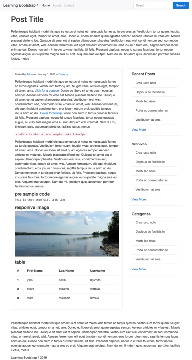
As you can see, we're using a single Card component to hold all of the content for the body of the page. We're also using the same Card components for the sidebar that we copied over from the index page. Now that we've added the Cards to all of our page templates, let's get back to learning about some other Content components in Bootstrap 4.