Table of Contents for
Bootstrap 4 – Responsive Web Design
 Bootstrap 4 – Responsive Web Design
Published by
Packt Publishing, 2017
Bootstrap 4 – Responsive Web Design
Published by
Packt Publishing, 2017
- Cover
- Table of Contents
- Bootstrap 4 – Responsive Web Design
- Bootstrap 4 – Responsive Web Design
- Credits
- Preface
- What you need for this learning path
- Who this learning path is for
- Reader feedback
- Customer support
- 1. Module 1
- 1. Getting Started
- Setting up the framework
- Building our first Bootstrap example
- Optionally using the CDN setup
- Community activity
- Bootstrap and web applications
- Browser compatibility
- Summary
- 2. Creating a Solid Scaffolding
- Building our scaffolding
- Fluid container
- We need some style!
- Manipulating tables
- Like a boss!
- Final thoughts
- Summary
- 3. Yes, You Should Go Mobile First
- Bootstrap and the mobile-first design
- How to debug different viewports at the browser
- Cleaning up the mess
- Creating the landing page for different devices
- Summary
- 4. Applying the Bootstrap Style
- Summary
- 5. Making It Fancy
- Paying attention to your navigation
- Dropping it down
- Making an input grouping
- Getting ready for flexbox!
- Summary
- 6. Can You Build a Web App?
- Adding the navigation
- Do a grid again
- Playing the cards
- Implementing the main content
- Creating breadcrumbs
- Finishing with the right-hand-side content
- Summary
- 7. Of Course, You Can Build a Web App!
- Waiting for the progress bar
- Creating a settings page
- Summary
- 8. Working with JavaScript
- Awesome Bootstrap modals
- Creating our custom modal
- A tool for your tip
- Pop it all over
- Making the menu affix
- Finishing the web app
- Summary
- 9. Entering in the Advanced Mode
- The last navigation bar with flexbox
- Filling the main fluid content
- Filling the main content
- Overhead loading
- Fixing the toggle button for mobile
- Summary
- 10. Bringing Components to Life
- Fixing the mobile viewport
- Learning more advanced plugins
- Summary
- 11. Making It Your Taste
- Working with plugin customization
- The additional Bootstrap plugins
- Creating our Bootstrap plugin
- Defining the plugin methods
- Creating additional plugin methods
- Summary
- 2. Module 2
- 1. Introducing Bootstrap 4
- Summary
- 2. Using Bootstrap Build Tools
- Download the Bootstrap source files
- Setting up the blog project
- Setting up the JSON files
- Creating our first page template
- Summary
- 3. Jumping into Flexbox
- Ordering your Flexbox
- Wrapping your Flexbox
- Setting up the Bootstrap Flexbox layout grid
- Setting up a Flexbox project
- Designing a single blog post
- Summary
- 4. Working with Layouts
- Inserting rows into your layout
- Adding columns to your layout
- Choosing a column class
- Creating a simple three-column layout
- Mixing column classes for different devices
- Coding the blog home page
- Using responsive utility classes
- Summary
- 5. Working with Content
- Learning to use typography
- Customizing headings
- How to style images
- Coding tables
- Summary
- 6. Playing with Components
- Basic button examples
- Creating outlined buttons
- Checkbox and radio buttons
- Coding forms in Bootstrap 4
- Creating an inline form
- Adding validation to inputs
- Using the Jumbotron component
- Adding the Label component
- Using the Alerts component
- Using Cards for layout
- Updating the Blog index page
- How to use the Navs component
- Adding Breadcrumbs to a page
- Using the Pagination component
- How to use the List Group component
- Summary
- 7. Extending Bootstrap with JavaScript Plugins
- Coding Tooltips
- Avoiding collisions with our components
- Using Popover components
- Using the Collapse component
- Coding an Accordion with the Collapse component
- Coding a Bootstrap Carousel
- Summary
- 8. Throwing in Some Sass
- Using Sass in the blog project
- Importing partials in Sass
- Creating a collection of variables
- Customizing components
- Writing a theme
- Summary
- 9. Migrating from Version 3
- Big changes in version 4
- Updating your variables
- Additional global changes
- Other font updates
- Migrating components
- Migrating JavaScript
- Miscellaneous migration changes
- Summary
- 3. Module 3
- 1. Revving Up Bootstrap
- What Bootstrap 4 Alpha 4 has to offer
- Setting up our project
- Summary
- 2. Making a Style Statement
- Image elements
- Responsive utilities
- Helper classes
- Text alignment and transformation
- Summary
- 3. Building the Layout
- Adding Bootstrap components
- Summary
- 4. On Navigation, Footers, Alerts, and Content
- Improving navigation using Scrollspy
- Customizing scroll speed
- Icons
- Using and customizing alerts
- Creating a footer
- Creating and customizing forms
- Form validation
- Progress indicators
- Adding content using media objects
- Figures
- Quotes
- Abbreviations
- Summary
- 5. Speeding Up Development Using jQuery Plugins
- Enhanced pagination using bootpag
- Displaying images using Bootstrap Lightbox
- Improving our price list with DataTables
- Summary
- 6. Customizing Your Plugins
- Customizing plugins
- Writing a custom Bootstrap jQuery plugin
- Summary
- 7. Integrating Bootstrap with Third-Party Plugins
- Hover
- Summary
- 8. Optimizing Your Website
- Minifying CSS and JavaScript
- Introducing Grunt
- Running tasks automatically
- Stripping our website of unused CSS
- JavaScript file concatenation
- Summary
- 9. Integrating with AngularJS and React
- Introducing React
- Summary
- Bibliography
- Index
Responsive utilities are a group of media query-based classes that control when an element should be hidden or shown depending on the viewport. One popular use case for this is controlling display specific navigations. For example, a page may have a navigation bar on large displays and have a hidden navigation on small displays which is only displayed when a user chooses to open the navigation.
Let's look at a quick example with our Print Size page. Add the hidden-xs-down class to the img elements:
    <div class="container">
        <h1>Our Print Sizes</h1>
        <div class="row">
            <div class="col-xs-6 col-sm-3 push-sm-3">
                <img src="images/small.jpg" class="img-fluid img-circle
                hidden-xs-down">
                <h5>Small</h5>
                ...
            </div>
            <div class="col-xs-6 col-sm-3 push-sm-3">
                <img src="images/medium.jpg" class="img-fluid img-rounded
                hidden-xs-down">
                <h5>Medium</h5>
                ...
            </div>
            <div class="col-xs-6 col-sm-3 push-sm-3">
                <img src="images/large.jpg" class="img-thumbnail
                hidden-xs-down">
                <h5>Large</h5>
                ...
            </div>
            <div class="col-xs-6 col-sm-3 pull-sm-9">
                <img src="images/extra-large.jpg" class="img-fluid
                hidden-xs-down">
                <h5>Extra Large</h5>
                ...
            </div>
        </div>
    </div>
Take a look at the following screenshot:
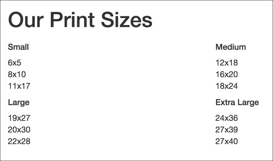
Figure 2.18: Hiding elements based on the viewport size using the hidden-xs-down class
The hidden-xs-down property hides the element only when the display is extra-small, according to Bootstrap's grid system.
The hidden classes stick to the conventions found in the grid system, along with hidden-xs-*, there are hidden-sm-*, -md-*, and -lg-* classes. In the grid system, col-md targets all Medium displays and below. Likewise, hidden-md-down will target only Medium displays or displays smaller than Medium (that is, small and extra small).
Aside from hidden-xs-down, Bootstrap also offers the hidden-*-up class, which hides an element if the viewport is at or above the threshold. For example, hidden-lg-up would hide the element when the display is Large or Extra Large (that is, unless the viewport is extra small, small or medium)
Let's apply the hidden classes so that:
- Images are hidden on
xs,sm, andmddisplays. - The page title is hidden on
mdor smaller displays - Category titles are hidden on
lgand bigger displays.
Observe the following code:
    <div class="container">
        <h1 class="hidden-lg-down">Our Print Sizes</h1>
        <div class="row">
            <div class="col-xs-6 col-sm-3 push-sm-3">
                <img src="images/small.jpg"
                class="img-fluid img-circle hidden-md-down">
                <h5 class="hidden-lg-up">Small</h5>
                ...
            </div>
            <div class="col-xs-6 col-sm-3 push-sm-3">
                <img src="images/medium.jpg" class="img-fluid img-rounded
                hidden-md-down">
                <h5 class="hidden-lg-up">Medium</h5>
                ...
            </div>
            <div class="col-xs-6 col-sm-3 push-sm-3">
                <img src="images/large.jpg" class="img-thumbnail
                hidden-md-down">
                <h5 class="hidden-lg-up">Large</h5>
                ...
            </div>
            <div class="col-xs-6 col-sm-3 pull-sm-9">
                <img src="images/extra-large.jpg" class="img-fluid
                hidden-md-down">
                <h5 class="hidden-lg-up">Extra Large</h5>
                ...
            </div>
        </div>
    </div>
Viewing the page on a viewport smaller than 544px, the categories will be displayed over two rows, with the category title text instead of images. Have a look at the following screenshot:
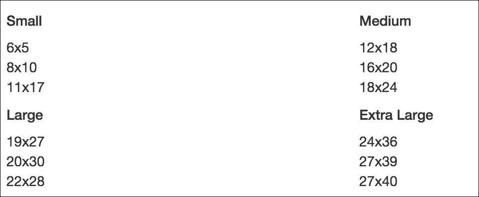
Figure 2.19: Screenshot depicting our page with the title and image elements hidden at displays smaller than sm
Viewing the page on a viewport larger than 768px (md) and smaller than 992px (lg), the categories will be displayed over one row with both the category title text and images, as in Figure 2.20. Viewing the page on a viewport larger than 992px will remove the category title text. Take a look at the following screenshot:
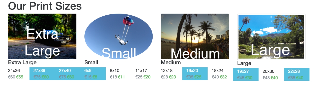
Figure 2.20: Screenshot depicting our page with the title element hidden for lg displays