Table of Contents for
Bootstrap 4 – Responsive Web Design
 Bootstrap 4 – Responsive Web Design
Published by
Packt Publishing, 2017
Bootstrap 4 – Responsive Web Design
Published by
Packt Publishing, 2017
- Cover
- Table of Contents
- Bootstrap 4 – Responsive Web Design
- Bootstrap 4 – Responsive Web Design
- Credits
- Preface
- What you need for this learning path
- Who this learning path is for
- Reader feedback
- Customer support
- 1. Module 1
- 1. Getting Started
- Setting up the framework
- Building our first Bootstrap example
- Optionally using the CDN setup
- Community activity
- Bootstrap and web applications
- Browser compatibility
- Summary
- 2. Creating a Solid Scaffolding
- Building our scaffolding
- Fluid container
- We need some style!
- Manipulating tables
- Like a boss!
- Final thoughts
- Summary
- 3. Yes, You Should Go Mobile First
- Bootstrap and the mobile-first design
- How to debug different viewports at the browser
- Cleaning up the mess
- Creating the landing page for different devices
- Summary
- 4. Applying the Bootstrap Style
- Summary
- 5. Making It Fancy
- Paying attention to your navigation
- Dropping it down
- Making an input grouping
- Getting ready for flexbox!
- Summary
- 6. Can You Build a Web App?
- Adding the navigation
- Do a grid again
- Playing the cards
- Implementing the main content
- Creating breadcrumbs
- Finishing with the right-hand-side content
- Summary
- 7. Of Course, You Can Build a Web App!
- Waiting for the progress bar
- Creating a settings page
- Summary
- 8. Working with JavaScript
- Awesome Bootstrap modals
- Creating our custom modal
- A tool for your tip
- Pop it all over
- Making the menu affix
- Finishing the web app
- Summary
- 9. Entering in the Advanced Mode
- The last navigation bar with flexbox
- Filling the main fluid content
- Filling the main content
- Overhead loading
- Fixing the toggle button for mobile
- Summary
- 10. Bringing Components to Life
- Fixing the mobile viewport
- Learning more advanced plugins
- Summary
- 11. Making It Your Taste
- Working with plugin customization
- The additional Bootstrap plugins
- Creating our Bootstrap plugin
- Defining the plugin methods
- Creating additional plugin methods
- Summary
- 2. Module 2
- 1. Introducing Bootstrap 4
- Summary
- 2. Using Bootstrap Build Tools
- Download the Bootstrap source files
- Setting up the blog project
- Setting up the JSON files
- Creating our first page template
- Summary
- 3. Jumping into Flexbox
- Ordering your Flexbox
- Wrapping your Flexbox
- Setting up the Bootstrap Flexbox layout grid
- Setting up a Flexbox project
- Designing a single blog post
- Summary
- 4. Working with Layouts
- Inserting rows into your layout
- Adding columns to your layout
- Choosing a column class
- Creating a simple three-column layout
- Mixing column classes for different devices
- Coding the blog home page
- Using responsive utility classes
- Summary
- 5. Working with Content
- Learning to use typography
- Customizing headings
- How to style images
- Coding tables
- Summary
- 6. Playing with Components
- Basic button examples
- Creating outlined buttons
- Checkbox and radio buttons
- Coding forms in Bootstrap 4
- Creating an inline form
- Adding validation to inputs
- Using the Jumbotron component
- Adding the Label component
- Using the Alerts component
- Using Cards for layout
- Updating the Blog index page
- How to use the Navs component
- Adding Breadcrumbs to a page
- Using the Pagination component
- How to use the List Group component
- Summary
- 7. Extending Bootstrap with JavaScript Plugins
- Coding Tooltips
- Avoiding collisions with our components
- Using Popover components
- Using the Collapse component
- Coding an Accordion with the Collapse component
- Coding a Bootstrap Carousel
- Summary
- 8. Throwing in Some Sass
- Using Sass in the blog project
- Importing partials in Sass
- Creating a collection of variables
- Customizing components
- Writing a theme
- Summary
- 9. Migrating from Version 3
- Big changes in version 4
- Updating your variables
- Additional global changes
- Other font updates
- Migrating components
- Migrating JavaScript
- Miscellaneous migration changes
- Summary
- 3. Module 3
- 1. Revving Up Bootstrap
- What Bootstrap 4 Alpha 4 has to offer
- Setting up our project
- Summary
- 2. Making a Style Statement
- Image elements
- Responsive utilities
- Helper classes
- Text alignment and transformation
- Summary
- 3. Building the Layout
- Adding Bootstrap components
- Summary
- 4. On Navigation, Footers, Alerts, and Content
- Improving navigation using Scrollspy
- Customizing scroll speed
- Icons
- Using and customizing alerts
- Creating a footer
- Creating and customizing forms
- Form validation
- Progress indicators
- Adding content using media objects
- Figures
- Quotes
- Abbreviations
- Summary
- 5. Speeding Up Development Using jQuery Plugins
- Enhanced pagination using bootpag
- Displaying images using Bootstrap Lightbox
- Improving our price list with DataTables
- Summary
- 6. Customizing Your Plugins
- Customizing plugins
- Writing a custom Bootstrap jQuery plugin
- Summary
- 7. Integrating Bootstrap with Third-Party Plugins
- Hover
- Summary
- 8. Optimizing Your Website
- Minifying CSS and JavaScript
- Introducing Grunt
- Running tasks automatically
- Stripping our website of unused CSS
- JavaScript file concatenation
- Summary
- 9. Integrating with AngularJS and React
- Introducing React
- Summary
- Bibliography
- Index
You may want to add some additional context to your headers and you can easily do this with some included Bootstrap 4 utility classes. By using a contextual text class, you can tag on a description to a heading like this:
<h3>
  This is the main title
  <small class="text-muted">this is a description</small>
</h3>
As you can see, I've added a class of text-muted to a <small> tag that is nested within my header tag. This will style the descriptive part of the text a bit differently, which creates a nice looking effect:

Another utility text class that has been added to Bootstrap 4 is the lead class. This class is used if you want to make a paragraph of text stand out. It will increase the font size by 25% and set the font-weight of the text to light or 300. It's easy to add, as the following code shows:
<p class="lead">
here's some text with the .lead class to make this paragraph look a bit different and standout.
</p>
The output of the preceding code will look like this:

As you can see, this gives the text a unique look. This would be good to use as the first paragraph in a blog post or perhaps to call out some text at the top of a landing page.
Bootstrap 4 comes with a number of list options out of the box. These CSS classes can be applied to the <ul>, <ol>, or <dl> tags to generate some styling. Let's start with the unstyled list.
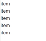
In some cases, you may want to remove the default bullets or numbers that come with ordered or unordered lists. This can be useful when creating a navigation, or perhaps you just want to create a list of items without bullet points. You can do this by using the list-unstyled class on the wrapping list tag. Here's an example of a basic unstyled, unordered list:
<ul class="list-unstyled">
  <li>item</li>
  <li>item</li>
  <li>item</li>
  <li>item</li>
  <li>item</li>
</ul>
This will produce a list with no bullet points that will look like this:
We can also nest additional lists inside if we want to create multi-level, indented lists. However, keep in mind that the list-unstyled class will only work on the first level of your list. Any nested additional lists will have their bullets or numbers. The code for this variation would look something like this:
<ul class="list-unstyled">
  <li>item
    <ul>
      <li>child item</li>
      <li>child item</li>
      <li>child item</li>
      <li>child item</li>
     </ul>
  </li>
  <li>item</li>
  <li>item</li>
  <li>item</li>
  <li>item</li>
</ul>
The preceding variation will look like the following output:
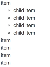
Now, if we check out this code sample in a browser, you'll notice you will see the bullet points for the child list that is nested within the parent.
The unstyled list is probably the one you will use the most. The next most useful class is list-inline, which will line up each <li> in a horizontal line. This is very useful for creating navigations or sub-navigations in a website or application. The code for this list is almost the same as the last, but we change the class name to list-inline. We also need to add a class of list-inline-item to each <li> tag. This is a new change for Bootstrap 4, so make sure you don't miss it in the following code:
<ul class="list-inline">
  <li class="list-inline-item">item</li>
  <li class="list-inline-item">item</li>
  <li class="list-inline-item">item</li>
  <li class="list-inline-item">item</li>
  <li class="list-inline-item">item</li>
</ul>
As I mentioned, the code is similar to the unstyled list, with a few changes. Here's what it will look like when rendered in the browser:
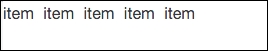
I think you can see how this would be a lightweight way to set up a horizontal navigation for your project. Let's move onto the last list type, which is a description list.
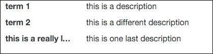
A description list allows you to create a horizontal display for terms and descriptions. Let's take a look at a basic list's code and then break it down:
<dl class="dl-horizontal">
  <dt class="col-sm-3">term 1</dt>
  <dd class="col-sm-9">this is a description</dd>

  <dt class="col-sm-3">term 2</dt>
  <dd class="col-sm-9">this is a different description</dd>

  <dt class="col-sm-3 text-truncate">this is a really long term name</dt>
  <dd class="col-sm-9">this is one last description</dd>
</dl>
There are a few things going on here that you need to be aware of, so let me break them all down for you:
- First you start a description list using the
<dl>tag. It requires a class ofdl-horizontalto trigger the list component styles. - Each row is made up of a
<dt>and<dd>tag.<dt>stands for term, while<dd>stands for description. Each tag should take a column class and is flexible, depending on how you want to lay out your list. - On the third row, you'll notice a class called
text-truncate. This class will truncate really long terms or text so they don't run outside the width of the column. This is a good technique to use for long chunks of text.
Now that I've explained all the code for the description list, let's see what this sample should look like in the browser:
That completes the typography styles that you need to know about in Bootstrap 4. Next, let me teach you what you can do with images in Bootstrap.