Table of Contents for
Bootstrap 4 – Responsive Web Design
 Bootstrap 4 – Responsive Web Design
Published by
Packt Publishing, 2017
Bootstrap 4 – Responsive Web Design
Published by
Packt Publishing, 2017
- Cover
- Table of Contents
- Bootstrap 4 – Responsive Web Design
- Bootstrap 4 – Responsive Web Design
- Credits
- Preface
- What you need for this learning path
- Who this learning path is for
- Reader feedback
- Customer support
- 1. Module 1
- 1. Getting Started
- Setting up the framework
- Building our first Bootstrap example
- Optionally using the CDN setup
- Community activity
- Bootstrap and web applications
- Browser compatibility
- Summary
- 2. Creating a Solid Scaffolding
- Building our scaffolding
- Fluid container
- We need some style!
- Manipulating tables
- Like a boss!
- Final thoughts
- Summary
- 3. Yes, You Should Go Mobile First
- Bootstrap and the mobile-first design
- How to debug different viewports at the browser
- Cleaning up the mess
- Creating the landing page for different devices
- Summary
- 4. Applying the Bootstrap Style
- Summary
- 5. Making It Fancy
- Paying attention to your navigation
- Dropping it down
- Making an input grouping
- Getting ready for flexbox!
- Summary
- 6. Can You Build a Web App?
- Adding the navigation
- Do a grid again
- Playing the cards
- Implementing the main content
- Creating breadcrumbs
- Finishing with the right-hand-side content
- Summary
- 7. Of Course, You Can Build a Web App!
- Waiting for the progress bar
- Creating a settings page
- Summary
- 8. Working with JavaScript
- Awesome Bootstrap modals
- Creating our custom modal
- A tool for your tip
- Pop it all over
- Making the menu affix
- Finishing the web app
- Summary
- 9. Entering in the Advanced Mode
- The last navigation bar with flexbox
- Filling the main fluid content
- Filling the main content
- Overhead loading
- Fixing the toggle button for mobile
- Summary
- 10. Bringing Components to Life
- Fixing the mobile viewport
- Learning more advanced plugins
- Summary
- 11. Making It Your Taste
- Working with plugin customization
- The additional Bootstrap plugins
- Creating our Bootstrap plugin
- Defining the plugin methods
- Creating additional plugin methods
- Summary
- 2. Module 2
- 1. Introducing Bootstrap 4
- Summary
- 2. Using Bootstrap Build Tools
- Download the Bootstrap source files
- Setting up the blog project
- Setting up the JSON files
- Creating our first page template
- Summary
- 3. Jumping into Flexbox
- Ordering your Flexbox
- Wrapping your Flexbox
- Setting up the Bootstrap Flexbox layout grid
- Setting up a Flexbox project
- Designing a single blog post
- Summary
- 4. Working with Layouts
- Inserting rows into your layout
- Adding columns to your layout
- Choosing a column class
- Creating a simple three-column layout
- Mixing column classes for different devices
- Coding the blog home page
- Using responsive utility classes
- Summary
- 5. Working with Content
- Learning to use typography
- Customizing headings
- How to style images
- Coding tables
- Summary
- 6. Playing with Components
- Basic button examples
- Creating outlined buttons
- Checkbox and radio buttons
- Coding forms in Bootstrap 4
- Creating an inline form
- Adding validation to inputs
- Using the Jumbotron component
- Adding the Label component
- Using the Alerts component
- Using Cards for layout
- Updating the Blog index page
- How to use the Navs component
- Adding Breadcrumbs to a page
- Using the Pagination component
- How to use the List Group component
- Summary
- 7. Extending Bootstrap with JavaScript Plugins
- Coding Tooltips
- Avoiding collisions with our components
- Using Popover components
- Using the Collapse component
- Coding an Accordion with the Collapse component
- Coding a Bootstrap Carousel
- Summary
- 8. Throwing in Some Sass
- Using Sass in the blog project
- Importing partials in Sass
- Creating a collection of variables
- Customizing components
- Writing a theme
- Summary
- 9. Migrating from Version 3
- Big changes in version 4
- Updating your variables
- Additional global changes
- Other font updates
- Migrating components
- Migrating JavaScript
- Miscellaneous migration changes
- Summary
- 3. Module 3
- 1. Revving Up Bootstrap
- What Bootstrap 4 Alpha 4 has to offer
- Setting up our project
- Summary
- 2. Making a Style Statement
- Image elements
- Responsive utilities
- Helper classes
- Text alignment and transformation
- Summary
- 3. Building the Layout
- Adding Bootstrap components
- Summary
- 4. On Navigation, Footers, Alerts, and Content
- Improving navigation using Scrollspy
- Customizing scroll speed
- Icons
- Using and customizing alerts
- Creating a footer
- Creating and customizing forms
- Form validation
- Progress indicators
- Adding content using media objects
- Figures
- Quotes
- Abbreviations
- Summary
- 5. Speeding Up Development Using jQuery Plugins
- Enhanced pagination using bootpag
- Displaying images using Bootstrap Lightbox
- Improving our price list with DataTables
- Summary
- 6. Customizing Your Plugins
- Customizing plugins
- Writing a custom Bootstrap jQuery plugin
- Summary
- 7. Integrating Bootstrap with Third-Party Plugins
- Hover
- Summary
- 8. Optimizing Your Website
- Minifying CSS and JavaScript
- Introducing Grunt
- Running tasks automatically
- Stripping our website of unused CSS
- JavaScript file concatenation
- Summary
- 9. Integrating with AngularJS and React
- Introducing React
- Summary
- Bibliography
- Index
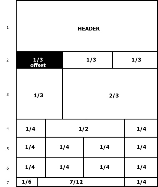
For our landing page, we will use the grid presented in the following image. As you can see, it is represented by seven rows, each containing a different number of columns. In this first example, we will use a nonmobile viewport, which we will discuss in the next chapter.
To start that, let's use our default layout presented in Chapter 1, Getting Started. Add inside the div.container tag another div with the .row class:
<!DOCTYPE html>
<html>
  <head>
    <meta charset="utf-8">
    <meta http-equiv="X-UA-Compatible" content="IE=edge">
    <meta name="viewport" content="width=device-width, initial-scale=1">
    <title>Landing page</title>

    <link rel="stylesheet" href="css/bootstrap.css">

    <!--[if lt IE 9]>
      <script src="https://oss.maxcdn.com/html5shiv/3.7.2/html5shiv.min.js">
</script>
      <script src="https://oss.maxcdn.com/respond/1.4.2/respond.min.js">
</script>
    <![endif]-->
  </head>
  <body>
    <div class="container">
      <div class="row"></div>
    </div>

    <script src="js/jquery-1.11.3.js"></script>
    <script src="js/bootstrap.js"></script>
  </body>
</html>
The hierarchy for the grid system always follows the sequence of a container that wraps rows and multiple columns. Keep in mind to always use this sequence to get a proper output.
Now that we have our .container with the first .row, let's create our first column. Every row is subdivided into 12 parts, so you can have up to 12 columns in a single row.
To identify a column, we must follow the template of .col-*-*. The first asterisk means the viewport for the column, and the other one means the size of the column. We will explain more about that, but to create our first column, we create a column identified by .col-md-12 inside our row:
<div class="container">
  <div class="row">
    <header class="col-md-12">
      HEADER
    </header>
  </div>
</div>
In this column, the md in.col-md-12 means that for the viewport medium (which means the md identifier), the column must have a 12-column width. In other words, the column fills the entire width of this row. This column will fill the complete width because it is our header, and as we can see in the previous image, this row is composed of just a single row.
So, to create a column in the Bootstrap grid system, you must follow the recipe of .col-*-* for every column. While you can set an integer from 1 to 12 for the width, for the viewport, you must set the correct class prefix. In this table, you can see the breakdown of class prefix usage and on which resolution it can be used:
|
Extra small devices (phones < 544 px / 34 em) |
Small devices (tablets ≥ 544 px / 34 em and < 768 px / 48 em) |
Medium devices (desktops ≥ 768 px /48 em and < 900 px / 62 em) |
Large devices (desktops ≥ 900 px / 62 em and < 1,200 px 75 em) |
Extra large devices (desktops ≥ 1,200 px / 75 em) | |
|---|---|---|---|---|---|
|
Grid behavior |
Horizontal lines at all times |
Collapse at start and fit the column grid | |||
|
Container's fixed width |
Auto |
|
|
|
|
|
Class prefix |
|
|
|
|
|
|
Number of columns |
12 | ||||
|
Column fixed width |
Auto |
|
|
|
|
Our second row is divided into three equal-sized columns, and the first one is an offset column, or in other words, an empty column that will be filled by a left margin. Therefore, the second row will be like this:
<div class="row">
  <div class="col-md-offset-4 col-md-4">1/3</div>
  <div class="col-md-4">1/3</div>
</div>
As you can see, by adding the .col-md-offset-4 class, we create a margin to the left four, sized in just this .row. By having each row independent of the others, we can properly customize the layout to appear just as it is supposed to be.
Now we will advance to the third row in our scaffolding. If you've got the spirit, you should have no problems with this row. For training, try doing it by yourself and check the solution in the book afterwards! I am sure you can handle it.
So, this row is composed of two columns. The first column must fill 4 out of the 12 parts of the row and the other column will fill the rest. The row in the HTML should look like this:
<div class="row">
  <div class="col-md-4"></div>
  <div class="col-md-8"></div>
</div>
About the fourth row—it is composed of a quarter divisor, followed by a half divisor, followed by a last quarter divisor. Using this in base 12, we will have the following grid in the row:
<div class="row">
  <div class="col-md-3">1/4</div>
  <div class="col-md-6">1/2</div>
  <div class="col-md-3">1/4</div>
</div>
In the fifth and sixth rows, we will show how you can create a row using two options. In the fifth row, we will create just as we are doing in the other rows, while in the sixth row, we will use the concept of nesting rows.
So, in the fifth row, create it just as you were doing before; create a row with four equally sized rows, which means that each column will have the .col-md-3 class:
<div class="row">
  <div class="col-md-3">1/4</div>
  <div class="col-md-3">1/4</div>
  <div class="col-md-3">1/4</div>
  <div class="col-md-3">1/4</div>
</div>
For the sixth row, we will use nesting rows. So, let's create the first .row, having three columns:
<div class="row">
  <div class="col-md-3">1/4</div>
  <div class="col-md-6"></div>
  <div class="col-md-3">1/4</div>
</div>
As you can see, the first and the last column use the same class of columns in row five—the .col-md-3 class—while the middle column is double the size, with the .col-md-6 class.
Let's nest another .row inside the middle column. When you create a new nested row, the columns inside of it are refreshed and you have another set of 12-sized columns to put inside it. So, inside this new row, create two columns with the .col-md-6 class to generate two columns representing a fourth of the row:
<div class="row">
  <div class="col-md-3">1/4</div>
  <div class="col-md-6">
    <div class="row">
      <div class="col-md-6">1/4</div>
      <div class="col-md-6">1/4</div>
    </div>
  </div>
  <div class="col-md-3">1/4</div>
</div>
The concept of nesting rows is pretty complex, since you can infinitely subdivide a row, although it is great to create small grid components inside your page that can be used in other locations.
To create the last row, we need to create the .col-md-2 column, followed by .col-md-7 and .col-md-3. So, just create a row using the <footer> tag with those columns. The complete scaffolding will be this:
<!DOCTYPE html>
<html>
  <head>
    <meta charset="utf-8">
    <meta http-equiv="X-UA-Compatible" content="IE=edge">
    <meta name="viewport" content="width=device-width, initial-scale=1">
    <title>Landing page</title>
    <link rel="stylesheet" href="css/bootstrap.css">
    <!--[if lt IE 9]>
      <script src="https://oss.maxcdn.com/html5shiv/3.7.2/html5shiv.min.js">
</script>
      <script src="https://oss.maxcdn.com/respond/1.4.2/respond.min.js">
</script>
    <![endif]-->
  </head>
  <body>
    <div class="container">
      <!-- row 1 -->
      <div class="row">
        <header class="col-md-12">
          HEADER
        </header>
      </div>

      <!-- row 2 -->
      <div class="row">
        <div class="col-md-offset-4 col-md-4">1/3</div>
        <div class="col-md-4">1/3</div>
      </div>

      <!-- row 3 -->
      <div class="row">
        <div class="col-md-4"></div>
        <div class="col-md-8"></div>
      </div>

      <!-- row 4 -->
      <div class="row">
        <div class="col-md-3">1/4</div>
        <div class="col-md-6">1/2</div>
        <div class="col-md-3">1/4</div>
      </div>

      <!-- row 5 -->
      <div class="row">
        <div class="col-md-3">1/4</div>
        <div class="col-md-3">1/4</div>
        <div class="col-md-3">1/4</div>
        <div class="col-md-3">1/4</div>
      </div>

      <!-- row 6 – nesting rows -->
      <div class="row">
        <div class="col-md-3">1/4</div>
        <div class="col-md-6">
          <div class="row">
            <div class="col-md-6">1/4</div>
            <div class="col-md-6">1/4</div>
          </div>
        </div>
        <div class="col-md-3">1/4</div>
      </div>

      <!-- row 7 -->
      <footer class="row">
        <div class="col-md-2">1/2</div>
        <div class="col-md-7">7/12</div>
        <div class="col-md-3">1/4</div>
      </footer>
    </div>

    <script src="js/jquery-1.11.3.js"></script>
    <script src="js/bootstrap.js"></script>
  </body>
</html>