Table of Contents for
Bootstrap 4 – Responsive Web Design
 Bootstrap 4 – Responsive Web Design
Published by
Packt Publishing, 2017
Bootstrap 4 – Responsive Web Design
Published by
Packt Publishing, 2017
- Cover
- Table of Contents
- Bootstrap 4 – Responsive Web Design
- Bootstrap 4 – Responsive Web Design
- Credits
- Preface
- What you need for this learning path
- Who this learning path is for
- Reader feedback
- Customer support
- 1. Module 1
- 1. Getting Started
- Setting up the framework
- Building our first Bootstrap example
- Optionally using the CDN setup
- Community activity
- Bootstrap and web applications
- Browser compatibility
- Summary
- 2. Creating a Solid Scaffolding
- Building our scaffolding
- Fluid container
- We need some style!
- Manipulating tables
- Like a boss!
- Final thoughts
- Summary
- 3. Yes, You Should Go Mobile First
- Bootstrap and the mobile-first design
- How to debug different viewports at the browser
- Cleaning up the mess
- Creating the landing page for different devices
- Summary
- 4. Applying the Bootstrap Style
- Summary
- 5. Making It Fancy
- Paying attention to your navigation
- Dropping it down
- Making an input grouping
- Getting ready for flexbox!
- Summary
- 6. Can You Build a Web App?
- Adding the navigation
- Do a grid again
- Playing the cards
- Implementing the main content
- Creating breadcrumbs
- Finishing with the right-hand-side content
- Summary
- 7. Of Course, You Can Build a Web App!
- Waiting for the progress bar
- Creating a settings page
- Summary
- 8. Working with JavaScript
- Awesome Bootstrap modals
- Creating our custom modal
- A tool for your tip
- Pop it all over
- Making the menu affix
- Finishing the web app
- Summary
- 9. Entering in the Advanced Mode
- The last navigation bar with flexbox
- Filling the main fluid content
- Filling the main content
- Overhead loading
- Fixing the toggle button for mobile
- Summary
- 10. Bringing Components to Life
- Fixing the mobile viewport
- Learning more advanced plugins
- Summary
- 11. Making It Your Taste
- Working with plugin customization
- The additional Bootstrap plugins
- Creating our Bootstrap plugin
- Defining the plugin methods
- Creating additional plugin methods
- Summary
- 2. Module 2
- 1. Introducing Bootstrap 4
- Summary
- 2. Using Bootstrap Build Tools
- Download the Bootstrap source files
- Setting up the blog project
- Setting up the JSON files
- Creating our first page template
- Summary
- 3. Jumping into Flexbox
- Ordering your Flexbox
- Wrapping your Flexbox
- Setting up the Bootstrap Flexbox layout grid
- Setting up a Flexbox project
- Designing a single blog post
- Summary
- 4. Working with Layouts
- Inserting rows into your layout
- Adding columns to your layout
- Choosing a column class
- Creating a simple three-column layout
- Mixing column classes for different devices
- Coding the blog home page
- Using responsive utility classes
- Summary
- 5. Working with Content
- Learning to use typography
- Customizing headings
- How to style images
- Coding tables
- Summary
- 6. Playing with Components
- Basic button examples
- Creating outlined buttons
- Checkbox and radio buttons
- Coding forms in Bootstrap 4
- Creating an inline form
- Adding validation to inputs
- Using the Jumbotron component
- Adding the Label component
- Using the Alerts component
- Using Cards for layout
- Updating the Blog index page
- How to use the Navs component
- Adding Breadcrumbs to a page
- Using the Pagination component
- How to use the List Group component
- Summary
- 7. Extending Bootstrap with JavaScript Plugins
- Coding Tooltips
- Avoiding collisions with our components
- Using Popover components
- Using the Collapse component
- Coding an Accordion with the Collapse component
- Coding a Bootstrap Carousel
- Summary
- 8. Throwing in Some Sass
- Using Sass in the blog project
- Importing partials in Sass
- Creating a collection of variables
- Customizing components
- Writing a theme
- Summary
- 9. Migrating from Version 3
- Big changes in version 4
- Updating your variables
- Additional global changes
- Other font updates
- Migrating components
- Migrating JavaScript
- Miscellaneous migration changes
- Summary
- 3. Module 3
- 1. Revving Up Bootstrap
- What Bootstrap 4 Alpha 4 has to offer
- Setting up our project
- Summary
- 2. Making a Style Statement
- Image elements
- Responsive utilities
- Helper classes
- Text alignment and transformation
- Summary
- 3. Building the Layout
- Adding Bootstrap components
- Summary
- 4. On Navigation, Footers, Alerts, and Content
- Improving navigation using Scrollspy
- Customizing scroll speed
- Icons
- Using and customizing alerts
- Creating a footer
- Creating and customizing forms
- Form validation
- Progress indicators
- Adding content using media objects
- Figures
- Quotes
- Abbreviations
- Summary
- 5. Speeding Up Development Using jQuery Plugins
- Enhanced pagination using bootpag
- Displaying images using Bootstrap Lightbox
- Improving our price list with DataTables
- Summary
- 6. Customizing Your Plugins
- Customizing plugins
- Writing a custom Bootstrap jQuery plugin
- Summary
- 7. Integrating Bootstrap with Third-Party Plugins
- Hover
- Summary
- 8. Optimizing Your Website
- Minifying CSS and JavaScript
- Introducing Grunt
- Running tasks automatically
- Stripping our website of unused CSS
- JavaScript file concatenation
- Summary
- 9. Integrating with AngularJS and React
- Introducing React
- Summary
- Bibliography
- Index
Just as you can do in Harp.js, you can use partials in Sass. If you've forgotten what a partial is, it's a little snippet of code that is saved into a different file and then imported into the main CSS theme or layout, in the case of Harp. This can be handy for making your CSS modular and easier to manage. For example, it would make a ton of sense to break every Bootstrap component into its own CSS file and then use the @import directive to bring them all into a single master theme, which is then included in your project. Let's go over an example of how you could do this for a single component. In your project, go to the /css directory and create a new sub-folder called /components. The the full path should be:
/css/components
In the /components directory, create a new Sass file and name it _buttons.scss. Make sure you always insert an underscore at the start of the filename of a partial. The compiler will then ignore these files as the underscore means it is being inserted into another file. Enter the following at the top of the file as a marker:
/* buttons */
Save the buttons file and then open up custom.scss and add the following line of code to the file:
@import "components/_buttons.scss";
That line of code uses the @import rule, which will allow us to import the _buttons.scss file into our main theme file that we are calling custom.scss. As I've mentioned, the reason you need to do this is for maintainability. This makes the code much easier to read and to add/remove components, which is just another way of saying it makes it more modular.
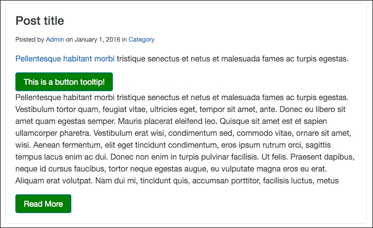
Before we can test this out to make sure it works, we need to add some code to our _buttons.scss file. Let's add some simple CSS to change the primary button as an example:
.btn-primary {
  background-color: green;
}
After adding this code, save the file and do a harp compile. Then launch the server and check out the home page; the buttons will be green like this:
After testing that out, you may want to take that custom code out unless you want the buttons to remain green. That's just a simple example of how you can use partials to make your Bootstrap components more modular. I'll get into that topic in greater depth in a future chapter but for now we are going to focus on using Sass mixins.
Writing something in CSS, such as, for example, browser vendor prefixes, can be really tedious. Mixins allow you to group CSS declarations together so that you can reuse them through your project. This is a great because you can include the code for, say, a border-radius, using one line of code instead of multiple lines for each browser. To start, open up custom.scss and insert the following code at the top of the file:
@mixin border-radius($radius) {
  -webkit-border-radius: $radius;
     -moz-border-radius: $radius;
      -ms-border-radius: $radius;
          border-radius: $radius;
}
Let's go over a few things that are happening here:
- A mixin is always started in Sass with the
@mixinkeyword - Following that, you want to include the property name to target as well as set a variable, in this case
$radius - We then apply the
$radiusvariable to each browser prefix instance
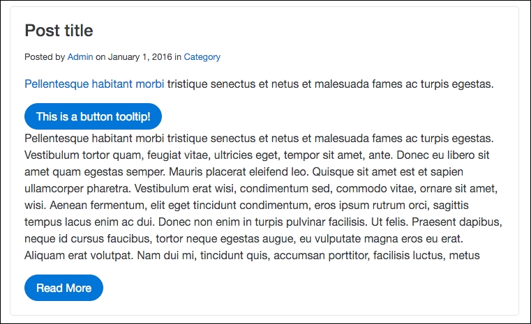
We've set up the mixin to handle the border-radius property but we still need to add the corner value to an element. Let's change the border-radius value for the default Bootstrap button. Open up _buttons.scss and insert the following code:
.btn {
  @include border-radius(20px);
 }
Let me explain what is happening here:
- I'm targeting all Bootstrap buttons by inserting the
.btnclass - Inserting the
@includekeyword will grab theborder-radiusmixin - Lastly, I've provided a value of
20px, which will make our buttons look really rounded on each end
Save your file, run the harp compile command, and then, when you view the project in the browser, it should look like this:
That concludes a fairly simple example of how to use mixins in Bootstrap 4. You can use them for many other reasons but replacing CSS3 vendor prefixes is one of the most common and useful. Next we'll cover a slightly more complicated topic in Sass, which is the use of operators.
Sass allows you to perform basic math operations in CSS, which is useful for a number of reasons. First of all, you can use the following operators +, -, *, /, and %. To give you an understanding of how you can use operators in CSS, let's learn how to convert a pixel-based grid into percentages. We'll create two columns in pixels and then use some Sass to convert them to percentages. Open up custom.scss and insert the following code:
.left-column {
  width: 700px / 1000px * 100%;
}

.right-column {
  width: 300px / 1000px * 100%;
}
Now, I've created two columns here. The .left-column class will have a width of 70% after we compile this Sass operator. The .right-column class will have a width of 30%. So if we add those together we'll get roughly a three-quarter layout with a larger column on the left and a smaller column on the right. Run a harp compile command to build this code and then open up custom.css in the /www/css folder. There you should find the following code:
.left-column {
  width:70%;
}

.right-column {
  width:30%;
}
As you can see, our Sass operators have been converted into regular percentage values. That's just one way you can use operators in Sass; I'd encourage you to play around more with them. Next we're going to learn how to set up a library of Sass variables that you can use to create a Bootstrap theme.