Table of Contents for
Bootstrap 4 – Responsive Web Design
 Bootstrap 4 – Responsive Web Design
Published by
Packt Publishing, 2017
Bootstrap 4 – Responsive Web Design
Published by
Packt Publishing, 2017
- Cover
- Table of Contents
- Bootstrap 4 – Responsive Web Design
- Bootstrap 4 – Responsive Web Design
- Credits
- Preface
- What you need for this learning path
- Who this learning path is for
- Reader feedback
- Customer support
- 1. Module 1
- 1. Getting Started
- Setting up the framework
- Building our first Bootstrap example
- Optionally using the CDN setup
- Community activity
- Bootstrap and web applications
- Browser compatibility
- Summary
- 2. Creating a Solid Scaffolding
- Building our scaffolding
- Fluid container
- We need some style!
- Manipulating tables
- Like a boss!
- Final thoughts
- Summary
- 3. Yes, You Should Go Mobile First
- Bootstrap and the mobile-first design
- How to debug different viewports at the browser
- Cleaning up the mess
- Creating the landing page for different devices
- Summary
- 4. Applying the Bootstrap Style
- Summary
- 5. Making It Fancy
- Paying attention to your navigation
- Dropping it down
- Making an input grouping
- Getting ready for flexbox!
- Summary
- 6. Can You Build a Web App?
- Adding the navigation
- Do a grid again
- Playing the cards
- Implementing the main content
- Creating breadcrumbs
- Finishing with the right-hand-side content
- Summary
- 7. Of Course, You Can Build a Web App!
- Waiting for the progress bar
- Creating a settings page
- Summary
- 8. Working with JavaScript
- Awesome Bootstrap modals
- Creating our custom modal
- A tool for your tip
- Pop it all over
- Making the menu affix
- Finishing the web app
- Summary
- 9. Entering in the Advanced Mode
- The last navigation bar with flexbox
- Filling the main fluid content
- Filling the main content
- Overhead loading
- Fixing the toggle button for mobile
- Summary
- 10. Bringing Components to Life
- Fixing the mobile viewport
- Learning more advanced plugins
- Summary
- 11. Making It Your Taste
- Working with plugin customization
- The additional Bootstrap plugins
- Creating our Bootstrap plugin
- Defining the plugin methods
- Creating additional plugin methods
- Summary
- 2. Module 2
- 1. Introducing Bootstrap 4
- Summary
- 2. Using Bootstrap Build Tools
- Download the Bootstrap source files
- Setting up the blog project
- Setting up the JSON files
- Creating our first page template
- Summary
- 3. Jumping into Flexbox
- Ordering your Flexbox
- Wrapping your Flexbox
- Setting up the Bootstrap Flexbox layout grid
- Setting up a Flexbox project
- Designing a single blog post
- Summary
- 4. Working with Layouts
- Inserting rows into your layout
- Adding columns to your layout
- Choosing a column class
- Creating a simple three-column layout
- Mixing column classes for different devices
- Coding the blog home page
- Using responsive utility classes
- Summary
- 5. Working with Content
- Learning to use typography
- Customizing headings
- How to style images
- Coding tables
- Summary
- 6. Playing with Components
- Basic button examples
- Creating outlined buttons
- Checkbox and radio buttons
- Coding forms in Bootstrap 4
- Creating an inline form
- Adding validation to inputs
- Using the Jumbotron component
- Adding the Label component
- Using the Alerts component
- Using Cards for layout
- Updating the Blog index page
- How to use the Navs component
- Adding Breadcrumbs to a page
- Using the Pagination component
- How to use the List Group component
- Summary
- 7. Extending Bootstrap with JavaScript Plugins
- Coding Tooltips
- Avoiding collisions with our components
- Using Popover components
- Using the Collapse component
- Coding an Accordion with the Collapse component
- Coding a Bootstrap Carousel
- Summary
- 8. Throwing in Some Sass
- Using Sass in the blog project
- Importing partials in Sass
- Creating a collection of variables
- Customizing components
- Writing a theme
- Summary
- 9. Migrating from Version 3
- Big changes in version 4
- Updating your variables
- Additional global changes
- Other font updates
- Migrating components
- Migrating JavaScript
- Miscellaneous migration changes
- Summary
- 3. Module 3
- 1. Revving Up Bootstrap
- What Bootstrap 4 Alpha 4 has to offer
- Setting up our project
- Summary
- 2. Making a Style Statement
- Image elements
- Responsive utilities
- Helper classes
- Text alignment and transformation
- Summary
- 3. Building the Layout
- Adding Bootstrap components
- Summary
- 4. On Navigation, Footers, Alerts, and Content
- Improving navigation using Scrollspy
- Customizing scroll speed
- Icons
- Using and customizing alerts
- Creating a footer
- Creating and customizing forms
- Form validation
- Progress indicators
- Adding content using media objects
- Figures
- Quotes
- Abbreviations
- Summary
- 5. Speeding Up Development Using jQuery Plugins
- Enhanced pagination using bootpag
- Displaying images using Bootstrap Lightbox
- Improving our price list with DataTables
- Summary
- 6. Customizing Your Plugins
- Customizing plugins
- Writing a custom Bootstrap jQuery plugin
- Summary
- 7. Integrating Bootstrap with Third-Party Plugins
- Hover
- Summary
- 8. Optimizing Your Website
- Minifying CSS and JavaScript
- Introducing Grunt
- Running tasks automatically
- Stripping our website of unused CSS
- JavaScript file concatenation
- Summary
- 9. Integrating with AngularJS and React
- Introducing React
- Summary
- Bibliography
- Index
In my opinion, the best new feature in Bootstrap 4 is the new Card component. If you're unfamiliar with Cards, they were made popular with the release of Google Material Design. They are a mobile first content container that works well for phones, tablets, and the desktop.
We'll be using the Card component heavily in our blog project so let's jump right in and start learning how to use them. Check out the following code to learn how to render a basic card:
<div class="card">
  <img class="card-img-top img-fluid"  src="path/to/your/image.jpg">
  <div class="card-block">
    <h4 class="card-title">Card title</h4>
    <p class="card-text">Some basic description text for your card should appear in this section.</p>
    <a href="#" class="btn btn-primary">Button</a>
  </div>
</div>
There are a number of new CSS classes you need to be aware of here, so let's go through them one by one:
- Any instance of the Card component must use a
<div>tag with a CSS class named.cardon it. - If you wish to include an image inside your card, it comes next. The image requires a class named
.card-img-topto display the image at the top of the card. Although not required, I would also recommend adding the class.img-fluidto your image. This will make the image responsive so that it will automatically resize to match the width of your card. - After the image, you need to start a new
<div>with a CSS class named.card-block. This part of the Card will contain the actual textual content. - The first thing your card should have is a title. Use an
<h4>tag with a CSS class of.card-titlefor this section. - Next, you can insert a paragraph of text with a
<p>tag and a class of.card-text. If you choose to have multiple paragraphs, make sure each one uses that same class name. - Finally, I've inserted a primary
<button>so the user has something to click on to view the full piece of content.
After you've finished coding this up, it should appear like this in your browser. Note for demo purposes, I've included an image of my own so you can see how it works. You'll need to provide your own images for your projects:
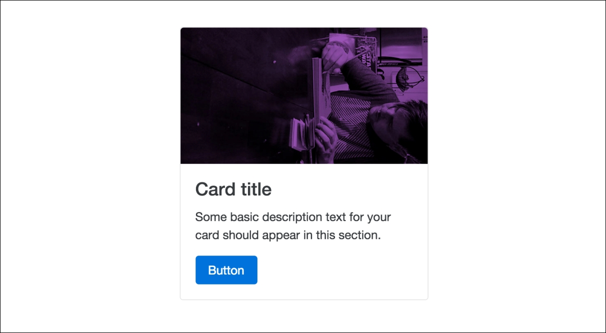
As you can see, this will render a neat-looking little content component that you can use in many different ways. Let's move on by learning some other ways that you can customize the Card component.
Perhaps you want to move the title of your card above the image? This is actually really easy to do, you simply need to move the <title> tag before the image in the flow of the component, like this:
<div class="card">
  <div class="card-block">
    <h4 class="card-title">Card title</h4>
  </div>
  <img
  class="card-img-top img-fluid"
  src="http://mattlambert.ca/img/matt-lambert.jpg">
  <div class="card-block">
    <p class="card-text">Some basic description text for your card should appear in this section.</p>
    <a href="#" class="btn btn-primary">Button</a>
  </div>
</div>
There are a couple of things here that you need to know about:
- There are now two instances of
<div class="card-block">in this card. It is perfectly fine to reuse this section within a single card. You'll notice that the header tag is wrapped inside of this<div>. This is required to apply the proper padding and margin around the title in the card. - The second thing you need to note is that the header tag has been moved above the image in the Card layout.
After making this change, your card should look like this:
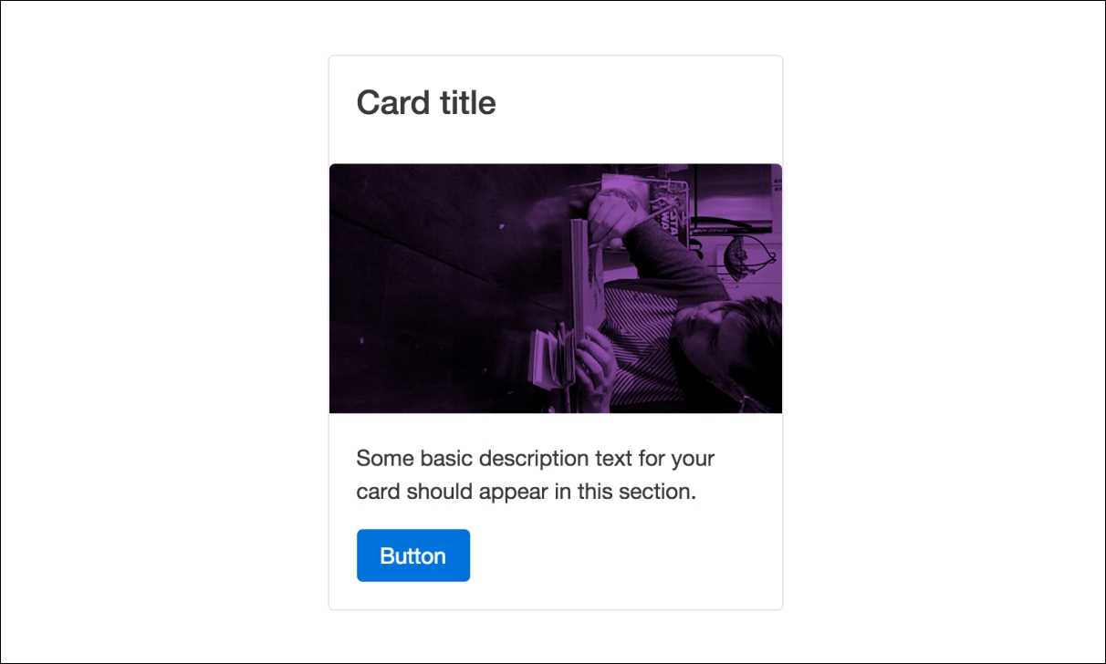
Hopefully this shows you how easy it is to work with different content in cards. Let's continue by showing some other things that you can do.
By default, text and elements will always align left in a card. However, it is possible to change this quite easily. Let's create a second card and then we'll center one and right align the other. I'm going to remove the image so the code is easier to understand:
<div class="card">
  <div class="card-block text-xs-center">
    <h4 class="card-title">Card title</h4>
    <p class="card-text">Some basic description text for your card should appear in this section.</p>
    <a href="#" class="btn btn-primary">Button</a>
  </div>
</div>
<div class="card">
  <div class="card-block text-xs-right">
    <h4 class="card-title">Card title</h4>
    <p class="card-text">Some basic description text for your card should appear in this section.</p>
    <a href="#" class="btn btn-primary">Button</a>
  </div>
</div>
Not much has changed here, but let's go over what is different:
- First, as I mentioned, I removed the image to make the code simpler
- On the first card, I've added a class of
.text-xs-center, which will center the text in the card - On the second card, I added a class named
.text-xs-right, which will right align everything
That's all you need to do. If you view this in the browser it should look like this:
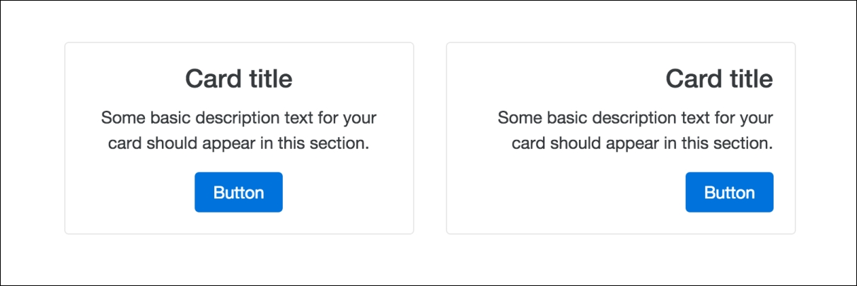
So with one additional CSS class we can easily control the alignment of the text and elements in a card. Cards are a pretty powerful component, so let's continue to learn how you can customize them.
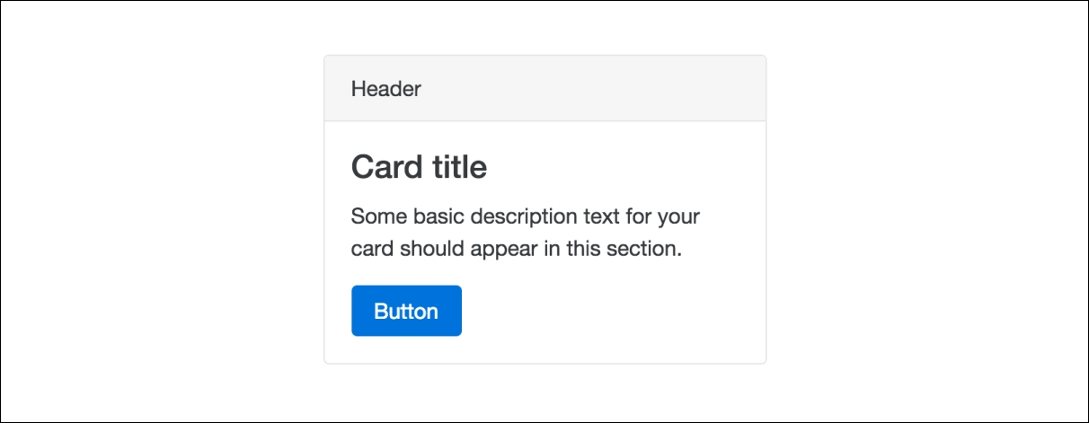
If you want to add a header to your Card, this is also pretty easy to do. Check out this code sample to see it in action:
<div class="card">
    <div class="card-header">
    Header
  </div>
  <div class="card-block">
    <h4 class="card-title">Card title</h4>
    <p class="card-text">Some basic description text for your card should appear in this section.</p>
    <a href="#" class="btn btn-primary">Button</a>
  </div>
</div>
With the addition of a new section of code, we can add a header:
- Before the
.card-blocksection, insert a new<div>with a class named.card-header - Within this new
<div>, you can add the header title
Save your file and check it out in the browser, and it should look like this:
That's a super easy way to add a header section to your card. You can add a footer in the same manner. Let's add some additional code for the footer:
<div class="card">
    <div class="card-header">
    Header
  </div>
  <div class="card-block">
    <h4 class="card-title">Card title</h4>
    <p class="card-text">Some basic description text for your card should appear in this section.</p>
    <a href="#" class="btn btn-primary">Button</a>
  </div>
  <div class="card-footer">
      footer
  </div>
</div>
The setup for the footer is very similar to the header; let's break it down:
- This time, below the
.card-blocksection, insert a new<div>with a class named.card-footer - Inside this new
<div>, insert your footer text
Save the file again and view it in the browser, and it should look like this:
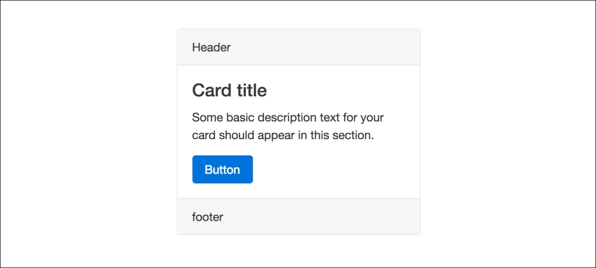
Easy as that, we've now also included a footer with our Card. Next, let's learn a way to apply a different look and feel to our Card.
In some cases, you may want a different look and feel for your Card to make it stand out more. There are some CSS classes included with Bootstrap that will allow you to inverse the color scheme. Let's take a look at the code to apply this style:
<div class="card card-inverse" style="background:#000;">
  <div class="card-block">
    <h4 class="card-title">Card title</h4>
    <p class="card-text">Some basic description text for your card should appear in this section.</p>
    <a href="#" class="btn btn-primary">Button</a>
  </div>
</div>
Again, this variation is pretty easy to apply with a couple of small changes:
- On the
<div>with the.cardclass, add a second class named.card-inverse. - This will only inverse the text in the card. You need to set the
background coloryourself. For speed, I just did an inline CSS style in the demo code. I'd recommend actually creating a CSS class in your stylesheet for your own project, which is a nicer way to do things.
That's all you need to do. Once you're done, your card should look like this:

In this case, you do need to specify the custom background color. However, Bootstrap does have some background color variations that you can use if you want to add an additional CSS class. The naming convention for these options is just like buttons and labels. Let's take a look at what the code will look like:
<div class="card card-inverse card-primary">
  <div class="card-block">
    <h4 class="card-title">Card title</h4>
    <p class="card-text">Some basic description text for your card should appear in this section.</p>
  </div>
</div>
<div class="card card-inverse card-success">
  <div class="card-block">
    <h4 class="card-title">Card title</h4>
    <p class="card-text">Some basic description text for your card should appear in this section.</p>
  </div>
</div>
<div class="card card-inverse card-info">
  <div class="card-block">
    <h4 class="card-title">Card title</h4>
    <p class="card-text">Some basic description text for your card should appear in this section.</p>
  </div>
</div>
<div class="card card-inverse card-warning">
  <div class="card-block">
    <h4 class="card-title">Card title</h4>
    <p class="card-text">Some basic description text for your card should appear in this section.</p>
  </div>
</div>
<div class="card card-inverse card-danger">
  <div class="card-block">
    <h4 class="card-title">Card title</h4>
    <p class="card-text">Some basic description text for your card should appear in this section.</p>
  </div>
</div>
This is a bunch of code, but there are only a couple of things that change from our previous card example:
- All I've done is add an additional CSS class to the
<div>with our base.cardclass on it. Let's review each one in the following points. - The Primary card uses the
.card-primaryclass and is blue. - The Success card uses the
.card-successclass and is green. - The Info card uses the
.card-infoclass and is light blue. - The Warning card uses the
.card-warningclass and is yellow. - The Danger card uses the
.card-dangerclass and is red.
Once you've set up the above code, your cards should look like this in the browser:
That concludes the basic and advanced styling you can do with the Card component. Why don't we take a break from learning for a bit and actually build some Cards in our blog project.
Let's jump back into our project by adding a simple Card component to the Contact page. Reopen contact.ejs in your text editor and head down to the main body that we recently updated with a contact form. Find the following column code for that section:
<div class="col-md-12">
We're going to split this full width column into two separate columns. Change the class on the previous snippet of code to .col-md-8 and add a new <div> with a class of .col-md-4 on it. When you're done, the body of the page code should now look like this:
<div class="col-md-8">
      <form>
        <fieldset class="form-group">
          <label>Email</label>
          <input type="email" class="form-control" placeholder="Enter email">
          <small class="text-muted">We'll never share your email with anyone else.</small>
        </fieldset>
        <fieldset class="form-group">
          <label>Name</label>
          <input type="text" class="form-control" placeholder="Name">
        </fieldset>
        <fieldset class="form-group">
          <label>Message</label>
          <textarea class="form-control" rows="3"></textarea>
        </fieldset>
        <button type="submit" class="btn btn-primary">Submit</button>
      </form>
    </div>
    <div class="col-md-4">
    </div>
Now that the column is set up, let's insert a Card component into our new column. Enter the following code into the second column in the layout:
<div class="card">
<div class="card-header">
Address & Phone
</div>
<div class="card-block">
<ul class="list-unstyled">
<li>Mike Smith</li>
<li>1234 Street Name</li>
<li>Vancouver, BC</li>
<li>Canada V7V 1V1</li>
<li>604.123.1234</li>
</ul>
</div>
</div>
Once you've inserted the Card component code, save your file and check it out in a browser. It should look like this:
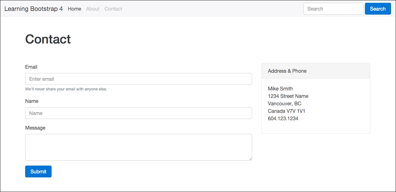
Now the Contact page is starting to take more shape. Let's add the Card component to a few other pages before we move on to our next Content component.