Table of Contents for
Bootstrap 4 – Responsive Web Design
 Bootstrap 4 – Responsive Web Design
Published by
Packt Publishing, 2017
Bootstrap 4 – Responsive Web Design
Published by
Packt Publishing, 2017
- Cover
- Table of Contents
- Bootstrap 4 – Responsive Web Design
- Bootstrap 4 – Responsive Web Design
- Credits
- Preface
- What you need for this learning path
- Who this learning path is for
- Reader feedback
- Customer support
- 1. Module 1
- 1. Getting Started
- Setting up the framework
- Building our first Bootstrap example
- Optionally using the CDN setup
- Community activity
- Bootstrap and web applications
- Browser compatibility
- Summary
- 2. Creating a Solid Scaffolding
- Building our scaffolding
- Fluid container
- We need some style!
- Manipulating tables
- Like a boss!
- Final thoughts
- Summary
- 3. Yes, You Should Go Mobile First
- Bootstrap and the mobile-first design
- How to debug different viewports at the browser
- Cleaning up the mess
- Creating the landing page for different devices
- Summary
- 4. Applying the Bootstrap Style
- Summary
- 5. Making It Fancy
- Paying attention to your navigation
- Dropping it down
- Making an input grouping
- Getting ready for flexbox!
- Summary
- 6. Can You Build a Web App?
- Adding the navigation
- Do a grid again
- Playing the cards
- Implementing the main content
- Creating breadcrumbs
- Finishing with the right-hand-side content
- Summary
- 7. Of Course, You Can Build a Web App!
- Waiting for the progress bar
- Creating a settings page
- Summary
- 8. Working with JavaScript
- Awesome Bootstrap modals
- Creating our custom modal
- A tool for your tip
- Pop it all over
- Making the menu affix
- Finishing the web app
- Summary
- 9. Entering in the Advanced Mode
- The last navigation bar with flexbox
- Filling the main fluid content
- Filling the main content
- Overhead loading
- Fixing the toggle button for mobile
- Summary
- 10. Bringing Components to Life
- Fixing the mobile viewport
- Learning more advanced plugins
- Summary
- 11. Making It Your Taste
- Working with plugin customization
- The additional Bootstrap plugins
- Creating our Bootstrap plugin
- Defining the plugin methods
- Creating additional plugin methods
- Summary
- 2. Module 2
- 1. Introducing Bootstrap 4
- Summary
- 2. Using Bootstrap Build Tools
- Download the Bootstrap source files
- Setting up the blog project
- Setting up the JSON files
- Creating our first page template
- Summary
- 3. Jumping into Flexbox
- Ordering your Flexbox
- Wrapping your Flexbox
- Setting up the Bootstrap Flexbox layout grid
- Setting up a Flexbox project
- Designing a single blog post
- Summary
- 4. Working with Layouts
- Inserting rows into your layout
- Adding columns to your layout
- Choosing a column class
- Creating a simple three-column layout
- Mixing column classes for different devices
- Coding the blog home page
- Using responsive utility classes
- Summary
- 5. Working with Content
- Learning to use typography
- Customizing headings
- How to style images
- Coding tables
- Summary
- 6. Playing with Components
- Basic button examples
- Creating outlined buttons
- Checkbox and radio buttons
- Coding forms in Bootstrap 4
- Creating an inline form
- Adding validation to inputs
- Using the Jumbotron component
- Adding the Label component
- Using the Alerts component
- Using Cards for layout
- Updating the Blog index page
- How to use the Navs component
- Adding Breadcrumbs to a page
- Using the Pagination component
- How to use the List Group component
- Summary
- 7. Extending Bootstrap with JavaScript Plugins
- Coding Tooltips
- Avoiding collisions with our components
- Using Popover components
- Using the Collapse component
- Coding an Accordion with the Collapse component
- Coding a Bootstrap Carousel
- Summary
- 8. Throwing in Some Sass
- Using Sass in the blog project
- Importing partials in Sass
- Creating a collection of variables
- Customizing components
- Writing a theme
- Summary
- 9. Migrating from Version 3
- Big changes in version 4
- Updating your variables
- Additional global changes
- Other font updates
- Migrating components
- Migrating JavaScript
- Miscellaneous migration changes
- Summary
- 3. Module 3
- 1. Revving Up Bootstrap
- What Bootstrap 4 Alpha 4 has to offer
- Setting up our project
- Summary
- 2. Making a Style Statement
- Image elements
- Responsive utilities
- Helper classes
- Text alignment and transformation
- Summary
- 3. Building the Layout
- Adding Bootstrap components
- Summary
- 4. On Navigation, Footers, Alerts, and Content
- Improving navigation using Scrollspy
- Customizing scroll speed
- Icons
- Using and customizing alerts
- Creating a footer
- Creating and customizing forms
- Form validation
- Progress indicators
- Adding content using media objects
- Figures
- Quotes
- Abbreviations
- Summary
- 5. Speeding Up Development Using jQuery Plugins
- Enhanced pagination using bootpag
- Displaying images using Bootstrap Lightbox
- Improving our price list with DataTables
- Summary
- 6. Customizing Your Plugins
- Customizing plugins
- Writing a custom Bootstrap jQuery plugin
- Summary
- 7. Integrating Bootstrap with Third-Party Plugins
- Hover
- Summary
- 8. Optimizing Your Website
- Minifying CSS and JavaScript
- Introducing Grunt
- Running tasks automatically
- Stripping our website of unused CSS
- JavaScript file concatenation
- Summary
- 9. Integrating with AngularJS and React
- Introducing React
- Summary
- Bibliography
- Index
Bootstrap is a web development framework that helps developers build web interfaces. Originally conceived at Twitter in 2011 by Mark Otto and Jacob Thornton, the framework is now open source and has grown to be one of the most popular web development frameworks to date. Being freely available for private, educational, and commercial use meant that Bootstrap quickly grew in popularity. Today, thousands of organizations rely on Bootstrap, including NASA, Walmart, and Bloomberg. According to BuiltWith.com , over 10% of the world's top 1 million websites are built using Bootstrap (http://trends.builtwith.com/docinfo/Twitter-Bootstrap). As such, knowing how to use Bootstrap will be an important skill and will serve as a powerful addition to any web developer's tool belt.
The framework itself consists of a mixture of JavaScript and CSS, and provides developers with all the essential components required to develop a fully functioning web user interface. Over the course of this book, we will be introducing you to all of the most essential features that Bootstrap has to offer by teaching you how to use the framework to build a complete website from scratch. As CSS and HTML alone are already the subject of entire books in themselves, we assume that you, the reader, has at least a basic knowledge of HTML, CSS, and JavaScript.
We begin this chapter by introducing you to our demo website, MyPhoto. This website will accompany us throughout this book, and serve as a practical point of reference. Therefore, all lessons learned will be taught within the context of MyPhoto.
We will then discuss the Bootstrap framework, listing its features and contrasting the current release to the last major release (Bootstrap 3).
Last but not least, this chapter will help you set up your development environment. To ensure equal footing, we will guide you towards installing the right build tools, and precisely detail the various ways in which you can integrate Bootstrap into a project. More advanced readers may safely skip this last part and continue to Chapter 2, Making a Style Statement.
To summarize, this chapter will do the following:
- Introduce you to what exactly we will be doing
- Explain what is new in the latest version of Bootstrap, and how the latest version differs to the previous major release
- Show you how to include Bootstrap in our web project
This book will teach you how to build a complete Bootstrap website from scratch. Starting with a simple layout in
Chapter 2
, Making a Style Statement and
Chapter 3
, Building the Layout, we will build and improve the website's various sections as we progress through each chapter. The concept behind our website is simple: to develop a landing page for photographers. Using this landing page, (hypothetical) users will be able to exhibit their wares and services. While building our website, we will be making use of the same third-party tools and libraries that you would if you were working as a professional software developer. We chose these tools and plugins specifically because of their widespread use. Learning how to use and integrate them will save you a lot of work when developing websites in the future. Specifically, the tools that we will use to assist us throughout the development of MyPhoto are Bower, node package manager (npm), and Grunt.
From a development perspective, the construction of MyPhoto will teach you how to use and apply all of the essential user interface concepts and components required to build a fully functioning website. Among other things, you will learn how to do the following:
- Use the Bootstrap grid system to structure the information presented on your website
- Create a fixed, branded, navigation bar with animated scroll effects
- Use an image carousel for displaying different photographs, implemented using Bootstrap's
carousel.jsand jumbotron (jumbotron is a design principle for displaying important content). It should be noted that carousels are becoming an increasingly unpopular design choice; however, they are still heavily used and are an important feature of Bootstrap. As such, we do not argue for or against the use of carousels as their effectiveness depends very much on how they are used, rather than on whether they are used. - Build custom tabs that allow users to navigate across different contents
- Use and apply Bootstrap's modal dialogs
- Apply a fixed page footer
- Create forms for data entry using Bootstrap's input controls (text fields, text areas, and buttons) and apply Bootstrap's input validation styles
- Make best use of Bootstrap's context classes
- Create alert messages and learn how to customize them
- Rapidly develop interactive data tables for displaying product information
- Use drop-down menus, custom fonts, and icons
In addition to learning how to use Bootstrap 4, the development of MyPhoto will introduce you to a range of third-party libraries such as Scrollspy (for scroll animations), SalvattoreJS (a library for complementing our Bootstrap grid), Animate.css (for beautiful CSS animations, such as fade-in effects at
https://daneden.github.io/animate.css/
), and Bootstrap DataTables (for rapidly displaying data in tabular form).
The website itself will consist of different sections:
- A Welcome section
- An About section
- A Services section
- A Gallery section
- A Contact Us section
The development of each section is intended to teach you how to use a distinct set of features found in third-party libraries. For example, by developing the Welcome section, you will learn how to use Bootstrap's jumbotron and alert dialogs along with different font and text styles, while the About section will show you how to use cards. The Services section of our project introduces you to Bootstrap's custom tabs. That is, you will learn how to use Bootstrap's tabs to display a range of different services offered by our website.
Following on from the Services section, you will need to use rich imagery to really show off the website's sample services. You will achieve this by really mastering Bootstrap's responsive core along with Bootstrap's carousel and third-party jQuery plugins. Last but not least, the Contact Us section will demonstrate how to use Bootstrap's form elements and helper functions. That is, you will learn how to use Bootstrap to create stylish HTML forms, how to use form fields and input groups, and how to perform data validation.
Finally, toward the end of the book, you will learn how to optimize your website, and integrate it with the popular JavaScript frameworks AngularJS (https://angularjs.org/) and React (http://facebook.github.io/react/). As entire books have been written on AngularJS alone, we will only cover the essentials required for the integration itself.
Now that you have glimpsed a brief overview of MyPhoto, let's examine Bootstrap 4 in more detail, and discuss what makes it so different to its predecessor. Take a look at the following screenshot:
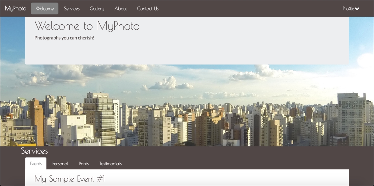
Figure 1.1: A taste of what is to come: the MyPhoto landing page