Table of Contents for
Bootstrap 4 – Responsive Web Design
 Bootstrap 4 – Responsive Web Design
Published by
Packt Publishing, 2017
Bootstrap 4 – Responsive Web Design
Published by
Packt Publishing, 2017
- Cover
- Table of Contents
- Bootstrap 4 – Responsive Web Design
- Bootstrap 4 – Responsive Web Design
- Credits
- Preface
- What you need for this learning path
- Who this learning path is for
- Reader feedback
- Customer support
- 1. Module 1
- 1. Getting Started
- Setting up the framework
- Building our first Bootstrap example
- Optionally using the CDN setup
- Community activity
- Bootstrap and web applications
- Browser compatibility
- Summary
- 2. Creating a Solid Scaffolding
- Building our scaffolding
- Fluid container
- We need some style!
- Manipulating tables
- Like a boss!
- Final thoughts
- Summary
- 3. Yes, You Should Go Mobile First
- Bootstrap and the mobile-first design
- How to debug different viewports at the browser
- Cleaning up the mess
- Creating the landing page for different devices
- Summary
- 4. Applying the Bootstrap Style
- Summary
- 5. Making It Fancy
- Paying attention to your navigation
- Dropping it down
- Making an input grouping
- Getting ready for flexbox!
- Summary
- 6. Can You Build a Web App?
- Adding the navigation
- Do a grid again
- Playing the cards
- Implementing the main content
- Creating breadcrumbs
- Finishing with the right-hand-side content
- Summary
- 7. Of Course, You Can Build a Web App!
- Waiting for the progress bar
- Creating a settings page
- Summary
- 8. Working with JavaScript
- Awesome Bootstrap modals
- Creating our custom modal
- A tool for your tip
- Pop it all over
- Making the menu affix
- Finishing the web app
- Summary
- 9. Entering in the Advanced Mode
- The last navigation bar with flexbox
- Filling the main fluid content
- Filling the main content
- Overhead loading
- Fixing the toggle button for mobile
- Summary
- 10. Bringing Components to Life
- Fixing the mobile viewport
- Learning more advanced plugins
- Summary
- 11. Making It Your Taste
- Working with plugin customization
- The additional Bootstrap plugins
- Creating our Bootstrap plugin
- Defining the plugin methods
- Creating additional plugin methods
- Summary
- 2. Module 2
- 1. Introducing Bootstrap 4
- Summary
- 2. Using Bootstrap Build Tools
- Download the Bootstrap source files
- Setting up the blog project
- Setting up the JSON files
- Creating our first page template
- Summary
- 3. Jumping into Flexbox
- Ordering your Flexbox
- Wrapping your Flexbox
- Setting up the Bootstrap Flexbox layout grid
- Setting up a Flexbox project
- Designing a single blog post
- Summary
- 4. Working with Layouts
- Inserting rows into your layout
- Adding columns to your layout
- Choosing a column class
- Creating a simple three-column layout
- Mixing column classes for different devices
- Coding the blog home page
- Using responsive utility classes
- Summary
- 5. Working with Content
- Learning to use typography
- Customizing headings
- How to style images
- Coding tables
- Summary
- 6. Playing with Components
- Basic button examples
- Creating outlined buttons
- Checkbox and radio buttons
- Coding forms in Bootstrap 4
- Creating an inline form
- Adding validation to inputs
- Using the Jumbotron component
- Adding the Label component
- Using the Alerts component
- Using Cards for layout
- Updating the Blog index page
- How to use the Navs component
- Adding Breadcrumbs to a page
- Using the Pagination component
- How to use the List Group component
- Summary
- 7. Extending Bootstrap with JavaScript Plugins
- Coding Tooltips
- Avoiding collisions with our components
- Using Popover components
- Using the Collapse component
- Coding an Accordion with the Collapse component
- Coding a Bootstrap Carousel
- Summary
- 8. Throwing in Some Sass
- Using Sass in the blog project
- Importing partials in Sass
- Creating a collection of variables
- Customizing components
- Writing a theme
- Summary
- 9. Migrating from Version 3
- Big changes in version 4
- Updating your variables
- Additional global changes
- Other font updates
- Migrating components
- Migrating JavaScript
- Miscellaneous migration changes
- Summary
- 3. Module 3
- 1. Revving Up Bootstrap
- What Bootstrap 4 Alpha 4 has to offer
- Setting up our project
- Summary
- 2. Making a Style Statement
- Image elements
- Responsive utilities
- Helper classes
- Text alignment and transformation
- Summary
- 3. Building the Layout
- Adding Bootstrap components
- Summary
- 4. On Navigation, Footers, Alerts, and Content
- Improving navigation using Scrollspy
- Customizing scroll speed
- Icons
- Using and customizing alerts
- Creating a footer
- Creating and customizing forms
- Form validation
- Progress indicators
- Adding content using media objects
- Figures
- Quotes
- Abbreviations
- Summary
- 5. Speeding Up Development Using jQuery Plugins
- Enhanced pagination using bootpag
- Displaying images using Bootstrap Lightbox
- Improving our price list with DataTables
- Summary
- 6. Customizing Your Plugins
- Customizing plugins
- Writing a custom Bootstrap jQuery plugin
- Summary
- 7. Integrating Bootstrap with Third-Party Plugins
- Hover
- Summary
- 8. Optimizing Your Website
- Minifying CSS and JavaScript
- Introducing Grunt
- Running tasks automatically
- Stripping our website of unused CSS
- JavaScript file concatenation
- Summary
- 9. Integrating with AngularJS and React
- Introducing React
- Summary
- Bibliography
- Index
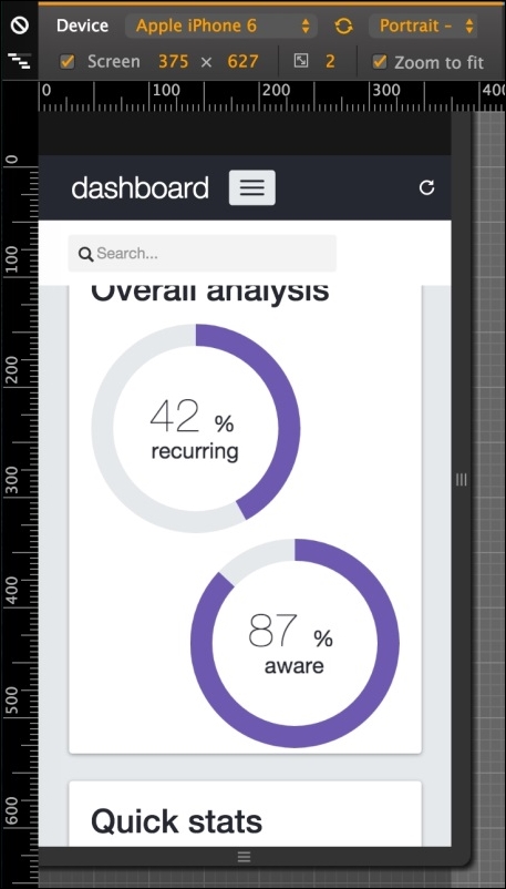
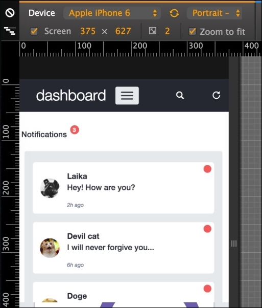
If you resize the dashboard to a mobile visualization (treated as an extra-small viewport in Bootstrap,) you should see some problems with the elements that are not appearing correctly. As shown in the next screenshot, note that the search appears and the card with the round chart is completely unaligned.
In this visualization mode, we are using the viewport of iPhone 6 in portrait orientation in the Chrome developer inspector:
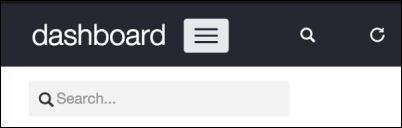
Regarding the search bar, it will be better if this bar appears just when required, for example, when clicking on a button. So, next to the refresh button, let's create another icon to toggle the search bar.
The HTML for this section must be like the following code:
<div class="col-sm-3 top-left-menu">
  <div class="navbar-header">
    <a class="navbar-brand" href="dashboard.html">
      <h1>dashboard</h1>
    </a>

    <button type="button" class="navbar-toggle collapsed" data-toggle="collapse" data-target="#nav-menu" aria-expanded="false">
      <span class="sr-only">Toggle navigation</span>
      <span class="icon-bar"></span>
      <span class="icon-bar"></span>
      <span class="icon-bar"></span>
    </button>
  </div>
  <a href="#" id="search-icon" data-toggle="tooltip" data-placement="bottom" data-delay="500" title="Display search bar" class="header-buttons pull-right visible-xs">
    <span class="glyphicon glyphicon-search" aria-hidden="true"></span>
  </a>
  <a href="#" data-toggle="tooltip" data-placement="bottom" data-delay="500" title="Refresh data" class="header-buttons pull-right">
    <span class="glyphicon glyphicon-repeat" aria-hidden="true"></span>
  </a>
</div>
Let's discuss this code. First, we made a change in the class name. The link in the refresh icon was a .header-refresh. Now, since we have multiple header buttons, we changed it to a .header-button class for generalization.
We also added the Bootstrap tooltip for this button, just as we did for the refresh icon, displaying the message: "Display search bar".
To complete the changes, replace the class names in the CSS as well:
nav .header-buttons {
  margin-left: auto;
  color: #FFF;
}
Then the header should look like this:
Now we have to fix the search bar. Let's change the classes on the form#search. Replace the classes from .hidden-sm.col-md-3 to just .col-sm-3 for better visualization.
Now, let's hide the form using a media query in CSS for extra small viewports:
@media(max-width:48em){
  form#search {
    display: none;
  }
}
To toggle the visualization of the search input, let's add some JavaScript events. The first one is for opening the search when we click on the magnifier icon at the header, identified by #search-icon. So in our main.js file, we add the following function:
$('#search-icon').on('click', function(e) {
    e.preventDefault();
    $('form#search').slideDown('fast');
    $('form#search input:first').focus();
});
What this will do first is prevent the default click action with the e.preventDefault() caller. Then, we use the .slideDown function from jQuery, which slides down an element. In this case, it will toggle form#search.
After toggling the form, we add focus to the input, which will open the keyboard if we are accessing the page from a mobile phone.
To increment that, it would be nice if the search bar can hide when the user blurs the focus on the search input. To do this, add the following event handler to the JavaScript:
$('form#search input').on('blur', function(e) {
    if($('#search-icon').is(':visible')) {
        $('form#search').slideUp('fast');
    }
});
What we are doing here is using the blur event, which is triggered whenever the element loses the focus. The trigger performs a check to find out whether the #search-icon is visible, meaning that we are in the extra small viewport, and then hides the search bar using the slideUp function, doing the opposite of what the slideDown function does.
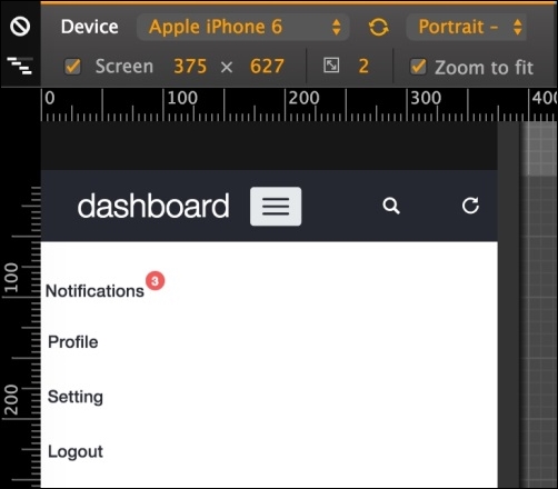
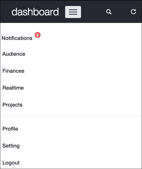
Click on the collapse toggle navigation (the hamburger button) and you will see how the #nav-menu looks so messy, as shown in the next screenshot. We must fix it just like the way we did in the last web application example:
To do this, we will first need to remove the .pull-right class from #nav-menu. The .pull-* classes add a float to the element by applying the !important flag, which cannot be overridden. In this case, we must override this style rule to remove the .pull-right class and add the float to the current element style rule:
#nav-menu {
  float: right;
}
Create a media query for extra small devices for #nav-menu and remove the float: right:
@media(max-width:48em){
  #nav-menu {
    float: none;
  }
}
After that, we must hide #nav-profile and move its button to the #nav-menu list. First, add the .hidden-xs class to the profile element:
<div id="nav-profile" class="btn-group pull-right hidden-xs">
    …
</div>
This will prevent the element from appearing for extra small devices using the Bootstrap viewport helper class. Then, in #nav-menu > ul, append the options that were in the #nav-profile drop-down button:
<div id="nav-menu" class="collapse navbar-collapse">
  <ul class="nav navbar-nav">
    <li>…</li>
    <li class="visible-xs">
      <a href="#">Profile</a>
    </li>
    <li class="visible-xs">
      <a href="settings.html">Setting</a>
    </li>
    <li class="visible-xs">
      <a href="#">Logout</a>
    </li>
  </ul>
</div>
Note that we make this new item list visible only for extra small viewports with the .visible-xs class.
These new item lists must now look just like the notification one, already present in this list. So, append the selector of the new item list to the current CSS style of #btn-notification:
#btn-notifications .btn-link,
#nav-menu li a {
  padding-top: 1.5rem;
  color: #252830;
  font-weight: 500;
}
The opened list should look like this:
Now, try to change the viewport and see how the elements on the header correctly change its visualization. The #nav-profile will appear only for small-to-large viewports and will shrink into #nav-menu ul in a small visualization for extra small viewports.
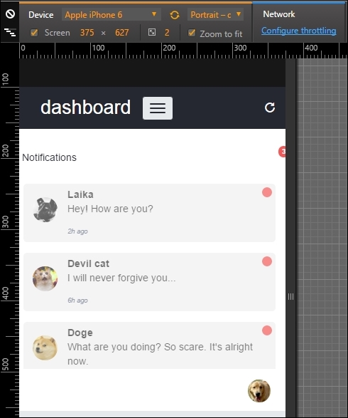
If you click on the notification list to open it, you will see three problems: firstly, the badge holding the number of new notifications jumps to the right portion; then the notification button is not filling the entire width; and finally, the notification list can appear a little nicer when opened.
To fix the jumping badge on the notification button, just add the following CSS:
@media(max-width:48em){
  #nav-menu #btn-notifications > .badge {
    right: inherit;
    left: 10rem;
  }
}
Note that we use a media query to change the position of the badge for extra small viewports only.
To modify the notification button's width, we have to create a media query as well. So, add this CSS style to it:
@media(max-width:48em){
  #btn-notifications,
  #btn-notifications > button {
    width: 100%;
    text-align: left;
  }
}
This style will change the width for both the notification button dropdown and the button itself.
Finally, the style for the notification list must be changed. We create the next CSS rule in our main.css file, and it should instantly look good:
@media(max-width:48em){
  #notification-list {
    margin: 1.25rem;
    margin-left: 2rem;
    background-color: #e5e9ec;
  }

  #notification-list a {
    background-color: #FFF;
    opacity: 1;
  }
}
Awesome! Update your web browser and #notification-list should look like what is shown in this screenshot:
Where are the items of the left menu? If you check out the HTML of #side-menu, you will see that we have added the .hidden-xs class to it. So, we must move the navigation options to another place in this extra small viewport.
Let's add the links to #nav-menu ul just as we did for #nav-profile:
<div id="nav-menu" class="collapse navbar-collapse">
  <ul class="nav navbar-nav">
    <li>…</li>
    <li class="visible-xs">
      <a href="#">Audience</a>
    </li>
    <li class="visible-xs">
      <a href="#">Finances</a>
    </li>
    <li class="visible-xs">
      <a href="#">Realtime</a>
    </li>
    <li class="visible-xs">
      <a href="#">Projects</a>
    </li>

    <li role="separator" class="divider visible-xs"></li>
    …
  </ul>
</div>
Modify the maximum height of #nav-menu when collapse is toggled with the style:
#nav-menu.navbar-collapse {
  max-height: 39rem;
}
For the .divider element in the list, create the following CSS:
#nav-menu .divider {
  height: 0.1rem;
  margin: 0.9rem 0;
  overflow: hidden;
  background-color: #e5e5e5;
}
Notice that in #nav-menu ul, the notification button will appear above the new elements added and the options from #nav-profile will appear below. The next screenshot represents the visualization of the final arrangement of the #nav-menu toggle:
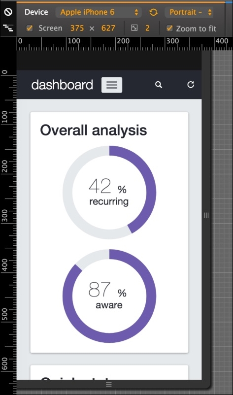
The .round-charts inside the #pie-charts element does not appear correctly aligned. However, we can quickly fix this with two CSS rules using media queries. So, create the following style:
@media(max-width:48em){
  .round-chart,
  .round-chart canvas {
    display: block;
    margin: auto;
  }

  .round-chart + .round-chart {
    margin-top: 2rem;
    float: none;
  }
}
Refresh the web page and see the result, like the following screenshot:
Great! Now we have our dashboard nailed for every viewport and device! That was a thorough task, but with a great payoff, because we have now created a complete dashboard. Let's move forward to some other pages in our example.