Table of Contents for
Bootstrap 4 – Responsive Web Design
 Bootstrap 4 – Responsive Web Design
Published by
Packt Publishing, 2017
Bootstrap 4 – Responsive Web Design
Published by
Packt Publishing, 2017
- Cover
- Table of Contents
- Bootstrap 4 – Responsive Web Design
- Bootstrap 4 – Responsive Web Design
- Credits
- Preface
- What you need for this learning path
- Who this learning path is for
- Reader feedback
- Customer support
- 1. Module 1
- 1. Getting Started
- Setting up the framework
- Building our first Bootstrap example
- Optionally using the CDN setup
- Community activity
- Bootstrap and web applications
- Browser compatibility
- Summary
- 2. Creating a Solid Scaffolding
- Building our scaffolding
- Fluid container
- We need some style!
- Manipulating tables
- Like a boss!
- Final thoughts
- Summary
- 3. Yes, You Should Go Mobile First
- Bootstrap and the mobile-first design
- How to debug different viewports at the browser
- Cleaning up the mess
- Creating the landing page for different devices
- Summary
- 4. Applying the Bootstrap Style
- Summary
- 5. Making It Fancy
- Paying attention to your navigation
- Dropping it down
- Making an input grouping
- Getting ready for flexbox!
- Summary
- 6. Can You Build a Web App?
- Adding the navigation
- Do a grid again
- Playing the cards
- Implementing the main content
- Creating breadcrumbs
- Finishing with the right-hand-side content
- Summary
- 7. Of Course, You Can Build a Web App!
- Waiting for the progress bar
- Creating a settings page
- Summary
- 8. Working with JavaScript
- Awesome Bootstrap modals
- Creating our custom modal
- A tool for your tip
- Pop it all over
- Making the menu affix
- Finishing the web app
- Summary
- 9. Entering in the Advanced Mode
- The last navigation bar with flexbox
- Filling the main fluid content
- Filling the main content
- Overhead loading
- Fixing the toggle button for mobile
- Summary
- 10. Bringing Components to Life
- Fixing the mobile viewport
- Learning more advanced plugins
- Summary
- 11. Making It Your Taste
- Working with plugin customization
- The additional Bootstrap plugins
- Creating our Bootstrap plugin
- Defining the plugin methods
- Creating additional plugin methods
- Summary
- 2. Module 2
- 1. Introducing Bootstrap 4
- Summary
- 2. Using Bootstrap Build Tools
- Download the Bootstrap source files
- Setting up the blog project
- Setting up the JSON files
- Creating our first page template
- Summary
- 3. Jumping into Flexbox
- Ordering your Flexbox
- Wrapping your Flexbox
- Setting up the Bootstrap Flexbox layout grid
- Setting up a Flexbox project
- Designing a single blog post
- Summary
- 4. Working with Layouts
- Inserting rows into your layout
- Adding columns to your layout
- Choosing a column class
- Creating a simple three-column layout
- Mixing column classes for different devices
- Coding the blog home page
- Using responsive utility classes
- Summary
- 5. Working with Content
- Learning to use typography
- Customizing headings
- How to style images
- Coding tables
- Summary
- 6. Playing with Components
- Basic button examples
- Creating outlined buttons
- Checkbox and radio buttons
- Coding forms in Bootstrap 4
- Creating an inline form
- Adding validation to inputs
- Using the Jumbotron component
- Adding the Label component
- Using the Alerts component
- Using Cards for layout
- Updating the Blog index page
- How to use the Navs component
- Adding Breadcrumbs to a page
- Using the Pagination component
- How to use the List Group component
- Summary
- 7. Extending Bootstrap with JavaScript Plugins
- Coding Tooltips
- Avoiding collisions with our components
- Using Popover components
- Using the Collapse component
- Coding an Accordion with the Collapse component
- Coding a Bootstrap Carousel
- Summary
- 8. Throwing in Some Sass
- Using Sass in the blog project
- Importing partials in Sass
- Creating a collection of variables
- Customizing components
- Writing a theme
- Summary
- 9. Migrating from Version 3
- Big changes in version 4
- Updating your variables
- Additional global changes
- Other font updates
- Migrating components
- Migrating JavaScript
- Miscellaneous migration changes
- Summary
- 3. Module 3
- 1. Revving Up Bootstrap
- What Bootstrap 4 Alpha 4 has to offer
- Setting up our project
- Summary
- 2. Making a Style Statement
- Image elements
- Responsive utilities
- Helper classes
- Text alignment and transformation
- Summary
- 3. Building the Layout
- Adding Bootstrap components
- Summary
- 4. On Navigation, Footers, Alerts, and Content
- Improving navigation using Scrollspy
- Customizing scroll speed
- Icons
- Using and customizing alerts
- Creating a footer
- Creating and customizing forms
- Form validation
- Progress indicators
- Adding content using media objects
- Figures
- Quotes
- Abbreviations
- Summary
- 5. Speeding Up Development Using jQuery Plugins
- Enhanced pagination using bootpag
- Displaying images using Bootstrap Lightbox
- Improving our price list with DataTables
- Summary
- 6. Customizing Your Plugins
- Customizing plugins
- Writing a custom Bootstrap jQuery plugin
- Summary
- 7. Integrating Bootstrap with Third-Party Plugins
- Hover
- Summary
- 8. Optimizing Your Website
- Minifying CSS and JavaScript
- Introducing Grunt
- Running tasks automatically
- Stripping our website of unused CSS
- JavaScript file concatenation
- Summary
- 9. Integrating with AngularJS and React
- Introducing React
- Summary
- Bibliography
- Index
For our first page template, we're going to create our Home or index page. In the root of the blog project, create a new file called index.ejs. Note this file is not prepended with an underscore like the previous files. With Harp, any file that has the underscore will be compiled into another and ignored when the files are copied into the production directory. For example, you don't want the compiler to spit out layout.html because it's fairly useless with the content of the Home page. You only want to get index.html, which you can deploy to your web server. The basic thing you need to remember is to not include an underscore at the beginning of your page template files. Once you've created the file, insert the following code:
<div class="container">
  <div class="row">
    <div class="col-lg-12">
      <h1>hello world!</h1>
    </div>
  </div>
</div>
To get us started, I'm going to keep this really simple. Here's a quick breakdown of what is happening:
- I've created another
.containerwhich will hold the content for theHomepage - Within the container, there is a full-width column. In that column, I've inserted an
<h1>with ahello world!message
That will be it for now. Later on, we'll build this page out further. Save the file and close it. We've now completed setting up all the basic files for our Harp development environment. The last step is to compile the project and test it out.
When we compile a project in Harp, it will find all the different partial, layout, and template files and combine them into regular HTML, CSS, and JavaScript files. We haven't used any Sass yet but, as with the template files, you can have multiple Sass files that are compiled into a single CSS file that can be used on a production web server. To compile your project, navigate to the root of the blog project in the Terminal. Once you are there, run the following command:
$ harp compile
If everything worked, a new blank line in the terminal will appear. This is good! If the compiler spits out an error, read what it has to say and make the appropriate changes to your template files. A couple of common errors that you might run into are the following:
- Syntax errors in
_harp.jsonor_data.json - Syntax errors for variable or partial names in
_layout.ejs - If you have created additional page templates in the root of your project, and not included them in
_data.json, the compile will fail
Once your compile is successful, head back to the root of the blog project and notice that there is a new www directory. This directory holds all the compiled HTML, CSS, and JavaScript files for your project. When you are ready to deploy your project to a production web server, you would copy these files up with FTP or using another means of file transfer. Every time you run the harp compile command in your project, these files will be updated with any new or edited code.
Harp has a built-in web server that is backed by Node.js. This means you don't need a web hosting account or web server to actually test your project. With a simple command, you can fire up the built-in server and view your project locally. This is also really great if you are working on a project somewhere with no Internet connection. It will allow you to continue building your projects Internet-free. To run the server, head back to the Terminal and make sure you are still in the root directory of your blog project. From there, enter the following command:
$ harp server
In the Terminal, you should see a message that the server is running. You are now free to visit the project in a browser.
Now that the project is up and running on the web server, simply navigate to the following URL to view it: http://localhost:9000.
By default, Harp runs on port 9000 but you can specify a different port by modifying the last command. Go back to the terminal and quit the server by hitting Ctrl + C. Now enter the following command:
$ harp server --port 9001
Using this command, you can invoke any port you would like to use. Head back to the web browser again and change the URL slightly to read http://localhost:9001.
Your project should load for you and look something like this:
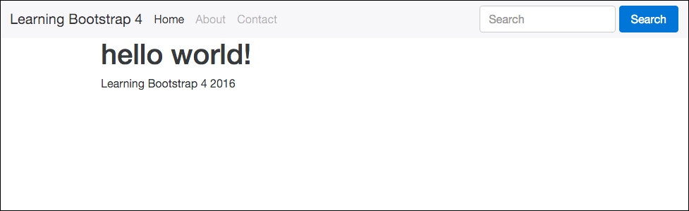
It might not be much to look at right now but it works! Your project is successfully set up and running. In future chapters, we'll add to this page and build some more using additional Bootstrap 4 components.
When building a project with Bootstrap 4, there are two ways you can work with Sass. The first would be by editing the actual Bootstrap framework files and then recompiling them using Grunt. This is useful if you'd like to use something such as Flexbox for your grid layout. I'll discuss this in greater depth in the next chapter. The other way you might want to use Sass is to craft a unique theme that applies a custom look and feel to Bootstrap. This is done in the actual Harp project. Within the css directory, you can include Sass files; when you compile your Harp project, they will be converted to regular CSS, as Harp has a built-in Sass compiler. Then it is just a simple exercise of including those additional files in your layout template. I'll also get into that a little later in the book but I wanted to point out the difference now.