Table of Contents for
Bootstrap 4 – Responsive Web Design
 Bootstrap 4 – Responsive Web Design
Published by
Packt Publishing, 2017
Bootstrap 4 – Responsive Web Design
Published by
Packt Publishing, 2017
- Cover
- Table of Contents
- Bootstrap 4 – Responsive Web Design
- Bootstrap 4 – Responsive Web Design
- Credits
- Preface
- What you need for this learning path
- Who this learning path is for
- Reader feedback
- Customer support
- 1. Module 1
- 1. Getting Started
- Setting up the framework
- Building our first Bootstrap example
- Optionally using the CDN setup
- Community activity
- Bootstrap and web applications
- Browser compatibility
- Summary
- 2. Creating a Solid Scaffolding
- Building our scaffolding
- Fluid container
- We need some style!
- Manipulating tables
- Like a boss!
- Final thoughts
- Summary
- 3. Yes, You Should Go Mobile First
- Bootstrap and the mobile-first design
- How to debug different viewports at the browser
- Cleaning up the mess
- Creating the landing page for different devices
- Summary
- 4. Applying the Bootstrap Style
- Summary
- 5. Making It Fancy
- Paying attention to your navigation
- Dropping it down
- Making an input grouping
- Getting ready for flexbox!
- Summary
- 6. Can You Build a Web App?
- Adding the navigation
- Do a grid again
- Playing the cards
- Implementing the main content
- Creating breadcrumbs
- Finishing with the right-hand-side content
- Summary
- 7. Of Course, You Can Build a Web App!
- Waiting for the progress bar
- Creating a settings page
- Summary
- 8. Working with JavaScript
- Awesome Bootstrap modals
- Creating our custom modal
- A tool for your tip
- Pop it all over
- Making the menu affix
- Finishing the web app
- Summary
- 9. Entering in the Advanced Mode
- The last navigation bar with flexbox
- Filling the main fluid content
- Filling the main content
- Overhead loading
- Fixing the toggle button for mobile
- Summary
- 10. Bringing Components to Life
- Fixing the mobile viewport
- Learning more advanced plugins
- Summary
- 11. Making It Your Taste
- Working with plugin customization
- The additional Bootstrap plugins
- Creating our Bootstrap plugin
- Defining the plugin methods
- Creating additional plugin methods
- Summary
- 2. Module 2
- 1. Introducing Bootstrap 4
- Summary
- 2. Using Bootstrap Build Tools
- Download the Bootstrap source files
- Setting up the blog project
- Setting up the JSON files
- Creating our first page template
- Summary
- 3. Jumping into Flexbox
- Ordering your Flexbox
- Wrapping your Flexbox
- Setting up the Bootstrap Flexbox layout grid
- Setting up a Flexbox project
- Designing a single blog post
- Summary
- 4. Working with Layouts
- Inserting rows into your layout
- Adding columns to your layout
- Choosing a column class
- Creating a simple three-column layout
- Mixing column classes for different devices
- Coding the blog home page
- Using responsive utility classes
- Summary
- 5. Working with Content
- Learning to use typography
- Customizing headings
- How to style images
- Coding tables
- Summary
- 6. Playing with Components
- Basic button examples
- Creating outlined buttons
- Checkbox and radio buttons
- Coding forms in Bootstrap 4
- Creating an inline form
- Adding validation to inputs
- Using the Jumbotron component
- Adding the Label component
- Using the Alerts component
- Using Cards for layout
- Updating the Blog index page
- How to use the Navs component
- Adding Breadcrumbs to a page
- Using the Pagination component
- How to use the List Group component
- Summary
- 7. Extending Bootstrap with JavaScript Plugins
- Coding Tooltips
- Avoiding collisions with our components
- Using Popover components
- Using the Collapse component
- Coding an Accordion with the Collapse component
- Coding a Bootstrap Carousel
- Summary
- 8. Throwing in Some Sass
- Using Sass in the blog project
- Importing partials in Sass
- Creating a collection of variables
- Customizing components
- Writing a theme
- Summary
- 9. Migrating from Version 3
- Big changes in version 4
- Updating your variables
- Additional global changes
- Other font updates
- Migrating components
- Migrating JavaScript
- Miscellaneous migration changes
- Summary
- 3. Module 3
- 1. Revving Up Bootstrap
- What Bootstrap 4 Alpha 4 has to offer
- Setting up our project
- Summary
- 2. Making a Style Statement
- Image elements
- Responsive utilities
- Helper classes
- Text alignment and transformation
- Summary
- 3. Building the Layout
- Adding Bootstrap components
- Summary
- 4. On Navigation, Footers, Alerts, and Content
- Improving navigation using Scrollspy
- Customizing scroll speed
- Icons
- Using and customizing alerts
- Creating a footer
- Creating and customizing forms
- Form validation
- Progress indicators
- Adding content using media objects
- Figures
- Quotes
- Abbreviations
- Summary
- 5. Speeding Up Development Using jQuery Plugins
- Enhanced pagination using bootpag
- Displaying images using Bootstrap Lightbox
- Improving our price list with DataTables
- Summary
- 6. Customizing Your Plugins
- Customizing plugins
- Writing a custom Bootstrap jQuery plugin
- Summary
- 7. Integrating Bootstrap with Third-Party Plugins
- Hover
- Summary
- 8. Optimizing Your Website
- Minifying CSS and JavaScript
- Introducing Grunt
- Running tasks automatically
- Stripping our website of unused CSS
- JavaScript file concatenation
- Summary
- 9. Integrating with AngularJS and React
- Introducing React
- Summary
- Bibliography
- Index
Now, we will start using some of the CSS provided for Bootstrap to make our components responsive and more elegant. Our main goal is to make our grid page like what is shown in this screenshot:
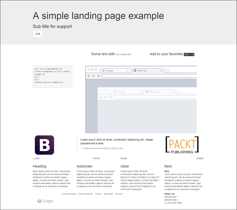
Let's break down each row and learn about typography and some other components. We will do this without using a single custom line of CSS!
Getting started with the first row, you may see that this row has a gray background, which is not present in the rest of the layout. To create this, we must make a change in our grid by creating a new .container for this row. So, create another .container and place it inside the first row:
<div class="container">
  <!-- row 1 -->
  <div class="row">
    <header class="col-md-12">
    </header>
  </div>
</div>
<div class="container">
  <!—- the others rows (2 to 7) -->
</div>
Now, to make the gray area, we will use a class in Bootstrap called .jumbotron. The jumbotron is a flexible Bootstrap component that can extend to the entire viewport to showcase some content, in this case the header. So, wrap the container inside a div.jumbotron:
<div class="jumbotron">
  <div class="container">
    <!-- row 1 -->
    <div class="row">
      <header class="col-md-12">
      </header>
    </div>
  </div>
</div>
Inside the header, as we can see in the layout, we must create a title, a subtitle, and a button. For the title, let's use the <h1> and <h2> heading elements. For the button, let's create a link with the .btn, .btn-default, and .btn-lg classes. We will mention more about these components in the next subsections:
<div class="jumbotron">
  <div class="container">
    <!-- row 1 -->
    <div class="row">
      <header class="col-md-12">
        <h1>A simple landing page example</h1>
        <h2>Sub title for support</h2>
        <a class="btn btn-default btn-lg" href="#" role="button">
          Link
        </a>
      </header>
    </div>
  </div>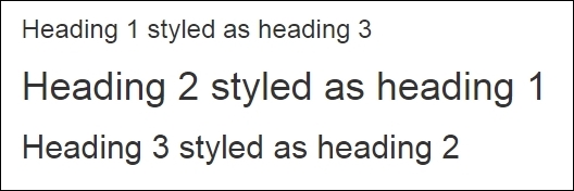
</div>Bootstrap provides styled headings from h1 to h6. You should always use them in order of importance, from <h1> to <h6> (the least important).
Tip
Do you know why headings are important?
Heading are very important for Search Engine Optimization (SEO). They suggest for search engines what is important in your page context. You must keep the hierarchy for page coherence, and do not skip any tag (that is, jump from heading 3 to heading 5). Otherwise, the structure will be broken and not relevant for SEO.
The heading has classes for identifying its style. So, if your most important phrase is not the biggest one at times, you can swap the sizes by adding heading classes, just as in the following example:
<h1 class="h3">Heading 1 styled as heading 3</h1>
<h2 class="h1">Heading 2 styled as heading 1</h2>
<h3 class="h2">Heading 3 styled as heading 2</h3>
The other element of the first row is a button! We can apply button classes for hyperlinks, button elements, and inputs. To make one of these elements a button, just add the .btn class followed by the kind of button, in this case the kind .btn-default, which is a blue button. The next table shows every possibility of color classes for a button:
|
Button class |
Output |
|---|---|
|
|
 |
|
|
 |
|
|
 |
|
|
 |
|
|
 |
|
|
 |
|
|
 |
We have also added the .btn-lg class in the first row button. This class will increase the size of the button. Bootstrap also provides some other button size classes, such as .btn-sm for small buttons and .btn-xs for even smaller ones.
You can also make a button span the full width of the parent element with the .btn-block class, changing the display of the button to block.
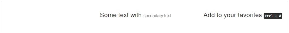
With regards to the second row, we have a row that contains a heading and complementary small text after that.
To add lighter and secondary text to the heading, we can add a <small> tag or any other tag with the .small class inside the heading. The HTML for the first column in the second row should be like the following:
<div class="row">
  <div class="col-md-offset-4 col-md-4">
    <h3>
      Some text with <small>secondary text</small>
    </h3>
  </div>
  <div class="col-md-4">
    <h3>
      Add to your favorites
      <small>
        <kbd><kbd>ctrl</kbd> + <kbd>d</kbd></kbd>
      </small>
    </h3>
  </div>
</div>
Note that inside the small tag, we have added a <kbd> tag, which is an HTML element that creates a user-like input keyboard. Refresh the web browser and you will see this row as shown here:
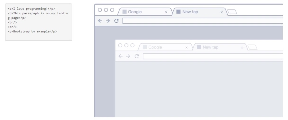
For the third row, we have a code snippet and an image. To create a code snippet, use the <pre> tag for multiple lines of code. The <pre> tag is present in HTML for creating preformatted text, such as a code snippet. You have the option of adding the .pre-scrollable class, which will add a scrollbar if the code snippet reaches the maximum height of 350 px (or 21.8 em).
For this row, in the right column, we have an image. For that, just create an <img> tag and add the .img-responsive class, which will make the images automatically responsive-friendly to the viewport. The HTML for the third row is as follows:
<div class="row">
<div class="col-md-3">
<pre><p>I love programming!</p>
<p>This paragraph is on my landing page</p>
<br/>
<br/>
<p>Bootstrap by example</p>
</pre>
</div>
<div class="col-md-9">
<img src="imgs/center.png" class="img-responsive">
</div>
</div>Refresh your browser and you will see the result of this row as shown in the following screenshot:
In the fourth row, we have images in both the left and right columns and a testimonial in the middle. Bootstrap provides a typographic theme for doing block quotes, so just create a <blockquote> tag. Inside it, create a <footer> tag to identify the source, and wrap the name in a <cite> tag, like this:
<div class="row">
  <div class="col-md-3">
    <img src="imgs/bs.png" class="img-responsive">
  </div>
  <div class="col-md-6">
    <blockquote>
      <p>Lorem ipsum dolor sit amet, consectetur adipiscing elit. Integer posuere erat a ante.</p>
      <footer>Testimonial from someone at <cite title="Source Title">Source Title</cite></footer>
    </blockquote>
  </div>
  <div class="col-md-3">
    <img src="imgs/packt.png" class="img-responsive">
  </div>
</div>
Moving on, we must advance to the fifth row. This row is here just to show the different ways in which we can apply typography and coding elements tags using Bootstrap. Let's go through each one to describe its usage.
In the first column, we have a piece of inline code. To do that, wrap the snippet in a <code> tag. From the first to the fourth column of this row, we are presenting the alignment classes. Using these, you can easily realign text content in a paragraph tag. The code for the row is as follows:
<div class="row">
<div class="col-md-3">
<p class="text-left"><code><Left></code></p>
</div>
<div class="col-md-3">
<p class="text-center">Center</p>
</div>
<div class="col-md-3">
<p class="text-justify">Justify</p>
</div>
<div class="col-md-3">
<p class="text-right">Right</p>
</div>
</div>Just use the right classes for a proper alignment. The result in the browser should look like this:

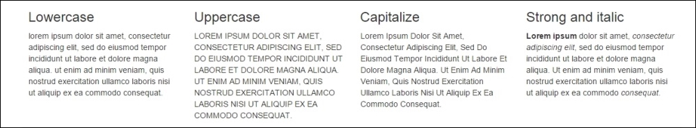
The sixth row is composed of four equally divided columns, but in this case, we are using the nesting rows option. On the first three columns, we added Bootstrap text transformation classes to make the text lowercase, uppercase, and capitalized, respectively. The code for this row should be like the following:
<div class="row">
  <div class="col-md-3">
    <h3>Lowercase</h3>
    <p class="text-lowercase">
      Lorem ipsum dolor ... consequat.
    </p>
  </div>
  <div class="col-md-6">
    <div class="row">
      <div class="col-md-6">
        <h3>Uppercase</h3>
        <p class="text-uppercase">
          Lorem ipsum dolor ... consequat.
        </p>
      </div>
      <div class="col-md-6">
        <h3>Capitalize</h3>
        <p class="text-capitalize">
          Lorem ipsum dolor ... consequat.
        </p>
      </div>
    </div>
  </div>
  <div class="col-md-3">
    <h3>Strong and italic</h3>
    <p>
      <strong>Lorem ipsum</strong> dolor ... <em>consequat</em>.
    </p>
  </div>
</div>
Pay attention to the last column, where we are using the <strong> tags to make the text bold and the <em> tag to make the text italic. Refresh your web browser and see the result, like this:
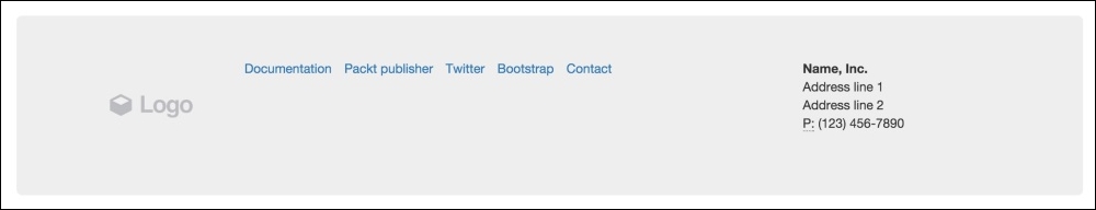
Finally, we are going through the footer, which is the last row. If you take a look at the full layout image (the one presented at the beginning of this section), you will notice that it is composed of three columns. The first column contains a logo image, the middle one contains an inline list, and the last one has the company's contact address.
For the first column, we should just create an <img> tag with the .img-responsive class. For the second column, the inline list, we must create a <ul> tag. By default, every <li> inside a <ul> has the bullets on the left-hand side. To remove them, apply the .unstyled Bootstrap class. Also, a <ul> will create the <li> elements as a block. In our case, we want the <li> to appear side by side, so we use the .list-inline Bootstrap class to create this effect.
To present contact information in the last column, we will use the <address> tag. Bootstrap offers a CSS theme for this tag; you just need to keep the formatting along with the <br> tags, as shown in this code:
<footer class="row jumbotron">
  <div class="col-md-2">
    <img src="imgs/logo.png" class="img-responsive">
  </div>
  <div class="col-md-7">
    <ul class="list-inline list-unstyled">
      <li><a href="#">Documentation</a></li>
      <li><a href="#">Packt publisher</a></li>
      <li><a href="#">Twitter</a></li>
      <li><a href="#">Bootstrap</a></li>
      <li><a href="#">Contact</a></li>
    </ul>
  </div>
  <div class="col-md-3">
    <address>
      <strong>Name, Inc.</strong><br>
      Address line 1<br>
      Address line 2<br>
      <abbr title="Phone">P:</abbr> (123) 456-7890
    </address>
  </div>
</footer>
Pay attention to the <footer> tag. We added the .jumbotron class to make it rounded and give it a gray background. The following screenshot presents to us the result of the footer: