Table of Contents for
Bootstrap 4 – Responsive Web Design
 Bootstrap 4 – Responsive Web Design
Published by
Packt Publishing, 2017
Bootstrap 4 – Responsive Web Design
Published by
Packt Publishing, 2017
- Cover
- Table of Contents
- Bootstrap 4 – Responsive Web Design
- Bootstrap 4 – Responsive Web Design
- Credits
- Preface
- What you need for this learning path
- Who this learning path is for
- Reader feedback
- Customer support
- 1. Module 1
- 1. Getting Started
- Setting up the framework
- Building our first Bootstrap example
- Optionally using the CDN setup
- Community activity
- Bootstrap and web applications
- Browser compatibility
- Summary
- 2. Creating a Solid Scaffolding
- Building our scaffolding
- Fluid container
- We need some style!
- Manipulating tables
- Like a boss!
- Final thoughts
- Summary
- 3. Yes, You Should Go Mobile First
- Bootstrap and the mobile-first design
- How to debug different viewports at the browser
- Cleaning up the mess
- Creating the landing page for different devices
- Summary
- 4. Applying the Bootstrap Style
- Summary
- 5. Making It Fancy
- Paying attention to your navigation
- Dropping it down
- Making an input grouping
- Getting ready for flexbox!
- Summary
- 6. Can You Build a Web App?
- Adding the navigation
- Do a grid again
- Playing the cards
- Implementing the main content
- Creating breadcrumbs
- Finishing with the right-hand-side content
- Summary
- 7. Of Course, You Can Build a Web App!
- Waiting for the progress bar
- Creating a settings page
- Summary
- 8. Working with JavaScript
- Awesome Bootstrap modals
- Creating our custom modal
- A tool for your tip
- Pop it all over
- Making the menu affix
- Finishing the web app
- Summary
- 9. Entering in the Advanced Mode
- The last navigation bar with flexbox
- Filling the main fluid content
- Filling the main content
- Overhead loading
- Fixing the toggle button for mobile
- Summary
- 10. Bringing Components to Life
- Fixing the mobile viewport
- Learning more advanced plugins
- Summary
- 11. Making It Your Taste
- Working with plugin customization
- The additional Bootstrap plugins
- Creating our Bootstrap plugin
- Defining the plugin methods
- Creating additional plugin methods
- Summary
- 2. Module 2
- 1. Introducing Bootstrap 4
- Summary
- 2. Using Bootstrap Build Tools
- Download the Bootstrap source files
- Setting up the blog project
- Setting up the JSON files
- Creating our first page template
- Summary
- 3. Jumping into Flexbox
- Ordering your Flexbox
- Wrapping your Flexbox
- Setting up the Bootstrap Flexbox layout grid
- Setting up a Flexbox project
- Designing a single blog post
- Summary
- 4. Working with Layouts
- Inserting rows into your layout
- Adding columns to your layout
- Choosing a column class
- Creating a simple three-column layout
- Mixing column classes for different devices
- Coding the blog home page
- Using responsive utility classes
- Summary
- 5. Working with Content
- Learning to use typography
- Customizing headings
- How to style images
- Coding tables
- Summary
- 6. Playing with Components
- Basic button examples
- Creating outlined buttons
- Checkbox and radio buttons
- Coding forms in Bootstrap 4
- Creating an inline form
- Adding validation to inputs
- Using the Jumbotron component
- Adding the Label component
- Using the Alerts component
- Using Cards for layout
- Updating the Blog index page
- How to use the Navs component
- Adding Breadcrumbs to a page
- Using the Pagination component
- How to use the List Group component
- Summary
- 7. Extending Bootstrap with JavaScript Plugins
- Coding Tooltips
- Avoiding collisions with our components
- Using Popover components
- Using the Collapse component
- Coding an Accordion with the Collapse component
- Coding a Bootstrap Carousel
- Summary
- 8. Throwing in Some Sass
- Using Sass in the blog project
- Importing partials in Sass
- Creating a collection of variables
- Customizing components
- Writing a theme
- Summary
- 9. Migrating from Version 3
- Big changes in version 4
- Updating your variables
- Additional global changes
- Other font updates
- Migrating components
- Migrating JavaScript
- Miscellaneous migration changes
- Summary
- 3. Module 3
- 1. Revving Up Bootstrap
- What Bootstrap 4 Alpha 4 has to offer
- Setting up our project
- Summary
- 2. Making a Style Statement
- Image elements
- Responsive utilities
- Helper classes
- Text alignment and transformation
- Summary
- 3. Building the Layout
- Adding Bootstrap components
- Summary
- 4. On Navigation, Footers, Alerts, and Content
- Improving navigation using Scrollspy
- Customizing scroll speed
- Icons
- Using and customizing alerts
- Creating a footer
- Creating and customizing forms
- Form validation
- Progress indicators
- Adding content using media objects
- Figures
- Quotes
- Abbreviations
- Summary
- 5. Speeding Up Development Using jQuery Plugins
- Enhanced pagination using bootpag
- Displaying images using Bootstrap Lightbox
- Improving our price list with DataTables
- Summary
- 6. Customizing Your Plugins
- Customizing plugins
- Writing a custom Bootstrap jQuery plugin
- Summary
- 7. Integrating Bootstrap with Third-Party Plugins
- Hover
- Summary
- 8. Optimizing Your Website
- Minifying CSS and JavaScript
- Introducing Grunt
- Running tasks automatically
- Stripping our website of unused CSS
- JavaScript file concatenation
- Summary
- 9. Integrating with AngularJS and React
- Introducing React
- Summary
- Bibliography
- Index
Carousel is a popular component used on many different types of websites. We're going to build a Carousel in the Blog Post template of our project. Let's start by opening up blog-post.ejs from the project directory in your text editor. After the page title block of code, insert the following markup:
<div id="carousel-example-generic" class="carousel slide" data-ride="carousel">
  <ol class="carousel-indicators">
    <li data-target="#carousel-example-generic" data-slide-to="0" class="active"></li>
    <li data-target="#carousel-example-generic" data-slide-to="1"></li>
    <li data-target="#carousel-example-generic" data-slide-to="2"></li>
  </ol>
  <div class="carousel-inner" role="listbox">
    <div class="carousel-item active">
      <img src="..." alt="First slide">
    </div>
    <div class="carousel-item">
      <img src="..." alt="Second slide">
    </div>
    <div class="carousel-item">
      <img src="..." alt="Third slide">
    </div>
  </div>
  <a class="left carousel-control" href="#carousel-example-generic" role="button" data-slide="prev">
    <span class="icon-prev" aria-hidden="true"></span>
    <span class="sr-only">Previous</span>
  </a>
  <a class="right carousel-control" href="#carousel-example-generic" role="button" data-slide="next">
    <span class="icon-next" aria-hidden="true"></span>
    <span class="sr-only">Next</span>
  </a>
</div>
This is a larger component like the Accordion so let's go through it section by section:
The Carousel component starts with a <div> and it needs a unique ID. In this case, #carouselOne. Also include the following classes: .carousel and .slide. Finally, you need to add the attribute data-ride with a value of carousel.
The first thing we need to add to the Carousel is the bullet or indicator navigation. It's made up of an ordered list. Here's the code, then we'll break it down:
<ol class="carousel-indicators">
  <li data-target="#carouselOne" data-slide-to="0" class="active"></li>
  <li data-target="#carouselOne" data-slide-to="1"></li>
  <li data-target="#carouselOne" data-slide-to="2"></li>
</ol>
Here's how the Carousel navigation works:
- On the
<ol>tag allocate a class of.carousel-indicators. - Each
<li>in the list needs to have a few things:- The
data-targetneeds to be the same ID that you gave to your root Carousel<div>, in this case,#carouselOne. - Include the
data-slide-toattribute and the first value should be 0. Increase it by one for each list item after the first.
- The
The next step is to include the actual Carousel slides. I'm not going to include images in the code, that will be up to you to insert, but don't worry, I'll show you where to put them. Here's the code for the section that wraps the slides:
<div class="carousel-inner" role="listbox">
  ..
</div>
Give that <div> a class of .carousel-inner and add the role attribute with a value of listbox. Inside this <div> you're going to add another section for each image slide in the Carousel. Here's the code for one slide in the Carousel:
<div class="carousel-item active">
  <img src="..." alt="First slide">
</div>
Let's breakdown what's happening here in the code:
- In this case, insert a
<div>tag with the classes.carousel-itemand.active
- Inside the
<div>, insert animgtag with the following attributes:- Insert the
srcattribute and the value should be the path to the image file for the slide - Optionally, include an
altattribute with a value for the image
- Insert the
The last thing we need to add to the Carousel is the arrow navigation. Here's the code for rendering the arrows:
<a class="left carousel-control" href="#carouselOne" role="button" data-slide="prev">
  <span class="icon-prev" aria-hidden="true"></span>
  <span class="sr-only">Previous</span>
</a>
<a class="right carousel-control" href="#carouselOne" role="button" data-slide="next">
  <span class="icon-next" aria-hidden="true"></span>
  <span class="sr-only">Next</span>
</a>
Let me explain how the arrow navigation works:
- The left and right arrow navigation is based on
hreftags. - The first will be the left arrow; code a link with the following classes on it:
.leftand.carousel-control. - The
hreffor the link should be set to the main ID for the Carousel, in this case,#carouselOne. - Set the
roleattribute tobutton. - Finally, set the
data-slideattribute toprev. - Within the link, add a
<span>with a class of.icon-prevon it. This will render the arrow icon. Include thearia-hiddenattribute and set it totrue. - Lastly, you can include another optional
<span>for accessibility reasons. If you want to include it, give it a class of.sr-only. Within the<span>include the textPrevious. - Now let's go over the differences for the right arrow:
- Code another link tag and switch the
.leftclass to.right. - Change the
data-slideattribute value tonext. - In the first
<span>tag change the class value to.icon-next. - If you included the accessibility
<span>tag change the text toNext.
- Code another link tag and switch the
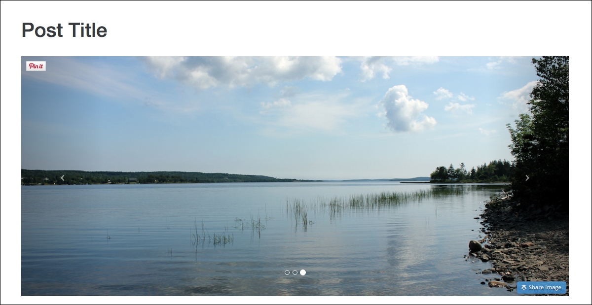
That completes the setup of the Carousel component. Fire up the project server and view the Blog Post page in the browser, and it should look like this:
That concludes the chapter on JavaScript components in Bootstrap. In this chapter, I taught you how to code up the following components: Modals, Tooltips, Popovers, Collapse, Accordion, and the Carousel. In the next chapter, I'll teach you how to use Sass in Bootstrap.