Table of Contents for
Bootstrap 4 – Responsive Web Design
 Bootstrap 4 – Responsive Web Design
Published by
Packt Publishing, 2017
Bootstrap 4 – Responsive Web Design
Published by
Packt Publishing, 2017
- Cover
- Table of Contents
- Bootstrap 4 – Responsive Web Design
- Bootstrap 4 – Responsive Web Design
- Credits
- Preface
- What you need for this learning path
- Who this learning path is for
- Reader feedback
- Customer support
- 1. Module 1
- 1. Getting Started
- Setting up the framework
- Building our first Bootstrap example
- Optionally using the CDN setup
- Community activity
- Bootstrap and web applications
- Browser compatibility
- Summary
- 2. Creating a Solid Scaffolding
- Building our scaffolding
- Fluid container
- We need some style!
- Manipulating tables
- Like a boss!
- Final thoughts
- Summary
- 3. Yes, You Should Go Mobile First
- Bootstrap and the mobile-first design
- How to debug different viewports at the browser
- Cleaning up the mess
- Creating the landing page for different devices
- Summary
- 4. Applying the Bootstrap Style
- Summary
- 5. Making It Fancy
- Paying attention to your navigation
- Dropping it down
- Making an input grouping
- Getting ready for flexbox!
- Summary
- 6. Can You Build a Web App?
- Adding the navigation
- Do a grid again
- Playing the cards
- Implementing the main content
- Creating breadcrumbs
- Finishing with the right-hand-side content
- Summary
- 7. Of Course, You Can Build a Web App!
- Waiting for the progress bar
- Creating a settings page
- Summary
- 8. Working with JavaScript
- Awesome Bootstrap modals
- Creating our custom modal
- A tool for your tip
- Pop it all over
- Making the menu affix
- Finishing the web app
- Summary
- 9. Entering in the Advanced Mode
- The last navigation bar with flexbox
- Filling the main fluid content
- Filling the main content
- Overhead loading
- Fixing the toggle button for mobile
- Summary
- 10. Bringing Components to Life
- Fixing the mobile viewport
- Learning more advanced plugins
- Summary
- 11. Making It Your Taste
- Working with plugin customization
- The additional Bootstrap plugins
- Creating our Bootstrap plugin
- Defining the plugin methods
- Creating additional plugin methods
- Summary
- 2. Module 2
- 1. Introducing Bootstrap 4
- Summary
- 2. Using Bootstrap Build Tools
- Download the Bootstrap source files
- Setting up the blog project
- Setting up the JSON files
- Creating our first page template
- Summary
- 3. Jumping into Flexbox
- Ordering your Flexbox
- Wrapping your Flexbox
- Setting up the Bootstrap Flexbox layout grid
- Setting up a Flexbox project
- Designing a single blog post
- Summary
- 4. Working with Layouts
- Inserting rows into your layout
- Adding columns to your layout
- Choosing a column class
- Creating a simple three-column layout
- Mixing column classes for different devices
- Coding the blog home page
- Using responsive utility classes
- Summary
- 5. Working with Content
- Learning to use typography
- Customizing headings
- How to style images
- Coding tables
- Summary
- 6. Playing with Components
- Basic button examples
- Creating outlined buttons
- Checkbox and radio buttons
- Coding forms in Bootstrap 4
- Creating an inline form
- Adding validation to inputs
- Using the Jumbotron component
- Adding the Label component
- Using the Alerts component
- Using Cards for layout
- Updating the Blog index page
- How to use the Navs component
- Adding Breadcrumbs to a page
- Using the Pagination component
- How to use the List Group component
- Summary
- 7. Extending Bootstrap with JavaScript Plugins
- Coding Tooltips
- Avoiding collisions with our components
- Using Popover components
- Using the Collapse component
- Coding an Accordion with the Collapse component
- Coding a Bootstrap Carousel
- Summary
- 8. Throwing in Some Sass
- Using Sass in the blog project
- Importing partials in Sass
- Creating a collection of variables
- Customizing components
- Writing a theme
- Summary
- 9. Migrating from Version 3
- Big changes in version 4
- Updating your variables
- Additional global changes
- Other font updates
- Migrating components
- Migrating JavaScript
- Miscellaneous migration changes
- Summary
- 3. Module 3
- 1. Revving Up Bootstrap
- What Bootstrap 4 Alpha 4 has to offer
- Setting up our project
- Summary
- 2. Making a Style Statement
- Image elements
- Responsive utilities
- Helper classes
- Text alignment and transformation
- Summary
- 3. Building the Layout
- Adding Bootstrap components
- Summary
- 4. On Navigation, Footers, Alerts, and Content
- Improving navigation using Scrollspy
- Customizing scroll speed
- Icons
- Using and customizing alerts
- Creating a footer
- Creating and customizing forms
- Form validation
- Progress indicators
- Adding content using media objects
- Figures
- Quotes
- Abbreviations
- Summary
- 5. Speeding Up Development Using jQuery Plugins
- Enhanced pagination using bootpag
- Displaying images using Bootstrap Lightbox
- Improving our price list with DataTables
- Summary
- 6. Customizing Your Plugins
- Customizing plugins
- Writing a custom Bootstrap jQuery plugin
- Summary
- 7. Integrating Bootstrap with Third-Party Plugins
- Hover
- Summary
- 8. Optimizing Your Website
- Minifying CSS and JavaScript
- Introducing Grunt
- Running tasks automatically
- Stripping our website of unused CSS
- JavaScript file concatenation
- Summary
- 9. Integrating with AngularJS and React
- Introducing React
- Summary
- Bibliography
- Index
As a next step, let us add an image to each column in our grid. Each image will act as a category heading, as well as allow us to display our photographic wares. The images used in the following part, and throughout the rest of the book, are provided with this book. Take a look at the following code:
    <div class="col-xs-6 col-sm-3 push-sm-3">
        <img src="images/small.jpg">
        <h5>Small</h5>
        <div class="row">
            <div class="col-sm-4">6x5</div>
            <div class="col-sm-4">8x10</div>
            <div class="col-sm-4">11x17</div>
        </div>
    </div>
    <div class="col-xs-6 col-sm-3 push-sm-3">
        <img src="images/medium.jpg">
        <h5>Medium</h5>
        <div class="row">
            <div class="col-sm-4">12x18</div>
            <div class="col-sm-4">16x20</div>
            <div class="col-sm-4">18x24</div>
        </div>
    </div>
    <div class="col-xs-6 col-sm-3 push-sm-3">
        <img src="images/large.jpg">
        <h5>Large</h5>
        <div class="row">
            <div class="col-sm-4">19x27</div>
            <div class="col-sm-4">20x30</div>
            <div class="col-md-4">22x28</div>
        </div>
    </div>
    <div class="col-xs-6 col-sm-3 pull-sm-9">
        <img src="images/extra-large.jpg">
        <h5>Extra Large</h5>
        <div class="row">
            <div class="col-md-4">24x36</div>
            <div class="col-md-4">27x39</div>
            <div class="col-md-4">27x40</div>
        </div>
    </div>
And that results in the following screenshot as seen in Figure 2.14:
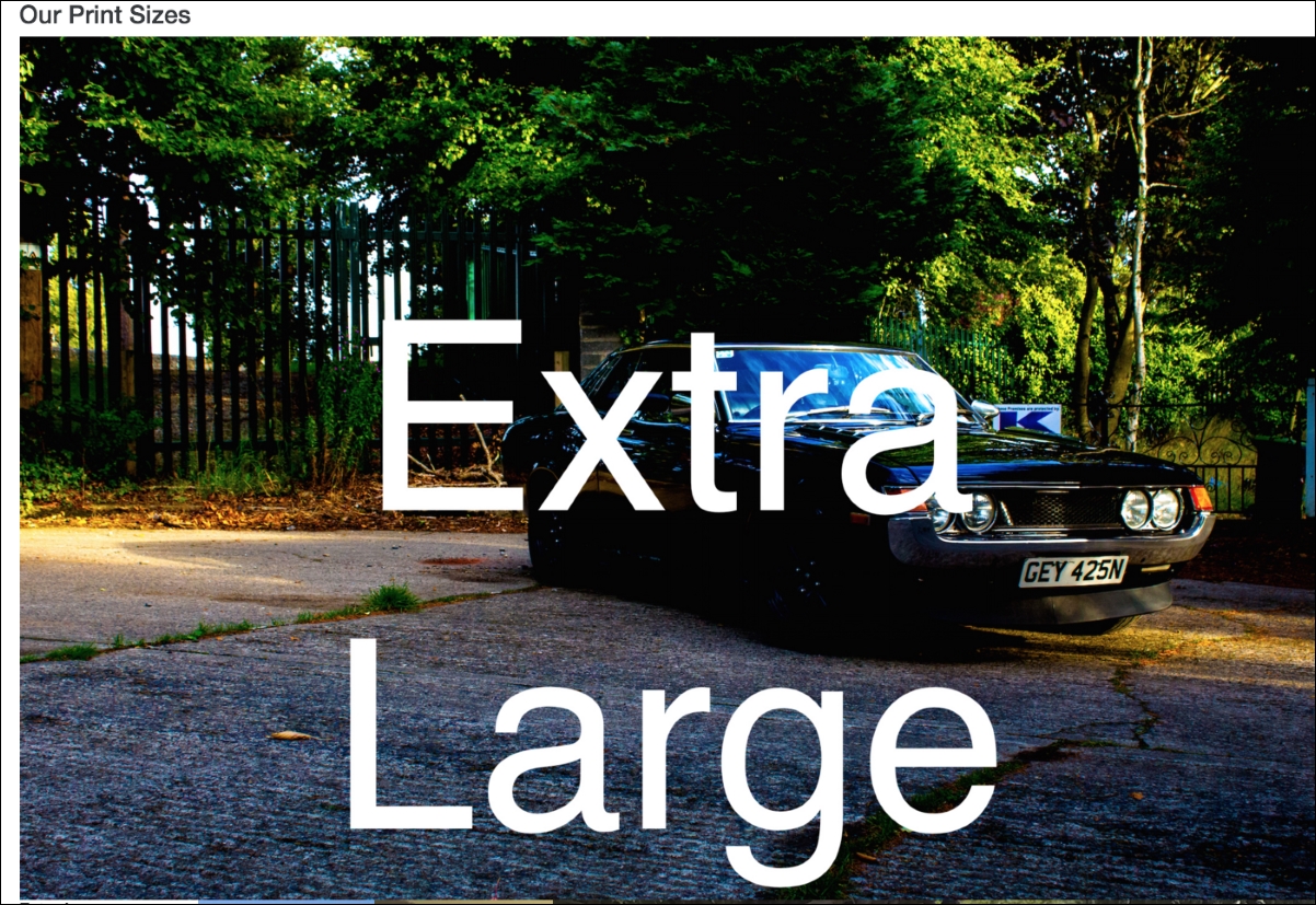
Figure 2.14: An unexpected outcome: Adding an image to the column in each grid results in the images failing to respect the boundaries of parent columns
That isn't what we expected. As you can see, images do not respect the boundaries of the parent column. Obviously, we can fix this with some styling, but we don't need to do that from scratch. Bootstrap comes with a class to handle this case, called img-fluid.
It is as straightforward as you would hope, just apply the img-fluid class to the element:
    <div class="col-xs-6 col-sm-3 push-sm-3">
        <img src="images/small.jpg" class="img-fluid">
        <h5>Small</h5>
        <div class="row">
            <div class="col-sm-4">6x5</div>
            <div class="col-sm-4">8x10</div>
            <div class="col-sm-4">11x17</div>
        </div>
    </div>
    <div class="col-xs-6 col-sm-3 push-sm-3">
        <img src="images/medium.jpg" class="img-fluid">
        <h5>Medium</h5>
        <div class="row">
            <div class="col-sm-4">12x18</div>
            <div class="col-sm-4">16x20</div>
            <div class="col-sm-4">18x24</div>
        </div>
    </div>
    <div class="col-xs-6 col-sm-3 push-sm-3">
        <img src="images/large.jpg" class="img-fluid">
        <h5>Large</h5>
        <div class="row">
            <div class="col-sm-4">19x27</div>
            <div class="col-sm-4">20x30</div>
            <div class="col-md-4">22x28</div>
        </div>
    </div>
    <div class="col-xs-6 col-sm-3 pull-sm-9">
        <img src="images/extra-large.jpg" class="img-fluid">
        <h5>Extra Large</h5>
        <div class="row">
            <div class="col-md-4">24x36</div>
            <div class="col-md-4">27x39</div>
            <div class="col-md-4">27x40</div>
        </div>
    </div>
Take a look at the following screenshot:
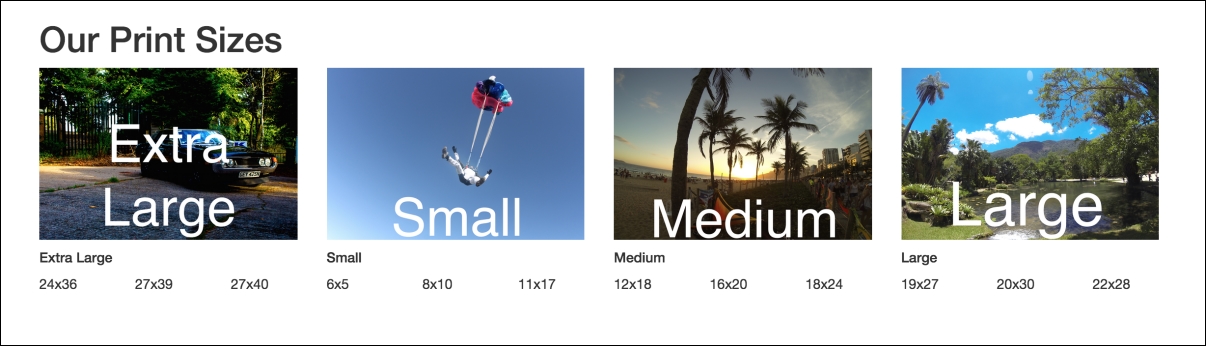
Figure 2.15: Making images responsive using Bootstrap's img-fluid class results in images that respect the boundaries of parent elements
That is more like it. img-fluid is exceedingly simple in itself, essentially just adding a max-width: 100% rule to the image element. Now, the img element will respect the boundaries of its parent.
However, this simple approach also means that the feature is very basic. The browser still downloads the full resolution image, even though it may only be rendered at a fraction of the size. There are other libraries and services which help resolve the responsive images problem.
Bootstrap does, however, provide a neat mixin to help mitigate issues with retina displays. The img-retina mixin basically extends background-image and background-size rules, by allowing for two images and two sizes to be defined one for standard displays, and one for retina. img-retina takes the form:
.img-retina(std-res-img, hi-res-img, standard-width, standard-height)
For standard displays, img-retina will set the background-image to std-res-img, with the defined width and height. For retina display, img-retina will set background-image to hi-res-img, with the defined width and height values doubled.
For example, if we wanted to make sure that the Extra Large image loaded at high resolution on retina displays, we could give it a class extra-large-image, and apply that to a div:
<div class="extra-large-image"></div>
We would define extra-large-image as:
    .extra-large-image {
        .img-retina('/images/extra-large_std-res.png',
        '/images/extra-large_hi-res.png', 700px, 400px)
    }
This will result in /images/extra-large_std-res.png being loaded with the dimensions 700 x 400 at standard resolution, and /images/extra-large_hi-res.png being loaded at 1400 x 800 on retina displays.
Bootstrap also comes with some useful built-in image modifiers namely img-rounded, img-thumbnail, and img-circle. Let's apply these to the images in our example:
    <div class="container">
        <h1>Our Print Sizes</h1>
        <div class="row">
            <div class="col-xs-6 col-sm-3 push-sm-3">
                <img src="images/small.jpg" class="img-fluid
                img-circle">
                <h5>Small</h5>
                ...
            </div>
            <div class="col-xs-6 col-sm-3 push-sm-3">
                <img src="images/medium.jpg" class="img-fluid
                img-rounded">
                <h5>Medium</h5>
                ...
            </div>
            <div class="col-xs-6 col-sm-3 push-sm-3">
                <img src="images/large.jpg" class="img-thumbnail">
                <h5>Large</h5>
                ...
            </div>
            <div class="col-xs-6 col-sm-3 pull-sm-9">
                <img src="images/extra-large.jpg" class="img-fluid">
                <h5>Extra Large</h5>
                ...
            </div>
        </div>
    </div>
Take a look at the following screenshot:
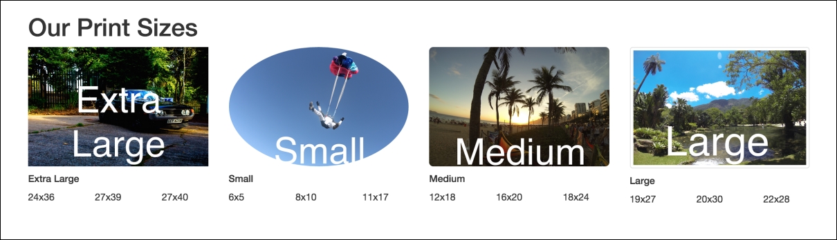
Figure 2.16: Applying Bootstrap's image modifiers: img-rounded, img-circle and img-thumbnail
You may notice that in the previously mentioned code, for the Small and Medium images, we have kept img-fluid, but removed img-fluid from Large. This is because img-thumbnail actually uses img-fluid as a mixin, while img-circle and img-rounded pay zero respect to the parent column width, so the img-fluid class is necessary. These images scale nicely down to xs displays, but it does look a little cluttered on a small viewport.
Take a look at the following screenshot:
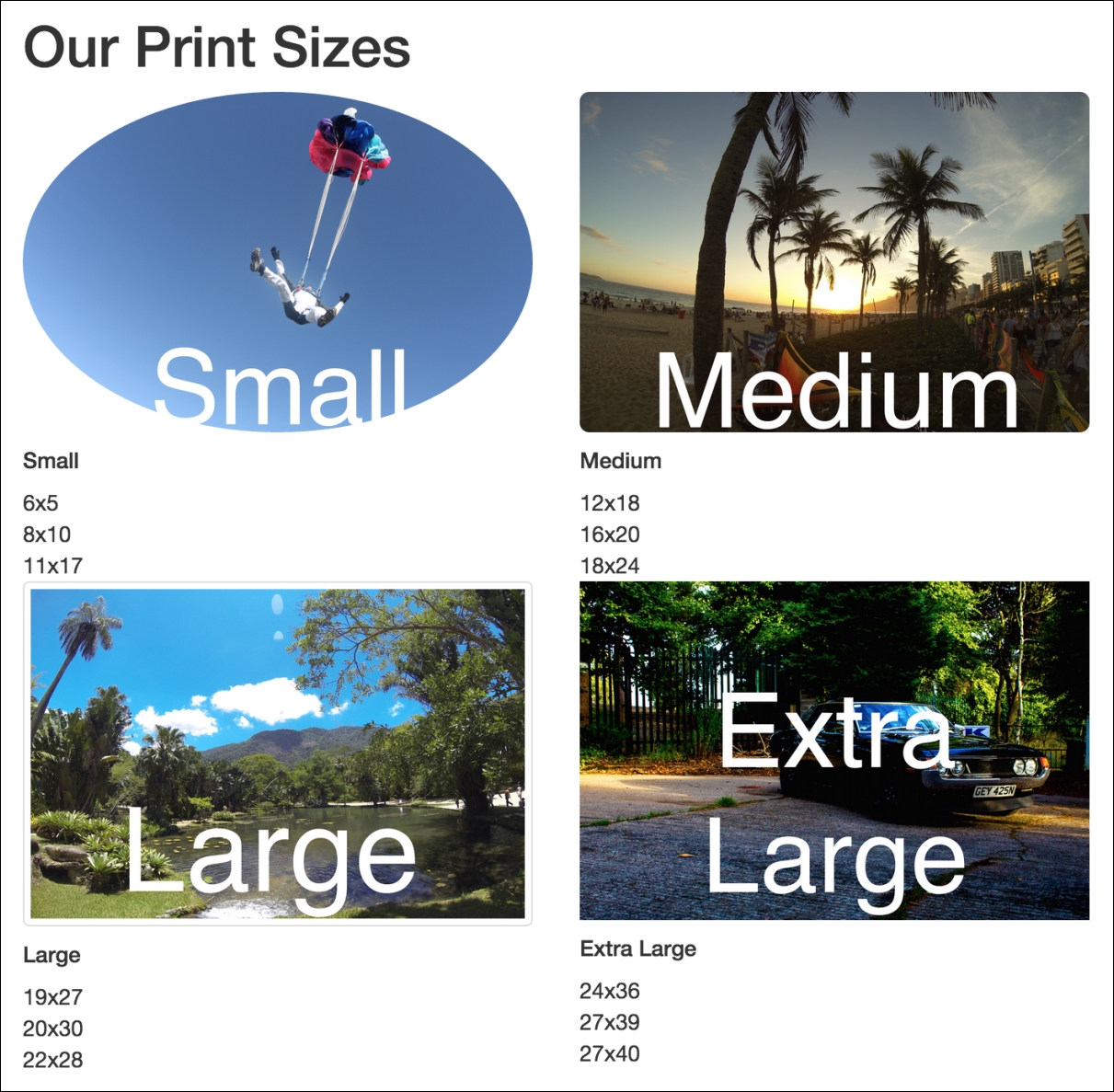
Figure 2.17: Dealing with smaller viewports by utilizing Bootstrap's responsive utilities
Bootstrap provides some really useful responsive utilities to tackle the issue of cluttered viewports.