Table of Contents for
Bootstrap 4 – Responsive Web Design
 Bootstrap 4 – Responsive Web Design
Published by
Packt Publishing, 2017
Bootstrap 4 – Responsive Web Design
Published by
Packt Publishing, 2017
- Cover
- Table of Contents
- Bootstrap 4 – Responsive Web Design
- Bootstrap 4 – Responsive Web Design
- Credits
- Preface
- What you need for this learning path
- Who this learning path is for
- Reader feedback
- Customer support
- 1. Module 1
- 1. Getting Started
- Setting up the framework
- Building our first Bootstrap example
- Optionally using the CDN setup
- Community activity
- Bootstrap and web applications
- Browser compatibility
- Summary
- 2. Creating a Solid Scaffolding
- Building our scaffolding
- Fluid container
- We need some style!
- Manipulating tables
- Like a boss!
- Final thoughts
- Summary
- 3. Yes, You Should Go Mobile First
- Bootstrap and the mobile-first design
- How to debug different viewports at the browser
- Cleaning up the mess
- Creating the landing page for different devices
- Summary
- 4. Applying the Bootstrap Style
- Summary
- 5. Making It Fancy
- Paying attention to your navigation
- Dropping it down
- Making an input grouping
- Getting ready for flexbox!
- Summary
- 6. Can You Build a Web App?
- Adding the navigation
- Do a grid again
- Playing the cards
- Implementing the main content
- Creating breadcrumbs
- Finishing with the right-hand-side content
- Summary
- 7. Of Course, You Can Build a Web App!
- Waiting for the progress bar
- Creating a settings page
- Summary
- 8. Working with JavaScript
- Awesome Bootstrap modals
- Creating our custom modal
- A tool for your tip
- Pop it all over
- Making the menu affix
- Finishing the web app
- Summary
- 9. Entering in the Advanced Mode
- The last navigation bar with flexbox
- Filling the main fluid content
- Filling the main content
- Overhead loading
- Fixing the toggle button for mobile
- Summary
- 10. Bringing Components to Life
- Fixing the mobile viewport
- Learning more advanced plugins
- Summary
- 11. Making It Your Taste
- Working with plugin customization
- The additional Bootstrap plugins
- Creating our Bootstrap plugin
- Defining the plugin methods
- Creating additional plugin methods
- Summary
- 2. Module 2
- 1. Introducing Bootstrap 4
- Summary
- 2. Using Bootstrap Build Tools
- Download the Bootstrap source files
- Setting up the blog project
- Setting up the JSON files
- Creating our first page template
- Summary
- 3. Jumping into Flexbox
- Ordering your Flexbox
- Wrapping your Flexbox
- Setting up the Bootstrap Flexbox layout grid
- Setting up a Flexbox project
- Designing a single blog post
- Summary
- 4. Working with Layouts
- Inserting rows into your layout
- Adding columns to your layout
- Choosing a column class
- Creating a simple three-column layout
- Mixing column classes for different devices
- Coding the blog home page
- Using responsive utility classes
- Summary
- 5. Working with Content
- Learning to use typography
- Customizing headings
- How to style images
- Coding tables
- Summary
- 6. Playing with Components
- Basic button examples
- Creating outlined buttons
- Checkbox and radio buttons
- Coding forms in Bootstrap 4
- Creating an inline form
- Adding validation to inputs
- Using the Jumbotron component
- Adding the Label component
- Using the Alerts component
- Using Cards for layout
- Updating the Blog index page
- How to use the Navs component
- Adding Breadcrumbs to a page
- Using the Pagination component
- How to use the List Group component
- Summary
- 7. Extending Bootstrap with JavaScript Plugins
- Coding Tooltips
- Avoiding collisions with our components
- Using Popover components
- Using the Collapse component
- Coding an Accordion with the Collapse component
- Coding a Bootstrap Carousel
- Summary
- 8. Throwing in Some Sass
- Using Sass in the blog project
- Importing partials in Sass
- Creating a collection of variables
- Customizing components
- Writing a theme
- Summary
- 9. Migrating from Version 3
- Big changes in version 4
- Updating your variables
- Additional global changes
- Other font updates
- Migrating components
- Migrating JavaScript
- Miscellaneous migration changes
- Summary
- 3. Module 3
- 1. Revving Up Bootstrap
- What Bootstrap 4 Alpha 4 has to offer
- Setting up our project
- Summary
- 2. Making a Style Statement
- Image elements
- Responsive utilities
- Helper classes
- Text alignment and transformation
- Summary
- 3. Building the Layout
- Adding Bootstrap components
- Summary
- 4. On Navigation, Footers, Alerts, and Content
- Improving navigation using Scrollspy
- Customizing scroll speed
- Icons
- Using and customizing alerts
- Creating a footer
- Creating and customizing forms
- Form validation
- Progress indicators
- Adding content using media objects
- Figures
- Quotes
- Abbreviations
- Summary
- 5. Speeding Up Development Using jQuery Plugins
- Enhanced pagination using bootpag
- Displaying images using Bootstrap Lightbox
- Improving our price list with DataTables
- Summary
- 6. Customizing Your Plugins
- Customizing plugins
- Writing a custom Bootstrap jQuery plugin
- Summary
- 7. Integrating Bootstrap with Third-Party Plugins
- Hover
- Summary
- 8. Optimizing Your Website
- Minifying CSS and JavaScript
- Introducing Grunt
- Running tasks automatically
- Stripping our website of unused CSS
- JavaScript file concatenation
- Summary
- 9. Integrating with AngularJS and React
- Introducing React
- Summary
- Bibliography
- Index
At long last we are ready to move on to the final part of our landing page, the Contact Us form. Note that we will not be writing any of the actual JavaScript that transfers the contents of the Contact Us form to the server. Instead, we will learn how to use Bootstrap to lay out our form elements in an elegant and responsive manner.
Typically, Contact Us forms require at least three pieces of information from the user—the user's name (so that the recipient of the form data will know who they are talking to), the user's e-mail address (so that the recipient of the form data can reply to the user), and the actual message (what the user wants to send to the recipient). As such, we will be creating a form that will consist of three inputs—a name field, an e-mail address field, and a text area for the user to write their message.
Let's dig right into it. Start by creating an empty form below the Contact Us header:
    <div class="container-fluid myphoto-section bg-myphoto-light"
    id="contact">
<div class="container">
            <div class="row">
                <h3>Contact Us</h3>
                    <form>
<!--Our form will go here-->
                    </form>
            </div>
        </div>
    </div>
At the heart of Bootstrap's form layout is the
form-group
class. On its own, all this class does is set a 15 px margin. However, as we will see, combining the form group with form controls gives us a powerful way of controlling our form's appearance.
By default, Bootstrap lays out its form elements vertically. That is, each element is stacked above the other. Let's go ahead and add a name field to our form. Insert the following snippet in between our previously created form tags:
    <div class="form-group">
<label for="name">First and Lastname</label>
<input type="name" class="form-control" id="name"
        placeholder="Name">
    </div>
Save and hit refresh. As you can see, the label takes over the entire first row, with the name input field appearing on the second row (Figure 4.13). Note how we applied the
form-control
class to our name input field. This class is what styles our actual input element. Among other things, Bootstrap sets its height (to exactly 34 px), pads it, sets the input's font size (to 14 px), and gives the element a nice inset effect by adjusting the border style, border color, and border radius. Removing this class from our input will result in just a simple, plain input box being displayed.
Now, what if we wanted slightly smaller form elements? Well, we could apply our own styles, for example, we could change the font size or height of our input element. However, Bootstrap provides us with
form-group-sm
and
form-group-lg
. The former reduces the height of nested form controls to 30 px, the font size to 12 px, and the line height to 1.5 mm. The
form-group-lg
, on the other hand, makes its containing form controls larger by increasing their font size to 18 px and their height to 46 px. Go ahead and apply either one to our form group. For example:
    <div class="form-group-sm">
        <label for="name">Name</label>
        <input type="name" class="form-control" id="name"
        placeholder="Name">
    </div>
Take a look at the following screenshot:
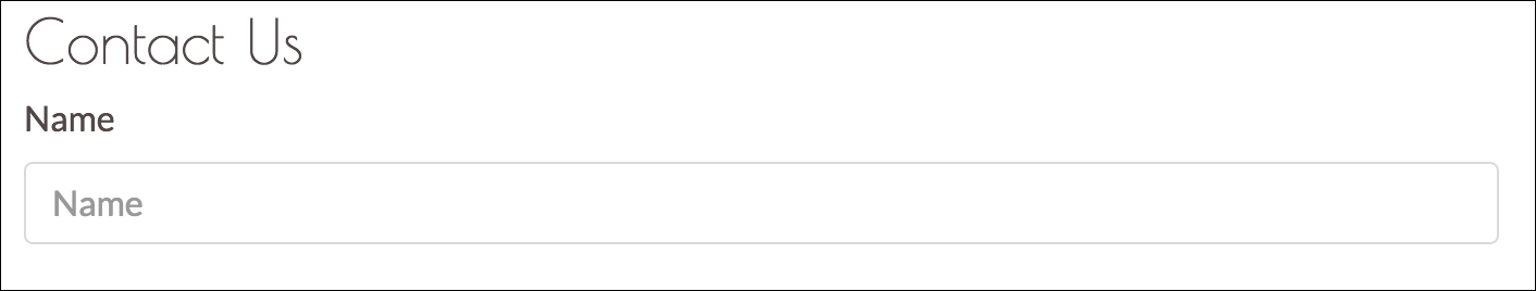
Figure 4.13: Our name input.
Great! We have created our first form. But note how (Figure 4.13) our name field stretches across the entire page, taking up a lot of valuable real estate. Seeing how users will certainly not need all this space for their names, you might wish to align the label and name input field. Luckily, Bootstrap makes this quite easy for us by offering horizontal form layouts and inline forms through the
form-inline
class. Applying it to our
form
element will change the display style of form controls and form groups contained within the form to
inline-block
. This will align the various components within your
form
element. Go ahead and apply it (see Figure 4.14):
    <form class="form-inline">
        <div class="form-group-sm">
            <label for="name">Name</label>
            <input type="name" class="form-control" id="name" placeholder="Name">
</div>
    </form>
Take a look at the following screenshot:
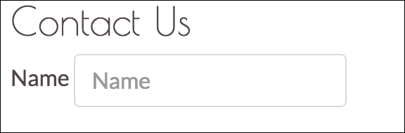
Figure 4.14: Our vertical name form group.
This is much better. But we are not done quite yet. Try adding a second form group to the form. It will end up on the same line as our name form group. Furthermore, the input fields are now a bit too small to be of practical use. Try customizing them by combining the lessons that you learned in this chapter with the lessons you learned in Chapter 2, Making a Style Statement.
While we can save valuable space by aligning labels and input boxes, there is a second approach that we can take to combine input description with the actual input fields: Icons and placeholder texts (see Figure 4.15). The idea is that we combine icons and placeholder text to signify the expected input. The advantage behind this approach is that we will not be losing space to label elements.
First, let's remove the previously inserted label element and edit the input's placeholder attribute to contain the string Your name. Our name form group should now consist of a single input element:
    <div class="form-group">
        <input type="text" class="form-control" placeholder="Your name">
    </div>
Let's go ahead and duplicate this form group so that we now also have an input for our user's e-mail address:
    <form>
        <div class="form-group">
            <input type="text" class="form-control" placeholder="Your
            name">
        </div>
        <div class="form-group">
<input type="text" class="form-control" placeholder="Your email
            address">
        </div>
    </form>
Now let's go ahead and select two Font Awesome icons that best describe the expected input. We recommend:
- A user symbol to indicate the user's name:
fa fa-user - An
@symbol to indicate the user's e-mail address:fa fa-at
Take a look at the following screenshot:
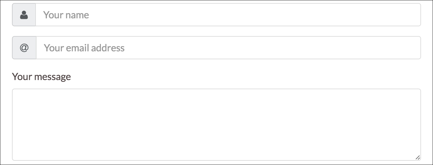
Figure 4.15: The finished Contact Us form: labels and placeholder text are combined to describe the expected input for a given input field.
To combine the input element with the icon, we first apply Bootstrap's
input-group
class to the form control. That is, our form control's
class
attribute should now be set to
class="form-group input-group"
. Next, we create the <i>
tag for our Font Awesome icon, insert it before our input element, and then wrap the icon with a
span
element. We set the span
class attribute to
class="input-group-addon"
:
<span class="input-group-addon"><i class="fa fa-user"></i></span>
Apply this to both the name and e-mail inputs and save. You should now see that the icons are aligned to the left of our input elements. To align them to the right, simply move the icon span after the input element:
    <div class="form-group input-group">
        <input type="text" class="form-control" placeholder="Your email
        address">
        <span class="input-group-addon"><i class="fa fa-at"></i></span>
    </div>
Our form is almost done. All that is left is to add a text area for our message (using the
textarea
element) and a Send button. To achieve the former, go ahead and create a new form-group. However, instead of the form-group containing an input box, add a
label
and a
textarea
. Just as with the
input
elements, the
textarea
should be a form control (so go ahead and set its class attribute to
form-control
):
    <div class="form-group">
        <label for="name">Your message</label>
        <textarea class="form-control" rows="5" id="message"></textarea>
    </div>
The last missing part of the puzzle is our Send button. Although we won't be writing the event listeners for our Send button, we will now explore the various Bootstrap context styles available for buttons. The parent class of any button is the
btn
class. In essence, the
btn
class adjusts the padding, margin, text alignment, font size, and weight as well as the border radius of any element that it is applied to. The seven context classes offered by Bootstrap are
btn-primary
,
btn-secondary
,
btn-success
,
btn-link
,
btn-info
,
btn-danger
, and
btn-warning
(see Figure 4.16). Take a look at the following screenshot:

Figure 4.16: The five Bootstrap button context styles. From left to right: Default, success, danger, info, and warning.
Let's go ahead and complete our form by inserting a
button
element and apply the success context class. Create a new form group below our text area. Inside the form group, create a button element and set its class to
btn btn-success
. Insert a nice icon and add some text to the button:
    <div class="container-fluid myphoto-section bg-myphoto-light"
    id="contact">
        <div class="container">
            <div class="row">
                <h3>Contact Us</h3>
                <form>
                    <div class="form-group input-group">
                        <span class="input-group-addon"><i class="fa
                        fa-user">
                        </i></span>
                        <input type="text" class="form-control"
                        placeholder="Your name">
                    </div>
                    <div class="form-group input-group">
                        <span class="input-group-addon"><i class="fa
                        fa-at">
                        </i></span>
                        <input type="text" class="form-control"
                        placeholder="Your email address">
                    </div>
                    <div class="form-group">
                        <label for="name">Your message</label>
                        <textarea class="form-control" rows="5"
                        id="message">
                        </textarea>
                    </div>
                    <div class="form-group">
                        <button class="btn btn-success">
                            <i class="fa fa-send-o"></i>
                            Send
                        </button>
                    </div>
                </form>
            </div>
        </div>
    </div>
Last but not least, we can add some descriptive text to our Contact Us section. In this case, we will use placeholder text generated using http://generator.lorem-ipsum.info/ (a useful tool if you ever require placeholder text for demo purposes):
    <h3>Contact Us</h3>
    <p>
        Lorem ipsum dolor sit amet, modo integre ad est, omittam temporibus
        ex sit,
        dicam molestie eum ne. His ad nonumy mentitum offendit, ea tempor
        timeam nec,
        doming latine liberavisse his ne. An vix movet dolor. Ut pri
        qualisque reprehendunt,
        altera insolens torquatos in per. Mei veri omnium omittam at,
        ea qui discere ceteros.
    </p>
Take a look at the following screenshot:
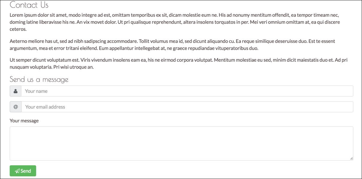
Figure 4.17: The Contact Us section along with the Send button.
While in the case of the preceding example the inputs are pretty explanatory, there may be inputs that require an explanation. As such, you can add descriptive text using the
form-text
class:
<p class="form-text">Some text describing my input.</p>
All that the form-text class does is set the element's display to block, and add a top margin of 0.25 rem to the element.
Furthermore, it should be noted that we wrapped both the Contact Us and
Send us a message text inside
h3
and
h4
header tags. This is appropriate in this case, as the titles blend nicely with the content. However, for cases in which the title should stand out more, or should not blend with the content, one should use Bootstrap's display heading class
display-*,where * denotes a number between 1 and 4. As with the header tags, the smaller the number, the bigger the font. The largest display class applies a font size of 6 rem to the target element, and decreases this by 0.5 rem for each successive display class (so, for example,
display-2
sets the font size to
5.5
rem). The display style definition also sets the font weight to 300. The Figure 4.18 contrasts the use of
display-*
against the use of the HTML header tags. Take a look at the following screenshot:
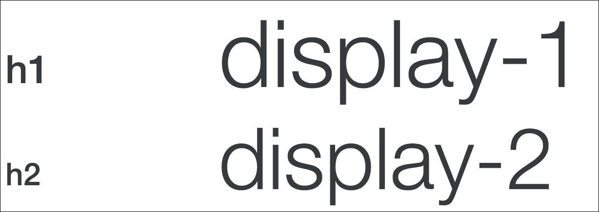
Figure 4.18: Contrasting Bootstrap's display classes against the HTML header tags.