Table of Contents for
Bootstrap 4 – Responsive Web Design
 Bootstrap 4 – Responsive Web Design
Published by
Packt Publishing, 2017
Bootstrap 4 – Responsive Web Design
Published by
Packt Publishing, 2017
- Cover
- Table of Contents
- Bootstrap 4 – Responsive Web Design
- Bootstrap 4 – Responsive Web Design
- Credits
- Preface
- What you need for this learning path
- Who this learning path is for
- Reader feedback
- Customer support
- 1. Module 1
- 1. Getting Started
- Setting up the framework
- Building our first Bootstrap example
- Optionally using the CDN setup
- Community activity
- Bootstrap and web applications
- Browser compatibility
- Summary
- 2. Creating a Solid Scaffolding
- Building our scaffolding
- Fluid container
- We need some style!
- Manipulating tables
- Like a boss!
- Final thoughts
- Summary
- 3. Yes, You Should Go Mobile First
- Bootstrap and the mobile-first design
- How to debug different viewports at the browser
- Cleaning up the mess
- Creating the landing page for different devices
- Summary
- 4. Applying the Bootstrap Style
- Summary
- 5. Making It Fancy
- Paying attention to your navigation
- Dropping it down
- Making an input grouping
- Getting ready for flexbox!
- Summary
- 6. Can You Build a Web App?
- Adding the navigation
- Do a grid again
- Playing the cards
- Implementing the main content
- Creating breadcrumbs
- Finishing with the right-hand-side content
- Summary
- 7. Of Course, You Can Build a Web App!
- Waiting for the progress bar
- Creating a settings page
- Summary
- 8. Working with JavaScript
- Awesome Bootstrap modals
- Creating our custom modal
- A tool for your tip
- Pop it all over
- Making the menu affix
- Finishing the web app
- Summary
- 9. Entering in the Advanced Mode
- The last navigation bar with flexbox
- Filling the main fluid content
- Filling the main content
- Overhead loading
- Fixing the toggle button for mobile
- Summary
- 10. Bringing Components to Life
- Fixing the mobile viewport
- Learning more advanced plugins
- Summary
- 11. Making It Your Taste
- Working with plugin customization
- The additional Bootstrap plugins
- Creating our Bootstrap plugin
- Defining the plugin methods
- Creating additional plugin methods
- Summary
- 2. Module 2
- 1. Introducing Bootstrap 4
- Summary
- 2. Using Bootstrap Build Tools
- Download the Bootstrap source files
- Setting up the blog project
- Setting up the JSON files
- Creating our first page template
- Summary
- 3. Jumping into Flexbox
- Ordering your Flexbox
- Wrapping your Flexbox
- Setting up the Bootstrap Flexbox layout grid
- Setting up a Flexbox project
- Designing a single blog post
- Summary
- 4. Working with Layouts
- Inserting rows into your layout
- Adding columns to your layout
- Choosing a column class
- Creating a simple three-column layout
- Mixing column classes for different devices
- Coding the blog home page
- Using responsive utility classes
- Summary
- 5. Working with Content
- Learning to use typography
- Customizing headings
- How to style images
- Coding tables
- Summary
- 6. Playing with Components
- Basic button examples
- Creating outlined buttons
- Checkbox and radio buttons
- Coding forms in Bootstrap 4
- Creating an inline form
- Adding validation to inputs
- Using the Jumbotron component
- Adding the Label component
- Using the Alerts component
- Using Cards for layout
- Updating the Blog index page
- How to use the Navs component
- Adding Breadcrumbs to a page
- Using the Pagination component
- How to use the List Group component
- Summary
- 7. Extending Bootstrap with JavaScript Plugins
- Coding Tooltips
- Avoiding collisions with our components
- Using Popover components
- Using the Collapse component
- Coding an Accordion with the Collapse component
- Coding a Bootstrap Carousel
- Summary
- 8. Throwing in Some Sass
- Using Sass in the blog project
- Importing partials in Sass
- Creating a collection of variables
- Customizing components
- Writing a theme
- Summary
- 9. Migrating from Version 3
- Big changes in version 4
- Updating your variables
- Additional global changes
- Other font updates
- Migrating components
- Migrating JavaScript
- Miscellaneous migration changes
- Summary
- 3. Module 3
- 1. Revving Up Bootstrap
- What Bootstrap 4 Alpha 4 has to offer
- Setting up our project
- Summary
- 2. Making a Style Statement
- Image elements
- Responsive utilities
- Helper classes
- Text alignment and transformation
- Summary
- 3. Building the Layout
- Adding Bootstrap components
- Summary
- 4. On Navigation, Footers, Alerts, and Content
- Improving navigation using Scrollspy
- Customizing scroll speed
- Icons
- Using and customizing alerts
- Creating a footer
- Creating and customizing forms
- Form validation
- Progress indicators
- Adding content using media objects
- Figures
- Quotes
- Abbreviations
- Summary
- 5. Speeding Up Development Using jQuery Plugins
- Enhanced pagination using bootpag
- Displaying images using Bootstrap Lightbox
- Improving our price list with DataTables
- Summary
- 6. Customizing Your Plugins
- Customizing plugins
- Writing a custom Bootstrap jQuery plugin
- Summary
- 7. Integrating Bootstrap with Third-Party Plugins
- Hover
- Summary
- 8. Optimizing Your Website
- Minifying CSS and JavaScript
- Introducing Grunt
- Running tasks automatically
- Stripping our website of unused CSS
- JavaScript file concatenation
- Summary
- 9. Integrating with AngularJS and React
- Introducing React
- Summary
- Bibliography
- Index
Following the patterns that we have seen in alert.js and carousel.js, we are going to build our own plugin. Of course, before we start coding, we need to understand what we want to build.
The A11yHCM plugin, depending on your background and experience, may give you a clue about what we want to build. A11y is the accepted shorthand for Accessibility, or Web Accessibility. W3C defines web accessibility as follows:
"Web accessibility means that people with disabilities can use the web. More specifically, web accessibility means that people with disabilities can perceive, understand, navigate, and interact with the web, and that they can contribute to the web. Web accessibility also benefits others, including older people with changing abilities due to aging." | ||
| --https://www.w3.org/WAI/intro/accessibility.php | ||
HCM is an acronym for an accessibility-related term: High Contrast Mode. HCM, in its simplest form, modifies the colors on a display to help visually impaired users view content.
However, different tools for enabling HCM may render differently, and some web pages may not actually improve the experience of a visually impaired user in HCM. Let's take a look at a couple of examples of MyPhoto in HCM, using two different tools.
First, we will use Mac OS X El Capitan's built-in high contrast options, Invert colors and Increase contrast:
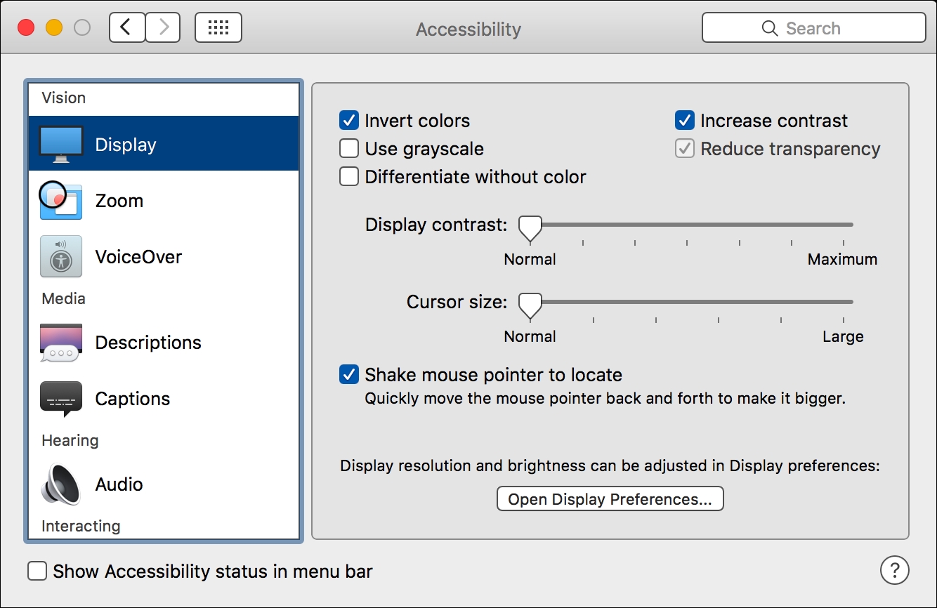
Figure 6.9: Mac OS X El Capitan's built-in Accessibility settings
With the Invert colors and Increase contrast settings enabled, MyPhoto is displayed quite differently:
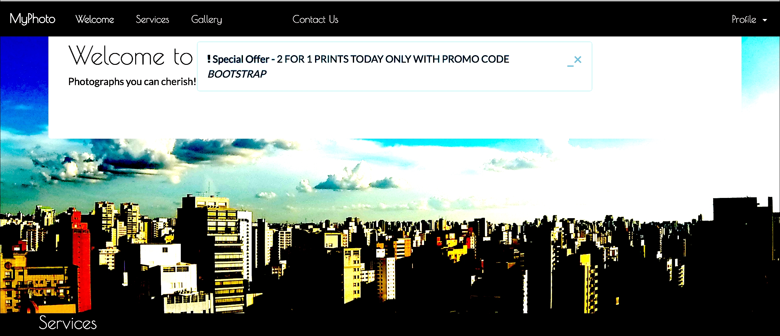
Figure 6.10: Viewing MyPhoto with the Invert Colors and Increase Contrast Accessibility settings enabled on Mac OS X El Capitan, with the About navbar link in a focused state
Let's take a look at another tool—Google Accessibility's High Contrast Chrome plugin (https://chrome.google.com/webstore/detail/high-contrast/djcfdncoelnlbldjfhinnjlhdjlikmph?hl=en).
With the High Contrast Chrome plugin installed, a high contrast button is added to Google Chrome:

Figure 6.11: The High Contrast button in Chrome, which appears after installing Google Accessibility's High Contrast Chrome plugin
Let'
s see how MyPhoto displays with this High Contrast plugin enabled:
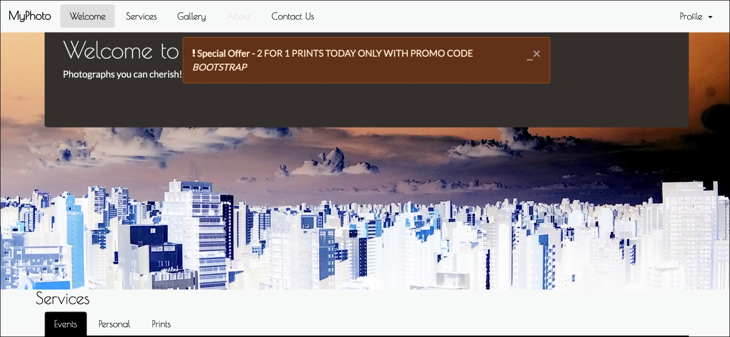
Figure 6.12: Viewing MyPhoto using Google's Accessibility High Contrast Chrome Plugin, with the 'About' navbar link in a focused state
The result of using the High Contrast Chrome plugin is similar to OS X's built-in high contrast options, but there are slight differences. For instance, the background color of our Services section and our special offers alert changes between the different tools.
At least one element of our page is clearly poor when displayed in HCM—the focused state of our navigation links. In HCM, the focused state of our navigation links, in this case the Welcome link, is practically illegible.
So what can we do here, without actually changing our default styles? The first thing that comes to mind is to simply check whether the display is in HCM and apply the appropriate styling, either through JavaScript or CSS. Unfortunately, high contrast may be applied in different ways by different tools, different browsers, different operating systems, and different devices. Programmatically, it may be very hard, or even impossible, to always recognize when your page is being displayed in HCM.
Time for plan B. Rather than figure out programmatically when a page is being viewed in high contrast, let's allow the user to simply tell us when they are viewing the page in HCM. Plan B is what our A11yHCM plugin is going to allow us to do.
The first thing we are going to do is define the API. Before building a plugin, it is wise to figure out how you want developers to interact with it. By doing this, you will be able to understand exactly what you are trying to build before writing a single line of code.
The fundamental functionality of our plugin is to enable a style sheet to be dynamically loaded and removed from a page based on the occurrence of a specific event. So, we need two things:
- An event to trigger the JS
- The path to the style sheet that is to be loaded
We can use a data-attribute to act as the trigger, just as we did with the other plugins, and use it to pass the path of a CSS file. We want the data-attribute to be unique to our plugin, so we must use an appropriate data-attribute postfix. Let's try something like the following:
    <div class="allyhcm" data-a11yhcm="path/to/css">High Contrast Mode
    </div>
Nice and succinct. There isn't anything else we need right now, so we will get to writing our JavaScript. Our plugin's JavaScript code is going to live in
js/a11yhcm.js
. Let's set up our skeleton; just like we have seen before, we want it immediately invoked and added to our page's jQuery object. We want to create an on-click listener for any element with the
data-a11yhcm
attribute, but we need to declare which function it triggers. As we want this plugin to dynamically load and remove a style sheet, we will call our function
toggle as it toggles HCM on and off. We also want to add a
VERSION
constant:
    +function ($) {
        'use strict';
        // A11YHCM CLASS DEFINITION
        // ======================
        var A11yHCM = function (element, options) {
        $(element).on('click', '[data-a11yhcm]', this.toggle)
        }
    A11yHCM.VERSION = '1.0.0'
    }(jQuery);
Next, we want to add the plugin definition. As explained earlier, the plugin definition creates an instance of the plugin for each DOM element with the
a11yhcm
class. Observe the following code:
    // A11YHCM PLUGIN DEFINITION
    // =======================
    function Plugin(option) {
    return this.each(function () {
        var $this = $(this)
        var data = $this.data('bs.a11yhcm')
        if (!data) $this.data('bs.a11yhcm', (data = new A11yHCM(this)))
        if (typeof option == 'string') data[option].call($this)
        })
    }
    var old = $.fn.a11yhcm
    $.fn.a11yhcm = Plugin
    $.fn.a11yhcm.Constructor = A11yHCM
We'd better not forget the noConflict function to help resolve namespace collisions.
    // A11YHCM NO CONFLICT
    // =================
    $.fn.a11yhcm.noConflict = function () {
        $.fn.a11yhcm = old
        return this
    }
Now we're getting to the fun part. Before we get into coding the functionality, we must declare our API. We know we want to use the
data-a11yhcm
attribute as our trigger (and to pass data to our plugin), and to use the
toggle
function that we declared in the constructor. Observe the following code:
    // A11YHCM DATA-API
// ==============
    $(document).on('click.bs.allyhcm.data-api', '[data-a11yhcm]',
    A11yHCM.prototype.toggle)
We also want to make sure our plugin definition is called for all elements with the data-a11yhcm attributes. Add this to the data API:
    $(window).on('load', function () {
        $('[data-a11yhcm]').each(function () {
            var $a11yhcm = $(this)
            Plugin.call($a11yhcm, $a11yhcm.data())
        })
    })
Okay, now all we need to do is write the
toggle
function! Let's discuss our approach. The first thing we need to do is get the reference to the style sheet to be loaded from the
data-a11yhcm
attribute. Observe the following code:
    A11yHCM.prototype.toggle = function (e) {
        var $this = $(this)
        var styleSheet = $this.attr('data-a11yhcm')
    }
Easy. Then, we need to figure out the current state. Are we in HCM or not? We could separate the functionality into on and off functions, hiding and showing the options in the UI as appropriate, much like our alert expand and minimize customizations. But let's try to keep the API and DOM manipulation to a minimum. Instead, we can simply check to see whether the
link
tag with the high contrast style sheet is present in the DOM. To do that, we need a way of being able to select the
link
tag. We will do this by adding the link tag with a unique id—
bs-a11yhcm
. Let's update
toggle
with a check to see if the element exists. If it does, use jQuery to remove it; if it doesn't, we will use jQuery to append it to the head of the DOM:
    if(document.getElementById('bs-a11yhcm'))
        $('#' + $this.styleSheetID).remove()
    else {
        var styleSheetLink = '<link href="' + styleSheet + '"
      rel="stylesheet" id="bs-a11yhcm"/>'
        $('head').append(styleSheetLink)
    }
That is pretty much it! Let's do one more thing. What if, by some chance, there is already another element on the page, unrelated to A11yHCM, with the
id value of bs-a11yhcm? Rather than forcing a developer to change their page to suit the plugin, we will do the right thing and allow the developer to pass in a custom value for the id. The toggle function will check to see if an a11yhcm-id attribute exists; if it does, A11yHCM will use that value as the id for the link tag. In that case, an element using A11yHCM could look like:
    <div class="allyhcm" data-a11yhcm="path/to/css" a11yhcm-
    id="customId">High Contrast Mode</div>
Let's update the toggle function to reflect this. We will add the default value for the
id
as a property of A11yHCM:
    var A11yHCM = function (element) {
        this.$element = $(element)
    }
    A11yHCM.VERSION = '1.0.0'
    A11yHCM.DEFAULTS = {
        styleSheetID : 'bs-a11yhcm'
    }
    A11yHCM.prototype.toggle = function (e) {
        var $this = $(this)
        var styleSheet = $this.attr('data-a11yhcm')
    if ($this.attr('a11yhcm-id'))
        $this.styleSheetID = $this.attr('a11yhcm-id')
      else
        $this.styleSheetID = A11yHCM.DEFAULTS.styleSheetID
      if (document.getElementById($this.styleSheetID))
        $('#' + $this.styleSheetID).remove()
   else {
       var styleSheetLink = '<link href="' + styleSheet + '"
       rel="stylesheet" id="' + $this.styleSheetID + '"/>'
       $('head').append(styleSheetLink)
    }
}
Okay, that's it. That looks like all the JavaScript we're going to need to make A11yHCM work the way we envisaged. Now, let's put it into practice by adding the markup.
The first thing we have to do is make sure the JavaScript for the A11yHCM plugin is loaded. Include the JS file in the head of the page, after
bootstrap.min.js
and
jquery.min.js
. Observe the following code:
    <script src="bower_components/jquery/dist/jquery.min.js">
    </script>
    <script src="bower_components/bootstrap/dist/js/bootstrap.min.js">
    </script>
    <script src="js/alert.js"></script>
    <script src="js/carousel.js"></script>
    <script src="js/a11yhcm.js"></script>
Let's add the new High Contrast Mode option to the Profile drop-down. We will also include a contrast icon from Font Awesome, and we want to load
styles/myphoto-hcm.css
:
    <li class="nav-item dropdown pull-xs-right">
        <a href="#" class="nav-link dropdown-toggle" data-toggle=
        "dropdown" role="button"
        aria-haspopup="true" aria-expanded="false">
        Profile <span class="caret"></span>
    </a>
    <div class="dropdown-menu dropdown-menu-right">
        <a class="dropdown-item" href="#" data-toggle="modal"
        data-target="#profile-modal">
            Profile
        </a>
        <a class="dropdown-item" href="#" data-toggle="modal"
        data-target="#settings-modal">
            Settings
        </a>
        <div class="dropdown-divider"></div>
        <a class="dropdown-item" href="#">
            Logout
        </a>
        <a class="dropdown-item a11yhcm" href="#" data-a11yhcm=
        "styles/myphoto-hcm.css">
            <i class="fa fa-adjust"></i> High Contrast Mode
          </a>
       </div>
   </li>
Take a look at the following screenshot:
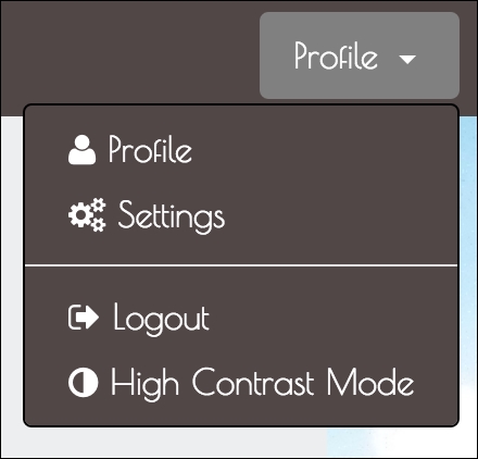
Figure 6.13: The new High Contrast Mode menu item
Great. Now, of course, when we click on High Contrast Mode we won't able to see any visual changes as we haven't actually created
styles/myphoto-hcm.css
. But if we inspect the DOM, we should be able to see the CSS file referenced in the head. Take a look at the following screenshot:
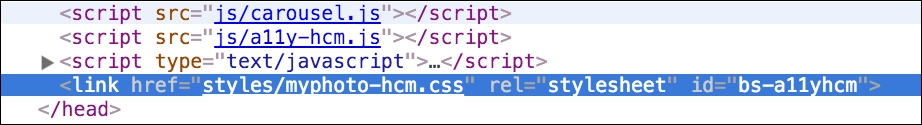
Figure 6.14: The High Contrast Mode style sheet dynamically added by the High Contrast Mode button
Click the High Contrast Mode button again, and the link element should be removed. Take a look at the following screenshot:
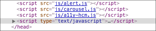
Figure 6.15: The High Contrast Mode style sheet dynamically removed by the High Contrast Mode butto
Great. Our plugin is working. Let's pass in a non-default value to be used as the id for the link element, to make sure that is also working as expected.
    <a href="#" class="a11yhcm" data-a11yhcm="styles/myphoto-hcm.css"
    a11yhcm-id="myphoto-hcm">
Take a look at the following screenshot:
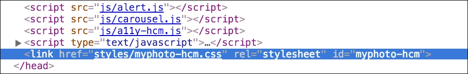
Figure 6.16: The High Contrast Mode style sheet dynamically added by the High Contrast Mode button, with a custom id attribute
Perfect. All functionality is working just like we wanted. Now, let's get to the CSS!
First, we're going to write the style sheet for A11yHCM, and, for good measure, we are going to write
myphoto-hcm.css
, to make our navigation more useful in High Contrast Mode.
Create a
styles/a11yhcm.css
file and include it in the
head
of our page:
    <link rel="stylesheet" href="bower_components/components-font-
    awesome/css/font-awesome.min.css" />
    <link rel="stylesheet" href="styles/alert.css" />
    <link rel="stylesheet" href="styles/carousel.css" />
    <link rel="stylesheet" href="styles/a11yhcm.css" />
All we are going to do here is toggle the a11yHCM element to indicate whether it is disabled or enabled. We're simply going to add a checkmark when it is enabled. We will need a little bit of JavaScript too, to add and remove the
enabled
class to our element. First, let's write the CSS:
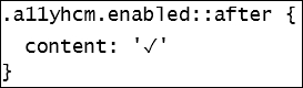
This rule simply appends a checkmark to the end of any content within an element with both the
a11yhcm
and
enabled
class applied, using the
after
pseudo-class. Let's update a11yHCM.js
to add and remove the
enabled
class:
    if (document.getElementById($this.styleSheetID)) {
        $('#' + $this.styleSheetID).remove()
        $this.removeClass('enabled')
    }
    else {
        var styleSheetLink = '<link href="' + styleSheet + '"
        rel="stylesheet" id="' + $this.styleSheetID + '"/>'
        $('head').append(styleSheetLink)
        $this.addClass('enabled')
    }
Let's check it out. Click on the High Contrast Mode button:
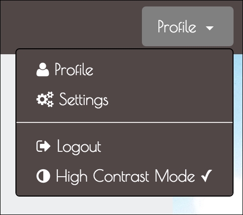
Figure 6.17: The checkmark is applied to the menu item to indicate when High Contrast Mode is enabled
Great. We now have a visual indicator for when High Contrast Mode is enabled. The checkmark might not be suitable for every design, but the rules can always be extended!
Now, let's get to fixing our navigation.
Create
styles/myphoto-hcm.css
and copy over the classes related to the hover, focus, and active states of the navigation from
myphoto.css
:
    .navbar-myphoto .navbar-nav > li > a:hover {        background-color: #504747;
        color: gray;
    }
    .navbar-myphoto .navbar-nav > li > a:focus {        background-color: #504747;
        color: gray;
    }
    .navbar-myphoto .navbar-nav > li.active > a {
        background-color: #504747;
        color: gray;
    }
    .navbar-myphoto .dropdown-menu > a {
        color: white;        background-color: #504747;
    }
    .navbar-myphoto .dropdown-menu > a:hover {
        color: gray;        background-color: #504747;
    }
    .navbar-myphoto .dropdown-menu > a:focus {
        color: gray;
        background-color: #504747;
    }
    .navbar-myphoto .dropdown-menu > .active > a:focus {
        color: gray;
        background-color: #504747;
    }
We want these states to be very clear in High Contrast Mode. For full effect, we will use the color blue. But hang on, before you go changing all the
color
properties to blue. The high contrast tools we're using are inverting the colors, so we need the inverse of blue, that is,
yellow. Observe the following code:
    .navbar-myphoto .navbar-nav > li > a:hover {
        background-color: #504747;
        color: yellow;
    }
    .navbar-myphoto .navbar-nav > li > a:focus {
        background-color: #504747;
        color: yellow;
    }
    .navbar-myphoto .navbar-nav > li.active > a {
        background-color: #504747;
        color: yellow;
    }
    .navbar-myphoto .dropdown-menu > li > a:hover {
        background-color: #504747;
        color: yellow;
    }
    .navbar-myphoto .dropdown-menu > li > a:focus {

        background-color: #504747;
        color: yellow;
    }
    .navbar-myphoto .dropdown-menu > li > .active > a:focus {

        background-color: #504747;
        color: yellow;
    }
Enable high contrast on your browser or OS, then click High Contrast Mode on the MyPhoto page to see the results. Take a look at the following screenshot:
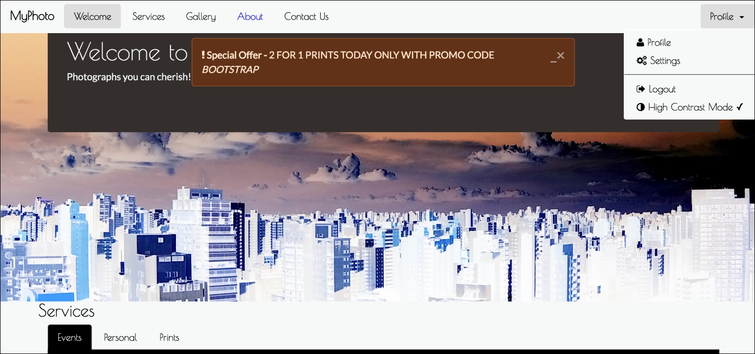
Figure 6.18: Viewing MyPhoto using Google's Accessibility High Contrast Chrome Plugin, with the 'About' navbar link in a focused state and with MyPhoto's High Contrast Mode enabled
The UI is now much clearer, and all thanks to our custom-built A11yHCM jQuery plugin. There is a lot more to do to make this page fully accessible, but it's a start.