Table of Contents for
Bootstrap 4 – Responsive Web Design
 Bootstrap 4 – Responsive Web Design
Published by
Packt Publishing, 2017
Bootstrap 4 – Responsive Web Design
Published by
Packt Publishing, 2017
- Cover
- Table of Contents
- Bootstrap 4 – Responsive Web Design
- Bootstrap 4 – Responsive Web Design
- Credits
- Preface
- What you need for this learning path
- Who this learning path is for
- Reader feedback
- Customer support
- 1. Module 1
- 1. Getting Started
- Setting up the framework
- Building our first Bootstrap example
- Optionally using the CDN setup
- Community activity
- Bootstrap and web applications
- Browser compatibility
- Summary
- 2. Creating a Solid Scaffolding
- Building our scaffolding
- Fluid container
- We need some style!
- Manipulating tables
- Like a boss!
- Final thoughts
- Summary
- 3. Yes, You Should Go Mobile First
- Bootstrap and the mobile-first design
- How to debug different viewports at the browser
- Cleaning up the mess
- Creating the landing page for different devices
- Summary
- 4. Applying the Bootstrap Style
- Summary
- 5. Making It Fancy
- Paying attention to your navigation
- Dropping it down
- Making an input grouping
- Getting ready for flexbox!
- Summary
- 6. Can You Build a Web App?
- Adding the navigation
- Do a grid again
- Playing the cards
- Implementing the main content
- Creating breadcrumbs
- Finishing with the right-hand-side content
- Summary
- 7. Of Course, You Can Build a Web App!
- Waiting for the progress bar
- Creating a settings page
- Summary
- 8. Working with JavaScript
- Awesome Bootstrap modals
- Creating our custom modal
- A tool for your tip
- Pop it all over
- Making the menu affix
- Finishing the web app
- Summary
- 9. Entering in the Advanced Mode
- The last navigation bar with flexbox
- Filling the main fluid content
- Filling the main content
- Overhead loading
- Fixing the toggle button for mobile
- Summary
- 10. Bringing Components to Life
- Fixing the mobile viewport
- Learning more advanced plugins
- Summary
- 11. Making It Your Taste
- Working with plugin customization
- The additional Bootstrap plugins
- Creating our Bootstrap plugin
- Defining the plugin methods
- Creating additional plugin methods
- Summary
- 2. Module 2
- 1. Introducing Bootstrap 4
- Summary
- 2. Using Bootstrap Build Tools
- Download the Bootstrap source files
- Setting up the blog project
- Setting up the JSON files
- Creating our first page template
- Summary
- 3. Jumping into Flexbox
- Ordering your Flexbox
- Wrapping your Flexbox
- Setting up the Bootstrap Flexbox layout grid
- Setting up a Flexbox project
- Designing a single blog post
- Summary
- 4. Working with Layouts
- Inserting rows into your layout
- Adding columns to your layout
- Choosing a column class
- Creating a simple three-column layout
- Mixing column classes for different devices
- Coding the blog home page
- Using responsive utility classes
- Summary
- 5. Working with Content
- Learning to use typography
- Customizing headings
- How to style images
- Coding tables
- Summary
- 6. Playing with Components
- Basic button examples
- Creating outlined buttons
- Checkbox and radio buttons
- Coding forms in Bootstrap 4
- Creating an inline form
- Adding validation to inputs
- Using the Jumbotron component
- Adding the Label component
- Using the Alerts component
- Using Cards for layout
- Updating the Blog index page
- How to use the Navs component
- Adding Breadcrumbs to a page
- Using the Pagination component
- How to use the List Group component
- Summary
- 7. Extending Bootstrap with JavaScript Plugins
- Coding Tooltips
- Avoiding collisions with our components
- Using Popover components
- Using the Collapse component
- Coding an Accordion with the Collapse component
- Coding a Bootstrap Carousel
- Summary
- 8. Throwing in Some Sass
- Using Sass in the blog project
- Importing partials in Sass
- Creating a collection of variables
- Customizing components
- Writing a theme
- Summary
- 9. Migrating from Version 3
- Big changes in version 4
- Updating your variables
- Additional global changes
- Other font updates
- Migrating components
- Migrating JavaScript
- Miscellaneous migration changes
- Summary
- 3. Module 3
- 1. Revving Up Bootstrap
- What Bootstrap 4 Alpha 4 has to offer
- Setting up our project
- Summary
- 2. Making a Style Statement
- Image elements
- Responsive utilities
- Helper classes
- Text alignment and transformation
- Summary
- 3. Building the Layout
- Adding Bootstrap components
- Summary
- 4. On Navigation, Footers, Alerts, and Content
- Improving navigation using Scrollspy
- Customizing scroll speed
- Icons
- Using and customizing alerts
- Creating a footer
- Creating and customizing forms
- Form validation
- Progress indicators
- Adding content using media objects
- Figures
- Quotes
- Abbreviations
- Summary
- 5. Speeding Up Development Using jQuery Plugins
- Enhanced pagination using bootpag
- Displaying images using Bootstrap Lightbox
- Improving our price list with DataTables
- Summary
- 6. Customizing Your Plugins
- Customizing plugins
- Writing a custom Bootstrap jQuery plugin
- Summary
- 7. Integrating Bootstrap with Third-Party Plugins
- Hover
- Summary
- 8. Optimizing Your Website
- Minifying CSS and JavaScript
- Introducing Grunt
- Running tasks automatically
- Stripping our website of unused CSS
- JavaScript file concatenation
- Summary
- 9. Integrating with AngularJS and React
- Introducing React
- Summary
- Bibliography
- Index
A Flexbox project is structured exactly like a regular one. You just have to be sure to replace the bootstrap.min.css file in the /css directory with the new Flexbox version. Copy the project we made in the last chapter and paste it wherever you want on your computer. Rename the project to something like Flexbox project. Now open up that project and navigate to the /css directory. In a new window, open up the Flexbox sources files directory and navigate to the /dist/css/ directory. Copy the bootstrap.min.css file from /dist/css into the /css directory in your new Flexbox project. You'll be prompted to overwrite the file and you should choose Yes. That's it, your new Flexbox project is ready to roll.
It would be a good idea to keep the Flexbox source files somewhere on your computer. In future projects, you can simply copy the compiled Flexbox version of the Bootstrap CSS over, saving you the trouble of having to recompile the source files each time you want a Flexbox layout.
Before we code our first Flexbox grid, we need to add a custom CSS theme to our project. We're going to do this to add any custom look and feel styles on top of Bootstrap. In Bootstrap you never want to edit the actual framework CSS. You should use the cascading power of CSS to insert a theme for additional custom CSS or to overwrite existing Bootstrap styles. In a later chapter, I'll go into more depth on custom themes but for now let's set up a basic one that we can use for our Flexbox grid. First, let's start by creating a new file in the /css directory of our project called theme.css. For now, the file can be blank; just make sure you create it and save it.
Next we need to update our _layout.ejs file to include the theme file in our page. Open up _layout.ejs in a text editor and make sure it matches the following code:
<!DOCTYPE html>
<html lang="en">
  <head>
    <!-- Required meta tags always come first -->
    <meta charset="utf-8">
    <meta name="viewport" content="width=device-width, initial-scale=1, shrink-to-fit=no">
    <meta http-equiv="x-ua-compatible" content="ie=edge">

    <title><%- pageTitle %> | <%- siteTitle %></title>

    <!-- Bootstrap CSS -->
    <link rel="stylesheet" href="css/bootstrap.min.css">
    <link rel="stylesheet" href="css/theme.css">
  </head>
  <body>

    <%- partial("partial/_header") %>

    <%- yield %>

    <%- partial("partial/_footer") %>

    <!-- jQuery first, then Bootstrap JS. -->
    <script src="https://ajax.googleapis.com/ajax/libs/jquery/2.1.4/jquery.min.js"></script>
    <script src="js/bootstrap.min.js"></script>
  </body>
</html>
I've added one line of code to the template that loads in theme.css:
<link rel="stylesheet" href="css/theme.css">
Note
Note that this line of code is after bootstrap.min.css. This is important as our theme needs to be loaded last so that we can overwrite Bootstrap default styles if we want to. Our template is now up-to-date and we are ready to start with our first grid. Feel free to keep theme.css open as we'll be adding some styles to it in the next step.
Now that we've set up our project, let's go ahead and start doing some Bootstrap coding. The good news is that the Bootstrap column classes used with the Flexbox grid are exactly the same as the ones used in a regular grid. There is no need to learn any new class names. In your project folder, create a new file and name it flexbox.ejs.
Before you go any further, you need to add an instance for this page to _data.json. Otherwise your harp compile command will fail. Open up _data.json and add the following code:
{
   "index": {
      "pageTitle": "Home"
   },
   "flexbox": {
      "pageTitle": "Flexbox"
   }
}
I've added a second entry for flexbox.ejs and given it this page title: Flexbox. Now we can safely start working on flexbox.ejs and the compile will work. Let's start with a simple three-column grid. Enter the following HTML code into flexbox.ejs:
<div class="container">
  <div class="row">
    <div class="col-md-4">Lorem ipsum dolor sit amet, consectetur adipiscing elit. Nullam eget ornare lacus. Nulla sed vulputate mauris. Nunc nec urna vel sapien mattis consectetur sit amet eu tellus.</div>
    <div class="col-md-4">Lorem ipsum dolor sit amet, consectetur adipiscing elit. Nullam eget ornare lacus. Nulla sed vulputate mauris. Nunc nec urna vel sapien mattis consectetur sit amet eu tellus. Suspendisse tempus, justo sed posuere maximus, velit purus dictum lacus, nec vulputate arcu neque et elit. Aliquam viverra vitae est eu suscipit. Donec nec neque eu sapien blandit pretium et quis est.</div>
    <div class="col-md-4">Lorem ipsum dolor sit amet, consectetur adipiscing elit. Nullam eget ornare lacus. Nulla sed vulputate mauris. Nunc nec urna vel sapien mattis consectetur sit amet eu tellus. Suspendisse tempus, justo sed posuere maximus, velit purus dictum lacus, nec vulputate arcu neque et elit. Aliquam viverra vitae est eu suscipit. Donec nec neque eu sapien blandit pretium et quis est. Sed malesuada sit amet mi eget pulvinar. Mauris posuere ac elit in dapibus. Duis ut nunc at diam volutpat ultrices non sit amet nulla. Aenean non diam tellus.</div>
  </div>
</div>
Let me breakdown what is happening here:
- Like in the earlier example, I've created three equal columns. Each one has a different amount of text in it.
- I'm using the
col-md-4column class, as I want the three-column horizontal layout to be used for medium-size devices and upwards. Smaller devices will default to a single column width layout. - I've also added a
.childclass to each of the column<div>s so that I can style them.
Now let's add a little CSS to theme.css so we can more easily see what is going on:
.child {
   background: #ccc;
   padding: 20px;
}
Here's what is happening with the .child class:
- I've added a light gray background color so we can easily see the child box.
- I've added some padding. Note that you can add padding to a Flexbox grid without worrying about breaking the grid. In a regular layout, this would break your box model and add extra width to the layout.
Here's what the finished layout should look like:
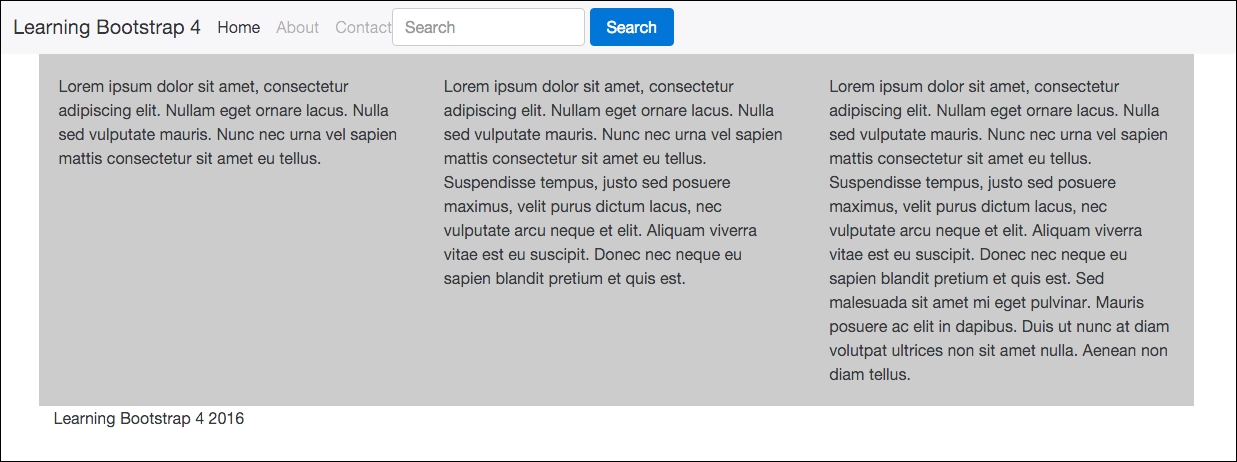
As you can see the light gray background has stretched to fit the height of the tallest column. An equal height column with almost no effort is awesome! You'll also notice that there is some padding on each column but our layout is not broken.
You may have noticed that I used the regular .container class to wrap this entire page layout. What if we want the layout to stretch the entire width of the browser?
Creating a full-width layout with no horizontal padding is actually really easy. Just remove the container class. The HTML for that type of layout would look like this:
<div class="row">
  <div class="col-md-4 child">Lorem ipsum dolor sit amet, consectetur adipiscing elit. Nullam eget ornare lacus. Nulla sed vulputate mauris. Nunc nec urna vel sapien mattis consectetur sit amet eu tellus.</div>
  <div class="col-md-4 child">Lorem ipsum dolor sit amet, consectetur adipiscing elit. Nullam eget ornare lacus. Nulla sed vulputate mauris. Nunc nec urna vel sapien mattis consectetur sit amet eu tellus. Suspendisse tempus, justo sed posuere maximus, velit purus dictum lacus, nec vulputate arcu neque et elit. Aliquam viverra vitae est eu suscipit. Donec nec neque eu sapien blandit pretium et quis est.</div>
  <div class="col-md-4 child">Lorem ipsum dolor sit amet, consectetur adipiscing elit. Nullam eget ornare lacus. Nulla sed vulputate mauris. Nunc nec urna vel sapien mattis consectetur sit amet eu tellus. Suspendisse tempus, justo sed posuere maximus, velit purus dictum lacus, nec vulputate arcu neque et elit. Aliquam viverra vitae est eu suscipit. Donec nec neque eu sapien blandit pretium et quis est. Sed malesuada sit amet mi eget pulvinar. Mauris posuere ac elit in dapibus. Duis ut nunc at diam volutpat ultrices non sit amet nulla. Aenean non diam tellus.</div>
</div>
As you can see, I've simply removed the <div> with the .container class on it. Let's take a look at what the layout looks like now:
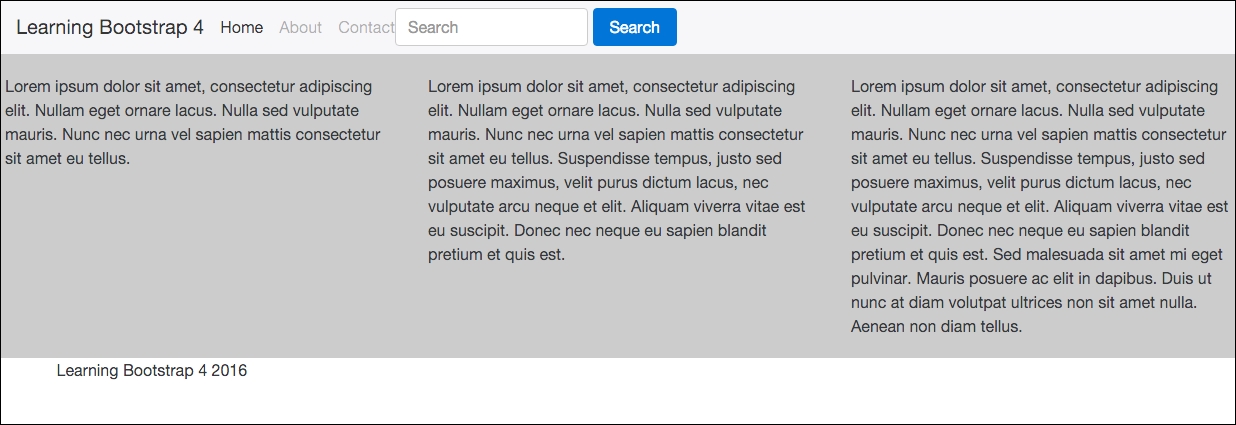
There we go, the columns are stretching right to the edges of the browser now. We've easily created a full-width layout that has equal height columns. Let's improve on this design by making each column an actual blog post and we'll also add more rows of posts.