Table of Contents for
Mastering PostCSS for Web Design
 Mastering PostCSS for Web Design
Published by
Packt Publishing, 2016
Mastering PostCSS for Web Design
Published by
Packt Publishing, 2016
- Cover
- Table of Contents
- Mastering PostCSS for Web Design
- Mastering PostCSS for Web Design
- Credits
- About the Author
- About the Reviewer
- www.PacktPub.com
- Preface
- What you need for this book
- Who this book is for
- Conventions
- Reader feedback
- Customer support
- 1. Introducing PostCSS
- Introducing PostCSS
- Setting up a development environment
- Creating a simple example using PostCSS
- Linting code using plugins
- Exploring how PostCSS works
- Summary
- 2. Creating Variables and Mixins
- Creating a hover effect example
- Transitioning to using PostCSS
- Adding variable support to PostCSS
- Updating our hover effect demo
- Setting the order of plugins
- Creating mixins with PostCSS
- Looping content with PostCSS
- Summary
- 3. Nesting Rules
- Navigating through pages
- Transitioning to using PostCSS plugins
- Exploring the pitfalls of nesting
- Making the switch to BEM
- Exploring our changes in more detail
- Summary
- 4. Building Media Queries
- Exploring custom media queries in PostCSS
- Making images responsive
- Adding responsive text support
- Optimizing media queries
- Retrofitting support for older browsers
- Moving away from responsive design
- Taking things further with CSS4
- Summary
- 5. Managing Colors, Images, and Fonts
- Managing fonts with PostCSS
- Creating image sprites
- Working with SVG in PostCSS
- Adding support for WebP images
- Manipulating colors and color palettes
- Creating color functions with PostCSS
- Summary
- 6. Creating Grids
- Creating an example with Bourbon Neat
- Exploring the grid plugins in PostCSS
- Transitioning to using PostCSS-Neat
- Creating a site using Neat and PostCSS
- Adding responsive capabilities
- Summary
- 7. Animating Elements
- Moving away from jQuery
- Making use of pre-built libraries
- Switching to using SASS
- Making the switch to PostCSS
- Exploring plugin options within PostCSS
- Updating code to use PostCSS
- Creating a demo in PostCSS
- Optimizing our animations
- Using our own animation plugin
- Summary
- 8. Creating PostCSS Plugins
- Dissecting the architecture of a standard plugin
- Creating an transition plugin
- Building a custom font plugin
- Simplifying the development process
- Guidelines for plugin building
- Making the plugin available for use
- Summary
- 9. Working with Shortcuts, Fallbacks, and Packs
- Exploring plugin packs for PostCSS
- Adding shortcuts with Rucksack
- Linting and optimizing your code
- Providing fallback support
- Summary
- 10. Building a Custom Processor
- Exploring our processor
- Dissecting issues with our processor
- Optimizing the output
- Adding reload capabilities
- Extending our processor further
- Testing the final pre-processor
- Getting started with some hints and tips
- Introducing the CSStyle library
- Summary
- 11. Manipulating Custom Syntaxes
- Preparing our environment
- Implementing custom syntax plugins
- Parsing CSS
- Formatting the output with the API
- Highlighting our syntax code
- Summary
- 12. Mixing Preprocessors
- Exploring the conversion process
- Introducing the Pleeease library
- Compiling with other preprocessors
- Using the PreCSS library
- Converting a WordPress installation
- Setting up our environment
- Considering the conversion process
- Making changes to our code
- Compiling and testing the changes
- Summary
- 13. Troubleshooting PostCSS Issues
- Exploring some common issues
- Getting help from others
- Summary
- 14. Preparing for the Future
- Converting CSS4 styles for use
- Supporting future syntax with cssnext
- Creating plugins to provide extra CSS4 support
- Summary
- Index
A key part of supporting CSS4 is the constant state of flux that we must deal with, until such time as modules have been standardized. If we maintained our current approach, it would entail constant updates of any plugins we decided to use that relate to CSS4 attributes—this is clearly not sustainable!
Instead, we can use a single plugin pack, in this case cssnext, to manage support for a range of new features. The beauty, though, is that all of the features are enabled by default, and will only kick in when needed in the code. There will of course come a time when new features are supported natively, at this point, we can simply discard the compilation process without impacting the final result.
It's worth taking the time to get to know cssnext—let's dive in and take a look in more detail.
The cssnext plugin is one of those exceptions to our guideline of one plugin per task; we call it using the plugin name, but in reality, it will perform a number of transformations at the same time.
The plugin is available from http://cssnext.io/. It is worth noting that an older version exists; we're using the newer version in this demo. The cssnext plugin was originally a complete system in its own right, before PostCSS became as popular as it is now.
The plugin contained options which didn't really belong to a plugin focused on the future of CSS, so the developers rewrote it to make cssnext simpler. At the same time, it was designed to be integrated into PostCSS, where we can use it at the same time as other plugins within our processor.
Note
The plugin even has its own playground, which we can use to test if changes will produce the desired effect—check it out at http://cssnext.io/playground/.
Let's explore this plugin in more detail—we'll begin by installing it, before setting up code for our next demo.
For this next demo, we're going to set up a basic template that can be used for a site—it's not going to win any awards for style, but the aim here is to explore how easy it is to make the changes, not become top billing at the next awards ceremony! Let's dive in and take a look at what we need to do:
- We'll start by firing up a Node.js command prompt session then changing the working folder to the root of our project area.
- At the prompt, enter this command, then press Enter:
npm install postcss-cssnext --save-devIf all is well, we should see something akin to this screenshot:

- Next, go ahead and extract a copy of the
T71 - working with cssnextfolder from the code download that accompanies this book—save it to the root of our project area. - From the
T71 - working with cssnextfolder, save copies of the styles.css file to thesrcfolder at the root of our project area, thenpackage.jsonandgulpfile.jsto the root of our project area. - Revert to the prompt we had open, then enter
gulpand pressEnter. - Gulp will go away and compile our file, when it has completed, we will see the now familiar files appear in the
destfolder at the root of our project area. - Copy the contents of the
destfolder at the root of our project area to thecssfolder withinT71 - working with cssnextfolder at the root of our project area. - Go ahead and preview
sitepage.htmlfrom within theT71 - working with cssnextfolder in a browser—if all is well, we should see something akin to this screenshot: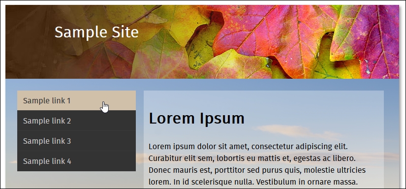
We've now seen the template for our site—there are several places where we have made changes to take advantage of the power of cssnext. For this, go ahead and open up a copy of the file stylescss from within the css folder of T71 - working with cssnext folder that we saved to our project area—let's explore what changes have been made:
- Autoprefixer: The plugin covers support for providing vendor prefixes for any future styles; any in the base file have been removed, and will be added during compilation.
- Media query ranges / custom queries: Instead of using the existing format, which isn't always clear, we can begin to use
>=or<=to better express the range that we're applying as part of our query. At the same time, we can use a custom query to define preset ranges at the top of our file, which can be used throughout the style sheet. - Nesting: Fans of existing preprocessors such as SASS or Less will be familiar with the nesting principle; put simply, this allows us to nest styles inside each other. We can then adjust the selectors used for these rules, so that when compiled, each rule is transformed into valid CSS.
- Custom selectors: Staying with the preprocessor theme, we can create custom values at the top of our code, and apply them as appropriate throughout.
- #rrggbbaa colors: Traditionally, hex colors have been expressed as either three or six digit values; using
cssnext, we can expand them to either four or eight digit values. Thecssnextplugin will transpile them into standard RGBA values, with equivalent HEX values provided as a fallback mechanism. - rem units: Traditionally, developers have used pixel values to apply sizes to elements or fonts. Pixel values don't respect user settings in a browser, so may not resize as expected. To work around this,
emunits were introduced; the math behind calculatingemvalues was simplified with the introduction of rem units. Today, some developers argue that pixel values should reign supreme; thecssnextplugin provides both pixel and rem units, which can be used where supported by browsers.
At first thought, you might expect to have to include a number of plugins, or a detailed configuration object; not so! Instead, all we need in our Gulp task file is this:
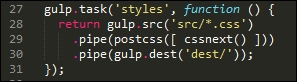
I've always been a keen fan of keeping things simple—the cssnext plugin is a perfect example! Whilst we may need to update the plugin regularly to keep abreast of changes, we don't need to change our Gulp file.
The plugin will simply transform those styles it finds that are supported by the plugin, and leave alone any not covered by the plugin. The beauty of this is that we can either let it run as is, or if we want disable functionality that is no longer needed, then we simply disable it within the configuration object:
cssnext(input, {
  features: { customProperties: false }
})
To prove that the changes we made work, we've turned our (non-responsive) template from this:
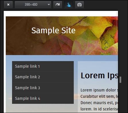
…to this view, where our content clearly fits the smaller screen better:
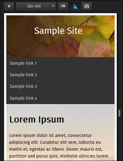
Even though it's only a small part of the changes made, is directly responsible for making our template responsive, it goes to show that incorporating cssnext into our processes is easier than you might think!
Okay, let's move on: we're going to take a look at a couple more plugins, but with a twist. We'll first look at using a plugin to provide support for a new color being introduced as part of CSS4, before using it as a basis for fixing a keyword issue that should have been fixed a long time ago!