Table of Contents for
Mastering PostCSS for Web Design
 Mastering PostCSS for Web Design
Published by
Packt Publishing, 2016
Mastering PostCSS for Web Design
Published by
Packt Publishing, 2016
- Cover
- Table of Contents
- Mastering PostCSS for Web Design
- Mastering PostCSS for Web Design
- Credits
- About the Author
- About the Reviewer
- www.PacktPub.com
- Preface
- What you need for this book
- Who this book is for
- Conventions
- Reader feedback
- Customer support
- 1. Introducing PostCSS
- Introducing PostCSS
- Setting up a development environment
- Creating a simple example using PostCSS
- Linting code using plugins
- Exploring how PostCSS works
- Summary
- 2. Creating Variables and Mixins
- Creating a hover effect example
- Transitioning to using PostCSS
- Adding variable support to PostCSS
- Updating our hover effect demo
- Setting the order of plugins
- Creating mixins with PostCSS
- Looping content with PostCSS
- Summary
- 3. Nesting Rules
- Navigating through pages
- Transitioning to using PostCSS plugins
- Exploring the pitfalls of nesting
- Making the switch to BEM
- Exploring our changes in more detail
- Summary
- 4. Building Media Queries
- Exploring custom media queries in PostCSS
- Making images responsive
- Adding responsive text support
- Optimizing media queries
- Retrofitting support for older browsers
- Moving away from responsive design
- Taking things further with CSS4
- Summary
- 5. Managing Colors, Images, and Fonts
- Managing fonts with PostCSS
- Creating image sprites
- Working with SVG in PostCSS
- Adding support for WebP images
- Manipulating colors and color palettes
- Creating color functions with PostCSS
- Summary
- 6. Creating Grids
- Creating an example with Bourbon Neat
- Exploring the grid plugins in PostCSS
- Transitioning to using PostCSS-Neat
- Creating a site using Neat and PostCSS
- Adding responsive capabilities
- Summary
- 7. Animating Elements
- Moving away from jQuery
- Making use of pre-built libraries
- Switching to using SASS
- Making the switch to PostCSS
- Exploring plugin options within PostCSS
- Updating code to use PostCSS
- Creating a demo in PostCSS
- Optimizing our animations
- Using our own animation plugin
- Summary
- 8. Creating PostCSS Plugins
- Dissecting the architecture of a standard plugin
- Creating an transition plugin
- Building a custom font plugin
- Simplifying the development process
- Guidelines for plugin building
- Making the plugin available for use
- Summary
- 9. Working with Shortcuts, Fallbacks, and Packs
- Exploring plugin packs for PostCSS
- Adding shortcuts with Rucksack
- Linting and optimizing your code
- Providing fallback support
- Summary
- 10. Building a Custom Processor
- Exploring our processor
- Dissecting issues with our processor
- Optimizing the output
- Adding reload capabilities
- Extending our processor further
- Testing the final pre-processor
- Getting started with some hints and tips
- Introducing the CSStyle library
- Summary
- 11. Manipulating Custom Syntaxes
- Preparing our environment
- Implementing custom syntax plugins
- Parsing CSS
- Formatting the output with the API
- Highlighting our syntax code
- Summary
- 12. Mixing Preprocessors
- Exploring the conversion process
- Introducing the Pleeease library
- Compiling with other preprocessors
- Using the PreCSS library
- Converting a WordPress installation
- Setting up our environment
- Considering the conversion process
- Making changes to our code
- Compiling and testing the changes
- Summary
- 13. Troubleshooting PostCSS Issues
- Exploring some common issues
- Getting help from others
- Summary
- 14. Preparing for the Future
- Converting CSS4 styles for use
- Supporting future syntax with cssnext
- Creating plugins to provide extra CSS4 support
- Summary
- Index
Although we've only covered a few ideas, there are nevertheless a fair few steps to go through; the key to this (and keeping your sanity!) is to complete each in blocks, and not all in one go.
The bulk of our changes will use existing tasks we've created in earlier demos; to this we will add the PreCSS library (from https://github.com/jonathantneal/precss), along with postcss-import and gulp-pixrem plugins. With this in mind, we'll make a start—our first task is to split the code into more manageable style sheets.
The critical part of this process is to split our style sheet—for this, we will use the postcss-import plugin, from https://github.com/postcss/postcss-import:
- We'll start, as always, by firing up a Node.js command prompt, then changing the working folder to the root of our project area.
- At the prompt, go ahead and enter this command, then press Enter:
npm install postcss-import --save-dev - Wait for Gulp to complete the installation process.
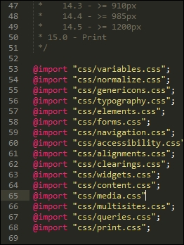
Next, we need to split our style sheet into separate blocks; the most convenient way to do this is split it into sections according to the list at the top of style.css:
- In the
srcfolder at the root of our project area, create a new folder calledcss. - Go ahead and open up a copy of
style.cssfrom within the Twenty Sixteen folder—it's located atC:\wamp\www\wordpress\wp-content\themes\twentysixteen\. - Save this to the
srcfolder at the root of our project area. - On or around line 53, add this line:
@import "css/variables.css";. Don't worry for now what it will be for—this will become clear later in this chapter. - Find lines 54 to 252, then copy them to a new file—save this as
normalize.cssin thecssfolder within the rootsrcfolder. - In the
style.cssfile within thesrcfolder, add these import statements, as indicated:
- Repeat the process until you have extracted all sections into their own files (1 to 15). Save them with the same names as each main section.
- We have one last step to perform: we need our Gulp task file! From the code download that accompanies this book, go ahead and extract a copy of
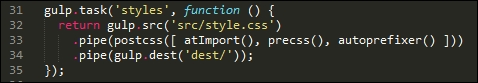
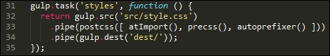
gulpfile.jsandpackage.jsonfrom theT68 - converting a WordPress themefolder, then save both to the root of our project area. - Take a quick look at the
gulpfile.jsfile, in particular, at lines 31 to 35:
Notice how we are compiling directly to style.css, unlike previous exercises? It's not ideal, but as WordPress themes use style.css by default, this is something we can live with as part of our compilation process.
Our next task is to install support for adding vendor prefixes—in a sense, we've already covered how to achieve this. Most, if not all, of our previous demos already include support for vendor prefixes, using the Autoprefixer plugin.
As a reminder, Autoprefixer is available from https://github.com/postcss/autoprefixer; there is an online version we can use to test changes at https://autoprefixer.github.io/.
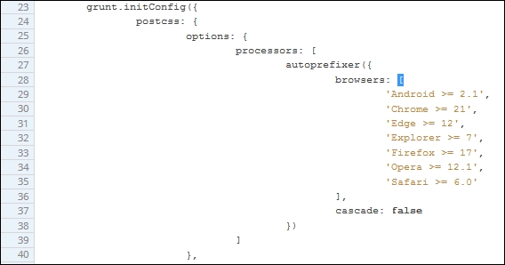
If we take a look at the Gulp task file we downloaded in the previous example, we can see the autoprefixer plugin has been called as part of firing PostCSS:
There are, however, a couple of key points we should note at this stage.
When using the Autoprefixer plugin, it uses data from the Can I Use site (http://www.caniuse.com) to update any vendor prefixes it finds that are out of date. It is worth spending time going through your style sheet to ensure that it does not already include vendor prefixes—if it does, these need to be removed.
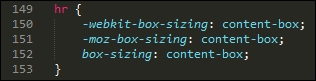
We can remove them manually, or a more effective route is to use the postcss-remove-prefixes plugin, available from https://github.com/johnotander/postcss-remove-prefixes. We can add it to our Gulp task file, or run it directly from the command line. The key here is to complete the removal first, so that Autoprefixer can then be used to manage vendor prefixes.
WordPress already uses Autoprefixer to manage vendor prefixes—you can see evidence of it in the Grunt file at https://core.trac.wordpress.org/browser/trunk/Gruntfile.js. Granted, it is using Grunt, but the process is very similar for those of you using Gulp or one of the other task runners available that are compatible with PostCSS:
Although setting up Autoprefixer in our Gulp task file is very easy—at least the basics—it will only be successful if we spend time removing any vendor prefixes that can then be added automatically at compilation. The postcss-remove-prefixes plugin will remove simple examples such as the following one, so that we are left with unprefixed versions that Autoprefixer can then update during compilation:
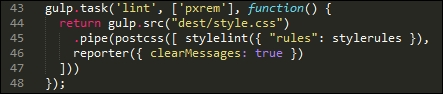
The final core task we should perform is to check our code for consistency—by now, this should be an all-too familiar task, as we've already set up a suitable task from earlier demos that can easily be reused for compiling WordPress themes. It's time to revisit this task. To ensure it works correctly, we will need to amend the settings slightly, so let's cover that now.
If we take a look at the Gulp task file we saved at the start of these changes, we should see this configuration object:
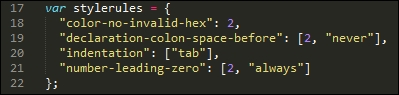
A little further down is the task, there are two changes here: we've hardcoded the destination file, and the order which has been adjusted, to allow for the presence of the pxrem task. The indentation setting has also been changed within the configuration object—when compiled, the style sheet uses tabs for indentation.
This will throw up a host of warnings, we can either manually alter 3000+ entries, or alter how the indentation is checked. Hopefully it's a no-brainer as to which we would prefer to do, at least in the short term!
Leaving aside these two changes, the remainder of the linting task has not changed:
Okay, let's change tack: there is one more core task which we should run, which is to minify our code. We've already used it in a number of demos, but let's take a moment to just revisit it within the context of compiling WordPress themes.
If we had to rank the top four key tasks that could be performed using PostCSS, then this next task should definitely be at the top of that list. Minifying our code is key to conserving bandwidth usage—WordPress themes are no lightweights!
Our Gulp file already has this built in: the package.json file will have the appropriate reference set. If we take a look at the task file in more detail, we should see something akin to this:
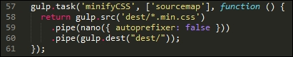
Looks familiar? It should—it's an almost direct copy of the existing task we've used from earlier demos. We've switched off autoprefixer, as this is being used elsewhere in our Gulp file.
Let's move on. WordPress uses SASS as its main pre-processor; we could use the Pleeease library to compile both SASS and PostCSS code, but a cleaner option is to use the PreCSS library. This abstracts support for a number of plugins that emulate SASS code (but without the SASS baggage, so to speak). Let's dive in and take a look at this in more detail.
One of the key features of SASS (and other processors) is the ability to use variables as placeholders for values—these are transformed into valid CSS styles at compilation.
Why use them, I hear you ask? Simple, if you decide to change a font family, or color, do you want to wade through thousands of lines of code to update any instance where it has been used? I would hope the answer is no—and quite rightly so: we have better things to do! One of those, is to install the plugin that will add variable support in the form of PreCSS.
We've already installed PreCSS from an earlier demo, so all that remains to do is to ensure it is added to our Gulp task file accordingly (it's already in ours, and in the accompanying package.json file):
The real work comes in changing our style sheet—let's take a look at what is required:
- First, we need to create a file to store our variables—go ahead and create a blank file in the
csssubfolder under thesrcfolder at the root of our project area, and label itvariables.css. - Open up the
variables.cssfile. Go ahead and add these values:/** * 0 - Variables */ /** * 0.1 - Colors */ $lightgray: #d1d1d1; $almostblack: #1a1a1a; $verydarkgray: #686868; $white: #ffffff; $verylightgray: #f7f7f7; $strongblue: #007acc; /** * 0.2 - Fonts */ $Monserrat: Montserrat, "Helvetica Neue", sans-serif; $OpenSans: "Open Sans", sans-serif; $Merriweather: Merriweather, Georgia, serif; $Inconsolata: Inconsolata, monospace; /** * 0.3 - Font Sizes */ $baseSize: 16px;
- Save the file, if we take a look back at Splitting our style sheet, you will notice that we've already included a link to it from our master style sheet:
- Values from this file will replace placeholders within our code, to produce valid CSS.
- The next task is a necessary evil, we have to work our way through each style sheet to be imported, and replace existing values with the variable equivalents. This screenshot shows a part example—here, the
font-familyvalue has been updated, but thebordervalue has yet to be changed: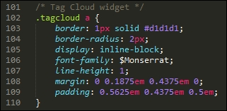
- Once each file has been changed, then save each, ready for the next exercise.
There is no easy way to get around it, but altering WordPress theme style sheets can require lots of patience! The best way to manage it is to use your editor's search and replace function— editors such as Sublime Text 3 (the author's editor of preference) have a very useful facility to replace text in multiple files; making use of this will help reduce the manual effort required to update each file.
This next task is one that is likely to cause debate—altering our code to use rem units, with pixel fallback added automatically.
Some developers claim that pixel values work just as well; others say that it all depends on where you need to specify a value, as to which unit of measure to use. Either way, we can use PostCSS to add pixel fall-back support automatically. The source for this plugin is available from https://github.com/gummesson/gulp-pixrem. Let's explore what is needed to add support for rem units:
- Open up a Node.js command prompt session, or if the one from the previous session is still available, then revert to it.
- Ensure that the working folder is set to the root of our project folder, then at the prompt enter this command and press Enter:
npm install gulp-pixrem --save-dev - Gulp will go away and install the plugin—wait for it to complete before continuing.
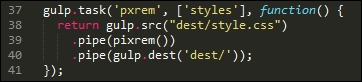
- We already have our Gulp task file in place—if we look at it in detail, we can see it being called at line 39:
At this point, we have everything in place - the next task is to work our way through the various style sheets that we've created, and replace any instance of pixel values with rem equivalents.
This is a thankless but necessary task—the plugin works by adding pixel fallback values for any instances of rem units that it finds within our code. It is up to us to do as much or as little as we want, in terms of changing values—it is worth making some changes to ensure that the code compiles, but the remaining changes can be done over time.
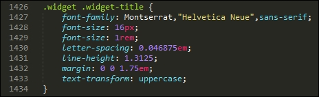
When compiling the code, we will end up with code similar to this example—this extract comes from the Widgets section (section 10):
It's easy to simply convert our style sheet to use pixel fallback support—the key here is that we need to decide where we want to be using rem unit support, and where existing values such as pixels or em units would be preferable.
Moving on, there are two more tasks we can set up as part of our compilation process—how about mimicking the ability to nest styles from SASS, or creating mini loops to automate generating certain styles? Don't worry if this is not something that you're familiar with—let's dive in and see what these mean in action.
The nesting of styles is a common feature when using processors such as SASS—if we have a bunch of styles that have very similar selectors, then it creates a degree of unwanted duplication.
We could stick with this duplication, but a more sensible option is to take the core part of the selector, then nest descendants within that block—this example is taken from the typography.css file:
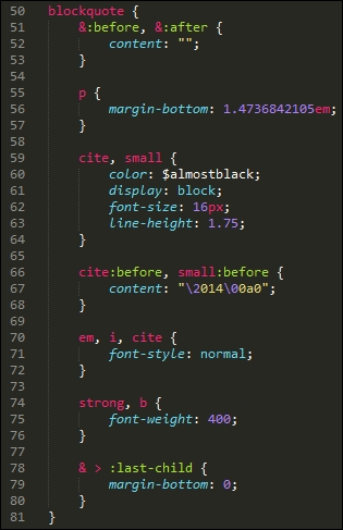
The idea is to avoid having to write the same duplicated parent styles—we can concentrate on the children instead! While the code may look longer, it is definitely easier to read; we can group together styles that have a common parent.
The technique is easy to pick up, but can be deceptively hard to get right; if you are not familiar with it, then I would recommend taking a look at my two books on SASS SASS Essentials and SASS CSS How-to, available at https://www.packtpub.com/.
Once compiled, the code will appear as normal CSS. There's one thing to note, though: resist the temptation to nest everything; nesting is really best kept to where you can see a real difference in the amount of code used!
There is one more change we can make to our code—take a look at the media.css file that we created earlier in this chapter, in particular around lines 158 to the end:
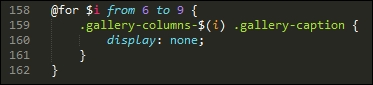
I can already hear the next questions coming, what is that meant to be, and why are we using what looks like a programming loop in our code? In this instance, we're borrowing a principle from SASS, namely creating loops; this, coupled with string interpolation allows us to create the rules automatically.
When the code is compiled, this is how the code will look:
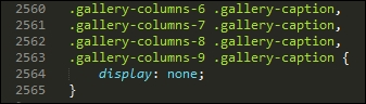
It's a more advanced principle to grasp, but certainly one worth spending time getting up to speed—if applied correctly, it can save a lot of time with creating styles!
Let's change tack at this point—we've covered a number of concepts that will help get you started; there are a few more ideas that we can follow up at a later date, once the basics are in place. Let's take a moment to consider these in more detail.
Over the last few pages, we've covered a number of areas where PostCSS can be used to help better manage our WordPress style sheets. It's important to bear in mind that there are no hard and fast rules on what should be used, but that each style sheet will have its own requirements.
The options we've covered only scratch the surface of what is possible—for those of you who are familiar with SASS, you may well be asking why we didn't use SASS mixins, for example. The simple reason is that there is nothing stopping us from doing so: it was all about providing options that give us a quick and easy win at the conversion stage.
Let's pause for a moment and consider some other ideas that will help get you started on updating our style sheet:
- Adding mixins: This is the obvious choice, but one that needs planning; this will be all about creating blocks of code that can be reused at will throughout our code.
- Color fallback: Although not part of the PreCSS package we've been using to date, color fallback is another option to consider. The core WordPress themes use standard HEX notation; we can update it to use RGB equivalents and use a PostCSS plugin to add in HEX values. If we prefer, we can even use a plugin such as postcss-rgba-hex to convert from using RGBA colors to plain HEX—you may prefer working with the former, or have processes that require the use of the former format.
- Font support: How about incorporating the font-magician plugin for PostCSS? If we look at the
variablesfile created earlier, it will contain a number of fonts that are not standard (at least to Windows); it means that our WordPress theme will look a little plain, to say the least! Fortunately, we can use the font-magician plugin to provide font-face support for the non-standard fonts; most, such as Inconsolata, Open Sans, and Merriweather, are available from the Font Squirrel website at http://www.fontsquirrel.com.
We've picked on just three ways to help extend your theme—with the use of a task runner such as Gulp, we are really only limited by the extent of what is available as plugins for Gulp. We don't have to limit ourselves to PostCSS plugins only; this will restrict what we can do, and mean that we're missing out on useful functionality. The key here is to consider what changes you want to make, and plan how and when you will make them—the process should be iterative, which will help with managing the changes!