Table of Contents for
Mastering PostCSS for Web Design
 Mastering PostCSS for Web Design
Published by
Packt Publishing, 2016
Mastering PostCSS for Web Design
Published by
Packt Publishing, 2016
- Cover
- Table of Contents
- Mastering PostCSS for Web Design
- Mastering PostCSS for Web Design
- Credits
- About the Author
- About the Reviewer
- www.PacktPub.com
- Preface
- What you need for this book
- Who this book is for
- Conventions
- Reader feedback
- Customer support
- 1. Introducing PostCSS
- Introducing PostCSS
- Setting up a development environment
- Creating a simple example using PostCSS
- Linting code using plugins
- Exploring how PostCSS works
- Summary
- 2. Creating Variables and Mixins
- Creating a hover effect example
- Transitioning to using PostCSS
- Adding variable support to PostCSS
- Updating our hover effect demo
- Setting the order of plugins
- Creating mixins with PostCSS
- Looping content with PostCSS
- Summary
- 3. Nesting Rules
- Navigating through pages
- Transitioning to using PostCSS plugins
- Exploring the pitfalls of nesting
- Making the switch to BEM
- Exploring our changes in more detail
- Summary
- 4. Building Media Queries
- Exploring custom media queries in PostCSS
- Making images responsive
- Adding responsive text support
- Optimizing media queries
- Retrofitting support for older browsers
- Moving away from responsive design
- Taking things further with CSS4
- Summary
- 5. Managing Colors, Images, and Fonts
- Managing fonts with PostCSS
- Creating image sprites
- Working with SVG in PostCSS
- Adding support for WebP images
- Manipulating colors and color palettes
- Creating color functions with PostCSS
- Summary
- 6. Creating Grids
- Creating an example with Bourbon Neat
- Exploring the grid plugins in PostCSS
- Transitioning to using PostCSS-Neat
- Creating a site using Neat and PostCSS
- Adding responsive capabilities
- Summary
- 7. Animating Elements
- Moving away from jQuery
- Making use of pre-built libraries
- Switching to using SASS
- Making the switch to PostCSS
- Exploring plugin options within PostCSS
- Updating code to use PostCSS
- Creating a demo in PostCSS
- Optimizing our animations
- Using our own animation plugin
- Summary
- 8. Creating PostCSS Plugins
- Dissecting the architecture of a standard plugin
- Creating an transition plugin
- Building a custom font plugin
- Simplifying the development process
- Guidelines for plugin building
- Making the plugin available for use
- Summary
- 9. Working with Shortcuts, Fallbacks, and Packs
- Exploring plugin packs for PostCSS
- Adding shortcuts with Rucksack
- Linting and optimizing your code
- Providing fallback support
- Summary
- 10. Building a Custom Processor
- Exploring our processor
- Dissecting issues with our processor
- Optimizing the output
- Adding reload capabilities
- Extending our processor further
- Testing the final pre-processor
- Getting started with some hints and tips
- Introducing the CSStyle library
- Summary
- 11. Manipulating Custom Syntaxes
- Preparing our environment
- Implementing custom syntax plugins
- Parsing CSS
- Formatting the output with the API
- Highlighting our syntax code
- Summary
- 12. Mixing Preprocessors
- Exploring the conversion process
- Introducing the Pleeease library
- Compiling with other preprocessors
- Using the PreCSS library
- Converting a WordPress installation
- Setting up our environment
- Considering the conversion process
- Making changes to our code
- Compiling and testing the changes
- Summary
- 13. Troubleshooting PostCSS Issues
- Exploring some common issues
- Getting help from others
- Summary
- 14. Preparing for the Future
- Converting CSS4 styles for use
- Supporting future syntax with cssnext
- Creating plugins to provide extra CSS4 support
- Summary
- Index
Throughout this book, we've explored a number of different plugins and concepts to help construct a processor; over the last few pages, we've brought together some of those concepts as the final version of our processor—at least one we can start using in anger.
There is one key step left to complete—we've compiled code for simple exercises, this works well, but doesn't really represent the kind of processes we might go through as developers! For this, we need to construct a real-world example, and put our processor through its paces.
As luck would have it, there is an example web page we can use from the code download that accompanies this book—let's take a look at putting its style sheet code through our processor. We'll begin by running the normal tasks we've done before, but will add a selection of plugins to make for a more realistic example:
- We'll start by extracting a copy of the
T55 - testing our processorfolder from the code download that accompanies this book; go ahead and save it to the root of our project area. - Copy the
gulpfile.jsandpackage.jsonfiles from within this sub-folder to the root of our project area. - Fire up a Node.js command prompt, then change the working folder to our project area.
- In the prompt, go ahead and enter these three lines, pressing Enter after each:
npm install postcss-nesting --save-dev
npm install postcss-short-color --save-dev
npm install postcss-pixrem
- Copy the
site.cssfile from within thecss – completed versionfolder underT55 – testing our processor, to thesrcfolder at the root of our project area. - Revert to the Node.js session, then enter
gulpat the prompt and press Enter—wait for it to complete compiling. - When compilation has finished, copy the contents of the
destfolder to thecssfolder withinT55 – testing our processor. - Try previewing the results of the compiled file—if all is well, we should see something akin to this screenshot:
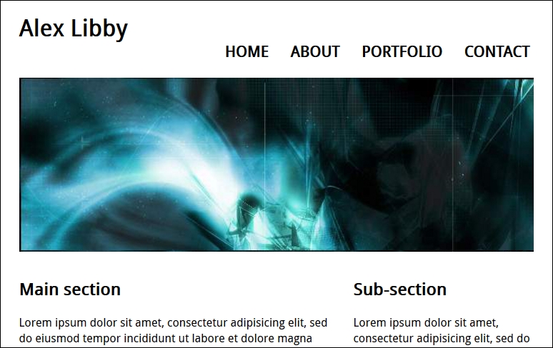
Try resizing the browser window, or enabling Responsive Design mode in your browser (if supported)—we should see that content automatically flows or resizes, according to the size you set for the browser window. Overall, a successful result!
The question is—what happened here? If we take a look at our code, the sharp-eyed should spot the addition of three plugins, plus a lot more code in the compiled version; let's take a moment to digest the results of our exercise.
If we look through our Gulp task file carefully, there should not be much in there that comes as a surprise—many of the tasks used are ones we have used on many occasions throughout the book.
The key here, though, is that whilst we can run the standard processor that we've already used before, it's unlikely to suit all occasions. It's more likely that we can use it as our base (as stated earlier), then add any extra plugins as needed. The great thing about this is that most of the configuration work is done—it keeps a consistent approach to our work. All that remains is to install any plugins that we don't already have in place—we of course have most of them, but need to install three additional ones, as highlighted here:
gulp.task('styles', function () {
  return gulp.src('src/*.css')
    .pipe(postcss([ rucksack({ fallbacks: true }), autoprefixer(), shortcolor, nesting, pixrem ]))
    .pipe(gulp.dest('dest/'));
});
These have to be accompanied with the relevant calls at the top of our Gulp task file:
var nesting = require('postcss-nesting');
var shortcolor = require('postcss-short-color');
var pixrem = require('pixrem');
In turn, these plugins are as follows:
- Rucksack: This is to handle responsive/media queries, fallback colors from rgba to hex, and implement
@font-face. - Pixrem: Available at https://github.com/robwierzbowski/node-pixrem, this takes care of providing a fallback mechanism for the rem unit values used throughout our style sheet.
- Nesting: Downloadable from https://github.com/jonathantneal/postcss-nesting (via Node), this covers an instance of nesting used in our code.
- Shorthand Color: In a couple of instances, we combined
background-colorandcolorattributes in a shorthand form that is later transpiled by the plugin. You can see more about this plugin at https://github.com/jonathantneal/postcss-short-color.
We can of course add others, and continue converting our code—there are other instances where Nesting can be applied, such as in the rules that control styling for our navigation. The key here, though, is that success is measured in how much we have to change our processor's default setup—in this instance, we didn't have to change it at all! We of course added extra plugins that required a change to one line of code in the processor, but none of the other tasks required any changes at all.
It's at this stage that we have effectively completed the journey to create our processor—well, strictly speaking, our journey should always be considered without end; this will help ensure our tool remains up to date. This aside, though, there are some useful tips we can use when creating our processor, so let's take a moment to cover these in more detail.