Table of Contents for
Mastering PostCSS for Web Design
 Mastering PostCSS for Web Design
Published by
Packt Publishing, 2016
Mastering PostCSS for Web Design
Published by
Packt Publishing, 2016
- Cover
- Table of Contents
- Mastering PostCSS for Web Design
- Mastering PostCSS for Web Design
- Credits
- About the Author
- About the Reviewer
- www.PacktPub.com
- Preface
- What you need for this book
- Who this book is for
- Conventions
- Reader feedback
- Customer support
- 1. Introducing PostCSS
- Introducing PostCSS
- Setting up a development environment
- Creating a simple example using PostCSS
- Linting code using plugins
- Exploring how PostCSS works
- Summary
- 2. Creating Variables and Mixins
- Creating a hover effect example
- Transitioning to using PostCSS
- Adding variable support to PostCSS
- Updating our hover effect demo
- Setting the order of plugins
- Creating mixins with PostCSS
- Looping content with PostCSS
- Summary
- 3. Nesting Rules
- Navigating through pages
- Transitioning to using PostCSS plugins
- Exploring the pitfalls of nesting
- Making the switch to BEM
- Exploring our changes in more detail
- Summary
- 4. Building Media Queries
- Exploring custom media queries in PostCSS
- Making images responsive
- Adding responsive text support
- Optimizing media queries
- Retrofitting support for older browsers
- Moving away from responsive design
- Taking things further with CSS4
- Summary
- 5. Managing Colors, Images, and Fonts
- Managing fonts with PostCSS
- Creating image sprites
- Working with SVG in PostCSS
- Adding support for WebP images
- Manipulating colors and color palettes
- Creating color functions with PostCSS
- Summary
- 6. Creating Grids
- Creating an example with Bourbon Neat
- Exploring the grid plugins in PostCSS
- Transitioning to using PostCSS-Neat
- Creating a site using Neat and PostCSS
- Adding responsive capabilities
- Summary
- 7. Animating Elements
- Moving away from jQuery
- Making use of pre-built libraries
- Switching to using SASS
- Making the switch to PostCSS
- Exploring plugin options within PostCSS
- Updating code to use PostCSS
- Creating a demo in PostCSS
- Optimizing our animations
- Using our own animation plugin
- Summary
- 8. Creating PostCSS Plugins
- Dissecting the architecture of a standard plugin
- Creating an transition plugin
- Building a custom font plugin
- Simplifying the development process
- Guidelines for plugin building
- Making the plugin available for use
- Summary
- 9. Working with Shortcuts, Fallbacks, and Packs
- Exploring plugin packs for PostCSS
- Adding shortcuts with Rucksack
- Linting and optimizing your code
- Providing fallback support
- Summary
- 10. Building a Custom Processor
- Exploring our processor
- Dissecting issues with our processor
- Optimizing the output
- Adding reload capabilities
- Extending our processor further
- Testing the final pre-processor
- Getting started with some hints and tips
- Introducing the CSStyle library
- Summary
- 11. Manipulating Custom Syntaxes
- Preparing our environment
- Implementing custom syntax plugins
- Parsing CSS
- Formatting the output with the API
- Highlighting our syntax code
- Summary
- 12. Mixing Preprocessors
- Exploring the conversion process
- Introducing the Pleeease library
- Compiling with other preprocessors
- Using the PreCSS library
- Converting a WordPress installation
- Setting up our environment
- Considering the conversion process
- Making changes to our code
- Compiling and testing the changes
- Summary
- 13. Troubleshooting PostCSS Issues
- Exploring some common issues
- Getting help from others
- Summary
- 14. Preparing for the Future
- Converting CSS4 styles for use
- Supporting future syntax with cssnext
- Creating plugins to provide extra CSS4 support
- Summary
- Index
Mention the word Rucksack, and one might be forgiven for thinking we were about to go on a journey or holiday—whilst the desire might be there, there are more practical matters to attend to first!
This said, working with PostCSS can easily be seen as going on a journey; this is particularly true when working with plugins. One of the plugins (or to be more accurate, packs) that you will very likely come across when working with PostCSS is Rucksack (see the play on words there?). This useful pack, available from http://simplaio.github.io/rucksack/, contains a number of plugins that have been linked together to provide additional functionality that we can use when compiling style sheets using Rucksack, such as these examples:
- Alias: This is available at https://github.com/seaneking/postcss-alias, this plugin allows us to create shorthand CSS properties.
- Clearfix: As a developer, I am sure you will be familiar with the clearfix hack: this plugin by Sean King provides the PostCSS equivalent, and is available at https://github.com/seaneking/postcss-clearfix.
- Font src expansion: How many times have you used custom font declarations in your code? They're a pain to write—another plugin by Sean King (at https://github.com/seaneking/postcss-fontpath), makes it a cinch to add to your code.
The irony here, though, is that we've already used Rucksack without realizing it—remember the postcss-responsive-type plugin we used back in Chapter 4, Building Media Queries? Or the autoprefixer plugin we've used in just about every chapter throughout the book? Both of these plugins are available via Rucksack—Rucksack is really an abstract layer that ties in access from multiple plugins into one consistent interface for us to use.
Okay, enough chitchat: let's get stuck into a demo and see some action! For our next demo, we're going to construct a simple slider using some standard HTML markup and CSS3 styles; no JavaScript will be used at all. We'll start with a quick run-through of our slider, before we convert the style sheet to use Rucksack.
For this next demo, we're going to break tradition and not install the plugin we're about to use first, before creating our demo. Instead, we'll set up our demo first—we can then ascertain where Rucksack can be used once we've set our baseline solution.
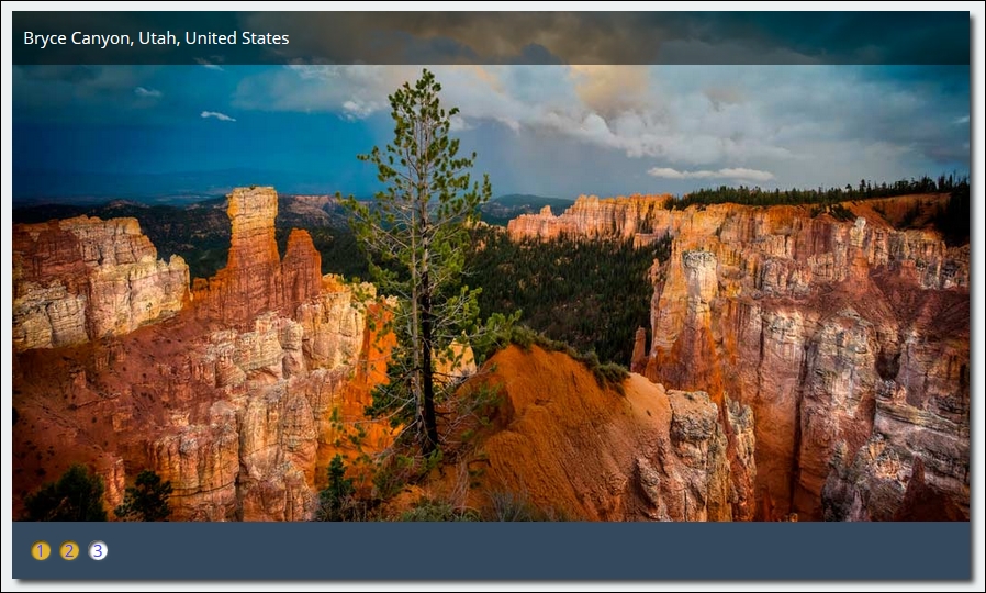
Our demo centers on a simple image slider, which uses pure CSS3 styling to control the animation. This is a screenshot of what we're going to create:

To see the demo in action, go ahead and extract the T45 – converting to use Rucksack folder from a copy of the code download that accompanies this book—save it to our project area. Go ahead and preview the results by running slider.html in a browser, then click on the numbers in the bottom left to move between different images.
With our demo in place, it's time to install Rucksack, and ascertain where we can use it in our demo! Rucksack, like most other PostCSS plugins, can be installed using the same method—we can use NPM:
- Fire up a Node.js command prompt, then change the working folder to our project area.
- In the prompt, enter
npm install rucksack-css --save-dev, then press Enter. - NPM will go away and install the plugin—if all is well, we should see something akin to this:
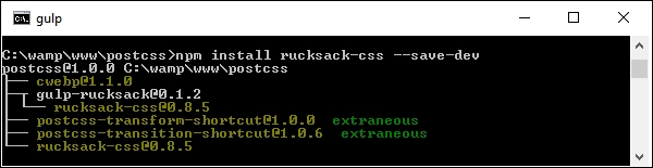
A note of caution—there are several plugins available for Rucksack: make sure you install the right one! There is a Gulp plugin, but this does not appear to work within PostCSS, even though we are using Gulp as our task runner.
This aside, let's move on. Before we go through the process of converting our slider to use Rucksack, let's take a quick look at using it in action with a simple easing demo.
Any developer who spends time animating content on a website will no doubt have created rules to control how content eases in or out of the page. Striking the right balance between easing content in and out of the page and the site becoming too overladen with effects takes time to get right!
Leaving aside the awful pun in that last comment, this is where Rucksack can help—one of the simpler plugins that forms part of this package is postcss-easings. This plugin, available from https://github.com/postcss/postcss-easings and one that we touched on in Chapter 7, Animating Content, has but one role in life: convert any recognized easing name into a cubic-bezier equivalent value.
Tip
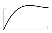
For an example of a Bezier curve, take a look at http://cubic-bezier.com/#.17,.67,.83,.67.
Is there any benefit in doing this, I hear you ask? Well, two that come to mind are consistency and a central point of source. Let me explain what I mean.
A central point of source borrows a principle from CSS preprocessors such as SASS or less, where a single value is defined at the top of the file; any instance found elsewhere in the file will be automatically replaced by its value (in this instance, a cubic-bezier easing). This then helps with consistency: we can specify names for any custom easings in the configuration, which will replace any instance found during compilation.
The benefit of this means that we only need to update one central point (that is, point of source), and can avoid mixing different types of easing values in our code—they will be converted to cubic-bezier values at compilation.
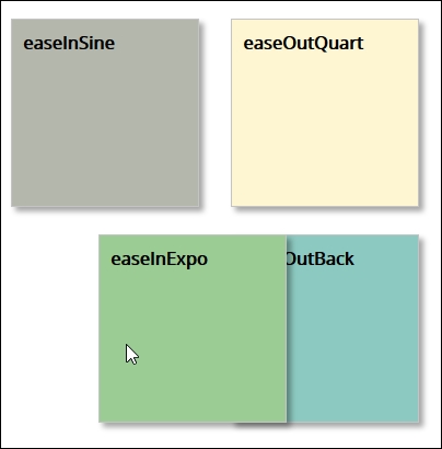
Okay, let's move on: time for a demo! Before we get stuck in, let's quickly cover what we're going to construct. Our demo is a simple affair with four squares that we will animate using nothing more than plain HTML and CSS (yes, no JavaScript). We will use a handful of effects, such as easeOutBack, which looks something like this:
Tip
You can learn more about the details for this particular easing at http://easings.net/#easeOutBack—it translates to cubic-bezier(0.175, 0.885, 0.32, 1.275) when used in code.
Let's get on and construct that demo…
If you're expecting dramatic effects, then I am sorry to disappoint—this exercise has been kept deliberately simple, to show you how easy it is to use Rucksack. We mentioned earlier that the overall result will be four simple squares that we can animate at will—they will look something like this:
The use of this plugin does raise one important question—we will cover this once we've built our demo:
- From the code download that accompanies this book, go ahead and extract a copy of the
T44 - postcss-easingsfolder, and save it to the root of our project area. - Next, copy the
gulpfile.jsandpackage.jsonfiles from thisT44 - postcss-easingsfolder to the root of our project area—go ahead and replace any that are already present in this location, or save them somewhere for safekeeping. - Copy the
style – pre-comile.cssfile from thecss – completed versionsfolder to thesrcfolder within our project area; this sets it ready for compilation. Rename itstyle.css. - Go ahead and fire up a Node.js command prompt session, then change the working folder to our project area.
- In the prompt, enter
Gulpthen press Enter—our file will be compiled, like this: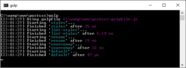
- Assuming no issues appeared during compilation, copy the contents of the
destfolder to thecssfolder within theT44 - postcss-easingsfolder. - Try previewing the results of our handiwork in a browser—if we hover over each square, the animation will kick in; they should appear similar to the figure shown at the start of this exercise.
Our demo was never meant to be anything more complicated—the aim was to show off how easy it is to get a consistent effect, provided the configuration object is correctly set up! It does, however, raise an important question concerning our choice of plugins, so let's explore that in more detail.
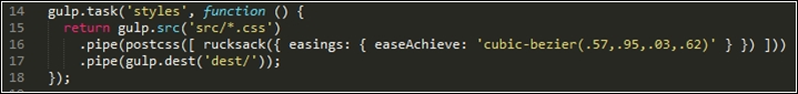
This is one example of where simplicity pays in spades; the postcss-easings plugin requires no configuration for standard use, and will only need configuring if the easing we use are not already part of its core library. The ones we picked for this demo are already defined in the plugin—if we open a copy of the compiled style sheet, we should see something akin to this:
The key to configuring this plugin lies in two lines of code, on or around lines 11 and 16:
var rucksack = require('rucksack-css');
  .pipe(postcss([ rucksack() ]))
Much of what is present in the Gulp task file that we used in this demo is code that we've already seen before; it frequently pays to think ahead, so that we can build a gulp file that can be reused for future projects. Once configured, then any style recognized by the plugin will be compiled into valid CSS.
If we had decided to use a custom easing style, then we can easily update the configuration object accordingly:
In case you're wondering about the name given—this effect replicates the motion when punching the air after you've achieved a good result, particularly if it has been a troublesome issue to solve!
Before we move on to our next exercise, we should answer the question that I alluded to earlier: which plugin should we use? But hold on, we're using the postcss-easings plugin, right?
No, I've not completely lost the plot: the postcss-easings plugin is available separately, and is referenced within the Rucksack pack of plugins. The key here, though, is that if we only need to use postcss-easings, then there is no sense in calling in Rucksack's plugins, which will only add an unnecessary burden to our workflow. Instead, we can change line 11 in our gulp task file to the following:
var easings = require('postcss-easings');
And we can change line 16 to the following:
.pipe(postcss([ easings() ]))As long as the plugin is still installed from earlier, then the code will be compiled as before, but without the extra overhead of the other plugins that form Rucksack.
If we're working with Rucksack, we've seen that the key to successful use is less about configuring it for use in our Gulp file, and more about deciding which plugins to use. To see what we mean by this, take a look at the original stylesheet from Introducing our demo carefully; it should reveal that we can use a number of plugins to improve on existing functionality:
- Responsive typography: Our demo is already partially responsive, but the label text isn't resizing if we change the size of our slider. We can fix this by altering our code to trigger Rucksack to make our fonts responsive.
- Shorthand positioning: This is a great plugin for adding position attributes; why bother adding top, left, right, and bottom attributes when we do all four in a single line of code? Add this one-liner, and we can get PostCSS to do the heavy lifting for us.
- Property aliases: Continuing with the shorthand theme, we can use this plugin to set up shorthand versions of any attribute we care to use; it means we only need to type in one or two letters, which PostCSS will transpile to the full version of that attribute.
- Font src expansion: If we look at our source style sheet carefully, we should see a small issue on or around line 6. The code calls for Open Sans as a font, but this is not a standard font! Thankfully, we can easily fix it by telling the browser where to download it from—Rucksack provides a convenient shorthand form for adding this detail to our code.
- Hex RGBA shortcuts: We've used a mix of RGBA and HEX codes in our style sheet to represent colors, yet some older browsers don't support the former style. This is becoming less of an issue, but as it is added automatically by Rucksack, then there is no harm in adding the latter values!
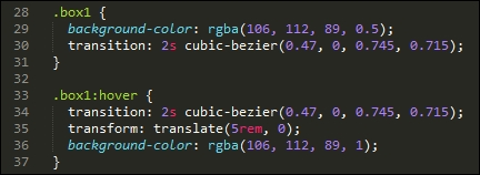
- Easings: Our slider demo used a single instance of an easing, in the form of ease-in-out-back. In the previous demo, we used
postcss-easings(that is the basis for this part of Rucksack) to convert the names tocubic-beziervalues; we should look to continue this theme when updating the slider. - Automatic prefixing: This isn't enabled by default, so it's up to us to decide if we want to use it. It references the same
autoprefixerplugin we've already used in earlier demos; if we're going to make good use of Rucksack, then it makes sense to enable it and remove any existing reference that is already in our code. We're going to use most of the plugins referenced in Rucksack, so we will enable it for use. If, however, we only need one or two, or we don't need support for older browsers, then it can remain switched off. - Legacy fallbacks: Support for older browsers is provided by the laggard plugin in Rucksack. This provides a mix of fallback mechanisms, such as adding fallback support for rem values, HEX fallbacks for RGBA values, or the 3D transform hack for will-change. We'll be adding rem fallback support, so we will enable this plugin for use.
Now that we've covered the elements we want to use, it's time for us to make the changes. Without further ado, let's make a start:
- From the code download that accompanies this book, go ahead and extract a copy of the
T45 - converting to use Rucksackfolder, and save it to our project area. - From within the
T45 - converting to use Rucksackfolder, copy thegulpfile.jsandpackage.jsonfiles to the root of our project area. - Next, copy the contents of the
css-completedversion folder from within theT45 - converting to use Rucksackfolder to thesrcfolder at the root of our project area. Rename pre-compileversion.cssstyle.css, then open up this file in a text editor—we need to make some changes to the styles within the file. - Our first change is to make the text in our demo responsive—do a search for
font-size, and change any instance tofont-size:responsive. This should cover each of the five number labels, and thediv.slide-content > figcaptionrule. - Next up, is adding our shorthand version for the position attribute—in this instance, there is only one we can change, which is on line 42. Comment out the
bottom,left,right, andtopattributes specified on lines 33-36, then replace theposition:attribute with this:position: 427px 0 0 0;
- Our next conversion is to add some aliases—this is just a shortcut to typing in more text! For our demo, go ahead and add this at the top of our style sheet:
@alias {
  pb: padding-bottom;
  bs: box-shadow;
  bgc: background-color;
}
Next, do a search and replace for each of these three styles—replace the full name with the shortcut names given in the @alias block.
- Remember the small issue I pointed out earlier, about the missing support for the Open Sans font? Well, we can easily fix that—at the top of our style sheet file, go ahead and add this block; this tells the browser where to find the Open Sans font:
@font-face { font-family: 'open_sansregular'; font-path: '../fonts/OpenSans-Regular-webfont'; font-weight: normal; font-style: normal; } - We touched briefly on Rucksack's ability to convert easing names to cubic-bezier values. The demo uses an easing name—this has already been set to one that is supported within Rucksack, so we don't need to alter our code. The same applies to the RGBA fall-back support—Rucksack will automatically convert any RGBA values it sees to HEX equivalents within our code.
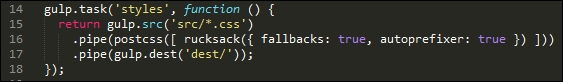
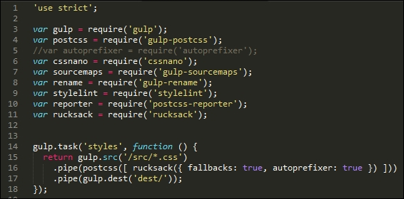
- The remaining two changes are for legacy support and automatic prefixing—to enable these, we have to modify our gulp file as shown in the screenshot:
- Save the file, then switch to a Node.js command prompt—at the prompt, make sure the working folder is set to our project area.
- At the prompt, enter
gulp, then press Enter—PostCSS will go away and compile the code; if all is well, we should see our compiled files in thedestfolder: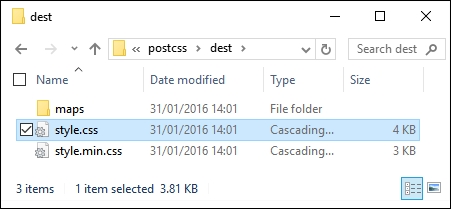
At this stage, we have a compiled set of files. To confirm if the demo works, go ahead and copy them to the css folder within the T45 - converting to use Rucksack folder; try previewing the results of our work by running slider.html. If all is well, we should see the same slider effect:
All should be good, we have a working demo and our code has compiled successfully. At this point we can move on to our next task, right…?
Well, it's worth taking a look at our compiled code first: Rucksack has made some additional changes to our code that we may not have expected to see.
For example, Rucksack has provided pixel-based fallback support for the rem units listed throughout our code, along with the HEX fallback support we discussed earlier:
body {
  font-family: "open_sansregular";
  line-height: 25.888px;
  line-height: 1.618rem;
  background-color: #ecf0f1;
  background-color: rgba(236, 240, 241, 1.0);
  color: #44466a;
  color: rgba(68, 68, 618, 1.0);
}
Next, take a look at line 96—remember the font-size: responsive attribute that we added? This is the compiled result:
font-size: calc(12px + 9 * ( (100vw - 420px) / 860));
Throughout the bottom two-thirds, there are a number of media queries that have been added; these were added as part of making our font styles responsive. Further down, at around line 226, we have this block:
-ms-filter: "progid:DXImageTransform.Microsoft.Alpha(Opacity=0)";
 -webkit-transition: opacity 0.35s;
 transition: opacity 0.35s;
At first glance, you might wonder where this came from, as we didn't specify an ms-filter attribute in our code. Well, this is thanks to Rucksack—it has added opacity support for IE automatically.
The key to this little exploration, though, is that choosing plugins should be an iterative process that will only really finish when the site is no longer needed. For example, we could easily add another step to our workflow that reduces calc() operations to static values (where allowed—the plugin for this is postcss-calc). We should always consider using postcss-remove-prefixes periodically to keep our code up to date; there will come a time when we either don't need to add prefixes, or existing prefixes become redundant.
Leaving aside the changes to our style sheet, there is one more to consider—you will note that the Autoprefixer plugin has been commented out in our code:
This is with good reason—Rucksack has built-in support for autoprefixer, so there is no need to call it twice; ironically, it simply calls the same plugin that is commented out of our code! It's up to us whether we want to call it from within Rucksack, or separately; this will largely depend on what else is being called from with Rucksack, and whether adding autopre
fixer will help provide a stronger case for using Rucksack.