Table of Contents for
Mastering PostCSS for Web Design
 Mastering PostCSS for Web Design
Published by
Packt Publishing, 2016
Mastering PostCSS for Web Design
Published by
Packt Publishing, 2016
- Cover
- Table of Contents
- Mastering PostCSS for Web Design
- Mastering PostCSS for Web Design
- Credits
- About the Author
- About the Reviewer
- www.PacktPub.com
- Preface
- What you need for this book
- Who this book is for
- Conventions
- Reader feedback
- Customer support
- 1. Introducing PostCSS
- Introducing PostCSS
- Setting up a development environment
- Creating a simple example using PostCSS
- Linting code using plugins
- Exploring how PostCSS works
- Summary
- 2. Creating Variables and Mixins
- Creating a hover effect example
- Transitioning to using PostCSS
- Adding variable support to PostCSS
- Updating our hover effect demo
- Setting the order of plugins
- Creating mixins with PostCSS
- Looping content with PostCSS
- Summary
- 3. Nesting Rules
- Navigating through pages
- Transitioning to using PostCSS plugins
- Exploring the pitfalls of nesting
- Making the switch to BEM
- Exploring our changes in more detail
- Summary
- 4. Building Media Queries
- Exploring custom media queries in PostCSS
- Making images responsive
- Adding responsive text support
- Optimizing media queries
- Retrofitting support for older browsers
- Moving away from responsive design
- Taking things further with CSS4
- Summary
- 5. Managing Colors, Images, and Fonts
- Managing fonts with PostCSS
- Creating image sprites
- Working with SVG in PostCSS
- Adding support for WebP images
- Manipulating colors and color palettes
- Creating color functions with PostCSS
- Summary
- 6. Creating Grids
- Creating an example with Bourbon Neat
- Exploring the grid plugins in PostCSS
- Transitioning to using PostCSS-Neat
- Creating a site using Neat and PostCSS
- Adding responsive capabilities
- Summary
- 7. Animating Elements
- Moving away from jQuery
- Making use of pre-built libraries
- Switching to using SASS
- Making the switch to PostCSS
- Exploring plugin options within PostCSS
- Updating code to use PostCSS
- Creating a demo in PostCSS
- Optimizing our animations
- Using our own animation plugin
- Summary
- 8. Creating PostCSS Plugins
- Dissecting the architecture of a standard plugin
- Creating an transition plugin
- Building a custom font plugin
- Simplifying the development process
- Guidelines for plugin building
- Making the plugin available for use
- Summary
- 9. Working with Shortcuts, Fallbacks, and Packs
- Exploring plugin packs for PostCSS
- Adding shortcuts with Rucksack
- Linting and optimizing your code
- Providing fallback support
- Summary
- 10. Building a Custom Processor
- Exploring our processor
- Dissecting issues with our processor
- Optimizing the output
- Adding reload capabilities
- Extending our processor further
- Testing the final pre-processor
- Getting started with some hints and tips
- Introducing the CSStyle library
- Summary
- 11. Manipulating Custom Syntaxes
- Preparing our environment
- Implementing custom syntax plugins
- Parsing CSS
- Formatting the output with the API
- Highlighting our syntax code
- Summary
- 12. Mixing Preprocessors
- Exploring the conversion process
- Introducing the Pleeease library
- Compiling with other preprocessors
- Using the PreCSS library
- Converting a WordPress installation
- Setting up our environment
- Considering the conversion process
- Making changes to our code
- Compiling and testing the changes
- Summary
- 13. Troubleshooting PostCSS Issues
- Exploring some common issues
- Getting help from others
- Summary
- 14. Preparing for the Future
- Converting CSS4 styles for use
- Supporting future syntax with cssnext
- Creating plugins to provide extra CSS4 support
- Summary
- Index
If you've seen any of my previous books, then you will see I have a thing about flowers, and in particular orchids; indeed, the cover on my first book was that of a phalaenopsis, or moth orchid! We'll use a couple of images of orchids as the basis for our next demo, as shown in the screenshot over the page, where it shows our desired effect in motion for the top image.
For this demo, we will need a copy of the tutorial1A folder from the code download that accompanies this book; make sure you dig that out before continuing:
- Open up a copy of
style.scssfrom thesrcfolder withintutorial1A; let's take a look at its contents. - At the top of the file, we have a small handful of variables. These define some of the colors used within the code, and set the
$fullsizevariable to 100%: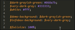
The sharp-eyed among you will spot that not all colors have been given a value; the reason for this will become clearer later in this chapter.
- Next up comes an example of a simple mixin, which converts pixel values to their rem unit equivalents, using
16pxas the base equivalent for1remunit: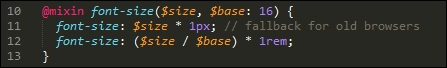
- To complete the exercise, we need to download a font. The demo uses the Source Sans Pro font available at http://www.fontsquirrel.com/fonts/source-sans-pro. Go ahead and download it; you will need to use the Generator option available from the black menu to produce a version that can be used online (it creates the CSS we've used in our demo).
- At this point, go ahead and drop a copy of the
style.scssfile from thetutorial1Afolder into thesrcfolder in our project area. - We also need the
imgfolder and theindex.htmlfile—go ahead and copy both across to the root of our project area. - Fire up a Node.js command prompt window, then enter this at the prompt and press Enter:
gulp - If all is well, we should see compressed CSS files and source maps appear in the
destfolder in our project area—copy themapsfolder andstyle.min.cssinto thecssfolder oftutorial1A. - Go ahead and preview the results in a browser. If all is well, we should see two orchid images appear on screen; if you hover over either one, you will see it fly to the left or right, to reveal an information box with information about the orchid:
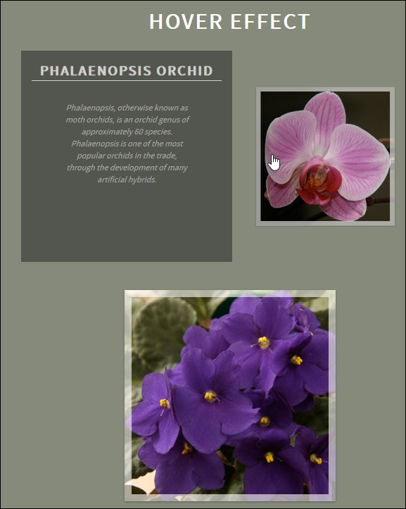
Interesting effect, huh? It's a simple animation that uses scale() to shrink the image to 0.5 (or 50%) of its size and slides it to the right, before sliding in the infobox immediately behind it. Take the mouse off the image and the reverse happens—it's the sample principle for the second image—but in reverse; the code sets an ltr and rtl class to determine which direction the image should move in the demo.
A copy of this demo using the equivalent code from the Less CSS pre-processor is available in the code download that accompanies this book. It's in the Tutorial1B folder if your preference is to use the Less CSS pre-processor; you will need to install the gulp-less plugin from https://github.com/plus3network/gulp-less, using NodeJS (in the same manner as other plugins that we've installed). An updated copy of the Gulp task file is also included in this folder, along with completed versions of the CSS code.