Table of Contents for
Mastering PostCSS for Web Design
 Mastering PostCSS for Web Design
Published by
Packt Publishing, 2016
Mastering PostCSS for Web Design
Published by
Packt Publishing, 2016
- Cover
- Table of Contents
- Mastering PostCSS for Web Design
- Mastering PostCSS for Web Design
- Credits
- About the Author
- About the Reviewer
- www.PacktPub.com
- Preface
- What you need for this book
- Who this book is for
- Conventions
- Reader feedback
- Customer support
- 1. Introducing PostCSS
- Introducing PostCSS
- Setting up a development environment
- Creating a simple example using PostCSS
- Linting code using plugins
- Exploring how PostCSS works
- Summary
- 2. Creating Variables and Mixins
- Creating a hover effect example
- Transitioning to using PostCSS
- Adding variable support to PostCSS
- Updating our hover effect demo
- Setting the order of plugins
- Creating mixins with PostCSS
- Looping content with PostCSS
- Summary
- 3. Nesting Rules
- Navigating through pages
- Transitioning to using PostCSS plugins
- Exploring the pitfalls of nesting
- Making the switch to BEM
- Exploring our changes in more detail
- Summary
- 4. Building Media Queries
- Exploring custom media queries in PostCSS
- Making images responsive
- Adding responsive text support
- Optimizing media queries
- Retrofitting support for older browsers
- Moving away from responsive design
- Taking things further with CSS4
- Summary
- 5. Managing Colors, Images, and Fonts
- Managing fonts with PostCSS
- Creating image sprites
- Working with SVG in PostCSS
- Adding support for WebP images
- Manipulating colors and color palettes
- Creating color functions with PostCSS
- Summary
- 6. Creating Grids
- Creating an example with Bourbon Neat
- Exploring the grid plugins in PostCSS
- Transitioning to using PostCSS-Neat
- Creating a site using Neat and PostCSS
- Adding responsive capabilities
- Summary
- 7. Animating Elements
- Moving away from jQuery
- Making use of pre-built libraries
- Switching to using SASS
- Making the switch to PostCSS
- Exploring plugin options within PostCSS
- Updating code to use PostCSS
- Creating a demo in PostCSS
- Optimizing our animations
- Using our own animation plugin
- Summary
- 8. Creating PostCSS Plugins
- Dissecting the architecture of a standard plugin
- Creating an transition plugin
- Building a custom font plugin
- Simplifying the development process
- Guidelines for plugin building
- Making the plugin available for use
- Summary
- 9. Working with Shortcuts, Fallbacks, and Packs
- Exploring plugin packs for PostCSS
- Adding shortcuts with Rucksack
- Linting and optimizing your code
- Providing fallback support
- Summary
- 10. Building a Custom Processor
- Exploring our processor
- Dissecting issues with our processor
- Optimizing the output
- Adding reload capabilities
- Extending our processor further
- Testing the final pre-processor
- Getting started with some hints and tips
- Introducing the CSStyle library
- Summary
- 11. Manipulating Custom Syntaxes
- Preparing our environment
- Implementing custom syntax plugins
- Parsing CSS
- Formatting the output with the API
- Highlighting our syntax code
- Summary
- 12. Mixing Preprocessors
- Exploring the conversion process
- Introducing the Pleeease library
- Compiling with other preprocessors
- Using the PreCSS library
- Converting a WordPress installation
- Setting up our environment
- Considering the conversion process
- Making changes to our code
- Compiling and testing the changes
- Summary
- 13. Troubleshooting PostCSS Issues
- Exploring some common issues
- Getting help from others
- Summary
- 14. Preparing for the Future
- Converting CSS4 styles for use
- Supporting future syntax with cssnext
- Creating plugins to provide extra CSS4 support
- Summary
- Index
Although Bourbon does add a degree of responsivity to our code, it's not quite enough for our needs. If we try resizing our demo, it soon becomes apparent that the elements don't quite go where we would want them, to say the least!
The quickest way to see just how the design looks when resized for smaller devices is to use Google Chrome. Press Shift +
Ctrl
+
I to enable Chrome's developer tools:
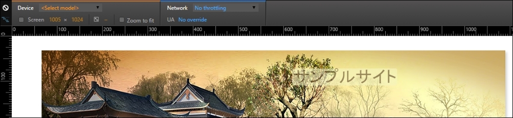
The design works well when viewed at 1280px x 1024px, but this soon changes if we change the available viewing estate to suit an Apple iPhone 6 at 375px by 627px:
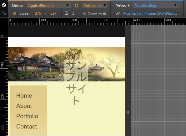
See what I mean? It just doesn't look right, does it? Fortunately, it's easy to fix using PostCSS, so let's dive in and see what is required to get our design working again.
Getting our design to work properly for smaller devices such as iPhones is easy when working with PostCSS: we can use the postcss-media-minmax plugin available from https://github.com/postcss/postcss-media-minmax.
"How can PostCSS help us though?", I hear you ask. Easy, the point at which most people trip up when working with media queries is in setting the breakpoints, or determining where our designs break at specific sizes. The postcss-media-minmax plugin helps to make the text a little more human; after all, if a design works when the size is greater than or equal to an amount, why not say that in our code?
To see what I mean, let's get stuck into fixing our code. For simplicity, we will focus entirely on resizing our content for an iPhone 6, using 375px by 627px as our breakpoint (as determined by using Google Chrome's Responsive Design view). We will continue exactly where we left off from the previous demo:
- We first need to install the
postcss-media-minmaxplugin—to do this, fire up a Node.js command prompt session, then at the prompt add this command and press Enter:npm install postcss-media-minmax --save-dev - Next, open up a copy of the
sample.cssfile from within thesrcfolder in our project area. We'll add the media query first, adjusted to ensure we catch the right breakpoint:/* media queries */ @media screen and (width >= 370px) and (width <= 630px) { } - Immediately inside the query, go ahead and add this rule. We don't want to resize below
375pxas a minimum:body { min-width: 375px; } - The header image text needs to be resized to a smaller space, and we can also reduce it in size and move it over to the left a little:
header { width: 50%; font-size: 2rem; margin-left: 45%; } - The
#alphacontent area (or menu) has automatically resized itself, but the main content area (#beta) is too wide; let's resize it down to fit. Our area won't cope with all of the text, so we'll add an overflow attribute, and set it to hide text outside the viewable area:#beta { margin-right: 2.35765160%; width: 55.1748%; overflow: auto; } - At this point, we need to install the
postcss-media-minmaxplugin, so fire up a Node,js command prompt and change the working folder to our project area. - At the prompt, enter this command, then press Enter:
npm install postcss-media-minmax --save-dev - When the plugin is installed, enter
gulpat the command prompt, and press Enter. - PostCSS will now compile the code, and if all is well, we should see updated style sheet and source
mapfiles appear in thedestfolder. - Go ahead and copy these into the
cssfolder in theTutorial32folder, then try previewing the results in a browser.
If all is well, we should see something akin to the following screenshot, when enabling Chrome's Responsive Design view, and switching the Device setting to Apple iPhone 6:
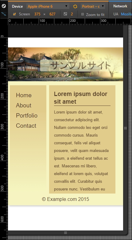
The changes we've made to our code are simple, and limited to supporting iPhones. This is just the tip of the iceberg, though: there is so much more we can do!
For example, instead of specifying an exact width value as our min-width attribute (or for the width of #beta, for that matter), we could consider using @neat-span-columns to provide this value for us. Of course, we can't limit ourselves to one media query, we need to ensure we have enough media queries to cater for the devices we need to support.
This does not mean that we need to have a 1:1 relationship between a query and a device. Provided we design our queries carefully, we can set existing ones to cover several devices. Ultimately, though, the principle is still the same, but instead of using the standard colon notation, we can use the easier to read >= or <= symbols to define the breakpoint range when working with queries using PostCSS.