Up to this point, all of our animations have had one thing in common—they are individually created, and stored within the same stylesheet as other styles for each project.
This will work perfectly well, but we can do better—after all, it's possible that we may well create animations that others have already built! Over time, we may also build up a series of animations that can form the basis of a library that can be reused for future projects.
A number of developers have already done this. One example of note is the Animate.css library, created by Dan Eden. It's worth getting to know this library, as we will use it later in this book in the guise of the postcss-animation plugin for PostCSS. In the meantime, let's run through a quick demo of how it works, as a precursor to working with it in PostCSS.
Let's make a start:
- We'll start by extracting a copy of the
T37folder from the code download that accompanies this book—save the folder to our project area. - Next, open a new file and add the following code:
body { background: #eee; } #gallery { width: 745px; height: 500px; margin-left: auto; margin-right: auto; } #gallery img { border: 0.25rem solid #fff; margin: 20px; box-shadow: 0.25rem 0.25rem 0.3125rem #999; float: left; } .animated { animation-duration: 1s; animation-fill-mode: both; } .animated:hover { animation-duration: 1s; animation-fill-mode: both; } - Save this as
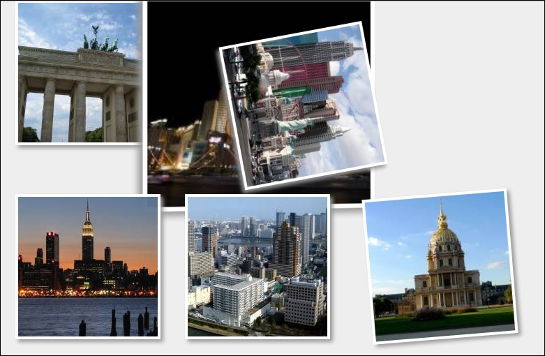
style.cssin thecsssubfolder within theT37folder. - Go ahead and preview the results in a browser—if all is well, then we should see something akin to this screenshot:

If we run the demo, we should see images run through different types of animation—there is nothing special or complicated here; the question is, though, how does it all fit in with PostCSS?
Well, there's a good reason for this—there will be some developers who have used Animate.css in the past, and will be familiar with how it works; we will also be using the postcss-animation plugin later, in Updating code to use PostCSS, which is based on the Animate.css stylesheet library. For those of you who are not familiar with the stylesheet library though, let's quickly run through how it works, within the context of our demo.
The effects used in our demo are quite striking—indeed, one might be forgiven for thinking that they required a lot of complex JavaScript!
This, however, could not be further from the truth—the Animate.css file contains a number of @keyframe based animations, similar to this:
@keyframes bounce {
  0%, 20%, 50%, 80%, 100% {transform: translateY(0);}
  40% {transform: translateY(-1.875rem);}
  60% {transform: translateY(-0.9375rem);}
}
We pull in the animations using the usual call to the library, within the <head> section of our code. We can then call any animation by name from within our code:
  <div id="gallery">
    <a href="#"><img class="animated bounce" src="http://lorempixum.com/200/200/city/1" alt="" /></a>
...
  </div>
  </body>
You will notice the addition of the .animated class in our code—this controls the duration and timing of the animation, and is set according to which animation name has been added to the code.
The downside of not using JavaScript (or jQuery for that matter) means that the animation will only run once when the demo is loaded; we can set it to run continuously by adding the .infinite class to the element being animated (this is part of the Animate library). We can fake a click option in CSS, but it is an experimental hack, which is not supported across all browsers—to effect any form of control, we really need to use JavaScript (or even jQuery)!
Note
If you are interested in the details of the hack, then take a look at this response on Stack Overflow, at http://stackoverflow.com/questions/13630229/can-i-have-an-onclick-effect-in-css/32721572#32721572.
Okay, onwards we go: we've covered the basic use of pre-built libraries, such as Animate. It's time to step up a gear, and make the transition to PostCSS. As a start, we will use Gulp as our task runner of choice, with SASS. The latter is a perfect choice, as it fits in with the plugin we will use later in this chapter. Let's take a look at what is involved in laying the groundwork for our conversion to PostCSS.
