Table of Contents for
Mastering PostCSS for Web Design
 Mastering PostCSS for Web Design
Published by
Packt Publishing, 2016
Mastering PostCSS for Web Design
Published by
Packt Publishing, 2016
- Cover
- Table of Contents
- Mastering PostCSS for Web Design
- Mastering PostCSS for Web Design
- Credits
- About the Author
- About the Reviewer
- www.PacktPub.com
- Preface
- What you need for this book
- Who this book is for
- Conventions
- Reader feedback
- Customer support
- 1. Introducing PostCSS
- Introducing PostCSS
- Setting up a development environment
- Creating a simple example using PostCSS
- Linting code using plugins
- Exploring how PostCSS works
- Summary
- 2. Creating Variables and Mixins
- Creating a hover effect example
- Transitioning to using PostCSS
- Adding variable support to PostCSS
- Updating our hover effect demo
- Setting the order of plugins
- Creating mixins with PostCSS
- Looping content with PostCSS
- Summary
- 3. Nesting Rules
- Navigating through pages
- Transitioning to using PostCSS plugins
- Exploring the pitfalls of nesting
- Making the switch to BEM
- Exploring our changes in more detail
- Summary
- 4. Building Media Queries
- Exploring custom media queries in PostCSS
- Making images responsive
- Adding responsive text support
- Optimizing media queries
- Retrofitting support for older browsers
- Moving away from responsive design
- Taking things further with CSS4
- Summary
- 5. Managing Colors, Images, and Fonts
- Managing fonts with PostCSS
- Creating image sprites
- Working with SVG in PostCSS
- Adding support for WebP images
- Manipulating colors and color palettes
- Creating color functions with PostCSS
- Summary
- 6. Creating Grids
- Creating an example with Bourbon Neat
- Exploring the grid plugins in PostCSS
- Transitioning to using PostCSS-Neat
- Creating a site using Neat and PostCSS
- Adding responsive capabilities
- Summary
- 7. Animating Elements
- Moving away from jQuery
- Making use of pre-built libraries
- Switching to using SASS
- Making the switch to PostCSS
- Exploring plugin options within PostCSS
- Updating code to use PostCSS
- Creating a demo in PostCSS
- Optimizing our animations
- Using our own animation plugin
- Summary
- 8. Creating PostCSS Plugins
- Dissecting the architecture of a standard plugin
- Creating an transition plugin
- Building a custom font plugin
- Simplifying the development process
- Guidelines for plugin building
- Making the plugin available for use
- Summary
- 9. Working with Shortcuts, Fallbacks, and Packs
- Exploring plugin packs for PostCSS
- Adding shortcuts with Rucksack
- Linting and optimizing your code
- Providing fallback support
- Summary
- 10. Building a Custom Processor
- Exploring our processor
- Dissecting issues with our processor
- Optimizing the output
- Adding reload capabilities
- Extending our processor further
- Testing the final pre-processor
- Getting started with some hints and tips
- Introducing the CSStyle library
- Summary
- 11. Manipulating Custom Syntaxes
- Preparing our environment
- Implementing custom syntax plugins
- Parsing CSS
- Formatting the output with the API
- Highlighting our syntax code
- Summary
- 12. Mixing Preprocessors
- Exploring the conversion process
- Introducing the Pleeease library
- Compiling with other preprocessors
- Using the PreCSS library
- Converting a WordPress installation
- Setting up our environment
- Considering the conversion process
- Making changes to our code
- Compiling and testing the changes
- Summary
- 13. Troubleshooting PostCSS Issues
- Exploring some common issues
- Getting help from others
- Summary
- 14. Preparing for the Future
- Converting CSS4 styles for use
- Supporting future syntax with cssnext
- Creating plugins to provide extra CSS4 support
- Summary
- Index
There are several different routes to take when creating basic site layouts, and in many cases, developers may decide to use CSS grids.
A classic example for those using CSS pre-processors, is of course, the SASS grid system, Bourbon Neat—a great package, spoiled by the need to install Ruby. We can easily fix this in PostCSS, by using one of several plugins available, without the need for extra dependencies. In this chapter, we'll take a look at what's available, and work through some examples, using a plugin for creating grids within PostCSS.
We will cover a number of topics throughout this chapter, which will include:
- Introducing the basic principles of using CSS grids
- Exploring the grid plugins available for use within PostCSS
- Working through some simple examples using Bourbon Neat
- Replicating pure SCSS examples using the PostCSS plugin, PostCSS-Neat
- Adding responsive capabilities using the PostCSS-media-minmax plugin
Let's get cracking…!
The principles of using grids in design are not new, they date from the Second World War, with a number of graphic designers questioning the design of conventional page layouts, in favor of designing a system that provided a flexible, yet coherent, layout.
The same principles have been transferred to the web, starting with plain HTML, and CSS-based designs, before newer frameworks took over and helped to make construction easier.
It doesn't matter how the design is constructed, we can of course use HTML and CSS, or we might favor the image template approach (using packages such as PhotoShop), particularly if responsibility for designing the front end falls with a different team.
These are perfectly acceptable methods, but require a lot of manual effort—in this age of web design, time is critical; we can instead make use of newer frameworks (such as SASS, Bourbon Neat, or Bootstrap) to create our grids, as shown in this example (which uses plain SASS):
We can see this type of layout in action, if we go ahead and extract the Tutorial28 folder from the code download that accompanies this book, then review it using a browser. We will see this grid appear, the style.css file used by this demo was created using the online SASS playground, Sassmeister at: http://www.sassmeister.com.
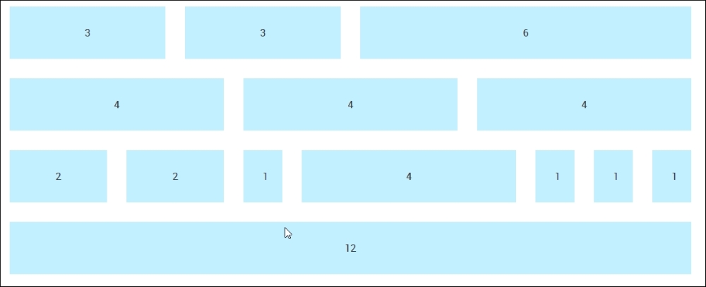
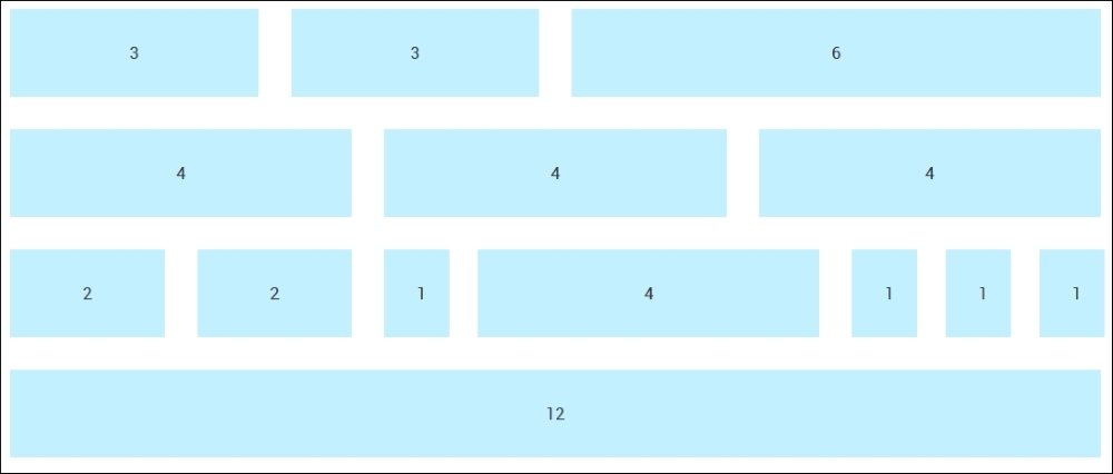
Much of the code used in this demo centers around each column width and the overall .wrapper container; if you take a look at the code, you will notice that there are no static values for column widths. There are a couple of static values, but their sizes are not critical to the overall effect.
The key to our demo working centers around this block of CSS styling:
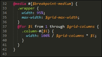
Here, we're using SASS's interpolation to first build our media query (to make it responsive), followed by styles for a series of columns that form our grid. When compiled, it creates a number of styles that apply to each part of our grid:
It's a simple matter of matching up the style with the number shown on the grid. If we want to change the widths, we simply need to increase the number of columns, and our for statement will automatically calculate a new set of values at the next compilation.
Okay, enough chitchat: time, I think, for a demo! Throughout this chapter, we will work through the principles of migrating from some basic examples using SASS, through to using Bourbon Neat, before converting to using PostCSS plugins. We always have to start somewhere, so let's begin with automating our compilation process using SASS.
"Installing SASS?" I hear you ask Why, when this book is about PostCSS?
I hear you, it's a good question: there is logic, though, in this madness—let me explain all:
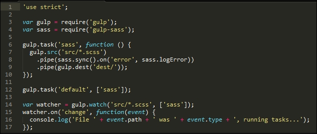
While we are installing SASS, we're not going to use the standard route to installing it; instead, we're going to use the gulp-sass plugin. This allows us to make the initial switch to using a gulp file; this puts us one step further on down the route to converting our processes to use PostCSS. The use of a gulp file provides a convenient framework where we can switch components in, or out, while we transition to using PostCSS.
Note
In Chapter 12, Mixing Preprocessors, we will see how PostCSS works well with other preprocessors, as a basis for adopting a consistent approach to compiling code.
So, without further ado, let's make a start on installing the gulp-sass plugin, before putting it to work:
- We'll start by firing up a Node.js command prompt session, then changing the working folder to our project area.
- At the prompt, go ahead and enter this command, then press Enter:
npm install gulp-sass --save-devDon't close the window, we will need it shortly!
- Node will go away and install
gulp-sass; it returns to the prompt when the installation is completed. - With the plugin installed, we now need to compile our code—go ahead and extract a copy of the
Tutorial29folder to our project area. - Copy the contents of the
sass – pre-compilefolder to thesrcfolder at the root of our project area. - We also need to add the
gulpfile.jsandpackage.jsonfiles from theTutorial29folder to the root of our project area. - Revert back to the Node.js window we had earlier, then at the prompt, enter
gulpand press Enter. - The files will now compile—once completed, copy them into the
cssfolder within theTutorial29folder. - Try previewing the results of our work in a browser; if all is well, we should see something akin to this screenshot:
Right, we now have automatic support for compiling in place; "What next?" I hear you ask. We're one step closer, in that our code can now be compiled automatically:
However, manual effort is still required to construct our grid! Let's start to change that now, there are several frameworks available that we can use, but in my view, one of the cleanest is SASS's Bourbon Neat. We'll use this as the basis for our next few exercises, before migrating to use the PostCSS version of this framework.
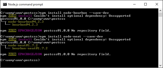
For the uninitiated, SASS's grid capability is provided by the Bourbon Neat add-on (available from http://neat.bourbon.io/). For the purposes of our exercise, we're going to use the Node versions of the framework—this requires two installations to be completed, so let's go ahead and do that now:
- If you still have it open, revert back to the Node.js command prompt session from the previous demo; otherwise, open a new one and change the working folder to our project area.
- At the prompt, enter these two commands in turn, pressing Enter after each:
npm install node-bourbon --save-dev
npm install node-neat --save-dev
- Both plugins will have installed correctly when we see a result akin to this screenshot:
- With the plugins now installed, we need to modify our
gulpfile—go ahead and add this at line 5:var neat = require('node-neat').includePaths; - Next, leave a line, then add the code as shown, at line 7:
var paths = { scss: 'src/*.scss' }; - The original SASS task can be replaced with this new task:
gulp.task('styles', function () { return gulp.src(paths.scss) .pipe(sass({ includePaths: require('node-neat').includePaths })) .pipe(gulp.dest('dest/')); }); - The reference to SASS in the default task is now incorrect—go ahead and change it to:
gulp.task('default', ['styles']); - Finally, change this line as indicated:
var watcher = gulp.watch('src/*.scss', ['styles']); - We're now ready to test our compilation process—go ahead and extract a copy of the contents of
style – pre-compile.scssfrom the code download and save it to thesrcfolder. - At this point, we can run
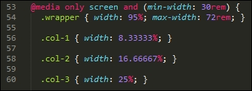
gulpfrom a Node.js command prompt. If this works okay, we should get astyle.cssfile appear in thedestfolder. If we open it up, we should see some compiled styles, as follows, that prove Neat is installed and working:@media only screen and (min-width: 30rem) { .wrapper { width: 95%; max-width: 72rem; } .col-1 { width: 8.33333%; }
At this point, we now have a working compilation process, and we're good to go with building a working site! For now, don't worry too much about the individual styles in the compiled test.css file, we will cover this in more detail over the next few pages. Let's put our new compilation process into practice and assemble a working example, so that we can see the grid facility in action.