Table of Contents for
Mastering PostCSS for Web Design
 Mastering PostCSS for Web Design
Published by
Packt Publishing, 2016
Mastering PostCSS for Web Design
Published by
Packt Publishing, 2016
- Cover
- Table of Contents
- Mastering PostCSS for Web Design
- Mastering PostCSS for Web Design
- Credits
- About the Author
- About the Reviewer
- www.PacktPub.com
- Preface
- What you need for this book
- Who this book is for
- Conventions
- Reader feedback
- Customer support
- 1. Introducing PostCSS
- Introducing PostCSS
- Setting up a development environment
- Creating a simple example using PostCSS
- Linting code using plugins
- Exploring how PostCSS works
- Summary
- 2. Creating Variables and Mixins
- Creating a hover effect example
- Transitioning to using PostCSS
- Adding variable support to PostCSS
- Updating our hover effect demo
- Setting the order of plugins
- Creating mixins with PostCSS
- Looping content with PostCSS
- Summary
- 3. Nesting Rules
- Navigating through pages
- Transitioning to using PostCSS plugins
- Exploring the pitfalls of nesting
- Making the switch to BEM
- Exploring our changes in more detail
- Summary
- 4. Building Media Queries
- Exploring custom media queries in PostCSS
- Making images responsive
- Adding responsive text support
- Optimizing media queries
- Retrofitting support for older browsers
- Moving away from responsive design
- Taking things further with CSS4
- Summary
- 5. Managing Colors, Images, and Fonts
- Managing fonts with PostCSS
- Creating image sprites
- Working with SVG in PostCSS
- Adding support for WebP images
- Manipulating colors and color palettes
- Creating color functions with PostCSS
- Summary
- 6. Creating Grids
- Creating an example with Bourbon Neat
- Exploring the grid plugins in PostCSS
- Transitioning to using PostCSS-Neat
- Creating a site using Neat and PostCSS
- Adding responsive capabilities
- Summary
- 7. Animating Elements
- Moving away from jQuery
- Making use of pre-built libraries
- Switching to using SASS
- Making the switch to PostCSS
- Exploring plugin options within PostCSS
- Updating code to use PostCSS
- Creating a demo in PostCSS
- Optimizing our animations
- Using our own animation plugin
- Summary
- 8. Creating PostCSS Plugins
- Dissecting the architecture of a standard plugin
- Creating an transition plugin
- Building a custom font plugin
- Simplifying the development process
- Guidelines for plugin building
- Making the plugin available for use
- Summary
- 9. Working with Shortcuts, Fallbacks, and Packs
- Exploring plugin packs for PostCSS
- Adding shortcuts with Rucksack
- Linting and optimizing your code
- Providing fallback support
- Summary
- 10. Building a Custom Processor
- Exploring our processor
- Dissecting issues with our processor
- Optimizing the output
- Adding reload capabilities
- Extending our processor further
- Testing the final pre-processor
- Getting started with some hints and tips
- Introducing the CSStyle library
- Summary
- 11. Manipulating Custom Syntaxes
- Preparing our environment
- Implementing custom syntax plugins
- Parsing CSS
- Formatting the output with the API
- Highlighting our syntax code
- Summary
- 12. Mixing Preprocessors
- Exploring the conversion process
- Introducing the Pleeease library
- Compiling with other preprocessors
- Using the PreCSS library
- Converting a WordPress installation
- Setting up our environment
- Considering the conversion process
- Making changes to our code
- Compiling and testing the changes
- Summary
- 13. Troubleshooting PostCSS Issues
- Exploring some common issues
- Getting help from others
- Summary
- 14. Preparing for the Future
- Converting CSS4 styles for use
- Supporting future syntax with cssnext
- Creating plugins to provide extra CSS4 support
- Summary
- Index
A key concern when designing web content is browser support—which browsers do we support? If the only browsers we had to support were the likes of Firefox or Chrome, then our job would be easy. Trouble is, we also have IE, Safari, Edge…not to mention mobile devices! Life would be boring otherwise…
But I digress, back to reality: for those legacy browsers that refuse to conform (yes, I'm looking at you in particular, IE), we have to consider providing some form of support or graceful degradation. Thankfully, there are a number of plugins we can use within the PostCSS ecosystem—we've already used one in the form of Autoprefixer; there are others available, so let's dive in and take a look at a selection of these plugins in more detail. Before we do so, though, there is a useful tip that I want to explore, which can help with checking for, and providing, legacy support in our browsers.
A key part of the development process is to ensure that our code works on those browsers we have to support. If we're lucky enough that this range of browsers is limited to newer offerings, then this is less of an issue.
For some developers, there will be a need to have to support older browsers; this is particularly true if the environment contains other browser-based applications that require use of these older browsers, and cannot be replaced.
To help get around this, we could use libraries such as Modernizr (http://www.modernizr.com), but a more efficient means is to use the CSS @supports directive. In short, this operates in a similar fashion to media queries; we can specify a backup property that is supported by all browsers, and cancel it out if we're using a browser that can support an enhanced property:
section {
  float: left;
}

@supports (display: -webkit-flex) or (display: flex) {
  section {
    display: -webkit-flex;
    display: flex;
    float: none;
  }
}
In the main, this is more likely to be useful for those who have to provide support for older versions of IE (given that other browsers have offered better support for some time). Ideally, we would look to persuade clients of the merits of not supporting older versions of IE (at least 8, and possibly 9). If we have to support them, this method coupled with the use of autoprefixer could prove very useful.
When it comes to providing support for legacy browsers, the biggest culprit is arguably Microsoft's IE. Whilst it has to be said that support in newer versions is improving, its popularity means that there are still enough old versions to warrant the need to provide support!
To their credit, Microsoft have announced that they no longer support IE8 to 10—this is a step in the right direction to help encourage users to upgrade, although it will be some time before these versions completely disappear from use.
So, if you still have to support old versions of IE, what can we do? A good solution to try out is the oldie pack of plugins; its name makes a reference to what some term oldIE, or those versions of IE that should have been consigned to history a long time ago!
This plugin, available from https://github.com/jonathantneal/oldie, is a wrapper for a host of plugins available within PostCSS; examples include the following:
post-calc: This reduces any instance ofcalc()to single values where possible; instances ofcalc()that use a mix of units may not be replacedpostcss-unroot: If our CSS uses :root selectors, then old versions of IE will fail; this plugin replaces them with HTML to allow our code to compilepostcss-unnot: In a similar vein, if we've specified rules that include elements where:notpseudo-elements have been used, then these selectors will be removedpostcss-unopacity: This converts any instance of the opacity property to usefilter: alpha(opacity=XX), whereXXis the equivalent value for the original opacity property
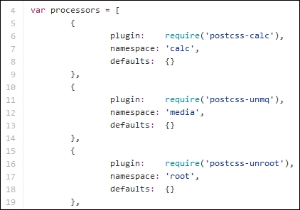
The pack includes other plugins—to get a feel for what plugins are included, it's worth taking a look at the index.js file for the plugin pack; it will look something like this:
The beauty, though, is that we are not forced to use the oldie plugin in its entirety. If, by some quirk of fate, we've managed to create something that in the main avoids those CSS attributes that are likely to make oldIE choke, then we can opt to simply reference those plugins that we need to use instead.
This will, of course, depend on how much we've used—a more likely scenario is that we will end up needing to use all of the plugins, so it makes better sense to use oldie instead! Of course, we could always encourage our clients to drop oldIE—this might not be as simple as it sounds…
If we're lucky enough to have understanding clients—and chance would be a fine thing—then there is likely to be a task that we need to perform: remove any style hacks from our code that relate to browsers we no longer support. The removal of these hacks may be trivial if we only have a small style sheet; the reality is that it will likely be a long, manual process for larger sheets, which carries a risk of us missing hacks.
Instead, we can avail ourselves of a plugin, in the form of stylehacks; this works very well with the stylelint plugin we've already used in demos throughout this book. Available from https://github.com/ben-eb/stylehacks, the plugin uses hacks listed on http://browserhacks.com, and is a cinch to install—let's take a look at it in action:
- We'll start by extracting a copy of the
T47 - using stylehacksfolder from the code download that accompanies this book; save it to the root of our project folder. - Copy the
gulpfile.jsandpackage.jsonfiles to the root of the project folder. - In a text editor, go ahead and add this code, saving it as
style.cssin thesrcfolder in our project area (not within theT47 - using stylehacksfolder!):h1 { _color: white; color: rgba(255, 255, 255, 0.5); } - Next, fire up a Node.js command prompt session, then change the working folder to our project area.
- We now need to install the plugin—in the prompt, enter this command, then press Enter:
npm install stylehacks --save-dev - When the plugin has installed, go ahead and enter
gulpin the prompt, then press Enter. - PostCSS will compile our code—if all is well, we should see this in the
destfolder at the root of our project area: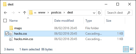
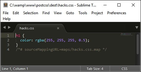
Assuming we have a successful compilation, try opening the style.css file in a text editor—we will, of course, have the requisite source map directive at the foot of the code, but otherwise notice how it has removed the color hack:
The key to this process lies within this task in our Gulp file:
gulp.task('styles', function () {
  return gulp.src('src/*.css')
    .pipe(postcss([ stylehacks({browsers: 'last 1 version, > 10%'}) ]))
    .pipe(gulp.dest('dest/'));
});
In our Gulp file, we've added the browsers attribute—this tells stylehacks to remove any hacks that are not required for modern browsers or those that have more than 10% global usage. This setting is based on the Browserslist query list available from https://github.com/ai/browserslist—it's worth noting that this can be used for plugins such as Autoprefixer as well.
Note
If we start to include more plugins that make use of the Browserslist queries, then consider using a variable in place of the query; updating this from a central location will automatically update all plugins that use it accordingly. For more details, please refer to the Browserslist site on GitHub.
Although this is a simple plugin to use, there is one nagging question that kept coming back whilst researching for this book: how useful is this plugin in reality? For some, you may think I need my head examined, but there is a reason behind this—let me explain.
If you've spent any time developing with jQuery, then you should be aware that it has dropped support for IE6-8 from jQuery 2.x, and will only develop support for it within the 1.x branch. Much of the baggage within jQuery within the 1.x branch is based on catering for browser hacks; the biggest culprit for these hacks is IE!
At the time of writing, Microsoft have publicly stated that support for IE10 and below is being dropped (at least for Windows 8)—they will only support IE11 on the Windows 8.1 platform, plus their new browser, MS Edge.
Given that many of the hacks found in CSS are for IE (and that this also applies to jQuery), one can't but wonder if the stylehacks plugin will still remain useful within the not too distant future! We should also be asking ourselves if using hacks is a good design decision. Are we designing a problem for ourselves at a later date, or should we be reconsidering our original design, and perhaps revisiting whether we need to support older browsers with a dedicated style sheet, rather than introducing hacks in amongst code designed for more recent browsers?