Table of Contents for
Mastering PostCSS for Web Design
 Mastering PostCSS for Web Design
Published by
Packt Publishing, 2016
Mastering PostCSS for Web Design
Published by
Packt Publishing, 2016
- Cover
- Table of Contents
- Mastering PostCSS for Web Design
- Mastering PostCSS for Web Design
- Credits
- About the Author
- About the Reviewer
- www.PacktPub.com
- Preface
- What you need for this book
- Who this book is for
- Conventions
- Reader feedback
- Customer support
- 1. Introducing PostCSS
- Introducing PostCSS
- Setting up a development environment
- Creating a simple example using PostCSS
- Linting code using plugins
- Exploring how PostCSS works
- Summary
- 2. Creating Variables and Mixins
- Creating a hover effect example
- Transitioning to using PostCSS
- Adding variable support to PostCSS
- Updating our hover effect demo
- Setting the order of plugins
- Creating mixins with PostCSS
- Looping content with PostCSS
- Summary
- 3. Nesting Rules
- Navigating through pages
- Transitioning to using PostCSS plugins
- Exploring the pitfalls of nesting
- Making the switch to BEM
- Exploring our changes in more detail
- Summary
- 4. Building Media Queries
- Exploring custom media queries in PostCSS
- Making images responsive
- Adding responsive text support
- Optimizing media queries
- Retrofitting support for older browsers
- Moving away from responsive design
- Taking things further with CSS4
- Summary
- 5. Managing Colors, Images, and Fonts
- Managing fonts with PostCSS
- Creating image sprites
- Working with SVG in PostCSS
- Adding support for WebP images
- Manipulating colors and color palettes
- Creating color functions with PostCSS
- Summary
- 6. Creating Grids
- Creating an example with Bourbon Neat
- Exploring the grid plugins in PostCSS
- Transitioning to using PostCSS-Neat
- Creating a site using Neat and PostCSS
- Adding responsive capabilities
- Summary
- 7. Animating Elements
- Moving away from jQuery
- Making use of pre-built libraries
- Switching to using SASS
- Making the switch to PostCSS
- Exploring plugin options within PostCSS
- Updating code to use PostCSS
- Creating a demo in PostCSS
- Optimizing our animations
- Using our own animation plugin
- Summary
- 8. Creating PostCSS Plugins
- Dissecting the architecture of a standard plugin
- Creating an transition plugin
- Building a custom font plugin
- Simplifying the development process
- Guidelines for plugin building
- Making the plugin available for use
- Summary
- 9. Working with Shortcuts, Fallbacks, and Packs
- Exploring plugin packs for PostCSS
- Adding shortcuts with Rucksack
- Linting and optimizing your code
- Providing fallback support
- Summary
- 10. Building a Custom Processor
- Exploring our processor
- Dissecting issues with our processor
- Optimizing the output
- Adding reload capabilities
- Extending our processor further
- Testing the final pre-processor
- Getting started with some hints and tips
- Introducing the CSStyle library
- Summary
- 11. Manipulating Custom Syntaxes
- Preparing our environment
- Implementing custom syntax plugins
- Parsing CSS
- Formatting the output with the API
- Highlighting our syntax code
- Summary
- 12. Mixing Preprocessors
- Exploring the conversion process
- Introducing the Pleeease library
- Compiling with other preprocessors
- Using the PreCSS library
- Converting a WordPress installation
- Setting up our environment
- Considering the conversion process
- Making changes to our code
- Compiling and testing the changes
- Summary
- 13. Troubleshooting PostCSS Issues
- Exploring some common issues
- Getting help from others
- Summary
- 14. Preparing for the Future
- Converting CSS4 styles for use
- Supporting future syntax with cssnext
- Creating plugins to provide extra CSS4 support
- Summary
- Index
If you have spent any time developing with preprocessors, then you will likely have come across nested properties—instead of writing multiple style rules with repeated references to the same elements, we can use nesting to create concise style rules that compile to valid CSS.
In this chapter, we'll delve into using the power of nesting, show you how you can transition from using preprocessors such as SASS or Less, and explore some of the tricks we can use that are not available with preprocessors such as SASS:
- Exploring the use of BEM (Block, Element, Modifier) or standard nesting
- Creating nested rules and BEM equivalents using existing preprocessors
- Transitioning to using PostCSS plugins
- Understanding the pitfalls of nesting and how we can improve our code
Let's make a start…!
The concept of nesting is nothing new when using processors such as Less CSS or SASS; it's a useful technique to help reduce the amount of code we need to write, and to organize code in a more human-readable format.
The flipside of the coin is that it is frequently abused—when using processors for the first time, many developers fall into the trap of thinking that everything should be nested. One can get away with it if the code is very simple; it is more likely to result in fragile code that is difficult to read and easily broken with simple changes to one or more styles in the code.
If nesting is done correctly, then it can be very effective; it helps avoid the need to repeat parent selectors, and allows us to group together rules that apply to the same selector, together. To see what is meant by this, take a look at this simple example for SASS:
#main p {
  color: #00ff00;
  width: 97%;

  .redbox {
    background-color: #ff0000;
    color: #000000;
  }
}
If this is compiled using a GUI application or via the command line, it results in these styles:
#main p {
  color: #00ff00;
  width: 97%;
}

#main p .redbox {
  background-color: #ff0000;
  color: #000000;
}
The great thing about this code is that we've not tried to cram in every single rule that applies to the same parent selector, or a descendant; this is something we should consider when working with nesting.
Some developers counsel against using nesting though, as it causes real issues for elements that have been styled in specific contexts; it becomes harder to change the code if we need to change the style. We will explore more of the reasons why nesting is fraught with risks later in this chapter.
Leaving aside the risks of nesting for the moment, we can use the same basic principle of nesting when using PostCSS—for this, we need to use the postcss-nesting plugin by Jonathan Neal, which is available from https://github.com/jonathantneal/postcss-nesting. To give you a flavor of what nesting looks like in PostCSS, take a look at this screenshot—this is an online playground provided by the author for trialing nested statements, where we can see the results automatically on the right:
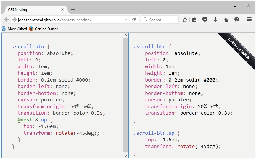
The key line is on the left, fifth from the bottom: the postcss-nesting plugin uses @nest & as the placeholder for nesting code.
To help illustrate how the
postcss-nesting plugin works, we will use it to create a somewhat unique navigation system. Our navigation will use a mix of jQuery and CSS to style and flip some demo pages, with the animation effects provided by CSS3 styling. Intrigued? Let's dive in and take a look.