Table of Contents for
Mastering PostCSS for Web Design
 Mastering PostCSS for Web Design
Published by
Packt Publishing, 2016
Mastering PostCSS for Web Design
Published by
Packt Publishing, 2016
- Cover
- Table of Contents
- Mastering PostCSS for Web Design
- Mastering PostCSS for Web Design
- Credits
- About the Author
- About the Reviewer
- www.PacktPub.com
- Preface
- What you need for this book
- Who this book is for
- Conventions
- Reader feedback
- Customer support
- 1. Introducing PostCSS
- Introducing PostCSS
- Setting up a development environment
- Creating a simple example using PostCSS
- Linting code using plugins
- Exploring how PostCSS works
- Summary
- 2. Creating Variables and Mixins
- Creating a hover effect example
- Transitioning to using PostCSS
- Adding variable support to PostCSS
- Updating our hover effect demo
- Setting the order of plugins
- Creating mixins with PostCSS
- Looping content with PostCSS
- Summary
- 3. Nesting Rules
- Navigating through pages
- Transitioning to using PostCSS plugins
- Exploring the pitfalls of nesting
- Making the switch to BEM
- Exploring our changes in more detail
- Summary
- 4. Building Media Queries
- Exploring custom media queries in PostCSS
- Making images responsive
- Adding responsive text support
- Optimizing media queries
- Retrofitting support for older browsers
- Moving away from responsive design
- Taking things further with CSS4
- Summary
- 5. Managing Colors, Images, and Fonts
- Managing fonts with PostCSS
- Creating image sprites
- Working with SVG in PostCSS
- Adding support for WebP images
- Manipulating colors and color palettes
- Creating color functions with PostCSS
- Summary
- 6. Creating Grids
- Creating an example with Bourbon Neat
- Exploring the grid plugins in PostCSS
- Transitioning to using PostCSS-Neat
- Creating a site using Neat and PostCSS
- Adding responsive capabilities
- Summary
- 7. Animating Elements
- Moving away from jQuery
- Making use of pre-built libraries
- Switching to using SASS
- Making the switch to PostCSS
- Exploring plugin options within PostCSS
- Updating code to use PostCSS
- Creating a demo in PostCSS
- Optimizing our animations
- Using our own animation plugin
- Summary
- 8. Creating PostCSS Plugins
- Dissecting the architecture of a standard plugin
- Creating an transition plugin
- Building a custom font plugin
- Simplifying the development process
- Guidelines for plugin building
- Making the plugin available for use
- Summary
- 9. Working with Shortcuts, Fallbacks, and Packs
- Exploring plugin packs for PostCSS
- Adding shortcuts with Rucksack
- Linting and optimizing your code
- Providing fallback support
- Summary
- 10. Building a Custom Processor
- Exploring our processor
- Dissecting issues with our processor
- Optimizing the output
- Adding reload capabilities
- Extending our processor further
- Testing the final pre-processor
- Getting started with some hints and tips
- Introducing the CSStyle library
- Summary
- 11. Manipulating Custom Syntaxes
- Preparing our environment
- Implementing custom syntax plugins
- Parsing CSS
- Formatting the output with the API
- Highlighting our syntax code
- Summary
- 12. Mixing Preprocessors
- Exploring the conversion process
- Introducing the Pleeease library
- Compiling with other preprocessors
- Using the PreCSS library
- Converting a WordPress installation
- Setting up our environment
- Considering the conversion process
- Making changes to our code
- Compiling and testing the changes
- Summary
- 13. Troubleshooting PostCSS Issues
- Exploring some common issues
- Getting help from others
- Summary
- 14. Preparing for the Future
- Converting CSS4 styles for use
- Supporting future syntax with cssnext
- Creating plugins to provide extra CSS4 support
- Summary
- Index
Let's start with something easy: I'm sure that at some point you will either have used or created image sprites, right? If you're a SASS developer, no doubt you will have availed yourself of the sprite mixins from Compass, and used an app such as Koala to compile, or compiled directly from the command line.
The process is relatively straightforward, but you still have to set up a Compass project, install a GUI application (if you're using one), and so on, which is a real pain! We could use an online application such as SpritePad (http://spritepad.wearekiss.com/) instead, but again that's a manual process, and it's prone to error. Instead, we can easily use PostCSS to help us here —over and above the normal variables that we declare at the top of any gulp file, there is very little required in order to produce basic image sprites. Let's take a look at creating one now, using the p
ostcss-sprites plugin.
How many times have you bought something from an e-commerce site? If you've bought as much as I have online, then no doubt you will have seen shopping carts with assorted payment card icons. These may be small, but they are nevertheless key to our site—after all, how can we tell if using a particular credit card might fail, if the online retailer doesn't accept Mastercard, for example? Seems obvious, but it's not always easy to tell.
Leaving that aside, it is a cinch to create an image sprite with PostCSS; gone is the dependency on SASS: in its place we can use the postcss-sprites plugin (available from https://github.com/2createStudio/postcss-sprites) to produce our composite image. Let's dive in and take a look.
For this demo, we will use the credit card icons available at http://findicons.com/pack/2102/credit_card_debit_card; please feel free to substitute if you would like to use different icons.
All of the code for this tutorial can be found in the Tutorial21B folder, in the code download—we will start afresh by installing the postcss-sprites plugin:
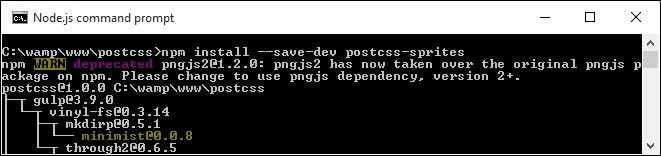
- Go ahead and fire up a Node.js command prompt, and change the working folder to that of our project area.
- At the command prompt, enter the command shown in this screenshot, then press Enter, once Node has confirmed successful installation, and minimize the window, as we will return to it later in this exercise:
- Go ahead and fire up your text editor, then add the following lines—these represent four credit card icons we would typically add to any online e-commerce site:
.amex { background: #fff url(img/amex.png) no-repeat 0 0; } .cirrus { background: url(img/cirrus.png) no-repeat 0 0; } .delta { background: url(img/delta.png) no-repeat 0 0; } .solo { background: url(img/solo.png) no-repeat 0 0; } - Save the file as
style.css, and store it in thesrcfolder of our project area. - In the same folder, create a folder called
imgat the root of our project area; extract copies of the icons stored in the code download that accompanies this book, and save them to theimgfolder. - From the code download that accompanies this book, go ahead and extract a copy of
gulpfile.js, and save this to the root of our project area. - Revert back to the Node.js window, then at the prompt, enter
gulpand press Enter. - Our code will now be compiled, if all is well, we should see something akin to this when viewing the
style.cssfile within thedestfolder:.amex { background-image: url(../img/sprite.png); background-position: 0 0; background-color: #fff; } .cirrus { background-image: url(../img/sprite.png); background-position: -102px 0; } .delta { background-image: url(../img/sprite.png); background-position: 0 -64px; } .solo { background-image: url(../img/sprite.png); background-position: -102px -64px; }
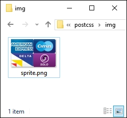
At this stage, we can then copy the code to our website, along with image—instead of using four separate icons (which each require separate calls to the server), we can cache the single icon. This will result in faster response times with fewer calls to our server. The compiled style sheet can be found in the dest folder, with the composite image one level up, in the img folder:
Even though this is a simple process, it's worth noting a key point with how our gulp file has been configured—the use of a configuration object for the sprites plugin:
var opts = {
  stylesheetPath: 'dest/',
  spritePath    : 'img/sprite.png',
  path          : 'src/img/'
};
It's not a process we've used to date, but it does not mean that it is any less useful—it simply boils down to a matter of personal preference and readability. It does make it easier to read the calls for each plugin we assign; in this instance, we're only using one, but you can imagine what it will be like with multiple plugins in use:
gulp.task('autoprefixer', function() {
  return gulp.src('src/*.css')
    .pipe(postcss([ sprites(opts) ]))
    .pipe(gulp.dest('dest/'));
});
Okay, let's change tack and take a look at a different side to using images with PostCSS: using SVG format images. Standard images don't always scale well, particularly when used in a responsive environment; sometimes we might use retina images instead, but an alternative to consider is the use of SVG images.