Table of Contents for
Mastering PostCSS for Web Design
 Mastering PostCSS for Web Design
Published by
Packt Publishing, 2016
Mastering PostCSS for Web Design
Published by
Packt Publishing, 2016
- Cover
- Table of Contents
- Mastering PostCSS for Web Design
- Mastering PostCSS for Web Design
- Credits
- About the Author
- About the Reviewer
- www.PacktPub.com
- Preface
- What you need for this book
- Who this book is for
- Conventions
- Reader feedback
- Customer support
- 1. Introducing PostCSS
- Introducing PostCSS
- Setting up a development environment
- Creating a simple example using PostCSS
- Linting code using plugins
- Exploring how PostCSS works
- Summary
- 2. Creating Variables and Mixins
- Creating a hover effect example
- Transitioning to using PostCSS
- Adding variable support to PostCSS
- Updating our hover effect demo
- Setting the order of plugins
- Creating mixins with PostCSS
- Looping content with PostCSS
- Summary
- 3. Nesting Rules
- Navigating through pages
- Transitioning to using PostCSS plugins
- Exploring the pitfalls of nesting
- Making the switch to BEM
- Exploring our changes in more detail
- Summary
- 4. Building Media Queries
- Exploring custom media queries in PostCSS
- Making images responsive
- Adding responsive text support
- Optimizing media queries
- Retrofitting support for older browsers
- Moving away from responsive design
- Taking things further with CSS4
- Summary
- 5. Managing Colors, Images, and Fonts
- Managing fonts with PostCSS
- Creating image sprites
- Working with SVG in PostCSS
- Adding support for WebP images
- Manipulating colors and color palettes
- Creating color functions with PostCSS
- Summary
- 6. Creating Grids
- Creating an example with Bourbon Neat
- Exploring the grid plugins in PostCSS
- Transitioning to using PostCSS-Neat
- Creating a site using Neat and PostCSS
- Adding responsive capabilities
- Summary
- 7. Animating Elements
- Moving away from jQuery
- Making use of pre-built libraries
- Switching to using SASS
- Making the switch to PostCSS
- Exploring plugin options within PostCSS
- Updating code to use PostCSS
- Creating a demo in PostCSS
- Optimizing our animations
- Using our own animation plugin
- Summary
- 8. Creating PostCSS Plugins
- Dissecting the architecture of a standard plugin
- Creating an transition plugin
- Building a custom font plugin
- Simplifying the development process
- Guidelines for plugin building
- Making the plugin available for use
- Summary
- 9. Working with Shortcuts, Fallbacks, and Packs
- Exploring plugin packs for PostCSS
- Adding shortcuts with Rucksack
- Linting and optimizing your code
- Providing fallback support
- Summary
- 10. Building a Custom Processor
- Exploring our processor
- Dissecting issues with our processor
- Optimizing the output
- Adding reload capabilities
- Extending our processor further
- Testing the final pre-processor
- Getting started with some hints and tips
- Introducing the CSStyle library
- Summary
- 11. Manipulating Custom Syntaxes
- Preparing our environment
- Implementing custom syntax plugins
- Parsing CSS
- Formatting the output with the API
- Highlighting our syntax code
- Summary
- 12. Mixing Preprocessors
- Exploring the conversion process
- Introducing the Pleeease library
- Compiling with other preprocessors
- Using the PreCSS library
- Converting a WordPress installation
- Setting up our environment
- Considering the conversion process
- Making changes to our code
- Compiling and testing the changes
- Summary
- 13. Troubleshooting PostCSS Issues
- Exploring some common issues
- Getting help from others
- Summary
- 14. Preparing for the Future
- Converting CSS4 styles for use
- Supporting future syntax with cssnext
- Creating plugins to provide extra CSS4 support
- Summary
- Index
The process of making text responsive within PostCSS shares some similarities to the postcss-responsive-images plugin we've already used, in both cases, all we need to add is a simple attribute to make our content responsive.
The plugin we need to use for text though is the PostCSS-responsive-type plugin by Sean King (available at https://github.com/seaneking/postcss-responsive-type); adding font-size, being responsive to a rule in our style sheet is enough to get us started. Of course, we almost certainly want to specify our own rules; for example, we can use something like this:
html {
  font-size: responsive 12px 21px; /* min-size, max-size */
  font-range: 420px 1280px; /* range of viewport widths */
}
This compiles into two media queries—one at 480px, and the other at 1280px; the former sets a text size of 12px, with the latter setting 21px as the font size. Without further ado, let's get stuck in and start using this plugin in anger:
- Fire up a Node.js command and change the working directory to the project area.
- Enter the command shown in this screenshot, then press Enter:
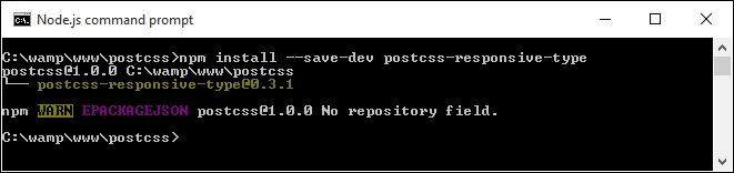
At this point, the plugin is installed—we can start to use it:
- Start by extracting a copy of the
Tutorial18folder from the code download that accompanies this book; save it to the root area of our project folder. - In a new file, add the following code—this contains some simple font styling for our demo; save it as
style.cssin thesrcfolder of our project area:@font-face { font-family: 'robotoregular'; src: url('Roboto-Regular-webfont.eot'); src: url('Roboto-Regular-webfont.eot?#iefix') format('embedded-opentype'), url('Roboto-Regular-webfont.woff') format('woff'), url('Roboto-Regular-webfont.ttf') format('truetype'), url('Roboto-Regular-webfont.svg#robotoregular') format('svg'); font-weight: normal; font-style: normal; } body { font-family: "robotoregular", sans-serif; font-size: responsive 12px 21px; font-range: 420px 1280px; } - Next, open up a copy of the
gulpfile.jsfile at the root of our project area. - Note how a reference to the
postcss-responsive-typeplugin has been added, as indicated:var at2x = require('postcss-at2x'); var responsivetype = require('postcss-responsive-type'); - The
autoprefixertask has also been amended—it has a reference to thepostcss-responsive-typeplugin, using the variable that has been declared at the top of the file:gulp.task('autoprefixer', function() { return gulp.src('src/*.css') .pipe(postcss([at2x(), responsivetype(), autoprefixer])) .pipe(gulp.dest('dest/')); }); - We can now compile the code from a Node.js command prompt, change the working directory to the project area, and run this command:
gulp - Once the code has compiled, copy the contents of the
destfolder to thecssfolder of theTutorial18folder; if all is well, we should see this when previewing the results in a browser: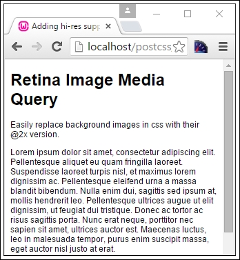
Try resizing the window to make it larger or smaller—you should notice that the text size increases or decreases in size, according to the size of the available screen estate. We can then use this as a basis for adding images; if we apply both postcss-responsive-images and postcss-responsive-type plugins, we can use this as a solid basis for adding responsive capabilities to our sites.
A small point to note though—we've used pixel values throughout our code. Historical convention recommended the use of em (or even better rem) values, as these scaled better than standard pixel values. However, some developers now argue that this convention is no longer valid; there are occasions when pixel em or rem values should be used. It's up to us to decide which unit of value to use, and when it should be used!
Note
For a good discussion on the merits of using pixel versus rem values, take a look at this post by Gion Kunz, at https://mindtheshift.wordpress.com/2015/04/02/r-i-p-rem-viva-css-reference-pixel/.
Leaving aside what is possible when working with media queries, there are a couple of key topics we should explore—optimizing media queries, and how we can retrofit some form of support for older browsers. We'll start with optimizing queries—PostCSS has a couple of useful plugins available to help with maintaining our code.