Table of Contents for
Mastering PostCSS for Web Design
 Mastering PostCSS for Web Design
Published by
Packt Publishing, 2016
Mastering PostCSS for Web Design
Published by
Packt Publishing, 2016
- Cover
- Table of Contents
- Mastering PostCSS for Web Design
- Mastering PostCSS for Web Design
- Credits
- About the Author
- About the Reviewer
- www.PacktPub.com
- Preface
- What you need for this book
- Who this book is for
- Conventions
- Reader feedback
- Customer support
- 1. Introducing PostCSS
- Introducing PostCSS
- Setting up a development environment
- Creating a simple example using PostCSS
- Linting code using plugins
- Exploring how PostCSS works
- Summary
- 2. Creating Variables and Mixins
- Creating a hover effect example
- Transitioning to using PostCSS
- Adding variable support to PostCSS
- Updating our hover effect demo
- Setting the order of plugins
- Creating mixins with PostCSS
- Looping content with PostCSS
- Summary
- 3. Nesting Rules
- Navigating through pages
- Transitioning to using PostCSS plugins
- Exploring the pitfalls of nesting
- Making the switch to BEM
- Exploring our changes in more detail
- Summary
- 4. Building Media Queries
- Exploring custom media queries in PostCSS
- Making images responsive
- Adding responsive text support
- Optimizing media queries
- Retrofitting support for older browsers
- Moving away from responsive design
- Taking things further with CSS4
- Summary
- 5. Managing Colors, Images, and Fonts
- Managing fonts with PostCSS
- Creating image sprites
- Working with SVG in PostCSS
- Adding support for WebP images
- Manipulating colors and color palettes
- Creating color functions with PostCSS
- Summary
- 6. Creating Grids
- Creating an example with Bourbon Neat
- Exploring the grid plugins in PostCSS
- Transitioning to using PostCSS-Neat
- Creating a site using Neat and PostCSS
- Adding responsive capabilities
- Summary
- 7. Animating Elements
- Moving away from jQuery
- Making use of pre-built libraries
- Switching to using SASS
- Making the switch to PostCSS
- Exploring plugin options within PostCSS
- Updating code to use PostCSS
- Creating a demo in PostCSS
- Optimizing our animations
- Using our own animation plugin
- Summary
- 8. Creating PostCSS Plugins
- Dissecting the architecture of a standard plugin
- Creating an transition plugin
- Building a custom font plugin
- Simplifying the development process
- Guidelines for plugin building
- Making the plugin available for use
- Summary
- 9. Working with Shortcuts, Fallbacks, and Packs
- Exploring plugin packs for PostCSS
- Adding shortcuts with Rucksack
- Linting and optimizing your code
- Providing fallback support
- Summary
- 10. Building a Custom Processor
- Exploring our processor
- Dissecting issues with our processor
- Optimizing the output
- Adding reload capabilities
- Extending our processor further
- Testing the final pre-processor
- Getting started with some hints and tips
- Introducing the CSStyle library
- Summary
- 11. Manipulating Custom Syntaxes
- Preparing our environment
- Implementing custom syntax plugins
- Parsing CSS
- Formatting the output with the API
- Highlighting our syntax code
- Summary
- 12. Mixing Preprocessors
- Exploring the conversion process
- Introducing the Pleeease library
- Compiling with other preprocessors
- Using the PreCSS library
- Converting a WordPress installation
- Setting up our environment
- Considering the conversion process
- Making changes to our code
- Compiling and testing the changes
- Summary
- 13. Troubleshooting PostCSS Issues
- Exploring some common issues
- Getting help from others
- Summary
- 14. Preparing for the Future
- Converting CSS4 styles for use
- Supporting future syntax with cssnext
- Creating plugins to provide extra CSS4 support
- Summary
- Index
It has to be said that although nesting is a simple technique to understand, it can be difficult to get right, as shown in our SASS version of the demo:
The issues we have here are twofold—the multiple levels of nesting result in a high level of code specificity; if we wanted to change the styling for .nav-panel ul li (the compiled version of line
125), it would likely break the appearance of our front end code. To see what I mean, let's take an example HTML page that any developer might create:
<body>
  <div class="container">
    <div class="content">
      <div class="articles">
        <div class="post">
          <div class="title">
            <h1><a href="#">Hello World</a>
          </div>
          <div class="content">
            <p></p>
            <ul>
              <li>...</li>
            </ul>
          </div>
          <div class="author">
            <a href="#" class="display"><img src="..." /></a>
            <h4><a href="#">...</a></h4>
            <p>
              <a href="#">...</a>
              <ul>
                <li>...</li>
              </ul>
            </p>
          </div>
        </div>
      </div>
    </div>
  </div>
</body>
Now, before you all scream, Yuk, I would never do that! at me, and claim (quite rightly) that we should use semantic elements such as <header>, <section>, <article>, and / or <footer> to provide context and meaning, instead of all of these <div> statements, then stop! There is a point in producing that ugly mix of code. Let me explain:
The example HTML we have just seen is likely to result in this nested CSS:
body {
  div.container {
    div.content {
      div.articles {
        & > div.post {
          div.title {
            h1 {
              a {
              }
            }
          }
          div.content {
            p { ... }
            ul {
              li { ... }
            }
          }
          div.author {
            a.display {
              img { ... }
            }
            h4 {
              a { ... }
            }
            p {
              a { ... }
            }
            ul {
              li { ... }
            }
          }
        }
      }
    }
  }
}
Some developers might think this is perfectly acceptable—after all, they know no different, so why should it be an issue, right? Wrong—this code, while it may technically fit the styles in our HTML document, has several issues with it:
- It is awkward to read at best, and enough to give anyone a headache when trying to decipher it.
- Try compiling it; it will result in a lot of duplicated parent selectors, with code stretching to around 20 lines.
- Rendering performance is likely to be poor—if for example, a tool such as Google's Page Speed is installed, then it is likely to trigger the Prioritize Visible Content rule, where additional round trips are needed to render content on-screen above the fold.
- Size is likely to be an issue—even though we live in an age of broadband connections, it is bad manners to take a cavalier attitude to content, and not create something in as small a footprint as possible.
- Maintainability will become a problem—our example code has bound styles too tightly, which defeats the purpose of cascading style sheets, where we should be able to place common styles in a parent selector and allow these to cascade down to children, or be overridden as required.
How can we get around it? The simplest answer is to be sensible about the number of levels we use when nesting code—some developers argue no more than four; I would argue from experience that two should be sufficient (which in this case would be body div.content, had we compiled our monster CSS style sheet).
There is nothing to stop us from using four levels if we absolutely have no other way of achieving our desired result; if we're doing this regularly, then we clearly need to revisit our code!
If, when working on code, we are forced to regularly use nested styles that are more than two or three levels deep, then there are some tricks we can use to reduce both the CSS specificity over time, and the need to use nesting more than two to three levels deep. Let's take a look at a few:
- Can you give yourself the class you need? Specificity can creep in if we're overriding an existing selector:
.section-header {
  /* normal styles */
}

body.about-page .section-header {
  /* override with higher specificity */
}
To avoid specificity, can a class be emitted through the use of server-side code or functions, which we can use to style the element instead?
<header class="<%= header_class %>">
Which could output one class, or both, as desired:
</header> .section-header { /* normal styles */ } .about-section-header { /* override with same specificity */ /* possibly extend the standard class */ } - The order of your style sheets can play an important role here, even though you might use a single class to override styles:
<header class="section-header section-header-about">
...
</header>
Your existing class may be overriding your override; both selectors have the same specificity, so the last rule(s) to be applied will take precedence. The fix for this is simply to rework the order in which your style rules are applied, so that overriding classes can be applied later.
- Consider reducing the specificity of the element you're trying to style; can the element be replaced, or removed in its entirety? If, however, it's being used within JavaScript (or jQuery) code, then it is preferable to leave it as-is, and add a second class (or use an existing class already applied, if one exists).
- Where possible, aim to use as flat a structure as possible for your code; it is too easy to style an element such as this:
.module > h2 {

}
In this example, we're styling all
h2elements that are direct children of the parent.moduleclass. However, this will work until we need to assign a different style for theh2element. If the markup looks similar to this example:<div class="module"> <h2 class="unique"> Special Header </h2> </div>…it will be difficult to apply styles easily, due to CSS specificity creeping in:
.module > h2 { /* normal styles */ } .unique { /* I'm going to lose this specificity battle */ } .module .unique { /* I'll work, but specificity creep! */ } - To avoid this, using as flat a structure as possible is recommended—it will be worth the extra effort required to set it up:
<div class="module">
  <h2 class="module-header">
  </h2>
  <div class="module-content">
  </div>
</div>
- Consider using an established pattern library, or atomic design (such as the one at http://patternlab.io/), to help guide you through how a site should be built—they are likely to be built using minimal CSS specificity, and with hopefully little need to override existing code.
- Be careful if you decide to use cascading when applying CSS styles—if we apply a base style to an element (or class) that is reused multiple times, this will cause issues. To avoid this, try to avoid using cascading if it isn't really needed; consider limiting it to 2-3 levels only, to reduce risk of odd or unexpected styles being applied.
- Sometimes code is outside of your control—in instances such as this, we have to work with it; we can either try using low specificity selectors where possible, or use the
!importantkeyword to override the code. For now, we may have to leave comments in the code to explain why the selectors are set as such; in an ideal world, we would try to contact the authors to see if they can update or alter the code to remove these issues. - As a last resort, if you must get into the realms of CSS specificity, then try to only apply a light touch, and not take the sledgehammer approach, such as using a selector ID or
!important.We can try applying a single class to an existing tag, but this may not feel right for some; an alternative is to use two classes:
.nav .override {
}
.override .override {
}
.nav {
}
The key here, though, is to not use more than one additional class!
- Nesting styles can lead to writing overly specific selectors in our code—some developers discourage its use for this reason, even though nesting can help make our code visually easier to read and digest. Instead of using compound selectors, we can emulate a form of name-spacing by using the ampersand symbol:
.somestyle {
    color: darkred;
   &-so {
      color: blue;
      &-ever {
        color: green;
      }
   }
}
…which will compile to this:
.somestyle { color: darkred; } . somestyle-so { color: blue; } .somestyle-so-ever { color: green; } - If your style is overriding a style that is already an override—stop: Why are you doing this? Overriding a class or selector element can be an efficient way of styling, but applying a second override will only cause confusion.
We've seen a number of ways of avoiding, or reducing CSS specificity issues that are inherent with nesting; the key message, though, is that we are not forced to have to nest our code, and that, to paraphrase the front-end architect Roy Tomeij—nested code doesn't create bad code; bad coders do!
Tip
You can see the original article by Roy Tomeij at http://www.thesassway.com/editorial/sass-doesnt-create-bad-code-bad-coders-do
There is one method, though, that we've not touched on, and for good reason: it's a route many developers new to using processing will likely take for the first time. Intrigued? It has something to do with using conversion tools, and more specifically, how we use them to convert from plain CSS to code suitable for compiling using PostCSS.
Imagine this scenario, if you will:
You've taken over a website, and are keen to make use of PostCSS to help with maintaining your code. The code uses plain vanilla CSS, so as a step to converting it, you happen to know of a number of sites that will convert plain CSS to SASS. After all, there are some similarities between PostCSS and SASS code, so why not?
You extract the results into a text file, save it, and put it through a SASS compilation process. Out comes some newly compiled CSS, which you drop into the relevant location on your server, and voilà! You have a working site that now uses SASS. A working site, and a perfect basis for converting to PostCSS…or is it?
The short answer should be no, but the longer one is that it will depend on your code. Let me explain why:
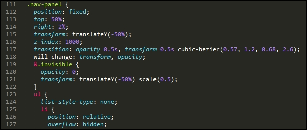
Simply pushing code through a conversion process isn't enough—granted, it will give you code that works, but unless it is very simple, it is likely not to give code that is concise and efficient. To see what I mean, take a close look at the CSS style sheet from Tutorial5—and specifically, the style rules for .nav-panel, from around line 132.
A conversion process will have no problem processing it to produce valid SASS, but it won't look pretty—as an example, try copying lines 114 to 197 into the converter hosted at http://css2sass.herokuapp.com/. Doesn't look great, does it? There is definitely room for improvement—I've already made some changes to the code, but we can do more; let's take a look at what can be done to improve the code.
When using a CSS to SASS convertor, the one key point that should always be at the back of our minds is that the converted code should not be considered the final article.
It doesn't matter how simple or complex your code is—it should be the first step in our conversion process. It's just a matter of how little or how much we have to do, once the code has been through the converter! As an example, take a look at this block of code:
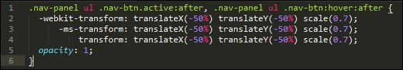
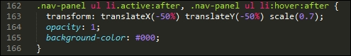
It's a direct copy of lines 234 to 239 of the compiled version of the pen by Nikolay, which we used as a basis for our earlier demos. Now take a quick look at the equivalent code that I tweaked from the original and used in my version:
Notice any differences? The vendor prefix version of the transform attribute has been stripped out—most modern browsers (certainly within the last year to eighteen months), should handle this code without the need for vendor prefixes. The original version also suffered from a high degree of CSS specificity—this will become even more apparent if the code is nested!
To improve it, I've switched in .nav-panel ul li as a direct replacement for .nav-panel ul .nav-btn—the code is relatively simple in that it does not need a second class to identify elements for styling purposes. The next logical step is to break up the large nesting block within the source file; it is tempting to include a single large block, but this will be at the expense of readability, maintenance, and performance.
We could potentially go even further, and consider removing the leading .nav-panel; not only will it make the code infinitely easier to read, but it will also reduce the issues around CSS specificity. Of course, this kind of change will depend on what is in your code; the point here is to examine your code thoroughly, and look to reduce any CSS specificity as much as possible, so that your nesting won't look so bad!
There is an alternative means we can use though, which removes issues around CSS specificity—using Block Element Modifier notation (or BEM for short). It's a great way to systematically style elements using CSS, and it is worth taking time to get accustomed to how it works. Let's dive in and take a look.