Table of Contents for
Mastering PostCSS for Web Design
 Mastering PostCSS for Web Design
Published by
Packt Publishing, 2016
Mastering PostCSS for Web Design
Published by
Packt Publishing, 2016
- Cover
- Table of Contents
- Mastering PostCSS for Web Design
- Mastering PostCSS for Web Design
- Credits
- About the Author
- About the Reviewer
- www.PacktPub.com
- Preface
- What you need for this book
- Who this book is for
- Conventions
- Reader feedback
- Customer support
- 1. Introducing PostCSS
- Introducing PostCSS
- Setting up a development environment
- Creating a simple example using PostCSS
- Linting code using plugins
- Exploring how PostCSS works
- Summary
- 2. Creating Variables and Mixins
- Creating a hover effect example
- Transitioning to using PostCSS
- Adding variable support to PostCSS
- Updating our hover effect demo
- Setting the order of plugins
- Creating mixins with PostCSS
- Looping content with PostCSS
- Summary
- 3. Nesting Rules
- Navigating through pages
- Transitioning to using PostCSS plugins
- Exploring the pitfalls of nesting
- Making the switch to BEM
- Exploring our changes in more detail
- Summary
- 4. Building Media Queries
- Exploring custom media queries in PostCSS
- Making images responsive
- Adding responsive text support
- Optimizing media queries
- Retrofitting support for older browsers
- Moving away from responsive design
- Taking things further with CSS4
- Summary
- 5. Managing Colors, Images, and Fonts
- Managing fonts with PostCSS
- Creating image sprites
- Working with SVG in PostCSS
- Adding support for WebP images
- Manipulating colors and color palettes
- Creating color functions with PostCSS
- Summary
- 6. Creating Grids
- Creating an example with Bourbon Neat
- Exploring the grid plugins in PostCSS
- Transitioning to using PostCSS-Neat
- Creating a site using Neat and PostCSS
- Adding responsive capabilities
- Summary
- 7. Animating Elements
- Moving away from jQuery
- Making use of pre-built libraries
- Switching to using SASS
- Making the switch to PostCSS
- Exploring plugin options within PostCSS
- Updating code to use PostCSS
- Creating a demo in PostCSS
- Optimizing our animations
- Using our own animation plugin
- Summary
- 8. Creating PostCSS Plugins
- Dissecting the architecture of a standard plugin
- Creating an transition plugin
- Building a custom font plugin
- Simplifying the development process
- Guidelines for plugin building
- Making the plugin available for use
- Summary
- 9. Working with Shortcuts, Fallbacks, and Packs
- Exploring plugin packs for PostCSS
- Adding shortcuts with Rucksack
- Linting and optimizing your code
- Providing fallback support
- Summary
- 10. Building a Custom Processor
- Exploring our processor
- Dissecting issues with our processor
- Optimizing the output
- Adding reload capabilities
- Extending our processor further
- Testing the final pre-processor
- Getting started with some hints and tips
- Introducing the CSStyle library
- Summary
- 11. Manipulating Custom Syntaxes
- Preparing our environment
- Implementing custom syntax plugins
- Parsing CSS
- Formatting the output with the API
- Highlighting our syntax code
- Summary
- 12. Mixing Preprocessors
- Exploring the conversion process
- Introducing the Pleeease library
- Compiling with other preprocessors
- Using the PreCSS library
- Converting a WordPress installation
- Setting up our environment
- Considering the conversion process
- Making changes to our code
- Compiling and testing the changes
- Summary
- 13. Troubleshooting PostCSS Issues
- Exploring some common issues
- Getting help from others
- Summary
- 14. Preparing for the Future
- Converting CSS4 styles for use
- Supporting future syntax with cssnext
- Creating plugins to provide extra CSS4 support
- Summary
- Index
So what is BEM, and why can it help with reducing or removing CSS specificity issues?
BEM, or Block Element Modifier, helps us style elements using a systematic naming convention, which is structured thus:
.block: top-level containing the element we're going to change.block__modifier: the style assigned when the state of an element is changed.block__element: an element inside a top-level container.block__element__modifier: alternate representation of an element, when its state has been changed
The idea behind this style of coding is to make it portable and easier to maintain. The basis for this is that, while standard, non-BEM CSS is more concise, it is harder to infer what each rule does. We frequently have to assign multiple classes to an element, which introduces a degree of CSS specificity, and reduces the reusability of CSS rules. Using BEM allows us to combine the constituent names into one style class name, and remove any concern around CSS specificity.
If we use this concept, we can use it to write style rules such as this:
.block {
  &__element {
  }
  &__modifier {
  }
}
This will compile to the following:
.block {}
.block__element {}
.block__modifier {}
The preceding code uses plain BEM format, but from within a processor environment such as SASS to construct BEM rules in PostCSS, we can use the postcss-bem plugin (available from https://github.com/ileri/postcss-bem) to produce our BEM CSS using @-rules. For example:
@component ComponentName {
  color: cyan;

  @modifier modifierName {
    color: purple;
  }

  @descendent descendentName {
    color: darkred;
  }

  @when stateName {
    color: yellow;
  }
}
In this instance, @component signifies our Block, @descendant our element, and @modifier is our modifier. When compiled, our CSS would look like this:
.ComponentName {
  color: cyan;
}

.ComponentName--modifierName {
  color: purple;
}

.ComponentName-descendentName {
  color: darkred;
}

.ComponentName.is-stateName {
  color: yellow;
}
The beauty of using BEM is that it helps to reduce or even avoid CSS specificity issues—although names are longer, we can combine both element and modifier names into one class, instead of having to apply three or more separate classes. Granted, there may be instances where we might have to apply a second class, but with careful planning we should be able to reduce this to a minimum.
Right, onwards we go: let's get stuck in to coding! Over the next few pages, we will take a look at implementing BEM styling in a simple demo, and see how we can use PostCSS to compile our code.
For our BEM demo, we're going to work through the CSS rules required to show some simple message boxes on screen, such as for displaying confirmation that a task has completed, or a warning when something isn't right.
Tip
The original version of this demo, by Rene Spronk, is available from http://www.cssportal.com/blog/css-notification-boxes/.
It's a simple demo, but shows off the principles behind BEM CSS perfectly—go ahead and extract a copy of the Tutorial8 folder, then run index.html to get a feel for what we will be producing. This version uses standard CSS; we will use this as a basis for converting to using BEM.
Let's make a start:
- We'll begin by extracting a copy of the
Tutorial9folder from the code download that accompanies this book—drop this into our project area. - Next, in a new file, add the following CSS statements starting at line 1, and leaving a one-line gap between each—they should be fairly self-explanatory, but we will go through each block in turn.
- We kick off with the core styles for each dialog—this is a basis style for each dialog box:
.dlgBox { border-radius: 0.625rem; padding: 0.625rem 0.625rem 0.625rem 2.375rem; margin: 0.625rem; width: 14.5rem } - Next up comes a simple style for each
<span>element—this turns the lead-in caption for each dialog to uppercase and sets it in bold text:span { font-weight: bold;text-transform: uppercase; } - We now need to add our block element—it's the opening line that forms the basis for our styling:
@component content { - Next up comes the Element part of our style rule. These rules need to be added as nested (that is, indented) rules immediately underneath—using the PostCSS plugin, we add it in as a
@descendentof our@component:@descendent alert { font-family: Tahoma, Geneva, Arial, sans-serif; font-size: 0.6875rem; color: #555; border-radius: 0.625rem; } - Up next comes the first of our status messages—we kick off with styling the Error message first; the main rule adds an error icon and styles the border. The
:hoverpseudo-element reduces the opacity when we hover over the box:@modifier error { background: #ffecec url("../img/error.png") no-repeat 0.625rem 50%; border: 0.0625rem solid #f5aca6; } @modifier error:hover { opacity: 0.8; } - This is swiftly followed by styling for the Success message:
@modifier success { background: #e9ffd9 url("../img/success.png") no-repeat 0.625rem 50%; border: 0.0625rem solid #a6ca8a; } @modifier success:hover { opacity: 0.8; } - We can't forget the obligatory Warning message, so here's the style rule for that status:
@modifier warning { background: #fff8c4 url("../img/warning.png") no-repeat 0.625rem 50%; border: 0.0625rem solid #f2c779; } @modifier warning:hover { opacity: 0.8; } - Last but by no means least, here's the final one, which is Notice; it includes the closing bracket for the BEM nesting:
@modifier notice { background: #e3f7fc url("../img/info.png") no-repeat 0.625rem 50%; border: 0.0625rem solid #8ed9f6; } @modifier notice:hover { opacity: 0.8; } } - Save the file as
style.scssinto thesrcfolder of our top-level project area (and not into theTutorial8folder!).
Our simple demo isn't going to set the world alight in terms of styling. If we were to preview it now, the results will of course not look great; let's fix that by setting up the compilation and linting tasks within PostCSS.
Note
If you are a SASS user, then you can see a version of this code suitable for that processor on GitHub—the code is available at: https://gist.github.com/alibby251/45eab822a6a619467279. Note how similar the results are when you compare the compiled version with the version we'll get in the next exercise!
Our code is in place, but the boxes won't look particularly appetizing—most of the styles are still written using PostCSS @-rules. We can fix that by compiling the code, so let's dive in and take a look at installing support for BEM.
Setting up BEM support in PostCSS is a cinch—we can make use of two plugins to compile and lint our code. The plugins we need for this task are postcss-bem (available from https://github.com/ileri/postcss-bem), and postcss-bem-linter (available from https://github.com/postcss/postcss-bem-linter). Both can be installed using the same process through Node.js.
Hopefully the process will be familiar by now, so without further ado, let's make a start:
- We'll begin by firing up a Node.js command prompt, and navigating to our working folder.
- At the command prompt, enter this command then press Enter:
npm install --save-dev postcss-bem - Node.js will install each of the elements required; if all is well, we should see this result, to indicate a successful installation:
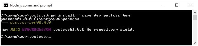
- Repeat the same process for
postcss-bem-linter, using this command:npm install --save-dev postcss-bem-linter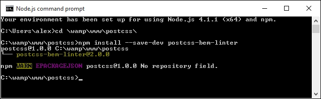
- Keep the command prompt session open, but minimized. We're going to make use of it again in a moment!
Now that the plugin is installed, we can go ahead and add support to our gulp task file, and begin to parse our code:
- First, go ahead and remove the existing
gulpfile.jsfile at the root of our project area. - In a new file, add the following lines and save it as
gulpfile.js, at the root of our project area. We start with setting a number of variables that call each of the plugins:var gulp = require('gulp'); var postcss = require('gulp-postcss'); var bem = require('postcss-bem'); var bemLinter = require('postcss-bem-linter'); var reporter = require('postcss-reporter'); - The first task in the file checks the code for consistency with BEM standards, and displays any errors on-screen:
gulp.task('lint', function() { return gulp.src('dest/*.css') .pipe(postcss([ bemLinter({ preset: 'bem' }), reporter({ clearMessages: true }) ])) .pipe(gulp.dest('dest/')); }); - The second task in the file compiles the BEM code to valid CSS:
gulp.task('bem', function() { return gulp.src("src/*.css") .pipe(postcss([bem({ style: 'bem', separators: { descendent: '__' } })])) .pipe(gulp.dest('dest/')); }); - This task is the default that is called when we run gulp from the command line; it calls each of the tasks in turn:
gulp.task('default', ['bem', 'lint']); - We finish the
gulpfile.jswith a watch facility, to kick in and compile our code when any changes are made to it:var watcher = gulp.watch('src/*.css', ['default']); watcher.on('change', function(event) { console.log('File ' + event.path + ' was ' + event.type + ', running tasks...'); }); - We're going to replace the
package.jsonfile too—add these lines to a new file, and save it to the root of the project area. These simply tell gulp which versions of our plugins to use when compiling the code:{ "name": "postcss", "version": "1.0.0", "description": "Configuration file for PostCSS", "main": "index.js", "scripts": { "test": "echo \"Error: no test specified\" && exit 1" }, "author": "Alex Libby", "license": "ISC", "devDependencies": { "gulp": "^3.9.0", "gulp-postcss": "^6.0.0", "postcss-bem-linter": "^2.0.0", "postcss-reporter": "^1.3.0" } } - From the code download that accompanies this book, go ahead and extract a copy of
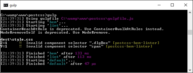
style.cssfrom thecss – completed versionfolder underTutorial9—save this to thesrcfolder under our project area. - Revert back to the Node.js command prompt session we had before, then at the prompt, enter this command and press Enter:
gulp - If all is well, the code will be checked, and the results displayed on screen. You may see errors appear, such as those shown in this screenshot. If they do, they can be ignored for now (we will explore this in more detail later):
- Go ahead and copy the contents of the
destfolder into thecssfolder underneathTutorial9—if all is well, we should see something akin to this screenshot when previewing the results in a browser: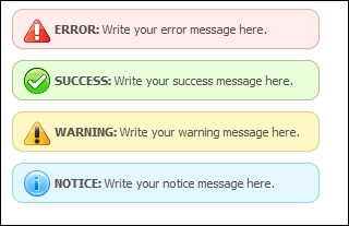
Our simple demo shows some useful message boxes that we can use as a basis for something more complex; it illustrates perfectly how we can use BEM to style our code, while keeping issues around CSS specificity at bay. We've covered a few useful techniques throughout this exercise, so let's take a moment to explore them in more detail.