Table of Contents for
Mastering PostCSS for Web Design
 Mastering PostCSS for Web Design
Published by
Packt Publishing, 2016
Mastering PostCSS for Web Design
Published by
Packt Publishing, 2016
- Cover
- Table of Contents
- Mastering PostCSS for Web Design
- Mastering PostCSS for Web Design
- Credits
- About the Author
- About the Reviewer
- www.PacktPub.com
- Preface
- What you need for this book
- Who this book is for
- Conventions
- Reader feedback
- Customer support
- 1. Introducing PostCSS
- Introducing PostCSS
- Setting up a development environment
- Creating a simple example using PostCSS
- Linting code using plugins
- Exploring how PostCSS works
- Summary
- 2. Creating Variables and Mixins
- Creating a hover effect example
- Transitioning to using PostCSS
- Adding variable support to PostCSS
- Updating our hover effect demo
- Setting the order of plugins
- Creating mixins with PostCSS
- Looping content with PostCSS
- Summary
- 3. Nesting Rules
- Navigating through pages
- Transitioning to using PostCSS plugins
- Exploring the pitfalls of nesting
- Making the switch to BEM
- Exploring our changes in more detail
- Summary
- 4. Building Media Queries
- Exploring custom media queries in PostCSS
- Making images responsive
- Adding responsive text support
- Optimizing media queries
- Retrofitting support for older browsers
- Moving away from responsive design
- Taking things further with CSS4
- Summary
- 5. Managing Colors, Images, and Fonts
- Managing fonts with PostCSS
- Creating image sprites
- Working with SVG in PostCSS
- Adding support for WebP images
- Manipulating colors and color palettes
- Creating color functions with PostCSS
- Summary
- 6. Creating Grids
- Creating an example with Bourbon Neat
- Exploring the grid plugins in PostCSS
- Transitioning to using PostCSS-Neat
- Creating a site using Neat and PostCSS
- Adding responsive capabilities
- Summary
- 7. Animating Elements
- Moving away from jQuery
- Making use of pre-built libraries
- Switching to using SASS
- Making the switch to PostCSS
- Exploring plugin options within PostCSS
- Updating code to use PostCSS
- Creating a demo in PostCSS
- Optimizing our animations
- Using our own animation plugin
- Summary
- 8. Creating PostCSS Plugins
- Dissecting the architecture of a standard plugin
- Creating an transition plugin
- Building a custom font plugin
- Simplifying the development process
- Guidelines for plugin building
- Making the plugin available for use
- Summary
- 9. Working with Shortcuts, Fallbacks, and Packs
- Exploring plugin packs for PostCSS
- Adding shortcuts with Rucksack
- Linting and optimizing your code
- Providing fallback support
- Summary
- 10. Building a Custom Processor
- Exploring our processor
- Dissecting issues with our processor
- Optimizing the output
- Adding reload capabilities
- Extending our processor further
- Testing the final pre-processor
- Getting started with some hints and tips
- Introducing the CSStyle library
- Summary
- 11. Manipulating Custom Syntaxes
- Preparing our environment
- Implementing custom syntax plugins
- Parsing CSS
- Formatting the output with the API
- Highlighting our syntax code
- Summary
- 12. Mixing Preprocessors
- Exploring the conversion process
- Introducing the Pleeease library
- Compiling with other preprocessors
- Using the PreCSS library
- Converting a WordPress installation
- Setting up our environment
- Considering the conversion process
- Making changes to our code
- Compiling and testing the changes
- Summary
- 13. Troubleshooting PostCSS Issues
- Exploring some common issues
- Getting help from others
- Summary
- 14. Preparing for the Future
- Converting CSS4 styles for use
- Supporting future syntax with cssnext
- Creating plugins to provide extra CSS4 support
- Summary
- Index
A key element of making any site responsive has of course to be images—after all, we can always construct a site without images, but how effective would it really be?
Sure, one can always use a data Uniform Resource Identifier (URI) to convert images to CSS equivalents, but this is at the risk of dramatically inflating our style sheet to the point of it becoming impossible to manage. The reality is that we have to have some form of images—if we are to make them behave, we clearly need to ensure that they expand or contract in size, according to available screen estate.
The easiest way to adapt images for responsive layouts is to set a max-width value to 100%, along with height: auto and display: block, and remove any attribute that defines either a fixed height or width for that image element. We can make the changes manually, but this is time-consuming; instead, let's take a look at a PostCSS plugin that allows us to set these three values at compilation, by adding one single line of code to each image.
Adding responsive capabilities to a site using PostCSS is simple; it will depend largely on your requirements as to how we make the images responsive, but the two key plugins to look out for are postcss-responsive-images (available at https://github.com/azat-io/postcss-responsive-images), and
postcss-at2x (available at https://github.com/simonsmith/postcss-at2x).
We will cover the use of the postcss-at2x plugin in a moment, but for now, let's take a look at using the postcss-re
sponsive-images plugin.
Making our images responsive requires a single line of code to be added to any image-based rule; let's dive in and add this capability to a copy of the Tutorial13 folder from the code download that accompanies this book:
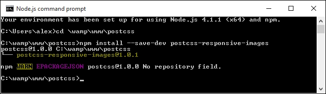
- We'll start, as always, by installing the plugin—for this, fire up a Node.js command prompt, then run the commands as shown in this screenshot:
- We'll start by extracting a copy of the
Tutorial13folder from the code download that accompanies this book, then saving it to our project area. - Open up
style.cssfrom thecssfolder within theTutorial13folder, then remove this rule:img { width: 584px; height: 389px; } - In its place, add the following line:
#retina img { image-size: responsive; } - Save the file, then copy it to the
srcfolder underneath our project area (not within theTutorialfolder!). - For this exercise, we're going to replace the Gulp task file—go ahead and add this code to a new file, saving it as
gulpfile.jsat the root of our project area:var gulp = require('gulp'); var postcss = require('gulp-postcss'); var responsiveimages = require('postcss-responsive-images'); gulp.task('default', function() { return gulp.src('src/*.css') .pipe(postcss([ responsiveimages ])) .pipe(gulp.dest('dest/')); }); var watcher = gulp.watch('src/*.css', ['default']); watcher.on('change', function(event) { console.log('File ' + event.path + ' was ' + event.type + ', running tasks...'); });Note that we're concentrating on just making our image responsive with this
gulpfile, hence why it is a lot shorter than previous versions we have used to date. - Fire up a Node.js command prompt, then change the working directory to our project area—at the prompt, enter
gulpthen press Enter. - Node will go away and compile our code—if all is well, the compiled code for
#retina imgwill look like this: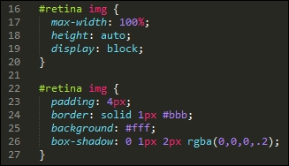
- Copy the compiled CSS file from the
destfolder into thecssfolder of theTutorial13folder. - Go ahead and preview the results—try resizing the browser; if all is well, the image will automatically resize the image for us.
Although it's easy enough to install and use this plugin, it works best when referencing images directly in our HTML code, and not through the use of background: or content: url(…) attributes in our CSS.
What does this mean for us? It's a little limiting, as the purists amongst us may prefer to hive off asset attributes to CSS style sheets such is open source software, though this is one limitation that is bound to be fixed in the fullness of time!
The keen-eyed amongst you will spot that the image presentation clearly needs further work—for example, the paper clip isn't repositioning when the window is resized, and we need to set a minimum width so that there is some white space around the image when we resize it:
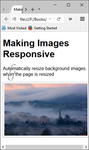
The key principles remain the same though, irrespective of the presentation, removing the fixed image sizes and replacing with a max-width of 100% is a good step to making an image responsive.
To get a true responsive image though, we ideally would use the new HTML5 <picture> tags—trouble is, PostCSS doesn't yet have a plugin to implement these tags!
Note
If you're interested in some of the more general techniques of making images responsive (and outside of the world of PostCSS), then take a look at https://jakearchibald.com/2015/anatomy-of-responsive-images/.
In the absence of any available capability to handle the use of <picture> tags within PostCSS, we can instead take a more traditional route and use media queries to help switch between different images, depending on the available screen estate.
We can go a step further, and even switch in images of better resolution if the device supports it—I'm thinking of course of Apple iPads or iPhones, which support retina images. We can easily use this format when working with PostCSS; for this, we need to make use of the
postcss-at2x plugin by Simon Smith, available at https://github.com/simonsmith/postcss-at2x. I feel a couple of demos coming on, so without further ado, let's go explore using this plugin.
Retina images, a term coined by Apple's marketing team, contain up to twice as many pixels in the same space as standard images. This allow us to switch in images of higher quality (or resolution) automatically, provided we're using a device that supports their use.
This might be as simple as an iPhone, or something more substantial like an iPad—Apple's marketing clout means that they are probably two of the most popular portable devices that people own! But I digress…
At a technical level, we have two routes available for adding retina images, before we explore these in more detail, let's just remind ourselves of the basics:
@media (-webkit-min-device-pixel-ratio: 2), (min-resolution: 192dpi) {
#retina img {
content: url("../img/mothorchid@2x.png");
}
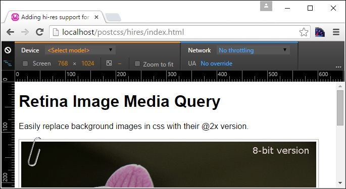
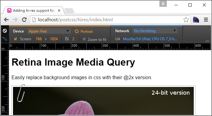
}This code is an extract from the CSS style sheet in the Tutorial15 folder, which is available in the code download that accompanies this book; try previewing index.html in a browser.
The image displayed displays the text 8-bit version—to switch, try this:
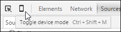
- Press Shift + Ctrl + I to display the Developer toolbar.
- Click on the mobile phone icon to enable Responsive Design mode
We can then switch between different devices using the dropdown—try switching to Apple iPad; you may need to press F5 to refresh the display. If all is well, it will switch between 8-bit and 24-bit versions of the orchid image.
This is all good, but we're clearly not using PostCSS here—what are our options? Well, we have two that we can use: customMedia() or the postcss-at2x plugin. We've already covered the basics of using customMedia in the Exploring custom media queries in PostCSS section; for this, we would use a variable such as this:
/* media query for hi-resolution image support */
@custom-media --hi-resolution screen and (-webkit-min-device-pixel-ratio: 2), (min-resolution: 192dpi);
This would be coupled with a query such as this:
@media (--hi-resolution) {
#retina img {
content: url("../img/mothorchid@2x.png");
}
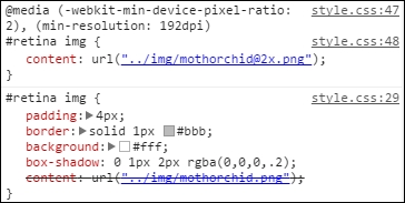
}When compiled, and run in Google Chrome (to take advantage of its responsive design tools), we can see the image switch from 8-bit:
…to a 24-bit version of the image:
A peek at the active style rules view shows the media query update automatically:
This is good, but still a manual approach that takes time—instead, we can use a quicker route to achieve similar results. The alternative route, using postcss-at2x, is a simpler option—instead of working out what resolution ratio to use, we simply add the term at-2x to our style rule:
#retina img { background: url("../img/mothorchid.png") at-2x; }This automatically compiles to produce the relative resolution statements for us in our style sheet. It's a useful trick to use when working with iPads and other devices that can support hi-res images.
Let's dive in and take a look at this in more detail.
- We start, as usual by installing the plugin—fire up a Node.js command prompt, then change the working directory to our project area.
- At the prompt, enter the commands shown in this screenshot, pressing Enter after each:
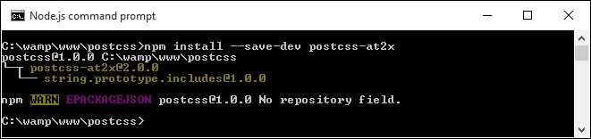
Keep the window handy, we will need it in a few steps!
- Let's now set up our markup, extract a copy of the
Tutorial17folder from the code download that accompanies this book, and save the folder to our project area. - Extract a copy of the
gulpfile from this folder and use it to replace the existing one at the root of our project area. - Extract a copy of
style – pre-compile.cssfrom theTutorial17folder, then copy it to thesrcfolder at the root of our project area. Rename it asstyle.css. - Switch back to the Node.js command prompt window we had up earlier—at the prompt, enter
gulpthen press Enter. - PostCSS will go away and compile our code—if all is well, we should see something akin to this extract in the compiled file within the
destfolder:#retina img { padding: 4px; border: solid 1px #bbb; background: #fff; box-shadow: 0 1px 2px rgba(0,0,0,.2); content: url("../img/mothorchid.png"); } … @media screen and (-webkit-min-device-pixel-ratio: 2), (-webkit-min-device-pixel-ratio: 2), (min-resolution: 192dpi) { #retina img { content: url("../img/mothorchid@2x.png"); } } - Go ahead and copy the contents of the
destfolder to thecssfolder within theTutorial17folder. - Try previewing the demo—if all is well, we should see that orchid flower as before, and force Chrome to display the hi-res version as we did in our previous demo.
The great thing about this plugin is that it deals with creating the media query for us; all we need to do is add the at2x tag to any image where we want to display hi-resolution versions in the browser. There is always a risk that we may end up producing queries that are not 100% optimized (for example, combining identical breakpoints into one block, and so on); we will explore a couple of options to help keep our queries working efficiently towards the end of this chapter.
As an aside, a more concise option for working with hi-res images which is frequently forgotten, is the use of image-set(); this performs in a similar fashion, by providing different versions for devices that support high-resolution images. PostCSS provides a fallback option in the form of postcss-image-set (available from https://github.com/alex499/postcss-image-set), which sets a basic image that will work in those browsers that don't support the use of image-
set() within a style sheet.
So, we've covered a number of key topics around making content responsive, using media queries; what does this mean when using PostCSS? The simple answer is that it opens up a world of possibilities—if your site needs to use media queries, then it is very likely that we can use PostCSS to compile our queries into valid CSS rules. To pique your interest, here are a couple of options to consider:
- Creating a responsive slider using the
bxSliderplugin, available from http://www.bxslider.com. Granted, it uses jQuery to move between each slide, but who's to say you couldn't eventually convert this to an all-CSS option? - How about using responsive image sprites? A classic use for this is credit card symbols on an e-commerce shopping cart, with a bit of care, we can even make the image adapt to display hi-res versions, if the device being used supports it. We'll cover more of this in Chapter 5, Managing Colors, Images and Fonts, if you want to give this a try, take a look at the postcss-sprites plugin, available from https://github.com/2createStudio/postcss-sprites.
Okay, we've covered making images responsive using PostCSS, but what about text? Pages won't look good if text doesn't flow properly when content is resized. Thankfully we can apply similar principles to text, using the postcss-responsive-type plugin by Sean King—let's take a look at it in action.