Table of Contents for
Mastering PostCSS for Web Design
 Mastering PostCSS for Web Design
Published by
Packt Publishing, 2016
Mastering PostCSS for Web Design
Published by
Packt Publishing, 2016
- Cover
- Table of Contents
- Mastering PostCSS for Web Design
- Mastering PostCSS for Web Design
- Credits
- About the Author
- About the Reviewer
- www.PacktPub.com
- Preface
- What you need for this book
- Who this book is for
- Conventions
- Reader feedback
- Customer support
- 1. Introducing PostCSS
- Introducing PostCSS
- Setting up a development environment
- Creating a simple example using PostCSS
- Linting code using plugins
- Exploring how PostCSS works
- Summary
- 2. Creating Variables and Mixins
- Creating a hover effect example
- Transitioning to using PostCSS
- Adding variable support to PostCSS
- Updating our hover effect demo
- Setting the order of plugins
- Creating mixins with PostCSS
- Looping content with PostCSS
- Summary
- 3. Nesting Rules
- Navigating through pages
- Transitioning to using PostCSS plugins
- Exploring the pitfalls of nesting
- Making the switch to BEM
- Exploring our changes in more detail
- Summary
- 4. Building Media Queries
- Exploring custom media queries in PostCSS
- Making images responsive
- Adding responsive text support
- Optimizing media queries
- Retrofitting support for older browsers
- Moving away from responsive design
- Taking things further with CSS4
- Summary
- 5. Managing Colors, Images, and Fonts
- Managing fonts with PostCSS
- Creating image sprites
- Working with SVG in PostCSS
- Adding support for WebP images
- Manipulating colors and color palettes
- Creating color functions with PostCSS
- Summary
- 6. Creating Grids
- Creating an example with Bourbon Neat
- Exploring the grid plugins in PostCSS
- Transitioning to using PostCSS-Neat
- Creating a site using Neat and PostCSS
- Adding responsive capabilities
- Summary
- 7. Animating Elements
- Moving away from jQuery
- Making use of pre-built libraries
- Switching to using SASS
- Making the switch to PostCSS
- Exploring plugin options within PostCSS
- Updating code to use PostCSS
- Creating a demo in PostCSS
- Optimizing our animations
- Using our own animation plugin
- Summary
- 8. Creating PostCSS Plugins
- Dissecting the architecture of a standard plugin
- Creating an transition plugin
- Building a custom font plugin
- Simplifying the development process
- Guidelines for plugin building
- Making the plugin available for use
- Summary
- 9. Working with Shortcuts, Fallbacks, and Packs
- Exploring plugin packs for PostCSS
- Adding shortcuts with Rucksack
- Linting and optimizing your code
- Providing fallback support
- Summary
- 10. Building a Custom Processor
- Exploring our processor
- Dissecting issues with our processor
- Optimizing the output
- Adding reload capabilities
- Extending our processor further
- Testing the final pre-processor
- Getting started with some hints and tips
- Introducing the CSStyle library
- Summary
- 11. Manipulating Custom Syntaxes
- Preparing our environment
- Implementing custom syntax plugins
- Parsing CSS
- Formatting the output with the API
- Highlighting our syntax code
- Summary
- 12. Mixing Preprocessors
- Exploring the conversion process
- Introducing the Pleeease library
- Compiling with other preprocessors
- Using the PreCSS library
- Converting a WordPress installation
- Setting up our environment
- Considering the conversion process
- Making changes to our code
- Compiling and testing the changes
- Summary
- 13. Troubleshooting PostCSS Issues
- Exploring some common issues
- Getting help from others
- Summary
- 14. Preparing for the Future
- Converting CSS4 styles for use
- Supporting future syntax with cssnext
- Creating plugins to provide extra CSS4 support
- Summary
- Index
Bandwidth usage has always been critical to the success of a website; remember the good old days of 56K modems? We've come a long way since then, but this is still no excuse for producing sites that swallow bandwidth like it's going out of fashion!
A part of this comes in the form of linting and minifying our style sheets before deploying into production use—it goes without saying that this should form part of any developer's workflow process by default. We can do this manually, but this manual job is prone to missing opportunities, which can lead to inconsistencies in our code.
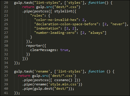
Instead, we can use the power of PostCSS to perform the heavy lifting for us; the stylelint and cssnano plugin packs make for a powerful optimization facility! If we take a careful look at most gulp task files that we've created throughout the course of this book, both processes are taking place; in this example, stylelint is used at line 22, and cssnano at line 38:
For anyone starting out with PostCSS for the first time, then simply specifying cssnano() as one of the processors for PostCSS should be sufficient:
If we take a look at the T45 – converting to use Rucksack demo, our original style sheet file weighs in at 4KB when compiled, but which drops to 3KB after compression. Granted, it's only a small file, but a 25% drop in size is still not an insignificant drop!
The cssnano plugin is not a single plugin, but a wrapper for a number of plugins, which include examples such as these:
postcss-reduce-idents: This reduces any custom identifier names (such as those used in@keyframes) to two letter equivalent codes; this helps with minifying code.postcss-zindex: This plugin reduces anyz-indexdeclarations that are unnecessarily higher than they should be.postcss-convert-values: If our CSS uses any number of different units, then we can reduce the CSS size by expressing the value a different way. For example,400mscan be expressed as.4s(a reduction by two characters). Some might argue this is a little extreme, but every little helps!postcss-colormin: In a similar vein, we can reduce the length of color names using this plugin: ifrgba(255, 0, 0, 1)is used in our code, then we can replace this withred. Although the name is indeed shorter, this is at the expense of losing consistency with naming our colors, which may not be so desirable.
Moving on, there are some key points we should be aware of, when using cssnano:
- You will notice the presence of the gulp-rename plugin in use within our Gulp file—
cssnanodoes not have a capability to rename a compressed file to something we would expect to see within our code. We can usegulp-renameto create a version that developers would expect to see in code; it does leave a copy of the original file in place, if needed. - Most options within
cssnanoare enabled by default; we can switch off individual ones in the configuration object, as shown in this example:var nano = require('gulp-cssnano'); gulp.task('default', function () { return gulp.src('./main.css') .pipe(nano({discardComments: {removeAll: true}})) .pipe(gulp.dest('./out')); });Tip
For a full list of the transform options, take a look at http://cssnano.co/options/. Click on the link to view individual configuration options for that plugin.
- This plugin automatically includes autoprefixer. Technically, there is no need to include it separately as we have done in previous exercises, so ideally it should be removed. We will focus on this more as part of optimizing our processor in Chapter 10, Building a Custom Processor.
- There are some transforms that are available within
cssnano, but which are not switched on by default; these are not considered safe and should only be included if you are 100% sure it has not affected your code. The details of unsafe transforms are available on theoptionspage at http://cssnano.co/options/.
Okay, let's move on: the second half of our double act is the stylelint plugin pack; unlike cssnano, stylelint takes the opposite approach and allows you to enable any rule as needed, from a list of over 100 available rules. Let's dive in and take a look in more detail.
How does one describe Stylelint, if you've never met it before? Well, to quote its website, "stylelint is a mighty, modern CSS linter".
Whether we agree with such a bold statement, it is certainly worth getting to know Stylelint as a linter. Available from http://stylelint.io/, the key to this plugin lies not in the plugin itself, but in the rules that define what we want to check in our code. At present, we can use any one of 100+ rules, or a mix of several; these can be specified in a .styleintrc file, within our package.json file, or as a stylelint.config.js file that exports a JavaScript object.
We've already used stylelint in earlier projects; for convenience, our Gulp task for linting styles has a number of rules specified within the object:
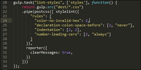
I've chosen a number of rules to illustrate how we can use Stylelint; it is, of course, up to each of you as developers to choose which rules you want to test as part of linting your code. Stylelint does not contain a core set of rules that are enabled by default—any checking it does will be dependent on what is specified in the rule configuration.
Tip
A useful source to bookmark is http://stylelint.io/—this contains a full set of rules that can be added to our Stylelint configuration prior to compiling code.
For example, if we were building a responsive site that made heavy use of the Golden Rule, we may want to limit any percentage values to no more than three or four places. For this, we would specify the number-max-precision rule—this takes an integer value; specifying 3 would flag warnings for these two attributes:
.foo { top: 3.2456px; }
.foo { top: 3.245634px; }
This is not the case for this one:
@media (min-width: 3.234em) {...}I would strongly recommend reading through the list of rules to get a flavor of what is available; it will take time to familiarize yourselves with the contents, but the reward will be code that is optimized and checked prior to it being used in a production environment. There is one small point though—even if we optimize our code ad infinitum, there is always a possibility that we still have to include some support for older browsers.
In an ideal world, we would convince our clients of the merits of limiting such support (or not even covering it). If clients insist on it, however, against our better judgment, then PostCSS can easily help with providing that support. Let's explore what is available—much of this will center around IE (as this is the biggest culprit), but will equally apply to other browsers.