Table of Contents for
Mastering PostCSS for Web Design
 Mastering PostCSS for Web Design
Published by
Packt Publishing, 2016
Mastering PostCSS for Web Design
Published by
Packt Publishing, 2016
- Cover
- Table of Contents
- Mastering PostCSS for Web Design
- Mastering PostCSS for Web Design
- Credits
- About the Author
- About the Reviewer
- www.PacktPub.com
- Preface
- What you need for this book
- Who this book is for
- Conventions
- Reader feedback
- Customer support
- 1. Introducing PostCSS
- Introducing PostCSS
- Setting up a development environment
- Creating a simple example using PostCSS
- Linting code using plugins
- Exploring how PostCSS works
- Summary
- 2. Creating Variables and Mixins
- Creating a hover effect example
- Transitioning to using PostCSS
- Adding variable support to PostCSS
- Updating our hover effect demo
- Setting the order of plugins
- Creating mixins with PostCSS
- Looping content with PostCSS
- Summary
- 3. Nesting Rules
- Navigating through pages
- Transitioning to using PostCSS plugins
- Exploring the pitfalls of nesting
- Making the switch to BEM
- Exploring our changes in more detail
- Summary
- 4. Building Media Queries
- Exploring custom media queries in PostCSS
- Making images responsive
- Adding responsive text support
- Optimizing media queries
- Retrofitting support for older browsers
- Moving away from responsive design
- Taking things further with CSS4
- Summary
- 5. Managing Colors, Images, and Fonts
- Managing fonts with PostCSS
- Creating image sprites
- Working with SVG in PostCSS
- Adding support for WebP images
- Manipulating colors and color palettes
- Creating color functions with PostCSS
- Summary
- 6. Creating Grids
- Creating an example with Bourbon Neat
- Exploring the grid plugins in PostCSS
- Transitioning to using PostCSS-Neat
- Creating a site using Neat and PostCSS
- Adding responsive capabilities
- Summary
- 7. Animating Elements
- Moving away from jQuery
- Making use of pre-built libraries
- Switching to using SASS
- Making the switch to PostCSS
- Exploring plugin options within PostCSS
- Updating code to use PostCSS
- Creating a demo in PostCSS
- Optimizing our animations
- Using our own animation plugin
- Summary
- 8. Creating PostCSS Plugins
- Dissecting the architecture of a standard plugin
- Creating an transition plugin
- Building a custom font plugin
- Simplifying the development process
- Guidelines for plugin building
- Making the plugin available for use
- Summary
- 9. Working with Shortcuts, Fallbacks, and Packs
- Exploring plugin packs for PostCSS
- Adding shortcuts with Rucksack
- Linting and optimizing your code
- Providing fallback support
- Summary
- 10. Building a Custom Processor
- Exploring our processor
- Dissecting issues with our processor
- Optimizing the output
- Adding reload capabilities
- Extending our processor further
- Testing the final pre-processor
- Getting started with some hints and tips
- Introducing the CSStyle library
- Summary
- 11. Manipulating Custom Syntaxes
- Preparing our environment
- Implementing custom syntax plugins
- Parsing CSS
- Formatting the output with the API
- Highlighting our syntax code
- Summary
- 12. Mixing Preprocessors
- Exploring the conversion process
- Introducing the Pleeease library
- Compiling with other preprocessors
- Using the PreCSS library
- Converting a WordPress installation
- Setting up our environment
- Considering the conversion process
- Making changes to our code
- Compiling and testing the changes
- Summary
- 13. Troubleshooting PostCSS Issues
- Exploring some common issues
- Getting help from others
- Summary
- 14. Preparing for the Future
- Converting CSS4 styles for use
- Supporting future syntax with cssnext
- Creating plugins to provide extra CSS4 support
- Summary
- Index
Making the transition to PostCSS is relatively straightforward. We need, of course,to update our compilation process to remove links to SASS, and introduce our PostCSS plugin.
In terms of changing the CSS, it's a little more complicated, as we have to work out how many columns are required for each grid block. Fortunately, our example is relatively straightforward, as we numbered the original blocks with the appropriate column count, so we can use that as a basis for changing our CSS.
Let's make a start with updating our compilation process:
- We'll start by extracting a copy of the
Tutorial31folder from the code download that accompanies this book. Save it to the root of our project area. - From the
Tutorial31folder, go ahead and extract copies ofpackage.jsonandgulpfile.jsfiles. Save these to the root of our project area. - Next, we need to install the
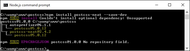
postcss-neatplugin. For this, fire up a Node.js command prompt, then change the working folder to our project area. - At the prompt, go ahead and enter this command, then press Enter:
npm install postcss-neat --save-dev - Node will go away and install our plugin—the plugin is installed, when we see this confirmation:
We now have a plugin installed and configured for use. Before we create a test to confirm it works OK, let's take a quick look at our gulp file, at the root of our project area.
If you were expecting a complex configuration, then I'm sorry to disappoint you—it's even easier than installing Bourbon and Neat using the normal method outlined on their site! Our gulp file contains the requisite variable calls to each plugin at the start, with a watch facility at the end of the file. The section of interest to us is this:
gulp.task('neat', function () {
  var processors = [
    require('autoprefixer-core')({ browsers: ['last 1 version'] }),
    require('postcss-neat')(/* { options } */)
  ];
  return gulp.src('src/*.css')
    .pipe(require('gulp-postcss')(processors))
    .pipe(gulp.dest('dest/'));
});
This setup should satisfy most scenarios, with a default of 12 columns; if there is a need to override it, we can do so by specifying the appropriate option in our configuration object:
postcss([
  ...
  require('postcss-neat')({
    neatMaxWidth: '128em'
  })
  ...
])
We will use this option later in this chapter in the Testing our configuration section, when we build our test example.
Note
For a full list of the attributes that can be modified, head over to https://github.com/jo-asakura/postcss-neat#custom-settings.
We have a basic configuration now in place, but hold on...it looks a little short! The sharp-eyed among you should notice that we've included additional options in the gulp files in previous exercises, such as creating source maps or minifying our CSS files. Let's fix that now, by amending our gulp file to include these missing options. Everything will then be in place, ready for when we create our example site.
Our gulp file, as it stands, is perfectly usable, but isn't really as useful as it could be—there are a handful of tasks we've built into previous exercises, but which of these are missing here.
A perfect example is the addition of source maps, but how about minifying our code too? Let's take a moment to refine our task list, and add in the missing tasks:
- The first task is to add in some variables that will act as references for the various plugins we will use—this goes in immediately after the last
varstatement, at the top of ourgulpfile:var cssnano = require('cssnano'); var sourcemaps = require('gulp-sourcemaps'); var rename = require('gulp-rename'); var stylelint = require('stylelint'); var reporter = require('postcss-reporter'); - The first task to add in is a facility to lint our styles:
gulp.task("lint-styles", ['neat'], function() { return gulp.src("dest/css/*.css") .pipe(postcss([ stylelint({ "rules": { "color-no-invalid-hex": 2, "declaration-colon-space-before": [2, "never"], "indentation": [2, 2], "number-leading-zero": [2, "always"] } }), reporter({ clearMessages: true, }) ])) }); - With our styles checked for accuracy and consistency, we can now minify our code. Add the following block:
gulp.task('rename', ['lint-styles'], function () { return gulp.src('dest/css/*.css') .pipe(postcss([ cssnano() ])) .pipe(rename('style.css')) .pipe(gulp.dest("dest/css")); }); - The next step is to add a source map option:
gulp.task('sourcemap', ['rename'], function () { return gulp.src('dest/css/*.css') .pipe(sourcemaps.init()) .pipe(sourcemaps.write('maps/')) .pipe(gulp.dest("dest/css")); }); - With the additions to our
gulpfile, we need to adjust the main default task to call these additional tasks:gulp.task('default', ['neat', 'lint-styles', 'rename', 'sourcemap']); - We have a watch facility in place, but it knows nothing about these extra tasks; let's add them in now:
var watcher = gulp.watch('src/*.css', ['default', 'lint-styles', 'rename', 'sourcemap']);
We now have a working gulp file, that includes all of the configuration tasks required for our exercise—let's put it to the test by compiling some example code, to confirm it all works as expected.
A key part of our process is testing our gulp file to ensure it works; not only should it run all of the required tasks, but in the correct order, and produce the expected results. Although we've reused existing code for our gulp file, we've made some major changes to our gulp file—let's take a moment to test it is working, using the code from our previous demo.
To get our demo working under PostCSS, we need to make some changes to our code:
- We'll start by resaving the
style.scssfile (from within thecssfolder in theTutorial31folder) as a plain CSS file, and not a SASS stylesheet, we've removed the use of SASS from our previous demo, making the use of the.scssextension redundant. - Next, we used a
.wrapperclass in our previous demo. This needs to be modified as indicated:.wrapper { @neat-outer-container; margin: 0 auto; } - Our
col-*class rules need to change too. In place of the static percentages from the old demo, we're going to replace them with this:.col-1 { @neat-span-columns 1; } .col-2 { @neat-span-columns 2; } .col-3 { @neat-span-columns 3; } .col-4 { @neat-span-columns 4; } .col-5 { @neat-span-columns 5; } .col-6 { @neat-span-columns 6; } .col-7 { @neat-span-columns 7; } .col-8 { @neat-span-columns 8; } .col-9 { @neat-span-columns 9; } .col-10 { @neat-span-columns 10;} .col-11 { @neat-span-columns 11; } .col-12 { @neat-span-columns 12; } - Our code is now ready, so go ahead and copy the
style.cssfile into thesrcfolder at the root of our project area. - Next, fire up a Node.js command prompt, then change the working folder to our project area.
- At the command prompt, enter
gulpthen press Enter. - If all is well, we should see a compiled
style.cssfile appear in thedestfolder. If we open it up, we should see a number of styles displayed that relate to each column, such as is shown in this screenshot: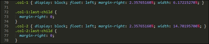
- If we try previewing the demo in a browser, we should see something akin to this screenshot. Notice how similar it is to the original version, which we built in SASS:
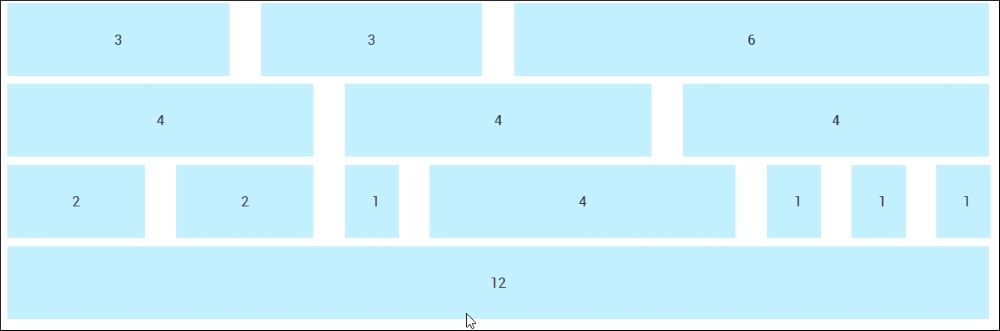
The demo that we've constructed is nearly identical to the original version. This proves that we have a working capability, which we can use to build our sites. The changes we made to our code are very simple, we added a @neat-outer-container to define how wide our site should be, followed by multiple instances of @neat-span-columns, to define how many columns each element should span.
Let's put some of this new knowledge to constructing something a little more useful, in the form of an example site with content. We'll reuse the example site page we created earlier in the chapter, and work through converting it for use with PostCSS plugins.