Table of Contents for
Mastering PostCSS for Web Design
 Mastering PostCSS for Web Design
Published by
Packt Publishing, 2016
Mastering PostCSS for Web Design
Published by
Packt Publishing, 2016
- Cover
- Table of Contents
- Mastering PostCSS for Web Design
- Mastering PostCSS for Web Design
- Credits
- About the Author
- About the Reviewer
- www.PacktPub.com
- Preface
- What you need for this book
- Who this book is for
- Conventions
- Reader feedback
- Customer support
- 1. Introducing PostCSS
- Introducing PostCSS
- Setting up a development environment
- Creating a simple example using PostCSS
- Linting code using plugins
- Exploring how PostCSS works
- Summary
- 2. Creating Variables and Mixins
- Creating a hover effect example
- Transitioning to using PostCSS
- Adding variable support to PostCSS
- Updating our hover effect demo
- Setting the order of plugins
- Creating mixins with PostCSS
- Looping content with PostCSS
- Summary
- 3. Nesting Rules
- Navigating through pages
- Transitioning to using PostCSS plugins
- Exploring the pitfalls of nesting
- Making the switch to BEM
- Exploring our changes in more detail
- Summary
- 4. Building Media Queries
- Exploring custom media queries in PostCSS
- Making images responsive
- Adding responsive text support
- Optimizing media queries
- Retrofitting support for older browsers
- Moving away from responsive design
- Taking things further with CSS4
- Summary
- 5. Managing Colors, Images, and Fonts
- Managing fonts with PostCSS
- Creating image sprites
- Working with SVG in PostCSS
- Adding support for WebP images
- Manipulating colors and color palettes
- Creating color functions with PostCSS
- Summary
- 6. Creating Grids
- Creating an example with Bourbon Neat
- Exploring the grid plugins in PostCSS
- Transitioning to using PostCSS-Neat
- Creating a site using Neat and PostCSS
- Adding responsive capabilities
- Summary
- 7. Animating Elements
- Moving away from jQuery
- Making use of pre-built libraries
- Switching to using SASS
- Making the switch to PostCSS
- Exploring plugin options within PostCSS
- Updating code to use PostCSS
- Creating a demo in PostCSS
- Optimizing our animations
- Using our own animation plugin
- Summary
- 8. Creating PostCSS Plugins
- Dissecting the architecture of a standard plugin
- Creating an transition plugin
- Building a custom font plugin
- Simplifying the development process
- Guidelines for plugin building
- Making the plugin available for use
- Summary
- 9. Working with Shortcuts, Fallbacks, and Packs
- Exploring plugin packs for PostCSS
- Adding shortcuts with Rucksack
- Linting and optimizing your code
- Providing fallback support
- Summary
- 10. Building a Custom Processor
- Exploring our processor
- Dissecting issues with our processor
- Optimizing the output
- Adding reload capabilities
- Extending our processor further
- Testing the final pre-processor
- Getting started with some hints and tips
- Introducing the CSStyle library
- Summary
- 11. Manipulating Custom Syntaxes
- Preparing our environment
- Implementing custom syntax plugins
- Parsing CSS
- Formatting the output with the API
- Highlighting our syntax code
- Summary
- 12. Mixing Preprocessors
- Exploring the conversion process
- Introducing the Pleeease library
- Compiling with other preprocessors
- Using the PreCSS library
- Converting a WordPress installation
- Setting up our environment
- Considering the conversion process
- Making changes to our code
- Compiling and testing the changes
- Summary
- 13. Troubleshooting PostCSS Issues
- Exploring some common issues
- Getting help from others
- Summary
- 14. Preparing for the Future
- Converting CSS4 styles for use
- Supporting future syntax with cssnext
- Creating plugins to provide extra CSS4 support
- Summary
- Index
Manipulating SVG images is an acquired art, and in some instances, it will clearly be overkill for what we need to achieve.
Instead, for those occasions where we need the detail in our images, we might normally use the JPEG format, or potentially PNG as an alternative. There's nothing wrong with either, but, it's old hat, and I do like to push the boundaries of what is possible! In addition, the JPEG image format is lossy and does not support alpha channels; PNG images are lossless, but suffer from larger file sizes for more complex images. If all we did was simply insert images onto a page, then PostCSS wouldn't be helpful here; instead, how about considering a different format altogether?
Enter Google's WebP. You'd be forgiven for thinking "Web…what?", as it isn't a common format! Part of this can be attributed to the lack of take-up; the only browsers to support it natively are Chrome, Android, and Opera. That doesn't mean to say it should be discounted. The format can offer some significant space savings over standard image formats such as JPEG or PNG, while maintaining superior quality. We can even get PostCSS to do most of the work for us, to boot! Let's explore the nuts and bolts of this in more detail, with a simple demo.
Image switching is nothing new, we covered one aspect back in Chapter 4, Building Media Queries, when we used PostCSS to switch-in hi-res images when supported in the browser.
We can use a similar technique, but this time with image formats, Google's WebP format was designed as a replacement for the myriad of other image formats available for the web. In an ideal world, we would use the new <picture> tag to take care of switching images automatically:
<picture>
  <source srcset="../img/landscape.webp" type="image/webp">
  <img src="../img/landscape.jpg" alt="The Oslo Opera House">
</picture>
It's not supported in all browsers, so instead, we can use a mix of PostCSS and Modernizr to apply the same effect. The plugin we need for this task is the webpcss plugin (available from https://github.com/lexich/webpcss)—we will need to run npm install gulp-webp --save-dev in a Node.js command prompt session to install the plugin. Let's dive in and take a look at it in more detail.
Tip
For best results, I would recommend using Chrome throughout these two demos, support can be added for Windows and other browsers, by visiting https://developers.google.com/speed/webp/.
Before we get stuck into using PostCSS, let's take a moment to perform a quick test. The files for this tutorial are in the Tutorial 23 folder:
- In the code download that accompanies this book, go ahead and extract a copy of
landscape – original version.jpg, and rename it aslandscape.jpg. The size should be around 11.5 MB in size. - Save the image to the root of our project area—we also need a copy of
cwebp.exe, so go ahead and extract that to our project area as well. - Fire up a command prompt session, change the working folder to our project area, enter
gulp, and then press Enter. - If all is well, we should see the results of our conversion, and the new WebP-format image appear in our project area:
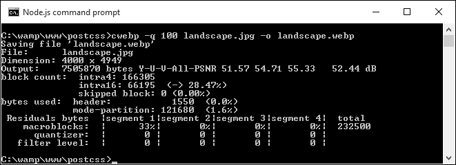
- Try performing the same process with a PNG format image; here are the results of a similar test I performed, with a PNG version of our landscape image:
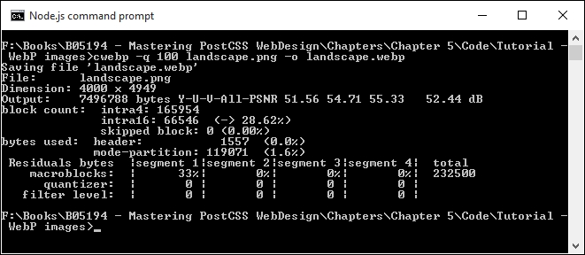
In both cases, the image sizes reduced significantly, the JPEG version dropped from around 12.5 MB to just over 7 MB; the PNG format shrunk from an enormous 25 MB to around the same size!
Note
To learn more about using the WebP format, take a look at the documentation on the Google Developers site at https://developers.google.com/speed/webp/.
Okay, time for another demo! Let's now make use of PostCSS to create our styles for both standard JPEG format, and WebP equivalents:
For this demo, we'll use the gulp-webpcss plugin, available from https://github.com/lexich/webpcss:
- Go ahead and download a copy of the
Tuturial23folder from the code download that accompanies this book, save this at the root of our project area. - Next, go ahead and remove any copies of
gulpfile.jsandpackage.jsonfrom the root of our project area; we need to replace them with copies from theTutorial23folder. - With these files in place, we still need to install the plugins, in a Node.js command prompt window, change the working folder to our project, then run these commands, pressing Enter after each:
npm install --save-dev gulp-webp
npm install --save-dev gulp-webpcss
Note the order of the parameters in these commands, if they are written in a different order, they will not install.
- Copy the
style – pre-compile.cssfile from theTutorial23folder to thesrcfolder at the root of our project area, then rename it asstyle.css. - Fire up a Node.js command prompt, change the working folder to our project area, then enter
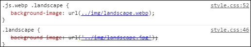
gulpat the prompt and press Enter. - If all is well, we should see the code shown in this screenshot when viewing the contents of the compiled file; the converted image will also appear in the
imgfolder:
- Copy the contents of the
imgfolder into theimgfolder within theTutorial23folder. - Copy the
style.cssfile from thedestfolder into thecssfolder within theTutorial23folder. - Go ahead and run
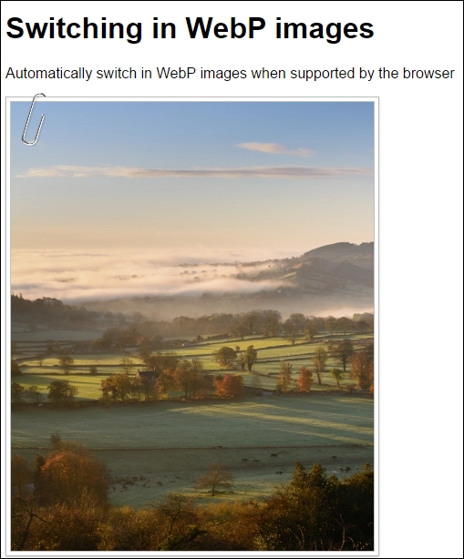
index.htmlin a browser, if all is well, we should see something akin to the screenshot at the start of this exercise.
If we run the same index.html in Google Chrome or Firefox, at first we should not see any difference—we'll only see the difference when viewing the compiled source within the Developer Toolbar in Chrome:
The real benefit, though, is in the img folder within our project area, the original JPEG image we use is 222 KB; however, the WebP is a fraction of this size: it weighs in at just 82 KB. See what I mean about the saving in space?
Okay, onwards we go: time to focus on another area of site building, which is manipulating colors. Colors play a key role within any site, as they make up a part of the message to the end user; let's dive in and take a look at some of the options available when using PostCSS.