Table of Contents for
Mastering PostCSS for Web Design
 Mastering PostCSS for Web Design
Published by
Packt Publishing, 2016
Mastering PostCSS for Web Design
Published by
Packt Publishing, 2016
- Cover
- Table of Contents
- Mastering PostCSS for Web Design
- Mastering PostCSS for Web Design
- Credits
- About the Author
- About the Reviewer
- www.PacktPub.com
- Preface
- What you need for this book
- Who this book is for
- Conventions
- Reader feedback
- Customer support
- 1. Introducing PostCSS
- Introducing PostCSS
- Setting up a development environment
- Creating a simple example using PostCSS
- Linting code using plugins
- Exploring how PostCSS works
- Summary
- 2. Creating Variables and Mixins
- Creating a hover effect example
- Transitioning to using PostCSS
- Adding variable support to PostCSS
- Updating our hover effect demo
- Setting the order of plugins
- Creating mixins with PostCSS
- Looping content with PostCSS
- Summary
- 3. Nesting Rules
- Navigating through pages
- Transitioning to using PostCSS plugins
- Exploring the pitfalls of nesting
- Making the switch to BEM
- Exploring our changes in more detail
- Summary
- 4. Building Media Queries
- Exploring custom media queries in PostCSS
- Making images responsive
- Adding responsive text support
- Optimizing media queries
- Retrofitting support for older browsers
- Moving away from responsive design
- Taking things further with CSS4
- Summary
- 5. Managing Colors, Images, and Fonts
- Managing fonts with PostCSS
- Creating image sprites
- Working with SVG in PostCSS
- Adding support for WebP images
- Manipulating colors and color palettes
- Creating color functions with PostCSS
- Summary
- 6. Creating Grids
- Creating an example with Bourbon Neat
- Exploring the grid plugins in PostCSS
- Transitioning to using PostCSS-Neat
- Creating a site using Neat and PostCSS
- Adding responsive capabilities
- Summary
- 7. Animating Elements
- Moving away from jQuery
- Making use of pre-built libraries
- Switching to using SASS
- Making the switch to PostCSS
- Exploring plugin options within PostCSS
- Updating code to use PostCSS
- Creating a demo in PostCSS
- Optimizing our animations
- Using our own animation plugin
- Summary
- 8. Creating PostCSS Plugins
- Dissecting the architecture of a standard plugin
- Creating an transition plugin
- Building a custom font plugin
- Simplifying the development process
- Guidelines for plugin building
- Making the plugin available for use
- Summary
- 9. Working with Shortcuts, Fallbacks, and Packs
- Exploring plugin packs for PostCSS
- Adding shortcuts with Rucksack
- Linting and optimizing your code
- Providing fallback support
- Summary
- 10. Building a Custom Processor
- Exploring our processor
- Dissecting issues with our processor
- Optimizing the output
- Adding reload capabilities
- Extending our processor further
- Testing the final pre-processor
- Getting started with some hints and tips
- Introducing the CSStyle library
- Summary
- 11. Manipulating Custom Syntaxes
- Preparing our environment
- Implementing custom syntax plugins
- Parsing CSS
- Formatting the output with the API
- Highlighting our syntax code
- Summary
- 12. Mixing Preprocessors
- Exploring the conversion process
- Introducing the Pleeease library
- Compiling with other preprocessors
- Using the PreCSS library
- Converting a WordPress installation
- Setting up our environment
- Considering the conversion process
- Making changes to our code
- Compiling and testing the changes
- Summary
- 13. Troubleshooting PostCSS Issues
- Exploring some common issues
- Getting help from others
- Summary
- 14. Preparing for the Future
- Converting CSS4 styles for use
- Supporting future syntax with cssnext
- Creating plugins to provide extra CSS4 support
- Summary
- Index
Making the switch to using PostCSS is a cinch, we can use the postcss-custom-media plugin for this purpose, available at https://github.com/postcss/postcss-custom-media.
The plugin is easy to install, it follows the same principles as all of the other plugins we've covered, so without further ado, let's get that out of the way now:
- Fire up a Node.js command prompt, then navigate to the working directory.
- At the prompt, enter this command, then press Enter:
npm install --save-dev postcss-custom-media - Keep the command prompt open for now, we will use it in the next few steps.
With the plugin installed, we can now use it, before we get stuck into converting our previous demo, let's work through a simple example, so you can see it in action:
- In a new file, add the following code, saving it as
style.csswithin thesrcfolder at the root of our project area:@custom-media --apple-watch (max-device-width: 42mm) and (min-device-width: 38mm); @media (--apple-watch) { h2 { font-size: 0.8rem; } } - Remove the existing
gulpfile.jsfile from the root of the project area. - In a new file, add the following code, this will form a new
gulpfile.jsfile; save this to the root of our project area:var gulp = require('gulp'); var postcss = require('gulp-postcss'); var customMedia = require('postcss-custom-media'); gulp.task('default', function() { return gulp.src('src/*.css') .pipe(postcss([ customMedia() ])) .pipe(gulp.dest('dest/')); }); var watcher = gulp.watch('src/*.css', ['default']); watcher.on('change', function(event) { console.log('File ' + event.path + ' was ' + event.type + ', running tasks...'); }); - Revert back to the command prompt session we had open earlier, then enter
gulpat the command prompt, and press Enter. - If all is well, we should see this code if we open up the compiled
style.cssfrom within thedestfolder of our project area:@media (max-device-width: 42mm) and (min-device-width: 38mm) { h2 { font-size: 0.8rem; } }
Believe it or not, this is all that is required to use the plugin; let's take a moment to consider what we've covered through this demo.
At first glance, you might be forgiven for thinking that this plugin doesn't actually do anything to help us—it's a valid point, but there is one key benefit to using this plugin. We can separate out the media breakpoints into separate variable statements, and store these at the top of our style sheet. This means that if we should ever need to update a particular breakpoint, we only need to do it once. Our code is then updated automatically at the compilation stage.
With that in mind, let's get stuck into a demo; we're going to work through the previous plain CSS version of our parallax scrolling example, and convert it to use PostCSS.
Over the next few pages, we're going to use a relatively recent technique as the basis for our demo—parallax scrolling. Just in case you've been under a rock, parallax scrolling is a single page application, which allows us to scroll through content whilst showing a number of fixed images behind our content:
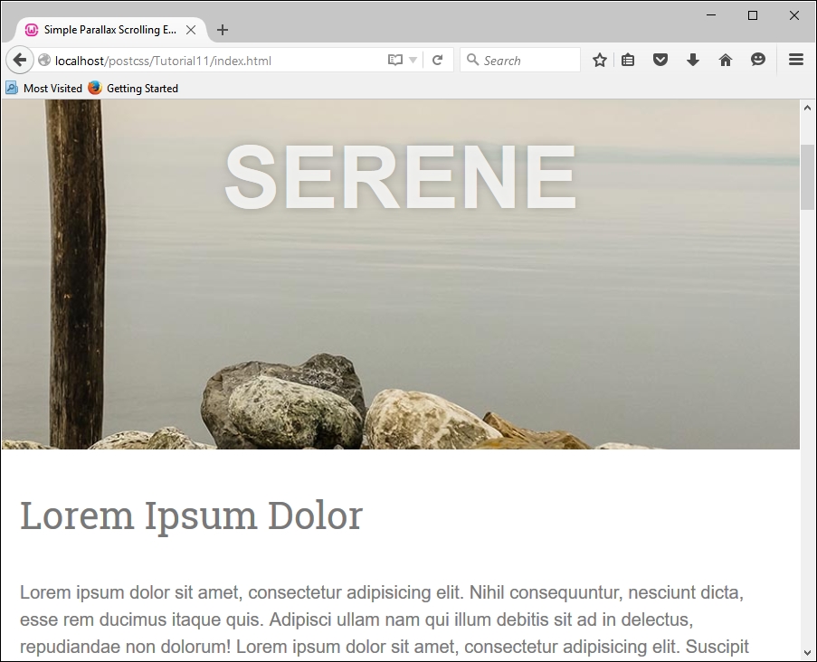
We'll be using a demo created by Nick Salloum, which is available at http://callmenick.com/_development/simple-parallax-effect/ (I've simplified some of the CSS styles used, removed vendor prefixes, and reduced the number of separate files called by the example). We'll start with a plain CSS version of our demo—go ahead and extract a copy of Tutorial11 to our project area. Try running index.html; if all is well, we should see something akin to the screenshot at the head of this section.
It's a great effect when used well, our interest is in the last section of the CSS file, from around line 133; this section contains the media queries we will convert in our next demo.
If media queries are used correctly, this can open up a world of possibilities; we can tweak our style sheet for anything from an iPhone through to a printer. In our demo, we've used a couple to adjust how content is displayed on sites where displays are larger than 600px or 960px width; altering these to work in PostCSS is a cinch.
Note
The CSS3 Media Queries site has a large list of different types of queries that are available; if you check out the site on a target PC or device, it will show you if that query is supported on that device. The full list is available at http://www.cssmediaqueries.com.
We only need to make a couple of changes in the style sheet to switch to using PostCSS, so let's make a start:
Let's make a start on the changes:
- We'll start by copying the
style.cssfile fromTutorial11folder to thesrcfolder in our project area. - We need to edit the file, to convert our media queries to use the PostCSS plugin—go ahead and add these two lines at lines 4 and 5:
@custom-media --small-viewport all and (min-width: 600px);
@custom-media --medium-viewport all and (min-width: 960px);
- Further down, replace lines 161 and 182 with this code:
@media (--small-viewport) { - On line 200, replace that line with this code:
@media (--medium-viewport) { - Save the file—next, go ahead and replace the current
gulpfile.jsfile with the version from the root of theTutorial12folder. It has the same initial PostCSS task, but this has been renamed and extended with additional tasks that we've already used from earlier chapters. - Next, go ahead and save a copy of the
package.jsonfile from the same location to the root of our project area—this contains updated links to the plugins used in this demo.Fire up a Node.js command prompt window, then change the working directory to our project area. At the prompt, enter
gulpthen press Enter. - If all is well, we should have a compiled CSS file appear in the
destfolder—go ahead and copy this into thecssfolder of theTutorial12folder. - Go ahead and run
index.htmlin our project area, to preview the results—if all is well, we should not see anything different, but a quick check in the source code should show that we're using the minified version of our code:
It's worth noting that in our demo, we used a typical format of media query: we could for example extend or alter our style sheet to work on handheld devices such as Galaxy tablets; the same principles apply, but clearly different width values will need to be used! For details on the values to use, take a look at http://cssmediaqueries.com, which has a useful list of queries to use for recent devices.
If we want to push the boundaries of what is possible, there are a couple of options that we can consider:
postcss-media-variables: This plugin (available at https://github.com/WolfgangKluge/postcss-media-variables) works in the same way, but allows us to use variables in media queries. The benefit of using this plugin is that we can hive off width values into a central:rootrule; we can potentially use one fixed value, but work out others based on this value:/* input */ :root { --min-width: 1000px; --smallscreen: 480px; } @media (min-width: var(--min-width)) {} @media (max-width: calc(var(--min-width) - 1px)) {} @custom-media --small-device (max-width: var(--smallscreen)); @media (--small-device) {} /* output */ @media (min-width: 1000px) {} @media (max-width: 999px) {} @media (max-width: 480px) {}The downside is that it is considered as non-standard, the plugin must be called twice, and if other plugins are used, be called in a certain order—this means it might only suit a specific set of circumstances!
postcss-quantity-queries: This plugin (available at https://github.com/pascalduez/postcss-quantity-queries) is based on the SASS quantity queries mixins by Daniel Guillan. This allows us to use rules such as this:ul > li:at-least(4) { color: rebeccapurple; }Which will compile to this:
ul > li:nth-last-child(n+4),
ul > li:nth-last-child(n+4) ~ li {
  color: rebeccapurple;
}
This is one of four pseudo-selector extensions we can use with this plugin, it's a perfect way to style items such as navigation entries, or if we wanted a numbered list of items with different styles for even or odd numbers.
Note
For a useful reference article on using quantity queries in CSS, head over to the post by Heydon Pickering at http://alistapart.com/article/quantity-queries-for-css.
Let's change tack now, and focus on our content. So far, we've concentrated on the page layout, but we can take it further by making images truly responsive; let's dive in and take a look.