Table of Contents for
QGIS: Becoming a GIS Power User
 QGIS: Becoming a GIS Power User
Published by
Packt Publishing, 2017
QGIS: Becoming a GIS Power User
Published by
Packt Publishing, 2017
- Cover
- Table of Contents
- QGIS: Becoming a GIS Power User
- QGIS: Becoming a GIS Power User
- QGIS: Becoming a GIS Power User
- Credits
- Preface
- What you need for this learning path
- Who this learning path is for
- Reader feedback
- Customer support
- 1. Module 1
- 1. Getting Started with QGIS
- Running QGIS for the first time
- Introducing the QGIS user interface
- Finding help and reporting issues
- Summary
- 2. Viewing Spatial Data
- Dealing with coordinate reference systems
- Loading raster files
- Loading data from databases
- Loading data from OGC web services
- Styling raster layers
- Styling vector layers
- Loading background maps
- Dealing with project files
- Summary
- 3. Data Creation and Editing
- Working with feature selection tools
- Editing vector geometries
- Using measuring tools
- Editing attributes
- Reprojecting and converting vector and raster data
- Joining tabular data
- Using temporary scratch layers
- Checking for topological errors and fixing them
- Adding data to spatial databases
- Summary
- 4. Spatial Analysis
- Combining raster and vector data
- Vector and raster analysis with Processing
- Leveraging the power of spatial databases
- Summary
- 5. Creating Great Maps
- Labeling
- Designing print maps
- Presenting your maps online
- Summary
- 6. Extending QGIS with Python
- Getting to know the Python Console
- Creating custom geoprocessing scripts using Python
- Developing your first plugin
- Summary
- 2. Module 2
- 1. Exploring Places – from Concept to Interface
- Acquiring data for geospatial applications
- Visualizing GIS data
- The basemap
- Summary
- 2. Identifying the Best Places
- Raster analysis
- Publishing the results as a web application
- Summary
- 3. Discovering Physical Relationships
- Spatial join for a performant operational layer interaction
- The CartoDB platform
- Leaflet and an external API: CartoDB SQL
- Summary
- 4. Finding the Best Way to Get There
- OpenStreetMap data for topology
- Database importing and topological relationships
- Creating the travel time isochron polygons
- Generating the shortest paths for all students
- Web applications – creating safe corridors
- Summary
- 5. Demonstrating Change
- TopoJSON
- The D3 data visualization library
- Summary
- 6. Estimating Unknown Values
- Interpolated model values
- A dynamic web application – OpenLayers AJAX with Python and SpatiaLite
- Summary
- 7. Mapping for Enterprises and Communities
- The cartographic rendering of geospatial data – MBTiles and UTFGrid
- Interacting with Mapbox services
- Putting it all together
- Going further – local MBTiles hosting with TileStream
- Summary
- 3. Module 3
- 1. Data Input and Output
- Finding geospatial data on your computer
- Describing data sources
- Importing data from text files
- Importing KML/KMZ files
- Importing DXF/DWG files
- Opening a NetCDF file
- Saving a vector layer
- Saving a raster layer
- Reprojecting a layer
- Batch format conversion
- Batch reprojection
- Loading vector layers into SpatiaLite
- Loading vector layers into PostGIS
- 2. Data Management
- Joining layer data
- Cleaning up the attribute table
- Configuring relations
- Joining tables in databases
- Creating views in SpatiaLite
- Creating views in PostGIS
- Creating spatial indexes
- Georeferencing rasters
- Georeferencing vector layers
- Creating raster overviews (pyramids)
- Building virtual rasters (catalogs)
- 3. Common Data Preprocessing Steps
- Converting points to lines to polygons and back – QGIS
- Converting points to lines to polygons and back – SpatiaLite
- Converting points to lines to polygons and back – PostGIS
- Cropping rasters
- Clipping vectors
- Extracting vectors
- Converting rasters to vectors
- Converting vectors to rasters
- Building DateTime strings
- Geotagging photos
- 4. Data Exploration
- Listing unique values in a column
- Exploring numeric value distribution in a column
- Exploring spatiotemporal vector data using Time Manager
- Creating animations using Time Manager
- Designing time-dependent styles
- Loading BaseMaps with the QuickMapServices plugin
- Loading BaseMaps with the OpenLayers plugin
- Viewing geotagged photos
- 5. Classic Vector Analysis
- Selecting optimum sites
- Dasymetric mapping
- Calculating regional statistics
- Estimating density heatmaps
- Estimating values based on samples
- 6. Network Analysis
- Creating a simple routing network
- Calculating the shortest paths using the Road graph plugin
- Routing with one-way streets in the Road graph plugin
- Calculating the shortest paths with the QGIS network analysis library
- Routing point sequences
- Automating multiple route computation using batch processing
- Matching points to the nearest line
- Creating a routing network for pgRouting
- Visualizing the pgRouting results in QGIS
- Using the pgRoutingLayer plugin for convenience
- Getting network data from the OSM
- 7. Raster Analysis I
- Using the raster calculator
- Preparing elevation data
- Calculating a slope
- Calculating a hillshade layer
- Analyzing hydrology
- Calculating a topographic index
- Automating analysis tasks using the graphical modeler
- 8. Raster Analysis II
- Calculating NDVI
- Handling null values
- Setting extents with masks
- Sampling a raster layer
- Visualizing multispectral layers
- Modifying and reclassifying values in raster layers
- Performing supervised classification of raster layers
- 9. QGIS and the Web
- Using web services
- Using WFS and WFS-T
- Searching CSW
- Using WMS and WMS Tiles
- Using WCS
- Using GDAL
- Serving web maps with the QGIS server
- Scale-dependent rendering
- Hooking up web clients
- Managing GeoServer from QGIS
- 10. Cartography Tips
- Using Rule Based Rendering
- Handling transparencies
- Understanding the feature and layer blending modes
- Saving and loading styles
- Configuring data-defined labels
- Creating custom SVG graphics
- Making pretty graticules in any projection
- Making useful graticules in printed maps
- Creating a map series using Atlas
- 11. Extending QGIS
- Defining custom projections
- Working near the dateline
- Working offline
- Using the QspatiaLite plugin
- Adding plugins with Python dependencies
- Using the Python console
- Writing Processing algorithms
- Writing QGIS plugins
- Using external tools
- 12. Up and Coming
- Preparing LiDAR data
- Opening File Geodatabases with the OpenFileGDB driver
- Using Geopackages
- The PostGIS Topology Editor plugin
- The Topology Checker plugin
- GRASS Topology tools
- Hunting for bugs
- Reporting bugs
- Bibliography
- Index
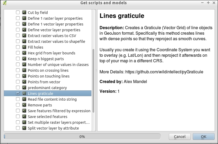
A graticule is a set of reference lines on a map that help orient a map reader. They are often set at, and labeled, with the coordinates. The tricky part about using graticules, however, is projections. If you don't make them correctly, instead of smooth curves between the line intersections, you get awkward unusual shapes (mostly straight lines). The default QGIS graticule creator is not projection-friendly, so in this recipe, you'll see an add-on processing algorithm that does this. This recipe is about ensuring you get nice, smooth, and properly-labeled graticules.
You don't really need much for this recipe other than a bounding box and a coordinate interval that you want to space the lines at. Usually, these will be in Latitude, Longitude WGS 84 (EPSG:4326), and decimal degrees, respectively, since the whole point of a graticule is to add reference lines that help orient a user.
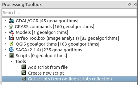
- Start by downloading a Processing Toolbox algorithm specifically for this task called Lines Graticule:
You will see something like the following screenshot:
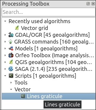
- Now that you've downloaded the algorithm, open it by navigating to Scripts | Vector (it's called Lines graticule though the code is actually pygraticule.py):
- You can fill in the parameters by hand if you know them or use the … button to get values from your existing project.
- For now, you can use the defaults that will make a graticule for the whole world. The outputs are determined by outfile and graticule. These parameters are optional, you can choose to pick one, both, or neither. If you want a GeoJSON file, set the outfile. If you want a shapefile, set the graticule (if you want the results to autoload afterwards, make sure that the second output is set to temporary or a real file, just not blank). Refer to the Help tab for details about each parameter. There are two really important values to control the graticule:
- The spacing value denotes how often to draw a line (when doing world-scale maps, 20 or 30 degrees works well).
- The density value denotes how often to put nodes:
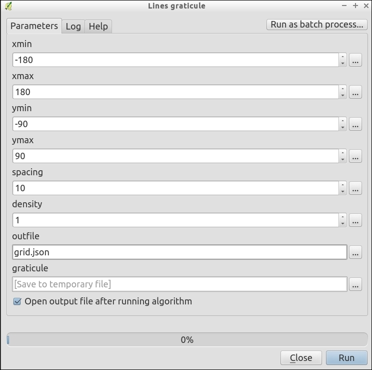
- Once you've chosen your settings, click on Run.
- After it runs, a vector layer should get loaded with the results. This won't look all that exciting, just straight lines making a grid.
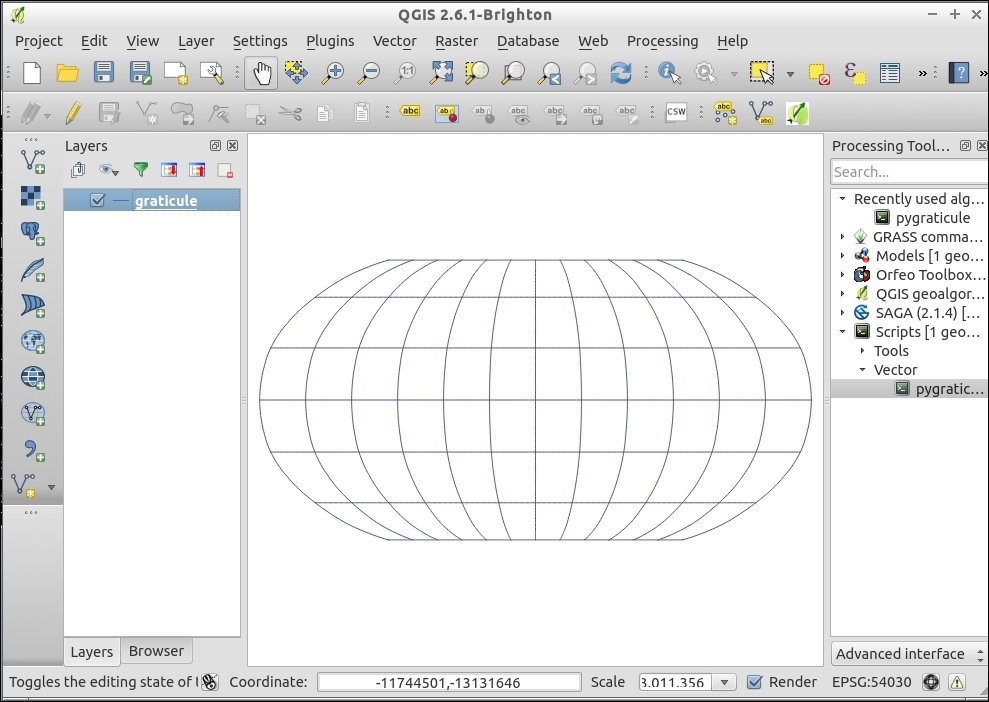
- The real magic is to now enable projection on-the-fly with one of the many decent world-wide projections such as "World Robinson (EPSG:54030):
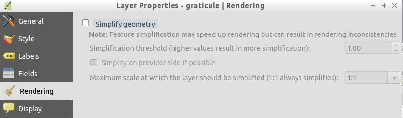
- (Optional) If it doesn't look like the image, but instead still has straight lines that are oddly spaced, you need to disable the QGIS rendering simplification:
- Pick the layer from Properties | Rendering.
- Make sure that Simplify geometry is disabled:
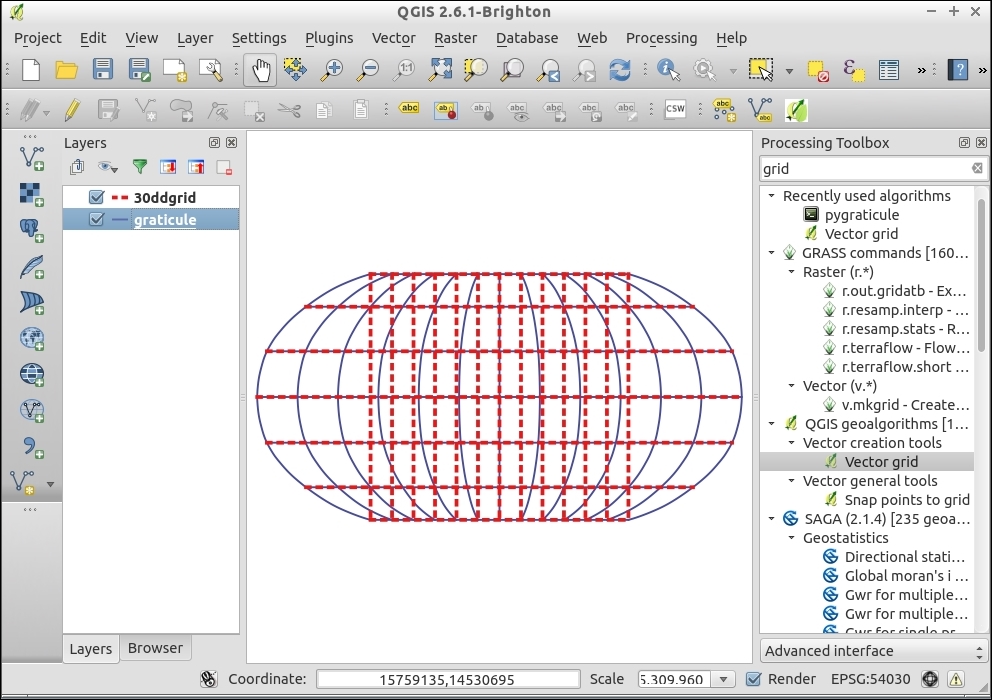
- (Bonus) Generate a vector grid from Vector | Research tools. The difference looks like the following:
Graticules are basically line layers (though sometimes they are also polygons). If you draw a grid with nodes only at the points where two lines intersect, you can easily see how distorting the grid will lead to blocky shapes. The key to smooth graticules is adding additional line nodes in between the intersections (that is, increase the node density).
It's important to note that, when using projections that don't cover the whole world (for example, polar or stereographic projections), pick bounding box values that fall within the projection limits; otherwise, you may get errors when trying to reproject.
The primary advantages of graticules in the main map canvas are that you can use them as references while working in QGIS, include them in web and digital maps, and have full control of the labels and symbology. The method used here differs from other graticule (grid) tools in QGIS because it focuses on putting Latitude/Longitude lines with smooth curves as references into any projection. Other grid tools focus more on making regular squares across a map to subdivide a region.
The main advantages of the print composer method (next recipe) are its ability to make multiple coordinate systems easily and to add tick marks around the outside edge of a map. Tick marks are what you commonly see on navigation-oriented maps, such as USGS Topo quads, and other printed maps.
Lines graticule (aka Pygraticule) can also be used as a pure Python script; for updates and more information, refer to https://github.com/wildintellect/pyGraticule.
To learn how to write your own processing toolbox algorithms, refer to the Writing processing algorithms recipe in Chapter 11, Extending QGIS.