Table of Contents for
QGIS: Becoming a GIS Power User
 QGIS: Becoming a GIS Power User
Published by
Packt Publishing, 2017
QGIS: Becoming a GIS Power User
Published by
Packt Publishing, 2017
- Cover
- Table of Contents
- QGIS: Becoming a GIS Power User
- QGIS: Becoming a GIS Power User
- QGIS: Becoming a GIS Power User
- Credits
- Preface
- What you need for this learning path
- Who this learning path is for
- Reader feedback
- Customer support
- 1. Module 1
- 1. Getting Started with QGIS
- Running QGIS for the first time
- Introducing the QGIS user interface
- Finding help and reporting issues
- Summary
- 2. Viewing Spatial Data
- Dealing with coordinate reference systems
- Loading raster files
- Loading data from databases
- Loading data from OGC web services
- Styling raster layers
- Styling vector layers
- Loading background maps
- Dealing with project files
- Summary
- 3. Data Creation and Editing
- Working with feature selection tools
- Editing vector geometries
- Using measuring tools
- Editing attributes
- Reprojecting and converting vector and raster data
- Joining tabular data
- Using temporary scratch layers
- Checking for topological errors and fixing them
- Adding data to spatial databases
- Summary
- 4. Spatial Analysis
- Combining raster and vector data
- Vector and raster analysis with Processing
- Leveraging the power of spatial databases
- Summary
- 5. Creating Great Maps
- Labeling
- Designing print maps
- Presenting your maps online
- Summary
- 6. Extending QGIS with Python
- Getting to know the Python Console
- Creating custom geoprocessing scripts using Python
- Developing your first plugin
- Summary
- 2. Module 2
- 1. Exploring Places – from Concept to Interface
- Acquiring data for geospatial applications
- Visualizing GIS data
- The basemap
- Summary
- 2. Identifying the Best Places
- Raster analysis
- Publishing the results as a web application
- Summary
- 3. Discovering Physical Relationships
- Spatial join for a performant operational layer interaction
- The CartoDB platform
- Leaflet and an external API: CartoDB SQL
- Summary
- 4. Finding the Best Way to Get There
- OpenStreetMap data for topology
- Database importing and topological relationships
- Creating the travel time isochron polygons
- Generating the shortest paths for all students
- Web applications – creating safe corridors
- Summary
- 5. Demonstrating Change
- TopoJSON
- The D3 data visualization library
- Summary
- 6. Estimating Unknown Values
- Interpolated model values
- A dynamic web application – OpenLayers AJAX with Python and SpatiaLite
- Summary
- 7. Mapping for Enterprises and Communities
- The cartographic rendering of geospatial data – MBTiles and UTFGrid
- Interacting with Mapbox services
- Putting it all together
- Going further – local MBTiles hosting with TileStream
- Summary
- 3. Module 3
- 1. Data Input and Output
- Finding geospatial data on your computer
- Describing data sources
- Importing data from text files
- Importing KML/KMZ files
- Importing DXF/DWG files
- Opening a NetCDF file
- Saving a vector layer
- Saving a raster layer
- Reprojecting a layer
- Batch format conversion
- Batch reprojection
- Loading vector layers into SpatiaLite
- Loading vector layers into PostGIS
- 2. Data Management
- Joining layer data
- Cleaning up the attribute table
- Configuring relations
- Joining tables in databases
- Creating views in SpatiaLite
- Creating views in PostGIS
- Creating spatial indexes
- Georeferencing rasters
- Georeferencing vector layers
- Creating raster overviews (pyramids)
- Building virtual rasters (catalogs)
- 3. Common Data Preprocessing Steps
- Converting points to lines to polygons and back – QGIS
- Converting points to lines to polygons and back – SpatiaLite
- Converting points to lines to polygons and back – PostGIS
- Cropping rasters
- Clipping vectors
- Extracting vectors
- Converting rasters to vectors
- Converting vectors to rasters
- Building DateTime strings
- Geotagging photos
- 4. Data Exploration
- Listing unique values in a column
- Exploring numeric value distribution in a column
- Exploring spatiotemporal vector data using Time Manager
- Creating animations using Time Manager
- Designing time-dependent styles
- Loading BaseMaps with the QuickMapServices plugin
- Loading BaseMaps with the OpenLayers plugin
- Viewing geotagged photos
- 5. Classic Vector Analysis
- Selecting optimum sites
- Dasymetric mapping
- Calculating regional statistics
- Estimating density heatmaps
- Estimating values based on samples
- 6. Network Analysis
- Creating a simple routing network
- Calculating the shortest paths using the Road graph plugin
- Routing with one-way streets in the Road graph plugin
- Calculating the shortest paths with the QGIS network analysis library
- Routing point sequences
- Automating multiple route computation using batch processing
- Matching points to the nearest line
- Creating a routing network for pgRouting
- Visualizing the pgRouting results in QGIS
- Using the pgRoutingLayer plugin for convenience
- Getting network data from the OSM
- 7. Raster Analysis I
- Using the raster calculator
- Preparing elevation data
- Calculating a slope
- Calculating a hillshade layer
- Analyzing hydrology
- Calculating a topographic index
- Automating analysis tasks using the graphical modeler
- 8. Raster Analysis II
- Calculating NDVI
- Handling null values
- Setting extents with masks
- Sampling a raster layer
- Visualizing multispectral layers
- Modifying and reclassifying values in raster layers
- Performing supervised classification of raster layers
- 9. QGIS and the Web
- Using web services
- Using WFS and WFS-T
- Searching CSW
- Using WMS and WMS Tiles
- Using WCS
- Using GDAL
- Serving web maps with the QGIS server
- Scale-dependent rendering
- Hooking up web clients
- Managing GeoServer from QGIS
- 10. Cartography Tips
- Using Rule Based Rendering
- Handling transparencies
- Understanding the feature and layer blending modes
- Saving and loading styles
- Configuring data-defined labels
- Creating custom SVG graphics
- Making pretty graticules in any projection
- Making useful graticules in printed maps
- Creating a map series using Atlas
- 11. Extending QGIS
- Defining custom projections
- Working near the dateline
- Working offline
- Using the QspatiaLite plugin
- Adding plugins with Python dependencies
- Using the Python console
- Writing Processing algorithms
- Writing QGIS plugins
- Using external tools
- 12. Up and Coming
- Preparing LiDAR data
- Opening File Geodatabases with the OpenFileGDB driver
- Using Geopackages
- The PostGIS Topology Editor plugin
- The Topology Checker plugin
- GRASS Topology tools
- Hunting for bugs
- Reporting bugs
- Bibliography
- Index
In this recipe, we will look at how to explore the properties of a column of numeric values. We will look at the tools that QGIS offers and apply them to analyze the elevation values in our sample POI dataset.
To follow this recipe, please load poi_names_wake.shp. If you followed the previous recipe, Listing unique values in a column, you can continue directly from there.
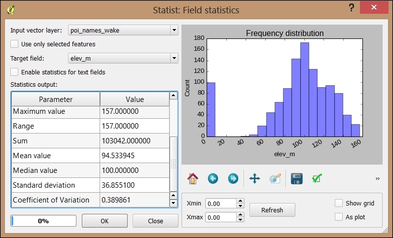
A good way to get a first impression of the properties of a numeric column is using the Basic Statistics tool from Vector. This allows you to calculate statistical values, such as the minimum and maximum values, mean and median, standard deviation, and sum.
If you want to examine the distribution of elevation values, there is the handy Statist plugin. Statist generates an interactive histogram representation of the value distribution:
- Install Statist using Plugin Manager.
- Start Statist from the Vector menu.
- Specify Input vector layer and the attribute that you want to analyze (Target field), then click on OK to compute the statistics.
- Using the buttons below the diagram, you can zoom and pan the diagram, as well as save the diagram image.
- You can even customize the diagram by changing the title and axis labels and ranges. Just use the right-most button with the green tick mark on it to open the customization dialog:
Thanks to Python Console and the editor, we are not limited to the existing tools and plugins. Instead, we can create or own specialized scripts such as the following one. This script creates a short layer statistics report using HTML and the Google Charts Javascript API (for more information and API docs refer to https://developers.google.com/chart/), which it then displays in a QWebView window. Of course, you can use any other JavaScript charting API as well. (Note that you need to be connected to the Internet for this script to work because it has to download the Javascript.) We recommend using the editor that was introduced in the previous recipe. Don't forget to select the layer in the legend:
import processing
from PyQt4.QtWebKit import QWebView
layer = iface.activeLayer()
values = []
features = processing.features(layer)
for f in features:
  values.append( f['elev_m'])
myWV = wQWebView(None)
html='<html><head><script type="text/javascript"'
html+='src="https://www.google.com/jsapi"></script>'
html+='<script type="text/javascript">'
html+='google.load("visualization","1",{packages:["corechart"]});'
html+='google.setOnLoadCallback(drawChart);'
html+='function drawChart() { '
  html+='var data = google.visualization.arrayToDataTable(['
    html+='["%s"],' % (field_name)
    for value in values:
      html+='[%f],' % (value)
  html+=']);'
  html+='var chart = new google.visualization.Histogram('
    html+='document.getElementById("chart_div"));'
  html+='chart.draw(data, {title: "Histogram"});}</script></head>'
html+='<body><h1>Layer: %s</h1>' % (layer.name())
html+='<p>Values for %s range from: ' % (field_name)
html+='%d to %d</p>' % (min(values),max(values))
html+='<div id="chart_div"style="width:900px; height:500px;">'
html+='</div></body></html>'
myWV.setHtml(html)
myWV.show()
Of course, custom reports such as this one lend themselves to adding more details. For example, we can create separate histograms for each POI class or add other types of charts, such as scatter charts:
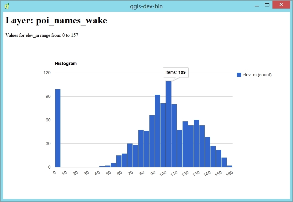
The first part (lines 1 to 12) is very similar to the script explained in the previous recipe, Listing unique values in a column: We get the active layer and collect all elevation values in the values list.
The QWebView created on line 14 enables us to display the HTML content, which we then generate in the following section (lines 16 to 34). First, we load the Google Charts Javascript. The actual magic happens in the drawChart() function starting on line 21. Lines 22 to 26 create the data object, which is filled with the elevation values from our values list. The last three lines of the function (lines 27 to 29) finally create and draw the histogram chart. Finally, lines 30 to 34 contain the HTML body definition with the header stating the layer name and a short introduction text that states the min and max elevation values.
- For those who want to perform more advanced graphing and numerical analysis, consider using the matplotlib python library or reading your data sources into R. Aggregate functions in SatialLitetgis PostGIS can also provide you with min, max, average, sum, and other summarization functions. For PostGIS, refer to http://www.postgresql.org/docs/9.1/static/functions-aggregate.html.