Table of Contents for
QGIS: Becoming a GIS Power User
 QGIS: Becoming a GIS Power User
Published by
Packt Publishing, 2017
QGIS: Becoming a GIS Power User
Published by
Packt Publishing, 2017
- Cover
- Table of Contents
- QGIS: Becoming a GIS Power User
- QGIS: Becoming a GIS Power User
- QGIS: Becoming a GIS Power User
- Credits
- Preface
- What you need for this learning path
- Who this learning path is for
- Reader feedback
- Customer support
- 1. Module 1
- 1. Getting Started with QGIS
- Running QGIS for the first time
- Introducing the QGIS user interface
- Finding help and reporting issues
- Summary
- 2. Viewing Spatial Data
- Dealing with coordinate reference systems
- Loading raster files
- Loading data from databases
- Loading data from OGC web services
- Styling raster layers
- Styling vector layers
- Loading background maps
- Dealing with project files
- Summary
- 3. Data Creation and Editing
- Working with feature selection tools
- Editing vector geometries
- Using measuring tools
- Editing attributes
- Reprojecting and converting vector and raster data
- Joining tabular data
- Using temporary scratch layers
- Checking for topological errors and fixing them
- Adding data to spatial databases
- Summary
- 4. Spatial Analysis
- Combining raster and vector data
- Vector and raster analysis with Processing
- Leveraging the power of spatial databases
- Summary
- 5. Creating Great Maps
- Labeling
- Designing print maps
- Presenting your maps online
- Summary
- 6. Extending QGIS with Python
- Getting to know the Python Console
- Creating custom geoprocessing scripts using Python
- Developing your first plugin
- Summary
- 2. Module 2
- 1. Exploring Places – from Concept to Interface
- Acquiring data for geospatial applications
- Visualizing GIS data
- The basemap
- Summary
- 2. Identifying the Best Places
- Raster analysis
- Publishing the results as a web application
- Summary
- 3. Discovering Physical Relationships
- Spatial join for a performant operational layer interaction
- The CartoDB platform
- Leaflet and an external API: CartoDB SQL
- Summary
- 4. Finding the Best Way to Get There
- OpenStreetMap data for topology
- Database importing and topological relationships
- Creating the travel time isochron polygons
- Generating the shortest paths for all students
- Web applications – creating safe corridors
- Summary
- 5. Demonstrating Change
- TopoJSON
- The D3 data visualization library
- Summary
- 6. Estimating Unknown Values
- Interpolated model values
- A dynamic web application – OpenLayers AJAX with Python and SpatiaLite
- Summary
- 7. Mapping for Enterprises and Communities
- The cartographic rendering of geospatial data – MBTiles and UTFGrid
- Interacting with Mapbox services
- Putting it all together
- Going further – local MBTiles hosting with TileStream
- Summary
- 3. Module 3
- 1. Data Input and Output
- Finding geospatial data on your computer
- Describing data sources
- Importing data from text files
- Importing KML/KMZ files
- Importing DXF/DWG files
- Opening a NetCDF file
- Saving a vector layer
- Saving a raster layer
- Reprojecting a layer
- Batch format conversion
- Batch reprojection
- Loading vector layers into SpatiaLite
- Loading vector layers into PostGIS
- 2. Data Management
- Joining layer data
- Cleaning up the attribute table
- Configuring relations
- Joining tables in databases
- Creating views in SpatiaLite
- Creating views in PostGIS
- Creating spatial indexes
- Georeferencing rasters
- Georeferencing vector layers
- Creating raster overviews (pyramids)
- Building virtual rasters (catalogs)
- 3. Common Data Preprocessing Steps
- Converting points to lines to polygons and back – QGIS
- Converting points to lines to polygons and back – SpatiaLite
- Converting points to lines to polygons and back – PostGIS
- Cropping rasters
- Clipping vectors
- Extracting vectors
- Converting rasters to vectors
- Converting vectors to rasters
- Building DateTime strings
- Geotagging photos
- 4. Data Exploration
- Listing unique values in a column
- Exploring numeric value distribution in a column
- Exploring spatiotemporal vector data using Time Manager
- Creating animations using Time Manager
- Designing time-dependent styles
- Loading BaseMaps with the QuickMapServices plugin
- Loading BaseMaps with the OpenLayers plugin
- Viewing geotagged photos
- 5. Classic Vector Analysis
- Selecting optimum sites
- Dasymetric mapping
- Calculating regional statistics
- Estimating density heatmaps
- Estimating values based on samples
- 6. Network Analysis
- Creating a simple routing network
- Calculating the shortest paths using the Road graph plugin
- Routing with one-way streets in the Road graph plugin
- Calculating the shortest paths with the QGIS network analysis library
- Routing point sequences
- Automating multiple route computation using batch processing
- Matching points to the nearest line
- Creating a routing network for pgRouting
- Visualizing the pgRouting results in QGIS
- Using the pgRoutingLayer plugin for convenience
- Getting network data from the OSM
- 7. Raster Analysis I
- Using the raster calculator
- Preparing elevation data
- Calculating a slope
- Calculating a hillshade layer
- Analyzing hydrology
- Calculating a topographic index
- Automating analysis tasks using the graphical modeler
- 8. Raster Analysis II
- Calculating NDVI
- Handling null values
- Setting extents with masks
- Sampling a raster layer
- Visualizing multispectral layers
- Modifying and reclassifying values in raster layers
- Performing supervised classification of raster layers
- 9. QGIS and the Web
- Using web services
- Using WFS and WFS-T
- Searching CSW
- Using WMS and WMS Tiles
- Using WCS
- Using GDAL
- Serving web maps with the QGIS server
- Scale-dependent rendering
- Hooking up web clients
- Managing GeoServer from QGIS
- 10. Cartography Tips
- Using Rule Based Rendering
- Handling transparencies
- Understanding the feature and layer blending modes
- Saving and loading styles
- Configuring data-defined labels
- Creating custom SVG graphics
- Making pretty graticules in any projection
- Making useful graticules in printed maps
- Creating a map series using Atlas
- 11. Extending QGIS
- Defining custom projections
- Working near the dateline
- Working offline
- Using the QspatiaLite plugin
- Adding plugins with Python dependencies
- Using the Python console
- Writing Processing algorithms
- Writing QGIS plugins
- Using external tools
- 12. Up and Coming
- Preparing LiDAR data
- Opening File Geodatabases with the OpenFileGDB driver
- Using Geopackages
- The PostGIS Topology Editor plugin
- The Topology Checker plugin
- GRASS Topology tools
- Hunting for bugs
- Reporting bugs
- Bibliography
- Index
In QGIS, print maps are designed in the print composer. A QGIS project can contain multiple composers, so it makes sense to pick descriptive names. Composers are saved automatically whenever we save the project. To see a list of all the compositions available in a project, go to Project | Composer Manager.
We can open a new composer by going to Project | New Print Composer or using Ctrl + P. The composer window consists of the following:
- A preview area for the map composition displaying a blank page when a new composer is created
- Panels for configuring Composition, Item properties, and Atlas generation, as well as a Command history panel for quick undo and redo actions
- Toolbars to manage, save, and export compositions; navigate in the preview area; as well as add and arrange different composer items
Once you have designed your print map the way you want it, you can save the template to a composer template .qpt file by going to Composer | Save as template and reuse it in other projects by going to Composer | Add Items from Template.
In this example, we will create a basic map with a scalebar, a north arrow, some explanatory text, and a legend.
When we start the print composer, we first see the Composition panel on the right-hand side. This panel gives us access to paper options such as size, orientation, and number of pages. It is also the place to configure snapping behavior and output resolution.
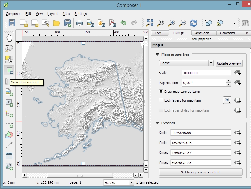
First, we add a map item to the paper using the Add new map button, or by going to Layout | Add Map and drawing the map rectangle on the paper. Click on the paper, keep the mouse button pressed down, and drag the rectangle open. We can move and resize the map using the mouse and the Select/Move item tools. Alternatively, it is possible to configure all the map settings in the Item properties panel.
The Item properties panel's content depends on the currently selected composition item. If a map item is selected, we can adjust the map's Scale and Extents as well as the Position and size tool of the map item itself. At a Scale of 10,000,000 (with the CRS set to EPSG:2964), we can more or less fit a map of Alaska on an A4-size paper, as shown in the following screenshot. To move the area that is displayed within the map item and change the map scale, we can use the Move item content tool.
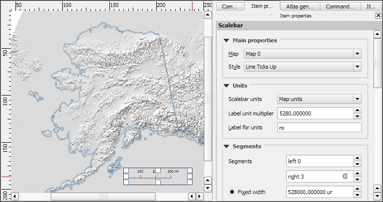
After the map looks like what we want it to, we can add a scalebar using the Add new scalebar button or by going to Layout | Add Scalebar and clicking on the map. The Item properties panel now displays the scalebar's properties, which are similar to what you can see in the next screenshot. Since we can add multiple map items to one composition, it is important to specify which map the scale belongs to. The second main property is the scalebar style, which allows us to choose between different scalebar types, or a Numeric type for a simple textual representation, such as 1:10,000,000. Using the Units properties, we can convert the map units in feet or meters to something more manageable, such as miles or kilometers. The Segments properties control the number of segments and the size of a single segment in the scalebar. Further, the properties control the scalebar's color, font, background, and so on.
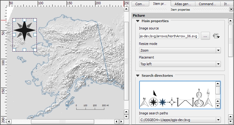
North arrows can be added to a composition using the Add Image button or by going to Layout | Add image and clicking on the paper. To use one of the SVGs that are part of the QGIS installation, open the Search directories section in the Item properties panel. It might take a while for QGIS to load the previews of the images in the SVG folder. You can pick a North arrow from the list of images or select your own image by clicking on the button next to the Image source input. More map decorations, such as arrows or rectangle, triangle, and ellipse shapes can be added using the appropriate toolbar buttons: Add Arrow, Add Rectangle, and so on.
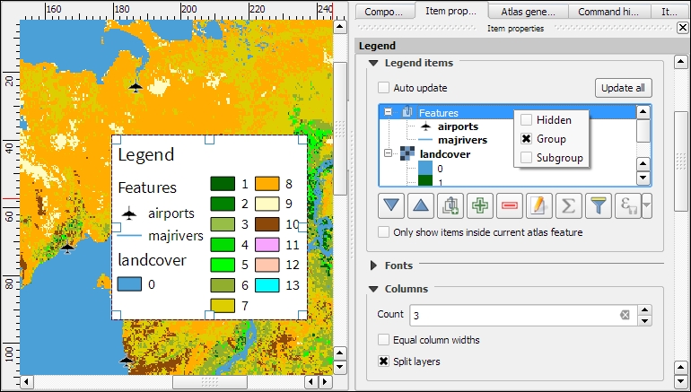
Legends are another vital map element. We can use the Add new legend button or go to Layout | Add legend to add a default legend with entries for all currently visible map layers. Legend entries can be reorganized (sorted or added to groups), edited, and removed from the legend items' properties. Using the Wrap text on option, we can split long labels on multiple rows. The following screenshot shows the context menu that allows us to change the style (Hidden, Group, or Subgroup) of an entry. The corresponding font, size, and color are configurable in the Fonts section.
Additionally, the legend in this example is divided into three Columns, as you can see in the bottom-right section of the following screenshot. By default, QGIS tries to keep all entries of one layer in a single column, but we can override this behavior by enabling Split layers.
To add text to the map, we can use the Add new label button or go to Layout | Add label. Simple labels display all text using the same font. By enabling Render as HTML, we can create more elaborate labels with headers, lists, different colors, and highlights in bold or italics using normal HTML notation. Here is an example:
<h1>Alaska</h1>
<p>The name <i>"Alaska"</i> means "the mainland".</p>
<ul><li>one list entry</li><li>another entry</li></ul>
<p style="font-size:70%;">[% format_date( $now ,'yyyy-mm-dd')%]</p>
Labels can also contain expressions such as these:
[% $now %]: This expression inserts the current timestamp, which can be formatted using theformat_datefunction, as shown in the following screenshot[% $page %] of [% $numpages %]: This expression can be used to insert page numbers in compositions with multiple pages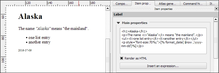
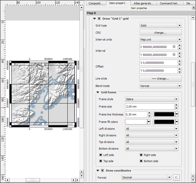
Other common features of maps are grids and frames. Every map item can have one or more grids. Click on the + button in the Grids section to add a grid. The Interval and Offset values have to be specified in map units. We can choose between the following Grid types:
- A normal Solid grid with customizable lines
- Crosses at specified intervals with customizable styles
- Customizable Markers at specified intervals
- Frame and annotation only will hide the grid while still displaying the frame and coordinate annotations
For Grid frame, we can select from the following Frame styles:
- Zebra, with customizable line and fill colors, as shown in the following screenshot
- Interior ticks, Exterior ticks, or Interior and exterior ticks for tick marks pointing inside the map, outside it, or in both directions
- Line border for a simple line frame
Using Draw coordinates, we can label the grid with the corresponding coordinates. The labels can be aligned horizontally or vertically and placed inside or outside the frame, as shown here:
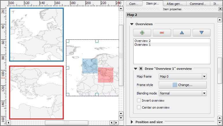
Maps that show an area close up are often accompanied by a second map that tells the reader where the area is located in a larger context. To create such an overview map, we add a second map item and an overview by clicking on the + button in the Overviews section. By setting the Map frame, we can define which detail map's extent should be highlighted. By clicking on the + button again, we can add more map frames to the overview map. The following screenshot shows an example with two detail maps both of which are added to an overview map. To distinguish between the two maps, the overview highlights are color-coded (by changing the overview Frame style) to match the colors of the frames of the detail maps.
Tip
Every map item in a composition can display a different combination of layers. Generally, map items in a composer are synced with the map in the main QGIS window. So, if we turn a layer off in the main window, it is removed from the print composer map as well. However, we can stop this automatic synchronization by enabling Lock layers for a map item in the map item's properties.
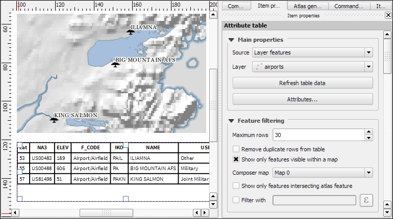
To insert additional details into the map, the composer also offers the possibility of adding an attribute table to the composition using the Add attribute table button or by going to Layout | Add attribute table. By enabling Show only features visible within a map, we can filter the table and display only the relevant results. Additional filter expressions can be set using the Filter with option. Sorting (by name for example, as shown in the following screenshot) and renaming of columns is possible via the Attributes button. To customize the header row with bold and centered text, go to the Fonts and text styling section and change the Table heading settings.
Even more advanced content can be added using the Add html frame button. We can point the item's URL reference to any HTML page on our local machines or online, and the content (text and images as displayed in a web browser) will be displayed on the composer page.
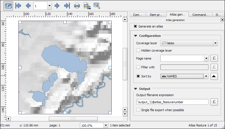
With the print composer's Atlas feature, we can create a series of maps using one print composition. The tool will create one output (which can be image files, PDFs, or multiple pages in one PDF) for every feature in the so-called Coverage layer.
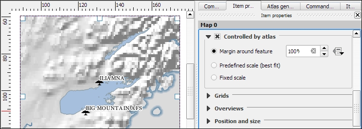
Atlas can control and update multiple map items within one composition. To enable Atlas for a map item, we have to enable the Controlled by atlas option in the Item properties of the map item. When we use the Fixed scale option in the Controlled by atlas section, all maps will be rendered using the same scale. If we need a more flexible output, we can switch to the Margin around feature option instead, which zooms to every Coverage layer feature and renders it in addition to the specified margin surrounding area.
To finish the configuration, we switch to the Atlas generation panel. As mentioned before, Atlas will create one map for every feature in the layer configured in the Coverage layer dropdown. Features in the coverage layer can be displayed like regular features or hidden by enabling Hidden coverage layer. Adding an expression to the Feature filtering option or enabling the Sort by option makes it possible to further fine-tune the results. The Output field can be one image or PDF for each coverage layer feature, or you can create a multipage PDF by enabling Single file export when possible before going to Composer | Export as PDF.
Once these configurations are finished, we can preview the map series by enabling the Preview Atlas button, which you can see in the top-left corner of the following screenshot. The arrow buttons next to the preview button are used to navigate between the Atlas maps.