Table of Contents for
QGIS: Becoming a GIS Power User
 QGIS: Becoming a GIS Power User
Published by
Packt Publishing, 2017
QGIS: Becoming a GIS Power User
Published by
Packt Publishing, 2017
- Cover
- Table of Contents
- QGIS: Becoming a GIS Power User
- QGIS: Becoming a GIS Power User
- QGIS: Becoming a GIS Power User
- Credits
- Preface
- What you need for this learning path
- Who this learning path is for
- Reader feedback
- Customer support
- 1. Module 1
- 1. Getting Started with QGIS
- Running QGIS for the first time
- Introducing the QGIS user interface
- Finding help and reporting issues
- Summary
- 2. Viewing Spatial Data
- Dealing with coordinate reference systems
- Loading raster files
- Loading data from databases
- Loading data from OGC web services
- Styling raster layers
- Styling vector layers
- Loading background maps
- Dealing with project files
- Summary
- 3. Data Creation and Editing
- Working with feature selection tools
- Editing vector geometries
- Using measuring tools
- Editing attributes
- Reprojecting and converting vector and raster data
- Joining tabular data
- Using temporary scratch layers
- Checking for topological errors and fixing them
- Adding data to spatial databases
- Summary
- 4. Spatial Analysis
- Combining raster and vector data
- Vector and raster analysis with Processing
- Leveraging the power of spatial databases
- Summary
- 5. Creating Great Maps
- Labeling
- Designing print maps
- Presenting your maps online
- Summary
- 6. Extending QGIS with Python
- Getting to know the Python Console
- Creating custom geoprocessing scripts using Python
- Developing your first plugin
- Summary
- 2. Module 2
- 1. Exploring Places – from Concept to Interface
- Acquiring data for geospatial applications
- Visualizing GIS data
- The basemap
- Summary
- 2. Identifying the Best Places
- Raster analysis
- Publishing the results as a web application
- Summary
- 3. Discovering Physical Relationships
- Spatial join for a performant operational layer interaction
- The CartoDB platform
- Leaflet and an external API: CartoDB SQL
- Summary
- 4. Finding the Best Way to Get There
- OpenStreetMap data for topology
- Database importing and topological relationships
- Creating the travel time isochron polygons
- Generating the shortest paths for all students
- Web applications – creating safe corridors
- Summary
- 5. Demonstrating Change
- TopoJSON
- The D3 data visualization library
- Summary
- 6. Estimating Unknown Values
- Interpolated model values
- A dynamic web application – OpenLayers AJAX with Python and SpatiaLite
- Summary
- 7. Mapping for Enterprises and Communities
- The cartographic rendering of geospatial data – MBTiles and UTFGrid
- Interacting with Mapbox services
- Putting it all together
- Going further – local MBTiles hosting with TileStream
- Summary
- 3. Module 3
- 1. Data Input and Output
- Finding geospatial data on your computer
- Describing data sources
- Importing data from text files
- Importing KML/KMZ files
- Importing DXF/DWG files
- Opening a NetCDF file
- Saving a vector layer
- Saving a raster layer
- Reprojecting a layer
- Batch format conversion
- Batch reprojection
- Loading vector layers into SpatiaLite
- Loading vector layers into PostGIS
- 2. Data Management
- Joining layer data
- Cleaning up the attribute table
- Configuring relations
- Joining tables in databases
- Creating views in SpatiaLite
- Creating views in PostGIS
- Creating spatial indexes
- Georeferencing rasters
- Georeferencing vector layers
- Creating raster overviews (pyramids)
- Building virtual rasters (catalogs)
- 3. Common Data Preprocessing Steps
- Converting points to lines to polygons and back – QGIS
- Converting points to lines to polygons and back – SpatiaLite
- Converting points to lines to polygons and back – PostGIS
- Cropping rasters
- Clipping vectors
- Extracting vectors
- Converting rasters to vectors
- Converting vectors to rasters
- Building DateTime strings
- Geotagging photos
- 4. Data Exploration
- Listing unique values in a column
- Exploring numeric value distribution in a column
- Exploring spatiotemporal vector data using Time Manager
- Creating animations using Time Manager
- Designing time-dependent styles
- Loading BaseMaps with the QuickMapServices plugin
- Loading BaseMaps with the OpenLayers plugin
- Viewing geotagged photos
- 5. Classic Vector Analysis
- Selecting optimum sites
- Dasymetric mapping
- Calculating regional statistics
- Estimating density heatmaps
- Estimating values based on samples
- 6. Network Analysis
- Creating a simple routing network
- Calculating the shortest paths using the Road graph plugin
- Routing with one-way streets in the Road graph plugin
- Calculating the shortest paths with the QGIS network analysis library
- Routing point sequences
- Automating multiple route computation using batch processing
- Matching points to the nearest line
- Creating a routing network for pgRouting
- Visualizing the pgRouting results in QGIS
- Using the pgRoutingLayer plugin for convenience
- Getting network data from the OSM
- 7. Raster Analysis I
- Using the raster calculator
- Preparing elevation data
- Calculating a slope
- Calculating a hillshade layer
- Analyzing hydrology
- Calculating a topographic index
- Automating analysis tasks using the graphical modeler
- 8. Raster Analysis II
- Calculating NDVI
- Handling null values
- Setting extents with masks
- Sampling a raster layer
- Visualizing multispectral layers
- Modifying and reclassifying values in raster layers
- Performing supervised classification of raster layers
- 9. QGIS and the Web
- Using web services
- Using WFS and WFS-T
- Searching CSW
- Using WMS and WMS Tiles
- Using WCS
- Using GDAL
- Serving web maps with the QGIS server
- Scale-dependent rendering
- Hooking up web clients
- Managing GeoServer from QGIS
- 10. Cartography Tips
- Using Rule Based Rendering
- Handling transparencies
- Understanding the feature and layer blending modes
- Saving and loading styles
- Configuring data-defined labels
- Creating custom SVG graphics
- Making pretty graticules in any projection
- Making useful graticules in printed maps
- Creating a map series using Atlas
- 11. Extending QGIS
- Defining custom projections
- Working near the dateline
- Working offline
- Using the QspatiaLite plugin
- Adding plugins with Python dependencies
- Using the Python console
- Writing Processing algorithms
- Writing QGIS plugins
- Using external tools
- 12. Up and Coming
- Preparing LiDAR data
- Opening File Geodatabases with the OpenFileGDB driver
- Using Geopackages
- The PostGIS Topology Editor plugin
- The Topology Checker plugin
- GRASS Topology tools
- Hunting for bugs
- Reporting bugs
- Bibliography
- Index
Some analyses require a combination of raster and vector data. In the following exercises, we will use both raster and vector datasets to explain how to convert between these different data types, how to access layer and zonal statistics, and finally how to create a raster heatmap from points.
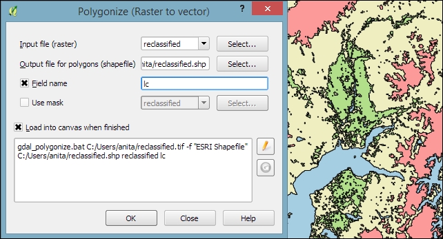
Tools for converting between raster and vector formats can be accessed by going to Raster | Conversion. These tools are called Rasterize (Vector to raster) and Polygonize (Raster to vector). Like the raster clipper tool that we used before, these tools are also based on GDAL and display the command at the bottom of the dialog.
Polygonize converts a raster into a polygon layer. Depending on the size of the raster, the conversion can take some time. When the process is finished, QGIS will notify us with a popup. For a quick test, we can, for example, convert the reclassified landcover raster to polygons. The resulting vector polygon layer contains multiple polygonal features with a single attribute, which we name lc; it depends on the original raster value, as shown in the following screenshot:
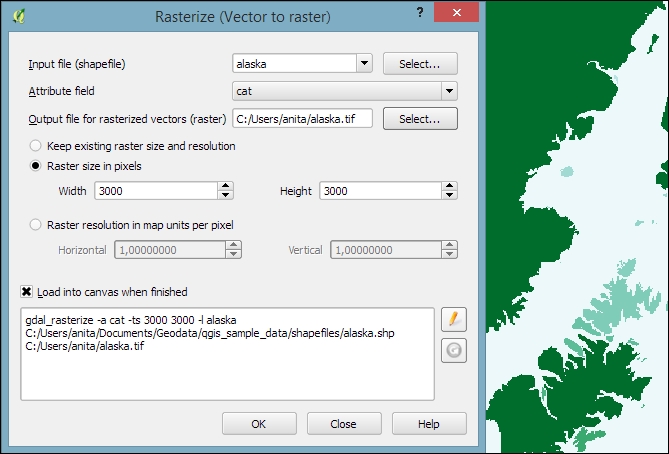
Using the
Rasterize tool is very similar to using the Polygonize tool. The only difference is that we get to specify the size of the resulting raster in pixels/cells. We can also specify the attribute field, which will provide input for the raster cell value, as shown in the next screenshot. In this case, the cat attribute of our alaska.shp dataset is rather meaningless, but you get the idea of how the tool works:
Whenever we get a new dataset, it is useful to examine the layer statistics to get an idea of the data it contains, such as the minimum and maximum values, number of features, and much more. QGIS offers a variety of tools to explore these values.
Raster layer statistics are readily available in the Layer Properties dialog, specifically in the following tabs:
- Metadata: This tab shows the minimum and maximum cell values as well as the mean and the standard deviation of the cell values.
- Histogram: This tab presents the distribution of raster values. Use the mouse to zoom into the histogram to see the details. For example, the following screenshot shows the zoomed-in version of the histogram for our
landcoverdataset: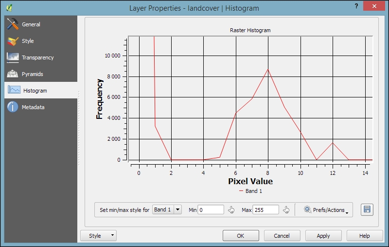
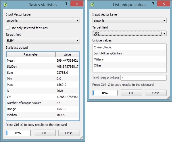
For vector layers, we can get summary statistics using two tools in Vector | Analysis Tools:
- Basics statistics is very useful for numerical fields. It calculates parameters such as mean and median, min and max, the feature count n, the number of unique values, and so on for all features of a layer or for selected features only.
- List unique values is useful for getting all unique values of a certain field.
In both tools, we can easily copy the results using Ctrl + C and paste them in a text file or spreadsheet. The following image shows examples of exploring the contents of our airports sample dataset:
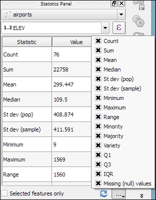
An alternative to the Basics statistics tool is the Statistics Panel, which you can activate by going to View | Panels | Statistics Panel. As shown in the following screenshot, this panel can be customized to show exactly those statistics that you are interested in:
Instead of computing raster statistics for the entire layer, it is sometimes necessary to compute statistics for selected regions. This is what the Zonal statistics plugin is good for. This plugin is installed by default and can be enabled in the Plugin Manager.
For example, we can compute elevation statistics for areas around each airport using srtm_05_01.tif and airports.shp from our sample data:
- First, we create the analysis areas around each airport using the Vector | Geoprocessing Tools | Buffer(s) tool and a buffer size of
10,000feet. - Before we can use the Zonal statistics plugin, it is important to notice that the buffer layer and the elevation raster use two different CRS (short for Coordinate Reference System). If we simply went ahead, the resulting statistics would be either empty or wrong. Therefore, we need to reproject the buffer layer to the raster CRS (WGS84 EPSG:4326, for details on how to change a layer CRS, see Chapter 3, Data Creation and Editing, in the Reprojecting and converting vector and raster data section).
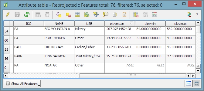
- Now we can compute the statistics for the analysis areas using the Zonal Statistics tool, which can be accessed by going to Raster | Zonal statistics. Here, we can configure the desired Output column prefix (in our example, we have chosen
elev, which is short for elevation) and the Statistics to calculate (for example,Mean,Minimum, andMaximum), as shown in the following screenshot: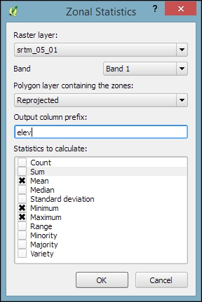
- After you click on OK, the selected statistics are appended to the polygon layer attribute table, as shown in the following screenshot. We can see that Big Mountain AFS is the airport with the highest mean elevation among the four airports that fall within the extent of our elevation raster:
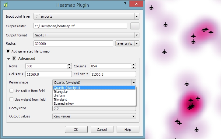
Heatmaps are great for visualizing a distribution of points. To create them, QGIS provides a simple-to-use Heatmap Plugin, which we have to activate in the Plugin Manager, and then we can access it by going to Raster | Heatmap | Heatmap. The plugin offers different Kernel shapes to choose from. The kernel is a moving window of a specific size and shape that moves over an area of points to calculate their local density. Additionally, the plugin allows us to control the output heatmap raster size in cells (using the Rows and Columns settings) as well as the cell size.
Note
Radius determines the distance around each point at which the point will have an influence. Therefore, smaller radius values result in heatmaps that show finer and smaller details, while larger values result in smoother heatmaps with fewer details.
Additionally, Kernel shape controls the rate at which the influence of a point decreases with increasing distance from the point. The kernel shapes that are available in the Heatmap plugin are listed in the following screenshot. For example, a Triweight kernel creates smaller hotspots than the Epanechnikov kernel. For formal definitions of the kernel functions, refer to http://en.wikipedia.org/wiki/Kernel_(statistics).
The following screenshot shows us how to create a heatmap of our airports.shp sample with a kernel radius of 300,000 layer units, which in the case of our airport data is in feet:
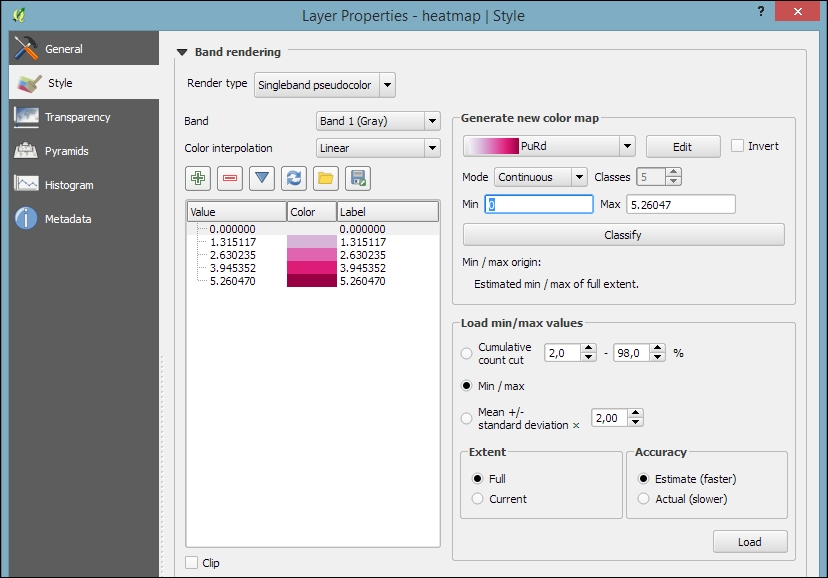
By default, the heatmap output will be rendered using the Singleband gray render type (with low raster values in black and high values in white). To change the style to something similar to what you saw in the previous screenshot, you can do the following:
- Change the heatmap raster layer render type to Singleband pseudocolor.
- In the Generate new color map section on the right-hand side of the dialog, select a color map you like, for example, the PuRd color map, as shown in the next screenshot.
- You can enter the Min and Max values for the color map manually, or have them computed by clicking on Load in the Load min/max values section.
Tip
When loading the raster min/max values, keep an eye on the settings. To get the actual min/max values of a raster layer, enable Min/max, Full Extent, and Actual (slower) Accuracy. If you only want the min/max values of the raster section that is currently displayed on the map, use Current Extent instead.
- Click on Classify to add the color map classes to the list on the left-hand side of the dialog.
- Optionally, we can change the color of the first entry (for value 0) to white (by double-clicking on the color in the list) to get a smooth transition from the white map background to our heatmap.