Table of Contents for
QGIS: Becoming a GIS Power User
 QGIS: Becoming a GIS Power User
Published by
Packt Publishing, 2017
QGIS: Becoming a GIS Power User
Published by
Packt Publishing, 2017
- Cover
- Table of Contents
- QGIS: Becoming a GIS Power User
- QGIS: Becoming a GIS Power User
- QGIS: Becoming a GIS Power User
- Credits
- Preface
- What you need for this learning path
- Who this learning path is for
- Reader feedback
- Customer support
- 1. Module 1
- 1. Getting Started with QGIS
- Running QGIS for the first time
- Introducing the QGIS user interface
- Finding help and reporting issues
- Summary
- 2. Viewing Spatial Data
- Dealing with coordinate reference systems
- Loading raster files
- Loading data from databases
- Loading data from OGC web services
- Styling raster layers
- Styling vector layers
- Loading background maps
- Dealing with project files
- Summary
- 3. Data Creation and Editing
- Working with feature selection tools
- Editing vector geometries
- Using measuring tools
- Editing attributes
- Reprojecting and converting vector and raster data
- Joining tabular data
- Using temporary scratch layers
- Checking for topological errors and fixing them
- Adding data to spatial databases
- Summary
- 4. Spatial Analysis
- Combining raster and vector data
- Vector and raster analysis with Processing
- Leveraging the power of spatial databases
- Summary
- 5. Creating Great Maps
- Labeling
- Designing print maps
- Presenting your maps online
- Summary
- 6. Extending QGIS with Python
- Getting to know the Python Console
- Creating custom geoprocessing scripts using Python
- Developing your first plugin
- Summary
- 2. Module 2
- 1. Exploring Places – from Concept to Interface
- Acquiring data for geospatial applications
- Visualizing GIS data
- The basemap
- Summary
- 2. Identifying the Best Places
- Raster analysis
- Publishing the results as a web application
- Summary
- 3. Discovering Physical Relationships
- Spatial join for a performant operational layer interaction
- The CartoDB platform
- Leaflet and an external API: CartoDB SQL
- Summary
- 4. Finding the Best Way to Get There
- OpenStreetMap data for topology
- Database importing and topological relationships
- Creating the travel time isochron polygons
- Generating the shortest paths for all students
- Web applications – creating safe corridors
- Summary
- 5. Demonstrating Change
- TopoJSON
- The D3 data visualization library
- Summary
- 6. Estimating Unknown Values
- Interpolated model values
- A dynamic web application – OpenLayers AJAX with Python and SpatiaLite
- Summary
- 7. Mapping for Enterprises and Communities
- The cartographic rendering of geospatial data – MBTiles and UTFGrid
- Interacting with Mapbox services
- Putting it all together
- Going further – local MBTiles hosting with TileStream
- Summary
- 3. Module 3
- 1. Data Input and Output
- Finding geospatial data on your computer
- Describing data sources
- Importing data from text files
- Importing KML/KMZ files
- Importing DXF/DWG files
- Opening a NetCDF file
- Saving a vector layer
- Saving a raster layer
- Reprojecting a layer
- Batch format conversion
- Batch reprojection
- Loading vector layers into SpatiaLite
- Loading vector layers into PostGIS
- 2. Data Management
- Joining layer data
- Cleaning up the attribute table
- Configuring relations
- Joining tables in databases
- Creating views in SpatiaLite
- Creating views in PostGIS
- Creating spatial indexes
- Georeferencing rasters
- Georeferencing vector layers
- Creating raster overviews (pyramids)
- Building virtual rasters (catalogs)
- 3. Common Data Preprocessing Steps
- Converting points to lines to polygons and back – QGIS
- Converting points to lines to polygons and back – SpatiaLite
- Converting points to lines to polygons and back – PostGIS
- Cropping rasters
- Clipping vectors
- Extracting vectors
- Converting rasters to vectors
- Converting vectors to rasters
- Building DateTime strings
- Geotagging photos
- 4. Data Exploration
- Listing unique values in a column
- Exploring numeric value distribution in a column
- Exploring spatiotemporal vector data using Time Manager
- Creating animations using Time Manager
- Designing time-dependent styles
- Loading BaseMaps with the QuickMapServices plugin
- Loading BaseMaps with the OpenLayers plugin
- Viewing geotagged photos
- 5. Classic Vector Analysis
- Selecting optimum sites
- Dasymetric mapping
- Calculating regional statistics
- Estimating density heatmaps
- Estimating values based on samples
- 6. Network Analysis
- Creating a simple routing network
- Calculating the shortest paths using the Road graph plugin
- Routing with one-way streets in the Road graph plugin
- Calculating the shortest paths with the QGIS network analysis library
- Routing point sequences
- Automating multiple route computation using batch processing
- Matching points to the nearest line
- Creating a routing network for pgRouting
- Visualizing the pgRouting results in QGIS
- Using the pgRoutingLayer plugin for convenience
- Getting network data from the OSM
- 7. Raster Analysis I
- Using the raster calculator
- Preparing elevation data
- Calculating a slope
- Calculating a hillshade layer
- Analyzing hydrology
- Calculating a topographic index
- Automating analysis tasks using the graphical modeler
- 8. Raster Analysis II
- Calculating NDVI
- Handling null values
- Setting extents with masks
- Sampling a raster layer
- Visualizing multispectral layers
- Modifying and reclassifying values in raster layers
- Performing supervised classification of raster layers
- 9. QGIS and the Web
- Using web services
- Using WFS and WFS-T
- Searching CSW
- Using WMS and WMS Tiles
- Using WCS
- Using GDAL
- Serving web maps with the QGIS server
- Scale-dependent rendering
- Hooking up web clients
- Managing GeoServer from QGIS
- 10. Cartography Tips
- Using Rule Based Rendering
- Handling transparencies
- Understanding the feature and layer blending modes
- Saving and loading styles
- Configuring data-defined labels
- Creating custom SVG graphics
- Making pretty graticules in any projection
- Making useful graticules in printed maps
- Creating a map series using Atlas
- 11. Extending QGIS
- Defining custom projections
- Working near the dateline
- Working offline
- Using the QspatiaLite plugin
- Adding plugins with Python dependencies
- Using the Python console
- Writing Processing algorithms
- Writing QGIS plugins
- Using external tools
- 12. Up and Coming
- Preparing LiDAR data
- Opening File Geodatabases with the OpenFileGDB driver
- Using Geopackages
- The PostGIS Topology Editor plugin
- The Topology Checker plugin
- GRASS Topology tools
- Hunting for bugs
- Reporting bugs
- Bibliography
- Index
In this chapter, we will cover the important features that enable us to create great maps. We will first go into advanced vector styling, building on what we covered in Chapter 2, Viewing Spatial Data. Then, you will learn how to label features by following examples for point labels as well as more advanced road labels with road shield graphics. We will also cover how to tweak labels manually. Then, you will get to know the print composer and how to use it to create printable maps and map books. Finally, we will explain how to create web maps directly in QGIS to present our results online.
Note
If you want to get an idea about what kind of map you can create using QGIS, visit the QGIS Map Showcase Flickr group at https://www.flickr.com/groups/qgis/, which is dedicated to maps created with QGIS without any further postprocessing.
This section introduces more advanced vector styling features, building on the basics that we covered in Chapter 2, Viewing Spatial Data. We will cover how to create detailed custom visualizations using the following features:
- Graduated styles
- Categorized styles
- Rule-based styles
- Data-defined styles
- Heatmap styles
- 2.5D styles
- Layer effects
Graduated styles are great for visualizing distributions of numerical values in choropleth or similar maps. The graduated renderer supports two methods:
- Color: This method changes the color of the feature according to the configured attribute
- Size: This method changes the symbol size for the feature according to the configured attribute (this option is only available for point and line layers)
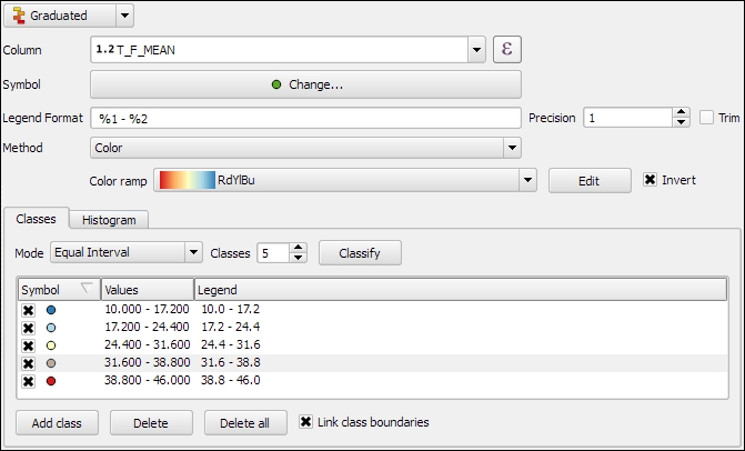
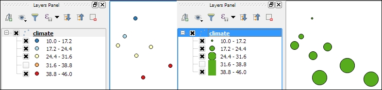
In our sample data, there is a climate.shp file that contains locations and mean temperature values. We can visualize this data using a graduated style by simply selecting the T_F_MEAN value for the Column field and clicking on Classify. Using the Color method, as shown in the following screenshot, we can pick a Color ramp from the corresponding drop-down list. Additionally, we can reverse the order of the colors within the color ramp using the Invert option:
Graduated styles are available in different classification modes, as follows:
- Equal Interval: This mode creates classes by splitting at equal intervals between the maximum and minimum values found in the specified column.
- Quantile (Equal Count): This mode creates classes so that each class contains an equal number of features.
- Natural Breaks (Jenks): This mode uses the Jenks natural breaks algorithm to create classes by reducing variance within classes and maximizing variance between classes.
- Standard Deviation: This mode uses the column values' standard deviation to create classes.
- Pretty Breaks: This mode is the only classification that doesn't strictly create the specified number of classes. Instead, its main goal is to create class boundaries that are round numbers.
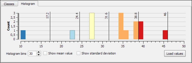
We can also manually edit the class values by double-clicking on the values in the list and changing the class bounds. A more convenient way to edit the classes is the Histogram view, as shown in the next screenshot. Switch to the Histogram tab and click on the Load values button in the bottom-right corner to enable the histogram. You can now edit the class bounds by moving the vertical lines with your mouse. You can also add new classes by adding a new vertical line, which you can do by clicking on empty space in the histogram:
Besides the symbols that are drawn on the map, another important aspect of the styling is the legend that goes with it. To customize the legend, we can define Legend Format as well as the Precision (that is, the number of decimal places) that should be displayed. In the Legend Format string, %1 will be replaced by the lower limit of the class and %2 by the upper limit. You can change this string to suit your needs, for example, to this: from %1 to %2. If you activate the Trim option, excess trailing zeros will be removed as well.
When we use the Size method, as shown in the following screenshot, the dialog changes a little, and we can now configure the desired symbol sizes:
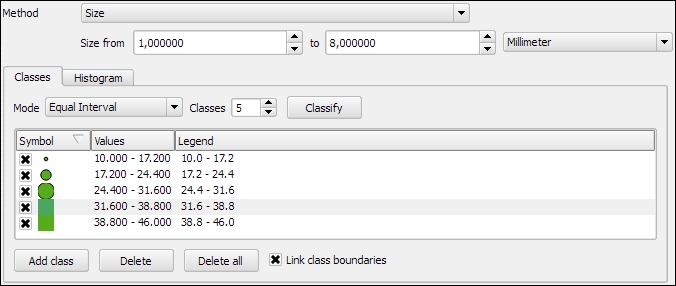
The next screenshot shows the results of using a Graduated renderer option with five classes using the Equal Interval classification mode. The left-hand side shows the results of the Color method (symbol color changes according to the T_F_MEAN value), while the right-hand side shows the results of the Size method (symbol size changes according to the T_F_MEAN value).
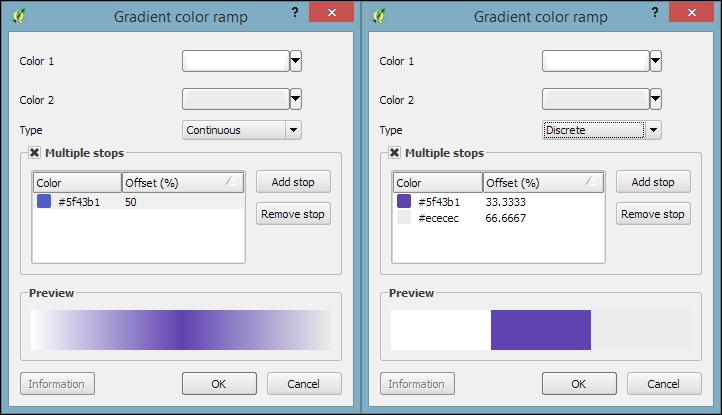
In the previous example, we used an existing color ramp to style our layer. Of course, we can also create our own color ramps. To create a new color ramp, we can scroll down the color ramp list to the New color ramp… entry. There are four different color ramp types, which we can chose from:
- Gradient: With this type, we can create color maps with two or more colors. The resulting color maps can be smooth gradients (using the Continuous type option) or distinct colors (using the Discrete type option), as shown in the following screenshot:
- Random: This type allows us to create a gradient with a certain number of random colors
- ColorBrewer: This type provides access to the ColorBrewer color schemes
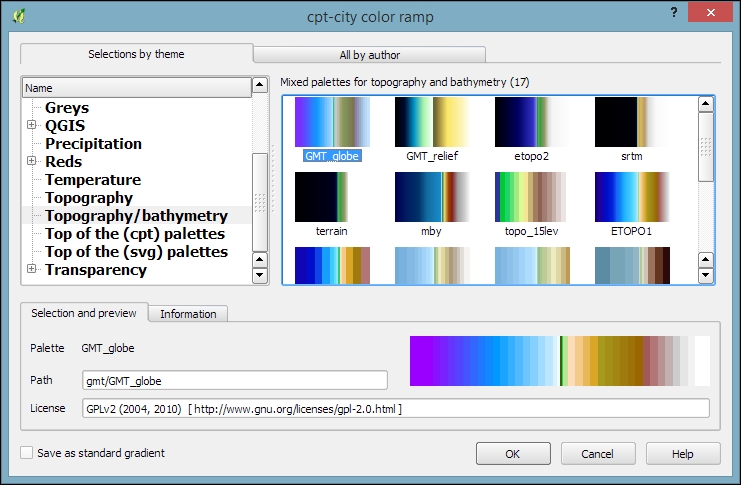
- cpt-city: This type provides access to a wide variety of preconfigured color schemes, including schemes for typography and bathymetry, as shown in this screenshot:
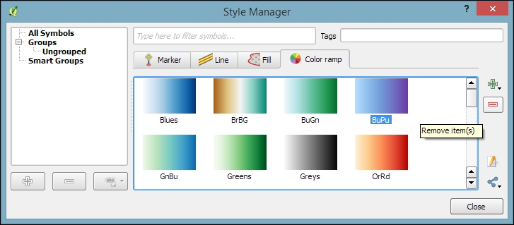
To manage all our color ramps and symbols, we can go to Settings | Style Manager. Here, we can add, delete, edit, export, or import color ramps and styles using the corresponding buttons on the right-hand side of the dialog, as shown in the following screenshot:
Just as graduated styles are very useful for visualizing numeric values, categorized styles are great for text values or—more generally speaking—all kinds of values on a nominal scale. A good example for this kind of data can be found in the trees.shp file in our sample data. For each area, there is a VEGDESC value that describes the type of forest found there. Using a categorized style, we can easily generate a style with one symbol for every unique value in the VEGDESC column, as shown in the following screenshot. Once we click on OK, the style is applied to our trees layer in order to visualize the distribution of different tree types in the area:
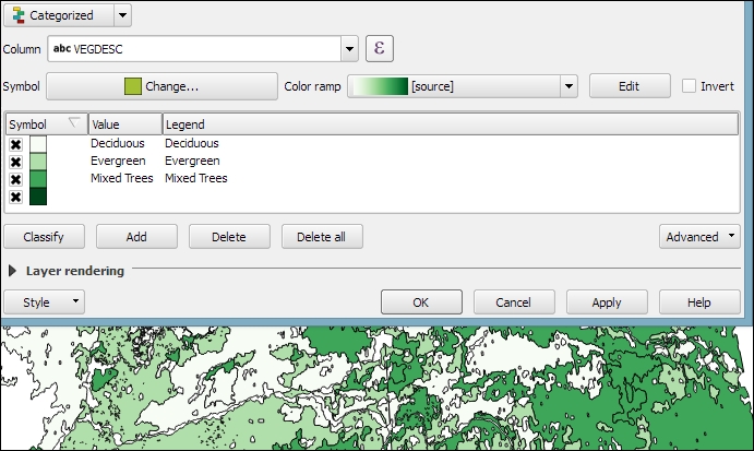
Of course, every symbol is editable and can be customized. Just double-click on the symbol preview to open the Symbol selector dialog, which allows you to select and combine different symbols.
With rule-based styles, we can create a layer style with a hierarchy of rules. Rules can take into account anything from attribute values to scale and geometry properties such as area or length. In this example, we will create a rule-based renderer for the ne_10m_roads.shp file from Natural Earth (you can download it from http://www.naturalearthdata.com/downloads/10m-cultural-vectors/roads/). As you can see here, our style will contain different road styles for major and secondary highways as well as scale-dependent styles:
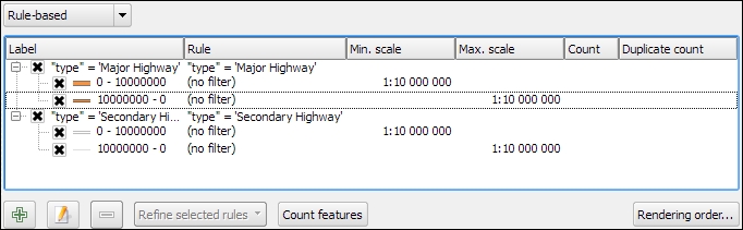
As you can see in the preceding screenshot, on the first level of rules, we distinguish between roads of "type" = 'Major Highway' and those of "type" = 'Secondary Highway'. The next level of rules handles scale-dependence. To add this second layer of rules, we can use the Refine selected rules button and select Add scales to rule. We simply input one or more scale values at which we want the rule to be split.
Note
Note that there are no symbols specified on the first rule level. If we had symbols specified on the first level as well, the renderer would draw two symbols over each other. While this can be useful in certain cases, we don't want this effect right now. Symbols can be deactivated in Rule properties, which is accessible by double-clicking on the rule or clicking on the edit button below the rule's tree view (the button between the plus and minus buttons).
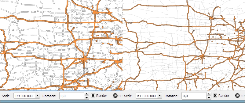
In the following screenshot, we can see the rule-based renderer and the scale rules in action. While the left-hand side shows wider white roads with grey outlines for secondary highways, the right-hand side shows the simpler symbology with thin grey lines:
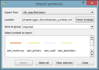
Tip
You can download the symbols used in this style by going to Settings | Style Manager, clicking on the sharing button in the bottom-right corner of the dialog, and selecting Import. The URL is https://raw.githubusercontent.com/anitagraser/QGIS-resources/master/qgis1.8/symbols/osm_symbols.xml. Paste the URL in the Location textbox, click on Fetch Symbols, then click on Select all, and finally click on Import. The dialog will look like what is shown in the following screenshot:
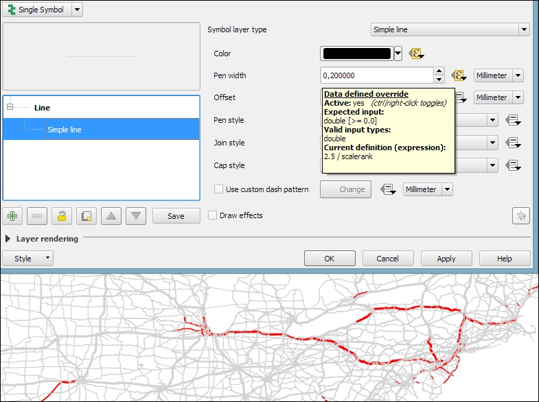
In previous examples, we created categories or rules to define how features are drawn on a map. An alternative approach is to use values from the layer attribute table to define the styling. This can be achieved using a QGIS feature called Data defined override. These overrides can be configured using the corresponding buttons next to each symbol property, as described in the following example.
In this example, we will again use the ne_10m_roads.shp file from Natural Earth. The next screenshot shows a configuration that creates a style where the line's Pen width depends on the feature's scalerank and the line Color depends on the toll attribute. To set a data-defined override for a symbol property, you need to click on the corresponding button, which is located right next to the property, and choose Edit. The following two expressions are used:
CASE WHEN toll = 1 THEN 'red' ELSE 'lightgray' END: This expression evaluates thetollvalue. If it is1, the line is drawn in red; otherwise, it is drawn in gray.2.5 / scalerank: This expression computes Pen width. Since a low scale rank should be represented by a wider line, we use a division operation instead of multiplication.
When data-defined overrides are active, the corresponding buttons are highlighted in yellow with an ε sign on them, as shown in the following screenshot:
In this example, you have seen that you can specify colors using color names such as 'red', 'gold', and 'deepskyblue'. Another especially useful group of functions for data-defined styles is the Color functions. There are functions for the following
color models:
- RGB:
color_rgb(red, green, blue) - HSL:
color_hsl(hue, saturation, lightness) - HSV:
color_hsv(hue, saturation, value) - CMYK:
color_cmyk(cyan, magenta, yellow, black)
There are also functions for accessing the color ramps. Here are two examples of how to use these functions:
ramp_color('Reds', T_F_MEAN / 46): This expression returns a color from theRedscolor ramp depending on theT_F_MEANvalue. Since the second parameter has to be a value between0and1, we divide theT_F_MEANvalue by the maximum value,46.color_rgba(0, 0, 180, scale_linear(T_F_JUL - T_F_JAN, 20, 70, 0, 255)): This expression computes the color depending on the difference between the July and January temperatures,T_F_JUL - T_F_JAN. The difference value is transformed into a value between0and255by thescale_linearfunction according to the following rule: any value up to20will be translated to0, any value of70and above will be translated to255, and anything in between will be interpolated linearly. Bigger difference values result in darker colors because of the higher alpha parameter value.
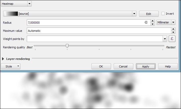
In Chapter 4, Spatial Analysis, you learned how to create a heatmap raster. However, there is a faster, more convenient way to achieve this look if you want a heatmap only for displaying purposes (and not for further spatial analysis)—the Heatmap renderer option.
The following screenshot shows a Heatmap renderer set up for our populated places dataset, popp.shp. We can specify a color ramp that will be applied to the resulting heatmap values between 0 and the defined Maximum value. If Maximum value is set to Automatic, QGIS automatically computes the highest value in the heatmap. As in the previously discussed heatmap tool, we can define point weights as well as the kernel Radius (for an explanation of this term, check out Creating a heatmap from points in Chapter 4, Spatial Analysis). The final Rendering quality option controls the quality of the rendered output with coarse, big raster cells for the Fastest option and a fine-grained look when set to Best:
If you want to create a pseudo-3D look, for example, to style building blocks or to create a thematic map, try the 2.5D renderer. The next screenshot shows the current configuration options that include controls for the feature's Height (in layer units), the viewing Angle, and colors. Since this renderer is still being improved at the time of writing this book, you might find additional options in this dialog when you see it for yourself.
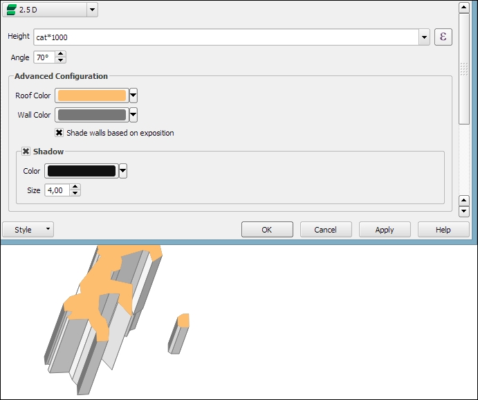
Once you have configured the 2.5D renderer to your liking, you can switch to another renderer to, for example, create classified or graduated versions of symbols.
With layer effects, we can change the way our symbols look even further. Effects can be added by enabling the Draw effects checkbox at the bottom of the symbol dialog, as shown in the following screenshot. To configure the effects, click on the Star button in the bottom-right corner of the dialog. The Effect Properties dialog offers access to a wide range of Effect types:
- Blur: This effect creates a blurred, fuzzy version of the symbol.
- Colorise: This effect changes the color of the symbol.
- Source: This is the original unchanged symbol.
- Drop Shadow: This effect creates a shadow.
- Inner Glow: This effect creates a glow-like gradient that extends inwards, starting from the symbol border.
- Inner Shadow: This effect creates a shadow that is restricted to the inside of the symbol.
- Outer Glow: This effect creates a glow that radiates from the symbol outwards.
- Transform: This effect can be used to transform the symbol. The available transformations include reflect, shear, scale, rotate, and translate:
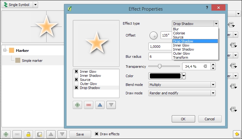
As you can see in the previous screenshot, we can combine multiple layer effects and they are organized in effect layers in the list in the bottom-left corner of the Effect Properties dialog.
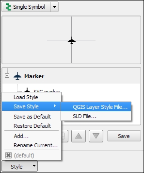
When we create elaborate styles, we might want to save them so that we can reuse them in other projects or share them with other users. To save a style, click on the Style button in the bottom-left corner of the style dialog and go to Save Style | QGIS Layer Style File…, as shown in the following screenshot. This will create a .qml file, which you can save anywhere, copy, and share with others. Similarly, to use the .qml file, click on the Style button and select Load Style:
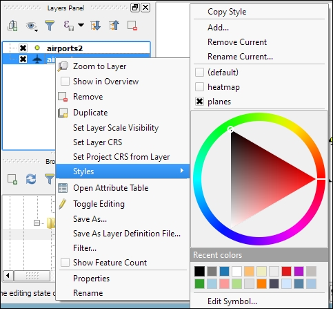
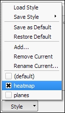
We can also save multiple different styles for one layer. For example, for our airports layer, we might want one style that displays airports using plane symbols and another style that renders a heatmap. To achieve this, we can do the following:
- Configure the plane style.
- Click on the Style button and select Add to add the current style to the list of styles for this layer.
- In the pop-up dialog, enter a name for the new style, for example,
planes. - Add another style by clicking on Style and Add and call it
heatmap. - Now, you can change the renderer to Heatmap and configure it. Click on the Apply button when ready.
- In the Style button menu, you can now see both styles, as shown in the next screenshot. Changing from one style to the other is now as simple as selecting one of the two entries from the list at the bottom of this menu:
Finally, we can also access these layer styles through the layer context menu Styles entry in the Layers Panel, as shown in the following screenshot. This context menu also provides a way to copy and paste styles between layers using the Copy Style and Paste Style entries, respectively. Furthermore, this context menu provides a shortcut to quickly change the symbol color using a color wheel or by picking a color from the Recent colors section: