
Copyright © 2017 Packt Publishing
All rights reserved. No part of this course may be reproduced, stored in a retrieval system, or transmitted in any form or by any means, without the prior written permission of the publisher, except in the case of brief quotations embedded in critical articles or reviews.
Every effort has been made in the preparation of this course to ensure the accuracy of the information presented. However, the information contained in this course is sold without warranty, either express or implied. Neither the authors, nor Packt Publishing, and its dealers and distributors will be held liable for any damages caused or alleged to be caused directly or indirectly by this course.
Packt Publishing has endeavored to provide trademark information about all of the companies and products mentioned in this course by the appropriate use of capitals. However, Packt Publishing cannot guarantee the accuracy of this information.
Published on: February 2017
Production reference: 1170217
Published by Packt Publishing Ltd.
Livery Place
35 Livery Street
Birmingham B3 2PB, UK.
ISBN 978-1-78829-972-5
Authors
Anita Graser,
Ben Mearns,
Alex Mandel,
Víctor Olaya Ferrero,
Alexander Bruy
Reviewers
Cornelius Roth
Ujaval Gandhi
Fred Gibbs
Gergely Padányi-Gulyás
Abdelghaffar KHORCHANI
Pablo Pardo
Mats Töpel
Jorge Arévalo
Olivier Dalang
Ben Mearns
Content Development Editor
Aishwarya Pandere
Production Coordinator
Aparna Bhagat
QGIS is a crossing point of the free and open source geospatial world. While there are a great many tools in QGIS, it is not one massive application that does everything, and it was never really designed to be that from the beginning. It is rather a visual interface to much of the open source geospatial world. You can load data from proprietary and open formats into spatial databases of various flavors and then analyze the data with well-known analytical backends before creating a printed or web-based map to display and interact with your results. What’s QGIS’s role in all this? It’s the place where you check your data along the way, build and queue the analysis, visualize the results, and develop cartographic end products.
This learning path will teach you all that and more, in a hands-on learn-by-doing manner. Become an expert in QGIS with this useful companion.
Module 1, Learning QGIS, Third edition, covers important features that enable us to create great maps. Then, we will cover labeling using examples of labeling point locations as well as creating more advanced road labels with road shield graphics. We will also cover how to tweak labels manually. We will get to know the print composer and how to use it to create printable maps and map books. Finally, we will cover solutions to present your maps on the Web.
Module 2, QGIS Blueprints, will demonstrate visualization and analytical techniques to explore relationships between place and time and between places themselves. You will work with demographic data from a census for election purposes through a timeline controlled animation.
Module 3, QGIS 2 Cookbook, deals with converting data into the formats you need for analysis, including vector to and from raster, transitioning through different types of vectors, and cutting your data to just the important areas. It also shows you how to take QGIS beyond the out-of-the-box features with plugins, customization, and add-on tools.
Module 1:
To follow the exercises in this book, you need QGIS 2.14. QGIS installation is covered in the first chapter and download links for the exercise data are provided in the respective chapters.
Module 2:
You will need:
Module 3:
We recommend installing QGIS 2.8 or later; you will need at least QGIS 2.4. During the writing of this book, several new versions were released, approximately every 4 months, and most recently, 2.14 was released. Most of the recipes will work on older versions, but some may require 2.6 or newer. In general, if you can, upgrade to the latest stable release or Long Term Support (LTS) version.
There are also a lot of side interactions with other software throughout many of these
recipes, including—but not limited to—Postgis 2+, GRASS 6.4+, SAGA 2.0.8+, and Spatialite 4+. On Windows, most of these can be installed using OSGeo4W; on Mac, you may need some additional frameworks from Kyngchaos, or if you’re familiar with Brew, you can use the OSGeo4Mac Tap. For Linux users, in particular Ubuntu and Debian, refer to the UbuntuGIS PPA and the DebianGIS blend.
Does all of this sound a little too complicated? If yes, then consider using a virtual machine that runs OSGeo-Live (http://live.osgeo.org). All the software is preinstalled for you and is known to work together.
Lastly, you will need data. For the most part, we’ve provided a lot of free and open data
from a variety of sources, including the OSGeo Educational dataset (North Carolina), Natural Earth Data, OpenFlights, Wake County, City of Davis, and Armed Conflict Location & Event Data Project (ACLED). A full list of our data sources is provided here if you would like additional data.
We recommend that you try methods with the sample data first, only because we tested it.
Feel free to try using your own data to test many of the recipes; however, just remember that you might need to alter the structure to make it work. After all, that’s what you’ll be working with normally.
The following are the data sources for this book:
OSGeo Educational Data: http://grass.osgeo.org/download/sample-data/
Wake County, USA: http://www.wakegov.com/gis/services/pages/data.aspx
Natural Earth Data: http://www.naturalearthdata.com/
City of Davis, USA: http://maps.cityofdavis.org/library
Stamen Designs: http://stamen.com/
Armed Conflict Location & Event Data Project: http://www.acleddata.com/
If you are a user, developer, or consultant and want to know how to use QGIS to achieve the results you are used to from other types of GIS, then this learning path is for you. You are expected to be comfortable with core GIS concepts. This Learning Path will make you an expert with QGIS by showing you how to develop more complex, layered map applications. It will launch you to the next level of GIS users.
Feedback from our readers is always welcome. Let us know what you think about this course—what you liked or disliked. Reader feedback is important for us as it helps us develop titles that you will really get the most out of.
To send us general feedback, simply e-mail <feedback@packtpub.com>, and mention the course’s title in the subject of your message.
If there is a topic that you have expertise in and you are interested in either writing or contributing to a course, see our author guide at www.packtpub.com/authors.
Now that you are the proud owner of a Packt course, we have a number of things to help you to get the most from your purchase.
You can download the example code files for this course from your account at http://www.packtpub.com. If you purchased this course elsewhere, you can visit http://www.packtpub.com/support and register to have the files e-mailed directly to you.
You can download the code files by following these steps:
You can also download the code files by clicking on the Code Files button on the course’s webpage at the Packt Publishing website. This page can be accessed by entering the course’s name in the Search box. Please note that you need to be logged in to your Packt account.
Once the file is downloaded, please make sure that you unzip or extract the folder using the latest version of:
The code bundle for the course is also hosted on GitHub at https://github.com/PacktPublishing/QGIS-Becoming-a-GIS-Power-User.
We also have other code bundles from our rich catalog of books, videos and courses available at https://github.com/PacktPublishing/. Check them out!
Although we have taken every care to ensure the accuracy of our content, mistakes do happen. If you find a mistake in one of our books—maybe a mistake in the text or the code—we would be grateful if you could report this to us. By doing so, you can save other readers from frustration and help us improve subsequent versions of this course. If you find any errata, please report them by visiting http://www.packtpub.com/submit-errata, selecting your course, clicking on the Errata Submission Form link, and entering the details of your errata. Once your errata are verified, your submission will be accepted and the errata will be uploaded to our website or added to any list of existing errata under the Errata section of that title.
To view the previously submitted errata, go to https://www.packtpub.com/books/content/support and enter the name of the book in the search field. The required information will appear under the Errata section.
Piracy of copyrighted material on the Internet is an ongoing problem across all media. At Packt, we take the protection of our copyright and licenses very seriously. If you come across any illegal copies of our works in any form on the Internet, please provide us with the location address or website name immediately so that we can pursue a remedy.
Please contact us at <copyright@packtpub.com> with a link to the suspected pirated material.
We appreciate your help in protecting our authors and our ability to bring you valuable content.
If you have a problem with any aspect of this course, you can contact us at <questions@packtpub.com>, and we will do our best to address the problem.
In this chapter, we will install and configure the QGIS geographic information system. We will also get to know the user interface and how to customize it. By the end of this chapter, you will have QGIS running on your machine and be ready to start with the tutorials.
QGIS runs on Windows, various Linux distributions, Unix, Mac OS X, and Android. The QGIS project provides ready-to-use packages as well as instructions to build from the source code at http://download.qgis.org. We will cover how to install QGIS on two systems, Windows and Ubuntu, as well as how to avoid the most common pitfalls.
Further installation instructions for other supported operating systems are available at http://www.qgis.org/en/site/forusers/alldownloads.html.
Like many other open source projects, QGIS offers you a choice between different releases. For the tutorials in this book, we will use the QGIS 2.14 LTR version. The following options are available:
You can find more information about the releases as well as the schedule for future releases at http://www.qgis.org/en/site/getinvolved/development/roadmap.html#release-schedule.
For an overview of the changes between releases, check out the visual change logs at http://www.qgis.org/en/site/forusers/visualchangelogs.html.
On Windows, we have two different options to install QGIS, the standalone installer and the OSGeo4W installer:
Regardless of the installer you choose, make sure that you avoid special characters such as German umlauts or letters from alphabets other than the default Latin ones (for details, refer to https://en.wikipedia.org/wiki/ISO_basic_Latin_alphabet) in the installation path, as they can cause problems later on, for example, during plugin installation.
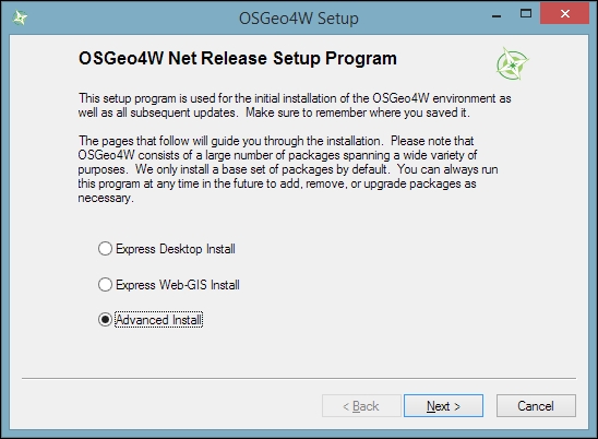
When the OSGeo4W installer starts, we get to choose between Express Desktop Install, Express Web-GIS Install, and Advanced Install. To install the QGIS LR version, we can simply select the Express Desktop Install option, and the next dialog will list the available desktop applications, such as QGIS, uDig, and GRASS GIS. We can simply select QGIS, click on Next, and confirm the necessary dependencies by clicking on Next again. Then the download and installation will start automatically. When the installation is complete, there will be desktop shortcuts and start menu entries for OSGeo4W and QGIS.
To install QGIS LTR (or DEV), we need to go through the Advanced Install option, as shown in the following screenshot:
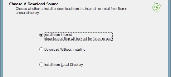
This installation path offers many options, such as Download Without Installing and Install from Local Directory, which can be used to download all the necessary packages on one machine and later install them on machines without Internet access. We just select Install from Internet, as shown in this screenshot:
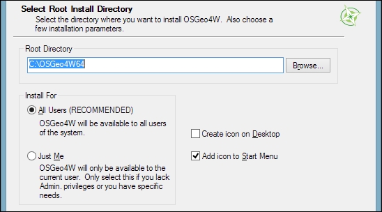
When selecting the installation Root Directory, as shown in the following screenshot, avoid special characters such as German umlauts or letters from alphabets other than the default Latin ones in the installation path (as mentioned before), as they can cause problems later on, for example, during plugin installation:
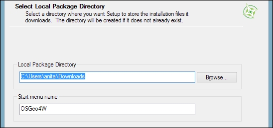
Then you can specify the folder (Local Package Directory) where the setup process will store the installation files as well as customize Start menu name. I recommend that you leave the default settings similar to what you can see in this screenshot:
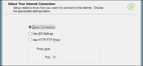
In the Internet connection settings, it is usually not necessary to change the default settings, but if your machine is, for example, hidden behind a proxy, you will be able to specify it here:
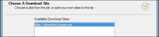
Then we can pick the download site. At the time of writing this book, there is only one download server available, anyway, as you can see in the following screenshot:
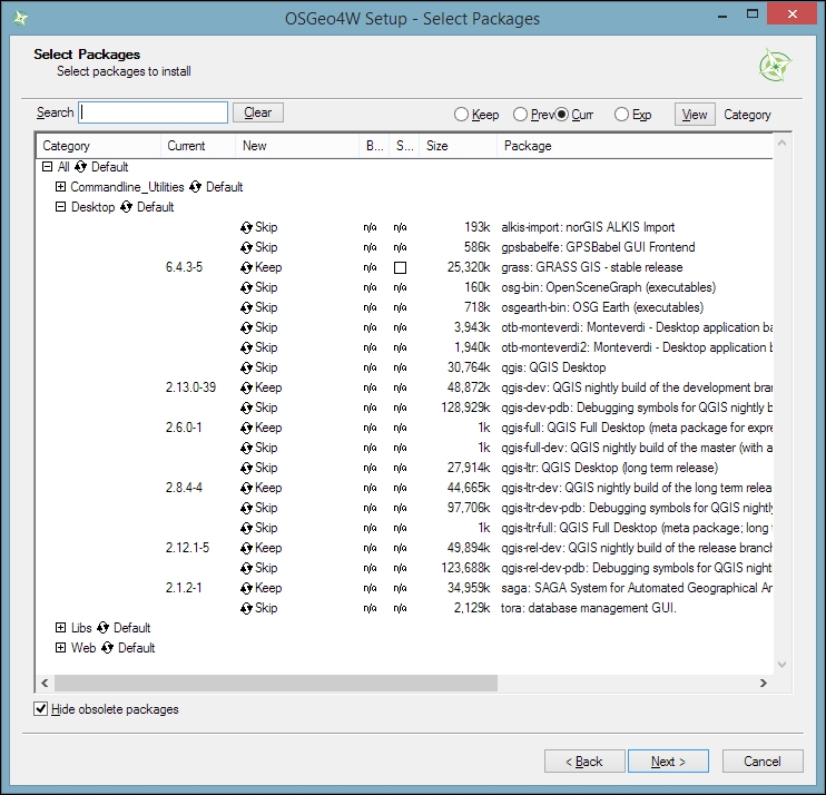
After the installer fetches the latest package information from OSGeo's servers, we get to pick the packages for installation. QGIS LTR is listed in the desktop category as qgis-ltr (and the DEV version is listed as qgis-dev). To select the LTR version for installation, click on the text that reads Skip, and it will change and display the version number, as shown in this screenshot:
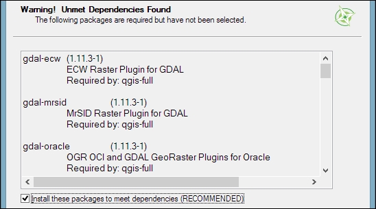
As you can see in the following screenshot, the installer will automatically select all the necessary dependencies (such as GDAL, SAGA, OTB, and GRASS), so we don't have to worry about this:
After you've clicked on Next, the download and installation starts automatically, just as in the Express version.
You have probably noticed other available QGIS packages called qgis-ltr-dev and qgis-rel-dev. These contain the latest changes (to the LTR and LR versions, respectively), which will be released as bug fix versions according to the release schedule. This makes these packages a good option if you run into an issue with a release that has been fixed recently but the bug fix version release is not out yet.
If you try to run QGIS and get a popup that says, The procedure entry point <some-name> could not be located in the dynamic link library <dll-name>.dll, it means that you are facing a common issue on Windows systems—a DLL conflict. This error is easy to fix; just copy the DLL file mentioned in the error message from C:\OSGeo4W\bin\ to C:\OSGeo4W\apps\qgis\bin\ (adjust the paths if necessary).
On Ubuntu, the QGIS project provides packages for the LTR, LR, and DEV versions. At the time of writing this book, the Ubuntu versions Precise, Trusty, Vivid, and Wily are supported, but you can find the latest information at http://www.qgis.org/en/site/forusers/alldownloads.html#debian-ubuntu. Be aware, however, that you can install only one version at a time. The packages are not listed in the default Ubuntu repositories. Therefore, we have to add the appropriate repositories to Ubuntu's source list, which you can find at /etc/apt/sources.list. You can open the file with any text editor. Make sure that you have super user rights, as you will need them to save your edits. One option is to use gedit, which is installed in Ubuntu by default. To edit the sources.list file, use the following command:
sudo gedit /etc/apt/sources.list
Downloading the example code
You can download the example code files for this book from your account at http://www.packtpub.com. If you purchased this book elsewhere, you can visit http://www.packtpub.com/support and register to have the files e-mailed directly to you.
Make sure that you add only one of the following package-source options to avoid conflicts due to incompatible packages. The specific lines that you have to add to the source list depend on your Ubuntu version:
deb     http://qgis.org/debian trusty main
deb-src http://qgis.org/debian trusty main
If necessary, replace trusty with precise, vivid, or wily to fit your system. For an updated list of supported Ubuntu versions, check out http://www.qgis.org/en/site/forusers/alldownloads.html#debian-ubuntu.
deb     http://qgis.org/debian-ltr trusty main
deb-src http://qgis.org/debian-ltr trusty main
deb     http://qgis.org/debian-nightly trusty main
deb-src http://qgis.org/debian-nightly trusty main
ubuntugis repository. Add these lines to your file:deb http://qgis.org/ubuntugis trusty main deb-src http://qgis.org/ubuntugis trusty main deb http://ppa.launchpad.net/ubuntugis/ubuntugis-unstable/ubuntu trusty main
deb     http://qgis.org/ubuntugis-ltr trusty main
deb-src http://qgis.org/ubuntugis-ltr trusty main
deb     http://ppa.launchpad.net/ubuntugis/ubuntugis-unstable/ubuntu trusty main
deb     http://qgis.org/ubuntugis-nightly trusty main
deb-src http://qgis.org/ubuntugis-nightly trusty main
deb     http://ppa.launchpad.net/ubuntugis/ubuntugis-unstable/ubuntu trusty main
After choosing the repository, we will add the qgis.org repository's public key to our apt keyring. This will avoid the warnings that you might otherwise get when installing from a non-default repository. Run the following command in the terminal:
sudo apt-key adv --keyserver keyserver.ubuntu.com --recv-key 3FF5FFCAD71472C4
By the time this book goes to print, the key information might have changed. Refer to http://www.qgis.org/en/site/forusers/alldownloads.html#debian-ubuntu for the latest updates.
Finally, to install QGIS, run the following commands:
sudo apt-get update
sudo apt-get install qgis python-qgis qgis-plugin-grass
When you install QGIS, you will get two applications: QGIS Desktop and QGIS Browser. If you are familiar with ArcGIS, you can think of QGIS Browser as something similar to ArcCatalog. It is a small application used to preview spatial data and related metadata. For the remainder of this book, we will focus on QGIS Desktop.
By default, QGIS will use the operating system's default language. To follow the tutorials in this book, I advise you to change the language to English by going to Settings | Options | Locale.
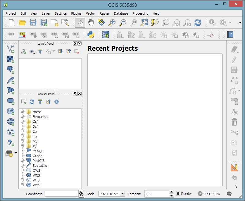
On the first run, the way the toolbars are arranged can hide some buttons. To be able to work efficiently, I suggest that you rearrange the toolbars (for the sake of completeness, I have enabled all toolbars in Toolbars, which is in the View menu). I like to place some toolbars on the left and right screen borders to save vertical screen estate, especially on wide-screen displays.
Additionally, we will activate the file browser by navigating to View | Panels | Browser Panel. It will provide us with quick access to our spatial data. At the end, the QGIS window on your screen should look similar to the following screenshot:
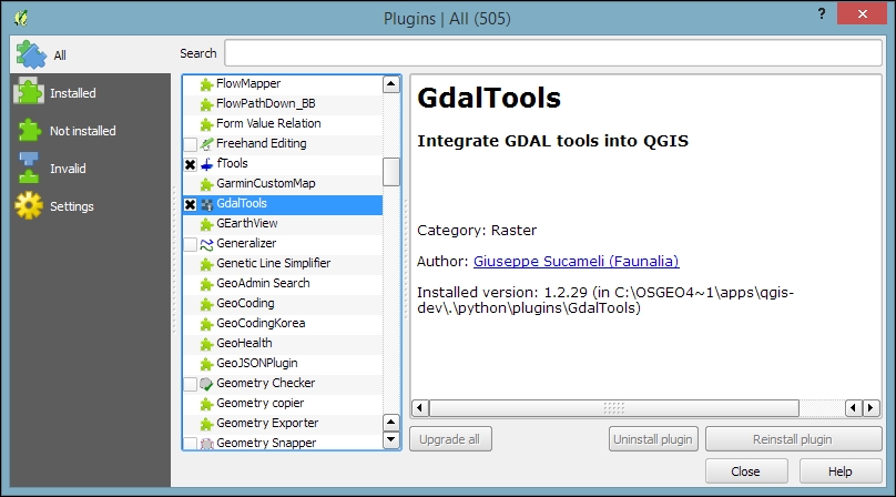
Next, we will activate some must-have plugins by navigating to Plugins | Manage and Install Plugins. Plugins are activated by ticking the checkboxes beside their names. To begin with, I will recommend the following:
To make it easier to find specific plugins, we can filter the list of plugins using the Search input field at the top of the window, which you can see in the following screenshot:
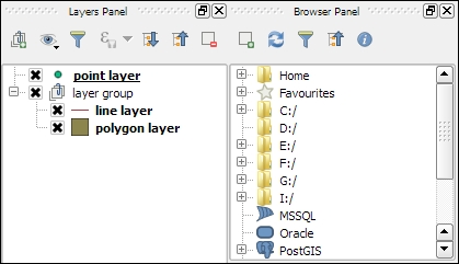
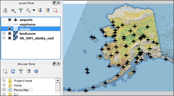
Now that we have set up QGIS, let's get accustomed to the interface. As we have already seen in the screenshot presented in the Running QGIS for the first time section, the biggest area is reserved for the map. To the left of the map, there are the Layers and Browser panels. In the following screenshot, you can see how the Layers Panel looks once we have loaded some layers (which we will do in the upcoming Chapter 2, Viewing Spatial Data). To the left of each layer entry, you can see a preview of the layer style. Additionally, we can use layer group to structure the layer list. The Browser Panel (on the right-hand side in the following screenshot) provides us with quick access to our spatial data, as you will soon see in the following chapter:
Below the map, we find important information such as (from left to right) the current map Coordinate, map Scale, and the (currently inactive) project coordinate reference system (CRS), for example, EPSG:4326 in this screenshot:

Next, there are multiple toolbars to explore. If you arrange them as shown in the previous section, the top row contains the following toolbars:

The second row contains the following toolbars:

On the left screen border, we place the Manage Layers toolbar. This toolbar contains the tools for adding layers from the vector or raster files, databases, web services, and text files or create new layers:

Finally, on the right screen border, we have two more toolbars:

Toolbars and panels can be activated and deactivated via the View menu's Panels and Toolbars entries, as well as by right-clicking on a menu or toolbar, which will open a context menu with all the available toolbars and panels. All the tools on the toolbars can also be accessed via the menu. If you deactivate the Manage Layers Toolbar, for example, you will still be able to add layers using the Layer menu.
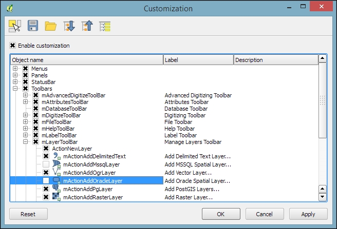
As you might have guessed by now, QGIS is highly customizable. You can increase your productivity by assigning shortcuts to the tools you use regularly, which you can do by going to Settings | Configure Shortcuts. Similarly, if you realize that you never use a certain toolbar button or menu entry, you can hide it by going to Settings | Customization. For example, if you don't have access to an Oracle Spatial database, you might want to hide the associated buttons to remove clutter and save screen estate, as shown in the following screenshot:
The QGIS community offers a variety of different community-based support options. These include the following:
qgis, you will see all QGIS-related questions and answers at http://gis.stackexchange.com/questions/tagged/qgis.qgis-user. For a full list of available mailing lists and links to sign up, visit http://www.qgis.org/en/site/getinvolved/mailinglists.html#qgis-mailinglists. To comfortably search for existing mailing list threads, you can use Nabble (http://osgeo-org.1560.x6.nabble.com/Quantum-GIS-User-f4125267.html).#qgis channel on www.freenode.net. You can visit it using, for example, the web interface at http://webchat.freenode.net/?channels=#qgis.Before contacting the community support, it's recommended to first take a look at the documentation at http://docs.qgis.org.
If you prefer commercial support, you can find a list of companies that provide support and custom development at http://www.qgis.org/en/site/forusers/commercial_support.html#qgis-commercial-support.
If you find a bug, please report it because the QGIS developers can only fix the bugs that they are aware of. For details on how to report bugs, visit http://www.qgis.org/en/site/getinvolved/development/bugreporting.html.
In this chapter, we installed QGIS and configured it by selecting useful defaults and arranging the user interface elements. Then we explored the panels, toolbars, and menus that make up the QGIS user interface, and you learned how to customize them to increase productivity. In the following chapter, we will use QGIS to view spatial data from different data sources such as files, databases, and web services in order to create our first map.
In this chapter, we will cover how to view spatial data from different data sources. QGIS supports many file and database formats as well as standardized Open Geospatial Consortium (OGC) Web Services. We will first cover how we can load layers from these different data sources. We will then look into the basics of styling both vector and raster layers and will create our first map, which you can see in the following screenshot:
We will finish this chapter with an example of loading background maps from online services.
For the examples in this chapter, we will use the sample data provided by the QGIS project, which is available for download from http://qgis.org/downloads/data/qgis_sample_data.zip (21 MB). Download and unzip it.
In this section, we will talk about loading vector data from GIS file formats, such as shapefiles, as well as from text files.
We can load vector files by going to Layer | Add Layer | Add Vector Layer and also using the Add Vector Layer toolbar button. If you like shortcuts, use Ctrl + Shift + V. In the Add vector layer dialog, which is shown in the following screenshot, we find a drop-down list that allows us to specify the encoding of the input file. This option is important if we are dealing with files that contain special characters, such as German umlauts or letters from alphabets different from the default Latin ones.
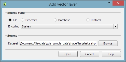
What we are most interested in now is the Browse button, which opens the file-opening dialog. Note the file type filter drop-down list in the bottom-right corner of the dialog. We can open it to see a list of supported vector file types. This filter is useful to find specific files faster by hiding all the files of a different type, but be aware that the filter settings are stored and will be applied again the next time you open the file opening dialog. This can be a source of confusion if you try to find a different file later and it happens to be hidden by the filter, so remember to check the filter settings if you are having trouble locating a file.
We can load more than one file in one go by selecting multiple files at once (holding down Ctrl on Windows/Ubuntu or cmd on Mac). Let's give it a try:
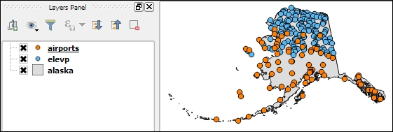
alaska.shp and airports.shp from the shapefiles sample data folder.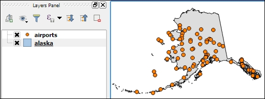
Even without us using any spatial analysis tools, these simple steps of visualizing spatial datasets enable us to find, for example, the southernmost airport on the Alaskan mainland.
There are multiple tricks that make loading data even faster; for example, you can simply drag and drop files from the operating system's file browser into QGIS.
Another way to quickly access your spatial data is by using QGIS's built-in file browser. If you have set up QGIS as shown in Chapter 1, Getting Started with QGIS, you'll find the browser on the left-hand side, just below the layer list. Navigate to your data folder, and you can again drag and drop files from the browser to the map.
Additionally, you can mark a folder as favorite by right-clicking on it and selecting Add as a favorite. In this way, you can access your data folders even faster, because they are added in the Favorites section right at the top of the browser list.
Another popular source of spatial data is delimited text (CSV) files. QGIS can load CSV files using the Add Delimited Text Layer option available via the menu entry by going to Layer | Add Layer | Add Delimited Text Layer or the corresponding toolbar button. Click on Browse and select elevp.csv from the sample data. CSV files come with all kinds of delimiters. As you can see in the following screenshot, the plugin lets you choose from the most common ones (Comma, Tab, and so on), but you can also specify any other plain or regular-expression delimiter:
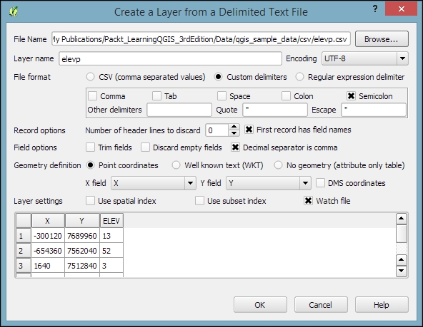
If your CSV file contains quotation marks such as, " or ', you can use the Quote option to have them removed. The Number of header lines to discard option allows us to skip any potential extra lines at the beginning of the text file. The following Field options include functionality for trimming extra spaces from field values or redefine the decimal separator to a comma. The spatial information itself can be provided either in the two columns that contain the coordinates of points X and Y, or using the Well known text (WKT) format. A WKT field can contain points, lines, or polygons. For example, a point can be specified as POINT (30 10), a simple line with three nodes would be LINESTRING (30 10, 10 30, 40 40), and a polygon with four nodes would be POLYGON ((30 10, 40 40, 20 40, 10 20, 30 10)).
Note that the first and last coordinate pair in a polygon has to be identical.
WKT is a very useful and flexible format. If you are unfamiliar with the concept, you can find a detailed introduction with examples at http://en.wikipedia.org/wiki/Well-known_text.
After we've clicked on OK, QGIS will prompt us to specify the layer's coordinate reference system (CRS). We will talk about handling CRS next.
Whenever we load a data source, QGIS looks for usable CRS information, for example, in the shapefile's .prj file. If QGIS cannot find any usable information, by default, it will ask you to specify the CRS manually. This behavior can be changed by going to Settings | Options | CRS to always use either the project CRS or a default CRS.
The QGIS Coordinate Reference System Selector offers a filter that makes finding a CRS easier. It can filter by name or ID (for example, the EPSG code). Just start typing and watch how the list of potential CRS gets shorter. There are actually two separate lists; the upper one contains the CRS that we recently used, while the lower list is much longer and contains all the available CRS. For the elevp.csv file, we select NAD27 / Alaska Albers. With the correct CRS, the elevp layer will be displayed as shown in this screenshot:
If we want to check a layer's CRS, we can find this information in the layer properties' General section, which can be accessed by going to Layer | Properties or by double-clicking on the layer name in the layer list. If you think that QGIS has picked the wrong CRS or if you have made a mistake in specifying the CRS, you can correct the CRS settings using Specify CRS. Note that this does not change the underlying data or reproject it. We'll talk about reprojecting vectors and raster files in Chapter 3, Data Creation and Editing.
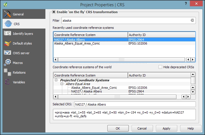
In QGIS, we can create a map out of multiple layers even if each dataset is stored with a different CRS. QGIS handles the necessary reprojections automatically by enabling a mechanism called on the fly reprojection, which can be accessed by going to Project | Project Properties, as shown in the following screenshot. Alternatively, you can click on the CRS status button (with the globe symbol and the EPSG code right next to it) in the bottom-right corner of the QGIS window to open this dialog:
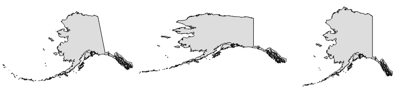
All layers are reprojected to the project CRS on the fly, which means that QGIS calculates these reprojections dynamically and only for the purpose of rendering the map. This also means that it can slow down your machine if you are working with big datasets that have to be reprojected. The underlying data is not changed and spatial analyses are not affected. For example, the following image shows Alaska in its default NAD27 / Alaska Albers projection (on the left-hand side), a reprojection on the fly to WGS84 EPSG:4326 (in the middle), and Web Mercator EPSG:3857 (on the right-hand side). Even though the map representation changes considerably, the analysis results for each version are identical since the on the fly reprojection feature does not change the data.
In some cases, you might have to specify a CRS that is not available in the QGIS CRS database. You can add CRS definitions by going to Settings | Custom CRS. Click on the Add new CRS button to create a new entry, type in a name for the new CRS, and paste the proj4 definition string in the Parameters input field. This definition string is used by the
Proj4 projection engine to determine the correct coordinate transformation. Just close the dialog by clicking on OK when you are done.
If you are looking for a specific projection proj4 definition, http://spatialreference.org is a good source for this kind of information.
Loading raster files is not much different from loading vector files. Going to Layer | Add Layer | Add Raster Layer, clicking on the Add Raster Layer button, or pressing the Ctrl + Shift + R shortcut will take you directly to the file-opening dialog. Again, you can check the file type filter to see a list of supported file types.
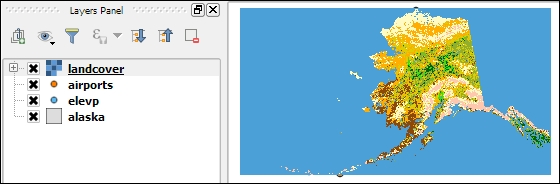
Let's give it a try and load landcover.img from the raster sample data folder. Similarly to vector files, you can load rasters by dragging them into QGIS from the operating system or the built-in file browser. The following screenshot shows the loaded raster layer:
Support for all of these different vector and raster file types in QGIS is handled by the powerful GDAL/OGR package. You can check out the full list of supported formats at www.gdal.org/formats_list.html (for rasters) and http://www.gdal.org/ogr_formats.html (for vectors).
Some raster data sources, such as simple scanned maps, lack proper spatial referencing, and we have to georeference them before we can use them in a GIS. In QGIS, we can georeference rasters using the Georeferencer GDAL plugin, which can be accessed by going to Raster | Georeferencer. (Enable it by going to Plugins | Manage and Install Plugins if you cannot find it in the Raster menu).
The Georeferencer plugin covers the following use cases:
After loading a raster into Georeferencer by going to File | Open raster or using the Open raster toolbar button, we are asked to specify the CRS of the ground control points that we are planning to add. Next, we can start adding ground control points by going to Edit | Add point. We can use the pan and zoom tools to navigate, and we can place GCPs by clicking on the map. We are then prompted to insert the coordinates of the new point or pick them from the reference map in the main QGIS window. The placed GCPs are displayed as red circles in both Georeferencer and the QGIS window, as you can see in the following screenshot:
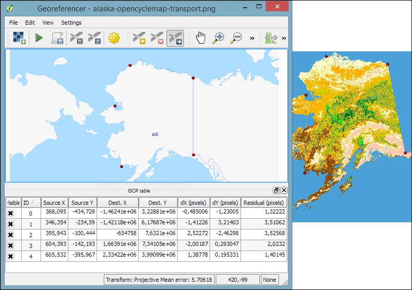
Georeferencer shows a screenshot of the OCM Landscape map © Thunderforest, Data © OpenStreetMap contributors (http://www.opencyclemap.org/?zoom=4&lat=62.50806&lon=-145.01953&layers=0B000)
After placing the GCPs, we can define the transformation algorithm by going to Settings | Transformation Settings. Which algorithm you choose depends on your input data and the level of geometric distortion you want to allow. The most commonly used algorithms are polynomial 1 to 3. A first-order polynomial transformation allows scaling, translation, and rotation only.
A second-order polynomial transformation can handle some curvature, and a third-order polynomial transformation consequently allows for even higher degrees of distortion. The thin-plate spline algorithm can handle local deformations in the map and is therefore very useful while working with very low-quality map scans. Projective transformation offers rotation and translation of coordinates. The linear option, on the other hand, is only used to create world files, and as mentioned earlier, this does not actually transform the raster.
The resampling method depends on your input data and the result you want to achieve. Cubic resampling creates smooth results, but if you don't want to change the raster values, choose the nearest neighbor method.
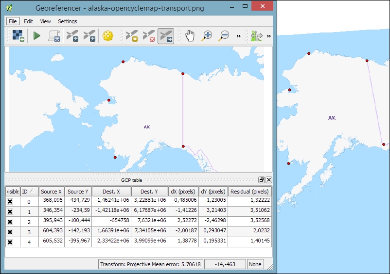
Before we can start the georeferencing process, we have to specify the output filename and target CRS. Make sure that the Load in QGIS when done option is active and activate the Use 0 for transparency when needed option to avoid black borders around the output image. Then, we can close the Transformation Settings dialog and go to File | Start Georeferencing. The georeferenced raster will automatically be loaded into the main map window of QGIS. In the following screenshot, you can see the result of applying projective transformation using the five specified GCPs:
QGIS supports PostGIS, SpatiaLite, MSSQL, and Oracle Spatial databases. We will cover two open source options: SpatiaLite and PostGIS. Both are available cross-platform, just like QGIS.
SpatiaLite is the spatial extension for SQLite databases. SQLite is a self-contained, server-less, zero-configuration, and transactional SQL database engine (www.sqlite.org). This basically means that a SQLite database, and therefore also a SpatiaLite database, doesn't need a server installation and can be copied and exchanged just like any ordinary file.
You can download an example database from www.gaia-gis.it/spatialite-2.3.1/test-2.3.zip (4 MB). Unzip the file; you will be able to connect to it by going to Layer | Add Layer | Add SpatiaLite Layer, using the Add SpatiaLite Layer toolbar button, or by pressing Ctrl + Shift + L. Click on New to select the test-2.3.sqlite database file. QGIS will save all the connections and add them to the drop-down list at the top. After clicking on Connect, you will see a list of layers stored in the database, as shown in this screenshot:
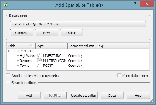
As with files, you can select one or more tables from the list and click on Add to load them into the map. Additionally, you can use Set Filter to only load specific features.
Filters in QGIS use SQL-like syntax, for example,
"Name" = 'EMILIA-ROMAGNA' to select only the region called
EMILIA-ROMAGNA or "Name" LIKE 'ISOLA%' to select all regions whose names start with ISOLA. The filter queries are passed on to the underlying data provider (for example, SpatiaLite or OGR). The provider syntax for basic filter queries is consistent over different providers but can vary when using more exotic functions. You can read the details of OGR SQL at http://www.gdal.org/ogr_sql.html.
In Chapter 4, Spatial Analysis, we will use this database to explore how we can take advantage of the spatial analysis capabilities of SpatiaLite.
PostGIS is the spatial extension of the PostgreSQL database system. Installing and configuring the database is out of the scope of this book, but there are installers for Windows and packages for many Linux distributions as well as for Mac (for details, visit http://www.postgresql.org/download/). To load data from a PostGIS database, go to Layers | Add Layer | Add PostGIS Layer, use the Add PostGIS Layer toolbar button, or press Ctrl + Shift + D.
When using a database for the first time, click on New to establish a new database connection. This opens the dialog shown in the following screenshot, where you can create a new connection, for example, to a database called postgis:
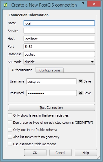
The fields that have to be filled in are as follows:
localhost if PostGIS is running locally.5432. If you have trouble reaching a database, it is recommended that you check the server's firewall settings for this port.After the connection is established, you can load and filter tables, just as we discussed for SpatiaLite.
More and more data providers offer access to their datasets via OGC-compliant web services such as Web Map Services (WMS), Web Coverage Services (WCS), or Web Feature Services (WFS). QGIS supports these services out of the box.
If you want to learn more about the different OGC web services available, visit http://live.osgeo.org/en/standards/standards.html for an overview.
You can load WMS layers by going to Layer | Add WMS/WMTS Layer, clicking on the Add WMS/WMTS Layer button, or pressing Ctrl + Shift + W. If you know a WMS server, you can connect to it by clicking on New and filling in a name and the URL. All other fields are optional. Don't worry if you don't know of any WMS servers, because you can simply click on the Add default servers button to get access information about servers whose administrators collaborate with the QGIS project. One of these servers is called Lizardtech server. Select Lizardtech server or any of the other servers from the drop-down box, and click on Connect to see the list of layers available through the server, as shown here:
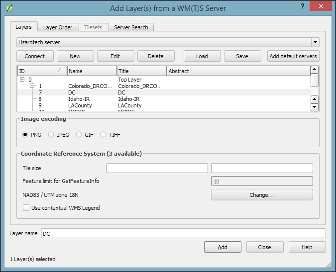
From the layer list, you can now select one or more layers for download. It is worth noting that the order in which you select the layers matters, because the layers will be combined on the server side and QGIS will only receive the combined image as the resultant layer. If you want to be able to use the layers separately, you will have to download them one by one. The data download starts once you click on Add. The dialog will stay open so that you can add more layers from the server.
Many WMS servers offer their layers in multiple, different CRS. You can check out the list of available CRS by clicking on the Change button at the bottom of the dialog. This will open a CRS selector dialog, which is limited to the WMS server's CRS capabilities.
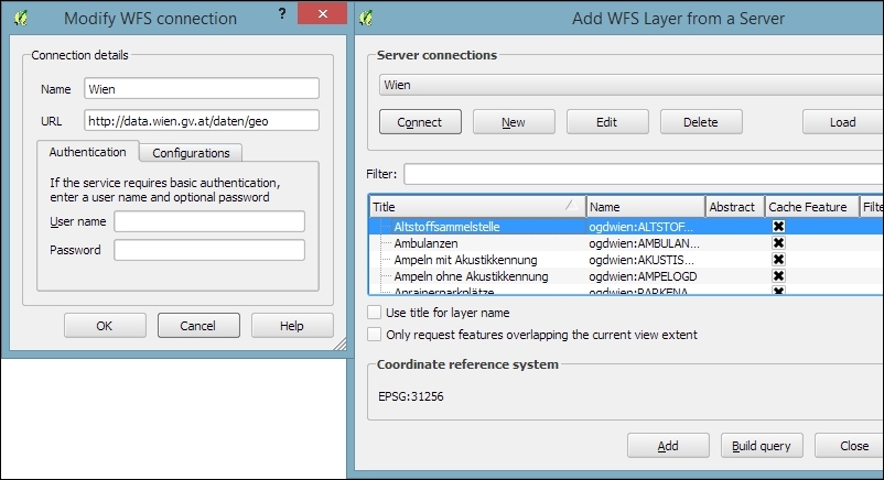
Loading data from WCS or WFS servers works in the same way, but public servers are quite rare. One of the few reliable public WFS servers is operated by the city of Vienna, Austria. The following screenshot shows how to configure the connection to the data.wien.gv.at WFS, as well as the list of available datasets that is loaded when we click on the Connect button:
After this introduction to data sources, we can create our first map. We will build the map from the bottom up by first loading some background rasters (hillshade and land cover), which we will then overlay with point, line, and polygon layers.
Let's start by loading a land cover and a hillshade from landcover.img and SR_50M_alaska_nad.tif, and then opening the Style section in the layer properties (by going to Layer | Properties or double-clicking on the layer name). QGIS automatically tries to pick a reasonable default render type for both raster layers. Besides these defaults, the following style options are available for raster layers:
The SR_50M_alaska_nad.tif hillshade raster is loaded with Singleband gray Render type, as you can see in the following screenshot. If we want to render the hillshade raster in color instead of grayscale, we can change Render type to Singleband pseudocolor. In the pseudocolor mode, we can create color maps either manually or by selecting one of the premade color ramps. However, let's stick to Singleband gray for the hillshade for now.
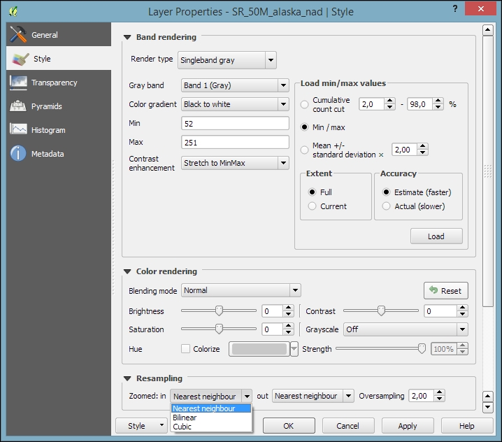
The Singleband gray renderer offers a Black to white Color gradient as well as a White to black gradient. When we use the Black to white gradient, the minimum value (specified in Min) will be drawn black and the maximum value (specified in Max) will be drawn in white, with all the values in between in shades of gray. You can specify these minimum and maximum values manually or use the Load min/max values interface to let QGIS compute the values.
Note that QGIS offers different options for computing the values from either the complete raster (Full Extent) or only the currently visible part of the raster (Current Extent). A common source of confusion is the Estimate (faster) option, which can result in different values than those documented elsewhere, for example, in the raster's metadata. The obvious advantage of this option is that it is faster to compute, so use it carefully!
Below the color settings, we find a section with more advanced options that control the raster Resampling, Brightness, Contrast, Saturation, and Hue—options that you probably know from image processing software. By default, resampling is set to the fast Nearest neighbour option. To get nicer and smoother results, we can change to the Bilinear or Cubic method.
Click on OK or Apply to confirm. In both cases, the map will be redrawn using the new layer style. If you click on Apply, the Layer Properties dialog stays open, and you can continue to fine-tune the layer style. If you click on OK, the Layer Properties dialog is closed.
The landcover.img raster is a good example of a paletted raster. Each cell value is mapped to a specific color. To change a color, we can simply double-click on the Color preview and a color picker will open. The style section of a paletted raster looks like what is shown in the following screenshot:
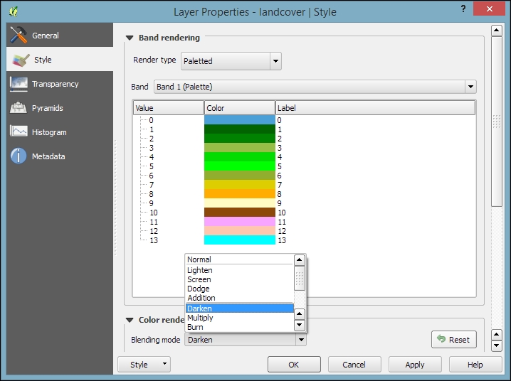
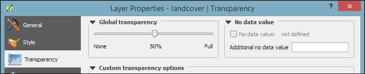
If we want to combine hillshade and land cover into one aesthetically pleasing background, we can use a combination of Blending mode and layer Transparency. Blending modes are another feature commonly found in image processing software. The main advantage of blending modes over transparency is that we can avoid the usually dull, low-contrast look that results from combining rasters using transparency alone. If you haven't had any experience with blending, take some time to try the different effects. For this example, I used the Darken blending mode, as highlighted in the previous screenshot, together with a global layer transparency of 50 %, as shown in the following screenshot:
When we load vector layers, QGIS renders them using a default style and a random color. Of course, we want to customize these styles to better reflect our data. In the following exercises, we will style point, line, and polygon layers, and you will also get accustomed to the most common vector styling options.
Regardless of the layer's geometry type, we always find a drop-down list with the available style options in the top-left corner of the Style dialog. The following style options are available for vector layers:
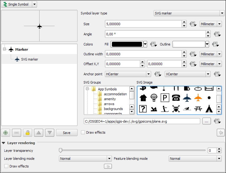
Let's get started with a point layer! Load airport.shp from your sample data. In the top-left corner of the Style dialog, below the drop-down list, we find the symbol preview. Below this, there is a list of symbol layers that shows us the different layers the symbol consists of. On the right-hand side, we find options for the symbol size and size units, color and transparency, as well as rotation. Finally, the bottom-right area contains a preview area with saved symbols.
Point layers are, by default, displayed using a simple circle symbol. We want to use a symbol of an airplane instead. To change the symbol, select the Simple marker entry in the symbol layers list on the left-hand side of the dialog. Notice how the right-hand side of the dialog changes. We can now see the options available for simple markers: Colors, Size, Rotation, Form, and so on. However, we are not looking for circles, stars, or square symbols—we want an airplane. That's why we need to change the Symbol layer type option from Simple marker to SVG marker. Many of the options are still similar, but at the bottom, we now find a selection of SVG images that we can choose from. Scroll through the list and pick the airplane symbol, as shown in the following screenshot:
Before we move on to styling lines, let's take a look at the other symbol layer types for points, which include the following:
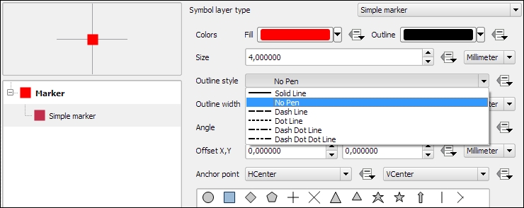
Simple marker layers can have different geometric forms, sizes, outlines, and angles (orientation), as shown in the following screenshot, where we create a red square without an outline (using the No Pen option):
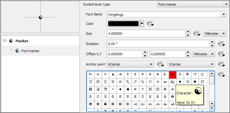
Font marker layers are useful for adding letters or other symbols from fonts that are installed on your computer. This screenshot, for example, shows how to add the yin-and-yang character from the Wingdings font:
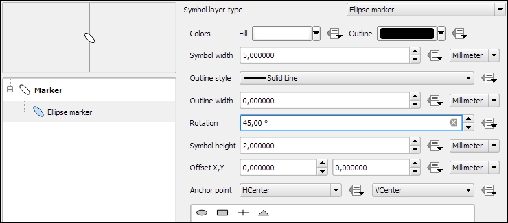
Ellipse marker layers make it possible to draw different ellipses, rectangles, crosses, and triangles, where both the width and height can be controlled separately. This symbol layer type is especially useful when combined with data-defined overrides, which we will discuss later. The following screenshot shows how to create an ellipse that is 5 millimeters long, 2 millimeters high, and rotated by 45 degrees:
In this exercise, we create a river style for the majriver.shp file in our sample data. The goal is to create a line style with two colors: a fill color for the center of the line and an outline color. This technique is very useful because it can also be used to create road styles.
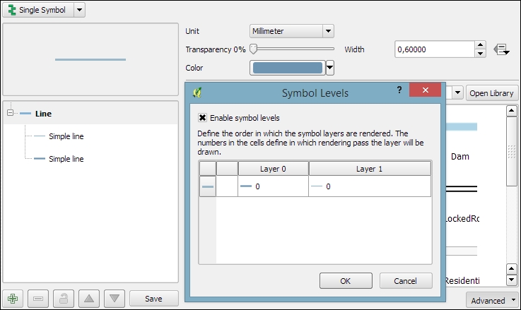
To create such a style, we combine two simple lines. The default symbol is one simple line. Click on the green + symbol located below the symbol layers list in the bottom-left corner to add another simple line. The lower line will be our outline and the upper one will be the fill. Select the upper simple line and change the color to blue and the width to 0.3 millimeters. Next, select the lower simple line and change its color to gray and width to 0.6 millimeters, slightly wider than the other line. Check the preview and click on Apply to test how the style looks when applied to the river layer.
You will notice that the style doesn't look perfect yet. This is because each line feature is drawn separately, one after the other, and this leads to a rather disconnected appearance. Luckily, this is easy to fix; we only need to enable the so-called symbol levels. To do this, select the Line entry in the symbol layers list and tick the checkbox in the Symbol Levels dialog of the Advanced section (the button in the bottom-right corner of the style dialog), as shown in the following screenshot. Click on Apply to test the results.
Before we move on to styling polygons, let's take a look at the other symbol layer types for lines, which include the following:
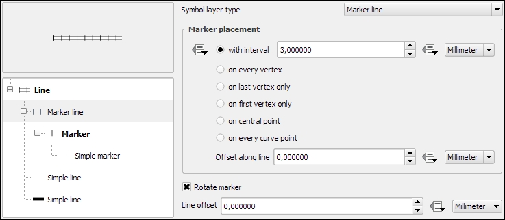
A common use case for Marker line symbol layers are train track symbols; they often feature repeating perpendicular lines, which are abstract representations of railway sleepers. The following screenshot shows how we can create a style like this by adding a marker line on top of two simple lines:
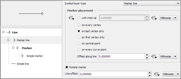
Another common use case for Marker line symbol layers is arrow symbols. The following screenshot shows how we can create a simple arrow by combining Simple line and Marker line. The key to creating an arrow symbol is to specify that Marker placement should be last vertex only. Then we only need to pick a suitable arrow head marker and the arrow symbol is ready.
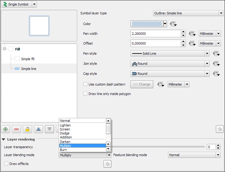
In this exercise, we will create a style for the alaska.shp file. The goal is to create a simple fill with a blue halo. As in the previous river style example, we will combine two symbol layers to create this style: a Simple fill layer that defines the main fill color (white) with a thin border (in gray), and an additional Simple line outline layer for the (light blue) halo. The halo should have nice rounded corners. To achieve these, change the Join style option of the Simple line symbol layer to Round. Similar to the previous example, we again enable symbol levels; to prevent this landmass style from blocking out the background map, we select the Multiply blending mode, as shown in the following screenshot:
Before we move on, let's take a look at the other symbol layer types for polygons, which include the following:
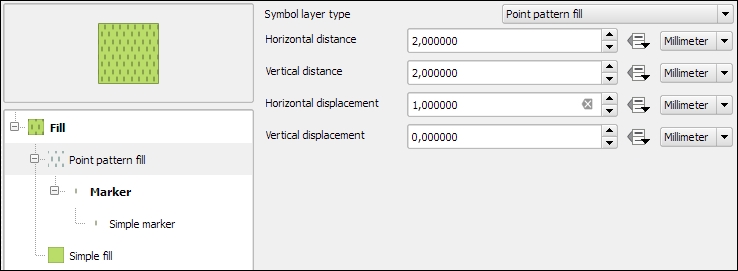
A common use case for Point pattern fill symbol layers is topographic symbols for different vegetation types, which typically consist of a Simple fill layer and Point pattern fill, as shown in this screenshot:
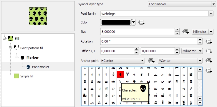
When we design point pattern fills, we are, of course, not restricted to simple markers. We can use any other marker type. For example, the following screenshot shows how to create a polygon fill style with a Font marker pattern that shows repeating alien faces from the Webdings font:
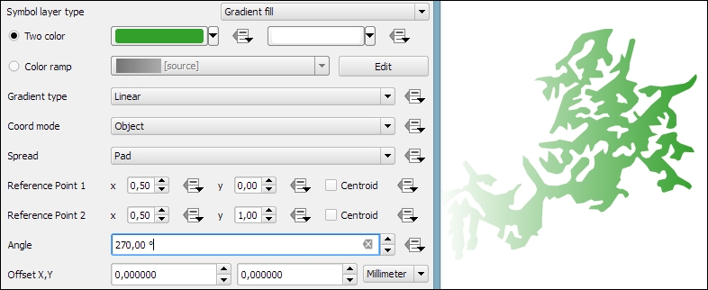
As an alternative to simple fills with only one color, we can create Gradient fill symbol layers. Gradients can be defined by Two colors, as shown in the following screenshot, or by a Color ramp that can consist of many different colors. Usually, gradients run from the top to the bottom, but we can change this to, for example, make the gradient run from right to left by setting Angle to 270 degrees, as shown here:
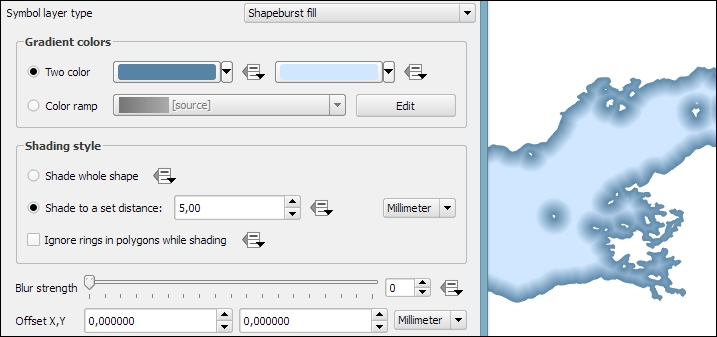
The Shapeburst fill symbol layer type, also known as a "buffered" gradient fill, is often used to style water areas with a smooth gradient that flows from the polygon border inwards. The following screenshot shows a fixed-distance shading using the Shade to a set distance option. If we select Shade whole shape instead, the gradient will be drawn all the way from the polygon border to the center.
Background maps are very useful for quick checks and to provide orientation, especially if you don't have access to any other base layers. Adding background maps is easy with the help of the QuickMapServices plugin. It provides access to satellite, street, and hybrid maps by different providers.
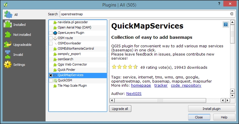
To install the QuickMapServices plugin, go to Plugins | Manage and Install Plugins. Wait until the list of available plugins has finished loading. Use the filter to look for the QuickMapServices option, as shown in the following screenshot. Select it from the list and click on Install plugin. This is going to take a moment. Once it's done, you will see a short confirmation message. You can then close the installer, and the QuickMapServices plugin will be available through the Web menu.
Another fact worth mentioning is that all of these services provide their maps only in Pseudo Mercator (EPSG: 3857). You should change your project CRS to Pseudo Mercator when using background maps from QuickMapServices, particularly if the map contains labels that would otherwise show up distorted.
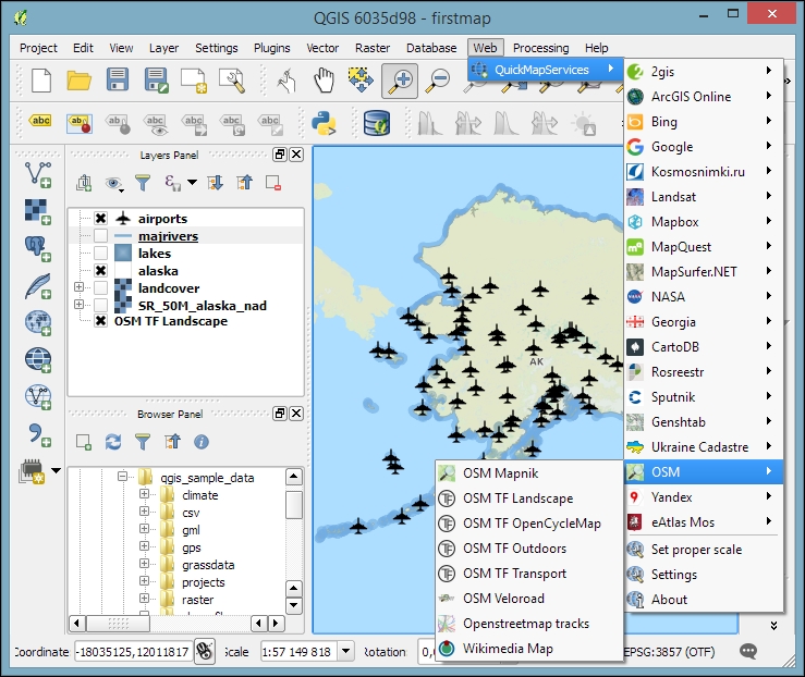
If you load the OSM TF Landscape layer, your map will look like what is shown in this screenshot:
QGIS project files are human-readable XML files with the filename ending with .qgs. You can open them in any text editor (such as Notepad++ on Windows or gedit on Ubuntu) and read or even change the file contents.
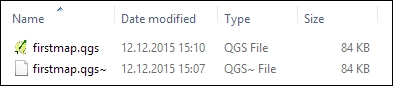
When you save a project file, you will notice that QGIS creates a second file with the same name and a .qgs~ ending, as shown in the next screenshot. This is a simple backup copy of the project file with identical content. If your project file gets corrupted for any reason, you can simply copy the backup file, remove the ~ from the file ending, and continue working from there.
By default, QGIS stores the relative path to the datasets in the project file. If you move a project file (without its associated data files) to a different location, QGIS won't be able to locate the data files anymore and will therefore display the following Handle bad layers dialog:
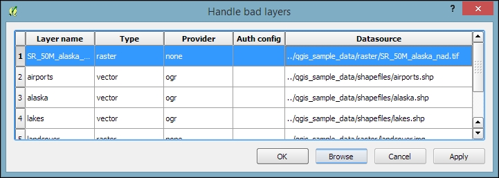
To fix the layers, you need to correct the path in the Datasource column. This can be done by double-clicking on the path text and typing in the correct path, or by pressing the Browse button at the bottom of the dialog and selecting the new file location in the file dialog that opens up.
A comfortable way to copy QGIS projects to other computers or share QGIS projects and associated files with other users is provided by the QConsolidate plugin. This plugin collects all the datasets used in the project and saves them in one directory, which you can then move around easily without breaking any paths.
In this chapter, you learned how to load spatial data from files, databases, and web services. We saw how QGIS handles coordinate reference systems and had an introduction to styling vector and raster layers, a topic that we will cover in more detail in Chapter 5, Creating Great Maps. We also installed our first Python plugin, the QuickMapServices plugin, and used it to load background maps into our project. Finally, we took a look at QGIS project files and how to work with them efficiently. In the following chapter, we will go into more detail and see how to create and edit raster and vector data.
In this chapter, we will first create some new vector layers and explain how to select features and take measurements. We will then continue with editing feature geometries and attributes. After that, we will reproject vector and raster data and convert between different file formats. We will also discuss how to join data from text files and spreadsheets to our spatial data and how to use temporary scratch layers for quick editing work. Moreover, we will take a look at common geometry topology issues and how to detect and fix them, before we end this chapter on how to add data to spatial databases.
In this exercise, we'll create a new layer from scratch. QGIS offers a wide range of functionalities to create different layers. The New menu under Layer lists the functions needed to create new Shapefile and SpatiaLite layers, but we can also create new database tables using the DB Manager plugin. The interfaces differ slightly in order to accommodate the features supported by each format.
Let's create some new Shapefiles to see how it works:
new_polygons: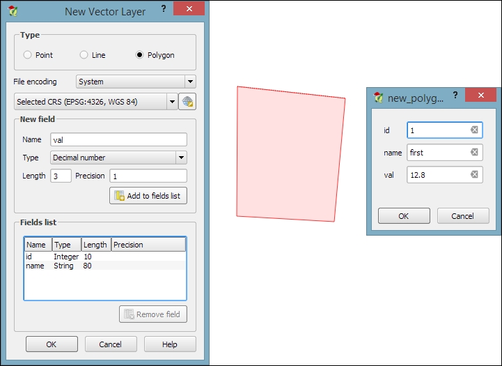
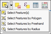
Selecting features is one of the core functions of any GIS, and it is useful to know them before we venture into editing geometries and attributes. Depending on the use case, selection tools come in many different flavors. QGIS offers three different kinds of tools to select features using the mouse, an expression, or another layer.
The first group of tools in the Attributes toolbar allows us to select features on the map using the mouse. The following screenshot shows the Select Feature(s) tool. We can select a single feature by clicking on it, or select multiple features by drawing a rectangle. The other tools can be used to select features by drawing different shapes (polygons, freehand areas, or circles) around the features. All features that intersect with the drawn shape are selected.
The second type of select tool is called Select by Expression, and it is also available in the Attribute toolbar. It selects features based on expressions that can contain references and functions that use feature attributes and/or geometry. The list of available functions in the center of the dialog is pretty long, but we can use the search box at the top of the list to filter it by name and find the function we are looking for faster. On the right-hand side of the window, we find the function help, which explains the functionality and how to use the function in an expression. The function list also shows the layer attribute fields, and by clicking on all unique or 10 samples, we can easily access their content. We can choose between creating a new selection or adding to or deleting from an existing selection. Additionally, we can choose to only select features from within an existing selection. Let's take a look at some example expressions that you can build on and use in your own work:
lakes.shp file in our sample data, we can, for example, select lakes with an area greater than 1,000 square miles by using a simple "AREA_MI" > 1000.0 attribute query, as shown in the following screenshot. Alternatively, we can use geometry functions such as $area > (1000.0 * 27878400). Note that the lakes.shp CRS uses feet, and therefore we have to multiply by 27,878,400 to convert square feet to square miles.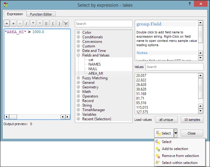
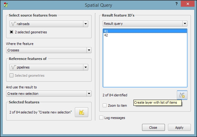
length("NAMES") > 12) or lakes with names that contain s or S (such as lower("NAMES") LIKE '%s%'); this function first converts the names to lowercase and then looks for any appearance of s.The third type of tool is called Spatial Query and allows us to select features in one layer based on their location relative to features in a second layer. These tools can be accessed by going to Vector | Research Tools | Select by location and Vector | Spatial Query | Spatial Query. Enable it in Plugin Manager if you cannot find it in the Vector menu. In general, we want to use the Spatial Query plugin as it supports a variety of spatial operations such as Crosses, Equals, Intersects, Is disjoint, Overlaps, Touches, and Contains, depending on the layer geometry type.
Let's test the Spatial Query plugin using railroads.shp and pipelines.shp from the sample data. For example, we might want to find all railroad features that cross a pipeline; therefore, we select the railroads layer, the Crosses operation, and the pipelines layer. After we've clicked on Apply, the plugin presents us with the query results. There is a list of IDs of the result features on the right-hand side of the window, as you can see in the next screenshot. Below this list, we can check the Zoom to item box, and QGIS will zoom into the feature that belongs to the selected ID. Additionally, the plugin offers buttons for direct saving of all the resulting features to a new layer:
Now that we know how to create and select features, we can take a closer look at the other tools in the Digitizing and Advanced Digitizing toolbars.
This is the basic Digitizing toolbar:

The Digitizing toolbar contains tools that we can use to create and move features and nodes as well as delete, copy, cut, and paste features, as follows:
The Advanced Digitizing toolbar offers very useful Undo and Redo functionalities as well as additional tools for more involved geometry editing, as shown in the following screenshot:

The Advanced Digitizing tools include the following:
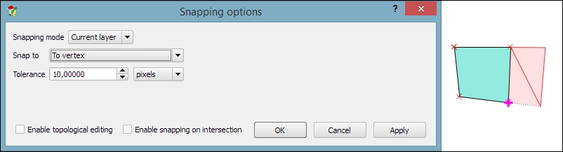
One of the challenges of digitizing features by hand is avoiding undesired gaps or overlapping features. To make it easier to avoid these issues, QGIS offers a snapping functionality. To configure snapping, we go to Settings | Snapping options. The following screenshot shows how to enable snapping for the Current layer. Similarly, you can choose snapping modes for All layers or the Advanced mode, where you can control the settings for each layer separately. In the example shown in the following screenshot, we enable snapping To vertex. This means that digitizing tools will automatically snap to vertices/nodes of existing features in the current layer. Similarly, you can enable snapping To segment or To vertex and segment. When snapping is enabled during digitizing, you will notice bold cross-shaped markers appearing whenever you go close to a vertex or segment that can be snapped to:
Another core functionality of any GIS is provided by measurement tools. In QGIS, we find the tools needed to measure lines, areas, and angles in the Attribute toolbar, as shown in this screenshot:
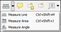
The measurements are updated continuously while we draw measurement lines, areas, or angles. When we draw a line with multiple segments, the tool shows the length of each segment as well as the total length of all the segments put together. To stop measuring, we can just right-click. If we want to change the measurement units from meters to feet or from degrees to radians, we can do this by going to Settings | Options | Map Tools.
There are three main use cases of attribute editing:
All three use cases are covered by the functionality available through the attribute table. We can access it by going to Layer | Open Attribute Table, using the Open Attribute Table button present in the Attributes toolbar, or in the layer name context menu.
NAME_2 of the first feature: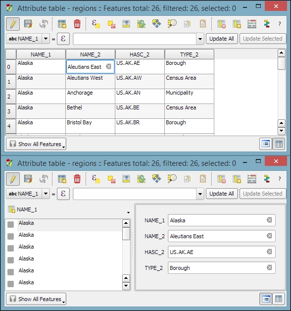
Besides the classic attribute table view, QGIS also supports a form view, which you can see in the lower dialog of the previous image. You can switch between these two views using the buttons in the bottom-right corner of the attribute table dialog.
In the attribute table, we also find tools for handling selections (from left to right, starting at the fourth button): Delete selected features, Select features using an expression, Unselect all, Move selection to top, Invert selection, Pan map to the selected rows, Zoom map to the selected rows, and Copy selected rows to clipboard. Another way to select features in the attribute table is by clicking on the row number.
The next two buttons allow us to add and remove columns. When we click on the Delete column button, we get a list of columns to choose from. Similarly, the New column button brings up a dialog that we can use to specify the name and data type of the new column.
Another option to edit the attributes of one feature is to open the attribute form directly by clicking on the feature on the map using the Identify tool. By default, the Identify tool displays the attribute values in read mode, but we can enable the Auto open form option in the Identify Results panel, as shown here:
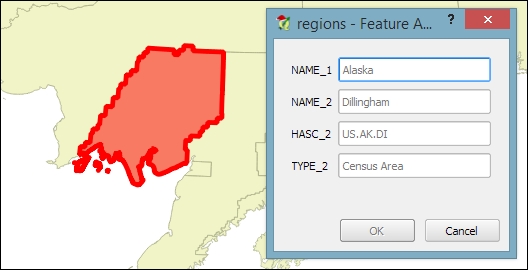
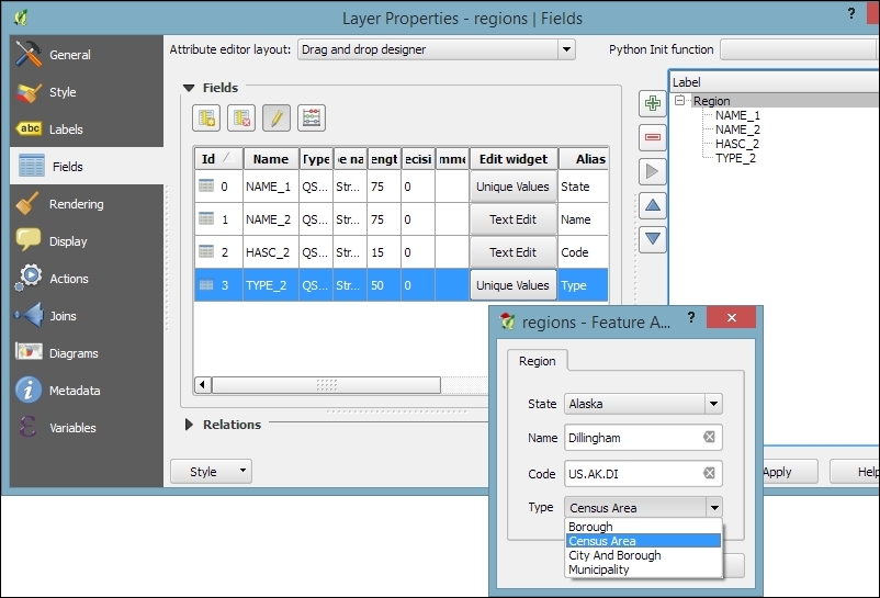
What you can see in the previous screenshot is the default feature attributes form that QGIS creates automatically, but we are not limited to this basic form. By going to Layer Properties | Fields section, we can configure the look and feel of the form in greater detail. The Attribute editor layout options are (in an increasing level of complexity) autogenerate, Drag and drop designer, and providing a .ui file. These options are described in detail as follows.
Autogenerate is the most basic option. You can assign a specific Edit widget and Alias for each field; this will replace the default input field and label in the form. For this example, we use the following edit widget types:
For the complete list of available Edit widget types, refer to the user manual at http://docs.qgis.org/2.2/en/docs/user_manual/working_with_vector/vector_properties.html#fields-menu.
This allows more control over the form layout. As you can see in the next screenshot, the designer enables us to create tabs within the form and also makes it possible to change the order of the form fields. The workflow is as follows:
This is the most advanced option. It enables you to use a Qt user interface designed using, for example, the Qt Designer software. This allows a great deal of freedom in designing the form layout and behavior.
Creating .ui files is out of the scope of this book, but you can find more information about it at http://docs.qgis.org/2.2/en/docs/training_manual/create_vector_data/forms.html#hard-fa-creating-a-new-form.
If we want to change the attributes of multiple or all features in a layer, editing them manually usually isn't an option. This is what the Field calculator is good for. We can access it using the Open field calculator button in the attribute table, or by pressing Ctrl + I. In the Field calculator, we can choose to update only the selected features or update all the features in the layer. Besides updating an existing field, we can also create a new field. The function list is the same one that we explored when we selected features by expression. We can use any of the functions and variables in this list to populate a new field or update an existing one. Here are some example expressions that are often used:
id column using the @row_number variable, which populates a column with row numbers, as shown in the following screenshot: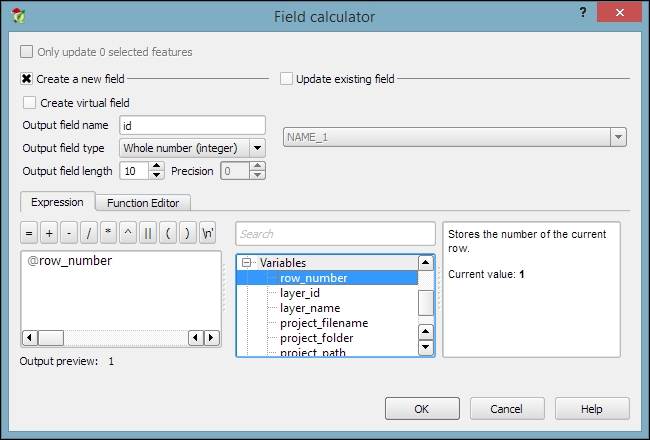
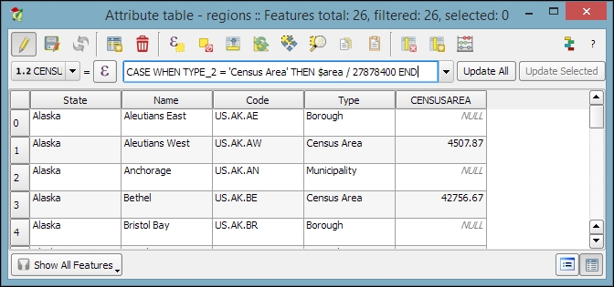
$length and $area geometry functions, respectively$x and $y$x_at(0) and $y_at(0), or $x_at(-1) and $y_at(-1), respectivelyAn alternative to the Field calculator—especially if you already know the formula you want to use—is the field calculator bar, which you can find directly in the Attribute table dialog right below the toolbar. In the next screenshot, you can see an example that calculates the area of all census areas (use the New Field button to add a Decimal number field called CENSUSAREA first). This example uses a CASE WHEN – THEN – END expression to check whether the value of TYPE_2 is Census Area:
CASE WHEN TYPE_2 = 'Census Area' THEN $area / 27878400 END
An alternative solution would be to use the if() function instead. If you use the CENSUSAREA attribute as the third parameter (which defines the value that is returned if the condition evaluates to false), the expression will only update those rows in which TYPE_2 is Census Area and leave the other rows unchanged:
if(TYPE_2 = 'Census Area', $area / 27878400, CENSUSAREA)
Alternatively, you can use NULL as a third parameter which will overwrite all rows where TYPE_2 does not equal Census Area with NULL:
if(TYPE_2 = 'Census Area', $area / 27878400, NULL)
Enter the formula and click on the Update All button to execute it:
Since it is not possible to directly change a field data type in a Shapefile or SpatiaLite attribute table, the field calculator and calculator bar are also used to create new fields with the desired properties and then populate them with the values from the original column.
In Chapter 2, Viewing Spatial Data, we talked about CRS and the fact that QGIS offers on the fly reprojection to display spatial datasets, which are stored in different CRS, in the same map. Still, in some cases, we might want to permanently reproject a dataset, for example, to geoprocess it later on.
In QGIS, reprojecting a vector or raster layer is done by simply saving it with a new CRS. We can save a layer by going to Layer | Save as... or using Save as… in the layer name context menu. Pick a target file format and filename, and then click on the Select CRS button beside the CRS drop-down field to pick a new CRS.
Besides changing the CRS, the main use case of the Save vector/raster layer dialog, as depicted in the following screenshot, is conversion between different file formats. For example, we can load a Shapefile and export it as GeoJSON, MapInfo MIF, CSV, and so on, or the other way around.
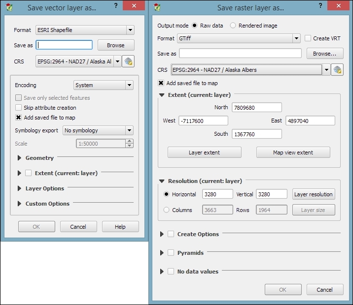
The Save raster layer dialog is also a convenient way to clip/crop rasters by a bounding box, since we can specify which Extent we want to save.
Furthermore, the Save vector layer dialog features a Save only selected features option, which enables us to save only selected features instead of all features of the layer (this option is active only if there are actually some selected features in the layer).
In many real-life situations, we get additional non-spatial data in the form of spreadsheets or text files. The good news is that we can load XLS files by simply dragging them into QGIS from the file browser or using Add Vector Layer. Don't let the wording fool you! It really works without any geometry data in the file. The file can even contain more than one table. You will see the following dialog, which lets you choose which table (or tables) you want to load:
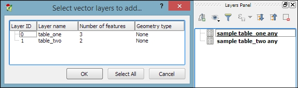
QGIS will automatically recognize the names and data types of columns in an XLS table. It's quite easy to tell because numerical values are aligned to the right in the attribute table, as shown in this screenshot:
We can also load tabular data from delimited text files, as we saw in Chapter 2, Viewing Spatial Data, when we loaded a point layer from a delimited text file. To load a delimited text file that contains only tabular data but no geometry information, we just need to enable the No geometry (attribute table only) option.
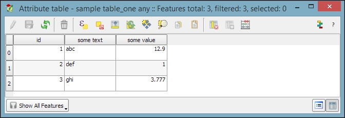
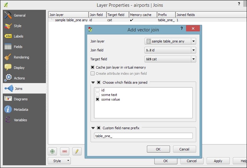
After loading the tabular data from either the spreadsheet or text file, we can continue to join this non-spatial data to a vector layer (for instance, our airports.shp dataset, as shown in the following example). To do this, we go to the vector's Layer Properties | Joins section. Here, we can add a new join by clicking on the green plus button. All we have to do is select the tabular Join layer and Join field (of the tabular layer), which will contain values that match those in the Target field (of the vector layer). Additionally, we can—if we want to—select a subset of the fields to be joined by enabling the Choose which fields are joined option. For example, the settings shown in the following screenshot will add only the some value field. Additionally, we use a Custom field name prefix instead of using the entire join layer name, which would be the default option.
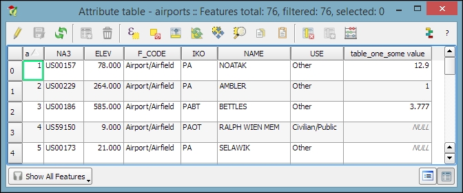
Once the join is added, we can see the extended attribute table and use the new appended attributes (as shown in the following screenshot) for styling and labeling. The way joins work in QGIS is as follows: the join layer's attributes are appended to the original layer's attribute table. The number of features in the original layer is not changed. Whenever there is a match between the join and the target field, the attribute value is filled in; otherwise, you see NULL entries.
You can save the joined layer permanently using Save as… to create the new file.
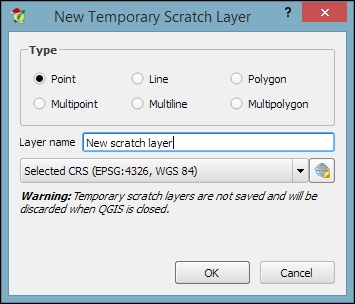
When you just want to quickly draw some features on the map, temporary scratch layers are a great way of doing that without having to worry about file formats and locations for your temporary data. Go to Layer | Create Layer | New Temporary Scratch Layer... to create a new temporary scratch layer. As you can see in the following screenshot, all we need to do to configure this temporary layer is pick a Type for the geometry, a Layer name, and a CRS. Once the layer is created, we can add features and attributes as we would with any other vector layer:
As the name suggests, temporary scratch layers are temporary. This means that they will vanish when you close the project.
If you want to preserve the data of your temporary layers, you can either use Save as... to create a file or install the Memory Layer Saver plugin, which will make layers with memory data providers (such as temporary scratch layers) persistent so that they are restored when a project is closed and reopened. The memory provider data is saved in a portable binary format that is saved with the .mldata extension alongside the project file.
Sometimes, the data that we receive from different sources or data that results from a chain of spatial processing steps can have problems. Topological errors can be particularly annoying, since they can lead to a multitude of different problems when using the data for analysis and further spatial processing. Therefore, it is important to have tools that can check data for topological errors and to know ways to fix discovered errors.
In QGIS, we can use the Topology Checker plugin; it is installed by default and is accessible via the Vector menu Topology Checker entry (if you cannot find the menu entry, you might have to enable the plugin in Plugin Manager). When the plugin is activated, it adds a Topology Checker Panel to the QGIS window. This panel can be used to configure and run different topology checks and will list the detected errors.
To see the Topology Checker in action, we create a temporary scratch layer with polygon geometries and digitize some polygons, as shown in the following screenshot. Make sure you use snapping to create polygons that touch but don't overlap. These could, for example, represent a group of row houses. When the polygons are ready, we can set up the topology rules we want to check for. Click on the Configure button in Topology Checker Panel to open the Topology Rule Settings dialog. Here, we can manage all the topology rules for our project data. For example, in the following screenshot, you can see the rules we might want to configure for our polygon layer, including these:
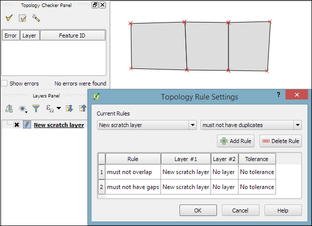
Once the rules are set up, we can close the settings dialog and click on the Validate All button in Topology Checker Panel to start running the topology rule checks. If you have been careful while creating the polygons, the checker will not find any errors and the status at the bottom of Topology Checker Panel will display this message: 0 errors were found. Let's change that by introducing some topology errors.
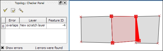
For example, if we move one vertex so that two polygons end up overlapping each other and then click on Validate All, we get the error shown in the next screenshot. Note that the error type and the affected layer and feature are displayed in Topology Checker Panel. Additionally, since the Show errors option is enabled, the problematic geometry part is highlighted in red on the map:
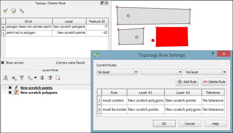
Of course, it is also possible to create rules that describe the relationship between features in different layers. For example, the following screenshot shows a point and a polygon layer where the rules state that each point should be inside a polygon and each polygon should contain a point:
Selecting an error from the list of errors in the panel centres the map on the problematic location so that we can start fixing it, for example, by moving the lone point into the empty polygon.
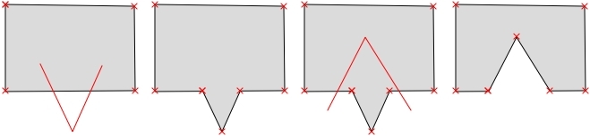
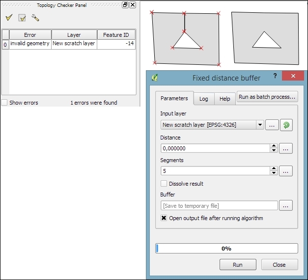
Sometimes, fixing all errors manually can be a lot of work. Luckily, certain errors can be addressed automatically. For example, the common error of self-intersecting polygons, which cause invalid geometry errors (as illustrated in the following screenshot), is often the result of intersecting polygon nodes or edges. These issues can often be resolved using a buffer tool (for example, Fixed distance buffer in the Processing Toolbox, which we will discuss in more detail in Chapter 4, Spatial Analysis) with the buffer Distance set to 0. Buffering will, for example, fix the self-intersecting polygon on the left-hand side of the following screenshot by removing the self-intersecting nodes and constructing a valid polygon with a hole (as depicted on the right-hand side):
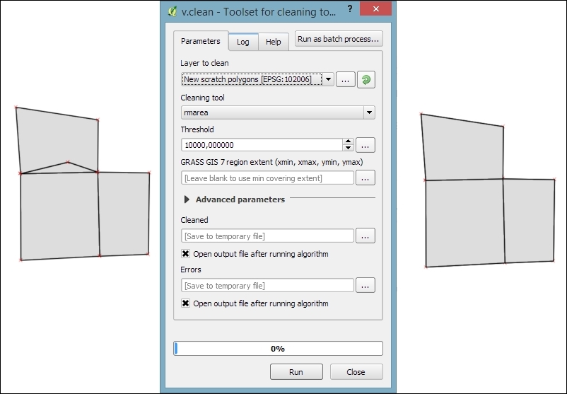
Another common issue that can be fixed automatically is so-called sliver polygons. These are small, and often quite thin, polygons that can be the result of spatial processes such as intersection operations. To get rid of these sliver polygons, we can use the v.clean tool with the Cleaning tool option set to rmarea (meaning "remove area"), which is also available through the Processing Toolbox. In the example shown in this screenshot, the Threshold value of 10000 tells the tool to remove all polygons with an area less than 10,000 square meters by merging them with the neighboring polygon with the longest common boundary:
For a thorough introduction and more details on the Processing Toolbox, refer to Chapter 4, Spatial Analysis.
In Chapter 2, Viewing Spatial Data, we saw how to view data from spatial databases. Of course, we also want to be able to add data to our databases. This is where the DB Manager plugin comes in handy. DB Manager is installed by default, and you can find it in the Database menu (if DB Manager is not visible in the Database menu, you might need to activate it in Plugin Manager).
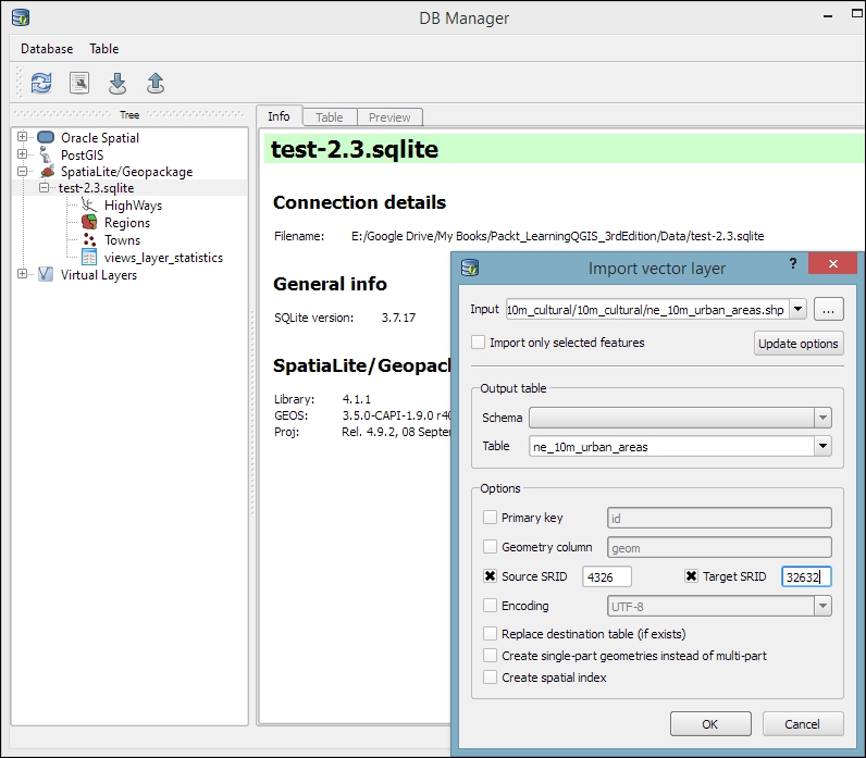
The Tree panel on the left-hand side of the DB Manager dialog lists all available database connections that have been configured so far. Since we have added a connection to the test-2.3.sqlite SpatiaLite database in Chapter 2, Viewing Spatial Data, this connection is listed in DB Manager, as shown in the next screenshot.
To add new data to this database, we just need to select the connection from the list of available connections and then go to Table | Import layer/file. This will open the Import vector layer dialog, where we can configure the import settings, such as the name of the Table we want to create as well as additional options, including the input data CRS (the Source SRID option) and table CRS (the Target SRID option). By enabling these CRS options, we can reproject data while importing it. In the example shown in the following screenshot, we import urban areas from a Shapefile and reproject the data from EPSG:4326 (WGS84) to EPSG:32632 (WGS 84 / UTM zone 32N), since this is the CRS used by the already existing tables:
A handy shortcut for importing data into databases is by directly dragging and dropping files from the main window Browser panel to a database listed in DB Manager. This even works for multiple selected files at once (hold down Ctrl on Windows/Ubuntu or cmd on Mac to select more than one file in the Browser panel). When you drop the files onto the desired database, an Import vector layer dialog will appear, where you can configure the import.
In this chapter, you learned how to create new layers from scratch. We used a selection of tools to create and edit feature geometries in different ways. Then, we went into editing attributes of single features, feature selections, and whole layers. Next, we reprojected both vector and raster layers, and you learned how to convert between different file formats. We also covered tabular data and how it can be loaded and joined to our spatial data. Furthermore, we explored the use of temporary scratch layers and discussed how to check for topological errors in our data and fix them. We finished this chapter with an example of importing new data into a database.
In the following chapter, we will put our data to good use and see how to perform different kinds of spatial analysis on raster and vector data. We will also take a closer look at the Processing Toolbox, which has made its first appearance in this chapter. You will learn how to use the tools and combine them to create automated workflows.
In this chapter, we will use QGIS to perform many typical geoprocessing and spatial analysis tasks. We will start with raster processing and analysis tasks such as clipping and terrain analysis. We will cover the essentials of converting between raster and vector formats, and then continue with common vector geoprocessing tasks, such as generating heatmaps and calculating area shares within a region. We will also use the Processing modeler to create automated geoprocessing workflows. Finally, we will finish the chapter with examples of how to use the power of spatial databases to analyze spatial data in QGIS.
Raster data, including but not limited to elevation models or remote sensing imagery, is commonly used in many analyses. The following exercises show common raster processing and analysis tasks such as clipping to a certain extent or mask, creating relief and slope rasters from digital elevation models, and using the raster calculator.
A common task in raster processing is clipping a raster with a polygon. This task is well covered by the Clipper tool located in Raster | Extraction | Clipper. This tool supports clipping to a specified extent as well as clipping using a polygon mask layer, as follows:
If we only want to clip a raster to a certain extent (the current map view extent or any other), we can also use the raster Save as... functionality, as shown in Chapter 3, Data Creation and Editing.
For a quick exercise, we will clip the hillshade raster (SR_50M_alaska_nad.tif) using the Alaska Shapefile (both from our sample data) as a mask layer. At the bottom of the window, as shown in the following screenshot, we can see the concrete gdalwarp command that QGIS uses to clip the raster. This is very useful if you also want to learn how to use
GDAL.
In Chapter 2, Viewing Spatial Data, we discussed that GDAL is one of the libraries that QGIS uses to read and process raster data. You can find the documentation of gdalwarp and all other GDAL utility programs at http://www.gdal.org/gdal_utilities.html.
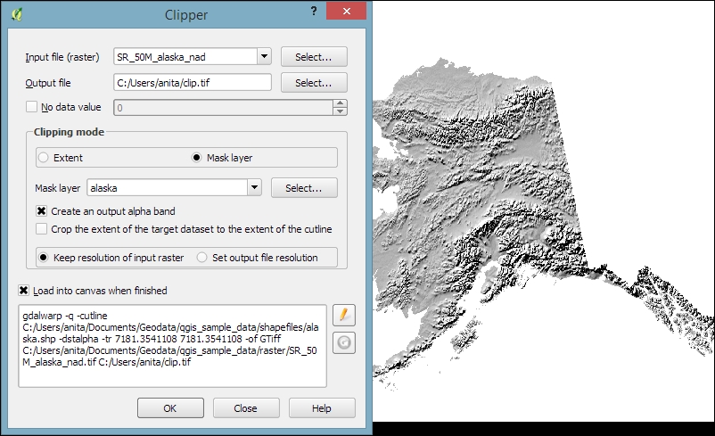
The default No data value is the no data value used in the input dataset or 0 if nothing is specified, but we can override it if necessary. Another good option is to Create an output alpha band, which will set all areas outside the mask to transparent. This will add an extra band to the output raster that will control the transparency of the rendered raster cells.
A common source of error is forgetting to add the file format extension to the Output file path (in our example, .tif for GeoTIFF). Similarly, you can get errors if you try to overwrite an existing file. In such cases, the best way to fix the error is to either choose a different filename or delete the existing file first.
The resulting layer will be loaded automatically, since we have enabled the Load into canvas when finished option. QGIS should also automatically recognize the alpha layer that we created, and the raster areas that fall outside the Alaska landmass should be transparent, as shown on the right-hand side in the previous screenshot. If, for some reason, QGIS fails to automatically recognize the alpha layer, we can enable it manually using the Transparency band option in the Transparency section of the raster layer's properties, as shown in the following screenshot. This dialog is also the right place to specify any No data value that we might want to be used:
To use terrain analysis tools, we need an elevation raster. If you don't have any at hand, you can simply download a dataset from the NASA Shuttle Radar Topography Mission (SRTM) using http://dwtkns.com/srtm/ or any of the other SRTM download services.
Raster Terrain Analysis can be used to calculate Slope, Aspect, Hillshade, Ruggedness Index, and Relief from elevation rasters. These tools are available through the Raster Terrain Analysis plugin, which comes with QGIS by default, but we have to enable it in the Plugin Manager in order to make it appear in the Raster menu, as shown in the following screenshot:
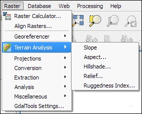
Terrain Analysis includes the following tools:
An important element in all terrain analysis tools is the Z factor. The Z factor is used if the x/y units are different from the z (elevation) unit. For example, if we try to create a relief from elevation data where x/y are in degrees and z is in meters, the resulting relief will look grossly exaggerated. The values for the z factor are as follows:
1.0370,400111,120Since the SRTM rasters are provided in WGS84 EPSG:4326, we need to use a Z factor of 111,120 in our exercise. Let's create a relief! The tool can calculate relief color ranges automatically; we just need to click on Create automatically, as shown in the following screenshot. Of course, we can still edit the elevation ranges' upper and lower bounds as well as the colors by double-clicking on the respective list entry:
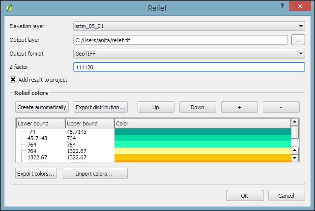
While relief maps are three-banded rasters, which are primarily used for visualization purposes, slope rasters are a common intermediate step in spatial analysis workflows. We will now create a slope raster that we can use in our example workflow through the following sections. The resulting slope raster will be loaded in grayscale automatically, as shown in this screenshot:
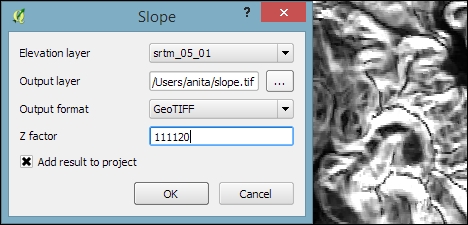
With the Raster calculator, we can create a new raster layer based on the values in one or more rasters that are loaded in the current QGIS project. To access it, go to Raster | Raster Calculator. All available raster bands are presented in a list in the top-left corner of the dialog using the raster_name@band_number format.
Continuing from our previous exercise in which we created a slope raster, we can, for example, find areas at elevations above 1,000 meters and with a slope of less than 5 degrees using the following expression:
"srtm_05_01@1" > 1000 AND "slope@1" < 5
Cells that meet both criteria of high elevation and evenness will be assigned a value of 1 in the resulting raster, while cells that fail to meet even one criterion will be set to 0. The only bigger areas with a value of 1 are found in the southern part of the raster layer. You can see a section of the resulting raster (displayed in black over the relief layer) to the right-hand side of the following screenshot:
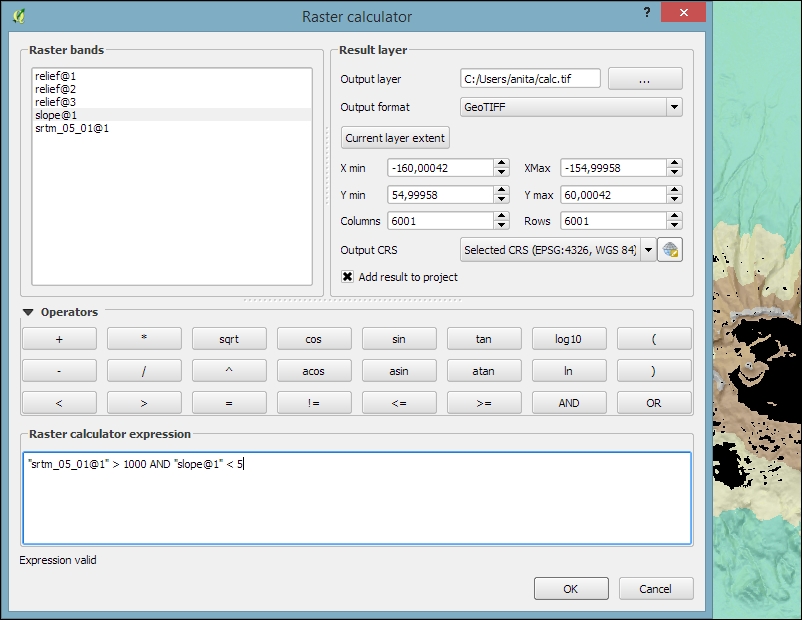
Another typical use case is reclassifying a raster. For example, we might want to reclassify the landcover.img raster in our sample data so that all areas with a landcover class from 1 to 5 get the value 100, areas from 6 to 10 get 101, and areas over 11 get a new value of 102. We will use the following code for this:
("landcover@1" > 0 AND "landcover@1" <= 6 ) * 100
+ ("landcover@1" >= 7 AND "landcover@1" <= 10 ) * 101
+ ("landcover@1" >= 11 ) * 102
The preceding raster calculator expression has three parts, each consisting of a check and a multiplication. For each cell, only one of the three checks can be true, and true is represented as 1. Therefore, if a landcover cell has a value of 4, the first check will be true and the expression will evaluate to 1*100 + 0*101 + 0*102 = 100.
Some analyses require a combination of raster and vector data. In the following exercises, we will use both raster and vector datasets to explain how to convert between these different data types, how to access layer and zonal statistics, and finally how to create a raster heatmap from points.
Tools for converting between raster and vector formats can be accessed by going to Raster | Conversion. These tools are called Rasterize (Vector to raster) and Polygonize (Raster to vector). Like the raster clipper tool that we used before, these tools are also based on GDAL and display the command at the bottom of the dialog.
Polygonize converts a raster into a polygon layer. Depending on the size of the raster, the conversion can take some time. When the process is finished, QGIS will notify us with a popup. For a quick test, we can, for example, convert the reclassified landcover raster to polygons. The resulting vector polygon layer contains multiple polygonal features with a single attribute, which we name lc; it depends on the original raster value, as shown in the following screenshot:
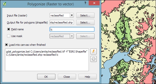
Using the
Rasterize tool is very similar to using the Polygonize tool. The only difference is that we get to specify the size of the resulting raster in pixels/cells. We can also specify the attribute field, which will provide input for the raster cell value, as shown in the next screenshot. In this case, the cat attribute of our alaska.shp dataset is rather meaningless, but you get the idea of how the tool works:
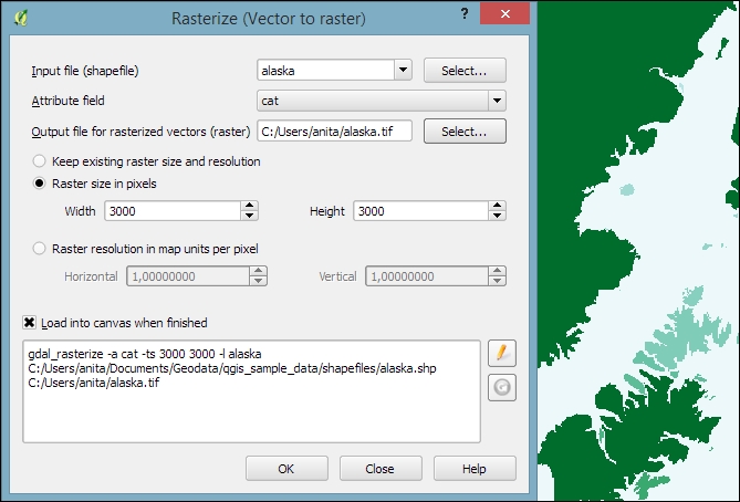
Whenever we get a new dataset, it is useful to examine the layer statistics to get an idea of the data it contains, such as the minimum and maximum values, number of features, and much more. QGIS offers a variety of tools to explore these values.
Raster layer statistics are readily available in the Layer Properties dialog, specifically in the following tabs:
landcover dataset: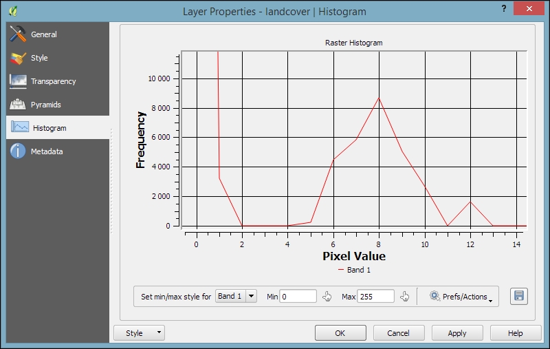
For vector layers, we can get summary statistics using two tools in Vector | Analysis Tools:
In both tools, we can easily copy the results using Ctrl + C and paste them in a text file or spreadsheet. The following image shows examples of exploring the contents of our airports sample dataset:
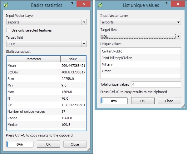
An alternative to the Basics statistics tool is the Statistics Panel, which you can activate by going to View | Panels | Statistics Panel. As shown in the following screenshot, this panel can be customized to show exactly those statistics that you are interested in:
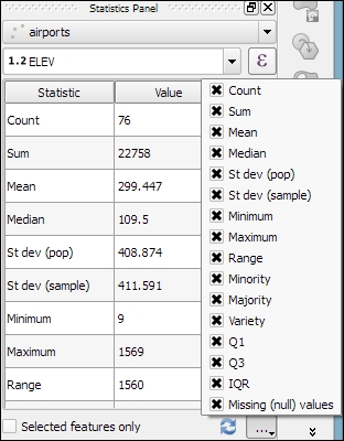
Instead of computing raster statistics for the entire layer, it is sometimes necessary to compute statistics for selected regions. This is what the Zonal statistics plugin is good for. This plugin is installed by default and can be enabled in the Plugin Manager.
For example, we can compute elevation statistics for areas around each airport using srtm_05_01.tif and airports.shp from our sample data:
10,000 feet.elev, which is short for elevation) and the Statistics to calculate (for example, Mean, Minimum, and Maximum), as shown in the following screenshot: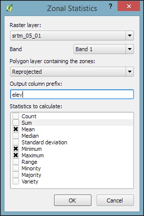
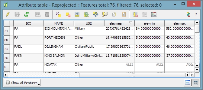
Heatmaps are great for visualizing a distribution of points. To create them, QGIS provides a simple-to-use Heatmap Plugin, which we have to activate in the Plugin Manager, and then we can access it by going to Raster | Heatmap | Heatmap. The plugin offers different Kernel shapes to choose from. The kernel is a moving window of a specific size and shape that moves over an area of points to calculate their local density. Additionally, the plugin allows us to control the output heatmap raster size in cells (using the Rows and Columns settings) as well as the cell size.
Radius determines the distance around each point at which the point will have an influence. Therefore, smaller radius values result in heatmaps that show finer and smaller details, while larger values result in smoother heatmaps with fewer details.
Additionally, Kernel shape controls the rate at which the influence of a point decreases with increasing distance from the point. The kernel shapes that are available in the Heatmap plugin are listed in the following screenshot. For example, a Triweight kernel creates smaller hotspots than the Epanechnikov kernel. For formal definitions of the kernel functions, refer to http://en.wikipedia.org/wiki/Kernel_(statistics).
The following screenshot shows us how to create a heatmap of our airports.shp sample with a kernel radius of 300,000 layer units, which in the case of our airport data is in feet:
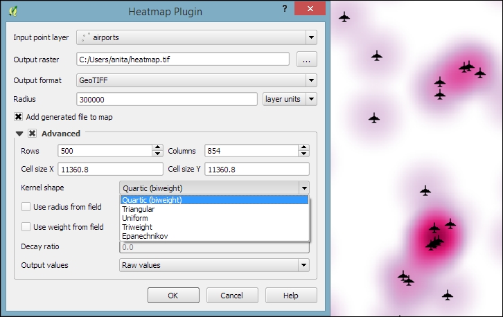
By default, the heatmap output will be rendered using the Singleband gray render type (with low raster values in black and high values in white). To change the style to something similar to what you saw in the previous screenshot, you can do the following:
When loading the raster min/max values, keep an eye on the settings. To get the actual min/max values of a raster layer, enable Min/max, Full Extent, and Actual (slower) Accuracy. If you only want the min/max values of the raster section that is currently displayed on the map, use Current Extent instead.
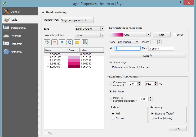
The most comprehensive set of spatial analysis tools is accessible via the Processing plugin, which we can enable in the Plugin Manager. When this plugin is enabled, we find a Processing menu, where we can activate the Toolbox, as shown in the following screenshot. In the toolbox, it is easy to find spatial analysis tools by their name thanks to the dynamic Search box at the top. This makes finding tools in the toolbox easier than in the Vector or Raster menu. Another advantage of getting accustomed to the Processing tools is that they can be automated in Python and in geoprocessing models.
In the following sections, we will cover a selection of the available geoprocessing tools and see how we can use the modeler to automate our tasks.
Finding nearest neighbors, for example, the airport nearest to a populated place, is a common task in geoprocessing. To find the nearest neighbor and create connections between input features and their nearest neighbor in another layer, we can use the Distance to nearest hub tool.
As shown in the next screenshot, we use the populated places as Source points layer and the airports as the Destination hubs layer. The Hub layer name attribute will be added to the result's attribute table to identify the nearest feature. Therefore, we select NAME to add the airport name to the populated places. There are two options for Output shape type:
It is recommended that you use Layer units as Measurement unit to avoid potential issues with wrong measurements:
It is often necessary to be able to convert between points, lines, and polygons, for example, to create lines from a series of points, or to extract the nodes of polygons and create a new point layer out of them. There are many tools that cover these different use cases. The following table provides an overview of the tools that are available in the Processing toolbox for conversion between points, lines, and polygons:
|
To points |
To lines |
To polygons | |
|---|---|---|---|
|
From points |
Points to path |
Convex hull Concave hull | |
|
From lines |
Extract nodes |
Lines to polygons Convex hull | |
|
From polygons |
Extract nodes Polygon centroids (Random points inside a polygon) |
Polygons to lines |
In general, it is easier to convert more complex representations to simpler ones (polygons to lines, polygons to points, or lines to points) than conversion in the other direction (points to lines, points to polygons, or lines to polygons). Here is a short overview of these tools:
0 (very detailed) and 1 (which is equivalent to the convex hull). The following screenshot shows a comparison between convex and concave hulls (with the threshold set to 0.3) around our airport data: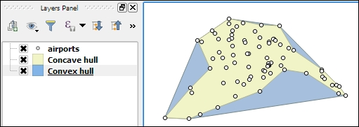
One common spatial analysis task is to identify features in the proximity of certain other features. One example would be to find all airports near rivers. Using airports.shp and majrivers.shp from our sample data, we can find airports within 5,000 feet of a river by using a combination of the Fixed distance buffer and Select by location tools. Use the search box to find the tools in the Processing Toolbox. The tool configurations for this example are shown in the following screenshot:
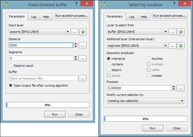
After buffering the airport point locations, the Select by location tool selects all the airport buffers that intersect a river. As a result, 14 out of the 76 airports are selected. This information is displayed in the information area at the bottom of the QGIS main window, as shown in this screenshot:
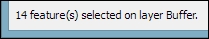
If you ever forget which settings you used or need to check whether you have used the correct input layer, you can go to Processing | History. The ALGORITHM section lists all the algorithms that we have been running as well as the used settings, as shown in the following screenshot:
The commands listed under ALGORITHM can also be used to call Processing tools from the QGIS Python console, which can be activated by going to Plugins | Python Console. The Python commands shown in the following screenshot run the buffer algorithm (processing.runalg) and load the result into the map (processing.load):
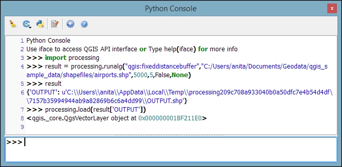
Another common task is to sample a raster at specific point locations. Using Processing, we can solve this problem with a GRASS tool called v.sample. To use GRASS tools, make sure that GRASS is installed and Processing is configured correctly under Processing | Options and configuration. On an OSGeo4W default system, the configuration will look like what is shown here:
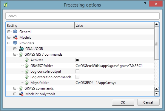
At the time of writing this book, GRASS 7.0.3RC1 is available in OSGeo4W. As shown in the previous screenshot, there is also support for the previous GRASS version 6.x, and Processing can be configured to use its algorithms as well. In the toolbox, you will find the algorithms under GRASS GIS 7 commands and GRASS commands (for GRASS 6.x).
For this exercise, let's imagine we want to sample the landcover layer at the airport locations of our sample data. All we have to do is specify the vector layer containing the sample points and the raster layer that should be sampled. For this example, we can leave all other settings at their default values, as shown in the following screenshot. The tool not only samples the raster but also compares point attributes with the sampled raster value. However, we don't need this comparison in our current example:
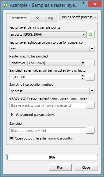
Mapping the density of points using a hexagonal grid has become quite a popular alternative to creating heatmaps. Processing offers us a fast way to create such an analysis. There is already a pre-made script called Hex grid from layer bounds, which is available through the Processing scripts collection and can be downloaded using the Get scripts from on-line scripts collection tool. As you can see in the following screenshot, you just need to enable the script by ticking the checkbox and clicking OK:
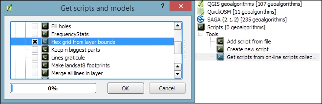
Then, we can use this script to create a hexagonal grid that covers all points in the input layer. The dataset of populated places (popp.shp), is a good sample dataset for this exercise. Once the grid is ready, we can run Count points in polygon to calculate the statistics. The number of points will be stored in the NUMPOINTS column if you use the settings shown in the following screenshot:
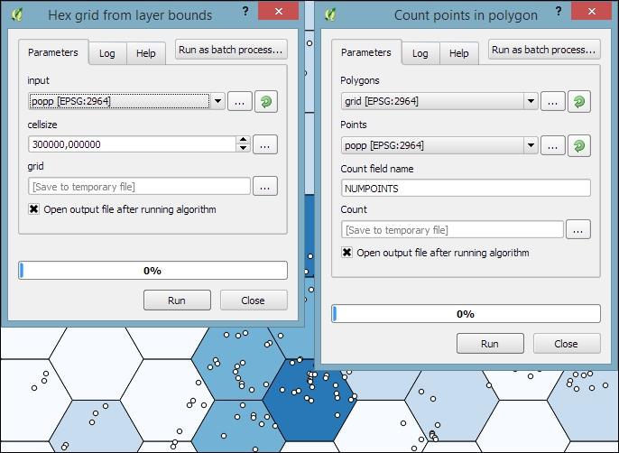
Another spatial analysis task we often encounter is calculating area shares within a certain region, for example, landcover shares along one specific river. Using majrivers.shp and trees.shp, we can calculate the share of wooded area in a 10,000-foot-wide strip of land along the Susitna River:
To select the Susitna River, we use the Select by attribute tool. After running the tool, you should see that our river of interest is selected and highlighted.
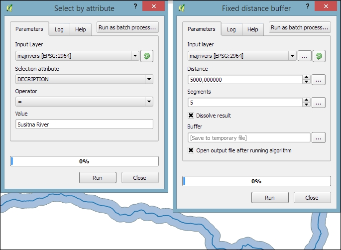
trees.shp, as shown in the following screenshot. The result of this operation is a layer that contains only those wooded areas within the river buffer.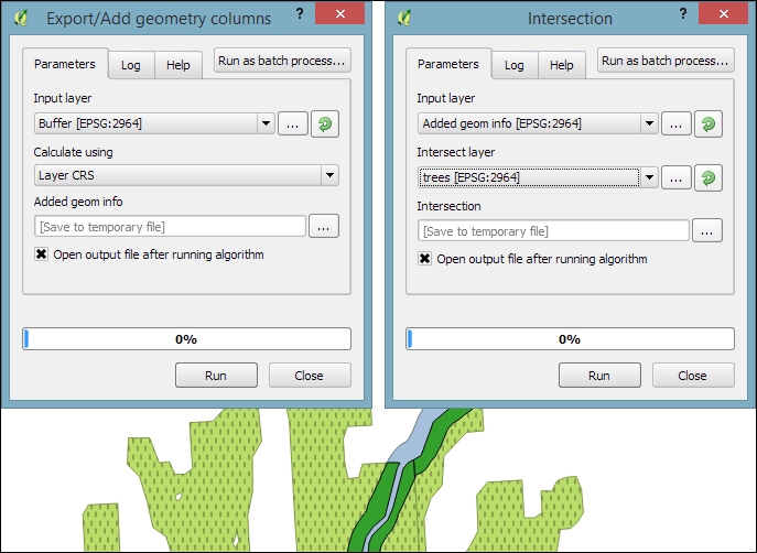
VEGDESC to only combine areas with the same vegetation in order not to mix deciduous and mixed trees.value = $geom.area()/<area> divides the area of the final polygon ($geom.area()) by the value in the area attribute (<area>), which we created earlier by running Export/Add geometry columns. As shown in the following screenshot, this calculation results in a wood share of 0.31601 for Deciduous and 0.09666 for Mixed Trees. Therefore, we can conclude that in total, 41.27 percent of the land along the Susitna River is wooded: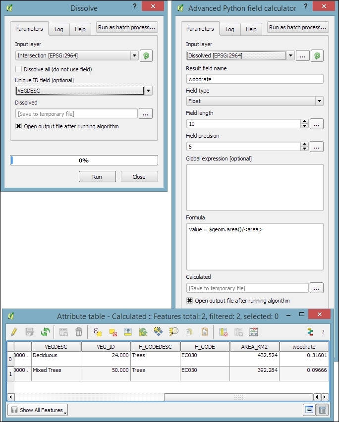
Sometimes, we want to run the same tool repeatedly but with slightly different settings. For this use case, Processing offers the Batch Processing functionality. Let's use this tool to extract some samples from our airports layer using the Random extract tool:
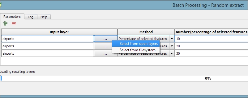
airports layer and click on OK.extract) and click on Save.extract10, extract20, and extract30, as shown in the following screenshot: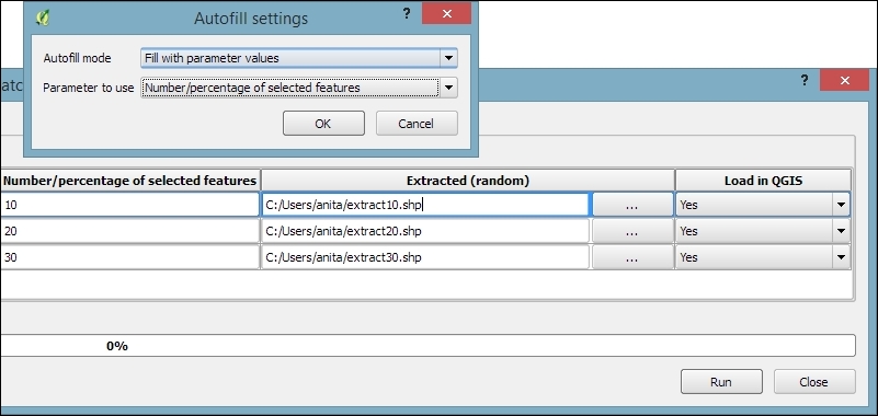
Using the graphical modeler, we can turn entire geoprocessing and analysis workflows into automated models. We can then use these models to run complex geoprocessing tasks that involve multiple different tools in one go. To create a model, we go to Processing | Graphical modeler to open the modeler, where we can select from different Inputs and Algorithms for our model.
Let's create a model that automates the creation of hexagonal heatmaps!
hex cell size instead of just size for the parameter that controls the size of the hexagonal grid cells) so that we can recognize which input is first and which is later in the model. It is also useful to restrict the Shape type field wherever appropriate. In our example, we restrict the input to Point layers. This will enable Processing to pre-filter the available layers and present us only the layers of the correct type.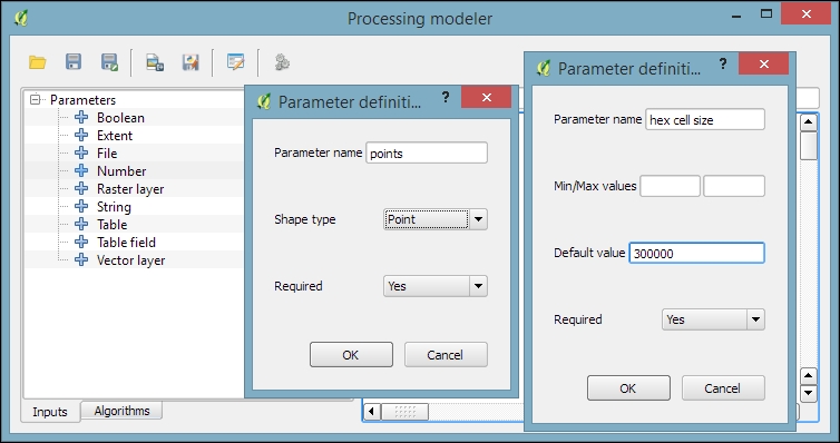
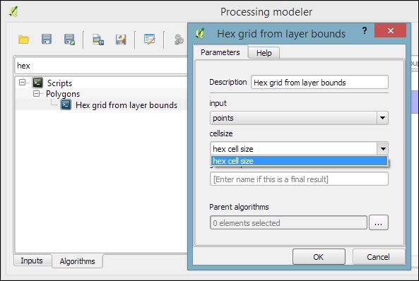
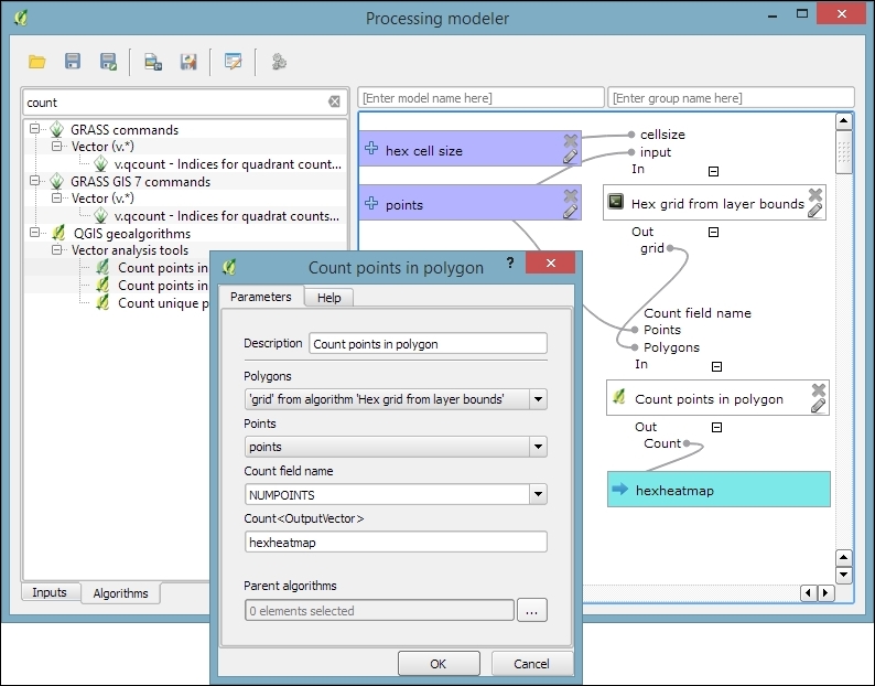
Create hexagonal heatmap) and a group name (for example, Learning QGIS). Processing will use the group name to organize all the models that we create into different toolbox groups. Once we have picked a name and group, we can save the model and then run it.Another useful feature is that we can specify a layer style that needs to be applied to the processing results automatically. This default style can be set using Edit rendering styles for outputs in the context menu of the created model in the toolbox, as shown in the following screenshot:
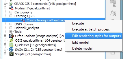
Models can easily be copied from one QGIS installation to another and shared with other users. To ensure the usability of the model, it is a good idea to write a short documentation. Processing provides a convenient Help editor; it can be accessed by clicking on the Edit model help button in the Processing modeler, as shown in this screenshot:
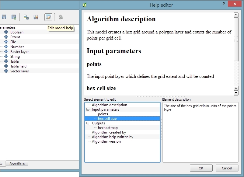
By default, the .model files are stored in your user directory. On Windows, it is C:\Users\<your_user_name>\.qgis2\processing\models, and on Linux and OS X, it is ~/.qgis2/processing/models.
You can copy these files and share them with others. To load a model from a file, use the loading tool by going to Models | Tools | Add model from file in the Processing Toolbox.
Another approach to geoprocessing is to use the functionality provided by spatial databases such as PostGIS and SpatiaLite. In the Loading data from databases section of Chapter 2, Viewing Spatial Data, we discussed how to load data from a SpatiaLite database. In this exercise, we will use SpatiaLite's built-in geoprocessing functions to perform spatial analysis directly in the database and visualize the results in QGIS. We will use the same SpatiaLite database that we downloaded in Chapter 2, Viewing Spatial Data, from www.gaia-gis.it/spatialite-2.3.1/test-2.3.zip (4 MB).
As an example, we will use SpatiaLite's spatial functions to get all highways that are within 1 km distance from the city of Firenze:
If you have followed the Loading data from databases section in Chapter 2, Viewing Spatial Data, you will see test-2.3.sqlite listed under SpatiaLite in the tree on the left-hand side of the DB Manager dialog, as shown in the next screenshot. If the database is not listed, refer to the previously mentioned section to set up the database connection.
SELECT *
FROM HighWays
WHERE PtDistWithin(
  HighWays.Geometry,
  (SELECT Geometry FROM Towns WHERE Name = 'Firenze'),
  1000
)
The SELECT Geometry FROM Towns WHERE Name = 'Firenze' subquery selects the point geometry that represents the city of Firenze. This point is then used in the PtDistWithin function to test for each highway geometry and check whether it is within a distance of 1,000 meters.
An introduction to SQL is out of the scope of this book, but you can find a thorough tutorial on using SpatiaLite at http://www.gaia-gis.it/gaia-sins/spatialite-cookbook/index.html. Additionally, to get an overview of all the spatial functionalities offered by SpatiaLite, visit http://www.gaia-gis.it/gaia-sins/spatialite-sql-4.2.0.html.
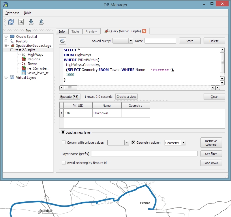
Geometry).Another thing that databases are really good at is aggregating data. For example, the following SQL query will count the number of towns per region:
SELECT Regions.Name, Regions.Geometry, count(*) as Count
FROM Regions
JOIN Towns
  ON Within(Towns.Geometry,Regions.Geometry)
GROUP BY Regions.Name
This can be used to create a new layer of regions that includes a Count attribute. This tells the number of towns in the region, as shown in this screenshot:
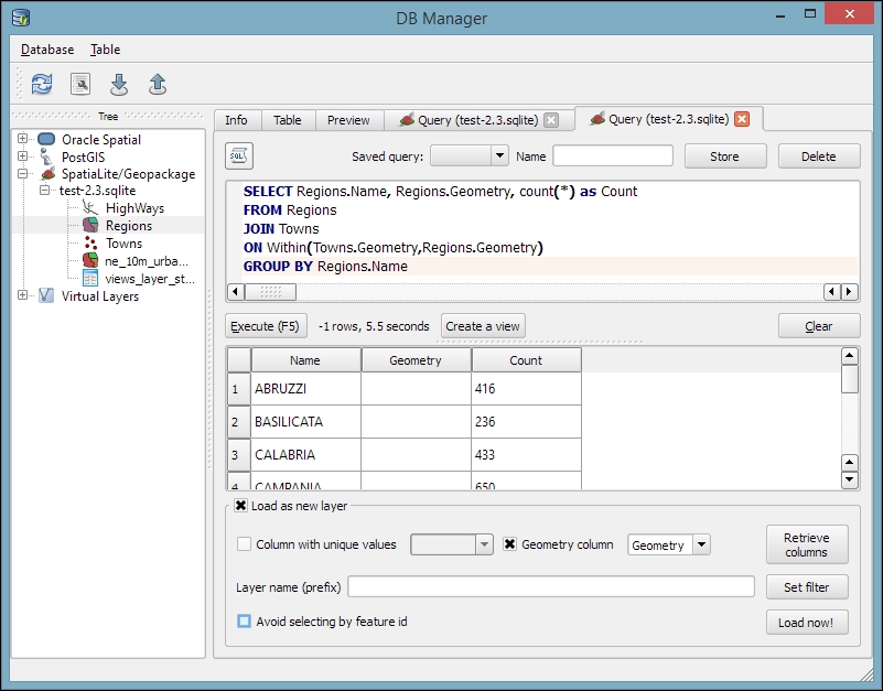
Although we have used SpatiaLite in this example, the tools and workflow presented here work just as well with PostGIS databases. It is worth noting, however, that SpatiaLite and PostGIS often use slightly different function names. Therefore, it is usually necessary to adjust the SQL queries accordingly.
In this chapter, we covered various raster and vector geoprocessing and analysis tools and how to apply them in common tasks. We saw how to use the Processing toolbox to run individual tools as well as the modeler to create complex geoprocessing models from multiple tools. Using the modeler, we can automate our workflows and increase our productivity, especially with respect to recurring tasks. Finally, we also had a quick look at how to leverage the power of spatial databases to perform spatial analysis.
In the following chapter, we will see how to bring all our knowledge together to create beautiful maps using advanced styles and print map composition features.
In this chapter, we will cover the important features that enable us to create great maps. We will first go into advanced vector styling, building on what we covered in Chapter 2, Viewing Spatial Data. Then, you will learn how to label features by following examples for point labels as well as more advanced road labels with road shield graphics. We will also cover how to tweak labels manually. Then, you will get to know the print composer and how to use it to create printable maps and map books. Finally, we will explain how to create web maps directly in QGIS to present our results online.
If you want to get an idea about what kind of map you can create using QGIS, visit the QGIS Map Showcase Flickr group at https://www.flickr.com/groups/qgis/, which is dedicated to maps created with QGIS without any further postprocessing.
This section introduces more advanced vector styling features, building on the basics that we covered in Chapter 2, Viewing Spatial Data. We will cover how to create detailed custom visualizations using the following features:
Graduated styles are great for visualizing distributions of numerical values in choropleth or similar maps. The graduated renderer supports two methods:
In our sample data, there is a climate.shp file that contains locations and mean temperature values. We can visualize this data using a graduated style by simply selecting the T_F_MEAN value for the Column field and clicking on Classify. Using the Color method, as shown in the following screenshot, we can pick a Color ramp from the corresponding drop-down list. Additionally, we can reverse the order of the colors within the color ramp using the Invert option:
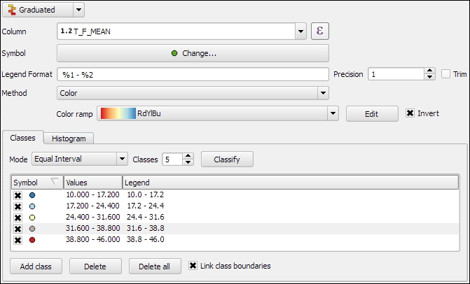
Graduated styles are available in different classification modes, as follows:
We can also manually edit the class values by double-clicking on the values in the list and changing the class bounds. A more convenient way to edit the classes is the Histogram view, as shown in the next screenshot. Switch to the Histogram tab and click on the Load values button in the bottom-right corner to enable the histogram. You can now edit the class bounds by moving the vertical lines with your mouse. You can also add new classes by adding a new vertical line, which you can do by clicking on empty space in the histogram:
Besides the symbols that are drawn on the map, another important aspect of the styling is the legend that goes with it. To customize the legend, we can define Legend Format as well as the Precision (that is, the number of decimal places) that should be displayed. In the Legend Format string, %1 will be replaced by the lower limit of the class and %2 by the upper limit. You can change this string to suit your needs, for example, to this: from %1 to %2. If you activate the Trim option, excess trailing zeros will be removed as well.
When we use the Size method, as shown in the following screenshot, the dialog changes a little, and we can now configure the desired symbol sizes:
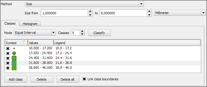
The next screenshot shows the results of using a Graduated renderer option with five classes using the Equal Interval classification mode. The left-hand side shows the results of the Color method (symbol color changes according to the T_F_MEAN value), while the right-hand side shows the results of the Size method (symbol size changes according to the T_F_MEAN value).
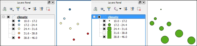
In the previous example, we used an existing color ramp to style our layer. Of course, we can also create our own color ramps. To create a new color ramp, we can scroll down the color ramp list to the New color ramp… entry. There are four different color ramp types, which we can chose from:
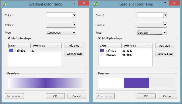
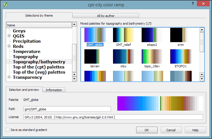
To manage all our color ramps and symbols, we can go to Settings | Style Manager. Here, we can add, delete, edit, export, or import color ramps and styles using the corresponding buttons on the right-hand side of the dialog, as shown in the following screenshot:
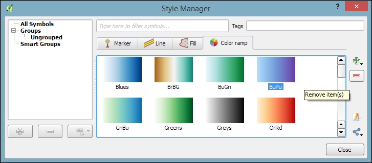
Just as graduated styles are very useful for visualizing numeric values, categorized styles are great for text values or—more generally speaking—all kinds of values on a nominal scale. A good example for this kind of data can be found in the trees.shp file in our sample data. For each area, there is a VEGDESC value that describes the type of forest found there. Using a categorized style, we can easily generate a style with one symbol for every unique value in the VEGDESC column, as shown in the following screenshot. Once we click on OK, the style is applied to our trees layer in order to visualize the distribution of different tree types in the area:
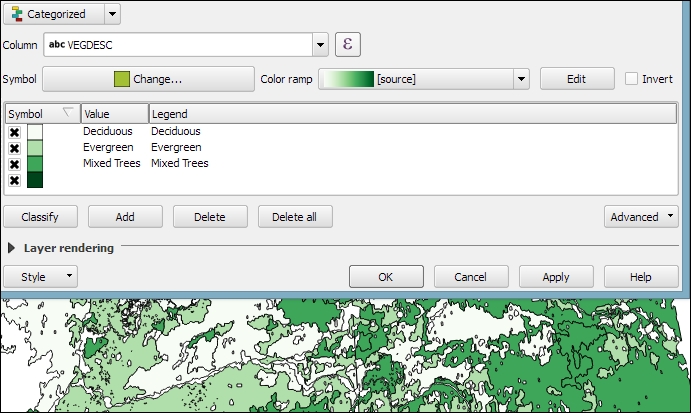
Of course, every symbol is editable and can be customized. Just double-click on the symbol preview to open the Symbol selector dialog, which allows you to select and combine different symbols.
With rule-based styles, we can create a layer style with a hierarchy of rules. Rules can take into account anything from attribute values to scale and geometry properties such as area or length. In this example, we will create a rule-based renderer for the ne_10m_roads.shp file from Natural Earth (you can download it from http://www.naturalearthdata.com/downloads/10m-cultural-vectors/roads/). As you can see here, our style will contain different road styles for major and secondary highways as well as scale-dependent styles:
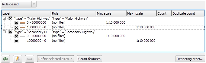
As you can see in the preceding screenshot, on the first level of rules, we distinguish between roads of "type" = 'Major Highway' and those of "type" = 'Secondary Highway'. The next level of rules handles scale-dependence. To add this second layer of rules, we can use the Refine selected rules button and select Add scales to rule. We simply input one or more scale values at which we want the rule to be split.
Note that there are no symbols specified on the first rule level. If we had symbols specified on the first level as well, the renderer would draw two symbols over each other. While this can be useful in certain cases, we don't want this effect right now. Symbols can be deactivated in Rule properties, which is accessible by double-clicking on the rule or clicking on the edit button below the rule's tree view (the button between the plus and minus buttons).
In the following screenshot, we can see the rule-based renderer and the scale rules in action. While the left-hand side shows wider white roads with grey outlines for secondary highways, the right-hand side shows the simpler symbology with thin grey lines:
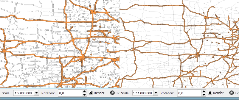
You can download the symbols used in this style by going to Settings | Style Manager, clicking on the sharing button in the bottom-right corner of the dialog, and selecting Import. The URL is https://raw.githubusercontent.com/anitagraser/QGIS-resources/master/qgis1.8/symbols/osm_symbols.xml. Paste the URL in the Location textbox, click on Fetch Symbols, then click on Select all, and finally click on Import. The dialog will look like what is shown in the following screenshot:
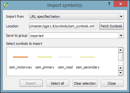
In previous examples, we created categories or rules to define how features are drawn on a map. An alternative approach is to use values from the layer attribute table to define the styling. This can be achieved using a QGIS feature called Data defined override. These overrides can be configured using the corresponding buttons next to each symbol property, as described in the following example.
In this example, we will again use the ne_10m_roads.shp file from Natural Earth. The next screenshot shows a configuration that creates a style where the line's Pen width depends on the feature's scalerank and the line Color depends on the toll attribute. To set a data-defined override for a symbol property, you need to click on the corresponding button, which is located right next to the property, and choose Edit. The following two expressions are used:
CASE WHEN toll = 1 THEN 'red' ELSE 'lightgray' END: This expression evaluates the toll value. If it is 1, the line is drawn in red; otherwise, it is drawn in gray.2.5 / scalerank: This expression computes Pen width. Since a low scale rank should be represented by a wider line, we use a division operation instead of multiplication.When data-defined overrides are active, the corresponding buttons are highlighted in yellow with an ε sign on them, as shown in the following screenshot:
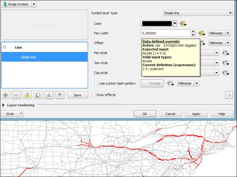
In this example, you have seen that you can specify colors using color names such as 'red', 'gold', and 'deepskyblue'. Another especially useful group of functions for data-defined styles is the Color functions. There are functions for the following
color models:
color_rgb(red, green, blue)color_hsl(hue, saturation, lightness)color_hsv(hue, saturation, value)color_cmyk(cyan, magenta, yellow, black)There are also functions for accessing the color ramps. Here are two examples of how to use these functions:
ramp_color('Reds', T_F_MEAN / 46): This expression returns a color from the Reds color ramp depending on the T_F_MEAN value. Since the second parameter has to be a value between 0 and 1, we divide the T_F_MEAN value by the maximum value, 46.color_rgba(0, 0, 180, scale_linear(T_F_JUL - T_F_JAN, 20, 70, 0, 255)): This expression computes the color depending on the difference between the July and January temperatures, T_F_JUL - T_F_JAN. The difference value is transformed into a value between 0 and 255 by the scale_linear function according to the following rule: any value up to 20 will be translated to 0, any value of 70 and above will be translated to 255, and anything in between will be interpolated linearly. Bigger difference values result in darker colors because of the higher alpha parameter value.In Chapter 4, Spatial Analysis, you learned how to create a heatmap raster. However, there is a faster, more convenient way to achieve this look if you want a heatmap only for displaying purposes (and not for further spatial analysis)—the Heatmap renderer option.
The following screenshot shows a Heatmap renderer set up for our populated places dataset, popp.shp. We can specify a color ramp that will be applied to the resulting heatmap values between 0 and the defined Maximum value. If Maximum value is set to Automatic, QGIS automatically computes the highest value in the heatmap. As in the previously discussed heatmap tool, we can define point weights as well as the kernel Radius (for an explanation of this term, check out Creating a heatmap from points in Chapter 4, Spatial Analysis). The final Rendering quality option controls the quality of the rendered output with coarse, big raster cells for the Fastest option and a fine-grained look when set to Best:
If you want to create a pseudo-3D look, for example, to style building blocks or to create a thematic map, try the 2.5D renderer. The next screenshot shows the current configuration options that include controls for the feature's Height (in layer units), the viewing Angle, and colors. Since this renderer is still being improved at the time of writing this book, you might find additional options in this dialog when you see it for yourself.
Once you have configured the 2.5D renderer to your liking, you can switch to another renderer to, for example, create classified or graduated versions of symbols.
With layer effects, we can change the way our symbols look even further. Effects can be added by enabling the Draw effects checkbox at the bottom of the symbol dialog, as shown in the following screenshot. To configure the effects, click on the Star button in the bottom-right corner of the dialog. The Effect Properties dialog offers access to a wide range of Effect types:
As you can see in the previous screenshot, we can combine multiple layer effects and they are organized in effect layers in the list in the bottom-left corner of the Effect Properties dialog.
When we create elaborate styles, we might want to save them so that we can reuse them in other projects or share them with other users. To save a style, click on the Style button in the bottom-left corner of the style dialog and go to Save Style | QGIS Layer Style File…, as shown in the following screenshot. This will create a .qml file, which you can save anywhere, copy, and share with others. Similarly, to use the .qml file, click on the Style button and select Load Style:
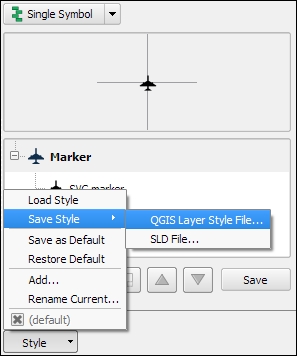
We can also save multiple different styles for one layer. For example, for our airports layer, we might want one style that displays airports using plane symbols and another style that renders a heatmap. To achieve this, we can do the following:
planes.heatmap.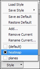
Finally, we can also access these layer styles through the layer context menu Styles entry in the Layers Panel, as shown in the following screenshot. This context menu also provides a way to copy and paste styles between layers using the Copy Style and Paste Style entries, respectively. Furthermore, this context menu provides a shortcut to quickly change the symbol color using a color wheel or by picking a color from the Recent colors section:
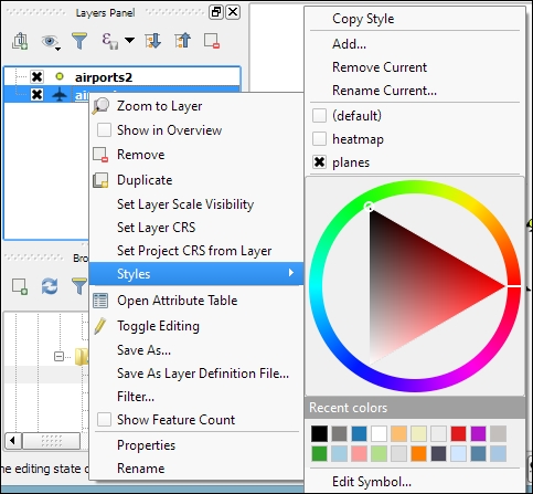
We can activate labeling by going to Layer Properties | Labels, selecting Show labels for this layer, and selecting the attribute field that we want to Label with. This is all we need to do to display labels with default settings. While default labels are great for a quick preview, we will usually want to customize labels if we create visualizations for reports or standalone maps.
Using Expressions (the button that is right beside the attribute drop-down list), we can format the label text to suit our needs. For example, the NAME field in our sample airports.shp file contains text in uppercase. To display the airport names in mixed case instead, we can set the title(NAME) expression, which will reformat the name text in title case. We can also use multiple fields to create a label, for example, combining the name and elevation in brackets using the concatenation operator (||), as follows:
title(NAME) || ' (' || "ELEV" || ')'Note the use of simple quotation marks around text, such as ' (', and double quotation marks around field names, such as "ELEV". The dialog will look like what is shown in this screenshot:
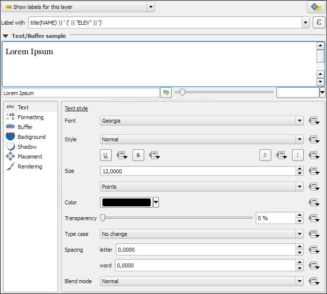
The big preview area at the top of the dialog, titled Text/Buffer sample, shows a preview of the current settings. The background color can be adjusted to test readability on different backgrounds. Under the preview area, we find the different label settings, which will be described in detail in the following sections.
In the Text section (shown in the previous screenshot), we can configure the text style. Besides changing Font, Style, Size, Color, and Transparency, we can also modify the Spacing between letters and words, as well as Blend mode, which works like the layer blending mode that we covered in Chapter 2, Viewing Spatial Data.
Note the column of buttons on the right-hand side of every setting. Clicking on these buttons allows us to create data-defined overrides, similar to those that we discussed at the beginning of the chapter when we talked about advanced vector styling. These data-defined overrides can be used, for example, to define different label colors or change the label size depending on an individual feature's attribute value or an expression.
In the Formatting section, which is shown in the following screenshot, we can enable multiline labels by specifying a Wrap on character. Additionally, we can control Line height and Alignment. Besides the typical alignment options, the QGIS labeling engine also provides a Follow label placement option, which ensures that multiline labels are aligned towards the same side as the symbol the label belongs to:
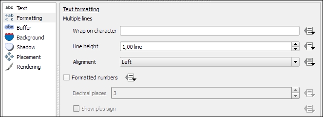
Finally, the Formatted numbers option offers a shortcut to format numerical values to a certain number of Decimal places.
An alternative to wrapping text on a certain character is the wordwrap function, available in expressions. It wraps the input string to a certain maximum or minimum number of characters. The following screenshot shows an example of wrapping a longer piece of text to a maximum of 22 characters per line:
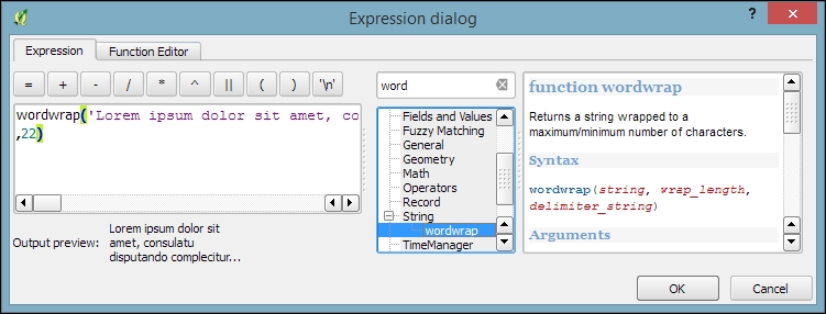
In the Buffer section, we can adjust the buffer Size, Color, and Transparency, as well as Pen join style and Blend mode. With transparency and blending, we can improve label readability without blocking out the underlying map too much, as shown in the following screenshot.
In the Background section, we can add a background shape in the form of a rectangle, square, circle, ellipsoid, or SVG. SVG backgrounds are great for creating effects such as highway shields, which we will discuss shortly.
Similarly, in the Shadow section, we can add a shadow to our labels. We can control everything from shadow direction to Color, Blur radius, Scale, and Transparency.
In the Placement section, we can configure which rules should be used to determine where the labels are placed. The available automatic label placement options depend on the layer geometry type.
For point layers, we can choose from the following:
The following screenshot shows airport labels with a 50 percent transparent Buffer and Drop Shadow, placed using Around point. The Label distance is 1 mm.
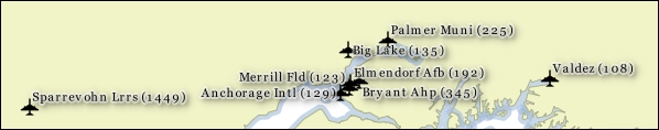
For line layers, we can choose from the following placement options:
For further fine-tuning, we can define whether the label should be placed Above line, On line, or Below line, and how far above or below it should be placed using Label distance.
For polygon layers, the placement options are as follows:
The following screenshot shows lake labels (lakes.shp) using the Multiple lines feature wrapping on the empty space character, Center Alignment, a Letter spacing of 2, and positioning using the Free option:
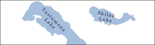
Besides automatic label placement, we also have the option to use data-defined placement to position labels exactly where we want them to be. In the labeling toolbar, we find tools for moving and rotating labels by hand. They are active and available only for layers that have set up data-defined placement for at least X and Y coordinates:
label_x, label_y, and label_rot to, for example, the airports.shp file. We don't have to enter any values in the attribute table right now. The labeling engine will check for values, and if it finds the attribute fields empty, it will simply place the labels automatically.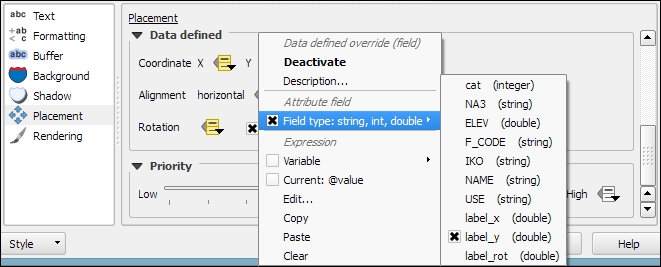
In the Rendering section, we can define Scale-based visibility limits to display labels only at certain scales and Pixel size-based visibility to hide labels for small features. Here, we can also tell the labeling engine to Show all labels for this layer (including colliding labels), which are normally hidden by default.
The following example shows labels with road shields. You can download a blank road shield SVG from http://upload.wikimedia.org/wikipedia/commons/c/c3/Blank_shield.svg. Note how only Interstates are labeled. This can be achieved using the Data defined Show label setting in the Rendering section with the following expression:
"level" = 'Interstate'
The labels are positioned using the Horizontal option (in the Placement section). Additionally, Merge connected lines to avoid duplicate labels and Suppress labeling of features smaller than are activated; for example, 5 mm helps avoid clutter by not labeling pieces of road that are shorter than 5 mm in the current scale.
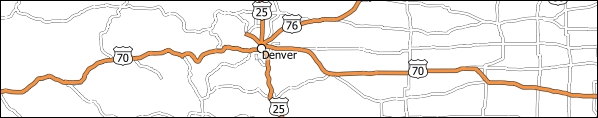
To set up the road shield, go to the Background section and select the blank shield SVG from the folder you downloaded it in. To make sure that the label fits nicely inside the shield, we additionally specify the Size type field as a buffer with a Size of 1 mm. This makes the shield a little bigger than the label it contains.
If you click on Apply now, you will notice that the labels are not centered perfectly inside the shields. To fix this, we apply a small Offset in the Y direction to the shield position, as shown in the following screenshot. Additionally, it is recommended that you deactivate any label buffers as they tend to block out parts of the shield, and we don't need them anyway.
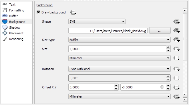
In QGIS, print maps are designed in the print composer. A QGIS project can contain multiple composers, so it makes sense to pick descriptive names. Composers are saved automatically whenever we save the project. To see a list of all the compositions available in a project, go to Project | Composer Manager.
We can open a new composer by going to Project | New Print Composer or using Ctrl + P. The composer window consists of the following:
Once you have designed your print map the way you want it, you can save the template to a composer template .qpt file by going to Composer | Save as template and reuse it in other projects by going to Composer | Add Items from Template.
In this example, we will create a basic map with a scalebar, a north arrow, some explanatory text, and a legend.
When we start the print composer, we first see the Composition panel on the right-hand side. This panel gives us access to paper options such as size, orientation, and number of pages. It is also the place to configure snapping behavior and output resolution.
First, we add a map item to the paper using the Add new map button, or by going to Layout | Add Map and drawing the map rectangle on the paper. Click on the paper, keep the mouse button pressed down, and drag the rectangle open. We can move and resize the map using the mouse and the Select/Move item tools. Alternatively, it is possible to configure all the map settings in the Item properties panel.
The Item properties panel's content depends on the currently selected composition item. If a map item is selected, we can adjust the map's Scale and Extents as well as the Position and size tool of the map item itself. At a Scale of 10,000,000 (with the CRS set to EPSG:2964), we can more or less fit a map of Alaska on an A4-size paper, as shown in the following screenshot. To move the area that is displayed within the map item and change the map scale, we can use the Move item content tool.
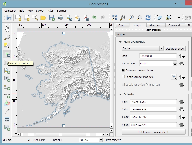
After the map looks like what we want it to, we can add a scalebar using the Add new scalebar button or by going to Layout | Add Scalebar and clicking on the map. The Item properties panel now displays the scalebar's properties, which are similar to what you can see in the next screenshot. Since we can add multiple map items to one composition, it is important to specify which map the scale belongs to. The second main property is the scalebar style, which allows us to choose between different scalebar types, or a Numeric type for a simple textual representation, such as 1:10,000,000. Using the Units properties, we can convert the map units in feet or meters to something more manageable, such as miles or kilometers. The Segments properties control the number of segments and the size of a single segment in the scalebar. Further, the properties control the scalebar's color, font, background, and so on.
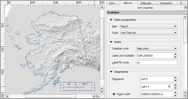
North arrows can be added to a composition using the Add Image button or by going to Layout | Add image and clicking on the paper. To use one of the SVGs that are part of the QGIS installation, open the Search directories section in the Item properties panel. It might take a while for QGIS to load the previews of the images in the SVG folder. You can pick a North arrow from the list of images or select your own image by clicking on the button next to the Image source input. More map decorations, such as arrows or rectangle, triangle, and ellipse shapes can be added using the appropriate toolbar buttons: Add Arrow, Add Rectangle, and so on.
Legends are another vital map element. We can use the Add new legend button or go to Layout | Add legend to add a default legend with entries for all currently visible map layers. Legend entries can be reorganized (sorted or added to groups), edited, and removed from the legend items' properties. Using the Wrap text on option, we can split long labels on multiple rows. The following screenshot shows the context menu that allows us to change the style (Hidden, Group, or Subgroup) of an entry. The corresponding font, size, and color are configurable in the Fonts section.
Additionally, the legend in this example is divided into three Columns, as you can see in the bottom-right section of the following screenshot. By default, QGIS tries to keep all entries of one layer in a single column, but we can override this behavior by enabling Split layers.
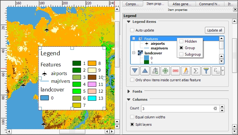
To add text to the map, we can use the Add new label button or go to Layout | Add label. Simple labels display all text using the same font. By enabling Render as HTML, we can create more elaborate labels with headers, lists, different colors, and highlights in bold or italics using normal HTML notation. Here is an example:
<h1>Alaska</h1>
<p>The name <i>"Alaska"</i> means "the mainland".</p>
<ul><li>one list entry</li><li>another entry</li></ul>
<p style="font-size:70%;">[% format_date( $now ,'yyyy-mm-dd')%]</p>
Labels can also contain expressions such as these:
[% $now %]: This expression inserts the current timestamp, which can be formatted using the format_date function, as shown in the following screenshot[% $page %] of [% $numpages %]: This expression can be used to insert page numbers in compositions with multiple pages
Other common features of maps are grids and frames. Every map item can have one or more grids. Click on the + button in the Grids section to add a grid. The Interval and Offset values have to be specified in map units. We can choose between the following Grid types:
For Grid frame, we can select from the following Frame styles:
Using Draw coordinates, we can label the grid with the corresponding coordinates. The labels can be aligned horizontally or vertically and placed inside or outside the frame, as shown here:
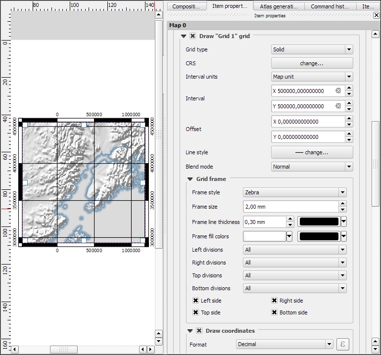
Maps that show an area close up are often accompanied by a second map that tells the reader where the area is located in a larger context. To create such an overview map, we add a second map item and an overview by clicking on the + button in the Overviews section. By setting the Map frame, we can define which detail map's extent should be highlighted. By clicking on the + button again, we can add more map frames to the overview map. The following screenshot shows an example with two detail maps both of which are added to an overview map. To distinguish between the two maps, the overview highlights are color-coded (by changing the overview Frame style) to match the colors of the frames of the detail maps.
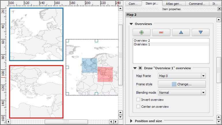
Every map item in a composition can display a different combination of layers. Generally, map items in a composer are synced with the map in the main QGIS window. So, if we turn a layer off in the main window, it is removed from the print composer map as well. However, we can stop this automatic synchronization by enabling Lock layers for a map item in the map item's properties.
To insert additional details into the map, the composer also offers the possibility of adding an attribute table to the composition using the Add attribute table button or by going to Layout | Add attribute table. By enabling Show only features visible within a map, we can filter the table and display only the relevant results. Additional filter expressions can be set using the Filter with option. Sorting (by name for example, as shown in the following screenshot) and renaming of columns is possible via the Attributes button. To customize the header row with bold and centered text, go to the Fonts and text styling section and change the Table heading settings.
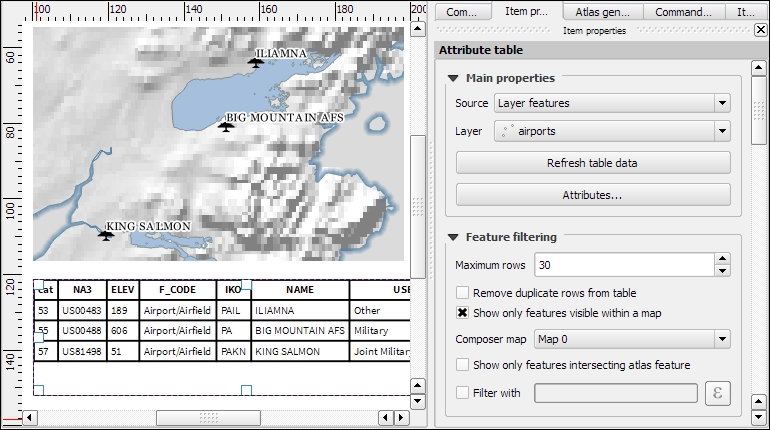
Even more advanced content can be added using the Add html frame button. We can point the item's URL reference to any HTML page on our local machines or online, and the content (text and images as displayed in a web browser) will be displayed on the composer page.
With the print composer's Atlas feature, we can create a series of maps using one print composition. The tool will create one output (which can be image files, PDFs, or multiple pages in one PDF) for every feature in the so-called Coverage layer.
Atlas can control and update multiple map items within one composition. To enable Atlas for a map item, we have to enable the Controlled by atlas option in the Item properties of the map item. When we use the Fixed scale option in the Controlled by atlas section, all maps will be rendered using the same scale. If we need a more flexible output, we can switch to the Margin around feature option instead, which zooms to every Coverage layer feature and renders it in addition to the specified margin surrounding area.
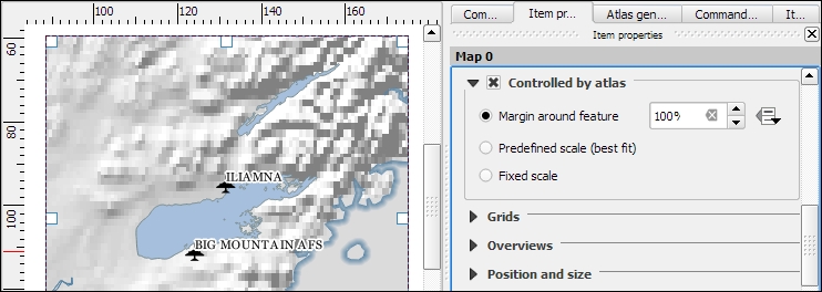
To finish the configuration, we switch to the Atlas generation panel. As mentioned before, Atlas will create one map for every feature in the layer configured in the Coverage layer dropdown. Features in the coverage layer can be displayed like regular features or hidden by enabling Hidden coverage layer. Adding an expression to the Feature filtering option or enabling the Sort by option makes it possible to further fine-tune the results. The Output field can be one image or PDF for each coverage layer feature, or you can create a multipage PDF by enabling Single file export when possible before going to Composer | Export as PDF.
Once these configurations are finished, we can preview the map series by enabling the Preview Atlas button, which you can see in the top-left corner of the following screenshot. The arrow buttons next to the preview button are used to navigate between the Atlas maps.
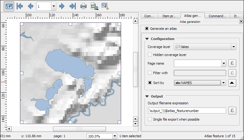
Besides print maps, web maps are another popular way of publishing maps. In this section, we will use different QGIS plugins to create different types of web map.
To create web maps from within QGIS, we can use the qgis2web plugin, which we have to install using the Plugin Manager. Once it is installed, go to Web | qgis2web | Create web map to start it. qgis2web supports the two most popular open source web mapping libraries: OpenLayers 3, and Leaflet.
The following screenshot shows an example of our airports dataset. In this example, we are using the Leaflet library (as configured in the bottom-left corner of the following screenshot) because at the time of writing this book, only Leaflet supports SVG markers:
When you are happy with the configuration, click on the Export button. This will save the web map at the location specified as the Export folder and open the resulting web map in your web browser. You can copy the contents in the Export folder to a web server to publish the map.
Another popular way to share maps on the Web is map tiles. These are basically just collections of images. These image tiles are typically 256 × 256 pixels and are placed side by side in order to create an illusion of a very large, seamless map image. Each tile has a z coordinate that describes its zoom level and x and y coordinates that describe its position within a square grid for that zoom level. On zoom level 0 (z0), the whole world fits in one tile. From there on, each consecutive zoom level is related to the previous one by a power of 4. This means z0 contains 1 tile, z1 contains 4 tiles, and z2 contains 16 tiles, and so on.
In QGIS, we can use the QTiles plugin, which has to be installed using the Plugin Manager, to create map tiles for our project. Once it is installed, you can go to Plugins | QTiles to start it. The following screenshot shows the plugin dialog where we can configure the Output location, the Extent of the map that we want to export as tiles, as well as the Zoom levels we want to create tiles for.
When you click on OK, the plugin will create a .zip file containing all tiles. Using map tiles in web mapping libraries is out of the scope of this book. Please refer to the documentation of your web mapping library for instructions on how to embed the tiles. If you are using Leaflet, for example, you can refer to https://switch2osm.org/using-tiles/getting-started-with-leaflet for detailed instructions.
To create stunning 3D web maps, we need the Qgis2threejs plugin, which we can install using the Plugin Manager.
For example, we can use our srtm_05_01.tif elevation dataset to create a 3D view of that part of Alaska. The following screenshot shows the configuration of DEM Layer in the Qgis2threejs dialog. By selecting Display type as Map canvas image, we furthermore define that the current map image (which is shown on the right-hand side of the dialog) will be draped over the 3D surface:
Besides creating a 3D surface, this plugin can also label features. For example, we can add our airports and label them with their names, as shown in the next screenshot. By setting Label height to Height from point, we let the plugin determine automatically where to place the label, but of course, you can manually override this by changing to Fixed value or one of the feature attributes.
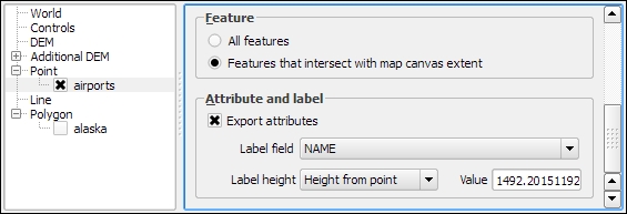
If you click on Run now, the plugin will create the export and open the 3D map in your web browser. On the first try, it is quite likely that the surface looks too flat. Luckily, this can be changed easily by adjusting the Vertical exaggeration setting in the World section of the plugin configuration. The following example was created with a Vertical exaggeration of 10:
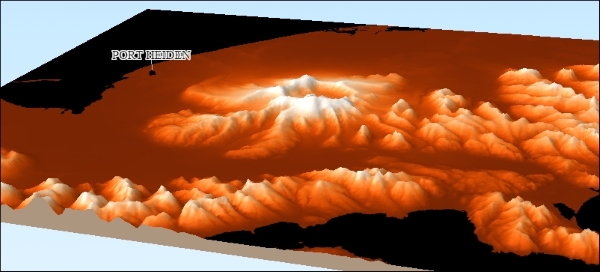
Qgis2threejs exports all files to the location specified in the Output HTML file path. You can copy the contents in that folder on a web server to publish the map.
In this chapter, we took a closer look at how we can create more complex maps using advanced vector layer styles, such as categorized or rule-based styles. We also covered the automatic and manual feature labeling options available in QGIS. This chapter also showed you how to create printable maps using the print composer and introduced the Atlas functionality for creating map books. Finally, we created web maps, which we can publish online.
Congratulations! In the chapters so far, you have learned how to install and use QGIS to create, edit, and analyze spatial data and how to present it in an effective manner. In the following and final chapter, we will take a look at expanding QGIS functionality using Python.
This chapter is an introduction to scripting QGIS with Python. Of course, a full-blown Python tutorial would be out of scope for this book. The examples here therefore assume a minimum proficiency of working with Python. Python is a very accessible programming language even if you are just getting started, and it has gained a lot of popularity in both the open source and proprietary GIS world, for example, ESRI's ArcPy or PyQGIS. QGIS currently supports Python 2.7, but there are plans to support Python 3 in the upcoming QGIS 3.x series. We will start with an introduction to actions and then move on to the QGIS Python Console, before we go into more advanced development of custom tools for the Processing Toolbox and an explanation of how to create our own plugins.
Actions are a convenient way of adding custom functionality to QGIS. Actions are created for specific layers, for example, our populated places dataset, popp.shp. Therefore, to create actions, we go to Layer Properties | Actions. There are different types of actions, such as the following:
.pdf files or your browser for websitesClick on the Add default actions button on the right-hand side of the dialog to add some example actions to your popp layer. This is really handy to get started with actions. For example, the Python action called Selected field's value will display the specified attribute's value when we use the action tool. All that we need to do before we can give this action a try is update it so that it accesses a valid attribute of our layer. For example, we can make it display the popp layer's TYPE attribute value in a message box, as shown in the next screenshot:
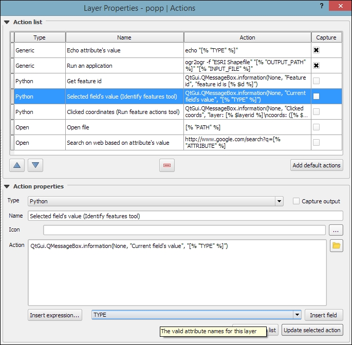
To use this action, close the Layer Properties dialog and click on the drop-down arrow next to the Run Feature Action button. This will expand the list of available layer actions, as shown in the following screenshot:
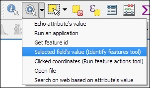
Click on the Selected field's value entry and then click on a layer feature. This will open a pop-up dialog in which the action will output the feature's TYPE value. Of course, we can also make this action output more information, for example, by extending it to this:
QtGui.QMessageBox.information(None, "Current field's value", "Type: [% "TYPE" %] \n[% "F_CODEDESC" %]")
This will display the TYPE value on the first line and the F_CODEDESC value on the second line.
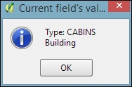
To open files directly from within QGIS, we use the Open actions. If you added the default actions in the previous exercise, your layer will already have an Open file action. The action is as simple as [% "PATH" %] for opening the file path specified in the layer's path attribute. Since none of our sample datasets contain a path attribute, we'll add one now to test this feature. Check out Chapter 3, Data Creation and Editing, if you need to know the details of how to add a new attribute. For example, the paths added in the following screenshot will open the default image viewer and PDF viewer application, respectively:

While the previous example uses absolute paths stored in the attributes, you can also use relative paths by changing the action code so that it completes the partial path stored in the attribute value; for example, you can use C:\temp\[% "TYPE" %].png to open .png files that are named according to the TYPE attribute values.
Another type of useful Open action is opening the web browser and accessing certain websites. For example, consider this action:
http://www.google.com/search?q=[% "TYPE" %]
It will open your default web browser and search for the TYPE value using Google, and this action:.
https://en.wikipedia.org/w/index.php?search=[% "TYPE" %]
will search on Wikipedia.
The most direct way to interact with the QGIS API (short for Application Programming Interface) is through the Python Console, which can be opened by going to Plugins | Python Console. As you can see in the following screenshot, the Python Console is displayed within a new panel below the map:
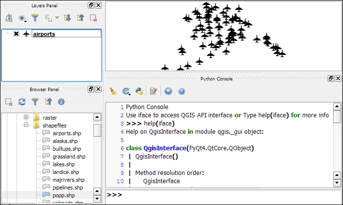
Our access point for interaction with the application, project, and data is the iface object. To get a list of all the functions available for iface, type help(iface). Alternatively, this information is available online in the API documentation at http://qgis.org/api/classQgisInterface.html.
One of the first things we will want to do is to load some data. For example, to load a vector layer, we use the addVectorLayer() function of iface:
v_layer = iface.addVectorLayer('C:/Users/anita/Documents/Geodata/qgis_sample_data/shapefiles/airports.shp','airports','ogr')When we execute this command, airports.shp will be loaded using the ogr driver and added to the map under the layer name of airports. Additionally, this function returns the created layer object. Using this layer object—which we stored in v_layer—we can access vector layer functions, such as name(), which returns the layer name and is displayed in the Layers list:
v_layer.name()
This is the output:
u'airports'
Of course, the next logical step is to look at the layer's features. The number of features can be accessed using featureCount():
v_layer.featureCount()
Here is the output:
76L
This shows us that the airport layer contains 76 features. The L in the end shows that it's a numerical value of the long type. In our next step, we will access these features. This is possible using the getFeatures() function, which returns a QgsFeatureIterator object. With a simple for loop, we can then print the attributes() of all features in our layer:
my_features = v_layer.getFeatures()
for feature in my_features:
    print feature.attributes()
This is the output:
[1, u'US00157', 78.0, u'Airport/Airfield', u'PA', u'NOATAK' ...
[2, u'US00229', 264.0, u'Airport/Airfield', u'PA', u'AMBLER'...
[3, u'US00186', 585.0, u'Airport/Airfield', u'PABT', u'BETTL...
...
You might have noticed that attributes() shows us the attribute values, but we don't know the field names yet. To get the field names, we use this code:
for field in v_layer.fields():
    print field.name()
The output is as follows:
ID
fk_region
ELEV
NAME
USE
Once we know the field names, we can access specific feature attributes, for example, NAME:
for feature in v_layer.getFeatures():
    print feature.attribute('NAME')
This is the output:
NOATAK
AMBLER
BETTLES
...
A quick solution to, for example, sum up the elevation values is as follows:
sum([feature.attribute('ELEV') for feature in v_layer.getFeatures()])Here is the output:
22758.0
In the previous example, we took advantage of the fact that Python allows us to create a list by writing a for loop inside square brackets. This is called
list comprehension, and you can read more about it at https://docs.python.org/2/tutorial/datastructures.html#list-comprehensions.
Loading raster data is very similar to loading vector data and is done using addRasterLayer():
r_layer = iface.addRasterLayer('C:/Users/anita/Documents/Geodata/qgis_sample_data/raster/SR_50M_alaska_nad.tif','hillshade')
r_layer.name()
The following is the output:
u'hillshade'
To get the raster layer's size in pixels we can use the width() and height() functions, like this:
r_layer.width(), r_layer.height()
Here is the output:
(1754, 1394)
If we want to know more about the raster values, we use the layer's data provider object, which provides access to the raster band statistics. It's worth noting that we have to use bandStatistics(1) instead of bandStatistics(0) to access the statistics of a single-band raster, such as our hillshade layer (for example, for the maximum value):
r_layer.dataProvider().bandStatistics(1).maximumValue
The output is as follows:
251.0
Other values that can be accessed like this are minimumValue, range, stdDev, and sum. For a full list, use this line:
help(r_layer.dataProvider().bandStatistics(1))
Since we now know how to load data, we can continue to style the layers. The simplest option is to load a premade style (a .qml file):
v_layer.loadNamedStyle('C:/temp/planes.qml')
v_layer.triggerRepaint()
Make sure that you call triggerRepaint() to ensure that the map is redrawn to reflect your changes.
You can create planes.qml by saving the airport style you created in Chapter 2, Viewing Spatial Data (by going to Layer Properties | Style | Save Style | QGIS Layer Style File), or use any other style you like.
Of course, we can also create a style in code. Let's take a look at a basic single symbol renderer. We create a simple symbol with one layer, for example, a yellow diamond:
from PyQt4.QtGui import QColor
symbol = QgsMarkerSymbolV2()
symbol.symbolLayer(0).setName('diamond')
symbol.symbolLayer(0).setSize(10)
symbol.symbolLayer(0).setColor(QColor('#ffff00'))
v_layer.rendererV2().setSymbol(symbol)
v_layer.triggerRepaint()
A much more advanced approach is to create a rule-based renderer. We discussed the basics of rule-based renderers in Chapter 5, Creating Great Maps. The following example creates two rules: one for civil-use airports and one for all other airports. Due to the length of this script, I recommend that you use the Python Console editor, which you can open by clicking on the Show editor button, as shown in the following screenshot:
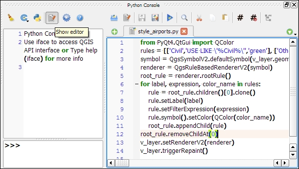
Each rule in this example has a name, a filter expression, and a symbol color. Note how the rules are appended to the renderer's root rule:
from PyQt4.QtGui import QColor
rules = [['Civil','USE LIKE \'%Civil%\'','green'], ['Other','USE NOT LIKE \'%Civil%\'','red']]
symbol = QgsSymbolV2.defaultSymbol(v_layer.geometryType())
renderer = QgsRuleBasedRendererV2(symbol)
root_rule = renderer.rootRule()
for label, expression, color_name in rules:
    rule = root_rule.children()[0].clone()
    rule.setLabel(label)
    rule.setFilterExpression(expression)
    rule.symbol().setColor(QColor(color_name))
    root_rule.appendChild(rule)
root_rule.removeChildAt(0)
v_layer.setRendererV2(renderer)
v_layer.triggerRepaint()
To run the script, click on the Run script button at the bottom of the editor toolbar.
If you are interested in reading more about styling vector layers, I recommend Joshua Arnott's post at http://snorf.net/blog/2014/03/04/symbology-of-vector-layers-in-qgis-python-plugins/.
To filter vector layer features programmatically, we can specify a subset string. This is the same as defining a Feature subset query in in the Layer Properties | General section. For example, we can choose to display airports only if their names start with an A:
v_layer.setSubsetString("NAME LIKE 'A%'")To remove the filter, just set an empty subset string:
v_layer.setSubsetString("")A great way to create a temporary vector layer is by using so-called memory layers. Memory layers are a good option for temporary analysis output or visualizations. They are the scripting equivalent of temporary scratch layers, which we used in Chapter 3, Data Creation and Editing. Like temporary scratch layers, memory layers exist within a QGIS session and are destroyed when QGIS is closed. In the following example, we create a memory layer and add a polygon feature to it.
Basically, a memory layer is a QgsVectorLayer like any other. However, the provider (the third parameter) is not 'ogr' as in the previous example of loading a file, but 'memory'. Instead of a file path, the first parameter is a definition string that specifies the geometry type, the CRS, and the attribute table fields (in this case, one integer field called MYNUM and one string field called MYTXT):
mem_layer = QgsVectorLayer("Polygon?crs=epsg:4326&field=MYNUM:integer&field=MYTXT:string", "temp_layer", "memory")
if not mem_layer.isValid():
    raise Exception("Failed to create memory layer")
Once we have created the QgsVectorLayer object, we can start adding features to its data provider:
mem_layer_provider = mem_layer.dataProvider()
my_polygon = QgsFeature()
my_polygon.setGeometry(QgsGeometry.fromRect(QgsRectangle(16,48,17,49)))
my_polygon.setAttributes([10,"hello world"])
mem_layer_provider.addFeatures([my_polygon])
QgsMapLayerRegistry.instance().addMapLayer(mem_layer)
The simplest option for saving the current map is by using the scripting equivalent of Save as Image (under Project). This will export the current map to an image file in the same resolution as the map area in the QGIS application window:
iface.mapCanvas().saveAsImage('C:/temp/simple_export.png')If we want more control over the size and resolution of the exported image, we need a few more lines of code. The following example shows how we can create our own QgsMapRendererCustomPainterJob object and configure to our own liking using custom QgsMapSettings for size (width and height), resolution (dpi), map extent, and map layers:
from PyQt4.QtGui import QImage, QPainter
from PyQt4.QtCore import QSize
# configure the output image
width = 800
height = 600
dpi = 92
img = QImage(QSize(width, height), QImage.Format_RGB32)
img.setDotsPerMeterX(dpi / 25.4 * 1000)
img.setDotsPerMeterY(dpi / 25.4 * 1000)
# get the map layers and extent
layers = [ layer.id() for layer in iface.legendInterface().layers() ]
extent = iface.mapCanvas().extent()
# configure map settings for export
mapSettings = QgsMapSettings()
mapSettings.setMapUnits(0)
mapSettings.setExtent(extent)
mapSettings.setOutputDpi(dpi)
mapSettings.setOutputSize(QSize(width, height))
mapSettings.setLayers(layers)
mapSettings.setFlags(QgsMapSettings.Antialiasing | QgsMapSettings.UseAdvancedEffects | QgsMapSettings.ForceVectorOutput | QgsMapSettings.DrawLabeling)
# configure and run painter
p = QPainter()
p.begin(img)
mapRenderer = QgsMapRendererCustomPainterJob(mapSettings, p)
mapRenderer.start()
mapRenderer.waitForFinished()
p.end()
# save the result
img.save("C:/temp/custom_export.png","png")
In Chapter 4, Spatial Analysis, we used the tools of Processing Toolbox to analyze our data, but we are not limited to these tools. We can expand processing with our own scripts. The advantages of processing scripts over normal Python scripts, such as the ones we saw in the previous section, are as follows:
As the following screenshot shows, the Scripts section is initially empty, except for some Tools to add and create new scripts:
We will create our first simple script; which fetches some layer information. To get started, double-click on the Create new script entry in Scripts | Tools. This opens an empty Script editor dialog. The following screenshot shows the Script editor with a short script that prints the input layer's name on the Python Console:
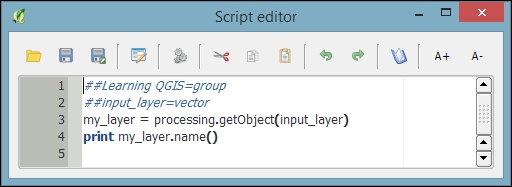
The first line means our script will be put into the Learning QGIS group of scripts, as shown in the following screenshot. The double hashes (##) are Processing syntax and they indicate that the line contains Processing-specific information rather than Python code. The script name is created from the filename you chose when you saved the script. For this example, I have saved the script as my_first_script.py. The second line defines the script input, a vector layer in this case. On the following line, we use Processing's getObject() function to get access to the input layer object, and finally the layer name is printed on the Python Console.
You can run the script either directly from within the editor by clicking on the Run algorithm button, or by double-clicking on the entry in the Processing Toolbox. If you want to change the code, use Edit script from the entry context menu, as shown in this screenshot:
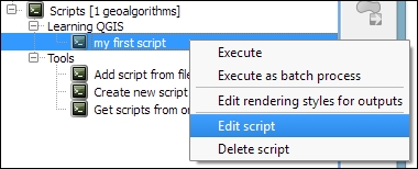
A good way of learning how to write custom scripts for Processing is to take a look at existing scripts, for example, at https://github.com/qgis/QGIS-Processing/tree/master/scripts. This is the official script repository, where you can also download scripts using the built-in Get scripts from on-line scripts collection tool in the Processing Toolbox.
Of course, in most cases, we don't want to just output something on the Python Console. That is why the following example shows how to create a vector layer. More specifically, the script creates square polygons around the points in the input layer. The numeric size input parameter controls the size of the squares in the output vector layer. The default size that will be displayed in the automatically generated dialog is set to 1000000:
##Learning QGIS=group
##input_layer=vector
##size=number 1000000
##squares=output vector
from qgis.core import *
from processing.tools.vector import VectorWriter
# get the input layer and its fields
my_layer = processing.getObject(input_layer)
fields = my_layer.dataProvider().fields()
# create the output vector writer with the same fields
writer = VectorWriter(squares, None, fields, QGis.WKBPolygon, my_layer.crs())
# create output features
feat = QgsFeature()
for input_feature in my_layer.getFeatures():
    # copy attributes from the input point feature
    attributes = input_feature.attributes()
    feat.setAttributes(attributes)
    # create square polygons
    point = input_feature.geometry().asPoint()
    xmin = point.x() - size/2
    ymin = point.y() - size/2
    square = QgsRectangle(xmin,ymin,xmin+size,ymin+size)
    feat.setGeometry(QgsGeometry.fromRect(square))
    writer.addFeature(feat)
del writer
In this script, we use a VectorWriter to write the output vector layer. The parameters for creating a VectorWriter object are fileName, encoding, fields, geometryType, and crs.
Note how we use the fields of the input layer (my_layer.dataProvider().fields()) to create the VectorWriter. This ensures that the output layer has the same fields (attribute table columns) as the input layer. Similarly, for each feature in the input layer, we copy its attribute values (input_feature.attributes()) to the corresponding output feature.
After running the script, the resulting layer will be loaded into QGIS and listed using the output parameter name; in this case, the layer is called squares. The following screenshot shows the automatically generated input dialog as well as the output of the script when applied to the airports from our sample dataset:
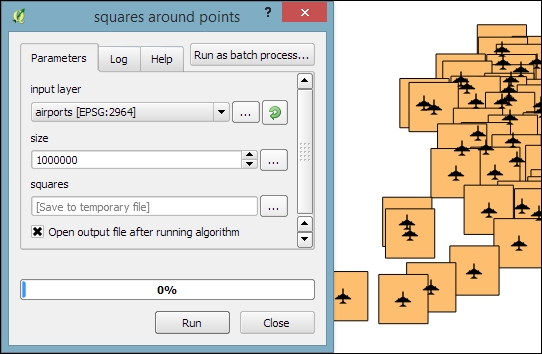
Especially when executing complex scripts that take a while to finish, it is good practice to display the progress of the script execution in a progress bar. To add a progress bar to the previous script, we can add the following lines of code before and inside the for loop that loops through the input features:
i = 0
n = my_layer.featureCount()
for input_feature in my_layer.getFeatures():
    progress.setPercentage(int(100*i/n))
i+=1When you want to implement interactive tools or very specific graphical user interfaces, it is time to look into plugin development. In the previous exercises, we introduced the QGIS Python API. Therefore, we can now focus on the necessary steps to get our first QGIS plugin started. The great thing about creating plugins for QGIS is that there is a plugin for this! It's called Plugin Builder. And while you are at it, also install Plugin Reloader, which is very useful for plugin developers. Because it lets you quickly reload your plugin without having to restart QGIS every time you make changes to the code. When you have installed both plugins, your Plugins toolbar will look like this:
Before we can get started, we also need to install
Qt Designer, which is the application we will use to design the user interface. If you are using Windows, I recommend
WinPython (http://winpython.github.io/) version 2.7.10.3 (the latest version with Python 2.7 at the time of writing this book), which provides Qt Designer and
Spyder (an integrated development environment for Python). On Ubuntu, you can install Qt Designer using sudo apt-get install qt4-designer. On Mac, you can get the Qt Creator installer (which includes Qt Designer) from http://qt-project.org/downloads.
Plugin Builder will create all the files that we need for our plugin. To create a plugin template, follow these steps:
When you hover your mouse over the input fields in the Plugin Builder dialog, it displays help information, as shown in the following screenshot:
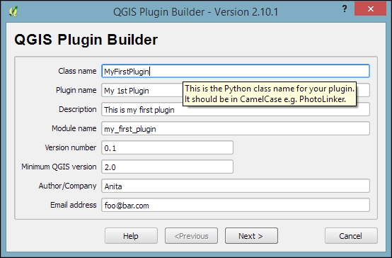
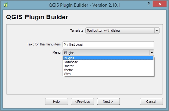
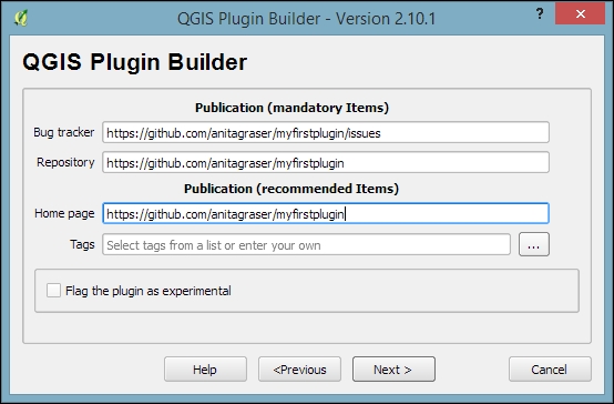
~\.qgis2\python\plugins on Windows, or ~/.qgis2/python/plugins on Linux and Mac.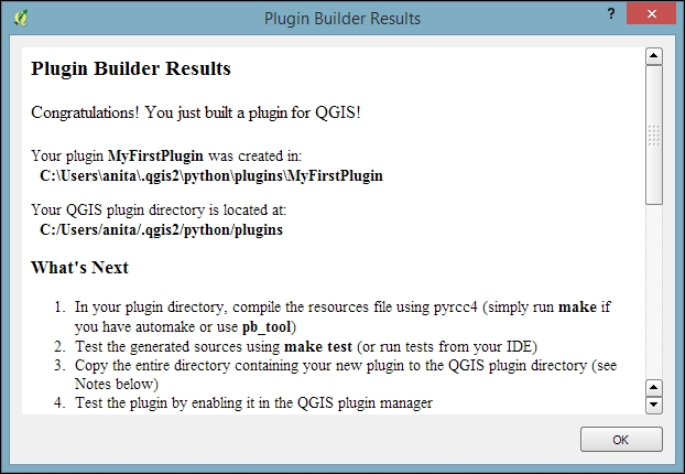
One thing we still have to do is prepare the icon for the plugin toolbar. This requires us to compile the resources.qrc file, which Plugin Builder created automatically, to turn the icon into usable Python code. This is done on the command line. On Windows, I recommend using the OSGeo4W shell, because it makes sure that the environment variables are set in such a way that the necessary tools can be found. Navigate to the plugin folder and run this:
pyrcc4 -o resources.py resources.qrc
Restart QGIS and you should now see your plugin listed in the Plugin Manager, as shown here:
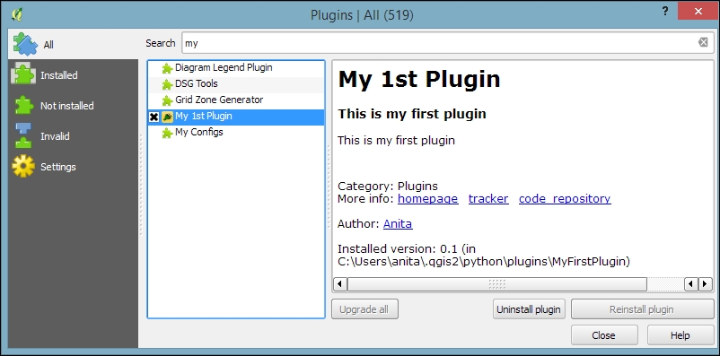
Activate your plugin in the Plugin Manager and you should see it listed in the Plugins menu. When you start your plugin, it will display a blank dialog that is just waiting for you to customize it.
To customize the blank default plugin dialog, we use Qt Designer. You can find the dialog file in the plugin folder. In my case, it is called my_first_plugin_dialog_base.ui (derived from the module name I specified in Plugin Builder). When you open your plugin's .ui file in Qt Designer, you will see the blank dialog. Now you can start adding widgets by dragging and dropping them from the Widget Box on the left-hand side of the Qt Designer window. In the following screenshot, you can see that I added a Label and a drop-down list widget (listed as Combo Box in the Widgetbox). You can change the label text to Layer by double-clicking on the default label text. Additionally, it is good practice to assign descriptive names to the widget objects; for example, I renamed the combobox to layerCombo, as you can see here in the bottom-right corner:
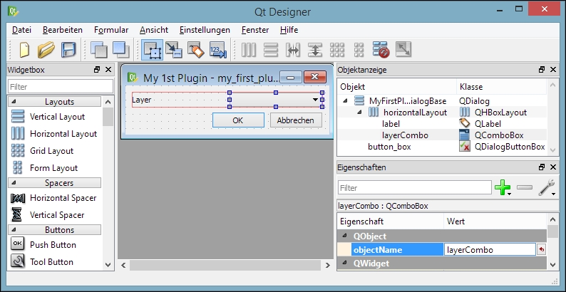
Once you are finished with the changes to the plugin dialog, you can save them. Then you can go back to QGIS. In QGIS, you can now configure Plugin Reloader by clicking on the Choose a plugin to be reloaded button in the Plugins toolbar and selecting your plugin. If you now click on the Reload Plugin button and the press your plugin button, your new plugin dialog will be displayed.
As you have certainly noticed, the layer combobox is still empty. To populate the combobox with a list of loaded layers, we need to add a few lines of code to my_first_plugin.py (located in the plugin folder). More specifically, we expand the run() method:
def run(self):
    """Run method that performs all the real work"""
    # show the dialog
    self.dlg.show()
    # clear the combo box to list only current layers
    self.dlg.layerCombo.clear()
    # get the layers and add them to the combo box
    layers = QgsMapLayerRegistry.instance().mapLayers().values()
    for layer in layers:
        if layer.type() == QgsMapLayer.VectorLayer:
            self.dlg.layerCombo.addItem( layer.name(), layer )
    # Run the dialog event loop
    result = self.dlg.exec_()
    # See if OK was pressed
    if result:
        # Check which layer was selected
        index = self.dlg.layerCombo.currentIndex()
        layer = self.dlg.layerCombo.itemData(index)
        # Display information about the layer
        QMessageBox.information(self.iface.mainWindow(),"Learning QGIS","%s has %d features." %(layer.name(),layer.featureCount()))
You also have to add the following import line at the top of the script to avoid NameErrors concerning QgsMapLayerRegistry and QMessageBox:
from qgis.core import *
from PyQt4.QtGui import QMessageBox
Once you are done with the changes to my_first_plugin.py, you can save the file and use the Reload Plugin button in QGIS to reload your plugin. If you start your plugin now, the combobox will be populated with a list of all layers in the current QGIS project, and when you click on OK, you will see a message box displaying the number of features in the selected layer.
While the previous exercise showed how to create a custom GUI that enables the user to interact with QGIS, in this exercise, we will go one step further and implement our own custom map tool similar to the default Identify tool. This means that the user can click on the map and the tool reports which feature on the map was clicked on.
To this end, we create another Tool button with dialog plugin template called MyFirstMapTool. For this tool, we do not need to create a dialog. Instead, we have to write a bit more code than we did in the previous example. First, we create our custom map tool class, which we call IdentifyFeatureTool. Besides the __init__() constructor, this tool has a function called canvasReleaseEvent() that defines the actions of the tool when the mouse button is released (that is, when you let go of the mouse button after pressing it):
class IdentifyFeatureTool(QgsMapToolIdentify):
    def __init__(self, canvas):
        QgsMapToolIdentify.__init__(self, canvas)
    def canvasReleaseEvent(self, mouseEvent):
        print "canvasReleaseEvent"
        # get features at the current mouse position
        results = self.identify(mouseEvent.x(),mouseEvent.y(),
                        self.TopDownStopAtFirst, self.VectorLayer)
        if len(results) > 0:
            # signal that a feature was identified
            self.emit( SIGNAL( "geomIdentified" ),
                       results[0].mLayer, results[0].mFeature)
You can paste the preceding code at the end of the my_first_map_tool.py code. Of course, we now have to put our new map tool to good use. In the initGui() function, we replace the run() method with a new map_tool_init() function. Additionally, we define that our map tool is checkable; this means that the user can click on the tool icon to activate it and click on it again to deactivate it:
def initGui(self):
    # create the toolbar icon and menu entry
    icon_path = ':/plugins/MyFirstMapTool/icon.png'
    self.map_tool_action=self.add_action(
        icon_path,
        text=self.tr(u'My 1st Map Tool'),
        callback=self.map_tool_init,
        parent=self.iface.mainWindow())
    self.map_tool_action.setCheckable(True)
The new map_tool_init()function takes care of activating or deactivating our map tool when the button is clicked on. During activation, it creates an instance of our custom IdentifyFeatureTool, and the following line connects the map tool's geomIdentified signal to the do_something() function, which we will discuss in a moment. Similarly, when the map tool is deactivated, we disconnect the signal and restore the previous map tool:
def map_tool_init(self):
    # this function is called when the map tool icon is clicked
    print "maptoolinit"
    canvas = self.iface.mapCanvas()
    if self.map_tool_action.isChecked():
        # when the user activates the tool
        self.prev_tool = canvas.mapTool()
        self.map_tool_action.setChecked( True )
        self.map_tool = IdentifyFeatureTool(canvas)
        QObject.connect(self.map_tool,SIGNAL("geomIdentified"),
                        self.do_something )
        canvas.setMapTool(self.map_tool)
        QObject.connect(canvas,SIGNAL("mapToolSet(QgsMapTool *)"),
                        self.map_tool_changed)
    else:
        # when the user deactivates the tool
        QObject.disconnect(canvas,SIGNAL("mapToolSet(QgsMapTool *)"
                                         ),self.map_tool_changed)
        canvas.unsetMapTool(self.map_tool)
        print "restore prev tool %s" %(self.prev_tool)
        canvas.setMapTool(self.prev_tool)
Our new custom do_something() function is called when our map tool is used to successfully identify a feature. For this example, we simply print the feature's attributes on the Python Console. Of course, you can get creative here and add your desired custom functionality:
def do_something(self, layer, feature):
    print feature.attributes()
Finally, we also have to handle the case when the user switches to a different map tool. This is similar to the case of the user deactivating our tool in the map_tool_init() function:
def map_tool_changed(self):
    print "maptoolchanged"
    canvas = self.iface.mapCanvas()
    QObject.disconnect(canvas,SIGNAL("mapToolSet(QgsMapTool *)"),
                       self.map_tool_changed)
    canvas.unsetMapTool(self.map_tool)
    self.map_tool_action.setChecked(False)
You also have to add the following import line at the top of the script to avoid errors concerning QObject, QgsMapTool, and others:
from qgis.core import *
from qgis.gui import *
from PyQt4.QtCore import *
When you are ready, you can reload the plugin and try it. You should have the Python Console open to be able to follow the plugin's outputs. The first thing you will see when you activate the plugin in the toolbar is that it prints maptoolinit on the console. Then, if you click on the map, it will print canvasReleaseEvent, and if you click on a feature, it will also display the feature's attributes. Finally, if you change to another map tool (for example, the Pan Map tool) it will print maptoolchanged on the console and the icon in the plugin toolbar will be unchecked.
In this chapter, we covered the different ways to extend QGIS using actions and Python scripting. We started with different types of actions and then continued to the Python Console, which offers a direct, interactive way to interact with the QGIS Python API. We also used the editor that is part of the Python Console panel and provides a better way to work on longer scripts containing loops or even multiple class and function definitions. Next, we applied our knowledge of PyQGIS to develop custom tools for the Processing Toolbox. These tools profit from Processing's automatic GUI generation capabilities, and they can be used in Graphical modeler to create geopreocessing models. Last but not least, we developed a basic plugin based on a Plugin Builder template.
With this background knowledge, you can now start your own PyQGIS experiments. There are several web and print resources that you can use to learn more about QGIS Python scripting. For the updated QGIS API documentation, check out http://qgis.org/api/. If you are interested in more PyQGIS recipes, take a look at PyQGIS Developer Cookbook at http://docs.qgis.org/testing/en/docs/pyqgis_developer_cookbook and QGIS programming books offered by Packt Publishing, as well as Gary Sherman's book The PyQGIS Programmer's Guide, Locate Press.
How do we turn our idea into a location-based web application? If you've heard this question before or asked it yourself, you would know that this deceptively simple question can have answers posed in a limitless number of ways. In this book, we will consider the application of QGIS through specific use cases selected for their general applicability. There's a good chance that the blueprint given here will shed some light on this question and its solution for your application.
In this book, you will learn how to leverage this ecosystem, let the existing software do the heavy lifting, and build the web mapping application that serves your needs. When integrated software is seamlessly available in QGIS, it's great! When it isn't, we'll look at how to pull it in.
In this chapter, we will look at how data can be acquired from a variety of sources and formats and visualized through QGIS. We will focus on the creation of the part of our application that is relatively static: the basemap. We will use the data focused on a US city, Newark, Delaware. A collection of data, such as historical temperature by area, point data by address, and historical map images, could be used for a digital humanities project, for example, if one wanted to look at the historical evidence for lower temperatures observed in a certain part of a city.
In this chapter, we will cover the following topics:
As QGIS is open source, no one entity owns the project; it's supported by a well-established community. The project is guided by the QGIS Project Steering Committee (PSC), which selects managers to oversee various areas of development, testing, packaging, and other infrastructure to keep the project going. The Open Source Geospatial Foundation (OSGeo) is a major contributor to software development, and QGIS is considered an official OSGeo project. Many of QGIS' dependencies and complimentary software are also OSGeo projects, and this collective status has served to bring some integration into what can be considered a platform. The Open GIS Consortium (OGC) deliberates and sets standards for the data and metadata formats. QGIS supports a range of OGC standards—from web services to data formats.
When QGIS is at its best, this rich platform provides a seamless functionality, with an ecosystem of open or simply available software ready to be tapped. At other times, the underlying dependencies and ecosystem software require more attention. Since it's an open source software, contributions are always being made, and you have the option of making customizations in code and even contributing to it!
The OSGeo ecosystem provides capabilities for data format read/write through the OGR Simple Features Library (OGR, originally for OpenGIS Simple Features Reference Implementation) and Geospatial Data Abstraction Library (GDAL) libraries, which support around 220 formats.
The models of the earth, which the coordinates refer to, are collectively known as Coordinate Reference Systems (CRSs). The spatial reference transformation between systems and projection—from a system in linear versus the one in angular coordinates—is supported by the PROJ.4 library with around 2,700 systems. These are expressed in a plain text format defined by PROJ.4 as Well Known Text (WKT). PROJ.4 WKT is actually very readable, containing the sort of information that would be familiar to the students of cartographic projection, such as meridians, spheroids, and so on.
Analysis, or application of algorithmic functions to data is rarely handled seamlessly by QGIS. More often, it is an extension of one of the dependencies already listed before or is provided by System for Automated Geoscientific Analyses (SAGA). Many other analytical operations are provided by numerous QGIS Python plugins.
In general, these libraries will seamlessly transform to or from the formats that we require. However, in some cases, additional dependencies will need to be acquired and either be built and configured themselves or have the code built around them.
QGIS has the capability of publishing to web hosts through both integrated and less immediate means.
OSGeo project binaries have sometimes been bundled to ease the installation process, given the multitude of interdependencies among projects. Tutorials in this book are written based on an installation using the QGIS standalone installer for Windows.
QGIS hosts repositories with the most current versions for Debian/Ubuntu and bundled packages for other major Linux distributions; however, these repositories are generally many versions behind. You will find that this is often the case even with the extra repositories for your distribution (for example, EPEL for RHEL flavors). Seeking out other repositories is worthwhile. Another option, of course, is to attempt to build it from scratch; however, this can be very difficult.
There is no bundled package installer for Mac OS, though you should be able to install QGIS with only one or two additional installations from the binaries readily available on the Web—the KyngChaos Wiki has long been the go-to source for this.
Installation with Windows is simpler than with other platforms at this time. The most recent version of QGIS, with basic dependencies such as GDAL, is installed with a typical executable installer: the "standalone" installer. In addition, the OSGeo4W (OSGeo for Windows) package installer is very useful for the extended dependencies. You will likely find that beyond simply installing QGIS, you will return to this installer to add additional software to extend QGIS into its ecosystem. You can launch the installer from the Setup shortcut under the QGIS submenu in the Windows Start menu.
The most extensive incarnation of the OSGeo software is embodied in OSGeo-Live, a Lubuntu Virtual Machine (VM) on which all of the OSGeo software is already installed. It is listed here separately since it will boot into its own OS, independent of the host platform.
Updates to OSGeo Live are typically released in tandem with FOSS4G, an annual global event hosted by OSGeo since 2006. Given that these events occur less regularly and are out of sync with OSGeo software development, bundled versions are usually a few releases behind. Still, OSGeo-Live is a quick way to get started.
Now that you've prepared your local machine, let's return to the idea of the generalizable web applications that will be the focus of this book. There are a few elements that we can identify in the process of developing web-mapping applications.
After any preliminary planning—a step that should include careful consideration of at least the use cases for our application—we must acquire data. Acquisition involves not only the physical transfer of the data, but also processing the data to a particular format and importing it into whatever data storage scheme we have developed. This is usually called Extract, Transform, and Load (ETL).
Though ETL is the first major step in developing a web application, it should not be taken lightly. As with any information-based project, data often comes to us in a form that's not immediately useable—whether because of nonuniform formatting, uncertain metadata, or unknown field mapping. Although any of these can affect a GIS project, as GISs are organized around cartographic coordinate systems, the principle concern is usually that data must be spatially described in a uniform way, namely by a single CRS, as referred to earlier. To that end, data often requires georeferencing and spatial reference manipulation.
For certain datasets, an ETL workflow is unnecessary because the data is already provided via web services. Using hosted data stored on the remote server and read directly from the Web by your application is a very attractive option, purely for ease of development if nothing else. However, you'll probably need to change the CRS, and possibly other formatting, of your local data to match that of the hosted data since hosted services are rarely provided in multiple CRSs. You must also consider whether the hosted data provides capabilities that support the interface of your application. You will find more information on this topic under the operational layer section of this chapter.
By georeferencing, or attaching our data to coordinates, we assert the geographic location of each object in our data. Once our data is georeferenced, we can call it geospatial. Georeferencing is done according to the fields in the data and those available in some geospatial reference source.
The simplest example is when a data field actually matches a field in some existing geospatial data. This data field is often an ID number or name. This kind of georeferencing is called a table join.
In this example, we will take a look at a table join with some temperature data from an unknown source and census tract boundaries from the US Census. Census' TIGER/Line files are generally the first places to look for U.S. national boundary files of all sorts, not just census tabulation areas.
The temperature data to be georeferenced through a table join would be as follows:
tract,date,mean_temp
014501,2010-06-01,73
014402,2010-06-01,75
014703,2010-06-01,75
014100,2010-06-01,76
014502,2010-06-01,75
014403,2010-06-01,75
014300,2010-06-01,71
014200,2010-06-01,72
013610,2010-06-01,68
Temperature data metadata would be as follows:
"String","Date","Integer"
Downloading the example code
You can download the example code files for all Packt books you have purchased from your account at http://www.packtpub.com. If you purchased this book elsewhere, you can visit http://www.packtpub.com/support and register to have the files e-mailed directly to you.
To perform a table join, perform the following steps:
temperature.csv.temperature.csvt. Otherwise, QGIS will not know what type of data is contained in each column.Data for all the chapters will be found under the data directory for each chapter. You can use the included data under c1/data/original with the file names given earlier. Besides selecting the browse menu, you can also just drag the file into the Layers panel from an open operating system window. You can find examples of data output during exercises under the output directory of each chapter's data directory. This is also the directory given in the instructions as the destination directory for your output. You will probably want to create a new directory for your output and save your data there so as to not overwrite the included reference data.
temperature.csv.tl_2010_10_tract10.shp file in the unzipped directory.tl_2010_10_tract10 in the Layer panel, and then navigate to Properties | Joins. Click on the button with the green plus sign (+) to add a join.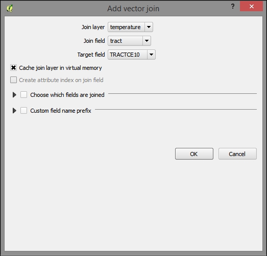
To verify that the join completed, open the attribute table of the target layer (such as the geospatial reference, in this case, tl_2010_10) and sort by the new temperature_mean_temp field. Notice that the fields and values from the join layer are now included in the target layer.
If our data is expressed as addresses, intersections, or other well-known places, we can geocode it (that is, match it with coordinates) with a local or remote geocoder configured for our particular set of fields, such as the standard fields in an address.
In this example, we will geocode it using the remote geocoder provided by Google. Perform the following steps:
The following is an example of MMQGIS-friendly address data:
id,address,city,state,zip,country
1801300170,44 W CLEVELAND AV,NEWARK,DE,19711,USA
1801400004,85 N COLLEGE AV,NEWARK,DE,19711,USA
1802600068,501 ACADEMY ST,NEWARK,DE,19716,USA
notfound.csv file for the final input. The default file location can be problematic.notfound.csv file and attempt to geocode these again.
Finally, if our data is an image or grid (raster), we can match up locations in the image with known locations in a reference map. The registration of these pairs and subsequent transformation of the grid is called orthorectification or sometimes by the more generic term, georeferencing (even though that applies to a wider range of operations).
c1/data/original/4622009.jpg) from David Rumsey Map Collection, MapRank Search (http://rumsey.mapranksearch.com/), which is an excellent source for historical map images of the United States.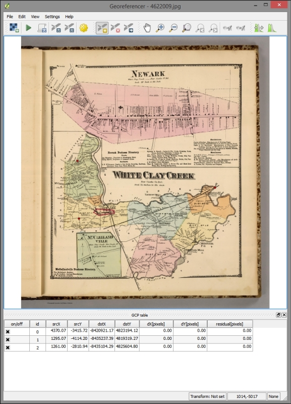
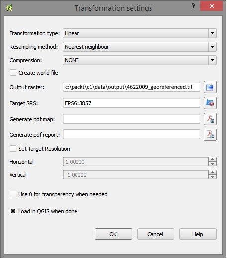
Once your image has been georeferenced, you should see it align with the other data on your map. You can alter the layer transparency under Layer properties | Transparency:
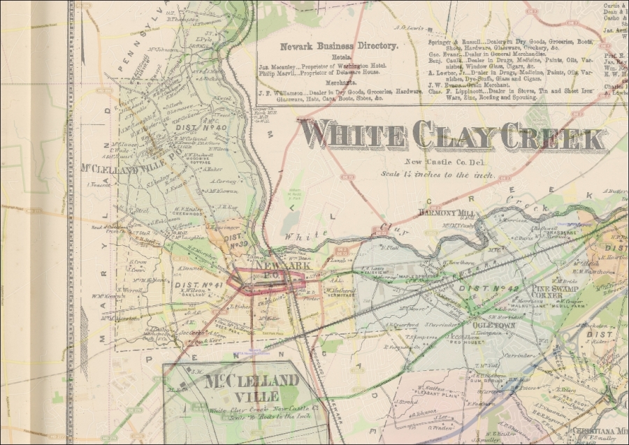
QGIS will sometimes do an On-the-Fly (OTF) projection of all the data added to the canvas on the project CRS (defined under Project | Project Properties | CRS). You will want to disable OTF projection in the projects you intend to produce for web applications, as all layers should have their own spatial reference independently defined and transformed or projected in the same CRS, if needed.
When geospatial data is received with no metadata on what the spatial reference system describes its coordinates, it is necessary to assign a system. This can be by right-clicking on the layer in Layers Panel | Save as and selecting the new CRS.
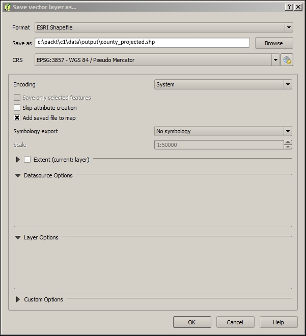
At other times, data is received with a different CRS than in the case of the other data used in the project. When CRSs differ, care should be taken to see whether to alter the CRS of the new nonconforming data or of the existing data. Of course we want to choose a system that supports our needs for accuracy or extent; at other times when we already have a suitable basemap, we will want operational layers to conform to the basemap's system. When a suitable basemap is already available to be consumed by our web application, we can often use the system of the basemap for the project. All major third-party basemap providers use Web Mercator, which is now known as EPSG:3857.
You can project data from geographic to projected coordinates or from one projection to another. This can be done in the same way as you would define a projection: by right-clicking on a layer in Layers Panel | Save as and selecting the new CRS. An appropriate transformation will generally be applied by default.
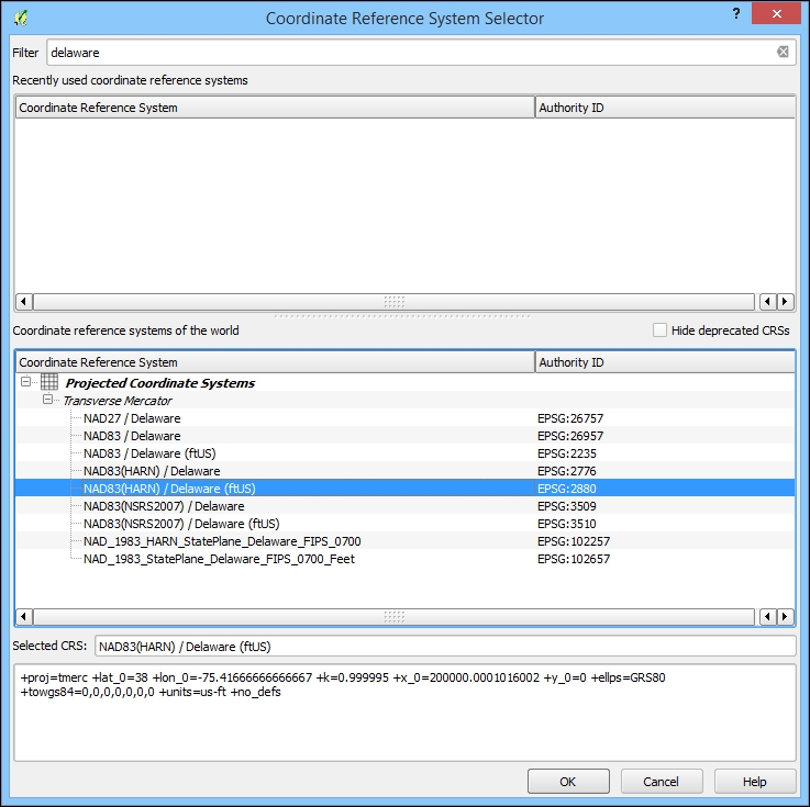
There are some features in CRS Selector that you should be aware of. By selecting from Recently used coordinate reference systems, you can often easily match up a new CRS with those existing in the workspace. You also have the option to search through the available systems by entering the Filter input. You will see the PROJ.4 WKT representation of the selected CRS at the bottom of the dialog.
Although the data has been added to the GIS through the ETL process, it is of limited value without adding some visualization enhancements.
The layer style is configured through the Style tab in the Layer Properties dialog. The Single Symbol style is the default style type, and it simply shows all the geographic layer objects using the same basic symbol. This setting doesn't provide any visual differentiation between objects other than their apparent geospatial characteristics. The Categorized and Graduated style types provide different styles according to the attribute table field of your choosing. Graduated, which applies to quantitative data, is particularly powerful in the way the color and symbols size are mapped to a numerical scale. This is all accomplished through the Layer Properties | Style tab.
To configure a simple graduated layer style to the data, perform the following steps:
temperature_mean_temp).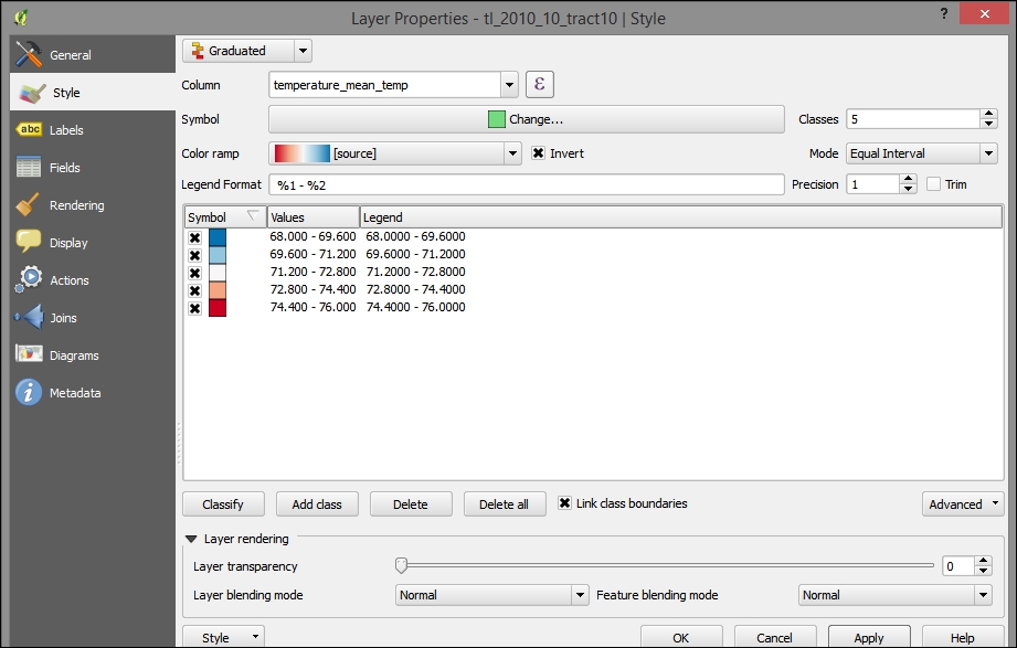
If you applied the preceding steps to the joined tract/temperature layer, you'd see something similar to the following image:
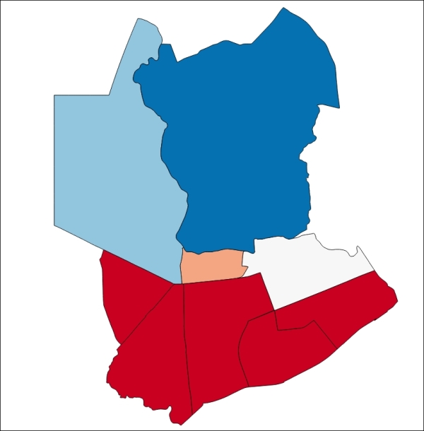
You will now see the following output:
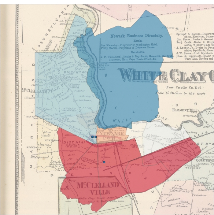
Perhaps the lower temperatures to the north of the city are related to the historical development in other parts of the city.
Labels can provide important information in a map without requiring a popup or legend. As labels are automatically placed by the software (they do not have an actual physical position in space), they are subject to particular placement issues. Also, a map with too much label text quickly becomes confusing. Sometimes, labels can be easily rendered into tiles by integrated QGIS operations. At other times, this will require an external rendering engine or a map server. These issues are discussed later on in this chapter.
To label the address points in our example, go to that layer's Layer Properties | Labels tab. Perform the following steps:
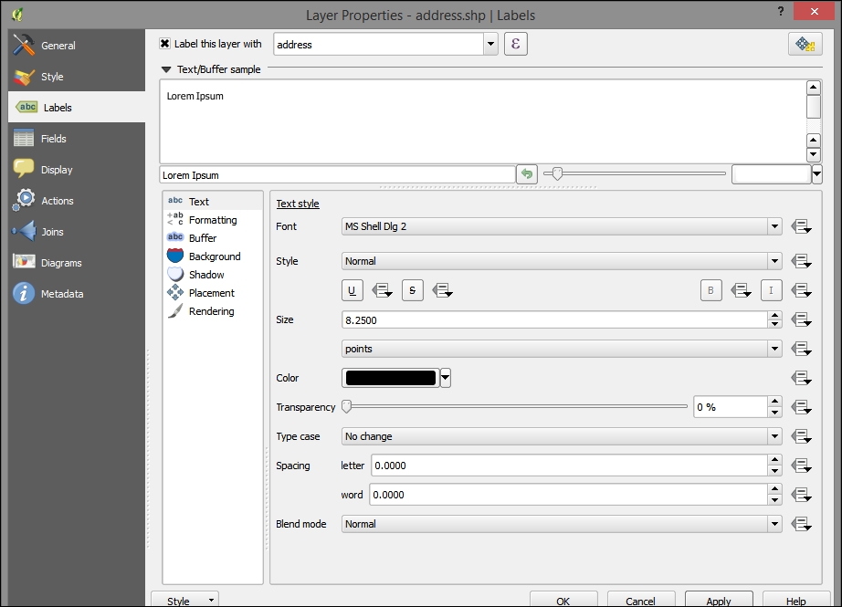
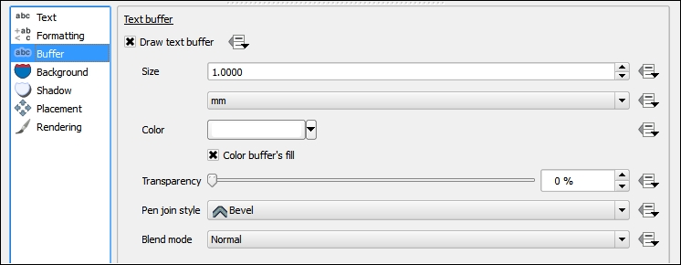
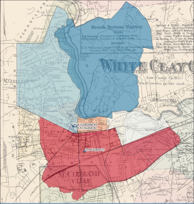
In web map applications, the meaning of basemap sometimes differs from that in use for print maps; basemaps are the unchanging, often cached, layers of the map visualization that tend to appear behind the layers that support interaction. In our example, the basemap could be the georeferenced historical image, alone or with other layers.
You should consider using a public basemap service if one is suitable for your project. You can browse a selection of these in QGIS using the OpenLayers plugin.
Use a basemap service if the following conditions are fulfilled:
If our basemap were not available via a web service as in our example, we must turn our attention to its production. It is important to consider what a basemap is and how it differs from the operational layer.
The geographic reference features included in a basemap are selected according to the map's intended use and audience. Often, this includes certain borders, roads, topography, hydrography, and so on.
Beyond these reference features, include the geographic object class in the basemap if you do not need:
Assuming that we will be using some kind of caching mechanism to store and deliver the basemap, we will optimize performance by maximizing the objects included therein.
Obtaining data for a basemap is not a trivial task. If a suitable map service is available via a web service, it would ease the task considerably. Otherwise, you must obtain supporting data from your local system and render this to a suitable cartographic format.
A challenge in creating basemaps and keeping them updated is interacting with different data providers. Different organizations tend be recognized as the provider of choice for the different classes of geographic objects. With different organizations in the mix, different data format conventions are bound to occur.
OpenStreetMap (OSM), an open data repository for geographic reference data, provides both map services and data. In addition to OSM's own map services, the data repository is a source for a number of other projects offering free basemap services.
OpenStreetMap uses a more abstract and scalable schema than most data providers. The OSM data includes a few system fields, such as osm_id, user_id, osm_version, and way. The osm_id field is unique to each geographic object, user_id is unique to the user who last modified the object, osm_version is unique to the versions for the object, and way is the geometry of the object.
By allowing a theoretically unlimited number of key value pairs along with the system fields mentioned before, the OSM data schema can potentially allow any kind of data and still maintain sanity. Keys are whatever the data editors add to the data that they upload to the repository. The well-established keys are documented on the OSM site and are compatible with the community produced rendering styles. If a community produced style does not include the key that you need or the one that you created, you can simply add it into your own rendering style. Columns are kept from overwhelming a local database during the import stage. Only keys added in a local configuration file are added to the database schema and populated.
High quality cartography with OSM data is an ongoing challenge. CloudMade has created its business on a cloud-based, albeit limited, rendering editor for OSM data, which is capable of also serving map services. CloudMade is, in fact, a fine source for cloud services for OSM data and has many visually appealing styles available. OpenMapSurfer, produced by a research group at the University of Heidelberg, shows off some best practices in high quality cartography with OSM data including sophisticated label placement, object-level scale dependency, careful color selection, and shaded topographic relief and bathymetry.
To obtain the OpenStreetMap data locally to produce your own basemap, perform the following steps:
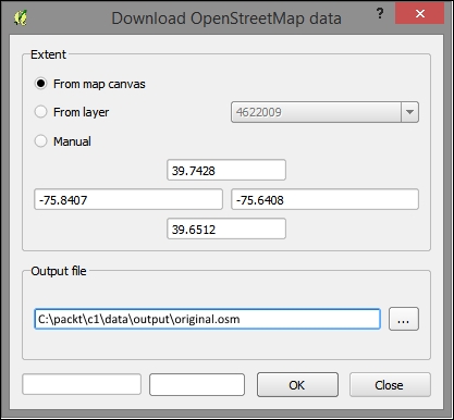
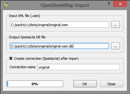
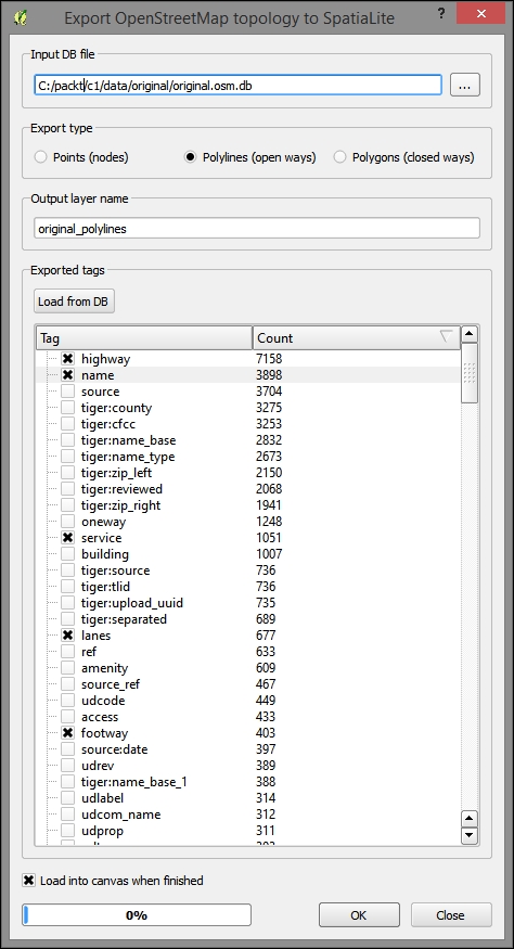
mapnik or sld style for use in rendering in an external tile caching software.Here's an example of the OSM data overlaid on our other layers with a basic, single symbol style:
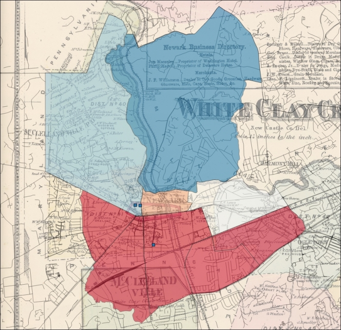
Of course, heaping data in the basemap is not without its drawbacks. Other than the relative loss of functionality, which occurs by design, basemaps can quickly become cluttered and otherwise unclear. The layer and label scale dependency dynamically alter the display of information to avoid the obfuscation of basemap geographic classes.
When classes of geographic objects are unnecessary to visualize at certain scales, the whole layer scale dependency can be used to hide the layer from view. For example, in the preceding image, we can see all the layers, including the geocoded addresses, at a smaller scale even when they may not be distinctly visible. To simplify the information, we can apply the layer scale dependency so that this layer does not show these small scales.
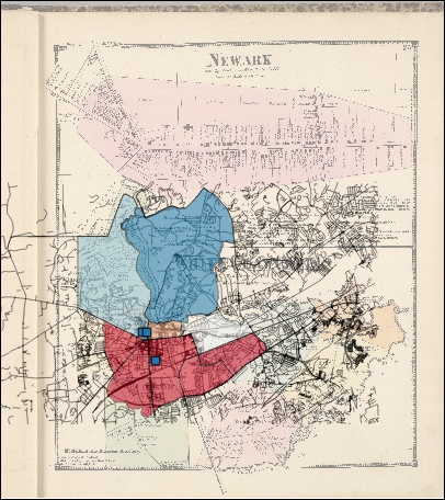
At this scale, some objects are not distinctly visible. Using the layer scale dependency, we can make these objects invisible at this scale.
It is also possible to alter visibility with scale at the geographic object level within a layer. For example, you may wish to show only the major roads at a small scale. However, this will generally require more effort to produce. Object-level visibility can be driven by attributes already existing or created for the purpose of scale dependency. It can also be defined according to the geometric characteristics of an object, such as its area. In general, smaller features should not be viewable at lower scales.
A common way to achieve layer dependency at the object level using the whole-layer dependency is to select objects that match the given criteria and create new layers from these. Scale dependency can be applied to the subsets of the object class now contained in this separate layer.
You will want to set the layer scale dependency in accordance with scale ratios that conform to those that are commonly used. These are based on some assumptions, including those about the resolution of the tiled image (96 dpi) and the size of the tile (256px x 265px).
|
Zoom |
Object extent |
Scale at 96 dpi |
|---|---|---|
|
|
Entire planet |
|
|
|
| |
|
|
| |
|
|
| |
|
|
| |
|
|
Country |
|
|
|
| |
|
|
| |
|
|
State |
|
|
|
| |
|
|
Metropolitan |
|
|
|
| |
|
|
City |
|
|
|
| |
|
|
Town |
|
|
|
| |
|
|
Minor road |
|
|
|
| |
|
|
Sidewalks |
|
Labels are commonly separated from the basemap layer itself. One reason for this is that if labels are included in the basemap layer, they will be obscured by the operational layer displayed above it. Another reason is that tile caching sometimes does not properly handle labels, causing fragments of labels to be left missing. Labels should also be displayed with their own scale dependency, filtering out only the most important labels at smaller scales. If you have many layers and objects to be labeled, this may be a good use case for a map server or at least a rendering engine such as Mapnik.
To achieve conflict resolution between label layers on our map output, we will convert the geographic objects to be labeled to centroids—points in the middle of each object—which will then be displayed along with the label field as a label layer.
CREATE VIEW AS
SELECT polygon_class.label, st_centroid(polygon_class.geography) AS geography
  FROM polygon_class;
Chapter 7, Mapping for Enterprises and Communities, includes a more detailed blueprint for creating a labeling layer with a cartographically enhanced placement and conflict resolution using SLD in GeoServer.
The characteristics of the basemap will affect the range of interaction, panning, and zooming in the map interface. You will want a basemap that covers the extent of the area to be seen on the map interface and probably restrict the interface to a region of interest. This way, someone viewing a collection of buildings in a corner of one state does not get lost panning to the opposite corner of another state! When you cache your basemap, you will want to indicate that you wish to cache to this extent. Similarly, viewable scales will be configured at the time your basemap is cached, and you'll want to indicate which these are. This affects the incremental steps, in which the zoom tool increases or decreases the map scale.
The best way to cache your basemap data so that it quickly loads is to save it as individual images. Rather than requiring a potentially complicated rendering by the browser of many geometric features, a few images corresponding to the scale and extent to which they are viewed can be quickly transferred from client to server and displayed. These prerendered images are referred to as tiles because these square images will be displayed seamlessly when the basemap is requested. This is now the standard method used to prepare data for web mapping. In this book, we will cover two tools to create tile caches: QTiles plugin (Chapter 1, Exploring Places – from Concept to Interface) and TileMill/MBTiles (Chapter 7, Mapping for Enterprises and Communities).
|
Configuration time |
Execution time |
Visual quality |
Stored in a single file |
Stored as image directories |
Suitable for labels | |
|---|---|---|---|---|---|---|
|
QTiles Plugin |
1 |
3 |
3 |
No |
Yes |
No |
|
GDAL2Tiles.py |
2 |
1 |
2 |
No |
Yes |
No |
|
TileMill/MBTiles |
3 |
2 |
1 |
Yes |
No |
Yes |
|
GeoServer/GWC |
3 |
2 |
1 |
No |
No |
Yes |
You will need to pay some attention to the scheme for tile storage that is used. The .mbtiles format that TileMill uses is a SQLite database that will need to be read with a map interface that supports it, such as Leaflet. The QTiles plugin and GDAL2Tiles.py use an XYZ tile scheme with hierarchical directories based on row (X), column (Y), and zoom (Z) respectively with the origin in the top-left corner of the map. This is the most popular tiling scheme. The TMS tiling scheme sometimes used by GeoServer open source map server (which supports multiple schemes/service specifications) and that accepted by OSGeo are almost identical; however, the origin is at the bottom-left of the map. This often leads to some confusing results. Note that zoom levels are standardized according to the tile scheme tile size and resolution (for example, 256 x 256 pixels)
We will now use the QTiles plugin to generate a directory-based ZYX tile scheme cache. Perform the following steps:
mytiles tileset with a minimum zoom of 14 and maximum of 16.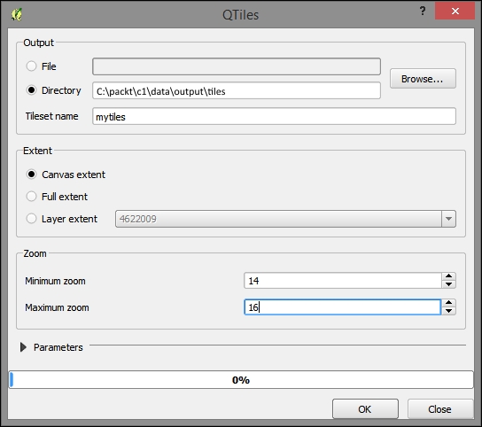
You will now see the following output:
Create a layer description file with a tsv (tab delimited) extension in the UTF-8 encoding. This is a universal text encoding that is widely used on the Web and is sometimes needed for compatibility.
title credit url yOriginTop [zmin zmax xmin ymin xmax ymax]
mytiles me file:///c:/packt/c1/data/output/tiles/ mytiles/{z}/{x}/{y}.png 1 14 16..png images are stored.mytiles.tsv to the following path:[YOUR HOME DIRECTORY]/.qgis2///python/plugins/TileLayerPlugin/layers
C:\Users\[user]\.qgis2\python\plugins\TileLayerPlugin\layers.Preview it with the TileLayer plugin. You should be able to add the layer from the TilerLayerPlugin dialog. Now that the layer description file has been added to the correct location, let's go to Web TileLayerPlugin | Add Tile Layer:
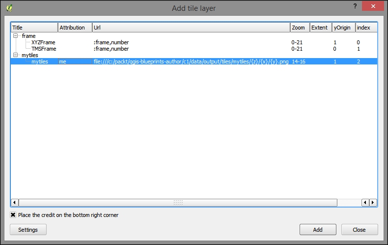
After selecting the layer, click on Add. Your tiles will look something like the following image:
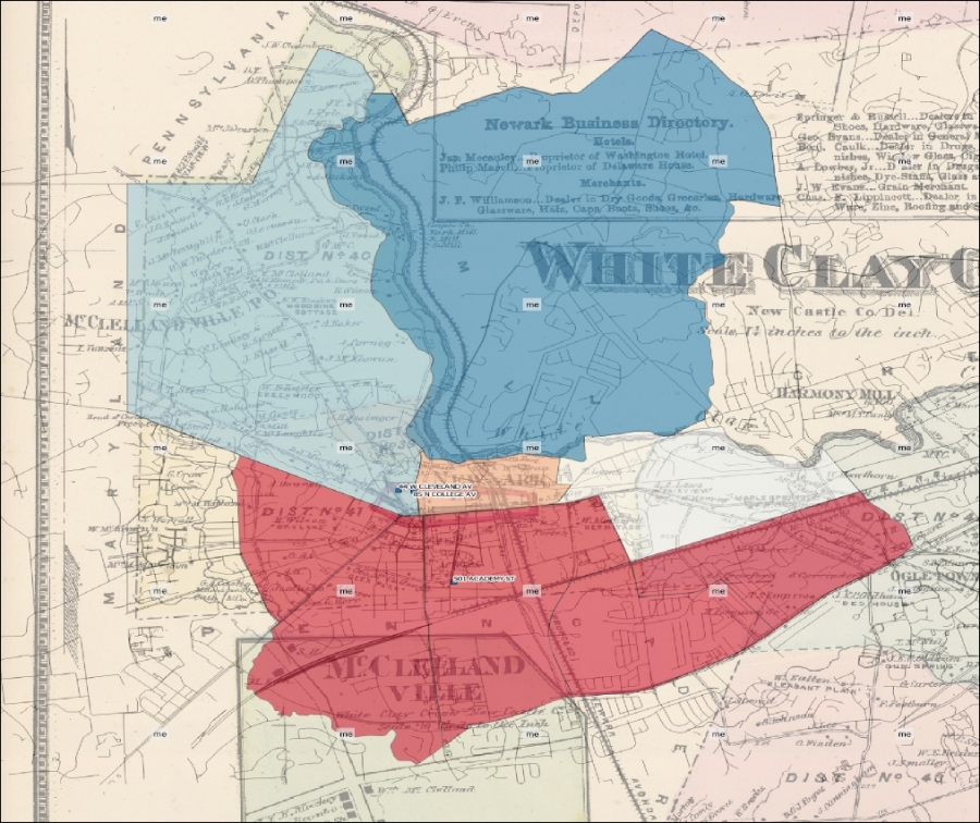
In this chapter, you learned the necessary background and took steps to get up and running with QGIS. We performed ETL on the location-based data to geospatially integrate it with our GIS project. You learned the fundamental GIS visualization techniques around layer style and labeling. Finally, after some consideration around the nature of basemaps, we produced a tile cache that we could preview in QGIS. In the next chapter, we will use raster analysis to produce an operational layer for interaction within a simple web map application.
In this chapter, we will take a look at how the raster data can be analyzed, enhanced, and used for map production. Specifically, you will learn to produce a grid of the suitable locations based on the criteria values in other grids using raster analysis and map algebra. Then, using the grid, we will produce a simple click-based map. The end result will be a site suitability web application with click-based discovery capabilities. We'll be looking at the suitability for the farmland preservation selection.
In this chapter, we will cover the following topics:
Our suitability analysis uses map algebra and criteria grids to give us a single value for the suitability for some activity in every place. This requires that the data be expressed in the raster (grid) format. So, let's perform the other necessary ETL steps and then convert our vector data to raster.
We will perform the following actions:
It is important for the layers in this project to be transformed or projected into the same geographic or projected coordinate system. This is necessary for an accurate analysis and for publication to the web formats. Perform the following steps for this:
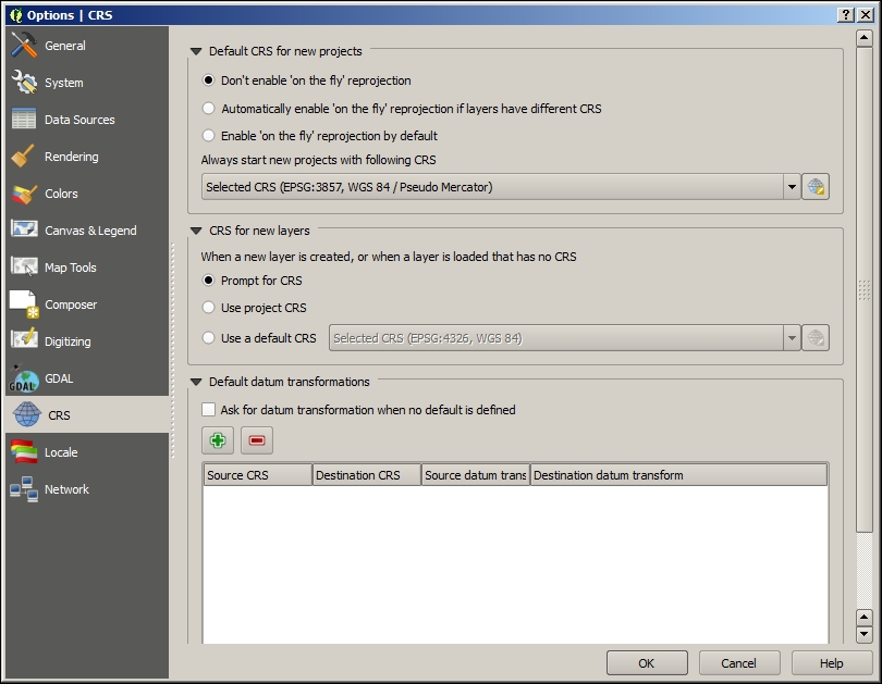
c2/data/original/dem/dem.tif.dem directory, select dem.tif and then click on Open.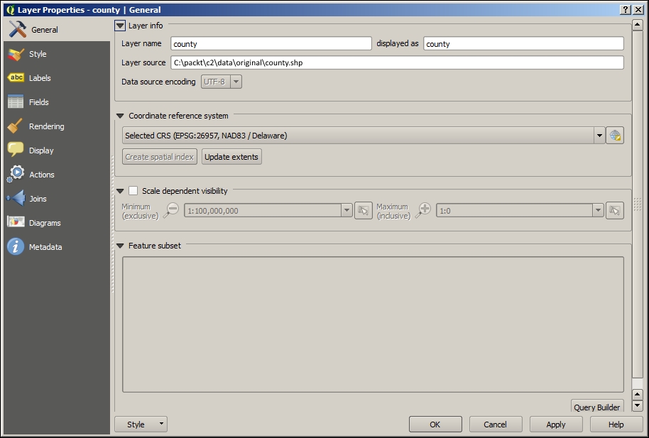
To prepare the layers for conversion to raster, we will add a new generic column to all the layers populated with the number 1. This will be translated to a Boolean type raster, where the presence of the object that the raster represents (for example, roads) is indicated by a cell of 1 and all others with a zero. Follow these steps for the applicants, easements, and roads:
value as the name for the new column and the following data format options: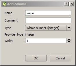
1 into the value box: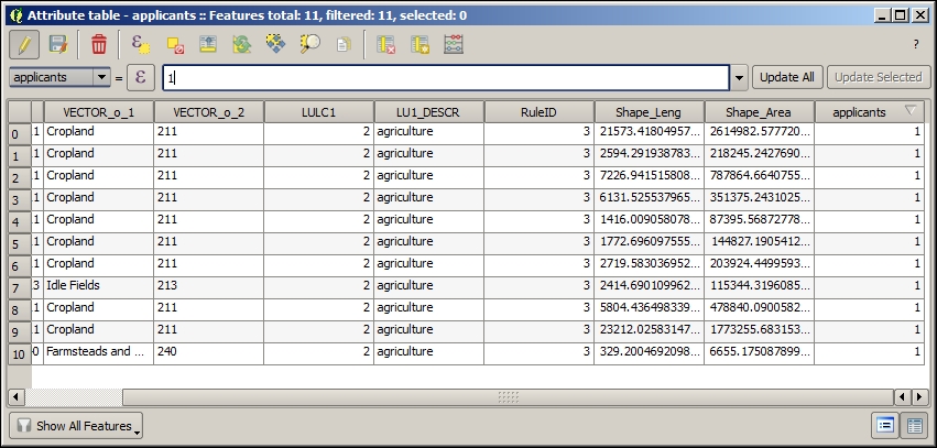
Let's suppose that our criteria includes only a subset of the features in our roads layer—major unlimited access roads (but not freeways), a subset of the features as determined by a classification code (CFCC). To temporarily extract this subset, we will do a layer query by performing the following steps:
"CFCC" = 'A21' OR "CFCC" = 'A25' OR "CFCC" = 'A31' OR "CFCC" = 'A35' OR "CFCC" = 'A63'
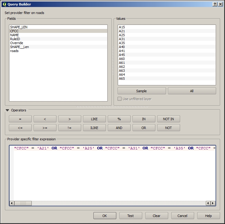
major_roads) in c2/data/output.developed (LULC1 = 1) and agriculture (LULC1 = 2) land uses (separately) from the landuse layer.In this section, we will convert all the needed vector layers to raster. We will be doing this in batch, which will allow us to repeat the same operation many times over multiple layers.
The QGIS Processing Framework provides capabilities to run the same operation many times on different data. This is called batch processing. A batch process is invoked from an operation's context menu in the Processing Toolbox. The batch dialog requires that the parameters for each layer be populated for every iteration. Perform the following steps:
rasterize to search for the Rasterize tool.
|
Parameter |
Value |
|---|---|
|
Input layer |
(For example, |
|
Attribute field |
|
|
Output raster size |
Output resolution in map units per pixel |
|
Horizontal |
|
|
Vertical |
|
|
Raster type |
Int16 |
|
Output layer |
(For example, |
The following images show how this will look in QGIS:
applicants). You should be able to find a hint for this value in the layer properties in the layer source (name of the .tif file).Press Shift + click on all the layers created by batch and the previous roads raster, in the Layers panel.
Right-click on the selected layers and click on Group selected.
Raster data, by organizing the data in uniform grids, is useful to analyze continuous phenomena or find some information at the subobject level. We will use continuous elevation and proximity data in this case, and we will look at the subapplicant object level —at the 30 meter-square cell level. You would choose a cell size depending on the resolution of the data source (for example, from sensors roughly 30 meters apart), the roughness of the analysis (regional versus local), and any hardware limitations.
First, let's make a few notes about raster data:
Now that all our data is in the raster format, we can work through how to derive information from these layers and combine this information in order to select the best sites.
Map algebra is a useful concept to work with multiple raster layers and analysis steps, providing arithmetic operations between cells in aligned grids. These produce an output grid with the respective value of the arithmetic solution for each set of cells. We will be using map algebra in this example for additive modeling.
Now that all our data is in the raster format, we can begin to model for the purpose of site selection. We want to discover which cells are best according to a set of criteria which has either been established for the domain area (for example, the agricultural conservation site selection) by convention or selected at the time of modeling. Additive modeling refers to this process of adding up all the criteria and associated weights to find the best areas, which will have the greatest value.
In this case, we have selected some criteria that are loosely known to affect the agricultural conservation site selection, as shown in the following table:
|
Layer |
Criteria |
Rule |
|---|---|---|
|
|
Is applicant | |
|
|
Proximity |
< 2000 m |
|
|
Land use, proximity |
< 100 m |
|
|
Slope |
=> 2 and <= 5, average |
|
|
Land use, proximity |
> 500 m |
|
|
Proximity |
> 100m |
The Proximity grid tool will generate a layer of cells with each cell having a value equal to its distance from the nearest non-nodata cell in another grid. The distance value is given in the CRS units of the other grid. It also generates direction and allocation grids with the direction and ID of the nearest nodata cell.
proximity in this toolbox. Ensure that you have the Advanced Interface selected.c2/data/output/easements_prox.tif.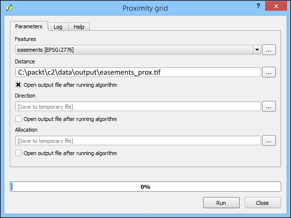
The resulting grid is of the distance to the closest easement cell.
agriculture, developed, and roads. Finally, you will see the following output: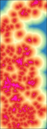
The Slope command creates a grid where the value of each cell is equal to the upgradient slope in percent terms. In other words, it is equal to how steep the terrain is at the current cell in the percentage of rise in elevation unit per horizontal distance unit. Perform the following steps:
c2/data/output. You can keep the other inputs as default.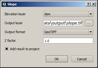
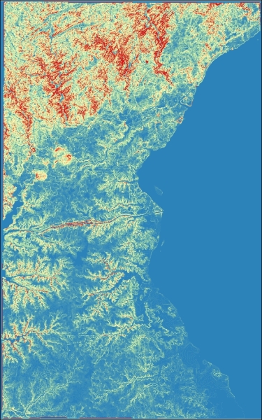
proximity, agriculture, developed, road, and slope) appear in the Layers panel. If they don't, add them.("slope@1" < 8) + ("applicants@1" = 1) + ("easement_prox@1"<2000) + ("roads_prox@1">100) + ("developed_prox@1" > 500) + ("agriculture@1" < 100)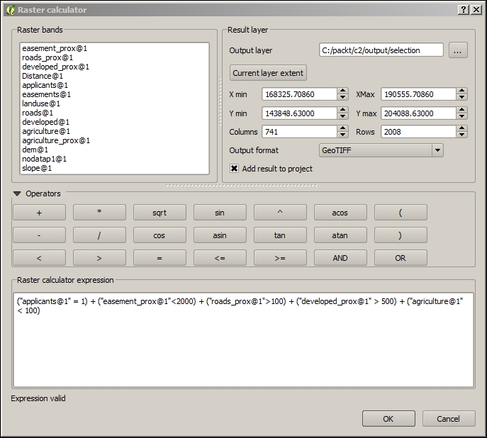
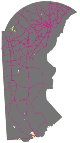
Here's a close up of the preceding map image so that you can see the variability in suitability:
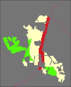
In the preceding screenshot, cells are scored as follows:
Zonal statistics are calculated from the cells that fall within polygons. Using zonal statistics, we can get a better idea of what the raster data tells us about a particular cell group, geographic object, or polygon. In this case, zonal statistics will give us an average score for a particular applicant. Perform the following steps:
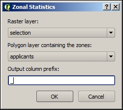
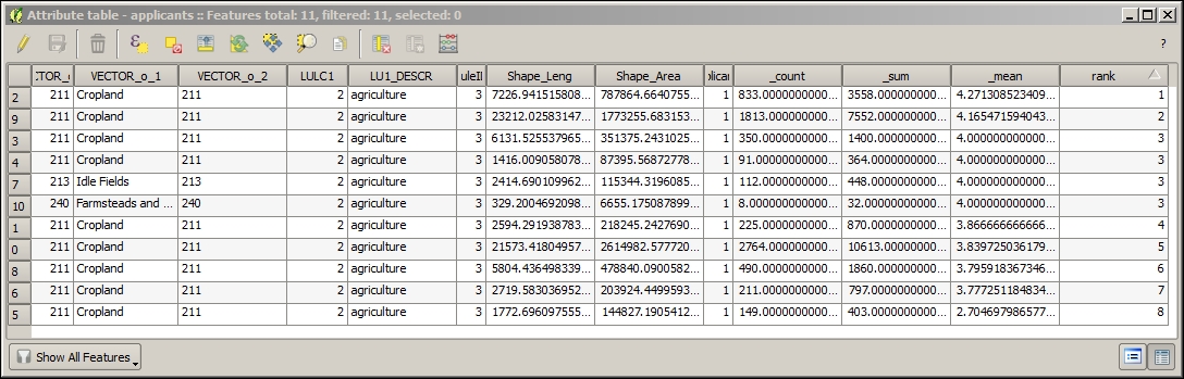
rank field, editing each value manually according to the _mean field created by the zonal statistics step. This is a measure of the mean suitability per cell. We will use this field for a label to communicate the relative suitability to a general audience; so, we want a rank instead of the rough mean value.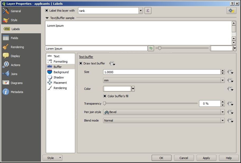
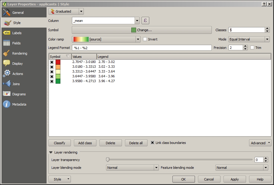
After you've completed these steps, your map will look something similar to this:
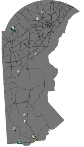
Now that we have completed our modeling for the site selection of a farmland for conservation, let's take steps to publish this for the Web.
qgis2leaf allows us to export our QGIS map to web map formats (JavaScript, HTML, and CSS) using the Leaflet map API. Leaflet is a very lightweight, extensible, and responsive (and trendy) web mapping interface.
qgis2leaf converts all our vector layers to GeoJSON, which is the most common textual way to express the geographic JavaScript objects. As our operational layer is in GeoJSON, Leaflet's click interaction is supported, and we can access the information in the layers by clicking. It is a fully editable HTML and JavaScript file. You can customize and upload it to an accessible web location, as you'll understand in subsequent chapters.
qgis2leaf is very simple to use as long as the layers are prepared properly (for example, with respect to CRS) up to this point. It is also very powerful in creating a good starting application including GeoJSON, HTML, and JavaScript for our Leaflet web map. Perform the following steps:
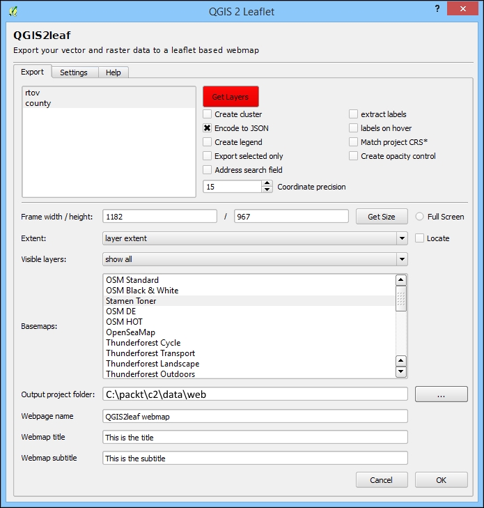
These steps will produce a map application similar to the following one. We'll take a look at how to restore the labels in the next chapter:
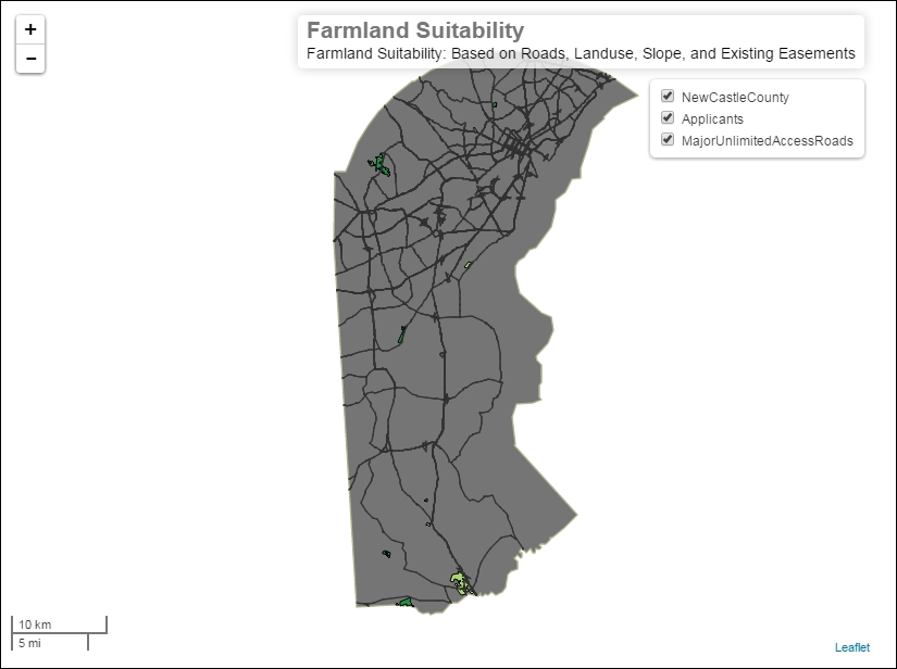
In this chapter, using the site selection example, we covered basic vector data ETL, raster analysis, and web map creation. We started with vector data, and after unifying CRS, we prepared the attribute tables. We then filtered and converted it to raster grids using batch processing. We also considered some fundamental raster concepts as we applied proximity and terrain analysis. Through map algebra, we combined these results for additive modeling site selection. We prepared these results, which required conversion to vector, styling, and labeling. Finally, we published the prepared vector output with qgis2leaf as a simple Leaflet web map application with a strong foundation for extension. In the next chapter, you will learn more about raster analysis and web application publishing with a hydrological modeling example.
In this chapter, we will create an application for a raster physical modeling example. First, we'll use a raster analysis to model the physical conditions for some basic hydrological analysis. Next, we'll redo these steps using a model automation tool. Then, we will attach the raster values to the vector objects for an efficient lookup in a web application. Finally, we will use a cloud platform to enable a dynamic query from the client-side application code. We will take a look at an environmental planning case, providing capabilities for stakeholders to discover the upstream toxic sites.
In this chapter, we will cover the following topics:
The behavior of water is closely tied with the characteristics of the terrain's surface—particularly the values connected to elevation. In this section, we will use a basic hydrological model to analyze the location and direction of the hydrological network—streams, creeks, and rivers. To do this, we will use a digital elevation model and a raster grid, in which the value of each cell is equal to the elevation at that location. A more complex model would employ additional physical parameters (e.g., infrastructure, vegetation, etc.). These modeling steps will lay the necessary foundation for our web application, which will display the upstream toxic sites (brownfields), both active and historical, for a given location.
There are a number of different plugins and Processing Framework algorithms (operations) that enable hydrological modeling. For this exercise, we will use SAGA algorithms, of which many are available, with some help from GDAL for the raster preparation. Note that you may need to wait much longer than you are accustomed to for some of the hydrological modeling operations to finish (approximately an hour).
Some work is needed to prepare the DEM data for hydrological modeling. The DEM path is c3/data/original/dem/dem.tif. Add this layer to the map (navigate to Layer | Add Layer | Add Raster Layer). Also, add the county shapefile at c3/data/original/county.shp (navigate to Layer | Add Layer | Add Vector Layer).
Filling the grid sinks smooths out the elevation surface to exclude the unusual low points in the surface that would cause the modeled streams to—unrealistically—drain to these local lows instead of to larger outlets. The steps to fill the grid sinks are as follows:
dem and Filled DEM as c3/data/output/fill.tif.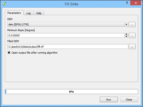
By limiting the raster processing extent, we exclude the unnecessary data, improving the speed of the operation. At the same time, we also output a more useful grid that conforms to our extent of interest. In QGIS/SAGA, in order to limit the processing to a fixed extent or area, it is necessary to eliminate those cells from the grid—in other words, the setting cells outside the area or extent, which are sometimes referred to as NoData (or no-data, and so on) in raster software, to a null value.
In QGIS, the raster processing's extent limitation can be accomplished using a vector polygon or a set of polygons with the Clip raster by mask layer tool. By following the given steps, we can achieve this:
fill.tif, created in the previous Fill Sinks sectioncountyc3/data/output/clip.tif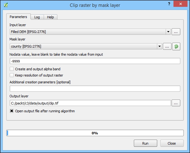
The output from Clip by mask layer tool, showing the grid clipped to the county polygon, will look similar to the following image (the black and white color gradient or mapping to a null value may be reversed):
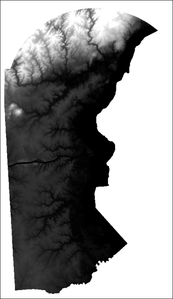
Now that our elevation grid has been prepared, it is time to actually model the hydrological network location and direction. To do this, we will use Channel network and drainage basins, which only requires a single input: the (filled and clipped) elevation model. This tool will produce the hydrological lines using a Strahler Order threshold, which relates to the hierarchy level of the returned streams (for example, to exclude very small ditches) The default of 5 is perfect for our purposes, including enough hydrological lines but not too many. The results look pretty realistic. This tool also produces many additional related grids, which we do not need for this project. Perform the following steps:
5.0).c3/data/output/channels.shp.Ensure that Open output file after running algorithm is selected
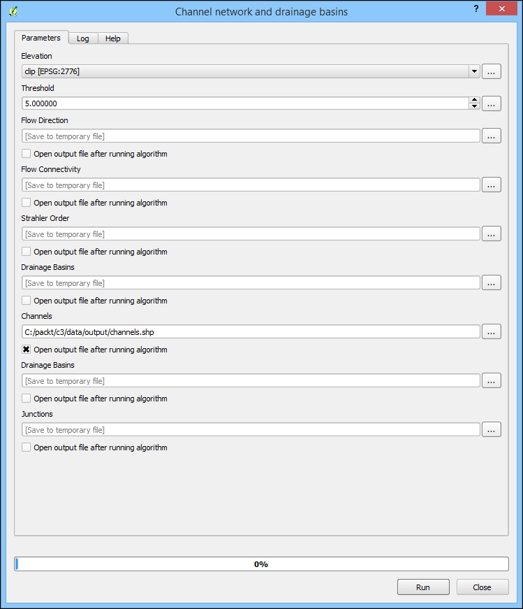
The output from the Channel network and drainage basins, showing the hydrological line location, will look similar to the following image:
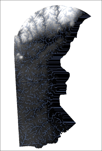
Graphical Modeler is a tool within QGIS that is useful for modeling and automating workflows. It differs from batch processing in that you can tie together many separate operations in a processing sequence. It is considered a part of the processing framework. Graphical Modeler is particularly useful for workflows containing many steps to be repeated.
By building a graphical model, we can operationalize our hydrological modeling process. This provides a few benefits, as follows:
c3/data/output/c3.model.The dialog is modal and needs to be closed before you can return to other work in QGIS, so saving early will be useful.
Some of the inputs to your model's algorithms will be the outputs of other model algorithms; for others, you will need to add a corresponding input parameter.
We will add the first data input parameter to the model so that it is available to the model algorithms. It is our original DEM elevation data. Perform the following steps:
We will add the next data input parameter to the model so that it is available to the model algorithms. It is our vector county data and the extent of our study.
extent.
The modeler connects the individual with their input data and their output data with the other algorithms. We will now add the algorithms.
The first algorithm we will add is Fill Sinks, which as we noted earlier, removes the problematic low elevations from the elevation data. Perform the following steps:
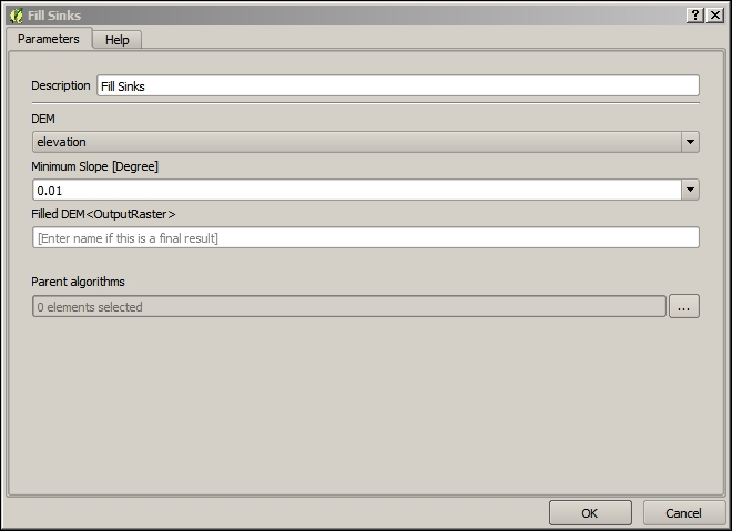
The next algorithm we will add is Clip raster by mask layer, which we've used to limit the processing extent of the subsequent raster processing. Perform the following steps:
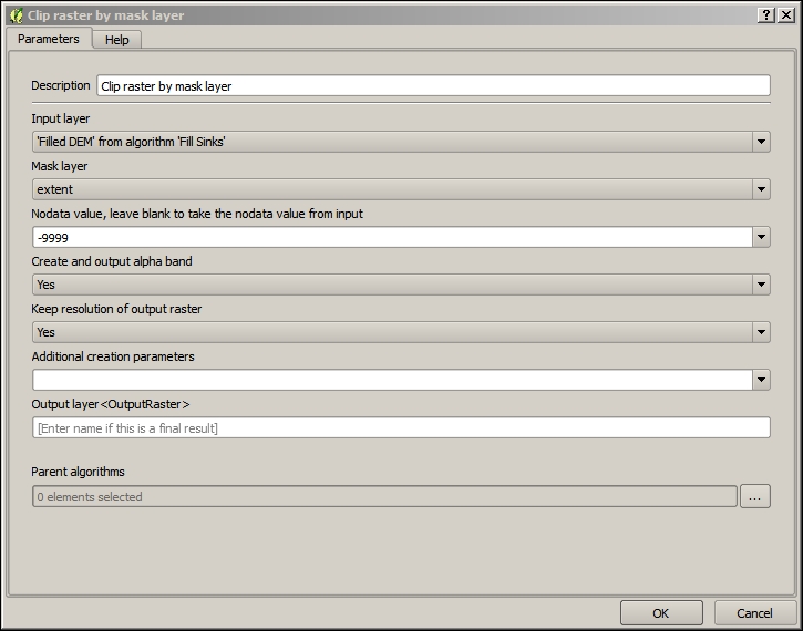
The final algorithm we will add is Channel network and drainage basins, which produces a model of our hydrological network. Perform the following steps:
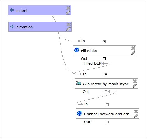
Now that our model is complete, we can execute all the steps in an automated sequential fashion:
elevation and the extent input layer parameters you defined earlier. Select the dem and county layers for these inputs, respectively, as shown in the following screenshot: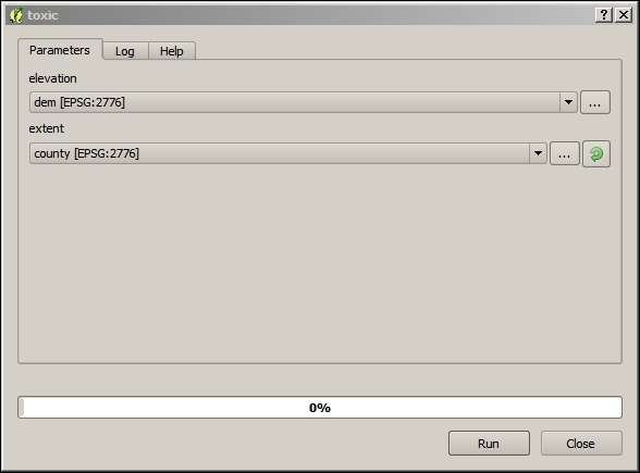
Now that we've completed the hydrological modeling, we'll look at a technique for preparing our outputs for dynamic web interaction.
A spatial join permanently relates two layers of geographic objects based on some geographic relationship between the objects. It is wise to do a spatial join in this way, and save to disk when possible, as the spatial queries can significantly increase the time of a database request. This is especially true for the tables with a large number of records or when your request involves multiple spatial or aggregate functions. In this case, we are performing a spatial join so that the end user can do the queries of the hydrological data based on the location of their choosing.
QGIS has less extensive options for the spatial join criteria than ArcGIS. The default spatial join method in QGIS is accessible via Vector | Data Management Tools | Join attributes by location. However, at the time of writing, this operation was limited to the intersecting features and did not offer the functionality for nearby features. The NNJoin plugin—NN standing for nearest neighbor—achieves what we want; it joins the geographic objects in two layers based on the criteria that they are nearest to each other.
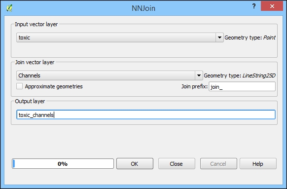
Now, in the Layers panel, right-click on the newly created toxic_channels layer and then on Save as. You should save this new file in the following path:
c3/data/output/toxic_channels.shp
The result of these steps will be a copy of the toxic layer with the columns from the nearest feature in the channels layer.
We've now completed all the data processing steps. It's now time to look at how we will host this data with an external cloud platform to enable the dynamic web query.
CartoDB is a cloud-based GIS platform which provides data management, query, and visualization capabilities. CartoDB is based on Postgres/PostGIS in the backend, and one of the most exciting functions of this platform is the ability to pass spatial queries using PostGIS syntax via the URL and HTTP API.
To publish the data to CartoDB, you'll first need to establish an account. You can easily do this with the Google Single sign-in or create your own account with a username and password. CartoDB offers free accounts, which are usable for an unlimited amount time. You are limited to 50 MB of data storage and all the data published will be publically viewable. Once you've signed up, you can upload the layer produced in the previous section. Perform the following steps:
c3/data/output/channels.* and c3/data/output/toxic_channels.*, to prepare them for upload to CartoDB.c3/data/output/channels.zip and c3/data/output/toxic_channels.zip and add these to the map.
SQL is the lingua franca of database queries through which you can do anything from filtering to spatial operations to manipulating data on the database. There are slight differences in the way SQL works from one database system to the next one. The CartoDB SQL queries use valid Postgres/PostGIS syntax. For more information on Postgres/PostGIS SQL, check out the reference chapter in the manuals for Postgres (http://www.postgresql.org/docs/9.4/interactive/reference.html) for general functions and PostGIS (http://postgis.net/docs/manual-2.1/reference.html) for spatial functions.
There are a few different ways in which you can test your queries against CartoDB—each involving a different ease of input and producing a different result type.
Our SQL query only requires one parameter that we do not know ahead of time: the coordinates of the user-selected click location. To simulate this interaction with QGIS and generate a coordinate pair, we will use the Coordinate Capture plugin. Perform the following steps:
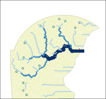
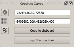
Now, we will return to CartoDB in a web browser to run our first test.
While this method is probably the most straightforward in terms of data entry, it is limited to producing results via the map. There are no text results produced besides errors, which limits your ability to test and debug. Perform the following steps:
Recall that we generated test coordinates to pass with the Coordinate Capture plugin in the last step. Enter the following into the SQL area. This query will select all the fields from toxic_channels as expressed with the wildcard symbol (*) using various subqueries, joins, and spatial operations. The end result will show all the toxic sites that are upstream from the clicked point in its basin (code in c3/data/original/query1.sql). Execute the following code:
SELECT toxic_channels.* FROM toxic_channels
INNER JOIN channels
ON toxic_channels.join_BASIN = channels.basin
WHERE toxic_channels.join_order <

(SELECT channels._order
FROM channels
WHERE
st_distance(the_geom, ST_GeomFromText
('POINT(-75.56111 39.72583)',4326))
IN (SELECT MIN(st_distance(the_geom,
ST_GeomFromText('POINT(-75.56111 39.72583)',4326)))
FROM channels x))

 AND toxic_channels.join_basin =

(SELECT channels.basin
FROM channels
WHERE
st_distance(the_geom, ST_GeomFromText
('POINT(-75.56111 39.72583)',4326))
IN (SELECT MIN(st_distance(the_geom,
ST_GeomFromText('POINT(-75.56111 39.72583)',4326)))
FROM channels x))
GROUP BY toxic_channels.cartodb_idIf the query runs successfully, you should see an output similar to the following image:
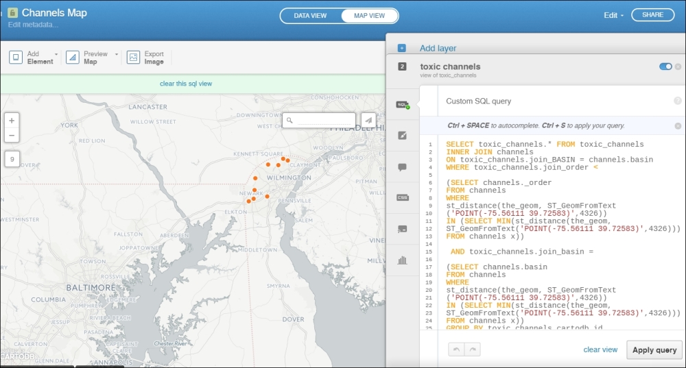
The following errors may confound the efforts to debug and test via the CartoDB SQL tab:
cartodb_id field so that it does not generate this error. However, this error does not typically affect the use through the API or URL parameters.the_geom column even though this column is not visible within your cartodb table, to map the result.Sometimes, the SQL input area is "sticky". If this happens, just "clear view".
Next, let's test the SQL from within QGIS using the QGIS CartoDB Plugin. Perform the following steps:
username.cartodb.com/*. You can find your API key by clicking on your avatar from your dashboard and selecting Your API keys.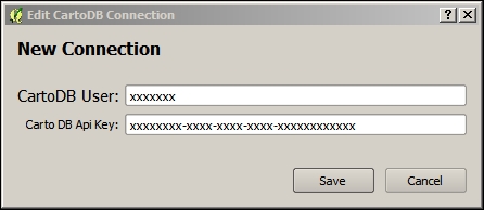
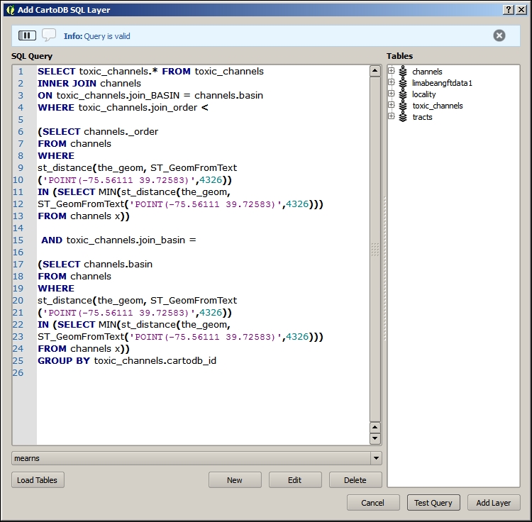
The layer added from these steps will give you the location of the toxic sites upstream from the chosen coordinate. If you symbolized these locations with stars and streams according to their upstream/downstream rank, you would see something similar to the following image:
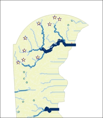
If you want to see the actual contents returned by a CartoDB SQL query in the JSON format, the best way to do so is by sending your SQL statement to the CartoDB SQL API endpoint at http://[YOURUSERNAME].cartodb.com/api/v2/sql. This can be useful to debug issues in interaction with your web application in particular.
The browser string uses an encoded URL, which substitutes character sequences for some special characters. For example, you could use a URL encoder/decoder, which is easily found on the Web, to produce such a string.
Use the following instructions to see the result JSON returned by CartoDB given a particular SQL query. The URL string is also contained in c3/data/original/url_query1.txt.
[YOURUSERNAME] with your CartoDB user name and [YOURAPIKEY] with your API key:http://[YOURUSERNAME].cartodb.com/api/v2/sql?q=%20SELECT%20toxic_channels.*%20FROM%20toxic_channels%20INNER%20JOIN%20channels%20ON%20toxic_channels.join_BASIN%20=%20channels.basin%20WHERE%20toxic_channels.join_order%20%3C%20(SELECT%20channels._order%20FROM%20channels%20WHERE%20st_distance(the_geom,%20ST_GeomFromText%20(%27POINT(-75.56111%2039.72583)%27,4326))%20IN%20(SELECT%20MIN(st_distance(the_geom,%20ST_GeomFromText(%27POINT(-75.56111%2039.72583)%27,4326)))%20FROM%20channels%20x))%20AND%20toxic_channels.join_basin%20=%20(SELECT%20channels.basin%20FROM%20channels%20WHERE%20st_distance(the_geom,%20ST_GeomFromText%20(%27POINT(-75.56111%2039.72583)%27,4326))%20IN%20(SELECT%20MIN(st_distance(the_geom,%20ST_GeomFromText(%27POINT(-75.56111%2039.72583)%27,4326)))%20FROM%20channels%20x))%20GROUP%20BY%20toxic_channels.cartodb_id%20&api_key=[YOURAPIKEY]
{"rows":[{"the_geom":"0101000020E610000056099A6A64E352C0B23A9C05D4E84340","id":13,"join_segme":1786,"join_node_":1897,"join_nod_1":1886,"join_basin":98,"join_order":2,"join_ord_1":6,"join_lengt":1890.6533221,"distance":150.739169156001,"cartodb_id":14,"created_at":"2015-05-06T21:52:52Z","updated_at":"2015-05-06T21:52:52Z","the_geom_webmercator":"0101000020110F00000B1E9E3DB30A60C18DCB53943D765241"},{"the_geom":"0101000020E61000001144805EA1E652C0ECE7F94B65E64340","id":3,"join_segme":1710,"join_node_":1819,"join_nod_1":1841,"join_basin":98,"join_order":1,"join_ord_1":5,"join_lengt":769.46323073,"distance":50.1031572450681,"cartodb_id":4,"created_at":"2015-05-06T21:52:52Z","updated_at":"2015-05-06T21:52:52Z","the_geom_webmercator":"0101000020110F0000181D4045730D60C1F35490178D735241"},{"the_geom":"0101000020E61000009449A70ACFF052C0F3916D0D41D34340","id":17,"join_segme":1098,"join_node_":1188,"join_nod_1":1191,"join_basin":98,"join_order":1,"join_ord_1":5,"join_lengt":1320.8328273,"distance":260.02935238833,"cartodb_id":18,"created_at":"2015-05-06T21:52:52Z","updated_at":"2015-05-06T21:52:52Z","the_geom_webmercator":"0101000020110F00008167DA44181660C117FA8EFC695E5241"},{"the_geom":"0101000020E6100000DD53F65225EA52C0966E1B86B1E64340","id":19,"join_segme":1728,"join_node_":1839,"join_nod_1":1826,"join_basin":98,"join_order":1,"join_ord_1":5,"join_lengt":489.2571289,"distance":201.8453893386,"cartodb_id":20,"created_at":"2015-05-06T21:52:52Z","updated_at":"2015-05-06T21:52:52Z","the_geom_webmercator":"0101000020110F00009D303E9A6F1060C1BAD6D85BE1735241"},{"the_geom":"0101000020E61000008868F447FAE452C02218260DC0E94340","id":12,"join_segme":1801,"join_node_":1913,"join_nod_1":1899,"join_basin":98,"join_order":2,"join_ord_1":6,"join_lengt":539.82994246,"distance":232.424790511141,"cartodb_id":13,"created_at":"2015-05-06T21:52:52Z","updated_at":"2015-05-06T21:52:52Z","the_geom_webmercator":"0101000020110F00003BC511F10B0C60C1D801919542775241"},{"the_geom":"0101000020E6100000A2EE318E20EF52C0A874919E9BD44340","id":16,"join_segme":1151,"join_node_":1243,"join_nod_1":1195,"join_basin":98,"join_order":1,"join_ord_1":5,"join_lengt":1585.6022332,"distance":48.7125304167275,"cartodb_id":17,"created_at":"2015-05-06T21:52:52Z","updated_at":"2015-05-06T21:52:52Z","the_geom_webmercator":"0101000020110F000055062CA8AA1460C19A29734CE85F5241"},{"the_geom":"0101000020E610000043356AB28DEE52C090391E3073DF4340","id":21,"join_segme":1548,"join_node_":1650,"join_nod_1":1633,"join_basin":98,"join_order":3,"join_ord_1":7,"join_lengt":893.68816603,"distance":733.948566072529,"cartodb_id":22,"created_at":"2015-05-06T21:52:52Z","updated_at":"2015-05-06T21:52:52Z","the_geom_webmercator":"0101000020110F0000F46510EE2D1460C18C0E2241E06B5241"},{"the_geom":"0101000020E61000009B543F2277EA52C0F3615A0BD1D54340","id":1,"join_segme":1198,"join_node_":1292,"join_nod_1":1293,"join_basin":98,"join_order":1,"join_ord_1":5,"join_lengt":746.7496066,"distance":123.258432999702,"cartodb_id":2,"created_at":"2015-05-06T21:52:52Z","updated_at":"2015-05-06T21:52:52Z","the_geom_webmercator":"0101000020110F0000CFB06115B51060C1B715F2AF3D615241"},{"the_geom":"0101000020E610000056AEF2E2D0EE52C0305E947734D94340","id":9,"join_segme":1336,"join_node_":1432,"join_nod_1":1391,"join_basin":98,"join_order":1,"join_ord_1":5,"join_lengt":1143.9037155,"distance":281.665088681164,"cartodb_id":10,"created_at":"2015-05-06T21:52:52Z","updated_at":"2015-05-06T21:52:52Z","the_geom_webmercator":"0101000020110F0000D8727BFE661460C1F269C8F6FA645241"}],"time":0.029,"fields":{"the_geom":{"type":"geometry"},"id":{"type":"number"},"join_segme":{"type":"number"},"join_node_":{"type":"number"},"join_nod_1":{"type":"number"},"join_basin":{"type":"number"},"join_order":{"type":"number"},"join_ord_1":{"type":"number"},"join_lengt":{"type":"number"},"distance":{"type":"number"},"cartodb_id":{"type":"number"},"created_at":{"type":"date"},"updated_at":{"type":"date"},"the_geom_webmercator":{"type":"geometry"}},"total_rows":9}In the first section, we created a web application using Leaflet and the local GeoJSON files containing our layers. In this section, we will use Leaflet to display data from an external API—CartoDB SQL API. Perform the following steps:
index.html in the output directory.index.html with the following code (also available at c3/data/web/index.html). This code is identical to the existing index.html with a few modifications. All lines after 25 and the ones below the closing script, body, and HTML tags have been removed. The getToxic function and call have been added. Look for this function to replace the existing filler text with your CartoDB account name and API key. This function carries out our CartoDB SQL query and displays the results. We will comment out a second function call, which you may want to test to see the varying results based on the different coordinate pairs passed, as follows:<!<!<!DOCTYPE html>>>>
<html>
<head>
<title>QGIS2leaf webmap</title>
<meta charset="utf-8" />
<link rel="stylesheet" href="http://cdnjs.cloudflare.com/ajax/libs/leaflet/0.7.3/leaflet.css" /> <!-- we will use this as the styling script for our webmap-->
<link rel="stylesheet" href="css/MarkerCluster.css" />
<link rel="stylesheet" href="css/MarkerCluster.Default.css" />
<link rel="stylesheet" type="text/css" href="css/own_style.css"/>
<link rel="stylesheet" href="css/label.css" />
<script src="http://code.jquery.com/jquery-1.11.1.min.js"></script> <!-- this is the javascript file that does the magic-->
<script src="js/Autolinker.min.js"></script>
</head>
<body>
<div id="map"></div> <!-- this is the initial look of the map. in most cases it is done externally using something like a map.css stylesheet where you can specify the look of map elements, like background color tables and so on.-->
<script src="http://cdnjs.cloudflare.com/ajax/libs/leaflet/0.7.3/leaflet.js"></script> <!-- this is the javascript file that does the magic-->
<script src="js/leaflet-hash.js"></script>
<script src="js/label.js"></script>
<script src="js/leaflet.markercluster.js"></script>
<script src='data/exp_toxicchannels.js' ></script>
<script>
var map = L.map('map', { zoomControl:true }).fitBounds([[39.4194805496,-75.8685268698],[39.9951967581,-75.2662748017]]);
var hash = new L.Hash(map); //add hashes to html address to easy share locations
var additional_attrib = 'created w. <a href="https://github.com/geolicious/qgis2leaf" target ="_blank">qgis2leaf</a> by <a href="http://www.geolicious.de" target ="_blank">Geolicious</a> & contributors<br>';
var feature_group = new L.featureGroup([]);
var raster_group = new L.LayerGroup([]);
var basemap_0 = L.tileLayer('http://otile1.mqcdn.com/tiles/1.0.0/map/{z}/{x}/{y}.jpeg', {
attribution: additional_attrib + 'Tiles Courtesy of <a href="http://www.mapquest.com/">MapQuest</a> — Map data: © <a href="http://openstreetmap.org">OpenStreetMap</a> contributors,<a href="http://creativecommons.org/licenses/by-sa/2.0/">CC-BY-SA</a>'});
basemap_0.addTo(map);
var layerOrder=new Array();
function pop_toxicchannels(feature, layer) {
var popupContent = '<table><tr><th scope="row">ID</th><td>' + Autolinker.link(String(feature.properties['ID'])) + '</td></tr><tr><th scope="row">join_SEGME</th><td>' + Autolinker.link(String(feature.properties['join_SEGME'])) + '</td></tr><tr><th scope="row">join_NODE_</th><td>' + Autolinker.link(String(feature.properties['join_NODE_'])) + '</td></tr><tr><th scope="row">join_NOD_1</th><td>' + Autolinker.link(String(feature.properties['join_NOD_1'])) + '</td></tr><tr><th scope="row">join_BASIN</th><td>' + Autolinker.link(String(feature.properties['join_BASIN'])) + '</td></tr><tr><th scope="row">join_ORDER</th><td>' + Autolinker.link(String(feature.properties['join_ORDER'])) + '</td></tr><tr><th scope="row">join_ORD_1</th><td>' + Autolinker.link(String(feature.properties['join_ORD_1'])) + '</td></tr><tr><th scope="row">join_LENGT</th><td>' + Autolinker.link(String(feature.properties['join_LENGT'])) + '</td></tr><tr><th scope="row">distance</th><td>' + Autolinker.link(String(feature.properties['distance'])) + '</td></tr></table>';
layer.bindPopup(popupContent);
}
var exp_toxicchannelsJSON = new L.geoJson(exp_toxicchannels,{
onEachFeature: pop_toxicchannels,
pointToLayer: function (feature, latlng) {
return L.circleMarker(latlng, {
radius: feature.properties.radius_qgis2leaf,
fillColor: feature.properties.color_qgis2leaf,
color: feature.properties.borderColor_qgis2leaf,
weight: 1,
opacity: feature.properties.transp_qgis2leaf,
fillOpacity: feature.properties.transp_qgis2leaf
})
}
});
feature_group.addLayer(exp_toxicchannelsJSON);
layerOrder[layerOrder.length] = exp_toxicchannelsJSON;
for (index = 0; index < layerOrder.length; index++) {
feature_group.removeLayer(layerOrder[index]);
feature_group.addLayer(layerOrder[index]);
}
//add comment sign to hide this layer on the map in the initial view.
exp_toxicchannelsJSON.addTo(map);
var title = new L.Control();
title.onAdd = function (map) {
this._div = L.DomUtil.create('div', 'info'); // create a div with a class "info"
this.update();
return this._div;
};
title.update = function () {
this._div.innerHTML = '<h2>This is the title</h2>
This is the subtitle'
};
title.addTo(map);
var baseMaps = {
'MapQuestOpen OSM': basemap_0
};
L.control.layers(baseMaps,{"toxicchannels": exp_toxicchannelsJSON},{collapsed:false}).addTo(map);
L.control.scale({options: {position: 'bottomleft',maxWidth: 100,metric: true,imperial: false,updateWhenIdle: false}}).addTo(map);
/* we've inserted the following after the existing index.html line 83, to handle query to cartodb */
function getToxic(lon,lat)
{
var toxicLayer = new L.GeoJSON();
$.getJSON(
"http://YOURCARTODBACCOUNTNAMEHERE.cartodb.com/api/v2/sql?q=%20SELECT%20toxic_channels.*%20FROM%20toxic_channels%20INNER%20JOIN%20channels%20ON%20toxic_channels.join_BASIN%20=%20channels.basin%20WHERE%20toxic_channels.join_order%20%3C%20(SELECT%20channels._order%20FROM%20channels%20WHERE%20st_distance(the_geom,%20ST_GeomFromText%20(%27POINT(" + lon + "%20" + lat + ")%27,4326))%20IN%20(SELECT%20MIN(st_distance(the_geom,%20ST_GeomFromText(%27POINT(" + lon + "%20" + lat + ")%27,4326)))%20FROM%20channels%20x))%20AND%20toxic_channels.join_basin%20=%20(SELECT%20channels.basin%20FROM%20channels%20WHERE%20st_distance(the_geom,%20ST_GeomFromText%20(%27POINT(" + lon + "%20" + lat + ")%27,4326))%20IN%20(SELECT%20MIN(st_distance(the_geom,%20ST_GeomFromText(%27POINT(" + lon + "%20" + lat + ")%27,4326)))%20FROM%20channels%20x))%20GROUP%20BY%20toxic_channels.cartodb_id%20&api_key=YOURCARTODBAPIKEYHERE&format=geojson&callback=?",
function(geojson) {
$.each(geojson.features, function(i, feature) {
toxicLayer.addData(feature);
})
});
map.addLayer(toxicLayer);
}
getToxic(-75.56111,39.72583);
//getToxic(-75.70993,39.69099);
</script>
</body>
</html>Your results should look similar to the following image:
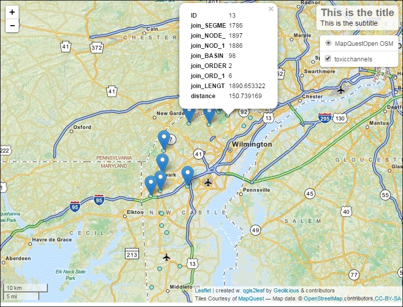
In this chapter, we produced a dynamic web application using a physical raster analysis example: hydrological analysis. To do this, we started by preparing the raster elevation data for the hydrological analysis and then performed the analysis. We took a look at how we could automate that workflow using the Modeler workflow automation tool. Next, we used NNJoin to create a spatial join between some hydrological outputs to produce a data source that would be suited to web interaction and querying. Finally, we published this data to an external cloud platform, CartoDB, and implemented their SQL API in a JavaScript function to find the toxic sites upstream from a location, given the Leaflet web client interaction. In the next chapter, we will produce a web application using network analysis and crowd sourced interaction.
In this chapter, we will explore formal network-like geographic vector object relationships. Topological relationships are useful in many ways for geographical data management and analysis, but perhaps the most important application is optimal path finding. Specifically, you will learn how to make a few visualizations related to optimal paths: isochron polygons and accumulated traffic lines. With these visual elements as a background, we will incorporate social media feedback through Twitter in our web map application. The end result will be an application that communicates back and forth with the stakeholders about safe school routes.
In this chapter, we will cover the following topics:
Vector-based GIS, if not by definition then de facto, are organized around databases of geographic objects, storing their geometric definitions, geographic metadata, object relationships, and other attributes. Postgres is a leading open source relational database platform. Unlike SQLite, this is not a file-based system, but rather it requires a running service on an available machine, such as the localhost or an accessible server. The spatial extension to Postgres, PostGIS, provides all the functionalities around geospatial data, such as spatial references, geographic transformation, spatial relationships, and more. Most recently, PostGIS has come to support topology—the formal relationships between geometric objects. pgRouting is a topological analysis engine built around optimal path-finding. Conveniently, PostGIS now comes bundled with pgRouting. The following content applies to Postgres 9.3.
On Windows, you can use the Postgres installer to install PostGIS and pgRouting along with Postgres. On Mac, you can use the Kyngchaos binary installer found at http://www.kyngchaos.com/software/postgres. On Linux, you can refer to the PostGIS installation documentation for your distribution found at http://postgis.net/install/.
The installation instructions for Windows are as follows:
Now that we installed the Postgres database server with PostGIS, the pgRouting extensions, and the pgAdmin III client program, we want to create a new database where we can work. Perform the following steps:
Next, we need to tell Postgres that we want to use the PostGIS and pgRouting extensions with our new database. Perform the following steps:
CREATE EXTENSION postgis;
CREATE EXTENSION pgrouting;
A topological network, which specifies the formal relationships between geometric objects, requires real geographic data for it to be useful in an actual physical space. So next, we will acquire some geographic data in order to construct a network providing the shortest path between points in a physical space, following certain rules embedded in the network. A great source of data for this, and many other purposes, is OpenStreetMap.
Now, let's move back to QGIS to acquire the OpenStreetMap data from which we will create a topological network:
The downloaded data must be added to the QGIS project to verify that it has been downloaded and to further work on the data from within QGIS. Perform the following steps:
We will project the OSM data onto the projection used by the other data to be added to the project, which is the location of the students. We want these two datasets to use the same projection system; otherwise, we will run into trouble while building our topological network and analyzing the network. Perform the following steps:
It is necessary that the topological edges to be created are coterminous with the geographic data vertices. This is called a topologically correct dataset. We will use Split lines with lines to fulfill this requirement. Perform the following steps:
c4/data/output/newark_osm.shp, as both the Input layer and Split layer.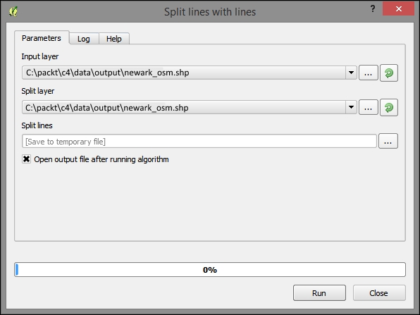
Now that we've prepared the OSM data, we need to actually load it into the database. Here, we can generate the topological relationships based on geographic relationships as determined by PostGIS.
Although we will be working from the Database Manager when dealing with the database in QGIS, we will first need to connect to the database through the normal "Add Layer" dialog. Perform the following steps:
packt_c4localhostpackt_c4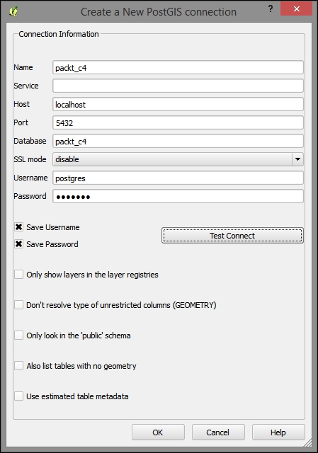
Once we've added the database connection, DB Manager is where we'll be interacting with the database. DB Manager provides query access via the SQL syntax as well as the facility to add results as a virtual (in memory, not on disk) layer. We can also use DB Manager to import or export data to/from the database when necessary. Perform the following steps:
packt_c4). The following is an image of the Database Manager and tables, which were generated when you created your new PostGIS database: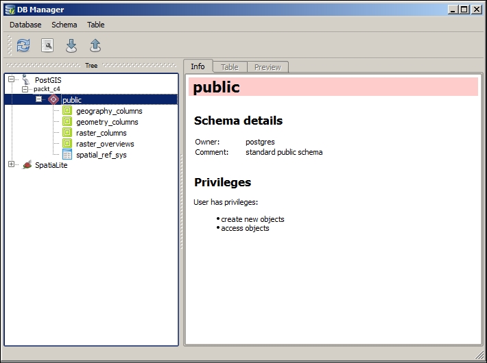
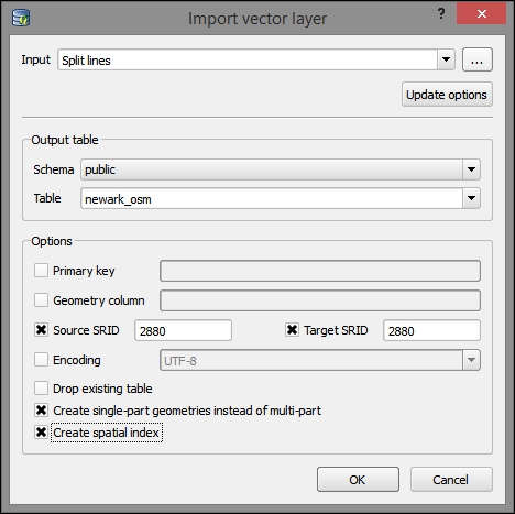
Repeat these steps with the students layer:
The imported tables and the associated schema and metadata information will now be visible in DB Manager, as shown in the following screenshot:
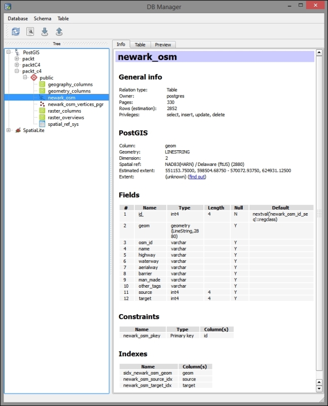
Next, run a query that adds the necessary fields to the newark_osm table, updating these with the topological information, and create the related table of the network vertices, newark_osm_vertices. These field names and types, expected by pgRouting, are added by the alter queries and populated by the pgr_createTopology pgRouting function. The length_m field is populated with the segment length using an update query with the st_length function (and st_transform here to control the spatial reference). This field will be used to help determine the cost of the shortest path (minimum cost) routing. Perform the following steps:
alter table newark_osm add column source integer;
alter table newark_osm add column target integer;
select pgr_createTopology('newark_osm', 0.0001, 'geom', 'id');

alter table newark_osm add column length_m float8;
update newark_osm set length_m = st_length(st_transform(geom,2880));The osm2po program performs many topological dataset preparation tasks that might otherwise require a longer workflow—such as the preceding task. As the name indicates, it is specifically used for the OpenStreetMap data. The osm2po program must be downloaded and installed separately from the osm2po website, http://osm2po.de. Once the program is installed, it is used as follows:
[..] > cd c:\packt\c4\data\output
c:\packt\c4\data\output>java -jar osm2po-5.0.0\osm2po-core-5.0.0-signed.jar cmd=tj
sp newark_osm.osm
This command will create a .sql file that you can run in your database to add the topological table to your database, producing something very similar to what we did in the preceding section.
Let's use the pgRouting Layer plugin to test whether the steps we've performed up to this point have produced a functioning topological network to find the shortest path. We will find the shortest path between two arbitrary points on the network: 1 and 1000. Perform the following steps:
Your output will look similar to the following image:
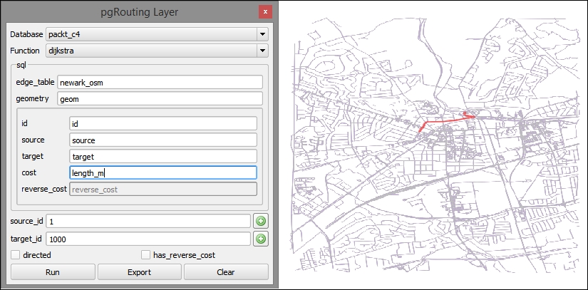
Let's say that the school in our study is located at the vertex with an ID of 1 in the newark_osm layer. To visualize the walking time from the students' homes, without releasing sensitive information about where the students actually live, we can create isochron polygons. Each polygon will cover the area that a person can walk from to a single destination within some time threshold.
We'll use DB Manager to create and populate a column for the travel time on each segment at the walking speed; then, we will create a query layer that includes the travel time from each road segment to our school at vertex 1. Perform the following steps:
ALTER TABLE newark_osm ADD COLUMN traveltime_min float8;
UPDATE newark_osm SET traveltime_min = length_m  / 6000.0 * 60;

SELECT *
FROM pgr_drivingdistance('SELECT id, source, target, traveltime_min as cost FROM newark_osm'::text, 1, 100000::double precision, false, false) di (seq, id1, id2, cost)
JOIN newark_osm rd ON di.id2 = rd.id;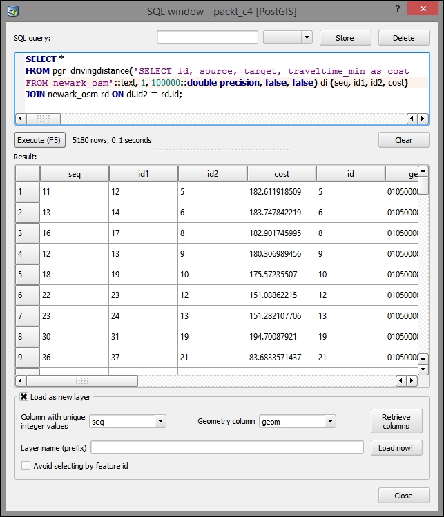
You can now symbolize the segments by the time it takes to get from that location to the school. To do this, use a Graduated style type with the traveltime_min field. You will see that the network segments with lower values (indicating quicker travel) are closer to vertex 1, and the opposite is true for the network segments with higher values. This method is limited by the extent to which the network models real conditions; for example, railroads are visualized along with other road segments for the travel time. However, railroads could cause discontinuity in our network—as they are not "traversable" by students traveling to school.
Next, we will create the polygons to visualize the areas from which the students can walk to school in certain time ranges. We can use this technique to characterize the general travel time and keep the student locations hidden.
We will need to first convert our current line-based travel time layer to points (centroids), using the polygons as an intermediate step. Perform the following steps:
c4/data/output/newark_isochrone.shp.c4/data/output/isochron_polygon.shpc4/data/output/isochron_polygon.shpc4/data/output/isochrons_centroids.shpNext, we'll create the actual isochron polygons for each time bin. We must select each set of travel time points using a filter expression for the three time periods: 15 minutes or less, 30 minutes or less, and 45 minutes or less. Then, we'll run the Concave hull tool on each selection. This will create a polygon feature around each set of points.
You'll perform the following steps three times for each of the three break values, which are 15, 30, and 45:
cost < [break value] (for example, cost < 15).c4/data/output/isochron45.shp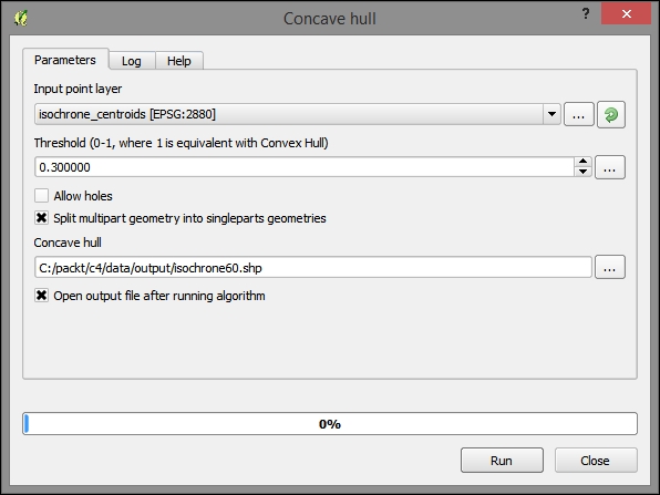
All concave hulls when displayed will look similar to the following image. The "spikiness" of the concave hulls reflects relatively few road segments (points) used to calculate these travel time polygons:
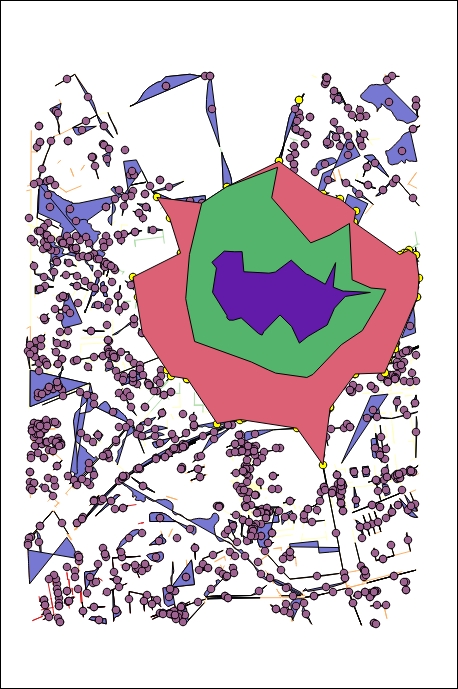
So far, we have only looked at the shortest path between all the given segments of road in the city. Now, given the student location, let's look at where student traffic will accumulate.
By following these steps, we will join attributes from the closest road segment—including the associated topological and travel attributes—to each student location. Perform the following steps:
students_topologystudents_topology into the packt_c4 database using Database Manager.The following image shows the parameters as entered into the NNJoin plugin:
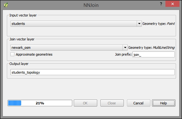
We want to find which routes are the most popular given the student locations, network characteristics, and school location. The following steps will produce an accumulated count of the student traffic along each network segment:
SELECT id, geom, count(id1)
FROM
(SELECT *
  FROM pgr_kdijkstraPath(
      'SELECT id, source, target, traveltime_min as cost FROM newark_osm',
      1, (SELECT array_agg(join_target) FROM students_topology), false, false
  ) a,
  newark_osm b
WHERE a.id3=b.id) x
GROUP BY id, geom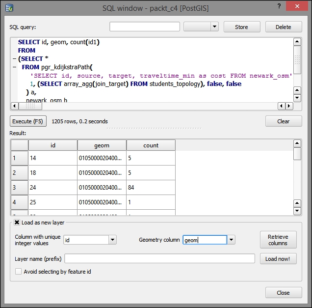
We want to visualize the number of students on each segment in a way that really accentuates the segments that have a high number of students traveling on them. A great way to do this is with a symbology expression. This produces a graduated symbol as would be found in other GIS packages. Perform the following steps:
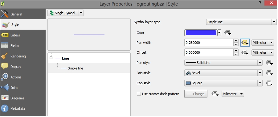
ln("count")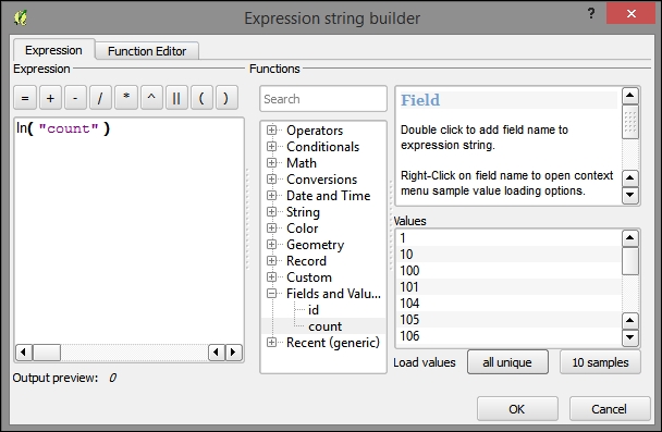
Now that we have mapped the variable sized symbol to the natural log of the count of students traveling on each segment, we will see a pleasing visualization of the "flow" of students traveling on each road segment. The student layer, showing the student locations, is displayed alongside the flow to better illustrate what the flow visualization shows.
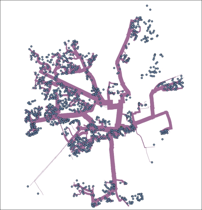
Decision makers can use the accumulated shortest paths output to identify the busiest paths to the school. They can use this information to communicate with guardians about the safest routes for their children.
Planners can go a step further by investing in safe infrastructure for the most used paths. For example, planners can identify the busy crossings over highways using the "count" attribute (and visualization) from the query layer and the "highways" attribute from newark_osm.
Of course, communication with stakeholders is ideally a two-way process. To achieve this goal, planners could establish a social networking account, such as a Twitter account, for parents and students to report the problems or features of the walking routes. Planners would likely want to look at this data as well to adjust the safe routes to the problem spots or amenities. This highly simplistic model should be adjusted for the other variables that could also be captured in the data and modeled, such as high traffic roads and so on.
The following instructions will direct you on how to set up a new Twitter account in a web browser and get your community to make geotagged tweets:
@YOURNAME). Retweet the tweets that you wish to add to your map. For a more passive solution, you can also follow all the users who you wish to capture; although, you'll need to find some way to filter out their irrelevant tweets.We must now download and install Python-based Twitter Tools, which leverage the Twitter API. This will allow us to pull down GeoJSON from our Twitter account. Perform the following steps:
sudo to run it with full privileges. Your OS Account must have administrator privileges. Navigate to C:\Program Files\QGIS Wien\OSGeo4W.bat.cd) into the directory that you extracted into (for example, C:\Users\[YOURUSERNAME]\Downloads\twitter-master\twitter-master), using the following command line:
> cd C:\Users\[YOURUSERNAME]\Downloads\twitter-master\twitter-master
> python setup.py install
> twitter
Running python setup.py install in a directory containing the setup.py file on a path including the Python executable is the normal way to build (install) a Python program. You will need to install the setuptools module beforehand. The instructions to do so can be found on this website: https://pypi.python.org/pypi/setuptools.
twitter --help for more options. Execute the following in the command line:> twitter --format json 1> "C:\packt\c4\data\output\twitter.json" > cd c:\packt\c4 > python
import json
f = open('./output/twitter.json', 'r')
jsonStr = f.read()
f.close()
jpy = json.loads(jsonStr)
geojson = ''
for x in jpy['safe']:
  if x['geo'] :
    geojson += '{"type": "Feature","geometry": {"type": "Point", "coordinates": [' + str(x['geo']['coordinates'][1]) + ',' + str(x['geo']['coordinates'][0]) + ']}, "properties": {"id": "' + str(x['id']) + '", "text": "' + x['text'] + '"}},'
geojson = geojson[:-1]
geojson += ']}'
geojson = '{"type": "FeatureCollection","features": [' + geojson
f = open('./data/output/twitter.geojson', 'w')
f.write(geojson)
f.close()
Or run the following command:
> python twitterJson2GeoJson.py
Here is an example of the GeoJSON-formatted output:
{"type": "FeatureCollection","features": [{"type": "Feature","geometry": {"type": "Point", "coordinates": [-75.75451,39.67434]}, "properties": {"id": "606454366212530177", "text": "Hello world"}},{"type": "Feature","geometry": {"type": "Point", "coordinates": [-75.73968,39.68139]}, "properties": {"id": "606454626456473600", "text": "Testing"}},{"type": "Feature","geometry": {"type": "Point", "coordinates": [-75.76838,39.69243]}, "properties": {"id": "606479472271826944", "text": "Test"}}]}Save this as c4/output/twitter.geojson from a text editor and import the file into QGIS as a vector layer to preview it along with the other layers. When these layers are symbolized, you may see something similar to the following image:
Finally, export the web application with qgis2leaf. You will notice some loss of information and symbology here. In addition, you may wish to customize the code to take advantage of the data and content passed through Twitter.
In this chapter, through a safe route selection example, we built a topological network using OSM data and Postgres with its PostGIS and pgRouting extensions. Using this network, we modeled the travel time to school from different locations on the road network and the students' travel to school, visualizing which routes were more and less frequently used. Finally, we added the contributed social network data on Twitter through a Python-based API, which we built using a typical Python build process. We then exported all the results using the same method as we did in the previous chapters: qgis2leaf. In the next chapter, we will explore the relationship between time and space and visualization through some new libraries.
In this chapter, we will encounter the visualization and analytical techniques of exploring the relationships between place and time and between the places themselves.
The data derived from temporal and spatial relationships is useful in learning more about the geographic objects that we are studying—from hydrological features to population units. This is particularly true if the data is not directly available for the geographic object of interest: either for a particular variable, for a particular time, or at all.
In this example, we will look at the demographic data from the US Census applied to the State House Districts, for election purposes. Elected officials often want to understand how the neighborhoods in their jurisdictions are changing demographically. Are their constituents becoming younger or more affluent? Is unemployment rising? Demographic factors can be used to predict the issues that will be of interest to potential voters and thus may be used for promotional purposes by the campaigns.
In this chapter, we will cover the following topics:
So far, we've looked at the methods of analysis that take advantage of the continuity of the gridded raster data or of the geometric formality of the topological network data.
For ordinary vector data, we need a more abstract method of analysis, which is establishing the formal relationships based on the conditions in the spatial arrangement of geometric objects.
For most of this section, we will gather and prepare the data in ways that will be familiar. When we get to preparing the boundary data, which is leveraging the State House Districts data from the census tracts, we will be covering new territory—using the spatial relationships to construct the data for a given geographic unit.
First, we will gather data from the sections of the US Census website. Though this workflow will be particularly useful for those working with the US demographic data, it will also be instructive for those dealing with any kind of data linked to geographic boundaries.
To begin with, obtain the boundary data with a unique identifier. After doing this, obtain the tabular data with the same unique identifier and then join on the identifier.
Download 2014 TIGER/Line Census Tracts and State Congressional Districts from the US Census at https://www.census.gov/geo/maps-data/data/tiger-line.html.
c5/data/original and extract them.Many different demographic datasets are available on the American FactFinder site. These complement the TIGER/Line data mentioned before with the attribute data for the TIGER/Line geographic boundaries. The main trick is to select the matching geographic boundary level and extent between the attribute and the geographic boundary data. Perform the following steps:
White and select B02008: WHITE ALONE OR IN COMBINATION WITH ONE OR MORE RACES in the suggested options. Then, click on GO.
total into the topic or table name field, selecting B01003: TOTAL POPULATION from the suggested datasets, and then click on GO.
aff_download.zip directory.c5/data/original and then extract it.First, we will cover the steps for tabular data preparation and exporting, which are fairly similar to those we've done before. Next, we will cover the steps for preparing the boundary data, which will be more novel. We need to prepare this data based on the spatial relationships between layers, requiring the use of SQLite, since this cannot easily be done with the out-of-the-box or plugin functionality in QGIS.
Our tabular data is of the census tract white population. We only need to have the parseable latitude and longitude fields in this data for plotting later and, therefore, can leave it in this generic tabular format.
To combine this yearly data, we can join each table on a common GEOID field in QGIS. Perform the following steps:
.shp extension. Data tables will be named something similar to x_with_ann.csv. You need to do this the same way you did earlier, which was through Add Vector Layer under the Layer menu. Here is a list of all the files to add:tl_2014_42_tract.shpACS_09_5YR B01003_with_ann.csvACS_10_5YR B01003_with_ann.csvACS_11_5YR B01003_with_ann.csvACS_12_5YR B01003_with_ann.csvACS_13_5YR B01003_with_ann.csvtl_2014_42_tract, from the Layers panel.x_B02008_with_ann), perform the following steps: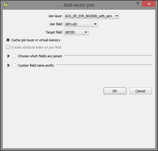
After joining all the tables, you will find many rows in the attribute table containing null values. If you sort them a few years later, you will find that we have the same number of rows populated for more recent years as we have in the Philadelphia tracts layer. However, the year 2009 (ACS_09_5YR B01003_with_ann.csv) has many rows that could not be populated due to the changes in the unique identifier used in the 2014 boundary data. For this reason, we will exclude the year 2009 from our analysis. You can remove the 2009 data table from the joined tables so that we don't have any issue with this later.
Now, export the joined layer as a new DBF database file, which we need to do to be able to make some final changes:
c5/data/output/whites.dbfQGIS allows us to calculate the coordinates for the geographic features and populate an attribute field with them. On the layer for the new DBF, calculate the latitude and longitude fields in the expected format and eliminate the unnecessary fields by performing the following steps:
lon field and fulfill the following parameters:lon."INTPLON". You can choose this from the Fields and Values sections in the tree under the Functions panel.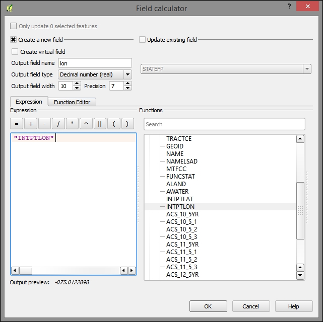
lat field from INTPLAT.name; Output field type: Text; Output field width: 50; Expression: NAMESLADJan-11; Output field type: Whole number (integer); Expression: "ACS_11_5_2" - "ACS_10_5_2"Jan-12; Output field type: Whole number (integer); Expression: "ACS_12_5_2" - "ACS_11_5_2"Jan-13; Output field type: Whole number (integer); Expression: "ACS_13_5_2" - "ACS_12_5_2"name, Jan-11, Jan-12, Jan-13, lat, and lon). This will remove all the unnecessary identification fields and those with a margin of error from the table.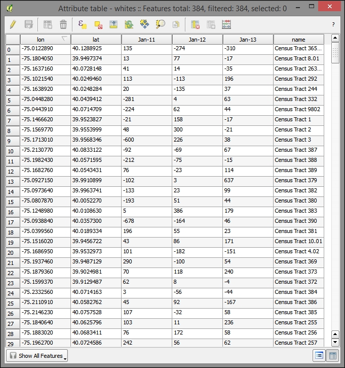
Finally, export the modified table as a new CSV data table, from which we will create our map visualization. Perform the following steps:
Although we have the boundary data for the census tracts, we are only interested in visualizing the State House Districts in our application. Our stakeholders are interested in visualizing change for these districts. However, as we do not have the population data by race for these boundary units, let alone by the yearly population, we need to leverage the spatial relationship between the State House Districts and the tracts to derive this information. This is a useful workflow whenever you have the data at a different level than the geographic unit you wish to visualize or query.
Now, we will construct a field that contains the average yearly change in the white population between 2010 and 2013. Perform the following steps:
B01003_with_ann) to the joined tract layer, tl_2014_42_tract, on the same GEO.id2, GEO fields from the new total population tables, and the tract layer respectively. Do not join the 2009 table, because we discovered that there were many null values in the join fields for the white-only version of this.tract_change and adding this to the map.avg_change.((("ACS_11_5_2" - "ACS_10_5_2")/ "ACS_10_5_2" )+
(("ACS_12_5_2" - "ACS_11_5_2")/ "ACS_11_5_2" )+
(("ACS_13_5_2" - "ACS_12_5_2")/ "ACS_12_5_2" ))/3 * 100Now that we have a value for the average change in white population by tract, let's attach this to the unit of interest, which are the State House Districts. We will do this by doing a spatial join, specifically by joining all the records that intersect our House District bounds to that House District. As more than one tract will intersect each State House District, we'll need to aggregate the attribute data from the intersected tracts to match with the single district that the tracts will be joined to.
We will use SpatiaLite for doing this. Similar to PostGIS for Postgres, SpatiaLite is the spatial extension for SQLite. It is file-based; rather than requiring a continuous server listening for connections, a database is stored on a file, and client programs directly connect to it. Also, SpatiaLite comes with QGIS out of the box, making it very easy to begin to use. As with PostGIS, SpatiaLite comes with a rich set of spatial relationship functions, making it a good choice when the existing plugins do not support the relationship we are trying to model.
To do this, perform the following steps:
c5/data/output/district_join.sqlite.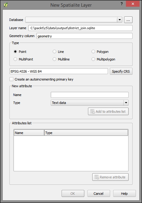
To import layers to SpatiaLite, you can perform the following steps:
tract_change and tl_2014_42_sldl).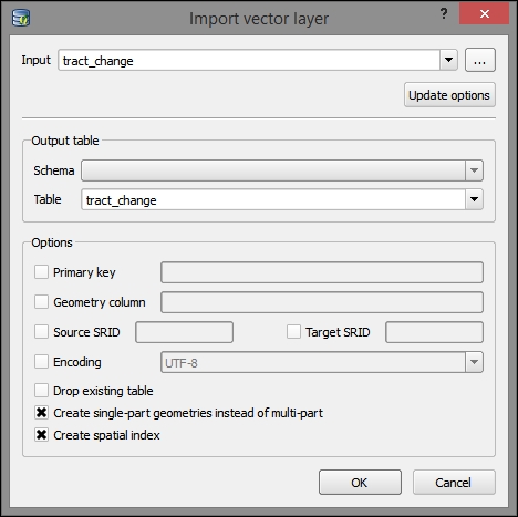
Now, repeat these steps with the House Districts layer (tl_2014_42_sldl), and deselect Create single-part geometries instead of multi-part as this seems to cause an error with this file, perhaps due to some part of a multi-part feature that would not be able to remain on its own under the SpatiaLite data requirements.
Next, we use the DB Manager to query the SpatiaLite database, adding the results to the QGIS layers panel.
We will use the MBRIntersects criteria here, which provides a performance advantage over a regular Intersects function as it only checks for the intersection of the extent (bounding box). In this example, we are dealing with a few features of limited complexity that are not done dynamically during a web request, so this shortcut does not provide a major advantage—we do this here so as to demonstrate its use for more complicated datasets.
tract_change and tl_2014_42_sldl (State Legislative District) tables, where they overlap. It also performs an aggregate (average) of the change by the State Legislative Districts overlying the census tract boundaries:SELECT t1.pk, t1.namelsad, t1.geom, avg(t2.avg_change)*1.0 as avg_change FROM tl_2014_42_sldl AS t1, tract_change AS t2 WHERE MbrIntersects(t1.geom, t2.geom) = 1 GROUP BY t1.pk;
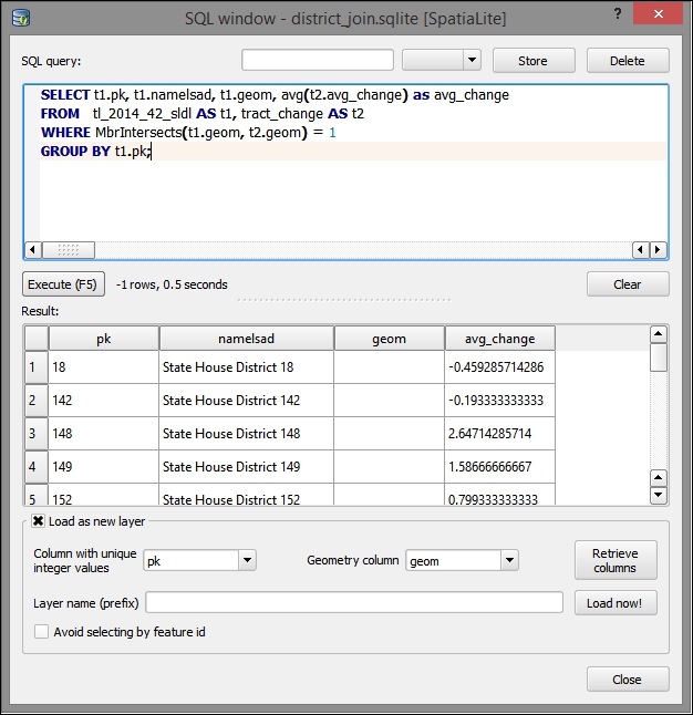
The symbolized result of the spatial relationship join showing the average white population change over a 4-year period for the State House Districts' census tracts intersection will look something similar to the following image:
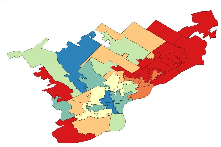
Next, we will move on to preparing this data relationship for the Web and its spatiotemporal visualization.
TopoJSON is a variant of JSON, which uses the topological relationships between the geometric features to greatly reduce the size of the vector data and thereby improves the browser's rendering performance and reduces the risk of delay due to data transfers.
The following code is an example of GeoJSON, showing two of our State House Districts. The format is familiar—based on our previous work with JSON—with sets of coordinates that define a polygonal area grouped together. The repeated sections are marked by ellipses (…).
{
  "type": "FeatureCollection",
  "crs": { "type": "name", "properties": { "name":   "urn:ogc:def:crs:OGC:1.3:CRS84" } },

  "features": [
{ "type": "Feature", "properties": { "STATEFP": "42", "SLDLST": "181", "GEOID": "42181", "NAMELSAD": "State House District 181", "LSAD": "LL", "LSY": "2014", "MTFCC": "G5220", "FUNCSTAT": "N", "ALAND": 8587447.000000, "AWATER": 0.000000, "INTPTLAT": "+39.9796799", "INTPTLON": "-075.1533540" }, "geometry": { "type": "Polygon", "coordinates": [ [ [ -75.176782, 39.987337 ], [ … ] ]] } }, {…}]}The following code is the corresponding representation of the same two State House Districts in TopoJSON, as discussed earlier.
Although this example uses the same coordinate system (WGS84/EPSG:4326) as that used before, it is expressed as simple pairs of abstract space coordinates. These are ultimately transformed into the WGS coordinate system using the scale and translate data in the transform section of the data.
By taking advantage of the shared topological relationships between geometric objects, the amount of data can be drastically reduced from 21K to 7K. That's a reduction of 2/3! You will see in the following code that each polygon is not clearly represented on its own but rather through these topological relationships. The repeated sections are marked by ellipses (…).
{"type":"Topology","objects":{"geojson":{"type":"GeometryCollection","crs":{"type":"name","properties":{"name":"urn:ogc:def:crs:OGC:1.3:CRS84"}},"geometries":[{"type":"Polygon","properties":{"STATEFP":"42","SLDLST":"181","GEOID":"42181","NAMELSAD":"State House District 181","LSAD":"LL","LSY":"2014","MTFCC":"G5220","FUNCSTAT":"N","ALAND":8587447,"AWATER":0,"INTPTLAT":"+39.9796799","INTPTLON":"-075.1533540"},"arcs":[[0,1]]},{"type":"Polygon","properties":{"STATEFP":"42","SLDLST":"197","GEOID":"42197","NAMELSAD":"State House District 197","LSAD":"LL","LSY":"2014","MTFCC":"G5220","FUNCSTAT":"N","ALAND":8251026,"AWATER":23964,"INTPTLAT":"+40.0054726","INTPTLON":"-075.1405813"},"arcs":[[-1,2]]}]}},"arcs":[[[903,5300],[…]]]],"transform":{"scale":[0.0000066593659365934984,0.000006594359435944118],"translate":[-75.176782,39.961088]}}Similar to TopoJSON, Vector simplification removes the nodes in a line or polygon layer and will often greatly increase the browser's rendering performance while decreasing the file size and network transfer time.
As the vector shapes can have an infinite level of complexity, in theory, simplification methods can decrease the complexity by more than 99 percent while still preserving the perceivable shape of the geometry. In reality, the level of complexity at which perception becomes significantly affected will almost never be this high; however, it is common to have a very acceptable perception change at 90 percent complexity loss. The more sophisticated simplification methods have improved results.
A number of simplification methods are commonly in use, each having strengths for particular data characteristics and outcomes. If one does not produce a good result, you can always try another. In addition to the method itself, you will also usually be asked to define a threshold parameter for an acceptable amount of complexity loss, as defined by the percentage of complexity lost, area, or some other measure.
The Visvalingam effective area method is the only method of simplification offered in the TopoJSON command-line tool that we will use. Mapshaper, a web-based tool that we will take a look at offers all these three methods but uses the weighted area method by default.
Other options affecting the data size are often offered alongside the simplification methods.
Both Web and desktop TopoJSON conversion tools that we will use support these simplification options. That way, you can simplify a polygon at the same time as you reduce the data size through the topological relationship notation.
If you wish to produce data other than for TopoJSON, you will need to find another way to do the simplification.
QGIS provides Simplify Geometries out of the box (navigate to Vector | Geometry Tools | Simplify Geometries), which does a Douglas-Peucker simplification. While it is the most popular method, it may not be the most effective one (see the following section for more).
The Simplify plugin offers a Visalvingam method in addition to Douglas-Peuker.
There are a few options for writing TopoJSON. We will take a look at one for the desktop, which requires a software installation, and one via the web browser. As you might imagine, the desktop option will be more stable for doing anything in a customized way, which the web browser does not support, and is also more stable with the more complex feature sets. The web browser has the advantage of not requiring an install.
You can use the web-based mapshaper software from http://www.mapshaper.org/ to convert from shapefile and other formats to TopoJSON and vice versa. Perform the following steps to convert the State Legislative Districts shapefile to TopoJSON:
c5/data/original/tl_2014_42_sldl/tl_2014_42_sldl.shp) from your local computer or drag a file in. As the page indicates, Shapefile, GeoJSON, and TopoJSON are supported.You will get the following screen in your browser:
The command-line tool is useful if you are working with a larger or more complicated dataset. The downside is that it requires that you install Node.js as it is a node package. For our purposes, Node.js is similar to Python. It is an interpreter environment for JavaScript, allowing the programs written in JavaScript to be run locally. In addition, it includes a package manager to install the needed dependencies. It also includes a web server—essentially running JavaScript as a server-side language.
Perform the following steps:
>npm install -g topojson
cd c:\packt\c5\data\output and input the following:
>topojson -p -o house_district.json house_district.shp
You will now get the following output:
Mapshaper also has a command-line tool, which we did not evaluate here.
D3 is a JavaScript library used for building the visualizations from the Document Object Model (DOM) present in all the modern web browsers.
In more detail, D3 manipulates the DOM into abstract vector visualization components, some of which have been further tailed to certain visualization types, such as maps. It provides us with the ability of parsing from some common data sources and binding, especially to the SVG and canvas elements that are designed to be manipulated for vector graphics.
There are a few basic aspects of D3 that are useful for you to understand before we begin. As D3 is not specifically built for geographic data, but rather for general data visualization, it tends to look at geographic data visualization more abstractly. Data must be parsed from its original format into a D3 object and rendered into the graphic space as an SVG or canvas element with a vector shape type. It must then be projected using relative mapping between the graphic space and a geographic coordinate system, scaled in relation to the graphic space and the geographic extent, and bound to a web object. This all must be done in relation to a D3 cursor of sorts, which handles the current scope that D3 is working in with keywords like "begin" and "end".
We will be parsing through the d3.json and d3.csv methods. We use the callbacks of these methods to wrap the code that we want to be executed after the external data has been parsed into a JavaScript object.
D3 makes heavy use of the two vector graphic elements in HTML5: SVG and Canvas. Scaleable Vector Graphics (SVG) is a mature technology for rendering vector graphics in the browser. It has seen some advancement in cross-browser support recently. Canvas is new to HTML5 and may offer better performance than SVG. Both, being DOM elements, are written directly as a subset of the larger HTML document rendered by the browser. Here, we will use SVG.
D3 is a bit unusual where geographic visualization libraries are concerned, in that it requires very little functionality specific to geographic data. The main geographic method provided is through the path element, projection, as D3 has its own concept of coordinate space, coordinates of the browser window and elements inside it.
Here is an example of projection. In the first line, we set the projection as Mercator. This allows us to center the map in familiar spherical latitude longitude coordinates. The scale property allows us to then zoom closer to the extent that we are interested in.
var projection = d3.geo.mercator()
  .center([-75.166667,40.03])
  .scale(60000);
You must configure a shape generator to bind to the d attribute of an SVG. This will tell the element how to draw the data that has been bound to it.
The main shape generator that we will use with the maps is path. Circle is also used in the following example, though its use is more complicated.
The following code creates a path shape generator, assigns it a projection, and stores it all in variable path:
var path = d3.geo.path()
  .projection(projection);
Scales allow the mapping of a domain of real data; say you have values of 1 through 100, in a range of possible values, and say you want everything down to numbers from 1 through 5. The most useful purpose of scales in mapping is to associate a range of values with a range of colors. The following code maps a set of values to a range of colors, mapping in-between values to intermediate colors:
var color = d3.scale.linear()
  .domain([-.5, 0, 2.66])
.range(["#FFEBEB", "#FFFFEB", "#E6FFFF"]);After a data object has been parsed into the DOM, it can be bound to a D3 object through its data or datum attribute.
In order to select the potentially existing elements, you will use the Select and Select All keywords. Then, based on whether you expect the elements to already be existent, you will use the Enter (if it is not yet existent), Return (if it is already existent), and Exit (if you wish to remove it) keywords to change the interaction with the element.
Here's an example of Select All, which uses the Enter keyword. The data from the house_district JSON, which was previously parsed, is loaded through the d attribute of the path element and assigned the path shape generator. In addition, a function is set on the fill attribute, which returns a color from the linear color scale:
map.selectAll("path")
  .data(topojson.feature(phila, phila.objects.house_district).features)
  .enter()
    .append("path")
    .attr("vector-effect","non-scaling-stroke")
    .style("fill", function(d) { return color(d.properties.d_avg_change); })
.attr("d", path);Through the following steps, we will produce an animated time series map with D3. We will start by moving our data to a filesystem path that we will use:
whites.csv to c5/data/web/csv.house_district.json to c5/data/web/json.Start the Python HTTP server using the code from Chapter 1, Exploring Places – from Concept to Interface, (refer to the Parsing the JSON data section from Chapter 7, Mapping for Enterprises and Communities). This is necessary for this example, since the typical cross-site scripting protection on the browsers would block the loading of the JSON files from the local filesystem.
You will find the following files and directory structure under c5/data/web:
|
|
|
|
|
|
|
|
|
|
|
Various supporting images |
|
|
|
|
|
|
|
|
|
The following code, mostly JavaScript, will provide a time-based animation of our geographic objects through D3. This code is largely based on the one found at TIP Strategies' Geography of Jobs map found at http://tipstrategies.com/geography-of-jobs/. The main code file is at c5/data/web/js/main.js.
Note the reference to the CSV and TopoJSON files that we created earlier: whites.csv and house_district.json.
All of the following JavaScript code is in ./js/main.js. All our customizations to this code will be done in this file:
var width = 960,
  height = 600;

//sets up the transformation from map coordinates to DOM coordinates
var projection = d3.geo.mercator()
  .center([-75.166667,40.03])
  .scale(60000);

//the shape generator
var path = d3.geo.path()
  .projection(projection);

var svg = d3.select("#map-container").append("svg")
  .attr("width", width)
  .attr("height", height);

var g = svg.append("g");

g.append( "rect" )
  .attr("width",width)
  .attr("height",height)
  .attr("fill","white")
  .attr("opacity",0)
  .on("mouseover",function(){
    hoverData = null;
    if ( probe ) probe.style("display","none");
  })

var map = g.append("g")
  .attr("id","map");

var probe,
  hoverData;

var dateScale, sliderScale, slider;

var format = d3.format(",");

  var months = ["Jan"],
    months_full = ["January"],
    orderedColumns = [],
    currentFrame = 0,
    interval,
    frameLength = 1000,
    isPlaying = false;

var sliderMargin = 65;

function circleSize(d){
  return Math.sqrt( .02 * Math.abs(d) );
};

//color scale
var color = d3.scale.linear()
  .domain([-.5, 0, 2.66])
    .range(["#FFEBEB", "#FFFFEB", "#E6FFFF"]);

//parse house_district.json TopoJSON, reference color scale and other styles
d3.json("json/house_district.json", function(error, phila) {
  map.selectAll("path")
    .data(topojson.feature(phila, phila.objects.house_district).features)
      .enter()
      .append("path")
      .attr("vector-effect","non-scaling-stroke")
      .attr("class","land")
      .style("fill", function(d) { return color(d.properties.d_avg_change); })
      .attr("d", path);

  //add a path element for district outlines
  map.append("path")
    .datum(topojson.mesh(phila, phila.objects.house_district, function(a, b) { return a !== b; }))
      .attr("class", "state-boundary")
      .attr("vector-effect","non-scaling-stroke")
      .attr("d", path);

  //probe is for popups
  probe = d3.select("#map-container").append("div")
    .attr("id","probe");

  d3.select("body")
    .append("div")
    .attr("id","loader")
    .style("top",d3.select("#play").node().offsetTop + "px")
    .style("height",d3.select("#date").node().offsetHeight + d3.select("#map-container").node().offsetHeight + "px");

  //load and parse whites.csv
  d3.csv("csv/whites.csv",function(data){
    var first = data[0];
    // get columns
    for ( var mug in first ){
      if ( mug != "name" && mug != "lat" && mug != "lon" ){
        orderedColumns.push(mug);
    }
  }

  orderedColumns.sort( sortColumns );

  // draw city points
  for ( var i in data ){
    var projected = projection([ parseFloat(data[i].lon), parseFloat(data[i].lat) ])
    map.append("circle")
      .datum( data[i] )
      .attr("cx",projected[0])
      .attr("cy",projected[1])
      .attr("r",1)
      .attr("vector-effect","non-scaling-stroke")
      .on("mousemove",function(d){
        hoverData = d;
        setProbeContent(d);
        probe
        .style( {
          "display" : "block",
          "top" : (d3.event.pageY - 80) + "px",
          "left" : (d3.event.pageX + 10) + "px"
        })
      })
      .on("mouseout",function(){
        hoverData = null;
        probe.style("display","none");
      })
    }

    createLegend();

    dateScale = createDateScale(orderedColumns).range([0,3]);

    createSlider();

    d3.select("#play")
      .attr("title","Play animation")
      .on("click",function(){
        if ( !isPlaying ){
          isPlaying = true;
          d3.select(this).classed("pause",true).attr("title","Pause animation");
          animate();
        } else {
          isPlaying = false;
          d3.select(this).classed("pause",false).attr("title","Play animation");
          clearInterval( interval );
        }
      });

      drawMonth( orderedColumns[currentFrame] ); // initial map

      window.onresize = resize;
       resize();

      d3.select("#loader").remove();

    })

});The finished product, which you can view by opening index.html in a web browser, is an animated set of points controlled by a timeline showing the change in the white population by the census tract. This data is displayed on top of the House Districts, colored from cool to hot by the change in the white population per year, and averaged over three periods of change (2010-11, 2011-12, and 2012-13). Our map application output, animated with a timeline, will look similar to this:
In this chapter, using an elections example, we covered spatial temporal data visualization and spatial relationship data integration. We also converted the data to TopoJSON, a format associated with D3, which greatly improves performance. We also created a spatial temporal animated web application through the D3 visualization library. In the next chapter, we will explore the interpolation to find the unknown values, the use of tiling, and the UTFGrid method to improve the performance with more complicated datasets.
In this chapter, we will use interpolation methods to estimate the unknown values at one location based on the known values at other locations.
Interpolation is a technique to estimate unknown values entirely on their geographic relationship with known location values. As space can be measured with infinite precision, data measurement is always limited by the data collector's finite resources. Interpolation and other more sophisticated spatial estimation techniques are useful to estimate the values at the locations that have not been measured. In this chapter, you will learn how to interpolate the values in weather station data, which will be scored and used in a model of vulnerability to a particular agricultural condition: mildew. We've made the weather data a subset to provide a month in the year during which vulnerability is usually historically high. An end user could use this application to do a ground truthing of the model, which is, matching high or low predicted vulnerability with the presence or absence of mildew. If the model were to be extended historically or to near real time, the application could be used to see the trends in vulnerability over time or to indicate that a grower needs to take action to prevent mildew. The parameters, including precipitation, relative humidity, and temperature, have been selected for use in the real models that predict the vulnerability of fields and crops to mildew.
In this chapter, we will cover the following topics:
Often, the data to be used in a highly interactive, dynamic web application is stored in an existing enterprise database. Although these are not the usual spatial databases, they contain coordinate locations, which can be easily leveraged in a spatial application.
The following section is provided as an illustration only—database installation and setup are needlessly time consuming for a short demonstration of their use.
If you do wish to install and set up MySQL, you can download it from http://dev.mysql.com/downloads/. MySQL Community Server is freely available under the open source GPL license. You will want to install MySQL Workbench and MySQL Utilities, which are also available at this location, for interaction with your new MySQL Community Server instance. You can then restore the database used in this demonstration using the Data Import/Restore command with the provided backup file (c6/original/packt.sql) from MySQL Workbench.
To connect to and add data from your MySQL database to your QGIS project, you need to do the following (again, as this is for demonstration only, it does not require database installation and setup):
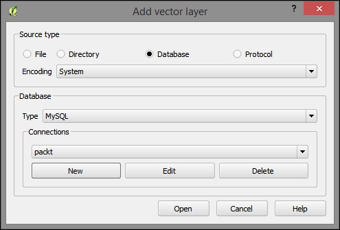
.sql backup of the packt schema:packtlocalhostpackt3306packtpackt, as shown in the following screenshot: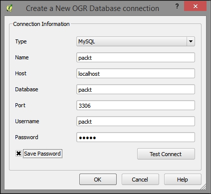
fieldsprecipitationrelative_humiditytemperatureThe layers (actually just the data tables) from the MySQL Database will now appear in the QGIS Layers panel of your project.
The fields layer (table) is only one of the four tables we added to our project with latitude and longitude fields. We want this table to be recognized by QGIS as geospatial data and these coordinate pairs to be plotted in QGIS. Perform the following steps:
.csv file. This file is included in the data under c6/data/output/fields.csv.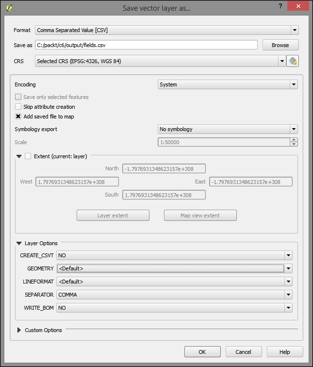
Now, to import the CSV with the coordinate fields that are recognized as geospatial data and to plot the locations, perform the following steps:
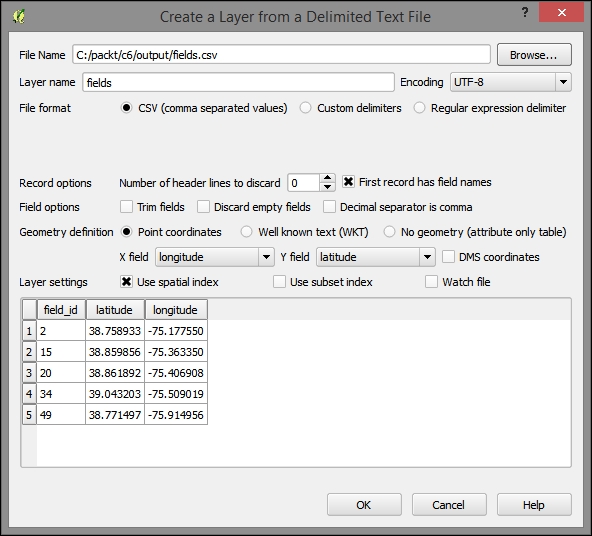
You will receive a notification that as no coordinate system was detected in this file, WGS 1984 was assigned. This is the correct coordinate system in our case, so no further intervention is necessary. After you dismiss this message, you will see the fields locations plotted on your map. If you don't, right–click on the new layer and select Zoom to Layer.
Note that this new layer is not reflected in a new file on the filesystem but is only stored with this QGIS project. This would be a good time to save your project.
Finally, join the other the other tables (precipitation, relative_humidity, and temperature) to the new plotted layer (fields) using the field_id field from each table one at a time. For a refresher on how to do this, refer to the Table join section of Chapter 1, Exploring Places – from Concept to Interface. To export each layer as separate shapefiles, right-click on each (precipitation, relative_humidity, and temperature), click on Save as, populate the path on which you want to save, and then save them.
The newer versions of QGIS support layer/table relations, which would allow us to model the one-to-many relationship between our locations, and an abstract measurement class that would include all the parameters. However, the use of table relationships is limited to a preliminary exploration of the relationships between layer objects and tables. The layer/table relationships are not recognized by any processing functions. Perform the following steps to explore the many-to-many layer/table relationships:
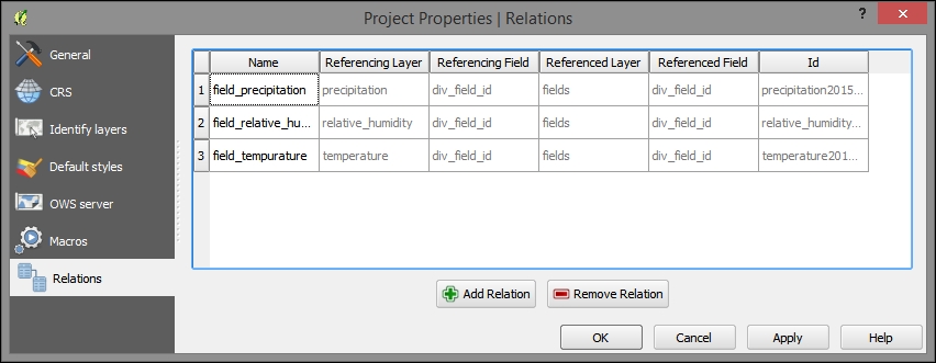
field_id), which references the layer, to relate the tables. The name field can be filled arbitrarily, as shown in the following screenshot: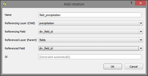
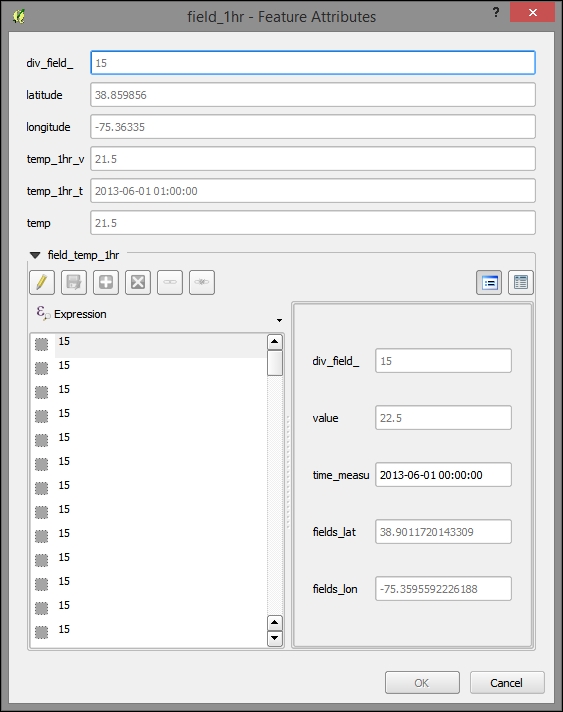
Network Common Data Form (NetCDF) is a standard—and powerful—format for environmental data, such as meteorological data. NetCDF's strong suit is holding multidimensional data. With its abstract concept of dimension, NetCDF can handle the dimensions of latitude, longitude, and time in the same way that it handles other often physical, continuous, and ordinal data scales, such as air pressure levels.
For this project, we used the monthly global gridded high-resolution station (land) data for air temperature and precipitation from 1901-2010, which the NetCDF University of Delaware maintains as part of a collaboration with NOAA. You can download further data from this source at http://www.esrl.noaa.gov/psd/data/gridded/data.UDel_AirT_Precip.html.
While there is a plugin available, NetCDF can be viewed directly in QGIS, in GDAL via the command line, and in the QGIS Python Console. Perform the following steps:
c6/data/original/air.mon.mean.v301.nc and add this layer.air_valid_range. You can see this information highlighted in the following image. Although QGIS's classifier will calculate the range for you, it is often thrown off by a numeric nodata value, which will typically skew the range to the lower end.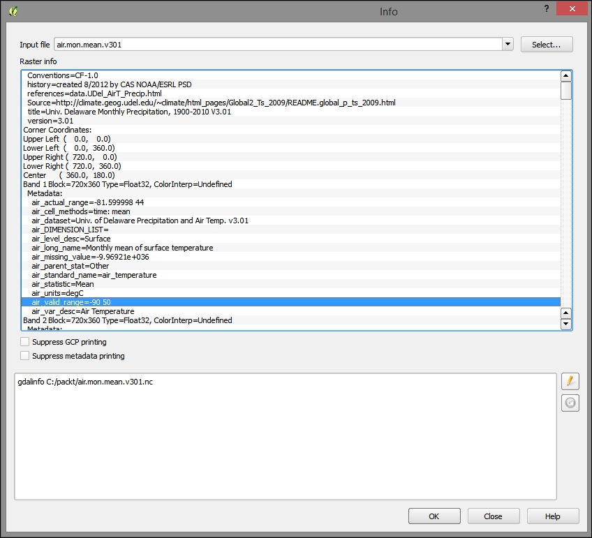
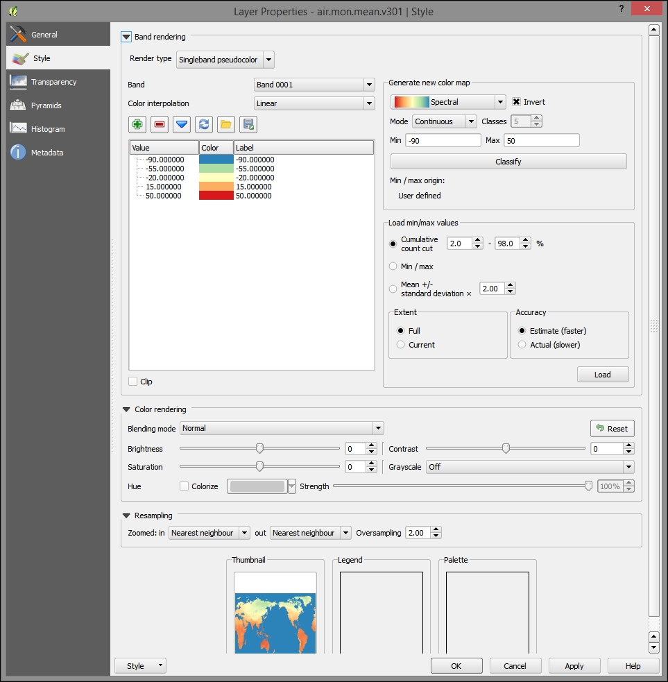
To render the gridded NetCDF data accessible to certain models, databases, and to web interaction, you could write a workflow program similar to the following after sampling the gridded values and attaching them to the points for each time period.
In this section, we will cover the creation of new statewide, point-based vulnerability index data from our limited weather station data obtained from the MySQL database mentioned before.
With Python's large and growing number of wrappers, which allow independent (often C written and compiled) libraries to be called directly into Python, it is the natural choice to communicate with other software. Apart from direct API and library use, Python also provides access to system automation tasks.
A deceptively simple challenge in developing with Python is of knowing which paths and dependencies are loaded into your development environment.
To print your paths, type out the following in the QGIS Python Console (navigate to Plugins | Python Console) or the OSGeo4W Shell bundled with QGIS:
import os
try:
  user_paths = os.environ['PYTHONPATH'].split(os.pathsep)
except KeyError:
  user_paths = []
print user_paths
To list all the modules so that we know which are already available, type out the following:
import sys
sys.modules.keys()
Once we know which modules are available to Python, we can look up documentation on those modules and the programmable objects that they may expose.
Remember to view all the special characters (including whitespace) in whatever text editor or IDE you are using. Python is sensitive to indentation as it relates to code blocks! You can set your text editor to automatically write the tabs as a default number of spaces. For example, when I hit a tab to indent, I will get four spaces instead of a special tab character.
Now, we're going to move into nonevaluation code. You may want to take this time to quit QGIS, particularly if you've been working in the Python command pane. If I'm already working on the command pane, I like to quit using Python syntax with the following code:
quit()
After quitting, start QGIS up again. The Python Console can be found under Plugins | Python Console.
By running the next code snippet in Python, you will generate a command-line code, which we will run, in turn, to generate intermediate data for this web application.
We will run a Python code to generate a more verbose script that will perform a lengthy workflow process.
Copy and paste the following lines into the Python interpreter. Press Enter if the code is pasted without execution. The code also assumes that data can be found in the locations hardcoded in the following (C:/packt/c6/data/prep/ogr.sqlite). You may need to move these files if they are not already in the given locations or change the code. You will also need to modify the following code according to your filesystem; Windows filesystem conventions are used in the following code:
# first variable to store commands
strCmds = 'del /F C:\packt\c6\data\prep\ogr.* \n'
# list of factors
factors = ['temperature','relative_humidity','precipitation']
# iterate through each factor, appending commands for each
for factor in factors:
  for i in range(10, 31):
    j = i - 5
    k = i - 9
    if factor == 'temperature':
      # commands use ogr2ogr executable from gdal project
      # you can run help on this from command line for more
      # information on syntax
        strOgr = 'ogr2ogr -f sqlite -sql "SELECT div_field_, GEOMETRY, AVG(o_value) AS o_value FROM (SELECT div_field_, GEOMETRY, MAX(value) AS o_value, date(time_measu) as date_f FROM {2} WHERE date_f BETWEEN date(\'2013-06-{0:02d}\') AND date(\'2013-06-{1:02d}\') GROUP BY div_field_, date(time_measu)) GROUP BY div_field_" -dialect sqlite -nln ogr -dsco SPATIALITE=yes -lco SPATIAL_INDEX=yes -overwrite C:/packt/c6/data/prep/ogr.sqlite C:/packt/c6/data/prep/temperature.shp \n'.format(j,i,factor)
        strOgr += 'ogr2ogr -sql "UPDATE ogr SET o_value = 0 WHERE o_value <=15.55" -dialect sqlite -update C:/packt/c6/data/prep/ogr.sqlite C:/packt/c6/data/prep/ogr.sqlite \n'
        strOgr += 'ogr2ogr -sql "UPDATE ogr SET o_value = 3 WHERE o_value > 25.55" -dialect sqlite -update C:/packt/c6/data/prep/ogr.sqlite C:/packt/c6/data/prep/ogr.sqlite \n'
        strOgr += 'ogr2ogr -sql "UPDATE ogr SET o_value = 2 WHERE o_value > 20.55 AND o_value <= 25.55" -dialect sqlite -update C:/packt/c6/data/prep/ogr.sqlite C:/packt/c6/data/prep/ogr.sqlite \n'
        strOgr += 'ogr2ogr -sql "UPDATE ogr SET o_value = 1 WHERE o_value > 15.55 AND o_value <= 20.55" -dialect sqlite -update C:/packt/c6/data/prep/ogr.sqlite C:/packt/c6/data/prep/ogr.sqlite \n'
        elif factor == 'relative_humidity':
        strOgr = 'ogr2ogr -f sqlite -sql "SELECT GEOMETRY, COUNT(value) AS o_value, date(time_measu) as date_f FROM relative_humidity WHERE value > 96 AND date_f BETWEEN date(\'2013-06-{0:02d}\') AND date(\'2013-06-{1:02d}\') GROUP BY div_field_" -dialect sqlite -nln ogr -dsco SPATIALITE=yes -lco SPATIAL_INDEX=yes -overwrite C:/packt/c6/data/prep/ogr.sqlite C:/packt/c6/data/prep/relative_humidity.shp \n'.format(j,i)
        strOgr += 'ogr2ogr -sql "UPDATE ogr SET o_value = 0 WHERE o_value <= 1" -dialect sqlite -update C:/packt/c6/data/prep/ogr.sqlite C:/packt/c6/data/prep/ogr.sqlite \n'
        strOgr += 'ogr2ogr -sql "UPDATE ogr SET o_value = 3 WHERE o_value > 40" -dialect sqlite -update C:/packt/c6/data/prep/ogr.sqlite C:/packt/c6/data/prep/ogr.sqlite \n'
        strOgr += 'ogr2ogr -sql "UPDATE ogr SET o_value = 2 WHERE o_value > 20 AND o_value <= 40" -dialect sqlite -update C:/packt/c6/data/prep/ogr.sqlite C:/packt/c6/data/prep/ogr.sqlite \n'
        strOgr += 'ogr2ogr -sql "UPDATE ogr SET o_value = 1 WHERE o_value > 10 AND o_value <= 20" -dialect sqlite -update C:/packt/c6/data/prep/ogr.sqlite C:/packt/c6/data/prep/ogr.sqlite \n'
        strOgr += 'ogr2ogr -sql "UPDATE ogr SET o_value = 1 WHERE o_value > 1 AND o_value <= 10" -dialect sqlite -update C:/packt/c6/data/prep/ogr.sqlite C:/packt/c6/data/prep/ogr.sqlite \n'
        elif factor == 'precipitation':
        strOgr = 'ogr2ogr  -f sqlite -sql "SELECT GEOMETRY, SUM(value) AS o_value, date(time_measu) as date_f FROM precipitation WHERE date_f BETWEEN date(\'2013-06-{0:02d}\') AND date(\'2013-06-{1:02d}\') GROUP BY div_field_" -dialect sqlite -nln ogr -dsco SPATIALITE=yes -lco SPATIAL_INDEX=yes -overwrite C:/packt/c6/data/prep/ogr.sqlite C:/packt/c6/data/prep/precipitation.shp \n'.format(k,i)
        strOgr += 'ogr2ogr -sql "UPDATE ogr SET o_value = 0 WHERE o_value < 25.4" -dialect sqlite -update C:/packt/c6/data/prep/ogr.sqlite C:/packt/c6/data/prep/ogr.sqlite \n'
        strOgr += 'ogr2ogr -sql "UPDATE ogr SET o_value = 3 WHERE o_value > 76.2" -dialect sqlite -update C:/packt/c6/data/prep/ogr.sqlite C:/packt/c6/data/prep/ogr.sqlite \n'
        strOgr += 'ogr2ogr -sql "UPDATE ogr SET o_value = 2 WHERE o_value > 50.8 AND o_value <= 76.2" -dialect sqlite -update C:/packt/c6/data/prep/ogr.sqlite C:/packt/c6/data/prep/ogr.sqlite \n'
        strOgr += 'ogr2ogr -sql "UPDATE ogr SET o_value = 1 WHERE o_value > 30.48 AND o_value <= 50.8" -dialect sqlite -update C:/packt/c6/data/prep/ogr.sqlite C:/packt/c6/data/prep/ogr.sqlite \n'
        strOgr += 'ogr2ogr -sql "UPDATE ogr SET o_value = 1 WHERE o_value > 25.4 AND o_value <= 30.48" -dialect sqlite -update C:/packt/c6/data/prep/ogr.sqlite C:/packt/c6/data/prep/ogr.sqlite \n'
        strGrid = 'gdal_grid -ot UInt16 -zfield o_value -l ogr -of GTiff C:/packt/c6/data/prep/ogr.sqlite C:/packt/c6/data/prep/{0}Inter{1}.tif'.format(factor,i)
        strCmds = strCmds + strOgr + '\n' + strGrid + '\n' + 'del /F C:\packt\c6\data\prep\ogr.*' + '\n'

print strCmdsRun the code output from the previous section by copying and pasting the result in the Windows command console. You can also find the output of the code to copy in c6/data/output/generate_values.bat.
The subprocess module allows you to open up any executable on your system using the relevant command line syntax.
Although we could alternatively direct the code that we just produced through the subprocess module, it is simpler to do so directly on the command line in this case. With shorter, less sequential processes, you should definitely go ahead and use subprocess.
To use subprocess, just import it (ideally) in the beginning of your program and then use the Popen method to call your command line code. Execute the following code:
import subprocess
...
subprocess.Popen(strCmds)
GDAL_CALC evaluates an algebraic expression with gridded data as variables. In other words, you can use this GDAL utility to run map algebra or raster calculator type expressions. Here, we will use GDAL_CALC to produce our grid of the vulnerability index values based on the interpolated threshold scores.
Open a Python Console in QGIS (navigate to Plugins | Python Console) and copy/paste/run the following code. Again, you may wish to quit Python (using quit()) and restart QGIS/Python before running this code, which will produce the intermediate data for our application. This is used to control the unexpected variables and imported modules that are held back in the Python session.
After you've pasted the following lines into the Python interpreter, press Enter if it has not been executed. This code, like the previous one, produces a script that includes a range of numbers attached to filenames. It will run a map algebra expression through gdal_calc using the respective number in the range. Execute the following:
strCmd = ''

for i in range(10, 31):
  j = i - 5
  k = i - 9
  strOgr = 'gdal_calc --A C:/packt/c6/data/prep//temperatureInter{0}.tif -B C:/packt/c6/data/prep/relative_humidityInter{0}.tif -C C:/packt/c6/data/prep/precipitationInter{0}.tif --calc="A+B+C" --type=UInt16 --outfile=C:/packt/c6/data/prep/calc{0}.tiff'.format(i)

  strCmd += strOgr + '\n'

print strCmd
Now, run the output from this code in the Windows command console. You can find the output code under c6/data/output/calculate_index.bat.
As dynamic web map interfaces are not usually good at querying raster inputs, we will create an intermediate set of locations—points—to use for interaction with a user click event. The Regular points tool will create a set of points at a regular distance from each other. The end result is almost like a grid but made up of points. Perform the following steps:
c6/data/original/delaware_boundary.shp to your map project if you haven't already done so..05 (in decimal degrees for now).c6/data/output/sample.shp.The following image shows these parameters populated:
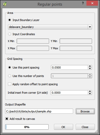
The output will look similar to this:
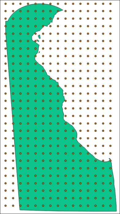
Now that we have regular points, we can attach the grid values to them using the following steps:
calc10 to calc30) if they were not already added (navigate to Layer | Add Layer | Add Vector Layer).Select all grids (calc10-calc30)
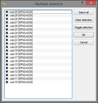
c6/data/output/sample_data.shp.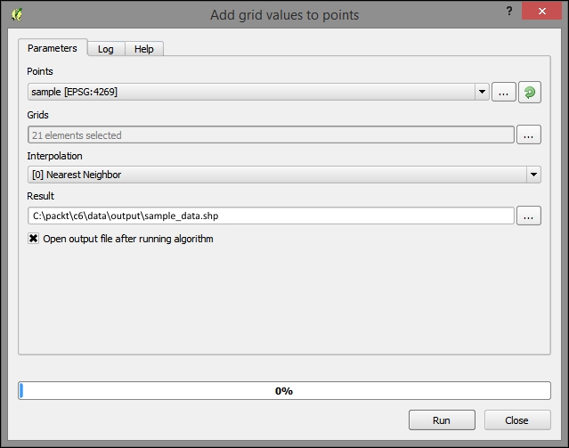
Next, create a SpatiaLite database at c6/data/web/cgi-bin/c6.sqlite (refer to the Creating a SpatiaLite database section of Chapter 5, Demonstrating Change) and import the sample_data shapefile using DB Manager.
DB Manager does not "see" SpatiaLite databases which were not created directly by the Add Layer command (as we've done so far; for example, in Chapter 5, Demonstrating Change), so it is best to do it this way rather than by saving it directly as a SpatiaLite database using the output dialog in the previous step.
Perform the following steps to test that our nearest neighbor result is correct:
sample_data layer.sample_data layer/shapefile.75.28075 39.47785):SELECT pk, calc10, min(Distance(PointFromText('POINT (-75.28075 39.47785)'),geom)) FROM vulnerabilityUsing the identify tool, click on the nearest point to the coordinate you selected to check whether the query produces the correct nearest neighbor.
In this section, we will produce our web application, which, unlike any so far, involves a dynamic interaction between client and server. We will also use a different web map client API—OpenLayers. OpenLayers has long been a leader in web mapping; however, it has been overshadowed by smaller clients, such as Leaflet, as of late. With its latest incarnation, OpenLayers 3, OpenLayers has been slimmed down but still retains a functionality advantage in most areas over its newer peers.
Common Gateway Interface (CGI) is perhaps the simplest way to run a server-side code for dynamic web use. This makes it great for doing proof of concept learning. The most typical use of CGI is in data processing and passing it onto the database from the web forms received through HTTP POST. The most common attack vector is the SQL injection. Going a step further, dynamic processing similar to CGI is often implemented through a minimal framework, such as Bottle, CherryPy, or Flask, to handle common tasks such as routing and sometimes templating, thus making for a more secure environment.
Don't forget that Python is sensitive to indents. Indents are always expressed as spaces with a uniform number per hierarchy level. For example, an if block may contain lines prefixed by four spaces. If the if block falls within a for loop, the same lines should be prefaced by 8 spaces.
Next, we will start up a CGIHTTPServer hosting instance via a separate Windows console session. Then, we will work on the development of our server-side code—primarily through the QGIS Python Console.
Starting a CGI session is simple— you just need to use the –m command line switch directly with Python, which loads the module as you might load a script. The following code starts CGIHTTPServer in port 8000. The current working directory will be served as the public web directory; in this case, this is C:\packt\c6\data\web.
In a new Windows console session, run the following:
cd C:\packt\c6\data\web
python -m CGIHTTPServer 8000
Python (.py) CGI files can only run out of directories named either cgi or cgi-bin. This is a precaution to ensure that we intend the files in this directory to be publically executable.
To test this, create a file at c6/data/web/cgi-bin/simple_test.py with the following content:
#!/usr/bin/python

# Import the cgi, and system modules
import cgi, sys

# Required header that tells the browser how to render the HTML.
print "Content-Type: text/html\n\n"
print "Hello world"
You should now see the "Hello world" message when you visit http://localhost:8000/cgi-bin/simple_test.py on your browser. To debug on the client side, make sure you are using a browser-based web development view, plugin, or extension, such as Chrome's Developer Tools toolbar or Firefox's Firebug extension.
Here are a few ways through which you can debug during Python CGI development:
–d (verbose debugging). This will catch any issues that may not come up in interactive use, avoiding the variables that may have inadvertently been set in the same interactive session (substitute index.py with the name of your Python script). Run the following command from your command line shell:
python -d C:\packt\c6\data\web\cgi-bin\index.py
index.py with the name of your Python script):localhost:8000/cgi-bin/index.py
Now, let's create a Python code to provide dynamic web access to our SQLite database.
The PySpatiaLite module provides dbapi2 access to SpatiaLite databases. Dbapi2 is a standard library for interacting with databases from Python. This is very fortunate because if you use the dbapi2 connector from the sqlite3 module alone, any query using spatial types or functions will fail. The sqlite3 module was not built to support SpatiaLite.
Add the following to the preceding code. This will perform the following functions:
SQLITE_VERSION() function in a SELECT query and print the resultThe following code, appended to the preceding one, can be found at c6/data/web/cgi-bin/db_test.py. Make sure that the path in the code for the SQLite database file matches the actual location on your system.
# Import the pySpatiaLite module
from pySpatiaLite import dbapi2 as sqlite3
conn = sqlite3.connect('C:\packt\c6\data\web\cgi-bin\c6.sqlite')

# Use connection handler as context
with conn:
  c = conn.cursor()
  c.execute('SELECT SQLITE_VERSION()')

  data = c.fetchone()
  print data
  print 'SQLite version:{0}'.format(data[0])
You can view the following results in a web browser at http://localhost:8000/cgi-bin/db_test.py.
(u'3.7.17',) SQLite version:3.7.17
The first time that the data is printed, it is preceded by a u and wrapped in single quotes. This tells us that this is a unicode string (as our database uses unicode encoding). If we access element 0 in this string, we get a nonwrapped result.
The following code performs the following functions:
You can find the code at c6/data/web/cgi-bin/get_json.py:
#!/usr/bin/python

import cgi, cgitb, json, sys
from pySpatiaLite import dbapi2 as sqlite3

# Enables some debugging functionality
cgitb.enable()

# Creating row factory function so that we can get field names
# in dict returned from query
def dict_factory(cursor, row):
  d = {}
  for idx, col in enumerate(cursor.description):
    d[col[0]] = row[idx]
  return d

# Connect to DB and setup row_factory
conn = sqlite3.connect('C:\packt\c6\data\web\cgi-bin\c6.sqlite')
conn.row_factory = dict_factory

# Print json headers, so response type is recognized and correctly decoded
print 'Content-Type: application/json\n\n'

# Use CGI FieldStorage object to retrieve data passed by HTTP GET
# Using numeric datatype casts to eliminate special characters
fs = cgi.FieldStorage()
longitude = float(fs.getfirst('longitude'))
latitude = float(fs.getfirst('latitude'))
day = int(fs.getfirst('day'))

# Use user selected location and days to find nearest location (minimum distance)
# and correct date column
query = 'SELECT pk, calc{2} as index_value, min(Distance(PointFromText(\'POINT ({0} {1})\'),geom)) as min_dist FROM vulnerability'.format(longitude, latitude, day)

# Use connection as context manager, output first/only result row as json
with conn:
  c = conn.cursor()
  c.execute(query)
  data = c.fetchone()
  print json.dumps(data)
You can test the preceding code by commenting out the portion that gets arguments from the HTTP request and setting these arbitrarily.
The full code is available at c6/data/web/cgi-bin/json_test.py:
# longitude = float(fs.getfirst('longitude'))
# latitude = float(fs.getfirst('latitude'))
# day = int(fs.getfirst('day'))
longitude = -75.28075
latitude = 39.47785
day = 15
If you browse to http://localhost:8000/cgi-bin/json_test.py, you'll see the literal JSON printed to the browser. You can also do the equivalent by browsing to the following URL, which includes these arguments: http://localhost:8000/cgi-bin/get_json.py?longitude=-75.28075&latitude= 39.47785&day=15.
{"pk": 260, "min_dist": 161.77454362713507, "index_value": 7}
Now that our backend code and dependencies are all in place, it's time to move on to integrating this into our frontend interface.
QGIS helps us get started on our project by allowing us to generate a working OpenLayers map with all the dependencies, basic HTML elements, and interaction event handler functionality. Of course, as with qgis2leaf, this can be extended to include the additional leveraging of the map project layers and interactivity elements.
The following steps will produce an OpenLayers 3 map that we will modify to produce our database-interactive map application:
delaware_boundary.shp to the map. Pan and zoom to the Delaware geographic boundary object if QGIS does not do so automatically.delaware_boundary polygon layer to lines by navigating to Vector | Geometry Tools | Polygons to lines. Nonfilled polygons are not supported by Export to OpenLayers. The following image shows these inputs populated: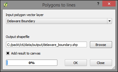
14.8.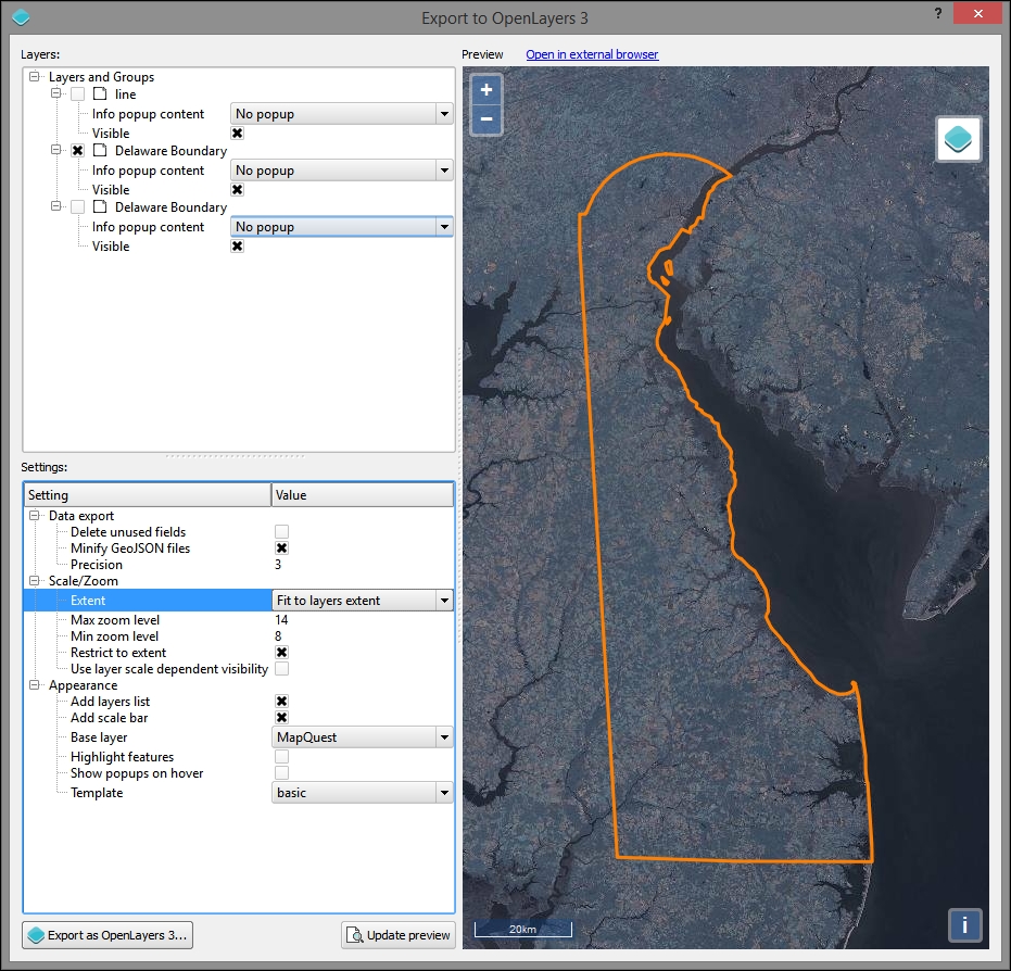
Now that we have the base code and dependencies for our map application, we can move on to modifying the code so that it interacts with the backend, providing the desired information upon click interaction.
Remember that the backend script will respond to the selected date and location by finding the closest "regular point" and the calculated interpolated index for that date.
Add the following to c6/data/web/index.html in the body, just above the div#id element.
This is the HTML for the select element, which will pass a day. You would probably want to change the code here to scale with your application—this one is limited to days in a single month (and as it requires 10 days of retrospective data, it is limited to days from 6/10 to 6/30):
  <select id="day">
    <option value="10">2013-06-10</option>
    <option value="11">2013-06-11</option>
    <option value="12">2013-06-12</option>
    <option value="13">2013-06-13</option>
    <option value="14">2013-06-14</option>
    <option value="15">2013-06-15</option>
    <option value="16">2013-06-16</option>
    <option value="17">2013-06-17</option>
    <option value="18">2013-06-18</option>
    <option value="19">2013-06-19</option>
    <option value="20">2013-06-20</option>
    <option value="21">2013-06-21</option>
    <option value="22">2013-06-22</option>
    <option value="23">2013-06-23</option>
    <option value="24">2013-06-24</option>
    <option value="25">2013-06-25</option>
    <option value="26">2013-06-26</option>
    <option value="27">2013-06-27</option>
    <option value="28">2013-06-28</option>
    <option value="29">2013-06-29</option>
    <option value="30">2013-06-30</option>
  </select>
This element will then be accessed by jQuery using the div#id reference.
AJAX is a loose term applied specifically to an asynchronous interaction between client and server software using XML objects. This makes it possible to retrieve data from the server without the classic interaction of a submit button, which will take you to a page built on the result. Nowadays, AJAX is often used with JSON instead of XML to the same affect; it does not require a new page to be generated to catch the result from the server-side processing.
jQuery is a JavaScript library which provides many useful cross-browser utilities, particularly focusing on the DOM manipulation. One of the useful features that jQuery is known for is sending, receiving, and rendering results from AJAX calls. AJAX calls used to be possible from within OpenLayers; however, in OpenLayers 3, an external library is required. Fortunately for us, jQuery is included in the exported base OpenLayers 3 web application from QGIS.
To add a jQuery AJAX call to our CGI script, add the following code to the "singleclick" event handler on SingleClick. This is our custom function that is triggered when a user clicks on the frontend map.
This AJAX call references the CGI script URL. The data object contains all the parameters that we wish to pass to the server. jQuery will take care of encoding the data object in a URL query string. Execute the following code:
jQuery.ajax({
  url: http://localhost:8000/cgi-bin/get_json.py,
  data: {"longitude": newCoord[0], "latitude": newCoord[1], "day": day}
})
Add a callback function to the jquery ajax call by inserting the following lines directly after it.
.done(function(response) {
popupText = 'Vulnerability Index (1=Least Vulnerable, 10=Most Vulnerable): ' + response.index_value;Now, to get the script response to show in a popup after clicking, comment out the following lines:
/* var popupField;

  var currentFeature;
  var currentFeatureKeys;
  map.forEachFeatureAtPixel(pixel, function(feature, layer) {
    currentFeature = feature;
    currentFeatureKeys = currentFeature.getKeys();
    var field = popupLayers[layersList.indexOf(layer) - 1];
    if (field == NO_POPUP){
    }
    else if (field == ALL_FIELDS){
      for ( var i=0; i<currentFeatureKeys.length;i++) {
        if (currentFeatureKeys[i] != 'geometry') {
          popupField = currentFeatureKeys[i] + ': '+ currentFeature.get(currentFeatureKeys[i]);
          popupText = popupText + popupField+'<br>';
        }
      }
    }
    else{
      var value = feature.get(field);
      if (value){
        popupText = field + ': '+ value;
      }
    }
  }); */
Finally, copy and paste the portion that does the actual triggering of the popup in the .done callback function. The .done callback is triggered when the AJAX call returns a data response from the server (the data response is stored in the response object variable). Execute the following code:
.done(function(response) {
  popupText = 'Vulnerability Index (1=Least Vulnerable, 10=Most Vulnerable): ' + response.index_value;
  if (popupText) {
    overlayPopup.setPosition(coord);
    content.innerHTML = popupText;
    container.style.display = 'block';
  } else {
    container.style.display = 'none';
   closer.blur();
}Now, the application should be complete. You will be able to view it in your browser at http://localhost:8000.
You will want to test by picking a date from the Select menu and clicking on different locations on the map. You will see something similar to the following image, showing a susceptibility score for any location on the map within the study extent (Delaware).
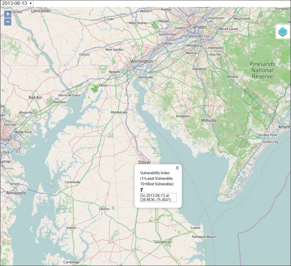
In this chapter, using an agricultural vulnerability modeling example, we covered interpolation and dynamic backend processing using spatial queries. The final application allows an end user to click on anything within a study area and see a score calculated from the interpolated point data and an algebraic model using a dynamic Python CGI code that queries a SQLite database. In the next chapter, we will continue to explore dynamic websites with an example that provides simple client editing capabilities and the use of the tiling and UTFGrid methods to improve performance with more complicated datasets.
In this chapter, we will use a mix of web services to provide an editable collaborative data system.
While the visualization and data viewing capabilities that we've seen so far are a powerful means to reach an audience, we can tap into an audience—whether they are members of our organization, community stakeholders, or simply interested parties out on the web—to contribute improved geometric and attribute data for our geographic objects. In this chapter, you will learn to build a system of web services that provides these capabilities for a university community. As far as editable systems go, this is at the simpler end of things. Using a map server such as GeoServer, you could extend more extensive geometric editing capabilities based on a sophisticated user access management.
In this chapter, we will cover the following topics:
Google Sheets provides us with virtually everything we need in a basic data management platform—it is web-based, easily editable through a spreadsheet interface, has fine-grained editing controls and API options, and is consumable through a simple JSON web service—at no cost, in most cases.
To create a new Google document, you'll need to sign up for a Google account at https://accounts.google.com. Perform the following steps:
c7/data/original/building_export.xlsx.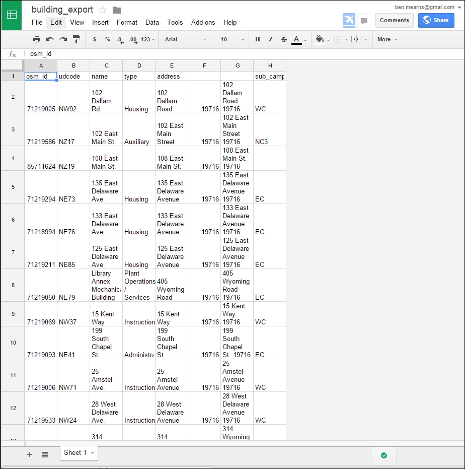
By default, Google Sheets will not be publicly viewable. In addition, no web service feed is exposed. To enable access to our data hosted by Google Sheets from our web application, we must publish the sheet. Perform the following steps:
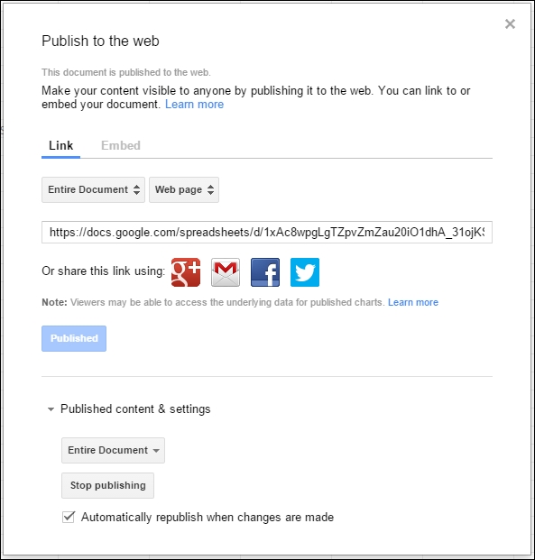
Now that we've published the sheet, our feed is exposed as JSON. We can view the JSON feed by substituting KEY with our spreadsheet unique identifier in a URL of the format https://spreadsheets.google.com/feeds/list/KEY/1/public/basic?alt=json. For example, it would look similar to the following URL:
This produces the following JSON response. For brevity, the response has been truncated after the first building object:
{"version":"1.0","encoding":"UTF-8","feed":{"xmlns":"http://www.w3.org/2005/Atom","xmlns$openSearch":"http://a9.com/-/spec/opensearchrss/1.0/","xmlns$gsx":"http://schemas.google.com/spreadsheets/2006/extended","id":{"$t":"https://spreadsheets.google.com/feeds/list/19xiRHxZE4jOnVcMDXFx1pPyir4fXVGisWOc8guWTo2A/od6/public/basic"},"updated":{"$t":"2012-04-06T13:55:10.774Z"},"category":[{"scheme":"http://schemas.google.com/spreadsheets/2006","term":"http://schemas.google.com/spreadsheets/2006#list"}],"title":{"type":"text","$t":"Sheet 1"},"link":[{"rel":"alternate","type":"application/atom+xml","href":"https://docs.google.com/spreadsheets/d/19xiRHxZE4jOnVcMDXFx1pPyir4fXVGisWOc8guWTo2A/pubhtml"},{"rel":"http://schemas.google.com/g/2005#feed","type":"application/atom+xml","href":"https://spreadsheets.google.com/feeds/list/19xiRHxZE4jOnVcMDXFx1pPyir4fXVGisWOc8guWTo2A/od6/public/basic"},{"rel":"http://schemas.google.com/g/2005#post","type":"application/atom+xml","href":"https://spreadsheets.google.com/feeds/list/19xiRHxZE4jOnVcMDXFx1pPyir4fXVGisWOc8guWTo2A/od6/public/basic"},{"rel":"self","type":"application/atom+xml","href":"https://spreadsheets.google.com/feeds/list/19xiRHxZE4jOnVcMDXFx1pPyir4fXVGisWOc8guWTo2A/od6/public/basic?alt\u003djson"}],"author":[{"name":{"$t":"Ben.Mearns"},"email":{"$t":"ben.mearns@gmail.com"}}],"openSearch$totalResults":{"$t":"293"},"openSearch$startIndex":{"$t":"1"},"entry":[{"id":{"$t":"https://spreadsheets.google.com/feeds/list/19xiRHxZE4jOnVcMDXFx1pPyir4fXVGisWOc8guWTo2A/od6/public/basic/cokwr"},"updated":{"$t":"2012-04-06T13:55:10.774Z"},"category":[{"scheme":"http://schemas.google.com/spreadsheets/2006","term":"http://schemas.google.com/spreadsheets/2006#list"}],"title":{"type":"text","$t":"71219005"},"content":{"type":"text","$t":"udcode: NW92, name: 102 Dallam Rd., type: Housing, address: 102 Dallam Road, _ciyn3: 19716, _ckd7g: 102 Dallam Road 19716, subcampus: WC"},"link":[{"rel":"self","type":"application/atom+xml","href":"https://spreadsheets.google.com/feeds/list/19xiRHxZE4jOnVcMDXFx1pPyir4fXVGisWOc8guWTo2A/od6/public/basic/cokwr"}]}, …
]}}To work with the JSON data from this web service, we will use jQuery's AJAX capabilities. Using the attributes of the JSON elements, we can take a look at how the data is rendered in HTML as a simple web page.
Start up SimpleHTTPServer on port 8000 for c7/data/web on the Windows command line using the following commands:
cd c:\packt\c7\data\web
python -m SimpleHTTPServer 8000
You can take a look at the following code (on the file system at c7/data/web/gsheet.html) to test our ability to parse the JSON data:
<html>
  <body>
    <div class="results"></div>
  </body>
  <script src="http://code.jquery.com/jquery-1.11.3.min.js"></script>
  <script>

    // ID of the Google Spreadsheet
    var spreadsheetID = "1xAc8wpgLgTZpvZmZau20iO1dhA_31ojKSIBmlG6FMzQ";

    // Make sure it is public or set to Anyone with link can view
    var url = "https://spreadsheets.google.com/feeds/list/" + spreadsheetID + "/1/public/values?alt=json";

    $.getJSON(url, function(data) {

      var entry = data.feed.entry;

      $(entry).each(function(){
        // Column names are name, type, etc.
        $('.results').prepend('<h2>'+this.gsx$name.$t+'</h2><p>'+this.gsx$type.$t+'</p>');
      });

    });

  </script>
You can preview this in a web browser at http://localhost:8000/gsheet.html. You'll see building names followed by types, as shown in the following image:
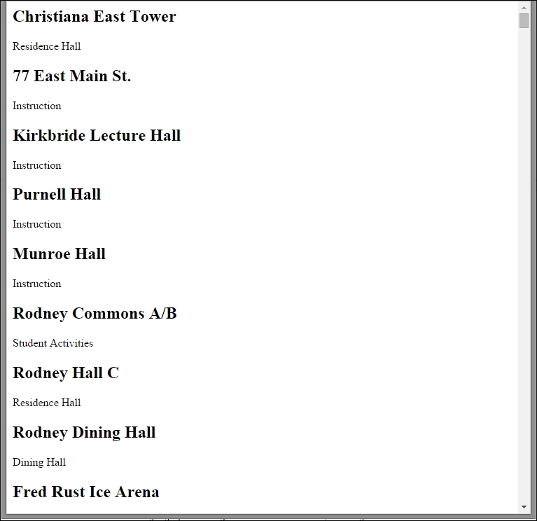
Now let's take look at how we would operationalize this system for collaborative data editing.
In the sheet, click on the blue Share button in the upper-right corner. Alternatively, from Drive, select the file by clicking on it and then click on the icon that looks like a person with a plus sign on it. Ensure that anyone can find and view the document. Finally, add the address of the people you'd like to be able to edit the document and give them edit permissions, as shown in the following screenshot:
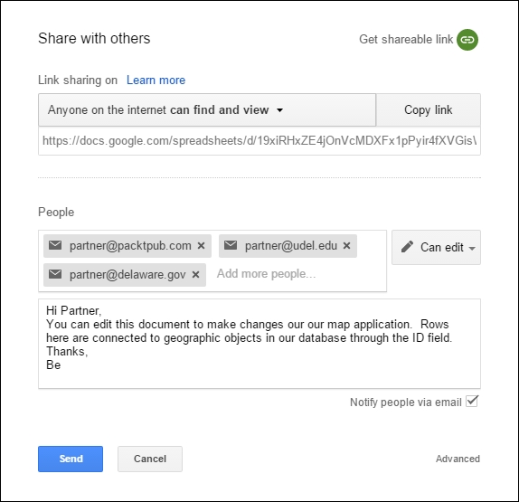
Now that your collaborators have received an invitation to edit the sheet, they just need to sign in with their Google credentials and make a change to the sheet—the changes will be saved automatically. Of course, if they don't have any Google credentials, they'll need to create an account.
To go to the sheet, your collaborator will just need to click on Open in Sheets. The sheet should now also appear under their drive in Shared with me.
Here, you can see the type fields for Christiana Hall, Kirkbride Lecture Hall, and Purnell Hall after the changes are made:
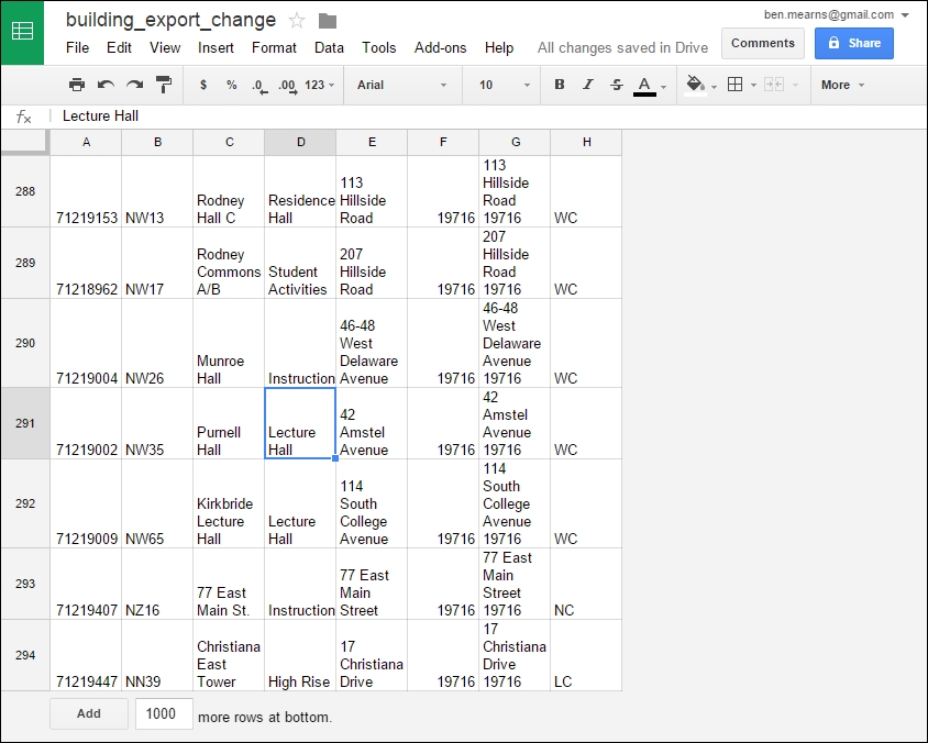
There is no need for an administrative intervention after the collaborators make changes. Data changed in sheets is automatically republished in the JSON feed, as we selected this option when we published the sheet. If you require more control over the publication of the collaborator edits, you may want to consider unselecting that option and setting up notifications of the changes. This way, you can republish after you've vetted the changes.
You can do a rollback of the changes as needed in the revision history. Perform the following steps:
Go to http://localhost:8000/gsheet.html again to see how the changes to your sheet affected your JSON feed. Note in the following image the changes we made to the type fields for Christiana East Tower, Kirkbride Lecture Hall, and Purnell Hall:

In the final section of this chapter, we will also take a look at how we can preview this in the map interface.
At this point, you may be wondering, what about the maps? So far, we have not included any geospatial data or visualization. We will be offloading some of the effort in managing and providing geospatial data and services to OpenStreetMap—our favorite public open source geospatial data repository!
Why do we use OpenStreetMap?
osm_version and osm_user fields, which complement the osm_id unique ID fieldTo use the OSM data, we need to get it in a format that will be interoperable with other GIS software components. A quick and powerful solution is to store the OSM data in a SQLite SpatiaLite database instance, which, if you remember, is a single file with full spatial and SQL functionality.
To use QGIS to download and convert OSM to SQLite, perform the following steps:
39.7009, -75.7195, 39.6542, -75.7784, clockwise from the top of the dialog in the next step):
.osm file to a topological SQLite database. This could potentially be used for routing; although, we will not be doing so here.
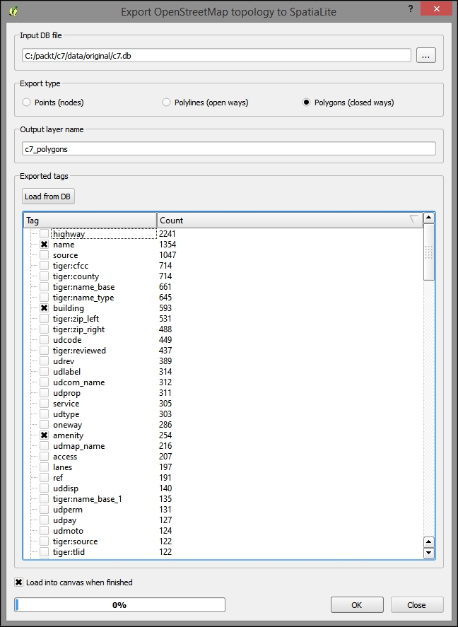
SELECT * FROM c7_polygons WHERE building = 'yes' and amenity = 'university'
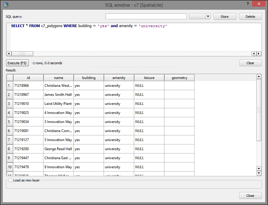
c7/data/original/delaware-latest-3875/buildings.shp with the EPSG:3857 projection.Although TileMill is no longer under active production by its creator Mapbox, it is still useful for us to produce MBTiles tiled images rendered by Mapnik using CartoCSS and a UTFGrid interaction layer.
TileMill requires that all the data be rendered and tiled together and, therefore, only supports vector data input, including JSON, shapefile, SpatiaLite, and PostGIS.
In the following steps, we will render a cartographically pleasing map as a .mbtiles (single-file-based) tile cache:
Output all the layers to c7/data/original/delaware-latest-3875.
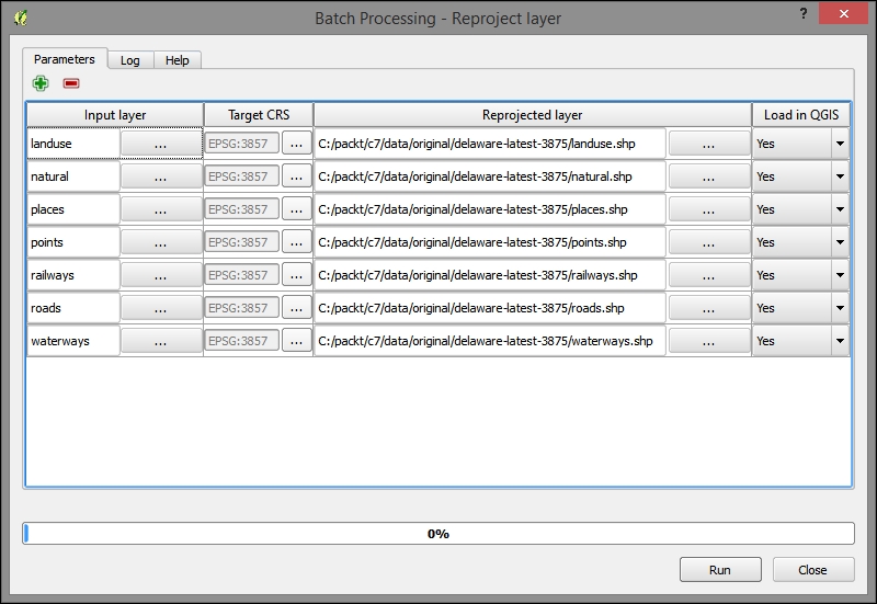
C:\Program Files (x86)\TileMill-v0.10.1\tilemill\examples\open-streets-dcC:\Users\[YOURUSERNAME]\Documents\MapBox\project\c7layers directory.c7/data/original/delaware-latest-3875 into the layers directory in the project directory of c7, which can be found at C:\Users\[YOURUSERNAME]\Documents\MapBox\project\c7\layers.project.mml file.open-streets-dc string to c7.Open Streets, DC to c7.bounds and center: "bounds": [
-75.7845,
39.6586,
-75.7187,
39.71
],
"center": [
-75.7538,
39.6827,
14
],Land usages: Change this layer from osm-landusages.shp to landuse.shp
ocean: Remove this layer or ignore
water: Change this layer from osm-waterareas.shp to waterways.shp
tunnels: Change this layer from osm-roads.shp to roads.shp
roads: Change this layer from osm-roads.shp to roads.shp
mainroads: Change this layer from osm-mainroads.shp to roads.shp
motorways: Change this layer from osm-motorways.shp to roads.shp
bridges: Change this layer from osm-roads.shp to roads.shp
places: Change this layer from osm-places.shp to places.shp
road-label: Change this layer from osm-roads.shp to roads.shp
c7 project from the Projects dialog, as shown in the following screenshot:
buildings.c7/data/original/delaware-latest-3875/buildings.shp.#c7 layer, as shown in the next image.style.mss. TileMill provides a color picker, which we can access by clicking on a swatch color at the bottom of the CartoCSS/style pane. After changing a color, you can view the hex code down there. Just pick a color, place the hex code in your CartoCSS, and save it. For example, consider the following code:#buildings {
line-color:#eb8f65;
line-width:0.5;
polygon-opacity:1;
polygon-fill:#fdedc9;
}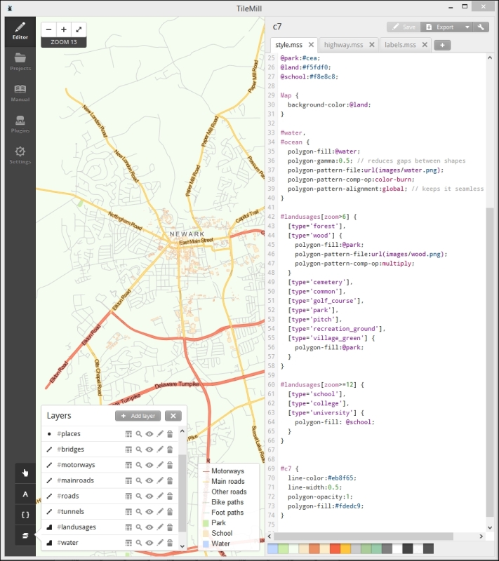
{{{id}}} from buildings, as shown in the following screenshot: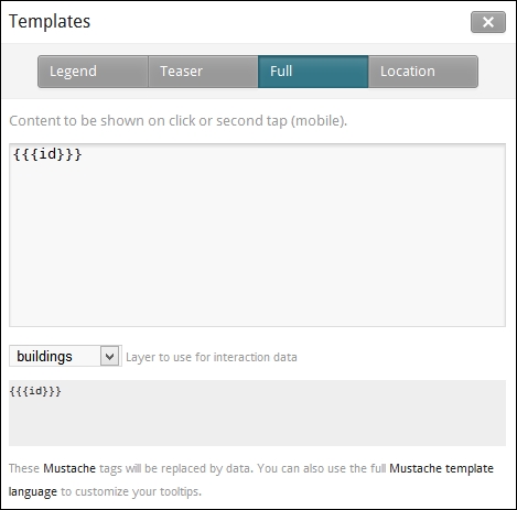
MBTiles is a format developed by Mapbox to store geographic information. There are two compelling aspects of this format, besides interaction with a small but impressive suite of software and services developed by Mapbox: firstly, MBTiles stores a whole tile store in a single file, which is easy to transfer and maintain and secondly, UTFGrid, which is the use of UTF characters for highly performant data interaction, is enabled by this format.
c711 to 16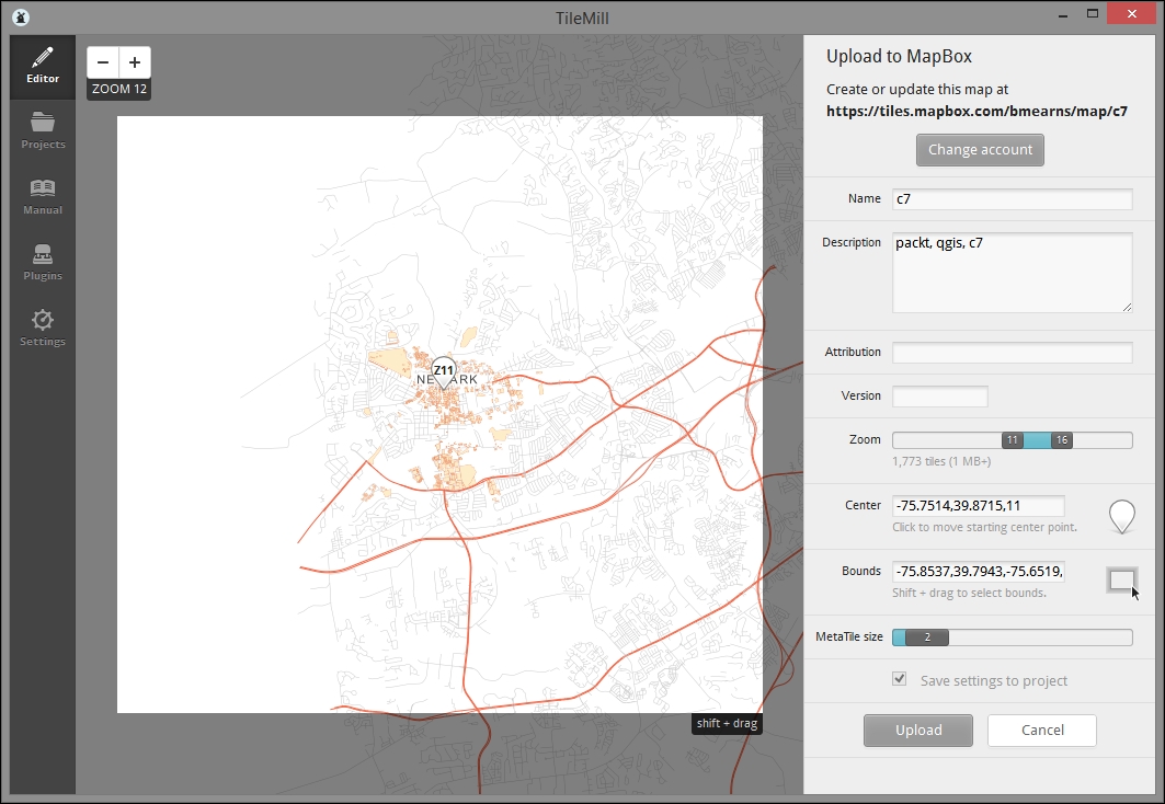
The steps for exporting directly to an MBTiles file are similar to the previous procedure. This format can be uploaded to mapbox.com or served with software that supports the format, such as TileStream. Of course, no sign-on is needed.
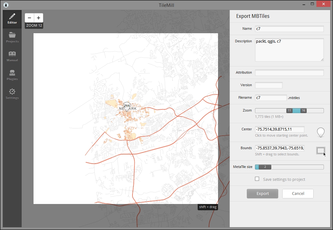
In the last part of the previous section, we uploaded our rendered map to Mapbox in the MBTiles format.
To view the HTML page that Mapbox generates for our MBTiles, navigate to Export | View Exports. You'll find the upload listed there. Click on View to open it on a web browser.
For example, consider the following URL: http://a.tiles.mapbox.com/v3/bmearns.c7/page.html#11/39.8715/-75.7514.
You may also want to preview the TileJSON web service connected to your data. You can do so by adding .json after your web map ID (bmearns.c7); for example, this is done in http://a.tiles.mapbox.com/v3/bmearns.c7.json, which executes the following:
{"attribution":"","bounds":[-75.8537,39.7943,-75.6519,39.9376],"center":[-75.7514,39.8715,11],"description":"packt, qgis, c7","download":"http://a.tiles.mapbox.com/v3/bmearns.c7.mbtiles","embed":"http://a.tiles.mapbox.com/v3/bmearns.c7.html","filesize":15349760,"format":"png","grids":["http://a.tiles.mapbox.com/v3/bmearns.c7/{z}/{x}/{y}.grid.json","http://b.tiles.mapbox.com/v3/bmearns.c7/{z}/{x}/{y}.grid.json"],"id":"bmearns.c7","legend":"","maxzoom":16,"minzoom":11,"modified":1435689144009,"name":"c7","private":true,"scheme":"xyz","template":"{{#__location__}}{{/__location__}}{{#__teaser__}}{{{id}}}{{/__teaser__}}{{#__full__}}{{{id}}}{{/__full__}}","tilejson":"2.0.0","tiles":["http://a.tiles.mapbox.com/v3/bmearns.c7/{z}/{x}/{y}.png","http://b.tiles.mapbox.com/v3/bmearns.c7/{z}/{x}/{y}.png"],"version":"1.0.0","webpage":"http://a.tiles.mapbox.com/v3/bmearns.c7/page.html"}Now that we can see our tile server via Mapbox-generated HTML and JSON, let's take a look at how we can connect this with a local HTML that we can customize.
First, you'll need to obtain the API token from Mapbox. The token identifies your web application with Mapbox and enables the use of the web service you've created. As you will be adding this to the frontend code of your application, it will be publically known and open to abuse. Given Mapbox's monthly view usage limitations, you may want to consider a regular schedule for the token rotation (which includes creation, code modification, and deletion). This is also a good reason to consider hosting your service locally with something similar to TileStream, which is covered in the following Going further – local MBTiles hosting with TileStream section.
Mapbox.js is the mapping library developed by Mapbox to interact with its services. As Leaflet is at its core, the code will look familiar. We'll look at the modifications to the Creating a popup from UTFGrid data sample app code that you can get at https://www.mapbox.com/mapbox.js/example/v1.0.0/utfgrid-data-popup/.
In the following example, we will modify just the portions of code that directly reference the example data. Of course, we would want to change these portions to reference our data instead:
<!DOCTYPE html>
<html>
  <head>
    <meta charset=utf-8 />
    <title>Creating a popup from UTFGrid data</title>
    <meta name='viewport' content='initial-scale=1,maximum-scale=1,user-scalable=no' />
    <script src='https://api.tiles.mapbox.com/mapbox.js/v2.2.1/mapbox.js'></script>
    <link href='https://api.tiles.mapbox.com/mapbox.js/v2.2.1/mapbox.css' rel='stylesheet' />
    <style>
      body { margin:0; padding:0; }
      #map { position:absolute; top:0; bottom:0; width:100%; }
    </style>
  </head>
  <body>
    <div id='map'></div>
    <script>
      // changed token and center coordinate pair/zoom below
      L.mapbox.accessToken = 'YOURMAPBOXTOKEN';
      var map = L.mapbox.map('map', 'mapbox.streets')
        .setView([39.87240,-75.75367], 15);

      // change variable names as appropriate (optional)
      // changed mapbox id to refer to our layer/service
      var c7Tiles = L.mapbox.tileLayer('bmearns.c7').addTo(map);
      var c7Grid = L.mapbox.gridLayer('bmearns.c7').addTo(map);

      // add click handler for grid
      // changed variable name in tandem with change above
      c7Grid.on('click', function(e) {
        if (!e.data) return;
        var popup = L.popup()
          .setLatLng(e.latLng)
          // changed to refer to a field we have here, as seen in tilemill interaction tab
          .setContent(e.data.id)
          .openOn(map);
      });
    </script>
  </body>
</html>The OpenLayers project provides a sample UTFGrid web map at http://openlayers.org/en/v3.2.1/examples/tileutfgrid.html.
The following is the sample code with the modifications for our data. References to the OpenLayers example (for instance, in the function names) were removed and replaced with generic names. The following example demonstrates a mouseover type event trigger (c7/data/web/utfgrid-ol.html):
<!DOCTYPE html>
<html>
<head>
<title>TileUTFGrid example</title>
<!— dependencies -->
<script src="https://code.jquery.com/jquery-1.11.2.min.js"></script>
<link rel="stylesheet" href="https://maxcdn.bootstrapcdn.com/bootstrap/3.3.4/css/bootstrap.min.css">
<script src="https://maxcdn.bootstrapcdn.com/bootstrap/3.3.4/js/bootstrap.min.js"></script>
<link rel="stylesheet" href="https://cdnjs.cloudflare.com/ajax/libs/ol3/3.6.0/ol.css" type="text/css">
<script src="https://cdnjs.cloudflare.com/ajax/libs/ol3/3.6.0/ol.js"></script>
</head>
<body>
<!-- html layout -->
<div class="container-fluid">
<div class="row-fluid">
<div class="span12">
<div id="map" class="map"></div>
</div>
</div>
<div style="display: none;">
<!-- Overlay with target info -->
<div id="info-info">
<div id="info-name"> </div>
</div>
</div>
</div>
<script>
// new openlayers tile object, pointing to TileJSON object from our mapbox service
var mapLayer = new ol.layer.Tile({
source: new ol.source.TileJSON({
url: 'http://api.tiles.mapbox.com/v3/bmearns.c7.json?access_token=YOURMAPBOXTOKENHERE'
})
});
// new openlayers UTFGrid object
var gridSource = new ol.source.TileUTFGrid({
url: 'http://api.tiles.mapbox.com/v3/bmearns.c7.json?access_token=YOURMAPBOXTOKENHERE'
});
var gridLayer = new ol.layer.Tile({source: gridSource});
var view = new ol.View({
center: [-8432793.2,4846930.4],
zoom: 15
});
var mapElement = document.getElementById('map');
var map = new ol.Map({
layers: [mapLayer, gridLayer],
target: mapElement,
view: view
});
var infoElement = document.getElementById('info-info');
var nameElement = document.getElementById('info-name');
var infoOverlay = new ol.Overlay({
element: infoElement,
offset: [15, 15],
stopEvent: false
});
map.addOverlay(infoOverlay);
// creating function to register as event handler, to display info based on coordinate and view resolution
var displayInfo = function(coordinate) {
var viewResolution = /** @type {number} */ (view.getResolution());
gridSource.forDataAtCoordinateAndResolution(coordinate, viewResolution,
function(data) {
// If you want to use the template from the TileJSON,
// load the mustache.js library separately and call
// info.innerHTML = Mustache.render(gridSource.getTemplate(), data);
mapElement.style.cursor = data ? 'pointer' : '';
if (data) {
nameElement.innerHTML = data['id'];
}
infoOverlay.setPosition(data ? coordinate : undefined);
});
};
// registering event handlers
map.on('pointermove', function(evt) {
if (evt.dragging) {
return;
}
var coordinate = map.getEventCoordinate(evt.originalEvent);
displayInfo(coordinate);
});
map.on('click', function(evt) {
displayInfo(evt.coordinate);
});
</script>Now, we'll connect the Google Sheets feed with our Mapbox tiles service in our final application.
Previously, we parsed the JSON feed with jQuery for each loop to print two attribute values for each element. Now, we'll remap the feed onto an object that we can use to look up data for the geographic objects triggered in UTFGrid. Review the following code, to see how this done:
// Create a data object in public scope to use for mapping
// of JSON data, using id for key
var d = {};

// url variable is set with code from previous section
// url contains public sheet id

$.getJSON(url, function(data) {
  var entry = data.feed.entry;
  var title = '';

  $(entry).each(function(index, value){
    // Column names are name, type, etc.
    $('.results').prepend('<h2>'+this.gsx$name.$t+'</h2><p>'+ this.title.$t +'</p>'+'<p>'+this.gsx$type.$t+'</p>');
    title = this.title.$t;
    $.each(this, function(i, n){
      if(!d[title]){
        d[title] = {};
      }
      d[title][i] = n.$t;
    });
});Finally, to complete the application, we need to add the event handler function inside the jQuery AJAX call to the code which handles our feed. This will keep the mapped data variable in a scope relative to the events triggered by the user. The following code is in c7/data/web/utfgrid-mb.html:
<!DOCTYPE html>
<html>
  <head>
  <meta charset=utf-8 />
  <title>A simple map</title>
  <meta name='viewport' content='initial-scale=1,maximum-scale=1,user-scalable=no' />
  <script src="http://code.jquery.com/jquery-1.11.3.min.js"></script>
  <script src='https://api.tiles.mapbox.com/mapbox.js/v2.2.1/mapbox.js'></script>
  <link href='https://api.tiles.mapbox.com/mapbox.js/v2.2.1/mapbox.css' rel='stylesheet' />
  <style>
    body { margin:0; padding:0; }
    #map { position:absolute; top:0; bottom:0; width:100%; }
  </style>
  </head>
  <body>
    <div id='map'></div>
    <script>
      // ID of the Google Spreadsheet
      var spreadsheetID = "1gDPlmvEX0P4raMvTJzcVNT3JVhtL3eK1XjqE7u9u4W4";
      // Mapbox ID
      L.mapbox.accessToken = 'pk.eyJ1IjoiYm1lYXJucyIsImEiOiI1NTJhYWZjNmI5Y2IxNDM5M2M0N2M4NWQyMGQ5YzQyMiJ9.q8-B7BXtuizGRBcnpREeWw';

      var map = L.mapbox.map('map', 'mapbox.streets')
        .setView([39.87240,-75.75367], 15);

      c7tiles = L.mapbox.tileLayer('bmearns.c7').addTo(map);
      c7grid = L.mapbox.gridLayer('bmearns.c7').addTo(map);

      // Setup click handler, Google spreadsheet lookup
      var d = {};
      // Make sure it is public or set to Anyone with link can view
      var url = "https://spreadsheets.google.com/feeds/list/" + spreadsheetID + "/od6/public/values?alt=json";
      $.getJSON(url, function(data) {

        var entry = data.feed.entry;
        var title = '';

        // loops through each sub object from the data feed using json each function, constructing html from the object properties for click handler
        $(entry).each(function(index, value){
          // Column names are name, type, etc.
          $('.results').prepend('<h2>'+this.gsx$name.$t+'</h2><p>'+ this.title.$t +'</p>'+'<p>'+this.gsx$type.$t+'</p>');
          title = this.title.$t;
          $.each(this, function(i, n){
            if(!d[title]){
              d[title] = {};
            }
            d[title][i] = n.$t;
          });
        });
        // register click handler, displaying html constructed from object properties/loop
        c7grid.on('click', function(e) {
          if (!e.data) return;
          key = e.data.id;
          content = d[key].content

          //
          var popup = L.popup()
            .setLatLng(e.latLng)
            .setContent(content)
            .openOn(map);
        });
      });

    </script>
  </body>
</html>
After saving this with a .html extension (for example, c7/data/web/utfgrid-mb.html), you can preview the application created using this code by opening the saved file in a web browser. When you do so, you will see something similar to the following image:
While Mapbox hosting is very appealing for its relative ease, you may wish to host your own MBTiles, for example, to minimize cost. TileStream is the open source foundation of Mapbox's hosting service. It runs under Node.js.
While TileStream can technically be installed under Windows with a Node.js install, some dependencies may fail to be installed. It is recommended that you perform the following install in a Linux environment. If you are already running Linux on your organization's server, that's great! You can skip ahead to installing Node.js and TileStream. Fortunately, with Virtual Box and Vagrant, it is possible to set up a Linux virtual machine on your Windows system.
c:\packt\c7\vagrant).
cd c:\packt\c7\vagrant
vagrant init hashicorp/precise32
vagrant up
c:\packt\c7\vagrant). Vagrantfile is the plaintext file that controls the Vagrant configuration. Add the following line to the Vagrantfile to forward the (not yet created) Node.js port to your Windows localhost:config.vm.network "forwarded_port", guest: 8888, host: 8088
vagrant reload
vagrant ssh variable should start it up and connect it to the instance in this directoryHost: 127.0.0.1
Port: 2222
Username: vagrant
Password (if needed): vagrant
Private key: c:/packt/c7/vagrant/.vagrant/machines/default/virtualbox/private_key
Use the following commands to install Node.js from the chris-lea package archive. This is the Node.js source recommended by Mapbox. The preceding Vagrant setup steps ensure that the dependencies, such as apt, are set up as needed. Otherwise, you may install some other dependencies. Also, note that on systems that do not support GNU/Debian, this will not work; you will need to search for the relevant repositories on yum, find RPMs, or build it from the source. However, I'm not sure that any of this will work.
Note that all the following commands are to be run in the Linux instance. If you followed the preceding steps, you will run these through an SSH client such as Putty:
sudo apt-add-repository ppa:chris-lea/node.js
sudo apt-get update
sudo apt-get install nodejs
Install Git and clone the TileStream source to a new directory. Run the following command line:
git clone https://github.com/mapbox/tilestream.git
cd tilestream
npm install
You must add your MBTiles file under /home/vagrant/Documents/MapBox/tiles. You can use your preferred file transfer client to do this; I like WinSCP. Just use the same SSH connection info you used for SSH.
Finally, start TileStream:
./index.js
Now, you can preview your TileStream service at http://localhost:8088.
Click on the info button to obtain the address to the PNG tiles. You can modify this by removing the reference to the x, y, and z tiles and adding a .json extension to get TileJSON such as http://localhost:8088/v2/c7_8b4e46.json.
Now, simply modify the OpenLayers example to refer to this .json address instead of Mapbox, and you will have a fully nonMapbox use for MBTiles.
The code demonstrating this is at http://localhost:8000/utfgrid-ts.html.
In this final chapter, we looked at a web application built on the web services that provides editing capabilities to our user. This is on the simpler end of collaborative geographic data systems but with an attractive cartographic rendering capability offered by TileMill (and Mapnik) and a highly performant data publishing capability through MBTiles and UTFGrid.
In this chapter, we will cover the following recipes:
If you want to work with QGIS, the first thing you need is spatial data. Whether you want to prepare a nice-looking map layout or perform spatial analysis, you need to open some data to work with. This chapter deals with the basic input and output commands, which will allow you to use data in several different formats and also export to the most convenient format in case you want to use it in different applications or share with others.
Automation is possible for many of the operations that you will see in this cookbook. This chapter contains some recipes that use automation to process a set of input files.
This recipe shows you how to use the QGIS browser to locate and open spatial data.
Before you start working, make sure that you have copied the sample dataset to your filesystem and you have it located.
There are several ways of locating and opening a data file to open it in QGIS, but the most convenient of these is the QGIS browser:
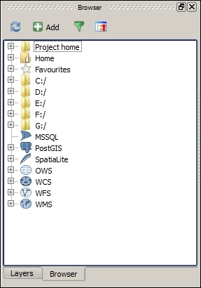
Browser contains a tree with all the available sources of spatial data. This includes data files in your filesystem, databases, and remote services.
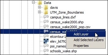
Another way of opening a file is by just dragging it and dropping it into the QGIS canvas. Dragging multiple files is allowed, as well, as shown in the following screenshot:
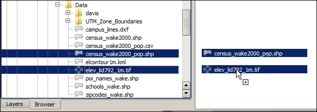
The browser acts as a file explorer that is directly linked to QGIS, which only shows valid data files and can be used to easily add them to a QGIS project.
There are a few more things that you need to know that are related to this recipe. They are explained in the following sections.
As an alternative to the browser, the Layer menu contains a set of entries. Each of them deals with a different type of data. They give you some additional options, and they might allow you to work with formats that are not directly supported by the browser.
Navigating to the folder where your data is located can be tedious. If you use a given folder regularly, you can right-click on it and select Add as favorite. The folder will appear on the Favorites section at the top of the browser tree.
The browser also shows non-file data, such as remote services. Services have to be defined before they appear on the corresponding section in the browser. To add a service, right-click on the service name and select New connection.... A dialog will appear to define the service connection parameters.
As an example, try adding the following WMS service, using the WMS entry in the browser, as shown in the following screenshot:
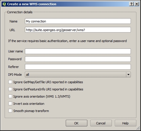
A new entry will appear, containing the layers offered by the service, as shown in the following screenshot:
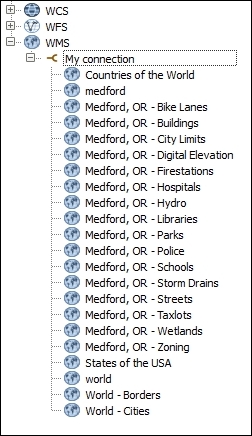
You can get additional information about a data file before opening it. This recipe shows you how to explore the properties of a data origin.
Before you start working, make sure that you have copied the sample dataset to your filesystem and that you have it located.
elev_lid792_1m file and right-click on it. In the context menu, select Properties. A dialog like the one in the following screenshot will appear: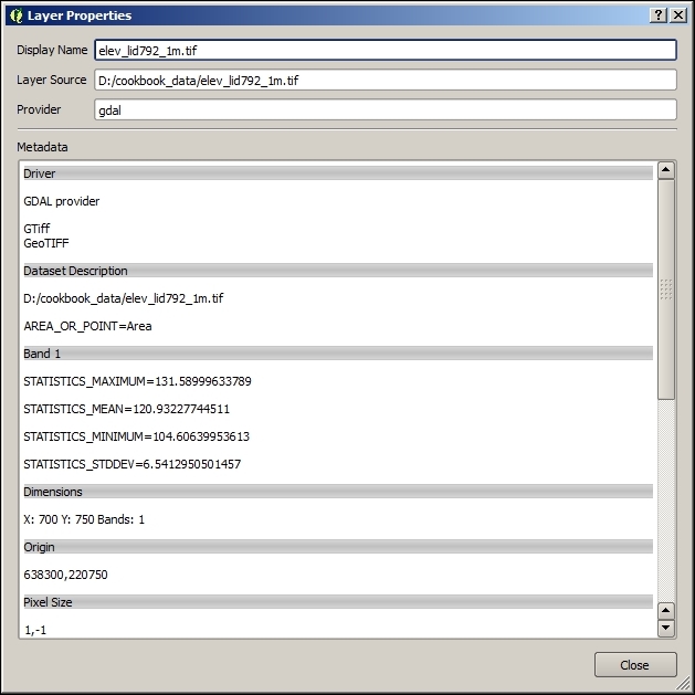
This dialog displays the properties of a raster layer.
elev_lid792_randpts.shp file, right-click on it, and select Properties. The information dialog will look like the following: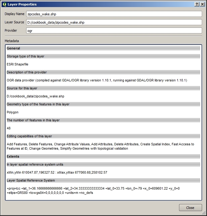
In the upper part of the description window, you will see a field named Provider. Provider defines the type or data origin and who takes care of reading the data and passing it to QGIS. For raster layers, you will see gdal as Provider. For most file-based vector layers, ogr will be the provider that will appear. They refer to the GDAL and OGR libraries, two open-source libraries that are used by many GIS programs to access both raster and vector data.
If the data is already loaded in QGIS, you can access the information about it in the Properties section of the layer (right-click on the layer name to select the Properties entry in the context menu). In the sections displayed in the left-hand side, select the Metadata section. You will see a box containing all the information corresponding to the layer data origin:
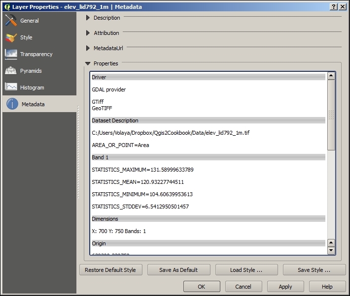
Functionality provided by the GDAL library, which (mentioned earlier) acts as a provider for raster layers, is also available in the Raster menu. This includes processing and data analysis methods, but it also includes the information tool that is used to describe a raster data source. You will find it by navigating to Raster | Miscellaneous | Info:
Data can be imported from text files, providing some additional about how the geometry information is stored in the text. This recipe shows you how to create a new points layer, based on a text file.
elev_lid792_randpts.csv file in the sample dataset. That file contains a points layer as text.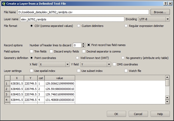
The X field and Y field drop-down lists will be populated with the fields that are available, which are described in the first line of the text file. Select X for X field and Y for Y field. Now, QGIS knows how to create the geometries and has enough information to create a new layer from the text file.
EPSG:3358. To set this as the CRS of the layer, right-click on the layer name and select Set layer CRS: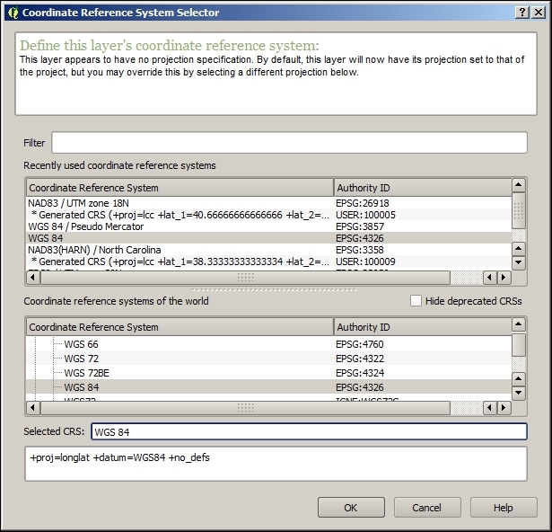
EPSG:3358 CRS and click on OK. The layer now has the correct CRS.Data is read from the text file and processed to create geometries. All the fields in the table (all data in a row in the text file) are also added, including the ones used to create the geometries, as you will see by right-clicking on the layer and selecting Open attribute table, as shown in the following screenshot:
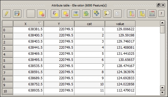
Along with the CSV file, this file may contains a CSVT file, which describes the types of the fields. This is used by QGIS to set the appropriate type for the attributes table of the layer. If the CSVT file is missing, as in our example's case, QGIS will try to figure out the type based on the values for each field.
Layers created from text files are not restricted to point files. Any geometry can be created from the text data. However, if it is not a point, instead of selecting two columns, you must place all the geometry information in a single one and enter a text representation of the geometry. QGIS uses the Well-Known Text (WKT) format, which is a text markup language for vector geometries, to describe geometries as strings. Here is an example of a very simple CSV file with line features and two attributes:
geom,id,elevation
LINESTRING(0 1, 0 2, 1 3),1,50
LINESTRING(0 -1, 0 -2, 1 -3),2,60
LINESTRING(0 1, 0 3, 5 4),3,70
KML and KMZ files are used and produced by Google Earth and are a popular format. This recipe shows you how to open them with QGIS.
elcontour1m.kml file. Click on OK in the vector layer selector dialog, and the layer will be added to your project, as shown in the following screenshot:
elcontour1m.kmz file. There is not a KMZ file type defined in QGIS, but QGIS supports it because the underlying OGR library can read KMZ files as well.From the layers contained in the KMZ file, you must select one of them. In this case, only a layer is contained in the elcontour1m.kmz file, so it is loaded automatically. The layer will be added to your QGIS project.
KMZ files are compressed files that contain a set of layers. When you select it, the OGR library will unzip the content of this file and then open the layers that it contains.
If just a single layer is contained, you will not see the layer selection dialog. QGIS will automatically open the only layer in the KMZ file.
As KMZ is not recognized as a supported format, the KMZ file will not appear in the QGIS browser. However, the browser supports zipped files, and a KMZ file is actually a zipped file with KML files inside it. Unzip it in a folder and then you will be able to use the QGIS Browser to open the layers it contains.
CAD files, such as DXF and DWG files, can be opened with QGIS. This recipe shows you how to do this.
Wake_ApproxContour_100.dxf file. Click on OK in the vector layer selector dialog and the layer will be added to your project, as shown in the following screenshot:
DXF files are read as normal vector layers although they do not have the same structure as a regular vector layer as they do not allow adding arbitrary attributes to each geometry.
The example DXF file that you opened contained just one type of geometry. DXF files can, however, contain several of them: in this case, they cannot be added to QGIS in one layer. When this happens, QGIS will ask you to select the type of geometry that you want to open.
In the sample dataset, you will find a file named CSS-SITE-CIV.dxf. Open it and you will see the following dialog:
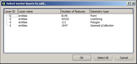
Select one of the available geometries, and a layer will be added to your QGIS project.
DWG is a closed format of Autodesk. This means that the specification of the format is not available. For this reason, QGIS, like other open source applications, does not support DWG files. To open a DWG file in QGIS, you need to convert it. Converting it to a DXF file is a good option as this will let you open your file in QGIS without any problem. There are many tools to do this. The Teigha converter can be found at http://opendesign.com/guestfiles/TeighaFileConverter and is a popular and reliable option.
Another option is using the free service offered by Autodesk, called Autocad 360, which can be found at https://www.autocad360.com/.
The NetCDF data is a data format, which is designed to be used with array-oriented scientific data, and it is frequently used for climate or ocean data, among others. This recipe shows you how to open a NetCDF file in QGIS.
NetCDF files are raster files, and they can be opened using the Add raster layer menu. Select NGMT NetCDF Grid for CDF as the file format in the file selection dialog that you will see, and select the rx5dayETCCDI_yr_MIROC5_rcp45_r2i1p1_2006-2100.nc file from the example dataset. Click on OK.
The proposed NetCDF file contains a single variable, which is opened as a regular raster layer.
A NetCDF file can contain contain multiple layers. In this case, QGIS will prompt you to select the one that you want to add from the ones contained in the specified file.
When only one layer is available, it is opened directly, as in the previously described example.
Another way of opening NetCDF files is using the NetCDF Browser plugin. Select the Manage and install plugins... menu to open the plugin manager. Go to the Not installed section and type netcdf in the search field to filter the list of available plugins. Select the NetCDF Browser plugin and click on Install plugin to install it. Close the plugin manager.
The plugin is now installed, and you can open it by selecting NetCDF Browser in the Plugins menu:
Select the NetCDF file in the upper field. The other fields will be updated with the content of the selected file. Select a layer from the available ones and click on Add to add the layer to your QGIS project.
QGIS supports multiple formats, not just to read vector layers but to also save them. This recipe shows you how to export a vector layer, converting it to a different format.
You will use the layer named poi_names_wake.shp in this recipe. Make sure that it is loaded in your QGIS project.
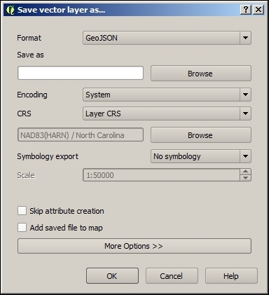
The OGR library, which is used by QGIS to read and open files, is also used to write them. Not all of the formats that are supported for reading purposes are also supported for writing purposes.
You can export even the layers that are not originally file-based to a file, such as a layer coming from a PostGIS database or a WFS connection. Just select the layer in the table of contents and proceed as just explained.
The Save as dialog allows additional configuration beyond what you have seen in the example in this recipe.
Depending on the format that you select to export your layer, different options are available to configure how the layer is exported.
The options are shown by clicking on the More options button. Select GeoJSON as the export format and then display the options for that particular format. The COORDINATE PRECISION option controls the number of decimal places to write in the output GeoJSON file. The default precision is too high for almost all cases, and most of the time, having three or four decimal places is more than enough. Set the precision to 4, enter a valid path and filename, and export the layer by clicking on OK. Your points layer will now be saved in a smaller GeoJSON file. You can open this with a text editor to verify that the coordinates are expressed with the selected precision or compare its size with the one created without specifying a precision value.
Raster layers can be exported to a different file. The export process can be used to crop the layer or perform resampling, creating a modified layer. This recipe shows you how to do this.
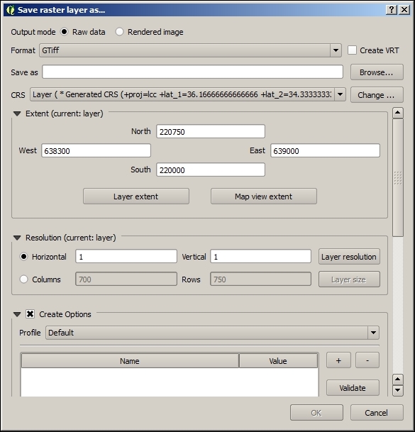
2. The original resolution (the size of the cell) is 1, as you saw in a previous recipe.The GDAL library is used to save the file. Not all formats supported for input are also supported for output, but the most common ones are supported for both operations.
The layer can be exported with a reduced extent. In the QGIS canvas, zoom to a small part of the raster layer. Then open the Save as dialog. In the Extent section, click on the Map view extent button. The bounding coordinates of the current map view will be placed in the four coordinate fields.
Enter a file path to save the file to and click on OK. A layer with a reduced extent covering only the region shown in the map view will be exported.
Layers may be in a CRS other than the one that is best for a given task. Although QGIS supports on-the-fly reprojection when rendering, other tasks, such as performing spatial analysis, may require using a given CRS or having all input layers in the same one. This recipe shows you how to reproject a vector layer.
The Davis_DBO_centerline.shp layer uses a CRS with feet as the unit, which makes this unsuitable for certain operations. We plan to use this layer in future recipes to calculate routes and work in metric units, so including this in a CRS that uses them is then a much better option:
EPSG:26911 CRS. Use the filter box to find it among the list of available CRSs and select it. Then click on OK.Reprojecting is done by the OGR library when it saves the file because this is one of the options that it supports.
Raster layers can be reprojected in a similar way:
The Save as dialog can be used to convert the format of a single layer. When several layers have to be converted, it is a better idea to use some automation. This recipe shows you how to easily convert an arbitrary number of layers.
No previous preparation is needed. Batch conversion is not performed based on open layers but performed directly on files, so there is no need to open layers in QGIS before converting them.
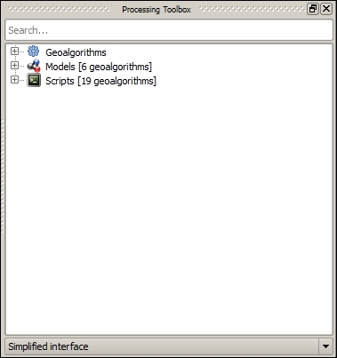
save to filter the list of available algorithms. Locate the Save selected features algorithm, right-click on it, and select Execute as batch process. The batch processing interface will be displayed, as shown in the following screenshot: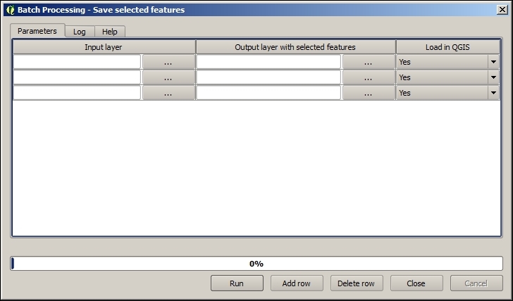
batch_conversion folder in the dataset. It should have a total of three files. Click on OK on the file selection dialog. The batch processing interface should now have all these selected files, one in each row in the parameters table.converted.geojson as the output filename. Click on OK and a new dialog like the one shown in the following screenshot will appear:
The conversion is performed by an algorithm from the QGIS Processing framework. Processing algorithms can be run either as individual algorithms or, in this case, in a batch process.
Outputs of Processing algorithms can be created in all formats supported by QGIS. The format is selected using the corresponding extension in the filename and, unlike in the case of saving a single layer, does not have to be selected in a field or list. Using geojson as the extension for your output files, you tell processing that you want to generate a file in this format.
Although the algorithm saves only the selected features of the layer, if there is no selection, it will use all the layer features. This is the default behavior of all algorithms in processing. As there is no selection in the layers that you have converted, all of their features will have been used.
When converting files this way, the additional options from the Save as dialog are not available, and the default configuration values are used.
You can also convert vector layers with another more complex algorithm from the Processing Toolbox menu, which allows you to enter the configuration parameters used by the underlying OGR library that takes care of the process. It's called Export vector. Find it in the toolbox, right-click on it, and select Execute as batch process:
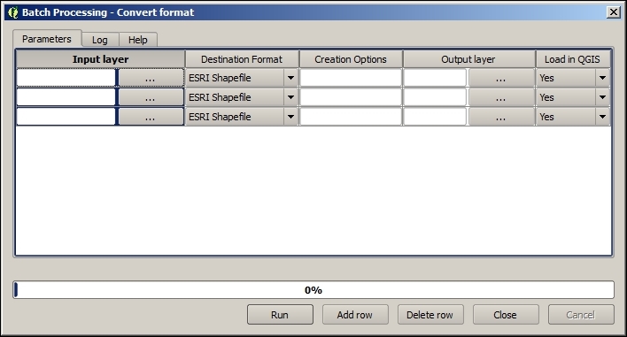
In this case, the output format is not controlled by the extension of the output filename as it happens with other processing algorithms according to what has been already explained.
Layers can be reprojected in a batch operation without having to enter parameters individually on the Save as dialog. This recipe shows you how to reproject a set of layers to a different CRS using an algorithm from the Processing Toolbox menu. You will see how to reproject all the files accompanying the Davis_DBO_centerline.shp file that you reprojected in the Reprojecting a layer recipe.
Reproject to filter the list of available algorithms. Locate the Reproject layer algorithm, right-click on it, and select Execute as batch process. The batch processing interface will be shown, as follows: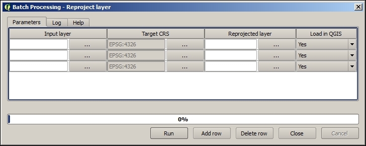
davis folder in the dataset and add the files to the table.EPSG:26911 CRS, as you did in a previous recipe when converting a single layer. Copy the value to the rest of rows in the column by double-clicking on the column header.The reprojection algorithm is a part of the Processing framework, so you can select the output format by changing the output file extension. You can use this to not only reproject a set of input layers but to also convert their format, all in a single step.
Raster layers can also be reprojected with another algorithm from the Processing Toolbox menu named Warp (reproject). These inputs are rather similar to the ones in the reprojection tool for vector layers with some additional parameters that are specific to raster layers. Select the algorithm, right-click on it, and select Execute as batch process to run it and convert a set of raster layers.
SpatiaLite is a single file relational database that is built on top of the well-known SQLite database. It can store many layers of various types, including nonspatial tables. Interfaces to the format also allow the ability to run spatial queries of various kinds. It's a highly-flexible and portable format that is great for everyday use, especially when working on standalone projects or with only one user at a time. SpatiaLite works in a similar manner to PostGIS without the need to configure or run a database server.
Pick a vector layer and load it up in QGIS. This step is optional, as you can pick the source layer from the filesystem in a later dialog.
cookbook.db. The easiest way to do this is with the Browser tab, as shown in the following screenshot:
If you have a lot of files listed, this will be quite difficult as the browser doesn't scroll during the drag operation. You can optionally open a second browser window and drag the layer across. Also, note that this defaults to multi-type geometry. If you need to control the options, use the next method.

QGIS converts your geometry to a format that is compatible with SpatiaLite and inserts it, along with the attribute table. Afterwards, it updates the metadata tables in SpatiaLite to register the geometry column and build the spatial index on it. These two postprocesses make the database table appear as a spatial layer to QGIS and speed up the loading of data from the table when panning and zooming.
The import dialog contained a few other features that are often useful. You can reproject data as part of the import process if you want, or you can specify the projection if QGIS didn't detect it properly. You can also name the geometry column something different than the default, geom; for example, utmz10n83 (this is normally not recommended). You can specify the character encoding of the text in the event that it's not handled correctly.
You can even use the dialog to append data to an existing table; for example, you have multiple counties with the same data structure that come as two separate files, but you want them all in one layer.
If, for some reason, the layer didn't import the way that you want, delete it and redo the import. If you delete layers, make sure to learn how to vacuum the database to recover the now empty space in the file and shrink its total size (this is not automatic).
What happens if this fails? Databases can be really picky sometimes. Here are some common issues and solutions:
-nlt PROMOTE_TO_MULTI, which converts all single items to multi-items to fix this.If you need more advanced settings or can't get the QGIS tool to work, you may need to use the QspatiaLite Plugin (install this with Manage Python Plugins under the Plugins menu), the spatialite-gui (download this from https://www.gaia-gis.it/fossil/spatialite_gui/index) application, or the ogr2ogr command line (this comes with QGIS, which is part of OSGeo4w shell on Windows, or the terminal on Mac or Linux).
PostGIS is the spatial add-on to the popular PostgreSQL database. It's a server-style database with authentication, permissions, schemas, and handling of simultaneous users. When you want to store large amounts of vector data and query them efficiently, especially in a multicomputer networked environment, consider PostGIS. This works fine for small data too, but many users find its configuration too much work when SpatiaLite may be better suited.
Pick a vector layer and load it in QGIS. You will also need to have a working copy of Postgres/PostGIS running, a PostGIS database created, and an account that allows table creation.
BostonGIS maintains a decent tutorial on installation for Windows, and getting a PostGIS set up for everyone. You can find this at http://www.bostongis.com/?content_name=postgis_tut01#316.
You should configure QGIS to be aware of your database and its connection parameters by creating a new database item in the PostGIS load dialog or by right-clicking on PostGIS in the Browser tab and selecting New Connection:
You can find more information about PostGIS at http://docs.qgis.org/2.8/en/docs/user_manual/working_with_vector/supported_data.html#postgis-layers.
Now that you can connect to a PostGIS database, you are ready to try importing data:
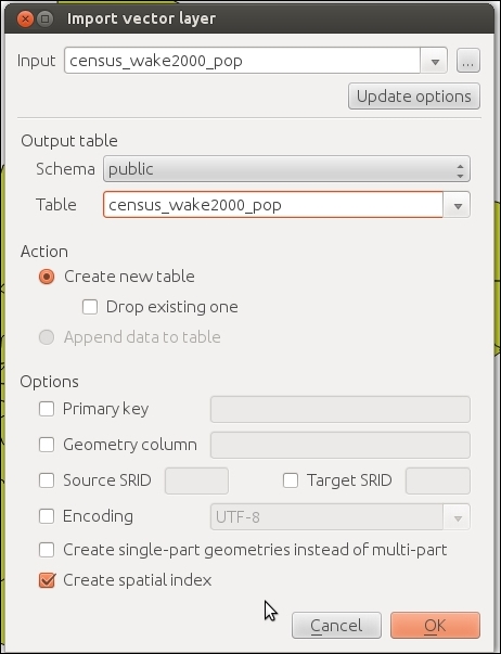
QGIS converts your geometries to a format that is compatible with PostGIS, and inserts it, along with importing the attributes. Afterwards, it updates the metadata views in PostGIS to register the geometry column and build the spatial index on it. These two post-processes make the database table appear as a spatial layer to QGIS and speed up the loading of data from the table when panning and zooming.
The options presented in the dialog are not all the options that are available. If you need more control or advanced options present, you'll likely be looking at the command-line tools: shp2pgsql (a graphical plugin for pgadmin3 is available on some platforms) and ogr2ogr. The shp2pgsql tool generally only handles shapefiles. If you have other formats, ogr2ogr can handle everything that QGIS is capable of loading. You can also use these tools to develop batch import scripts.
To import large or complicated CSV or text files, you sometimes will need to use the pgadmin3 or psql command-line interface to Postgres.
Need even more control? Then, consider scripting. OGR and Postgres both have very capable Python libraries.
Another option is using the OpenGeo Suite plugin, which has some additional options, such as allowing importing multiple layers into a single table or into one table per layer. To learn more about this, including how to install it, refer to http://qgis.boundlessgeo.com/static/docs/intro.html.
What happens if this fails? Databases can be really picky sometimes:
-nlt PROMOTE_TO_MULTI, which converts all single items to multi-items, to fix this.For more information on PostGIS installation and setup, refer to http://postgis.net/install.
For a more in-depth text on using PostGIS, there are many books available, including Packt Publishing's PostGIS Cookbook.
In this chapter, we will cover the following recipes:
One of the reasons to use QGIS is its many features that enable management and analysis preparation of spatial data in a visual manner. This chapter focuses on common operations that users need to perform to get data ready for other uses, such as analysis, cartography, or input into other programs.
In this chapter, you will find recipes to manage vector as well as raster data. These recipes cover the handling of data from both file and database sources.
We often get data in different formats and information spread over multiple files. Therefore, one important skill to know is how to join attribute data from different layers. Joining data is a way to combine data from multiple tables based on common values, such as IDs or categories.
This exercise shows you how to use the join functionality in Layer Properties to join geographic census tract data to tabular population data and how to save the results to a new file.
To follow this exercise, load the census tracts in census_wake2000.shp using Add Vector Layer (you can also drag and drop the shapefile from the file browser to QGIS) and population data in census_wake2000_pop.csv using Add Delimited Text Layer.
You can also load the .csv text file using Add Vector Layer, but this will load all data as text columns because the .csv file does not come with a .csvt file to specify data types. Instead, the Add Delimited Text Layer tool will scan the data and determine the most suitable data type for each column.
To join two layers, there has to be a column with values/IDs that both layers have in common. If we check the attribute tables of the two layers that we just loaded, we will see that both have the STFID field in common. So, to join the population data to the census tracts, use the following steps:
census_wake2000 layer (for example, by double-clicking on the layer name in the Layers list) and go to Joins.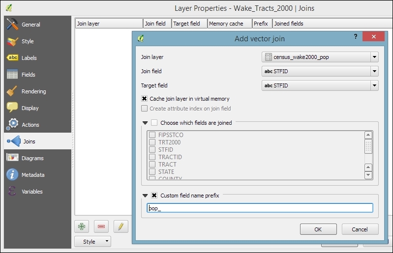
Joins can be used to join vector layers and tabular layers from many different file and database sources, including (but not limited to) Shapefiles, PostGIS, CSV, Excel sheets, and more.
When two layers are joined, the attributes of Join layer are appended to the original layer's attribute table. If you want, you can use the Choose which fields are joined option to select which of the fields from the population layer should be joined to the census tracts. Otherwise, by default, all fields will be added. The number of features in the original layer is not changed. Whenever there is a match between the values in the join and the target field, the new attribute values will be filled; otherwise, there will be NULL values in the new columns.
By default, the names of the new columns are constructed from join layer name with underscore followed by join layer column name. For example, the STATE column of census_wake2000_pop becomes census_wake2000_pop_STATE. You can change this default behavior by enabling the Custom field name prefix option, as shown in the previous screenshot. With these settings, the STATE column becomes pop_STATE, which is considerably shorter and, thus, easier to handle.
The join that you've created now only exists in memory. None of the original files have been altered. However, it's possible to create a new file from the joined layers. To do this, just use Save as … from the Layer menu or Context menu. You can choose between a variety of data formats, including the ESRI shapefile, Mapinfo MIF, or GML.
Shapefiles are a very common choice as they are still the de facto standard GIS data exchange format, but if you are familiar with GIS data formats, you will have noticed that the names of the joined columns are too long for the 10 character-name length limit of the shapefile format. QGIS ensures that all columns in the exported shapefiles have unique names even after the names have been shortened to only 10 characters. To do this, QGIS adds incrementing numbers to the end of, otherwise, duplicate column names. If you save the join from this example as a shapefile, you will see that the column names are altered to census_w_1, census_w_2, and so on. Of course, these names are less than optimal to continue working with the data. As described in How it works... in this recipe, the names for the joined columns are a combination of joined layer name and column name. Therefore, we can use the following trick if we want to create a shapefile from the join: we can shorten the layer name. Just rename the layer in the layer list. You can even have a completely empty layer name! If you change the joined layer name to an empty string, the joined column names will be _STATE, _COUNTY, and so on instead of census_wake2000_pop_STATE and census_wake2000_pop_COUNTY. In any case, it is good practice to document your data and provide a description of the attribute table columns in the metadata.
In any case, it is very likely that you will want to clean up the attribute table of the new dataset, and this is exactly what we are going to do in the next exercise.
There are many reasons why we need to clean up attribute tables every now and then. These may be because we receive badly structured or named data from external sources, or because data processing, such as the layer joins that we performed in the previous exercise, require some post processing. This recipe shows us how to use attribute table and the Table Manager plugin to rename, delete, and reorder columns, as well as how to convert between different data types using Field Calculator.
If you performed the previous recipe, just save the joined layer to a new shapefile; otherwise, load census_wake2000_pop.shp. In any case, you will notice that the dataset contains a lot of duplicate information, and the column names could use some love as well. To follow this recipe, you should also install and enable the Table Manager plugin by navigating to Plugins | Manage and Install Plugins.
_STATE, _COUNTY, _TRACT, FIPSSTCO, TRT2000, STFID, _POP2000, AREA, and PERIMETER._STATE, _COUNTY, _TRACT, and _POP2000.STFID to the first position and AREA and PERIMETER to the last.The steps provided in this exercise are mostly limited to layers with shapefile sources. If you use other input data formats, such as MIF, GML, or GeoJSON files, you will notice that the Toggle editing button is grayed out because these files cannot be edited in QGIS. Whether a certain format can be edited in QGIS or not depends on which functionality has been implemented in the respective GDAL/OGR driver.
The GDAL/OGR version that is used by QGIS is either part of the QGIS package (as in the case of the Windows installers) or QGIS uses the GDAL library existing in your system (on Linux and Mac). To get access to specific drivers that are not supported by the provided GDAL/OGR version, it is possible to compile custom versions of GDAL/OGR, but the details of doing this are out of the scope of this cookbook.
Another common task while dealing with attribute table management is changing column data types. Currently, it is not possible to simply change the data type directly. Instead, we have to use Field Calculator (which is directly accessible through the corresponding button in the Attributes toolbar or from the attribute table dialog) to perform conversions and create a new column for the result.
In our census_wake2000_pop.shp file, for example, the tract ID, TRACT, is stored in a REAL type column with a precision of 15 digits even though it may be preferable to simply have it in a STRING column and formatted to two digits after the decimal separator. To create such a column using Field Calculator, we can use the following expression:
format_number("TRACT",2)Compared to a simple conversion (which would be simple, use tostring("TRACT"), format_number("TRACT",2) offers the advantage that all values will be formatted to display two digits after the decimal separator, while a simple conversion would drop these digits if they are zeros.
Of course, it's also common to convert from text to numerical. In this case, you can chose between toint() and toreal().
In the Joining layer data recipe, we discussed that joins only append additional columns to existing features (1:1 or n:1 relationships). Using joins, it is, therefore, not possible to model 1:n relationships, such as "one zip code area containing n schools". These kinds of relationships can instead be modeled using relations. This recipe introduces the concept of relations and shows how you can put them to use.
To follow this exercise, load zip code areas and schools from zipcodes_wake.shp and schools_wake.shp.
Relations are configured in Project Properties. The dialog is very similar to the join dialog:
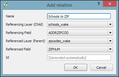
As the preceding screenshot shows, setting up this relation enables you to get access to all schools within a certain zip code in a very convenient way. As the edit button suggests, it is even possible to edit the school data from this view. You can simply edit the values in the table view. You can add and delete schools from the dataset using the + and X buttons. The next two buttons enable you to quickly add new entries to the relation or to remove them.
In this example, removing a school from the dataset works just fine, but adding a school via this dialog makes less sense because you cannot create a point geometry through this process.
If you press the button to add to the relation, you will get a dialog that allows you to choose which existing school you want to add. In the background, the school's ADDRZIPCOD value is updated to match the zip code we just assigned it to.
Similarly, if you select a school and press the button to remove the relation, what actually happens is that the school's ADDRZIPCOD value is set to NULL.
If you use a database (SpatiaLite or PostGIS) to store your data, vector and nonspatial, then you also have the option of using the database and SQL to perform tables joins. The primary advantages of this method include being able to filter data before loading in the map, perform multitable joins (three or more), and have full control over the details of the join via queries.
You'll need at least two layers in either a SpatiaLite or PostGIS database. These two layers need at least one column in common, and the column in common should contain unique values in at least one table. In this case, our example uses the census_wake_2000 polygon layer and census_wake_2000_pop.csv.
cookbook.db in SpatiaLite (which was created in Chapter 1, Data Input and Output).SELECT * FROM census_wake2000 Sas a JOIN census_wake2000_pop AS b ON a.stfid = b.stfid;
SELECT lists all the columns that you want from the source tables; in this case, * means everything. FROM is the first (left) table, as a is an alias, which is used so that there's less typing later. JOIN is the second (right) table, and ON indicates which columns to should be matched between the two tables. The rest of how this works in relational database theory is best explained in other texts.
In databases, there's more than one type of join. You can perform a join where you retain only the matches in both tables, or you can retain all content from the left (first table) and any matches from the right. You can also control how a one-to-many relationship is summarized or select specific records instead of aggregating.
If you want to save the results of a query you have two options. You can make a view or a new table. A view is a saved copy of your query. Every time you open it, the query will be rerun. This is great if your data changes because it will always be up-to-date, and this doesn't use any additional disk space. On the other hand, a table is like saving a new file; it becomes a static new copy of the results. This is good to repeatedly access the same answer, and it is usually faster to use, especially for large tables.
cookbook.db databaseIn a database, view is a stored query. Every time you open it, the query is run and fresh results are generated. To use views as layers in QGIS takes a couple of steps.
For this recipe, you'll need a query that returns results containing a geometry. The example that we'll use is the query from the Joining tables in databases recipe (the previous recipe) where attributes were joined 1:1 between the census polygons and the population CSV. The QSpatiaLite plugin is recommended for this recipe.
The GUI method is described as follows:
SELECT *
FROM census_wake2000 as a
JOIN census_wake2000_pop as b
ON a.stfid = b.stfid;
geom.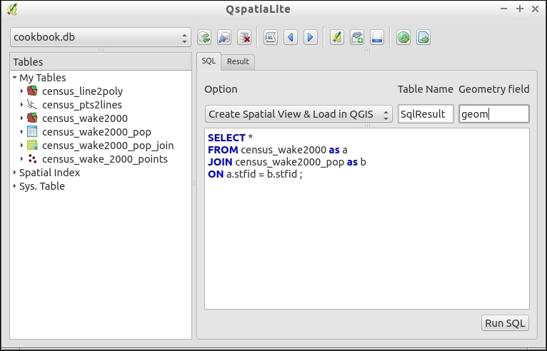
The SQL method is as described, as follows:
CREATE VIEW <name> as SELECT:CREATE VIEW census_wake2000_pop_join AS SELECT * FROM census_wake2000 as a JOIN census_wake2000_pop as b ON a.stfid = b.stfid;
CREATE VIEW census_wake2000_pop_join AS
INSERT INTO views_geometry_columns
(view_name, view_geometry, view_rowid, f_table_name, f_geometry_column,read_only)
VALUES ('census_wake2000_pop_join', 'geom', 'rowid', 'census_wake2000', 'geom',1);A view is actually stored in the database and is triggered when you load it. In this way, if you change the original data tables, the view will always be up to date. By comparison, creating new tables makes copies of the existing data, which is stored in a new place, or creates a snapshot or freeze of the values at that time. It also increases the database's size by replicating data. Whereas, a view is just the SQL text itself and doesn't store any additional data.
QGIS reads the metadata tables of SpatiaLite in order to figure out what layers contain spatial data, what kind of spatial data they contain, and which column contains the geometry definition. Without creating entries in the metadata, the tables appear as normal SQLite tables, and you can only load attribute data without spatial representation.
As it's a view, it's really reading the geometries from the original tables. Therefore, any edits to the original table will show up. New in SpatiaLite 4.x series, this makes it easier to create writable views. If you use the spatialite-gui standalone application, it registers all the database triggers needed to make it work, and the changes made will affect the original tables.
You don't have to use ROWID as unique id, but this is a convenient handle that always exists in SQLite, and unlike an ID from the original table, there's no chance of duplication in an aggregating query.
In a database, a view is a stored query. Every time that you open it, the query is run and fresh results are generated. To use views as layers in QGIS takes a couple of steps.
For this recipe, you'll need a query that returns results containing a geometry. The example that we'll use here is the query from the Joining tables in databases recipe where attributes were joined 1:1 between the census polygons and the population CSV.
The SQL method is described as follows:
SELECT *
FROM census_wake2000 as a
JOIN census_wake2000_pop as b
ON a.stfid = b."STFID";
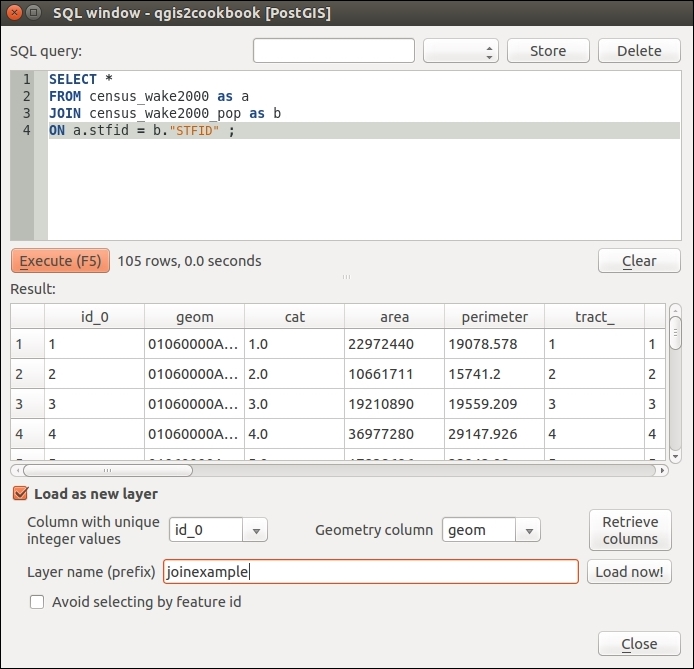
id_0) for Column with unique integer values and geom for Geometry column. Name your result in the Layer name (prefix) textbox and click on Load now!.CREATE VIEW <name> AS SELECT:CREATE VIEW census_wake2000_pop_join AS SELECT * FROM census_wake2000 as a JOIN census_wake2000_pop as b ON a.stfid = b."STFID";
QGIS reads the metadata tables or views of PostGIS in order to figure out what layers contain spatial data, what kind of spatial data they contain, and which column contains the geometry definition. Without creating entries in the metadata, the tables appear as normal PostgreSQL tables, and you can only load attribute data without spatial representation.
As this is a view, it's really reading the geometries from the original tables. Therefore, any edits to the original table will also show up.
QGIS is really picky about having a unique ID for PostGIS tables and views. There are a few tips to make this always work. Always include a numeric unique ID (as the first column is recommended but not required, IDs must be integer columns (usually int4, but int8 should work now too). Autoincrementing IDs are good idea. When you don't have such an ID field to use from one of the underlying tables, you can add an ID on the fly with the following:
SELECT row_number() OVER() AS id_qgis, <add the other fields you want here> FROM table;
The downside of this is that you now have to list out all the fields that you want to use in the view rather than using *. When creating tables, you'll want to turn this id_qgis field into an auto-incrementing field if you plan to add records.
The other big catch is that if you make a new geometry by manipulating existing geometries, QGIS isn't always aware of the results. In the previous example, the geometry is just passed from the original table to the view unchanged, so it is properly registered in the geometry_columns metadata of PostGIS. However, a new geometry doesn't exist in the original table, so the trick is to cast the geometry result, as follows:
CREATE VIEW census_wake2000_4326 AS
SELECT id_0,
stfid,tractid,ST_Transform(geom,4326)::geometry(GeometryZ, 4326)
As geom
FROM census_wake2000;
QGIS doesn't always think that this is a valid spatial layer but adding to the Canvas should work.
Also, keep your eyes on Postgres's relatively new feature called Materialized Views. This is a method of caching view results that don't update automatically, but they also don't require whole new tables.
Spatial indexes are methods to speed up queries of geometries. This includes speeding up the display of database layers in QGIS when you zoom in close (it has no effect on viewing entire layers).
This recipe applies to SpatiaLite and PostGIS databases. In the event that you've made a new table or you have imported some data and didn't create a spatial index, it's usually a good idea to add this.
You can also create a spatial index for shapefile layers. Take a look at Layer Properties | General for the Create Spatial Index button. This will create a .qix file that works with QGIS, Mapserver, GDAL/OGR, and other open source applications. Refer to https://en.wikipedia.org/wiki/Shapefile.
You'll need a SpatiaLite and a Postgis database. For ease, import a vector layer from the provided sample data and do not select the Create spatial index option when importing. (Not sure how to import data? Refer to Chapter 1, Data Input and Output, for how to do this.)
Using the DB Manager plugin (in the Database menu), perform the following steps:
SELECT CreateSpatialIndex('schools_wake', 'geom');CREATE INDEX sidx_census_wake2000_geom ON public.census_wake2000 USING gist(geom);
idx_nameoftable_geomcolumn listed as a table: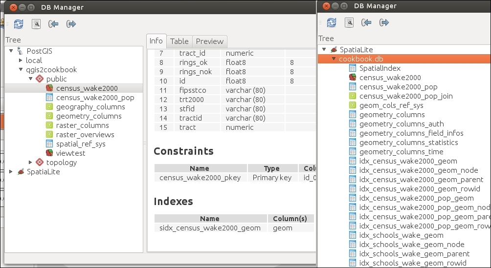
When you create a spatial index, the database stores a bounding box rectangle for every spatial object in the geometry column. These boxes are also sorted so that boxes near each other in coordinate space are also near each other in the index.
When queries are run involving a location, a comparison is made against the boxes, which is a simple math comparison. Rows with boxes that match the area in question are then selected to be tested in depth for a precise match, based on their real geometries. This method of searching for intersection is faster than testing complex geometries one by one because it quickly eliminates items that are clearly not near the area of interest.
Spatial indexes are really important to speed up the loading time of database spatial layers in QGIS. They also play a critical role in the speed of spatial queries (such as intersects). Note that PostGIS will automatically use a spatial index if one is present. SpatiaLite requires that you write queries that intentionally call a particular spatial index (Refer to Haute Cuisine examples from the SpatiaLite Cookbook)
Also, keep in mind that only one spatial index per table can be used in a single query. This really comes into play if you happen to have more than one spatial column or create a spatial index in a different projection than the geometry (check out the PostGIS Cookbook by Packt Publishing for more information).
Do you want to check lots of tables at once? You can list all GIST indexes in PostGIS at once:
SELECT i.relname as indexname, idx.indrelid::regclass as tablename,
  am.amname as typename,
ARRAY(SELECT pg_get_indexdef(idx.indexrelid, k + 1, true)
  FROM generate_subscripts(idx.indkey, 1) as k
  ORDER BY k
  ) as indkey_names
FROM pg_index as idx
JOIN pg_class as i  ON  i.oid = idx.indexrelid
JOIN pg_am as am  ON  i.relam = am.oid
JOIN pg_namespace as ns  ON  ns.oid = i.relnamespace
AND ns.nspname = ANY(current_schemas(false))
Where am.amname Like 'gist';
To do something similar in SpatiaLite, use the following:
SELECT * FROM geometry_columns WHERE spatial_index_enabled = 1;
Sometimes, you have a paper map, an image of a map from the Internet, or even a raster file with projection data included. When working with these types of data, the first thing you'll need to do is reference them to existing spatial data so that they will work with your other data and GIS tools. This recipe will walk you through the process to reference your raster (image) data, called georeferencing.
You'll need a raster that lacks spatial reference information; that is, unknown projection according to QGIS. You'll also need a second layer (reference map) that is known and you can use for reference points. The exception to this is, if you have a paper map that has coordinates marked on it or a spatial dataset that just didn't come with a reference file but you happen to know its CRS/SRS definition. Load your reference map in QGIS.
This book's data includes a scanned USGS topographic map that's missing its o38121e7.tif projection information. This map is from Davis, CA, so the example data has plenty of other possible reference layers you could use, for example, the streets would be a good choice.
On the Raster menu, open the Georeferencing tool and perform the following steps:
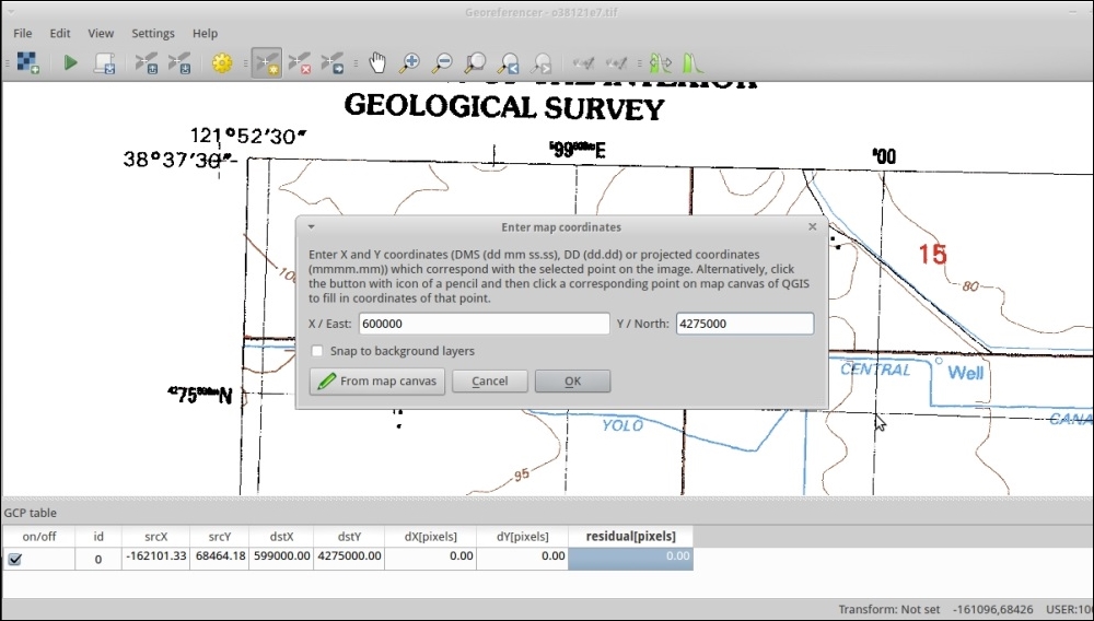
A mathematical function is created based on the differences between your two sets of points. This function is then applied to the whole image, stretching it in an attempt to fit. This is basically a translation or projection from one coordinate system to another.
Picking transformation types can be a little tricky, the list in QGIS is currently in alphabetical order and not the recommended order. Polynomial 2 and Thin-plate-spline (TPS) are probably the two most common choices. Polynomial 1 is great when you just have minor shift, zooming (scale), and rotation. When you have old well-made maps in consistent projections, this will apply the least amount of change. Polynomial 2 picks up from here and handles consistent distortion. Both of these provide you with an error estimate as the Residual or RMSE (Root Mean Square Error). TPS handles variable distortion, varying it's correction around each control point. This will almost always result in the best fit, at least through the GCPs that you provide. However, because it varies at every GCP location, you can't calculate an error estimate and it may actually overfit (create new distortion). TPS is best for hand-drawn maps, nonflat scans of maps, or other variable distorted sources. Polynomial methods are good for sources that had high accuracy and reference marks to begin with.
If you really want a good match, once you have all your points, check the RMSE values in the table at the bottom. Generally, you want this near or less than 1. If you have a point with a huge value, consider deleting it or redoing it. You can move existing points, and a line will be drawn in the direction of the estimated error. So, go back over the high values, zoom in extra close, and use the GCP move option.
Sometimes, just changing your transformation type will help, as shown in the following screenshot that compares Polynomial 1 versus Polynomial 2 for the same set of GCP:
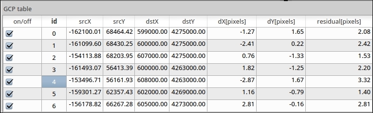
Polynomial 1
Note the residual values difference when changing to Polynomial 2 (assuming that you have the minimum number of points to use Polynomial 2):
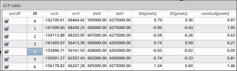
Polynomial 2
Resampling methods can also have a big impact on how the output looks. Some of the methods are more aggressive about trying to smooth out distortions. If you're not sure, stick with the default nearest neighbor. This will copy the value of the nearest pixel from the original to a new square pixel in the output.
For various reasons, sometimes you have a vector layer that lacks projection information. This is often the case with CAD layers that were created only in local coordinates. When it is possible, try to track down the original projection information. As a last resort, you can attempt to warp the vector layer to match a known reference layer with the recipe described here.
You can open two instances of QGIS (or use one as you'll just be zooming back and forth a lot). In one instance, load a reference layer, something in the projection that you want your data to be in. Activate Coordinate Capture Plugin from the Manage Plugins menu.
This example uses cad-lines-only.shp, which is the line layer extracted from the CSS-SITE-CIV.dxf file. This file is a CAD rendering of design plans for Academy St. in the town of Cary, Wake County, North Carolina.
cad-lines-only.shp) and your reference layer (CarystreetsND83NC.shp).cad-lines-only.shp referenced to CarystreetsND83NC.shp. These will make it easier to find matches between the two layers:cad-lines-only.shp, and adjust its style properties using a rule-based style. Use the "Layer" = 'C-ROAD-CNTR' rule, which will only show you street centerlines.CarystreetsND83NC.shp in order to find the matching area, open the attribute table, and apply the following select expression: "Street" LIKE '%N ACADEMY%' OR "Street" LIKE '%S ACADEMY%' OR "Street" LIKE '%CHATHAM%'. The filter here highlights the three main streets of the original project, which is at the intersection of Chatham and N/S Academy streets in the center of the town. This may also be useful to change the color of the selected features to make it easier to find. The traffic circles at either end of the project are good landmarks: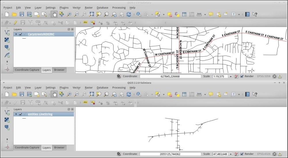
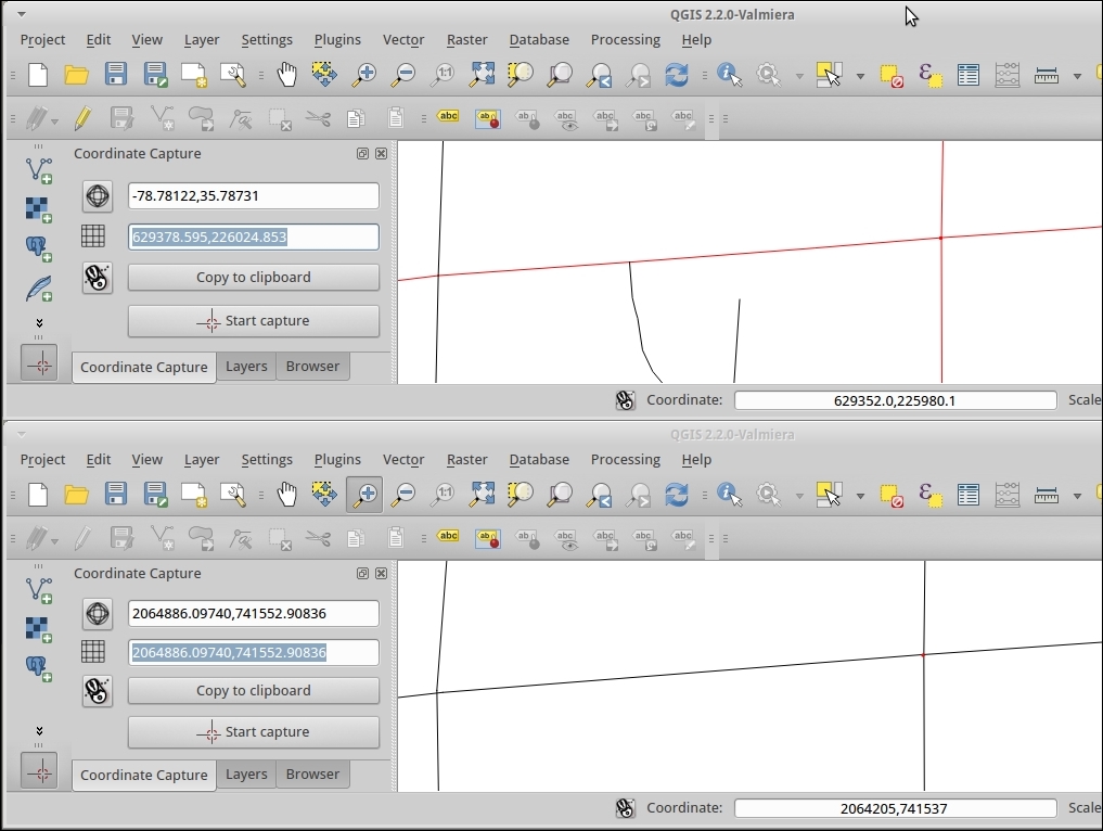
-gcp sourceX sourceY destinationX destinationY
cd /home/user/Qgis2Cookbook/):
ogr2ogr -a_srs EPSG:3358 -gcp 2064886.09740 741552.90836 629378.595 226024.853 -gcp 2066610.97021 741674.39817 629903.420 226064.049 -gcp 2064904.46214 743055.63847 629384.784 226485.725 -gcp 2062863.85707 741337.65243 628762.587 225960.900 cad_lines_nd83nc.shp cad-lines-only.shp
-a_srs is the proj code for your reference layer.
The command pattern is ogr2ogr <options> <destination> <source>.
Other useful advanced options include -order <n> to indicate polynomial level (default is based on the number of GCPs) or -tps to use Thin-plate-spline instead of polynomial. For more options refer to http://www.gdal.org/ogr2ogr.html.
cad_lines_nd83nc.shp file in the same project, as CarystreetsND83NC.shp. They should line up without the need to enable projection-on-the-fly: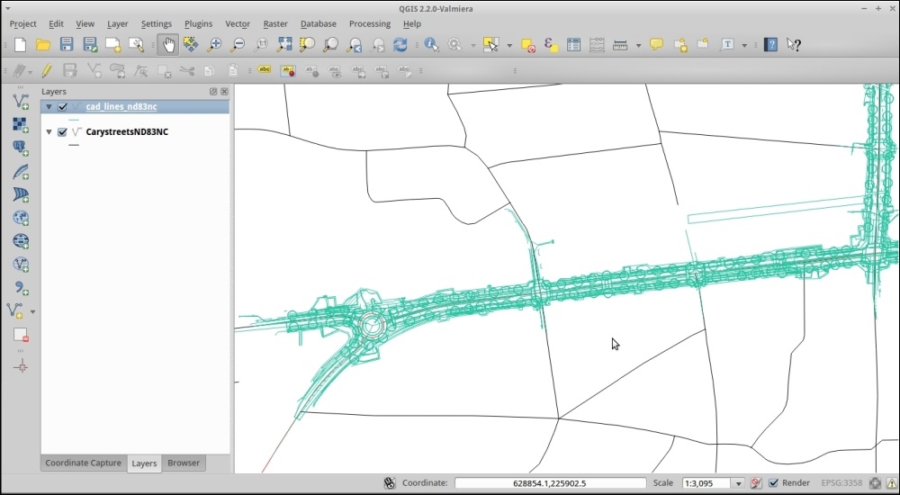
Given the list of input coordinates and matching output coordinates, a math formula is derived to translate between the two sets. This formula is then applied to all the points in the original data. The result of this is a reprojected dataset from an unknown projection to a known projection.
When picking a reference layer, try to pick something in the projection that you want to use for your maps and analysis. That way you only have to reproject once, as each additional transformation can add an error. There's also more than one way to go about accomplishing this task, including moving the data by hand.
In this particular, example the transformation is autoselected based on the number of GCP point pairs. 4-5 is the first order polynomial, 6-9 is the second order polynomial, and 10+ is the third order polynomial. Refer to the previous recipe in this chapter for more information.
A related topic is Affine transformations when you simply want to shift or rotate a vector layer by a known amount. The QgsAffine plugin is great if you already know the parameters, or roughly know how far you want to rotate and shift the vector layer, as it then just needs some math to get the parameters.
Overviews, or pyramids, and resampling are all about making raster layers load faster when zooming and panning in your map canvas, by reducing the amount of data loaded when not zoomed in all the way.
You will need a large raster image.
elev_lid792_1m.tif will work fine for this example.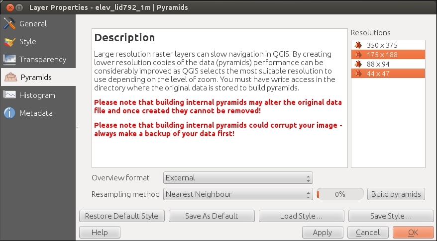
Generating pyramids essentially makes copies of your original data resized for different zoom levels. As you zoom out, the original data is resampled to fit the size of the screen. The pyramids do the same thing, but they let you decide what resampling method to use and generate this overview ahead of time. By generating them ahead of time, QGIS can load the image faster when you change zoom levels.
Resampling is a fancy way of saying that at each zoom level that is now 1 pixel is more than 1 pixel from the original data, so they need to be averaged in some way and the result assigned to the 1 pixel that is now available. Each of the different methods uses a different math formula to decide the new value and how much to smooth that value with neighboring pixels (so that it looks aesthetically pleasing). This is the same concept as when you shrink pictures so that you can e-mail them to your friends.
If you chose to save them externally, your overviews are stored in elev_lid792_1m.tif.ovr. Some other programs store the same thing in the .aux files; however, pyramid formats are not universally compatible between GIS applications.
gdaladdo command; refer to http://gdal.org/gdaladdo.htmlWhen you have a lot of rasters (instead of one big raster) that are all part of the same dataset (typically adjacent to each other), you don't want to load each file individually and then style it. It's much easier to load one file and treat it as one layer. This recipe lets you do this without actually creating a single monstrous raster, which can be difficult to work with.
You will need two or more raster files that have adjacent extents or only overlap partially around the edges and are in the same projection. Ideally, the files should be of the same type, such as all elevations, all air photos, and so on. For this recipe, the elevation rasters from the OSGeo EDU (North Carolina) dataset will work.
.vrt extension.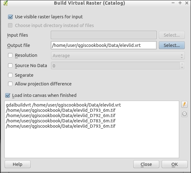
GDAL VRT format is an XML file that defines the location of each raster file relative to an anchor file. It uses the existing spatial extent information of the rasters to figure out their positions relative to each other and then anchors the set in the given coordinate system.
Using a VRT is all about saving time. When you have hundreds of raster files for one particular dataset, you can combine them into a single file. However, this file could be gigantic in size and somewhat impossible to work with. This is a quick way to be able use the files as a seamless background layer. If you need to perform analysis, you'll likely need to either combine the layers or loop over them individually.
You could also generate Tile Index (also in the Miscellaneous menu), which makes a shapefile of the outlines of the rasters and puts the ID and path of the raster in the attribute table. This would allow you to figure out which image you want to load for a given map without having to load them all.
Finally, if you really want to make all of the files a single large file, use the context menu (right-click on the loaded VRT layer and choose Save As). If you have overlaps, more complicated situations, or want to merge without loading the files, first use the Merge tool (also in the Miscellaneous menu). This can be tricky if your files overlap, you'll need to decide how to handle the double data.
In this chapter, we will cover the following recipes:
When working with other people's data, it is often not the exact format that you need for a particular use. This chapter is all about taking the data that you do have and converting it to what you actually need. It covers converting between different types of vectors (points, lines, and polygons), between vectors and polygons, and cutting out only the parts that you need. Taking data from how you get it and converting it to the format and layout that you need in order to work with is often called 'data preprocessing'.
Sometimes your data is vector formatted (point, line, or polygon), but it is not the right kind of vector for a particular type of analysis. Or perhaps you need to split a vector in a particular way to facilitate some analysis or cartography. Thankfully, all vector formats are related, lines are two or more connected points, polygons are lines whose first and last point are the same, multipolygons are two or more polygons for the same record, and rings are nested polygons where the inner polygon outlines an area to be excluded. This recipe covers how to convert between the different vector types using built-in QGIS methods.
To convert points to lines or polygons, you will need a shapefile with an ID column that has a single value shared between the points of the same line or polygon. In the following example, we will use census_wake_2000_points.shp.
You will also need to install and activate the Points2One plugin. Refer to the following website for how install plugins, http://docs.qgis.org/2.8/en/docs/user_manual/plugins/plugins.html.
The following instructions show four different conversion methods, depending on the starting data and the end data type. All of the tools are in the Vector menu:
Start by loading the census_wake_2000_points.shp layer.
Converting to simpler types from more complex ones is fairly straightforward in simple cases. Lines are just multiple points connected together and polygons are lines that start and end with the same point. So, it's pretty easy to see how to deconstruct one geometry to simpler geometries.
It's building up from points, which is a little trickier. In a line with three or more points, you need to make sure that you have them in the correct order; otherwise, you'll end up with a squiggle. When going to polygons, this can create bigger issues by leaving you with invalid polygons that self-intersect. So, it's really important to order your points in your source table in the same order that they will be combined. Reordering your data can be somewhat tricky. The Points2One plugin now includes a sort order option; to use this, make sure that your attribute table has a numeric column with the order of the points specified per group (you can restart the numbering at 1 for each distinct grouping).
You can also split or combine multipolygons with the Singleparts to Multiparts and Multiparts to Singleparts commands.
When things get really tricky, you may need to switch to editing the shapes by hand or custom scripts. A good example of this is when you want a polygon with a hole in the middle. If you do go the route of editing by hand, make sure to turn on snapping so that your lines are automatically snapped to existing points. The official documentation on snapping can be found at http://docs.qgis.org/2.8/en/docs/user_manual/working_with_vector/editing_geometry_attributes.html#setting-the-snapping-tolerance-and-search-radius.
The Editing and Advanced Editing toolbars and additional editing related plugins offer the ability to manipulate particularly tricky geometries, one at a time, if you need to.
The goal of this recipe is identical to the previous recipe, but it covers how to perform the process with data in a SpatiaLite database. You will to turn points into lines and lines into polygons.
Not all methods are available; for those that are not available, you can use the previous recipe. It will also work on a database layer; it just doesn't save the results to the database. So, the results will need to be imported to the database after completion.
You need to load a vector layer of points with a numeric ID indicating order, and an identifier of unique lines or polygons that is shared between points of the same geometry. For example, you can use census_wake_2000_points loaded into SpatiaLite with the geometry field called geom.
Using DB Manager Plugin (comes with QGIS and is in the Database menu), the QspatiaLite plugin, or an alternate SpatiaLite SQL application (command line or GUI), the following SQL examples will perform the conversions between vector types.
--Create table grouping points with shared stfid into lines
CREATE Table census_pts2lines AS
SELECT stfid,MakeLine(geom) as geom
FROM census_wake_2000_points
GROUP BY stfid;
The following screenshot shows what the screen will look like:
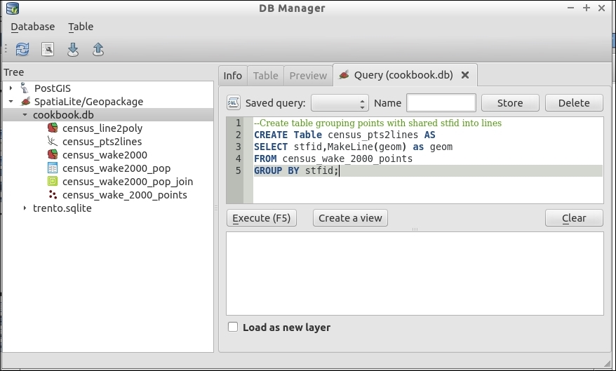
--Register the new table's geometry so QGIS knows its a spatial layer
SELECT RecoverGeometryColumn('census_pts2lines','geom',3358,'LINESTRING',2);Some SQL interfaces can run multiple SQL statements in a row, separated by a semicolon. However, there are also many interfaces that can only perform one query at a time. Generally, run one query at a time unless you know your software supports multiple queries; otherwise, this may fail or silently only run the first query.
--Create table grouping lines with shared stfid into polygons
CREATE Table census_line2poly AS
SELECT stfid,ST_Polygonize(geom) as geom
FROM census_pts2lines
GROUP BY stfid;
--Register the new table's geometry so QGIS knows its a spatial layer
SELECT RecoverGeometryColumn('census_line2poly','geom',3358,'POLYGON',2);Based on the common identifier specified in GROUP BY, the SQL statement aggregates multiple points into a new geometry of the type specified. After creating the new geometry and saving the results to a table, registration of the spatial metadata allows Spatialite and QGIS to know the table is a spatial layer.
In the second example, lines were converted to polygons. You could also go directly from points to polygons with ST_Polygonize(ST_MakeLine(geom)).
Under the current versions of SpatiaLite, only aggregation to higher levels is fully supported. If you wish to disaggregate geometries, you can use the QGIS vector tools from the previous recipe.
The goal of this recipe is identical to the previous two recipes, but it covers how to perform the process with data in a PostGIS database. You will use it to turn points into lines, and lines into polygons.
Not all methods are available; for those not available, you can use the previous recipe. It will also work on a database layer; it just doesn't save the results to the database. So, the results will need to be imported to the database after completion.
You need to load a vector layer of points with a numeric ID indicating order, and an identifier of unique lines or polygons that is shared between points of the same geometry. For example, you can use census_wake_2000_points loaded into PostGIS with the geometry field called geom. (Refer to Chapter 1, Data Input and Output, the Loading Vector Data into PostGIS recipe to see how to load data into PostGIS.)
Using DB Manager Plugin (this comes with QGIS and is in the Database menu) or an alternate PostGIS SQL application (command line—pgsql or GUI—pgadmin III), the following SQL examples will perform the conversions between vector types.
To test the creation of new geometries, wrap the queries in CREATE VIEW, as demonstrated in Chapter 2, Data Management. If the data is large or you are happy with the results, you can swap in CREATE TABLE to make a new table for more permanent storage.
CREATE VIEW line2poly AS
SELECT id,stfid,ST_MakePolygon(geom) as geom
FROM pts2line;
CREATE VIEW pts AS
SELECT ROW_NUMBER() over (order by a.id_0) as id,id_0 as grpid,(a.a_geom).path[2] as path, ST_GeometryType((a.a_geom).geom), ((a.a_geom).geom) as geom
FROM (SELECT id_0,(ST_DumpPoints(geom)) as a_geom FROM "census_wake2000") as a;
Based on the common identifier specified in GROUP BY, the SQL statement aggregates multiple points into a new geometry of the specified type.
When dumping geometries to points, PostGIS actually dumps an array, including ID information. This is why the example query is actually a nested set of queries. The first is to dump the array of geometry information, and the second to extract the relevant parts of the results in the format that we want them in.
PostGIS has a few dump functions with different purposes in mind. Splitting geometries is apparently a difficult concept for databases because aggregation is usually the only direction functions can logically go. Disaggregation is claimed by some to be counter to how SQL conceptually works and would require non-SQL logic.
ST_Dump, ST_DumpPoints, and ST_DumpRings), refer to the PostGIS manual at http://postgis.net/docs/manual-2.1/reference.htmlSometimes, the raster data you have for a theme is just much larger than the actual extent of your study area or map. Or, in the case of scanned maps, you have extra nonmap information around the outside edge. In these cases, you want to cut out a portion of your raster.
You'll need a raster file that you want to cut a portion of. In this example, we will use the North Carolina whole state elevation model (elev_state_500m.tif) and cut it with the outline of Wake County (county_wake.shp). Load both of these files in a fresh QGIS project.
The easiest way to do this is to use a polygon mask layer. The vector mask can be a rectangle, but it doesn't have to be. The outline of a single polygon works best, though.
elev_state_500m.tif.elev_wake_500m.tif.Why -9999? Setting No data value to something impossible makes it more obvious later to other users. The value 0 is a really bad choice as data can legitimately have a value of zero. As some raster formats only support numbers and, in particular, integers, a large negative number is a common choice.
county_wake.shp as Mask Layer: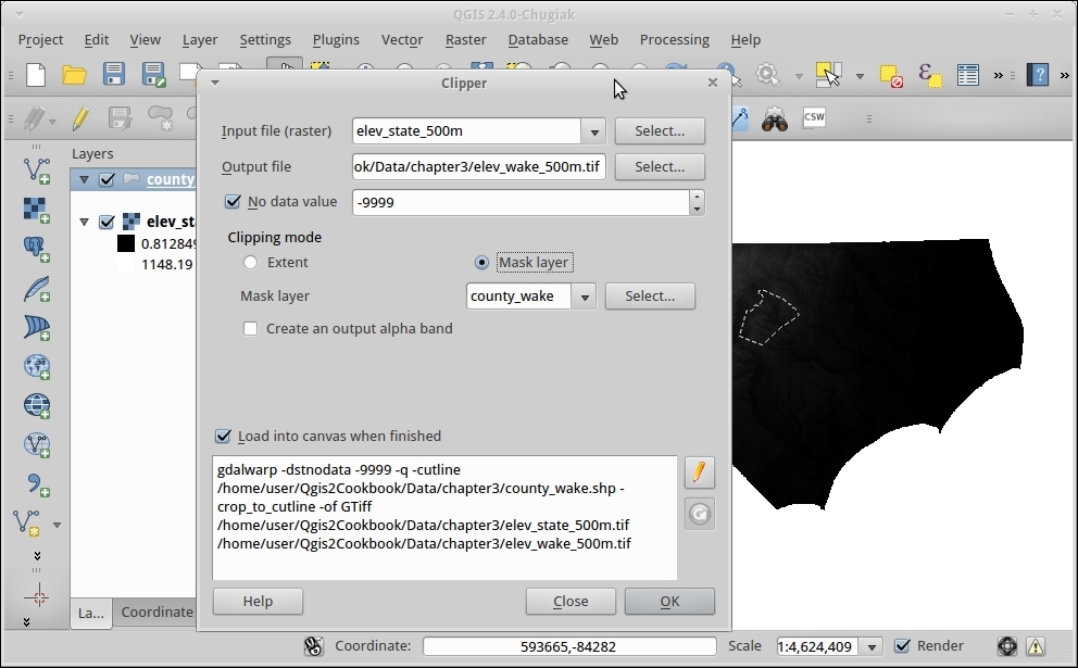
The shape of your mask and the size of the raster cells in the source data will determine how pixelated the resulting raster will be. Zoom in to the results and compare the edge of the new raster to the vector outline of the county. You'll notice that because of the 500 m wide pixels, it's hard to exactly match the edge of the county exactly with whole pixels.
Note that this tool, as with all other tools in the GDAL Tools menu, is actually a graphical interface to GDAL command-line tools.
You'll notice that with this particular example, an issue that arises with converting rasters to nonrectangular shapes; the edges are jagged as compared to the vector. If you need it to be really smooth, there are a few options. You can decrease the pixel size, splitting current pixels into multiple pixels using the -tr option. As with other Raster tools, you can use the pencil icon to override the GDAL command-line options to add features not included in the interface. In this case, the -tr option inline with the rest of the already formatted command:
gdalwarp -tr 100 100
This would make each pixel 100 units instead of the current 500 x 500.
Some important options to remember when saving TIFF files with GDAL are number type (Integer versus Float) and compression. Both of these can greatly impact the final file size. Refer to the Converting Vectors to Rasters recipe later in this chapter for an example. Also, if you have a multicore CPU, add -multi to take advantage of your CPU cores for faster processing of most raster operations.
Like rasters, occasionally you only need vector data to cover a certain area of study (area of interest). Also, like rasters, you can use a layer defining the extent that you want to select only for a portion of a vector layer to make a new layer. The tool that is used for this job is Clip; that is, 'Cookie Cutter' because of how the results look afterwards.
For the example in this recipe, we will use geology.shp and clip it to the extent of Wake County using census_wake2000.shp. Any vector layer with the aggregation of polygons covering all of the county will work.
geology.shp and census_wake2000.shp, layers.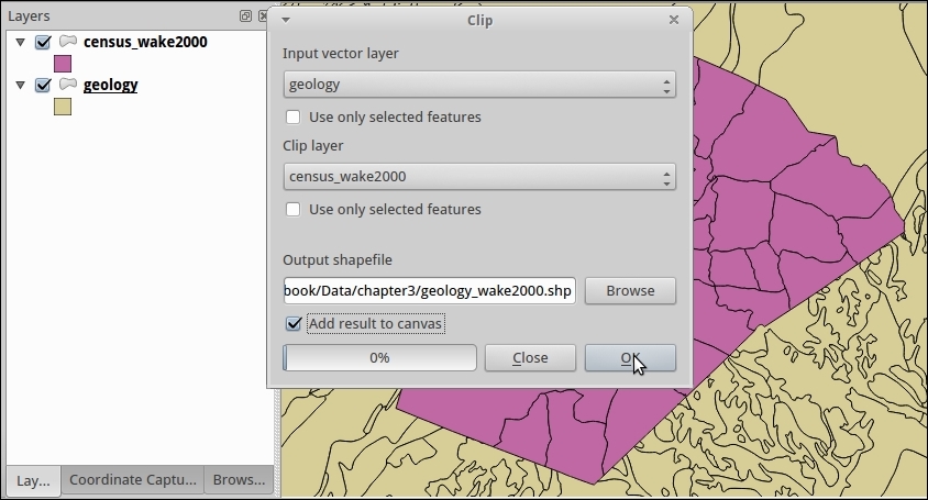
geology.shp.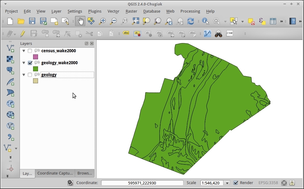
All clipping is based on the principle of intersection features. For each feature in Input, the tool checks to see whether it intersects with the overall shape of clip layer. When it does intersect, the algorithm then checks whether any part falls outside the intersection. When a part lands outside, it is cut off.
You have to be careful when using clip. If the original table contained columns that included measurements such as area and perimeter, these values are copied from the original. Therefore, they may not reflect the new size of and shapes that were cut.
Generally, all geometry operations and analysis should be done with layers in the same projection in order to ensure consistent results. Also, many tools are not projection aware and won't compensate for two source layers being in different projections.
Tools that create the intersection of objects (for example, in PostGIS's and SpatiaLite's ST_Intersection) can provide you with similar results. However, you may need to perform multiple steps: Intersect, then select by contains or intersection to eliminate unwanted data.
Clipping is great, except when you don't want to alter the original geometries, such as when you want to select overlapping features. Or, in other cases, you just want filter the geometries based on nonspatial attributes. To achieve both of these results, you can utilize the Selection tools in combination with Save Layer As.. to extract just the features of interest. This recipe uses spatial selection methods to extract a subset of original polygons without altering them.
geology.shp that overlap with Wake County (census_wake2000.shp) by navigating to Vector | Research Tools | Select by location.census_wake2000.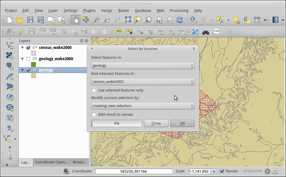
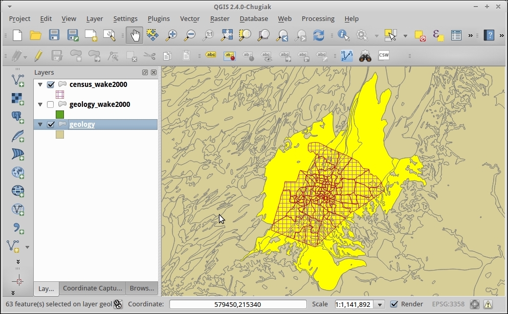
When in the Save As... (as described in Chapter 1, Data Input and Output) dialog make sure to check the box next to Save only selected features.
This really goes back to the same fundamental concept of Intersection that most vector analysis rely on. When you can test whether two features overlap, there are many different operations possible based on the answer. You can select, deselect, or, as in the previous recipe, select then cut to fit. In these cases, each polygon is tested for at least a partial intersection, and the matches are then highlighted as the results.
While this recipe demonstrates how to select a subset of data based on location, you can also do the same thing based on attributes of the features with a query on the attribute table. Or, you can combine attribute based selection, spatial selection, and hand selection graphically on the map—any selection combination that you want can be saved as a new layer.
You may also notice in the Select by location tool that vectors can also be added or removed from existing selections in case you want to perform more complicated operations involving more than one type of criteria.
Sometimes, you need to convert data that is originally in raster format to a vector format in order to perform vector-based analysis methods. Generally speaking, as rasters are continuous datasets, converting them to polygons is more common than converting them to lines or points.
You need a raster layer, preferably one with groups of the same valued pixels next to each other. For this example, we'll use geology_30m.tif, as a 30 meter x 30 meter pixel should give decent results.
geology_30m.tif.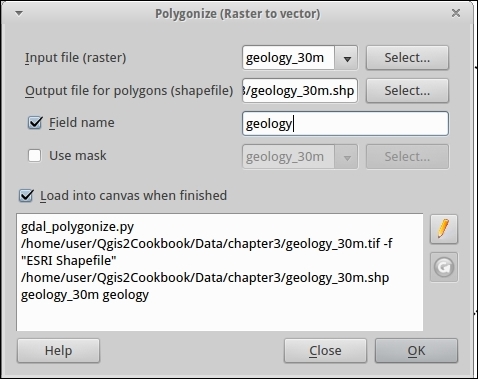
geology_30m.shp.geology, class or value.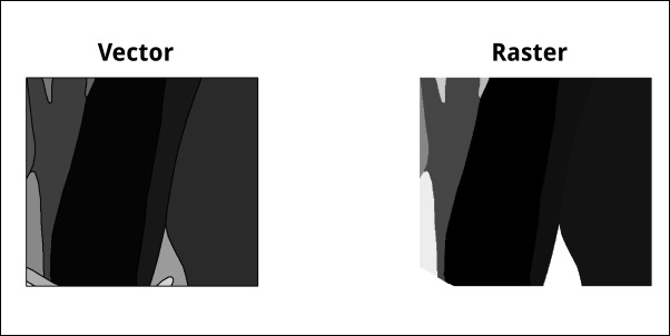
For each pixel, the value is compared to its neighbors (there are different neighbor algorithms). When two pixels next to each other have the same value, they are lumped into a polygon. Additional neighbors of the same value get added to the polygon until pixels of differing values are encountered. As it's pixel-based, the edge of the result will usually follow the outline of the pixels, making for a jagged edge. This edge can be smoothed into straight lines with additional options or other tools, such as the QGIS smoothing tool.
The minimum number of pixels required to make a polygon or the maximum allowed value difference to be counted as the same can be altered to drop out isolated pixels or to allow for a range of values to be counted together.
Note that if each pixel is unique as compared to its adjacent neighbors, then you'll just end up with a polygon for each pixel. Or if your raster is sufficiently large and varied, this process could take days. You may want to reconsider whether you really need to convert or whether your analysis can be done in raster. Another option would be to resample or reclassify the raster to larger polygons first to decrease the data density. Or, you need to investigate remote sensing type tools that perform classification to create related groupings of pixels based on similarity.
If you want to convert raster data to points, then you probably want to use the points sampling tool. If you want to convert some portion of a raster to lines then you may need more sophisticated feature extraction tools found; for example, in SAGA and GRASS, either through the Processing toolbox or as standalone software. Or, you may even need to result to a mix of pixel extraction and hand digitizing.
Occasionally, you want to convert vectors to rasters to facilitate using raster analysis tools such as the raster calculator.
You'll need a vector layer; this can be a point, line or polygon layer. The best results generally come from polygon layers. We will use geology_wake2000reclass.shp. This file is the result of the earlier clipping vectors recipe with a new column added that codes the geology types as integers. For reference, you'll also use elev_wake_500m.tif as a matching raster for the area of interest.
In order to be useful in analysis, here's a checklist:
You can only pick numeric fields as raster formats only store a single number per cell. In order to keep the attribute that you want, you may need to use the field calculator to create a new field that reclassifies categories of text into a numeric scheme (for example, 1 = water, 2 = land, and so on) before performing the conversion. If you copy a unique ID as the attribute, there are some tools later that let you rejoin the original attribute table as a value attribute table (refer to the GRASS functions in Processing Toolbox).
geology_wake2000reclass.shp and elev_wake_500m.tif.elev_wake_500m.tif:geology_wake2000reclass.geology_wake.tif (you will get a warning to set the size or resolution).The following screenshot shows how the screen will look:
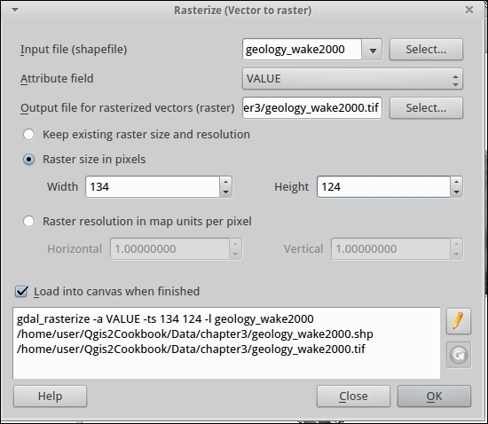
A grid of pixels is created at the specified width, height, and extent. For each cell, an intersection is performed with the underlying vector layer. If more than 50% of the cell intersects with the vector, it's designated attribute is assigned to the cell.
It's really important to match projection and extent before converting to raster. If you fail to do so, then your pixels in different raster layers won't line up perfectly with each other, and either tools won't work or they will introduce a resampling error. If this looks too pixelated (squares) for your liking, consider creating the raster at a higher pixel density.
If you compare the vector version to the new raster, you'll notice that the area in the middle all came out a similar color. This is due to the values used for classification, where the geology that started with the same major component was given the same starting value (for example, PZ all start with 40, and the last number changes based on the letters after PZ).
Looking at the new layer and want to get rid of the black surrounding the real data? This area is no-data, refer to Chapter 8, Raster Analysis II.
Date and time data get stored in all sorts of ways. One of the more frustrating issues is that some common GIS formats (Shapefiles) can't store date and time in the same field without making it a string. This is fine for visual display but terrible for use with tools that use DateTime for their functionality, such as the TimeManager Plugin (refer to Chapter 4, Data Exploration).
Use datetime-example.shp, which contains a variety of date and time representations to play with.
datetime-example.shp.datetime-example.calculated).substr String operation (that is, Substring) in combination with the || concatenation to rearrange the values from existing fields into a valid DateTime:shpDate with Time and put a space in between:"shpdate" || ' '|| "Time"
Date: substr("Date",7,4) ||'-'||substr("Date",1,2)||'-'|| substr("Date",4,2) || ' '|| "Time"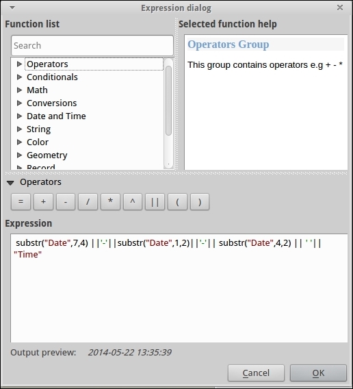
Substr takes three arguments: the field name, the starting position, and the number of characters after this to include. The position index starts at 1.
Using string manipulation, we've combined multiple fields into an ISO standard format for DateTime, which other tools will recognize and be able to utilize.
The fields included in this example data are as follows:
|
Field |
Type |
Explanation |
|---|---|---|
|
|
String |
This is time in a 24 hour format: hours:minutes:seconds. |
|
|
String |
This is a |
|
|
String |
This is a String that is long enough to hold date and time with padding characters and a timezone UTC offset. |
|
|
String |
This is a typical date format coming out of a spreadsheet. |
|
|
Date |
This is a date format in the |
Newer cameras and phones with built-in GPS can be wonderful tools for data collection, as they help keep track of exactly where and when a picture was taken. However, not all cameras have a built-in GPS. You can add geotags afterwards, either with a GPS log from a separate GPS unit or just using a reference map and your memory or notes.
For this recipe, you'll need a some photos and either a GPS log (*.gpx), reference vector, reference raster, or coordinates. We've provided centerofcalifornia.jpg in the geotag folder, and the coordinates are in the image itself but also included as a point in centerofcalifornia.shp.
You will also need the Geotag photos plugin, which requires the exiftool program to be installed on your system. If exiftool didn't come with your install, you can easily get it from the Web at http://www.sno.phy.queensu.ca/~phil/exiftool/ or at package repositories (Linux).
This particular plugin assigns location per folder, so all photos in a folder will get the same coordinates. This works well for batch assigning of general coordinates:
centerofcalifornia.shp.geotag folder.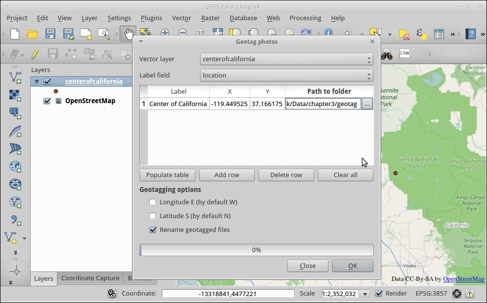
Exiftools writes to the built-in metadata of an image file to a section called EXIF. It's a standard in photography to store extra data about photos that many software management tools can easily read from. Latitude and Longitude in WGS 84 coordinates are the standard method of encoding GPS data within the EXIF section.
Now that you have a geotagged photo, you can upload it to sites such as Flickr, which will display it on a map, or skip to the recipe Viewing Geotagged Photos in Chapter 4, Data Exploration, for how to make a map in QGIS.
This plugin is very manual and assigns location per folder as it was created to work specifically with camera traps. Instead, if you were travelling between each photo location and have a GPS log, there are other non-QGIS tools to help you match GPS points with your photos. Digikam (a photography management tool) has a function to geotag based on timestamp matches.
In this chapter, we will cover the following recipes:
This chapter focuses on recipes that will help you visually inspect and better comprehend your data. The recipes in this chapter include methods of summarizing, inspecting, filtering, and styling data, based on spatial and temporal attributes so that you can get a better feeling for your data before you perform analysis. The primary goal is to create some visuals or summaries of data that allow you, the human, to utilize your brain's ability to identify patterns of interest. The better you understand your data, the easier it is to pick appropriate analysis methods later.
When investigating a new dataset, it is very helpful to have a way to quickly check which values a column contains. In this recipe, we will use different approaches using both the GUI and the Python console to list the unique values of POI classes in our sample POI dataset.
If you are simply looking for a solution based on the GUI, the List unique values tool is available both in Vector | Analysis Tools as well as in the Processing Toolbox menu. You can use either one of these to get a list of the unique values in a column. Having this tool available in the Processing Toolbox menu makes it possible to include it in processing models and, thus, automate the process. The following steps to list unique values use the Processing Toolbox menu:
poi_names_wake layer as Input layer and the class attribute as Target field.If you want to further customize this task, for example, by counting how often the values appear in this dataset, it's time to fire up Python console:
import processing
layer = iface.activeLayer()
classes = {}
features = processing.features(layer)
for f in features:
  attrs = f.attributes()
  class_value = f['class']
  if class_value in classes:
    classes[class_value] += 1
  else:
    classes[class_value] = 1
print classes
The following screenshot shows what the screen looks like:
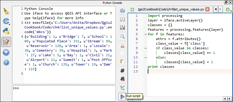
In the first line, we use import processing because it offers a very handy and convenient function, processing.features(), to access layer features, which we use in line 7. It is worth noting that, if there is a selection, processing.features() will only return an iterator of the selected features.
In line 3, we get the currently active layer object. Line 5 creates the empty dictionary object, which we will fill with the unique values and corresponding counts.
The for loop, starting on line 5, loops through all features of the layer. For each feature, we get the value in the classification field (line 7). You can change the column name to analyze other columns. Then, we only need to check whether this value is already present in the classes dictionary (line 8) or whether we have to add it (line 11).
In this recipe, we will look at how to explore the properties of a column of numeric values. We will look at the tools that QGIS offers and apply them to analyze the elevation values in our sample POI dataset.
To follow this recipe, please load poi_names_wake.shp. If you followed the previous recipe, Listing unique values in a column, you can continue directly from there.
A good way to get a first impression of the properties of a numeric column is using the Basic Statistics tool from Vector. This allows you to calculate statistical values, such as the minimum and maximum values, mean and median, standard deviation, and sum.
If you want to examine the distribution of elevation values, there is the handy Statist plugin. Statist generates an interactive histogram representation of the value distribution:
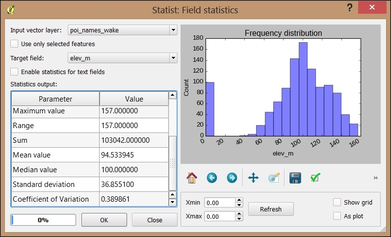
Thanks to Python Console and the editor, we are not limited to the existing tools and plugins. Instead, we can create or own specialized scripts such as the following one. This script creates a short layer statistics report using HTML and the Google Charts Javascript API (for more information and API docs refer to https://developers.google.com/chart/), which it then displays in a QWebView window. Of course, you can use any other JavaScript charting API as well. (Note that you need to be connected to the Internet for this script to work because it has to download the Javascript.) We recommend using the editor that was introduced in the previous recipe. Don't forget to select the layer in the legend:
import processing
from PyQt4.QtWebKit import QWebView
layer = iface.activeLayer()
values = []
features = processing.features(layer)
for f in features:
  values.append( f['elev_m'])
myWV = wQWebView(None)
html='<html><head><script type="text/javascript"'
html+='src="https://www.google.com/jsapi"></script>'
html+='<script type="text/javascript">'
html+='google.load("visualization","1",{packages:["corechart"]});'
html+='google.setOnLoadCallback(drawChart);'
html+='function drawChart() { '
  html+='var data = google.visualization.arrayToDataTable(['
    html+='["%s"],' % (field_name)
    for value in values:
      html+='[%f],' % (value)
  html+=']);'
  html+='var chart = new google.visualization.Histogram('
    html+='document.getElementById("chart_div"));'
  html+='chart.draw(data, {title: "Histogram"});}</script></head>'
html+='<body><h1>Layer: %s</h1>' % (layer.name())
html+='<p>Values for %s range from: ' % (field_name)
html+='%d to %d</p>' % (min(values),max(values))
html+='<div id="chart_div"style="width:900px; height:500px;">'
html+='</div></body></html>'
myWV.setHtml(html)
myWV.show()
Of course, custom reports such as this one lend themselves to adding more details. For example, we can create separate histograms for each POI class or add other types of charts, such as scatter charts:
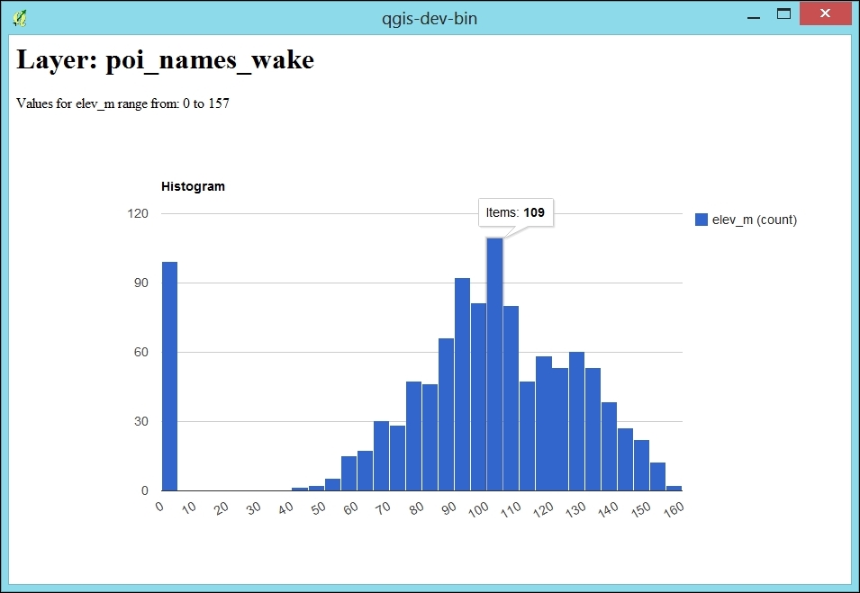
The first part (lines 1 to 12) is very similar to the script explained in the previous recipe, Listing unique values in a column: We get the active layer and collect all elevation values in the values list.
The QWebView created on line 14 enables us to display the HTML content, which we then generate in the following section (lines 16 to 34). First, we load the Google Charts Javascript. The actual magic happens in the drawChart() function starting on line 21. Lines 22 to 26 create the data object, which is filled with the elevation values from our values list. The last three lines of the function (lines 27 to 29) finally create and draw the histogram chart. Finally, lines 30 to 34 contain the HTML body definition with the header stating the layer name and a short introduction text that states the min and max elevation values.
In this recipe, we will look at exploring spatiotemporal vector data using the Time Manager plugin. We'll use event data from the ACLED (Armed Conflict Location and Event Data Project) at http://www.acleddata.com/about-acled/.
To follow this recipe, please load ACLED_africa_fatalities_dec2013.shp. The layer style that you will see in the following screenshots consists of a simple circle marker at 50% transparency with the data-defined size set to the number of fatalities of the incident. (You can read more about styling in Chapter 10, Cartography Tips, and Learning QGIS book by Packt Publishing.) If you want some additional geographic context, you can also load NE_africa.shp, which contains the outline of Africa.
Once the data is loaded, all event positions will be displayed. The default way to filter the events, for example, to only see the events from December 1, is to use Layer | Query and enter a filter expression or query, such as the following:
"EVENT_DATE" >= '2013-12-01' AND "EVENT_DATE" < '2013-12-02'
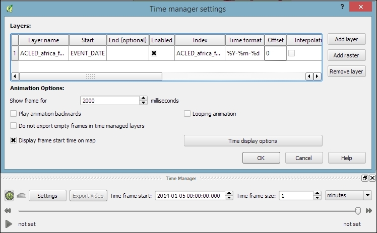
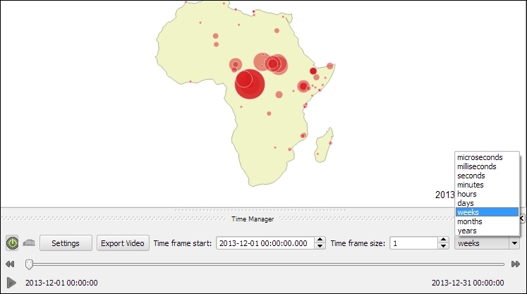
For performance reasons, Time Manager relies on the layer query/filter expression capability of QGIS. This comes with the following limitations:
%Y-%m-%d %H:%M:%S.%f
%Y-%m-%d %H:%M:%S
%Y-%m-%d %H:%M
%Y-%m-%dT%H:%M:%S
%Y-%m-%dT%H:%M:%SZ
%Y-%m-%dT%H:%M
%Y-%m-%dT%H:%MZ
%Y-%m-%d
%Y/%m/%d %H:%M:%S.%f
%Y/%m/%d %H:%M:%S
%Y/%m/%d %H:%M
%Y/%m/%d
%H:%M:%S
%H:%M:%S.%f
%Y.%m.%d %H:%M:%S.%f
%Y.%m.%d %H:%M:%S
%Y.%m.%d %H:%M
%Y.%m.%d
%Y%m%d%H%M%S
In this recipe, we will use the Time Manager plugin to create an image series out of our spatiotemporal QGIS project and turn it into a video, which is ready to be uploaded on Youtube or added into a presentation using easily available and free tools.
To follow this recipe, it's advisable that you complete the previous recipe, Exploring spatiotemporal vector data using Time Manager, to set up this project.
To turn the image series exported by Time Manager into a video, we can use external programs, such as the command-line tool Mencoder, or the free Windows Movie Maker.
Mencoder is a very useful command-line tool to encode videos, which is available from repositories for many Linux distributions and for Mac. Windows users can download it from Gianluigi Tiesi's site at http://oss.netfarm.it/mplayer-win32.php.
If you're using Windows, you can also create the video using the free Windows Movie Maker application, which can be downloaded from http://windows.microsoft.com/en-us/windows/get-movie-maker-download.
Before starting the export, it is a good idea to check all the settings, as follows:
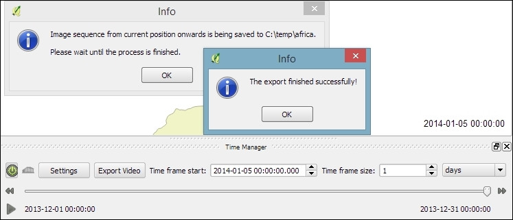
export folder, you will see the animation frames that Time Manager just created..avi video from all .png images in the current working directory. Make sure that you are in the folder containing the images before running the following command:
mencoder "mf://*.png" -mf fps=10 -o output.avi -ovc lavc -lavcopts vcodec=mpeg4
fps) parameter. Higher values create a faster animation.If you're using Windows Movie Maker, perform the following steps:
In this recipe, we will use the animation_datetime() function, which is exposed by Time Manager to create a time-dependent style for our animation. The style will represent the age of the event feature: the event marker's fill color will fade towards gray the older the event gets.
To follow this recipe, please load ACLED_africa_fatalities_dec2013.shp and configure Time Manager, as shown in the Exploring spatiotemporal vector data using Time Manager recipe, with the following exception: when adding the layer to Time Manager, set the End time value to the FOREVER attribute.
To create a time-dependent style, we use the Data defined properties option of the Simple marker:
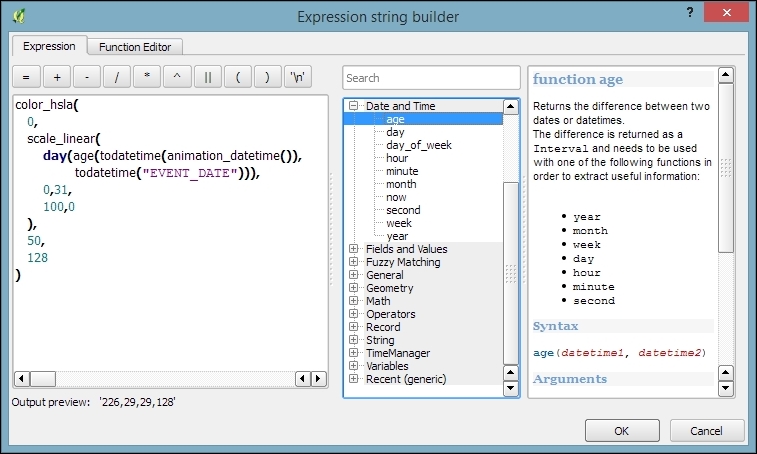
Here is our color expression in more detail:
color_hsla(
  0,
  scale_linear(
    day(age(todatetime(animation_datetime()),
    todatetime("EVENT_DATE"))),
    0,31,
    100,0
  ),
  50,
  128
)
The expression consists of multiple parts, as follows:
day(age(todatetime(animation_datetime()),todatetime("EVENT_DATE"))): This calculates the number of days between the current animation time given by animation_datetime() and calculates EVENT_DATEscale_linear: This transforms the age value (in days between 0 to 31 days) into a value between 100 and 0 which is suitable for the saturation parameter of the following color functioncolor_hsla: This is one of many functions that are available in QGIS to create colors. It returns a string representation of a color, based on its attributes for hue (0 equals red), saturation (between 0 and 100 depending on our age function), lightness (50 equals medium lightness) and alpha (128 equals 50% transparency)You can speed up the fading effect by reducing the scale_linear parameter, domain_max, from 31 days to a smaller value, such as 7, for a complete fade to gray within one week.
Often, when exploring your data, you may feel somewhat lost. Without the context of the known world, a layer can seem like a blob of information floating in space. By adding an atlas-style map, air photos, or another BaseMap, you can begin to see how your data fits in the on-the-ground reality. However, adding such layers often takes considerable preprocessing work; sometimes, you just don't want to go through this until you know you need it. What's the solution? Use a premade layer, preferably fast-loading tiles, from a web service.
The QuickMapServices plugin works best when you have another dataset that you want to provide extra context for. Start by first loading such a layer and then zooming in to its extent.
You will need the following:
Davis_DBO_Centerline-wgs84.shp)Starting with a new QGIS project, follow these instructions to load BaseMap from the web with the QuickMapServices plugin:
The plugin will not turn on projection-on-the-fly for you unless you change its settings. However, in order for most tile services to work in QGIS, projection-on-the-fly must be enabled and set to EPSG:3857 Psuedo/Web/Popular Mercator. Other data will fail to line up if their projection is not defined or read properly by QGIS.
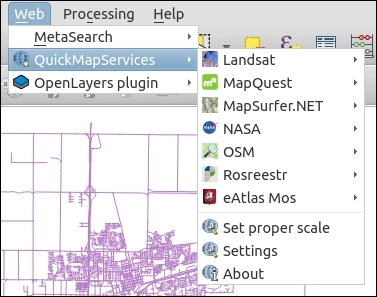
The following screenshot shows how the screen will look:
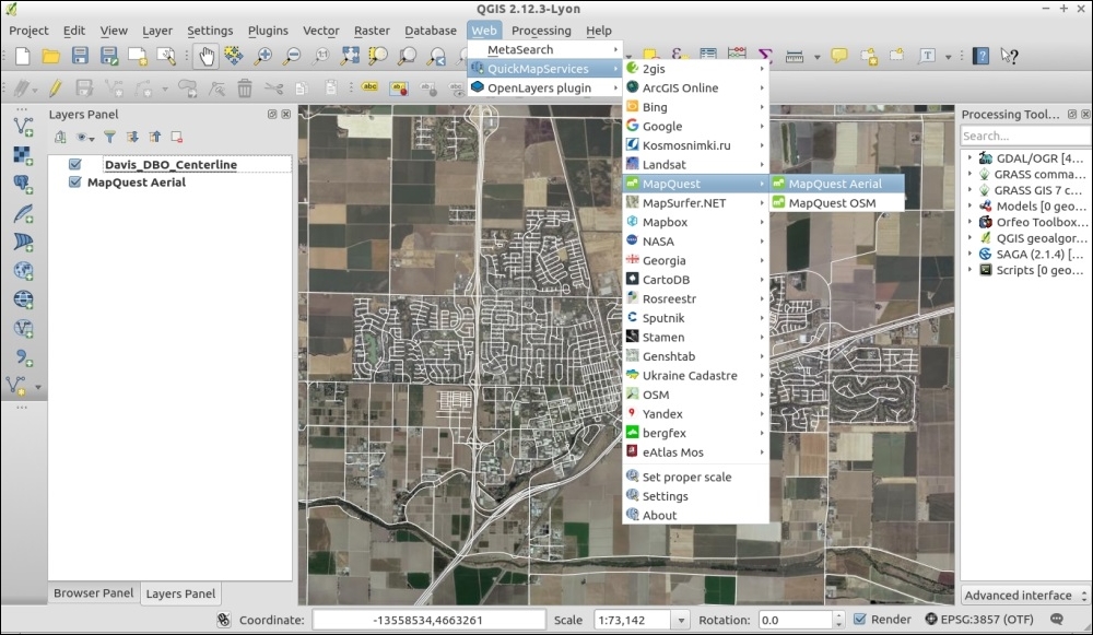
The QuickMapServices plugin is a web-based tool. All of the BaseMaps come from the Internet as you pan and zoom; none of the data comes from your computer or QGIS itself.
There are a few things to be cautious of when using the QuickMapServices plugin. It doesn't always line up quite right, especially when zoomed out to big areas. First, check whether your other layers' projections are defined correctly and then try to reset the map by slightly panning to the side. The key idea to remember is that tiled services generally only exist for EPSG:3857 and at a very specific set of scales. QGIS will attempt to pick the closest matching scale and resample the scale to make it fit. This also explains why loading such layers can sometimes be slow.
To add more restricted services, such as Google. Bing, and so on, perform the following steps:
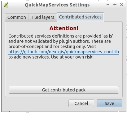
While it may be legal to view the maps (most of the time), depending on layers that are selected, it may not be legal to digitize maps based on them, print them, or, otherwise, save them for offline use. The license varies by data source. So, make sure to check this for the sources you want to use by going online and reading the Terms of Service on their websites. If your use case is outside of generally viewing for quick reference, you will probably need to spend some time obtaining a license or permission for your use.
OpenStreetMap-based sources are often good choices as the licenses typically just require attribution with no restrictions on use. The main layers that originally come with the plugin are there because they have less restrictive licenses.
Finally, you may be wondering how QuickMapServices differs from the OpenLayers plugin mentioned in the next recipe. For starters, this plugin is newer and currently supported. It also solves some long-standing issues, especially in regards to printing. There is also the contributed layers GitHub repository, which should make it easier for people to contribute new layer definitions.
Often, when exploring your data, you may feel somewhat lost. Without the context of the known world, a layer can seem like a blob of information floating in space. By adding an atlas-style map, air photos, or another BaseMap, you can begin to see how your data fits in the on-the-ground reality. However, adding such layers often takes considerable preprocessing work; sometimes, you just don't want to go through this until you know you need it. What's the solution? Use a premade layer from a web service.
This recipe is almost identical to the previous recipe. QuickMapServices is a replacement for the OpenLayers plugin, which is being discontinued (deprecated). We kept this recipe because it's still a commonly-mentioned plugin and works slightly differently. However, please consider using QuickMapServices.
The Openlayers plugin works best when you have another dataset that you want to provide extra context for. Start by first loading such a layer and then zooming in to its extent.
You will need the following:
Davis_DBO_Centerline-wgs84.shp)Starting with a new QGIS project, follow these instructions to load BaseMap from the Web with the Openlayers plugin:
The following screenshot shows how the screen will look:
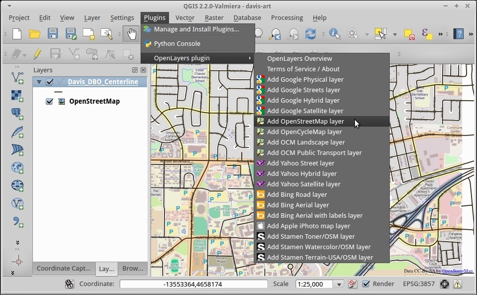
The OpenLayers plugin is a web-based tool, based on the similarly named OpenLayers library to create web-based maps in an Internet browser. However, instead of displaying the maps in the browser, this plugin renders them into an active QGIS canvas (that is, a map).
There are a few things to be cautious of when using the OpenLayers plugin. It doesn't always line up quite right, especially when zoomed out to big areas. First, check whether your other layers' projections are defined correctly and then try to reset the map by panning slightly to the side. The key idea to remember is that tiled services generally only exist for EPSG:3857 and at a very specific set of scales. QGIS will attempt to pick the closest matching scale and resample the scale to make it fit. This also explains why loading such layers can sometimes be slow.
While it may be legal to view the maps, depending on layers selected, it may not be legal to digitize maps based on them, print them, or, otherwise, save them for offline use. The license varies by data source. So, make sure to check for the sources you want to use by going online and reading the Terms of Service on their websites. If your use case is outside of generally viewing for quick reference, you will probably need to spend some time obtaining a license or permission for your use. OpenStreetMap-based sources are often good choices as the licenses typically just require attribution.
Keeping track of photographs by location can be an extremely useful tool, enabling you to easily pull up relevant photos of a place and time. They provide local context about other data collected in the same place, and they can provide office staff with a view of what people in the field saw. You can think of this as your own personal Street View, which is just more focused than Google's version.
For this recipe, you'll need a set of geotagged photos. We've included a set a photos in this book's data for you to learn with. This is a collection of photos from downtown Davis that highlights the density and variety of public art along several blocks.
This recipe also takes advantage of several plugins, as follows:
Follow these steps to view geotagged photo locations in QGIS:
Davis_DBO_Centerline.shp and/or OpenStreetMap/Google Streets via OpenLayers Plugin).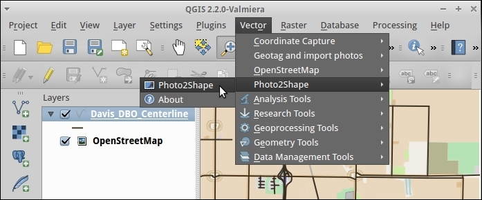
davis-art folder as the input directory.)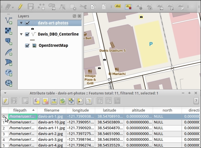
If you want to be able to see the actual photos in QGIS and not just the locations, continue with the next section of steps:
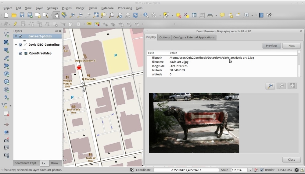
In photography, there is a standard metadata format written by most cameras called Exif, which is stored as part of the image file format. Normally, all images store the timestamp, camera model, camera settings, and other general information about an image. When you take a picture with a GPS enabled camera, it should write the latitude and longitude to the photo's metadata. Other programs that are metadata-aware can then read this information at any time. If you happen to touch up these photos, make sure to tell your software to keep or copy the metadata from the original so that you retain the location information.
Don't have a camera or phone with built-in geotagging? This is not a problem. There are many ways to add location information by yourself. One such method is with the Geotag and import photos plugin that lets you link photo data to known locations, and this can be found at http://hub.qgis.org/projects/geotagphotos/wiki.
If you need something more sophisticated, there are many other tools out there. Digikam, an open source photo management program, includes a geotagging tool that will attempt to automatch a GPX file from a GPS to your photos, based on timestamps.
Geotagged photos are also supported by many online photos services, so you can easily browse a map of the photos that you've uploaded. Flickr is probably the most well-known for this, and it also includes a concept of geo-fences, where you can exclude certain locations from being publicly known.
On the flip-side, you now have an idea about how to remove geotags from photos in case you don't want their locations known if you share them online.
In this chapter, we will cover the following recipes:
This chapter will provide you with an introduction to some of the most-common GIS analysis use cases. The recipes focus on step-by-step instructions, as well as a closer explanation of the tools that are used to achieve the desired analysis results. This chapter includes recipes on optimum site selection, using interpolation, and creating heat maps, as well as calculating regional statistics.
Optimum site selection is a pretty common problem, for example, when planning shop or warehouse locations or when looking for a new apartment. In this recipe, you will learn how to perform optimum site selection manually using tools from the Processing Toolbox option, but you will also see how to automate this workflow by creating a Processing model.
In the optimum site selection in this recipe, we will combine different vector analysis tools to find potential locations in Wake County that match the following criteria:
To follow this exercise, load the following datasets, lakes.shp, schools_wake.shp, and roadsmajor.shp.
As all datasets in our test data already use the same CRS, we can get right to the analysis. If you are using different data, you may have to get all your datasets into the same CRS first. In this case, please refer to Chapter 1, Data Input and Output.
The following steps show you how to perform optimum site selection using the Processing Toolbox option:
"AREA" > 1000000 AND "FTYPE" = 'LAKE/POND' in the Expression textbox, as shown in the following screenshot: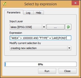
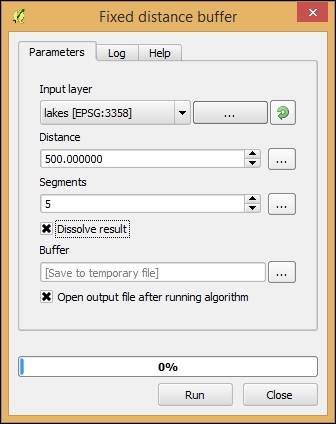
"GLEVEL" = 'E' using the Select by Expression tool like we did for the lakes buffer. Then, use the buffer tool like we just did for the lakes buffer."GLEVEL" = 'H' and a buffer distance of 2,000 meters.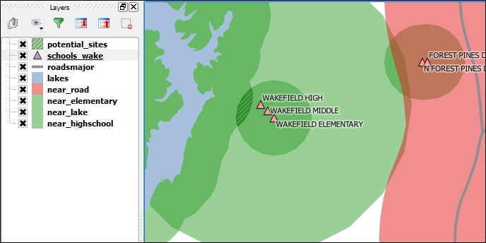
In step 1, we used Intersection to model the requirement that our preferred site would be near both an elementary and a high school. Later, in step 3, the Difference tool enabled us to remove areas close to major roads. The following figure gives us an overview of the available vector analysis tools that can be useful for similar analyses. For example, Union could be used to model requirements, such as "close to at least an elementary or a high school". Symmetrical Difference, on the other hand, would result in "close to an elementary or a high school but not both", as illustrated in the following figure:
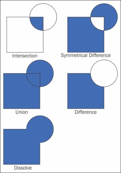
We were lucky and found a potential site that matched all criteria. Of course, this is not always the case, and you will have to try and adjust your criteria to find a matching site. As you can imagine, it can be very tedious and time-consuming to repeat these steps again and again with different settings. Therefore, it's a good idea to create a Processing model to automate this task.
The model (as shown in the following screenshot) basically contains the same tools that we used in the manual process, as follows:
Select by expression (refer to the Select big lakes step) and buffer them using fixed distance buffer of 500 meters (refer to the Buffer lakes step).This is how the final model looks like:
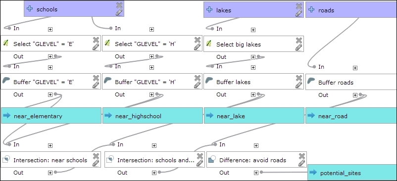
You can run this model from the Processing Toolbox option, or you can even use it as a building block in other models. It is worth noting that this model produces intermediate results in the form of buffer results (near_elementary, near highschool, and so on). While these intermediate results are useful while developing and debugging the model, you may eventually want to remove them. This can be done by editing the buffer steps and removing the Buffer <OutputVector> names.
Dasymetric mapping is a technique that is commonly used to improve population distribution maps. By default, population is displayed using census data, which is usually available for geographic units, such as census tracts whose boundaries don't necessarily reflect the actual distribution of the population. To be able to model population distribution better, Dasymetric mapping enables us to map population density relative to land use. For example, population counts that are organized by census tracts can be more accurately distributed by removing unpopulated areas, such as water bodies or vacant land, from the census tract areas.
In this recipe, we will use data about populated urban areas, as well as data about water bodies to refine our census tract population data.
To follow this exercise, please load the population data from census_wake2000_pop.shp (the file that we created in Chapter 2, Data Management), as well as the urban areas from urbanarea.shp, and the lakes from lakes.shp.
As all the datasets in our sample data already use the same CRS, we can get right into the analysis. If you are using different data, you may have to first get all datasets into the same CRS. In this case, please refer to Chapter 1, Data Input and Output, for details.
To create a new and improved population distribution map, we will first remove the unpopulated areas from the census tracts. Then, we will recalculate the population density values to reflect the changes to the area geometries by performing the following steps:
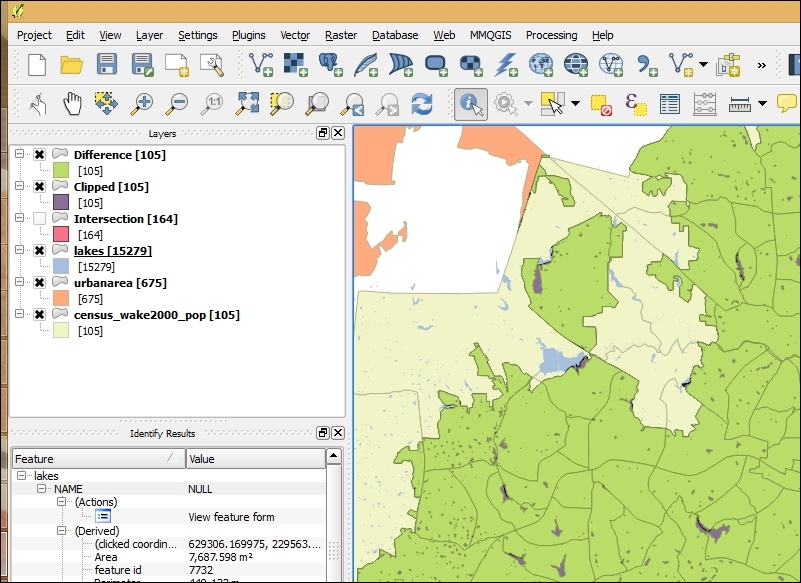
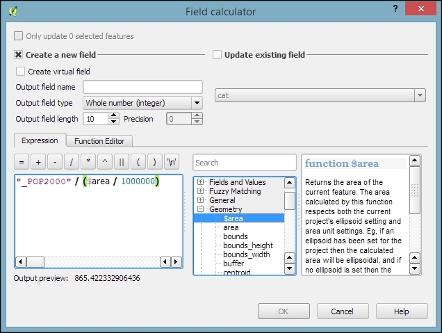
It is worth noting that you don't necessarily have to make a new column. If you only want to use the density values for styling purposes, you can also enter the expression directly in the style configuration. On the other hand, if you create a new column, you can inspect the density values in the attribute table, export them, or analyze them further.
We are done, and you can now visualize the results using a Graduated renderer with, for example, the Natural Breaks (Jenks) classification mode. The Jenks Natural Breaks classification is designed to arrange values into "natural" classes by maximizing the variance between different classes while reducing the variance within the generated classes. The following figure shows the population density based on the original census data (on the left) and the results after Dasymetric mapping (on the right):
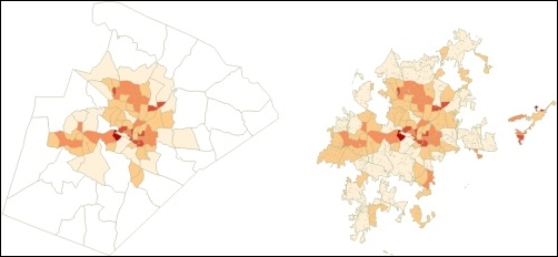
In the first step of this recipe, we used the Clip operation. As you most likely noticed, the results of a Clip operation look very similar to the results of the Intersection tool, which we used in the previous recipe of this chapter, Selecting optimum sites. Compare both the results, and you will see the following differences:
A popular way of thinking about the Clip operation is to imagine one layer as the cookie cutter and the other layer as the cookie dough.
Another classic spatial analysis task is calculating the areas of a certain type within regions, for example, the area within a county that is covered by certain land use types, or the share of different crops that is farmed in given municipalities.
In this recipe, we will calculate statistics of geological data for zip code areas. In particular, we will calculate the total area of each type of rock per zip code area.
To follow this recipe, load zipcodes_wake.shp and geology.shp from our sample data. Additionally, install and activate the Group Stats plugin using Plugin Manager.
Using the following steps, we can calculate the areas of certain rock types per zip code area:
The following screenshot displays the complete configuration, as well as the results:
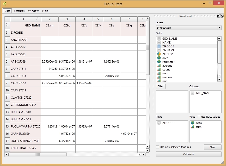
The Group Stats plugin brings functionality, which is commonly known as pivot tables, to QGIS. A pivot table is a data summarization tool, which is commonly found in applications, such as spreadsheets or business intelligence software. As shown in this example, pivot tables can aggregate data from an input table. Additionally, the Group Stats plugin offers extended geometry functions, such as, Area and Perimeter for polygon input layers, or Length for line layers. This makes using the plugin more convenient because it is not necessary to first use Field calculator to add these geometric values to the attribute table.
It is worth noting that you always need to put the following two entries into the Value input area:
Whether they are animal sightings, accident locations, or general points of interest, many point datasets can be interpreted more easily by visualizing the point density using a heatmap. In this recipe, we will estimate the density of POIs in Wake county to find areas with a high density.
Load the poi_names_wake.shp POI dataset from our sample data. Make sure that the Heatmap plugin, which comes with QGIS by default, is enabled in Plugin Manager.
Using the following steps, we can calculate the POI heatmap:
1000 meters.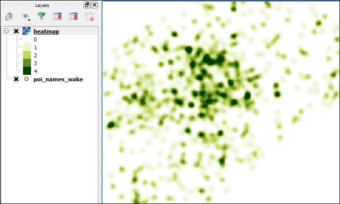
The search radius, which is also known as the kernel bandwidth, determines how smooth the heatmap will look because it sets the distance around each point at which the influence of the point will be felt. Therefore, smaller radius values result in heatmaps that display finer details, while larger values result in smoother heatmaps.
Besides the kernel bandwidth, there are also different kernel shapes to choose from. The kernel shape controls the rate at which the influence of a point decreases with increasing distance from the point. The kernel shapes that are available in the Heatmap plugin can be seen in the following figures. For example, a Triweight kernel (the first on the bottom row) creates smaller hotspots than the Epanechnikov kernel (the second on the bottom) because the Triweight shape gives features a higher influence for distances that are closer to the point:
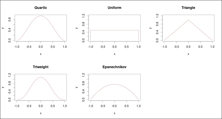
The triangular kernel shape can be further adjusted using the Decay ratio setting. In the preceding figure, you can see the shape for ratios of 0 (a solid red line), 0.5 (a dashed black line), and 1 (a dotted black line), which is equal to the uniform kernel shape. You can even specify values greater than 1. In this case, the influence of a feature will increase with the distance from the point.
Interpolation is the idea that, with a set of known values, you can estimate the values of additional points based on their proximity to these known values. This recipe shows you how to use known values at point locations to create a continuous surface (raster) of value estimates. Classic examples include weather data estimations that are based on weather station data (think temperature or rainfall maps), crop yield estimates that are based on sampling parts of a field, and like in this example in this recipe, elevation estimations that are based on the elevation of sampled points.
Activate Interpolation Plugin via Plugin Manager.
Load a point layer with numeric columns, representing the feature of interest. For this recipe, use the poi_names_wake.shp, and the elev_m column, which contains elevation in meters for each point.
poi_name_wake.poi_names_wake for Input.elev_m for Interpolation attribute.100 and 100. This forces the output cells to be 100x100 units of the current projection.Generally, if this was for analysis, you would attempt to match the region of interest or other raster layers. In this case, we just want to go for sensibly-sized cells. As the map is in UTM, we will want cells to be integers that represent metric units; 100 meters by 100 meters makes interpreting the results easier.
idw100m (the result will be an ASCII raster .asc file), as shown in the following screenshot: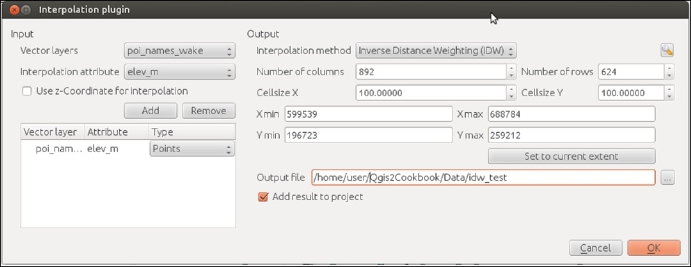
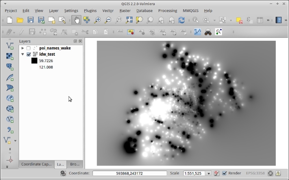
The basic idea is that, at a given cell, you take the average of all the nearby points that are weighted by their distance to the cell in order to estimate the value at your current location. Inverse Distance Weighted (IDW) takes this one step further by giving more weight to values that are closer to the given cell and less weight to values that are further. This function uses an exponent factor P in order to greatly increase the role of closer points over distant points.
Are the results not quite what you expected? There are a few parameters that can be adjusted; these are primarily the P value and the size of the cell. Is this still not coming out the way that you want? There are several other Interpolation tools that are accessible in Processing under the SAGA, GRASS, and GDAL toolboxes, which allow you to manipulate more of the formula parameters to refine the results.
Finally, depending on your data, IDW may not do a good job of interpolating. In the example here, you can actually see how there are distinct circles around isolated points. This is generally not a good result, and this needs a smoother transition to nearby points. If you have any control over field sampling to begin with, keep in mind that regularly-spaced grids will usually provide better results.
Do you not have control over the source data or you didn't get good results? Then, you may need to look into other more complicated formulas that compensate for skew, strong directionality, obstructions, and non-regular spacing of samples, such as Splines or Kriging, or Triangulated Irregular Networks (TINs). There is lot of science and statistics behind the methods and diagnostic tools to determine the best parameters. This is far too complicated a topic for this recipe, but it is well-covered in books on geostatistics.
In this chapter, we will cover the following recipes:
This chapter focuses on the common use cases that are related to routing within networks. By far, the most common networks that are used to route are street networks. Other less common cases include networks for indoor routing, that is, through rooms inside buildings, or networks of shipping routes.
Networks and routing are in no way a GIS-only topic. You will find a lot of math literature related to this, called Graph Theory. In this chapter, we will use the following terms to talk about networks:
The following figure explains these terms:
The two routing tools that are commonly used with QGIS are as follows:
In this recipe, we will create a routing network from scratch using the QGIS editing tools. Even though more and more open network data is available, there will still be numerous use cases where necessary network data does not exist or is not available for use. Therefore, it is good to know how to create a network and what to pay attention to in order to avoid common pitfalls.
For the task of network creation, the main difference between the Road graph plugin and pgRouting is that pgRouting needs a network node (that is, link start or end node) at each intersection while the Road graph plugin will also use intermediate link geometry nodes to infer intersections if two links share a node. In this recipe, we will create a network, which can be used in both tools.
To follow this recipe, you only need a new empty QGIS project. Additionally, make sure you have the Digitizing toolbar enabled (as shown in the following screenshot). We will create an imaginary network, but if you want you can load a background map and digitize this:

Before we can start to create the network, there are a few things that need to be set up first:
You can read more about creating new shapefiles in the Learning QGIS book by Packt Publishing and the QGIS user guide at http://docs.qgis.org/2.2/en/docs/user_manual/working_with_vector/editing_geometry_attributes.html#creating-a-new-shapefile-layer.
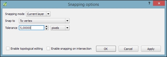
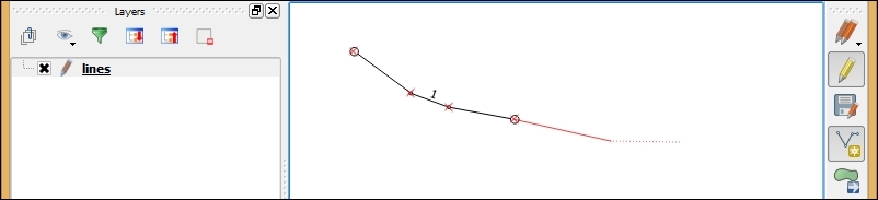
The line in the preceding screenshot is drawn with a style that has circles on the starting and ending points. You can reproduce this style by adding the Marker line symbol levels to the line style or load network_links.qml from our sample data. For more details about styling features, please refer to Chapter 10, Cartography Tips.
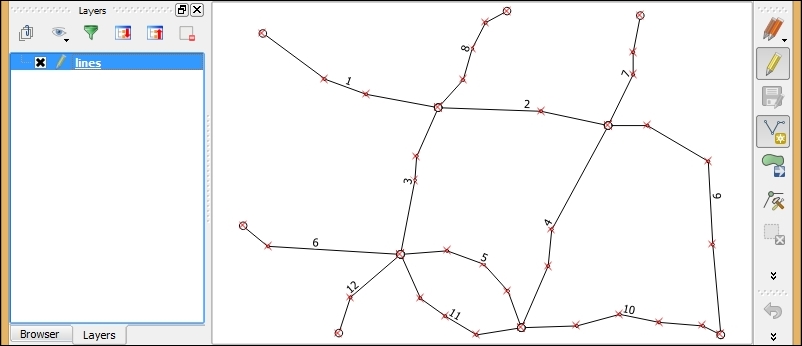
We will use this basic network as a starting point for the remaining recipes in this chapter.
By setting the snapping mode to to vertex, we made it possible to digitize the line network in a way that ensures that lines, which should be connected, really contain a node at the exact same position.
You can validate the network topology by running the Topology Checker plugin, which is installed with QGIS by default (you can read more about Topology Checker in Chapter 12, Up and Coming):
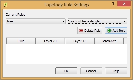
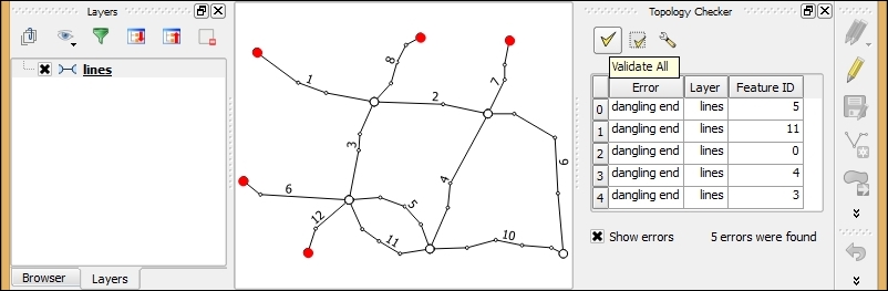
This recipe shows you how to use the built-in Road graph plugin to calculate the shortest paths in a network.
To follow this recipe, load network_pgr.shp from the sample data. Additionally, make sure that the Road graph plugin is enabled in Plugin Manager.
The Road graph plugin enables us to route between two points that are selected on the map. Before we can use this, we have to configure it first, as follows:
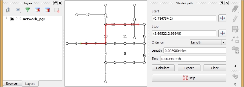
The Road graph plugin uses the QGIS network analysis library, which implements Dijkstra's algorithm. For a given starting node, the algorithm finds the path with the lowest cost (that is, the shortest path if the cost criterion is length or the fastest path if the cost criterion is time) between this node and every other node in the network. This can also be used to find costs of the shortest paths from a start node to a destination node by stopping the algorithm once the shortest path to the destination node has been determined.
In contrast to many simple routing tools, the Road graph plugin builds the network topology automatically. As our network dataset is topologically sound (that is, there are no tiny gaps where network edges meet), we can set up Road graph plugin settings with Topology tolerance as 0. If you are using a network from a different source, it may not have been created with the same attention to detail, and you may have to increase Topology tolerance to get routing to work.
When it comes to vehicle routing, it is often necessary to go into more detail and consider driving restrictions, such as one-way streets. This recipe shows you how to use one-way street information to route with the Road graph plugin.
To follow this recipe, load network_pgr.shp from the sample data. Additionally, make sure that the Road graph plugin is enabled in Plugin Manager.
To demonstrate routing with one-way street information, we will first visualize the one-way values, and then we will configure the Road graph plugin to use the one-way information, as follows:
network_pgr.qml from our sample data to get the style: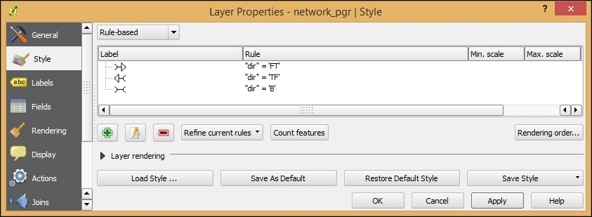
There are many different ways to encode one-way information. In our dataset, a forward direction is encoded as FT for "from-to", a backward direction as TF for "to-from", and both ways as B for "both".
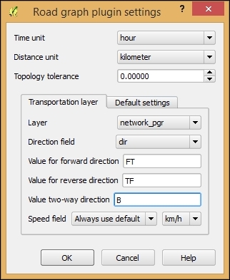
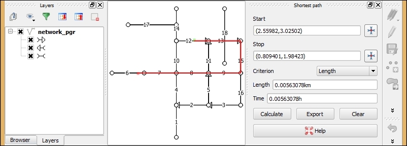
When we use the default two-way setting, each network link is interpreted as a connection from the start to end node, as well as a connection from the end to start node. By adding one-way restrictions, this changes and the link is only interpreted as one connection now.
Besides FT, TF, and B, another common way to encode one-ways is 1 for in-link direction, -1 for against-link direction, and 0 for both ways. In OpenStreetMap, you will find yes for the in-link direction, no for both ways and -1 for the against-link direction (refer to http://wiki.openstreetmap.org/wiki/Key:oneway for more details).
As mentioned in the recipe, Calculating the shortest paths using the Road graph plugin, QGIS comes with a network analysis library, which can be used from the Python console, inside plugins, to process scripts, and basically anything else that you can think of. In this recipe, we will introduce the usage of the network analysis to compute the shortest paths in the Python console.
Instead of typing or copying the following script directly in the Python console, we recommend opening the Python console editor using the Show editor button on the left-hand side of the Python console:
import processing
from processing.tools.vector import VectorWriter
from PyQt4.QtCore import *
from qgis.core import *
from qgis.networkanalysis import *

# create the graph
layer = processing.getObject('network_pgr')
director = QgsLineVectorLayerDirector(layer,-1,'','','',3)
director.addProperter(QgsDistanceArcProperter())
builder = QgsGraphBuilder(layer.crs())
from_point = QgsPoint(2.73343,3.00581)
to_point = QgsPoint(0.483584,2.01487)
tied_points = director.makeGraph(builder,[from_point,to_point])
graph = builder.graph()

# compute the route from from_id to to_id
from_id = graph.findVertex(tied_points[0])
to_id = graph.findVertex(tied_points[1])
(tree,cost) = QgsGraphAnalyzer.dijkstra(graph,from_id,0)

# assemble the route
route_points = []
curPos = to_id
while (curPos != from_id):
  in_vertex = graph.arc(tree[curPos]).inVertex()
  route_points.append(graph.vertex(in_vertex).point())
  curPos = graph.arc(tree[curPos]).outVertex()
route_points.append(from_point)

# write the results to a Shapefile
result = 'C:\\temp\\route.shp'
writer = VectorWriter(result,None,[],2,layer.crs())
fet = QgsFeature()
fet.setGeometry(QgsGeometry.fromPolyline(route_points))
writer.addFeature(fet)
del writer
processing.load(result)network_pgr.shp, which is provided with this book, adjust the coordinates of from_point and to_point for the route's starting and ending points.On line 8, we created a QgsLineVectorLayerDirector object (http://qgis.org/api/classQgsLineVectorLayerDirector.html), which contains the network configuration. The constructor (QgsLineVectorLayerDirector(layer,-1,'','','',3)) parameters are as follows:
-1 because this script does not consider one-ways1 for the in link direction, 2 for the reverse direction, and 3 for the two-wayLine 10 creates the QgsGraphBuilder (http://qgis.org/api/classQgsGraphBuilder.html) instance, which will be used to create the routing graph on line 14.
On lines 11 and 12, we defined the starting and ending points of our route. To be able to route between these two points, they have to be matched to the nearest network link. This happens on line 13 in the makeGraph() function, which returns the so-called tied_points.
The actual route computation takes place on line 18 in the QgsGraphAnalyzer.dijkstra() (http://qgis.org/api/classQgsGraphAnalyzer.html) function.
The while loop, starting on line 22, is where the script moves through the tree created by Dijkstra's algorithm to collect all the vertices on the way and add them to the route_points list, which becomes the resulting route geometry on line 31.
The writer for output route line layer is created on line 29, where we pass the file path, None for default encoding, the [] for empty fields list, and the 2 for geometry type, which equals to lines as well as the resulting layer CRS. The following lines, 30 to 32, create the route feature and add it to the writer.
Finally, the last line loads the resulting shapefile, and this is displayed on the map, as illustrated by the following screenshot:
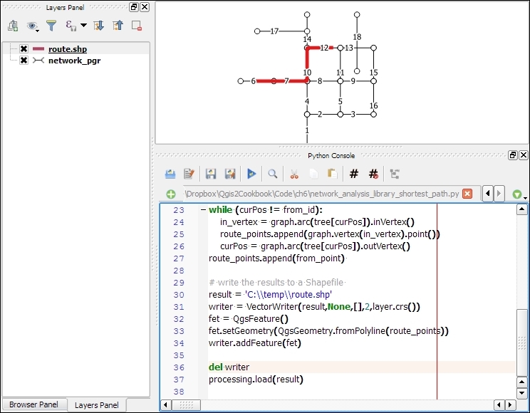
You can read more about QGIS's network analysis library online in the PyQGIS Developer Cookbook at http://docs.qgis.org/testing/en/docs/pyqgis_developer_cookbook/network_analysis.html.
In the recipes so far, we routed from one starting point to one destination point. Another use case is when we want to compute routes that connect a sequence of points, such as the points in a GPS track. In this recipe, we will use the point layer to route processing script to compute a route for a point sequence. At its core, this script uses the same idea that was introduced in the previous recipe, Calculating the shortest paths with the QGIS network analysis library, but this computes several shortest paths one after the other.
To follow this recipe, load network_pgr.shp and sample_pts_for_routing.shp, which contains a point layer that should be routed from the sample dataset.
Additionally, you need to get the point layer to route script from https://raw.githubusercontent.com/anitagraser/QGIS-Processing-tools/master/2.6/scripts/point_layer_to_route.py and save it in the Processing script folder, which is set to C:\Users\youruser\qgis2\processing\scripts (on Windows), /home/youruser/.qgis2/processing/scripts (on Linux), and /Users/youruser/.qgis2/processing/scripts (on Mac) by default. Alternatively, save the point layer to route to the folder configured in the Processing menu under Options | Scripts | Scripts folder.
To compute the route between the input points, you need to perform the following tasks:
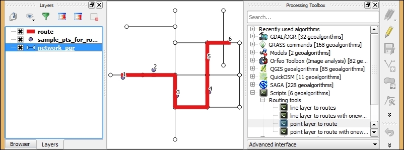
The point layer to route tool uses the QGIS network analysis library. We already discussed the basic use of this library in the previous recipe, Calculating the shortest paths with the QGIS network analysis library. The main difference is that we now have to handle more than two points. Therefore, the script fetches all points from the input point layer and ties or matches them to the graph:
points = []
features = processing.features(point_layer)
for f in features:
  points.append(f.geometry().asPoint())
tiedPoints = director.makeGraph(builder, points)
For each pair of consecutive points, the script then computes the route between the two points just like we did in the Calculating the shortest paths with the QGIS network analysis library recipe:
point_count = point_layer.featureCount()
for i in range(0,point_count-1):
  # compute the route between two consecutive points
The resulting route line layer contains one line feature for each consecutive point pair.
Of course, you can also use the point layer to route tool to route between only two points as well.
There is also a version of this script, which takes one-way information into account at https://raw.githubusercontent.com/anitagraser/QGIS-Processing-tools/master/2.2/scripts/point_layer_to_route_with_oneways.py.
If you have multiple input point layers, you can use Processing's batch processing capabilities to speed up the process. In this recipe, we will compute routes for two input point layers at once, but the same approach can be applied to many more layers.
To follow this recipe, load network_pgr.shp and the two point layers, sample_pts_for_routing.shp and sample_pts_for_routing2.shp.
To get started, right-click on the point layer to route tool in the Processing Toolbox option and select Execute as batch process. Then perform the following steps:
sample_pts_for_routing and sample_pts_for_routing2.network_pgr. You can avoid having to pick the file twice by double-clicking on the table header entry (where it reads network). This will autofill all rows with the same network file path.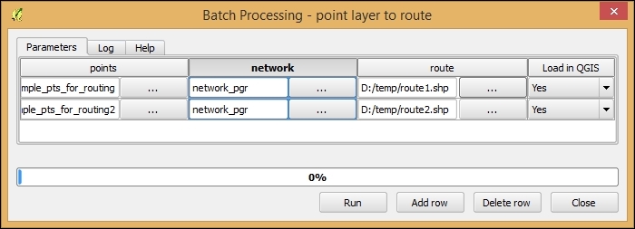
In this recipe, we will use the QGIS network analysis library from Python console to match points to the nearest line. This is the simplest form of what is also known as map matching.
The following script will match three points, QgsPoint(3.63715,3.60401), QgsPoint(3.86250,1.58906), and QgsPoint(0.42913,2.26512), to the network:
network_analysis_match_points.py script:import processing
from processing.tools.vector import VectorWriter
from PyQt4.QtCore import *
from qgis.core import *
from qgis.networkanalysis import *
layer = processing.getObject('network_pgr')
director = QgsLineVectorLayerDirector(layer,-1,'','','',3)
director.addProperter(QgsDistanceArcProperter())
builder = QgsGraphBuilder(layer.crs())
additional_points = [QgsPoint(3.63715,3.60401),QgsPoint(3.86250,1.58906),QgsPoint(0.42913,2.26512)]
tied_points = director.makeGraph(builder,additional_points)
result = 'C:\\temp\\matched_pts.shp'
writer = VectorWriter(result,None,[],1,layer.crs())
fet = QgsFeature()
for pt in tied_points:
fet.setGeometry(QgsGeometry.fromPoint(pt))
writer.addFeature(fet)
del writer
processing.load(result)This script uses the QGIS network analysis library's ability to match points to lines using the makeGraph() function. The resulting tied_points list contains the coordinates of the points on the network that are closest to the input points.
The 1 option on line 15 specifies that the output layer is of type point.
The for loop finally goes through all points in the tied_points list and creates point features, which are then added to the result writer.
This recipe shows you how to import a line layer into PostGIS and create a routable network out of it, which can be used by PostGIS's routing library, pgRouting. (For details about pgRouting, please visit the project website at http://docs.pgrouting.org.)
The installation of PostGIS with pgRouting won't be covered in detail here because instructions for the different operating systems can be found on the project's website at http://docs.pgrouting.org/2.0/en/doc/src/installation/index.html.
If you are using Windows, both PostGIS and pgRouting can be installed directly from the Stack Builder application, which is provided by the standard PostgreSQL installation, as described at http://anitagraser.com/2013/07/06/pgrouting-2-0-for-windows-quick-guide/.
To follow this exercise, you need a PostGIS database with pgRouting enabled. In QGIS, you should set up the connection to the database using the New button in the Add PostGIS Layers dialog. Additionally, you should load network_pgr.shp from the sample data.
These steps will create a routable network table in your PostGIS database:
network_pgr layer into your database, as shown in the following screenshot: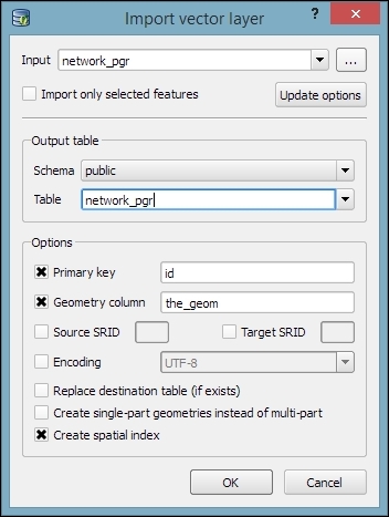
network_pgr has been imported successfully, open the SQL window of DB Manager by pressing F2, clicking on the corresponding toolbar button, or in the Database menu.network_pgr with QGIS's DB Manager, it creates the cost column as numeric. As pgRouting won't accept numeric, we will use Table | Edit Table in DB Manager to edit the cost column. Click on the Edit column button and change Type from numeric to double precision (which equals the required float8).network_pgr_vertices_pgr table, which contains the computed network nodes:SELECT pgr_createTopology('network_pgr',0.001);16 to the node number 9:SELECT pgr_dijkstra('SELECT id, source, target, cost
FROM network_pgr', 16, 9, false, false);This will result in the following:
(0,16,6,1)
(1,17,7,1)
(2,5,8,1)
(3,6,9,1)
(4,11,15,1)
(5,9,-1,0)
The preceding pgr_dijkstra query consists of the following parts:
'SELECT id, source, target, cost FROM network_pgr': This is a SQL query, which returns a set of rows with the following columns:id: This is the unique edge ID (type int4)source: This is the ID of the edge source node (type int4)target: This is the ID of the edge target node (type int4)cost: This is the cost of the edge traversal (type float8)16, 9: These are the IDs of the route source and target nodes (type int4)false: This is true if the graph is directedfalse: If true, the reverse_cost column of the SQL-generated set of rows will be used for the cost of the traversal of the edge in the opposite directionThe results of pgr_dijkstra contain the list of network links that our route uses to get from the start to the destination. The four values in reach result row are as follows:
seq: This is the sequence number, which tells us the order of the links within the route starting from 0id1: This is the node IDid2: This is the edge IDcost: This is the cost of the link (can be distance, travel time, a monetary value, or any other measure that you chose)In the previous recipe, Creating a routing network for pgRouting, we imported a network layer, built the topology, and finally tested the routing. Building on these results, this recipe will show you how to visualize the routing results on a map in QGIS.
You should first go through the previous recipe, Creating a routing network for pgRouting, to set up the necessary PostGIS tables. Alternatively, you can use your own network tables, but be aware that you may have to alter some of the SQL statements if your table uses different column names.
To visualize the results in QGIS, we can use the DB Manager SQL window, as shown in the following screenshot. The extended query that we use here joins the routing results back to the original network table to get the route link geometries, which we want to display on the map:
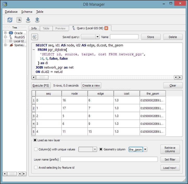
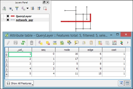
As pgr_dijkstra only returns a list with the IDs of the route edges, we need to get the edge geometries from the original network table in order to display the route on the map. Therefore, we join the routing results with the network table on id2 (which contains the edge ID) and the network table's id column.
The previous recipe, Visualizing pgRouting results in QGIS, showed you how to manually add pgRouting results to the map. In this chapter, we will use the pgRoutingLayer plugin to get more convenient access to the functions that pgRouting offers, including the most basic algorithms, such as Dijkstra's algorithm, which we have used so far, to more complex algorithms, such as drivingDistance and alphashape, which can be used to visualize catchment zones, also known as service areas.
You should first go through the previous recipe, Creating a routing network for pgRouting, to set up the necessary PostGIS tables. Alternatively, you can use your own network tables, but be aware that you may have to alter some of the SQL statements if your table uses different column names.
Additionally, install the pgRoutingLayer plugin from Plugin Installer. You will need to enable experimental plugins in Settings to view this.
The pgRoutingLayer plugin adds a new panel to the QGIS GUI, which allows convenient access to the available routing functions. The following steps show you how to use this plugin:
dijkstra function. You will recognize the parameters from the previous recipes where we wrote the pgRouting SQL query manually.edge_table) and the geometry, id, source, target, and cost columns, as shown in the following screenshot: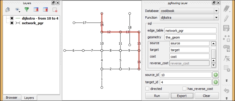
alphashape function. The rest of the input fields adapt automatically to the selected function.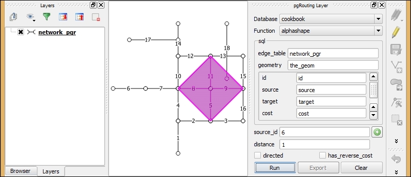
When we click on the Run button, the query results are visualized as a temporary overlay on the map. If you want to save the output permanently, you can click on the Export button. Currently, the Export button is only available for the routing functions but not for the service area functions.
For a detailed documentation on the pgRouting algorithms, refer to the project documentation website at http://docs.pgrouting.org/2.0/en/doc/index.html.
A popular data source for real-world routing applications is OpenStreetMap (OSM). This recipe shows you how to prepare OSM data for usage with pgRouting using the osm2po command-line tool to convert OSM data to an insert script for PostGIS. Finally, we will test the data import using the pgRoutingLayer plugin.
Download osm2po from http://osm2po.de and unpack the download. Note that osm2po requires Java to be installed on your machine.
You also need a pgRouting-enabled database to follow this recipe.
Additionally, you should have the pgRoutingLayer plugin installed and enabled because we will use this to test the OSM data import.
You can use the wake.pbf OSM file from our sample data, or download your own data from services such as http://download.geofabrik.de.
Open the command line to perform the following steps. If you are working on Windows, we recommend using the osgeo4W Shell:
osm2po folder and open osm2po.config in a text editor. Look for the following configuration line and remove the # at the beginning of the line to activate the pgRouting export:postp.0.class = de.cm.osm2po.plugins.postp.PgRoutingWriter
.pbf file to SQL. Adjust the file paths for your system, as follows:D:\osm2po-5.1.0>java -jar osm2po-core-5.1.0-signed.jar prefix=wake "C:\tmp\OSM_NorthCarolina\wake.pbf"
INFO Services started. Waiting for requests at http://localhost:8888/Osm2poService
wake) inside the osm2po folder. This contains a log file, which in turn provides a command-line template to import the OSM network to PostGIS:INFO commandline template:psql -U [username] -d [dbname] -q -f "D:\osm2po-5.1.0\wake\wake_2po_4pgr.sql"
.sql file into an existing database, as follows:D:\osm2po-5.1.0\wake>psql -U [username] -d cookbook -q -f D:\osm2po-5.1.0\wake\wake_2po_4pgr.sql
wake_2po_4pgr table: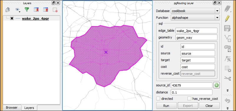
In this chapter, we will cover the following recipes:
Raster analysis is a classic area in GIS analysis. This chapter shows you some of the most important and common tasks of raster analysis. Elevation data is commonly stored as raster layers, and in this format, it is particularly suitable to run a large variety of analysis. For this reason, terrain analysis has traditionally been one of the main areas of raster analysis, and we will show you some of the most common operations that are related to Digital Elevation Models (DEM), from simple analysis, such as slope calculation, to more complex ones, such as drainage network delineation or watershed extraction.
The raster calculator is one of the most flexible and versatile tools in QGIS. This allows you to perform algebraic operations based on raster layers, and compute new layers. This recipe shows you how to use it.
catchment_area layer. Select this layer.ln(a).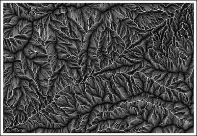
The layers selected in the layer selector are referred to using a single letter in alphabetical order (a for the first one, b for the second one, and so on). In this case, we selected just one layer, so we can refer to it as a in the formula.
The formula calculates a natural logarithm of the values in the catchment area layer. The distribution of values in this layer is not homogeneous because it contains a large number of cells with low values and just a few of them with very large values. This causes the rendering of the layer to be not very informative with most of the colors in the color ramp not even being used.
The resulting layer is much more informative because applying the logarithm alters the distribution of values, resulting in a more explicit rendering.
QGIS contains a raster calculator module outside of Processing. You can find this by navigating to Raster | Raster calculator...:
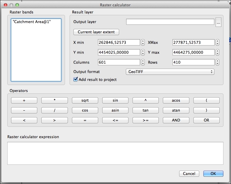
This interface resembles an actual calculator, and it is more intuitive and user friendly. On the other hand, this lacks many of the functions that are available in the Processing raster calculator (the logarithm that we have computed, for instance, is not available). This also cannot be used in automated processes, such as scripts or graphical models, which are only available for the Processing algorithms.
On the other hand, the QGIS built-in calculator supports multiband layers, while the Processing one is limited to single-band ones.
In this recipe, we will show you how to perform terrain analysis in QGIS. Terrain analysis algorithms assume certain characteristics in the DEMs that are used as inputs, so it is important to know them and prepare these DEMs if they are needed. This recipe shows you how to do this.
Open the dem_to_prepare.tif layer. This layer contains a DEM in the EPSG:4326 CRS and elevation data in feet. These characteristics are unsuitable to run most terrain analysis algorithms, so we will modify this layer to get a suitable one.
a * 0.3048 in the Formula field. Run the algorithm.Most of the algorithms that we are going to use assume that the horizontal units (the unit used to measure the size of the cell) are the same as the units used in the elevation values that are contained in the layer. If the layer does not meet this requirement, the result of the analysis will be wrong.
Our input layer uses a CRS with geographic coordinates (degrees). As elevation cannot be measured in degrees, the layer cannot have the same units for horizontal and vertical distances, and it is not ready to be used for terrain analysis.
By reprojecting the layer to the EPSG:3857 CRS, we get a new layer in which coordinates are expressed in meters. This is a unit that is more suitable for the type of analysis that we plan to run. Actually, after the reprojection, the units are meters only near the equator, but this gives us enough precision for this case. If more precise calculations are needed, a local projection system should be used.
The next step is converting the elevation values in feet to elevation values in meters. Knowing that 1 foot = 0.3048 meter, we just have to use the calculator to apply this formula and convert the values in the reprojected layer.
There are other things that must be taken into account when running a terrain analysis algorithm to ensure that results are correct.
One common problem is dealing with different cell sizes. An assumption that is made by most terrain analysis algorithms (and also most of the ones not related to terrain analysis) is that cells are square. That is, their horizontal and vertical values are the same. This is the case in our input layer (you can verify this by checking the layer properties), but it may not be true for other layers.
In this case, you should export the layer and define the sizes of the cells of the exported layer to have the same value. Right-click on the layer name and select Save as.... In the save dialog that will appear, enter the new sizes of the cells in the lower part of the dialog:
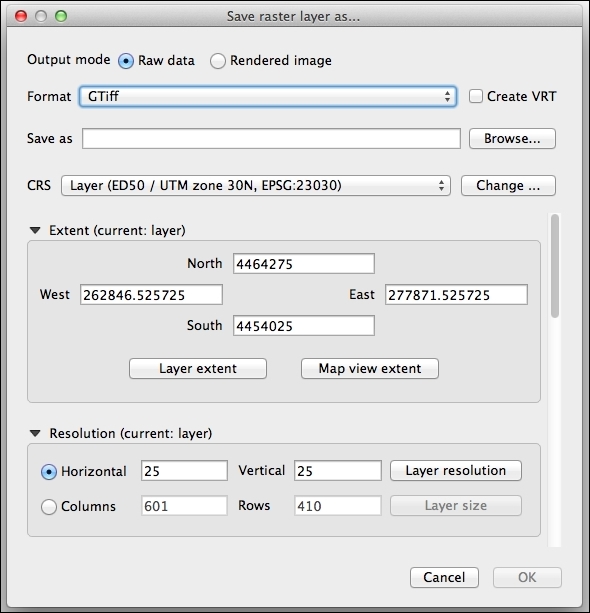
Slope is one of the most basic parameters that can be derived from a DEM. It corresponds to the first derivative of the DEM, and it represents the rate of change of the elevation. It is computed by analyzing the elevation of each cell and comparing this with the elevation of the surrounding ones. This recipe shows you how to compute slope in QGIS.
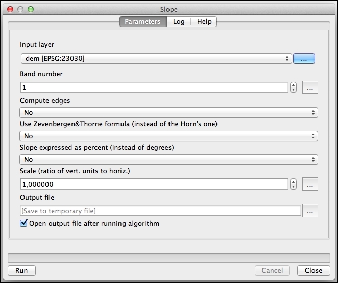
Slope is calculated from a DEM elevation model by analyzing the cells around a given one. This analysis is performed by the slope algorithm from the GDAL library.
There are several ways of using the slope algorithms in QGIS. Here are some comments and ideas about this.
If the units of elevation are not the same as the horizontal units, you can convert them, as we did in the previous recipe, using the raster calculator. However, the slope module contains an option to convert them on-the-fly by entering the conversion factor in the Scale field. Note that this option is not available in other terrain analysis modules that we will use, so it's still good practice to create a layer with the correct units, which can be used without any further processing.
The Processing framework contains algorithms that rely on several external applications and libraries. These libraries sometimes contain similar algorithms, so there is more than one option for a given analysis.
If you switch the presentation mode of the toolbox from simplified to advanced using the lower part of the drop-down list and then type slope in the search box, you will see something like the following screenshot:
A hillshade layer is commonly used to enhance the appearance of a map and display topography in an intuitive way, by simulating a light source and the shadows it casts. This can be computed from a DEM by using this recipe.
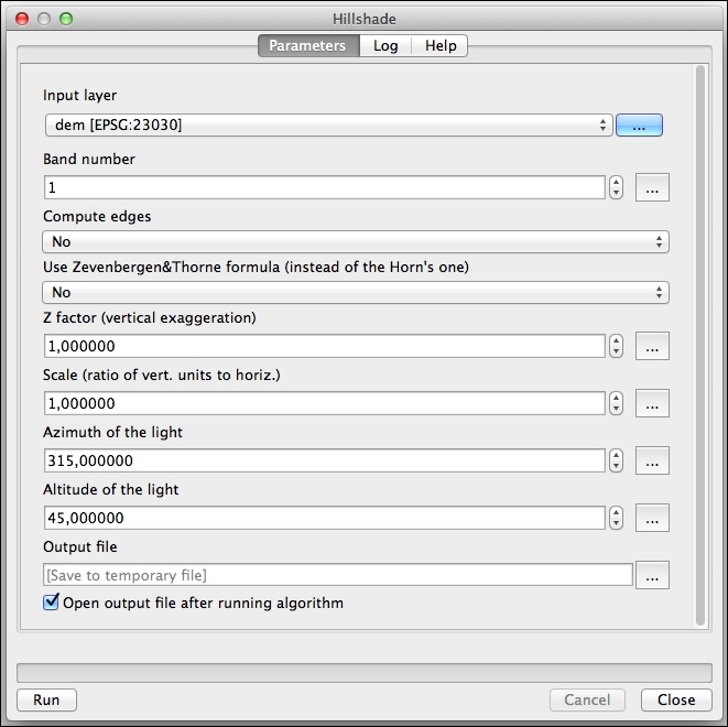
The hillshade layer will be added to the QGIS project, as follows:
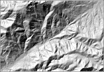
As in the case of the slope, the algorithm is part of the GDAL library. You will see that the parameters are very similar to the slope case. This is because slope is used to compute the hillshade layer. Based on the slope and the aspect of the terrain in each cell and using the position of the sun that is defined by the Azimuth and Altitude fields, the algorithm computes the illumination that the cell will receive. This is based on a focal analysis, so shadows are not considered and are not a real illumination value, but they can be used to render and to display the topography of the terrain.
You can try changing the values of these parameters to alter the appearance of the layer.
As in the case of slope, there are alternative options to compute the hillshade. The SAGA one in the Processing Toolbox option has a feature that is worth mentioning.
The SAGA hillshade algorithm contains a field named method. This field is used to select the method that is used to compute the hillshade value, and the last method that is available. Raytracing differs from the other ones as it models the real behavior of light, making an analysis that is not local but that uses the full information of the DEM instead because it takes into account the shadows that are cast by the surrounding relief. This renders more precise hillshade layers, but the processing time can be notably larger.
You can combine the hillshade layer with your other layers to enhance their appearance.
As you used a DEM to compute the hillshade layer, it should be already in your QGIS project along with the hillshade itself. However, this will be covered by the hillshade because of the new layers produced by Processing are added on top of the existing ones in the layers list. Move it to the top of the layer list so that you can see the DEM (and not the hillshade layer) and style it to something like the following screenshot:
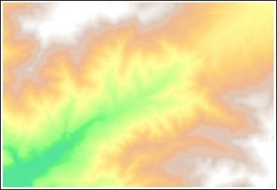
Lets see the steps to enhance the map view with a hillshade layer:
Another way of doing this is using the blending modes in QGIS. You can find more information about this in the recipe, Understanding the feature and layer blending modes of Chapter 10, Cartography Tips, or in the QGIS manual at http://docs.qgis.org/2.8/en/docs/user_manual/working_with_vector/vector_properties.html#style-menu.
A common analysis from a DEM is to compute hydrological elements, such as the channel network or the set of watersheds. This recipe shows you the steps to do these analysis.
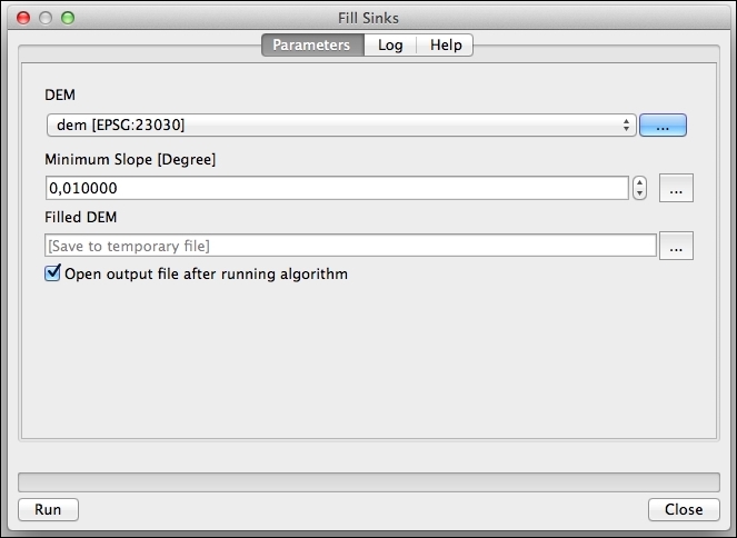
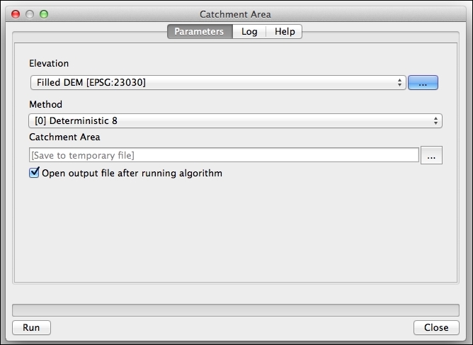
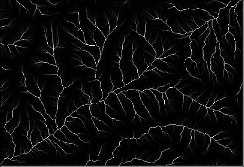
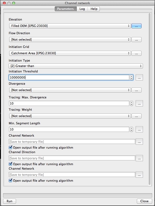
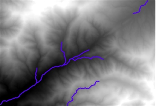
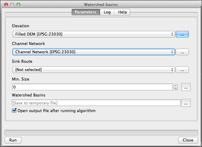
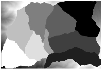
Starting from the DEM, the preceding steps follow a typical workflow for hydrological analysis:
The key parameter in the preceding workflow is the catchment area threshold. If a larger threshold is used, fewer cells will be considered as river cells, and the resulting channel network will be sparser. As the watershed is computed based on the channel network, this will result in a lower number of watersheds.
You can try this yourself with different values of the catchment area threshold. Here, you can see the result for threshold is equal to 1,000,000 in the following screenshot:
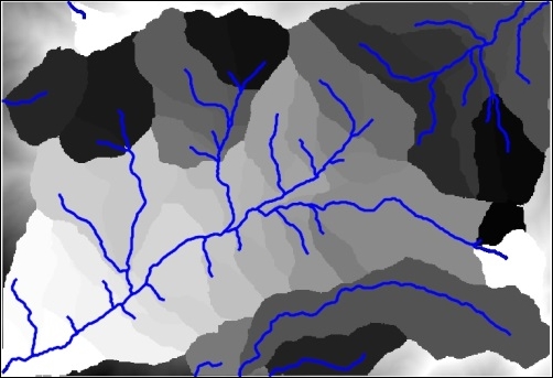
The channel network has been added to help you understand the structure of the resulting set of watersheds.
Here, you can see the result for a threshold of 50,000,000 in the following screenshot:
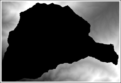
Note that in this last case, with a higher threshold value, there is only one single watershed in the resulting layer.
The threshold values are expressed in the units of the catchment area which, as the size of the cell is assumed to be in meters, are in square meters.
As the topography defines and influences most of the processes that take place in a given terrain, the DEM can be used to extract many different parameters, which give us information about these processes. This recipe shows you how to calculate a popular one, which is called the Topographic wetness index, which estimates the soil wetness based on the topography.
Open the Topographic wetness index algorithm from the Processing Toolbox option and fill it in, as shown in the following screenshot:
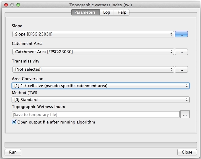
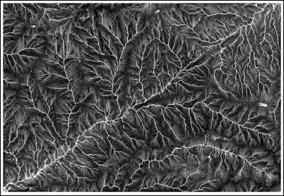
The index combines slope and catchment area, two parameters that influence the soil wetness. If the catchment area value is high, this means that more water will flow into the cell, thus, increasing its soil wetness. A low value of slope will have a similar effect because the water that flows into the cell will not flow out of it quickly.
This algorithm expects the slope to be expressed in radians. This is the reason why the Slope, aspect, curvature algorithm has to be used because it produces its slope output in radians. The other Slope algorithm that you will find, which is based on the GDAL library, creates a slope layer with values expressed in degrees. You can use this layer if you convert its units using the raster calculator.
Most analysis tasks involve using several algorithms. Repeating the same analysis with a different dataset or different input parameters requires using them one by one, making this task tedious and error-prone. You can automate analysis workflows using the Processing graphical modeler, which allows you to define a workflow graphically and wrap it in a single algorithm. This recipe introduces the main ideas about the modeler and creates a simple model as an example.
No special preparation is needed in QGIS for this recipe, but make sure that you have read the previous recipe about computing a topographic index. This recipe will create a model based on the workflow in that recipe, so it is important that you understand it.
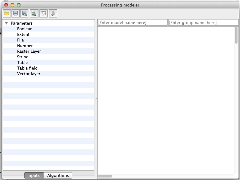
DEM and set it as mandatory:
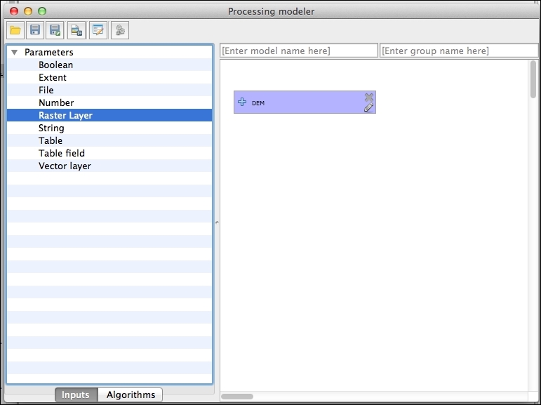
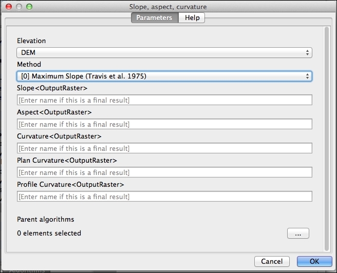
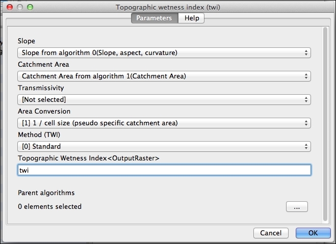
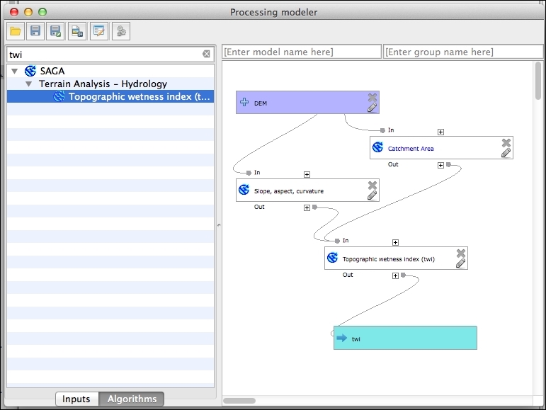
The model automates the workflow and wraps all the steps into a single one.
By saving the model in the models folder, Processing will see this when updating the toolbox and will include it along with the rest of algorithms so that it can be executed normally.
In this chapter, we will cover the following recipes:
Following the previous chapter, this chapter introduces some additional techniques for raster analysis. This chapter will show you how to work with images, how to modify raster values and classify them, and how raster layers can be used along with vector layers, thus extending the set of tools that were introduced in the recipes in the previous chapter.
The Normalized Differential Vegetation Index is a very popular vegetation index that gives us useful information about the presence or absence of live green vegetation.
NDVI is calculated using a band with red spectral reflectance values, and another one with near-infrared reflectance values. In the sample dataset, you will find two image files named red.tif and nir.tif that can be used to compute NDVI. A project named ndvi.qgs is available, which contains these two layers and a landsat image corresponding to this same area. Open this project.
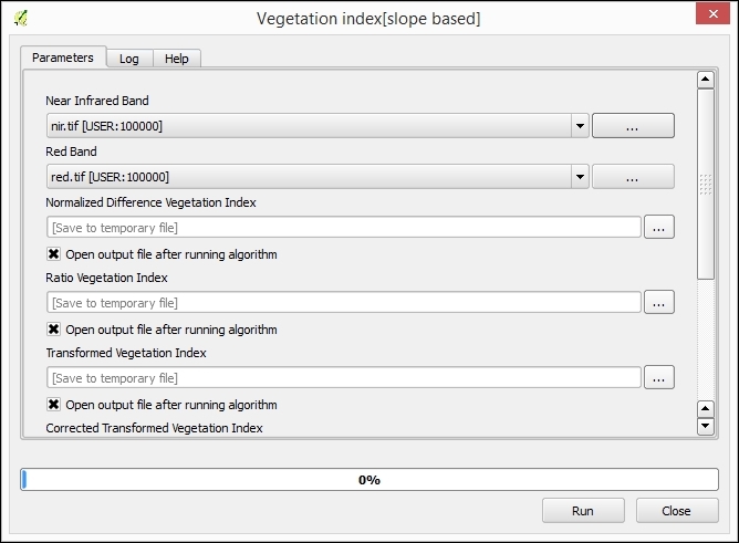
red.tif layer in the Red Band field and the nir.tif layer in the Near Infrared Band field. Click on Run to run the algorithm.
All vegetation indices that are computed by the algorithm are based on the relation between red and near-infrared reflectances. Leaf cells scatter solar radiation in the near-infrared reflectance and absorb radiation in the red reflectance, which can be used to predict the location of healthy green vegetation based on these two values.
NDVI is computed with the formula given in the following section.
As the formula of the NDVI is rather simple, you can calculate it without using a specific algorithm, just by going to the raster calculator. You can use the one integrated in the Processing Framework or the QGIS built-in on. You can see how you should fill the parameters in the QGIS Raster calculator to compute the NDVI, based on the two proposed sample layers in the following screenshot:
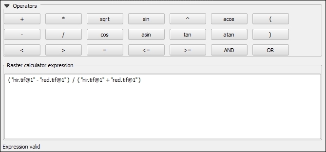
The vegetation indices algorithm requires the red and infrared values to be in two separate layers, each of them with a single band. However, it's common to have both of them in a multiband image. To be able to use these bands, you must separate them, extracting them into two separate files.
This can be done using the GDAL translate algorithm. The project contains a multiband image named landsat.tif with the red band in band number 3 and infrared band in band number 4:
The Translate algorithm uses the GDAL library underneath. You can also use this library as an independent tool from the console. At the lower part of the algorithm dialog, you will find a text field where you will see the equivalent console call to your current algorithm configuration.
Null values are a particular type of values that are used to indicate cells where the value for a given layer is not defined. Understanding how to use them is important to avoid wrong results when performing analyses but also to use them as a tool to get better and more correct results. This recipe explains some of the fundamental ideas about null values in raster layers.
The watershed.tif layer contains the area of a watershed. Cells inside the watershed are cells from which water will eventually flow into the outlet point of the watershed. The remaining cells belong to a different watershed. To mask the DEM with the watershed mask, follow these steps:
watershed.tif layer.no data.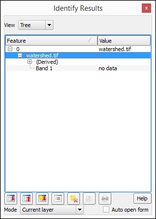
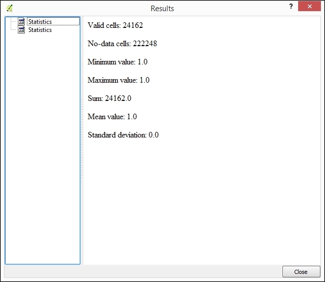
Only the cells with a value of 1 have been considered, and the average value in the layer is equal to 1.
The layer has 610 columns and 401 rows, but the total number of valid cells is much lower than 610 x 410. These are the cells that have been used to compute the statistics.
Raster layers always cover a rectangular region. However, in some circumstances, the land object that the layer represents might not be rectangular. This might be due to a purely geophysical reason (imagine a layer with water temperature that contains non-water cells), political ones (a layer with a DEM of a given country with no data available for a neighboring country), or many others. In any case, a value is needed for these cells to indicate that no data is available. An arbitrary value is selected and used. As such, this is usually a value that is not a logical and/or feasible value for the variable that is stored in the layer.
In the case of the example layer, the value used is -99999, which is the default value set for no-data values. This means that, when the identify tool shows no data, it has actually selected a value of -99999 in this case.
Algorithms in the Processing framework systematically ignore no-data cells, and do not use their values. You can clearly see this in the preceding example. A large part of the cells in the layer have a value of 1 (the ones that belong to the watershed), but many of them have a value of -99999. The average value of the cells should then be different from 1, but as -99999 is defined as the no-data value, all cells with this value are ignored. The average of the layer is, therefore, equal to 1.
Null values should be considered not only when performing an analysis, but also when we just want to render a layer that contains them.
Null values are also considered separately when rendering a raster layer. You can choose to select them using a given color (as set by the current color palette), or to not render them at all. To make all cells with null values transparent, open the layer properties and go to the Transparency section. Make sure that the No data value checkbox is checked, as shown in the following screenshot:
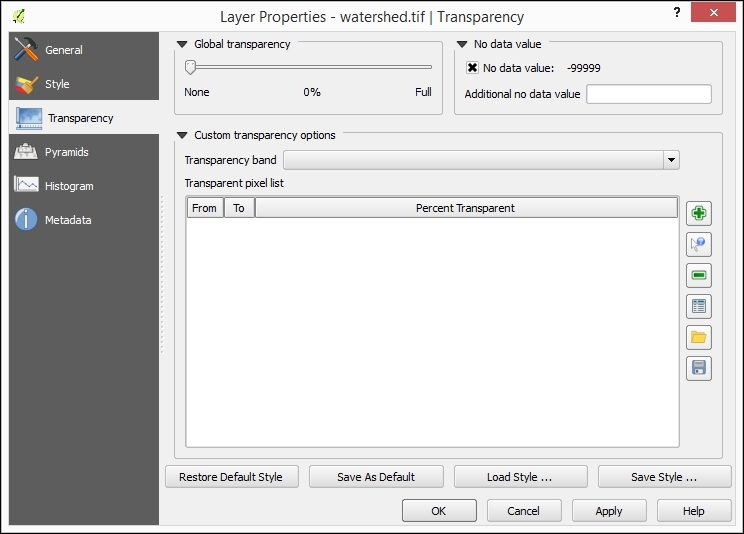
The extent of a layer can be set using a second layer, which acts as a mask. This recipe shows you how to do this.
To mask the DEM with the watershed mask, follow these steps:
watershed.tif layer and the dem.tif layer.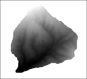
When using the raster calculator, all operations involving a no-data value will result in another no-data value. This means that, when multiplying the DEM layer and the mask layer, in the cells that contain no-data values in the mask layer, the value in the resulting layer will be a no-data value, no matter which elevation value is found in the DEM layer for this cell.
As cells inside the watershed in the mask layer have a value of 1, the result is a layer with elevation values for watershed cells and no-data values for the remaining ones.
Here are some additional ideas about masks.
Once we have masked the area of interest (in this case, the watershed), all analysis that we perform will be restricted to this. For instance, let's calculate the average elevation of the watershed:
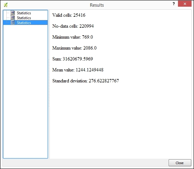
These values have been computed using only valid cell values and ignoring the no-data ones, which means that they refer to the watershed and not the the full extent of the raster layer.
Sometimes, you might have more no-data values that are needed in a raster layer, as in the case of the proposed watershed layer. To reduce the extent of the layer and just have the minimum extent that covers the valid data, you can use the Crop to data algorithm:
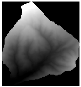
Masking a raster layer can also be done using a polygon vector layer. The watershed.shp file contains a single polygon with the area of the watershed that we have already used to mask the DEM. Here is how to use this to mask that DEM without using the raster mask:
In this case, the clip algorithm automatically reduces the extent of the output layer to the minimum extent defined by the polygon layer, so there is no need to run the Crop to data algorithm afterwards.
Data from a raster layer can be added to a points layer by querying the value of the layer in the coordinates of the points. This process is known as sampling, and this recipe explains how to perform it.
A new vector layer will be created. This contains the same points as the input layer, but the attribute table will have an additional field with the name of the selected raster layer and the values corresponding to this layer in each point:
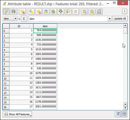
The coordinates of the points are taken, and the value of the pixel in which the layer falls is added to the resulting points layer.
This method assumes that the value of a cell is constant in all the area covered by this cell. A different approach is to consider that the value of the cell represents its value only in the center of the cell and perform additional calculations to compute the value at the exact sampling point using the values of the surrounding cells as well. This can be done using several different interpolation methods, which can be selected in the Interpolation method selector, changing the default value, which only uses the value of the cell where the sampling point falls.
Layers are assumed to be in the same CRS and no reprojection is performed. If this is not the case, the value added to the vector layer might not be correct.
Here, you can find some ideas about how to combine a raster and vector layer in different situations.
Data coming from a raster layer can also be added to other types of vector layers. In the case of a vector layer with polygons, the Grid statistics for polygons algorithm can be used, as follows:
watershed.shp file that we used in the previous recipe.The resulting layer is a new polygon layer with the watershed and an additional field in the attributes table, containing the mean elevation value for each polygon.
If more statistics are selected, the result will have a larger number of additional fields added, one for each new parameter computed and each selected grid.
Multispectral layers can be rendered in different ways depending on how bands are used. This recipe shows you how to do this and discusses the theory behind it.
Your style configuration should be like the following:
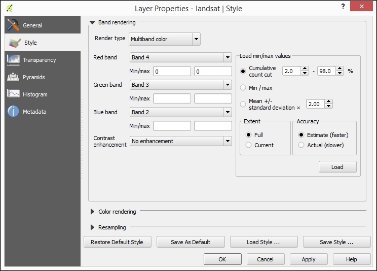
The image should now look like the following:
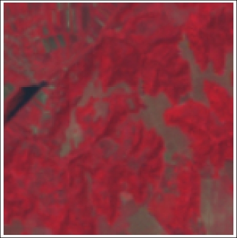
Colors representing a given pixel are defined using the RGB color space, which requires three different components. A normal image (such as the one you will get from a digital camera) has three bands containing the intensity for each one of these three components: red, green, and blue.
Multispectral bands, such as the one used in this recipe, have more than three bands and provide more detail in different regions of the electromagnetic spectrum. To visualize these, three bands from the total number of available bands have to be chosen and their intensities have to be used as intensities of the basic red, green, and blue components (although they might correspond to a different region of the spectrum, even outside the visible range). This is known as a false color image.
Depending on the combination of the bands that are used, the resulting image will convey a different type of information. The combination chosen is frequently used for vegetation studies, as it allows you to separate coniferous from hardwood vegetation as well as providing information about vegetation health.
The combination is applied, in this case, to a Landsat 7 image, which is taken with the ETM+ sensor. The wavelengths covered by each band are as follows (in micrometers):
Different combinations are frequently used for Landsat layers. One of them is the following:
This is a natural color combination, as the bands used for the R, G, and B components actually have the wavelengths corresponding to the colors red, green, and blue:
If you are using an image that is not a Landsat 7 one, each band will have a different meaning, and using the same combination of band numbers will yield different results. The meaning of each band must be checked in order to understand the information displayed by the rendered image.
A very useful technique to work with raster data is changing their values or grouping them into categories. In this recipe, we will see how to do this.
We will classify the elevation in three groups:
To do this, follow these steps:
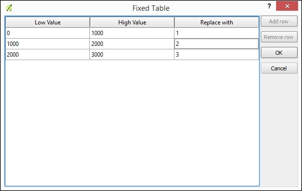
Values for each cell are compared with the range limits in the lookup table, considering the specified comparison criteria. Whenever a value falls into a given range, the class value specified for this range will be used in the output layer.
Other strategies can be used to automate a reclassification, especially when this involves dividing the raster layer values into classes with some constant property. Here, we show two of these cases.
A typical case of reclassification is dividing the total range of values of the layer into a given number of classes. This is similar to slicing it, and if applied on a DEM, such as our example data, this will have a result similar to that of defining contour lines with a regular interval (although the result is a not vector layer with lines in this case, but a new raster layer).
To reclassify in equal intervals, follow these steps:
The reclassified layer will look like the following:
The numerical values in the formula correspond to the minimum and maximum values of the layer. You can find these values in the properties window of the layer.
To create a different number of classes, just use another value instead of 5 in the formula.
There is no tool to reclassify into a set of n classes, as each of them occupies the same area, but a similar result can be obtained using some other algorithms. To show you how this is done, let's reclassify the DEM into five classes of the same area:
The resulting layer has the cells ordered according to their value in the DEM, so the cell with a value of 1 represents the cell with the lowest elevation value, 2 is the second lowest, and so on.
In the previous recipes, we saw how to change the values of a raster layer and create classes. When you have several layers, classifying might not be that easy, and defining the patterns to perform this classification might not be obvious. A different technique to be used in this case is to define zones that share a common characteristic and let the corresponding algorithm extract the statistical values that define them so that this can later be applied to perform the classification itself. This is known as Supervised classification, and this recipe explains how to do this in QGIS.
Open the classification.qgs project. It contains an RGB image and a vector layer with polygons.
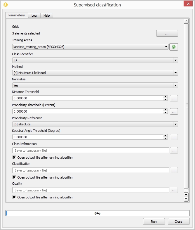
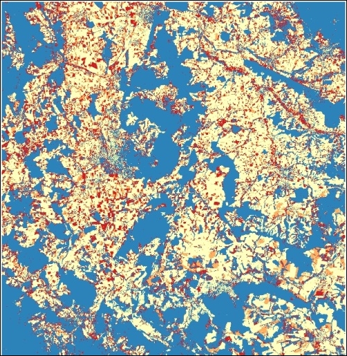
The supervised classification needs a set of raster layers and a vector layer with polygons that define the different classes to create. The identifier of the class is defined in the Class field in the attributes table. If you open the attributes tables, you will see that it looks something like the following:
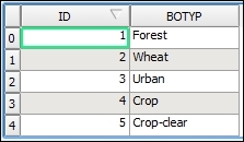
There are five different classes, each of them represented by a feature and with a text ID along with a numerical ID. The classification algorithms analyzes the pixels that fall within the polygons of each class and computes statistics for them. Using these statistics assigns a class to each pixel in the image, trying to assign the class that is statistically more similar among the ones defined in the vector layer. The numerical ID is used to identify the class in the resulting raster layer.
There are other ways of performing a supervised classification in QGIS. One of them, which allows more control over the different elements in the process, is to use the QGIS semi-automatic classification plugin.
Other more sophisticated classification methods can be used from the Processing Toolbox menu. They can be found in the Advanced interface of the toolbox, under the Orfeo Toolbox group, as shown in the following screenshot:
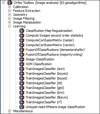
In this chapter we will cover the following recipes:
QGIS is a classic desktop geographic information system (GIS). However, these days only working with local data just isn't enough. You want to be able to freely use data from the web without spending days downloading this data. At the same time, you want to be able to put maps online for a much wider audience than a paper map or PDF. This is where web services come in. QGIS can be both a web service client and a web server, providing you with lots of options to use and share geographic data. This chapter covers the basics of using open web services for geographic data and a few methods to put your maps online.
There are quite a few different types of web-based map service that can be loaded in QGIS. Each type of web service provides data; often, this is the same data in different ways. This recipe is about helping you figure out what type of web service you want to consume, and conversely what type of web service you may want to create for others to use.
This recipe is all about thinking, so you don't need anything in particular to start. It does help if you have a project in mind and some type of data you are interested in using or creating. Most, if not all, of these methods require an Internet connection or a local server, providing these services. Of course, if you have the data locally, you should probably just load it directly.
To help with the following section, here's a list of acronyms:
|
Criteria |
CSW |
WFS |
WFS-T |
WCS |
WMS |
Tiles (WMTS, XYZ, TMS) |
|---|---|---|---|---|---|---|
|
Do you already know where to find the data you want? |
No |
Yes |
Yes |
Yes |
Yes |
Yes |
|
Do you need to edit or apply custom styling to the data? |
Yes |
Yes |
Yes |
No |
No | |
|
Do you care if the data is vector or raster? |
Vector |
Vector |
Raster |
Raster |
Raster | |
|
Do you need the data at its original resolution or quality? |
Yes |
Yes |
Yes |
No |
No | |
|
Do you need data at specific resolutions or in a specific projection? |
Yes |
Yes |
Yes |
Yes |
No | |
|
Recipe number in this chapter. |
3 |
2 |
2 |
5 |
4 |
4, 6 |
Now that you've found the appropriate recipe for the web service that you want to use, jump to this recipe later in this chapter. If you're still not sure, read on for more hints on how to pick the correct service. This recipe applies both to how you use web services and how to decide what web services to offer (if you put up a web service for other people to use).
Generally speaking, from left (WFS) to right (Tiles) the speed of the service increases. Tiles serve data the fastest to end users but with the most limitations.
For each of the services, there is a QGIS tool (built-in or plugin). This tool stores your list of web servers and connection settings for each service. When you go to load a layer from a chosen server for a particular protocol an up-to-date list of layers is requested from the server (that is, the GetCapabilities XML). You then get to pick off this list the layers that you would like to add to the map canvas (and depending on service type, the projection, and the file type).
Vector is generally slower, as more data needs to be transmitted as the data grows. Raster formats are a fixed number of pixels onscreen, so it's always approximately the same amount of data per screen load.
Each situation will have additional considerations. For example, if you need a specific projection, you probably can't use a Tile service because these are usually only in very specific projections (Web/Spherical Mercator). Or perhaps, you want to print large paper maps. Then, you probably want WFS or WCS in order to get the full resolution possible over your entire region.
One of the most common mistakes is to think that you need vector data when you actually just need a background tile that incorporates vector data. A great example of this is road data. If you don't actually need to style, select, or individually manipulate road data, and then a Tile or WMS type layer will be much faster.
Web Feature Services (WFS) is an OGC standard method to access and, in some cases, edit (WFS-T) vector data over the Internet. When you need full attribute tables, local style control, or editing, WFS is the way to go. Like most other web services, the biggest advantage over a local layer is that you don't have to copy or load the whole layer at once.
You need the URL of a WFS service to use and a working Internet connection. We will use the public Mapserver demo website (http://demo.mapserver.org/).
To try WFS-T, which involves editing, you will need to get access to a service (typically, password protected) or make one yourself. Do you need a WFS-T test server? This is a great case where OSGeo-Live comes in handy, as you can run your own WFS-T server in a virtual machine at http://live.osgeo.org.

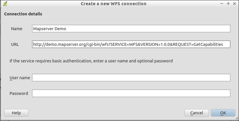
continents or cities works for this example: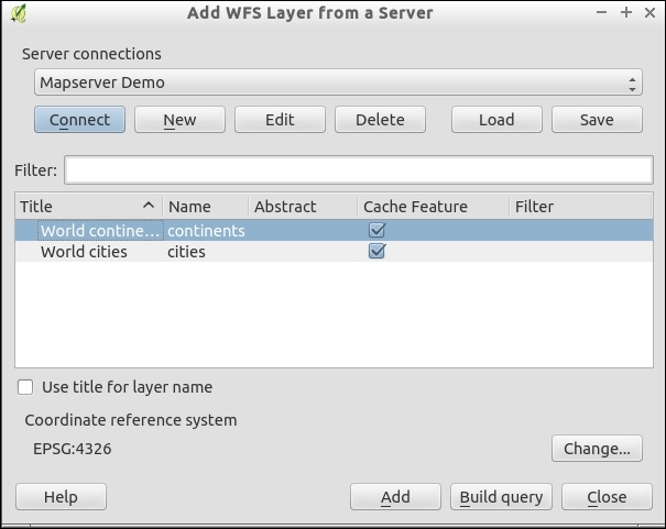
For each web service, there is a main URL. When you browse to this URL and add the GetCapabilities parameter (QGIS does this for you), the returned result is an XML file, which describes the services that are offered by the server. The client, QGIS, parses the list of layers for you to choose from, and once you pick the layer(s), uses the additional information in the XML to look up the data at the specific URL.
Data requests are limited to the visible bounding box of the map canvas. This limits the amount of data that is requested. At least this is how it should work. However, features that go off screen will likely be included in their entirety to maintain geometry integrity. So, expect that loading large vector layers over WFS has the potential to be extremely slow.
WFS-T services typically require passwords and are designed to work over the Internet. If you are working within a local network, you may consider just using PostGIS layers. Either way, it should also be noted that versioning and conflict resolution are not automatic, requiring the service backend to be configured to support such features.
CSW is a catalog web service. Its main function is to provide discoverability of geographic data and link you to usable data either by download or by any other of the web services that are mentioned in this chapter.
This recipe uses the MetaSearch plugin. It requires the pycsw and owslib libraries installed in your system's Python. Refer to the Adding plugins with Python dependencies recipe of Chapter 11, Extending QGIS, for help on installing pycsw and owslib if you don't know how to do this.
Park.Global searches often return too many results, or they cause the connection to time out while waiting for all the results. As with other web services, it is advisable to load a reference layer and zoom to the area of interest first before trying to search them. The third tab, Settings, allows you to adjust the timeout. Increase this if you're getting too many timeout errors.
MetaSearch queries websites that provide catalogs in the CSW standard, which is defined by the OGC. Once your request parameters are sent, the receiving website queries its online database for matches. If matches are found, metadata about the results is sent back to the client, in this case, QGIS.
CSW currently includes options to search by keyword and spatial extent. Future versions may enable setting time frames.
If you pick opening an additional service that is based on the results, Metasearch will create a temporary service registration and open the correct service dialog. Unfortunately, at this time, you need to then scroll through the available layers to find the one that you want and actually add it to the map.
You can add more catalogs to search on the Services tab within the plugin. You will need to find the CSW GetCapabilities URL on the website that you want to query. Most of the common geoportal-type websites now support CSW, including (but not limited to) Geonode, Geonetwork, and the ESRI Geoportal.
CSW is a relatively new standard when compared to some of the others, and it seems to be hard to find services that consistently work and actually offer WMS, WCS, or WFS of the layers in their catalog.
Web Map Services (WMS), one of the first OGC web services created, provides a method for dynamic raster generation served over the Web. They are a compromise between the flexibility of WFS and the speed of Tile services.
There are several iterations of WMS, and QGIS supports most of them. To use a WMS, you need to give QGIS the GetCapabilities URL of the service that you want to view data from.
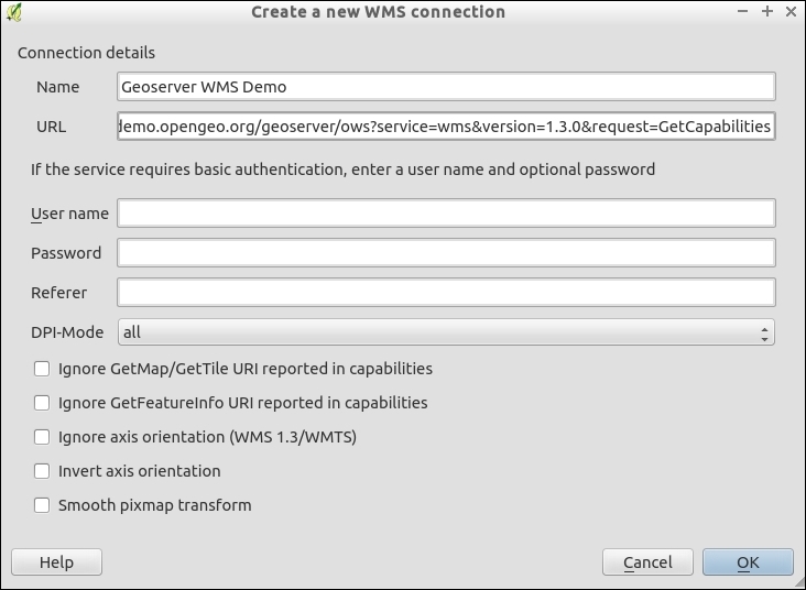
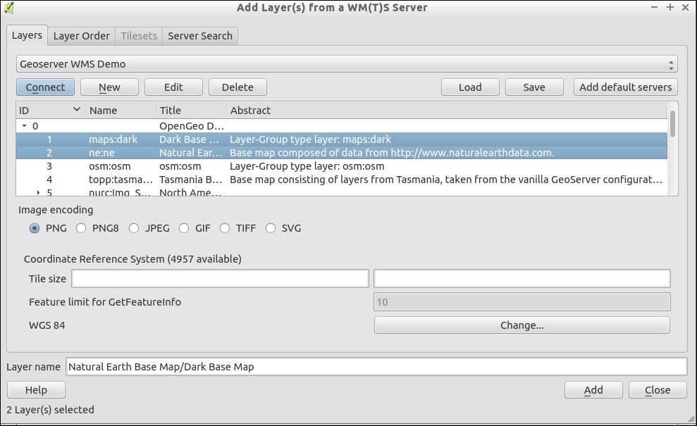
You can select one or more layers. If you select multiple layers, they will be merged and only appear as a single layer in the QGIS Layers list. The Layer Order tab lets you arrange the WMS layers within the combined layer. This is important when one of the layers is opaque and has 100% continuous data, allowing you to put other data on top of it visually.
When you pan and zoom the map, a request with the bounding box of the viewable extent and scale is sent to the service. The server then renders an image that matches the request and passes it back to the client (in this case, QGIS).
Some WMS services now also support tiling under the Web Map Tiling Service (WMTS) protocol. From the client's perspective, this not really different from WMS in usage. On the server side, after each request the results are cached so that if the same extent and scale is requested, the cached version can be delivered instead of creating the results from scratch. For you, the end user, this should result in faster loading if a service provides WMTS.
When configuring a WMTS, use the WMTS URL instead of the WMS URL. One example would be the Geoserver demo site's WMTS:
http://demo.opengeo.org/geoserver/gwc/service/wmts?REQUEST=GetCapabilities
Once successful, this will take you to the Tilesets tab, where you can pick which layer and projection of the available options you want to load. As the Tiles are premade or cached, you will usually not have the option to combine multiple layers at once and will need to load them one at a time:
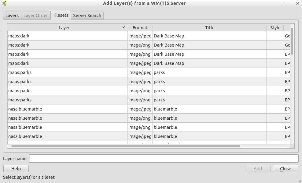
A Web Coverage Service (WCS) differs greatly in use case from the other services, but it behaves very similarly. The goal of WCS is to allow users to extract a region of interest from a large raster data that is hosted remotely. Unlike a WMS or Tiled set, WCS is a clip of the original data in full resolution and usually in the original projection. This format is ideal if you need the raster data for analysis purposes and not just visualization.
For this recipe, you need a WCS to connect to. Check with your data providers to see whether they offer WCS. For this recipe, we can use the OpenGeo Geoserver Demo site at http://demo.opengeo.org/geoserver/web/.
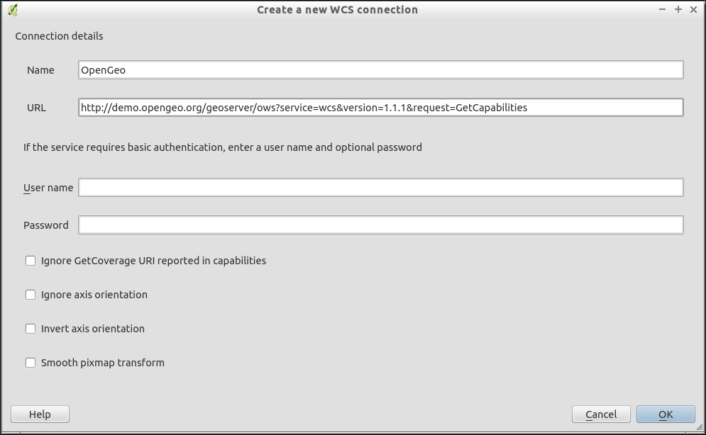
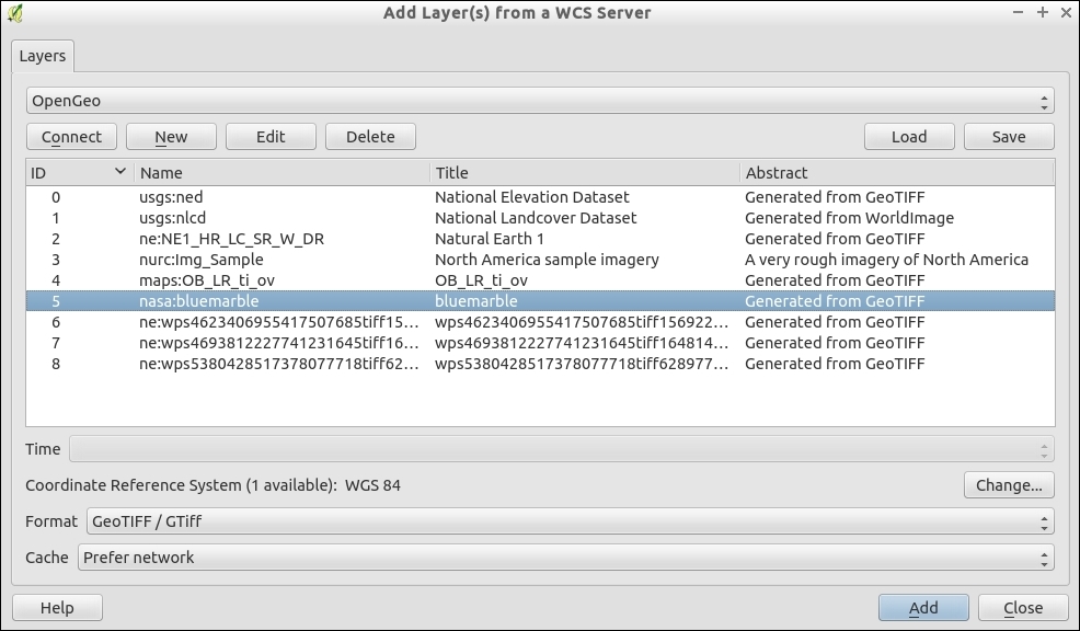
If you zoom in to the level of a US State or a European country, you will see the image start to pixelate. Blue Marble is a low resolution image put together by NASA that roughly shows what the whole world looks like from space, cloud free. It is meant as a general view of the whole world and does not contain fine details.
WCS, like other web services, sends a bounding box request to the server, which in turn delivers the raster data to QGIS. Unlike WMS, no rendering is done on the server side, the raw original raster data is sent. This could mean the following:
Keep in mind that requesting the full extent of a high resolution raster will result in a large amount of data transfer. This is unlike Tiles or WMS, which at most return the exact number of pixels in the viewable area at the resolution that is requested.
The QuickMapsServices and OpenLayers plugins, as described in the Loading BaseMaps with the QuickMapServices plugin and Loading BaseMaps with the OpenLayers plugin recipes in Chapter 4, Data Exploration, are awesome as they put a reference layer in your map session. The one downside, however, is that it is a hassle to add new layers. So, if you come across or build your own Tile service and want to use it in QGIS, this recipe will let you use almost any Tile service.
You will need a web browser, text editor, and the URL of a web-based XYZ (sometimes called TMS) service—one that allows you to make requests without an API key. We're going to use the maps at http://www.opencyclemap.org/.
Viewing the JavaScript source (a good tool for this is Firebug, or other web-developer tools for the browser), we can view the source URLs for the tiles.
map.js and you'll see the layer definition:var cycle = new OpenLayers.Layer.OSM("OpenCycleMap",
["https://a.tile.thunderforest.com/cycle/${z}/${x}/${y}.png",
"https://b.tile.thunderforest.com/cycle/${z}/${x}/${y}.png",
"https://c.tile.thunderforest.com/cycle/${z}/${x}/${y}.png"],
{ displayOutsideMaxExtent: true,
attribution: cycleattrib, transitionEffect: 'resize'}
);<server name>/<layer>/<zoom>/<tile index X>/<tile index X>.<image format>
In this particular case, the Tile Index pattern is the TMS style; refer to http://www.maptiler.org/google-maps-coordinates-tile-bounds-projection/.
z, x, and y as variables. Save the file as opencyclemap.xml:<GDAL_WMS>
<Service name="TMS">
<ServerUrl>http://c.tile.thunderforest.com/cycle/${z}/${x}/${y}.png</ServerUrl>
</Service>
<DataWindow>
<UpperLeftX>-20037508.34</UpperLeftX>
<UpperLeftY>20037508.34</UpperLeftY>
<LowerRightX>20037508.34</LowerRightX>
<LowerRightY>-20037508.34</LowerRightY>
<TileLevel>18</TileLevel>
<TileCountX>1</TileCountX>
<TileCountY>1</TileCountY>
<YOrigin>top</YOrigin>
</DataWindow>
<Projection>EPSG:3785</Projection>
<BlockSizeX>256</BlockSizeX>
<BlockSizeY>256</BlockSizeY>
<BandsCount>3</BandsCount>
<Cache />
</GDAL_WMS>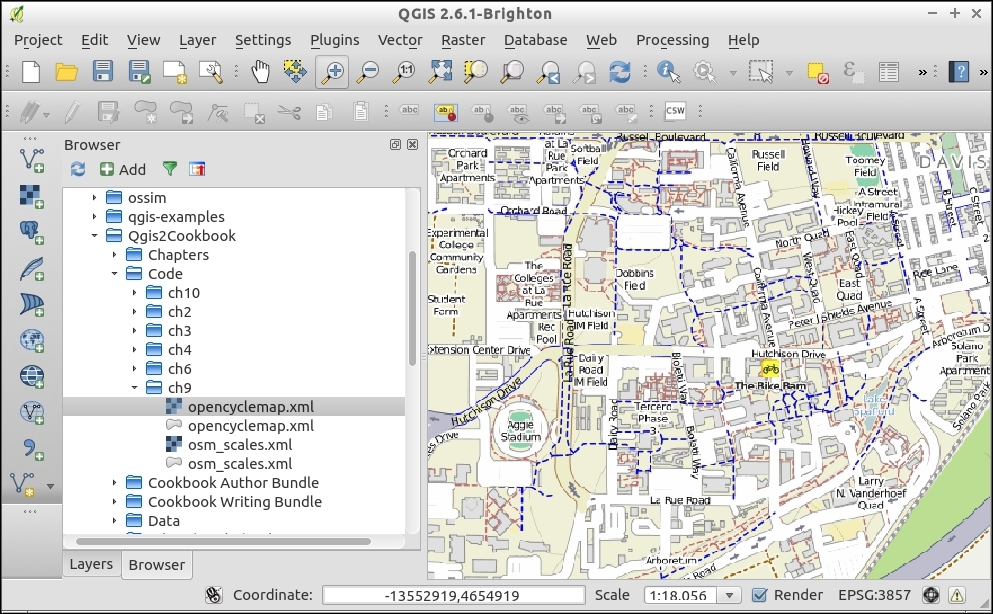
The XML file defines the parameters of the service; however, because XYZ-style servers don't follow a standard, the URL pattern varies slightly for each server and the servers do not have a GetCapabilities function that describes available layers. By telling GDAL how to handle the URL, you are wrapping a nonstandard format into a typical GDAL layer, which QGIS can easily be loaded as a raster.
One additional tip when using Spherical Mercator (EPSG:3785) is that you can set a custom list of scales (Zoom Levels) in QGIS. The following set of scales can be loaded per QGIS project, and will change the dropdown at the bottom right. These scales match the scales that most servers will provide, so you get the best viewing experience:
scales.xml file that is provided: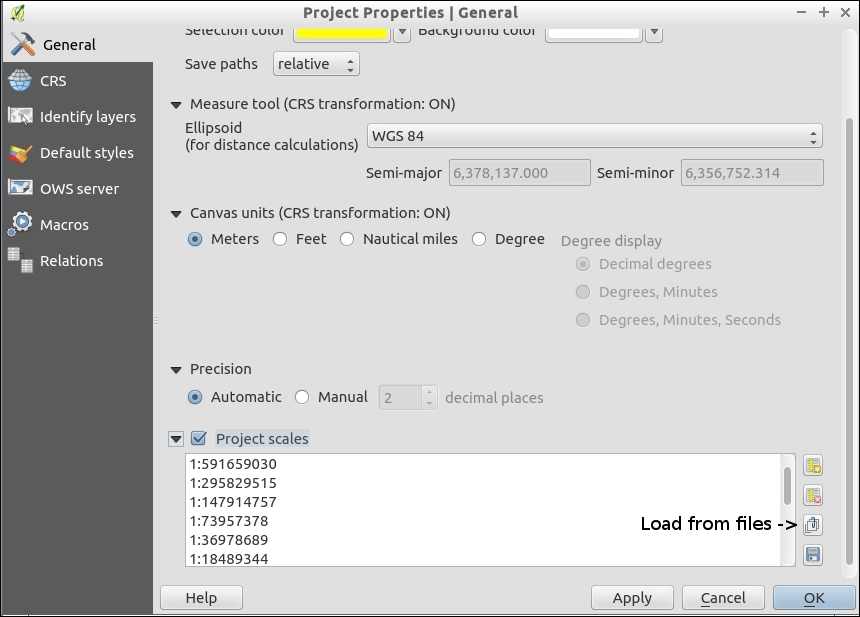
This technique is not limited to just tile services. Many other formats that GDAL works with can be wrapped for easier usage in QGIS. This is a similar method to Virtual Raster Tables (VRT) layers mentioned in the Creating raster overviews (pyramids) recipe in Chapter 2, Data Management.
Lastly, you may ask why a new plugin using this method doesn't replace the OpenLayers plugin. Such an idea has been under discussion for a while; the key sticking point is that accessing some layers, such as Google, Bing, and so on, with this method may violate the Terms of Service as they do not keep the Copyright, Trademark, and Logo in the correct place. Also, caching and printing such layers may not be legal. In general, avoid using proprietary data when possible to reduce licensing issues.
QGIS and the Web is not all about consuming data, it can also be used to serve data over the Web for others to view online or consume in other web clients (such as QGIS). Keep in mind that setting up your own web service is not the easiest way to make a web map (refer to the Hooking up web clients recipe in this chapter). This is, however, a great way to transition all the hard work that you've put into a QGIS project file into something other people can see and use.
For this recipe, you need a working installation of the QGIS server. This involves running a standard web server (such as Apache or Nginx). There are many ways to set up the server, so please see the official documentation at http://hub.qgis.org/projects/quantum-gis/wiki/QGIS_Server_Tutorial.
Once you have the QGIS server running, then you just need a QGIS project with the configuration outlined in this recipe.
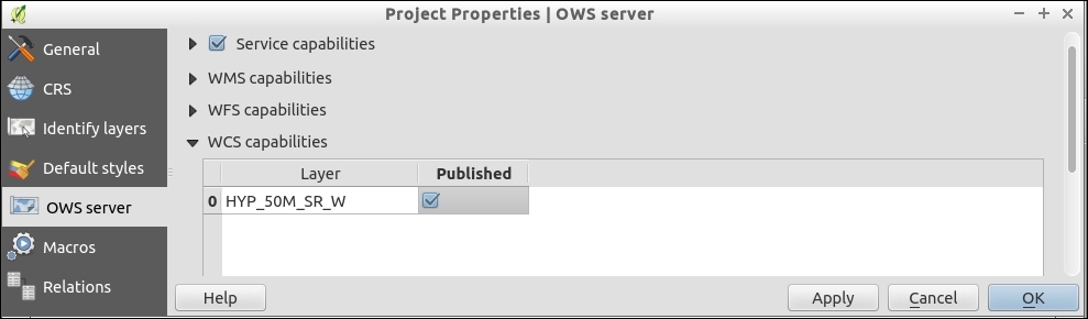
The QGIS server is a middleman that takes in web service requests and translates them into QGIS internal calls, returning the requested data or rendered images, which are delivered to the end user via the web server.
The QGIS server contains many options that allow you to control which types of service to offer, which layers to offer over each service, and how to style these services. Alternatives to the QGIS server include MapServer and GeoServer (refer to the Managing GeoServer from QGIS section in this chapter).
While they are not specifically for web services, being able to change the styling and presence of data based on the scale of the map can have a huge impact on the speed and readability of web services. Unlike printed maps, web maps are viewed at multiple scales. This variation in scales often requires different cartography to keep the map legible and usable.
You'll need a QGIS project, preferably one with a high data density or differing levels of information. A good example is road data, where you have major, minor, local, and other variants of road classification. caryStreets.shp converted from CAD in a previous chapter is a good example.
caryStreets.shp.caryStreets.shp, there are several potential columns to use, such as StreetType, Major_Road, and Main_Road.This is what your layer looks like before and after you create the first rule:
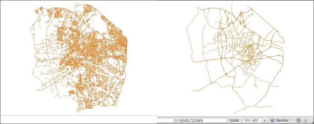
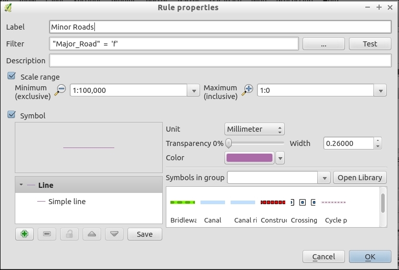
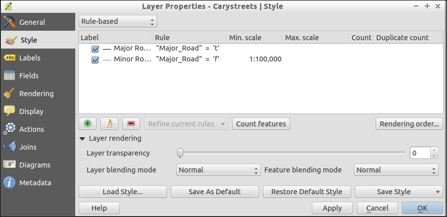
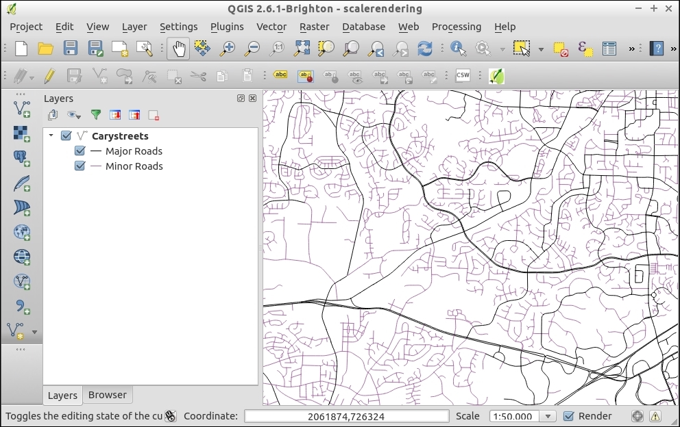
The goal with scale-dependent rendering is generally to make your map readable at many different zoom levels. By setting the Min and Max scales for each layer or subfeatures within a layer, you can declutter a map for readability. The rendering engine just checks the scale against each rule before deciding what to render.
Scale-dependent rendering can be used in several ways. This can be used to change the styling based on zoom or hide or reveal data based on the zoom level. However, it's also not limited to just changing styles or layers. You can also perform scale-dependent labeling, which is part of data-driven labeling described in the Configuring data-defined labels recipe in Chapter 10, Cartography Tips, of this book.
Scale rules also work on raster layers; however, this only allows you to turn a raster on and off. It doesn't allow you to change its appearance.
If you have a QGIS server set up from earlier in this chapter, the scaling rules should apply to your web services (WMS and WFS).
Sometimes, the best way to share a map is to build a website with a map embedded in it. There are many methods to accomplish this goal, ranging from a simple dump of a few layers to a highly-interactive map, which is based on web services. There are many web clients that will work with standard OGC services. This recipe will show you how to build a simple web map using Leaflet—a popular JavaScript library that is used to create web maps.
You will need the qgis2leaf plugin and some sample data. The schools_wake.shp (Points) and census_wake_2000.shp files make for a good example.
Styling can be really tricky. Leaflet and other web map libraries don't support 100% of the same options as QGIS. Try making a few maps, changing settings, and re-exporting these maps a few times to figure out how to get it the way that you want. It may not look good in QGIS but look good in the export.
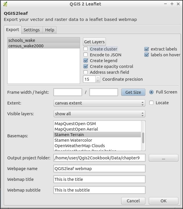
export_year_month_day_hour_minute_seconds (for example, export_2015_02_19_11_34_05). Inside this folder is index.html. Open this file with a web browser to see your map: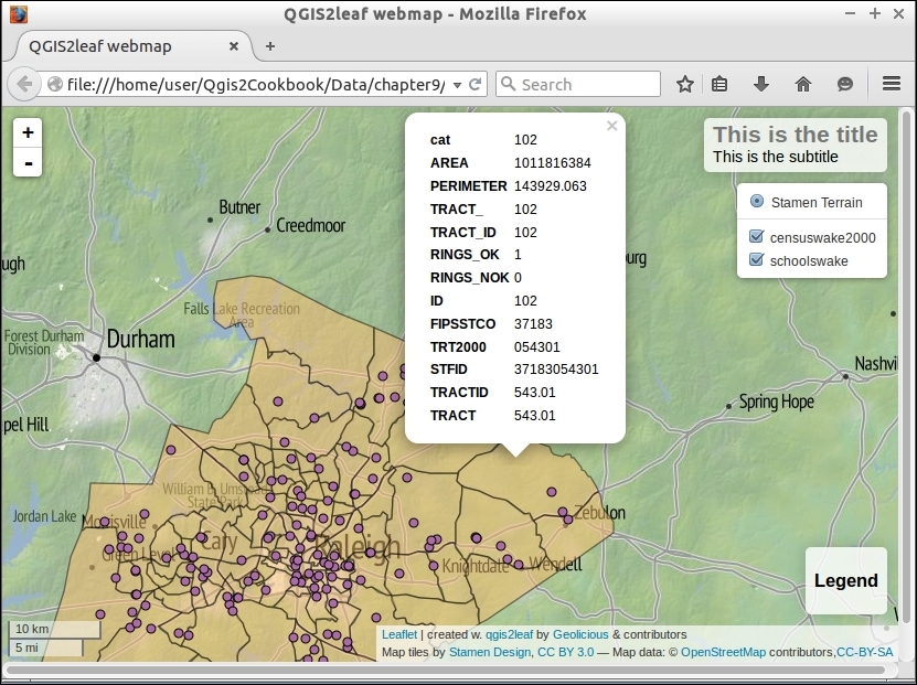
The qgis2leaf plugin converts your map into something that is compatible with the web. Generally, this means converting vector data to the GeoJSON format and generating an HTML page (web page) with some JavaScript to create and populate the map.
Raster layers are trickier, and if you can, try to stick to using Tile or WMS services to serve them. Refer to the next section to see how to use Tiles or WMS.
The next logical step is to make the map dynamic based on a web service. To do this, you can swap static files for web services:
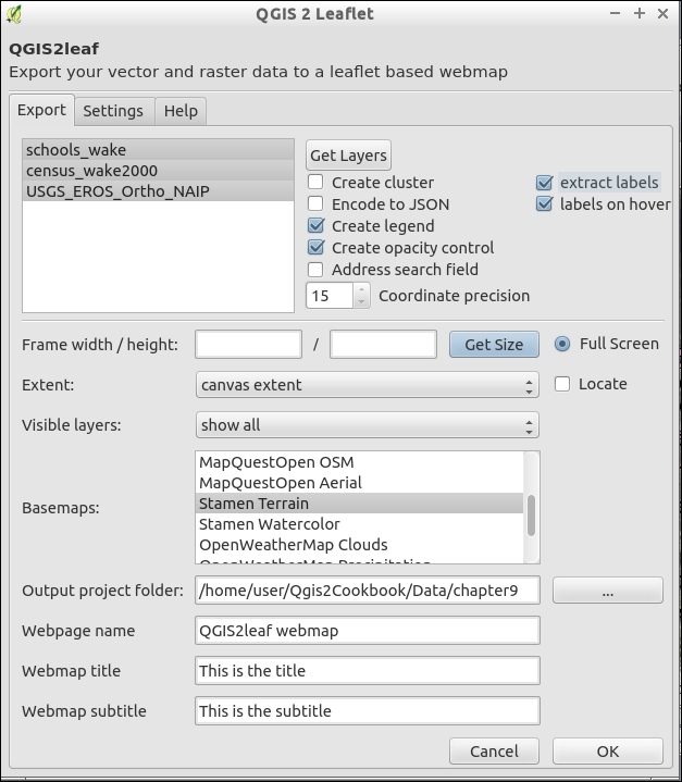
You don't have to use Tiles or WMS for raster layers but this is recommended. If you do want to use a local file, be warned there is a bug currently where some exports fail unless your raster is converted to a .jpg format image in EPSG:4326 projection.
QGIS does not only serve as a frontend for the QGIS server, but it can also serve as a frontend for other similar servers. GeoServer is one of the most popular ones, and you can configure it from QGIS, upload layers, or even edit the style of a GeoServer layer using the QGIS symbology tools.
For this recipe, you will need the GeoServer Explorer plugin. This can be installed using Plugin Manager.
You will also need a running instance of GeoServer. We will assume that you have a local one running on port 8080, but you can replace the corresponding URL with the one of the GeoServer instance that you have available, whether local or remote.
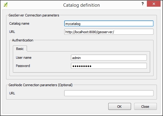
zipcodes_wake.shp layer and style it.zipcode_wake.shp layer and drop it on the catalog item in the GeoServer Explorer. The layer will be uploaded and added to the default workspace of the catalog.http://localhost:8080/geoserver/web/.The GeoServer Suite plugin communicates with GeoServer using its REST API. By linking QGIS with the GeoServer REST API, it allows you to easily configure many elements that, otherwise, should be configured manually, such as the styling of layers.
The Geoserver Explorer plugin has a lot of features to work with GeoServer. Here are some additional ideas so that you can explore them. For more information, check out the plugin help at http://boundlessgeo.github.io/qgis-geoserver-plugin/.
Once the layer is in the GeoServer catalog, you can edit its style without having to upload the layer again. Just open the Styles branch in the explorer tree under the corresponding catalog and double-click on the style to edit, or select the Edit... item in the context menu that is shown when right-clicking on the element:
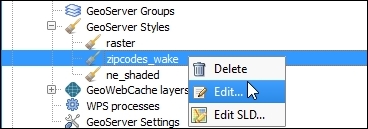
The QGIS symbology dialog will be opened, and you can edit the style in there. Once you close the dialog, the style will be uploaded and updated in the catalog.
Don't have a Geoserver instance, it's pretty easy to setup for testing. See http://geoserver.org/ for details.
In this chapter, we will cover the following recipes:
Cartography has changed quite a bit in the past decade as more people transition to purely electronic map products on a device or on the Web. While some types of visualizations are better suited to different media, many of the underlying tools and techniques can actually be applied across the board. This chapter covers a variety of tools that enable you, the QGIS user, to maximize the readability and beauty of your maps.
In the past, if you wanted to apply a wildly different style to more than one type of data in the same source, the only way to do this was to duplicate or subset a layer. With Rule Based Rendering, you now just have to create rules that are applied on-the-fly. This opens a huge door on cartographic possibilities with different features in the same layer not only having different colors but also different fill types, transparency, line type, and all manner of other customizations. Extending from categorized symbology, rules also allow for mixing and inheritance, allowing for intermediate categories or some shared properties and reducing the amount of work to create elegant symbology.
Rule Based Rendering is built-in to vector symbology. So, you'll need a good complicated vector layer to fully utilize its potential. A road layer is often a good use case, but for this example we'll go slightly simpler with busroutesall.shp.
busroutesall.shp layer.$length < 2000 (Do you want to see all the options? Then, open the filter tool with the … button). Name your rule and click on OK. Back in the main Style dialog, apply the rule to see the results in Canvas. Make sure to use the Test button to verify that your rule works: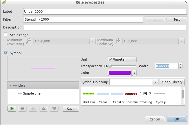
$length > 2000 (don't forget to test this).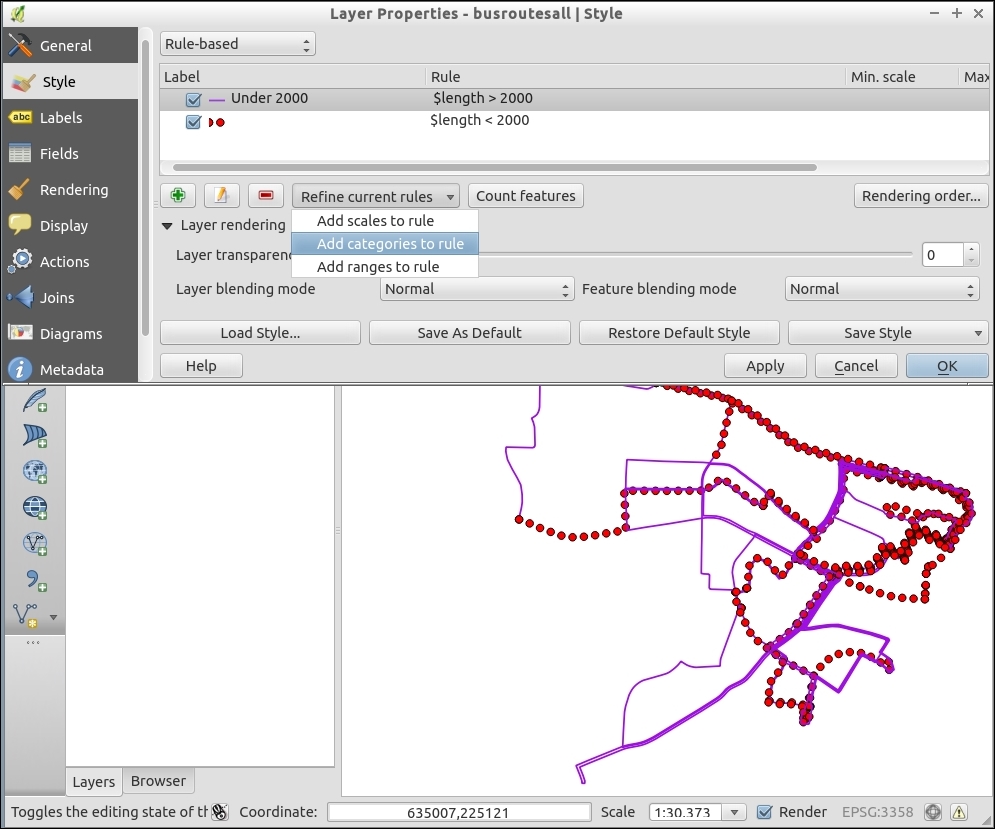
ROUTE name that contains a. The rule will look like: "Route" LIKE '%a'.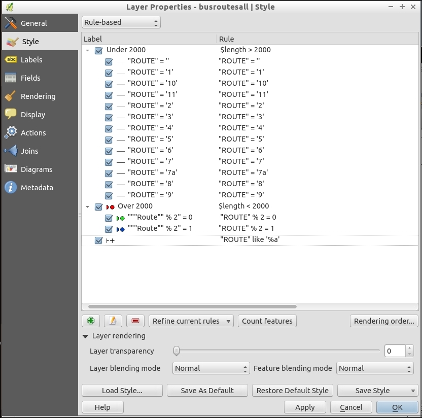
"ROUTE" % 2 = 0 is even-numbered).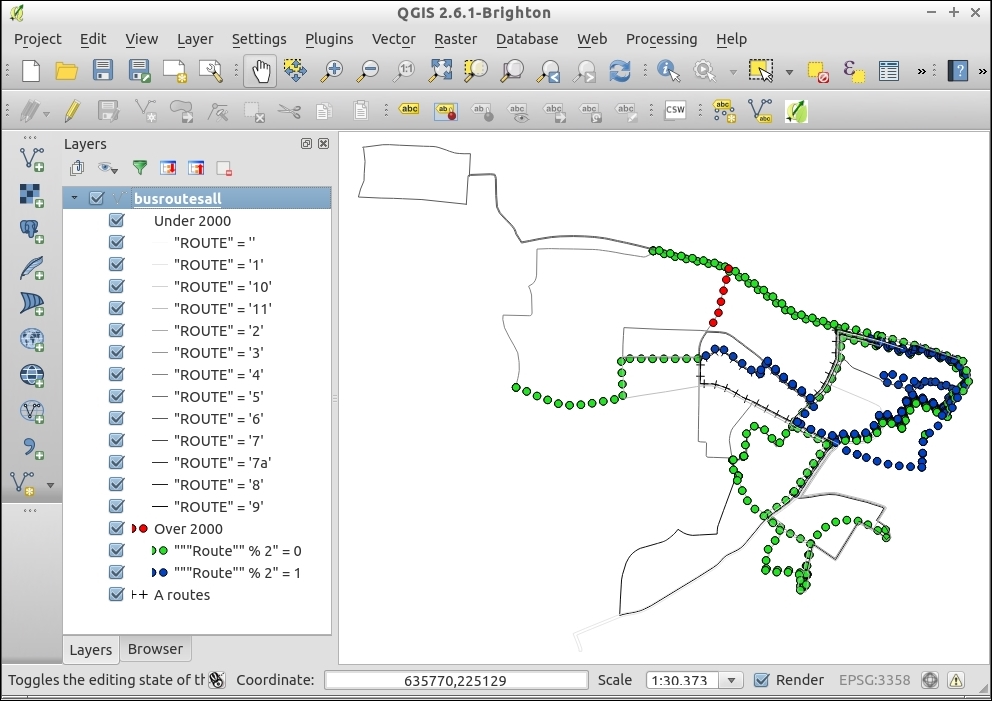
Each rule is processed in the rendering order specified from top to bottom, the last rule being drawn last and, therefore, on top. The rules are added to any existing style that is already applied to feature. You can change the rendering order by changing the rule order or by applying a render order. The filters work just like attribute filters in the field calculator or the table search. All of the symbology options are available to vectors and can be applied to one or many rules. You can group rules by scale-rendering rules too.
There are way too many possible ways to use Rule Based Rendering than can be described here. You can create rendering groups that inherit rules from their parent and apply their own. Each feature given a unique ID could have a completely different look. The big improvement over using traditional single symbol, categorized, or graduated symbology is that you don't have to edit every possible group, and you can more easily stack rules, mixing and matching all the original methods.
There are some catches. Not everything you do with Rule Based Rendering is possible with web services; so, before you go too crazy, consider your output format and test your ideas before spending too much time on this.
Transparency is a lack of pigment or color, such that you can see through one feature to the feature beneath. You can think of this as being similar to tinted or stained glass; some light is allowed to pass through and reflect off what's inside. When used right, transparency can help emphasize or de-emphasize features in a map composition. It can also be used to blend two layers to look as if they are one layer.
This recipe demonstrates transparency for both vectors and rasters, so we'll need an example of each. The lakes.shp and elevlid_D782_6.tif layers will work well for demonstration purposes. Load both of these layers in a fresh project, putting lake.shp on top.
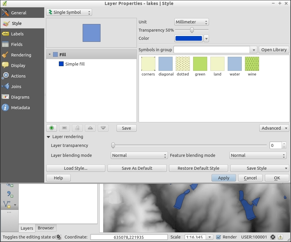
elevlid is on top.elevid and the Transparency tab.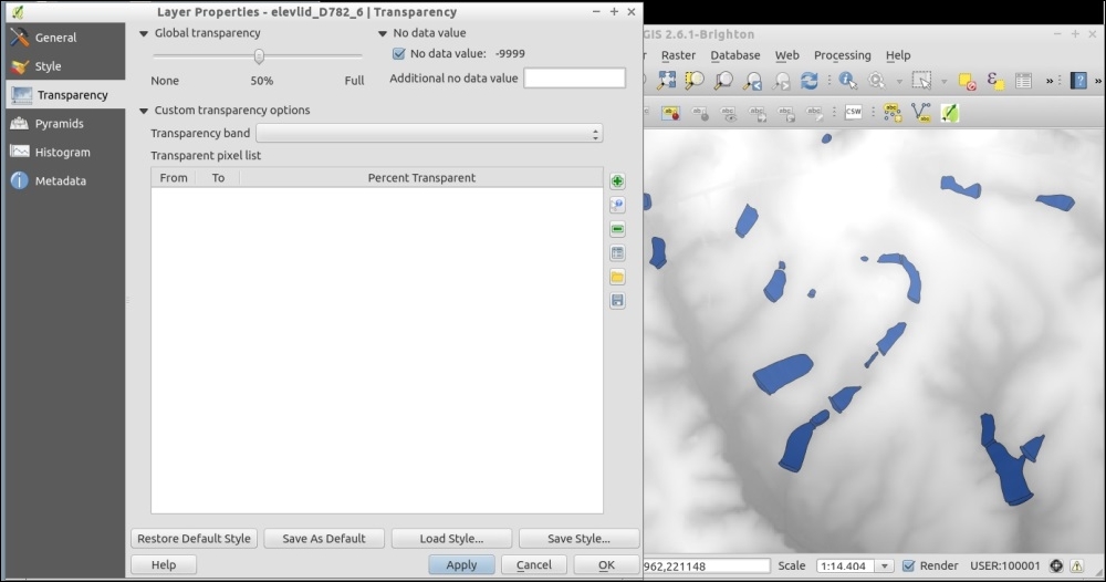
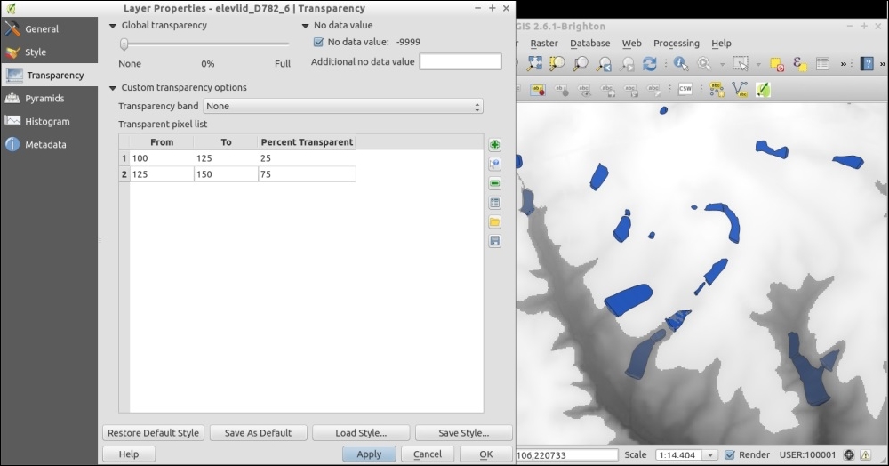
This is really a computer graphics thing, but the simplest explanation is that you're telling the computer to combine a percentage of two different layers in the same location instead of the top layer's value covering. Based on the math of the original colors and their transparency, a blended color is calculated for each pixel on the screen.
This doesn't begin to explain all the possible variations of appearance that can be achieved by mixing multiple layers and multiple transparencies, only tinkering can show you this.
One classic example of transparencies is to mix hillshades and airphotos. You can place either layer on top and then adjust the transparency to let the other show through. Generally, you would place the hillshade underneath in this case (but either can work). The end result is a landscape that appears to have 3D relief, but it looks like an airphoto.
Another classic example is to create a mask layer with a hole cut out around the region that you want to emphasize. You now place the mask layer on top. Before adding transparency, it blocks everything but the hole. Then, you slowly add transparency so that you can see surrounding regions, but they are muted and stand out less. For this technique, try a black, gray, or white fill for the mask layer. Each will have a slightly different look.
When styling vectors, you can apply different transparencies to different features in the same layer if you use Rule Based Rendering. Each rule can have a different transparency value and the entire layer can have yet another transparency modifier in the Layer Rendering section.
Lastly, keep in mind that not all output formats handle transparency well. In particular, be careful using color gradients with transparencies when exporting to PDF. Generally, PNG handles transparency, SVG may work or at least allow to you to edit the transparency after export, unlike image formats.
In this recipe, we will look at the different layer and feature blending modes. Using these tools, we can achieve special rendering effects, which you may already know from other graphics programs.
To follow this recipe, you just need to load stamen.png and effect.png from our sample data. Make sure that stamen (left-hand side in the following screenshot) is the lower layer and effect (right-hand side in the following screenshot) is the upper layer. To test the feature blending modes, load blending.shp:
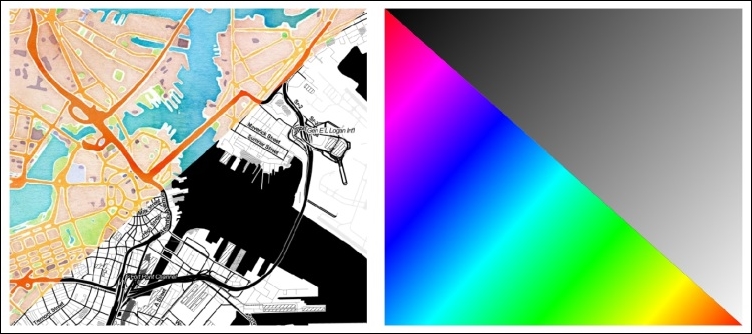
(Background maps "Watercolor" and "Toner" by Stamen Design, under CC BY 3.0. Data by OpenStreetMap, under CC BY SA).
Using the two raster layers, we can try the different blending modes. Of course, this works for vector layers, as well:
effects layer to open Layer Properties.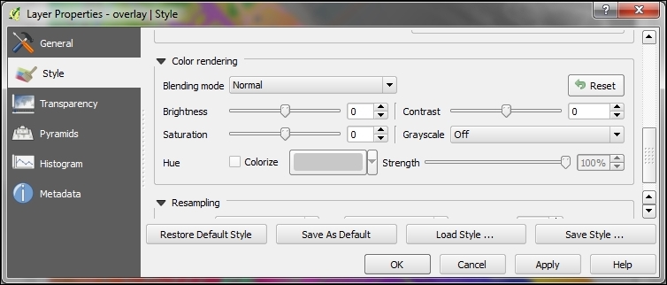
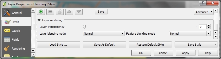
The main difference is that, for vector layers, we can control how features are blended together, and how the result is then blended to the underlying layers using the Feature blending and Layer blending modes, respectively. The feature blending mode is applied on a per-feature-basis.
The following screenshot shows the differences between feature and layer blending:
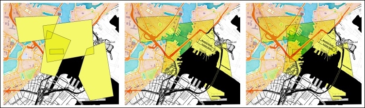
Feature and/or layer blending in action (from left to right): feature blending only, layer blending only, feature and layer blending combined (background maps "Watercolor" and "Toner" by Stamen Design, under CC BY 3.0. Data by OpenStreetMap, under CC BY SA).
The following is an explanation of the preceding screenshots:
Based on the selected blending mode, the pixel colors (in the RGB mode) of the lower and upper layers are mixed as described next. For illustration and quick reference, the following figure shows the results of all 12 blending modes (from left to right and top to bottom), except for the Normal setting, which does not mix the colors but only uses the alpha channel of the upper layer to blend with the layer below it:
Overview of the 12 blending modes (background maps "Watercolor" and "Toner" by Stamen Design, under CC BY 3.0. Data by OpenStreetMap, under CC BY SA): first row: Lighten, Screen, and Dodge; second row: Addition, Darken, and Multiply; third row: Burn, Overlay, and Soft light; fourth row: Hard light, Difference, and Subtract.
What's better than making an awesome style for your feature layers? Being able to easily share and reuse them. Both vector and raster styles can be saved and reused—however, in slightly different ways.
For this recipe, you need two similar vector layers and a set of two similar raster layers. In the example data that is provided, use two of the bus route shapefiles and two of the elevation rasters (for example, elevlid_D782_6.tif).
First we'll start by copying and pasting styles for vector layers:
Try to copy and paste the style of one bus route to the second bus route using the right-click menus:
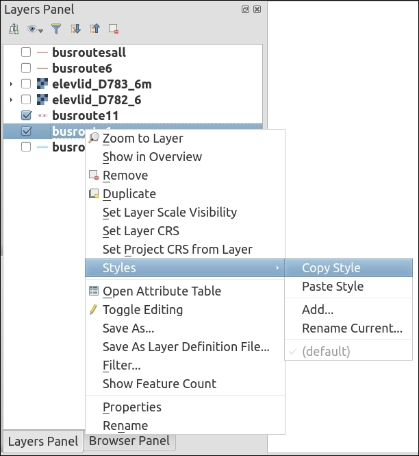
.qml) or SLD File.... Both formats are XML text files, QGIS Layer Style... is recommended for maximum compatibility: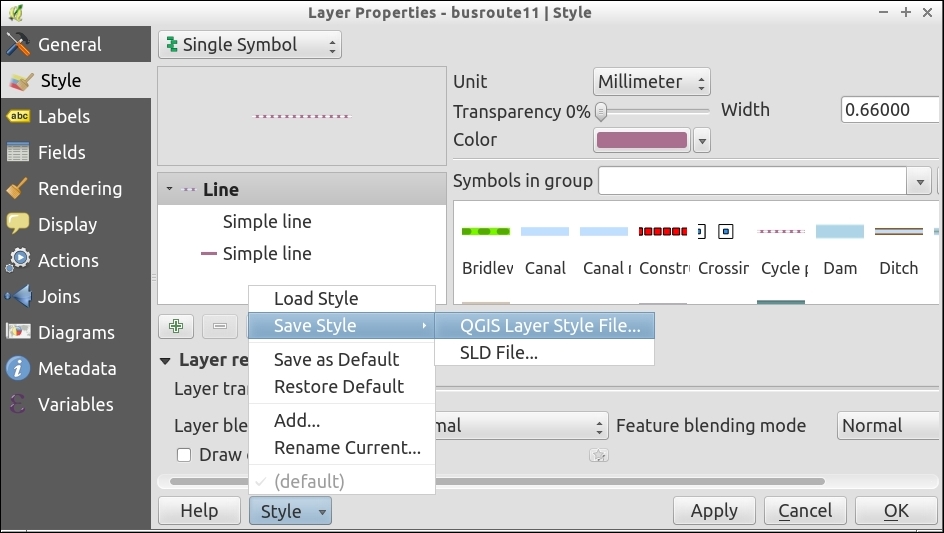
Rasters are slightly trickier in that you can save a symbology file, but you can also save a color table. The color table is a text file that lists raster value ranges and associated color codes. It's a much simpler format to hand-edit than XML (QGIS Layer Style File), but does not retain things like transparency or classification settings:
.txt file with the disk button (above the color table on the right end of the button row; refer to the screenshot).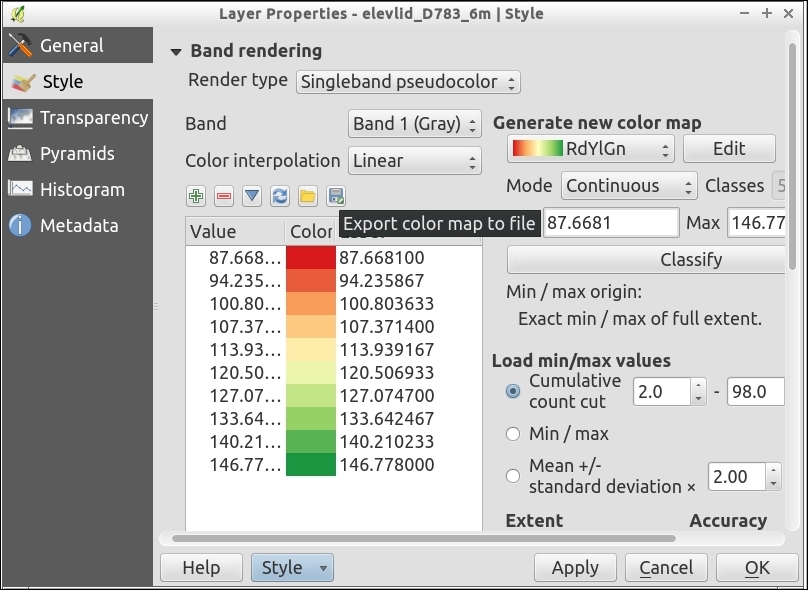
Normally the style information for a layer is saved in the .qgs (if you save your project) project file. The various export methods just package up the style information for a layer into a separate file in a generic manner (not associated with the original data). This lets you apply similar styles to similar data sources.
Vector symbology is stored in a special XML file that ends in the .qml extension. You can read or edit the file if you want, and it can be produced via scripts or copied and pasted to create mashups of multiple styles.
Raster symbology can also be stored in a .qml file. However, there's an additional option to export the classification ranges and colors to a simple text file, one value or range of values and one color code per line.
If there was a list of top features of QGIS, data-defined labels would be high on that list. They offer the ease of automatic labeling with the customization of freehand labeling. You can mix and match automatic and custom edits, storing the values in a table for later reference.
There are a couple of useful plugins for data-defined labeling which will add the extra attribute fields that you need to either an existing layer or make a new layer just for labels. Download and install Layer to labeled layer and Create labeled layer.
census_wake2000.shp.census_wake2000_label.shp. (You don't always have to do this but this process does modify the table, so it's a good idea to make a backup.)census_wake2000_label.shp in the layer list.STFID.
NULL:
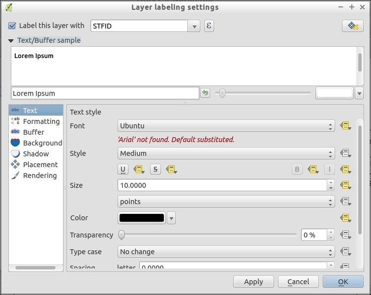

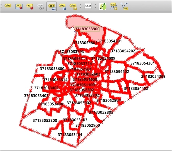
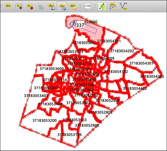
You can also use the Change Label button to edit the other properties of a specific label that you select. This is really nice when you just need some fine-tuning.
The basic premise is that you keep an extra set of attributes in a table often as additional fields to your existing table.
These fields if you set them are used in determining the location, size, font, color, angle, and so on, of the label for the given row. If you don't set them, then the automatic settings from the labeling engine are kept.
Data-defined labels are powerful in that you can combine automated, calculated, and custom-edited values. They are automated from the built-in labeling engine and calculated using the field calculator to populate the data-defined fields (for example, with if statements or calculations that are based on other attributes). Lastly, by just making these little hand tweaks, you can fix a few not-quite labels that misbehave.
Note that you don't have to use data-defined labeling on an existing layer. You can create just a label layer with the Create labeled layer plugin. In other software, user-defined labeling is often called Annotation layers. QGIS also has annotation layers. These are layers where you click to add a label to the map and then write and style it however you want. The biggest problem is that these layers are not associated with the data that they label. You can't easily give them to someone else, and if a label name or style changes, you have to chase down and hand-edit every fix. In QGIS, data-defined labeling solves almost all the shortcomings of annotation layers because it actually saves to a shapefile with all its properties as fields.
This recipe is all about making your map unique by creating custom icons, north arrows, or even fill patterns.
You will need a vector illustration program (for example, Inkscape or Adobe Illustrator).
Don't have one? There are several free and open source options available on all platforms. Many people in the QGIS community use Inkscape (http://inkscape.org), but you can also use LibreOffice Draw or OpenOffice Draw. The most common proprietary software equivalent is Adobe Illustrator.
You will also need a text editor, such as TextEdit (Mac), Notepad, Notepad++ (Windows).
.svg file..svg file in a text editor, search and find the style line of your object, and replace it with the following lines:stroke-width="param(outline-width) 1" stroke="param(outline) #000" fill="param(fill) #FFF"
The before-after scenario when this code has been incorporated is shown in the following table:
|
Before |
After |
|---|---|
<rect
  style="color:#000000;display:inline;overflow:visible;visibility:visible;opacity:1;fill:"param(fill) #000000";fill-opacity:1;stroke:"param(outline) #ff0000";stroke-width:"param(outline-width) 4";stroke-miterlimit:4;stroke-dasharray:none;stroke-opacity:1;marker:none;enable-background:accumulate"
    id="rect3336"
    width="301.61023"
    height="308.96658"
    x="30.651445"
y="725.00476" /> |
<rect
  stroke-width="param(outline-width) 1" stroke="param(outline) #000"fill="param(fill) #FFF"
    id="rect3336"
    width="301.61023"
    height="308.96658"
    x="30.651445"
y="725.00476" /> |
.svg file that you previously created.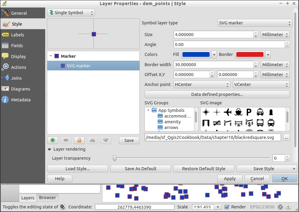
The special text that you add to the .svg file is a marker or placeholder. QGIS looks for these particular words and then utilizes them to insert symbol changes on-the-fly as the SVG is read into the program.
While this recipe demonstrated a very simple SVG, this method applies to more complicated symbols.
Also note that in Settings | Options | System, you can set paths to folders of SVGs so that all of them will be available in the symbology dialogs all the time.
QGIS also lets you customize fill patterns using SVG symbols. The QGIS Training Manual has a good example of this at http://docs.qgis.org/2.8/en/docs/training_manual/basic_map/symbology.html#hard-fa-creating-a-custom-svg-fill.
A graticule is a set of reference lines on a map that help orient a map reader. They are often set at, and labeled, with the coordinates. The tricky part about using graticules, however, is projections. If you don't make them correctly, instead of smooth curves between the line intersections, you get awkward unusual shapes (mostly straight lines). The default QGIS graticule creator is not projection-friendly, so in this recipe, you'll see an add-on processing algorithm that does this. This recipe is about ensuring you get nice, smooth, and properly-labeled graticules.
You don't really need much for this recipe other than a bounding box and a coordinate interval that you want to space the lines at. Usually, these will be in Latitude, Longitude WGS 84 (EPSG:4326), and decimal degrees, respectively, since the whole point of a graticule is to add reference lines that help orient a user.
You will see something like the following screenshot:
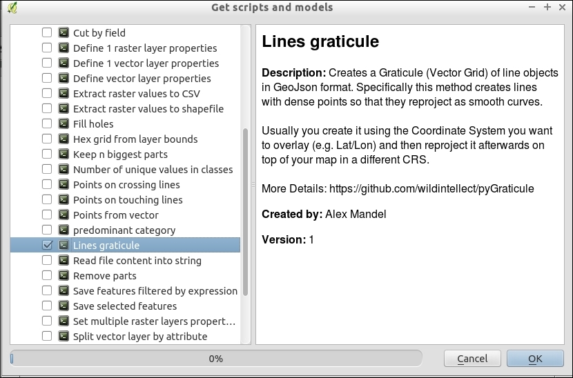
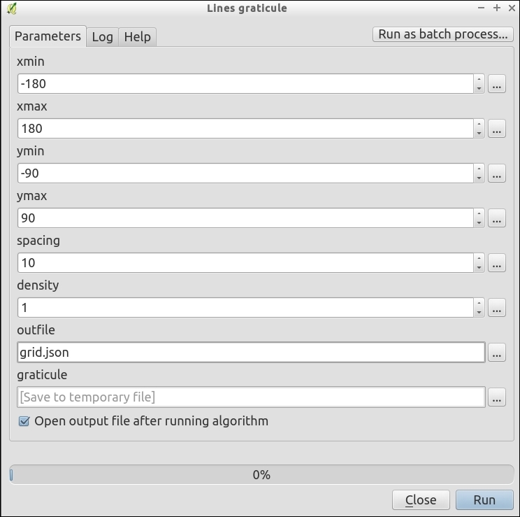
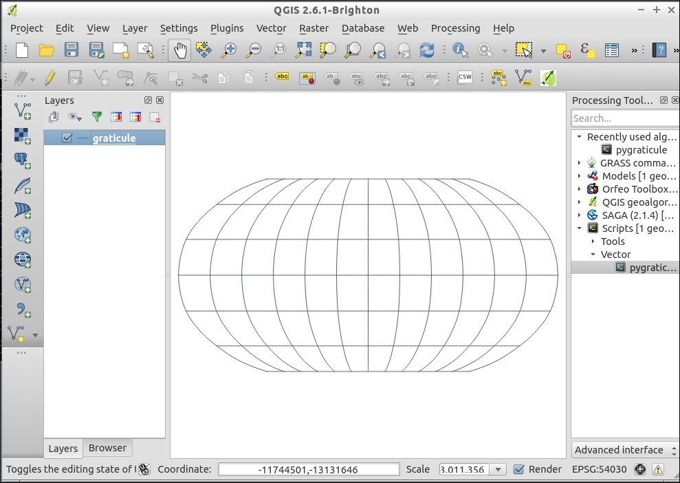
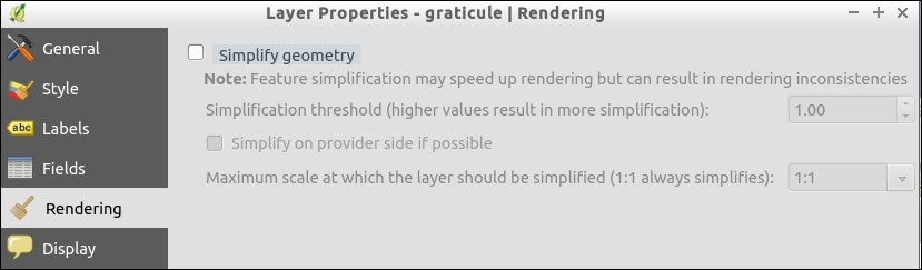
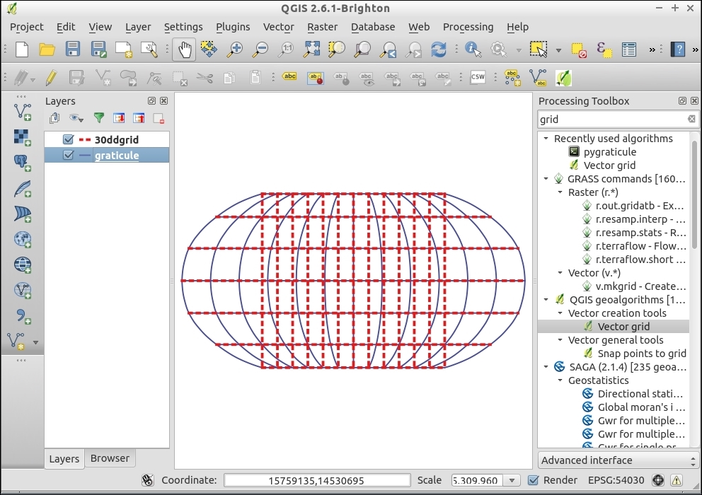
Graticules are basically line layers (though sometimes they are also polygons). If you draw a grid with nodes only at the points where two lines intersect, you can easily see how distorting the grid will lead to blocky shapes. The key to smooth graticules is adding additional line nodes in between the intersections (that is, increase the node density).
It's important to note that, when using projections that don't cover the whole world (for example, polar or stereographic projections), pick bounding box values that fall within the projection limits; otherwise, you may get errors when trying to reproject.
The primary advantages of graticules in the main map canvas are that you can use them as references while working in QGIS, include them in web and digital maps, and have full control of the labels and symbology. The method used here differs from other graticule (grid) tools in QGIS because it focuses on putting Latitude/Longitude lines with smooth curves as references into any projection. Other grid tools focus more on making regular squares across a map to subdivide a region.
The main advantages of the print composer method (next recipe) are its ability to make multiple coordinate systems easily and to add tick marks around the outside edge of a map. Tick marks are what you commonly see on navigation-oriented maps, such as USGS Topo quads, and other printed maps.
Lines graticule (aka Pygraticule) can also be used as a pure Python script; for updates and more information, refer to https://github.com/wildintellect/pyGraticule.
To learn how to write your own processing toolbox algorithms, refer to the Writing processing algorithms recipe in Chapter 11, Extending QGIS.
A graticule is a set of reference lines on a map that help orient a map reader. They are often set at and labeled with the coordinates. For traditional printed maps that are intended for navigation and surveying tasks where you want to mark the geographic coordinates, sometimes in multiple coordinate systems. This recipe is about adding such reference lines to a Print Composer map.
You will need a map, typically of a small area (several miles or km across). For this recipe, elevlid_D782_6.tif works well.
elevlid_D782_6.tif.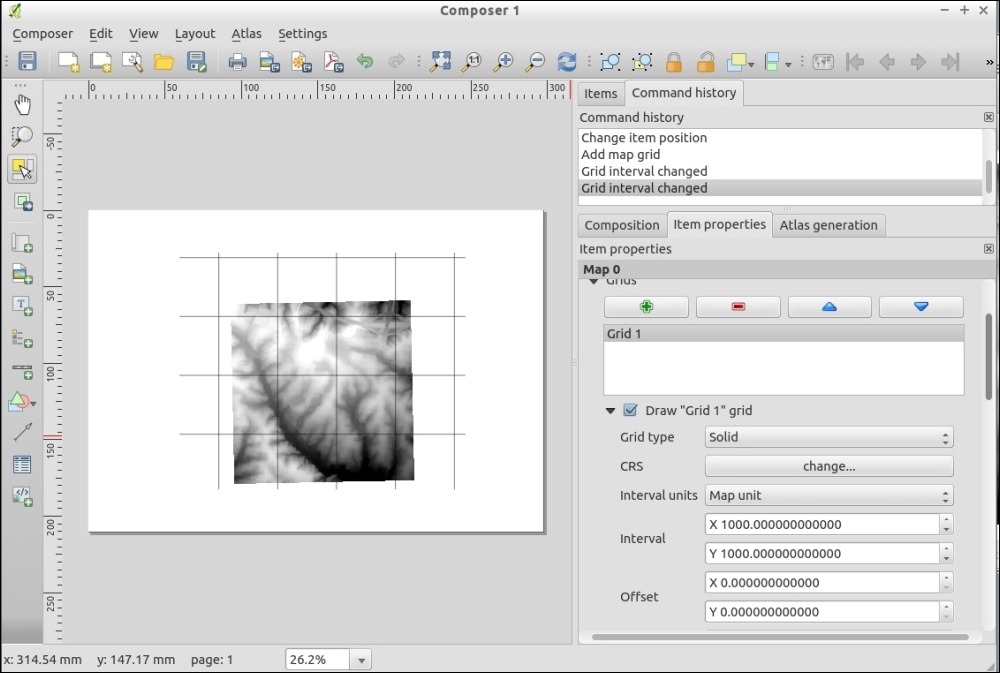
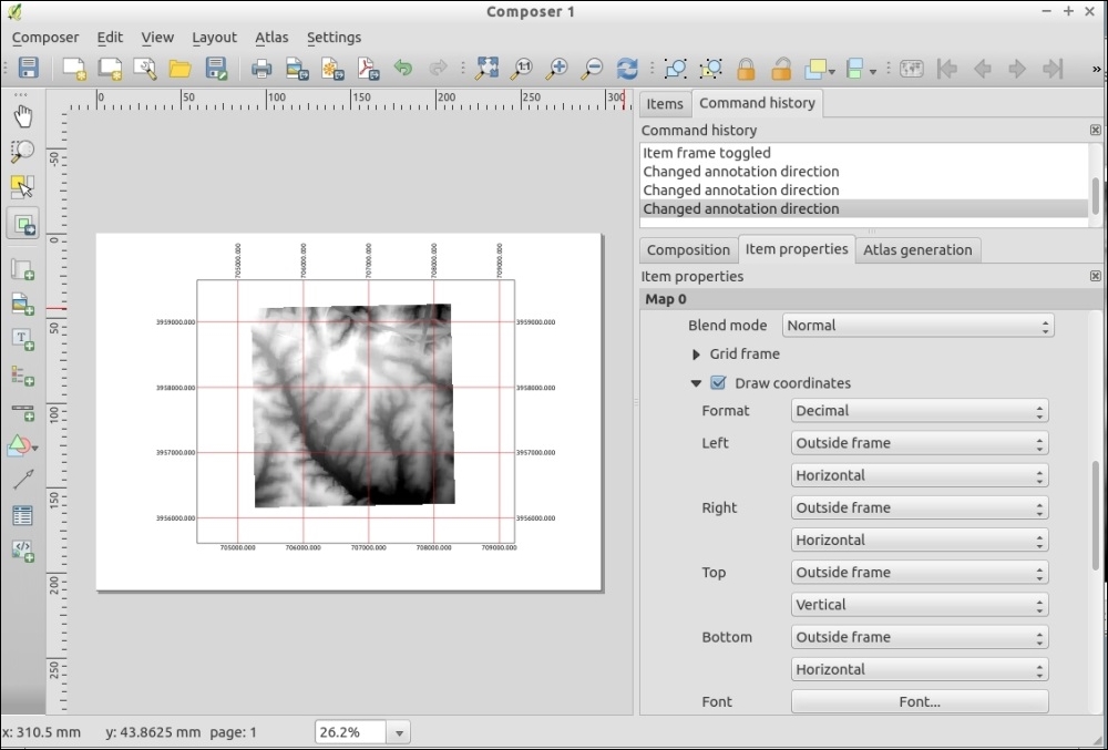
Reference graticules are evenly spaced lines with marked coordinates. Based on your settings the composer calculates the positioning of the lines from the map data coordinates. The key to making useful graticules in the print composer is to select intervals that are often enough to provide reference but not so often that they cover a large portion of the map. It's also important to pick intervals that have nice rounded numbers, so that it's easy to calculate the value half way between two lines.
There are two ways to make grids/graticules in QGIS: the print composer for printed maps or as a layer in QGIS for printed web maps as an internal usage.
The main advantages of the print composer method are the ability to do multiple coordinate systems easily and to add tick marks around the outside edge of a map. Tick marks are what you commonly see on navigation oriented maps, such as USGS Topo quads.
The primary advantages of graticules in the main map canvas are that you can use them as references while working with QGIS and have full control of the labels and symbology. Refer to the Making pretty graticules in any projection recipe in this chapter for how to make graticules in the main map interface.
In this recipe, we will use the Print Composer Atlas functionality to automatically create a PDF map book with a series of maps.
To follow this recipe, load zipcodes_wake.shp and geology.shp from our sample data. In the following screenshots, the zipcodes_wake layer was styled with a simple white border, while the geology layer is styled with random colors.
The Print Composer Atlas feature will create one map for each feature in the so-called Coverage layer. In this recipe, the zipcodes layer will serve as a Coverage layer, and we will create one map for each zipcode feature:
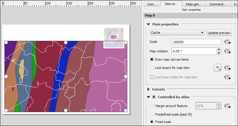
NAME value which will be automatically updated by Atlas for each map in the series. To achieve this, we insert the following expression in the input field of the label item's Main properties:[%attribute( @atlas_feature, 'NAME' ) %]
zipcodes_wake layer, as shown in the following screenshot.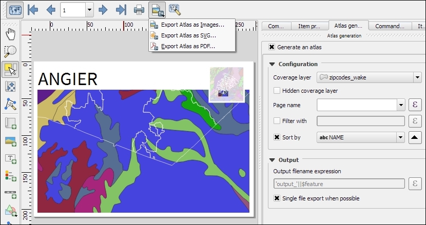
The Atlas feature provides access to a series of variables related to the current feature. We already used this to display the NAME value of the current feature in the title label using the [%attribute( @atlas_feature, 'NAME' ) %] expression. Besides @atlas_feature, you have access to the following variables:
@atlas_feature: This is the feature ID of the current Atlas feature. This makes it possible to use this information in rules to, for example, hide or highlight features based on their ID.@atlas_geometry: This is the geometry of the current Atlas feature and can be used in rules to, for example, only show features of other layers if their geometry intersects the Atlas feature geometry.@atlas_featurenumber: This is the number of the current Atlas feature.@atlas_totalfeatures: This is the total number of features in the Atlas coverage layer.Overview maps are a great way to provide context to more detailed main maps. To add an overview map (as shown in the upper-right corner of the composition in the following screenshot), you need to add a second map item to the composition. To turn this map item into an overview map, go to Item properties | Overviews and click on the button with the green plus sign. This will add an Overview 1 entry and enable the Draw "Overview 1" overview configuration GUI:
Map 0, Map 1, Map 2, and so on, depending on the order they were added to the composition. Therefore, we will select the Map 0 entry if the main map was the first item that was added to the composition.In this chapter, we will cover the following topics:
QGIS can do many things on its own. However, as with all software, there are limits to its default abilities. The great news is there are many ways to extend QGIS to do even more through built-in customization options, existing add-on plugins, creating new analysis algorithms, creating your own plugins, and using external software that compliments QGIS. This chapter covers just a few of the common customizations and plugins that haven't been mentioned in other chapters, and how you can get started with making your own add-ons to share with others.
Map projections stump just about everybody at some point in their GIS career, if not more often. If you're lucky, you just stick to the common ones that are known by everyone and your life is simple. Sometimes though, for a particular location or a custom map, you just need something a little different that isn't in the already vast QGIS projections database. (Often, these are also referred to as Coordinate Reference System (CRS) or Spatial Reference System (SRS).)
I'm not going to cover what the difference is between a Projection, Projected Coordinate System, and a Coordinate system. From a practical perspective in QGIS, you can pick the one that matches your data or your intended output. There's lots of little caveats that come with this, but a book or class is a much better place to get a handle on it.
For this recipe, we'll be using a custom graticule, a grid of lines every 10 degrees (10d_graticule.json.geojson), and the Natural Earth 1:10 million coastline (ne_10m_coastline.shp).
Stereographic, this is a good start.proj4 string and copy the information. NAD83(CSRS) / Prince Edward Isl. Stereographic (NAD83) is a similar enough projection.If you don't find anything in the QGIS projection database, search the Web for a proj4 string for the projection that you want to use. Sometimes, you'll find Projection WKT. With a little work, you can figure out which proj4 slot each of the WKT parameters corresponds to using the documentation at https://github.com/OSGeo/proj.4/wiki/GenParms. A good place to research projections is provided at the end of this recipe.
lat_0 and lon_0 parameters to match the following example. This particular type of projection only takes one reference point. For projections with multiple standard parallels and meridians, you will see the number after the underscore increment:+proj=sterea +lat_0=53.5 +lon_0=-7.8 +k=0.999912 +x_0=400000 +y_0=800000 +ellps=GRS80 +towgs84=0,0,0,0,0,0,0 +units=m +no_defs
The following screenshot shows what the screen will look like:
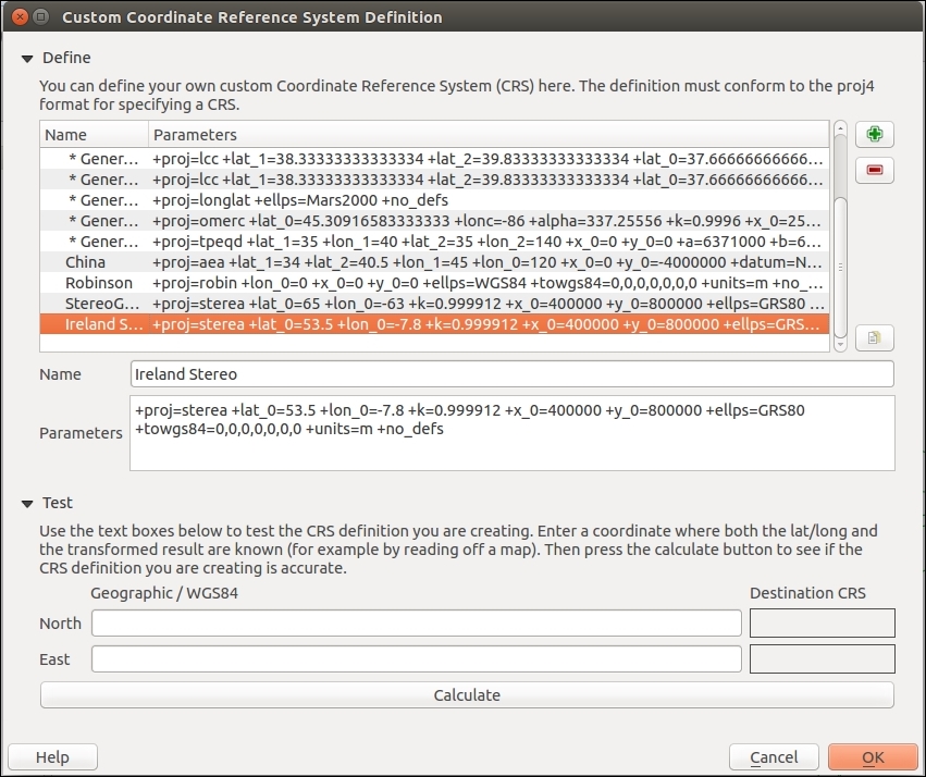
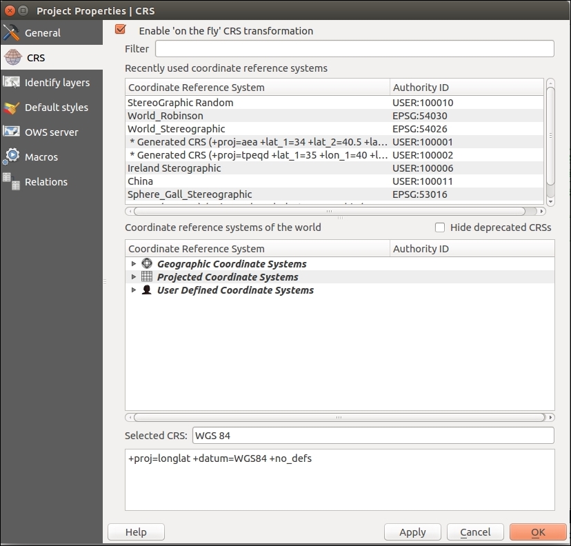
The following screenshot shows the projection:
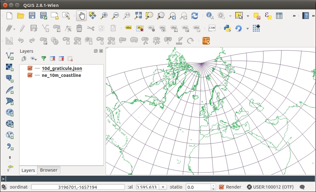
Projection information (in this case, a proj4 string) encodes the parameters that are needed by the computer to pick the correct math formula (projection type) and variables (various parameters, such as parallels and the center line) to convert the data into the desired flat map from whatever it currently is. This library of information includes approximations for the shape of the earth and differing manners to squash this into a flat visual.
You can really alter most of the parameters to change your map appearance, but generally, stick to known definitions so that your map matches other maps that are made the same way.
QGIS only allows forward/backward transformation projections. Cartographic forward-only projections (for example, Natural Earth, Winkel Tripel (III), and Van der Grinten) aren't in the projection list currently; this is because these reprojections are not a pure math formula, but an approximate mapping from one to the other, and the inverse doesn't always exist. You can get around this by reprojecting your data with the ogr2ogr and gdal_transform command line to the desired projection, and then loading it into QGIS with Projection-on-the-fly disabled. While the proj4 strings exist for these projections, QGIS will reject them if you try to enter them.
Geometries that cross the outer edge of projections don't always cut off nicely. You will often see this as an unexpected polygon band across your map. The easiest thing to do in this case is to remove data that is outside your intended mapping region. You can use a clip function or simply select what you want to keep and Save Selection As a new layer.
There are other common projection description formats (prj, WKT, and proj4) out there. Luckily, several websites help you translate. There are a couple of good websites to look up the existing Proj4 style projection information available at http://spatialreference.org and http://epsg.io.
If you read the previous recipe about custom projections, you might have noticed the note about data that crosses the edge of projections and how it doesn't usually render properly. When working on data near -180 or 180 degrees longitude, you are going to have this issue. Maps showing far Eastern Russia, Fiji, New Zealand, and the South Pacific, to name a few places, will often contend with this issue.
The required solution really depends on what you're trying to do. If you just need a map of such areas, pick a locally suitable projection. If you have existing data from other sources, it may be cut along the edge and you might need to stitch it back together. As for worldwide maps, sometimes you have to trim .01 degrees of the edge of your data so that it doesn't display oddly.
To follow this recipe, you will need the honolulu-flights.shp layer and the SpatiaLite database new-zealand.sqlite from the sample data.
Load the honolulu-flights.shp layer in QGIS. This layer represents great circles flight lines from the Honolulu airport. As you can see, it is displayed in a very strange manner, as some flight lines cross the dateline meridian:
To display this layer correctly, we can select a suitable projection for your map. To do this, perform the following steps:
Another option is to clip data to the dateline meridian. This can be done with the ogr2ogr tool from the GDAL toolset. To do this, perform the following steps:
honolulu-flights.shp is located, for example, the following directory:
cd c:\data
ogr2ogr -wrapdateline honolulu-flights-wrapped.shp honolulu-flights.shp
honolulu-flights-wrapped.shp layer into QGIS, you will now see that flights wrapped on the dateline meridian are displayed correctly:
nz-coastlines-and-islands layer from the new-zealand.sqlite database. You should see two sets of polygons far from each other. This is New Zealand and Chatham islands, which should be located nearby:
To display them correctly, we can use the ST_Shift_Longitude function available in the SpatiaLite. To do this, perform the following steps:
new-zealand database.
UPDATE "nz-coastlines-and-islands" SET Geometry=ST_Shift_Longitude(Geometry)
nz-coastlines-and-islands layer from QGIS and add it again. Now, New Zealand and Chatham islands will be displayed correctly, as follows:
It is worth mentioning that the ST_Shift_Longitude function is also available in PostGIS.
When we enable 'on the fly' CRS transformation, every geometry is reprojected to the given CRS (in our case Pacific centered) so that coordinates now have the same sign.
The ogr2ogr tool with the -wrapdateline option splits all geometries that cross the dateline and write them to the output file. Geometries that do not cross the dateline are copied without changes.
The ST_Shift_Longitude function translates negative longitudes by 360 and as a result, all the data will be in the range of 0-360 degrees and displayed correctly.
The Internet is an awesome resource, but sometimes you just don't have access to it. For field work, in places with intermittent services, on an airplane, or even in a meeting room, you just might not be able to access all the stuff that you need. By stuff, we're referring to documentation (user and developer), but more importantly database layers (for example, PostGIS) and web service-based layers (for example, WMS, WFS, the OpenLayers plugin, and so on).
This recipe is about caching local copies of the files that you need on your computer before you leave for an unconnected place.
For this recipe, you will need to open a PostGIS database or WFS and enable the Offline Editing plugin that ships with QGIS.
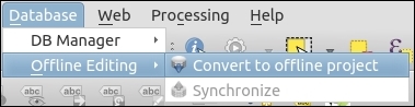
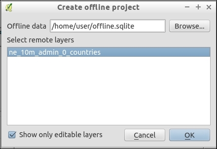
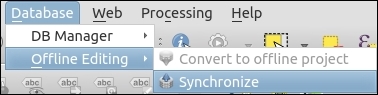
The basics are straightforward, a copy of you data is saved into a SpatiaLite database locally on your computer. The project file records the change, and you are good to go as SpatiaLite can do anything any other vector data source in QGIS can do.
Be careful when working in a multiuser environment, this does not handle dealing with editing conflicts if multiple users have been modifying the same dataset independently.
Also, there are all sorts of ways to create offline caches of Raster datasets (network files or web services) including gdalwmscaching or mbtiles. If you plan to need to work away from the Internet for periods of time, plan ahead, and test solutions before actually needing to go offline. No amount of plugins makes up for good planning.
Please remember to check the legality of caching web services (for example, Google and Bing) before doing so. OpenStreetMap is a reliable source of tiles for offline usage without restrictions.
Sometimes, you may not need to load a whole layer into QGIS, but only some subset of it, or perform some calculations on the fly. In such situations, the ability to run complex SQL queries and display their results in QGIS will be very useful.
This recipe shows you how to execute SQL code with the QspatiaLite plugin and load data in QGIS.
To follow this recipe, you need to create connection to the cookbook.db database created in the Loading vector layers into SpatiaLite recipe in Chapter 1, Data Input and Output. Alternatively, you can use your own SpatiaLite database, but be aware that you might have to alter some of the following SQL statements to match your tables.
Additionally, install the QspatiaLite plugin from Plugin Manager.
Make sure that you created a connection to cookbook.db. Start the QspatiaLite plugin by navigating to Database | SpatiaLite | QspatiaLite:
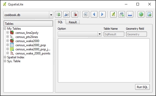
To execute the SQL query, perform the following steps:
SELECT "census_wake2000".'pk' AS id, "census_wake2000".'geom' AS Geometry, "census_wake2000".'area', "census_wake2000".'perimeter' FROM "census_wake2000" WHERE "census_wake2000".'perimeter > 100000;
You can easily insert the table and column names by double-clicking on them in the Tables tree on the left-hand side of the dialog.
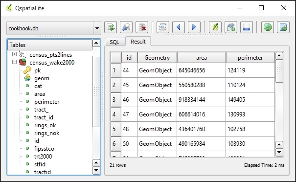
If the query results contain geometry information (the so-called geometry column), you can display them in QGIS. To do this, perform the following steps:
above100k.When we click on the Run button, the query is passed to the SpatiaLite database engine for execution, and the results are returned to the plugin and displayed in the table. If you want to store results permanently, you can export them in a text file or in an OGR-compatible format using the corresponding buttons in the plugin dialog.
You can also use the DB Manager plugin (which is bundled with QGIS) to execute SQL-queries directly and load them as layers.
While the most common and widely-used Python packages are shipped with QGIS, and they can be used by plugins without any additional actions, some QGIS plugins need third-party Python packages, which are not available with the default QGIS installation.
This recipe shows you how to add missing Python packages to the QGIS installation.
To follow this recipe, you may need administrator rights if you are a Windows user, and QGIS is installed in the system drive.
This steps will install pip — a Python package management tool:
get-pip.py file from https://raw.githubusercontent.com/pypa/pip/master/contrib/get-pip.py and save it somewhere on your hard drive, for example in D:\Downloads.python D:\Downloads\get-pip.py. Don't forget to replace D:\Downloads with the correct path to the get-pip.py file. Wait while the command execution completes.Now, when pip is ready, you can easily download and install third-party Python packages. To do this, perform the following steps:
pip install package_name. Don't forget to replace package_name with the name of the package that you want to install. For example, if you want to install the PySAL package, use this command: pip install pysal.If you are a Linux user, use your package manager to install pip. For example, under Debian and Ubuntu, use the sudo apt-get install python-pip command to install pip. After doing this, you can use pip to download and install packages as described in the preceding paragraph.
Mac OS users can install pip via Homebrew using the brew install pip command.
Using pip, you also can view installed packages, update, and remove them. For more information please look at the pip documentation available at https://pip.pypa.io/en/stable/.
pip downloads the requested package with all necessary dependencies from the Python Package Index (https://pypi.python.org/) and installs them into Python bundled with QGIS.
You can also register Python bundled with QGIS in the Windows registry as the system default Python version. After this, you can use usual Windows installers to install the required packages. More information on this topic can be found at https://trac.osgeo.org/osgeo4w/ticket/114.
QGIS has a built-in Python console, where you can enter commands in the Python programming language and get results. This is very useful for quick data processing.
To follow this recipe, you should be familiar with the Python programming language. You can find a small but detailed tutorial in the official Python documentation at https://docs.python.org/2.7/tutorial/index.html.
Also load the poi_names_wake.shp file from the sample data.
QGIS Python console can be opened by clicking on the Python Console button at toolbar or by navigating to Plugins | Python Console. The console opens as a non-modal floating window, as shown in the following screenshot:
Let's take a look at how to perform some data exploration with the QGIS Python console:
layer = iface.activeLayer()
layer.featureCount()
for f in layer.getFeatures():
  print f["featurenam"], f["elev_m"]
You can also use the Python console for more complex tasks, such as exporting features with some attributes to a text file. Here is how to do this:
import csv
layer = iface.activeLayer()
with open('c:\\temp\\export.csv', 'wb') as outputFile:
  writer = csv.writer(outputFile)
  for feature in layer.getFeatures():
    geom = feature.geometry().exportToWkt()
writer.writerow([geom, feature["featurenam"], feature['elev_m"]])poi_names_wake.shp, which is provided with this book, adjust attribute names in line 8.In line 1, we imported the csv module from the standard Python library. This module provides a convenient way to read and write comma-separated files. In line 3, we obtained a reference to the currently selected layer, which will be used later to access layer features.
In line 3, an output file opened. Note that here we use the with statement so that later there is no need to close the file explicitly, context manager will do this work for us. In line 5, we set up the so-called writer—an object that will write data to the CSV file using specified format settings.
In line 6, we started iterating over features of the active layer. For each feature, we extracted its geometry and converted it into a Well-Known Text (WKT) format (line 7). We then wrote this text representation of the feature geometry with some attributes to the output file (line 8).
It is necessary to mention that our script is very simple and will work only with attributes that have ASCII encoding. To handle non-Latin characters, it is necessary to convert the output data to the unicode before writing it to file.
Using the Python console, you also can invoke Processing algorithms to create complex scripts for automated analysis and/or data preparation.
To make the Python console even more useful, take a look at the Script Runner plugin. Detailed information about this plugin with some usage examples can be found at http://spatialgalaxy.net/2012/01/29/script-runner-a-plugin-to-run-python-scripts-in-qgis/.
You can extend the capabilities of QGIS by adding scripts that can be used within the Processing framework. This will allow you to create your own analysis algorithms and then run them efficiently from the toolbox or from any of the productivity tools, such as the batch processing interface or the graphical modeler.
This recipe covers basic ideas about how to create a Processing algorithm.
A basic knowledge of Python is needed to understand this recipe. Also, as it uses the Processing framework, you should be familiar with it before studying this recipe.
We are going to add a new process to filter the polygons of a layer, generating a new layer that just contains the ones with an area larger than a given value. Here's how to do this:
##Cookbook=group
##Filter polygons by size=name
##Vector_layer=vector
##Area=number 1
##Output=output vector

layer = processing.getObject(Vector_layer)
provider = layer.dataProvider()
writer = processing.VectorWriter(Output, None,
  provider.fields(), provider.geometryType(), layer.crs())
for feature in processing.features(layer):
  print feature.geometry().area()
  if feature.geometry().area() > Area:
    writer.addFeature(feature)
del writer.py extension. Do not move this to a different folder. Make sure that you use the default folder that is selected when the file selector is opened.Filter polygons by size.
The script contains mainly two parts:
In our example, the first part looks like the following:
##Cookbook=group
##Filter polygons by size=name
##Vector_layer=vector
##Area=number 1
##Output=output vector
We are defining two inputs (the layer and the area value) and declaring one output (the filtered layer). These elements are defined using the Python comments with a double Python comment sign (#).
The second part includes the code itself and looks like the following:
layer = processing.getObject(Vector_layer)
provider = layer.dataProvider()
writer = processing.VectorWriter(Output, None,
  provider.fields(), provider.geometryType(), layer.crs())
for feature in processing.features(layer):
  print feature.geometry().area()
  if feature.geometry().area() > Area:
    writer.addFeature(feature)
del writer
The inputs that we defined in the first part will be available here, and we can use them. In the case of the area, we will have a variable named Area, containing a number. In the case of the vector layer, we will have a Layer variable, containing a string with the source of the selected layer.
Using these values, we use the PyQGIS API to perform the calculations and create a new layer. The layer is saved in the file path contained in the Output variable, which is the one that the user will select when running the algorithm.
Apart from using regular Python and the PyQGIS interface, Processing includes some classes and functions because this makes it easier to create scripts, and that wrap some of the most common functionality of QGIS.
In particular, the processing.features(layer) method is important. This provides an iterator over the features in a layer, but only considering the selected ones. If no selection exists, it iterates over all the features in the layer. This is the expected behavior of any Processing algorithm, so this method has to be used to provide a consistent behavior in your script.
Some of the core algorithms that are provided with Processing are actually scripts, such as the one we just created, but they do not appear in the scripts section. Instead, they appear in the QGIS algorithms section because they are a core part of Processing.
Other scripts are not part of processing itself but they can be installed easily from the toolbox using the Tools/Get scripts from on-line collection menu:
You will see a window like the following one:
Just select the scripts that you want to install and then click on OK. The selected scripts will now appear in the toolbox. You can use it as you use any other Processing algorithm.
One of the main reasons of the popularity of QGIS is its extensibility. Using the basic tools and features provided by the QGIS API, new functionality can be implemented and added as a new plugin that can be shared by contributing it to the QGIS plugins repository.
To be able to develop a new QGIS plugin, you should be familiar with the Python programming language. If the plugin has a graphical interface, you should have some knowledge of the Qt framework, as this is used for all UI elements, such as dialogs. To access the QGIS functionality, it is required that you know the QGIS API.
A very handy resource for all these (plus a few others) is the GeoAPIs website, which is created by SourcePole at http://geoapis.sourcepole.com/.
To simplify the creation of a plugin, we will use an additional plugin named Plugin Builder. It should be installed in your QGIS application.
The following steps create a new plugin that will print out detailed information about the layers currently loaded in your QGIS project:
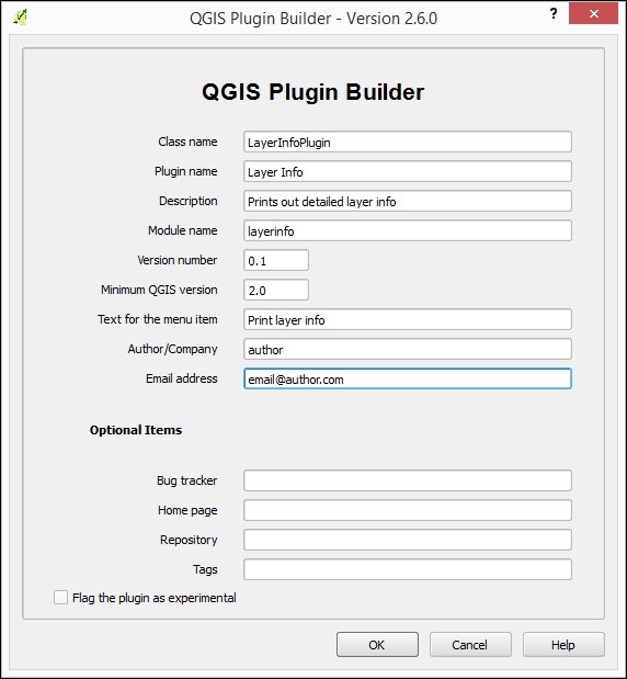
LayerInfoPlugin, with the following content (items in square brackets indicate folders):[help] [i18n] [scripts] [test] icon.png layerinfo.py layerinfo_dialog.py layerinfo_dialog_base.ui Makefile metadata.txt pb_tool.cfg plugin_upload.py pylintrc README.html README.txt resources.qrc __init__.py
layerinfo.py file in a text editor. At the end of it, you will find the run() method, with the following code:def run(self): """Run method that performs all the real work""" # show the dialog self.dlg.show() # Run the dialog event loop result = self.dlg.exec_() # See if OK was pressed if result: pass
run method with the following code: def run(self):
layers = self.iface.legendInterface().layers()
print "---LAYERS INFO---"
for layer in layers:
print "Layer name: " + layer.name()
print "Layer source " + layer.source()
print "Extent: " + layer.extent().asWktCoordinates()
printpb_tool application by opening a terminal and running easy_install pb_tool (you can also use pip install pb_tool or any other way of installing a library from PyPI).pb_tool and compile. Then, run pb_tool deploy to install the plugin in your local QGIS.
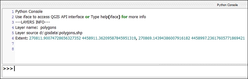
The Plugin Builder plugin takes some basic information about the plugin to create it, and uses it to create its skeleton. By default, it includes a menu entry, which becomes the entry point to the plugin from the QGIS interface.
When the menu item is selected, the corresponding action in the plugin code is executed. In this case, it runs the run() method, where we have added our code.
The plugin will always have a reference to the QGIS instance (an object of class QgsInterface), which can be used to access the QGIS API and connect with the elements in the current QGIS session. In our case, this is used to access the legend, which contains a list of all the layers loaded in the current project. Calling the corresponding methods in each one of these layers, the information about them is retrieved and printed out.
The standard output is redirected to the QGIS Python console, so printing a text using the built-in Python print command will cause the text to appear in the console in case it is open.
QGIS stores its plugins in the .qgis2/python/plugin folder under the current user folder. For instance, this is when you download a new plugin using Plugin Manager. Each time you start QGIS, it will look for plugins there and load them. Copying the folder is done by the deploy task that we have run, and this allows QGIS to discover the plugin and add it to the list of available plugins when QGIS is started.
The following are some ideas to create better plugins and manage them.
The plugin that we have created has no UI elements. However, among the files created by the plugin builder, you can find a basic dialog file with the .ui extension. You can edit this to create a dialog that can later be used, by calling it from your plugin code. To know more about how to create and use UI elements from the Qt framework (QGIS is built on top of this framework), check out the PyQt documentation.
Another thing that is created by the Plugin Builder is a Sphinx documentation project where you can write the usage documentation of your plugin using RestructuredText. To know more about Sphinx, you can visit the Sphinx official site at http://www.sphinx-doc.org/en/stable/.
The documentation project is built when the deploy task is run, and will create HTML files and place them in the plugin folder.
Once your plugin is finished, it would be a good idea to share it and let other people use it. If you upload your plugin to the QGIS plugin server, it would be easy for all QGIS users to get it using Plugin Manager and also get the latest updates.
To upload the plugin, you first need to create a ZIP file containing all its code and resources. There is a pb_tool task for this, and you just have to run pb_tool zip in a terminal. With the resulting zip file, you can start the release process. More information about it can be found at http://docs.qgis.org/2.6/en/docs/pyqgis_developer_cookbook/releasing.html.
While QGIS itself is a great and functional program, sometimes it is better to use more suitable tools to perform some simple or complex actions. This recipe shows you how to use some of these third-party tools.
To follow this recipe, you will need a btnmeatrack_2014-05-22_13-35-40.nmea file from the book dataset. We will also use the cookbook.db SpatiaLite database that we created in the Loading vector layers into SpatiaLite recipe in Chapter 1, Data Input and Output, and the PostgreSQL database, which we developed in Chapter 6, Network Analysis.
Besides this, don't forget to install GPSBabel (usually this comes with QGIS), spatialite-gui, and pgAdmin (these should be installed manually).
First we will convert NMEA data to GPX format with GPSBabel, then learn how to use SpatiaLite GUI tools and pgAdmin to work with databases.
GPSBabel is a command-line tool to manipulate, convert, and process GPS data (waypoints, tracks, and routes) in different formats.
To convert a file from the NMEA format to more common GPX, follows these steps:
btnmeatrack_2014-05-22_13-35-40.nmea file is located. Usually, this can be done with the cd command, for example, if the file is located in the data directory on the C: drive, use this command:
cd c:\data
gpsbabel -i nmea -f btnmeatrack_2014-05-22_13-35-40.nmea -o gpx -F 2014-05-22_13_35-40.gpx
spatialite-gui is a GUI tool supporting SpatiaLite. This is lightweight and very useful when you need to quickly perform some queries or just check contents of the SQLite/SpatiaLite database.
To explore spatial or nonspatial tables in the SpatiaLite database, perform these steps:
spatialite-gui by double-clicking on its executable file.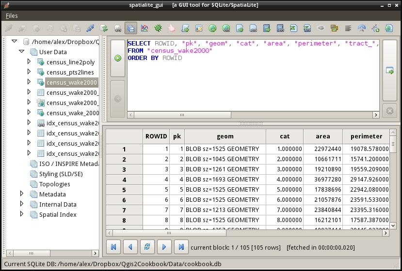
After massive edits, especially when tables were altered or deleted, it is recommended to run VACUUM command to rebuild the database. To do this, perform these steps:
spatialite-gui by double-clicking on its executable file.pgAdmin is an administration tool and development platform for PostgreSQL databases. It allows you to perform administrative tasks (such as backup and restore), run simple queries as well as develop new databases from scratch.
To create a backup of the database with pgAdmin, follow these steps:
To restore the database from the backup, perform the following steps:
In this chapter, we will cover the following topics:
The software landscape is constantly changing and QGIS is no exception. There are new features added weekly, and a huge, growing library of plugins. This chapter highlights some of the newer features at the time of writing. These are features that we think will be around for some time due to their usefulness. Keep in mind, however, that they are still in development and can easily change at any moment; hopefully, this is for the better. Included in this chapter are the handling of some more recent and additional formats that were not covered earlier, such as LIDAR, File Geodatabases, and Geopackages. Also included are several recipes on topology usage, editing, and fixing. Finally, there are a few recipes on how you can become part of the community that helps evolve QGIS through bug hunting and reporting.
LiDAR data is becoming more available, and it represents a fundamental source of detailed elevation data. This chapter will show you how to work with LiDAR data in QGIS.
We will use the Processing framework, so you should be familiar with it.
We will also use LASTools, which is not included with QGIS. Download LASTools binaries from http://lastools.org/download/LAStools.zip and install them on your computer.
Processing has to be configured so that it can find and execute LASTools. Open the Processing configuration by going to the Processing | Options menu and move to the Tools for LiDAR data section, as shown in the following screenshot:
In the LAStools folder field, type the path to the folder where you have installed the LASTools executables.
In the data corresponding to this recipe, you will find a las file with LiDAR data. This cannot be opened in QGIS, but we will convert it so that it can be opened and rendered as part of a normal QGIS project.
Follow these steps:
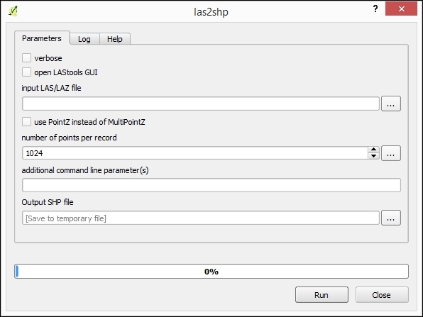
The las2shp tool converts a las file into a shp file. Processing calls las2shp using the provided parameters, and then loads the resulting layer into your QGIS project.
You can also convert a LAS file into a raster layer using the las2dem algorithm instead.
In the Tools for LiDAR data/LASTools branch, double-click on the las2dem algorithm. The Parameters dialog of the algorithm looks like the following:
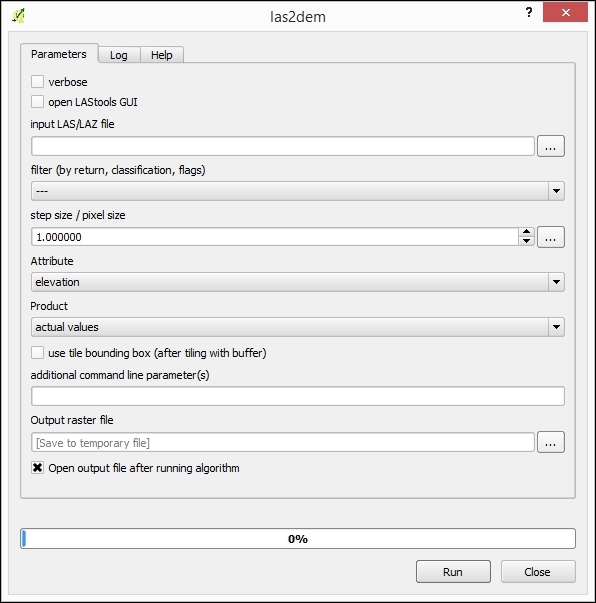
0.005 in the step size/pixel size field.File Geodatabases (GDB) are a relatively new format compared to shapefiles, and they were created by Esri for their Arc product line. They allow the storage of multiple vector and raster layers in a single database. Some government agencies release data officially in this format. However, only in the last few years has it been possible to open this data with open source tools.
For this recipe, you will need a File Geodatabase, naturalearthsample.gdb.zip, which is included in the sample data, and GDAL 1.11 or a newer version.
Check your GDAL version by navigating to Help | About | About. If your GDAL is a lower number, upgrading your QGIS should get you a new enough version. Refer to http://qgis.org/en/site/forusers/download.html for more options, especially if on Linux where you may need third-party repositories for a newer version of GDAL.
File Geodatabases are actually folders full of all sorts of binary files. Typically, you will get them zipped and must extract the zip to a real system folder before you can use it.
naturalearthsample.gdb.zip file so that you have a folder called naturalearthsample.gdb.naturalearthsample.gdb folder (if you haven't unzipped this already you need to do this first).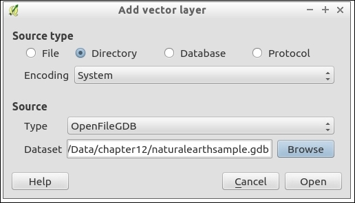
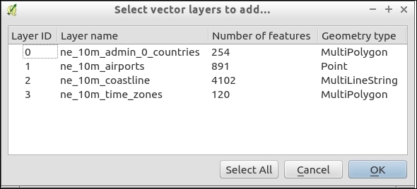
This is fairly straightforward. You tell QGIS the root folder of the File Geodatabase, and it can figure out how to use all the files inside of the folder appropriately. As long as GDAL has a driver for a given format, then you should be able to open the data with QGIS. Support for additional formats is always ongoing and being refined.
The key limitation to File Geodatabase drivers currently are that raster layers are not supported and that there is limited write ability for vectors. There are actually two different drivers. One is an open source project, which is built by the community, and is the default driver. The other is based on a development library, which is released publicly by ESRI that has specific license restrictions.
OpenFileGDB, the open source community-built driver, can open multiple versions of GDB (9 and 10), is read only, and comes with most versions of GDAL 1.11+.
The ESRIFileGDB driver can read and write vector layers (this has some limitations, which are discussed in the link in the See also section). However, it often can only open the version of GDB it was built for (the newest version only reads newer GDB formats, for example, 10). Sometimes, it requires you to build the GDAL driver from the SDK code provided by ESRI. (This is done for Windows users as part of osgeo4w; Linux, and Mac users at this time need to compile GDAL with the FileGDB SDK 1.4.)
To use this driver, pick a different type in the dialog as ESRIFileGDB. If you don't see it listed, you don't have a version of GDAL that includes this, and you will need to compile GDAL yourself.
If you get a database in this format, consider batch converting it to Spatialite, which will maintain most of the same information and give you full read, write, query, and edit capabilities in QGIS. You'll need the ogr2ogr command for now until someone writes a plugin (or you could load them one by one with the DB Manager):
ogr2ogr -f SQLite naturalearthsample.sqlite naturalearthsample.gdb -skip-failures -nlt PROMOTE_TO_MULTI -dsco SPATIALITE=YES
Geopackage is a new open standard for geospatial data exchange from the Open Geospatial Consortium (OGC), an industry standards organization. It is intended to allow users to bundle multiple layers of various types into a single file that can easily be passed to others. This recipe demonstrates how to utilize this new data format and what to expect in the future.
For this recipe, you will need a Geopackage file, often the extension is .gpkg. There should be a naturalearthsample.gpkg file in the provided sample data.
You'll also need GDAL 1.11 or newer; if you have QGIS 2.6 or newer, this probably came with a new enough GDAL. If you don't have a new enough GDAL, consider upgrading QGIS, which usually bundles newer versions.
naturalearthsample.gpkg file: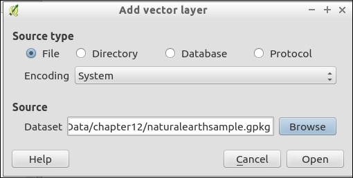
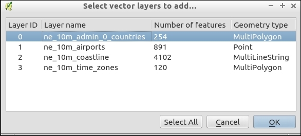
Consider Geopackage more of a read-only format. Even though it is not, its whole purpose is to exchange collections of data between systems with a single file, especially mobile systems. Due to this, once you have loaded layers, consider saving them to another format. Keep in mind that saving to Shapefiles may cause data loss in the attribute table. Spatialite or PostGIS are the recommend formats; refer to recipes Loading vector layers into SpatiaLite and Loading vector layers into PostGIS in Chapter 1, Data Input and Output.
Geopackage is also a database that is based on SQLite and it is compatible with SpatiaLite. If you open it with SpatiaLite tools, you should be able to query the tables. Geopackage and SpatiaLite store geometries differently, so not all functions or spatial index methods are available to Geopackages, but they are very easy to convert.
QGIS 2.10 introduces the ability to write a single layer to a Geopackage. It's expected that QGIS 2.12 will add the ability to write multiple layers to the same Geopackage (as well as SpatiaLite). In the meantime, you can use ogr2ogr on the command line to manage layers in a Geopackage.
If you want to batch convert a Geopackage to SpatiaLite, this can be done on the command line (OSGeo4W Shell on Windows, and a Terminal on Mac or Linux), as follows:
ogr2ogr -f SQLite naturalearthsample.sqlite naturalearthsample.gpkg -skip-failures -nlt PROMOTE_TO_MULTI -dsco SPATIALITE=YES
You can also perform the reverse to create a Geopackage:
ogr2ogr -f GPKG naturalearthsample.gpkg naturalearthsample.sqlite
Keep your eyes out for future implementation of raster support. The Geopackage specification does include limited raster support, which is primarily targeted at including imagery or tiles in the database for use on mobile devices.
Maintaining topology in the vector layers is very important; this results in greater data integrity and leads to more accurate analysis results. This recipe shows you how to edit PostGIS topology layers (in other words, layers with topology objects, such as edges, faces, and nodes) with QGIS.
Installation of PostGIS with topology support won't be covered in detail here because instructions for the different operating systems can be found on the project website at http://postgis.net/docs/manual-2.1/postgis_installation.html. If you are using Windows, PostGIS can be installed directly from the Stack Builder application, which is provided by the standard PostgreSQL installation, as described at http://www.bostongis.com/PrinterFriendly.aspx?content_name=postgis_tut01.
To follow this exercise, you need a PostGIS database with topology enabled. In QGIS, you should set up the connection to the database using the New button in the Add PostGIS Layers dialog.
Also, it is necessary to install and activate the PostGIS Topology Editor plugin.
These steps will create a topology-enabled vector layer in your PostGIS database:
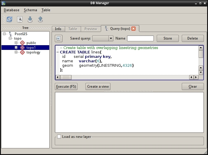
topology.sql file and click on Execute (F5) to run the queries.topo1 table in Tree.topo1 table in Tree and go to Schema | TopoViewer to load all the topology layers into QGIS. The result should look like the following: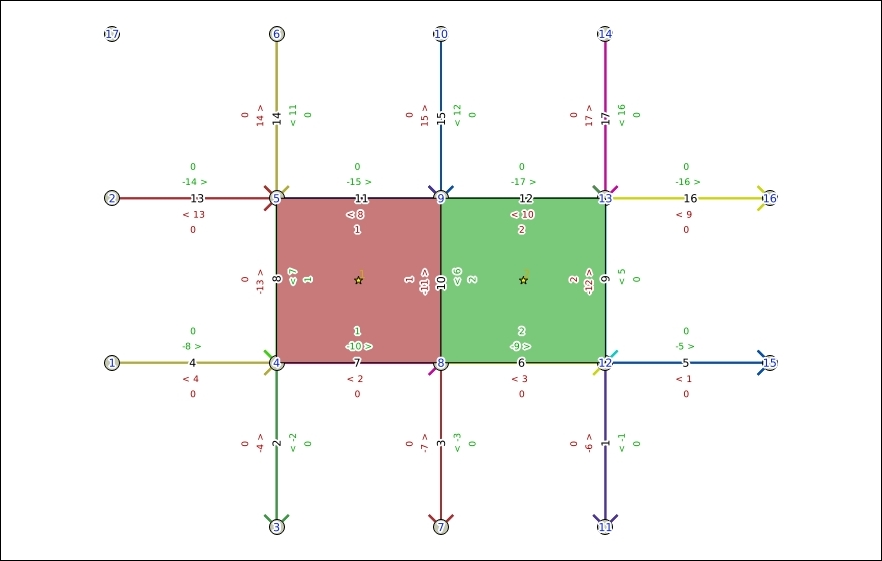
Once the topology is ready and loaded into QGIS, we can edit it with the PostGIS Topology Editor plugin. It is worth mentioning that, currently, the plugin allows us only to delete nodes and edges. Other editing operations are not supported.
To delete a node, perform the following steps:
Nodes group and select the topo1.node layer.To delete edges, perform the following steps:
Edges group and select the edge layer that you want to edit, for example, the topo1.edge layer.As QGIS currently does not support dynamic updates of topology, it is necessary to reload topology layers with TopoViewer to reflect our edits:
topo1 table in the tree, and go to Schema | TopoViewer to load all topology layers into QGIS: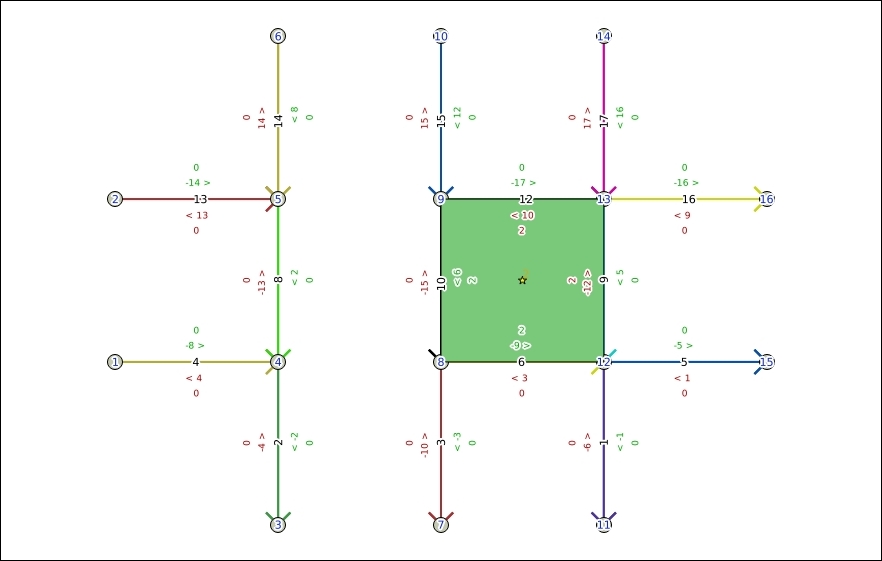
You will see that the previously deleted nodes and edges now disappear.
The PostGIS Topology Editor plugin issues SQL queries directly to the corresponding topology tables in the PostGIS database to remove edges and nodes.
Topology is a set of rules that defines the spatial relationship between adjacent features, and it also defines and enforces data integrity and validity.
This recipe shows you how to use the built-in Topology Checker plugin to find topology errors in vector layers.
To follow this recipe, load the census_wake2000_topology.shp and roadsmajor.shp layers from the sample data. Additionally, make sure that the Topology Checker plugin is enabled in Plugin Manager.
The Topology Checker plugin allows us to test a vector layer or its part for different topology errors. Before we can use this, we should load all the layers that we want to test in QGIS and then configure topology rules:
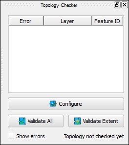
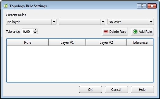
roadsmajor layer.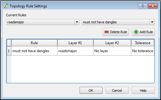
census_wake2000_topology as the target layer.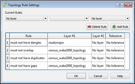
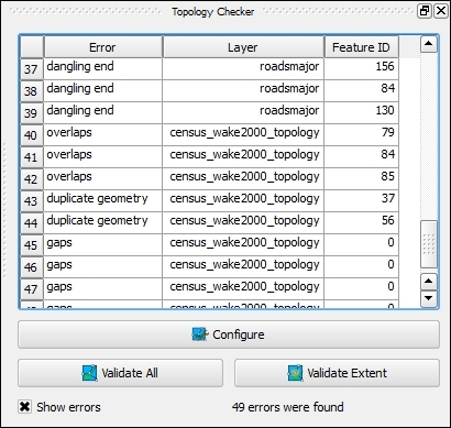
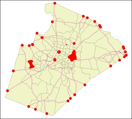
The Topology Checker plugin uses the GEOS library as well as its own algorithms to check spatial relationships between features in the vector layer.
Having vector data without topology errors is important for further analysis, as these errors may lead to incorrect results.
This recipe shows you how to use the built-in GRASS tools to fix various topology errors in vector layers.
QGIS has very good integration with GRASS GIS; there is a GRASS plugin that provides access to the GRASS GIS database and functionality. GRASS algorithms are also available from the Processing plugin. The latter is simpler because you don't need to bother with setting up GRASS locations and mapsets and importing and exporting data.
To follow this recipe, load the nonbreak.shp, dangles.shp, and nosnap.shp layers from the sample data. Additionally, make sure that the Processing plugin is enabled in Plugin Manager.
The following steps show you how to fix various topology errors with the GRASS v.clean toolset using the Processing toolbox:
First, we will learn how to remove dangling lines. Dangling lines are lines that have no connection with other lines on one or either end nodes:
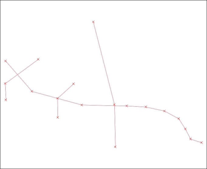
To remove them, perform the following steps:
dangling layer.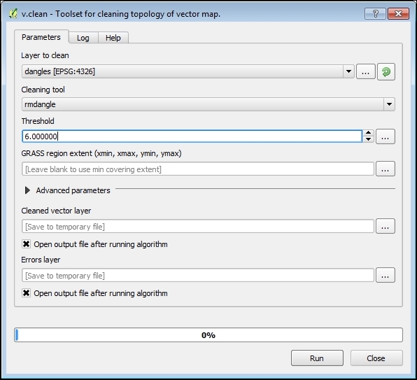
Cleaned layer contains cleaned geometries (shown in green) and the Errors layer contains dangles that were removed (shown in red):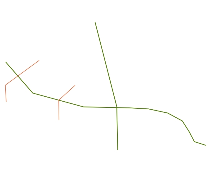
Another topology issue is missed line breaks in the intersection nodes. To add break at intersections, perform the following steps:
nobreaks layer.Another very common topology issue is undershots, which happen when the line feature is not connected with another one at the intersection point and overshoots, which happens when the line ends beyond another line instead of connecting to it. Such errors often appear after inaccurate digitizing. To fix them, perform the following steps:
nosnap layer.Cleaned layer contains features with fixed errors and the Errors layer contains original invalid features.The rmdangle tool simply sequentially removes all dangling lines with length less than the given threshold. If the threshold is less than 0, then all dangles will be removed.
The break tool breaks lines at intersections, so all lines will have a common node. This tool does not need a threshold value to be specified.
The snap tool tries to snap vertices to another one within the given threshold, if no appropriate vertices are found, then no snapping is done. It is worth mentioning that large threshold values may break the topology of polygonal features.
If you need more control over the topology cleaning process, try to use v.clean.advanced from the Processing Toolbox menu or consider using the GRASS plugin.
Also, there are other ways to clean vector topology, for example, using the lwgeom functions or external tools such as prepair and pprepair. Both tools are available as Processing plugins, and they can be installed via Plugin Manager.
While QGIS developers do their best to make every QGIS release as stable as possible, sometimes you may encounter bugs or even crashes. To get them fixed in the future, it is necessary to inform the developers about issues.
This recipe shows you how to perform basic debugging and collect information that will help developers understand the problem better and help to fix it.
As the QGIS development process is very quick, bugs that are present in older versions are very likely already fixed in the latest version. So, it is necessary to ensure that you have the most recent QGIS version. If you use the development version of QGIS (so called "nightly" builds), upgrade to the last available build. If you prefer stable releases, then ensure that you have the latest stable version.
Under Linux, QGIS automatically tries to use gdb to produce a backtrace when crashed.
If you see no backtrace after the crash, this may mean that the possibility to connect debugger to the running processes is disabled in your distribution (for example, Ubuntu after version 10.10). This behavior is controlled by the ptrace_scope sysctl value. If it equals to 1 ptrace calls from external processes are not allowed. A value that equals to 0 allows external processes to examine memory of the other process.
In such cases, to enable a backtrace creation, temporarily open the root shell and execute the following command:
echo 0 > /proc/sys/kernel/yama/ptrace_scope
If you want to enable a backtrace creation permanently, you need to edit the /etc/sysctl.d/10-ptrace.conf file as root, and set the value to 0. Then, run as root to reload sysctl settings, as follows:
sysctl -p
After this, repeat the steps to reproduce the crash, copy the backtrace, and attach it to your bug report or e-mail.
DebugView is a small program for the Windows operating system that allows you to view and save the debug output of programs. With its help, you can easily get the QGIS debug output and add it to your bug report.
To get the debug output with DebugView, follow these steps:
Dbgview.exe.
Also, if QGIS crashes, it produces a minidump file (usually these files are created in your Temp directory and have the tmp.mdmp extension), as shown in the following screenshot:
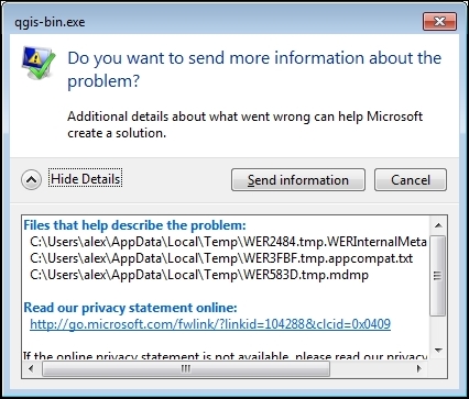
A backtrace is a summary of program functions that are still active. In other words, it shows all nested functions and calls from the program's start to the crash point. With the help of a backtrace, developers can isolate place where the bug is.
If you have access to computers with different operating systems, it would be good to check whether this error is reproduced in different environments.
Almost all modern computers and laptops have enough performance to run virtual machines. The snapshots feature is available in the most popular virtual machines. You can have a clean and up-to-date system with recent QGIS for testing and debugging purposes.
Once you have found a bug and collected all the potentially useful information about its occurrence, it is time to create a bug report.
This recipe shows you how to file a bug report in a right way.
While QGIS project hosts its own bugtracker, you still need an OSGeo User ID to use it. If you don't have an OSGeo account, create one by filling in the form at https://www.osgeo.org/cgi-bin/ldap_create_user.py.
Go to the QGIS bugtracker at http://hub.qgis.org/projects/quantum-gis/issues and use your OSGeo User ID and password to log in. The Login link is located in the top-right corner of the page.
Before creating a new bug report, it is necessary to make sure this bug has not yet been reported. To do this, perform the following steps:
All tickets that match your criteria will be listed in the table.
Also, it makes sense to try to find similar issues with the ordinal search functionality:
Results will be displayed as a raw list of all existing tickets (open and closed), which contain keywords in their titles and description:
If your issue is already reported, add your observations to it. If you cannot find anything similar to your problem, it is time to submit a bug report. To do this, perform the following steps:
This form contains many fields, the most important ones are listed as follows:
Check the formatting of the bug report by clicking on the Preview link at the bottom. To submit a bug report, click on the Submit button.
Bug Tracker is a database with information about bugs. Developers look over bug queue and arrange them according to priorities, available resources, and fix them. Fixes usually go to the development version (the so-called "master"), but fixes for regressions and important bugs also go to the long-term release branch.
Using the QGIS Bug Tracker, you also can leave feature requests and submit patches. However, for the latter, creating a pull-request at GitHub is preferable.
This course is a blend of text and quizzes, all packaged up keeping your journey in mind. It includes content from the following Packt products:
Copyright © 2017 Packt Publishing
All rights reserved. No part of this course may be reproduced, stored in a retrieval system, or transmitted in any form or by any means, without the prior written permission of the publisher, except in the case of brief quotations embedded in critical articles or reviews.
Every effort has been made in the preparation of this course to ensure the accuracy of the information presented. However, the information contained in this course is sold without warranty, either express or implied. Neither the authors, nor Packt Publishing, and its dealers and distributors will be held liable for any damages caused or alleged to be caused directly or indirectly by this course.
Packt Publishing has endeavored to provide trademark information about all of the companies and products mentioned in this course by the appropriate use of capitals. However, Packt Publishing cannot guarantee the accuracy of this information.
Published on: February 2017
Production reference: 1170217
Published by Packt Publishing Ltd.
Livery Place
35 Livery Street
Birmingham B3 2PB, UK.
ISBN 978-1-78829-972-5
Authors
Anita Graser,
Ben Mearns,
Alex Mandel,
Víctor Olaya Ferrero,
Alexander Bruy
Reviewers
Cornelius Roth
Ujaval Gandhi
Fred Gibbs
Gergely Padányi-Gulyás
Abdelghaffar KHORCHANI
Pablo Pardo
Mats Töpel
Jorge Arévalo
Olivier Dalang
Ben Mearns
Content Development Editor
Aishwarya Pandere
Production Coordinator
Aparna Bhagat
QGIS is a crossing point of the free and open source geospatial world. While there are a great many tools in QGIS, it is not one massive application that does everything, and it was never really designed to be that from the beginning. It is rather a visual interface to much of the open source geospatial world. You can load data from proprietary and open formats into spatial databases of various flavors and then analyze the data with well-known analytical backends before creating a printed or web-based map to display and interact with your results. What’s QGIS’s role in all this? It’s the place where you check your data along the way, build and queue the analysis, visualize the results, and develop cartographic end products.
This learning path will teach you all that and more, in a hands-on learn-by-doing manner. Become an expert in QGIS with this useful companion.
Module 1, Learning QGIS, Third edition, covers important features that enable us to create great maps. Then, we will cover labeling using examples of labeling point locations as well as creating more advanced road labels with road shield graphics. We will also cover how to tweak labels manually. We will get to know the print composer and how to use it to create printable maps and map books. Finally, we will cover solutions to present your maps on the Web.
Module 2, QGIS Blueprints, will demonstrate visualization and analytical techniques to explore relationships between place and time and between places themselves. You will work with demographic data from a census for election purposes through a timeline controlled animation.
Module 3, QGIS 2 Cookbook, deals with converting data into the formats you need for analysis, including vector to and from raster, transitioning through different types of vectors, and cutting your data to just the important areas. It also shows you how to take QGIS beyond the out-of-the-box features with plugins, customization, and add-on tools.
Module 1:
To follow the exercises in this book, you need QGIS 2.14. QGIS installation is covered in the first chapter and download links for the exercise data are provided in the respective chapters.
Module 2:
You will need:
Module 3:
We recommend installing QGIS 2.8 or later; you will need at least QGIS 2.4. During the writing of this book, several new versions were released, approximately every 4 months, and most recently, 2.14 was released. Most of the recipes will work on older versions, but some may require 2.6 or newer. In general, if you can, upgrade to the latest stable release or Long Term Support (LTS) version.
There are also a lot of side interactions with other software throughout many of these
recipes, including—but not limited to—Postgis 2+, GRASS 6.4+, SAGA 2.0.8+, and Spatialite 4+. On Windows, most of these can be installed using OSGeo4W; on Mac, you may need some additional frameworks from Kyngchaos, or if you’re familiar with Brew, you can use the OSGeo4Mac Tap. For Linux users, in particular Ubuntu and Debian, refer to the UbuntuGIS PPA and the DebianGIS blend.
Does all of this sound a little too complicated? If yes, then consider using a virtual machine that runs OSGeo-Live (http://live.osgeo.org). All the software is preinstalled for you and is known to work together.
Lastly, you will need data. For the most part, we’ve provided a lot of free and open data
from a variety of sources, including the OSGeo Educational dataset (North Carolina), Natural Earth Data, OpenFlights, Wake County, City of Davis, and Armed Conflict Location & Event Data Project (ACLED). A full list of our data sources is provided here if you would like additional data.
We recommend that you try methods with the sample data first, only because we tested it.
Feel free to try using your own data to test many of the recipes; however, just remember that you might need to alter the structure to make it work. After all, that’s what you’ll be working with normally.
The following are the data sources for this book:
OSGeo Educational Data: http://grass.osgeo.org/download/sample-data/
Wake County, USA: http://www.wakegov.com/gis/services/pages/data.aspx
Natural Earth Data: http://www.naturalearthdata.com/
City of Davis, USA: http://maps.cityofdavis.org/library
Stamen Designs: http://stamen.com/
Armed Conflict Location & Event Data Project: http://www.acleddata.com/
If you are a user, developer, or consultant and want to know how to use QGIS to achieve the results you are used to from other types of GIS, then this learning path is for you. You are expected to be comfortable with core GIS concepts. This Learning Path will make you an expert with QGIS by showing you how to develop more complex, layered map applications. It will launch you to the next level of GIS users.
Feedback from our readers is always welcome. Let us know what you think about this course—what you liked or disliked. Reader feedback is important for us as it helps us develop titles that you will really get the most out of.
To send us general feedback, simply e-mail <feedback@packtpub.com>, and mention the course’s title in the subject of your message.
If there is a topic that you have expertise in and you are interested in either writing or contributing to a course, see our author guide at www.packtpub.com/authors.
Now that you are the proud owner of a Packt course, we have a number of things to help you to get the most from your purchase.
You can download the example code files for this course from your account at http://www.packtpub.com. If you purchased this course elsewhere, you can visit http://www.packtpub.com/support and register to have the files e-mailed directly to you.
You can download the code files by following these steps:
You can also download the code files by clicking on the Code Files button on the course’s webpage at the Packt Publishing website. This page can be accessed by entering the course’s name in the Search box. Please note that you need to be logged in to your Packt account.
Once the file is downloaded, please make sure that you unzip or extract the folder using the latest version of:
The code bundle for the course is also hosted on GitHub at https://github.com/PacktPublishing/QGIS-Becoming-a-GIS-Power-User.
We also have other code bundles from our rich catalog of books, videos and courses available at https://github.com/PacktPublishing/. Check them out!
Although we have taken every care to ensure the accuracy of our content, mistakes do happen. If you find a mistake in one of our books—maybe a mistake in the text or the code—we would be grateful if you could report this to us. By doing so, you can save other readers from frustration and help us improve subsequent versions of this course. If you find any errata, please report them by visiting http://www.packtpub.com/submit-errata, selecting your course, clicking on the Errata Submission Form link, and entering the details of your errata. Once your errata are verified, your submission will be accepted and the errata will be uploaded to our website or added to any list of existing errata under the Errata section of that title.
To view the previously submitted errata, go to https://www.packtpub.com/books/content/support and enter the name of the book in the search field. The required information will appear under the Errata section.
Piracy of copyrighted material on the Internet is an ongoing problem across all media. At Packt, we take the protection of our copyright and licenses very seriously. If you come across any illegal copies of our works in any form on the Internet, please provide us with the location address or website name immediately so that we can pursue a remedy.
Please contact us at <copyright@packtpub.com> with a link to the suspected pirated material.
We appreciate your help in protecting our authors and our ability to bring you valuable content.
If you have a problem with any aspect of this course, you can contact us at <questions@packtpub.com>, and we will do our best to address the problem.
In this chapter, we will install and configure the QGIS geographic information system. We will also get to know the user interface and how to customize it. By the end of this chapter, you will have QGIS running on your machine and be ready to start with the tutorials.
QGIS runs on Windows, various Linux distributions, Unix, Mac OS X, and Android. The QGIS project provides ready-to-use packages as well as instructions to build from the source code at http://download.qgis.org. We will cover how to install QGIS on two systems, Windows and Ubuntu, as well as how to avoid the most common pitfalls.
Further installation instructions for other supported operating systems are available at http://www.qgis.org/en/site/forusers/alldownloads.html.
Like many other open source projects, QGIS offers you a choice between different releases. For the tutorials in this book, we will use the QGIS 2.14 LTR version. The following options are available:
You can find more information about the releases as well as the schedule for future releases at http://www.qgis.org/en/site/getinvolved/development/roadmap.html#release-schedule.
For an overview of the changes between releases, check out the visual change logs at http://www.qgis.org/en/site/forusers/visualchangelogs.html.
On Windows, we have two different options to install QGIS, the standalone installer and the OSGeo4W installer:
Regardless of the installer you choose, make sure that you avoid special characters such as German umlauts or letters from alphabets other than the default Latin ones (for details, refer to https://en.wikipedia.org/wiki/ISO_basic_Latin_alphabet) in the installation path, as they can cause problems later on, for example, during plugin installation.
When the OSGeo4W installer starts, we get to choose between Express Desktop Install, Express Web-GIS Install, and Advanced Install. To install the QGIS LR version, we can simply select the Express Desktop Install option, and the next dialog will list the available desktop applications, such as QGIS, uDig, and GRASS GIS. We can simply select QGIS, click on Next, and confirm the necessary dependencies by clicking on Next again. Then the download and installation will start automatically. When the installation is complete, there will be desktop shortcuts and start menu entries for OSGeo4W and QGIS.
To install QGIS LTR (or DEV), we need to go through the Advanced Install option, as shown in the following screenshot:
This installation path offers many options, such as Download Without Installing and Install from Local Directory, which can be used to download all the necessary packages on one machine and later install them on machines without Internet access. We just select Install from Internet, as shown in this screenshot:
When selecting the installation Root Directory, as shown in the following screenshot, avoid special characters such as German umlauts or letters from alphabets other than the default Latin ones in the installation path (as mentioned before), as they can cause problems later on, for example, during plugin installation:
Then you can specify the folder (Local Package Directory) where the setup process will store the installation files as well as customize Start menu name. I recommend that you leave the default settings similar to what you can see in this screenshot:
In the Internet connection settings, it is usually not necessary to change the default settings, but if your machine is, for example, hidden behind a proxy, you will be able to specify it here:
Then we can pick the download site. At the time of writing this book, there is only one download server available, anyway, as you can see in the following screenshot:
After the installer fetches the latest package information from OSGeo's servers, we get to pick the packages for installation. QGIS LTR is listed in the desktop category as qgis-ltr (and the DEV version is listed as qgis-dev). To select the LTR version for installation, click on the text that reads Skip, and it will change and display the version number, as shown in this screenshot:
As you can see in the following screenshot, the installer will automatically select all the necessary dependencies (such as GDAL, SAGA, OTB, and GRASS), so we don't have to worry about this:
After you've clicked on Next, the download and installation starts automatically, just as in the Express version.
You have probably noticed other available QGIS packages called qgis-ltr-dev and qgis-rel-dev. These contain the latest changes (to the LTR and LR versions, respectively), which will be released as bug fix versions according to the release schedule. This makes these packages a good option if you run into an issue with a release that has been fixed recently but the bug fix version release is not out yet.
If you try to run QGIS and get a popup that says, The procedure entry point <some-name> could not be located in the dynamic link library <dll-name>.dll, it means that you are facing a common issue on Windows systems—a DLL conflict. This error is easy to fix; just copy the DLL file mentioned in the error message from C:\OSGeo4W\bin\ to C:\OSGeo4W\apps\qgis\bin\ (adjust the paths if necessary).
On Ubuntu, the QGIS project provides packages for the LTR, LR, and DEV versions. At the time of writing this book, the Ubuntu versions Precise, Trusty, Vivid, and Wily are supported, but you can find the latest information at http://www.qgis.org/en/site/forusers/alldownloads.html#debian-ubuntu. Be aware, however, that you can install only one version at a time. The packages are not listed in the default Ubuntu repositories. Therefore, we have to add the appropriate repositories to Ubuntu's source list, which you can find at /etc/apt/sources.list. You can open the file with any text editor. Make sure that you have super user rights, as you will need them to save your edits. One option is to use gedit, which is installed in Ubuntu by default. To edit the sources.list file, use the following command:
sudo gedit /etc/apt/sources.list
Downloading the example code
You can download the example code files for this book from your account at http://www.packtpub.com. If you purchased this book elsewhere, you can visit http://www.packtpub.com/support and register to have the files e-mailed directly to you.
Make sure that you add only one of the following package-source options to avoid conflicts due to incompatible packages. The specific lines that you have to add to the source list depend on your Ubuntu version:
deb     http://qgis.org/debian trusty main
deb-src http://qgis.org/debian trusty main
If necessary, replace trusty with precise, vivid, or wily to fit your system. For an updated list of supported Ubuntu versions, check out http://www.qgis.org/en/site/forusers/alldownloads.html#debian-ubuntu.
deb     http://qgis.org/debian-ltr trusty main
deb-src http://qgis.org/debian-ltr trusty main
deb     http://qgis.org/debian-nightly trusty main
deb-src http://qgis.org/debian-nightly trusty main
ubuntugis repository. Add these lines to your file:deb http://qgis.org/ubuntugis trusty main deb-src http://qgis.org/ubuntugis trusty main deb http://ppa.launchpad.net/ubuntugis/ubuntugis-unstable/ubuntu trusty main
deb     http://qgis.org/ubuntugis-ltr trusty main
deb-src http://qgis.org/ubuntugis-ltr trusty main
deb     http://ppa.launchpad.net/ubuntugis/ubuntugis-unstable/ubuntu trusty main
deb     http://qgis.org/ubuntugis-nightly trusty main
deb-src http://qgis.org/ubuntugis-nightly trusty main
deb     http://ppa.launchpad.net/ubuntugis/ubuntugis-unstable/ubuntu trusty main
After choosing the repository, we will add the qgis.org repository's public key to our apt keyring. This will avoid the warnings that you might otherwise get when installing from a non-default repository. Run the following command in the terminal:
sudo apt-key adv --keyserver keyserver.ubuntu.com --recv-key 3FF5FFCAD71472C4
By the time this book goes to print, the key information might have changed. Refer to http://www.qgis.org/en/site/forusers/alldownloads.html#debian-ubuntu for the latest updates.
Finally, to install QGIS, run the following commands:
sudo apt-get update
sudo apt-get install qgis python-qgis qgis-plugin-grass
When you install QGIS, you will get two applications: QGIS Desktop and QGIS Browser. If you are familiar with ArcGIS, you can think of QGIS Browser as something similar to ArcCatalog. It is a small application used to preview spatial data and related metadata. For the remainder of this book, we will focus on QGIS Desktop.
By default, QGIS will use the operating system's default language. To follow the tutorials in this book, I advise you to change the language to English by going to Settings | Options | Locale.
On the first run, the way the toolbars are arranged can hide some buttons. To be able to work efficiently, I suggest that you rearrange the toolbars (for the sake of completeness, I have enabled all toolbars in Toolbars, which is in the View menu). I like to place some toolbars on the left and right screen borders to save vertical screen estate, especially on wide-screen displays.
Additionally, we will activate the file browser by navigating to View | Panels | Browser Panel. It will provide us with quick access to our spatial data. At the end, the QGIS window on your screen should look similar to the following screenshot:
Next, we will activate some must-have plugins by navigating to Plugins | Manage and Install Plugins. Plugins are activated by ticking the checkboxes beside their names. To begin with, I will recommend the following:
To make it easier to find specific plugins, we can filter the list of plugins using the Search input field at the top of the window, which you can see in the following screenshot:
Now that we have set up QGIS, let's get accustomed to the interface. As we have already seen in the screenshot presented in the Running QGIS for the first time section, the biggest area is reserved for the map. To the left of the map, there are the Layers and Browser panels. In the following screenshot, you can see how the Layers Panel looks once we have loaded some layers (which we will do in the upcoming Chapter 2, Viewing Spatial Data). To the left of each layer entry, you can see a preview of the layer style. Additionally, we can use layer group to structure the layer list. The Browser Panel (on the right-hand side in the following screenshot) provides us with quick access to our spatial data, as you will soon see in the following chapter:
Below the map, we find important information such as (from left to right) the current map Coordinate, map Scale, and the (currently inactive) project coordinate reference system (CRS), for example, EPSG:4326 in this screenshot:
Next, there are multiple toolbars to explore. If you arrange them as shown in the previous section, the top row contains the following toolbars:
The second row contains the following toolbars:
On the left screen border, we place the Manage Layers toolbar. This toolbar contains the tools for adding layers from the vector or raster files, databases, web services, and text files or create new layers:
Finally, on the right screen border, we have two more toolbars:
Toolbars and panels can be activated and deactivated via the View menu's Panels and Toolbars entries, as well as by right-clicking on a menu or toolbar, which will open a context menu with all the available toolbars and panels. All the tools on the toolbars can also be accessed via the menu. If you deactivate the Manage Layers Toolbar, for example, you will still be able to add layers using the Layer menu.
As you might have guessed by now, QGIS is highly customizable. You can increase your productivity by assigning shortcuts to the tools you use regularly, which you can do by going to Settings | Configure Shortcuts. Similarly, if you realize that you never use a certain toolbar button or menu entry, you can hide it by going to Settings | Customization. For example, if you don't have access to an Oracle Spatial database, you might want to hide the associated buttons to remove clutter and save screen estate, as shown in the following screenshot:
The QGIS community offers a variety of different community-based support options. These include the following:
qgis, you will see all QGIS-related questions and answers at http://gis.stackexchange.com/questions/tagged/qgis.qgis-user. For a full list of available mailing lists and links to sign up, visit http://www.qgis.org/en/site/getinvolved/mailinglists.html#qgis-mailinglists. To comfortably search for existing mailing list threads, you can use Nabble (http://osgeo-org.1560.x6.nabble.com/Quantum-GIS-User-f4125267.html).#qgis channel on www.freenode.net. You can visit it using, for example, the web interface at http://webchat.freenode.net/?channels=#qgis.Before contacting the community support, it's recommended to first take a look at the documentation at http://docs.qgis.org.
If you prefer commercial support, you can find a list of companies that provide support and custom development at http://www.qgis.org/en/site/forusers/commercial_support.html#qgis-commercial-support.
If you find a bug, please report it because the QGIS developers can only fix the bugs that they are aware of. For details on how to report bugs, visit http://www.qgis.org/en/site/getinvolved/development/bugreporting.html.
In this chapter, we installed QGIS and configured it by selecting useful defaults and arranging the user interface elements. Then we explored the panels, toolbars, and menus that make up the QGIS user interface, and you learned how to customize them to increase productivity. In the following chapter, we will use QGIS to view spatial data from different data sources such as files, databases, and web services in order to create our first map.
In this chapter, we will cover how to view spatial data from different data sources. QGIS supports many file and database formats as well as standardized Open Geospatial Consortium (OGC) Web Services. We will first cover how we can load layers from these different data sources. We will then look into the basics of styling both vector and raster layers and will create our first map, which you can see in the following screenshot:
We will finish this chapter with an example of loading background maps from online services.
For the examples in this chapter, we will use the sample data provided by the QGIS project, which is available for download from http://qgis.org/downloads/data/qgis_sample_data.zip (21 MB). Download and unzip it.
In this section, we will talk about loading vector data from GIS file formats, such as shapefiles, as well as from text files.
We can load vector files by going to Layer | Add Layer | Add Vector Layer and also using the Add Vector Layer toolbar button. If you like shortcuts, use Ctrl + Shift + V. In the Add vector layer dialog, which is shown in the following screenshot, we find a drop-down list that allows us to specify the encoding of the input file. This option is important if we are dealing with files that contain special characters, such as German umlauts or letters from alphabets different from the default Latin ones.
What we are most interested in now is the Browse button, which opens the file-opening dialog. Note the file type filter drop-down list in the bottom-right corner of the dialog. We can open it to see a list of supported vector file types. This filter is useful to find specific files faster by hiding all the files of a different type, but be aware that the filter settings are stored and will be applied again the next time you open the file opening dialog. This can be a source of confusion if you try to find a different file later and it happens to be hidden by the filter, so remember to check the filter settings if you are having trouble locating a file.
We can load more than one file in one go by selecting multiple files at once (holding down Ctrl on Windows/Ubuntu or cmd on Mac). Let's give it a try:
alaska.shp and airports.shp from the shapefiles sample data folder.Even without us using any spatial analysis tools, these simple steps of visualizing spatial datasets enable us to find, for example, the southernmost airport on the Alaskan mainland.
There are multiple tricks that make loading data even faster; for example, you can simply drag and drop files from the operating system's file browser into QGIS.
Another way to quickly access your spatial data is by using QGIS's built-in file browser. If you have set up QGIS as shown in Chapter 1, Getting Started with QGIS, you'll find the browser on the left-hand side, just below the layer list. Navigate to your data folder, and you can again drag and drop files from the browser to the map.
Additionally, you can mark a folder as favorite by right-clicking on it and selecting Add as a favorite. In this way, you can access your data folders even faster, because they are added in the Favorites section right at the top of the browser list.
Another popular source of spatial data is delimited text (CSV) files. QGIS can load CSV files using the Add Delimited Text Layer option available via the menu entry by going to Layer | Add Layer | Add Delimited Text Layer or the corresponding toolbar button. Click on Browse and select elevp.csv from the sample data. CSV files come with all kinds of delimiters. As you can see in the following screenshot, the plugin lets you choose from the most common ones (Comma, Tab, and so on), but you can also specify any other plain or regular-expression delimiter:
If your CSV file contains quotation marks such as, " or ', you can use the Quote option to have them removed. The Number of header lines to discard option allows us to skip any potential extra lines at the beginning of the text file. The following Field options include functionality for trimming extra spaces from field values or redefine the decimal separator to a comma. The spatial information itself can be provided either in the two columns that contain the coordinates of points X and Y, or using the Well known text (WKT) format. A WKT field can contain points, lines, or polygons. For example, a point can be specified as POINT (30 10), a simple line with three nodes would be LINESTRING (30 10, 10 30, 40 40), and a polygon with four nodes would be POLYGON ((30 10, 40 40, 20 40, 10 20, 30 10)).
Note that the first and last coordinate pair in a polygon has to be identical.
WKT is a very useful and flexible format. If you are unfamiliar with the concept, you can find a detailed introduction with examples at http://en.wikipedia.org/wiki/Well-known_text.
After we've clicked on OK, QGIS will prompt us to specify the layer's coordinate reference system (CRS). We will talk about handling CRS next.
Whenever we load a data source, QGIS looks for usable CRS information, for example, in the shapefile's .prj file. If QGIS cannot find any usable information, by default, it will ask you to specify the CRS manually. This behavior can be changed by going to Settings | Options | CRS to always use either the project CRS or a default CRS.
The QGIS Coordinate Reference System Selector offers a filter that makes finding a CRS easier. It can filter by name or ID (for example, the EPSG code). Just start typing and watch how the list of potential CRS gets shorter. There are actually two separate lists; the upper one contains the CRS that we recently used, while the lower list is much longer and contains all the available CRS. For the elevp.csv file, we select NAD27 / Alaska Albers. With the correct CRS, the elevp layer will be displayed as shown in this screenshot:
If we want to check a layer's CRS, we can find this information in the layer properties' General section, which can be accessed by going to Layer | Properties or by double-clicking on the layer name in the layer list. If you think that QGIS has picked the wrong CRS or if you have made a mistake in specifying the CRS, you can correct the CRS settings using Specify CRS. Note that this does not change the underlying data or reproject it. We'll talk about reprojecting vectors and raster files in Chapter 3, Data Creation and Editing.
In QGIS, we can create a map out of multiple layers even if each dataset is stored with a different CRS. QGIS handles the necessary reprojections automatically by enabling a mechanism called on the fly reprojection, which can be accessed by going to Project | Project Properties, as shown in the following screenshot. Alternatively, you can click on the CRS status button (with the globe symbol and the EPSG code right next to it) in the bottom-right corner of the QGIS window to open this dialog:
All layers are reprojected to the project CRS on the fly, which means that QGIS calculates these reprojections dynamically and only for the purpose of rendering the map. This also means that it can slow down your machine if you are working with big datasets that have to be reprojected. The underlying data is not changed and spatial analyses are not affected. For example, the following image shows Alaska in its default NAD27 / Alaska Albers projection (on the left-hand side), a reprojection on the fly to WGS84 EPSG:4326 (in the middle), and Web Mercator EPSG:3857 (on the right-hand side). Even though the map representation changes considerably, the analysis results for each version are identical since the on the fly reprojection feature does not change the data.
In some cases, you might have to specify a CRS that is not available in the QGIS CRS database. You can add CRS definitions by going to Settings | Custom CRS. Click on the Add new CRS button to create a new entry, type in a name for the new CRS, and paste the proj4 definition string in the Parameters input field. This definition string is used by the
Proj4 projection engine to determine the correct coordinate transformation. Just close the dialog by clicking on OK when you are done.
If you are looking for a specific projection proj4 definition, http://spatialreference.org is a good source for this kind of information.
Loading raster files is not much different from loading vector files. Going to Layer | Add Layer | Add Raster Layer, clicking on the Add Raster Layer button, or pressing the Ctrl + Shift + R shortcut will take you directly to the file-opening dialog. Again, you can check the file type filter to see a list of supported file types.
Let's give it a try and load landcover.img from the raster sample data folder. Similarly to vector files, you can load rasters by dragging them into QGIS from the operating system or the built-in file browser. The following screenshot shows the loaded raster layer:
Support for all of these different vector and raster file types in QGIS is handled by the powerful GDAL/OGR package. You can check out the full list of supported formats at www.gdal.org/formats_list.html (for rasters) and http://www.gdal.org/ogr_formats.html (for vectors).
Some raster data sources, such as simple scanned maps, lack proper spatial referencing, and we have to georeference them before we can use them in a GIS. In QGIS, we can georeference rasters using the Georeferencer GDAL plugin, which can be accessed by going to Raster | Georeferencer. (Enable it by going to Plugins | Manage and Install Plugins if you cannot find it in the Raster menu).
The Georeferencer plugin covers the following use cases:
After loading a raster into Georeferencer by going to File | Open raster or using the Open raster toolbar button, we are asked to specify the CRS of the ground control points that we are planning to add. Next, we can start adding ground control points by going to Edit | Add point. We can use the pan and zoom tools to navigate, and we can place GCPs by clicking on the map. We are then prompted to insert the coordinates of the new point or pick them from the reference map in the main QGIS window. The placed GCPs are displayed as red circles in both Georeferencer and the QGIS window, as you can see in the following screenshot:
Georeferencer shows a screenshot of the OCM Landscape map © Thunderforest, Data © OpenStreetMap contributors (http://www.opencyclemap.org/?zoom=4&lat=62.50806&lon=-145.01953&layers=0B000)
After placing the GCPs, we can define the transformation algorithm by going to Settings | Transformation Settings. Which algorithm you choose depends on your input data and the level of geometric distortion you want to allow. The most commonly used algorithms are polynomial 1 to 3. A first-order polynomial transformation allows scaling, translation, and rotation only.
A second-order polynomial transformation can handle some curvature, and a third-order polynomial transformation consequently allows for even higher degrees of distortion. The thin-plate spline algorithm can handle local deformations in the map and is therefore very useful while working with very low-quality map scans. Projective transformation offers rotation and translation of coordinates. The linear option, on the other hand, is only used to create world files, and as mentioned earlier, this does not actually transform the raster.
The resampling method depends on your input data and the result you want to achieve. Cubic resampling creates smooth results, but if you don't want to change the raster values, choose the nearest neighbor method.
Before we can start the georeferencing process, we have to specify the output filename and target CRS. Make sure that the Load in QGIS when done option is active and activate the Use 0 for transparency when needed option to avoid black borders around the output image. Then, we can close the Transformation Settings dialog and go to File | Start Georeferencing. The georeferenced raster will automatically be loaded into the main map window of QGIS. In the following screenshot, you can see the result of applying projective transformation using the five specified GCPs:
QGIS supports PostGIS, SpatiaLite, MSSQL, and Oracle Spatial databases. We will cover two open source options: SpatiaLite and PostGIS. Both are available cross-platform, just like QGIS.
SpatiaLite is the spatial extension for SQLite databases. SQLite is a self-contained, server-less, zero-configuration, and transactional SQL database engine (www.sqlite.org). This basically means that a SQLite database, and therefore also a SpatiaLite database, doesn't need a server installation and can be copied and exchanged just like any ordinary file.
You can download an example database from www.gaia-gis.it/spatialite-2.3.1/test-2.3.zip (4 MB). Unzip the file; you will be able to connect to it by going to Layer | Add Layer | Add SpatiaLite Layer, using the Add SpatiaLite Layer toolbar button, or by pressing Ctrl + Shift + L. Click on New to select the test-2.3.sqlite database file. QGIS will save all the connections and add them to the drop-down list at the top. After clicking on Connect, you will see a list of layers stored in the database, as shown in this screenshot:
As with files, you can select one or more tables from the list and click on Add to load them into the map. Additionally, you can use Set Filter to only load specific features.
Filters in QGIS use SQL-like syntax, for example,
"Name" = 'EMILIA-ROMAGNA' to select only the region called
EMILIA-ROMAGNA or "Name" LIKE 'ISOLA%' to select all regions whose names start with ISOLA. The filter queries are passed on to the underlying data provider (for example, SpatiaLite or OGR). The provider syntax for basic filter queries is consistent over different providers but can vary when using more exotic functions. You can read the details of OGR SQL at http://www.gdal.org/ogr_sql.html.
In Chapter 4, Spatial Analysis, we will use this database to explore how we can take advantage of the spatial analysis capabilities of SpatiaLite.
PostGIS is the spatial extension of the PostgreSQL database system. Installing and configuring the database is out of the scope of this book, but there are installers for Windows and packages for many Linux distributions as well as for Mac (for details, visit http://www.postgresql.org/download/). To load data from a PostGIS database, go to Layers | Add Layer | Add PostGIS Layer, use the Add PostGIS Layer toolbar button, or press Ctrl + Shift + D.
When using a database for the first time, click on New to establish a new database connection. This opens the dialog shown in the following screenshot, where you can create a new connection, for example, to a database called postgis:
The fields that have to be filled in are as follows:
localhost if PostGIS is running locally.5432. If you have trouble reaching a database, it is recommended that you check the server's firewall settings for this port.After the connection is established, you can load and filter tables, just as we discussed for SpatiaLite.
More and more data providers offer access to their datasets via OGC-compliant web services such as Web Map Services (WMS), Web Coverage Services (WCS), or Web Feature Services (WFS). QGIS supports these services out of the box.
If you want to learn more about the different OGC web services available, visit http://live.osgeo.org/en/standards/standards.html for an overview.
You can load WMS layers by going to Layer | Add WMS/WMTS Layer, clicking on the Add WMS/WMTS Layer button, or pressing Ctrl + Shift + W. If you know a WMS server, you can connect to it by clicking on New and filling in a name and the URL. All other fields are optional. Don't worry if you don't know of any WMS servers, because you can simply click on the Add default servers button to get access information about servers whose administrators collaborate with the QGIS project. One of these servers is called Lizardtech server. Select Lizardtech server or any of the other servers from the drop-down box, and click on Connect to see the list of layers available through the server, as shown here:
From the layer list, you can now select one or more layers for download. It is worth noting that the order in which you select the layers matters, because the layers will be combined on the server side and QGIS will only receive the combined image as the resultant layer. If you want to be able to use the layers separately, you will have to download them one by one. The data download starts once you click on Add. The dialog will stay open so that you can add more layers from the server.
Many WMS servers offer their layers in multiple, different CRS. You can check out the list of available CRS by clicking on the Change button at the bottom of the dialog. This will open a CRS selector dialog, which is limited to the WMS server's CRS capabilities.
Loading data from WCS or WFS servers works in the same way, but public servers are quite rare. One of the few reliable public WFS servers is operated by the city of Vienna, Austria. The following screenshot shows how to configure the connection to the data.wien.gv.at WFS, as well as the list of available datasets that is loaded when we click on the Connect button:
After this introduction to data sources, we can create our first map. We will build the map from the bottom up by first loading some background rasters (hillshade and land cover), which we will then overlay with point, line, and polygon layers.
Let's start by loading a land cover and a hillshade from landcover.img and SR_50M_alaska_nad.tif, and then opening the Style section in the layer properties (by going to Layer | Properties or double-clicking on the layer name). QGIS automatically tries to pick a reasonable default render type for both raster layers. Besides these defaults, the following style options are available for raster layers:
The SR_50M_alaska_nad.tif hillshade raster is loaded with Singleband gray Render type, as you can see in the following screenshot. If we want to render the hillshade raster in color instead of grayscale, we can change Render type to Singleband pseudocolor. In the pseudocolor mode, we can create color maps either manually or by selecting one of the premade color ramps. However, let's stick to Singleband gray for the hillshade for now.
The Singleband gray renderer offers a Black to white Color gradient as well as a White to black gradient. When we use the Black to white gradient, the minimum value (specified in Min) will be drawn black and the maximum value (specified in Max) will be drawn in white, with all the values in between in shades of gray. You can specify these minimum and maximum values manually or use the Load min/max values interface to let QGIS compute the values.
Note that QGIS offers different options for computing the values from either the complete raster (Full Extent) or only the currently visible part of the raster (Current Extent). A common source of confusion is the Estimate (faster) option, which can result in different values than those documented elsewhere, for example, in the raster's metadata. The obvious advantage of this option is that it is faster to compute, so use it carefully!
Below the color settings, we find a section with more advanced options that control the raster Resampling, Brightness, Contrast, Saturation, and Hue—options that you probably know from image processing software. By default, resampling is set to the fast Nearest neighbour option. To get nicer and smoother results, we can change to the Bilinear or Cubic method.
Click on OK or Apply to confirm. In both cases, the map will be redrawn using the new layer style. If you click on Apply, the Layer Properties dialog stays open, and you can continue to fine-tune the layer style. If you click on OK, the Layer Properties dialog is closed.
The landcover.img raster is a good example of a paletted raster. Each cell value is mapped to a specific color. To change a color, we can simply double-click on the Color preview and a color picker will open. The style section of a paletted raster looks like what is shown in the following screenshot:
If we want to combine hillshade and land cover into one aesthetically pleasing background, we can use a combination of Blending mode and layer Transparency. Blending modes are another feature commonly found in image processing software. The main advantage of blending modes over transparency is that we can avoid the usually dull, low-contrast look that results from combining rasters using transparency alone. If you haven't had any experience with blending, take some time to try the different effects. For this example, I used the Darken blending mode, as highlighted in the previous screenshot, together with a global layer transparency of 50 %, as shown in the following screenshot:
When we load vector layers, QGIS renders them using a default style and a random color. Of course, we want to customize these styles to better reflect our data. In the following exercises, we will style point, line, and polygon layers, and you will also get accustomed to the most common vector styling options.
Regardless of the layer's geometry type, we always find a drop-down list with the available style options in the top-left corner of the Style dialog. The following style options are available for vector layers:
Let's get started with a point layer! Load airport.shp from your sample data. In the top-left corner of the Style dialog, below the drop-down list, we find the symbol preview. Below this, there is a list of symbol layers that shows us the different layers the symbol consists of. On the right-hand side, we find options for the symbol size and size units, color and transparency, as well as rotation. Finally, the bottom-right area contains a preview area with saved symbols.
Point layers are, by default, displayed using a simple circle symbol. We want to use a symbol of an airplane instead. To change the symbol, select the Simple marker entry in the symbol layers list on the left-hand side of the dialog. Notice how the right-hand side of the dialog changes. We can now see the options available for simple markers: Colors, Size, Rotation, Form, and so on. However, we are not looking for circles, stars, or square symbols—we want an airplane. That's why we need to change the Symbol layer type option from Simple marker to SVG marker. Many of the options are still similar, but at the bottom, we now find a selection of SVG images that we can choose from. Scroll through the list and pick the airplane symbol, as shown in the following screenshot:
Before we move on to styling lines, let's take a look at the other symbol layer types for points, which include the following:
Simple marker layers can have different geometric forms, sizes, outlines, and angles (orientation), as shown in the following screenshot, where we create a red square without an outline (using the No Pen option):
Font marker layers are useful for adding letters or other symbols from fonts that are installed on your computer. This screenshot, for example, shows how to add the yin-and-yang character from the Wingdings font:
Ellipse marker layers make it possible to draw different ellipses, rectangles, crosses, and triangles, where both the width and height can be controlled separately. This symbol layer type is especially useful when combined with data-defined overrides, which we will discuss later. The following screenshot shows how to create an ellipse that is 5 millimeters long, 2 millimeters high, and rotated by 45 degrees:
In this exercise, we create a river style for the majriver.shp file in our sample data. The goal is to create a line style with two colors: a fill color for the center of the line and an outline color. This technique is very useful because it can also be used to create road styles.
To create such a style, we combine two simple lines. The default symbol is one simple line. Click on the green + symbol located below the symbol layers list in the bottom-left corner to add another simple line. The lower line will be our outline and the upper one will be the fill. Select the upper simple line and change the color to blue and the width to 0.3 millimeters. Next, select the lower simple line and change its color to gray and width to 0.6 millimeters, slightly wider than the other line. Check the preview and click on Apply to test how the style looks when applied to the river layer.
You will notice that the style doesn't look perfect yet. This is because each line feature is drawn separately, one after the other, and this leads to a rather disconnected appearance. Luckily, this is easy to fix; we only need to enable the so-called symbol levels. To do this, select the Line entry in the symbol layers list and tick the checkbox in the Symbol Levels dialog of the Advanced section (the button in the bottom-right corner of the style dialog), as shown in the following screenshot. Click on Apply to test the results.
Before we move on to styling polygons, let's take a look at the other symbol layer types for lines, which include the following:
A common use case for Marker line symbol layers are train track symbols; they often feature repeating perpendicular lines, which are abstract representations of railway sleepers. The following screenshot shows how we can create a style like this by adding a marker line on top of two simple lines:
Another common use case for Marker line symbol layers is arrow symbols. The following screenshot shows how we can create a simple arrow by combining Simple line and Marker line. The key to creating an arrow symbol is to specify that Marker placement should be last vertex only. Then we only need to pick a suitable arrow head marker and the arrow symbol is ready.
In this exercise, we will create a style for the alaska.shp file. The goal is to create a simple fill with a blue halo. As in the previous river style example, we will combine two symbol layers to create this style: a Simple fill layer that defines the main fill color (white) with a thin border (in gray), and an additional Simple line outline layer for the (light blue) halo. The halo should have nice rounded corners. To achieve these, change the Join style option of the Simple line symbol layer to Round. Similar to the previous example, we again enable symbol levels; to prevent this landmass style from blocking out the background map, we select the Multiply blending mode, as shown in the following screenshot:
Before we move on, let's take a look at the other symbol layer types for polygons, which include the following:
A common use case for Point pattern fill symbol layers is topographic symbols for different vegetation types, which typically consist of a Simple fill layer and Point pattern fill, as shown in this screenshot:
When we design point pattern fills, we are, of course, not restricted to simple markers. We can use any other marker type. For example, the following screenshot shows how to create a polygon fill style with a Font marker pattern that shows repeating alien faces from the Webdings font:
As an alternative to simple fills with only one color, we can create Gradient fill symbol layers. Gradients can be defined by Two colors, as shown in the following screenshot, or by a Color ramp that can consist of many different colors. Usually, gradients run from the top to the bottom, but we can change this to, for example, make the gradient run from right to left by setting Angle to 270 degrees, as shown here:
The Shapeburst fill symbol layer type, also known as a "buffered" gradient fill, is often used to style water areas with a smooth gradient that flows from the polygon border inwards. The following screenshot shows a fixed-distance shading using the Shade to a set distance option. If we select Shade whole shape instead, the gradient will be drawn all the way from the polygon border to the center.
Background maps are very useful for quick checks and to provide orientation, especially if you don't have access to any other base layers. Adding background maps is easy with the help of the QuickMapServices plugin. It provides access to satellite, street, and hybrid maps by different providers.
To install the QuickMapServices plugin, go to Plugins | Manage and Install Plugins. Wait until the list of available plugins has finished loading. Use the filter to look for the QuickMapServices option, as shown in the following screenshot. Select it from the list and click on Install plugin. This is going to take a moment. Once it's done, you will see a short confirmation message. You can then close the installer, and the QuickMapServices plugin will be available through the Web menu.
Another fact worth mentioning is that all of these services provide their maps only in Pseudo Mercator (EPSG: 3857). You should change your project CRS to Pseudo Mercator when using background maps from QuickMapServices, particularly if the map contains labels that would otherwise show up distorted.
If you load the OSM TF Landscape layer, your map will look like what is shown in this screenshot:
QGIS project files are human-readable XML files with the filename ending with .qgs. You can open them in any text editor (such as Notepad++ on Windows or gedit on Ubuntu) and read or even change the file contents.
When you save a project file, you will notice that QGIS creates a second file with the same name and a .qgs~ ending, as shown in the next screenshot. This is a simple backup copy of the project file with identical content. If your project file gets corrupted for any reason, you can simply copy the backup file, remove the ~ from the file ending, and continue working from there.
By default, QGIS stores the relative path to the datasets in the project file. If you move a project file (without its associated data files) to a different location, QGIS won't be able to locate the data files anymore and will therefore display the following Handle bad layers dialog:
To fix the layers, you need to correct the path in the Datasource column. This can be done by double-clicking on the path text and typing in the correct path, or by pressing the Browse button at the bottom of the dialog and selecting the new file location in the file dialog that opens up.
A comfortable way to copy QGIS projects to other computers or share QGIS projects and associated files with other users is provided by the QConsolidate plugin. This plugin collects all the datasets used in the project and saves them in one directory, which you can then move around easily without breaking any paths.
In this chapter, you learned how to load spatial data from files, databases, and web services. We saw how QGIS handles coordinate reference systems and had an introduction to styling vector and raster layers, a topic that we will cover in more detail in Chapter 5, Creating Great Maps. We also installed our first Python plugin, the QuickMapServices plugin, and used it to load background maps into our project. Finally, we took a look at QGIS project files and how to work with them efficiently. In the following chapter, we will go into more detail and see how to create and edit raster and vector data.
In this chapter, we will first create some new vector layers and explain how to select features and take measurements. We will then continue with editing feature geometries and attributes. After that, we will reproject vector and raster data and convert between different file formats. We will also discuss how to join data from text files and spreadsheets to our spatial data and how to use temporary scratch layers for quick editing work. Moreover, we will take a look at common geometry topology issues and how to detect and fix them, before we end this chapter on how to add data to spatial databases.
In this exercise, we'll create a new layer from scratch. QGIS offers a wide range of functionalities to create different layers. The New menu under Layer lists the functions needed to create new Shapefile and SpatiaLite layers, but we can also create new database tables using the DB Manager plugin. The interfaces differ slightly in order to accommodate the features supported by each format.
Let's create some new Shapefiles to see how it works:
new_polygons:Selecting features is one of the core functions of any GIS, and it is useful to know them before we venture into editing geometries and attributes. Depending on the use case, selection tools come in many different flavors. QGIS offers three different kinds of tools to select features using the mouse, an expression, or another layer.
The first group of tools in the Attributes toolbar allows us to select features on the map using the mouse. The following screenshot shows the Select Feature(s) tool. We can select a single feature by clicking on it, or select multiple features by drawing a rectangle. The other tools can be used to select features by drawing different shapes (polygons, freehand areas, or circles) around the features. All features that intersect with the drawn shape are selected.
The second type of select tool is called Select by Expression, and it is also available in the Attribute toolbar. It selects features based on expressions that can contain references and functions that use feature attributes and/or geometry. The list of available functions in the center of the dialog is pretty long, but we can use the search box at the top of the list to filter it by name and find the function we are looking for faster. On the right-hand side of the window, we find the function help, which explains the functionality and how to use the function in an expression. The function list also shows the layer attribute fields, and by clicking on all unique or 10 samples, we can easily access their content. We can choose between creating a new selection or adding to or deleting from an existing selection. Additionally, we can choose to only select features from within an existing selection. Let's take a look at some example expressions that you can build on and use in your own work:
lakes.shp file in our sample data, we can, for example, select lakes with an area greater than 1,000 square miles by using a simple "AREA_MI" > 1000.0 attribute query, as shown in the following screenshot. Alternatively, we can use geometry functions such as $area > (1000.0 * 27878400). Note that the lakes.shp CRS uses feet, and therefore we have to multiply by 27,878,400 to convert square feet to square miles.length("NAMES") > 12) or lakes with names that contain s or S (such as lower("NAMES") LIKE '%s%'); this function first converts the names to lowercase and then looks for any appearance of s.The third type of tool is called Spatial Query and allows us to select features in one layer based on their location relative to features in a second layer. These tools can be accessed by going to Vector | Research Tools | Select by location and Vector | Spatial Query | Spatial Query. Enable it in Plugin Manager if you cannot find it in the Vector menu. In general, we want to use the Spatial Query plugin as it supports a variety of spatial operations such as Crosses, Equals, Intersects, Is disjoint, Overlaps, Touches, and Contains, depending on the layer geometry type.
Let's test the Spatial Query plugin using railroads.shp and pipelines.shp from the sample data. For example, we might want to find all railroad features that cross a pipeline; therefore, we select the railroads layer, the Crosses operation, and the pipelines layer. After we've clicked on Apply, the plugin presents us with the query results. There is a list of IDs of the result features on the right-hand side of the window, as you can see in the next screenshot. Below this list, we can check the Zoom to item box, and QGIS will zoom into the feature that belongs to the selected ID. Additionally, the plugin offers buttons for direct saving of all the resulting features to a new layer:
Now that we know how to create and select features, we can take a closer look at the other tools in the Digitizing and Advanced Digitizing toolbars.
This is the basic Digitizing toolbar:
The Digitizing toolbar contains tools that we can use to create and move features and nodes as well as delete, copy, cut, and paste features, as follows:
The Advanced Digitizing toolbar offers very useful Undo and Redo functionalities as well as additional tools for more involved geometry editing, as shown in the following screenshot:
The Advanced Digitizing tools include the following:
One of the challenges of digitizing features by hand is avoiding undesired gaps or overlapping features. To make it easier to avoid these issues, QGIS offers a snapping functionality. To configure snapping, we go to Settings | Snapping options. The following screenshot shows how to enable snapping for the Current layer. Similarly, you can choose snapping modes for All layers or the Advanced mode, where you can control the settings for each layer separately. In the example shown in the following screenshot, we enable snapping To vertex. This means that digitizing tools will automatically snap to vertices/nodes of existing features in the current layer. Similarly, you can enable snapping To segment or To vertex and segment. When snapping is enabled during digitizing, you will notice bold cross-shaped markers appearing whenever you go close to a vertex or segment that can be snapped to:
Another core functionality of any GIS is provided by measurement tools. In QGIS, we find the tools needed to measure lines, areas, and angles in the Attribute toolbar, as shown in this screenshot:
The measurements are updated continuously while we draw measurement lines, areas, or angles. When we draw a line with multiple segments, the tool shows the length of each segment as well as the total length of all the segments put together. To stop measuring, we can just right-click. If we want to change the measurement units from meters to feet or from degrees to radians, we can do this by going to Settings | Options | Map Tools.
There are three main use cases of attribute editing:
All three use cases are covered by the functionality available through the attribute table. We can access it by going to Layer | Open Attribute Table, using the Open Attribute Table button present in the Attributes toolbar, or in the layer name context menu.
NAME_2 of the first feature:Besides the classic attribute table view, QGIS also supports a form view, which you can see in the lower dialog of the previous image. You can switch between these two views using the buttons in the bottom-right corner of the attribute table dialog.
In the attribute table, we also find tools for handling selections (from left to right, starting at the fourth button): Delete selected features, Select features using an expression, Unselect all, Move selection to top, Invert selection, Pan map to the selected rows, Zoom map to the selected rows, and Copy selected rows to clipboard. Another way to select features in the attribute table is by clicking on the row number.
The next two buttons allow us to add and remove columns. When we click on the Delete column button, we get a list of columns to choose from. Similarly, the New column button brings up a dialog that we can use to specify the name and data type of the new column.
Another option to edit the attributes of one feature is to open the attribute form directly by clicking on the feature on the map using the Identify tool. By default, the Identify tool displays the attribute values in read mode, but we can enable the Auto open form option in the Identify Results panel, as shown here:
What you can see in the previous screenshot is the default feature attributes form that QGIS creates automatically, but we are not limited to this basic form. By going to Layer Properties | Fields section, we can configure the look and feel of the form in greater detail. The Attribute editor layout options are (in an increasing level of complexity) autogenerate, Drag and drop designer, and providing a .ui file. These options are described in detail as follows.
Autogenerate is the most basic option. You can assign a specific Edit widget and Alias for each field; this will replace the default input field and label in the form. For this example, we use the following edit widget types:
For the complete list of available Edit widget types, refer to the user manual at http://docs.qgis.org/2.2/en/docs/user_manual/working_with_vector/vector_properties.html#fields-menu.
This allows more control over the form layout. As you can see in the next screenshot, the designer enables us to create tabs within the form and also makes it possible to change the order of the form fields. The workflow is as follows:
This is the most advanced option. It enables you to use a Qt user interface designed using, for example, the Qt Designer software. This allows a great deal of freedom in designing the form layout and behavior.
Creating .ui files is out of the scope of this book, but you can find more information about it at http://docs.qgis.org/2.2/en/docs/training_manual/create_vector_data/forms.html#hard-fa-creating-a-new-form.
If we want to change the attributes of multiple or all features in a layer, editing them manually usually isn't an option. This is what the Field calculator is good for. We can access it using the Open field calculator button in the attribute table, or by pressing Ctrl + I. In the Field calculator, we can choose to update only the selected features or update all the features in the layer. Besides updating an existing field, we can also create a new field. The function list is the same one that we explored when we selected features by expression. We can use any of the functions and variables in this list to populate a new field or update an existing one. Here are some example expressions that are often used:
id column using the @row_number variable, which populates a column with row numbers, as shown in the following screenshot:$length and $area geometry functions, respectively$x and $y$x_at(0) and $y_at(0), or $x_at(-1) and $y_at(-1), respectivelyAn alternative to the Field calculator—especially if you already know the formula you want to use—is the field calculator bar, which you can find directly in the Attribute table dialog right below the toolbar. In the next screenshot, you can see an example that calculates the area of all census areas (use the New Field button to add a Decimal number field called CENSUSAREA first). This example uses a CASE WHEN – THEN – END expression to check whether the value of TYPE_2 is Census Area:
CASE WHEN TYPE_2 = 'Census Area' THEN $area / 27878400 END
An alternative solution would be to use the if() function instead. If you use the CENSUSAREA attribute as the third parameter (which defines the value that is returned if the condition evaluates to false), the expression will only update those rows in which TYPE_2 is Census Area and leave the other rows unchanged:
if(TYPE_2 = 'Census Area', $area / 27878400, CENSUSAREA)
Alternatively, you can use NULL as a third parameter which will overwrite all rows where TYPE_2 does not equal Census Area with NULL:
if(TYPE_2 = 'Census Area', $area / 27878400, NULL)
Enter the formula and click on the Update All button to execute it:
Since it is not possible to directly change a field data type in a Shapefile or SpatiaLite attribute table, the field calculator and calculator bar are also used to create new fields with the desired properties and then populate them with the values from the original column.
In Chapter 2, Viewing Spatial Data, we talked about CRS and the fact that QGIS offers on the fly reprojection to display spatial datasets, which are stored in different CRS, in the same map. Still, in some cases, we might want to permanently reproject a dataset, for example, to geoprocess it later on.
In QGIS, reprojecting a vector or raster layer is done by simply saving it with a new CRS. We can save a layer by going to Layer | Save as... or using Save as… in the layer name context menu. Pick a target file format and filename, and then click on the Select CRS button beside the CRS drop-down field to pick a new CRS.
Besides changing the CRS, the main use case of the Save vector/raster layer dialog, as depicted in the following screenshot, is conversion between different file formats. For example, we can load a Shapefile and export it as GeoJSON, MapInfo MIF, CSV, and so on, or the other way around.
The Save raster layer dialog is also a convenient way to clip/crop rasters by a bounding box, since we can specify which Extent we want to save.
Furthermore, the Save vector layer dialog features a Save only selected features option, which enables us to save only selected features instead of all features of the layer (this option is active only if there are actually some selected features in the layer).
In many real-life situations, we get additional non-spatial data in the form of spreadsheets or text files. The good news is that we can load XLS files by simply dragging them into QGIS from the file browser or using Add Vector Layer. Don't let the wording fool you! It really works without any geometry data in the file. The file can even contain more than one table. You will see the following dialog, which lets you choose which table (or tables) you want to load:
QGIS will automatically recognize the names and data types of columns in an XLS table. It's quite easy to tell because numerical values are aligned to the right in the attribute table, as shown in this screenshot:
We can also load tabular data from delimited text files, as we saw in Chapter 2, Viewing Spatial Data, when we loaded a point layer from a delimited text file. To load a delimited text file that contains only tabular data but no geometry information, we just need to enable the No geometry (attribute table only) option.
After loading the tabular data from either the spreadsheet or text file, we can continue to join this non-spatial data to a vector layer (for instance, our airports.shp dataset, as shown in the following example). To do this, we go to the vector's Layer Properties | Joins section. Here, we can add a new join by clicking on the green plus button. All we have to do is select the tabular Join layer and Join field (of the tabular layer), which will contain values that match those in the Target field (of the vector layer). Additionally, we can—if we want to—select a subset of the fields to be joined by enabling the Choose which fields are joined option. For example, the settings shown in the following screenshot will add only the some value field. Additionally, we use a Custom field name prefix instead of using the entire join layer name, which would be the default option.
Once the join is added, we can see the extended attribute table and use the new appended attributes (as shown in the following screenshot) for styling and labeling. The way joins work in QGIS is as follows: the join layer's attributes are appended to the original layer's attribute table. The number of features in the original layer is not changed. Whenever there is a match between the join and the target field, the attribute value is filled in; otherwise, you see NULL entries.
You can save the joined layer permanently using Save as… to create the new file.
When you just want to quickly draw some features on the map, temporary scratch layers are a great way of doing that without having to worry about file formats and locations for your temporary data. Go to Layer | Create Layer | New Temporary Scratch Layer... to create a new temporary scratch layer. As you can see in the following screenshot, all we need to do to configure this temporary layer is pick a Type for the geometry, a Layer name, and a CRS. Once the layer is created, we can add features and attributes as we would with any other vector layer:
As the name suggests, temporary scratch layers are temporary. This means that they will vanish when you close the project.
If you want to preserve the data of your temporary layers, you can either use Save as... to create a file or install the Memory Layer Saver plugin, which will make layers with memory data providers (such as temporary scratch layers) persistent so that they are restored when a project is closed and reopened. The memory provider data is saved in a portable binary format that is saved with the .mldata extension alongside the project file.
Sometimes, the data that we receive from different sources or data that results from a chain of spatial processing steps can have problems. Topological errors can be particularly annoying, since they can lead to a multitude of different problems when using the data for analysis and further spatial processing. Therefore, it is important to have tools that can check data for topological errors and to know ways to fix discovered errors.
In QGIS, we can use the Topology Checker plugin; it is installed by default and is accessible via the Vector menu Topology Checker entry (if you cannot find the menu entry, you might have to enable the plugin in Plugin Manager). When the plugin is activated, it adds a Topology Checker Panel to the QGIS window. This panel can be used to configure and run different topology checks and will list the detected errors.
To see the Topology Checker in action, we create a temporary scratch layer with polygon geometries and digitize some polygons, as shown in the following screenshot. Make sure you use snapping to create polygons that touch but don't overlap. These could, for example, represent a group of row houses. When the polygons are ready, we can set up the topology rules we want to check for. Click on the Configure button in Topology Checker Panel to open the Topology Rule Settings dialog. Here, we can manage all the topology rules for our project data. For example, in the following screenshot, you can see the rules we might want to configure for our polygon layer, including these:
Once the rules are set up, we can close the settings dialog and click on the Validate All button in Topology Checker Panel to start running the topology rule checks. If you have been careful while creating the polygons, the checker will not find any errors and the status at the bottom of Topology Checker Panel will display this message: 0 errors were found. Let's change that by introducing some topology errors.
For example, if we move one vertex so that two polygons end up overlapping each other and then click on Validate All, we get the error shown in the next screenshot. Note that the error type and the affected layer and feature are displayed in Topology Checker Panel. Additionally, since the Show errors option is enabled, the problematic geometry part is highlighted in red on the map:
Of course, it is also possible to create rules that describe the relationship between features in different layers. For example, the following screenshot shows a point and a polygon layer where the rules state that each point should be inside a polygon and each polygon should contain a point:
Selecting an error from the list of errors in the panel centres the map on the problematic location so that we can start fixing it, for example, by moving the lone point into the empty polygon.
Sometimes, fixing all errors manually can be a lot of work. Luckily, certain errors can be addressed automatically. For example, the common error of self-intersecting polygons, which cause invalid geometry errors (as illustrated in the following screenshot), is often the result of intersecting polygon nodes or edges. These issues can often be resolved using a buffer tool (for example, Fixed distance buffer in the Processing Toolbox, which we will discuss in more detail in Chapter 4, Spatial Analysis) with the buffer Distance set to 0. Buffering will, for example, fix the self-intersecting polygon on the left-hand side of the following screenshot by removing the self-intersecting nodes and constructing a valid polygon with a hole (as depicted on the right-hand side):
Another common issue that can be fixed automatically is so-called sliver polygons. These are small, and often quite thin, polygons that can be the result of spatial processes such as intersection operations. To get rid of these sliver polygons, we can use the v.clean tool with the Cleaning tool option set to rmarea (meaning "remove area"), which is also available through the Processing Toolbox. In the example shown in this screenshot, the Threshold value of 10000 tells the tool to remove all polygons with an area less than 10,000 square meters by merging them with the neighboring polygon with the longest common boundary:
For a thorough introduction and more details on the Processing Toolbox, refer to Chapter 4, Spatial Analysis.
In Chapter 2, Viewing Spatial Data, we saw how to view data from spatial databases. Of course, we also want to be able to add data to our databases. This is where the DB Manager plugin comes in handy. DB Manager is installed by default, and you can find it in the Database menu (if DB Manager is not visible in the Database menu, you might need to activate it in Plugin Manager).
The Tree panel on the left-hand side of the DB Manager dialog lists all available database connections that have been configured so far. Since we have added a connection to the test-2.3.sqlite SpatiaLite database in Chapter 2, Viewing Spatial Data, this connection is listed in DB Manager, as shown in the next screenshot.
To add new data to this database, we just need to select the connection from the list of available connections and then go to Table | Import layer/file. This will open the Import vector layer dialog, where we can configure the import settings, such as the name of the Table we want to create as well as additional options, including the input data CRS (the Source SRID option) and table CRS (the Target SRID option). By enabling these CRS options, we can reproject data while importing it. In the example shown in the following screenshot, we import urban areas from a Shapefile and reproject the data from EPSG:4326 (WGS84) to EPSG:32632 (WGS 84 / UTM zone 32N), since this is the CRS used by the already existing tables:
A handy shortcut for importing data into databases is by directly dragging and dropping files from the main window Browser panel to a database listed in DB Manager. This even works for multiple selected files at once (hold down Ctrl on Windows/Ubuntu or cmd on Mac to select more than one file in the Browser panel). When you drop the files onto the desired database, an Import vector layer dialog will appear, where you can configure the import.
In this chapter, you learned how to create new layers from scratch. We used a selection of tools to create and edit feature geometries in different ways. Then, we went into editing attributes of single features, feature selections, and whole layers. Next, we reprojected both vector and raster layers, and you learned how to convert between different file formats. We also covered tabular data and how it can be loaded and joined to our spatial data. Furthermore, we explored the use of temporary scratch layers and discussed how to check for topological errors in our data and fix them. We finished this chapter with an example of importing new data into a database.
In the following chapter, we will put our data to good use and see how to perform different kinds of spatial analysis on raster and vector data. We will also take a closer look at the Processing Toolbox, which has made its first appearance in this chapter. You will learn how to use the tools and combine them to create automated workflows.
In this chapter, we will use QGIS to perform many typical geoprocessing and spatial analysis tasks. We will start with raster processing and analysis tasks such as clipping and terrain analysis. We will cover the essentials of converting between raster and vector formats, and then continue with common vector geoprocessing tasks, such as generating heatmaps and calculating area shares within a region. We will also use the Processing modeler to create automated geoprocessing workflows. Finally, we will finish the chapter with examples of how to use the power of spatial databases to analyze spatial data in QGIS.
Raster data, including but not limited to elevation models or remote sensing imagery, is commonly used in many analyses. The following exercises show common raster processing and analysis tasks such as clipping to a certain extent or mask, creating relief and slope rasters from digital elevation models, and using the raster calculator.
A common task in raster processing is clipping a raster with a polygon. This task is well covered by the Clipper tool located in Raster | Extraction | Clipper. This tool supports clipping to a specified extent as well as clipping using a polygon mask layer, as follows:
If we only want to clip a raster to a certain extent (the current map view extent or any other), we can also use the raster Save as... functionality, as shown in Chapter 3, Data Creation and Editing.
For a quick exercise, we will clip the hillshade raster (SR_50M_alaska_nad.tif) using the Alaska Shapefile (both from our sample data) as a mask layer. At the bottom of the window, as shown in the following screenshot, we can see the concrete gdalwarp command that QGIS uses to clip the raster. This is very useful if you also want to learn how to use
GDAL.
In Chapter 2, Viewing Spatial Data, we discussed that GDAL is one of the libraries that QGIS uses to read and process raster data. You can find the documentation of gdalwarp and all other GDAL utility programs at http://www.gdal.org/gdal_utilities.html.
The default No data value is the no data value used in the input dataset or 0 if nothing is specified, but we can override it if necessary. Another good option is to Create an output alpha band, which will set all areas outside the mask to transparent. This will add an extra band to the output raster that will control the transparency of the rendered raster cells.
A common source of error is forgetting to add the file format extension to the Output file path (in our example, .tif for GeoTIFF). Similarly, you can get errors if you try to overwrite an existing file. In such cases, the best way to fix the error is to either choose a different filename or delete the existing file first.
The resulting layer will be loaded automatically, since we have enabled the Load into canvas when finished option. QGIS should also automatically recognize the alpha layer that we created, and the raster areas that fall outside the Alaska landmass should be transparent, as shown on the right-hand side in the previous screenshot. If, for some reason, QGIS fails to automatically recognize the alpha layer, we can enable it manually using the Transparency band option in the Transparency section of the raster layer's properties, as shown in the following screenshot. This dialog is also the right place to specify any No data value that we might want to be used:
To use terrain analysis tools, we need an elevation raster. If you don't have any at hand, you can simply download a dataset from the NASA Shuttle Radar Topography Mission (SRTM) using http://dwtkns.com/srtm/ or any of the other SRTM download services.
Raster Terrain Analysis can be used to calculate Slope, Aspect, Hillshade, Ruggedness Index, and Relief from elevation rasters. These tools are available through the Raster Terrain Analysis plugin, which comes with QGIS by default, but we have to enable it in the Plugin Manager in order to make it appear in the Raster menu, as shown in the following screenshot:
Terrain Analysis includes the following tools:
An important element in all terrain analysis tools is the Z factor. The Z factor is used if the x/y units are different from the z (elevation) unit. For example, if we try to create a relief from elevation data where x/y are in degrees and z is in meters, the resulting relief will look grossly exaggerated. The values for the z factor are as follows:
1.0370,400111,120Since the SRTM rasters are provided in WGS84 EPSG:4326, we need to use a Z factor of 111,120 in our exercise. Let's create a relief! The tool can calculate relief color ranges automatically; we just need to click on Create automatically, as shown in the following screenshot. Of course, we can still edit the elevation ranges' upper and lower bounds as well as the colors by double-clicking on the respective list entry:
While relief maps are three-banded rasters, which are primarily used for visualization purposes, slope rasters are a common intermediate step in spatial analysis workflows. We will now create a slope raster that we can use in our example workflow through the following sections. The resulting slope raster will be loaded in grayscale automatically, as shown in this screenshot:
With the Raster calculator, we can create a new raster layer based on the values in one or more rasters that are loaded in the current QGIS project. To access it, go to Raster | Raster Calculator. All available raster bands are presented in a list in the top-left corner of the dialog using the raster_name@band_number format.
Continuing from our previous exercise in which we created a slope raster, we can, for example, find areas at elevations above 1,000 meters and with a slope of less than 5 degrees using the following expression:
"srtm_05_01@1" > 1000 AND "slope@1" < 5
Cells that meet both criteria of high elevation and evenness will be assigned a value of 1 in the resulting raster, while cells that fail to meet even one criterion will be set to 0. The only bigger areas with a value of 1 are found in the southern part of the raster layer. You can see a section of the resulting raster (displayed in black over the relief layer) to the right-hand side of the following screenshot:
Another typical use case is reclassifying a raster. For example, we might want to reclassify the landcover.img raster in our sample data so that all areas with a landcover class from 1 to 5 get the value 100, areas from 6 to 10 get 101, and areas over 11 get a new value of 102. We will use the following code for this:
("landcover@1" > 0 AND "landcover@1" <= 6 ) * 100
+ ("landcover@1" >= 7 AND "landcover@1" <= 10 ) * 101
+ ("landcover@1" >= 11 ) * 102
The preceding raster calculator expression has three parts, each consisting of a check and a multiplication. For each cell, only one of the three checks can be true, and true is represented as 1. Therefore, if a landcover cell has a value of 4, the first check will be true and the expression will evaluate to 1*100 + 0*101 + 0*102 = 100.
Some analyses require a combination of raster and vector data. In the following exercises, we will use both raster and vector datasets to explain how to convert between these different data types, how to access layer and zonal statistics, and finally how to create a raster heatmap from points.
Tools for converting between raster and vector formats can be accessed by going to Raster | Conversion. These tools are called Rasterize (Vector to raster) and Polygonize (Raster to vector). Like the raster clipper tool that we used before, these tools are also based on GDAL and display the command at the bottom of the dialog.
Polygonize converts a raster into a polygon layer. Depending on the size of the raster, the conversion can take some time. When the process is finished, QGIS will notify us with a popup. For a quick test, we can, for example, convert the reclassified landcover raster to polygons. The resulting vector polygon layer contains multiple polygonal features with a single attribute, which we name lc; it depends on the original raster value, as shown in the following screenshot:
Using the
Rasterize tool is very similar to using the Polygonize tool. The only difference is that we get to specify the size of the resulting raster in pixels/cells. We can also specify the attribute field, which will provide input for the raster cell value, as shown in the next screenshot. In this case, the cat attribute of our alaska.shp dataset is rather meaningless, but you get the idea of how the tool works:
Whenever we get a new dataset, it is useful to examine the layer statistics to get an idea of the data it contains, such as the minimum and maximum values, number of features, and much more. QGIS offers a variety of tools to explore these values.
Raster layer statistics are readily available in the Layer Properties dialog, specifically in the following tabs:
landcover dataset:For vector layers, we can get summary statistics using two tools in Vector | Analysis Tools:
In both tools, we can easily copy the results using Ctrl + C and paste them in a text file or spreadsheet. The following image shows examples of exploring the contents of our airports sample dataset:
An alternative to the Basics statistics tool is the Statistics Panel, which you can activate by going to View | Panels | Statistics Panel. As shown in the following screenshot, this panel can be customized to show exactly those statistics that you are interested in:
Instead of computing raster statistics for the entire layer, it is sometimes necessary to compute statistics for selected regions. This is what the Zonal statistics plugin is good for. This plugin is installed by default and can be enabled in the Plugin Manager.
For example, we can compute elevation statistics for areas around each airport using srtm_05_01.tif and airports.shp from our sample data:
10,000 feet.elev, which is short for elevation) and the Statistics to calculate (for example, Mean, Minimum, and Maximum), as shown in the following screenshot:Heatmaps are great for visualizing a distribution of points. To create them, QGIS provides a simple-to-use Heatmap Plugin, which we have to activate in the Plugin Manager, and then we can access it by going to Raster | Heatmap | Heatmap. The plugin offers different Kernel shapes to choose from. The kernel is a moving window of a specific size and shape that moves over an area of points to calculate their local density. Additionally, the plugin allows us to control the output heatmap raster size in cells (using the Rows and Columns settings) as well as the cell size.
Radius determines the distance around each point at which the point will have an influence. Therefore, smaller radius values result in heatmaps that show finer and smaller details, while larger values result in smoother heatmaps with fewer details.
Additionally, Kernel shape controls the rate at which the influence of a point decreases with increasing distance from the point. The kernel shapes that are available in the Heatmap plugin are listed in the following screenshot. For example, a Triweight kernel creates smaller hotspots than the Epanechnikov kernel. For formal definitions of the kernel functions, refer to http://en.wikipedia.org/wiki/Kernel_(statistics).
The following screenshot shows us how to create a heatmap of our airports.shp sample with a kernel radius of 300,000 layer units, which in the case of our airport data is in feet:
By default, the heatmap output will be rendered using the Singleband gray render type (with low raster values in black and high values in white). To change the style to something similar to what you saw in the previous screenshot, you can do the following:
When loading the raster min/max values, keep an eye on the settings. To get the actual min/max values of a raster layer, enable Min/max, Full Extent, and Actual (slower) Accuracy. If you only want the min/max values of the raster section that is currently displayed on the map, use Current Extent instead.
The most comprehensive set of spatial analysis tools is accessible via the Processing plugin, which we can enable in the Plugin Manager. When this plugin is enabled, we find a Processing menu, where we can activate the Toolbox, as shown in the following screenshot. In the toolbox, it is easy to find spatial analysis tools by their name thanks to the dynamic Search box at the top. This makes finding tools in the toolbox easier than in the Vector or Raster menu. Another advantage of getting accustomed to the Processing tools is that they can be automated in Python and in geoprocessing models.
In the following sections, we will cover a selection of the available geoprocessing tools and see how we can use the modeler to automate our tasks.
Finding nearest neighbors, for example, the airport nearest to a populated place, is a common task in geoprocessing. To find the nearest neighbor and create connections between input features and their nearest neighbor in another layer, we can use the Distance to nearest hub tool.
As shown in the next screenshot, we use the populated places as Source points layer and the airports as the Destination hubs layer. The Hub layer name attribute will be added to the result's attribute table to identify the nearest feature. Therefore, we select NAME to add the airport name to the populated places. There are two options for Output shape type:
It is recommended that you use Layer units as Measurement unit to avoid potential issues with wrong measurements:
It is often necessary to be able to convert between points, lines, and polygons, for example, to create lines from a series of points, or to extract the nodes of polygons and create a new point layer out of them. There are many tools that cover these different use cases. The following table provides an overview of the tools that are available in the Processing toolbox for conversion between points, lines, and polygons:
|
To points |
To lines |
To polygons | |
|---|---|---|---|
|
From points |
Points to path |
Convex hull Concave hull | |
|
From lines |
Extract nodes |
Lines to polygons Convex hull | |
|
From polygons |
Extract nodes Polygon centroids (Random points inside a polygon) |
Polygons to lines |
In general, it is easier to convert more complex representations to simpler ones (polygons to lines, polygons to points, or lines to points) than conversion in the other direction (points to lines, points to polygons, or lines to polygons). Here is a short overview of these tools:
0 (very detailed) and 1 (which is equivalent to the convex hull). The following screenshot shows a comparison between convex and concave hulls (with the threshold set to 0.3) around our airport data:One common spatial analysis task is to identify features in the proximity of certain other features. One example would be to find all airports near rivers. Using airports.shp and majrivers.shp from our sample data, we can find airports within 5,000 feet of a river by using a combination of the Fixed distance buffer and Select by location tools. Use the search box to find the tools in the Processing Toolbox. The tool configurations for this example are shown in the following screenshot:
After buffering the airport point locations, the Select by location tool selects all the airport buffers that intersect a river. As a result, 14 out of the 76 airports are selected. This information is displayed in the information area at the bottom of the QGIS main window, as shown in this screenshot:
If you ever forget which settings you used or need to check whether you have used the correct input layer, you can go to Processing | History. The ALGORITHM section lists all the algorithms that we have been running as well as the used settings, as shown in the following screenshot:
The commands listed under ALGORITHM can also be used to call Processing tools from the QGIS Python console, which can be activated by going to Plugins | Python Console. The Python commands shown in the following screenshot run the buffer algorithm (processing.runalg) and load the result into the map (processing.load):
Another common task is to sample a raster at specific point locations. Using Processing, we can solve this problem with a GRASS tool called v.sample. To use GRASS tools, make sure that GRASS is installed and Processing is configured correctly under Processing | Options and configuration. On an OSGeo4W default system, the configuration will look like what is shown here:
At the time of writing this book, GRASS 7.0.3RC1 is available in OSGeo4W. As shown in the previous screenshot, there is also support for the previous GRASS version 6.x, and Processing can be configured to use its algorithms as well. In the toolbox, you will find the algorithms under GRASS GIS 7 commands and GRASS commands (for GRASS 6.x).
For this exercise, let's imagine we want to sample the landcover layer at the airport locations of our sample data. All we have to do is specify the vector layer containing the sample points and the raster layer that should be sampled. For this example, we can leave all other settings at their default values, as shown in the following screenshot. The tool not only samples the raster but also compares point attributes with the sampled raster value. However, we don't need this comparison in our current example:
Mapping the density of points using a hexagonal grid has become quite a popular alternative to creating heatmaps. Processing offers us a fast way to create such an analysis. There is already a pre-made script called Hex grid from layer bounds, which is available through the Processing scripts collection and can be downloaded using the Get scripts from on-line scripts collection tool. As you can see in the following screenshot, you just need to enable the script by ticking the checkbox and clicking OK:
Then, we can use this script to create a hexagonal grid that covers all points in the input layer. The dataset of populated places (popp.shp), is a good sample dataset for this exercise. Once the grid is ready, we can run Count points in polygon to calculate the statistics. The number of points will be stored in the NUMPOINTS column if you use the settings shown in the following screenshot:
Another spatial analysis task we often encounter is calculating area shares within a certain region, for example, landcover shares along one specific river. Using majrivers.shp and trees.shp, we can calculate the share of wooded area in a 10,000-foot-wide strip of land along the Susitna River:
To select the Susitna River, we use the Select by attribute tool. After running the tool, you should see that our river of interest is selected and highlighted.
trees.shp, as shown in the following screenshot. The result of this operation is a layer that contains only those wooded areas within the river buffer.VEGDESC to only combine areas with the same vegetation in order not to mix deciduous and mixed trees.value = $geom.area()/<area> divides the area of the final polygon ($geom.area()) by the value in the area attribute (<area>), which we created earlier by running Export/Add geometry columns. As shown in the following screenshot, this calculation results in a wood share of 0.31601 for Deciduous and 0.09666 for Mixed Trees. Therefore, we can conclude that in total, 41.27 percent of the land along the Susitna River is wooded:Sometimes, we want to run the same tool repeatedly but with slightly different settings. For this use case, Processing offers the Batch Processing functionality. Let's use this tool to extract some samples from our airports layer using the Random extract tool:
airports layer and click on OK.extract) and click on Save.extract10, extract20, and extract30, as shown in the following screenshot:Using the graphical modeler, we can turn entire geoprocessing and analysis workflows into automated models. We can then use these models to run complex geoprocessing tasks that involve multiple different tools in one go. To create a model, we go to Processing | Graphical modeler to open the modeler, where we can select from different Inputs and Algorithms for our model.
Let's create a model that automates the creation of hexagonal heatmaps!
hex cell size instead of just size for the parameter that controls the size of the hexagonal grid cells) so that we can recognize which input is first and which is later in the model. It is also useful to restrict the Shape type field wherever appropriate. In our example, we restrict the input to Point layers. This will enable Processing to pre-filter the available layers and present us only the layers of the correct type.Create hexagonal heatmap) and a group name (for example, Learning QGIS). Processing will use the group name to organize all the models that we create into different toolbox groups. Once we have picked a name and group, we can save the model and then run it.Another useful feature is that we can specify a layer style that needs to be applied to the processing results automatically. This default style can be set using Edit rendering styles for outputs in the context menu of the created model in the toolbox, as shown in the following screenshot:
Models can easily be copied from one QGIS installation to another and shared with other users. To ensure the usability of the model, it is a good idea to write a short documentation. Processing provides a convenient Help editor; it can be accessed by clicking on the Edit model help button in the Processing modeler, as shown in this screenshot:
By default, the .model files are stored in your user directory. On Windows, it is C:\Users\<your_user_name>\.qgis2\processing\models, and on Linux and OS X, it is ~/.qgis2/processing/models.
You can copy these files and share them with others. To load a model from a file, use the loading tool by going to Models | Tools | Add model from file in the Processing Toolbox.
Another approach to geoprocessing is to use the functionality provided by spatial databases such as PostGIS and SpatiaLite. In the Loading data from databases section of Chapter 2, Viewing Spatial Data, we discussed how to load data from a SpatiaLite database. In this exercise, we will use SpatiaLite's built-in geoprocessing functions to perform spatial analysis directly in the database and visualize the results in QGIS. We will use the same SpatiaLite database that we downloaded in Chapter 2, Viewing Spatial Data, from www.gaia-gis.it/spatialite-2.3.1/test-2.3.zip (4 MB).
As an example, we will use SpatiaLite's spatial functions to get all highways that are within 1 km distance from the city of Firenze:
If you have followed the Loading data from databases section in Chapter 2, Viewing Spatial Data, you will see test-2.3.sqlite listed under SpatiaLite in the tree on the left-hand side of the DB Manager dialog, as shown in the next screenshot. If the database is not listed, refer to the previously mentioned section to set up the database connection.
SELECT *
FROM HighWays
WHERE PtDistWithin(
  HighWays.Geometry,
  (SELECT Geometry FROM Towns WHERE Name = 'Firenze'),
  1000
)
The SELECT Geometry FROM Towns WHERE Name = 'Firenze' subquery selects the point geometry that represents the city of Firenze. This point is then used in the PtDistWithin function to test for each highway geometry and check whether it is within a distance of 1,000 meters.
An introduction to SQL is out of the scope of this book, but you can find a thorough tutorial on using SpatiaLite at http://www.gaia-gis.it/gaia-sins/spatialite-cookbook/index.html. Additionally, to get an overview of all the spatial functionalities offered by SpatiaLite, visit http://www.gaia-gis.it/gaia-sins/spatialite-sql-4.2.0.html.
Geometry).Another thing that databases are really good at is aggregating data. For example, the following SQL query will count the number of towns per region:
SELECT Regions.Name, Regions.Geometry, count(*) as Count
FROM Regions
JOIN Towns
  ON Within(Towns.Geometry,Regions.Geometry)
GROUP BY Regions.Name
This can be used to create a new layer of regions that includes a Count attribute. This tells the number of towns in the region, as shown in this screenshot:
Although we have used SpatiaLite in this example, the tools and workflow presented here work just as well with PostGIS databases. It is worth noting, however, that SpatiaLite and PostGIS often use slightly different function names. Therefore, it is usually necessary to adjust the SQL queries accordingly.
In this chapter, we covered various raster and vector geoprocessing and analysis tools and how to apply them in common tasks. We saw how to use the Processing toolbox to run individual tools as well as the modeler to create complex geoprocessing models from multiple tools. Using the modeler, we can automate our workflows and increase our productivity, especially with respect to recurring tasks. Finally, we also had a quick look at how to leverage the power of spatial databases to perform spatial analysis.
In the following chapter, we will see how to bring all our knowledge together to create beautiful maps using advanced styles and print map composition features.
In this chapter, we will cover the important features that enable us to create great maps. We will first go into advanced vector styling, building on what we covered in Chapter 2, Viewing Spatial Data. Then, you will learn how to label features by following examples for point labels as well as more advanced road labels with road shield graphics. We will also cover how to tweak labels manually. Then, you will get to know the print composer and how to use it to create printable maps and map books. Finally, we will explain how to create web maps directly in QGIS to present our results online.
If you want to get an idea about what kind of map you can create using QGIS, visit the QGIS Map Showcase Flickr group at https://www.flickr.com/groups/qgis/, which is dedicated to maps created with QGIS without any further postprocessing.
This section introduces more advanced vector styling features, building on the basics that we covered in Chapter 2, Viewing Spatial Data. We will cover how to create detailed custom visualizations using the following features:
Graduated styles are great for visualizing distributions of numerical values in choropleth or similar maps. The graduated renderer supports two methods:
In our sample data, there is a climate.shp file that contains locations and mean temperature values. We can visualize this data using a graduated style by simply selecting the T_F_MEAN value for the Column field and clicking on Classify. Using the Color method, as shown in the following screenshot, we can pick a Color ramp from the corresponding drop-down list. Additionally, we can reverse the order of the colors within the color ramp using the Invert option:
Graduated styles are available in different classification modes, as follows:
We can also manually edit the class values by double-clicking on the values in the list and changing the class bounds. A more convenient way to edit the classes is the Histogram view, as shown in the next screenshot. Switch to the Histogram tab and click on the Load values button in the bottom-right corner to enable the histogram. You can now edit the class bounds by moving the vertical lines with your mouse. You can also add new classes by adding a new vertical line, which you can do by clicking on empty space in the histogram:
Besides the symbols that are drawn on the map, another important aspect of the styling is the legend that goes with it. To customize the legend, we can define Legend Format as well as the Precision (that is, the number of decimal places) that should be displayed. In the Legend Format string, %1 will be replaced by the lower limit of the class and %2 by the upper limit. You can change this string to suit your needs, for example, to this: from %1 to %2. If you activate the Trim option, excess trailing zeros will be removed as well.
When we use the Size method, as shown in the following screenshot, the dialog changes a little, and we can now configure the desired symbol sizes:
The next screenshot shows the results of using a Graduated renderer option with five classes using the Equal Interval classification mode. The left-hand side shows the results of the Color method (symbol color changes according to the T_F_MEAN value), while the right-hand side shows the results of the Size method (symbol size changes according to the T_F_MEAN value).
In the previous example, we used an existing color ramp to style our layer. Of course, we can also create our own color ramps. To create a new color ramp, we can scroll down the color ramp list to the New color ramp… entry. There are four different color ramp types, which we can chose from:
To manage all our color ramps and symbols, we can go to Settings | Style Manager. Here, we can add, delete, edit, export, or import color ramps and styles using the corresponding buttons on the right-hand side of the dialog, as shown in the following screenshot:
Just as graduated styles are very useful for visualizing numeric values, categorized styles are great for text values or—more generally speaking—all kinds of values on a nominal scale. A good example for this kind of data can be found in the trees.shp file in our sample data. For each area, there is a VEGDESC value that describes the type of forest found there. Using a categorized style, we can easily generate a style with one symbol for every unique value in the VEGDESC column, as shown in the following screenshot. Once we click on OK, the style is applied to our trees layer in order to visualize the distribution of different tree types in the area:
Of course, every symbol is editable and can be customized. Just double-click on the symbol preview to open the Symbol selector dialog, which allows you to select and combine different symbols.
With rule-based styles, we can create a layer style with a hierarchy of rules. Rules can take into account anything from attribute values to scale and geometry properties such as area or length. In this example, we will create a rule-based renderer for the ne_10m_roads.shp file from Natural Earth (you can download it from http://www.naturalearthdata.com/downloads/10m-cultural-vectors/roads/). As you can see here, our style will contain different road styles for major and secondary highways as well as scale-dependent styles:
As you can see in the preceding screenshot, on the first level of rules, we distinguish between roads of "type" = 'Major Highway' and those of "type" = 'Secondary Highway'. The next level of rules handles scale-dependence. To add this second layer of rules, we can use the Refine selected rules button and select Add scales to rule. We simply input one or more scale values at which we want the rule to be split.
Note that there are no symbols specified on the first rule level. If we had symbols specified on the first level as well, the renderer would draw two symbols over each other. While this can be useful in certain cases, we don't want this effect right now. Symbols can be deactivated in Rule properties, which is accessible by double-clicking on the rule or clicking on the edit button below the rule's tree view (the button between the plus and minus buttons).
In the following screenshot, we can see the rule-based renderer and the scale rules in action. While the left-hand side shows wider white roads with grey outlines for secondary highways, the right-hand side shows the simpler symbology with thin grey lines:
You can download the symbols used in this style by going to Settings | Style Manager, clicking on the sharing button in the bottom-right corner of the dialog, and selecting Import. The URL is https://raw.githubusercontent.com/anitagraser/QGIS-resources/master/qgis1.8/symbols/osm_symbols.xml. Paste the URL in the Location textbox, click on Fetch Symbols, then click on Select all, and finally click on Import. The dialog will look like what is shown in the following screenshot:
In previous examples, we created categories or rules to define how features are drawn on a map. An alternative approach is to use values from the layer attribute table to define the styling. This can be achieved using a QGIS feature called Data defined override. These overrides can be configured using the corresponding buttons next to each symbol property, as described in the following example.
In this example, we will again use the ne_10m_roads.shp file from Natural Earth. The next screenshot shows a configuration that creates a style where the line's Pen width depends on the feature's scalerank and the line Color depends on the toll attribute. To set a data-defined override for a symbol property, you need to click on the corresponding button, which is located right next to the property, and choose Edit. The following two expressions are used:
CASE WHEN toll = 1 THEN 'red' ELSE 'lightgray' END: This expression evaluates the toll value. If it is 1, the line is drawn in red; otherwise, it is drawn in gray.2.5 / scalerank: This expression computes Pen width. Since a low scale rank should be represented by a wider line, we use a division operation instead of multiplication.When data-defined overrides are active, the corresponding buttons are highlighted in yellow with an ε sign on them, as shown in the following screenshot:
In this example, you have seen that you can specify colors using color names such as 'red', 'gold', and 'deepskyblue'. Another especially useful group of functions for data-defined styles is the Color functions. There are functions for the following
color models:
color_rgb(red, green, blue)color_hsl(hue, saturation, lightness)color_hsv(hue, saturation, value)color_cmyk(cyan, magenta, yellow, black)There are also functions for accessing the color ramps. Here are two examples of how to use these functions:
ramp_color('Reds', T_F_MEAN / 46): This expression returns a color from the Reds color ramp depending on the T_F_MEAN value. Since the second parameter has to be a value between 0 and 1, we divide the T_F_MEAN value by the maximum value, 46.color_rgba(0, 0, 180, scale_linear(T_F_JUL - T_F_JAN, 20, 70, 0, 255)): This expression computes the color depending on the difference between the July and January temperatures, T_F_JUL - T_F_JAN. The difference value is transformed into a value between 0 and 255 by the scale_linear function according to the following rule: any value up to 20 will be translated to 0, any value of 70 and above will be translated to 255, and anything in between will be interpolated linearly. Bigger difference values result in darker colors because of the higher alpha parameter value.In Chapter 4, Spatial Analysis, you learned how to create a heatmap raster. However, there is a faster, more convenient way to achieve this look if you want a heatmap only for displaying purposes (and not for further spatial analysis)—the Heatmap renderer option.
The following screenshot shows a Heatmap renderer set up for our populated places dataset, popp.shp. We can specify a color ramp that will be applied to the resulting heatmap values between 0 and the defined Maximum value. If Maximum value is set to Automatic, QGIS automatically computes the highest value in the heatmap. As in the previously discussed heatmap tool, we can define point weights as well as the kernel Radius (for an explanation of this term, check out Creating a heatmap from points in Chapter 4, Spatial Analysis). The final Rendering quality option controls the quality of the rendered output with coarse, big raster cells for the Fastest option and a fine-grained look when set to Best:
If you want to create a pseudo-3D look, for example, to style building blocks or to create a thematic map, try the 2.5D renderer. The next screenshot shows the current configuration options that include controls for the feature's Height (in layer units), the viewing Angle, and colors. Since this renderer is still being improved at the time of writing this book, you might find additional options in this dialog when you see it for yourself.
Once you have configured the 2.5D renderer to your liking, you can switch to another renderer to, for example, create classified or graduated versions of symbols.
With layer effects, we can change the way our symbols look even further. Effects can be added by enabling the Draw effects checkbox at the bottom of the symbol dialog, as shown in the following screenshot. To configure the effects, click on the Star button in the bottom-right corner of the dialog. The Effect Properties dialog offers access to a wide range of Effect types:
As you can see in the previous screenshot, we can combine multiple layer effects and they are organized in effect layers in the list in the bottom-left corner of the Effect Properties dialog.
When we create elaborate styles, we might want to save them so that we can reuse them in other projects or share them with other users. To save a style, click on the Style button in the bottom-left corner of the style dialog and go to Save Style | QGIS Layer Style File…, as shown in the following screenshot. This will create a .qml file, which you can save anywhere, copy, and share with others. Similarly, to use the .qml file, click on the Style button and select Load Style:
We can also save multiple different styles for one layer. For example, for our airports layer, we might want one style that displays airports using plane symbols and another style that renders a heatmap. To achieve this, we can do the following:
planes.heatmap.Finally, we can also access these layer styles through the layer context menu Styles entry in the Layers Panel, as shown in the following screenshot. This context menu also provides a way to copy and paste styles between layers using the Copy Style and Paste Style entries, respectively. Furthermore, this context menu provides a shortcut to quickly change the symbol color using a color wheel or by picking a color from the Recent colors section:
We can activate labeling by going to Layer Properties | Labels, selecting Show labels for this layer, and selecting the attribute field that we want to Label with. This is all we need to do to display labels with default settings. While default labels are great for a quick preview, we will usually want to customize labels if we create visualizations for reports or standalone maps.
Using Expressions (the button that is right beside the attribute drop-down list), we can format the label text to suit our needs. For example, the NAME field in our sample airports.shp file contains text in uppercase. To display the airport names in mixed case instead, we can set the title(NAME) expression, which will reformat the name text in title case. We can also use multiple fields to create a label, for example, combining the name and elevation in brackets using the concatenation operator (||), as follows:
title(NAME) || ' (' || "ELEV" || ')'Note the use of simple quotation marks around text, such as ' (', and double quotation marks around field names, such as "ELEV". The dialog will look like what is shown in this screenshot:
The big preview area at the top of the dialog, titled Text/Buffer sample, shows a preview of the current settings. The background color can be adjusted to test readability on different backgrounds. Under the preview area, we find the different label settings, which will be described in detail in the following sections.
In the Text section (shown in the previous screenshot), we can configure the text style. Besides changing Font, Style, Size, Color, and Transparency, we can also modify the Spacing between letters and words, as well as Blend mode, which works like the layer blending mode that we covered in Chapter 2, Viewing Spatial Data.
Note the column of buttons on the right-hand side of every setting. Clicking on these buttons allows us to create data-defined overrides, similar to those that we discussed at the beginning of the chapter when we talked about advanced vector styling. These data-defined overrides can be used, for example, to define different label colors or change the label size depending on an individual feature's attribute value or an expression.
In the Formatting section, which is shown in the following screenshot, we can enable multiline labels by specifying a Wrap on character. Additionally, we can control Line height and Alignment. Besides the typical alignment options, the QGIS labeling engine also provides a Follow label placement option, which ensures that multiline labels are aligned towards the same side as the symbol the label belongs to:
Finally, the Formatted numbers option offers a shortcut to format numerical values to a certain number of Decimal places.
An alternative to wrapping text on a certain character is the wordwrap function, available in expressions. It wraps the input string to a certain maximum or minimum number of characters. The following screenshot shows an example of wrapping a longer piece of text to a maximum of 22 characters per line:
In the Buffer section, we can adjust the buffer Size, Color, and Transparency, as well as Pen join style and Blend mode. With transparency and blending, we can improve label readability without blocking out the underlying map too much, as shown in the following screenshot.
In the Background section, we can add a background shape in the form of a rectangle, square, circle, ellipsoid, or SVG. SVG backgrounds are great for creating effects such as highway shields, which we will discuss shortly.
Similarly, in the Shadow section, we can add a shadow to our labels. We can control everything from shadow direction to Color, Blur radius, Scale, and Transparency.
In the Placement section, we can configure which rules should be used to determine where the labels are placed. The available automatic label placement options depend on the layer geometry type.
For point layers, we can choose from the following:
The following screenshot shows airport labels with a 50 percent transparent Buffer and Drop Shadow, placed using Around point. The Label distance is 1 mm.
For line layers, we can choose from the following placement options:
For further fine-tuning, we can define whether the label should be placed Above line, On line, or Below line, and how far above or below it should be placed using Label distance.
For polygon layers, the placement options are as follows:
The following screenshot shows lake labels (lakes.shp) using the Multiple lines feature wrapping on the empty space character, Center Alignment, a Letter spacing of 2, and positioning using the Free option:
Besides automatic label placement, we also have the option to use data-defined placement to position labels exactly where we want them to be. In the labeling toolbar, we find tools for moving and rotating labels by hand. They are active and available only for layers that have set up data-defined placement for at least X and Y coordinates:
label_x, label_y, and label_rot to, for example, the airports.shp file. We don't have to enter any values in the attribute table right now. The labeling engine will check for values, and if it finds the attribute fields empty, it will simply place the labels automatically.In the Rendering section, we can define Scale-based visibility limits to display labels only at certain scales and Pixel size-based visibility to hide labels for small features. Here, we can also tell the labeling engine to Show all labels for this layer (including colliding labels), which are normally hidden by default.
The following example shows labels with road shields. You can download a blank road shield SVG from http://upload.wikimedia.org/wikipedia/commons/c/c3/Blank_shield.svg. Note how only Interstates are labeled. This can be achieved using the Data defined Show label setting in the Rendering section with the following expression:
"level" = 'Interstate'
The labels are positioned using the Horizontal option (in the Placement section). Additionally, Merge connected lines to avoid duplicate labels and Suppress labeling of features smaller than are activated; for example, 5 mm helps avoid clutter by not labeling pieces of road that are shorter than 5 mm in the current scale.
To set up the road shield, go to the Background section and select the blank shield SVG from the folder you downloaded it in. To make sure that the label fits nicely inside the shield, we additionally specify the Size type field as a buffer with a Size of 1 mm. This makes the shield a little bigger than the label it contains.
If you click on Apply now, you will notice that the labels are not centered perfectly inside the shields. To fix this, we apply a small Offset in the Y direction to the shield position, as shown in the following screenshot. Additionally, it is recommended that you deactivate any label buffers as they tend to block out parts of the shield, and we don't need them anyway.
In QGIS, print maps are designed in the print composer. A QGIS project can contain multiple composers, so it makes sense to pick descriptive names. Composers are saved automatically whenever we save the project. To see a list of all the compositions available in a project, go to Project | Composer Manager.
We can open a new composer by going to Project | New Print Composer or using Ctrl + P. The composer window consists of the following:
Once you have designed your print map the way you want it, you can save the template to a composer template .qpt file by going to Composer | Save as template and reuse it in other projects by going to Composer | Add Items from Template.
In this example, we will create a basic map with a scalebar, a north arrow, some explanatory text, and a legend.
When we start the print composer, we first see the Composition panel on the right-hand side. This panel gives us access to paper options such as size, orientation, and number of pages. It is also the place to configure snapping behavior and output resolution.
First, we add a map item to the paper using the Add new map button, or by going to Layout | Add Map and drawing the map rectangle on the paper. Click on the paper, keep the mouse button pressed down, and drag the rectangle open. We can move and resize the map using the mouse and the Select/Move item tools. Alternatively, it is possible to configure all the map settings in the Item properties panel.
The Item properties panel's content depends on the currently selected composition item. If a map item is selected, we can adjust the map's Scale and Extents as well as the Position and size tool of the map item itself. At a Scale of 10,000,000 (with the CRS set to EPSG:2964), we can more or less fit a map of Alaska on an A4-size paper, as shown in the following screenshot. To move the area that is displayed within the map item and change the map scale, we can use the Move item content tool.
After the map looks like what we want it to, we can add a scalebar using the Add new scalebar button or by going to Layout | Add Scalebar and clicking on the map. The Item properties panel now displays the scalebar's properties, which are similar to what you can see in the next screenshot. Since we can add multiple map items to one composition, it is important to specify which map the scale belongs to. The second main property is the scalebar style, which allows us to choose between different scalebar types, or a Numeric type for a simple textual representation, such as 1:10,000,000. Using the Units properties, we can convert the map units in feet or meters to something more manageable, such as miles or kilometers. The Segments properties control the number of segments and the size of a single segment in the scalebar. Further, the properties control the scalebar's color, font, background, and so on.
North arrows can be added to a composition using the Add Image button or by going to Layout | Add image and clicking on the paper. To use one of the SVGs that are part of the QGIS installation, open the Search directories section in the Item properties panel. It might take a while for QGIS to load the previews of the images in the SVG folder. You can pick a North arrow from the list of images or select your own image by clicking on the button next to the Image source input. More map decorations, such as arrows or rectangle, triangle, and ellipse shapes can be added using the appropriate toolbar buttons: Add Arrow, Add Rectangle, and so on.
Legends are another vital map element. We can use the Add new legend button or go to Layout | Add legend to add a default legend with entries for all currently visible map layers. Legend entries can be reorganized (sorted or added to groups), edited, and removed from the legend items' properties. Using the Wrap text on option, we can split long labels on multiple rows. The following screenshot shows the context menu that allows us to change the style (Hidden, Group, or Subgroup) of an entry. The corresponding font, size, and color are configurable in the Fonts section.
Additionally, the legend in this example is divided into three Columns, as you can see in the bottom-right section of the following screenshot. By default, QGIS tries to keep all entries of one layer in a single column, but we can override this behavior by enabling Split layers.
To add text to the map, we can use the Add new label button or go to Layout | Add label. Simple labels display all text using the same font. By enabling Render as HTML, we can create more elaborate labels with headers, lists, different colors, and highlights in bold or italics using normal HTML notation. Here is an example:
<h1>Alaska</h1>
<p>The name <i>"Alaska"</i> means "the mainland".</p>
<ul><li>one list entry</li><li>another entry</li></ul>
<p style="font-size:70%;">[% format_date( $now ,'yyyy-mm-dd')%]</p>
Labels can also contain expressions such as these:
[% $now %]: This expression inserts the current timestamp, which can be formatted using the format_date function, as shown in the following screenshot[% $page %] of [% $numpages %]: This expression can be used to insert page numbers in compositions with multiple pagesOther common features of maps are grids and frames. Every map item can have one or more grids. Click on the + button in the Grids section to add a grid. The Interval and Offset values have to be specified in map units. We can choose between the following Grid types:
For Grid frame, we can select from the following Frame styles:
Using Draw coordinates, we can label the grid with the corresponding coordinates. The labels can be aligned horizontally or vertically and placed inside or outside the frame, as shown here:
Maps that show an area close up are often accompanied by a second map that tells the reader where the area is located in a larger context. To create such an overview map, we add a second map item and an overview by clicking on the + button in the Overviews section. By setting the Map frame, we can define which detail map's extent should be highlighted. By clicking on the + button again, we can add more map frames to the overview map. The following screenshot shows an example with two detail maps both of which are added to an overview map. To distinguish between the two maps, the overview highlights are color-coded (by changing the overview Frame style) to match the colors of the frames of the detail maps.
Every map item in a composition can display a different combination of layers. Generally, map items in a composer are synced with the map in the main QGIS window. So, if we turn a layer off in the main window, it is removed from the print composer map as well. However, we can stop this automatic synchronization by enabling Lock layers for a map item in the map item's properties.
To insert additional details into the map, the composer also offers the possibility of adding an attribute table to the composition using the Add attribute table button or by going to Layout | Add attribute table. By enabling Show only features visible within a map, we can filter the table and display only the relevant results. Additional filter expressions can be set using the Filter with option. Sorting (by name for example, as shown in the following screenshot) and renaming of columns is possible via the Attributes button. To customize the header row with bold and centered text, go to the Fonts and text styling section and change the Table heading settings.
Even more advanced content can be added using the Add html frame button. We can point the item's URL reference to any HTML page on our local machines or online, and the content (text and images as displayed in a web browser) will be displayed on the composer page.
With the print composer's Atlas feature, we can create a series of maps using one print composition. The tool will create one output (which can be image files, PDFs, or multiple pages in one PDF) for every feature in the so-called Coverage layer.
Atlas can control and update multiple map items within one composition. To enable Atlas for a map item, we have to enable the Controlled by atlas option in the Item properties of the map item. When we use the Fixed scale option in the Controlled by atlas section, all maps will be rendered using the same scale. If we need a more flexible output, we can switch to the Margin around feature option instead, which zooms to every Coverage layer feature and renders it in addition to the specified margin surrounding area.
To finish the configuration, we switch to the Atlas generation panel. As mentioned before, Atlas will create one map for every feature in the layer configured in the Coverage layer dropdown. Features in the coverage layer can be displayed like regular features or hidden by enabling Hidden coverage layer. Adding an expression to the Feature filtering option or enabling the Sort by option makes it possible to further fine-tune the results. The Output field can be one image or PDF for each coverage layer feature, or you can create a multipage PDF by enabling Single file export when possible before going to Composer | Export as PDF.
Once these configurations are finished, we can preview the map series by enabling the Preview Atlas button, which you can see in the top-left corner of the following screenshot. The arrow buttons next to the preview button are used to navigate between the Atlas maps.
Besides print maps, web maps are another popular way of publishing maps. In this section, we will use different QGIS plugins to create different types of web map.
To create web maps from within QGIS, we can use the qgis2web plugin, which we have to install using the Plugin Manager. Once it is installed, go to Web | qgis2web | Create web map to start it. qgis2web supports the two most popular open source web mapping libraries: OpenLayers 3, and Leaflet.
The following screenshot shows an example of our airports dataset. In this example, we are using the Leaflet library (as configured in the bottom-left corner of the following screenshot) because at the time of writing this book, only Leaflet supports SVG markers:
When you are happy with the configuration, click on the Export button. This will save the web map at the location specified as the Export folder and open the resulting web map in your web browser. You can copy the contents in the Export folder to a web server to publish the map.
Another popular way to share maps on the Web is map tiles. These are basically just collections of images. These image tiles are typically 256 × 256 pixels and are placed side by side in order to create an illusion of a very large, seamless map image. Each tile has a z coordinate that describes its zoom level and x and y coordinates that describe its position within a square grid for that zoom level. On zoom level 0 (z0), the whole world fits in one tile. From there on, each consecutive zoom level is related to the previous one by a power of 4. This means z0 contains 1 tile, z1 contains 4 tiles, and z2 contains 16 tiles, and so on.
In QGIS, we can use the QTiles plugin, which has to be installed using the Plugin Manager, to create map tiles for our project. Once it is installed, you can go to Plugins | QTiles to start it. The following screenshot shows the plugin dialog where we can configure the Output location, the Extent of the map that we want to export as tiles, as well as the Zoom levels we want to create tiles for.
When you click on OK, the plugin will create a .zip file containing all tiles. Using map tiles in web mapping libraries is out of the scope of this book. Please refer to the documentation of your web mapping library for instructions on how to embed the tiles. If you are using Leaflet, for example, you can refer to https://switch2osm.org/using-tiles/getting-started-with-leaflet for detailed instructions.
To create stunning 3D web maps, we need the Qgis2threejs plugin, which we can install using the Plugin Manager.
For example, we can use our srtm_05_01.tif elevation dataset to create a 3D view of that part of Alaska. The following screenshot shows the configuration of DEM Layer in the Qgis2threejs dialog. By selecting Display type as Map canvas image, we furthermore define that the current map image (which is shown on the right-hand side of the dialog) will be draped over the 3D surface:
Besides creating a 3D surface, this plugin can also label features. For example, we can add our airports and label them with their names, as shown in the next screenshot. By setting Label height to Height from point, we let the plugin determine automatically where to place the label, but of course, you can manually override this by changing to Fixed value or one of the feature attributes.
If you click on Run now, the plugin will create the export and open the 3D map in your web browser. On the first try, it is quite likely that the surface looks too flat. Luckily, this can be changed easily by adjusting the Vertical exaggeration setting in the World section of the plugin configuration. The following example was created with a Vertical exaggeration of 10:
Qgis2threejs exports all files to the location specified in the Output HTML file path. You can copy the contents in that folder on a web server to publish the map.
In this chapter, we took a closer look at how we can create more complex maps using advanced vector layer styles, such as categorized or rule-based styles. We also covered the automatic and manual feature labeling options available in QGIS. This chapter also showed you how to create printable maps using the print composer and introduced the Atlas functionality for creating map books. Finally, we created web maps, which we can publish online.
Congratulations! In the chapters so far, you have learned how to install and use QGIS to create, edit, and analyze spatial data and how to present it in an effective manner. In the following and final chapter, we will take a look at expanding QGIS functionality using Python.
This chapter is an introduction to scripting QGIS with Python. Of course, a full-blown Python tutorial would be out of scope for this book. The examples here therefore assume a minimum proficiency of working with Python. Python is a very accessible programming language even if you are just getting started, and it has gained a lot of popularity in both the open source and proprietary GIS world, for example, ESRI's ArcPy or PyQGIS. QGIS currently supports Python 2.7, but there are plans to support Python 3 in the upcoming QGIS 3.x series. We will start with an introduction to actions and then move on to the QGIS Python Console, before we go into more advanced development of custom tools for the Processing Toolbox and an explanation of how to create our own plugins.
Actions are a convenient way of adding custom functionality to QGIS. Actions are created for specific layers, for example, our populated places dataset, popp.shp. Therefore, to create actions, we go to Layer Properties | Actions. There are different types of actions, such as the following:
.pdf files or your browser for websitesClick on the Add default actions button on the right-hand side of the dialog to add some example actions to your popp layer. This is really handy to get started with actions. For example, the Python action called Selected field's value will display the specified attribute's value when we use the action tool. All that we need to do before we can give this action a try is update it so that it accesses a valid attribute of our layer. For example, we can make it display the popp layer's TYPE attribute value in a message box, as shown in the next screenshot:
To use this action, close the Layer Properties dialog and click on the drop-down arrow next to the Run Feature Action button. This will expand the list of available layer actions, as shown in the following screenshot:
Click on the Selected field's value entry and then click on a layer feature. This will open a pop-up dialog in which the action will output the feature's TYPE value. Of course, we can also make this action output more information, for example, by extending it to this:
QtGui.QMessageBox.information(None, "Current field's value", "Type: [% "TYPE" %] \n[% "F_CODEDESC" %]")
This will display the TYPE value on the first line and the F_CODEDESC value on the second line.
To open files directly from within QGIS, we use the Open actions. If you added the default actions in the previous exercise, your layer will already have an Open file action. The action is as simple as [% "PATH" %] for opening the file path specified in the layer's path attribute. Since none of our sample datasets contain a path attribute, we'll add one now to test this feature. Check out Chapter 3, Data Creation and Editing, if you need to know the details of how to add a new attribute. For example, the paths added in the following screenshot will open the default image viewer and PDF viewer application, respectively:
While the previous example uses absolute paths stored in the attributes, you can also use relative paths by changing the action code so that it completes the partial path stored in the attribute value; for example, you can use C:\temp\[% "TYPE" %].png to open .png files that are named according to the TYPE attribute values.
Another type of useful Open action is opening the web browser and accessing certain websites. For example, consider this action:
http://www.google.com/search?q=[% "TYPE" %]
It will open your default web browser and search for the TYPE value using Google, and this action:.
https://en.wikipedia.org/w/index.php?search=[% "TYPE" %]
will search on Wikipedia.
The most direct way to interact with the QGIS API (short for Application Programming Interface) is through the Python Console, which can be opened by going to Plugins | Python Console. As you can see in the following screenshot, the Python Console is displayed within a new panel below the map:
Our access point for interaction with the application, project, and data is the iface object. To get a list of all the functions available for iface, type help(iface). Alternatively, this information is available online in the API documentation at http://qgis.org/api/classQgisInterface.html.
One of the first things we will want to do is to load some data. For example, to load a vector layer, we use the addVectorLayer() function of iface:
v_layer = iface.addVectorLayer('C:/Users/anita/Documents/Geodata/qgis_sample_data/shapefiles/airports.shp','airports','ogr')When we execute this command, airports.shp will be loaded using the ogr driver and added to the map under the layer name of airports. Additionally, this function returns the created layer object. Using this layer object—which we stored in v_layer—we can access vector layer functions, such as name(), which returns the layer name and is displayed in the Layers list:
v_layer.name()
This is the output:
u'airports'
Of course, the next logical step is to look at the layer's features. The number of features can be accessed using featureCount():
v_layer.featureCount()
Here is the output:
76L
This shows us that the airport layer contains 76 features. The L in the end shows that it's a numerical value of the long type. In our next step, we will access these features. This is possible using the getFeatures() function, which returns a QgsFeatureIterator object. With a simple for loop, we can then print the attributes() of all features in our layer:
my_features = v_layer.getFeatures()
for feature in my_features:
    print feature.attributes()
This is the output:
[1, u'US00157', 78.0, u'Airport/Airfield', u'PA', u'NOATAK' ...
[2, u'US00229', 264.0, u'Airport/Airfield', u'PA', u'AMBLER'...
[3, u'US00186', 585.0, u'Airport/Airfield', u'PABT', u'BETTL...
...
You might have noticed that attributes() shows us the attribute values, but we don't know the field names yet. To get the field names, we use this code:
for field in v_layer.fields():
    print field.name()
The output is as follows:
ID
fk_region
ELEV
NAME
USE
Once we know the field names, we can access specific feature attributes, for example, NAME:
for feature in v_layer.getFeatures():
    print feature.attribute('NAME')
This is the output:
NOATAK
AMBLER
BETTLES
...
A quick solution to, for example, sum up the elevation values is as follows:
sum([feature.attribute('ELEV') for feature in v_layer.getFeatures()])Here is the output:
22758.0
In the previous example, we took advantage of the fact that Python allows us to create a list by writing a for loop inside square brackets. This is called
list comprehension, and you can read more about it at https://docs.python.org/2/tutorial/datastructures.html#list-comprehensions.
Loading raster data is very similar to loading vector data and is done using addRasterLayer():
r_layer = iface.addRasterLayer('C:/Users/anita/Documents/Geodata/qgis_sample_data/raster/SR_50M_alaska_nad.tif','hillshade')
r_layer.name()
The following is the output:
u'hillshade'
To get the raster layer's size in pixels we can use the width() and height() functions, like this:
r_layer.width(), r_layer.height()
Here is the output:
(1754, 1394)
If we want to know more about the raster values, we use the layer's data provider object, which provides access to the raster band statistics. It's worth noting that we have to use bandStatistics(1) instead of bandStatistics(0) to access the statistics of a single-band raster, such as our hillshade layer (for example, for the maximum value):
r_layer.dataProvider().bandStatistics(1).maximumValue
The output is as follows:
251.0
Other values that can be accessed like this are minimumValue, range, stdDev, and sum. For a full list, use this line:
help(r_layer.dataProvider().bandStatistics(1))
Since we now know how to load data, we can continue to style the layers. The simplest option is to load a premade style (a .qml file):
v_layer.loadNamedStyle('C:/temp/planes.qml')
v_layer.triggerRepaint()
Make sure that you call triggerRepaint() to ensure that the map is redrawn to reflect your changes.
You can create planes.qml by saving the airport style you created in Chapter 2, Viewing Spatial Data (by going to Layer Properties | Style | Save Style | QGIS Layer Style File), or use any other style you like.
Of course, we can also create a style in code. Let's take a look at a basic single symbol renderer. We create a simple symbol with one layer, for example, a yellow diamond:
from PyQt4.QtGui import QColor
symbol = QgsMarkerSymbolV2()
symbol.symbolLayer(0).setName('diamond')
symbol.symbolLayer(0).setSize(10)
symbol.symbolLayer(0).setColor(QColor('#ffff00'))
v_layer.rendererV2().setSymbol(symbol)
v_layer.triggerRepaint()
A much more advanced approach is to create a rule-based renderer. We discussed the basics of rule-based renderers in Chapter 5, Creating Great Maps. The following example creates two rules: one for civil-use airports and one for all other airports. Due to the length of this script, I recommend that you use the Python Console editor, which you can open by clicking on the Show editor button, as shown in the following screenshot:
Each rule in this example has a name, a filter expression, and a symbol color. Note how the rules are appended to the renderer's root rule:
from PyQt4.QtGui import QColor
rules = [['Civil','USE LIKE \'%Civil%\'','green'], ['Other','USE NOT LIKE \'%Civil%\'','red']]
symbol = QgsSymbolV2.defaultSymbol(v_layer.geometryType())
renderer = QgsRuleBasedRendererV2(symbol)
root_rule = renderer.rootRule()
for label, expression, color_name in rules:
    rule = root_rule.children()[0].clone()
    rule.setLabel(label)
    rule.setFilterExpression(expression)
    rule.symbol().setColor(QColor(color_name))
    root_rule.appendChild(rule)
root_rule.removeChildAt(0)
v_layer.setRendererV2(renderer)
v_layer.triggerRepaint()
To run the script, click on the Run script button at the bottom of the editor toolbar.
If you are interested in reading more about styling vector layers, I recommend Joshua Arnott's post at http://snorf.net/blog/2014/03/04/symbology-of-vector-layers-in-qgis-python-plugins/.
To filter vector layer features programmatically, we can specify a subset string. This is the same as defining a Feature subset query in in the Layer Properties | General section. For example, we can choose to display airports only if their names start with an A:
v_layer.setSubsetString("NAME LIKE 'A%'")To remove the filter, just set an empty subset string:
v_layer.setSubsetString("")A great way to create a temporary vector layer is by using so-called memory layers. Memory layers are a good option for temporary analysis output or visualizations. They are the scripting equivalent of temporary scratch layers, which we used in Chapter 3, Data Creation and Editing. Like temporary scratch layers, memory layers exist within a QGIS session and are destroyed when QGIS is closed. In the following example, we create a memory layer and add a polygon feature to it.
Basically, a memory layer is a QgsVectorLayer like any other. However, the provider (the third parameter) is not 'ogr' as in the previous example of loading a file, but 'memory'. Instead of a file path, the first parameter is a definition string that specifies the geometry type, the CRS, and the attribute table fields (in this case, one integer field called MYNUM and one string field called MYTXT):
mem_layer = QgsVectorLayer("Polygon?crs=epsg:4326&field=MYNUM:integer&field=MYTXT:string", "temp_layer", "memory")
if not mem_layer.isValid():
    raise Exception("Failed to create memory layer")
Once we have created the QgsVectorLayer object, we can start adding features to its data provider:
mem_layer_provider = mem_layer.dataProvider()
my_polygon = QgsFeature()
my_polygon.setGeometry(QgsGeometry.fromRect(QgsRectangle(16,48,17,49)))
my_polygon.setAttributes([10,"hello world"])
mem_layer_provider.addFeatures([my_polygon])
QgsMapLayerRegistry.instance().addMapLayer(mem_layer)
The simplest option for saving the current map is by using the scripting equivalent of Save as Image (under Project). This will export the current map to an image file in the same resolution as the map area in the QGIS application window:
iface.mapCanvas().saveAsImage('C:/temp/simple_export.png')If we want more control over the size and resolution of the exported image, we need a few more lines of code. The following example shows how we can create our own QgsMapRendererCustomPainterJob object and configure to our own liking using custom QgsMapSettings for size (width and height), resolution (dpi), map extent, and map layers:
from PyQt4.QtGui import QImage, QPainter
from PyQt4.QtCore import QSize
# configure the output image
width = 800
height = 600
dpi = 92
img = QImage(QSize(width, height), QImage.Format_RGB32)
img.setDotsPerMeterX(dpi / 25.4 * 1000)
img.setDotsPerMeterY(dpi / 25.4 * 1000)
# get the map layers and extent
layers = [ layer.id() for layer in iface.legendInterface().layers() ]
extent = iface.mapCanvas().extent()
# configure map settings for export
mapSettings = QgsMapSettings()
mapSettings.setMapUnits(0)
mapSettings.setExtent(extent)
mapSettings.setOutputDpi(dpi)
mapSettings.setOutputSize(QSize(width, height))
mapSettings.setLayers(layers)
mapSettings.setFlags(QgsMapSettings.Antialiasing | QgsMapSettings.UseAdvancedEffects | QgsMapSettings.ForceVectorOutput | QgsMapSettings.DrawLabeling)
# configure and run painter
p = QPainter()
p.begin(img)
mapRenderer = QgsMapRendererCustomPainterJob(mapSettings, p)
mapRenderer.start()
mapRenderer.waitForFinished()
p.end()
# save the result
img.save("C:/temp/custom_export.png","png")
In Chapter 4, Spatial Analysis, we used the tools of Processing Toolbox to analyze our data, but we are not limited to these tools. We can expand processing with our own scripts. The advantages of processing scripts over normal Python scripts, such as the ones we saw in the previous section, are as follows:
As the following screenshot shows, the Scripts section is initially empty, except for some Tools to add and create new scripts:
We will create our first simple script; which fetches some layer information. To get started, double-click on the Create new script entry in Scripts | Tools. This opens an empty Script editor dialog. The following screenshot shows the Script editor with a short script that prints the input layer's name on the Python Console:
The first line means our script will be put into the Learning QGIS group of scripts, as shown in the following screenshot. The double hashes (##) are Processing syntax and they indicate that the line contains Processing-specific information rather than Python code. The script name is created from the filename you chose when you saved the script. For this example, I have saved the script as my_first_script.py. The second line defines the script input, a vector layer in this case. On the following line, we use Processing's getObject() function to get access to the input layer object, and finally the layer name is printed on the Python Console.
You can run the script either directly from within the editor by clicking on the Run algorithm button, or by double-clicking on the entry in the Processing Toolbox. If you want to change the code, use Edit script from the entry context menu, as shown in this screenshot:
A good way of learning how to write custom scripts for Processing is to take a look at existing scripts, for example, at https://github.com/qgis/QGIS-Processing/tree/master/scripts. This is the official script repository, where you can also download scripts using the built-in Get scripts from on-line scripts collection tool in the Processing Toolbox.
Of course, in most cases, we don't want to just output something on the Python Console. That is why the following example shows how to create a vector layer. More specifically, the script creates square polygons around the points in the input layer. The numeric size input parameter controls the size of the squares in the output vector layer. The default size that will be displayed in the automatically generated dialog is set to 1000000:
##Learning QGIS=group
##input_layer=vector
##size=number 1000000
##squares=output vector
from qgis.core import *
from processing.tools.vector import VectorWriter
# get the input layer and its fields
my_layer = processing.getObject(input_layer)
fields = my_layer.dataProvider().fields()
# create the output vector writer with the same fields
writer = VectorWriter(squares, None, fields, QGis.WKBPolygon, my_layer.crs())
# create output features
feat = QgsFeature()
for input_feature in my_layer.getFeatures():
    # copy attributes from the input point feature
    attributes = input_feature.attributes()
    feat.setAttributes(attributes)
    # create square polygons
    point = input_feature.geometry().asPoint()
    xmin = point.x() - size/2
    ymin = point.y() - size/2
    square = QgsRectangle(xmin,ymin,xmin+size,ymin+size)
    feat.setGeometry(QgsGeometry.fromRect(square))
    writer.addFeature(feat)
del writer
In this script, we use a VectorWriter to write the output vector layer. The parameters for creating a VectorWriter object are fileName, encoding, fields, geometryType, and crs.
Note how we use the fields of the input layer (my_layer.dataProvider().fields()) to create the VectorWriter. This ensures that the output layer has the same fields (attribute table columns) as the input layer. Similarly, for each feature in the input layer, we copy its attribute values (input_feature.attributes()) to the corresponding output feature.
After running the script, the resulting layer will be loaded into QGIS and listed using the output parameter name; in this case, the layer is called squares. The following screenshot shows the automatically generated input dialog as well as the output of the script when applied to the airports from our sample dataset:
Especially when executing complex scripts that take a while to finish, it is good practice to display the progress of the script execution in a progress bar. To add a progress bar to the previous script, we can add the following lines of code before and inside the for loop that loops through the input features:
i = 0
n = my_layer.featureCount()
for input_feature in my_layer.getFeatures():
    progress.setPercentage(int(100*i/n))
i+=1When you want to implement interactive tools or very specific graphical user interfaces, it is time to look into plugin development. In the previous exercises, we introduced the QGIS Python API. Therefore, we can now focus on the necessary steps to get our first QGIS plugin started. The great thing about creating plugins for QGIS is that there is a plugin for this! It's called Plugin Builder. And while you are at it, also install Plugin Reloader, which is very useful for plugin developers. Because it lets you quickly reload your plugin without having to restart QGIS every time you make changes to the code. When you have installed both plugins, your Plugins toolbar will look like this:
Before we can get started, we also need to install
Qt Designer, which is the application we will use to design the user interface. If you are using Windows, I recommend
WinPython (http://winpython.github.io/) version 2.7.10.3 (the latest version with Python 2.7 at the time of writing this book), which provides Qt Designer and
Spyder (an integrated development environment for Python). On Ubuntu, you can install Qt Designer using sudo apt-get install qt4-designer. On Mac, you can get the Qt Creator installer (which includes Qt Designer) from http://qt-project.org/downloads.
Plugin Builder will create all the files that we need for our plugin. To create a plugin template, follow these steps:
When you hover your mouse over the input fields in the Plugin Builder dialog, it displays help information, as shown in the following screenshot:
~\.qgis2\python\plugins on Windows, or ~/.qgis2/python/plugins on Linux and Mac.One thing we still have to do is prepare the icon for the plugin toolbar. This requires us to compile the resources.qrc file, which Plugin Builder created automatically, to turn the icon into usable Python code. This is done on the command line. On Windows, I recommend using the OSGeo4W shell, because it makes sure that the environment variables are set in such a way that the necessary tools can be found. Navigate to the plugin folder and run this:
pyrcc4 -o resources.py resources.qrc
Restart QGIS and you should now see your plugin listed in the Plugin Manager, as shown here:
Activate your plugin in the Plugin Manager and you should see it listed in the Plugins menu. When you start your plugin, it will display a blank dialog that is just waiting for you to customize it.
To customize the blank default plugin dialog, we use Qt Designer. You can find the dialog file in the plugin folder. In my case, it is called my_first_plugin_dialog_base.ui (derived from the module name I specified in Plugin Builder). When you open your plugin's .ui file in Qt Designer, you will see the blank dialog. Now you can start adding widgets by dragging and dropping them from the Widget Box on the left-hand side of the Qt Designer window. In the following screenshot, you can see that I added a Label and a drop-down list widget (listed as Combo Box in the Widgetbox). You can change the label text to Layer by double-clicking on the default label text. Additionally, it is good practice to assign descriptive names to the widget objects; for example, I renamed the combobox to layerCombo, as you can see here in the bottom-right corner:
Once you are finished with the changes to the plugin dialog, you can save them. Then you can go back to QGIS. In QGIS, you can now configure Plugin Reloader by clicking on the Choose a plugin to be reloaded button in the Plugins toolbar and selecting your plugin. If you now click on the Reload Plugin button and the press your plugin button, your new plugin dialog will be displayed.
As you have certainly noticed, the layer combobox is still empty. To populate the combobox with a list of loaded layers, we need to add a few lines of code to my_first_plugin.py (located in the plugin folder). More specifically, we expand the run() method:
def run(self):
    """Run method that performs all the real work"""
    # show the dialog
    self.dlg.show()
    # clear the combo box to list only current layers
    self.dlg.layerCombo.clear()
    # get the layers and add them to the combo box
    layers = QgsMapLayerRegistry.instance().mapLayers().values()
    for layer in layers:
        if layer.type() == QgsMapLayer.VectorLayer:
            self.dlg.layerCombo.addItem( layer.name(), layer )
    # Run the dialog event loop
    result = self.dlg.exec_()
    # See if OK was pressed
    if result:
        # Check which layer was selected
        index = self.dlg.layerCombo.currentIndex()
        layer = self.dlg.layerCombo.itemData(index)
        # Display information about the layer
        QMessageBox.information(self.iface.mainWindow(),"Learning QGIS","%s has %d features." %(layer.name(),layer.featureCount()))
You also have to add the following import line at the top of the script to avoid NameErrors concerning QgsMapLayerRegistry and QMessageBox:
from qgis.core import *
from PyQt4.QtGui import QMessageBox
Once you are done with the changes to my_first_plugin.py, you can save the file and use the Reload Plugin button in QGIS to reload your plugin. If you start your plugin now, the combobox will be populated with a list of all layers in the current QGIS project, and when you click on OK, you will see a message box displaying the number of features in the selected layer.
While the previous exercise showed how to create a custom GUI that enables the user to interact with QGIS, in this exercise, we will go one step further and implement our own custom map tool similar to the default Identify tool. This means that the user can click on the map and the tool reports which feature on the map was clicked on.
To this end, we create another Tool button with dialog plugin template called MyFirstMapTool. For this tool, we do not need to create a dialog. Instead, we have to write a bit more code than we did in the previous example. First, we create our custom map tool class, which we call IdentifyFeatureTool. Besides the __init__() constructor, this tool has a function called canvasReleaseEvent() that defines the actions of the tool when the mouse button is released (that is, when you let go of the mouse button after pressing it):
class IdentifyFeatureTool(QgsMapToolIdentify):
    def __init__(self, canvas):
        QgsMapToolIdentify.__init__(self, canvas)
    def canvasReleaseEvent(self, mouseEvent):
        print "canvasReleaseEvent"
        # get features at the current mouse position
        results = self.identify(mouseEvent.x(),mouseEvent.y(),
                        self.TopDownStopAtFirst, self.VectorLayer)
        if len(results) > 0:
            # signal that a feature was identified
            self.emit( SIGNAL( "geomIdentified" ),
                       results[0].mLayer, results[0].mFeature)
You can paste the preceding code at the end of the my_first_map_tool.py code. Of course, we now have to put our new map tool to good use. In the initGui() function, we replace the run() method with a new map_tool_init() function. Additionally, we define that our map tool is checkable; this means that the user can click on the tool icon to activate it and click on it again to deactivate it:
def initGui(self):
    # create the toolbar icon and menu entry
    icon_path = ':/plugins/MyFirstMapTool/icon.png'
    self.map_tool_action=self.add_action(
        icon_path,
        text=self.tr(u'My 1st Map Tool'),
        callback=self.map_tool_init,
        parent=self.iface.mainWindow())
    self.map_tool_action.setCheckable(True)
The new map_tool_init()function takes care of activating or deactivating our map tool when the button is clicked on. During activation, it creates an instance of our custom IdentifyFeatureTool, and the following line connects the map tool's geomIdentified signal to the do_something() function, which we will discuss in a moment. Similarly, when the map tool is deactivated, we disconnect the signal and restore the previous map tool:
def map_tool_init(self):
    # this function is called when the map tool icon is clicked
    print "maptoolinit"
    canvas = self.iface.mapCanvas()
    if self.map_tool_action.isChecked():
        # when the user activates the tool
        self.prev_tool = canvas.mapTool()
        self.map_tool_action.setChecked( True )
        self.map_tool = IdentifyFeatureTool(canvas)
        QObject.connect(self.map_tool,SIGNAL("geomIdentified"),
                        self.do_something )
        canvas.setMapTool(self.map_tool)
        QObject.connect(canvas,SIGNAL("mapToolSet(QgsMapTool *)"),
                        self.map_tool_changed)
    else:
        # when the user deactivates the tool
        QObject.disconnect(canvas,SIGNAL("mapToolSet(QgsMapTool *)"
                                         ),self.map_tool_changed)
        canvas.unsetMapTool(self.map_tool)
        print "restore prev tool %s" %(self.prev_tool)
        canvas.setMapTool(self.prev_tool)
Our new custom do_something() function is called when our map tool is used to successfully identify a feature. For this example, we simply print the feature's attributes on the Python Console. Of course, you can get creative here and add your desired custom functionality:
def do_something(self, layer, feature):
    print feature.attributes()
Finally, we also have to handle the case when the user switches to a different map tool. This is similar to the case of the user deactivating our tool in the map_tool_init() function:
def map_tool_changed(self):
    print "maptoolchanged"
    canvas = self.iface.mapCanvas()
    QObject.disconnect(canvas,SIGNAL("mapToolSet(QgsMapTool *)"),
                       self.map_tool_changed)
    canvas.unsetMapTool(self.map_tool)
    self.map_tool_action.setChecked(False)
You also have to add the following import line at the top of the script to avoid errors concerning QObject, QgsMapTool, and others:
from qgis.core import *
from qgis.gui import *
from PyQt4.QtCore import *
When you are ready, you can reload the plugin and try it. You should have the Python Console open to be able to follow the plugin's outputs. The first thing you will see when you activate the plugin in the toolbar is that it prints maptoolinit on the console. Then, if you click on the map, it will print canvasReleaseEvent, and if you click on a feature, it will also display the feature's attributes. Finally, if you change to another map tool (for example, the Pan Map tool) it will print maptoolchanged on the console and the icon in the plugin toolbar will be unchecked.
In this chapter, we covered the different ways to extend QGIS using actions and Python scripting. We started with different types of actions and then continued to the Python Console, which offers a direct, interactive way to interact with the QGIS Python API. We also used the editor that is part of the Python Console panel and provides a better way to work on longer scripts containing loops or even multiple class and function definitions. Next, we applied our knowledge of PyQGIS to develop custom tools for the Processing Toolbox. These tools profit from Processing's automatic GUI generation capabilities, and they can be used in Graphical modeler to create geopreocessing models. Last but not least, we developed a basic plugin based on a Plugin Builder template.
With this background knowledge, you can now start your own PyQGIS experiments. There are several web and print resources that you can use to learn more about QGIS Python scripting. For the updated QGIS API documentation, check out http://qgis.org/api/. If you are interested in more PyQGIS recipes, take a look at PyQGIS Developer Cookbook at http://docs.qgis.org/testing/en/docs/pyqgis_developer_cookbook and QGIS programming books offered by Packt Publishing, as well as Gary Sherman's book The PyQGIS Programmer's Guide, Locate Press.
How do we turn our idea into a location-based web application? If you've heard this question before or asked it yourself, you would know that this deceptively simple question can have answers posed in a limitless number of ways. In this book, we will consider the application of QGIS through specific use cases selected for their general applicability. There's a good chance that the blueprint given here will shed some light on this question and its solution for your application.
In this book, you will learn how to leverage this ecosystem, let the existing software do the heavy lifting, and build the web mapping application that serves your needs. When integrated software is seamlessly available in QGIS, it's great! When it isn't, we'll look at how to pull it in.
In this chapter, we will look at how data can be acquired from a variety of sources and formats and visualized through QGIS. We will focus on the creation of the part of our application that is relatively static: the basemap. We will use the data focused on a US city, Newark, Delaware. A collection of data, such as historical temperature by area, point data by address, and historical map images, could be used for a digital humanities project, for example, if one wanted to look at the historical evidence for lower temperatures observed in a certain part of a city.
In this chapter, we will cover the following topics:
As QGIS is open source, no one entity owns the project; it's supported by a well-established community. The project is guided by the QGIS Project Steering Committee (PSC), which selects managers to oversee various areas of development, testing, packaging, and other infrastructure to keep the project going. The Open Source Geospatial Foundation (OSGeo) is a major contributor to software development, and QGIS is considered an official OSGeo project. Many of QGIS' dependencies and complimentary software are also OSGeo projects, and this collective status has served to bring some integration into what can be considered a platform. The Open GIS Consortium (OGC) deliberates and sets standards for the data and metadata formats. QGIS supports a range of OGC standards—from web services to data formats.
When QGIS is at its best, this rich platform provides a seamless functionality, with an ecosystem of open or simply available software ready to be tapped. At other times, the underlying dependencies and ecosystem software require more attention. Since it's an open source software, contributions are always being made, and you have the option of making customizations in code and even contributing to it!
The OSGeo ecosystem provides capabilities for data format read/write through the OGR Simple Features Library (OGR, originally for OpenGIS Simple Features Reference Implementation) and Geospatial Data Abstraction Library (GDAL) libraries, which support around 220 formats.
The models of the earth, which the coordinates refer to, are collectively known as Coordinate Reference Systems (CRSs). The spatial reference transformation between systems and projection—from a system in linear versus the one in angular coordinates—is supported by the PROJ.4 library with around 2,700 systems. These are expressed in a plain text format defined by PROJ.4 as Well Known Text (WKT). PROJ.4 WKT is actually very readable, containing the sort of information that would be familiar to the students of cartographic projection, such as meridians, spheroids, and so on.
Analysis, or application of algorithmic functions to data is rarely handled seamlessly by QGIS. More often, it is an extension of one of the dependencies already listed before or is provided by System for Automated Geoscientific Analyses (SAGA). Many other analytical operations are provided by numerous QGIS Python plugins.
In general, these libraries will seamlessly transform to or from the formats that we require. However, in some cases, additional dependencies will need to be acquired and either be built and configured themselves or have the code built around them.
QGIS has the capability of publishing to web hosts through both integrated and less immediate means.
OSGeo project binaries have sometimes been bundled to ease the installation process, given the multitude of interdependencies among projects. Tutorials in this book are written based on an installation using the QGIS standalone installer for Windows.
QGIS hosts repositories with the most current versions for Debian/Ubuntu and bundled packages for other major Linux distributions; however, these repositories are generally many versions behind. You will find that this is often the case even with the extra repositories for your distribution (for example, EPEL for RHEL flavors). Seeking out other repositories is worthwhile. Another option, of course, is to attempt to build it from scratch; however, this can be very difficult.
There is no bundled package installer for Mac OS, though you should be able to install QGIS with only one or two additional installations from the binaries readily available on the Web—the KyngChaos Wiki has long been the go-to source for this.
Installation with Windows is simpler than with other platforms at this time. The most recent version of QGIS, with basic dependencies such as GDAL, is installed with a typical executable installer: the "standalone" installer. In addition, the OSGeo4W (OSGeo for Windows) package installer is very useful for the extended dependencies. You will likely find that beyond simply installing QGIS, you will return to this installer to add additional software to extend QGIS into its ecosystem. You can launch the installer from the Setup shortcut under the QGIS submenu in the Windows Start menu.
The most extensive incarnation of the OSGeo software is embodied in OSGeo-Live, a Lubuntu Virtual Machine (VM) on which all of the OSGeo software is already installed. It is listed here separately since it will boot into its own OS, independent of the host platform.
Updates to OSGeo Live are typically released in tandem with FOSS4G, an annual global event hosted by OSGeo since 2006. Given that these events occur less regularly and are out of sync with OSGeo software development, bundled versions are usually a few releases behind. Still, OSGeo-Live is a quick way to get started.
Now that you've prepared your local machine, let's return to the idea of the generalizable web applications that will be the focus of this book. There are a few elements that we can identify in the process of developing web-mapping applications.
After any preliminary planning—a step that should include careful consideration of at least the use cases for our application—we must acquire data. Acquisition involves not only the physical transfer of the data, but also processing the data to a particular format and importing it into whatever data storage scheme we have developed. This is usually called Extract, Transform, and Load (ETL).
Though ETL is the first major step in developing a web application, it should not be taken lightly. As with any information-based project, data often comes to us in a form that's not immediately useable—whether because of nonuniform formatting, uncertain metadata, or unknown field mapping. Although any of these can affect a GIS project, as GISs are organized around cartographic coordinate systems, the principle concern is usually that data must be spatially described in a uniform way, namely by a single CRS, as referred to earlier. To that end, data often requires georeferencing and spatial reference manipulation.
For certain datasets, an ETL workflow is unnecessary because the data is already provided via web services. Using hosted data stored on the remote server and read directly from the Web by your application is a very attractive option, purely for ease of development if nothing else. However, you'll probably need to change the CRS, and possibly other formatting, of your local data to match that of the hosted data since hosted services are rarely provided in multiple CRSs. You must also consider whether the hosted data provides capabilities that support the interface of your application. You will find more information on this topic under the operational layer section of this chapter.
By georeferencing, or attaching our data to coordinates, we assert the geographic location of each object in our data. Once our data is georeferenced, we can call it geospatial. Georeferencing is done according to the fields in the data and those available in some geospatial reference source.
The simplest example is when a data field actually matches a field in some existing geospatial data. This data field is often an ID number or name. This kind of georeferencing is called a table join.
In this example, we will take a look at a table join with some temperature data from an unknown source and census tract boundaries from the US Census. Census' TIGER/Line files are generally the first places to look for U.S. national boundary files of all sorts, not just census tabulation areas.
The temperature data to be georeferenced through a table join would be as follows:
tract,date,mean_temp
014501,2010-06-01,73
014402,2010-06-01,75
014703,2010-06-01,75
014100,2010-06-01,76
014502,2010-06-01,75
014403,2010-06-01,75
014300,2010-06-01,71
014200,2010-06-01,72
013610,2010-06-01,68
Temperature data metadata would be as follows:
"String","Date","Integer"
Downloading the example code
You can download the example code files for all Packt books you have purchased from your account at http://www.packtpub.com. If you purchased this book elsewhere, you can visit http://www.packtpub.com/support and register to have the files e-mailed directly to you.
To perform a table join, perform the following steps:
temperature.csv.temperature.csvt. Otherwise, QGIS will not know what type of data is contained in each column.Data for all the chapters will be found under the data directory for each chapter. You can use the included data under c1/data/original with the file names given earlier. Besides selecting the browse menu, you can also just drag the file into the Layers panel from an open operating system window. You can find examples of data output during exercises under the output directory of each chapter's data directory. This is also the directory given in the instructions as the destination directory for your output. You will probably want to create a new directory for your output and save your data there so as to not overwrite the included reference data.
temperature.csv.tl_2010_10_tract10.shp file in the unzipped directory.tl_2010_10_tract10 in the Layer panel, and then navigate to Properties | Joins. Click on the button with the green plus sign (+) to add a join.To verify that the join completed, open the attribute table of the target layer (such as the geospatial reference, in this case, tl_2010_10) and sort by the new temperature_mean_temp field. Notice that the fields and values from the join layer are now included in the target layer.
If our data is expressed as addresses, intersections, or other well-known places, we can geocode it (that is, match it with coordinates) with a local or remote geocoder configured for our particular set of fields, such as the standard fields in an address.
In this example, we will geocode it using the remote geocoder provided by Google. Perform the following steps:
The following is an example of MMQGIS-friendly address data:
id,address,city,state,zip,country
1801300170,44 W CLEVELAND AV,NEWARK,DE,19711,USA
1801400004,85 N COLLEGE AV,NEWARK,DE,19711,USA
1802600068,501 ACADEMY ST,NEWARK,DE,19716,USA
notfound.csv file for the final input. The default file location can be problematic.notfound.csv file and attempt to geocode these again.Finally, if our data is an image or grid (raster), we can match up locations in the image with known locations in a reference map. The registration of these pairs and subsequent transformation of the grid is called orthorectification or sometimes by the more generic term, georeferencing (even though that applies to a wider range of operations).
c1/data/original/4622009.jpg) from David Rumsey Map Collection, MapRank Search (http://rumsey.mapranksearch.com/), which is an excellent source for historical map images of the United States.Once your image has been georeferenced, you should see it align with the other data on your map. You can alter the layer transparency under Layer properties | Transparency:
QGIS will sometimes do an On-the-Fly (OTF) projection of all the data added to the canvas on the project CRS (defined under Project | Project Properties | CRS). You will want to disable OTF projection in the projects you intend to produce for web applications, as all layers should have their own spatial reference independently defined and transformed or projected in the same CRS, if needed.
When geospatial data is received with no metadata on what the spatial reference system describes its coordinates, it is necessary to assign a system. This can be by right-clicking on the layer in Layers Panel | Save as and selecting the new CRS.
At other times, data is received with a different CRS than in the case of the other data used in the project. When CRSs differ, care should be taken to see whether to alter the CRS of the new nonconforming data or of the existing data. Of course we want to choose a system that supports our needs for accuracy or extent; at other times when we already have a suitable basemap, we will want operational layers to conform to the basemap's system. When a suitable basemap is already available to be consumed by our web application, we can often use the system of the basemap for the project. All major third-party basemap providers use Web Mercator, which is now known as EPSG:3857.
You can project data from geographic to projected coordinates or from one projection to another. This can be done in the same way as you would define a projection: by right-clicking on a layer in Layers Panel | Save as and selecting the new CRS. An appropriate transformation will generally be applied by default.
There are some features in CRS Selector that you should be aware of. By selecting from Recently used coordinate reference systems, you can often easily match up a new CRS with those existing in the workspace. You also have the option to search through the available systems by entering the Filter input. You will see the PROJ.4 WKT representation of the selected CRS at the bottom of the dialog.
Although the data has been added to the GIS through the ETL process, it is of limited value without adding some visualization enhancements.
The layer style is configured through the Style tab in the Layer Properties dialog. The Single Symbol style is the default style type, and it simply shows all the geographic layer objects using the same basic symbol. This setting doesn't provide any visual differentiation between objects other than their apparent geospatial characteristics. The Categorized and Graduated style types provide different styles according to the attribute table field of your choosing. Graduated, which applies to quantitative data, is particularly powerful in the way the color and symbols size are mapped to a numerical scale. This is all accomplished through the Layer Properties | Style tab.
To configure a simple graduated layer style to the data, perform the following steps:
temperature_mean_temp).If you applied the preceding steps to the joined tract/temperature layer, you'd see something similar to the following image:
You will now see the following output:
Perhaps the lower temperatures to the north of the city are related to the historical development in other parts of the city.
Labels can provide important information in a map without requiring a popup or legend. As labels are automatically placed by the software (they do not have an actual physical position in space), they are subject to particular placement issues. Also, a map with too much label text quickly becomes confusing. Sometimes, labels can be easily rendered into tiles by integrated QGIS operations. At other times, this will require an external rendering engine or a map server. These issues are discussed later on in this chapter.
To label the address points in our example, go to that layer's Layer Properties | Labels tab. Perform the following steps:
In web map applications, the meaning of basemap sometimes differs from that in use for print maps; basemaps are the unchanging, often cached, layers of the map visualization that tend to appear behind the layers that support interaction. In our example, the basemap could be the georeferenced historical image, alone or with other layers.
You should consider using a public basemap service if one is suitable for your project. You can browse a selection of these in QGIS using the OpenLayers plugin.
Use a basemap service if the following conditions are fulfilled:
If our basemap were not available via a web service as in our example, we must turn our attention to its production. It is important to consider what a basemap is and how it differs from the operational layer.
The geographic reference features included in a basemap are selected according to the map's intended use and audience. Often, this includes certain borders, roads, topography, hydrography, and so on.
Beyond these reference features, include the geographic object class in the basemap if you do not need:
Assuming that we will be using some kind of caching mechanism to store and deliver the basemap, we will optimize performance by maximizing the objects included therein.
Obtaining data for a basemap is not a trivial task. If a suitable map service is available via a web service, it would ease the task considerably. Otherwise, you must obtain supporting data from your local system and render this to a suitable cartographic format.
A challenge in creating basemaps and keeping them updated is interacting with different data providers. Different organizations tend be recognized as the provider of choice for the different classes of geographic objects. With different organizations in the mix, different data format conventions are bound to occur.
OpenStreetMap (OSM), an open data repository for geographic reference data, provides both map services and data. In addition to OSM's own map services, the data repository is a source for a number of other projects offering free basemap services.
OpenStreetMap uses a more abstract and scalable schema than most data providers. The OSM data includes a few system fields, such as osm_id, user_id, osm_version, and way. The osm_id field is unique to each geographic object, user_id is unique to the user who last modified the object, osm_version is unique to the versions for the object, and way is the geometry of the object.
By allowing a theoretically unlimited number of key value pairs along with the system fields mentioned before, the OSM data schema can potentially allow any kind of data and still maintain sanity. Keys are whatever the data editors add to the data that they upload to the repository. The well-established keys are documented on the OSM site and are compatible with the community produced rendering styles. If a community produced style does not include the key that you need or the one that you created, you can simply add it into your own rendering style. Columns are kept from overwhelming a local database during the import stage. Only keys added in a local configuration file are added to the database schema and populated.
High quality cartography with OSM data is an ongoing challenge. CloudMade has created its business on a cloud-based, albeit limited, rendering editor for OSM data, which is capable of also serving map services. CloudMade is, in fact, a fine source for cloud services for OSM data and has many visually appealing styles available. OpenMapSurfer, produced by a research group at the University of Heidelberg, shows off some best practices in high quality cartography with OSM data including sophisticated label placement, object-level scale dependency, careful color selection, and shaded topographic relief and bathymetry.
To obtain the OpenStreetMap data locally to produce your own basemap, perform the following steps:
mapnik or sld style for use in rendering in an external tile caching software.Here's an example of the OSM data overlaid on our other layers with a basic, single symbol style:
Of course, heaping data in the basemap is not without its drawbacks. Other than the relative loss of functionality, which occurs by design, basemaps can quickly become cluttered and otherwise unclear. The layer and label scale dependency dynamically alter the display of information to avoid the obfuscation of basemap geographic classes.
When classes of geographic objects are unnecessary to visualize at certain scales, the whole layer scale dependency can be used to hide the layer from view. For example, in the preceding image, we can see all the layers, including the geocoded addresses, at a smaller scale even when they may not be distinctly visible. To simplify the information, we can apply the layer scale dependency so that this layer does not show these small scales.
At this scale, some objects are not distinctly visible. Using the layer scale dependency, we can make these objects invisible at this scale.
It is also possible to alter visibility with scale at the geographic object level within a layer. For example, you may wish to show only the major roads at a small scale. However, this will generally require more effort to produce. Object-level visibility can be driven by attributes already existing or created for the purpose of scale dependency. It can also be defined according to the geometric characteristics of an object, such as its area. In general, smaller features should not be viewable at lower scales.
A common way to achieve layer dependency at the object level using the whole-layer dependency is to select objects that match the given criteria and create new layers from these. Scale dependency can be applied to the subsets of the object class now contained in this separate layer.
You will want to set the layer scale dependency in accordance with scale ratios that conform to those that are commonly used. These are based on some assumptions, including those about the resolution of the tiled image (96 dpi) and the size of the tile (256px x 265px).
|
Zoom |
Object extent |
Scale at 96 dpi |
|---|---|---|
|
|
Entire planet |
|
|
|
| |
|
|
| |
|
|
| |
|
|
| |
|
|
Country |
|
|
|
| |
|
|
| |
|
|
State |
|
|
|
| |
|
|
Metropolitan |
|
|
|
| |
|
|
City |
|
|
|
| |
|
|
Town |
|
|
|
| |
|
|
Minor road |
|
|
|
| |
|
|
Sidewalks |
|
Labels are commonly separated from the basemap layer itself. One reason for this is that if labels are included in the basemap layer, they will be obscured by the operational layer displayed above it. Another reason is that tile caching sometimes does not properly handle labels, causing fragments of labels to be left missing. Labels should also be displayed with their own scale dependency, filtering out only the most important labels at smaller scales. If you have many layers and objects to be labeled, this may be a good use case for a map server or at least a rendering engine such as Mapnik.
To achieve conflict resolution between label layers on our map output, we will convert the geographic objects to be labeled to centroids—points in the middle of each object—which will then be displayed along with the label field as a label layer.
CREATE VIEW AS
SELECT polygon_class.label, st_centroid(polygon_class.geography) AS geography
  FROM polygon_class;
Chapter 7, Mapping for Enterprises and Communities, includes a more detailed blueprint for creating a labeling layer with a cartographically enhanced placement and conflict resolution using SLD in GeoServer.
The characteristics of the basemap will affect the range of interaction, panning, and zooming in the map interface. You will want a basemap that covers the extent of the area to be seen on the map interface and probably restrict the interface to a region of interest. This way, someone viewing a collection of buildings in a corner of one state does not get lost panning to the opposite corner of another state! When you cache your basemap, you will want to indicate that you wish to cache to this extent. Similarly, viewable scales will be configured at the time your basemap is cached, and you'll want to indicate which these are. This affects the incremental steps, in which the zoom tool increases or decreases the map scale.
The best way to cache your basemap data so that it quickly loads is to save it as individual images. Rather than requiring a potentially complicated rendering by the browser of many geometric features, a few images corresponding to the scale and extent to which they are viewed can be quickly transferred from client to server and displayed. These prerendered images are referred to as tiles because these square images will be displayed seamlessly when the basemap is requested. This is now the standard method used to prepare data for web mapping. In this book, we will cover two tools to create tile caches: QTiles plugin (Chapter 1, Exploring Places – from Concept to Interface) and TileMill/MBTiles (Chapter 7, Mapping for Enterprises and Communities).
|
Configuration time |
Execution time |
Visual quality |
Stored in a single file |
Stored as image directories |
Suitable for labels | |
|---|---|---|---|---|---|---|
|
QTiles Plugin |
1 |
3 |
3 |
No |
Yes |
No |
|
GDAL2Tiles.py |
2 |
1 |
2 |
No |
Yes |
No |
|
TileMill/MBTiles |
3 |
2 |
1 |
Yes |
No |
Yes |
|
GeoServer/GWC |
3 |
2 |
1 |
No |
No |
Yes |
You will need to pay some attention to the scheme for tile storage that is used. The .mbtiles format that TileMill uses is a SQLite database that will need to be read with a map interface that supports it, such as Leaflet. The QTiles plugin and GDAL2Tiles.py use an XYZ tile scheme with hierarchical directories based on row (X), column (Y), and zoom (Z) respectively with the origin in the top-left corner of the map. This is the most popular tiling scheme. The TMS tiling scheme sometimes used by GeoServer open source map server (which supports multiple schemes/service specifications) and that accepted by OSGeo are almost identical; however, the origin is at the bottom-left of the map. This often leads to some confusing results. Note that zoom levels are standardized according to the tile scheme tile size and resolution (for example, 256 x 256 pixels)
We will now use the QTiles plugin to generate a directory-based ZYX tile scheme cache. Perform the following steps:
mytiles tileset with a minimum zoom of 14 and maximum of 16.You will now see the following output:
Create a layer description file with a tsv (tab delimited) extension in the UTF-8 encoding. This is a universal text encoding that is widely used on the Web and is sometimes needed for compatibility.
title credit url yOriginTop [zmin zmax xmin ymin xmax ymax]
mytiles me file:///c:/packt/c1/data/output/tiles/ mytiles/{z}/{x}/{y}.png 1 14 16..png images are stored.mytiles.tsv to the following path:[YOUR HOME DIRECTORY]/.qgis2///python/plugins/TileLayerPlugin/layers
C:\Users\[user]\.qgis2\python\plugins\TileLayerPlugin\layers.Preview it with the TileLayer plugin. You should be able to add the layer from the TilerLayerPlugin dialog. Now that the layer description file has been added to the correct location, let's go to Web TileLayerPlugin | Add Tile Layer:
After selecting the layer, click on Add. Your tiles will look something like the following image:
In this chapter, you learned the necessary background and took steps to get up and running with QGIS. We performed ETL on the location-based data to geospatially integrate it with our GIS project. You learned the fundamental GIS visualization techniques around layer style and labeling. Finally, after some consideration around the nature of basemaps, we produced a tile cache that we could preview in QGIS. In the next chapter, we will use raster analysis to produce an operational layer for interaction within a simple web map application.
In this chapter, we will take a look at how the raster data can be analyzed, enhanced, and used for map production. Specifically, you will learn to produce a grid of the suitable locations based on the criteria values in other grids using raster analysis and map algebra. Then, using the grid, we will produce a simple click-based map. The end result will be a site suitability web application with click-based discovery capabilities. We'll be looking at the suitability for the farmland preservation selection.
In this chapter, we will cover the following topics:
Our suitability analysis uses map algebra and criteria grids to give us a single value for the suitability for some activity in every place. This requires that the data be expressed in the raster (grid) format. So, let's perform the other necessary ETL steps and then convert our vector data to raster.
We will perform the following actions:
It is important for the layers in this project to be transformed or projected into the same geographic or projected coordinate system. This is necessary for an accurate analysis and for publication to the web formats. Perform the following steps for this:
c2/data/original/dem/dem.tif.dem directory, select dem.tif and then click on Open.To prepare the layers for conversion to raster, we will add a new generic column to all the layers populated with the number 1. This will be translated to a Boolean type raster, where the presence of the object that the raster represents (for example, roads) is indicated by a cell of 1 and all others with a zero. Follow these steps for the applicants, easements, and roads:
value as the name for the new column and the following data format options:1 into the value box:Let's suppose that our criteria includes only a subset of the features in our roads layer—major unlimited access roads (but not freeways), a subset of the features as determined by a classification code (CFCC). To temporarily extract this subset, we will do a layer query by performing the following steps:
"CFCC" = 'A21' OR "CFCC" = 'A25' OR "CFCC" = 'A31' OR "CFCC" = 'A35' OR "CFCC" = 'A63'
major_roads) in c2/data/output.developed (LULC1 = 1) and agriculture (LULC1 = 2) land uses (separately) from the landuse layer.In this section, we will convert all the needed vector layers to raster. We will be doing this in batch, which will allow us to repeat the same operation many times over multiple layers.
The QGIS Processing Framework provides capabilities to run the same operation many times on different data. This is called batch processing. A batch process is invoked from an operation's context menu in the Processing Toolbox. The batch dialog requires that the parameters for each layer be populated for every iteration. Perform the following steps:
rasterize to search for the Rasterize tool.|
Parameter |
Value |
|---|---|
|
Input layer |
(For example, |
|
Attribute field |
|
|
Output raster size |
Output resolution in map units per pixel |
|
Horizontal |
|
|
Vertical |
|
|
Raster type |
Int16 |
|
Output layer |
(For example, |
The following images show how this will look in QGIS:
applicants). You should be able to find a hint for this value in the layer properties in the layer source (name of the .tif file).Press Shift + click on all the layers created by batch and the previous roads raster, in the Layers panel.
Right-click on the selected layers and click on Group selected.
Raster data, by organizing the data in uniform grids, is useful to analyze continuous phenomena or find some information at the subobject level. We will use continuous elevation and proximity data in this case, and we will look at the subapplicant object level —at the 30 meter-square cell level. You would choose a cell size depending on the resolution of the data source (for example, from sensors roughly 30 meters apart), the roughness of the analysis (regional versus local), and any hardware limitations.
First, let's make a few notes about raster data:
Now that all our data is in the raster format, we can work through how to derive information from these layers and combine this information in order to select the best sites.
Map algebra is a useful concept to work with multiple raster layers and analysis steps, providing arithmetic operations between cells in aligned grids. These produce an output grid with the respective value of the arithmetic solution for each set of cells. We will be using map algebra in this example for additive modeling.
Now that all our data is in the raster format, we can begin to model for the purpose of site selection. We want to discover which cells are best according to a set of criteria which has either been established for the domain area (for example, the agricultural conservation site selection) by convention or selected at the time of modeling. Additive modeling refers to this process of adding up all the criteria and associated weights to find the best areas, which will have the greatest value.
In this case, we have selected some criteria that are loosely known to affect the agricultural conservation site selection, as shown in the following table:
|
Layer |
Criteria |
Rule |
|---|---|---|
|
|
Is applicant | |
|
|
Proximity |
< 2000 m |
|
|
Land use, proximity |
< 100 m |
|
|
Slope |
=> 2 and <= 5, average |
|
|
Land use, proximity |
> 500 m |
|
|
Proximity |
> 100m |
The Proximity grid tool will generate a layer of cells with each cell having a value equal to its distance from the nearest non-nodata cell in another grid. The distance value is given in the CRS units of the other grid. It also generates direction and allocation grids with the direction and ID of the nearest nodata cell.
proximity in this toolbox. Ensure that you have the Advanced Interface selected.c2/data/output/easements_prox.tif.The resulting grid is of the distance to the closest easement cell.
agriculture, developed, and roads. Finally, you will see the following output:The Slope command creates a grid where the value of each cell is equal to the upgradient slope in percent terms. In other words, it is equal to how steep the terrain is at the current cell in the percentage of rise in elevation unit per horizontal distance unit. Perform the following steps:
c2/data/output. You can keep the other inputs as default.proximity, agriculture, developed, road, and slope) appear in the Layers panel. If they don't, add them.("slope@1" < 8) + ("applicants@1" = 1) + ("easement_prox@1"<2000) + ("roads_prox@1">100) + ("developed_prox@1" > 500) + ("agriculture@1" < 100)Here's a close up of the preceding map image so that you can see the variability in suitability:
In the preceding screenshot, cells are scored as follows:
Zonal statistics are calculated from the cells that fall within polygons. Using zonal statistics, we can get a better idea of what the raster data tells us about a particular cell group, geographic object, or polygon. In this case, zonal statistics will give us an average score for a particular applicant. Perform the following steps:
rank field, editing each value manually according to the _mean field created by the zonal statistics step. This is a measure of the mean suitability per cell. We will use this field for a label to communicate the relative suitability to a general audience; so, we want a rank instead of the rough mean value.After you've completed these steps, your map will look something similar to this:
Now that we have completed our modeling for the site selection of a farmland for conservation, let's take steps to publish this for the Web.
qgis2leaf allows us to export our QGIS map to web map formats (JavaScript, HTML, and CSS) using the Leaflet map API. Leaflet is a very lightweight, extensible, and responsive (and trendy) web mapping interface.
qgis2leaf converts all our vector layers to GeoJSON, which is the most common textual way to express the geographic JavaScript objects. As our operational layer is in GeoJSON, Leaflet's click interaction is supported, and we can access the information in the layers by clicking. It is a fully editable HTML and JavaScript file. You can customize and upload it to an accessible web location, as you'll understand in subsequent chapters.
qgis2leaf is very simple to use as long as the layers are prepared properly (for example, with respect to CRS) up to this point. It is also very powerful in creating a good starting application including GeoJSON, HTML, and JavaScript for our Leaflet web map. Perform the following steps:
These steps will produce a map application similar to the following one. We'll take a look at how to restore the labels in the next chapter:
In this chapter, using the site selection example, we covered basic vector data ETL, raster analysis, and web map creation. We started with vector data, and after unifying CRS, we prepared the attribute tables. We then filtered and converted it to raster grids using batch processing. We also considered some fundamental raster concepts as we applied proximity and terrain analysis. Through map algebra, we combined these results for additive modeling site selection. We prepared these results, which required conversion to vector, styling, and labeling. Finally, we published the prepared vector output with qgis2leaf as a simple Leaflet web map application with a strong foundation for extension. In the next chapter, you will learn more about raster analysis and web application publishing with a hydrological modeling example.
In this chapter, we will create an application for a raster physical modeling example. First, we'll use a raster analysis to model the physical conditions for some basic hydrological analysis. Next, we'll redo these steps using a model automation tool. Then, we will attach the raster values to the vector objects for an efficient lookup in a web application. Finally, we will use a cloud platform to enable a dynamic query from the client-side application code. We will take a look at an environmental planning case, providing capabilities for stakeholders to discover the upstream toxic sites.
In this chapter, we will cover the following topics:
The behavior of water is closely tied with the characteristics of the terrain's surface—particularly the values connected to elevation. In this section, we will use a basic hydrological model to analyze the location and direction of the hydrological network—streams, creeks, and rivers. To do this, we will use a digital elevation model and a raster grid, in which the value of each cell is equal to the elevation at that location. A more complex model would employ additional physical parameters (e.g., infrastructure, vegetation, etc.). These modeling steps will lay the necessary foundation for our web application, which will display the upstream toxic sites (brownfields), both active and historical, for a given location.
There are a number of different plugins and Processing Framework algorithms (operations) that enable hydrological modeling. For this exercise, we will use SAGA algorithms, of which many are available, with some help from GDAL for the raster preparation. Note that you may need to wait much longer than you are accustomed to for some of the hydrological modeling operations to finish (approximately an hour).
Some work is needed to prepare the DEM data for hydrological modeling. The DEM path is c3/data/original/dem/dem.tif. Add this layer to the map (navigate to Layer | Add Layer | Add Raster Layer). Also, add the county shapefile at c3/data/original/county.shp (navigate to Layer | Add Layer | Add Vector Layer).
Filling the grid sinks smooths out the elevation surface to exclude the unusual low points in the surface that would cause the modeled streams to—unrealistically—drain to these local lows instead of to larger outlets. The steps to fill the grid sinks are as follows:
dem and Filled DEM as c3/data/output/fill.tif.By limiting the raster processing extent, we exclude the unnecessary data, improving the speed of the operation. At the same time, we also output a more useful grid that conforms to our extent of interest. In QGIS/SAGA, in order to limit the processing to a fixed extent or area, it is necessary to eliminate those cells from the grid—in other words, the setting cells outside the area or extent, which are sometimes referred to as NoData (or no-data, and so on) in raster software, to a null value.
In QGIS, the raster processing's extent limitation can be accomplished using a vector polygon or a set of polygons with the Clip raster by mask layer tool. By following the given steps, we can achieve this:
fill.tif, created in the previous Fill Sinks sectioncountyc3/data/output/clip.tifThe output from Clip by mask layer tool, showing the grid clipped to the county polygon, will look similar to the following image (the black and white color gradient or mapping to a null value may be reversed):
Now that our elevation grid has been prepared, it is time to actually model the hydrological network location and direction. To do this, we will use Channel network and drainage basins, which only requires a single input: the (filled and clipped) elevation model. This tool will produce the hydrological lines using a Strahler Order threshold, which relates to the hierarchy level of the returned streams (for example, to exclude very small ditches) The default of 5 is perfect for our purposes, including enough hydrological lines but not too many. The results look pretty realistic. This tool also produces many additional related grids, which we do not need for this project. Perform the following steps:
5.0).c3/data/output/channels.shp.Ensure that Open output file after running algorithm is selected
The output from the Channel network and drainage basins, showing the hydrological line location, will look similar to the following image:
Graphical Modeler is a tool within QGIS that is useful for modeling and automating workflows. It differs from batch processing in that you can tie together many separate operations in a processing sequence. It is considered a part of the processing framework. Graphical Modeler is particularly useful for workflows containing many steps to be repeated.
By building a graphical model, we can operationalize our hydrological modeling process. This provides a few benefits, as follows:
c3/data/output/c3.model.The dialog is modal and needs to be closed before you can return to other work in QGIS, so saving early will be useful.
Some of the inputs to your model's algorithms will be the outputs of other model algorithms; for others, you will need to add a corresponding input parameter.
We will add the first data input parameter to the model so that it is available to the model algorithms. It is our original DEM elevation data. Perform the following steps:
We will add the next data input parameter to the model so that it is available to the model algorithms. It is our vector county data and the extent of our study.
extent.The modeler connects the individual with their input data and their output data with the other algorithms. We will now add the algorithms.
The first algorithm we will add is Fill Sinks, which as we noted earlier, removes the problematic low elevations from the elevation data. Perform the following steps:
The next algorithm we will add is Clip raster by mask layer, which we've used to limit the processing extent of the subsequent raster processing. Perform the following steps:
The final algorithm we will add is Channel network and drainage basins, which produces a model of our hydrological network. Perform the following steps:
Now that our model is complete, we can execute all the steps in an automated sequential fashion:
elevation and the extent input layer parameters you defined earlier. Select the dem and county layers for these inputs, respectively, as shown in the following screenshot:Now that we've completed the hydrological modeling, we'll look at a technique for preparing our outputs for dynamic web interaction.
A spatial join permanently relates two layers of geographic objects based on some geographic relationship between the objects. It is wise to do a spatial join in this way, and save to disk when possible, as the spatial queries can significantly increase the time of a database request. This is especially true for the tables with a large number of records or when your request involves multiple spatial or aggregate functions. In this case, we are performing a spatial join so that the end user can do the queries of the hydrological data based on the location of their choosing.
QGIS has less extensive options for the spatial join criteria than ArcGIS. The default spatial join method in QGIS is accessible via Vector | Data Management Tools | Join attributes by location. However, at the time of writing, this operation was limited to the intersecting features and did not offer the functionality for nearby features. The NNJoin plugin—NN standing for nearest neighbor—achieves what we want; it joins the geographic objects in two layers based on the criteria that they are nearest to each other.
Now, in the Layers panel, right-click on the newly created toxic_channels layer and then on Save as. You should save this new file in the following path:
c3/data/output/toxic_channels.shp
The result of these steps will be a copy of the toxic layer with the columns from the nearest feature in the channels layer.
We've now completed all the data processing steps. It's now time to look at how we will host this data with an external cloud platform to enable the dynamic web query.
CartoDB is a cloud-based GIS platform which provides data management, query, and visualization capabilities. CartoDB is based on Postgres/PostGIS in the backend, and one of the most exciting functions of this platform is the ability to pass spatial queries using PostGIS syntax via the URL and HTTP API.
To publish the data to CartoDB, you'll first need to establish an account. You can easily do this with the Google Single sign-in or create your own account with a username and password. CartoDB offers free accounts, which are usable for an unlimited amount time. You are limited to 50 MB of data storage and all the data published will be publically viewable. Once you've signed up, you can upload the layer produced in the previous section. Perform the following steps:
c3/data/output/channels.* and c3/data/output/toxic_channels.*, to prepare them for upload to CartoDB.c3/data/output/channels.zip and c3/data/output/toxic_channels.zip and add these to the map.SQL is the lingua franca of database queries through which you can do anything from filtering to spatial operations to manipulating data on the database. There are slight differences in the way SQL works from one database system to the next one. The CartoDB SQL queries use valid Postgres/PostGIS syntax. For more information on Postgres/PostGIS SQL, check out the reference chapter in the manuals for Postgres (http://www.postgresql.org/docs/9.4/interactive/reference.html) for general functions and PostGIS (http://postgis.net/docs/manual-2.1/reference.html) for spatial functions.
There are a few different ways in which you can test your queries against CartoDB—each involving a different ease of input and producing a different result type.
Our SQL query only requires one parameter that we do not know ahead of time: the coordinates of the user-selected click location. To simulate this interaction with QGIS and generate a coordinate pair, we will use the Coordinate Capture plugin. Perform the following steps:
Now, we will return to CartoDB in a web browser to run our first test.
While this method is probably the most straightforward in terms of data entry, it is limited to producing results via the map. There are no text results produced besides errors, which limits your ability to test and debug. Perform the following steps:
Recall that we generated test coordinates to pass with the Coordinate Capture plugin in the last step. Enter the following into the SQL area. This query will select all the fields from toxic_channels as expressed with the wildcard symbol (*) using various subqueries, joins, and spatial operations. The end result will show all the toxic sites that are upstream from the clicked point in its basin (code in c3/data/original/query1.sql). Execute the following code:
SELECT toxic_channels.* FROM toxic_channels
INNER JOIN channels
ON toxic_channels.join_BASIN = channels.basin
WHERE toxic_channels.join_order <

(SELECT channels._order
FROM channels
WHERE
st_distance(the_geom, ST_GeomFromText
('POINT(-75.56111 39.72583)',4326))
IN (SELECT MIN(st_distance(the_geom,
ST_GeomFromText('POINT(-75.56111 39.72583)',4326)))
FROM channels x))

 AND toxic_channels.join_basin =

(SELECT channels.basin
FROM channels
WHERE
st_distance(the_geom, ST_GeomFromText
('POINT(-75.56111 39.72583)',4326))
IN (SELECT MIN(st_distance(the_geom,
ST_GeomFromText('POINT(-75.56111 39.72583)',4326)))
FROM channels x))
GROUP BY toxic_channels.cartodb_idIf the query runs successfully, you should see an output similar to the following image:
The following errors may confound the efforts to debug and test via the CartoDB SQL tab:
cartodb_id field so that it does not generate this error. However, this error does not typically affect the use through the API or URL parameters.the_geom column even though this column is not visible within your cartodb table, to map the result.Sometimes, the SQL input area is "sticky". If this happens, just "clear view".
Next, let's test the SQL from within QGIS using the QGIS CartoDB Plugin. Perform the following steps:
username.cartodb.com/*. You can find your API key by clicking on your avatar from your dashboard and selecting Your API keys.The layer added from these steps will give you the location of the toxic sites upstream from the chosen coordinate. If you symbolized these locations with stars and streams according to their upstream/downstream rank, you would see something similar to the following image:
If you want to see the actual contents returned by a CartoDB SQL query in the JSON format, the best way to do so is by sending your SQL statement to the CartoDB SQL API endpoint at http://[YOURUSERNAME].cartodb.com/api/v2/sql. This can be useful to debug issues in interaction with your web application in particular.
The browser string uses an encoded URL, which substitutes character sequences for some special characters. For example, you could use a URL encoder/decoder, which is easily found on the Web, to produce such a string.
Use the following instructions to see the result JSON returned by CartoDB given a particular SQL query. The URL string is also contained in c3/data/original/url_query1.txt.
[YOURUSERNAME] with your CartoDB user name and [YOURAPIKEY] with your API key:http://[YOURUSERNAME].cartodb.com/api/v2/sql?q=%20SELECT%20toxic_channels.*%20FROM%20toxic_channels%20INNER%20JOIN%20channels%20ON%20toxic_channels.join_BASIN%20=%20channels.basin%20WHERE%20toxic_channels.join_order%20%3C%20(SELECT%20channels._order%20FROM%20channels%20WHERE%20st_distance(the_geom,%20ST_GeomFromText%20(%27POINT(-75.56111%2039.72583)%27,4326))%20IN%20(SELECT%20MIN(st_distance(the_geom,%20ST_GeomFromText(%27POINT(-75.56111%2039.72583)%27,4326)))%20FROM%20channels%20x))%20AND%20toxic_channels.join_basin%20=%20(SELECT%20channels.basin%20FROM%20channels%20WHERE%20st_distance(the_geom,%20ST_GeomFromText%20(%27POINT(-75.56111%2039.72583)%27,4326))%20IN%20(SELECT%20MIN(st_distance(the_geom,%20ST_GeomFromText(%27POINT(-75.56111%2039.72583)%27,4326)))%20FROM%20channels%20x))%20GROUP%20BY%20toxic_channels.cartodb_id%20&api_key=[YOURAPIKEY]
{"rows":[{"the_geom":"0101000020E610000056099A6A64E352C0B23A9C05D4E84340","id":13,"join_segme":1786,"join_node_":1897,"join_nod_1":1886,"join_basin":98,"join_order":2,"join_ord_1":6,"join_lengt":1890.6533221,"distance":150.739169156001,"cartodb_id":14,"created_at":"2015-05-06T21:52:52Z","updated_at":"2015-05-06T21:52:52Z","the_geom_webmercator":"0101000020110F00000B1E9E3DB30A60C18DCB53943D765241"},{"the_geom":"0101000020E61000001144805EA1E652C0ECE7F94B65E64340","id":3,"join_segme":1710,"join_node_":1819,"join_nod_1":1841,"join_basin":98,"join_order":1,"join_ord_1":5,"join_lengt":769.46323073,"distance":50.1031572450681,"cartodb_id":4,"created_at":"2015-05-06T21:52:52Z","updated_at":"2015-05-06T21:52:52Z","the_geom_webmercator":"0101000020110F0000181D4045730D60C1F35490178D735241"},{"the_geom":"0101000020E61000009449A70ACFF052C0F3916D0D41D34340","id":17,"join_segme":1098,"join_node_":1188,"join_nod_1":1191,"join_basin":98,"join_order":1,"join_ord_1":5,"join_lengt":1320.8328273,"distance":260.02935238833,"cartodb_id":18,"created_at":"2015-05-06T21:52:52Z","updated_at":"2015-05-06T21:52:52Z","the_geom_webmercator":"0101000020110F00008167DA44181660C117FA8EFC695E5241"},{"the_geom":"0101000020E6100000DD53F65225EA52C0966E1B86B1E64340","id":19,"join_segme":1728,"join_node_":1839,"join_nod_1":1826,"join_basin":98,"join_order":1,"join_ord_1":5,"join_lengt":489.2571289,"distance":201.8453893386,"cartodb_id":20,"created_at":"2015-05-06T21:52:52Z","updated_at":"2015-05-06T21:52:52Z","the_geom_webmercator":"0101000020110F00009D303E9A6F1060C1BAD6D85BE1735241"},{"the_geom":"0101000020E61000008868F447FAE452C02218260DC0E94340","id":12,"join_segme":1801,"join_node_":1913,"join_nod_1":1899,"join_basin":98,"join_order":2,"join_ord_1":6,"join_lengt":539.82994246,"distance":232.424790511141,"cartodb_id":13,"created_at":"2015-05-06T21:52:52Z","updated_at":"2015-05-06T21:52:52Z","the_geom_webmercator":"0101000020110F00003BC511F10B0C60C1D801919542775241"},{"the_geom":"0101000020E6100000A2EE318E20EF52C0A874919E9BD44340","id":16,"join_segme":1151,"join_node_":1243,"join_nod_1":1195,"join_basin":98,"join_order":1,"join_ord_1":5,"join_lengt":1585.6022332,"distance":48.7125304167275,"cartodb_id":17,"created_at":"2015-05-06T21:52:52Z","updated_at":"2015-05-06T21:52:52Z","the_geom_webmercator":"0101000020110F000055062CA8AA1460C19A29734CE85F5241"},{"the_geom":"0101000020E610000043356AB28DEE52C090391E3073DF4340","id":21,"join_segme":1548,"join_node_":1650,"join_nod_1":1633,"join_basin":98,"join_order":3,"join_ord_1":7,"join_lengt":893.68816603,"distance":733.948566072529,"cartodb_id":22,"created_at":"2015-05-06T21:52:52Z","updated_at":"2015-05-06T21:52:52Z","the_geom_webmercator":"0101000020110F0000F46510EE2D1460C18C0E2241E06B5241"},{"the_geom":"0101000020E61000009B543F2277EA52C0F3615A0BD1D54340","id":1,"join_segme":1198,"join_node_":1292,"join_nod_1":1293,"join_basin":98,"join_order":1,"join_ord_1":5,"join_lengt":746.7496066,"distance":123.258432999702,"cartodb_id":2,"created_at":"2015-05-06T21:52:52Z","updated_at":"2015-05-06T21:52:52Z","the_geom_webmercator":"0101000020110F0000CFB06115B51060C1B715F2AF3D615241"},{"the_geom":"0101000020E610000056AEF2E2D0EE52C0305E947734D94340","id":9,"join_segme":1336,"join_node_":1432,"join_nod_1":1391,"join_basin":98,"join_order":1,"join_ord_1":5,"join_lengt":1143.9037155,"distance":281.665088681164,"cartodb_id":10,"created_at":"2015-05-06T21:52:52Z","updated_at":"2015-05-06T21:52:52Z","the_geom_webmercator":"0101000020110F0000D8727BFE661460C1F269C8F6FA645241"}],"time":0.029,"fields":{"the_geom":{"type":"geometry"},"id":{"type":"number"},"join_segme":{"type":"number"},"join_node_":{"type":"number"},"join_nod_1":{"type":"number"},"join_basin":{"type":"number"},"join_order":{"type":"number"},"join_ord_1":{"type":"number"},"join_lengt":{"type":"number"},"distance":{"type":"number"},"cartodb_id":{"type":"number"},"created_at":{"type":"date"},"updated_at":{"type":"date"},"the_geom_webmercator":{"type":"geometry"}},"total_rows":9}In the first section, we created a web application using Leaflet and the local GeoJSON files containing our layers. In this section, we will use Leaflet to display data from an external API—CartoDB SQL API. Perform the following steps:
index.html in the output directory.index.html with the following code (also available at c3/data/web/index.html). This code is identical to the existing index.html with a few modifications. All lines after 25 and the ones below the closing script, body, and HTML tags have been removed. The getToxic function and call have been added. Look for this function to replace the existing filler text with your CartoDB account name and API key. This function carries out our CartoDB SQL query and displays the results. We will comment out a second function call, which you may want to test to see the varying results based on the different coordinate pairs passed, as follows:<!<!<!DOCTYPE html>>>>
<html>
<head>
<title>QGIS2leaf webmap</title>
<meta charset="utf-8" />
<link rel="stylesheet" href="http://cdnjs.cloudflare.com/ajax/libs/leaflet/0.7.3/leaflet.css" /> <!-- we will use this as the styling script for our webmap-->
<link rel="stylesheet" href="css/MarkerCluster.css" />
<link rel="stylesheet" href="css/MarkerCluster.Default.css" />
<link rel="stylesheet" type="text/css" href="css/own_style.css"/>
<link rel="stylesheet" href="css/label.css" />
<script src="http://code.jquery.com/jquery-1.11.1.min.js"></script> <!-- this is the javascript file that does the magic-->
<script src="js/Autolinker.min.js"></script>
</head>
<body>
<div id="map"></div> <!-- this is the initial look of the map. in most cases it is done externally using something like a map.css stylesheet where you can specify the look of map elements, like background color tables and so on.-->
<script src="http://cdnjs.cloudflare.com/ajax/libs/leaflet/0.7.3/leaflet.js"></script> <!-- this is the javascript file that does the magic-->
<script src="js/leaflet-hash.js"></script>
<script src="js/label.js"></script>
<script src="js/leaflet.markercluster.js"></script>
<script src='data/exp_toxicchannels.js' ></script>
<script>
var map = L.map('map', { zoomControl:true }).fitBounds([[39.4194805496,-75.8685268698],[39.9951967581,-75.2662748017]]);
var hash = new L.Hash(map); //add hashes to html address to easy share locations
var additional_attrib = 'created w. <a href="https://github.com/geolicious/qgis2leaf" target ="_blank">qgis2leaf</a> by <a href="http://www.geolicious.de" target ="_blank">Geolicious</a> & contributors<br>';
var feature_group = new L.featureGroup([]);
var raster_group = new L.LayerGroup([]);
var basemap_0 = L.tileLayer('http://otile1.mqcdn.com/tiles/1.0.0/map/{z}/{x}/{y}.jpeg', {
attribution: additional_attrib + 'Tiles Courtesy of <a href="http://www.mapquest.com/">MapQuest</a> — Map data: © <a href="http://openstreetmap.org">OpenStreetMap</a> contributors,<a href="http://creativecommons.org/licenses/by-sa/2.0/">CC-BY-SA</a>'});
basemap_0.addTo(map);
var layerOrder=new Array();
function pop_toxicchannels(feature, layer) {
var popupContent = '<table><tr><th scope="row">ID</th><td>' + Autolinker.link(String(feature.properties['ID'])) + '</td></tr><tr><th scope="row">join_SEGME</th><td>' + Autolinker.link(String(feature.properties['join_SEGME'])) + '</td></tr><tr><th scope="row">join_NODE_</th><td>' + Autolinker.link(String(feature.properties['join_NODE_'])) + '</td></tr><tr><th scope="row">join_NOD_1</th><td>' + Autolinker.link(String(feature.properties['join_NOD_1'])) + '</td></tr><tr><th scope="row">join_BASIN</th><td>' + Autolinker.link(String(feature.properties['join_BASIN'])) + '</td></tr><tr><th scope="row">join_ORDER</th><td>' + Autolinker.link(String(feature.properties['join_ORDER'])) + '</td></tr><tr><th scope="row">join_ORD_1</th><td>' + Autolinker.link(String(feature.properties['join_ORD_1'])) + '</td></tr><tr><th scope="row">join_LENGT</th><td>' + Autolinker.link(String(feature.properties['join_LENGT'])) + '</td></tr><tr><th scope="row">distance</th><td>' + Autolinker.link(String(feature.properties['distance'])) + '</td></tr></table>';
layer.bindPopup(popupContent);
}
var exp_toxicchannelsJSON = new L.geoJson(exp_toxicchannels,{
onEachFeature: pop_toxicchannels,
pointToLayer: function (feature, latlng) {
return L.circleMarker(latlng, {
radius: feature.properties.radius_qgis2leaf,
fillColor: feature.properties.color_qgis2leaf,
color: feature.properties.borderColor_qgis2leaf,
weight: 1,
opacity: feature.properties.transp_qgis2leaf,
fillOpacity: feature.properties.transp_qgis2leaf
})
}
});
feature_group.addLayer(exp_toxicchannelsJSON);
layerOrder[layerOrder.length] = exp_toxicchannelsJSON;
for (index = 0; index < layerOrder.length; index++) {
feature_group.removeLayer(layerOrder[index]);
feature_group.addLayer(layerOrder[index]);
}
//add comment sign to hide this layer on the map in the initial view.
exp_toxicchannelsJSON.addTo(map);
var title = new L.Control();
title.onAdd = function (map) {
this._div = L.DomUtil.create('div', 'info'); // create a div with a class "info"
this.update();
return this._div;
};
title.update = function () {
this._div.innerHTML = '<h2>This is the title</h2>
This is the subtitle'
};
title.addTo(map);
var baseMaps = {
'MapQuestOpen OSM': basemap_0
};
L.control.layers(baseMaps,{"toxicchannels": exp_toxicchannelsJSON},{collapsed:false}).addTo(map);
L.control.scale({options: {position: 'bottomleft',maxWidth: 100,metric: true,imperial: false,updateWhenIdle: false}}).addTo(map);
/* we've inserted the following after the existing index.html line 83, to handle query to cartodb */
function getToxic(lon,lat)
{
var toxicLayer = new L.GeoJSON();
$.getJSON(
"http://YOURCARTODBACCOUNTNAMEHERE.cartodb.com/api/v2/sql?q=%20SELECT%20toxic_channels.*%20FROM%20toxic_channels%20INNER%20JOIN%20channels%20ON%20toxic_channels.join_BASIN%20=%20channels.basin%20WHERE%20toxic_channels.join_order%20%3C%20(SELECT%20channels._order%20FROM%20channels%20WHERE%20st_distance(the_geom,%20ST_GeomFromText%20(%27POINT(" + lon + "%20" + lat + ")%27,4326))%20IN%20(SELECT%20MIN(st_distance(the_geom,%20ST_GeomFromText(%27POINT(" + lon + "%20" + lat + ")%27,4326)))%20FROM%20channels%20x))%20AND%20toxic_channels.join_basin%20=%20(SELECT%20channels.basin%20FROM%20channels%20WHERE%20st_distance(the_geom,%20ST_GeomFromText%20(%27POINT(" + lon + "%20" + lat + ")%27,4326))%20IN%20(SELECT%20MIN(st_distance(the_geom,%20ST_GeomFromText(%27POINT(" + lon + "%20" + lat + ")%27,4326)))%20FROM%20channels%20x))%20GROUP%20BY%20toxic_channels.cartodb_id%20&api_key=YOURCARTODBAPIKEYHERE&format=geojson&callback=?",
function(geojson) {
$.each(geojson.features, function(i, feature) {
toxicLayer.addData(feature);
})
});
map.addLayer(toxicLayer);
}
getToxic(-75.56111,39.72583);
//getToxic(-75.70993,39.69099);
</script>
</body>
</html>Your results should look similar to the following image:
In this chapter, we produced a dynamic web application using a physical raster analysis example: hydrological analysis. To do this, we started by preparing the raster elevation data for the hydrological analysis and then performed the analysis. We took a look at how we could automate that workflow using the Modeler workflow automation tool. Next, we used NNJoin to create a spatial join between some hydrological outputs to produce a data source that would be suited to web interaction and querying. Finally, we published this data to an external cloud platform, CartoDB, and implemented their SQL API in a JavaScript function to find the toxic sites upstream from a location, given the Leaflet web client interaction. In the next chapter, we will produce a web application using network analysis and crowd sourced interaction.
In this chapter, we will explore formal network-like geographic vector object relationships. Topological relationships are useful in many ways for geographical data management and analysis, but perhaps the most important application is optimal path finding. Specifically, you will learn how to make a few visualizations related to optimal paths: isochron polygons and accumulated traffic lines. With these visual elements as a background, we will incorporate social media feedback through Twitter in our web map application. The end result will be an application that communicates back and forth with the stakeholders about safe school routes.
In this chapter, we will cover the following topics:
Vector-based GIS, if not by definition then de facto, are organized around databases of geographic objects, storing their geometric definitions, geographic metadata, object relationships, and other attributes. Postgres is a leading open source relational database platform. Unlike SQLite, this is not a file-based system, but rather it requires a running service on an available machine, such as the localhost or an accessible server. The spatial extension to Postgres, PostGIS, provides all the functionalities around geospatial data, such as spatial references, geographic transformation, spatial relationships, and more. Most recently, PostGIS has come to support topology—the formal relationships between geometric objects. pgRouting is a topological analysis engine built around optimal path-finding. Conveniently, PostGIS now comes bundled with pgRouting. The following content applies to Postgres 9.3.
On Windows, you can use the Postgres installer to install PostGIS and pgRouting along with Postgres. On Mac, you can use the Kyngchaos binary installer found at http://www.kyngchaos.com/software/postgres. On Linux, you can refer to the PostGIS installation documentation for your distribution found at http://postgis.net/install/.
The installation instructions for Windows are as follows:
Now that we installed the Postgres database server with PostGIS, the pgRouting extensions, and the pgAdmin III client program, we want to create a new database where we can work. Perform the following steps:
Next, we need to tell Postgres that we want to use the PostGIS and pgRouting extensions with our new database. Perform the following steps:
CREATE EXTENSION postgis;
CREATE EXTENSION pgrouting;
A topological network, which specifies the formal relationships between geometric objects, requires real geographic data for it to be useful in an actual physical space. So next, we will acquire some geographic data in order to construct a network providing the shortest path between points in a physical space, following certain rules embedded in the network. A great source of data for this, and many other purposes, is OpenStreetMap.
Now, let's move back to QGIS to acquire the OpenStreetMap data from which we will create a topological network:
The downloaded data must be added to the QGIS project to verify that it has been downloaded and to further work on the data from within QGIS. Perform the following steps:
We will project the OSM data onto the projection used by the other data to be added to the project, which is the location of the students. We want these two datasets to use the same projection system; otherwise, we will run into trouble while building our topological network and analyzing the network. Perform the following steps:
It is necessary that the topological edges to be created are coterminous with the geographic data vertices. This is called a topologically correct dataset. We will use Split lines with lines to fulfill this requirement. Perform the following steps:
c4/data/output/newark_osm.shp, as both the Input layer and Split layer.Now that we've prepared the OSM data, we need to actually load it into the database. Here, we can generate the topological relationships based on geographic relationships as determined by PostGIS.
Although we will be working from the Database Manager when dealing with the database in QGIS, we will first need to connect to the database through the normal "Add Layer" dialog. Perform the following steps:
packt_c4localhostpackt_c4Once we've added the database connection, DB Manager is where we'll be interacting with the database. DB Manager provides query access via the SQL syntax as well as the facility to add results as a virtual (in memory, not on disk) layer. We can also use DB Manager to import or export data to/from the database when necessary. Perform the following steps:
packt_c4). The following is an image of the Database Manager and tables, which were generated when you created your new PostGIS database:Repeat these steps with the students layer:
The imported tables and the associated schema and metadata information will now be visible in DB Manager, as shown in the following screenshot:
Next, run a query that adds the necessary fields to the newark_osm table, updating these with the topological information, and create the related table of the network vertices, newark_osm_vertices. These field names and types, expected by pgRouting, are added by the alter queries and populated by the pgr_createTopology pgRouting function. The length_m field is populated with the segment length using an update query with the st_length function (and st_transform here to control the spatial reference). This field will be used to help determine the cost of the shortest path (minimum cost) routing. Perform the following steps:
alter table newark_osm add column source integer;
alter table newark_osm add column target integer;
select pgr_createTopology('newark_osm', 0.0001, 'geom', 'id');

alter table newark_osm add column length_m float8;
update newark_osm set length_m = st_length(st_transform(geom,2880));The osm2po program performs many topological dataset preparation tasks that might otherwise require a longer workflow—such as the preceding task. As the name indicates, it is specifically used for the OpenStreetMap data. The osm2po program must be downloaded and installed separately from the osm2po website, http://osm2po.de. Once the program is installed, it is used as follows:
[..] > cd c:\packt\c4\data\output
c:\packt\c4\data\output>java -jar osm2po-5.0.0\osm2po-core-5.0.0-signed.jar cmd=tj
sp newark_osm.osm
This command will create a .sql file that you can run in your database to add the topological table to your database, producing something very similar to what we did in the preceding section.
Let's use the pgRouting Layer plugin to test whether the steps we've performed up to this point have produced a functioning topological network to find the shortest path. We will find the shortest path between two arbitrary points on the network: 1 and 1000. Perform the following steps:
Your output will look similar to the following image:
Let's say that the school in our study is located at the vertex with an ID of 1 in the newark_osm layer. To visualize the walking time from the students' homes, without releasing sensitive information about where the students actually live, we can create isochron polygons. Each polygon will cover the area that a person can walk from to a single destination within some time threshold.
We'll use DB Manager to create and populate a column for the travel time on each segment at the walking speed; then, we will create a query layer that includes the travel time from each road segment to our school at vertex 1. Perform the following steps:
ALTER TABLE newark_osm ADD COLUMN traveltime_min float8;
UPDATE newark_osm SET traveltime_min = length_m  / 6000.0 * 60;

SELECT *
FROM pgr_drivingdistance('SELECT id, source, target, traveltime_min as cost FROM newark_osm'::text, 1, 100000::double precision, false, false) di (seq, id1, id2, cost)
JOIN newark_osm rd ON di.id2 = rd.id;You can now symbolize the segments by the time it takes to get from that location to the school. To do this, use a Graduated style type with the traveltime_min field. You will see that the network segments with lower values (indicating quicker travel) are closer to vertex 1, and the opposite is true for the network segments with higher values. This method is limited by the extent to which the network models real conditions; for example, railroads are visualized along with other road segments for the travel time. However, railroads could cause discontinuity in our network—as they are not "traversable" by students traveling to school.
Next, we will create the polygons to visualize the areas from which the students can walk to school in certain time ranges. We can use this technique to characterize the general travel time and keep the student locations hidden.
We will need to first convert our current line-based travel time layer to points (centroids), using the polygons as an intermediate step. Perform the following steps:
c4/data/output/newark_isochrone.shp.c4/data/output/isochron_polygon.shpc4/data/output/isochron_polygon.shpc4/data/output/isochrons_centroids.shpNext, we'll create the actual isochron polygons for each time bin. We must select each set of travel time points using a filter expression for the three time periods: 15 minutes or less, 30 minutes or less, and 45 minutes or less. Then, we'll run the Concave hull tool on each selection. This will create a polygon feature around each set of points.
You'll perform the following steps three times for each of the three break values, which are 15, 30, and 45:
cost < [break value] (for example, cost < 15).c4/data/output/isochron45.shpAll concave hulls when displayed will look similar to the following image. The "spikiness" of the concave hulls reflects relatively few road segments (points) used to calculate these travel time polygons:
So far, we have only looked at the shortest path between all the given segments of road in the city. Now, given the student location, let's look at where student traffic will accumulate.
By following these steps, we will join attributes from the closest road segment—including the associated topological and travel attributes—to each student location. Perform the following steps:
students_topologystudents_topology into the packt_c4 database using Database Manager.The following image shows the parameters as entered into the NNJoin plugin:
We want to find which routes are the most popular given the student locations, network characteristics, and school location. The following steps will produce an accumulated count of the student traffic along each network segment:
SELECT id, geom, count(id1)
FROM
(SELECT *
  FROM pgr_kdijkstraPath(
      'SELECT id, source, target, traveltime_min as cost FROM newark_osm',
      1, (SELECT array_agg(join_target) FROM students_topology), false, false
  ) a,
  newark_osm b
WHERE a.id3=b.id) x
GROUP BY id, geomWe want to visualize the number of students on each segment in a way that really accentuates the segments that have a high number of students traveling on them. A great way to do this is with a symbology expression. This produces a graduated symbol as would be found in other GIS packages. Perform the following steps:
ln("count")Now that we have mapped the variable sized symbol to the natural log of the count of students traveling on each segment, we will see a pleasing visualization of the "flow" of students traveling on each road segment. The student layer, showing the student locations, is displayed alongside the flow to better illustrate what the flow visualization shows.
Decision makers can use the accumulated shortest paths output to identify the busiest paths to the school. They can use this information to communicate with guardians about the safest routes for their children.
Planners can go a step further by investing in safe infrastructure for the most used paths. For example, planners can identify the busy crossings over highways using the "count" attribute (and visualization) from the query layer and the "highways" attribute from newark_osm.
Of course, communication with stakeholders is ideally a two-way process. To achieve this goal, planners could establish a social networking account, such as a Twitter account, for parents and students to report the problems or features of the walking routes. Planners would likely want to look at this data as well to adjust the safe routes to the problem spots or amenities. This highly simplistic model should be adjusted for the other variables that could also be captured in the data and modeled, such as high traffic roads and so on.
The following instructions will direct you on how to set up a new Twitter account in a web browser and get your community to make geotagged tweets:
@YOURNAME). Retweet the tweets that you wish to add to your map. For a more passive solution, you can also follow all the users who you wish to capture; although, you'll need to find some way to filter out their irrelevant tweets.We must now download and install Python-based Twitter Tools, which leverage the Twitter API. This will allow us to pull down GeoJSON from our Twitter account. Perform the following steps:
sudo to run it with full privileges. Your OS Account must have administrator privileges. Navigate to C:\Program Files\QGIS Wien\OSGeo4W.bat.cd) into the directory that you extracted into (for example, C:\Users\[YOURUSERNAME]\Downloads\twitter-master\twitter-master), using the following command line:
> cd C:\Users\[YOURUSERNAME]\Downloads\twitter-master\twitter-master
> python setup.py install
> twitter
Running python setup.py install in a directory containing the setup.py file on a path including the Python executable is the normal way to build (install) a Python program. You will need to install the setuptools module beforehand. The instructions to do so can be found on this website: https://pypi.python.org/pypi/setuptools.
twitter --help for more options. Execute the following in the command line:> twitter --format json 1> "C:\packt\c4\data\output\twitter.json" > cd c:\packt\c4 > python
import json
f = open('./output/twitter.json', 'r')
jsonStr = f.read()
f.close()
jpy = json.loads(jsonStr)
geojson = ''
for x in jpy['safe']:
  if x['geo'] :
    geojson += '{"type": "Feature","geometry": {"type": "Point", "coordinates": [' + str(x['geo']['coordinates'][1]) + ',' + str(x['geo']['coordinates'][0]) + ']}, "properties": {"id": "' + str(x['id']) + '", "text": "' + x['text'] + '"}},'
geojson = geojson[:-1]
geojson += ']}'
geojson = '{"type": "FeatureCollection","features": [' + geojson
f = open('./data/output/twitter.geojson', 'w')
f.write(geojson)
f.close()
Or run the following command:
> python twitterJson2GeoJson.py
Here is an example of the GeoJSON-formatted output:
{"type": "FeatureCollection","features": [{"type": "Feature","geometry": {"type": "Point", "coordinates": [-75.75451,39.67434]}, "properties": {"id": "606454366212530177", "text": "Hello world"}},{"type": "Feature","geometry": {"type": "Point", "coordinates": [-75.73968,39.68139]}, "properties": {"id": "606454626456473600", "text": "Testing"}},{"type": "Feature","geometry": {"type": "Point", "coordinates": [-75.76838,39.69243]}, "properties": {"id": "606479472271826944", "text": "Test"}}]}Save this as c4/output/twitter.geojson from a text editor and import the file into QGIS as a vector layer to preview it along with the other layers. When these layers are symbolized, you may see something similar to the following image:
Finally, export the web application with qgis2leaf. You will notice some loss of information and symbology here. In addition, you may wish to customize the code to take advantage of the data and content passed through Twitter.
In this chapter, through a safe route selection example, we built a topological network using OSM data and Postgres with its PostGIS and pgRouting extensions. Using this network, we modeled the travel time to school from different locations on the road network and the students' travel to school, visualizing which routes were more and less frequently used. Finally, we added the contributed social network data on Twitter through a Python-based API, which we built using a typical Python build process. We then exported all the results using the same method as we did in the previous chapters: qgis2leaf. In the next chapter, we will explore the relationship between time and space and visualization through some new libraries.
In this chapter, we will encounter the visualization and analytical techniques of exploring the relationships between place and time and between the places themselves.
The data derived from temporal and spatial relationships is useful in learning more about the geographic objects that we are studying—from hydrological features to population units. This is particularly true if the data is not directly available for the geographic object of interest: either for a particular variable, for a particular time, or at all.
In this example, we will look at the demographic data from the US Census applied to the State House Districts, for election purposes. Elected officials often want to understand how the neighborhoods in their jurisdictions are changing demographically. Are their constituents becoming younger or more affluent? Is unemployment rising? Demographic factors can be used to predict the issues that will be of interest to potential voters and thus may be used for promotional purposes by the campaigns.
In this chapter, we will cover the following topics:
So far, we've looked at the methods of analysis that take advantage of the continuity of the gridded raster data or of the geometric formality of the topological network data.
For ordinary vector data, we need a more abstract method of analysis, which is establishing the formal relationships based on the conditions in the spatial arrangement of geometric objects.
For most of this section, we will gather and prepare the data in ways that will be familiar. When we get to preparing the boundary data, which is leveraging the State House Districts data from the census tracts, we will be covering new territory—using the spatial relationships to construct the data for a given geographic unit.
First, we will gather data from the sections of the US Census website. Though this workflow will be particularly useful for those working with the US demographic data, it will also be instructive for those dealing with any kind of data linked to geographic boundaries.
To begin with, obtain the boundary data with a unique identifier. After doing this, obtain the tabular data with the same unique identifier and then join on the identifier.
Download 2014 TIGER/Line Census Tracts and State Congressional Districts from the US Census at https://www.census.gov/geo/maps-data/data/tiger-line.html.
c5/data/original and extract them.Many different demographic datasets are available on the American FactFinder site. These complement the TIGER/Line data mentioned before with the attribute data for the TIGER/Line geographic boundaries. The main trick is to select the matching geographic boundary level and extent between the attribute and the geographic boundary data. Perform the following steps:
White and select B02008: WHITE ALONE OR IN COMBINATION WITH ONE OR MORE RACES in the suggested options. Then, click on GO.total into the topic or table name field, selecting B01003: TOTAL POPULATION from the suggested datasets, and then click on GO.aff_download.zip directory.c5/data/original and then extract it.First, we will cover the steps for tabular data preparation and exporting, which are fairly similar to those we've done before. Next, we will cover the steps for preparing the boundary data, which will be more novel. We need to prepare this data based on the spatial relationships between layers, requiring the use of SQLite, since this cannot easily be done with the out-of-the-box or plugin functionality in QGIS.
Our tabular data is of the census tract white population. We only need to have the parseable latitude and longitude fields in this data for plotting later and, therefore, can leave it in this generic tabular format.
To combine this yearly data, we can join each table on a common GEOID field in QGIS. Perform the following steps:
.shp extension. Data tables will be named something similar to x_with_ann.csv. You need to do this the same way you did earlier, which was through Add Vector Layer under the Layer menu. Here is a list of all the files to add:tl_2014_42_tract.shpACS_09_5YR B01003_with_ann.csvACS_10_5YR B01003_with_ann.csvACS_11_5YR B01003_with_ann.csvACS_12_5YR B01003_with_ann.csvACS_13_5YR B01003_with_ann.csvtl_2014_42_tract, from the Layers panel.x_B02008_with_ann), perform the following steps:After joining all the tables, you will find many rows in the attribute table containing null values. If you sort them a few years later, you will find that we have the same number of rows populated for more recent years as we have in the Philadelphia tracts layer. However, the year 2009 (ACS_09_5YR B01003_with_ann.csv) has many rows that could not be populated due to the changes in the unique identifier used in the 2014 boundary data. For this reason, we will exclude the year 2009 from our analysis. You can remove the 2009 data table from the joined tables so that we don't have any issue with this later.
Now, export the joined layer as a new DBF database file, which we need to do to be able to make some final changes:
c5/data/output/whites.dbfQGIS allows us to calculate the coordinates for the geographic features and populate an attribute field with them. On the layer for the new DBF, calculate the latitude and longitude fields in the expected format and eliminate the unnecessary fields by performing the following steps:
lon field and fulfill the following parameters:lon."INTPLON". You can choose this from the Fields and Values sections in the tree under the Functions panel.lat field from INTPLAT.name; Output field type: Text; Output field width: 50; Expression: NAMESLADJan-11; Output field type: Whole number (integer); Expression: "ACS_11_5_2" - "ACS_10_5_2"Jan-12; Output field type: Whole number (integer); Expression: "ACS_12_5_2" - "ACS_11_5_2"Jan-13; Output field type: Whole number (integer); Expression: "ACS_13_5_2" - "ACS_12_5_2"name, Jan-11, Jan-12, Jan-13, lat, and lon). This will remove all the unnecessary identification fields and those with a margin of error from the table.Finally, export the modified table as a new CSV data table, from which we will create our map visualization. Perform the following steps:
Although we have the boundary data for the census tracts, we are only interested in visualizing the State House Districts in our application. Our stakeholders are interested in visualizing change for these districts. However, as we do not have the population data by race for these boundary units, let alone by the yearly population, we need to leverage the spatial relationship between the State House Districts and the tracts to derive this information. This is a useful workflow whenever you have the data at a different level than the geographic unit you wish to visualize or query.
Now, we will construct a field that contains the average yearly change in the white population between 2010 and 2013. Perform the following steps:
B01003_with_ann) to the joined tract layer, tl_2014_42_tract, on the same GEO.id2, GEO fields from the new total population tables, and the tract layer respectively. Do not join the 2009 table, because we discovered that there were many null values in the join fields for the white-only version of this.tract_change and adding this to the map.avg_change.((("ACS_11_5_2" - "ACS_10_5_2")/ "ACS_10_5_2" )+
(("ACS_12_5_2" - "ACS_11_5_2")/ "ACS_11_5_2" )+
(("ACS_13_5_2" - "ACS_12_5_2")/ "ACS_12_5_2" ))/3 * 100Now that we have a value for the average change in white population by tract, let's attach this to the unit of interest, which are the State House Districts. We will do this by doing a spatial join, specifically by joining all the records that intersect our House District bounds to that House District. As more than one tract will intersect each State House District, we'll need to aggregate the attribute data from the intersected tracts to match with the single district that the tracts will be joined to.
We will use SpatiaLite for doing this. Similar to PostGIS for Postgres, SpatiaLite is the spatial extension for SQLite. It is file-based; rather than requiring a continuous server listening for connections, a database is stored on a file, and client programs directly connect to it. Also, SpatiaLite comes with QGIS out of the box, making it very easy to begin to use. As with PostGIS, SpatiaLite comes with a rich set of spatial relationship functions, making it a good choice when the existing plugins do not support the relationship we are trying to model.
To do this, perform the following steps:
c5/data/output/district_join.sqlite.To import layers to SpatiaLite, you can perform the following steps:
tract_change and tl_2014_42_sldl).Now, repeat these steps with the House Districts layer (tl_2014_42_sldl), and deselect Create single-part geometries instead of multi-part as this seems to cause an error with this file, perhaps due to some part of a multi-part feature that would not be able to remain on its own under the SpatiaLite data requirements.
Next, we use the DB Manager to query the SpatiaLite database, adding the results to the QGIS layers panel.
We will use the MBRIntersects criteria here, which provides a performance advantage over a regular Intersects function as it only checks for the intersection of the extent (bounding box). In this example, we are dealing with a few features of limited complexity that are not done dynamically during a web request, so this shortcut does not provide a major advantage—we do this here so as to demonstrate its use for more complicated datasets.
tract_change and tl_2014_42_sldl (State Legislative District) tables, where they overlap. It also performs an aggregate (average) of the change by the State Legislative Districts overlying the census tract boundaries:SELECT t1.pk, t1.namelsad, t1.geom, avg(t2.avg_change)*1.0 as avg_change FROM tl_2014_42_sldl AS t1, tract_change AS t2 WHERE MbrIntersects(t1.geom, t2.geom) = 1 GROUP BY t1.pk;
The symbolized result of the spatial relationship join showing the average white population change over a 4-year period for the State House Districts' census tracts intersection will look something similar to the following image:
Next, we will move on to preparing this data relationship for the Web and its spatiotemporal visualization.
TopoJSON is a variant of JSON, which uses the topological relationships between the geometric features to greatly reduce the size of the vector data and thereby improves the browser's rendering performance and reduces the risk of delay due to data transfers.
The following code is an example of GeoJSON, showing two of our State House Districts. The format is familiar—based on our previous work with JSON—with sets of coordinates that define a polygonal area grouped together. The repeated sections are marked by ellipses (…).
{
  "type": "FeatureCollection",
  "crs": { "type": "name", "properties": { "name":   "urn:ogc:def:crs:OGC:1.3:CRS84" } },

  "features": [
{ "type": "Feature", "properties": { "STATEFP": "42", "SLDLST": "181", "GEOID": "42181", "NAMELSAD": "State House District 181", "LSAD": "LL", "LSY": "2014", "MTFCC": "G5220", "FUNCSTAT": "N", "ALAND": 8587447.000000, "AWATER": 0.000000, "INTPTLAT": "+39.9796799", "INTPTLON": "-075.1533540" }, "geometry": { "type": "Polygon", "coordinates": [ [ [ -75.176782, 39.987337 ], [ … ] ]] } }, {…}]}The following code is the corresponding representation of the same two State House Districts in TopoJSON, as discussed earlier.
Although this example uses the same coordinate system (WGS84/EPSG:4326) as that used before, it is expressed as simple pairs of abstract space coordinates. These are ultimately transformed into the WGS coordinate system using the scale and translate data in the transform section of the data.
By taking advantage of the shared topological relationships between geometric objects, the amount of data can be drastically reduced from 21K to 7K. That's a reduction of 2/3! You will see in the following code that each polygon is not clearly represented on its own but rather through these topological relationships. The repeated sections are marked by ellipses (…).
{"type":"Topology","objects":{"geojson":{"type":"GeometryCollection","crs":{"type":"name","properties":{"name":"urn:ogc:def:crs:OGC:1.3:CRS84"}},"geometries":[{"type":"Polygon","properties":{"STATEFP":"42","SLDLST":"181","GEOID":"42181","NAMELSAD":"State House District 181","LSAD":"LL","LSY":"2014","MTFCC":"G5220","FUNCSTAT":"N","ALAND":8587447,"AWATER":0,"INTPTLAT":"+39.9796799","INTPTLON":"-075.1533540"},"arcs":[[0,1]]},{"type":"Polygon","properties":{"STATEFP":"42","SLDLST":"197","GEOID":"42197","NAMELSAD":"State House District 197","LSAD":"LL","LSY":"2014","MTFCC":"G5220","FUNCSTAT":"N","ALAND":8251026,"AWATER":23964,"INTPTLAT":"+40.0054726","INTPTLON":"-075.1405813"},"arcs":[[-1,2]]}]}},"arcs":[[[903,5300],[…]]]],"transform":{"scale":[0.0000066593659365934984,0.000006594359435944118],"translate":[-75.176782,39.961088]}}Similar to TopoJSON, Vector simplification removes the nodes in a line or polygon layer and will often greatly increase the browser's rendering performance while decreasing the file size and network transfer time.
As the vector shapes can have an infinite level of complexity, in theory, simplification methods can decrease the complexity by more than 99 percent while still preserving the perceivable shape of the geometry. In reality, the level of complexity at which perception becomes significantly affected will almost never be this high; however, it is common to have a very acceptable perception change at 90 percent complexity loss. The more sophisticated simplification methods have improved results.
A number of simplification methods are commonly in use, each having strengths for particular data characteristics and outcomes. If one does not produce a good result, you can always try another. In addition to the method itself, you will also usually be asked to define a threshold parameter for an acceptable amount of complexity loss, as defined by the percentage of complexity lost, area, or some other measure.
The Visvalingam effective area method is the only method of simplification offered in the TopoJSON command-line tool that we will use. Mapshaper, a web-based tool that we will take a look at offers all these three methods but uses the weighted area method by default.
Other options affecting the data size are often offered alongside the simplification methods.
Both Web and desktop TopoJSON conversion tools that we will use support these simplification options. That way, you can simplify a polygon at the same time as you reduce the data size through the topological relationship notation.
If you wish to produce data other than for TopoJSON, you will need to find another way to do the simplification.
QGIS provides Simplify Geometries out of the box (navigate to Vector | Geometry Tools | Simplify Geometries), which does a Douglas-Peucker simplification. While it is the most popular method, it may not be the most effective one (see the following section for more).
The Simplify plugin offers a Visalvingam method in addition to Douglas-Peuker.
There are a few options for writing TopoJSON. We will take a look at one for the desktop, which requires a software installation, and one via the web browser. As you might imagine, the desktop option will be more stable for doing anything in a customized way, which the web browser does not support, and is also more stable with the more complex feature sets. The web browser has the advantage of not requiring an install.
You can use the web-based mapshaper software from http://www.mapshaper.org/ to convert from shapefile and other formats to TopoJSON and vice versa. Perform the following steps to convert the State Legislative Districts shapefile to TopoJSON:
c5/data/original/tl_2014_42_sldl/tl_2014_42_sldl.shp) from your local computer or drag a file in. As the page indicates, Shapefile, GeoJSON, and TopoJSON are supported.You will get the following screen in your browser:
The command-line tool is useful if you are working with a larger or more complicated dataset. The downside is that it requires that you install Node.js as it is a node package. For our purposes, Node.js is similar to Python. It is an interpreter environment for JavaScript, allowing the programs written in JavaScript to be run locally. In addition, it includes a package manager to install the needed dependencies. It also includes a web server—essentially running JavaScript as a server-side language.
Perform the following steps:
>npm install -g topojson
cd c:\packt\c5\data\output and input the following:
>topojson -p -o house_district.json house_district.shp
You will now get the following output:
Mapshaper also has a command-line tool, which we did not evaluate here.
D3 is a JavaScript library used for building the visualizations from the Document Object Model (DOM) present in all the modern web browsers.
In more detail, D3 manipulates the DOM into abstract vector visualization components, some of which have been further tailed to certain visualization types, such as maps. It provides us with the ability of parsing from some common data sources and binding, especially to the SVG and canvas elements that are designed to be manipulated for vector graphics.
There are a few basic aspects of D3 that are useful for you to understand before we begin. As D3 is not specifically built for geographic data, but rather for general data visualization, it tends to look at geographic data visualization more abstractly. Data must be parsed from its original format into a D3 object and rendered into the graphic space as an SVG or canvas element with a vector shape type. It must then be projected using relative mapping between the graphic space and a geographic coordinate system, scaled in relation to the graphic space and the geographic extent, and bound to a web object. This all must be done in relation to a D3 cursor of sorts, which handles the current scope that D3 is working in with keywords like "begin" and "end".
We will be parsing through the d3.json and d3.csv methods. We use the callbacks of these methods to wrap the code that we want to be executed after the external data has been parsed into a JavaScript object.
D3 makes heavy use of the two vector graphic elements in HTML5: SVG and Canvas. Scaleable Vector Graphics (SVG) is a mature technology for rendering vector graphics in the browser. It has seen some advancement in cross-browser support recently. Canvas is new to HTML5 and may offer better performance than SVG. Both, being DOM elements, are written directly as a subset of the larger HTML document rendered by the browser. Here, we will use SVG.
D3 is a bit unusual where geographic visualization libraries are concerned, in that it requires very little functionality specific to geographic data. The main geographic method provided is through the path element, projection, as D3 has its own concept of coordinate space, coordinates of the browser window and elements inside it.
Here is an example of projection. In the first line, we set the projection as Mercator. This allows us to center the map in familiar spherical latitude longitude coordinates. The scale property allows us to then zoom closer to the extent that we are interested in.
var projection = d3.geo.mercator()
  .center([-75.166667,40.03])
  .scale(60000);
You must configure a shape generator to bind to the d attribute of an SVG. This will tell the element how to draw the data that has been bound to it.
The main shape generator that we will use with the maps is path. Circle is also used in the following example, though its use is more complicated.
The following code creates a path shape generator, assigns it a projection, and stores it all in variable path:
var path = d3.geo.path()
  .projection(projection);
Scales allow the mapping of a domain of real data; say you have values of 1 through 100, in a range of possible values, and say you want everything down to numbers from 1 through 5. The most useful purpose of scales in mapping is to associate a range of values with a range of colors. The following code maps a set of values to a range of colors, mapping in-between values to intermediate colors:
var color = d3.scale.linear()
  .domain([-.5, 0, 2.66])
.range(["#FFEBEB", "#FFFFEB", "#E6FFFF"]);After a data object has been parsed into the DOM, it can be bound to a D3 object through its data or datum attribute.
In order to select the potentially existing elements, you will use the Select and Select All keywords. Then, based on whether you expect the elements to already be existent, you will use the Enter (if it is not yet existent), Return (if it is already existent), and Exit (if you wish to remove it) keywords to change the interaction with the element.
Here's an example of Select All, which uses the Enter keyword. The data from the house_district JSON, which was previously parsed, is loaded through the d attribute of the path element and assigned the path shape generator. In addition, a function is set on the fill attribute, which returns a color from the linear color scale:
map.selectAll("path")
  .data(topojson.feature(phila, phila.objects.house_district).features)
  .enter()
    .append("path")
    .attr("vector-effect","non-scaling-stroke")
    .style("fill", function(d) { return color(d.properties.d_avg_change); })
.attr("d", path);Through the following steps, we will produce an animated time series map with D3. We will start by moving our data to a filesystem path that we will use:
whites.csv to c5/data/web/csv.house_district.json to c5/data/web/json.Start the Python HTTP server using the code from Chapter 1, Exploring Places – from Concept to Interface, (refer to the Parsing the JSON data section from Chapter 7, Mapping for Enterprises and Communities). This is necessary for this example, since the typical cross-site scripting protection on the browsers would block the loading of the JSON files from the local filesystem.
You will find the following files and directory structure under c5/data/web:
|
|
|
|
|
|
|
|
|
|
|
Various supporting images |
|
|
|
|
|
|
|
|
|
The following code, mostly JavaScript, will provide a time-based animation of our geographic objects through D3. This code is largely based on the one found at TIP Strategies' Geography of Jobs map found at http://tipstrategies.com/geography-of-jobs/. The main code file is at c5/data/web/js/main.js.
Note the reference to the CSV and TopoJSON files that we created earlier: whites.csv and house_district.json.
All of the following JavaScript code is in ./js/main.js. All our customizations to this code will be done in this file:
var width = 960,
  height = 600;

//sets up the transformation from map coordinates to DOM coordinates
var projection = d3.geo.mercator()
  .center([-75.166667,40.03])
  .scale(60000);

//the shape generator
var path = d3.geo.path()
  .projection(projection);

var svg = d3.select("#map-container").append("svg")
  .attr("width", width)
  .attr("height", height);

var g = svg.append("g");

g.append( "rect" )
  .attr("width",width)
  .attr("height",height)
  .attr("fill","white")
  .attr("opacity",0)
  .on("mouseover",function(){
    hoverData = null;
    if ( probe ) probe.style("display","none");
  })

var map = g.append("g")
  .attr("id","map");

var probe,
  hoverData;

var dateScale, sliderScale, slider;

var format = d3.format(",");

  var months = ["Jan"],
    months_full = ["January"],
    orderedColumns = [],
    currentFrame = 0,
    interval,
    frameLength = 1000,
    isPlaying = false;

var sliderMargin = 65;

function circleSize(d){
  return Math.sqrt( .02 * Math.abs(d) );
};

//color scale
var color = d3.scale.linear()
  .domain([-.5, 0, 2.66])
    .range(["#FFEBEB", "#FFFFEB", "#E6FFFF"]);

//parse house_district.json TopoJSON, reference color scale and other styles
d3.json("json/house_district.json", function(error, phila) {
  map.selectAll("path")
    .data(topojson.feature(phila, phila.objects.house_district).features)
      .enter()
      .append("path")
      .attr("vector-effect","non-scaling-stroke")
      .attr("class","land")
      .style("fill", function(d) { return color(d.properties.d_avg_change); })
      .attr("d", path);

  //add a path element for district outlines
  map.append("path")
    .datum(topojson.mesh(phila, phila.objects.house_district, function(a, b) { return a !== b; }))
      .attr("class", "state-boundary")
      .attr("vector-effect","non-scaling-stroke")
      .attr("d", path);

  //probe is for popups
  probe = d3.select("#map-container").append("div")
    .attr("id","probe");

  d3.select("body")
    .append("div")
    .attr("id","loader")
    .style("top",d3.select("#play").node().offsetTop + "px")
    .style("height",d3.select("#date").node().offsetHeight + d3.select("#map-container").node().offsetHeight + "px");

  //load and parse whites.csv
  d3.csv("csv/whites.csv",function(data){
    var first = data[0];
    // get columns
    for ( var mug in first ){
      if ( mug != "name" && mug != "lat" && mug != "lon" ){
        orderedColumns.push(mug);
    }
  }

  orderedColumns.sort( sortColumns );

  // draw city points
  for ( var i in data ){
    var projected = projection([ parseFloat(data[i].lon), parseFloat(data[i].lat) ])
    map.append("circle")
      .datum( data[i] )
      .attr("cx",projected[0])
      .attr("cy",projected[1])
      .attr("r",1)
      .attr("vector-effect","non-scaling-stroke")
      .on("mousemove",function(d){
        hoverData = d;
        setProbeContent(d);
        probe
        .style( {
          "display" : "block",
          "top" : (d3.event.pageY - 80) + "px",
          "left" : (d3.event.pageX + 10) + "px"
        })
      })
      .on("mouseout",function(){
        hoverData = null;
        probe.style("display","none");
      })
    }

    createLegend();

    dateScale = createDateScale(orderedColumns).range([0,3]);

    createSlider();

    d3.select("#play")
      .attr("title","Play animation")
      .on("click",function(){
        if ( !isPlaying ){
          isPlaying = true;
          d3.select(this).classed("pause",true).attr("title","Pause animation");
          animate();
        } else {
          isPlaying = false;
          d3.select(this).classed("pause",false).attr("title","Play animation");
          clearInterval( interval );
        }
      });

      drawMonth( orderedColumns[currentFrame] ); // initial map

      window.onresize = resize;
       resize();

      d3.select("#loader").remove();

    })

});The finished product, which you can view by opening index.html in a web browser, is an animated set of points controlled by a timeline showing the change in the white population by the census tract. This data is displayed on top of the House Districts, colored from cool to hot by the change in the white population per year, and averaged over three periods of change (2010-11, 2011-12, and 2012-13). Our map application output, animated with a timeline, will look similar to this:
In this chapter, using an elections example, we covered spatial temporal data visualization and spatial relationship data integration. We also converted the data to TopoJSON, a format associated with D3, which greatly improves performance. We also created a spatial temporal animated web application through the D3 visualization library. In the next chapter, we will explore the interpolation to find the unknown values, the use of tiling, and the UTFGrid method to improve the performance with more complicated datasets.
In this chapter, we will use interpolation methods to estimate the unknown values at one location based on the known values at other locations.
Interpolation is a technique to estimate unknown values entirely on their geographic relationship with known location values. As space can be measured with infinite precision, data measurement is always limited by the data collector's finite resources. Interpolation and other more sophisticated spatial estimation techniques are useful to estimate the values at the locations that have not been measured. In this chapter, you will learn how to interpolate the values in weather station data, which will be scored and used in a model of vulnerability to a particular agricultural condition: mildew. We've made the weather data a subset to provide a month in the year during which vulnerability is usually historically high. An end user could use this application to do a ground truthing of the model, which is, matching high or low predicted vulnerability with the presence or absence of mildew. If the model were to be extended historically or to near real time, the application could be used to see the trends in vulnerability over time or to indicate that a grower needs to take action to prevent mildew. The parameters, including precipitation, relative humidity, and temperature, have been selected for use in the real models that predict the vulnerability of fields and crops to mildew.
In this chapter, we will cover the following topics:
Often, the data to be used in a highly interactive, dynamic web application is stored in an existing enterprise database. Although these are not the usual spatial databases, they contain coordinate locations, which can be easily leveraged in a spatial application.
The following section is provided as an illustration only—database installation and setup are needlessly time consuming for a short demonstration of their use.
If you do wish to install and set up MySQL, you can download it from http://dev.mysql.com/downloads/. MySQL Community Server is freely available under the open source GPL license. You will want to install MySQL Workbench and MySQL Utilities, which are also available at this location, for interaction with your new MySQL Community Server instance. You can then restore the database used in this demonstration using the Data Import/Restore command with the provided backup file (c6/original/packt.sql) from MySQL Workbench.
To connect to and add data from your MySQL database to your QGIS project, you need to do the following (again, as this is for demonstration only, it does not require database installation and setup):
.sql backup of the packt schema:packtlocalhostpackt3306packtpackt, as shown in the following screenshot:fieldsprecipitationrelative_humiditytemperatureThe layers (actually just the data tables) from the MySQL Database will now appear in the QGIS Layers panel of your project.
The fields layer (table) is only one of the four tables we added to our project with latitude and longitude fields. We want this table to be recognized by QGIS as geospatial data and these coordinate pairs to be plotted in QGIS. Perform the following steps:
.csv file. This file is included in the data under c6/data/output/fields.csv.Now, to import the CSV with the coordinate fields that are recognized as geospatial data and to plot the locations, perform the following steps:
You will receive a notification that as no coordinate system was detected in this file, WGS 1984 was assigned. This is the correct coordinate system in our case, so no further intervention is necessary. After you dismiss this message, you will see the fields locations plotted on your map. If you don't, right–click on the new layer and select Zoom to Layer.
Note that this new layer is not reflected in a new file on the filesystem but is only stored with this QGIS project. This would be a good time to save your project.
Finally, join the other the other tables (precipitation, relative_humidity, and temperature) to the new plotted layer (fields) using the field_id field from each table one at a time. For a refresher on how to do this, refer to the Table join section of Chapter 1, Exploring Places – from Concept to Interface. To export each layer as separate shapefiles, right-click on each (precipitation, relative_humidity, and temperature), click on Save as, populate the path on which you want to save, and then save them.
The newer versions of QGIS support layer/table relations, which would allow us to model the one-to-many relationship between our locations, and an abstract measurement class that would include all the parameters. However, the use of table relationships is limited to a preliminary exploration of the relationships between layer objects and tables. The layer/table relationships are not recognized by any processing functions. Perform the following steps to explore the many-to-many layer/table relationships:
field_id), which references the layer, to relate the tables. The name field can be filled arbitrarily, as shown in the following screenshot:Network Common Data Form (NetCDF) is a standard—and powerful—format for environmental data, such as meteorological data. NetCDF's strong suit is holding multidimensional data. With its abstract concept of dimension, NetCDF can handle the dimensions of latitude, longitude, and time in the same way that it handles other often physical, continuous, and ordinal data scales, such as air pressure levels.
For this project, we used the monthly global gridded high-resolution station (land) data for air temperature and precipitation from 1901-2010, which the NetCDF University of Delaware maintains as part of a collaboration with NOAA. You can download further data from this source at http://www.esrl.noaa.gov/psd/data/gridded/data.UDel_AirT_Precip.html.
While there is a plugin available, NetCDF can be viewed directly in QGIS, in GDAL via the command line, and in the QGIS Python Console. Perform the following steps:
c6/data/original/air.mon.mean.v301.nc and add this layer.air_valid_range. You can see this information highlighted in the following image. Although QGIS's classifier will calculate the range for you, it is often thrown off by a numeric nodata value, which will typically skew the range to the lower end.To render the gridded NetCDF data accessible to certain models, databases, and to web interaction, you could write a workflow program similar to the following after sampling the gridded values and attaching them to the points for each time period.
In this section, we will cover the creation of new statewide, point-based vulnerability index data from our limited weather station data obtained from the MySQL database mentioned before.
With Python's large and growing number of wrappers, which allow independent (often C written and compiled) libraries to be called directly into Python, it is the natural choice to communicate with other software. Apart from direct API and library use, Python also provides access to system automation tasks.
A deceptively simple challenge in developing with Python is of knowing which paths and dependencies are loaded into your development environment.
To print your paths, type out the following in the QGIS Python Console (navigate to Plugins | Python Console) or the OSGeo4W Shell bundled with QGIS:
import os
try:
  user_paths = os.environ['PYTHONPATH'].split(os.pathsep)
except KeyError:
  user_paths = []
print user_paths
To list all the modules so that we know which are already available, type out the following:
import sys
sys.modules.keys()
Once we know which modules are available to Python, we can look up documentation on those modules and the programmable objects that they may expose.
Remember to view all the special characters (including whitespace) in whatever text editor or IDE you are using. Python is sensitive to indentation as it relates to code blocks! You can set your text editor to automatically write the tabs as a default number of spaces. For example, when I hit a tab to indent, I will get four spaces instead of a special tab character.
Now, we're going to move into nonevaluation code. You may want to take this time to quit QGIS, particularly if you've been working in the Python command pane. If I'm already working on the command pane, I like to quit using Python syntax with the following code:
quit()
After quitting, start QGIS up again. The Python Console can be found under Plugins | Python Console.
By running the next code snippet in Python, you will generate a command-line code, which we will run, in turn, to generate intermediate data for this web application.
We will run a Python code to generate a more verbose script that will perform a lengthy workflow process.
Copy and paste the following lines into the Python interpreter. Press Enter if the code is pasted without execution. The code also assumes that data can be found in the locations hardcoded in the following (C:/packt/c6/data/prep/ogr.sqlite). You may need to move these files if they are not already in the given locations or change the code. You will also need to modify the following code according to your filesystem; Windows filesystem conventions are used in the following code:
# first variable to store commands
strCmds = 'del /F C:\packt\c6\data\prep\ogr.* \n'
# list of factors
factors = ['temperature','relative_humidity','precipitation']
# iterate through each factor, appending commands for each
for factor in factors:
  for i in range(10, 31):
    j = i - 5
    k = i - 9
    if factor == 'temperature':
      # commands use ogr2ogr executable from gdal project
      # you can run help on this from command line for more
      # information on syntax
        strOgr = 'ogr2ogr -f sqlite -sql "SELECT div_field_, GEOMETRY, AVG(o_value) AS o_value FROM (SELECT div_field_, GEOMETRY, MAX(value) AS o_value, date(time_measu) as date_f FROM {2} WHERE date_f BETWEEN date(\'2013-06-{0:02d}\') AND date(\'2013-06-{1:02d}\') GROUP BY div_field_, date(time_measu)) GROUP BY div_field_" -dialect sqlite -nln ogr -dsco SPATIALITE=yes -lco SPATIAL_INDEX=yes -overwrite C:/packt/c6/data/prep/ogr.sqlite C:/packt/c6/data/prep/temperature.shp \n'.format(j,i,factor)
        strOgr += 'ogr2ogr -sql "UPDATE ogr SET o_value = 0 WHERE o_value <=15.55" -dialect sqlite -update C:/packt/c6/data/prep/ogr.sqlite C:/packt/c6/data/prep/ogr.sqlite \n'
        strOgr += 'ogr2ogr -sql "UPDATE ogr SET o_value = 3 WHERE o_value > 25.55" -dialect sqlite -update C:/packt/c6/data/prep/ogr.sqlite C:/packt/c6/data/prep/ogr.sqlite \n'
        strOgr += 'ogr2ogr -sql "UPDATE ogr SET o_value = 2 WHERE o_value > 20.55 AND o_value <= 25.55" -dialect sqlite -update C:/packt/c6/data/prep/ogr.sqlite C:/packt/c6/data/prep/ogr.sqlite \n'
        strOgr += 'ogr2ogr -sql "UPDATE ogr SET o_value = 1 WHERE o_value > 15.55 AND o_value <= 20.55" -dialect sqlite -update C:/packt/c6/data/prep/ogr.sqlite C:/packt/c6/data/prep/ogr.sqlite \n'
        elif factor == 'relative_humidity':
        strOgr = 'ogr2ogr -f sqlite -sql "SELECT GEOMETRY, COUNT(value) AS o_value, date(time_measu) as date_f FROM relative_humidity WHERE value > 96 AND date_f BETWEEN date(\'2013-06-{0:02d}\') AND date(\'2013-06-{1:02d}\') GROUP BY div_field_" -dialect sqlite -nln ogr -dsco SPATIALITE=yes -lco SPATIAL_INDEX=yes -overwrite C:/packt/c6/data/prep/ogr.sqlite C:/packt/c6/data/prep/relative_humidity.shp \n'.format(j,i)
        strOgr += 'ogr2ogr -sql "UPDATE ogr SET o_value = 0 WHERE o_value <= 1" -dialect sqlite -update C:/packt/c6/data/prep/ogr.sqlite C:/packt/c6/data/prep/ogr.sqlite \n'
        strOgr += 'ogr2ogr -sql "UPDATE ogr SET o_value = 3 WHERE o_value > 40" -dialect sqlite -update C:/packt/c6/data/prep/ogr.sqlite C:/packt/c6/data/prep/ogr.sqlite \n'
        strOgr += 'ogr2ogr -sql "UPDATE ogr SET o_value = 2 WHERE o_value > 20 AND o_value <= 40" -dialect sqlite -update C:/packt/c6/data/prep/ogr.sqlite C:/packt/c6/data/prep/ogr.sqlite \n'
        strOgr += 'ogr2ogr -sql "UPDATE ogr SET o_value = 1 WHERE o_value > 10 AND o_value <= 20" -dialect sqlite -update C:/packt/c6/data/prep/ogr.sqlite C:/packt/c6/data/prep/ogr.sqlite \n'
        strOgr += 'ogr2ogr -sql "UPDATE ogr SET o_value = 1 WHERE o_value > 1 AND o_value <= 10" -dialect sqlite -update C:/packt/c6/data/prep/ogr.sqlite C:/packt/c6/data/prep/ogr.sqlite \n'
        elif factor == 'precipitation':
        strOgr = 'ogr2ogr  -f sqlite -sql "SELECT GEOMETRY, SUM(value) AS o_value, date(time_measu) as date_f FROM precipitation WHERE date_f BETWEEN date(\'2013-06-{0:02d}\') AND date(\'2013-06-{1:02d}\') GROUP BY div_field_" -dialect sqlite -nln ogr -dsco SPATIALITE=yes -lco SPATIAL_INDEX=yes -overwrite C:/packt/c6/data/prep/ogr.sqlite C:/packt/c6/data/prep/precipitation.shp \n'.format(k,i)
        strOgr += 'ogr2ogr -sql "UPDATE ogr SET o_value = 0 WHERE o_value < 25.4" -dialect sqlite -update C:/packt/c6/data/prep/ogr.sqlite C:/packt/c6/data/prep/ogr.sqlite \n'
        strOgr += 'ogr2ogr -sql "UPDATE ogr SET o_value = 3 WHERE o_value > 76.2" -dialect sqlite -update C:/packt/c6/data/prep/ogr.sqlite C:/packt/c6/data/prep/ogr.sqlite \n'
        strOgr += 'ogr2ogr -sql "UPDATE ogr SET o_value = 2 WHERE o_value > 50.8 AND o_value <= 76.2" -dialect sqlite -update C:/packt/c6/data/prep/ogr.sqlite C:/packt/c6/data/prep/ogr.sqlite \n'
        strOgr += 'ogr2ogr -sql "UPDATE ogr SET o_value = 1 WHERE o_value > 30.48 AND o_value <= 50.8" -dialect sqlite -update C:/packt/c6/data/prep/ogr.sqlite C:/packt/c6/data/prep/ogr.sqlite \n'
        strOgr += 'ogr2ogr -sql "UPDATE ogr SET o_value = 1 WHERE o_value > 25.4 AND o_value <= 30.48" -dialect sqlite -update C:/packt/c6/data/prep/ogr.sqlite C:/packt/c6/data/prep/ogr.sqlite \n'
        strGrid = 'gdal_grid -ot UInt16 -zfield o_value -l ogr -of GTiff C:/packt/c6/data/prep/ogr.sqlite C:/packt/c6/data/prep/{0}Inter{1}.tif'.format(factor,i)
        strCmds = strCmds + strOgr + '\n' + strGrid + '\n' + 'del /F C:\packt\c6\data\prep\ogr.*' + '\n'

print strCmdsRun the code output from the previous section by copying and pasting the result in the Windows command console. You can also find the output of the code to copy in c6/data/output/generate_values.bat.
The subprocess module allows you to open up any executable on your system using the relevant command line syntax.
Although we could alternatively direct the code that we just produced through the subprocess module, it is simpler to do so directly on the command line in this case. With shorter, less sequential processes, you should definitely go ahead and use subprocess.
To use subprocess, just import it (ideally) in the beginning of your program and then use the Popen method to call your command line code. Execute the following code:
import subprocess
...
subprocess.Popen(strCmds)
GDAL_CALC evaluates an algebraic expression with gridded data as variables. In other words, you can use this GDAL utility to run map algebra or raster calculator type expressions. Here, we will use GDAL_CALC to produce our grid of the vulnerability index values based on the interpolated threshold scores.
Open a Python Console in QGIS (navigate to Plugins | Python Console) and copy/paste/run the following code. Again, you may wish to quit Python (using quit()) and restart QGIS/Python before running this code, which will produce the intermediate data for our application. This is used to control the unexpected variables and imported modules that are held back in the Python session.
After you've pasted the following lines into the Python interpreter, press Enter if it has not been executed. This code, like the previous one, produces a script that includes a range of numbers attached to filenames. It will run a map algebra expression through gdal_calc using the respective number in the range. Execute the following:
strCmd = ''

for i in range(10, 31):
  j = i - 5
  k = i - 9
  strOgr = 'gdal_calc --A C:/packt/c6/data/prep//temperatureInter{0}.tif -B C:/packt/c6/data/prep/relative_humidityInter{0}.tif -C C:/packt/c6/data/prep/precipitationInter{0}.tif --calc="A+B+C" --type=UInt16 --outfile=C:/packt/c6/data/prep/calc{0}.tiff'.format(i)

  strCmd += strOgr + '\n'

print strCmd
Now, run the output from this code in the Windows command console. You can find the output code under c6/data/output/calculate_index.bat.
As dynamic web map interfaces are not usually good at querying raster inputs, we will create an intermediate set of locations—points—to use for interaction with a user click event. The Regular points tool will create a set of points at a regular distance from each other. The end result is almost like a grid but made up of points. Perform the following steps:
c6/data/original/delaware_boundary.shp to your map project if you haven't already done so..05 (in decimal degrees for now).c6/data/output/sample.shp.The following image shows these parameters populated:
The output will look similar to this:
Now that we have regular points, we can attach the grid values to them using the following steps:
calc10 to calc30) if they were not already added (navigate to Layer | Add Layer | Add Vector Layer).Select all grids (calc10-calc30)
c6/data/output/sample_data.shp.Next, create a SpatiaLite database at c6/data/web/cgi-bin/c6.sqlite (refer to the Creating a SpatiaLite database section of Chapter 5, Demonstrating Change) and import the sample_data shapefile using DB Manager.
DB Manager does not "see" SpatiaLite databases which were not created directly by the Add Layer command (as we've done so far; for example, in Chapter 5, Demonstrating Change), so it is best to do it this way rather than by saving it directly as a SpatiaLite database using the output dialog in the previous step.
Perform the following steps to test that our nearest neighbor result is correct:
sample_data layer.sample_data layer/shapefile.75.28075 39.47785):SELECT pk, calc10, min(Distance(PointFromText('POINT (-75.28075 39.47785)'),geom)) FROM vulnerabilityUsing the identify tool, click on the nearest point to the coordinate you selected to check whether the query produces the correct nearest neighbor.
In this section, we will produce our web application, which, unlike any so far, involves a dynamic interaction between client and server. We will also use a different web map client API—OpenLayers. OpenLayers has long been a leader in web mapping; however, it has been overshadowed by smaller clients, such as Leaflet, as of late. With its latest incarnation, OpenLayers 3, OpenLayers has been slimmed down but still retains a functionality advantage in most areas over its newer peers.
Common Gateway Interface (CGI) is perhaps the simplest way to run a server-side code for dynamic web use. This makes it great for doing proof of concept learning. The most typical use of CGI is in data processing and passing it onto the database from the web forms received through HTTP POST. The most common attack vector is the SQL injection. Going a step further, dynamic processing similar to CGI is often implemented through a minimal framework, such as Bottle, CherryPy, or Flask, to handle common tasks such as routing and sometimes templating, thus making for a more secure environment.
Don't forget that Python is sensitive to indents. Indents are always expressed as spaces with a uniform number per hierarchy level. For example, an if block may contain lines prefixed by four spaces. If the if block falls within a for loop, the same lines should be prefaced by 8 spaces.
Next, we will start up a CGIHTTPServer hosting instance via a separate Windows console session. Then, we will work on the development of our server-side code—primarily through the QGIS Python Console.
Starting a CGI session is simple— you just need to use the –m command line switch directly with Python, which loads the module as you might load a script. The following code starts CGIHTTPServer in port 8000. The current working directory will be served as the public web directory; in this case, this is C:\packt\c6\data\web.
In a new Windows console session, run the following:
cd C:\packt\c6\data\web
python -m CGIHTTPServer 8000
Python (.py) CGI files can only run out of directories named either cgi or cgi-bin. This is a precaution to ensure that we intend the files in this directory to be publically executable.
To test this, create a file at c6/data/web/cgi-bin/simple_test.py with the following content:
#!/usr/bin/python

# Import the cgi, and system modules
import cgi, sys

# Required header that tells the browser how to render the HTML.
print "Content-Type: text/html\n\n"
print "Hello world"
You should now see the "Hello world" message when you visit http://localhost:8000/cgi-bin/simple_test.py on your browser. To debug on the client side, make sure you are using a browser-based web development view, plugin, or extension, such as Chrome's Developer Tools toolbar or Firefox's Firebug extension.
Here are a few ways through which you can debug during Python CGI development:
–d (verbose debugging). This will catch any issues that may not come up in interactive use, avoiding the variables that may have inadvertently been set in the same interactive session (substitute index.py with the name of your Python script). Run the following command from your command line shell:
python -d C:\packt\c6\data\web\cgi-bin\index.py
index.py with the name of your Python script):localhost:8000/cgi-bin/index.py
Now, let's create a Python code to provide dynamic web access to our SQLite database.
The PySpatiaLite module provides dbapi2 access to SpatiaLite databases. Dbapi2 is a standard library for interacting with databases from Python. This is very fortunate because if you use the dbapi2 connector from the sqlite3 module alone, any query using spatial types or functions will fail. The sqlite3 module was not built to support SpatiaLite.
Add the following to the preceding code. This will perform the following functions:
SQLITE_VERSION() function in a SELECT query and print the resultThe following code, appended to the preceding one, can be found at c6/data/web/cgi-bin/db_test.py. Make sure that the path in the code for the SQLite database file matches the actual location on your system.
# Import the pySpatiaLite module
from pySpatiaLite import dbapi2 as sqlite3
conn = sqlite3.connect('C:\packt\c6\data\web\cgi-bin\c6.sqlite')

# Use connection handler as context
with conn:
  c = conn.cursor()
  c.execute('SELECT SQLITE_VERSION()')

  data = c.fetchone()
  print data
  print 'SQLite version:{0}'.format(data[0])
You can view the following results in a web browser at http://localhost:8000/cgi-bin/db_test.py.
(u'3.7.17',) SQLite version:3.7.17
The first time that the data is printed, it is preceded by a u and wrapped in single quotes. This tells us that this is a unicode string (as our database uses unicode encoding). If we access element 0 in this string, we get a nonwrapped result.
The following code performs the following functions:
You can find the code at c6/data/web/cgi-bin/get_json.py:
#!/usr/bin/python

import cgi, cgitb, json, sys
from pySpatiaLite import dbapi2 as sqlite3

# Enables some debugging functionality
cgitb.enable()

# Creating row factory function so that we can get field names
# in dict returned from query
def dict_factory(cursor, row):
  d = {}
  for idx, col in enumerate(cursor.description):
    d[col[0]] = row[idx]
  return d

# Connect to DB and setup row_factory
conn = sqlite3.connect('C:\packt\c6\data\web\cgi-bin\c6.sqlite')
conn.row_factory = dict_factory

# Print json headers, so response type is recognized and correctly decoded
print 'Content-Type: application/json\n\n'

# Use CGI FieldStorage object to retrieve data passed by HTTP GET
# Using numeric datatype casts to eliminate special characters
fs = cgi.FieldStorage()
longitude = float(fs.getfirst('longitude'))
latitude = float(fs.getfirst('latitude'))
day = int(fs.getfirst('day'))

# Use user selected location and days to find nearest location (minimum distance)
# and correct date column
query = 'SELECT pk, calc{2} as index_value, min(Distance(PointFromText(\'POINT ({0} {1})\'),geom)) as min_dist FROM vulnerability'.format(longitude, latitude, day)

# Use connection as context manager, output first/only result row as json
with conn:
  c = conn.cursor()
  c.execute(query)
  data = c.fetchone()
  print json.dumps(data)
You can test the preceding code by commenting out the portion that gets arguments from the HTTP request and setting these arbitrarily.
The full code is available at c6/data/web/cgi-bin/json_test.py:
# longitude = float(fs.getfirst('longitude'))
# latitude = float(fs.getfirst('latitude'))
# day = int(fs.getfirst('day'))
longitude = -75.28075
latitude = 39.47785
day = 15
If you browse to http://localhost:8000/cgi-bin/json_test.py, you'll see the literal JSON printed to the browser. You can also do the equivalent by browsing to the following URL, which includes these arguments: http://localhost:8000/cgi-bin/get_json.py?longitude=-75.28075&latitude= 39.47785&day=15.
{"pk": 260, "min_dist": 161.77454362713507, "index_value": 7}
Now that our backend code and dependencies are all in place, it's time to move on to integrating this into our frontend interface.
QGIS helps us get started on our project by allowing us to generate a working OpenLayers map with all the dependencies, basic HTML elements, and interaction event handler functionality. Of course, as with qgis2leaf, this can be extended to include the additional leveraging of the map project layers and interactivity elements.
The following steps will produce an OpenLayers 3 map that we will modify to produce our database-interactive map application:
delaware_boundary.shp to the map. Pan and zoom to the Delaware geographic boundary object if QGIS does not do so automatically.delaware_boundary polygon layer to lines by navigating to Vector | Geometry Tools | Polygons to lines. Nonfilled polygons are not supported by Export to OpenLayers. The following image shows these inputs populated:14.8.Now that we have the base code and dependencies for our map application, we can move on to modifying the code so that it interacts with the backend, providing the desired information upon click interaction.
Remember that the backend script will respond to the selected date and location by finding the closest "regular point" and the calculated interpolated index for that date.
Add the following to c6/data/web/index.html in the body, just above the div#id element.
This is the HTML for the select element, which will pass a day. You would probably want to change the code here to scale with your application—this one is limited to days in a single month (and as it requires 10 days of retrospective data, it is limited to days from 6/10 to 6/30):
  <select id="day">
    <option value="10">2013-06-10</option>
    <option value="11">2013-06-11</option>
    <option value="12">2013-06-12</option>
    <option value="13">2013-06-13</option>
    <option value="14">2013-06-14</option>
    <option value="15">2013-06-15</option>
    <option value="16">2013-06-16</option>
    <option value="17">2013-06-17</option>
    <option value="18">2013-06-18</option>
    <option value="19">2013-06-19</option>
    <option value="20">2013-06-20</option>
    <option value="21">2013-06-21</option>
    <option value="22">2013-06-22</option>
    <option value="23">2013-06-23</option>
    <option value="24">2013-06-24</option>
    <option value="25">2013-06-25</option>
    <option value="26">2013-06-26</option>
    <option value="27">2013-06-27</option>
    <option value="28">2013-06-28</option>
    <option value="29">2013-06-29</option>
    <option value="30">2013-06-30</option>
  </select>
This element will then be accessed by jQuery using the div#id reference.
AJAX is a loose term applied specifically to an asynchronous interaction between client and server software using XML objects. This makes it possible to retrieve data from the server without the classic interaction of a submit button, which will take you to a page built on the result. Nowadays, AJAX is often used with JSON instead of XML to the same affect; it does not require a new page to be generated to catch the result from the server-side processing.
jQuery is a JavaScript library which provides many useful cross-browser utilities, particularly focusing on the DOM manipulation. One of the useful features that jQuery is known for is sending, receiving, and rendering results from AJAX calls. AJAX calls used to be possible from within OpenLayers; however, in OpenLayers 3, an external library is required. Fortunately for us, jQuery is included in the exported base OpenLayers 3 web application from QGIS.
To add a jQuery AJAX call to our CGI script, add the following code to the "singleclick" event handler on SingleClick. This is our custom function that is triggered when a user clicks on the frontend map.
This AJAX call references the CGI script URL. The data object contains all the parameters that we wish to pass to the server. jQuery will take care of encoding the data object in a URL query string. Execute the following code:
jQuery.ajax({
  url: http://localhost:8000/cgi-bin/get_json.py,
  data: {"longitude": newCoord[0], "latitude": newCoord[1], "day": day}
})
Add a callback function to the jquery ajax call by inserting the following lines directly after it.
.done(function(response) {
popupText = 'Vulnerability Index (1=Least Vulnerable, 10=Most Vulnerable): ' + response.index_value;Now, to get the script response to show in a popup after clicking, comment out the following lines:
/* var popupField;

  var currentFeature;
  var currentFeatureKeys;
  map.forEachFeatureAtPixel(pixel, function(feature, layer) {
    currentFeature = feature;
    currentFeatureKeys = currentFeature.getKeys();
    var field = popupLayers[layersList.indexOf(layer) - 1];
    if (field == NO_POPUP){
    }
    else if (field == ALL_FIELDS){
      for ( var i=0; i<currentFeatureKeys.length;i++) {
        if (currentFeatureKeys[i] != 'geometry') {
          popupField = currentFeatureKeys[i] + ': '+ currentFeature.get(currentFeatureKeys[i]);
          popupText = popupText + popupField+'<br>';
        }
      }
    }
    else{
      var value = feature.get(field);
      if (value){
        popupText = field + ': '+ value;
      }
    }
  }); */
Finally, copy and paste the portion that does the actual triggering of the popup in the .done callback function. The .done callback is triggered when the AJAX call returns a data response from the server (the data response is stored in the response object variable). Execute the following code:
.done(function(response) {
  popupText = 'Vulnerability Index (1=Least Vulnerable, 10=Most Vulnerable): ' + response.index_value;
  if (popupText) {
    overlayPopup.setPosition(coord);
    content.innerHTML = popupText;
    container.style.display = 'block';
  } else {
    container.style.display = 'none';
   closer.blur();
}Now, the application should be complete. You will be able to view it in your browser at http://localhost:8000.
You will want to test by picking a date from the Select menu and clicking on different locations on the map. You will see something similar to the following image, showing a susceptibility score for any location on the map within the study extent (Delaware).
In this chapter, using an agricultural vulnerability modeling example, we covered interpolation and dynamic backend processing using spatial queries. The final application allows an end user to click on anything within a study area and see a score calculated from the interpolated point data and an algebraic model using a dynamic Python CGI code that queries a SQLite database. In the next chapter, we will continue to explore dynamic websites with an example that provides simple client editing capabilities and the use of the tiling and UTFGrid methods to improve performance with more complicated datasets.
In this chapter, we will use a mix of web services to provide an editable collaborative data system.
While the visualization and data viewing capabilities that we've seen so far are a powerful means to reach an audience, we can tap into an audience—whether they are members of our organization, community stakeholders, or simply interested parties out on the web—to contribute improved geometric and attribute data for our geographic objects. In this chapter, you will learn to build a system of web services that provides these capabilities for a university community. As far as editable systems go, this is at the simpler end of things. Using a map server such as GeoServer, you could extend more extensive geometric editing capabilities based on a sophisticated user access management.
In this chapter, we will cover the following topics:
Google Sheets provides us with virtually everything we need in a basic data management platform—it is web-based, easily editable through a spreadsheet interface, has fine-grained editing controls and API options, and is consumable through a simple JSON web service—at no cost, in most cases.
To create a new Google document, you'll need to sign up for a Google account at https://accounts.google.com. Perform the following steps:
c7/data/original/building_export.xlsx.By default, Google Sheets will not be publicly viewable. In addition, no web service feed is exposed. To enable access to our data hosted by Google Sheets from our web application, we must publish the sheet. Perform the following steps:
Now that we've published the sheet, our feed is exposed as JSON. We can view the JSON feed by substituting KEY with our spreadsheet unique identifier in a URL of the format https://spreadsheets.google.com/feeds/list/KEY/1/public/basic?alt=json. For example, it would look similar to the following URL:
This produces the following JSON response. For brevity, the response has been truncated after the first building object:
{"version":"1.0","encoding":"UTF-8","feed":{"xmlns":"http://www.w3.org/2005/Atom","xmlns$openSearch":"http://a9.com/-/spec/opensearchrss/1.0/","xmlns$gsx":"http://schemas.google.com/spreadsheets/2006/extended","id":{"$t":"https://spreadsheets.google.com/feeds/list/19xiRHxZE4jOnVcMDXFx1pPyir4fXVGisWOc8guWTo2A/od6/public/basic"},"updated":{"$t":"2012-04-06T13:55:10.774Z"},"category":[{"scheme":"http://schemas.google.com/spreadsheets/2006","term":"http://schemas.google.com/spreadsheets/2006#list"}],"title":{"type":"text","$t":"Sheet 1"},"link":[{"rel":"alternate","type":"application/atom+xml","href":"https://docs.google.com/spreadsheets/d/19xiRHxZE4jOnVcMDXFx1pPyir4fXVGisWOc8guWTo2A/pubhtml"},{"rel":"http://schemas.google.com/g/2005#feed","type":"application/atom+xml","href":"https://spreadsheets.google.com/feeds/list/19xiRHxZE4jOnVcMDXFx1pPyir4fXVGisWOc8guWTo2A/od6/public/basic"},{"rel":"http://schemas.google.com/g/2005#post","type":"application/atom+xml","href":"https://spreadsheets.google.com/feeds/list/19xiRHxZE4jOnVcMDXFx1pPyir4fXVGisWOc8guWTo2A/od6/public/basic"},{"rel":"self","type":"application/atom+xml","href":"https://spreadsheets.google.com/feeds/list/19xiRHxZE4jOnVcMDXFx1pPyir4fXVGisWOc8guWTo2A/od6/public/basic?alt\u003djson"}],"author":[{"name":{"$t":"Ben.Mearns"},"email":{"$t":"ben.mearns@gmail.com"}}],"openSearch$totalResults":{"$t":"293"},"openSearch$startIndex":{"$t":"1"},"entry":[{"id":{"$t":"https://spreadsheets.google.com/feeds/list/19xiRHxZE4jOnVcMDXFx1pPyir4fXVGisWOc8guWTo2A/od6/public/basic/cokwr"},"updated":{"$t":"2012-04-06T13:55:10.774Z"},"category":[{"scheme":"http://schemas.google.com/spreadsheets/2006","term":"http://schemas.google.com/spreadsheets/2006#list"}],"title":{"type":"text","$t":"71219005"},"content":{"type":"text","$t":"udcode: NW92, name: 102 Dallam Rd., type: Housing, address: 102 Dallam Road, _ciyn3: 19716, _ckd7g: 102 Dallam Road 19716, subcampus: WC"},"link":[{"rel":"self","type":"application/atom+xml","href":"https://spreadsheets.google.com/feeds/list/19xiRHxZE4jOnVcMDXFx1pPyir4fXVGisWOc8guWTo2A/od6/public/basic/cokwr"}]}, …
]}}To work with the JSON data from this web service, we will use jQuery's AJAX capabilities. Using the attributes of the JSON elements, we can take a look at how the data is rendered in HTML as a simple web page.
Start up SimpleHTTPServer on port 8000 for c7/data/web on the Windows command line using the following commands:
cd c:\packt\c7\data\web
python -m SimpleHTTPServer 8000
You can take a look at the following code (on the file system at c7/data/web/gsheet.html) to test our ability to parse the JSON data:
<html>
  <body>
    <div class="results"></div>
  </body>
  <script src="http://code.jquery.com/jquery-1.11.3.min.js"></script>
  <script>

    // ID of the Google Spreadsheet
    var spreadsheetID = "1xAc8wpgLgTZpvZmZau20iO1dhA_31ojKSIBmlG6FMzQ";

    // Make sure it is public or set to Anyone with link can view
    var url = "https://spreadsheets.google.com/feeds/list/" + spreadsheetID + "/1/public/values?alt=json";

    $.getJSON(url, function(data) {

      var entry = data.feed.entry;

      $(entry).each(function(){
        // Column names are name, type, etc.
        $('.results').prepend('<h2>'+this.gsx$name.$t+'</h2><p>'+this.gsx$type.$t+'</p>');
      });

    });

  </script>
You can preview this in a web browser at http://localhost:8000/gsheet.html. You'll see building names followed by types, as shown in the following image:
Now let's take look at how we would operationalize this system for collaborative data editing.
In the sheet, click on the blue Share button in the upper-right corner. Alternatively, from Drive, select the file by clicking on it and then click on the icon that looks like a person with a plus sign on it. Ensure that anyone can find and view the document. Finally, add the address of the people you'd like to be able to edit the document and give them edit permissions, as shown in the following screenshot:
Now that your collaborators have received an invitation to edit the sheet, they just need to sign in with their Google credentials and make a change to the sheet—the changes will be saved automatically. Of course, if they don't have any Google credentials, they'll need to create an account.
To go to the sheet, your collaborator will just need to click on Open in Sheets. The sheet should now also appear under their drive in Shared with me.
Here, you can see the type fields for Christiana Hall, Kirkbride Lecture Hall, and Purnell Hall after the changes are made:
There is no need for an administrative intervention after the collaborators make changes. Data changed in sheets is automatically republished in the JSON feed, as we selected this option when we published the sheet. If you require more control over the publication of the collaborator edits, you may want to consider unselecting that option and setting up notifications of the changes. This way, you can republish after you've vetted the changes.
You can do a rollback of the changes as needed in the revision history. Perform the following steps:
Go to http://localhost:8000/gsheet.html again to see how the changes to your sheet affected your JSON feed. Note in the following image the changes we made to the type fields for Christiana East Tower, Kirkbride Lecture Hall, and Purnell Hall:
In the final section of this chapter, we will also take a look at how we can preview this in the map interface.
At this point, you may be wondering, what about the maps? So far, we have not included any geospatial data or visualization. We will be offloading some of the effort in managing and providing geospatial data and services to OpenStreetMap—our favorite public open source geospatial data repository!
Why do we use OpenStreetMap?
osm_version and osm_user fields, which complement the osm_id unique ID fieldTo use the OSM data, we need to get it in a format that will be interoperable with other GIS software components. A quick and powerful solution is to store the OSM data in a SQLite SpatiaLite database instance, which, if you remember, is a single file with full spatial and SQL functionality.
To use QGIS to download and convert OSM to SQLite, perform the following steps:
39.7009, -75.7195, 39.6542, -75.7784, clockwise from the top of the dialog in the next step):.osm file to a topological SQLite database. This could potentially be used for routing; although, we will not be doing so here.SELECT * FROM c7_polygons WHERE building = 'yes' and amenity = 'university'
c7/data/original/delaware-latest-3875/buildings.shp with the EPSG:3857 projection.Although TileMill is no longer under active production by its creator Mapbox, it is still useful for us to produce MBTiles tiled images rendered by Mapnik using CartoCSS and a UTFGrid interaction layer.
TileMill requires that all the data be rendered and tiled together and, therefore, only supports vector data input, including JSON, shapefile, SpatiaLite, and PostGIS.
In the following steps, we will render a cartographically pleasing map as a .mbtiles (single-file-based) tile cache:
Output all the layers to c7/data/original/delaware-latest-3875.
C:\Program Files (x86)\TileMill-v0.10.1\tilemill\examples\open-streets-dcC:\Users\[YOURUSERNAME]\Documents\MapBox\project\c7layers directory.c7/data/original/delaware-latest-3875 into the layers directory in the project directory of c7, which can be found at C:\Users\[YOURUSERNAME]\Documents\MapBox\project\c7\layers.project.mml file.open-streets-dc string to c7.Open Streets, DC to c7.bounds and center: "bounds": [
-75.7845,
39.6586,
-75.7187,
39.71
],
"center": [
-75.7538,
39.6827,
14
],Land usages: Change this layer from osm-landusages.shp to landuse.shp
ocean: Remove this layer or ignore
water: Change this layer from osm-waterareas.shp to waterways.shp
tunnels: Change this layer from osm-roads.shp to roads.shp
roads: Change this layer from osm-roads.shp to roads.shp
mainroads: Change this layer from osm-mainroads.shp to roads.shp
motorways: Change this layer from osm-motorways.shp to roads.shp
bridges: Change this layer from osm-roads.shp to roads.shp
places: Change this layer from osm-places.shp to places.shp
road-label: Change this layer from osm-roads.shp to roads.shp
c7 project from the Projects dialog, as shown in the following screenshot:buildings.c7/data/original/delaware-latest-3875/buildings.shp.#c7 layer, as shown in the next image.style.mss. TileMill provides a color picker, which we can access by clicking on a swatch color at the bottom of the CartoCSS/style pane. After changing a color, you can view the hex code down there. Just pick a color, place the hex code in your CartoCSS, and save it. For example, consider the following code:#buildings {
line-color:#eb8f65;
line-width:0.5;
polygon-opacity:1;
polygon-fill:#fdedc9;
}{{{id}}} from buildings, as shown in the following screenshot:MBTiles is a format developed by Mapbox to store geographic information. There are two compelling aspects of this format, besides interaction with a small but impressive suite of software and services developed by Mapbox: firstly, MBTiles stores a whole tile store in a single file, which is easy to transfer and maintain and secondly, UTFGrid, which is the use of UTF characters for highly performant data interaction, is enabled by this format.
c711 to 16The steps for exporting directly to an MBTiles file are similar to the previous procedure. This format can be uploaded to mapbox.com or served with software that supports the format, such as TileStream. Of course, no sign-on is needed.
In the last part of the previous section, we uploaded our rendered map to Mapbox in the MBTiles format.
To view the HTML page that Mapbox generates for our MBTiles, navigate to Export | View Exports. You'll find the upload listed there. Click on View to open it on a web browser.
For example, consider the following URL: http://a.tiles.mapbox.com/v3/bmearns.c7/page.html#11/39.8715/-75.7514.
You may also want to preview the TileJSON web service connected to your data. You can do so by adding .json after your web map ID (bmearns.c7); for example, this is done in http://a.tiles.mapbox.com/v3/bmearns.c7.json, which executes the following:
{"attribution":"","bounds":[-75.8537,39.7943,-75.6519,39.9376],"center":[-75.7514,39.8715,11],"description":"packt, qgis, c7","download":"http://a.tiles.mapbox.com/v3/bmearns.c7.mbtiles","embed":"http://a.tiles.mapbox.com/v3/bmearns.c7.html","filesize":15349760,"format":"png","grids":["http://a.tiles.mapbox.com/v3/bmearns.c7/{z}/{x}/{y}.grid.json","http://b.tiles.mapbox.com/v3/bmearns.c7/{z}/{x}/{y}.grid.json"],"id":"bmearns.c7","legend":"","maxzoom":16,"minzoom":11,"modified":1435689144009,"name":"c7","private":true,"scheme":"xyz","template":"{{#__location__}}{{/__location__}}{{#__teaser__}}{{{id}}}{{/__teaser__}}{{#__full__}}{{{id}}}{{/__full__}}","tilejson":"2.0.0","tiles":["http://a.tiles.mapbox.com/v3/bmearns.c7/{z}/{x}/{y}.png","http://b.tiles.mapbox.com/v3/bmearns.c7/{z}/{x}/{y}.png"],"version":"1.0.0","webpage":"http://a.tiles.mapbox.com/v3/bmearns.c7/page.html"}Now that we can see our tile server via Mapbox-generated HTML and JSON, let's take a look at how we can connect this with a local HTML that we can customize.
First, you'll need to obtain the API token from Mapbox. The token identifies your web application with Mapbox and enables the use of the web service you've created. As you will be adding this to the frontend code of your application, it will be publically known and open to abuse. Given Mapbox's monthly view usage limitations, you may want to consider a regular schedule for the token rotation (which includes creation, code modification, and deletion). This is also a good reason to consider hosting your service locally with something similar to TileStream, which is covered in the following Going further – local MBTiles hosting with TileStream section.
Mapbox.js is the mapping library developed by Mapbox to interact with its services. As Leaflet is at its core, the code will look familiar. We'll look at the modifications to the Creating a popup from UTFGrid data sample app code that you can get at https://www.mapbox.com/mapbox.js/example/v1.0.0/utfgrid-data-popup/.
In the following example, we will modify just the portions of code that directly reference the example data. Of course, we would want to change these portions to reference our data instead:
<!DOCTYPE html>
<html>
  <head>
    <meta charset=utf-8 />
    <title>Creating a popup from UTFGrid data</title>
    <meta name='viewport' content='initial-scale=1,maximum-scale=1,user-scalable=no' />
    <script src='https://api.tiles.mapbox.com/mapbox.js/v2.2.1/mapbox.js'></script>
    <link href='https://api.tiles.mapbox.com/mapbox.js/v2.2.1/mapbox.css' rel='stylesheet' />
    <style>
      body { margin:0; padding:0; }
      #map { position:absolute; top:0; bottom:0; width:100%; }
    </style>
  </head>
  <body>
    <div id='map'></div>
    <script>
      // changed token and center coordinate pair/zoom below
      L.mapbox.accessToken = 'YOURMAPBOXTOKEN';
      var map = L.mapbox.map('map', 'mapbox.streets')
        .setView([39.87240,-75.75367], 15);

      // change variable names as appropriate (optional)
      // changed mapbox id to refer to our layer/service
      var c7Tiles = L.mapbox.tileLayer('bmearns.c7').addTo(map);
      var c7Grid = L.mapbox.gridLayer('bmearns.c7').addTo(map);

      // add click handler for grid
      // changed variable name in tandem with change above
      c7Grid.on('click', function(e) {
        if (!e.data) return;
        var popup = L.popup()
          .setLatLng(e.latLng)
          // changed to refer to a field we have here, as seen in tilemill interaction tab
          .setContent(e.data.id)
          .openOn(map);
      });
    </script>
  </body>
</html>The OpenLayers project provides a sample UTFGrid web map at http://openlayers.org/en/v3.2.1/examples/tileutfgrid.html.
The following is the sample code with the modifications for our data. References to the OpenLayers example (for instance, in the function names) were removed and replaced with generic names. The following example demonstrates a mouseover type event trigger (c7/data/web/utfgrid-ol.html):
<!DOCTYPE html>
<html>
<head>
<title>TileUTFGrid example</title>
<!— dependencies -->
<script src="https://code.jquery.com/jquery-1.11.2.min.js"></script>
<link rel="stylesheet" href="https://maxcdn.bootstrapcdn.com/bootstrap/3.3.4/css/bootstrap.min.css">
<script src="https://maxcdn.bootstrapcdn.com/bootstrap/3.3.4/js/bootstrap.min.js"></script>
<link rel="stylesheet" href="https://cdnjs.cloudflare.com/ajax/libs/ol3/3.6.0/ol.css" type="text/css">
<script src="https://cdnjs.cloudflare.com/ajax/libs/ol3/3.6.0/ol.js"></script>
</head>
<body>
<!-- html layout -->
<div class="container-fluid">
<div class="row-fluid">
<div class="span12">
<div id="map" class="map"></div>
</div>
</div>
<div style="display: none;">
<!-- Overlay with target info -->
<div id="info-info">
<div id="info-name"> </div>
</div>
</div>
</div>
<script>
// new openlayers tile object, pointing to TileJSON object from our mapbox service
var mapLayer = new ol.layer.Tile({
source: new ol.source.TileJSON({
url: 'http://api.tiles.mapbox.com/v3/bmearns.c7.json?access_token=YOURMAPBOXTOKENHERE'
})
});
// new openlayers UTFGrid object
var gridSource = new ol.source.TileUTFGrid({
url: 'http://api.tiles.mapbox.com/v3/bmearns.c7.json?access_token=YOURMAPBOXTOKENHERE'
});
var gridLayer = new ol.layer.Tile({source: gridSource});
var view = new ol.View({
center: [-8432793.2,4846930.4],
zoom: 15
});
var mapElement = document.getElementById('map');
var map = new ol.Map({
layers: [mapLayer, gridLayer],
target: mapElement,
view: view
});
var infoElement = document.getElementById('info-info');
var nameElement = document.getElementById('info-name');
var infoOverlay = new ol.Overlay({
element: infoElement,
offset: [15, 15],
stopEvent: false
});
map.addOverlay(infoOverlay);
// creating function to register as event handler, to display info based on coordinate and view resolution
var displayInfo = function(coordinate) {
var viewResolution = /** @type {number} */ (view.getResolution());
gridSource.forDataAtCoordinateAndResolution(coordinate, viewResolution,
function(data) {
// If you want to use the template from the TileJSON,
// load the mustache.js library separately and call
// info.innerHTML = Mustache.render(gridSource.getTemplate(), data);
mapElement.style.cursor = data ? 'pointer' : '';
if (data) {
nameElement.innerHTML = data['id'];
}
infoOverlay.setPosition(data ? coordinate : undefined);
});
};
// registering event handlers
map.on('pointermove', function(evt) {
if (evt.dragging) {
return;
}
var coordinate = map.getEventCoordinate(evt.originalEvent);
displayInfo(coordinate);
});
map.on('click', function(evt) {
displayInfo(evt.coordinate);
});
</script>Now, we'll connect the Google Sheets feed with our Mapbox tiles service in our final application.
Previously, we parsed the JSON feed with jQuery for each loop to print two attribute values for each element. Now, we'll remap the feed onto an object that we can use to look up data for the geographic objects triggered in UTFGrid. Review the following code, to see how this done:
// Create a data object in public scope to use for mapping
// of JSON data, using id for key
var d = {};

// url variable is set with code from previous section
// url contains public sheet id

$.getJSON(url, function(data) {
  var entry = data.feed.entry;
  var title = '';

  $(entry).each(function(index, value){
    // Column names are name, type, etc.
    $('.results').prepend('<h2>'+this.gsx$name.$t+'</h2><p>'+ this.title.$t +'</p>'+'<p>'+this.gsx$type.$t+'</p>');
    title = this.title.$t;
    $.each(this, function(i, n){
      if(!d[title]){
        d[title] = {};
      }
      d[title][i] = n.$t;
    });
});Finally, to complete the application, we need to add the event handler function inside the jQuery AJAX call to the code which handles our feed. This will keep the mapped data variable in a scope relative to the events triggered by the user. The following code is in c7/data/web/utfgrid-mb.html:
<!DOCTYPE html>
<html>
  <head>
  <meta charset=utf-8 />
  <title>A simple map</title>
  <meta name='viewport' content='initial-scale=1,maximum-scale=1,user-scalable=no' />
  <script src="http://code.jquery.com/jquery-1.11.3.min.js"></script>
  <script src='https://api.tiles.mapbox.com/mapbox.js/v2.2.1/mapbox.js'></script>
  <link href='https://api.tiles.mapbox.com/mapbox.js/v2.2.1/mapbox.css' rel='stylesheet' />
  <style>
    body { margin:0; padding:0; }
    #map { position:absolute; top:0; bottom:0; width:100%; }
  </style>
  </head>
  <body>
    <div id='map'></div>
    <script>
      // ID of the Google Spreadsheet
      var spreadsheetID = "1gDPlmvEX0P4raMvTJzcVNT3JVhtL3eK1XjqE7u9u4W4";
      // Mapbox ID
      L.mapbox.accessToken = 'pk.eyJ1IjoiYm1lYXJucyIsImEiOiI1NTJhYWZjNmI5Y2IxNDM5M2M0N2M4NWQyMGQ5YzQyMiJ9.q8-B7BXtuizGRBcnpREeWw';

      var map = L.mapbox.map('map', 'mapbox.streets')
        .setView([39.87240,-75.75367], 15);

      c7tiles = L.mapbox.tileLayer('bmearns.c7').addTo(map);
      c7grid = L.mapbox.gridLayer('bmearns.c7').addTo(map);

      // Setup click handler, Google spreadsheet lookup
      var d = {};
      // Make sure it is public or set to Anyone with link can view
      var url = "https://spreadsheets.google.com/feeds/list/" + spreadsheetID + "/od6/public/values?alt=json";
      $.getJSON(url, function(data) {

        var entry = data.feed.entry;
        var title = '';

        // loops through each sub object from the data feed using json each function, constructing html from the object properties for click handler
        $(entry).each(function(index, value){
          // Column names are name, type, etc.
          $('.results').prepend('<h2>'+this.gsx$name.$t+'</h2><p>'+ this.title.$t +'</p>'+'<p>'+this.gsx$type.$t+'</p>');
          title = this.title.$t;
          $.each(this, function(i, n){
            if(!d[title]){
              d[title] = {};
            }
            d[title][i] = n.$t;
          });
        });
        // register click handler, displaying html constructed from object properties/loop
        c7grid.on('click', function(e) {
          if (!e.data) return;
          key = e.data.id;
          content = d[key].content

          //
          var popup = L.popup()
            .setLatLng(e.latLng)
            .setContent(content)
            .openOn(map);
        });
      });

    </script>
  </body>
</html>
After saving this with a .html extension (for example, c7/data/web/utfgrid-mb.html), you can preview the application created using this code by opening the saved file in a web browser. When you do so, you will see something similar to the following image:
While Mapbox hosting is very appealing for its relative ease, you may wish to host your own MBTiles, for example, to minimize cost. TileStream is the open source foundation of Mapbox's hosting service. It runs under Node.js.
While TileStream can technically be installed under Windows with a Node.js install, some dependencies may fail to be installed. It is recommended that you perform the following install in a Linux environment. If you are already running Linux on your organization's server, that's great! You can skip ahead to installing Node.js and TileStream. Fortunately, with Virtual Box and Vagrant, it is possible to set up a Linux virtual machine on your Windows system.
c:\packt\c7\vagrant).
cd c:\packt\c7\vagrant
vagrant init hashicorp/precise32 vagrant up
c:\packt\c7\vagrant). Vagrantfile is the plaintext file that controls the Vagrant configuration. Add the following line to the Vagrantfile to forward the (not yet created) Node.js port to your Windows localhost:config.vm.network "forwarded_port", guest: 8888, host: 8088
vagrant reload
vagrant ssh variable should start it up and connect it to the instance in this directoryHost: 127.0.0.1
Port: 2222
Username: vagrant
Password (if needed): vagrant
Private key: c:/packt/c7/vagrant/.vagrant/machines/default/virtualbox/private_key
Use the following commands to install Node.js from the chris-lea package archive. This is the Node.js source recommended by Mapbox. The preceding Vagrant setup steps ensure that the dependencies, such as apt, are set up as needed. Otherwise, you may install some other dependencies. Also, note that on systems that do not support GNU/Debian, this will not work; you will need to search for the relevant repositories on yum, find RPMs, or build it from the source. However, I'm not sure that any of this will work.
Note that all the following commands are to be run in the Linux instance. If you followed the preceding steps, you will run these through an SSH client such as Putty:
sudo apt-add-repository ppa:chris-lea/node.js sudo apt-get update sudo apt-get install nodejs
Install Git and clone the TileStream source to a new directory. Run the following command line:
git clone https://github.com/mapbox/tilestream.git cd tilestream npm install
You must add your MBTiles file under /home/vagrant/Documents/MapBox/tiles. You can use your preferred file transfer client to do this; I like WinSCP. Just use the same SSH connection info you used for SSH.
Finally, start TileStream:
./index.js
Now, you can preview your TileStream service at http://localhost:8088.
Click on the info button to obtain the address to the PNG tiles. You can modify this by removing the reference to the x, y, and z tiles and adding a .json extension to get TileJSON such as http://localhost:8088/v2/c7_8b4e46.json.
Now, simply modify the OpenLayers example to refer to this .json address instead of Mapbox, and you will have a fully nonMapbox use for MBTiles.
The code demonstrating this is at http://localhost:8000/utfgrid-ts.html.
In this final chapter, we looked at a web application built on the web services that provides editing capabilities to our user. This is on the simpler end of collaborative geographic data systems but with an attractive cartographic rendering capability offered by TileMill (and Mapnik) and a highly performant data publishing capability through MBTiles and UTFGrid.
In this chapter, we will cover the following recipes:
If you want to work with QGIS, the first thing you need is spatial data. Whether you want to prepare a nice-looking map layout or perform spatial analysis, you need to open some data to work with. This chapter deals with the basic input and output commands, which will allow you to use data in several different formats and also export to the most convenient format in case you want to use it in different applications or share with others.
Automation is possible for many of the operations that you will see in this cookbook. This chapter contains some recipes that use automation to process a set of input files.
This recipe shows you how to use the QGIS browser to locate and open spatial data.
Before you start working, make sure that you have copied the sample dataset to your filesystem and you have it located.
There are several ways of locating and opening a data file to open it in QGIS, but the most convenient of these is the QGIS browser:
Browser contains a tree with all the available sources of spatial data. This includes data files in your filesystem, databases, and remote services.
Another way of opening a file is by just dragging it and dropping it into the QGIS canvas. Dragging multiple files is allowed, as well, as shown in the following screenshot:
The browser acts as a file explorer that is directly linked to QGIS, which only shows valid data files and can be used to easily add them to a QGIS project.
There are a few more things that you need to know that are related to this recipe. They are explained in the following sections.
As an alternative to the browser, the Layer menu contains a set of entries. Each of them deals with a different type of data. They give you some additional options, and they might allow you to work with formats that are not directly supported by the browser.
Navigating to the folder where your data is located can be tedious. If you use a given folder regularly, you can right-click on it and select Add as favorite. The folder will appear on the Favorites section at the top of the browser tree.
The browser also shows non-file data, such as remote services. Services have to be defined before they appear on the corresponding section in the browser. To add a service, right-click on the service name and select New connection.... A dialog will appear to define the service connection parameters.
As an example, try adding the following WMS service, using the WMS entry in the browser, as shown in the following screenshot:
A new entry will appear, containing the layers offered by the service, as shown in the following screenshot:
You can get additional information about a data file before opening it. This recipe shows you how to explore the properties of a data origin.
Before you start working, make sure that you have copied the sample dataset to your filesystem and that you have it located.
elev_lid792_1m file and right-click on it. In the context menu, select Properties. A dialog like the one in the following screenshot will appear:This dialog displays the properties of a raster layer.
elev_lid792_randpts.shp file, right-click on it, and select Properties. The information dialog will look like the following:In the upper part of the description window, you will see a field named Provider. Provider defines the type or data origin and who takes care of reading the data and passing it to QGIS. For raster layers, you will see gdal as Provider. For most file-based vector layers, ogr will be the provider that will appear. They refer to the GDAL and OGR libraries, two open-source libraries that are used by many GIS programs to access both raster and vector data.
If the data is already loaded in QGIS, you can access the information about it in the Properties section of the layer (right-click on the layer name to select the Properties entry in the context menu). In the sections displayed in the left-hand side, select the Metadata section. You will see a box containing all the information corresponding to the layer data origin:
Functionality provided by the GDAL library, which (mentioned earlier) acts as a provider for raster layers, is also available in the Raster menu. This includes processing and data analysis methods, but it also includes the information tool that is used to describe a raster data source. You will find it by navigating to Raster | Miscellaneous | Info:
Data can be imported from text files, providing some additional about how the geometry information is stored in the text. This recipe shows you how to create a new points layer, based on a text file.
elev_lid792_randpts.csv file in the sample dataset. That file contains a points layer as text.The X field and Y field drop-down lists will be populated with the fields that are available, which are described in the first line of the text file. Select X for X field and Y for Y field. Now, QGIS knows how to create the geometries and has enough information to create a new layer from the text file.
EPSG:3358. To set this as the CRS of the layer, right-click on the layer name and select Set layer CRS:EPSG:3358 CRS and click on OK. The layer now has the correct CRS.Data is read from the text file and processed to create geometries. All the fields in the table (all data in a row in the text file) are also added, including the ones used to create the geometries, as you will see by right-clicking on the layer and selecting Open attribute table, as shown in the following screenshot:
Along with the CSV file, this file may contains a CSVT file, which describes the types of the fields. This is used by QGIS to set the appropriate type for the attributes table of the layer. If the CSVT file is missing, as in our example's case, QGIS will try to figure out the type based on the values for each field.
Layers created from text files are not restricted to point files. Any geometry can be created from the text data. However, if it is not a point, instead of selecting two columns, you must place all the geometry information in a single one and enter a text representation of the geometry. QGIS uses the Well-Known Text (WKT) format, which is a text markup language for vector geometries, to describe geometries as strings. Here is an example of a very simple CSV file with line features and two attributes:
geom,id,elevation LINESTRING(0 1, 0 2, 1 3),1,50 LINESTRING(0 -1, 0 -2, 1 -3),2,60 LINESTRING(0 1, 0 3, 5 4),3,70
KML and KMZ files are used and produced by Google Earth and are a popular format. This recipe shows you how to open them with QGIS.
elcontour1m.kml file. Click on OK in the vector layer selector dialog, and the layer will be added to your project, as shown in the following screenshot:elcontour1m.kmz file. There is not a KMZ file type defined in QGIS, but QGIS supports it because the underlying OGR library can read KMZ files as well.From the layers contained in the KMZ file, you must select one of them. In this case, only a layer is contained in the elcontour1m.kmz file, so it is loaded automatically. The layer will be added to your QGIS project.
KMZ files are compressed files that contain a set of layers. When you select it, the OGR library will unzip the content of this file and then open the layers that it contains.
If just a single layer is contained, you will not see the layer selection dialog. QGIS will automatically open the only layer in the KMZ file.
As KMZ is not recognized as a supported format, the KMZ file will not appear in the QGIS browser. However, the browser supports zipped files, and a KMZ file is actually a zipped file with KML files inside it. Unzip it in a folder and then you will be able to use the QGIS Browser to open the layers it contains.
CAD files, such as DXF and DWG files, can be opened with QGIS. This recipe shows you how to do this.
Wake_ApproxContour_100.dxf file. Click on OK in the vector layer selector dialog and the layer will be added to your project, as shown in the following screenshot:DXF files are read as normal vector layers although they do not have the same structure as a regular vector layer as they do not allow adding arbitrary attributes to each geometry.
The example DXF file that you opened contained just one type of geometry. DXF files can, however, contain several of them: in this case, they cannot be added to QGIS in one layer. When this happens, QGIS will ask you to select the type of geometry that you want to open.
In the sample dataset, you will find a file named CSS-SITE-CIV.dxf. Open it and you will see the following dialog:
Select one of the available geometries, and a layer will be added to your QGIS project.
DWG is a closed format of Autodesk. This means that the specification of the format is not available. For this reason, QGIS, like other open source applications, does not support DWG files. To open a DWG file in QGIS, you need to convert it. Converting it to a DXF file is a good option as this will let you open your file in QGIS without any problem. There are many tools to do this. The Teigha converter can be found at http://opendesign.com/guestfiles/TeighaFileConverter and is a popular and reliable option.
Another option is using the free service offered by Autodesk, called Autocad 360, which can be found at https://www.autocad360.com/.
The NetCDF data is a data format, which is designed to be used with array-oriented scientific data, and it is frequently used for climate or ocean data, among others. This recipe shows you how to open a NetCDF file in QGIS.
NetCDF files are raster files, and they can be opened using the Add raster layer menu. Select NGMT NetCDF Grid for CDF as the file format in the file selection dialog that you will see, and select the rx5dayETCCDI_yr_MIROC5_rcp45_r2i1p1_2006-2100.nc file from the example dataset. Click on OK.
The proposed NetCDF file contains a single variable, which is opened as a regular raster layer.
A NetCDF file can contain contain multiple layers. In this case, QGIS will prompt you to select the one that you want to add from the ones contained in the specified file.
When only one layer is available, it is opened directly, as in the previously described example.
Another way of opening NetCDF files is using the NetCDF Browser plugin. Select the Manage and install plugins... menu to open the plugin manager. Go to the Not installed section and type netcdf in the search field to filter the list of available plugins. Select the NetCDF Browser plugin and click on Install plugin to install it. Close the plugin manager.
The plugin is now installed, and you can open it by selecting NetCDF Browser in the Plugins menu:
Select the NetCDF file in the upper field. The other fields will be updated with the content of the selected file. Select a layer from the available ones and click on Add to add the layer to your QGIS project.
QGIS supports multiple formats, not just to read vector layers but to also save them. This recipe shows you how to export a vector layer, converting it to a different format.
You will use the layer named poi_names_wake.shp in this recipe. Make sure that it is loaded in your QGIS project.
The OGR library, which is used by QGIS to read and open files, is also used to write them. Not all of the formats that are supported for reading purposes are also supported for writing purposes.
You can export even the layers that are not originally file-based to a file, such as a layer coming from a PostGIS database or a WFS connection. Just select the layer in the table of contents and proceed as just explained.
The Save as dialog allows additional configuration beyond what you have seen in the example in this recipe.
Depending on the format that you select to export your layer, different options are available to configure how the layer is exported.
The options are shown by clicking on the More options button. Select GeoJSON as the export format and then display the options for that particular format. The COORDINATE PRECISION option controls the number of decimal places to write in the output GeoJSON file. The default precision is too high for almost all cases, and most of the time, having three or four decimal places is more than enough. Set the precision to 4, enter a valid path and filename, and export the layer by clicking on OK. Your points layer will now be saved in a smaller GeoJSON file. You can open this with a text editor to verify that the coordinates are expressed with the selected precision or compare its size with the one created without specifying a precision value.
Raster layers can be exported to a different file. The export process can be used to crop the layer or perform resampling, creating a modified layer. This recipe shows you how to do this.
2. The original resolution (the size of the cell) is 1, as you saw in a previous recipe.The GDAL library is used to save the file. Not all formats supported for input are also supported for output, but the most common ones are supported for both operations.
The layer can be exported with a reduced extent. In the QGIS canvas, zoom to a small part of the raster layer. Then open the Save as dialog. In the Extent section, click on the Map view extent button. The bounding coordinates of the current map view will be placed in the four coordinate fields.
Enter a file path to save the file to and click on OK. A layer with a reduced extent covering only the region shown in the map view will be exported.
Layers may be in a CRS other than the one that is best for a given task. Although QGIS supports on-the-fly reprojection when rendering, other tasks, such as performing spatial analysis, may require using a given CRS or having all input layers in the same one. This recipe shows you how to reproject a vector layer.
The Davis_DBO_centerline.shp layer uses a CRS with feet as the unit, which makes this unsuitable for certain operations. We plan to use this layer in future recipes to calculate routes and work in metric units, so including this in a CRS that uses them is then a much better option:
EPSG:26911 CRS. Use the filter box to find it among the list of available CRSs and select it. Then click on OK.Reprojecting is done by the OGR library when it saves the file because this is one of the options that it supports.
Raster layers can be reprojected in a similar way:
The Save as dialog can be used to convert the format of a single layer. When several layers have to be converted, it is a better idea to use some automation. This recipe shows you how to easily convert an arbitrary number of layers.
No previous preparation is needed. Batch conversion is not performed based on open layers but performed directly on files, so there is no need to open layers in QGIS before converting them.
save to filter the list of available algorithms. Locate the Save selected features algorithm, right-click on it, and select Execute as batch process. The batch processing interface will be displayed, as shown in the following screenshot:batch_conversion folder in the dataset. It should have a total of three files. Click on OK on the file selection dialog. The batch processing interface should now have all these selected files, one in each row in the parameters table.converted.geojson as the output filename. Click on OK and a new dialog like the one shown in the following screenshot will appear:The conversion is performed by an algorithm from the QGIS Processing framework. Processing algorithms can be run either as individual algorithms or, in this case, in a batch process.
Outputs of Processing algorithms can be created in all formats supported by QGIS. The format is selected using the corresponding extension in the filename and, unlike in the case of saving a single layer, does not have to be selected in a field or list. Using geojson as the extension for your output files, you tell processing that you want to generate a file in this format.
Although the algorithm saves only the selected features of the layer, if there is no selection, it will use all the layer features. This is the default behavior of all algorithms in processing. As there is no selection in the layers that you have converted, all of their features will have been used.
When converting files this way, the additional options from the Save as dialog are not available, and the default configuration values are used.
You can also convert vector layers with another more complex algorithm from the Processing Toolbox menu, which allows you to enter the configuration parameters used by the underlying OGR library that takes care of the process. It's called Export vector. Find it in the toolbox, right-click on it, and select Execute as batch process:
In this case, the output format is not controlled by the extension of the output filename as it happens with other processing algorithms according to what has been already explained.
Layers can be reprojected in a batch operation without having to enter parameters individually on the Save as dialog. This recipe shows you how to reproject a set of layers to a different CRS using an algorithm from the Processing Toolbox menu. You will see how to reproject all the files accompanying the Davis_DBO_centerline.shp file that you reprojected in the Reprojecting a layer recipe.
Reproject to filter the list of available algorithms. Locate the Reproject layer algorithm, right-click on it, and select Execute as batch process. The batch processing interface will be shown, as follows:davis folder in the dataset and add the files to the table.EPSG:26911 CRS, as you did in a previous recipe when converting a single layer. Copy the value to the rest of rows in the column by double-clicking on the column header.The reprojection algorithm is a part of the Processing framework, so you can select the output format by changing the output file extension. You can use this to not only reproject a set of input layers but to also convert their format, all in a single step.
Raster layers can also be reprojected with another algorithm from the Processing Toolbox menu named Warp (reproject). These inputs are rather similar to the ones in the reprojection tool for vector layers with some additional parameters that are specific to raster layers. Select the algorithm, right-click on it, and select Execute as batch process to run it and convert a set of raster layers.
SpatiaLite is a single file relational database that is built on top of the well-known SQLite database. It can store many layers of various types, including nonspatial tables. Interfaces to the format also allow the ability to run spatial queries of various kinds. It's a highly-flexible and portable format that is great for everyday use, especially when working on standalone projects or with only one user at a time. SpatiaLite works in a similar manner to PostGIS without the need to configure or run a database server.
Pick a vector layer and load it up in QGIS. This step is optional, as you can pick the source layer from the filesystem in a later dialog.
cookbook.db. The easiest way to do this is with the Browser tab, as shown in the following screenshot:If you have a lot of files listed, this will be quite difficult as the browser doesn't scroll during the drag operation. You can optionally open a second browser window and drag the layer across. Also, note that this defaults to multi-type geometry. If you need to control the options, use the next method.
QGIS converts your geometry to a format that is compatible with SpatiaLite and inserts it, along with the attribute table. Afterwards, it updates the metadata tables in SpatiaLite to register the geometry column and build the spatial index on it. These two postprocesses make the database table appear as a spatial layer to QGIS and speed up the loading of data from the table when panning and zooming.
The import dialog contained a few other features that are often useful. You can reproject data as part of the import process if you want, or you can specify the projection if QGIS didn't detect it properly. You can also name the geometry column something different than the default, geom; for example, utmz10n83 (this is normally not recommended). You can specify the character encoding of the text in the event that it's not handled correctly.
You can even use the dialog to append data to an existing table; for example, you have multiple counties with the same data structure that come as two separate files, but you want them all in one layer.
If, for some reason, the layer didn't import the way that you want, delete it and redo the import. If you delete layers, make sure to learn how to vacuum the database to recover the now empty space in the file and shrink its total size (this is not automatic).
What happens if this fails? Databases can be really picky sometimes. Here are some common issues and solutions:
-nlt PROMOTE_TO_MULTI, which converts all single items to multi-items to fix this.If you need more advanced settings or can't get the QGIS tool to work, you may need to use the QspatiaLite Plugin (install this with Manage Python Plugins under the Plugins menu), the spatialite-gui (download this from https://www.gaia-gis.it/fossil/spatialite_gui/index) application, or the ogr2ogr command line (this comes with QGIS, which is part of OSGeo4w shell on Windows, or the terminal on Mac or Linux).
PostGIS is the spatial add-on to the popular PostgreSQL database. It's a server-style database with authentication, permissions, schemas, and handling of simultaneous users. When you want to store large amounts of vector data and query them efficiently, especially in a multicomputer networked environment, consider PostGIS. This works fine for small data too, but many users find its configuration too much work when SpatiaLite may be better suited.
Pick a vector layer and load it in QGIS. You will also need to have a working copy of Postgres/PostGIS running, a PostGIS database created, and an account that allows table creation.
BostonGIS maintains a decent tutorial on installation for Windows, and getting a PostGIS set up for everyone. You can find this at http://www.bostongis.com/?content_name=postgis_tut01#316.
You should configure QGIS to be aware of your database and its connection parameters by creating a new database item in the PostGIS load dialog or by right-clicking on PostGIS in the Browser tab and selecting New Connection:
You can find more information about PostGIS at http://docs.qgis.org/2.8/en/docs/user_manual/working_with_vector/supported_data.html#postgis-layers.
Now that you can connect to a PostGIS database, you are ready to try importing data:
QGIS converts your geometries to a format that is compatible with PostGIS, and inserts it, along with importing the attributes. Afterwards, it updates the metadata views in PostGIS to register the geometry column and build the spatial index on it. These two post-processes make the database table appear as a spatial layer to QGIS and speed up the loading of data from the table when panning and zooming.
The options presented in the dialog are not all the options that are available. If you need more control or advanced options present, you'll likely be looking at the command-line tools: shp2pgsql (a graphical plugin for pgadmin3 is available on some platforms) and ogr2ogr. The shp2pgsql tool generally only handles shapefiles. If you have other formats, ogr2ogr can handle everything that QGIS is capable of loading. You can also use these tools to develop batch import scripts.
To import large or complicated CSV or text files, you sometimes will need to use the pgadmin3 or psql command-line interface to Postgres.
Need even more control? Then, consider scripting. OGR and Postgres both have very capable Python libraries.
Another option is using the OpenGeo Suite plugin, which has some additional options, such as allowing importing multiple layers into a single table or into one table per layer. To learn more about this, including how to install it, refer to http://qgis.boundlessgeo.com/static/docs/intro.html.
What happens if this fails? Databases can be really picky sometimes:
-nlt PROMOTE_TO_MULTI, which converts all single items to multi-items, to fix this.For more information on PostGIS installation and setup, refer to http://postgis.net/install.
For a more in-depth text on using PostGIS, there are many books available, including Packt Publishing's PostGIS Cookbook.
In this chapter, we will cover the following recipes:
One of the reasons to use QGIS is its many features that enable management and analysis preparation of spatial data in a visual manner. This chapter focuses on common operations that users need to perform to get data ready for other uses, such as analysis, cartography, or input into other programs.
In this chapter, you will find recipes to manage vector as well as raster data. These recipes cover the handling of data from both file and database sources.
We often get data in different formats and information spread over multiple files. Therefore, one important skill to know is how to join attribute data from different layers. Joining data is a way to combine data from multiple tables based on common values, such as IDs or categories.
This exercise shows you how to use the join functionality in Layer Properties to join geographic census tract data to tabular population data and how to save the results to a new file.
To follow this exercise, load the census tracts in census_wake2000.shp using Add Vector Layer (you can also drag and drop the shapefile from the file browser to QGIS) and population data in census_wake2000_pop.csv using Add Delimited Text Layer.
You can also load the .csv text file using Add Vector Layer, but this will load all data as text columns because the .csv file does not come with a .csvt file to specify data types. Instead, the Add Delimited Text Layer tool will scan the data and determine the most suitable data type for each column.
To join two layers, there has to be a column with values/IDs that both layers have in common. If we check the attribute tables of the two layers that we just loaded, we will see that both have the STFID field in common. So, to join the population data to the census tracts, use the following steps:
census_wake2000 layer (for example, by double-clicking on the layer name in the Layers list) and go to Joins.Joins can be used to join vector layers and tabular layers from many different file and database sources, including (but not limited to) Shapefiles, PostGIS, CSV, Excel sheets, and more.
When two layers are joined, the attributes of Join layer are appended to the original layer's attribute table. If you want, you can use the Choose which fields are joined option to select which of the fields from the population layer should be joined to the census tracts. Otherwise, by default, all fields will be added. The number of features in the original layer is not changed. Whenever there is a match between the values in the join and the target field, the new attribute values will be filled; otherwise, there will be NULL values in the new columns.
By default, the names of the new columns are constructed from join layer name with underscore followed by join layer column name. For example, the STATE column of census_wake2000_pop becomes census_wake2000_pop_STATE. You can change this default behavior by enabling the Custom field name prefix option, as shown in the previous screenshot. With these settings, the STATE column becomes pop_STATE, which is considerably shorter and, thus, easier to handle.
The join that you've created now only exists in memory. None of the original files have been altered. However, it's possible to create a new file from the joined layers. To do this, just use Save as … from the Layer menu or Context menu. You can choose between a variety of data formats, including the ESRI shapefile, Mapinfo MIF, or GML.
Shapefiles are a very common choice as they are still the de facto standard GIS data exchange format, but if you are familiar with GIS data formats, you will have noticed that the names of the joined columns are too long for the 10 character-name length limit of the shapefile format. QGIS ensures that all columns in the exported shapefiles have unique names even after the names have been shortened to only 10 characters. To do this, QGIS adds incrementing numbers to the end of, otherwise, duplicate column names. If you save the join from this example as a shapefile, you will see that the column names are altered to census_w_1, census_w_2, and so on. Of course, these names are less than optimal to continue working with the data. As described in How it works... in this recipe, the names for the joined columns are a combination of joined layer name and column name. Therefore, we can use the following trick if we want to create a shapefile from the join: we can shorten the layer name. Just rename the layer in the layer list. You can even have a completely empty layer name! If you change the joined layer name to an empty string, the joined column names will be _STATE, _COUNTY, and so on instead of census_wake2000_pop_STATE and census_wake2000_pop_COUNTY. In any case, it is good practice to document your data and provide a description of the attribute table columns in the metadata.
In any case, it is very likely that you will want to clean up the attribute table of the new dataset, and this is exactly what we are going to do in the next exercise.
There are many reasons why we need to clean up attribute tables every now and then. These may be because we receive badly structured or named data from external sources, or because data processing, such as the layer joins that we performed in the previous exercise, require some post processing. This recipe shows us how to use attribute table and the Table Manager plugin to rename, delete, and reorder columns, as well as how to convert between different data types using Field Calculator.
If you performed the previous recipe, just save the joined layer to a new shapefile; otherwise, load census_wake2000_pop.shp. In any case, you will notice that the dataset contains a lot of duplicate information, and the column names could use some love as well. To follow this recipe, you should also install and enable the Table Manager plugin by navigating to Plugins | Manage and Install Plugins.
_STATE, _COUNTY, _TRACT, FIPSSTCO, TRT2000, STFID, _POP2000, AREA, and PERIMETER._STATE, _COUNTY, _TRACT, and _POP2000.STFID to the first position and AREA and PERIMETER to the last.The steps provided in this exercise are mostly limited to layers with shapefile sources. If you use other input data formats, such as MIF, GML, or GeoJSON files, you will notice that the Toggle editing button is grayed out because these files cannot be edited in QGIS. Whether a certain format can be edited in QGIS or not depends on which functionality has been implemented in the respective GDAL/OGR driver.
The GDAL/OGR version that is used by QGIS is either part of the QGIS package (as in the case of the Windows installers) or QGIS uses the GDAL library existing in your system (on Linux and Mac). To get access to specific drivers that are not supported by the provided GDAL/OGR version, it is possible to compile custom versions of GDAL/OGR, but the details of doing this are out of the scope of this cookbook.
Another common task while dealing with attribute table management is changing column data types. Currently, it is not possible to simply change the data type directly. Instead, we have to use Field Calculator (which is directly accessible through the corresponding button in the Attributes toolbar or from the attribute table dialog) to perform conversions and create a new column for the result.
In our census_wake2000_pop.shp file, for example, the tract ID, TRACT, is stored in a REAL type column with a precision of 15 digits even though it may be preferable to simply have it in a STRING column and formatted to two digits after the decimal separator. To create such a column using Field Calculator, we can use the following expression:
format_number("TRACT",2)Compared to a simple conversion (which would be simple, use tostring("TRACT"), format_number("TRACT",2) offers the advantage that all values will be formatted to display two digits after the decimal separator, while a simple conversion would drop these digits if they are zeros.
Of course, it's also common to convert from text to numerical. In this case, you can chose between toint() and toreal().
In the Joining layer data recipe, we discussed that joins only append additional columns to existing features (1:1 or n:1 relationships). Using joins, it is, therefore, not possible to model 1:n relationships, such as "one zip code area containing n schools". These kinds of relationships can instead be modeled using relations. This recipe introduces the concept of relations and shows how you can put them to use.
To follow this exercise, load zip code areas and schools from zipcodes_wake.shp and schools_wake.shp.
Relations are configured in Project Properties. The dialog is very similar to the join dialog:
As the preceding screenshot shows, setting up this relation enables you to get access to all schools within a certain zip code in a very convenient way. As the edit button suggests, it is even possible to edit the school data from this view. You can simply edit the values in the table view. You can add and delete schools from the dataset using the + and X buttons. The next two buttons enable you to quickly add new entries to the relation or to remove them.
In this example, removing a school from the dataset works just fine, but adding a school via this dialog makes less sense because you cannot create a point geometry through this process.
If you press the button to add to the relation, you will get a dialog that allows you to choose which existing school you want to add. In the background, the school's ADDRZIPCOD value is updated to match the zip code we just assigned it to.
Similarly, if you select a school and press the button to remove the relation, what actually happens is that the school's ADDRZIPCOD value is set to NULL.
If you use a database (SpatiaLite or PostGIS) to store your data, vector and nonspatial, then you also have the option of using the database and SQL to perform tables joins. The primary advantages of this method include being able to filter data before loading in the map, perform multitable joins (three or more), and have full control over the details of the join via queries.
You'll need at least two layers in either a SpatiaLite or PostGIS database. These two layers need at least one column in common, and the column in common should contain unique values in at least one table. In this case, our example uses the census_wake_2000 polygon layer and census_wake_2000_pop.csv.
cookbook.db in SpatiaLite (which was created in Chapter 1, Data Input and Output).SELECT * FROM census_wake2000 Sas a JOIN census_wake2000_pop AS b ON a.stfid = b.stfid;
SELECT lists all the columns that you want from the source tables; in this case, * means everything. FROM is the first (left) table, as a is an alias, which is used so that there's less typing later. JOIN is the second (right) table, and ON indicates which columns to should be matched between the two tables. The rest of how this works in relational database theory is best explained in other texts.
In databases, there's more than one type of join. You can perform a join where you retain only the matches in both tables, or you can retain all content from the left (first table) and any matches from the right. You can also control how a one-to-many relationship is summarized or select specific records instead of aggregating.
If you want to save the results of a query you have two options. You can make a view or a new table. A view is a saved copy of your query. Every time you open it, the query will be rerun. This is great if your data changes because it will always be up-to-date, and this doesn't use any additional disk space. On the other hand, a table is like saving a new file; it becomes a static new copy of the results. This is good to repeatedly access the same answer, and it is usually faster to use, especially for large tables.
cookbook.db databaseIn a database, view is a stored query. Every time you open it, the query is run and fresh results are generated. To use views as layers in QGIS takes a couple of steps.
For this recipe, you'll need a query that returns results containing a geometry. The example that we'll use is the query from the Joining tables in databases recipe (the previous recipe) where attributes were joined 1:1 between the census polygons and the population CSV. The QSpatiaLite plugin is recommended for this recipe.
The GUI method is described as follows:
SELECT * FROM census_wake2000 as a JOIN census_wake2000_pop as b ON a.stfid = b.stfid;
geom.The SQL method is as described, as follows:
CREATE VIEW <name> as SELECT:CREATE VIEW census_wake2000_pop_join AS SELECT * FROM census_wake2000 as a JOIN census_wake2000_pop as b ON a.stfid = b.stfid;
CREATE VIEW census_wake2000_pop_join AS
INSERT INTO views_geometry_columns
(view_name, view_geometry, view_rowid, f_table_name, f_geometry_column,read_only)
VALUES ('census_wake2000_pop_join', 'geom', 'rowid', 'census_wake2000', 'geom',1);A view is actually stored in the database and is triggered when you load it. In this way, if you change the original data tables, the view will always be up to date. By comparison, creating new tables makes copies of the existing data, which is stored in a new place, or creates a snapshot or freeze of the values at that time. It also increases the database's size by replicating data. Whereas, a view is just the SQL text itself and doesn't store any additional data.
QGIS reads the metadata tables of SpatiaLite in order to figure out what layers contain spatial data, what kind of spatial data they contain, and which column contains the geometry definition. Without creating entries in the metadata, the tables appear as normal SQLite tables, and you can only load attribute data without spatial representation.
As it's a view, it's really reading the geometries from the original tables. Therefore, any edits to the original table will show up. New in SpatiaLite 4.x series, this makes it easier to create writable views. If you use the spatialite-gui standalone application, it registers all the database triggers needed to make it work, and the changes made will affect the original tables.
You don't have to use ROWID as unique id, but this is a convenient handle that always exists in SQLite, and unlike an ID from the original table, there's no chance of duplication in an aggregating query.
In a database, a view is a stored query. Every time that you open it, the query is run and fresh results are generated. To use views as layers in QGIS takes a couple of steps.
For this recipe, you'll need a query that returns results containing a geometry. The example that we'll use here is the query from the Joining tables in databases recipe where attributes were joined 1:1 between the census polygons and the population CSV.
The SQL method is described as follows:
SELECT * FROM census_wake2000 as a JOIN census_wake2000_pop as b ON a.stfid = b."STFID";
id_0) for Column with unique integer values and geom for Geometry column. Name your result in the Layer name (prefix) textbox and click on Load now!.CREATE VIEW <name> AS SELECT:CREATE VIEW census_wake2000_pop_join AS SELECT * FROM census_wake2000 as a JOIN census_wake2000_pop as b ON a.stfid = b."STFID";
QGIS reads the metadata tables or views of PostGIS in order to figure out what layers contain spatial data, what kind of spatial data they contain, and which column contains the geometry definition. Without creating entries in the metadata, the tables appear as normal PostgreSQL tables, and you can only load attribute data without spatial representation.
As this is a view, it's really reading the geometries from the original tables. Therefore, any edits to the original table will also show up.
QGIS is really picky about having a unique ID for PostGIS tables and views. There are a few tips to make this always work. Always include a numeric unique ID (as the first column is recommended but not required, IDs must be integer columns (usually int4, but int8 should work now too). Autoincrementing IDs are good idea. When you don't have such an ID field to use from one of the underlying tables, you can add an ID on the fly with the following:
SELECT row_number() OVER() AS id_qgis, <add the other fields you want here> FROM table;
The downside of this is that you now have to list out all the fields that you want to use in the view rather than using *. When creating tables, you'll want to turn this id_qgis field into an auto-incrementing field if you plan to add records.
The other big catch is that if you make a new geometry by manipulating existing geometries, QGIS isn't always aware of the results. In the previous example, the geometry is just passed from the original table to the view unchanged, so it is properly registered in the geometry_columns metadata of PostGIS. However, a new geometry doesn't exist in the original table, so the trick is to cast the geometry result, as follows:
CREATE VIEW census_wake2000_4326 AS SELECT id_0, stfid,tractid,ST_Transform(geom,4326)::geometry(GeometryZ, 4326) As geom FROM census_wake2000;
QGIS doesn't always think that this is a valid spatial layer but adding to the Canvas should work.
Also, keep your eyes on Postgres's relatively new feature called Materialized Views. This is a method of caching view results that don't update automatically, but they also don't require whole new tables.
Spatial indexes are methods to speed up queries of geometries. This includes speeding up the display of database layers in QGIS when you zoom in close (it has no effect on viewing entire layers).
This recipe applies to SpatiaLite and PostGIS databases. In the event that you've made a new table or you have imported some data and didn't create a spatial index, it's usually a good idea to add this.
You can also create a spatial index for shapefile layers. Take a look at Layer Properties | General for the Create Spatial Index button. This will create a .qix file that works with QGIS, Mapserver, GDAL/OGR, and other open source applications. Refer to https://en.wikipedia.org/wiki/Shapefile.
You'll need a SpatiaLite and a Postgis database. For ease, import a vector layer from the provided sample data and do not select the Create spatial index option when importing. (Not sure how to import data? Refer to Chapter 1, Data Input and Output, for how to do this.)
Using the DB Manager plugin (in the Database menu), perform the following steps:
SELECT CreateSpatialIndex('schools_wake', 'geom');CREATE INDEX sidx_census_wake2000_geom ON public.census_wake2000 USING gist(geom);
idx_nameoftable_geomcolumn listed as a table:When you create a spatial index, the database stores a bounding box rectangle for every spatial object in the geometry column. These boxes are also sorted so that boxes near each other in coordinate space are also near each other in the index.
When queries are run involving a location, a comparison is made against the boxes, which is a simple math comparison. Rows with boxes that match the area in question are then selected to be tested in depth for a precise match, based on their real geometries. This method of searching for intersection is faster than testing complex geometries one by one because it quickly eliminates items that are clearly not near the area of interest.
Spatial indexes are really important to speed up the loading time of database spatial layers in QGIS. They also play a critical role in the speed of spatial queries (such as intersects). Note that PostGIS will automatically use a spatial index if one is present. SpatiaLite requires that you write queries that intentionally call a particular spatial index (Refer to Haute Cuisine examples from the SpatiaLite Cookbook)
Also, keep in mind that only one spatial index per table can be used in a single query. This really comes into play if you happen to have more than one spatial column or create a spatial index in a different projection than the geometry (check out the PostGIS Cookbook by Packt Publishing for more information).
Do you want to check lots of tables at once? You can list all GIST indexes in PostGIS at once:
SELECT i.relname as indexname, idx.indrelid::regclass as tablename, am.amname as typename, ARRAY(SELECT pg_get_indexdef(idx.indexrelid, k + 1, true) FROM generate_subscripts(idx.indkey, 1) as k ORDER BY k ) as indkey_names FROM pg_index as idx JOIN pg_class as i ON i.oid = idx.indexrelid JOIN pg_am as am ON i.relam = am.oid JOIN pg_namespace as ns ON ns.oid = i.relnamespace AND ns.nspname = ANY(current_schemas(false)) Where am.amname Like 'gist';
To do something similar in SpatiaLite, use the following:
SELECT * FROM geometry_columns WHERE spatial_index_enabled = 1;
Sometimes, you have a paper map, an image of a map from the Internet, or even a raster file with projection data included. When working with these types of data, the first thing you'll need to do is reference them to existing spatial data so that they will work with your other data and GIS tools. This recipe will walk you through the process to reference your raster (image) data, called georeferencing.
You'll need a raster that lacks spatial reference information; that is, unknown projection according to QGIS. You'll also need a second layer (reference map) that is known and you can use for reference points. The exception to this is, if you have a paper map that has coordinates marked on it or a spatial dataset that just didn't come with a reference file but you happen to know its CRS/SRS definition. Load your reference map in QGIS.
This book's data includes a scanned USGS topographic map that's missing its o38121e7.tif projection information. This map is from Davis, CA, so the example data has plenty of other possible reference layers you could use, for example, the streets would be a good choice.
On the Raster menu, open the Georeferencing tool and perform the following steps:
A mathematical function is created based on the differences between your two sets of points. This function is then applied to the whole image, stretching it in an attempt to fit. This is basically a translation or projection from one coordinate system to another.
Picking transformation types can be a little tricky, the list in QGIS is currently in alphabetical order and not the recommended order. Polynomial 2 and Thin-plate-spline (TPS) are probably the two most common choices. Polynomial 1 is great when you just have minor shift, zooming (scale), and rotation. When you have old well-made maps in consistent projections, this will apply the least amount of change. Polynomial 2 picks up from here and handles consistent distortion. Both of these provide you with an error estimate as the Residual or RMSE (Root Mean Square Error). TPS handles variable distortion, varying it's correction around each control point. This will almost always result in the best fit, at least through the GCPs that you provide. However, because it varies at every GCP location, you can't calculate an error estimate and it may actually overfit (create new distortion). TPS is best for hand-drawn maps, nonflat scans of maps, or other variable distorted sources. Polynomial methods are good for sources that had high accuracy and reference marks to begin with.
If you really want a good match, once you have all your points, check the RMSE values in the table at the bottom. Generally, you want this near or less than 1. If you have a point with a huge value, consider deleting it or redoing it. You can move existing points, and a line will be drawn in the direction of the estimated error. So, go back over the high values, zoom in extra close, and use the GCP move option.
Sometimes, just changing your transformation type will help, as shown in the following screenshot that compares Polynomial 1 versus Polynomial 2 for the same set of GCP:
Polynomial 1
Note the residual values difference when changing to Polynomial 2 (assuming that you have the minimum number of points to use Polynomial 2):
Polynomial 2
Resampling methods can also have a big impact on how the output looks. Some of the methods are more aggressive about trying to smooth out distortions. If you're not sure, stick with the default nearest neighbor. This will copy the value of the nearest pixel from the original to a new square pixel in the output.
For various reasons, sometimes you have a vector layer that lacks projection information. This is often the case with CAD layers that were created only in local coordinates. When it is possible, try to track down the original projection information. As a last resort, you can attempt to warp the vector layer to match a known reference layer with the recipe described here.
You can open two instances of QGIS (or use one as you'll just be zooming back and forth a lot). In one instance, load a reference layer, something in the projection that you want your data to be in. Activate Coordinate Capture Plugin from the Manage Plugins menu.
This example uses cad-lines-only.shp, which is the line layer extracted from the CSS-SITE-CIV.dxf file. This file is a CAD rendering of design plans for Academy St. in the town of Cary, Wake County, North Carolina.
cad-lines-only.shp) and your reference layer (CarystreetsND83NC.shp).cad-lines-only.shp referenced to CarystreetsND83NC.shp. These will make it easier to find matches between the two layers:cad-lines-only.shp, and adjust its style properties using a rule-based style. Use the "Layer" = 'C-ROAD-CNTR' rule, which will only show you street centerlines.CarystreetsND83NC.shp in order to find the matching area, open the attribute table, and apply the following select expression: "Street" LIKE '%N ACADEMY%' OR "Street" LIKE '%S ACADEMY%' OR "Street" LIKE '%CHATHAM%'. The filter here highlights the three main streets of the original project, which is at the intersection of Chatham and N/S Academy streets in the center of the town. This may also be useful to change the color of the selected features to make it easier to find. The traffic circles at either end of the project are good landmarks:
-gcp sourceX sourceY destinationX destinationY
cd /home/user/Qgis2Cookbook/):
ogr2ogr -a_srs EPSG:3358 -gcp 2064886.09740 741552.90836 629378.595 226024.853 -gcp 2066610.97021 741674.39817 629903.420 226064.049 -gcp 2064904.46214 743055.63847 629384.784 226485.725 -gcp 2062863.85707 741337.65243 628762.587 225960.900 cad_lines_nd83nc.shp cad-lines-only.shp
-a_srs is the proj code for your reference layer.
The command pattern is ogr2ogr <options> <destination> <source>.
Other useful advanced options include -order <n> to indicate polynomial level (default is based on the number of GCPs) or -tps to use Thin-plate-spline instead of polynomial. For more options refer to http://www.gdal.org/ogr2ogr.html.
cad_lines_nd83nc.shp file in the same project, as CarystreetsND83NC.shp. They should line up without the need to enable projection-on-the-fly:Given the list of input coordinates and matching output coordinates, a math formula is derived to translate between the two sets. This formula is then applied to all the points in the original data. The result of this is a reprojected dataset from an unknown projection to a known projection.
When picking a reference layer, try to pick something in the projection that you want to use for your maps and analysis. That way you only have to reproject once, as each additional transformation can add an error. There's also more than one way to go about accomplishing this task, including moving the data by hand.
In this particular, example the transformation is autoselected based on the number of GCP point pairs. 4-5 is the first order polynomial, 6-9 is the second order polynomial, and 10+ is the third order polynomial. Refer to the previous recipe in this chapter for more information.
A related topic is Affine transformations when you simply want to shift or rotate a vector layer by a known amount. The QgsAffine plugin is great if you already know the parameters, or roughly know how far you want to rotate and shift the vector layer, as it then just needs some math to get the parameters.
Overviews, or pyramids, and resampling are all about making raster layers load faster when zooming and panning in your map canvas, by reducing the amount of data loaded when not zoomed in all the way.
You will need a large raster image.
elev_lid792_1m.tif will work fine for this example.Generating pyramids essentially makes copies of your original data resized for different zoom levels. As you zoom out, the original data is resampled to fit the size of the screen. The pyramids do the same thing, but they let you decide what resampling method to use and generate this overview ahead of time. By generating them ahead of time, QGIS can load the image faster when you change zoom levels.
Resampling is a fancy way of saying that at each zoom level that is now 1 pixel is more than 1 pixel from the original data, so they need to be averaged in some way and the result assigned to the 1 pixel that is now available. Each of the different methods uses a different math formula to decide the new value and how much to smooth that value with neighboring pixels (so that it looks aesthetically pleasing). This is the same concept as when you shrink pictures so that you can e-mail them to your friends.
If you chose to save them externally, your overviews are stored in elev_lid792_1m.tif.ovr. Some other programs store the same thing in the .aux files; however, pyramid formats are not universally compatible between GIS applications.
gdaladdo command; refer to http://gdal.org/gdaladdo.htmlWhen you have a lot of rasters (instead of one big raster) that are all part of the same dataset (typically adjacent to each other), you don't want to load each file individually and then style it. It's much easier to load one file and treat it as one layer. This recipe lets you do this without actually creating a single monstrous raster, which can be difficult to work with.
You will need two or more raster files that have adjacent extents or only overlap partially around the edges and are in the same projection. Ideally, the files should be of the same type, such as all elevations, all air photos, and so on. For this recipe, the elevation rasters from the OSGeo EDU (North Carolina) dataset will work.
.vrt extension.GDAL VRT format is an XML file that defines the location of each raster file relative to an anchor file. It uses the existing spatial extent information of the rasters to figure out their positions relative to each other and then anchors the set in the given coordinate system.
Using a VRT is all about saving time. When you have hundreds of raster files for one particular dataset, you can combine them into a single file. However, this file could be gigantic in size and somewhat impossible to work with. This is a quick way to be able use the files as a seamless background layer. If you need to perform analysis, you'll likely need to either combine the layers or loop over them individually.
You could also generate Tile Index (also in the Miscellaneous menu), which makes a shapefile of the outlines of the rasters and puts the ID and path of the raster in the attribute table. This would allow you to figure out which image you want to load for a given map without having to load them all.
Finally, if you really want to make all of the files a single large file, use the context menu (right-click on the loaded VRT layer and choose Save As). If you have overlaps, more complicated situations, or want to merge without loading the files, first use the Merge tool (also in the Miscellaneous menu). This can be tricky if your files overlap, you'll need to decide how to handle the double data.
In this chapter, we will cover the following recipes:
When working with other people's data, it is often not the exact format that you need for a particular use. This chapter is all about taking the data that you do have and converting it to what you actually need. It covers converting between different types of vectors (points, lines, and polygons), between vectors and polygons, and cutting out only the parts that you need. Taking data from how you get it and converting it to the format and layout that you need in order to work with is often called 'data preprocessing'.
Sometimes your data is vector formatted (point, line, or polygon), but it is not the right kind of vector for a particular type of analysis. Or perhaps you need to split a vector in a particular way to facilitate some analysis or cartography. Thankfully, all vector formats are related, lines are two or more connected points, polygons are lines whose first and last point are the same, multipolygons are two or more polygons for the same record, and rings are nested polygons where the inner polygon outlines an area to be excluded. This recipe covers how to convert between the different vector types using built-in QGIS methods.
To convert points to lines or polygons, you will need a shapefile with an ID column that has a single value shared between the points of the same line or polygon. In the following example, we will use census_wake_2000_points.shp.
You will also need to install and activate the Points2One plugin. Refer to the following website for how install plugins, http://docs.qgis.org/2.8/en/docs/user_manual/plugins/plugins.html.
The following instructions show four different conversion methods, depending on the starting data and the end data type. All of the tools are in the Vector menu:
Start by loading the census_wake_2000_points.shp layer.
Converting to simpler types from more complex ones is fairly straightforward in simple cases. Lines are just multiple points connected together and polygons are lines that start and end with the same point. So, it's pretty easy to see how to deconstruct one geometry to simpler geometries.
It's building up from points, which is a little trickier. In a line with three or more points, you need to make sure that you have them in the correct order; otherwise, you'll end up with a squiggle. When going to polygons, this can create bigger issues by leaving you with invalid polygons that self-intersect. So, it's really important to order your points in your source table in the same order that they will be combined. Reordering your data can be somewhat tricky. The Points2One plugin now includes a sort order option; to use this, make sure that your attribute table has a numeric column with the order of the points specified per group (you can restart the numbering at 1 for each distinct grouping).
You can also split or combine multipolygons with the Singleparts to Multiparts and Multiparts to Singleparts commands.
When things get really tricky, you may need to switch to editing the shapes by hand or custom scripts. A good example of this is when you want a polygon with a hole in the middle. If you do go the route of editing by hand, make sure to turn on snapping so that your lines are automatically snapped to existing points. The official documentation on snapping can be found at http://docs.qgis.org/2.8/en/docs/user_manual/working_with_vector/editing_geometry_attributes.html#setting-the-snapping-tolerance-and-search-radius.
The Editing and Advanced Editing toolbars and additional editing related plugins offer the ability to manipulate particularly tricky geometries, one at a time, if you need to.
The goal of this recipe is identical to the previous recipe, but it covers how to perform the process with data in a SpatiaLite database. You will to turn points into lines and lines into polygons.
Not all methods are available; for those that are not available, you can use the previous recipe. It will also work on a database layer; it just doesn't save the results to the database. So, the results will need to be imported to the database after completion.
You need to load a vector layer of points with a numeric ID indicating order, and an identifier of unique lines or polygons that is shared between points of the same geometry. For example, you can use census_wake_2000_points loaded into SpatiaLite with the geometry field called geom.
Using DB Manager Plugin (comes with QGIS and is in the Database menu), the QspatiaLite plugin, or an alternate SpatiaLite SQL application (command line or GUI), the following SQL examples will perform the conversions between vector types.
--Create table grouping points with shared stfid into lines CREATE Table census_pts2lines AS SELECT stfid,MakeLine(geom) as geom FROM census_wake_2000_points GROUP BY stfid;
The following screenshot shows what the screen will look like:
--Register the new table's geometry so QGIS knows its a spatial layer
SELECT RecoverGeometryColumn('census_pts2lines','geom',3358,'LINESTRING',2);Some SQL interfaces can run multiple SQL statements in a row, separated by a semicolon. However, there are also many interfaces that can only perform one query at a time. Generally, run one query at a time unless you know your software supports multiple queries; otherwise, this may fail or silently only run the first query.
--Create table grouping lines with shared stfid into polygons CREATE Table census_line2poly AS SELECT stfid,ST_Polygonize(geom) as geom FROM census_pts2lines GROUP BY stfid;
--Register the new table's geometry so QGIS knows its a spatial layer
SELECT RecoverGeometryColumn('census_line2poly','geom',3358,'POLYGON',2);Based on the common identifier specified in GROUP BY, the SQL statement aggregates multiple points into a new geometry of the type specified. After creating the new geometry and saving the results to a table, registration of the spatial metadata allows Spatialite and QGIS to know the table is a spatial layer.
In the second example, lines were converted to polygons. You could also go directly from points to polygons with ST_Polygonize(ST_MakeLine(geom)).
Under the current versions of SpatiaLite, only aggregation to higher levels is fully supported. If you wish to disaggregate geometries, you can use the QGIS vector tools from the previous recipe.
The goal of this recipe is identical to the previous two recipes, but it covers how to perform the process with data in a PostGIS database. You will use it to turn points into lines, and lines into polygons.
Not all methods are available; for those not available, you can use the previous recipe. It will also work on a database layer; it just doesn't save the results to the database. So, the results will need to be imported to the database after completion.
You need to load a vector layer of points with a numeric ID indicating order, and an identifier of unique lines or polygons that is shared between points of the same geometry. For example, you can use census_wake_2000_points loaded into PostGIS with the geometry field called geom. (Refer to Chapter 1, Data Input and Output, the Loading Vector Data into PostGIS recipe to see how to load data into PostGIS.)
Using DB Manager Plugin (this comes with QGIS and is in the Database menu) or an alternate PostGIS SQL application (command line—pgsql or GUI—pgadmin III), the following SQL examples will perform the conversions between vector types.
To test the creation of new geometries, wrap the queries in CREATE VIEW, as demonstrated in Chapter 2, Data Management. If the data is large or you are happy with the results, you can swap in CREATE TABLE to make a new table for more permanent storage.
CREATE VIEW line2poly AS SELECT id,stfid,ST_MakePolygon(geom) as geom FROM pts2line;
CREATE VIEW pts AS SELECT ROW_NUMBER() over (order by a.id_0) as id,id_0 as grpid,(a.a_geom).path[2] as path, ST_GeometryType((a.a_geom).geom), ((a.a_geom).geom) as geom FROM (SELECT id_0,(ST_DumpPoints(geom)) as a_geom FROM "census_wake2000") as a;
Based on the common identifier specified in GROUP BY, the SQL statement aggregates multiple points into a new geometry of the specified type.
When dumping geometries to points, PostGIS actually dumps an array, including ID information. This is why the example query is actually a nested set of queries. The first is to dump the array of geometry information, and the second to extract the relevant parts of the results in the format that we want them in.
PostGIS has a few dump functions with different purposes in mind. Splitting geometries is apparently a difficult concept for databases because aggregation is usually the only direction functions can logically go. Disaggregation is claimed by some to be counter to how SQL conceptually works and would require non-SQL logic.
ST_Dump, ST_DumpPoints, and ST_DumpRings), refer to the PostGIS manual at http://postgis.net/docs/manual-2.1/reference.htmlSometimes, the raster data you have for a theme is just much larger than the actual extent of your study area or map. Or, in the case of scanned maps, you have extra nonmap information around the outside edge. In these cases, you want to cut out a portion of your raster.
You'll need a raster file that you want to cut a portion of. In this example, we will use the North Carolina whole state elevation model (elev_state_500m.tif) and cut it with the outline of Wake County (county_wake.shp). Load both of these files in a fresh QGIS project.
The easiest way to do this is to use a polygon mask layer. The vector mask can be a rectangle, but it doesn't have to be. The outline of a single polygon works best, though.
elev_state_500m.tif.elev_wake_500m.tif.Why -9999? Setting No data value to something impossible makes it more obvious later to other users. The value 0 is a really bad choice as data can legitimately have a value of zero. As some raster formats only support numbers and, in particular, integers, a large negative number is a common choice.
county_wake.shp as Mask Layer:The shape of your mask and the size of the raster cells in the source data will determine how pixelated the resulting raster will be. Zoom in to the results and compare the edge of the new raster to the vector outline of the county. You'll notice that because of the 500 m wide pixels, it's hard to exactly match the edge of the county exactly with whole pixels.
Note that this tool, as with all other tools in the GDAL Tools menu, is actually a graphical interface to GDAL command-line tools.
You'll notice that with this particular example, an issue that arises with converting rasters to nonrectangular shapes; the edges are jagged as compared to the vector. If you need it to be really smooth, there are a few options. You can decrease the pixel size, splitting current pixels into multiple pixels using the -tr option. As with other Raster tools, you can use the pencil icon to override the GDAL command-line options to add features not included in the interface. In this case, the -tr option inline with the rest of the already formatted command:
gdalwarp -tr 100 100
This would make each pixel 100 units instead of the current 500 x 500.
Some important options to remember when saving TIFF files with GDAL are number type (Integer versus Float) and compression. Both of these can greatly impact the final file size. Refer to the Converting Vectors to Rasters recipe later in this chapter for an example. Also, if you have a multicore CPU, add -multi to take advantage of your CPU cores for faster processing of most raster operations.
Like rasters, occasionally you only need vector data to cover a certain area of study (area of interest). Also, like rasters, you can use a layer defining the extent that you want to select only for a portion of a vector layer to make a new layer. The tool that is used for this job is Clip; that is, 'Cookie Cutter' because of how the results look afterwards.
For the example in this recipe, we will use geology.shp and clip it to the extent of Wake County using census_wake2000.shp. Any vector layer with the aggregation of polygons covering all of the county will work.
geology.shp and census_wake2000.shp, layers.geology.shp.All clipping is based on the principle of intersection features. For each feature in Input, the tool checks to see whether it intersects with the overall shape of clip layer. When it does intersect, the algorithm then checks whether any part falls outside the intersection. When a part lands outside, it is cut off.
You have to be careful when using clip. If the original table contained columns that included measurements such as area and perimeter, these values are copied from the original. Therefore, they may not reflect the new size of and shapes that were cut.
Generally, all geometry operations and analysis should be done with layers in the same projection in order to ensure consistent results. Also, many tools are not projection aware and won't compensate for two source layers being in different projections.
Tools that create the intersection of objects (for example, in PostGIS's and SpatiaLite's ST_Intersection) can provide you with similar results. However, you may need to perform multiple steps: Intersect, then select by contains or intersection to eliminate unwanted data.
Clipping is great, except when you don't want to alter the original geometries, such as when you want to select overlapping features. Or, in other cases, you just want filter the geometries based on nonspatial attributes. To achieve both of these results, you can utilize the Selection tools in combination with Save Layer As.. to extract just the features of interest. This recipe uses spatial selection methods to extract a subset of original polygons without altering them.
geology.shp that overlap with Wake County (census_wake2000.shp) by navigating to Vector | Research Tools | Select by location.census_wake2000.When in the Save As... (as described in Chapter 1, Data Input and Output) dialog make sure to check the box next to Save only selected features.
This really goes back to the same fundamental concept of Intersection that most vector analysis rely on. When you can test whether two features overlap, there are many different operations possible based on the answer. You can select, deselect, or, as in the previous recipe, select then cut to fit. In these cases, each polygon is tested for at least a partial intersection, and the matches are then highlighted as the results.
While this recipe demonstrates how to select a subset of data based on location, you can also do the same thing based on attributes of the features with a query on the attribute table. Or, you can combine attribute based selection, spatial selection, and hand selection graphically on the map—any selection combination that you want can be saved as a new layer.
You may also notice in the Select by location tool that vectors can also be added or removed from existing selections in case you want to perform more complicated operations involving more than one type of criteria.
Sometimes, you need to convert data that is originally in raster format to a vector format in order to perform vector-based analysis methods. Generally speaking, as rasters are continuous datasets, converting them to polygons is more common than converting them to lines or points.
You need a raster layer, preferably one with groups of the same valued pixels next to each other. For this example, we'll use geology_30m.tif, as a 30 meter x 30 meter pixel should give decent results.
geology_30m.tif.geology_30m.shp.geology, class or value.For each pixel, the value is compared to its neighbors (there are different neighbor algorithms). When two pixels next to each other have the same value, they are lumped into a polygon. Additional neighbors of the same value get added to the polygon until pixels of differing values are encountered. As it's pixel-based, the edge of the result will usually follow the outline of the pixels, making for a jagged edge. This edge can be smoothed into straight lines with additional options or other tools, such as the QGIS smoothing tool.
The minimum number of pixels required to make a polygon or the maximum allowed value difference to be counted as the same can be altered to drop out isolated pixels or to allow for a range of values to be counted together.
Note that if each pixel is unique as compared to its adjacent neighbors, then you'll just end up with a polygon for each pixel. Or if your raster is sufficiently large and varied, this process could take days. You may want to reconsider whether you really need to convert or whether your analysis can be done in raster. Another option would be to resample or reclassify the raster to larger polygons first to decrease the data density. Or, you need to investigate remote sensing type tools that perform classification to create related groupings of pixels based on similarity.
If you want to convert raster data to points, then you probably want to use the points sampling tool. If you want to convert some portion of a raster to lines then you may need more sophisticated feature extraction tools found; for example, in SAGA and GRASS, either through the Processing toolbox or as standalone software. Or, you may even need to result to a mix of pixel extraction and hand digitizing.
Occasionally, you want to convert vectors to rasters to facilitate using raster analysis tools such as the raster calculator.
You'll need a vector layer; this can be a point, line or polygon layer. The best results generally come from polygon layers. We will use geology_wake2000reclass.shp. This file is the result of the earlier clipping vectors recipe with a new column added that codes the geology types as integers. For reference, you'll also use elev_wake_500m.tif as a matching raster for the area of interest.
In order to be useful in analysis, here's a checklist:
You can only pick numeric fields as raster formats only store a single number per cell. In order to keep the attribute that you want, you may need to use the field calculator to create a new field that reclassifies categories of text into a numeric scheme (for example, 1 = water, 2 = land, and so on) before performing the conversion. If you copy a unique ID as the attribute, there are some tools later that let you rejoin the original attribute table as a value attribute table (refer to the GRASS functions in Processing Toolbox).
geology_wake2000reclass.shp and elev_wake_500m.tif.elev_wake_500m.tif:geology_wake2000reclass.geology_wake.tif (you will get a warning to set the size or resolution).The following screenshot shows how the screen will look:
A grid of pixels is created at the specified width, height, and extent. For each cell, an intersection is performed with the underlying vector layer. If more than 50% of the cell intersects with the vector, it's designated attribute is assigned to the cell.
It's really important to match projection and extent before converting to raster. If you fail to do so, then your pixels in different raster layers won't line up perfectly with each other, and either tools won't work or they will introduce a resampling error. If this looks too pixelated (squares) for your liking, consider creating the raster at a higher pixel density.
If you compare the vector version to the new raster, you'll notice that the area in the middle all came out a similar color. This is due to the values used for classification, where the geology that started with the same major component was given the same starting value (for example, PZ all start with 40, and the last number changes based on the letters after PZ).
Looking at the new layer and want to get rid of the black surrounding the real data? This area is no-data, refer to Chapter 8, Raster Analysis II.
Date and time data get stored in all sorts of ways. One of the more frustrating issues is that some common GIS formats (Shapefiles) can't store date and time in the same field without making it a string. This is fine for visual display but terrible for use with tools that use DateTime for their functionality, such as the TimeManager Plugin (refer to Chapter 4, Data Exploration).
Use datetime-example.shp, which contains a variety of date and time representations to play with.
datetime-example.shp.datetime-example.calculated).substr String operation (that is, Substring) in combination with the || concatenation to rearrange the values from existing fields into a valid DateTime:shpDate with Time and put a space in between:"shpdate" || ' '|| "Time"
Date: substr("Date",7,4) ||'-'||substr("Date",1,2)||'-'|| substr("Date",4,2) || ' '|| "Time"Substr takes three arguments: the field name, the starting position, and the number of characters after this to include. The position index starts at 1.
Using string manipulation, we've combined multiple fields into an ISO standard format for DateTime, which other tools will recognize and be able to utilize.
The fields included in this example data are as follows:
|
Field |
Type |
Explanation |
|---|---|---|
|
|
String |
This is time in a 24 hour format: hours:minutes:seconds. |
|
|
String |
This is a |
|
|
String |
This is a String that is long enough to hold date and time with padding characters and a timezone UTC offset. |
|
|
String |
This is a typical date format coming out of a spreadsheet. |
|
|
Date |
This is a date format in the |
Newer cameras and phones with built-in GPS can be wonderful tools for data collection, as they help keep track of exactly where and when a picture was taken. However, not all cameras have a built-in GPS. You can add geotags afterwards, either with a GPS log from a separate GPS unit or just using a reference map and your memory or notes.
For this recipe, you'll need a some photos and either a GPS log (*.gpx), reference vector, reference raster, or coordinates. We've provided centerofcalifornia.jpg in the geotag folder, and the coordinates are in the image itself but also included as a point in centerofcalifornia.shp.
You will also need the Geotag photos plugin, which requires the exiftool program to be installed on your system. If exiftool didn't come with your install, you can easily get it from the Web at http://www.sno.phy.queensu.ca/~phil/exiftool/ or at package repositories (Linux).
This particular plugin assigns location per folder, so all photos in a folder will get the same coordinates. This works well for batch assigning of general coordinates:
centerofcalifornia.shp.geotag folder.Exiftools writes to the built-in metadata of an image file to a section called EXIF. It's a standard in photography to store extra data about photos that many software management tools can easily read from. Latitude and Longitude in WGS 84 coordinates are the standard method of encoding GPS data within the EXIF section.
Now that you have a geotagged photo, you can upload it to sites such as Flickr, which will display it on a map, or skip to the recipe Viewing Geotagged Photos in Chapter 4, Data Exploration, for how to make a map in QGIS.
This plugin is very manual and assigns location per folder as it was created to work specifically with camera traps. Instead, if you were travelling between each photo location and have a GPS log, there are other non-QGIS tools to help you match GPS points with your photos. Digikam (a photography management tool) has a function to geotag based on timestamp matches.
In this chapter, we will cover the following recipes:
This chapter focuses on recipes that will help you visually inspect and better comprehend your data. The recipes in this chapter include methods of summarizing, inspecting, filtering, and styling data, based on spatial and temporal attributes so that you can get a better feeling for your data before you perform analysis. The primary goal is to create some visuals or summaries of data that allow you, the human, to utilize your brain's ability to identify patterns of interest. The better you understand your data, the easier it is to pick appropriate analysis methods later.
When investigating a new dataset, it is very helpful to have a way to quickly check which values a column contains. In this recipe, we will use different approaches using both the GUI and the Python console to list the unique values of POI classes in our sample POI dataset.
If you are simply looking for a solution based on the GUI, the List unique values tool is available both in Vector | Analysis Tools as well as in the Processing Toolbox menu. You can use either one of these to get a list of the unique values in a column. Having this tool available in the Processing Toolbox menu makes it possible to include it in processing models and, thus, automate the process. The following steps to list unique values use the Processing Toolbox menu:
poi_names_wake layer as Input layer and the class attribute as Target field.If you want to further customize this task, for example, by counting how often the values appear in this dataset, it's time to fire up Python console:
import processing
layer = iface.activeLayer()
classes = {}
features = processing.features(layer)
for f in features:
attrs = f.attributes()
class_value = f['class']
if class_value in classes:
classes[class_value] += 1
else:
classes[class_value] = 1
print classesThe following screenshot shows what the screen looks like:
In the first line, we use import processing because it offers a very handy and convenient function, processing.features(), to access layer features, which we use in line 7. It is worth noting that, if there is a selection, processing.features() will only return an iterator of the selected features.
In line 3, we get the currently active layer object. Line 5 creates the empty dictionary object, which we will fill with the unique values and corresponding counts.
The for loop, starting on line 5, loops through all features of the layer. For each feature, we get the value in the classification field (line 7). You can change the column name to analyze other columns. Then, we only need to check whether this value is already present in the classes dictionary (line 8) or whether we have to add it (line 11).
In this recipe, we will look at how to explore the properties of a column of numeric values. We will look at the tools that QGIS offers and apply them to analyze the elevation values in our sample POI dataset.
To follow this recipe, please load poi_names_wake.shp. If you followed the previous recipe, Listing unique values in a column, you can continue directly from there.
A good way to get a first impression of the properties of a numeric column is using the Basic Statistics tool from Vector. This allows you to calculate statistical values, such as the minimum and maximum values, mean and median, standard deviation, and sum.
If you want to examine the distribution of elevation values, there is the handy Statist plugin. Statist generates an interactive histogram representation of the value distribution:
Thanks to Python Console and the editor, we are not limited to the existing tools and plugins. Instead, we can create or own specialized scripts such as the following one. This script creates a short layer statistics report using HTML and the Google Charts Javascript API (for more information and API docs refer to https://developers.google.com/chart/), which it then displays in a QWebView window. Of course, you can use any other JavaScript charting API as well. (Note that you need to be connected to the Internet for this script to work because it has to download the Javascript.) We recommend using the editor that was introduced in the previous recipe. Don't forget to select the layer in the legend:
import processing
from PyQt4.QtWebKit import QWebView
layer = iface.activeLayer()
values = []
features = processing.features(layer)
for f in features:
values.append( f['elev_m'])
myWV = wQWebView(None)
html='<html><head><script type="text/javascript"'
html+='src="https://www.google.com/jsapi"></script>'
html+='<script type="text/javascript">'
html+='google.load("visualization","1",{packages:["corechart"]});'
html+='google.setOnLoadCallback(drawChart);'
html+='function drawChart() { '
html+='var data = google.visualization.arrayToDataTable(['
html+='["%s"],' % (field_name)
for value in values:
html+='[%f],' % (value)
html+=']);'
html+='var chart = new google.visualization.Histogram('
html+='document.getElementById("chart_div"));'
html+='chart.draw(data, {title: "Histogram"});}</script></head>'
html+='<body><h1>Layer: %s</h1>' % (layer.name())
html+='<p>Values for %s range from: ' % (field_name)
html+='%d to %d</p>' % (min(values),max(values))
html+='<div id="chart_div"style="width:900px; height:500px;">'
html+='</div></body></html>'
myWV.setHtml(html)
myWV.show()Of course, custom reports such as this one lend themselves to adding more details. For example, we can create separate histograms for each POI class or add other types of charts, such as scatter charts:
The first part (lines 1 to 12) is very similar to the script explained in the previous recipe, Listing unique values in a column: We get the active layer and collect all elevation values in the values list.
The QWebView created on line 14 enables us to display the HTML content, which we then generate in the following section (lines 16 to 34). First, we load the Google Charts Javascript. The actual magic happens in the drawChart() function starting on line 21. Lines 22 to 26 create the data object, which is filled with the elevation values from our values list. The last three lines of the function (lines 27 to 29) finally create and draw the histogram chart. Finally, lines 30 to 34 contain the HTML body definition with the header stating the layer name and a short introduction text that states the min and max elevation values.
In this recipe, we will look at exploring spatiotemporal vector data using the Time Manager plugin. We'll use event data from the ACLED (Armed Conflict Location and Event Data Project) at http://www.acleddata.com/about-acled/.
To follow this recipe, please load ACLED_africa_fatalities_dec2013.shp. The layer style that you will see in the following screenshots consists of a simple circle marker at 50% transparency with the data-defined size set to the number of fatalities of the incident. (You can read more about styling in Chapter 10, Cartography Tips, and Learning QGIS book by Packt Publishing.) If you want some additional geographic context, you can also load NE_africa.shp, which contains the outline of Africa.
Once the data is loaded, all event positions will be displayed. The default way to filter the events, for example, to only see the events from December 1, is to use Layer | Query and enter a filter expression or query, such as the following:
"EVENT_DATE" >= '2013-12-01' AND "EVENT_DATE" < '2013-12-02'
For performance reasons, Time Manager relies on the layer query/filter expression capability of QGIS. This comes with the following limitations:
%Y-%m-%d %H:%M:%S.%f %Y-%m-%d %H:%M:%S %Y-%m-%d %H:%M %Y-%m-%dT%H:%M:%S %Y-%m-%dT%H:%M:%SZ %Y-%m-%dT%H:%M %Y-%m-%dT%H:%MZ %Y-%m-%d %Y/%m/%d %H:%M:%S.%f %Y/%m/%d %H:%M:%S %Y/%m/%d %H:%M %Y/%m/%d %H:%M:%S %H:%M:%S.%f %Y.%m.%d %H:%M:%S.%f %Y.%m.%d %H:%M:%S %Y.%m.%d %H:%M %Y.%m.%d %Y%m%d%H%M%S
In this recipe, we will use the Time Manager plugin to create an image series out of our spatiotemporal QGIS project and turn it into a video, which is ready to be uploaded on Youtube or added into a presentation using easily available and free tools.
To follow this recipe, it's advisable that you complete the previous recipe, Exploring spatiotemporal vector data using Time Manager, to set up this project.
To turn the image series exported by Time Manager into a video, we can use external programs, such as the command-line tool Mencoder, or the free Windows Movie Maker.
Mencoder is a very useful command-line tool to encode videos, which is available from repositories for many Linux distributions and for Mac. Windows users can download it from Gianluigi Tiesi's site at http://oss.netfarm.it/mplayer-win32.php.
If you're using Windows, you can also create the video using the free Windows Movie Maker application, which can be downloaded from http://windows.microsoft.com/en-us/windows/get-movie-maker-download.
Before starting the export, it is a good idea to check all the settings, as follows:
export folder, you will see the animation frames that Time Manager just created..avi video from all .png images in the current working directory. Make sure that you are in the folder containing the images before running the following command:
mencoder "mf://*.png" -mf fps=10 -o output.avi -ovc lavc -lavcopts vcodec=mpeg4
fps) parameter. Higher values create a faster animation.If you're using Windows Movie Maker, perform the following steps:
In this recipe, we will use the animation_datetime() function, which is exposed by Time Manager to create a time-dependent style for our animation. The style will represent the age of the event feature: the event marker's fill color will fade towards gray the older the event gets.
To follow this recipe, please load ACLED_africa_fatalities_dec2013.shp and configure Time Manager, as shown in the Exploring spatiotemporal vector data using Time Manager recipe, with the following exception: when adding the layer to Time Manager, set the End time value to the FOREVER attribute.
To create a time-dependent style, we use the Data defined properties option of the Simple marker:
Here is our color expression in more detail:
color_hsla(
0,
scale_linear(
day(age(todatetime(animation_datetime()),
todatetime("EVENT_DATE"))),
0,31,
100,0
),
50,
128
)The expression consists of multiple parts, as follows:
day(age(todatetime(animation_datetime()),todatetime("EVENT_DATE"))): This calculates the number of days between the current animation time given by animation_datetime() and calculates EVENT_DATEscale_linear: This transforms the age value (in days between 0 to 31 days) into a value between 100 and 0 which is suitable for the saturation parameter of the following color functioncolor_hsla: This is one of many functions that are available in QGIS to create colors. It returns a string representation of a color, based on its attributes for hue (0 equals red), saturation (between 0 and 100 depending on our age function), lightness (50 equals medium lightness) and alpha (128 equals 50% transparency)You can speed up the fading effect by reducing the scale_linear parameter, domain_max, from 31 days to a smaller value, such as 7, for a complete fade to gray within one week.
Often, when exploring your data, you may feel somewhat lost. Without the context of the known world, a layer can seem like a blob of information floating in space. By adding an atlas-style map, air photos, or another BaseMap, you can begin to see how your data fits in the on-the-ground reality. However, adding such layers often takes considerable preprocessing work; sometimes, you just don't want to go through this until you know you need it. What's the solution? Use a premade layer, preferably fast-loading tiles, from a web service.
The QuickMapServices plugin works best when you have another dataset that you want to provide extra context for. Start by first loading such a layer and then zooming in to its extent.
You will need the following:
Davis_DBO_Centerline-wgs84.shp)Starting with a new QGIS project, follow these instructions to load BaseMap from the web with the QuickMapServices plugin:
The plugin will not turn on projection-on-the-fly for you unless you change its settings. However, in order for most tile services to work in QGIS, projection-on-the-fly must be enabled and set to EPSG:3857 Psuedo/Web/Popular Mercator. Other data will fail to line up if their projection is not defined or read properly by QGIS.
The following screenshot shows how the screen will look:
The QuickMapServices plugin is a web-based tool. All of the BaseMaps come from the Internet as you pan and zoom; none of the data comes from your computer or QGIS itself.
There are a few things to be cautious of when using the QuickMapServices plugin. It doesn't always line up quite right, especially when zoomed out to big areas. First, check whether your other layers' projections are defined correctly and then try to reset the map by slightly panning to the side. The key idea to remember is that tiled services generally only exist for EPSG:3857 and at a very specific set of scales. QGIS will attempt to pick the closest matching scale and resample the scale to make it fit. This also explains why loading such layers can sometimes be slow.
To add more restricted services, such as Google. Bing, and so on, perform the following steps:
While it may be legal to view the maps (most of the time), depending on layers that are selected, it may not be legal to digitize maps based on them, print them, or, otherwise, save them for offline use. The license varies by data source. So, make sure to check this for the sources you want to use by going online and reading the Terms of Service on their websites. If your use case is outside of generally viewing for quick reference, you will probably need to spend some time obtaining a license or permission for your use.
OpenStreetMap-based sources are often good choices as the licenses typically just require attribution with no restrictions on use. The main layers that originally come with the plugin are there because they have less restrictive licenses.
Finally, you may be wondering how QuickMapServices differs from the OpenLayers plugin mentioned in the next recipe. For starters, this plugin is newer and currently supported. It also solves some long-standing issues, especially in regards to printing. There is also the contributed layers GitHub repository, which should make it easier for people to contribute new layer definitions.
Often, when exploring your data, you may feel somewhat lost. Without the context of the known world, a layer can seem like a blob of information floating in space. By adding an atlas-style map, air photos, or another BaseMap, you can begin to see how your data fits in the on-the-ground reality. However, adding such layers often takes considerable preprocessing work; sometimes, you just don't want to go through this until you know you need it. What's the solution? Use a premade layer from a web service.
This recipe is almost identical to the previous recipe. QuickMapServices is a replacement for the OpenLayers plugin, which is being discontinued (deprecated). We kept this recipe because it's still a commonly-mentioned plugin and works slightly differently. However, please consider using QuickMapServices.
The Openlayers plugin works best when you have another dataset that you want to provide extra context for. Start by first loading such a layer and then zooming in to its extent.
You will need the following:
Davis_DBO_Centerline-wgs84.shp)Starting with a new QGIS project, follow these instructions to load BaseMap from the Web with the Openlayers plugin:
The following screenshot shows how the screen will look:
The OpenLayers plugin is a web-based tool, based on the similarly named OpenLayers library to create web-based maps in an Internet browser. However, instead of displaying the maps in the browser, this plugin renders them into an active QGIS canvas (that is, a map).
There are a few things to be cautious of when using the OpenLayers plugin. It doesn't always line up quite right, especially when zoomed out to big areas. First, check whether your other layers' projections are defined correctly and then try to reset the map by panning slightly to the side. The key idea to remember is that tiled services generally only exist for EPSG:3857 and at a very specific set of scales. QGIS will attempt to pick the closest matching scale and resample the scale to make it fit. This also explains why loading such layers can sometimes be slow.
While it may be legal to view the maps, depending on layers selected, it may not be legal to digitize maps based on them, print them, or, otherwise, save them for offline use. The license varies by data source. So, make sure to check for the sources you want to use by going online and reading the Terms of Service on their websites. If your use case is outside of generally viewing for quick reference, you will probably need to spend some time obtaining a license or permission for your use. OpenStreetMap-based sources are often good choices as the licenses typically just require attribution.
Keeping track of photographs by location can be an extremely useful tool, enabling you to easily pull up relevant photos of a place and time. They provide local context about other data collected in the same place, and they can provide office staff with a view of what people in the field saw. You can think of this as your own personal Street View, which is just more focused than Google's version.
For this recipe, you'll need a set of geotagged photos. We've included a set a photos in this book's data for you to learn with. This is a collection of photos from downtown Davis that highlights the density and variety of public art along several blocks.
This recipe also takes advantage of several plugins, as follows:
Follow these steps to view geotagged photo locations in QGIS:
Davis_DBO_Centerline.shp and/or OpenStreetMap/Google Streets via OpenLayers Plugin).davis-art folder as the input directory.)If you want to be able to see the actual photos in QGIS and not just the locations, continue with the next section of steps:
In photography, there is a standard metadata format written by most cameras called Exif, which is stored as part of the image file format. Normally, all images store the timestamp, camera model, camera settings, and other general information about an image. When you take a picture with a GPS enabled camera, it should write the latitude and longitude to the photo's metadata. Other programs that are metadata-aware can then read this information at any time. If you happen to touch up these photos, make sure to tell your software to keep or copy the metadata from the original so that you retain the location information.
Don't have a camera or phone with built-in geotagging? This is not a problem. There are many ways to add location information by yourself. One such method is with the Geotag and import photos plugin that lets you link photo data to known locations, and this can be found at http://hub.qgis.org/projects/geotagphotos/wiki.
If you need something more sophisticated, there are many other tools out there. Digikam, an open source photo management program, includes a geotagging tool that will attempt to automatch a GPX file from a GPS to your photos, based on timestamps.
Geotagged photos are also supported by many online photos services, so you can easily browse a map of the photos that you've uploaded. Flickr is probably the most well-known for this, and it also includes a concept of geo-fences, where you can exclude certain locations from being publicly known.
On the flip-side, you now have an idea about how to remove geotags from photos in case you don't want their locations known if you share them online.
In this chapter, we will cover the following recipes:
This chapter will provide you with an introduction to some of the most-common GIS analysis use cases. The recipes focus on step-by-step instructions, as well as a closer explanation of the tools that are used to achieve the desired analysis results. This chapter includes recipes on optimum site selection, using interpolation, and creating heat maps, as well as calculating regional statistics.
Optimum site selection is a pretty common problem, for example, when planning shop or warehouse locations or when looking for a new apartment. In this recipe, you will learn how to perform optimum site selection manually using tools from the Processing Toolbox option, but you will also see how to automate this workflow by creating a Processing model.
In the optimum site selection in this recipe, we will combine different vector analysis tools to find potential locations in Wake County that match the following criteria:
To follow this exercise, load the following datasets, lakes.shp, schools_wake.shp, and roadsmajor.shp.
As all datasets in our test data already use the same CRS, we can get right to the analysis. If you are using different data, you may have to get all your datasets into the same CRS first. In this case, please refer to Chapter 1, Data Input and Output.
The following steps show you how to perform optimum site selection using the Processing Toolbox option:
"AREA" > 1000000 AND "FTYPE" = 'LAKE/POND' in the Expression textbox, as shown in the following screenshot:"GLEVEL" = 'E' using the Select by Expression tool like we did for the lakes buffer. Then, use the buffer tool like we just did for the lakes buffer."GLEVEL" = 'H' and a buffer distance of 2,000 meters.In step 1, we used Intersection to model the requirement that our preferred site would be near both an elementary and a high school. Later, in step 3, the Difference tool enabled us to remove areas close to major roads. The following figure gives us an overview of the available vector analysis tools that can be useful for similar analyses. For example, Union could be used to model requirements, such as "close to at least an elementary or a high school". Symmetrical Difference, on the other hand, would result in "close to an elementary or a high school but not both", as illustrated in the following figure:
We were lucky and found a potential site that matched all criteria. Of course, this is not always the case, and you will have to try and adjust your criteria to find a matching site. As you can imagine, it can be very tedious and time-consuming to repeat these steps again and again with different settings. Therefore, it's a good idea to create a Processing model to automate this task.
The model (as shown in the following screenshot) basically contains the same tools that we used in the manual process, as follows:
Select by expression (refer to the Select big lakes step) and buffer them using fixed distance buffer of 500 meters (refer to the Buffer lakes step).This is how the final model looks like:
You can run this model from the Processing Toolbox option, or you can even use it as a building block in other models. It is worth noting that this model produces intermediate results in the form of buffer results (near_elementary, near highschool, and so on). While these intermediate results are useful while developing and debugging the model, you may eventually want to remove them. This can be done by editing the buffer steps and removing the Buffer <OutputVector> names.
Dasymetric mapping is a technique that is commonly used to improve population distribution maps. By default, population is displayed using census data, which is usually available for geographic units, such as census tracts whose boundaries don't necessarily reflect the actual distribution of the population. To be able to model population distribution better, Dasymetric mapping enables us to map population density relative to land use. For example, population counts that are organized by census tracts can be more accurately distributed by removing unpopulated areas, such as water bodies or vacant land, from the census tract areas.
In this recipe, we will use data about populated urban areas, as well as data about water bodies to refine our census tract population data.
To follow this exercise, please load the population data from census_wake2000_pop.shp (the file that we created in Chapter 2, Data Management), as well as the urban areas from urbanarea.shp, and the lakes from lakes.shp.
As all the datasets in our sample data already use the same CRS, we can get right into the analysis. If you are using different data, you may have to first get all datasets into the same CRS. In this case, please refer to Chapter 1, Data Input and Output, for details.
To create a new and improved population distribution map, we will first remove the unpopulated areas from the census tracts. Then, we will recalculate the population density values to reflect the changes to the area geometries by performing the following steps:
It is worth noting that you don't necessarily have to make a new column. If you only want to use the density values for styling purposes, you can also enter the expression directly in the style configuration. On the other hand, if you create a new column, you can inspect the density values in the attribute table, export them, or analyze them further.
We are done, and you can now visualize the results using a Graduated renderer with, for example, the Natural Breaks (Jenks) classification mode. The Jenks Natural Breaks classification is designed to arrange values into "natural" classes by maximizing the variance between different classes while reducing the variance within the generated classes. The following figure shows the population density based on the original census data (on the left) and the results after Dasymetric mapping (on the right):
In the first step of this recipe, we used the Clip operation. As you most likely noticed, the results of a Clip operation look very similar to the results of the Intersection tool, which we used in the previous recipe of this chapter, Selecting optimum sites. Compare both the results, and you will see the following differences:
A popular way of thinking about the Clip operation is to imagine one layer as the cookie cutter and the other layer as the cookie dough.
Another classic spatial analysis task is calculating the areas of a certain type within regions, for example, the area within a county that is covered by certain land use types, or the share of different crops that is farmed in given municipalities.
In this recipe, we will calculate statistics of geological data for zip code areas. In particular, we will calculate the total area of each type of rock per zip code area.
To follow this recipe, load zipcodes_wake.shp and geology.shp from our sample data. Additionally, install and activate the Group Stats plugin using Plugin Manager.
Using the following steps, we can calculate the areas of certain rock types per zip code area:
The following screenshot displays the complete configuration, as well as the results:
The Group Stats plugin brings functionality, which is commonly known as pivot tables, to QGIS. A pivot table is a data summarization tool, which is commonly found in applications, such as spreadsheets or business intelligence software. As shown in this example, pivot tables can aggregate data from an input table. Additionally, the Group Stats plugin offers extended geometry functions, such as, Area and Perimeter for polygon input layers, or Length for line layers. This makes using the plugin more convenient because it is not necessary to first use Field calculator to add these geometric values to the attribute table.
It is worth noting that you always need to put the following two entries into the Value input area:
Whether they are animal sightings, accident locations, or general points of interest, many point datasets can be interpreted more easily by visualizing the point density using a heatmap. In this recipe, we will estimate the density of POIs in Wake county to find areas with a high density.
Load the poi_names_wake.shp POI dataset from our sample data. Make sure that the Heatmap plugin, which comes with QGIS by default, is enabled in Plugin Manager.
Using the following steps, we can calculate the POI heatmap:
1000 meters.The search radius, which is also known as the kernel bandwidth, determines how smooth the heatmap will look because it sets the distance around each point at which the influence of the point will be felt. Therefore, smaller radius values result in heatmaps that display finer details, while larger values result in smoother heatmaps.
Besides the kernel bandwidth, there are also different kernel shapes to choose from. The kernel shape controls the rate at which the influence of a point decreases with increasing distance from the point. The kernel shapes that are available in the Heatmap plugin can be seen in the following figures. For example, a Triweight kernel (the first on the bottom row) creates smaller hotspots than the Epanechnikov kernel (the second on the bottom) because the Triweight shape gives features a higher influence for distances that are closer to the point:
The triangular kernel shape can be further adjusted using the Decay ratio setting. In the preceding figure, you can see the shape for ratios of 0 (a solid red line), 0.5 (a dashed black line), and 1 (a dotted black line), which is equal to the uniform kernel shape. You can even specify values greater than 1. In this case, the influence of a feature will increase with the distance from the point.
Interpolation is the idea that, with a set of known values, you can estimate the values of additional points based on their proximity to these known values. This recipe shows you how to use known values at point locations to create a continuous surface (raster) of value estimates. Classic examples include weather data estimations that are based on weather station data (think temperature or rainfall maps), crop yield estimates that are based on sampling parts of a field, and like in this example in this recipe, elevation estimations that are based on the elevation of sampled points.
Activate Interpolation Plugin via Plugin Manager.
Load a point layer with numeric columns, representing the feature of interest. For this recipe, use the poi_names_wake.shp, and the elev_m column, which contains elevation in meters for each point.
poi_name_wake.poi_names_wake for Input.elev_m for Interpolation attribute.100 and 100. This forces the output cells to be 100x100 units of the current projection.Generally, if this was for analysis, you would attempt to match the region of interest or other raster layers. In this case, we just want to go for sensibly-sized cells. As the map is in UTM, we will want cells to be integers that represent metric units; 100 meters by 100 meters makes interpreting the results easier.
idw100m (the result will be an ASCII raster .asc file), as shown in the following screenshot:The basic idea is that, at a given cell, you take the average of all the nearby points that are weighted by their distance to the cell in order to estimate the value at your current location. Inverse Distance Weighted (IDW) takes this one step further by giving more weight to values that are closer to the given cell and less weight to values that are further. This function uses an exponent factor P in order to greatly increase the role of closer points over distant points.
Are the results not quite what you expected? There are a few parameters that can be adjusted; these are primarily the P value and the size of the cell. Is this still not coming out the way that you want? There are several other Interpolation tools that are accessible in Processing under the SAGA, GRASS, and GDAL toolboxes, which allow you to manipulate more of the formula parameters to refine the results.
Finally, depending on your data, IDW may not do a good job of interpolating. In the example here, you can actually see how there are distinct circles around isolated points. This is generally not a good result, and this needs a smoother transition to nearby points. If you have any control over field sampling to begin with, keep in mind that regularly-spaced grids will usually provide better results.
Do you not have control over the source data or you didn't get good results? Then, you may need to look into other more complicated formulas that compensate for skew, strong directionality, obstructions, and non-regular spacing of samples, such as Splines or Kriging, or Triangulated Irregular Networks (TINs). There is lot of science and statistics behind the methods and diagnostic tools to determine the best parameters. This is far too complicated a topic for this recipe, but it is well-covered in books on geostatistics.
In this chapter, we will cover the following recipes:
This chapter focuses on the common use cases that are related to routing within networks. By far, the most common networks that are used to route are street networks. Other less common cases include networks for indoor routing, that is, through rooms inside buildings, or networks of shipping routes.
Networks and routing are in no way a GIS-only topic. You will find a lot of math literature related to this, called Graph Theory. In this chapter, we will use the following terms to talk about networks:
The following figure explains these terms:
The two routing tools that are commonly used with QGIS are as follows:
In this recipe, we will create a routing network from scratch using the QGIS editing tools. Even though more and more open network data is available, there will still be numerous use cases where necessary network data does not exist or is not available for use. Therefore, it is good to know how to create a network and what to pay attention to in order to avoid common pitfalls.
For the task of network creation, the main difference between the Road graph plugin and pgRouting is that pgRouting needs a network node (that is, link start or end node) at each intersection while the Road graph plugin will also use intermediate link geometry nodes to infer intersections if two links share a node. In this recipe, we will create a network, which can be used in both tools.
To follow this recipe, you only need a new empty QGIS project. Additionally, make sure you have the Digitizing toolbar enabled (as shown in the following screenshot). We will create an imaginary network, but if you want you can load a background map and digitize this:
Before we can start to create the network, there are a few things that need to be set up first:
You can read more about creating new shapefiles in the Learning QGIS book by Packt Publishing and the QGIS user guide at http://docs.qgis.org/2.2/en/docs/user_manual/working_with_vector/editing_geometry_attributes.html#creating-a-new-shapefile-layer.
The line in the preceding screenshot is drawn with a style that has circles on the starting and ending points. You can reproduce this style by adding the Marker line symbol levels to the line style or load network_links.qml from our sample data. For more details about styling features, please refer to Chapter 10, Cartography Tips.
We will use this basic network as a starting point for the remaining recipes in this chapter.
By setting the snapping mode to to vertex, we made it possible to digitize the line network in a way that ensures that lines, which should be connected, really contain a node at the exact same position.
You can validate the network topology by running the Topology Checker plugin, which is installed with QGIS by default (you can read more about Topology Checker in Chapter 12, Up and Coming):
This recipe shows you how to use the built-in Road graph plugin to calculate the shortest paths in a network.
To follow this recipe, load network_pgr.shp from the sample data. Additionally, make sure that the Road graph plugin is enabled in Plugin Manager.
The Road graph plugin enables us to route between two points that are selected on the map. Before we can use this, we have to configure it first, as follows:
The Road graph plugin uses the QGIS network analysis library, which implements Dijkstra's algorithm. For a given starting node, the algorithm finds the path with the lowest cost (that is, the shortest path if the cost criterion is length or the fastest path if the cost criterion is time) between this node and every other node in the network. This can also be used to find costs of the shortest paths from a start node to a destination node by stopping the algorithm once the shortest path to the destination node has been determined.
In contrast to many simple routing tools, the Road graph plugin builds the network topology automatically. As our network dataset is topologically sound (that is, there are no tiny gaps where network edges meet), we can set up Road graph plugin settings with Topology tolerance as 0. If you are using a network from a different source, it may not have been created with the same attention to detail, and you may have to increase Topology tolerance to get routing to work.
When it comes to vehicle routing, it is often necessary to go into more detail and consider driving restrictions, such as one-way streets. This recipe shows you how to use one-way street information to route with the Road graph plugin.
To follow this recipe, load network_pgr.shp from the sample data. Additionally, make sure that the Road graph plugin is enabled in Plugin Manager.
To demonstrate routing with one-way street information, we will first visualize the one-way values, and then we will configure the Road graph plugin to use the one-way information, as follows:
network_pgr.qml from our sample data to get the style:There are many different ways to encode one-way information. In our dataset, a forward direction is encoded as FT for "from-to", a backward direction as TF for "to-from", and both ways as B for "both".
When we use the default two-way setting, each network link is interpreted as a connection from the start to end node, as well as a connection from the end to start node. By adding one-way restrictions, this changes and the link is only interpreted as one connection now.
Besides FT, TF, and B, another common way to encode one-ways is 1 for in-link direction, -1 for against-link direction, and 0 for both ways. In OpenStreetMap, you will find yes for the in-link direction, no for both ways and -1 for the against-link direction (refer to http://wiki.openstreetmap.org/wiki/Key:oneway for more details).
As mentioned in the recipe, Calculating the shortest paths using the Road graph plugin, QGIS comes with a network analysis library, which can be used from the Python console, inside plugins, to process scripts, and basically anything else that you can think of. In this recipe, we will introduce the usage of the network analysis to compute the shortest paths in the Python console.
Instead of typing or copying the following script directly in the Python console, we recommend opening the Python console editor using the Show editor button on the left-hand side of the Python console:
import processing
from processing.tools.vector import VectorWriter
from PyQt4.QtCore import *
from qgis.core import *
from qgis.networkanalysis import *
# create the graph
layer = processing.getObject('network_pgr')
director = QgsLineVectorLayerDirector(layer,-1,'','','',3)
director.addProperter(QgsDistanceArcProperter())
builder = QgsGraphBuilder(layer.crs())
from_point = QgsPoint(2.73343,3.00581)
to_point = QgsPoint(0.483584,2.01487)
tied_points = director.makeGraph(builder,[from_point,to_point])
graph = builder.graph()
# compute the route from from_id to to_id
from_id = graph.findVertex(tied_points[0])
to_id = graph.findVertex(tied_points[1])
(tree,cost) = QgsGraphAnalyzer.dijkstra(graph,from_id,0)
# assemble the route
route_points = []
curPos = to_id
while (curPos != from_id):
in_vertex = graph.arc(tree[curPos]).inVertex()
route_points.append(graph.vertex(in_vertex).point())
curPos = graph.arc(tree[curPos]).outVertex()
route_points.append(from_point)
# write the results to a Shapefile
result = 'C:\\temp\\route.shp'
writer = VectorWriter(result,None,[],2,layer.crs())
fet = QgsFeature()
fet.setGeometry(QgsGeometry.fromPolyline(route_points))
writer.addFeature(fet)
del writer
processing.load(result)network_pgr.shp, which is provided with this book, adjust the coordinates of from_point and to_point for the route's starting and ending points.On line 8, we created a QgsLineVectorLayerDirector object (http://qgis.org/api/classQgsLineVectorLayerDirector.html), which contains the network configuration. The constructor (QgsLineVectorLayerDirector(layer,-1,'','','',3)) parameters are as follows:
-1 because this script does not consider one-ways1 for the in link direction, 2 for the reverse direction, and 3 for the two-wayLine 10 creates the QgsGraphBuilder (http://qgis.org/api/classQgsGraphBuilder.html) instance, which will be used to create the routing graph on line 14.
On lines 11 and 12, we defined the starting and ending points of our route. To be able to route between these two points, they have to be matched to the nearest network link. This happens on line 13 in the makeGraph() function, which returns the so-called tied_points.
The actual route computation takes place on line 18 in the QgsGraphAnalyzer.dijkstra() (http://qgis.org/api/classQgsGraphAnalyzer.html) function.
The while loop, starting on line 22, is where the script moves through the tree created by Dijkstra's algorithm to collect all the vertices on the way and add them to the route_points list, which becomes the resulting route geometry on line 31.
The writer for output route line layer is created on line 29, where we pass the file path, None for default encoding, the [] for empty fields list, and the 2 for geometry type, which equals to lines as well as the resulting layer CRS. The following lines, 30 to 32, create the route feature and add it to the writer.
Finally, the last line loads the resulting shapefile, and this is displayed on the map, as illustrated by the following screenshot:
You can read more about QGIS's network analysis library online in the PyQGIS Developer Cookbook at http://docs.qgis.org/testing/en/docs/pyqgis_developer_cookbook/network_analysis.html.
In the recipes so far, we routed from one starting point to one destination point. Another use case is when we want to compute routes that connect a sequence of points, such as the points in a GPS track. In this recipe, we will use the point layer to route processing script to compute a route for a point sequence. At its core, this script uses the same idea that was introduced in the previous recipe, Calculating the shortest paths with the QGIS network analysis library, but this computes several shortest paths one after the other.
To follow this recipe, load network_pgr.shp and sample_pts_for_routing.shp, which contains a point layer that should be routed from the sample dataset.
Additionally, you need to get the point layer to route script from https://raw.githubusercontent.com/anitagraser/QGIS-Processing-tools/master/2.6/scripts/point_layer_to_route.py and save it in the Processing script folder, which is set to C:\Users\youruser\qgis2\processing\scripts (on Windows), /home/youruser/.qgis2/processing/scripts (on Linux), and /Users/youruser/.qgis2/processing/scripts (on Mac) by default. Alternatively, save the point layer to route to the folder configured in the Processing menu under Options | Scripts | Scripts folder.
To compute the route between the input points, you need to perform the following tasks:
The point layer to route tool uses the QGIS network analysis library. We already discussed the basic use of this library in the previous recipe, Calculating the shortest paths with the QGIS network analysis library. The main difference is that we now have to handle more than two points. Therefore, the script fetches all points from the input point layer and ties or matches them to the graph:
points = [] features = processing.features(point_layer) for f in features: points.append(f.geometry().asPoint()) tiedPoints = director.makeGraph(builder, points)
For each pair of consecutive points, the script then computes the route between the two points just like we did in the Calculating the shortest paths with the QGIS network analysis library recipe:
point_count = point_layer.featureCount() for i in range(0,point_count-1): # compute the route between two consecutive points
The resulting route line layer contains one line feature for each consecutive point pair.
Of course, you can also use the point layer to route tool to route between only two points as well.
There is also a version of this script, which takes one-way information into account at https://raw.githubusercontent.com/anitagraser/QGIS-Processing-tools/master/2.2/scripts/point_layer_to_route_with_oneways.py.
If you have multiple input point layers, you can use Processing's batch processing capabilities to speed up the process. In this recipe, we will compute routes for two input point layers at once, but the same approach can be applied to many more layers.
To follow this recipe, load network_pgr.shp and the two point layers, sample_pts_for_routing.shp and sample_pts_for_routing2.shp.
To get started, right-click on the point layer to route tool in the Processing Toolbox option and select Execute as batch process. Then perform the following steps:
sample_pts_for_routing and sample_pts_for_routing2.network_pgr. You can avoid having to pick the file twice by double-clicking on the table header entry (where it reads network). This will autofill all rows with the same network file path.In this recipe, we will use the QGIS network analysis library from Python console to match points to the nearest line. This is the simplest form of what is also known as map matching.
The following script will match three points, QgsPoint(3.63715,3.60401), QgsPoint(3.86250,1.58906), and QgsPoint(0.42913,2.26512), to the network:
network_analysis_match_points.py script:import processing
from processing.tools.vector import VectorWriter
from PyQt4.QtCore import *
from qgis.core import *
from qgis.networkanalysis import *
layer = processing.getObject('network_pgr')
director = QgsLineVectorLayerDirector(layer,-1,'','','',3)
director.addProperter(QgsDistanceArcProperter())
builder = QgsGraphBuilder(layer.crs())
additional_points = [QgsPoint(3.63715,3.60401),QgsPoint(3.86250,1.58906),QgsPoint(0.42913,2.26512)]
tied_points = director.makeGraph(builder,additional_points)
result = 'C:\\temp\\matched_pts.shp'
writer = VectorWriter(result,None,[],1,layer.crs())
fet = QgsFeature()
for pt in tied_points:
fet.setGeometry(QgsGeometry.fromPoint(pt))
writer.addFeature(fet)
del writer
processing.load(result)This script uses the QGIS network analysis library's ability to match points to lines using the makeGraph() function. The resulting tied_points list contains the coordinates of the points on the network that are closest to the input points.
The 1 option on line 15 specifies that the output layer is of type point.
The for loop finally goes through all points in the tied_points list and creates point features, which are then added to the result writer.
This recipe shows you how to import a line layer into PostGIS and create a routable network out of it, which can be used by PostGIS's routing library, pgRouting. (For details about pgRouting, please visit the project website at http://docs.pgrouting.org.)
The installation of PostGIS with pgRouting won't be covered in detail here because instructions for the different operating systems can be found on the project's website at http://docs.pgrouting.org/2.0/en/doc/src/installation/index.html.
If you are using Windows, both PostGIS and pgRouting can be installed directly from the Stack Builder application, which is provided by the standard PostgreSQL installation, as described at http://anitagraser.com/2013/07/06/pgrouting-2-0-for-windows-quick-guide/.
To follow this exercise, you need a PostGIS database with pgRouting enabled. In QGIS, you should set up the connection to the database using the New button in the Add PostGIS Layers dialog. Additionally, you should load network_pgr.shp from the sample data.
These steps will create a routable network table in your PostGIS database:
network_pgr layer into your database, as shown in the following screenshot:network_pgr has been imported successfully, open the SQL window of DB Manager by pressing F2, clicking on the corresponding toolbar button, or in the Database menu.network_pgr with QGIS's DB Manager, it creates the cost column as numeric. As pgRouting won't accept numeric, we will use Table | Edit Table in DB Manager to edit the cost column. Click on the Edit column button and change Type from numeric to double precision (which equals the required float8).network_pgr_vertices_pgr table, which contains the computed network nodes:SELECT pgr_createTopology('network_pgr',0.001);16 to the node number 9:SELECT pgr_dijkstra('SELECT id, source, target, cost
FROM network_pgr', 16, 9, false, false);This will result in the following:
(0,16,6,1) (1,17,7,1) (2,5,8,1) (3,6,9,1) (4,11,15,1) (5,9,-1,0)
The preceding pgr_dijkstra query consists of the following parts:
'SELECT id, source, target, cost FROM network_pgr': This is a SQL query, which returns a set of rows with the following columns:id: This is the unique edge ID (type int4)source: This is the ID of the edge source node (type int4)target: This is the ID of the edge target node (type int4)cost: This is the cost of the edge traversal (type float8)16, 9: These are the IDs of the route source and target nodes (type int4)false: This is true if the graph is directedfalse: If true, the reverse_cost column of the SQL-generated set of rows will be used for the cost of the traversal of the edge in the opposite directionThe results of pgr_dijkstra contain the list of network links that our route uses to get from the start to the destination. The four values in reach result row are as follows:
seq: This is the sequence number, which tells us the order of the links within the route starting from 0id1: This is the node IDid2: This is the edge IDcost: This is the cost of the link (can be distance, travel time, a monetary value, or any other measure that you chose)In the previous recipe, Creating a routing network for pgRouting, we imported a network layer, built the topology, and finally tested the routing. Building on these results, this recipe will show you how to visualize the routing results on a map in QGIS.
You should first go through the previous recipe, Creating a routing network for pgRouting, to set up the necessary PostGIS tables. Alternatively, you can use your own network tables, but be aware that you may have to alter some of the SQL statements if your table uses different column names.
To visualize the results in QGIS, we can use the DB Manager SQL window, as shown in the following screenshot. The extended query that we use here joins the routing results back to the original network table to get the route link geometries, which we want to display on the map:
As pgr_dijkstra only returns a list with the IDs of the route edges, we need to get the edge geometries from the original network table in order to display the route on the map. Therefore, we join the routing results with the network table on id2 (which contains the edge ID) and the network table's id column.
The previous recipe, Visualizing pgRouting results in QGIS, showed you how to manually add pgRouting results to the map. In this chapter, we will use the pgRoutingLayer plugin to get more convenient access to the functions that pgRouting offers, including the most basic algorithms, such as Dijkstra's algorithm, which we have used so far, to more complex algorithms, such as drivingDistance and alphashape, which can be used to visualize catchment zones, also known as service areas.
You should first go through the previous recipe, Creating a routing network for pgRouting, to set up the necessary PostGIS tables. Alternatively, you can use your own network tables, but be aware that you may have to alter some of the SQL statements if your table uses different column names.
Additionally, install the pgRoutingLayer plugin from Plugin Installer. You will need to enable experimental plugins in Settings to view this.
The pgRoutingLayer plugin adds a new panel to the QGIS GUI, which allows convenient access to the available routing functions. The following steps show you how to use this plugin:
dijkstra function. You will recognize the parameters from the previous recipes where we wrote the pgRouting SQL query manually.edge_table) and the geometry, id, source, target, and cost columns, as shown in the following screenshot:alphashape function. The rest of the input fields adapt automatically to the selected function.When we click on the Run button, the query results are visualized as a temporary overlay on the map. If you want to save the output permanently, you can click on the Export button. Currently, the Export button is only available for the routing functions but not for the service area functions.
For a detailed documentation on the pgRouting algorithms, refer to the project documentation website at http://docs.pgrouting.org/2.0/en/doc/index.html.
A popular data source for real-world routing applications is OpenStreetMap (OSM). This recipe shows you how to prepare OSM data for usage with pgRouting using the osm2po command-line tool to convert OSM data to an insert script for PostGIS. Finally, we will test the data import using the pgRoutingLayer plugin.
Download osm2po from http://osm2po.de and unpack the download. Note that osm2po requires Java to be installed on your machine.
You also need a pgRouting-enabled database to follow this recipe.
Additionally, you should have the pgRoutingLayer plugin installed and enabled because we will use this to test the OSM data import.
You can use the wake.pbf OSM file from our sample data, or download your own data from services such as http://download.geofabrik.de.
Open the command line to perform the following steps. If you are working on Windows, we recommend using the osgeo4W Shell:
osm2po folder and open osm2po.config in a text editor. Look for the following configuration line and remove the # at the beginning of the line to activate the pgRouting export:postp.0.class = de.cm.osm2po.plugins.postp.PgRoutingWriter
.pbf file to SQL. Adjust the file paths for your system, as follows:D:\osm2po-5.1.0>java -jar osm2po-core-5.1.0-signed.jar prefix=wake "C:\tmp\OSM_NorthCarolina\wake.pbf"
INFO Services started. Waiting for requests at http://localhost:8888/Osm2poService
wake) inside the osm2po folder. This contains a log file, which in turn provides a command-line template to import the OSM network to PostGIS:INFO commandline template:psql -U [username] -d [dbname] -q -f "D:\osm2po-5.1.0\wake\wake_2po_4pgr.sql"
.sql file into an existing database, as follows:D:\osm2po-5.1.0\wake>psql -U [username] -d cookbook -q -f D:\osm2po-5.1.0\wake\wake_2po_4pgr.sql
wake_2po_4pgr table:In this chapter, we will cover the following recipes:
Raster analysis is a classic area in GIS analysis. This chapter shows you some of the most important and common tasks of raster analysis. Elevation data is commonly stored as raster layers, and in this format, it is particularly suitable to run a large variety of analysis. For this reason, terrain analysis has traditionally been one of the main areas of raster analysis, and we will show you some of the most common operations that are related to Digital Elevation Models (DEM), from simple analysis, such as slope calculation, to more complex ones, such as drainage network delineation or watershed extraction.
The raster calculator is one of the most flexible and versatile tools in QGIS. This allows you to perform algebraic operations based on raster layers, and compute new layers. This recipe shows you how to use it.
catchment_area layer. Select this layer.ln(a).The layers selected in the layer selector are referred to using a single letter in alphabetical order (a for the first one, b for the second one, and so on). In this case, we selected just one layer, so we can refer to it as a in the formula.
The formula calculates a natural logarithm of the values in the catchment area layer. The distribution of values in this layer is not homogeneous because it contains a large number of cells with low values and just a few of them with very large values. This causes the rendering of the layer to be not very informative with most of the colors in the color ramp not even being used.
The resulting layer is much more informative because applying the logarithm alters the distribution of values, resulting in a more explicit rendering.
QGIS contains a raster calculator module outside of Processing. You can find this by navigating to Raster | Raster calculator...:
This interface resembles an actual calculator, and it is more intuitive and user friendly. On the other hand, this lacks many of the functions that are available in the Processing raster calculator (the logarithm that we have computed, for instance, is not available). This also cannot be used in automated processes, such as scripts or graphical models, which are only available for the Processing algorithms.
On the other hand, the QGIS built-in calculator supports multiband layers, while the Processing one is limited to single-band ones.
In this recipe, we will show you how to perform terrain analysis in QGIS. Terrain analysis algorithms assume certain characteristics in the DEMs that are used as inputs, so it is important to know them and prepare these DEMs if they are needed. This recipe shows you how to do this.
Open the dem_to_prepare.tif layer. This layer contains a DEM in the EPSG:4326 CRS and elevation data in feet. These characteristics are unsuitable to run most terrain analysis algorithms, so we will modify this layer to get a suitable one.
a * 0.3048 in the Formula field. Run the algorithm.Most of the algorithms that we are going to use assume that the horizontal units (the unit used to measure the size of the cell) are the same as the units used in the elevation values that are contained in the layer. If the layer does not meet this requirement, the result of the analysis will be wrong.
Our input layer uses a CRS with geographic coordinates (degrees). As elevation cannot be measured in degrees, the layer cannot have the same units for horizontal and vertical distances, and it is not ready to be used for terrain analysis.
By reprojecting the layer to the EPSG:3857 CRS, we get a new layer in which coordinates are expressed in meters. This is a unit that is more suitable for the type of analysis that we plan to run. Actually, after the reprojection, the units are meters only near the equator, but this gives us enough precision for this case. If more precise calculations are needed, a local projection system should be used.
The next step is converting the elevation values in feet to elevation values in meters. Knowing that 1 foot = 0.3048 meter, we just have to use the calculator to apply this formula and convert the values in the reprojected layer.
There are other things that must be taken into account when running a terrain analysis algorithm to ensure that results are correct.
One common problem is dealing with different cell sizes. An assumption that is made by most terrain analysis algorithms (and also most of the ones not related to terrain analysis) is that cells are square. That is, their horizontal and vertical values are the same. This is the case in our input layer (you can verify this by checking the layer properties), but it may not be true for other layers.
In this case, you should export the layer and define the sizes of the cells of the exported layer to have the same value. Right-click on the layer name and select Save as.... In the save dialog that will appear, enter the new sizes of the cells in the lower part of the dialog:
Slope is one of the most basic parameters that can be derived from a DEM. It corresponds to the first derivative of the DEM, and it represents the rate of change of the elevation. It is computed by analyzing the elevation of each cell and comparing this with the elevation of the surrounding ones. This recipe shows you how to compute slope in QGIS.
Slope is calculated from a DEM elevation model by analyzing the cells around a given one. This analysis is performed by the slope algorithm from the GDAL library.
There are several ways of using the slope algorithms in QGIS. Here are some comments and ideas about this.
If the units of elevation are not the same as the horizontal units, you can convert them, as we did in the previous recipe, using the raster calculator. However, the slope module contains an option to convert them on-the-fly by entering the conversion factor in the Scale field. Note that this option is not available in other terrain analysis modules that we will use, so it's still good practice to create a layer with the correct units, which can be used without any further processing.
The Processing framework contains algorithms that rely on several external applications and libraries. These libraries sometimes contain similar algorithms, so there is more than one option for a given analysis.
If you switch the presentation mode of the toolbox from simplified to advanced using the lower part of the drop-down list and then type slope in the search box, you will see something like the following screenshot:
A hillshade layer is commonly used to enhance the appearance of a map and display topography in an intuitive way, by simulating a light source and the shadows it casts. This can be computed from a DEM by using this recipe.
The hillshade layer will be added to the QGIS project, as follows:
As in the case of the slope, the algorithm is part of the GDAL library. You will see that the parameters are very similar to the slope case. This is because slope is used to compute the hillshade layer. Based on the slope and the aspect of the terrain in each cell and using the position of the sun that is defined by the Azimuth and Altitude fields, the algorithm computes the illumination that the cell will receive. This is based on a focal analysis, so shadows are not considered and are not a real illumination value, but they can be used to render and to display the topography of the terrain.
You can try changing the values of these parameters to alter the appearance of the layer.
As in the case of slope, there are alternative options to compute the hillshade. The SAGA one in the Processing Toolbox option has a feature that is worth mentioning.
The SAGA hillshade algorithm contains a field named method. This field is used to select the method that is used to compute the hillshade value, and the last method that is available. Raytracing differs from the other ones as it models the real behavior of light, making an analysis that is not local but that uses the full information of the DEM instead because it takes into account the shadows that are cast by the surrounding relief. This renders more precise hillshade layers, but the processing time can be notably larger.
You can combine the hillshade layer with your other layers to enhance their appearance.
As you used a DEM to compute the hillshade layer, it should be already in your QGIS project along with the hillshade itself. However, this will be covered by the hillshade because of the new layers produced by Processing are added on top of the existing ones in the layers list. Move it to the top of the layer list so that you can see the DEM (and not the hillshade layer) and style it to something like the following screenshot:
Lets see the steps to enhance the map view with a hillshade layer:
Another way of doing this is using the blending modes in QGIS. You can find more information about this in the recipe, Understanding the feature and layer blending modes of Chapter 10, Cartography Tips, or in the QGIS manual at http://docs.qgis.org/2.8/en/docs/user_manual/working_with_vector/vector_properties.html#style-menu.
A common analysis from a DEM is to compute hydrological elements, such as the channel network or the set of watersheds. This recipe shows you the steps to do these analysis.
Starting from the DEM, the preceding steps follow a typical workflow for hydrological analysis:
The key parameter in the preceding workflow is the catchment area threshold. If a larger threshold is used, fewer cells will be considered as river cells, and the resulting channel network will be sparser. As the watershed is computed based on the channel network, this will result in a lower number of watersheds.
You can try this yourself with different values of the catchment area threshold. Here, you can see the result for threshold is equal to 1,000,000 in the following screenshot:
The channel network has been added to help you understand the structure of the resulting set of watersheds.
Here, you can see the result for a threshold of 50,000,000 in the following screenshot:
Note that in this last case, with a higher threshold value, there is only one single watershed in the resulting layer.
The threshold values are expressed in the units of the catchment area which, as the size of the cell is assumed to be in meters, are in square meters.
As the topography defines and influences most of the processes that take place in a given terrain, the DEM can be used to extract many different parameters, which give us information about these processes. This recipe shows you how to calculate a popular one, which is called the Topographic wetness index, which estimates the soil wetness based on the topography.
Open the Topographic wetness index algorithm from the Processing Toolbox option and fill it in, as shown in the following screenshot:
The index combines slope and catchment area, two parameters that influence the soil wetness. If the catchment area value is high, this means that more water will flow into the cell, thus, increasing its soil wetness. A low value of slope will have a similar effect because the water that flows into the cell will not flow out of it quickly.
This algorithm expects the slope to be expressed in radians. This is the reason why the Slope, aspect, curvature algorithm has to be used because it produces its slope output in radians. The other Slope algorithm that you will find, which is based on the GDAL library, creates a slope layer with values expressed in degrees. You can use this layer if you convert its units using the raster calculator.
Most analysis tasks involve using several algorithms. Repeating the same analysis with a different dataset or different input parameters requires using them one by one, making this task tedious and error-prone. You can automate analysis workflows using the Processing graphical modeler, which allows you to define a workflow graphically and wrap it in a single algorithm. This recipe introduces the main ideas about the modeler and creates a simple model as an example.
No special preparation is needed in QGIS for this recipe, but make sure that you have read the previous recipe about computing a topographic index. This recipe will create a model based on the workflow in that recipe, so it is important that you understand it.
DEM and set it as mandatory:The model automates the workflow and wraps all the steps into a single one.
By saving the model in the models folder, Processing will see this when updating the toolbox and will include it along with the rest of algorithms so that it can be executed normally.
In this chapter, we will cover the following recipes:
Following the previous chapter, this chapter introduces some additional techniques for raster analysis. This chapter will show you how to work with images, how to modify raster values and classify them, and how raster layers can be used along with vector layers, thus extending the set of tools that were introduced in the recipes in the previous chapter.
The Normalized Differential Vegetation Index is a very popular vegetation index that gives us useful information about the presence or absence of live green vegetation.
NDVI is calculated using a band with red spectral reflectance values, and another one with near-infrared reflectance values. In the sample dataset, you will find two image files named red.tif and nir.tif that can be used to compute NDVI. A project named ndvi.qgs is available, which contains these two layers and a landsat image corresponding to this same area. Open this project.
red.tif layer in the Red Band field and the nir.tif layer in the Near Infrared Band field. Click on Run to run the algorithm.All vegetation indices that are computed by the algorithm are based on the relation between red and near-infrared reflectances. Leaf cells scatter solar radiation in the near-infrared reflectance and absorb radiation in the red reflectance, which can be used to predict the location of healthy green vegetation based on these two values.
NDVI is computed with the formula given in the following section.
As the formula of the NDVI is rather simple, you can calculate it without using a specific algorithm, just by going to the raster calculator. You can use the one integrated in the Processing Framework or the QGIS built-in on. You can see how you should fill the parameters in the QGIS Raster calculator to compute the NDVI, based on the two proposed sample layers in the following screenshot:
The vegetation indices algorithm requires the red and infrared values to be in two separate layers, each of them with a single band. However, it's common to have both of them in a multiband image. To be able to use these bands, you must separate them, extracting them into two separate files.
This can be done using the GDAL translate algorithm. The project contains a multiband image named landsat.tif with the red band in band number 3 and infrared band in band number 4:
The Translate algorithm uses the GDAL library underneath. You can also use this library as an independent tool from the console. At the lower part of the algorithm dialog, you will find a text field where you will see the equivalent console call to your current algorithm configuration.
Null values are a particular type of values that are used to indicate cells where the value for a given layer is not defined. Understanding how to use them is important to avoid wrong results when performing analyses but also to use them as a tool to get better and more correct results. This recipe explains some of the fundamental ideas about null values in raster layers.
The watershed.tif layer contains the area of a watershed. Cells inside the watershed are cells from which water will eventually flow into the outlet point of the watershed. The remaining cells belong to a different watershed. To mask the DEM with the watershed mask, follow these steps:
watershed.tif layer.no data.Only the cells with a value of 1 have been considered, and the average value in the layer is equal to 1.
The layer has 610 columns and 401 rows, but the total number of valid cells is much lower than 610 x 410. These are the cells that have been used to compute the statistics.
Raster layers always cover a rectangular region. However, in some circumstances, the land object that the layer represents might not be rectangular. This might be due to a purely geophysical reason (imagine a layer with water temperature that contains non-water cells), political ones (a layer with a DEM of a given country with no data available for a neighboring country), or many others. In any case, a value is needed for these cells to indicate that no data is available. An arbitrary value is selected and used. As such, this is usually a value that is not a logical and/or feasible value for the variable that is stored in the layer.
In the case of the example layer, the value used is -99999, which is the default value set for no-data values. This means that, when the identify tool shows no data, it has actually selected a value of -99999 in this case.
Algorithms in the Processing framework systematically ignore no-data cells, and do not use their values. You can clearly see this in the preceding example. A large part of the cells in the layer have a value of 1 (the ones that belong to the watershed), but many of them have a value of -99999. The average value of the cells should then be different from 1, but as -99999 is defined as the no-data value, all cells with this value are ignored. The average of the layer is, therefore, equal to 1.
Null values should be considered not only when performing an analysis, but also when we just want to render a layer that contains them.
Null values are also considered separately when rendering a raster layer. You can choose to select them using a given color (as set by the current color palette), or to not render them at all. To make all cells with null values transparent, open the layer properties and go to the Transparency section. Make sure that the No data value checkbox is checked, as shown in the following screenshot:
The extent of a layer can be set using a second layer, which acts as a mask. This recipe shows you how to do this.
To mask the DEM with the watershed mask, follow these steps:
watershed.tif layer and the dem.tif layer.When using the raster calculator, all operations involving a no-data value will result in another no-data value. This means that, when multiplying the DEM layer and the mask layer, in the cells that contain no-data values in the mask layer, the value in the resulting layer will be a no-data value, no matter which elevation value is found in the DEM layer for this cell.
As cells inside the watershed in the mask layer have a value of 1, the result is a layer with elevation values for watershed cells and no-data values for the remaining ones.
Here are some additional ideas about masks.
Once we have masked the area of interest (in this case, the watershed), all analysis that we perform will be restricted to this. For instance, let's calculate the average elevation of the watershed:
These values have been computed using only valid cell values and ignoring the no-data ones, which means that they refer to the watershed and not the the full extent of the raster layer.
Sometimes, you might have more no-data values that are needed in a raster layer, as in the case of the proposed watershed layer. To reduce the extent of the layer and just have the minimum extent that covers the valid data, you can use the Crop to data algorithm:
Masking a raster layer can also be done using a polygon vector layer. The watershed.shp file contains a single polygon with the area of the watershed that we have already used to mask the DEM. Here is how to use this to mask that DEM without using the raster mask:
In this case, the clip algorithm automatically reduces the extent of the output layer to the minimum extent defined by the polygon layer, so there is no need to run the Crop to data algorithm afterwards.
Data from a raster layer can be added to a points layer by querying the value of the layer in the coordinates of the points. This process is known as sampling, and this recipe explains how to perform it.
A new vector layer will be created. This contains the same points as the input layer, but the attribute table will have an additional field with the name of the selected raster layer and the values corresponding to this layer in each point:
The coordinates of the points are taken, and the value of the pixel in which the layer falls is added to the resulting points layer.
This method assumes that the value of a cell is constant in all the area covered by this cell. A different approach is to consider that the value of the cell represents its value only in the center of the cell and perform additional calculations to compute the value at the exact sampling point using the values of the surrounding cells as well. This can be done using several different interpolation methods, which can be selected in the Interpolation method selector, changing the default value, which only uses the value of the cell where the sampling point falls.
Layers are assumed to be in the same CRS and no reprojection is performed. If this is not the case, the value added to the vector layer might not be correct.
Here, you can find some ideas about how to combine a raster and vector layer in different situations.
Data coming from a raster layer can also be added to other types of vector layers. In the case of a vector layer with polygons, the Grid statistics for polygons algorithm can be used, as follows:
watershed.shp file that we used in the previous recipe.The resulting layer is a new polygon layer with the watershed and an additional field in the attributes table, containing the mean elevation value for each polygon.
If more statistics are selected, the result will have a larger number of additional fields added, one for each new parameter computed and each selected grid.
Multispectral layers can be rendered in different ways depending on how bands are used. This recipe shows you how to do this and discusses the theory behind it.
Your style configuration should be like the following:
The image should now look like the following:
Colors representing a given pixel are defined using the RGB color space, which requires three different components. A normal image (such as the one you will get from a digital camera) has three bands containing the intensity for each one of these three components: red, green, and blue.
Multispectral bands, such as the one used in this recipe, have more than three bands and provide more detail in different regions of the electromagnetic spectrum. To visualize these, three bands from the total number of available bands have to be chosen and their intensities have to be used as intensities of the basic red, green, and blue components (although they might correspond to a different region of the spectrum, even outside the visible range). This is known as a false color image.
Depending on the combination of the bands that are used, the resulting image will convey a different type of information. The combination chosen is frequently used for vegetation studies, as it allows you to separate coniferous from hardwood vegetation as well as providing information about vegetation health.
The combination is applied, in this case, to a Landsat 7 image, which is taken with the ETM+ sensor. The wavelengths covered by each band are as follows (in micrometers):
Different combinations are frequently used for Landsat layers. One of them is the following:
This is a natural color combination, as the bands used for the R, G, and B components actually have the wavelengths corresponding to the colors red, green, and blue:
If you are using an image that is not a Landsat 7 one, each band will have a different meaning, and using the same combination of band numbers will yield different results. The meaning of each band must be checked in order to understand the information displayed by the rendered image.
A very useful technique to work with raster data is changing their values or grouping them into categories. In this recipe, we will see how to do this.
We will classify the elevation in three groups:
To do this, follow these steps:
Values for each cell are compared with the range limits in the lookup table, considering the specified comparison criteria. Whenever a value falls into a given range, the class value specified for this range will be used in the output layer.
Other strategies can be used to automate a reclassification, especially when this involves dividing the raster layer values into classes with some constant property. Here, we show two of these cases.
A typical case of reclassification is dividing the total range of values of the layer into a given number of classes. This is similar to slicing it, and if applied on a DEM, such as our example data, this will have a result similar to that of defining contour lines with a regular interval (although the result is a not vector layer with lines in this case, but a new raster layer).
To reclassify in equal intervals, follow these steps:
The reclassified layer will look like the following:
The numerical values in the formula correspond to the minimum and maximum values of the layer. You can find these values in the properties window of the layer.
To create a different number of classes, just use another value instead of 5 in the formula.
There is no tool to reclassify into a set of n classes, as each of them occupies the same area, but a similar result can be obtained using some other algorithms. To show you how this is done, let's reclassify the DEM into five classes of the same area:
The resulting layer has the cells ordered according to their value in the DEM, so the cell with a value of 1 represents the cell with the lowest elevation value, 2 is the second lowest, and so on.
In the previous recipes, we saw how to change the values of a raster layer and create classes. When you have several layers, classifying might not be that easy, and defining the patterns to perform this classification might not be obvious. A different technique to be used in this case is to define zones that share a common characteristic and let the corresponding algorithm extract the statistical values that define them so that this can later be applied to perform the classification itself. This is known as Supervised classification, and this recipe explains how to do this in QGIS.
Open the classification.qgs project. It contains an RGB image and a vector layer with polygons.
The supervised classification needs a set of raster layers and a vector layer with polygons that define the different classes to create. The identifier of the class is defined in the Class field in the attributes table. If you open the attributes tables, you will see that it looks something like the following:
There are five different classes, each of them represented by a feature and with a text ID along with a numerical ID. The classification algorithms analyzes the pixels that fall within the polygons of each class and computes statistics for them. Using these statistics assigns a class to each pixel in the image, trying to assign the class that is statistically more similar among the ones defined in the vector layer. The numerical ID is used to identify the class in the resulting raster layer.
There are other ways of performing a supervised classification in QGIS. One of them, which allows more control over the different elements in the process, is to use the QGIS semi-automatic classification plugin.
Other more sophisticated classification methods can be used from the Processing Toolbox menu. They can be found in the Advanced interface of the toolbox, under the Orfeo Toolbox group, as shown in the following screenshot:
In this chapter we will cover the following recipes:
QGIS is a classic desktop geographic information system (GIS). However, these days only working with local data just isn't enough. You want to be able to freely use data from the web without spending days downloading this data. At the same time, you want to be able to put maps online for a much wider audience than a paper map or PDF. This is where web services come in. QGIS can be both a web service client and a web server, providing you with lots of options to use and share geographic data. This chapter covers the basics of using open web services for geographic data and a few methods to put your maps online.
There are quite a few different types of web-based map service that can be loaded in QGIS. Each type of web service provides data; often, this is the same data in different ways. This recipe is about helping you figure out what type of web service you want to consume, and conversely what type of web service you may want to create for others to use.
This recipe is all about thinking, so you don't need anything in particular to start. It does help if you have a project in mind and some type of data you are interested in using or creating. Most, if not all, of these methods require an Internet connection or a local server, providing these services. Of course, if you have the data locally, you should probably just load it directly.
To help with the following section, here's a list of acronyms:
|
Criteria |
CSW |
WFS |
WFS-T |
WCS |
WMS |
Tiles (WMTS, XYZ, TMS) |
|---|---|---|---|---|---|---|
|
Do you already know where to find the data you want? |
No |
Yes |
Yes |
Yes |
Yes |
Yes |
|
Do you need to edit or apply custom styling to the data? |
Yes |
Yes |
Yes |
No |
No | |
|
Do you care if the data is vector or raster? |
Vector |
Vector |
Raster |
Raster |
Raster | |
|
Do you need the data at its original resolution or quality? |
Yes |
Yes |
Yes |
No |
No | |
|
Do you need data at specific resolutions or in a specific projection? |
Yes |
Yes |
Yes |
Yes |
No | |
|
Recipe number in this chapter. |
3 |
2 |
2 |
5 |
4 |
4, 6 |
Now that you've found the appropriate recipe for the web service that you want to use, jump to this recipe later in this chapter. If you're still not sure, read on for more hints on how to pick the correct service. This recipe applies both to how you use web services and how to decide what web services to offer (if you put up a web service for other people to use).
Generally speaking, from left (WFS) to right (Tiles) the speed of the service increases. Tiles serve data the fastest to end users but with the most limitations.
For each of the services, there is a QGIS tool (built-in or plugin). This tool stores your list of web servers and connection settings for each service. When you go to load a layer from a chosen server for a particular protocol an up-to-date list of layers is requested from the server (that is, the GetCapabilities XML). You then get to pick off this list the layers that you would like to add to the map canvas (and depending on service type, the projection, and the file type).
Vector is generally slower, as more data needs to be transmitted as the data grows. Raster formats are a fixed number of pixels onscreen, so it's always approximately the same amount of data per screen load.
Each situation will have additional considerations. For example, if you need a specific projection, you probably can't use a Tile service because these are usually only in very specific projections (Web/Spherical Mercator). Or perhaps, you want to print large paper maps. Then, you probably want WFS or WCS in order to get the full resolution possible over your entire region.
One of the most common mistakes is to think that you need vector data when you actually just need a background tile that incorporates vector data. A great example of this is road data. If you don't actually need to style, select, or individually manipulate road data, and then a Tile or WMS type layer will be much faster.
Web Feature Services (WFS) is an OGC standard method to access and, in some cases, edit (WFS-T) vector data over the Internet. When you need full attribute tables, local style control, or editing, WFS is the way to go. Like most other web services, the biggest advantage over a local layer is that you don't have to copy or load the whole layer at once.
You need the URL of a WFS service to use and a working Internet connection. We will use the public Mapserver demo website (http://demo.mapserver.org/).
To try WFS-T, which involves editing, you will need to get access to a service (typically, password protected) or make one yourself. Do you need a WFS-T test server? This is a great case where OSGeo-Live comes in handy, as you can run your own WFS-T server in a virtual machine at http://live.osgeo.org.
continents or cities works for this example:For each web service, there is a main URL. When you browse to this URL and add the GetCapabilities parameter (QGIS does this for you), the returned result is an XML file, which describes the services that are offered by the server. The client, QGIS, parses the list of layers for you to choose from, and once you pick the layer(s), uses the additional information in the XML to look up the data at the specific URL.
Data requests are limited to the visible bounding box of the map canvas. This limits the amount of data that is requested. At least this is how it should work. However, features that go off screen will likely be included in their entirety to maintain geometry integrity. So, expect that loading large vector layers over WFS has the potential to be extremely slow.
WFS-T services typically require passwords and are designed to work over the Internet. If you are working within a local network, you may consider just using PostGIS layers. Either way, it should also be noted that versioning and conflict resolution are not automatic, requiring the service backend to be configured to support such features.
CSW is a catalog web service. Its main function is to provide discoverability of geographic data and link you to usable data either by download or by any other of the web services that are mentioned in this chapter.
This recipe uses the MetaSearch plugin. It requires the pycsw and owslib libraries installed in your system's Python. Refer to the Adding plugins with Python dependencies recipe of Chapter 11, Extending QGIS, for help on installing pycsw and owslib if you don't know how to do this.
Park.Global searches often return too many results, or they cause the connection to time out while waiting for all the results. As with other web services, it is advisable to load a reference layer and zoom to the area of interest first before trying to search them. The third tab, Settings, allows you to adjust the timeout. Increase this if you're getting too many timeout errors.
MetaSearch queries websites that provide catalogs in the CSW standard, which is defined by the OGC. Once your request parameters are sent, the receiving website queries its online database for matches. If matches are found, metadata about the results is sent back to the client, in this case, QGIS.
CSW currently includes options to search by keyword and spatial extent. Future versions may enable setting time frames.
If you pick opening an additional service that is based on the results, Metasearch will create a temporary service registration and open the correct service dialog. Unfortunately, at this time, you need to then scroll through the available layers to find the one that you want and actually add it to the map.
You can add more catalogs to search on the Services tab within the plugin. You will need to find the CSW GetCapabilities URL on the website that you want to query. Most of the common geoportal-type websites now support CSW, including (but not limited to) Geonode, Geonetwork, and the ESRI Geoportal.
CSW is a relatively new standard when compared to some of the others, and it seems to be hard to find services that consistently work and actually offer WMS, WCS, or WFS of the layers in their catalog.
Web Map Services (WMS), one of the first OGC web services created, provides a method for dynamic raster generation served over the Web. They are a compromise between the flexibility of WFS and the speed of Tile services.
There are several iterations of WMS, and QGIS supports most of them. To use a WMS, you need to give QGIS the GetCapabilities URL of the service that you want to view data from.
You can select one or more layers. If you select multiple layers, they will be merged and only appear as a single layer in the QGIS Layers list. The Layer Order tab lets you arrange the WMS layers within the combined layer. This is important when one of the layers is opaque and has 100% continuous data, allowing you to put other data on top of it visually.
When you pan and zoom the map, a request with the bounding box of the viewable extent and scale is sent to the service. The server then renders an image that matches the request and passes it back to the client (in this case, QGIS).
Some WMS services now also support tiling under the Web Map Tiling Service (WMTS) protocol. From the client's perspective, this not really different from WMS in usage. On the server side, after each request the results are cached so that if the same extent and scale is requested, the cached version can be delivered instead of creating the results from scratch. For you, the end user, this should result in faster loading if a service provides WMTS.
When configuring a WMTS, use the WMTS URL instead of the WMS URL. One example would be the Geoserver demo site's WMTS:
http://demo.opengeo.org/geoserver/gwc/service/wmts?REQUEST=GetCapabilities
Once successful, this will take you to the Tilesets tab, where you can pick which layer and projection of the available options you want to load. As the Tiles are premade or cached, you will usually not have the option to combine multiple layers at once and will need to load them one at a time:
A Web Coverage Service (WCS) differs greatly in use case from the other services, but it behaves very similarly. The goal of WCS is to allow users to extract a region of interest from a large raster data that is hosted remotely. Unlike a WMS or Tiled set, WCS is a clip of the original data in full resolution and usually in the original projection. This format is ideal if you need the raster data for analysis purposes and not just visualization.
For this recipe, you need a WCS to connect to. Check with your data providers to see whether they offer WCS. For this recipe, we can use the OpenGeo Geoserver Demo site at http://demo.opengeo.org/geoserver/web/.
If you zoom in to the level of a US State or a European country, you will see the image start to pixelate. Blue Marble is a low resolution image put together by NASA that roughly shows what the whole world looks like from space, cloud free. It is meant as a general view of the whole world and does not contain fine details.
WCS, like other web services, sends a bounding box request to the server, which in turn delivers the raster data to QGIS. Unlike WMS, no rendering is done on the server side, the raw original raster data is sent. This could mean the following:
Keep in mind that requesting the full extent of a high resolution raster will result in a large amount of data transfer. This is unlike Tiles or WMS, which at most return the exact number of pixels in the viewable area at the resolution that is requested.
The QuickMapsServices and OpenLayers plugins, as described in the Loading BaseMaps with the QuickMapServices plugin and Loading BaseMaps with the OpenLayers plugin recipes in Chapter 4, Data Exploration, are awesome as they put a reference layer in your map session. The one downside, however, is that it is a hassle to add new layers. So, if you come across or build your own Tile service and want to use it in QGIS, this recipe will let you use almost any Tile service.
You will need a web browser, text editor, and the URL of a web-based XYZ (sometimes called TMS) service—one that allows you to make requests without an API key. We're going to use the maps at http://www.opencyclemap.org/.
Viewing the JavaScript source (a good tool for this is Firebug, or other web-developer tools for the browser), we can view the source URLs for the tiles.
map.js and you'll see the layer definition:var cycle = new OpenLayers.Layer.OSM("OpenCycleMap",
["https://a.tile.thunderforest.com/cycle/${z}/${x}/${y}.png",
"https://b.tile.thunderforest.com/cycle/${z}/${x}/${y}.png",
"https://c.tile.thunderforest.com/cycle/${z}/${x}/${y}.png"],
{ displayOutsideMaxExtent: true,
attribution: cycleattrib, transitionEffect: 'resize'}
);<server name>/<layer>/<zoom>/<tile index X>/<tile index X>.<image format>
In this particular case, the Tile Index pattern is the TMS style; refer to http://www.maptiler.org/google-maps-coordinates-tile-bounds-projection/.
z, x, and y as variables. Save the file as opencyclemap.xml:<GDAL_WMS>
<Service name="TMS">
<ServerUrl>http://c.tile.thunderforest.com/cycle/${z}/${x}/${y}.png</ServerUrl>
</Service>
<DataWindow>
<UpperLeftX>-20037508.34</UpperLeftX>
<UpperLeftY>20037508.34</UpperLeftY>
<LowerRightX>20037508.34</LowerRightX>
<LowerRightY>-20037508.34</LowerRightY>
<TileLevel>18</TileLevel>
<TileCountX>1</TileCountX>
<TileCountY>1</TileCountY>
<YOrigin>top</YOrigin>
</DataWindow>
<Projection>EPSG:3785</Projection>
<BlockSizeX>256</BlockSizeX>
<BlockSizeY>256</BlockSizeY>
<BandsCount>3</BandsCount>
<Cache />
</GDAL_WMS>The XML file defines the parameters of the service; however, because XYZ-style servers don't follow a standard, the URL pattern varies slightly for each server and the servers do not have a GetCapabilities function that describes available layers. By telling GDAL how to handle the URL, you are wrapping a nonstandard format into a typical GDAL layer, which QGIS can easily be loaded as a raster.
One additional tip when using Spherical Mercator (EPSG:3785) is that you can set a custom list of scales (Zoom Levels) in QGIS. The following set of scales can be loaded per QGIS project, and will change the dropdown at the bottom right. These scales match the scales that most servers will provide, so you get the best viewing experience:
scales.xml file that is provided:This technique is not limited to just tile services. Many other formats that GDAL works with can be wrapped for easier usage in QGIS. This is a similar method to Virtual Raster Tables (VRT) layers mentioned in the Creating raster overviews (pyramids) recipe in Chapter 2, Data Management.
Lastly, you may ask why a new plugin using this method doesn't replace the OpenLayers plugin. Such an idea has been under discussion for a while; the key sticking point is that accessing some layers, such as Google, Bing, and so on, with this method may violate the Terms of Service as they do not keep the Copyright, Trademark, and Logo in the correct place. Also, caching and printing such layers may not be legal. In general, avoid using proprietary data when possible to reduce licensing issues.
QGIS and the Web is not all about consuming data, it can also be used to serve data over the Web for others to view online or consume in other web clients (such as QGIS). Keep in mind that setting up your own web service is not the easiest way to make a web map (refer to the Hooking up web clients recipe in this chapter). This is, however, a great way to transition all the hard work that you've put into a QGIS project file into something other people can see and use.
For this recipe, you need a working installation of the QGIS server. This involves running a standard web server (such as Apache or Nginx). There are many ways to set up the server, so please see the official documentation at http://hub.qgis.org/projects/quantum-gis/wiki/QGIS_Server_Tutorial.
Once you have the QGIS server running, then you just need a QGIS project with the configuration outlined in this recipe.
The QGIS server is a middleman that takes in web service requests and translates them into QGIS internal calls, returning the requested data or rendered images, which are delivered to the end user via the web server.
The QGIS server contains many options that allow you to control which types of service to offer, which layers to offer over each service, and how to style these services. Alternatives to the QGIS server include MapServer and GeoServer (refer to the Managing GeoServer from QGIS section in this chapter).
While they are not specifically for web services, being able to change the styling and presence of data based on the scale of the map can have a huge impact on the speed and readability of web services. Unlike printed maps, web maps are viewed at multiple scales. This variation in scales often requires different cartography to keep the map legible and usable.
You'll need a QGIS project, preferably one with a high data density or differing levels of information. A good example is road data, where you have major, minor, local, and other variants of road classification. caryStreets.shp converted from CAD in a previous chapter is a good example.
caryStreets.shp.caryStreets.shp, there are several potential columns to use, such as StreetType, Major_Road, and Main_Road.This is what your layer looks like before and after you create the first rule:
The goal with scale-dependent rendering is generally to make your map readable at many different zoom levels. By setting the Min and Max scales for each layer or subfeatures within a layer, you can declutter a map for readability. The rendering engine just checks the scale against each rule before deciding what to render.
Scale-dependent rendering can be used in several ways. This can be used to change the styling based on zoom or hide or reveal data based on the zoom level. However, it's also not limited to just changing styles or layers. You can also perform scale-dependent labeling, which is part of data-driven labeling described in the Configuring data-defined labels recipe in Chapter 10, Cartography Tips, of this book.
Scale rules also work on raster layers; however, this only allows you to turn a raster on and off. It doesn't allow you to change its appearance.
If you have a QGIS server set up from earlier in this chapter, the scaling rules should apply to your web services (WMS and WFS).
Sometimes, the best way to share a map is to build a website with a map embedded in it. There are many methods to accomplish this goal, ranging from a simple dump of a few layers to a highly-interactive map, which is based on web services. There are many web clients that will work with standard OGC services. This recipe will show you how to build a simple web map using Leaflet—a popular JavaScript library that is used to create web maps.
You will need the qgis2leaf plugin and some sample data. The schools_wake.shp (Points) and census_wake_2000.shp files make for a good example.
Styling can be really tricky. Leaflet and other web map libraries don't support 100% of the same options as QGIS. Try making a few maps, changing settings, and re-exporting these maps a few times to figure out how to get it the way that you want. It may not look good in QGIS but look good in the export.
export_year_month_day_hour_minute_seconds (for example, export_2015_02_19_11_34_05). Inside this folder is index.html. Open this file with a web browser to see your map:The qgis2leaf plugin converts your map into something that is compatible with the web. Generally, this means converting vector data to the GeoJSON format and generating an HTML page (web page) with some JavaScript to create and populate the map.
Raster layers are trickier, and if you can, try to stick to using Tile or WMS services to serve them. Refer to the next section to see how to use Tiles or WMS.
The next logical step is to make the map dynamic based on a web service. To do this, you can swap static files for web services:
You don't have to use Tiles or WMS for raster layers but this is recommended. If you do want to use a local file, be warned there is a bug currently where some exports fail unless your raster is converted to a .jpg format image in EPSG:4326 projection.
QGIS does not only serve as a frontend for the QGIS server, but it can also serve as a frontend for other similar servers. GeoServer is one of the most popular ones, and you can configure it from QGIS, upload layers, or even edit the style of a GeoServer layer using the QGIS symbology tools.
For this recipe, you will need the GeoServer Explorer plugin. This can be installed using Plugin Manager.
You will also need a running instance of GeoServer. We will assume that you have a local one running on port 8080, but you can replace the corresponding URL with the one of the GeoServer instance that you have available, whether local or remote.
zipcodes_wake.shp layer and style it.zipcode_wake.shp layer and drop it on the catalog item in the GeoServer Explorer. The layer will be uploaded and added to the default workspace of the catalog.http://localhost:8080/geoserver/web/.The GeoServer Suite plugin communicates with GeoServer using its REST API. By linking QGIS with the GeoServer REST API, it allows you to easily configure many elements that, otherwise, should be configured manually, such as the styling of layers.
The Geoserver Explorer plugin has a lot of features to work with GeoServer. Here are some additional ideas so that you can explore them. For more information, check out the plugin help at http://boundlessgeo.github.io/qgis-geoserver-plugin/.
Once the layer is in the GeoServer catalog, you can edit its style without having to upload the layer again. Just open the Styles branch in the explorer tree under the corresponding catalog and double-click on the style to edit, or select the Edit... item in the context menu that is shown when right-clicking on the element:
The QGIS symbology dialog will be opened, and you can edit the style in there. Once you close the dialog, the style will be uploaded and updated in the catalog.
Don't have a Geoserver instance, it's pretty easy to setup for testing. See http://geoserver.org/ for details.
In this chapter, we will cover the following recipes:
Cartography has changed quite a bit in the past decade as more people transition to purely electronic map products on a device or on the Web. While some types of visualizations are better suited to different media, many of the underlying tools and techniques can actually be applied across the board. This chapter covers a variety of tools that enable you, the QGIS user, to maximize the readability and beauty of your maps.
In the past, if you wanted to apply a wildly different style to more than one type of data in the same source, the only way to do this was to duplicate or subset a layer. With Rule Based Rendering, you now just have to create rules that are applied on-the-fly. This opens a huge door on cartographic possibilities with different features in the same layer not only having different colors but also different fill types, transparency, line type, and all manner of other customizations. Extending from categorized symbology, rules also allow for mixing and inheritance, allowing for intermediate categories or some shared properties and reducing the amount of work to create elegant symbology.
Rule Based Rendering is built-in to vector symbology. So, you'll need a good complicated vector layer to fully utilize its potential. A road layer is often a good use case, but for this example we'll go slightly simpler with busroutesall.shp.
busroutesall.shp layer.$length < 2000 (Do you want to see all the options? Then, open the filter tool with the … button). Name your rule and click on OK. Back in the main Style dialog, apply the rule to see the results in Canvas. Make sure to use the Test button to verify that your rule works:$length > 2000 (don't forget to test this).ROUTE name that contains a. The rule will look like: "Route" LIKE '%a'."ROUTE" % 2 = 0 is even-numbered).Each rule is processed in the rendering order specified from top to bottom, the last rule being drawn last and, therefore, on top. The rules are added to any existing style that is already applied to feature. You can change the rendering order by changing the rule order or by applying a render order. The filters work just like attribute filters in the field calculator or the table search. All of the symbology options are available to vectors and can be applied to one or many rules. You can group rules by scale-rendering rules too.
There are way too many possible ways to use Rule Based Rendering than can be described here. You can create rendering groups that inherit rules from their parent and apply their own. Each feature given a unique ID could have a completely different look. The big improvement over using traditional single symbol, categorized, or graduated symbology is that you don't have to edit every possible group, and you can more easily stack rules, mixing and matching all the original methods.
There are some catches. Not everything you do with Rule Based Rendering is possible with web services; so, before you go too crazy, consider your output format and test your ideas before spending too much time on this.
Transparency is a lack of pigment or color, such that you can see through one feature to the feature beneath. You can think of this as being similar to tinted or stained glass; some light is allowed to pass through and reflect off what's inside. When used right, transparency can help emphasize or de-emphasize features in a map composition. It can also be used to blend two layers to look as if they are one layer.
This recipe demonstrates transparency for both vectors and rasters, so we'll need an example of each. The lakes.shp and elevlid_D782_6.tif layers will work well for demonstration purposes. Load both of these layers in a fresh project, putting lake.shp on top.
elevlid is on top.elevid and the Transparency tab.This is really a computer graphics thing, but the simplest explanation is that you're telling the computer to combine a percentage of two different layers in the same location instead of the top layer's value covering. Based on the math of the original colors and their transparency, a blended color is calculated for each pixel on the screen.
This doesn't begin to explain all the possible variations of appearance that can be achieved by mixing multiple layers and multiple transparencies, only tinkering can show you this.
One classic example of transparencies is to mix hillshades and airphotos. You can place either layer on top and then adjust the transparency to let the other show through. Generally, you would place the hillshade underneath in this case (but either can work). The end result is a landscape that appears to have 3D relief, but it looks like an airphoto.
Another classic example is to create a mask layer with a hole cut out around the region that you want to emphasize. You now place the mask layer on top. Before adding transparency, it blocks everything but the hole. Then, you slowly add transparency so that you can see surrounding regions, but they are muted and stand out less. For this technique, try a black, gray, or white fill for the mask layer. Each will have a slightly different look.
When styling vectors, you can apply different transparencies to different features in the same layer if you use Rule Based Rendering. Each rule can have a different transparency value and the entire layer can have yet another transparency modifier in the Layer Rendering section.
Lastly, keep in mind that not all output formats handle transparency well. In particular, be careful using color gradients with transparencies when exporting to PDF. Generally, PNG handles transparency, SVG may work or at least allow to you to edit the transparency after export, unlike image formats.
In this recipe, we will look at the different layer and feature blending modes. Using these tools, we can achieve special rendering effects, which you may already know from other graphics programs.
To follow this recipe, you just need to load stamen.png and effect.png from our sample data. Make sure that stamen (left-hand side in the following screenshot) is the lower layer and effect (right-hand side in the following screenshot) is the upper layer. To test the feature blending modes, load blending.shp:
(Background maps "Watercolor" and "Toner" by Stamen Design, under CC BY 3.0. Data by OpenStreetMap, under CC BY SA).
Using the two raster layers, we can try the different blending modes. Of course, this works for vector layers, as well:
effects layer to open Layer Properties.The main difference is that, for vector layers, we can control how features are blended together, and how the result is then blended to the underlying layers using the Feature blending and Layer blending modes, respectively. The feature blending mode is applied on a per-feature-basis.
The following screenshot shows the differences between feature and layer blending:
Feature and/or layer blending in action (from left to right): feature blending only, layer blending only, feature and layer blending combined (background maps "Watercolor" and "Toner" by Stamen Design, under CC BY 3.0. Data by OpenStreetMap, under CC BY SA).
The following is an explanation of the preceding screenshots:
Based on the selected blending mode, the pixel colors (in the RGB mode) of the lower and upper layers are mixed as described next. For illustration and quick reference, the following figure shows the results of all 12 blending modes (from left to right and top to bottom), except for the Normal setting, which does not mix the colors but only uses the alpha channel of the upper layer to blend with the layer below it:
Overview of the 12 blending modes (background maps "Watercolor" and "Toner" by Stamen Design, under CC BY 3.0. Data by OpenStreetMap, under CC BY SA): first row: Lighten, Screen, and Dodge; second row: Addition, Darken, and Multiply; third row: Burn, Overlay, and Soft light; fourth row: Hard light, Difference, and Subtract.
What's better than making an awesome style for your feature layers? Being able to easily share and reuse them. Both vector and raster styles can be saved and reused—however, in slightly different ways.
For this recipe, you need two similar vector layers and a set of two similar raster layers. In the example data that is provided, use two of the bus route shapefiles and two of the elevation rasters (for example, elevlid_D782_6.tif).
First we'll start by copying and pasting styles for vector layers:
Try to copy and paste the style of one bus route to the second bus route using the right-click menus:
.qml) or SLD File.... Both formats are XML text files, QGIS Layer Style... is recommended for maximum compatibility:Rasters are slightly trickier in that you can save a symbology file, but you can also save a color table. The color table is a text file that lists raster value ranges and associated color codes. It's a much simpler format to hand-edit than XML (QGIS Layer Style File), but does not retain things like transparency or classification settings:
.txt file with the disk button (above the color table on the right end of the button row; refer to the screenshot).Normally the style information for a layer is saved in the .qgs (if you save your project) project file. The various export methods just package up the style information for a layer into a separate file in a generic manner (not associated with the original data). This lets you apply similar styles to similar data sources.
Vector symbology is stored in a special XML file that ends in the .qml extension. You can read or edit the file if you want, and it can be produced via scripts or copied and pasted to create mashups of multiple styles.
Raster symbology can also be stored in a .qml file. However, there's an additional option to export the classification ranges and colors to a simple text file, one value or range of values and one color code per line.
If there was a list of top features of QGIS, data-defined labels would be high on that list. They offer the ease of automatic labeling with the customization of freehand labeling. You can mix and match automatic and custom edits, storing the values in a table for later reference.
There are a couple of useful plugins for data-defined labeling which will add the extra attribute fields that you need to either an existing layer or make a new layer just for labels. Download and install Layer to labeled layer and Create labeled layer.
census_wake2000.shp.census_wake2000_label.shp. (You don't always have to do this but this process does modify the table, so it's a good idea to make a backup.)census_wake2000_label.shp in the layer list.STFID.NULL:You can also use the Change Label button to edit the other properties of a specific label that you select. This is really nice when you just need some fine-tuning.
The basic premise is that you keep an extra set of attributes in a table often as additional fields to your existing table.
These fields if you set them are used in determining the location, size, font, color, angle, and so on, of the label for the given row. If you don't set them, then the automatic settings from the labeling engine are kept.
Data-defined labels are powerful in that you can combine automated, calculated, and custom-edited values. They are automated from the built-in labeling engine and calculated using the field calculator to populate the data-defined fields (for example, with if statements or calculations that are based on other attributes). Lastly, by just making these little hand tweaks, you can fix a few not-quite labels that misbehave.
Note that you don't have to use data-defined labeling on an existing layer. You can create just a label layer with the Create labeled layer plugin. In other software, user-defined labeling is often called Annotation layers. QGIS also has annotation layers. These are layers where you click to add a label to the map and then write and style it however you want. The biggest problem is that these layers are not associated with the data that they label. You can't easily give them to someone else, and if a label name or style changes, you have to chase down and hand-edit every fix. In QGIS, data-defined labeling solves almost all the shortcomings of annotation layers because it actually saves to a shapefile with all its properties as fields.
This recipe is all about making your map unique by creating custom icons, north arrows, or even fill patterns.
You will need a vector illustration program (for example, Inkscape or Adobe Illustrator).
Don't have one? There are several free and open source options available on all platforms. Many people in the QGIS community use Inkscape (http://inkscape.org), but you can also use LibreOffice Draw or OpenOffice Draw. The most common proprietary software equivalent is Adobe Illustrator.
You will also need a text editor, such as TextEdit (Mac), Notepad, Notepad++ (Windows).
.svg file..svg file in a text editor, search and find the style line of your object, and replace it with the following lines:stroke-width="param(outline-width) 1" stroke="param(outline) #000" fill="param(fill) #FFF"
The before-after scenario when this code has been incorporated is shown in the following table:
|
Before |
After |
|---|---|
<rect
style="color:#000000;display:inline;overflow:visible;visibility:visible;opacity:1;fill:"param(fill) #000000";fill-opacity:1;stroke:"param(outline) #ff0000";stroke-width:"param(outline-width) 4";stroke-miterlimit:4;stroke-dasharray:none;stroke-opacity:1;marker:none;enable-background:accumulate"
id="rect3336"
width="301.61023"
height="308.96658"
x="30.651445"
y="725.00476" /> |
<rect
stroke-width="param(outline-width) 1" stroke="param(outline) #000"fill="param(fill) #FFF"
id="rect3336"
width="301.61023"
height="308.96658"
x="30.651445"
y="725.00476" /> |
.svg file that you previously created.The special text that you add to the .svg file is a marker or placeholder. QGIS looks for these particular words and then utilizes them to insert symbol changes on-the-fly as the SVG is read into the program.
While this recipe demonstrated a very simple SVG, this method applies to more complicated symbols.
Also note that in Settings | Options | System, you can set paths to folders of SVGs so that all of them will be available in the symbology dialogs all the time.
QGIS also lets you customize fill patterns using SVG symbols. The QGIS Training Manual has a good example of this at http://docs.qgis.org/2.8/en/docs/training_manual/basic_map/symbology.html#hard-fa-creating-a-custom-svg-fill.
A graticule is a set of reference lines on a map that help orient a map reader. They are often set at, and labeled, with the coordinates. The tricky part about using graticules, however, is projections. If you don't make them correctly, instead of smooth curves between the line intersections, you get awkward unusual shapes (mostly straight lines). The default QGIS graticule creator is not projection-friendly, so in this recipe, you'll see an add-on processing algorithm that does this. This recipe is about ensuring you get nice, smooth, and properly-labeled graticules.
You don't really need much for this recipe other than a bounding box and a coordinate interval that you want to space the lines at. Usually, these will be in Latitude, Longitude WGS 84 (EPSG:4326), and decimal degrees, respectively, since the whole point of a graticule is to add reference lines that help orient a user.
You will see something like the following screenshot:
Graticules are basically line layers (though sometimes they are also polygons). If you draw a grid with nodes only at the points where two lines intersect, you can easily see how distorting the grid will lead to blocky shapes. The key to smooth graticules is adding additional line nodes in between the intersections (that is, increase the node density).
It's important to note that, when using projections that don't cover the whole world (for example, polar or stereographic projections), pick bounding box values that fall within the projection limits; otherwise, you may get errors when trying to reproject.
The primary advantages of graticules in the main map canvas are that you can use them as references while working in QGIS, include them in web and digital maps, and have full control of the labels and symbology. The method used here differs from other graticule (grid) tools in QGIS because it focuses on putting Latitude/Longitude lines with smooth curves as references into any projection. Other grid tools focus more on making regular squares across a map to subdivide a region.
The main advantages of the print composer method (next recipe) are its ability to make multiple coordinate systems easily and to add tick marks around the outside edge of a map. Tick marks are what you commonly see on navigation-oriented maps, such as USGS Topo quads, and other printed maps.
Lines graticule (aka Pygraticule) can also be used as a pure Python script; for updates and more information, refer to https://github.com/wildintellect/pyGraticule.
To learn how to write your own processing toolbox algorithms, refer to the Writing processing algorithms recipe in Chapter 11, Extending QGIS.
A graticule is a set of reference lines on a map that help orient a map reader. They are often set at and labeled with the coordinates. For traditional printed maps that are intended for navigation and surveying tasks where you want to mark the geographic coordinates, sometimes in multiple coordinate systems. This recipe is about adding such reference lines to a Print Composer map.
You will need a map, typically of a small area (several miles or km across). For this recipe, elevlid_D782_6.tif works well.
elevlid_D782_6.tif.Reference graticules are evenly spaced lines with marked coordinates. Based on your settings the composer calculates the positioning of the lines from the map data coordinates. The key to making useful graticules in the print composer is to select intervals that are often enough to provide reference but not so often that they cover a large portion of the map. It's also important to pick intervals that have nice rounded numbers, so that it's easy to calculate the value half way between two lines.
There are two ways to make grids/graticules in QGIS: the print composer for printed maps or as a layer in QGIS for printed web maps as an internal usage.
The main advantages of the print composer method are the ability to do multiple coordinate systems easily and to add tick marks around the outside edge of a map. Tick marks are what you commonly see on navigation oriented maps, such as USGS Topo quads.
The primary advantages of graticules in the main map canvas are that you can use them as references while working with QGIS and have full control of the labels and symbology. Refer to the Making pretty graticules in any projection recipe in this chapter for how to make graticules in the main map interface.
In this recipe, we will use the Print Composer Atlas functionality to automatically create a PDF map book with a series of maps.
To follow this recipe, load zipcodes_wake.shp and geology.shp from our sample data. In the following screenshots, the zipcodes_wake layer was styled with a simple white border, while the geology layer is styled with random colors.
The Print Composer Atlas feature will create one map for each feature in the so-called Coverage layer. In this recipe, the zipcodes layer will serve as a Coverage layer, and we will create one map for each zipcode feature:
NAME value which will be automatically updated by Atlas for each map in the series. To achieve this, we insert the following expression in the input field of the label item's Main properties:[%attribute( @atlas_feature, 'NAME' ) %]
zipcodes_wake layer, as shown in the following screenshot.The Atlas feature provides access to a series of variables related to the current feature. We already used this to display the NAME value of the current feature in the title label using the [%attribute( @atlas_feature, 'NAME' ) %] expression. Besides @atlas_feature, you have access to the following variables:
@atlas_feature: This is the feature ID of the current Atlas feature. This makes it possible to use this information in rules to, for example, hide or highlight features based on their ID.@atlas_geometry: This is the geometry of the current Atlas feature and can be used in rules to, for example, only show features of other layers if their geometry intersects the Atlas feature geometry.@atlas_featurenumber: This is the number of the current Atlas feature.@atlas_totalfeatures: This is the total number of features in the Atlas coverage layer.Overview maps are a great way to provide context to more detailed main maps. To add an overview map (as shown in the upper-right corner of the composition in the following screenshot), you need to add a second map item to the composition. To turn this map item into an overview map, go to Item properties | Overviews and click on the button with the green plus sign. This will add an Overview 1 entry and enable the Draw "Overview 1" overview configuration GUI:
Map 0, Map 1, Map 2, and so on, depending on the order they were added to the composition. Therefore, we will select the Map 0 entry if the main map was the first item that was added to the composition.In this chapter, we will cover the following topics:
QGIS can do many things on its own. However, as with all software, there are limits to its default abilities. The great news is there are many ways to extend QGIS to do even more through built-in customization options, existing add-on plugins, creating new analysis algorithms, creating your own plugins, and using external software that compliments QGIS. This chapter covers just a few of the common customizations and plugins that haven't been mentioned in other chapters, and how you can get started with making your own add-ons to share with others.
Map projections stump just about everybody at some point in their GIS career, if not more often. If you're lucky, you just stick to the common ones that are known by everyone and your life is simple. Sometimes though, for a particular location or a custom map, you just need something a little different that isn't in the already vast QGIS projections database. (Often, these are also referred to as Coordinate Reference System (CRS) or Spatial Reference System (SRS).)
I'm not going to cover what the difference is between a Projection, Projected Coordinate System, and a Coordinate system. From a practical perspective in QGIS, you can pick the one that matches your data or your intended output. There's lots of little caveats that come with this, but a book or class is a much better place to get a handle on it.
For this recipe, we'll be using a custom graticule, a grid of lines every 10 degrees (10d_graticule.json.geojson), and the Natural Earth 1:10 million coastline (ne_10m_coastline.shp).
Stereographic, this is a good start.proj4 string and copy the information. NAD83(CSRS) / Prince Edward Isl. Stereographic (NAD83) is a similar enough projection.If you don't find anything in the QGIS projection database, search the Web for a proj4 string for the projection that you want to use. Sometimes, you'll find Projection WKT. With a little work, you can figure out which proj4 slot each of the WKT parameters corresponds to using the documentation at https://github.com/OSGeo/proj.4/wiki/GenParms. A good place to research projections is provided at the end of this recipe.
lat_0 and lon_0 parameters to match the following example. This particular type of projection only takes one reference point. For projections with multiple standard parallels and meridians, you will see the number after the underscore increment:+proj=sterea +lat_0=53.5 +lon_0=-7.8 +k=0.999912 +x_0=400000 +y_0=800000 +ellps=GRS80 +towgs84=0,0,0,0,0,0,0 +units=m +no_defs
The following screenshot shows what the screen will look like:
The following screenshot shows the projection:
Projection information (in this case, a proj4 string) encodes the parameters that are needed by the computer to pick the correct math formula (projection type) and variables (various parameters, such as parallels and the center line) to convert the data into the desired flat map from whatever it currently is. This library of information includes approximations for the shape of the earth and differing manners to squash this into a flat visual.
You can really alter most of the parameters to change your map appearance, but generally, stick to known definitions so that your map matches other maps that are made the same way.
QGIS only allows forward/backward transformation projections. Cartographic forward-only projections (for example, Natural Earth, Winkel Tripel (III), and Van der Grinten) aren't in the projection list currently; this is because these reprojections are not a pure math formula, but an approximate mapping from one to the other, and the inverse doesn't always exist. You can get around this by reprojecting your data with the ogr2ogr and gdal_transform command line to the desired projection, and then loading it into QGIS with Projection-on-the-fly disabled. While the proj4 strings exist for these projections, QGIS will reject them if you try to enter them.
Geometries that cross the outer edge of projections don't always cut off nicely. You will often see this as an unexpected polygon band across your map. The easiest thing to do in this case is to remove data that is outside your intended mapping region. You can use a clip function or simply select what you want to keep and Save Selection As a new layer.
There are other common projection description formats (prj, WKT, and proj4) out there. Luckily, several websites help you translate. There are a couple of good websites to look up the existing Proj4 style projection information available at http://spatialreference.org and http://epsg.io.
If you read the previous recipe about custom projections, you might have noticed the note about data that crosses the edge of projections and how it doesn't usually render properly. When working on data near -180 or 180 degrees longitude, you are going to have this issue. Maps showing far Eastern Russia, Fiji, New Zealand, and the South Pacific, to name a few places, will often contend with this issue.
The required solution really depends on what you're trying to do. If you just need a map of such areas, pick a locally suitable projection. If you have existing data from other sources, it may be cut along the edge and you might need to stitch it back together. As for worldwide maps, sometimes you have to trim .01 degrees of the edge of your data so that it doesn't display oddly.
To follow this recipe, you will need the honolulu-flights.shp layer and the SpatiaLite database new-zealand.sqlite from the sample data.
Load the honolulu-flights.shp layer in QGIS. This layer represents great circles flight lines from the Honolulu airport. As you can see, it is displayed in a very strange manner, as some flight lines cross the dateline meridian:
To display this layer correctly, we can select a suitable projection for your map. To do this, perform the following steps:
Another option is to clip data to the dateline meridian. This can be done with the ogr2ogr tool from the GDAL toolset. To do this, perform the following steps:
honolulu-flights.shp is located, for example, the following directory:
cd c:\data
ogr2ogr -wrapdateline honolulu-flights-wrapped.shp honolulu-flights.shp
honolulu-flights-wrapped.shp layer into QGIS, you will now see that flights wrapped on the dateline meridian are displayed correctly:nz-coastlines-and-islands layer from the new-zealand.sqlite database. You should see two sets of polygons far from each other. This is New Zealand and Chatham islands, which should be located nearby:To display them correctly, we can use the ST_Shift_Longitude function available in the SpatiaLite. To do this, perform the following steps:
new-zealand database.
UPDATE "nz-coastlines-and-islands" SET Geometry=ST_Shift_Longitude(Geometry)
nz-coastlines-and-islands layer from QGIS and add it again. Now, New Zealand and Chatham islands will be displayed correctly, as follows:It is worth mentioning that the ST_Shift_Longitude function is also available in PostGIS.
When we enable 'on the fly' CRS transformation, every geometry is reprojected to the given CRS (in our case Pacific centered) so that coordinates now have the same sign.
The ogr2ogr tool with the -wrapdateline option splits all geometries that cross the dateline and write them to the output file. Geometries that do not cross the dateline are copied without changes.
The ST_Shift_Longitude function translates negative longitudes by 360 and as a result, all the data will be in the range of 0-360 degrees and displayed correctly.
The Internet is an awesome resource, but sometimes you just don't have access to it. For field work, in places with intermittent services, on an airplane, or even in a meeting room, you just might not be able to access all the stuff that you need. By stuff, we're referring to documentation (user and developer), but more importantly database layers (for example, PostGIS) and web service-based layers (for example, WMS, WFS, the OpenLayers plugin, and so on).
This recipe is about caching local copies of the files that you need on your computer before you leave for an unconnected place.
For this recipe, you will need to open a PostGIS database or WFS and enable the Offline Editing plugin that ships with QGIS.
The basics are straightforward, a copy of you data is saved into a SpatiaLite database locally on your computer. The project file records the change, and you are good to go as SpatiaLite can do anything any other vector data source in QGIS can do.
Be careful when working in a multiuser environment, this does not handle dealing with editing conflicts if multiple users have been modifying the same dataset independently.
Also, there are all sorts of ways to create offline caches of Raster datasets (network files or web services) including gdalwmscaching or mbtiles. If you plan to need to work away from the Internet for periods of time, plan ahead, and test solutions before actually needing to go offline. No amount of plugins makes up for good planning.
Please remember to check the legality of caching web services (for example, Google and Bing) before doing so. OpenStreetMap is a reliable source of tiles for offline usage without restrictions.
Sometimes, you may not need to load a whole layer into QGIS, but only some subset of it, or perform some calculations on the fly. In such situations, the ability to run complex SQL queries and display their results in QGIS will be very useful.
This recipe shows you how to execute SQL code with the QspatiaLite plugin and load data in QGIS.
To follow this recipe, you need to create connection to the cookbook.db database created in the Loading vector layers into SpatiaLite recipe in Chapter 1, Data Input and Output. Alternatively, you can use your own SpatiaLite database, but be aware that you might have to alter some of the following SQL statements to match your tables.
Additionally, install the QspatiaLite plugin from Plugin Manager.
Make sure that you created a connection to cookbook.db. Start the QspatiaLite plugin by navigating to Database | SpatiaLite | QspatiaLite:
To execute the SQL query, perform the following steps:
SELECT "census_wake2000".'pk' AS id, "census_wake2000".'geom' AS Geometry, "census_wake2000".'area', "census_wake2000".'perimeter' FROM "census_wake2000" WHERE "census_wake2000".'perimeter > 100000;
You can easily insert the table and column names by double-clicking on them in the Tables tree on the left-hand side of the dialog.
If the query results contain geometry information (the so-called geometry column), you can display them in QGIS. To do this, perform the following steps:
above100k.When we click on the Run button, the query is passed to the SpatiaLite database engine for execution, and the results are returned to the plugin and displayed in the table. If you want to store results permanently, you can export them in a text file or in an OGR-compatible format using the corresponding buttons in the plugin dialog.
You can also use the DB Manager plugin (which is bundled with QGIS) to execute SQL-queries directly and load them as layers.
While the most common and widely-used Python packages are shipped with QGIS, and they can be used by plugins without any additional actions, some QGIS plugins need third-party Python packages, which are not available with the default QGIS installation.
This recipe shows you how to add missing Python packages to the QGIS installation.
To follow this recipe, you may need administrator rights if you are a Windows user, and QGIS is installed in the system drive.
This steps will install pip — a Python package management tool:
get-pip.py file from https://raw.githubusercontent.com/pypa/pip/master/contrib/get-pip.py and save it somewhere on your hard drive, for example in D:\Downloads.python D:\Downloads\get-pip.py. Don't forget to replace D:\Downloads with the correct path to the get-pip.py file. Wait while the command execution completes.Now, when pip is ready, you can easily download and install third-party Python packages. To do this, perform the following steps:
pip install package_name. Don't forget to replace package_name with the name of the package that you want to install. For example, if you want to install the PySAL package, use this command: pip install pysal.If you are a Linux user, use your package manager to install pip. For example, under Debian and Ubuntu, use the sudo apt-get install python-pip command to install pip. After doing this, you can use pip to download and install packages as described in the preceding paragraph.
Mac OS users can install pip via Homebrew using the brew install pip command.
Using pip, you also can view installed packages, update, and remove them. For more information please look at the pip documentation available at https://pip.pypa.io/en/stable/.
pip downloads the requested package with all necessary dependencies from the Python Package Index (https://pypi.python.org/) and installs them into Python bundled with QGIS.
You can also register Python bundled with QGIS in the Windows registry as the system default Python version. After this, you can use usual Windows installers to install the required packages. More information on this topic can be found at https://trac.osgeo.org/osgeo4w/ticket/114.
QGIS has a built-in Python console, where you can enter commands in the Python programming language and get results. This is very useful for quick data processing.
To follow this recipe, you should be familiar with the Python programming language. You can find a small but detailed tutorial in the official Python documentation at https://docs.python.org/2.7/tutorial/index.html.
Also load the poi_names_wake.shp file from the sample data.
QGIS Python console can be opened by clicking on the Python Console button at toolbar or by navigating to Plugins | Python Console. The console opens as a non-modal floating window, as shown in the following screenshot:
Let's take a look at how to perform some data exploration with the QGIS Python console:
layer = iface.activeLayer()
layer.featureCount()
for f in layer.getFeatures(): print f["featurenam"], f["elev_m"]
You can also use the Python console for more complex tasks, such as exporting features with some attributes to a text file. Here is how to do this:
import csv
layer = iface.activeLayer()
with open('c:\\temp\\export.csv', 'wb') as outputFile:
writer = csv.writer(outputFile)
for feature in layer.getFeatures():
geom = feature.geometry().exportToWkt()
writer.writerow([geom, feature["featurenam"], feature['elev_m"]])poi_names_wake.shp, which is provided with this book, adjust attribute names in line 8.In line 1, we imported the csv module from the standard Python library. This module provides a convenient way to read and write comma-separated files. In line 3, we obtained a reference to the currently selected layer, which will be used later to access layer features.
In line 3, an output file opened. Note that here we use the with statement so that later there is no need to close the file explicitly, context manager will do this work for us. In line 5, we set up the so-called writer—an object that will write data to the CSV file using specified format settings.
In line 6, we started iterating over features of the active layer. For each feature, we extracted its geometry and converted it into a Well-Known Text (WKT) format (line 7). We then wrote this text representation of the feature geometry with some attributes to the output file (line 8).
It is necessary to mention that our script is very simple and will work only with attributes that have ASCII encoding. To handle non-Latin characters, it is necessary to convert the output data to the unicode before writing it to file.
Using the Python console, you also can invoke Processing algorithms to create complex scripts for automated analysis and/or data preparation.
To make the Python console even more useful, take a look at the Script Runner plugin. Detailed information about this plugin with some usage examples can be found at http://spatialgalaxy.net/2012/01/29/script-runner-a-plugin-to-run-python-scripts-in-qgis/.
You can extend the capabilities of QGIS by adding scripts that can be used within the Processing framework. This will allow you to create your own analysis algorithms and then run them efficiently from the toolbox or from any of the productivity tools, such as the batch processing interface or the graphical modeler.
This recipe covers basic ideas about how to create a Processing algorithm.
A basic knowledge of Python is needed to understand this recipe. Also, as it uses the Processing framework, you should be familiar with it before studying this recipe.
We are going to add a new process to filter the polygons of a layer, generating a new layer that just contains the ones with an area larger than a given value. Here's how to do this:
##Cookbook=group
##Filter polygons by size=name
##Vector_layer=vector
##Area=number 1
##Output=output vector
layer = processing.getObject(Vector_layer)
provider = layer.dataProvider()
writer = processing.VectorWriter(Output, None,
provider.fields(), provider.geometryType(), layer.crs())
for feature in processing.features(layer):
print feature.geometry().area()
if feature.geometry().area() > Area:
writer.addFeature(feature)
del writer.py extension. Do not move this to a different folder. Make sure that you use the default folder that is selected when the file selector is opened.Filter polygons by size.The script contains mainly two parts:
In our example, the first part looks like the following:
##Cookbook=group ##Filter polygons by size=name ##Vector_layer=vector ##Area=number 1 ##Output=output vector
We are defining two inputs (the layer and the area value) and declaring one output (the filtered layer). These elements are defined using the Python comments with a double Python comment sign (#).
The second part includes the code itself and looks like the following:
layer = processing.getObject(Vector_layer)
provider = layer.dataProvider()
writer = processing.VectorWriter(Output, None,
provider.fields(), provider.geometryType(), layer.crs())
for feature in processing.features(layer):
print feature.geometry().area()
if feature.geometry().area() > Area:
writer.addFeature(feature)
del writerThe inputs that we defined in the first part will be available here, and we can use them. In the case of the area, we will have a variable named Area, containing a number. In the case of the vector layer, we will have a Layer variable, containing a string with the source of the selected layer.
Using these values, we use the PyQGIS API to perform the calculations and create a new layer. The layer is saved in the file path contained in the Output variable, which is the one that the user will select when running the algorithm.
Apart from using regular Python and the PyQGIS interface, Processing includes some classes and functions because this makes it easier to create scripts, and that wrap some of the most common functionality of QGIS.
In particular, the processing.features(layer) method is important. This provides an iterator over the features in a layer, but only considering the selected ones. If no selection exists, it iterates over all the features in the layer. This is the expected behavior of any Processing algorithm, so this method has to be used to provide a consistent behavior in your script.
Some of the core algorithms that are provided with Processing are actually scripts, such as the one we just created, but they do not appear in the scripts section. Instead, they appear in the QGIS algorithms section because they are a core part of Processing.
Other scripts are not part of processing itself but they can be installed easily from the toolbox using the Tools/Get scripts from on-line collection menu:
You will see a window like the following one:
Just select the scripts that you want to install and then click on OK. The selected scripts will now appear in the toolbox. You can use it as you use any other Processing algorithm.
One of the main reasons of the popularity of QGIS is its extensibility. Using the basic tools and features provided by the QGIS API, new functionality can be implemented and added as a new plugin that can be shared by contributing it to the QGIS plugins repository.
To be able to develop a new QGIS plugin, you should be familiar with the Python programming language. If the plugin has a graphical interface, you should have some knowledge of the Qt framework, as this is used for all UI elements, such as dialogs. To access the QGIS functionality, it is required that you know the QGIS API.
A very handy resource for all these (plus a few others) is the GeoAPIs website, which is created by SourcePole at http://geoapis.sourcepole.com/.
To simplify the creation of a plugin, we will use an additional plugin named Plugin Builder. It should be installed in your QGIS application.
The following steps create a new plugin that will print out detailed information about the layers currently loaded in your QGIS project:
LayerInfoPlugin, with the following content (items in square brackets indicate folders):[help] [i18n] [scripts] [test] icon.png layerinfo.py layerinfo_dialog.py layerinfo_dialog_base.ui Makefile metadata.txt pb_tool.cfg plugin_upload.py pylintrc README.html README.txt resources.qrc __init__.py
layerinfo.py file in a text editor. At the end of it, you will find the run() method, with the following code:def run(self): """Run method that performs all the real work""" # show the dialog self.dlg.show() # Run the dialog event loop result = self.dlg.exec_() # See if OK was pressed if result: pass
run method with the following code: def run(self):
layers = self.iface.legendInterface().layers()
print "---LAYERS INFO---"
for layer in layers:
print "Layer name: " + layer.name()
print "Layer source " + layer.source()
print "Extent: " + layer.extent().asWktCoordinates()
printpb_tool application by opening a terminal and running easy_install pb_tool (you can also use pip install pb_tool or any other way of installing a library from PyPI).pb_tool and compile. Then, run pb_tool deploy to install the plugin in your local QGIS.The Plugin Builder plugin takes some basic information about the plugin to create it, and uses it to create its skeleton. By default, it includes a menu entry, which becomes the entry point to the plugin from the QGIS interface.
When the menu item is selected, the corresponding action in the plugin code is executed. In this case, it runs the run() method, where we have added our code.
The plugin will always have a reference to the QGIS instance (an object of class QgsInterface), which can be used to access the QGIS API and connect with the elements in the current QGIS session. In our case, this is used to access the legend, which contains a list of all the layers loaded in the current project. Calling the corresponding methods in each one of these layers, the information about them is retrieved and printed out.
The standard output is redirected to the QGIS Python console, so printing a text using the built-in Python print command will cause the text to appear in the console in case it is open.
QGIS stores its plugins in the .qgis2/python/plugin folder under the current user folder. For instance, this is when you download a new plugin using Plugin Manager. Each time you start QGIS, it will look for plugins there and load them. Copying the folder is done by the deploy task that we have run, and this allows QGIS to discover the plugin and add it to the list of available plugins when QGIS is started.
The following are some ideas to create better plugins and manage them.
The plugin that we have created has no UI elements. However, among the files created by the plugin builder, you can find a basic dialog file with the .ui extension. You can edit this to create a dialog that can later be used, by calling it from your plugin code. To know more about how to create and use UI elements from the Qt framework (QGIS is built on top of this framework), check out the PyQt documentation.
Another thing that is created by the Plugin Builder is a Sphinx documentation project where you can write the usage documentation of your plugin using RestructuredText. To know more about Sphinx, you can visit the Sphinx official site at http://www.sphinx-doc.org/en/stable/.
The documentation project is built when the deploy task is run, and will create HTML files and place them in the plugin folder.
Once your plugin is finished, it would be a good idea to share it and let other people use it. If you upload your plugin to the QGIS plugin server, it would be easy for all QGIS users to get it using Plugin Manager and also get the latest updates.
To upload the plugin, you first need to create a ZIP file containing all its code and resources. There is a pb_tool task for this, and you just have to run pb_tool zip in a terminal. With the resulting zip file, you can start the release process. More information about it can be found at http://docs.qgis.org/2.6/en/docs/pyqgis_developer_cookbook/releasing.html.
While QGIS itself is a great and functional program, sometimes it is better to use more suitable tools to perform some simple or complex actions. This recipe shows you how to use some of these third-party tools.
To follow this recipe, you will need a btnmeatrack_2014-05-22_13-35-40.nmea file from the book dataset. We will also use the cookbook.db SpatiaLite database that we created in the Loading vector layers into SpatiaLite recipe in Chapter 1, Data Input and Output, and the PostgreSQL database, which we developed in Chapter 6, Network Analysis.
Besides this, don't forget to install GPSBabel (usually this comes with QGIS), spatialite-gui, and pgAdmin (these should be installed manually).
First we will convert NMEA data to GPX format with GPSBabel, then learn how to use SpatiaLite GUI tools and pgAdmin to work with databases.
GPSBabel is a command-line tool to manipulate, convert, and process GPS data (waypoints, tracks, and routes) in different formats.
To convert a file from the NMEA format to more common GPX, follows these steps:
btnmeatrack_2014-05-22_13-35-40.nmea file is located. Usually, this can be done with the cd command, for example, if the file is located in the data directory on the C: drive, use this command:
cd c:\data
gpsbabel -i nmea -f btnmeatrack_2014-05-22_13-35-40.nmea -o gpx -F 2014-05-22_13_35-40.gpx
spatialite-gui is a GUI tool supporting SpatiaLite. This is lightweight and very useful when you need to quickly perform some queries or just check contents of the SQLite/SpatiaLite database.
To explore spatial or nonspatial tables in the SpatiaLite database, perform these steps:
spatialite-gui by double-clicking on its executable file.After massive edits, especially when tables were altered or deleted, it is recommended to run VACUUM command to rebuild the database. To do this, perform these steps:
spatialite-gui by double-clicking on its executable file.pgAdmin is an administration tool and development platform for PostgreSQL databases. It allows you to perform administrative tasks (such as backup and restore), run simple queries as well as develop new databases from scratch.
To create a backup of the database with pgAdmin, follow these steps:
To restore the database from the backup, perform the following steps:
In this chapter, we will cover the following topics:
The software landscape is constantly changing and QGIS is no exception. There are new features added weekly, and a huge, growing library of plugins. This chapter highlights some of the newer features at the time of writing. These are features that we think will be around for some time due to their usefulness. Keep in mind, however, that they are still in development and can easily change at any moment; hopefully, this is for the better. Included in this chapter are the handling of some more recent and additional formats that were not covered earlier, such as LIDAR, File Geodatabases, and Geopackages. Also included are several recipes on topology usage, editing, and fixing. Finally, there are a few recipes on how you can become part of the community that helps evolve QGIS through bug hunting and reporting.
LiDAR data is becoming more available, and it represents a fundamental source of detailed elevation data. This chapter will show you how to work with LiDAR data in QGIS.
We will use the Processing framework, so you should be familiar with it.
We will also use LASTools, which is not included with QGIS. Download LASTools binaries from http://lastools.org/download/LAStools.zip and install them on your computer.
Processing has to be configured so that it can find and execute LASTools. Open the Processing configuration by going to the Processing | Options menu and move to the Tools for LiDAR data section, as shown in the following screenshot:
In the LAStools folder field, type the path to the folder where you have installed the LASTools executables.
In the data corresponding to this recipe, you will find a las file with LiDAR data. This cannot be opened in QGIS, but we will convert it so that it can be opened and rendered as part of a normal QGIS project.
Follow these steps:
The las2shp tool converts a las file into a shp file. Processing calls las2shp using the provided parameters, and then loads the resulting layer into your QGIS project.
You can also convert a LAS file into a raster layer using the las2dem algorithm instead.
In the Tools for LiDAR data/LASTools branch, double-click on the las2dem algorithm. The Parameters dialog of the algorithm looks like the following:
0.005 in the step size/pixel size field.File Geodatabases (GDB) are a relatively new format compared to shapefiles, and they were created by Esri for their Arc product line. They allow the storage of multiple vector and raster layers in a single database. Some government agencies release data officially in this format. However, only in the last few years has it been possible to open this data with open source tools.
For this recipe, you will need a File Geodatabase, naturalearthsample.gdb.zip, which is included in the sample data, and GDAL 1.11 or a newer version.
Check your GDAL version by navigating to Help | About | About. If your GDAL is a lower number, upgrading your QGIS should get you a new enough version. Refer to http://qgis.org/en/site/forusers/download.html for more options, especially if on Linux where you may need third-party repositories for a newer version of GDAL.
File Geodatabases are actually folders full of all sorts of binary files. Typically, you will get them zipped and must extract the zip to a real system folder before you can use it.
naturalearthsample.gdb.zip file so that you have a folder called naturalearthsample.gdb.naturalearthsample.gdb folder (if you haven't unzipped this already you need to do this first).This is fairly straightforward. You tell QGIS the root folder of the File Geodatabase, and it can figure out how to use all the files inside of the folder appropriately. As long as GDAL has a driver for a given format, then you should be able to open the data with QGIS. Support for additional formats is always ongoing and being refined.
The key limitation to File Geodatabase drivers currently are that raster layers are not supported and that there is limited write ability for vectors. There are actually two different drivers. One is an open source project, which is built by the community, and is the default driver. The other is based on a development library, which is released publicly by ESRI that has specific license restrictions.
OpenFileGDB, the open source community-built driver, can open multiple versions of GDB (9 and 10), is read only, and comes with most versions of GDAL 1.11+.
The ESRIFileGDB driver can read and write vector layers (this has some limitations, which are discussed in the link in the See also section). However, it often can only open the version of GDB it was built for (the newest version only reads newer GDB formats, for example, 10). Sometimes, it requires you to build the GDAL driver from the SDK code provided by ESRI. (This is done for Windows users as part of osgeo4w; Linux, and Mac users at this time need to compile GDAL with the FileGDB SDK 1.4.)
To use this driver, pick a different type in the dialog as ESRIFileGDB. If you don't see it listed, you don't have a version of GDAL that includes this, and you will need to compile GDAL yourself.
If you get a database in this format, consider batch converting it to Spatialite, which will maintain most of the same information and give you full read, write, query, and edit capabilities in QGIS. You'll need the ogr2ogr command for now until someone writes a plugin (or you could load them one by one with the DB Manager):
ogr2ogr -f SQLite naturalearthsample.sqlite naturalearthsample.gdb -skip-failures -nlt PROMOTE_TO_MULTI -dsco SPATIALITE=YES
Geopackage is a new open standard for geospatial data exchange from the Open Geospatial Consortium (OGC), an industry standards organization. It is intended to allow users to bundle multiple layers of various types into a single file that can easily be passed to others. This recipe demonstrates how to utilize this new data format and what to expect in the future.
For this recipe, you will need a Geopackage file, often the extension is .gpkg. There should be a naturalearthsample.gpkg file in the provided sample data.
You'll also need GDAL 1.11 or newer; if you have QGIS 2.6 or newer, this probably came with a new enough GDAL. If you don't have a new enough GDAL, consider upgrading QGIS, which usually bundles newer versions.
naturalearthsample.gpkg file:Consider Geopackage more of a read-only format. Even though it is not, its whole purpose is to exchange collections of data between systems with a single file, especially mobile systems. Due to this, once you have loaded layers, consider saving them to another format. Keep in mind that saving to Shapefiles may cause data loss in the attribute table. Spatialite or PostGIS are the recommend formats; refer to recipes Loading vector layers into SpatiaLite and Loading vector layers into PostGIS in Chapter 1, Data Input and Output.
Geopackage is also a database that is based on SQLite and it is compatible with SpatiaLite. If you open it with SpatiaLite tools, you should be able to query the tables. Geopackage and SpatiaLite store geometries differently, so not all functions or spatial index methods are available to Geopackages, but they are very easy to convert.
QGIS 2.10 introduces the ability to write a single layer to a Geopackage. It's expected that QGIS 2.12 will add the ability to write multiple layers to the same Geopackage (as well as SpatiaLite). In the meantime, you can use ogr2ogr on the command line to manage layers in a Geopackage.
If you want to batch convert a Geopackage to SpatiaLite, this can be done on the command line (OSGeo4W Shell on Windows, and a Terminal on Mac or Linux), as follows:
ogr2ogr -f SQLite naturalearthsample.sqlite naturalearthsample.gpkg -skip-failures -nlt PROMOTE_TO_MULTI -dsco SPATIALITE=YES
You can also perform the reverse to create a Geopackage:
ogr2ogr -f GPKG naturalearthsample.gpkg naturalearthsample.sqlite
Keep your eyes out for future implementation of raster support. The Geopackage specification does include limited raster support, which is primarily targeted at including imagery or tiles in the database for use on mobile devices.
Maintaining topology in the vector layers is very important; this results in greater data integrity and leads to more accurate analysis results. This recipe shows you how to edit PostGIS topology layers (in other words, layers with topology objects, such as edges, faces, and nodes) with QGIS.
Installation of PostGIS with topology support won't be covered in detail here because instructions for the different operating systems can be found on the project website at http://postgis.net/docs/manual-2.1/postgis_installation.html. If you are using Windows, PostGIS can be installed directly from the Stack Builder application, which is provided by the standard PostgreSQL installation, as described at http://www.bostongis.com/PrinterFriendly.aspx?content_name=postgis_tut01.
To follow this exercise, you need a PostGIS database with topology enabled. In QGIS, you should set up the connection to the database using the New button in the Add PostGIS Layers dialog.
Also, it is necessary to install and activate the PostGIS Topology Editor plugin.
These steps will create a topology-enabled vector layer in your PostGIS database:
topology.sql file and click on Execute (F5) to run the queries.topo1 table in Tree.topo1 table in Tree and go to Schema | TopoViewer to load all the topology layers into QGIS. The result should look like the following:Once the topology is ready and loaded into QGIS, we can edit it with the PostGIS Topology Editor plugin. It is worth mentioning that, currently, the plugin allows us only to delete nodes and edges. Other editing operations are not supported.
To delete a node, perform the following steps:
Nodes group and select the topo1.node layer.To delete edges, perform the following steps:
Edges group and select the edge layer that you want to edit, for example, the topo1.edge layer.As QGIS currently does not support dynamic updates of topology, it is necessary to reload topology layers with TopoViewer to reflect our edits:
topo1 table in the tree, and go to Schema | TopoViewer to load all topology layers into QGIS:You will see that the previously deleted nodes and edges now disappear.
The PostGIS Topology Editor plugin issues SQL queries directly to the corresponding topology tables in the PostGIS database to remove edges and nodes.
Topology is a set of rules that defines the spatial relationship between adjacent features, and it also defines and enforces data integrity and validity.
This recipe shows you how to use the built-in Topology Checker plugin to find topology errors in vector layers.
To follow this recipe, load the census_wake2000_topology.shp and roadsmajor.shp layers from the sample data. Additionally, make sure that the Topology Checker plugin is enabled in Plugin Manager.
The Topology Checker plugin allows us to test a vector layer or its part for different topology errors. Before we can use this, we should load all the layers that we want to test in QGIS and then configure topology rules:
roadsmajor layer.census_wake2000_topology as the target layer.The Topology Checker plugin uses the GEOS library as well as its own algorithms to check spatial relationships between features in the vector layer.
Having vector data without topology errors is important for further analysis, as these errors may lead to incorrect results.
This recipe shows you how to use the built-in GRASS tools to fix various topology errors in vector layers.
QGIS has very good integration with GRASS GIS; there is a GRASS plugin that provides access to the GRASS GIS database and functionality. GRASS algorithms are also available from the Processing plugin. The latter is simpler because you don't need to bother with setting up GRASS locations and mapsets and importing and exporting data.
To follow this recipe, load the nonbreak.shp, dangles.shp, and nosnap.shp layers from the sample data. Additionally, make sure that the Processing plugin is enabled in Plugin Manager.
The following steps show you how to fix various topology errors with the GRASS v.clean toolset using the Processing toolbox:
First, we will learn how to remove dangling lines. Dangling lines are lines that have no connection with other lines on one or either end nodes:
To remove them, perform the following steps:
dangling layer.Cleaned layer contains cleaned geometries (shown in green) and the Errors layer contains dangles that were removed (shown in red):Another topology issue is missed line breaks in the intersection nodes. To add break at intersections, perform the following steps:
nobreaks layer.Another very common topology issue is undershots, which happen when the line feature is not connected with another one at the intersection point and overshoots, which happens when the line ends beyond another line instead of connecting to it. Such errors often appear after inaccurate digitizing. To fix them, perform the following steps:
nosnap layer.Cleaned layer contains features with fixed errors and the Errors layer contains original invalid features.The rmdangle tool simply sequentially removes all dangling lines with length less than the given threshold. If the threshold is less than 0, then all dangles will be removed.
The break tool breaks lines at intersections, so all lines will have a common node. This tool does not need a threshold value to be specified.
The snap tool tries to snap vertices to another one within the given threshold, if no appropriate vertices are found, then no snapping is done. It is worth mentioning that large threshold values may break the topology of polygonal features.
If you need more control over the topology cleaning process, try to use v.clean.advanced from the Processing Toolbox menu or consider using the GRASS plugin.
Also, there are other ways to clean vector topology, for example, using the lwgeom functions or external tools such as prepair and pprepair. Both tools are available as Processing plugins, and they can be installed via Plugin Manager.
While QGIS developers do their best to make every QGIS release as stable as possible, sometimes you may encounter bugs or even crashes. To get them fixed in the future, it is necessary to inform the developers about issues.
This recipe shows you how to perform basic debugging and collect information that will help developers understand the problem better and help to fix it.
As the QGIS development process is very quick, bugs that are present in older versions are very likely already fixed in the latest version. So, it is necessary to ensure that you have the most recent QGIS version. If you use the development version of QGIS (so called "nightly" builds), upgrade to the last available build. If you prefer stable releases, then ensure that you have the latest stable version.
Under Linux, QGIS automatically tries to use gdb to produce a backtrace when crashed.
If you see no backtrace after the crash, this may mean that the possibility to connect debugger to the running processes is disabled in your distribution (for example, Ubuntu after version 10.10). This behavior is controlled by the ptrace_scope sysctl value. If it equals to 1 ptrace calls from external processes are not allowed. A value that equals to 0 allows external processes to examine memory of the other process.
In such cases, to enable a backtrace creation, temporarily open the root shell and execute the following command:
echo 0 > /proc/sys/kernel/yama/ptrace_scope
If you want to enable a backtrace creation permanently, you need to edit the /etc/sysctl.d/10-ptrace.conf file as root, and set the value to 0. Then, run as root to reload sysctl settings, as follows:
sysctl -p
After this, repeat the steps to reproduce the crash, copy the backtrace, and attach it to your bug report or e-mail.
DebugView is a small program for the Windows operating system that allows you to view and save the debug output of programs. With its help, you can easily get the QGIS debug output and add it to your bug report.
To get the debug output with DebugView, follow these steps:
Dbgview.exe.Also, if QGIS crashes, it produces a minidump file (usually these files are created in your Temp directory and have the tmp.mdmp extension), as shown in the following screenshot:
A backtrace is a summary of program functions that are still active. In other words, it shows all nested functions and calls from the program's start to the crash point. With the help of a backtrace, developers can isolate place where the bug is.
If you have access to computers with different operating systems, it would be good to check whether this error is reproduced in different environments.
Almost all modern computers and laptops have enough performance to run virtual machines. The snapshots feature is available in the most popular virtual machines. You can have a clean and up-to-date system with recent QGIS for testing and debugging purposes.
Once you have found a bug and collected all the potentially useful information about its occurrence, it is time to create a bug report.
This recipe shows you how to file a bug report in a right way.
While QGIS project hosts its own bugtracker, you still need an OSGeo User ID to use it. If you don't have an OSGeo account, create one by filling in the form at https://www.osgeo.org/cgi-bin/ldap_create_user.py.
Go to the QGIS bugtracker at http://hub.qgis.org/projects/quantum-gis/issues and use your OSGeo User ID and password to log in. The Login link is located in the top-right corner of the page.
Before creating a new bug report, it is necessary to make sure this bug has not yet been reported. To do this, perform the following steps:
All tickets that match your criteria will be listed in the table.
Also, it makes sense to try to find similar issues with the ordinal search functionality:
Results will be displayed as a raw list of all existing tickets (open and closed), which contain keywords in their titles and description:
If your issue is already reported, add your observations to it. If you cannot find anything similar to your problem, it is time to submit a bug report. To do this, perform the following steps:
This form contains many fields, the most important ones are listed as follows:
Check the formatting of the bug report by clicking on the Preview link at the bottom. To submit a bug report, click on the Submit button.
Bug Tracker is a database with information about bugs. Developers look over bug queue and arrange them according to priorities, available resources, and fix them. Fixes usually go to the development version (the so-called "master"), but fixes for regressions and important bugs also go to the long-term release branch.
Using the QGIS Bug Tracker, you also can leave feature requests and submit patches. However, for the latter, creating a pull-request at GitHub is preferable.
This course is a blend of text and quizzes, all packaged up keeping your journey in mind. It includes content from the following Packt products:

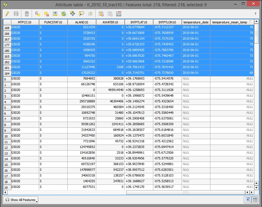
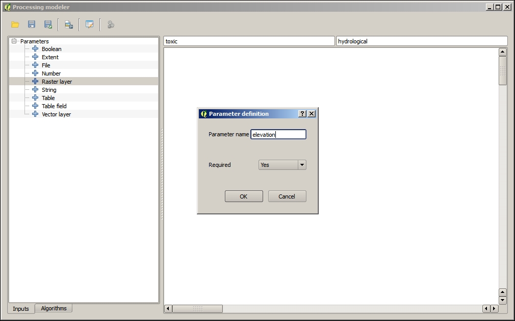
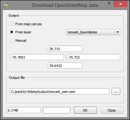
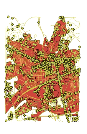
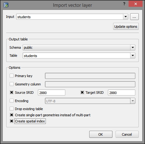
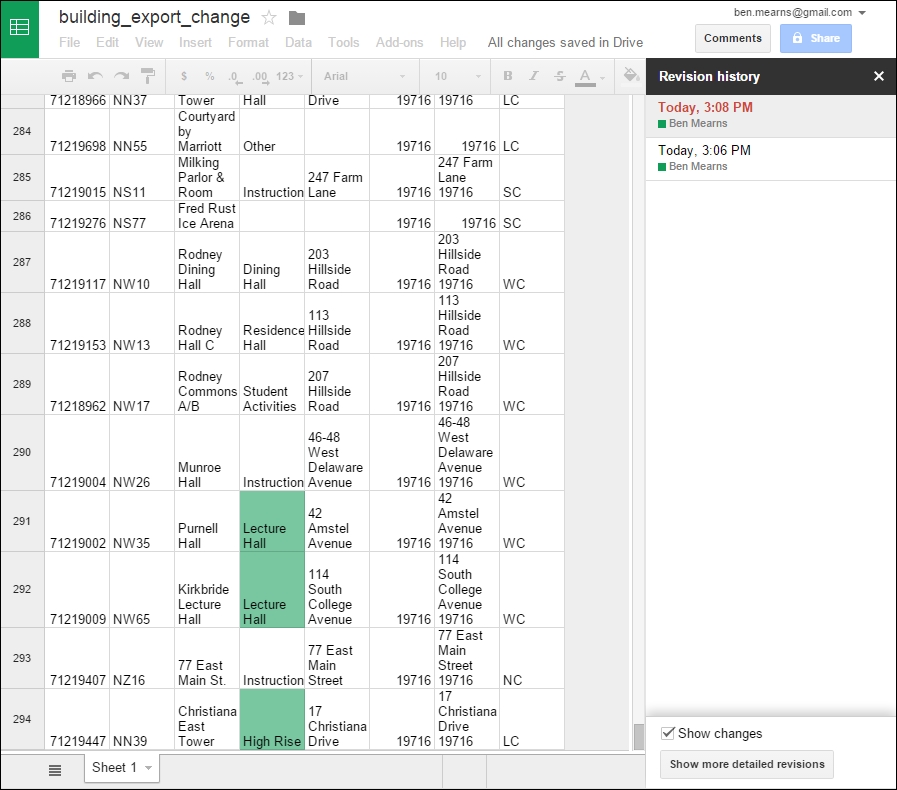
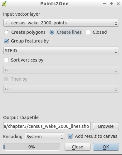
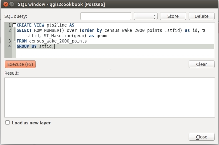
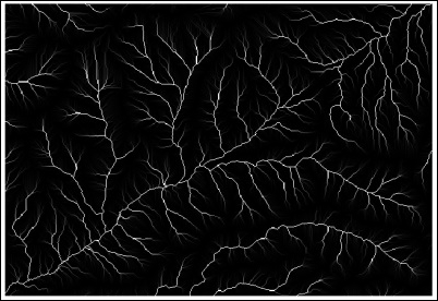
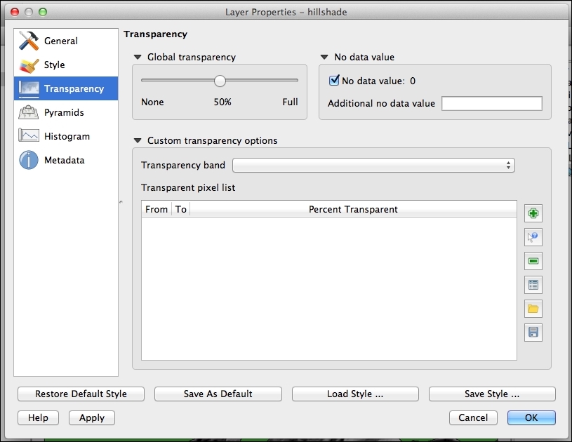
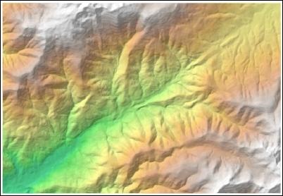
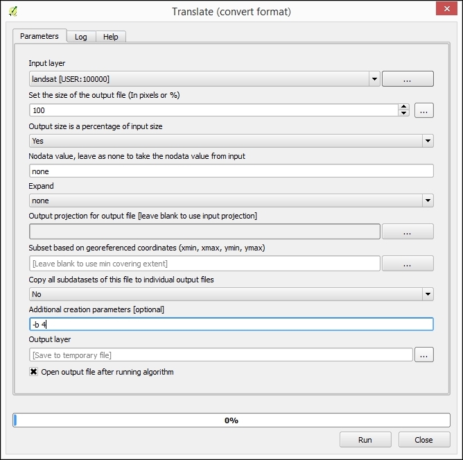
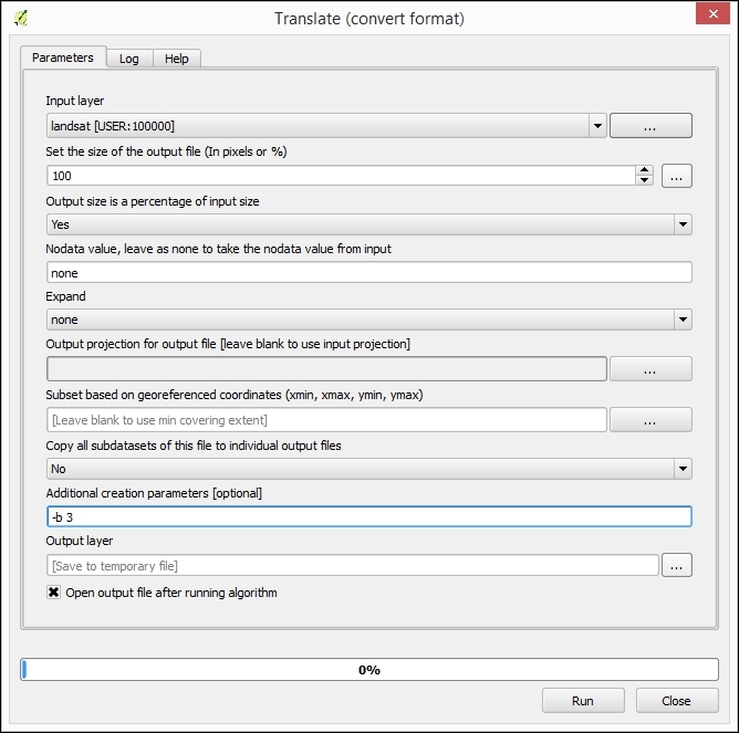
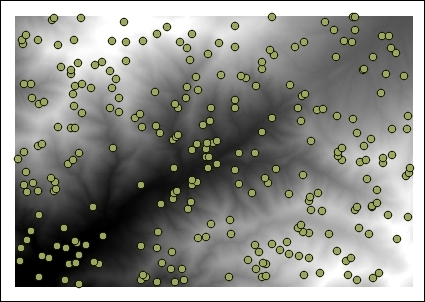
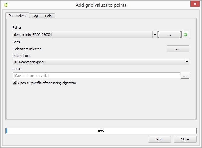
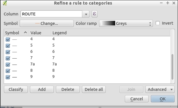
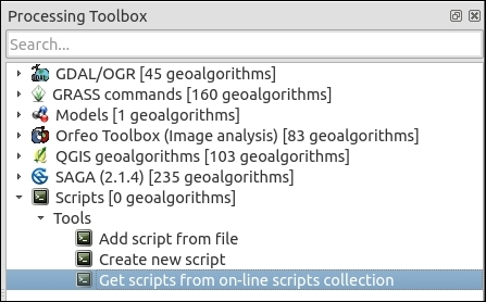