Table of Contents for
QGIS: Becoming a GIS Power User
 QGIS: Becoming a GIS Power User
Published by
Packt Publishing, 2017
QGIS: Becoming a GIS Power User
Published by
Packt Publishing, 2017
- Cover
- Table of Contents
- QGIS: Becoming a GIS Power User
- QGIS: Becoming a GIS Power User
- QGIS: Becoming a GIS Power User
- Credits
- Preface
- What you need for this learning path
- Who this learning path is for
- Reader feedback
- Customer support
- 1. Module 1
- 1. Getting Started with QGIS
- Running QGIS for the first time
- Introducing the QGIS user interface
- Finding help and reporting issues
- Summary
- 2. Viewing Spatial Data
- Dealing with coordinate reference systems
- Loading raster files
- Loading data from databases
- Loading data from OGC web services
- Styling raster layers
- Styling vector layers
- Loading background maps
- Dealing with project files
- Summary
- 3. Data Creation and Editing
- Working with feature selection tools
- Editing vector geometries
- Using measuring tools
- Editing attributes
- Reprojecting and converting vector and raster data
- Joining tabular data
- Using temporary scratch layers
- Checking for topological errors and fixing them
- Adding data to spatial databases
- Summary
- 4. Spatial Analysis
- Combining raster and vector data
- Vector and raster analysis with Processing
- Leveraging the power of spatial databases
- Summary
- 5. Creating Great Maps
- Labeling
- Designing print maps
- Presenting your maps online
- Summary
- 6. Extending QGIS with Python
- Getting to know the Python Console
- Creating custom geoprocessing scripts using Python
- Developing your first plugin
- Summary
- 2. Module 2
- 1. Exploring Places – from Concept to Interface
- Acquiring data for geospatial applications
- Visualizing GIS data
- The basemap
- Summary
- 2. Identifying the Best Places
- Raster analysis
- Publishing the results as a web application
- Summary
- 3. Discovering Physical Relationships
- Spatial join for a performant operational layer interaction
- The CartoDB platform
- Leaflet and an external API: CartoDB SQL
- Summary
- 4. Finding the Best Way to Get There
- OpenStreetMap data for topology
- Database importing and topological relationships
- Creating the travel time isochron polygons
- Generating the shortest paths for all students
- Web applications – creating safe corridors
- Summary
- 5. Demonstrating Change
- TopoJSON
- The D3 data visualization library
- Summary
- 6. Estimating Unknown Values
- Interpolated model values
- A dynamic web application – OpenLayers AJAX with Python and SpatiaLite
- Summary
- 7. Mapping for Enterprises and Communities
- The cartographic rendering of geospatial data – MBTiles and UTFGrid
- Interacting with Mapbox services
- Putting it all together
- Going further – local MBTiles hosting with TileStream
- Summary
- 3. Module 3
- 1. Data Input and Output
- Finding geospatial data on your computer
- Describing data sources
- Importing data from text files
- Importing KML/KMZ files
- Importing DXF/DWG files
- Opening a NetCDF file
- Saving a vector layer
- Saving a raster layer
- Reprojecting a layer
- Batch format conversion
- Batch reprojection
- Loading vector layers into SpatiaLite
- Loading vector layers into PostGIS
- 2. Data Management
- Joining layer data
- Cleaning up the attribute table
- Configuring relations
- Joining tables in databases
- Creating views in SpatiaLite
- Creating views in PostGIS
- Creating spatial indexes
- Georeferencing rasters
- Georeferencing vector layers
- Creating raster overviews (pyramids)
- Building virtual rasters (catalogs)
- 3. Common Data Preprocessing Steps
- Converting points to lines to polygons and back – QGIS
- Converting points to lines to polygons and back – SpatiaLite
- Converting points to lines to polygons and back – PostGIS
- Cropping rasters
- Clipping vectors
- Extracting vectors
- Converting rasters to vectors
- Converting vectors to rasters
- Building DateTime strings
- Geotagging photos
- 4. Data Exploration
- Listing unique values in a column
- Exploring numeric value distribution in a column
- Exploring spatiotemporal vector data using Time Manager
- Creating animations using Time Manager
- Designing time-dependent styles
- Loading BaseMaps with the QuickMapServices plugin
- Loading BaseMaps with the OpenLayers plugin
- Viewing geotagged photos
- 5. Classic Vector Analysis
- Selecting optimum sites
- Dasymetric mapping
- Calculating regional statistics
- Estimating density heatmaps
- Estimating values based on samples
- 6. Network Analysis
- Creating a simple routing network
- Calculating the shortest paths using the Road graph plugin
- Routing with one-way streets in the Road graph plugin
- Calculating the shortest paths with the QGIS network analysis library
- Routing point sequences
- Automating multiple route computation using batch processing
- Matching points to the nearest line
- Creating a routing network for pgRouting
- Visualizing the pgRouting results in QGIS
- Using the pgRoutingLayer plugin for convenience
- Getting network data from the OSM
- 7. Raster Analysis I
- Using the raster calculator
- Preparing elevation data
- Calculating a slope
- Calculating a hillshade layer
- Analyzing hydrology
- Calculating a topographic index
- Automating analysis tasks using the graphical modeler
- 8. Raster Analysis II
- Calculating NDVI
- Handling null values
- Setting extents with masks
- Sampling a raster layer
- Visualizing multispectral layers
- Modifying and reclassifying values in raster layers
- Performing supervised classification of raster layers
- 9. QGIS and the Web
- Using web services
- Using WFS and WFS-T
- Searching CSW
- Using WMS and WMS Tiles
- Using WCS
- Using GDAL
- Serving web maps with the QGIS server
- Scale-dependent rendering
- Hooking up web clients
- Managing GeoServer from QGIS
- 10. Cartography Tips
- Using Rule Based Rendering
- Handling transparencies
- Understanding the feature and layer blending modes
- Saving and loading styles
- Configuring data-defined labels
- Creating custom SVG graphics
- Making pretty graticules in any projection
- Making useful graticules in printed maps
- Creating a map series using Atlas
- 11. Extending QGIS
- Defining custom projections
- Working near the dateline
- Working offline
- Using the QspatiaLite plugin
- Adding plugins with Python dependencies
- Using the Python console
- Writing Processing algorithms
- Writing QGIS plugins
- Using external tools
- 12. Up and Coming
- Preparing LiDAR data
- Opening File Geodatabases with the OpenFileGDB driver
- Using Geopackages
- The PostGIS Topology Editor plugin
- The Topology Checker plugin
- GRASS Topology tools
- Hunting for bugs
- Reporting bugs
- Bibliography
- Index
D3 is a JavaScript library used for building the visualizations from the Document Object Model (DOM) present in all the modern web browsers.
In more detail, D3 manipulates the DOM into abstract vector visualization components, some of which have been further tailed to certain visualization types, such as maps. It provides us with the ability of parsing from some common data sources and binding, especially to the SVG and canvas elements that are designed to be manipulated for vector graphics.
There are a few basic aspects of D3 that are useful for you to understand before we begin. As D3 is not specifically built for geographic data, but rather for general data visualization, it tends to look at geographic data visualization more abstractly. Data must be parsed from its original format into a D3 object and rendered into the graphic space as an SVG or canvas element with a vector shape type. It must then be projected using relative mapping between the graphic space and a geographic coordinate system, scaled in relation to the graphic space and the geographic extent, and bound to a web object. This all must be done in relation to a D3 cursor of sorts, which handles the current scope that D3 is working in with keywords like "begin" and "end".
We will be parsing through the d3.json and d3.csv methods. We use the callbacks of these methods to wrap the code that we want to be executed after the external data has been parsed into a JavaScript object.
D3 makes heavy use of the two vector graphic elements in HTML5: SVG and Canvas. Scaleable Vector Graphics (SVG) is a mature technology for rendering vector graphics in the browser. It has seen some advancement in cross-browser support recently. Canvas is new to HTML5 and may offer better performance than SVG. Both, being DOM elements, are written directly as a subset of the larger HTML document rendered by the browser. Here, we will use SVG.
D3 is a bit unusual where geographic visualization libraries are concerned, in that it requires very little functionality specific to geographic data. The main geographic method provided is through the path element, projection, as D3 has its own concept of coordinate space, coordinates of the browser window and elements inside it.
Here is an example of projection. In the first line, we set the projection as Mercator. This allows us to center the map in familiar spherical latitude longitude coordinates. The scale property allows us to then zoom closer to the extent that we are interested in.
var projection = d3.geo.mercator()
  .center([-75.166667,40.03])
  .scale(60000);
You must configure a shape generator to bind to the d attribute of an SVG. This will tell the element how to draw the data that has been bound to it.
The main shape generator that we will use with the maps is path. Circle is also used in the following example, though its use is more complicated.
The following code creates a path shape generator, assigns it a projection, and stores it all in variable path:
var path = d3.geo.path()
  .projection(projection);
Scales allow the mapping of a domain of real data; say you have values of 1 through 100, in a range of possible values, and say you want everything down to numbers from 1 through 5. The most useful purpose of scales in mapping is to associate a range of values with a range of colors. The following code maps a set of values to a range of colors, mapping in-between values to intermediate colors:
var color = d3.scale.linear()
  .domain([-.5, 0, 2.66])
.range(["#FFEBEB", "#FFFFEB", "#E6FFFF"]);After a data object has been parsed into the DOM, it can be bound to a D3 object through its data or datum attribute.
In order to select the potentially existing elements, you will use the Select and Select All keywords. Then, based on whether you expect the elements to already be existent, you will use the Enter (if it is not yet existent), Return (if it is already existent), and Exit (if you wish to remove it) keywords to change the interaction with the element.
Here's an example of Select All, which uses the Enter keyword. The data from the house_district JSON, which was previously parsed, is loaded through the d attribute of the path element and assigned the path shape generator. In addition, a function is set on the fill attribute, which returns a color from the linear color scale:
map.selectAll("path")
  .data(topojson.feature(phila, phila.objects.house_district).features)
  .enter()
    .append("path")
    .attr("vector-effect","non-scaling-stroke")
    .style("fill", function(d) { return color(d.properties.d_avg_change); })
.attr("d", path);Through the following steps, we will produce an animated time series map with D3. We will start by moving our data to a filesystem path that we will use:
- Move
whites.csvtoc5/data/web/csv. - Move
house_district.jsontoc5/data/web/json.
Start the Python HTTP server using the code from Chapter 1, Exploring Places – from Concept to Interface, (refer to the Parsing the JSON data section from Chapter 7, Mapping for Enterprises and Communities). This is necessary for this example, since the typical cross-site scripting protection on the browsers would block the loading of the JSON files from the local filesystem.
You will find the following files and directory structure under c5/data/web:
|
|
|
|
|
|
|
|
|
|
|
Various supporting images |
|
|
|
|
|
|
|
|
|
The following code, mostly JavaScript, will provide a time-based animation of our geographic objects through D3. This code is largely based on the one found at TIP Strategies' Geography of Jobs map found at http://tipstrategies.com/geography-of-jobs/. The main code file is at c5/data/web/js/main.js.
Note the reference to the CSV and TopoJSON files that we created earlier: whites.csv and house_district.json.
All of the following JavaScript code is in ./js/main.js. All our customizations to this code will be done in this file:
var width = 960,
  height = 600;

//sets up the transformation from map coordinates to DOM coordinates
var projection = d3.geo.mercator()
  .center([-75.166667,40.03])
  .scale(60000);

//the shape generator
var path = d3.geo.path()
  .projection(projection);

var svg = d3.select("#map-container").append("svg")
  .attr("width", width)
  .attr("height", height);

var g = svg.append("g");

g.append( "rect" )
  .attr("width",width)
  .attr("height",height)
  .attr("fill","white")
  .attr("opacity",0)
  .on("mouseover",function(){
    hoverData = null;
    if ( probe ) probe.style("display","none");
  })

var map = g.append("g")
  .attr("id","map");

var probe,
  hoverData;

var dateScale, sliderScale, slider;

var format = d3.format(",");

  var months = ["Jan"],
    months_full = ["January"],
    orderedColumns = [],
    currentFrame = 0,
    interval,
    frameLength = 1000,
    isPlaying = false;

var sliderMargin = 65;

function circleSize(d){
  return Math.sqrt( .02 * Math.abs(d) );
};

//color scale
var color = d3.scale.linear()
  .domain([-.5, 0, 2.66])
    .range(["#FFEBEB", "#FFFFEB", "#E6FFFF"]);

//parse house_district.json TopoJSON, reference color scale and other styles
d3.json("json/house_district.json", function(error, phila) {
  map.selectAll("path")
    .data(topojson.feature(phila, phila.objects.house_district).features)
      .enter()
      .append("path")
      .attr("vector-effect","non-scaling-stroke")
      .attr("class","land")
      .style("fill", function(d) { return color(d.properties.d_avg_change); })
      .attr("d", path);

  //add a path element for district outlines
  map.append("path")
    .datum(topojson.mesh(phila, phila.objects.house_district, function(a, b) { return a !== b; }))
      .attr("class", "state-boundary")
      .attr("vector-effect","non-scaling-stroke")
      .attr("d", path);

  //probe is for popups
  probe = d3.select("#map-container").append("div")
    .attr("id","probe");

  d3.select("body")
    .append("div")
    .attr("id","loader")
    .style("top",d3.select("#play").node().offsetTop + "px")
    .style("height",d3.select("#date").node().offsetHeight + d3.select("#map-container").node().offsetHeight + "px");

  //load and parse whites.csv
  d3.csv("csv/whites.csv",function(data){
    var first = data[0];
    // get columns
    for ( var mug in first ){
      if ( mug != "name" && mug != "lat" && mug != "lon" ){
        orderedColumns.push(mug);
    }
  }

  orderedColumns.sort( sortColumns );

  // draw city points
  for ( var i in data ){
    var projected = projection([ parseFloat(data[i].lon), parseFloat(data[i].lat) ])
    map.append("circle")
      .datum( data[i] )
      .attr("cx",projected[0])
      .attr("cy",projected[1])
      .attr("r",1)
      .attr("vector-effect","non-scaling-stroke")
      .on("mousemove",function(d){
        hoverData = d;
        setProbeContent(d);
        probe
        .style( {
          "display" : "block",
          "top" : (d3.event.pageY - 80) + "px",
          "left" : (d3.event.pageX + 10) + "px"
        })
      })
      .on("mouseout",function(){
        hoverData = null;
        probe.style("display","none");
      })
    }

    createLegend();

    dateScale = createDateScale(orderedColumns).range([0,3]);

    createSlider();

    d3.select("#play")
      .attr("title","Play animation")
      .on("click",function(){
        if ( !isPlaying ){
          isPlaying = true;
          d3.select(this).classed("pause",true).attr("title","Pause animation");
          animate();
        } else {
          isPlaying = false;
          d3.select(this).classed("pause",false).attr("title","Play animation");
          clearInterval( interval );
        }
      });

      drawMonth( orderedColumns[currentFrame] ); // initial map

      window.onresize = resize;
       resize();

      d3.select("#loader").remove();

    })
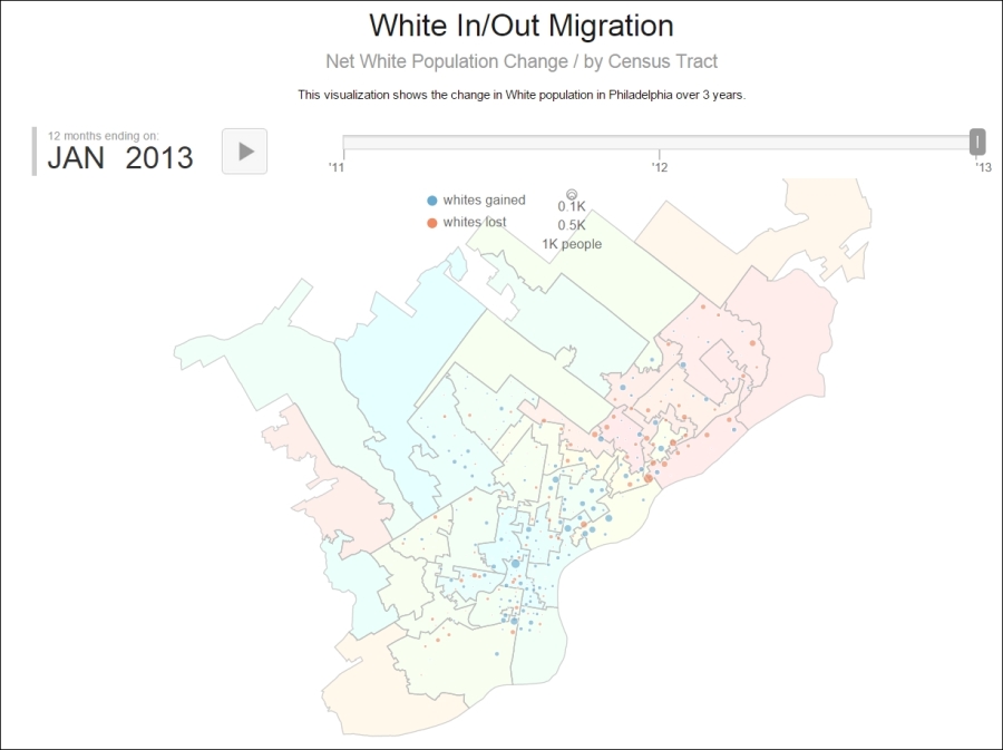
});The finished product, which you can view by opening index.html in a web browser, is an animated set of points controlled by a timeline showing the change in the white population by the census tract. This data is displayed on top of the House Districts, colored from cool to hot by the change in the white population per year, and averaged over three periods of change (2010-11, 2011-12, and 2012-13). Our map application output, animated with a timeline, will look similar to this: